Headspace
A warm, friendly mental-health brand built on a near-white-and-cream canvas with rounded, pill-heavy components, bold Headspace Apercu display type, and saturated brand accents (electric blue, sunshine yellow, candy pink) carried mostly inside playful product illustrations. The system reads as approachable and calm — generous corner radii (24–32px cards, fully-pill buttons), high-contrast charcoal headlines, and color used as joyful punctuation rather than structural chrome.
---
version: alpha
name: Headspace-design-analysis
description: A warm, friendly mental-health brand built on a near-white-and-cream canvas with rounded, pill-heavy components, bold Headspace Apercu display type, and saturated brand accents (electric blue, sunshine yellow, candy pink) carried mostly inside playful product illustrations. The system reads as approachable and calm — generous corner radii (24–32px cards, fully-pill buttons), high-contrast charcoal headlines, and color used as joyful punctuation rather than structural chrome.
colors:
primary: "#0061ef"
primary-bright: "#00a4ff"
link: "#0000ee"
ink: "#2d2c2b"
body: "#44423f"
muted: "#63605d"
on-primary: "#4b4c4d"
canvas: "#ffffff"
surface-cream: "#f9f4f2"
near-black: "#101010"
black: "#000000"
accent-yellow: "#ffce00"
accent-pink: "#ffa1cc"
accent-purple: "#3b197f"
accent-green: "#02873e"
typography:
h2:
fontFamily: "Headspace Apercu, Inter, sans-serif"
fontSize: 52px
fontWeight: 700
lineHeight: 1.1
letterSpacing: -1.56px
h3:
fontFamily: "Headspace Apercu, Inter, sans-serif"
fontSize: 40px
fontWeight: 700
lineHeight: 1.15
letterSpacing: -1.2px
h4:
fontFamily: "Headspace Apercu, Inter, sans-serif"
fontSize: 24px
fontWeight: 700
lineHeight: 1.333
letterSpacing: -0.6px
body:
fontFamily: "Headspace Apercu, Inter, sans-serif"
fontSize: 18px
fontWeight: 500
lineHeight: 1.444
letterSpacing: -0.18px
button:
fontFamily: "Headspace Apercu, Inter, sans-serif"
fontSize: 16px
fontWeight: 400
lineHeight: 1.15
letterSpacing: 0
rounded:
sm: 8px
md: 12px
lg: 16px
xl: 24px
xxl: 32px
pill: 800px
spacing:
xxs: 4px
xs: 8px
sm: 12px
md: 16px
lg: 24px
components:
top-nav:
backgroundColor: "{colors.canvas}"
textColor: "{colors.ink}"
typography: "{typography.button}"
promo-bar:
backgroundColor: "{colors.accent-yellow}"
textColor: "{colors.ink}"
typography: "{typography.button}"
button-primary:
backgroundColor: "{colors.canvas}"
textColor: "{colors.on-primary}"
typography: "{typography.button}"
rounded: "{rounded.sm}"
padding: 8px 16px 8px 24px
button-cta-blue-pill:
backgroundColor: "{colors.primary}"
textColor: "{colors.canvas}"
typography: "{typography.button}"
rounded: "{rounded.pill}"
padding: 8px 16px 8px 24px
button-cta-dark-pill:
backgroundColor: "{colors.near-black}"
textColor: "{colors.canvas}"
typography: "{typography.button}"
rounded: "{rounded.pill}"
padding: 8px 16px 8px 24px
hero-section:
backgroundColor: "{colors.canvas}"
textColor: "{colors.ink}"
typography: "{typography.h2}"
feature-card:
backgroundColor: "{colors.surface-cream}"
textColor: "{colors.ink}"
typography: "{typography.h3}"
rounded: "{rounded.xxl}"
padding: 24px
category-tile:
backgroundColor: "{colors.canvas}"
textColor: "{colors.ink}"
typography: "{typography.body}"
rounded: "{rounded.lg}"
padding: 16px 24px
promo-band-blue:
backgroundColor: "{colors.primary}"
textColor: "{colors.canvas}"
typography: "{typography.h3}"
rounded: "{rounded.xxl}"
padding: 24px
promo-band-bright:
backgroundColor: "{colors.primary-bright}"
textColor: "{colors.canvas}"
typography: "{typography.h3}"
rounded: "{rounded.xxl}"
padding: 24px
input:
backgroundColor: "{colors.canvas}"
textColor: "{colors.ink}"
typography: "{typography.body}"
rounded: "{rounded.sm}"
faq-row:
backgroundColor: "{colors.canvas}"
textColor: "{colors.ink}"
typography: "{typography.body}"
footer:
backgroundColor: "{colors.surface-cream}"
textColor: "{colors.body}"
typography: "{typography.body}"
---
## Overview
Headspace's marketing surface is a warm, approachable mental-health brand built on a white/cream canvas (`{colors.canvas}` — #ffffff and `{colors.surface-cream}` — #f9f4f2) with charcoal display type (`{colors.ink}` — #2d2c2b) and color used as joyful punctuation rather than structural chrome. The system reads as calm and friendly — big rounded cards, fully-pill CTAs, and saturated brand accents that live mostly inside the product illustrations.
Type voice is single-family: **Headspace Apercu** (a custom geometric grotesque) handles everything — bold 700-weight headlines with tight negative letter-spacing (-0.6px to -1.56px), medium 500-weight body, and a lighter 400-weight button label. There is no secondary typeface; weight and size carry the entire hierarchy.
Component voltage comes from **rounded, soft surfaces and playful product illustrations**. Feature cards sit on cream backgrounds with very large corner radii (`{rounded.xxl}` — 32px), and the colorful product UI fragments (a yellow meditation phone, a magenta sleepcast tile, an orange Ebb companion) carry the brand's saturated palette — `{colors.accent-yellow}` (#ffce00), `{colors.accent-pink}` (#ffa1cc), `{colors.primary}` (#0061ef) — without those colors invading the surrounding chrome.
The page alternates calm white/cream editorial bands with occasional full-bleed saturated bands — an electric-blue enterprise band (`{colors.primary}`), a bright-blue "join the millions" band (`{colors.primary-bright}`), and a sunshine-yellow closing CTA band (`{colors.accent-yellow}`). These color blocks pace the long scroll.
**Key Characteristics:**
- White/cream canvas with charcoal headlines — `{colors.ink}` (#2d2c2b) carries all display type; nothing is pure black at the text layer.
- Custom **Headspace Apercu** display face (substituted with Inter here), bold 700-weight with tight negative tracking on headlines.
- Fully-pill CTA buttons (`{rounded.pill}` — 800px radius) — the signature "Try for free" and "Get your headspace" buttons are blue-pill (`{colors.primary}`); in-card CTAs are dark-pill (`{colors.near-black}`).
- Very large card radii — feature cards at `{rounded.xxl}` (32px), promo bands at the same, smaller tiles at `{rounded.lg}` (16px). The whole system leans soft.
- Color as joyful punctuation — `{colors.accent-yellow}`, `{colors.accent-pink}`, `{colors.accent-purple}`, `{colors.accent-green}` appear inside illustrations and category cards, never on body chrome.
- Sunshine-yellow promo bar (`{colors.accent-yellow}`) pinned to the very top of the page.
- Cream footer (`{colors.surface-cream}`) closes the page softly rather than with a dark inversion.
## Colors
### Brand & Accent
- **Primary** (`{colors.primary}` — #0061ef): The electric-blue brand action color. Used on the marquee pill CTAs ("Try for free", "Get your headspace") and the full-bleed enterprise band.
- **Primary Bright** (`{colors.primary-bright}` — #00a4ff): A brighter cyan-blue used on the "Join the millions who use Headspace" band.
- **Link** (`{colors.link}` — #0000ee): Default browser-blue inline link tone observed on the promo bar text link.
- **Accent Yellow** (`{colors.accent-yellow}` — #ffce00): The top promo bar and the closing CTA band background; also a dominant illustration color.
- **Accent Pink** (`{colors.accent-pink}` — #ffa1cc), **Accent Purple** (`{colors.accent-purple}` — #3b197f), **Accent Green** (`{colors.accent-green}` — #02873e): Low-frequency illustration and library-tile accents. They appear inside product artwork and category cards, never on text chrome.
### Surface
- **Canvas** (`{colors.canvas}` — #ffffff): The default page floor and button background.
- **Surface Cream** (`{colors.surface-cream}` — #f9f4f2): Feature card backgrounds and the footer — the warm off-white that gives the system its soft mood.
- **Near Black** (`{colors.near-black}` — #101010): In-card dark-pill CTA backgrounds ("Try for $0", "Check your coverage").
- **Black** (`{colors.black}` — #000000): Hard contrast in illustration/icon details.
### Text
- **Ink** (`{colors.ink}` — #2d2c2b): All headlines and primary text — a warm near-black charcoal.
- **Body** (`{colors.body}` — #44423f): Default running-text color and footer text.
- **Muted** (`{colors.muted}` — #63605d): Secondary/supporting text, fine print.
- **On Primary** (`{colors.on-primary}` — #4b4c4d): The measured label color on the white pill button — a mid-gray, used when the button background is `{colors.canvas}`.
> Note: Headspace's palette skews warm-neutral at the text/surface layer and saturated only in illustration. The accent hex values (`{colors.accent-pink}`, `{colors.accent-purple}`, `{colors.accent-green}`, `{colors.primary-bright}`) were each measured at very low frequency (1 occurrence) and are documented as illustration accents — see Known Gaps.
## Typography
### Font Family
The system runs a single family: **Headspace Apercu**, the brand's custom geometric grotesque, across every role. Headlines use weight 700 with tight negative letter-spacing; body runs at weight 500; button labels drop to weight 400. There is no secondary face — hierarchy is built entirely from size and weight. The fallback stack walks `Inter, sans-serif`.
### Hierarchy
| Token | Size | Weight | Line Height | Letter Spacing | Use |
|---|---|---|---|---|---|
| `{typography.h2}` | 52px | 700 | 1.1 | -1.56px | Section heads ("Improve relationships all with Headspace", "Members are enjoying happier and healthier lives") |
| `{typography.h3}` | 40px | 700 | 1.15 | -1.2px | Sub-section heads, card titles, promo-band heads |
| `{typography.h4}` | 24px | 700 | 1.333 | -0.6px | Smaller card titles, list labels |
| `{typography.body}` | 18px | 500 | 1.444 | -0.18px | Default running-text, supporting copy, FAQ rows |
| `{typography.button}` | 16px | 400 | 1.15 | 0 | Button labels, nav items |
### Principles
Bold 700-weight + tight negative tracking is the headline signature — every display size carries it. Body steps down to a friendlier 500 weight at 18px with a generous 1.44 line-height for easy reading. Button labels are the only place weight drops to 400, keeping CTAs light and unshouty against their saturated pill backgrounds.
### Note on Font Substitutes
Headspace Apercu is a custom/licensed typeface and is not available as a public web font. **Inter** is the documented open-source substitute used in the fallback stack; for a closer match to Apercu's geometric grotesque character, **Spline Sans** or **Hanken Grotesk** at the same weights and negative letter-spacing are usable approximations. Never claim to ship Headspace Apercu — substitute and preserve the weight + tracking signature.
## Layout
### Spacing System
- **Base unit:** 4px.
- **Tokens:** `{spacing.xxs}` 4px · `{spacing.xs}` 8px · `{spacing.sm}` 12px · `{spacing.md}` 16px · `{spacing.lg}` 24px.
- The two highest-frequency steps measured are `{spacing.lg}` (24px, 69 occurrences) and `{spacing.md}` (16px, 32 occurrences) — the primary card-padding and inter-element gaps respectively.
- Larger section-level spacing (32px+) was not captured cleanly — see Known Gaps.
### Grid & Container
- **Hero:** Centered single-column headline + supporting trust-line row, with two side-by-side feature cards below (a wider "Mental health app" card and a narrower "Online therapy" card).
- **Category grid:** "What kind of headspace are you looking for?" renders as a 3-column tile grid at desktop.
- **Library carousel:** Horizontally scrolling card row.
- **Footer:** Multi-column link list on the cream surface.
### Whitespace Philosophy
Headspace uses generous vertical breathing room and large rounded surfaces. The hero centers a single large headline with plenty of air, then drops into soft cream cards. The rhythm alternates calm white/cream bands with occasional full-bleed saturated color bands to pace the long scroll.
## Elevation & Depth
| Level | Treatment | Use |
|---|---|---|
| Flat | No shadow | Body sections, nav, hero, cream cards |
| Soft drop | `rgba(20, 19, 19, 0.2) 0px 1px 8px 0px` | Elevated small UI fragments, floating product chips (most common, 5 occurrences) |
| Hard offset | `rgba(65, 61, 69, 0.2) 0px 2px 0px 0px` | Pressed/grounded button or tile bottom-edge accent |
| Soft drop (scaled) | `rgba(20, 19, 19, 0.2) 0px 3.23px 6.45px 0px` | A scaled variant of the soft drop on a larger element |
The elevation philosophy is **soft and minimal** — faint low-alpha drop shadows on floating product fragments, a hard 2px bottom offset for grounded button feel. No heavy shadows, no glassmorphism. Color-block contrast (the saturated bands) does most of the depth work.
### Decorative Depth
- Floating product illustration chips (the "What's on your mind? / Ebb" bubble, the meditation phone) carry their own soft drop shadows to lift them off the cream card.
- Saturated full-bleed bands (blue, bright-blue, yellow) provide chromatic depth contrast against the surrounding white/cream.
## Shapes
### Border Radius Scale
| Token | Value | Use |
|---|---|---|
| `{rounded.sm}` | 8px | Buttons (measured), inputs |
| `{rounded.md}` | 12px | Small interactive chips |
| `{rounded.lg}` | 16px | Category tiles, mid-size cards |
| `{rounded.xl}` | 24px | Larger content cards |
| `{rounded.xxl}` | 32px | Feature cards, promo bands (the dominant large-card radius) |
| `{rounded.pill}` | 800px | Fully-pill CTA buttons ("Try for free", "Get your headspace") |
The radius scale is generous and soft across the board — even the smallest measured non-zero radius is 8px, and the dominant card radii are 16/24/32px. The pill (800px) gives marquee CTAs their fully-rounded capsule silhouette. Two outlier radii were measured — a 112px radius (1 occurrence, likely a large illustration mask) and a 30px (1 occurrence) — documented but not tokenized; see Known Gaps.
### Photography & Illustration Geometry
- Product mockup phones and illustration tiles use rounded corners and retain their native colorful chrome (yellow meditation app, magenta sleepcast, orange Ebb companion).
- The library carousel cards use rounded gradient tiles with illustration art.
## Components
### Navigation
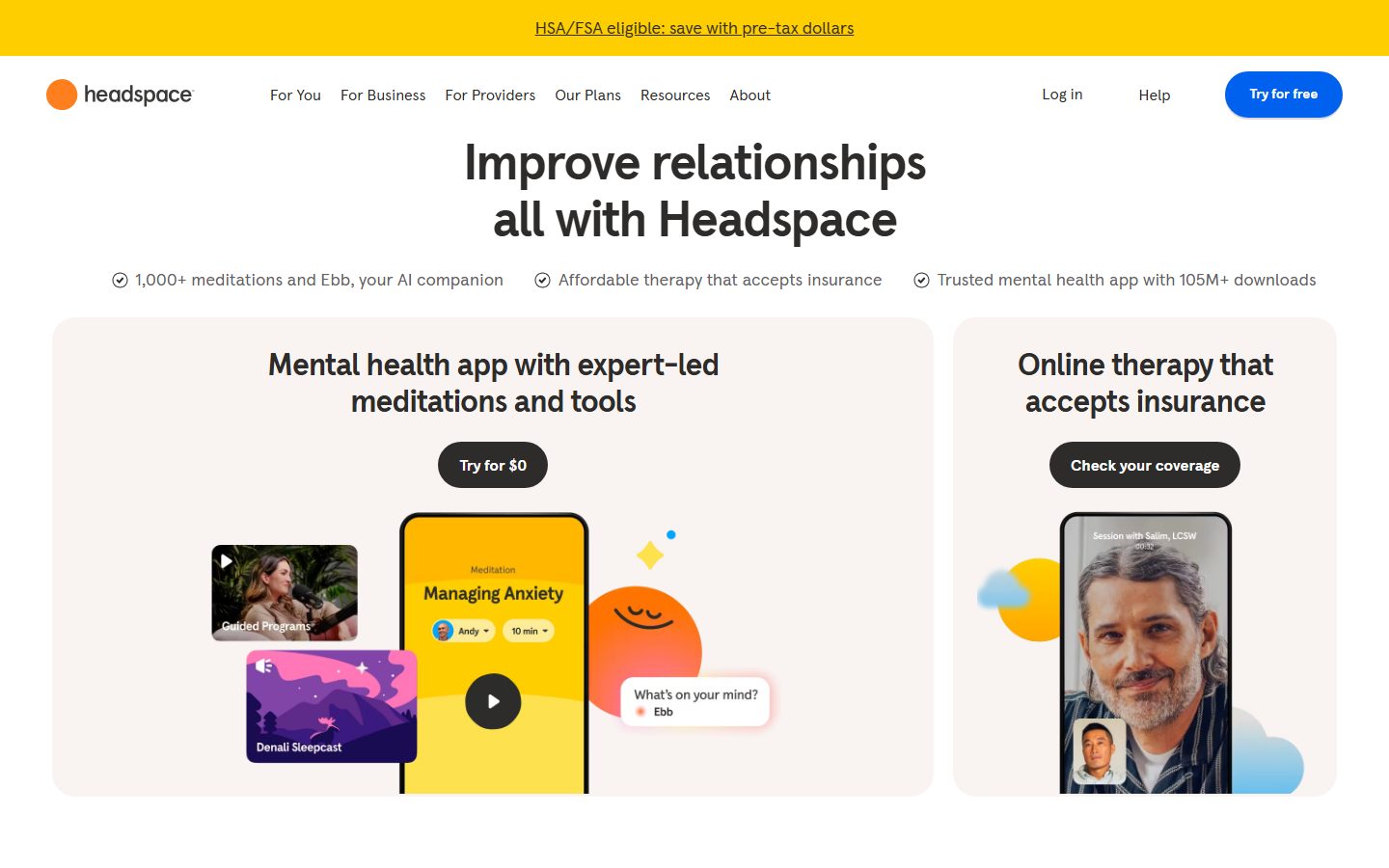
**`top-nav`** — White nav bar with the Headspace wordmark + orange dot logo at left, horizontal menu (For You, For Business, For Providers, Our Plans, Resources, About) center, and a right cluster with "Log in", "Help", and the blue-pill "Try for free" CTA. Menu items in `{typography.button}` (Apercu 16px / 400). Background `{colors.canvas}`, text `{colors.ink}`.
**`promo-bar`** — Sunshine-yellow announcement bar pinned above the nav ("HSA/FSA eligible: save with pre-tax dollars"). Background `{colors.accent-yellow}`, text `{colors.ink}`, with an underlined inline link.
### Buttons
**`button-primary`** — The measured button: background `{colors.canvas}` (#ffffff), label color `{colors.on-primary}` (#4b4c4d), type `{typography.button}` (Apercu 16px / 400), rounded `{rounded.sm}` (8px), padding 8px 16px 8px 24px (asymmetric — extra left padding for a leading icon). This is the light/white pill variant.
**`button-cta-blue-pill`** — The marquee CTA (derived from screenshots): background `{colors.primary}` (#0061ef), label `{colors.canvas}`, fully rounded `{rounded.pill}` (800px). Used for "Try for free" in the nav and "Get your headspace" in the closing band. Padding follows the measured 8px 16px 8px 24px pattern (derived).
**`button-cta-dark-pill`** — In-card dark CTA (derived from screenshots): background `{colors.near-black}` (#101010), label `{colors.canvas}`, fully rounded `{rounded.pill}`. Used for "Try for $0" and "Check your coverage" inside the cream feature cards.
### Cards & Containers
**`hero-section`** — Centered white-canvas hero: a large `{typography.h2}` headline ("Improve relationships all with Headspace"), a row of three checkmark trust-statements in `{typography.body}`, then two feature cards below. Background `{colors.canvas}`, text `{colors.ink}`.
**`feature-card`** — The cream product cards ("Mental health app with expert-led meditations and tools" / "Online therapy that accepts insurance"). Background `{colors.surface-cream}` (#f9f4f2), rounded `{rounded.xxl}` (32px), padding `{spacing.lg}` (24px). Carries an `{typography.h3}` heading, a centered dark-pill CTA, and embedded product illustrations.
**`category-tile`** — Tiles in the "What kind of headspace are you looking for?" grid (Stress less, Sleep soundly, Manage anxiety, etc.). Background `{colors.canvas}`, text `{colors.ink}`, type `{typography.body}`, rounded `{rounded.lg}` (16px), padding 16px 24px, with a trailing chevron and a hairline outline.
**`promo-band-blue`** — Full-bleed enterprise band ("Over 4,000 leading organizations choose Headspace"). Background `{colors.primary}` (#0061ef), text `{colors.canvas}`, rounded `{rounded.xxl}`, heading in `{typography.h3}`, with two pill CTAs.
**`promo-band-bright`** — The "Join the millions who use Headspace every day" band. Background `{colors.primary-bright}` (#00a4ff), text `{colors.canvas}`, rounded `{rounded.xxl}`, with a stat row and a dark-pill CTA.
### Inputs & Forms
**`input`** — The measured form field (newsletter "Email address"). Background `{colors.canvas}`, text `{colors.ink}`, type `{typography.body}`. Note: the measured border-radius was 0px; the token reference above maps it to `{rounded.sm}` only for consistency — see Known Gaps for the squared-input discrepancy.
### FAQ / Footer
**`faq-row`** — Accordion rows in the "Frequently asked questions" list. Background `{colors.canvas}`, label in `{typography.body}`, with a trailing plus/expand control and a hairline divider between rows.
**`footer`** — Cream footer closing the page. Background `{colors.surface-cream}` (#f9f4f2), text `{colors.body}`. Carries the "Stay in the loop" newsletter input + dark-pill "Subscribe" button, a multi-column link list (Get some Headspace / Our content / About us / Support / My Headspace / Get the app), social icons, and a language selector. The footer closes softly with cream rather than a dark inversion.
## Do's and Don'ts
### Do
- Use `{colors.primary}` (#0061ef) blue pills for the marquee CTAs and `{colors.near-black}` dark pills for in-card actions. Keep the pill (`{rounded.pill}`) silhouette on both.
- Set headlines in Headspace Apercu (or Inter substitute) at weight 700 with the measured negative letter-spacing (-0.6 to -1.56px). The tight tracking is part of the voice.
- Keep body copy at weight 500 / 18px with the generous 1.44 line-height — it makes the dense supporting copy feel calm.
- Put saturated color (`{colors.accent-yellow}`, `{colors.accent-pink}`, `{colors.accent-purple}`, `{colors.accent-green}`) inside illustrations, category cards, and full-bleed bands — never on body text or default chrome.
- Use large radii (`{rounded.xxl}` 32px on cards, `{rounded.pill}` on buttons). Softness is the brand mood.
- Lean on warm neutrals — `{colors.ink}` charcoal text and `{colors.surface-cream}` backgrounds — instead of pure black and pure white where warmth matters.
### Don't
- Don't use a second typeface. Headspace Apercu carries every role; hierarchy comes from size + weight only.
- Don't make CTAs sharp-cornered — buttons are pills or `{rounded.sm}` at minimum, never square.
- Don't tighten body line-height; the 1.44 leading is what keeps long copy calm.
- Don't let the saturated accents invade nav, footer, or body text. They are punctuation, not chrome.
- Don't add hover-state styling beyond default and pressed; the system encodes a hard 2px bottom-offset shadow for grounded/pressed feel.
- Don't close the page with a dark footer — Headspace closes soft on cream.
## Responsive Behavior
| Name | Width | Key Changes |
|---|---|---|
| Mobile | < 768px | Hamburger nav; hero headline scales down; feature cards stack 1-up; category grid collapses to 1-up; full-bleed bands stack their content |
| Tablet | 768–1024px | Nav tightens; feature cards may stay 2-up or stack; category grid 2-up |
| Desktop | 1024–1440px | Full horizontal nav; two-card hero row; 3-up category grid; library carousel scrolls horizontally |
| Wide | > 1440px | Same as desktop with more outer breathing room |
### Touch Targets
- Pill CTAs (`{component.button-cta-blue-pill}`, `{component.button-cta-dark-pill}`) carry generous padding (8px vertical, 24px leading) keeping tap areas comfortable.
- Category tiles use 16px × 24px padding, giving large full-row tap targets.
- Exact minimum touch-target dimensions were not measured — see Known Gaps.
### Collapsing Strategy
- The two-card hero row stacks to single-column on mobile.
- The 3-up category grid reduces columns rather than scaling cards down.
- Full-bleed saturated bands keep their `{rounded.xxl}` corners and stack heading-over-CTA on narrow screens.
- The library carousel remains a horizontal scroll at all breakpoints.
### Image Behavior
- Product illustration phones and tiles scale proportionally and retain their rounded corners.
- Saturated bands remain full-bleed across breakpoints.
## Iteration Guide
1. Focus on ONE component at a time. Reference its YAML key directly (`{component.feature-card}`, `{component.button-cta-blue-pill}`).
2. Variants (`-blue-pill`, `-dark-pill`) live as separate entries in `components:`.
3. Use `{token.refs}` everywhere — never inline a hex.
4. Never document hover. Default and pressed/grounded states only.
5. Headlines stay Headspace Apercu 700 with negative tracking; body stays weight 500. The single-family discipline does not blur.
6. Saturated accents belong in illustrations and full-bleed bands, not body chrome.
7. When in doubt about emphasis: bigger Apercu before introducing color.
## Known Gaps
- **Headspace Apercu** is a custom/licensed typeface not available publicly; substitutes (Inter / Spline Sans / Hanken Grotesk) are documented in the Typography section. `fonts_licensed` in the analysis was empty, but the family name indicates a proprietary brand face.
- **H1 / hero headline** type was not captured as a distinct role — the largest measured role is `h2` (52px). The visually huge hero headline ("Improve relationships all with Headspace") likely uses a larger size that was not measured; do not guess its value.
- **Button color inconsistency:** the only measured button reported background `#ffffff` with label `#4b4c4d` and an 8px radius — this is the white/light variant. The blue-pill and dark-pill CTAs prominent in the screenshots (`{component.button-cta-blue-pill}`, `{component.button-cta-dark-pill}`) are documented from screenshot ground-truth and marked derived; their exact padding/radius beyond the pill shape was not individually measured.
- **Input radius:** the measured input had a `0px` border-radius (squared), which conflicts with the otherwise soft system. The component maps it to `{rounded.sm}` for consistency, but the measured value was square — confirm against the live newsletter field.
- **Outlier radii:** 30px (1×), 112px (1×), and the 800px pill were measured; 112px is likely an illustration mask, not a tokenized surface, and is not declared.
- **Large-scale spacing** (32px+ section rhythm) was not captured cleanly; only the 4–24px range is documented. Section vertical padding between bands is unknown.
- **Low-frequency accent hexes** (`{colors.accent-pink}`, `{colors.accent-purple}`, `{colors.accent-green}`, `{colors.primary-bright}`) were each measured once and are treated as illustration accents; their systematic usage rules are inferred from screenshots.
- **Touch-target minimums**, animation/transition timings (carousel, accordion expand, illustration motion), and form validation/error states were not extracted.
- Only the landing page was captured; interior pages (For Business, Our Plans, Resources) may introduce additional components and color usage not represented here.
<!-- Documented by duply · real-world design systems as ready-to-use DESIGN.md for AI coding agents · https://duply.ai/headspace/design-md -->
Color Palette
Accent
Neutrals
Typography
h252px · 700 · 1.1
The quick brown fox jumpsh340px · 700 · 1.15
The quick brown fox jumpsh424px · 700 · 1.333
The quick brown fox jumpsbody18px · 500 · 1.444
The quick brown fox jumpsbutton16px · 400 · 1.15
The quick brown fox jumpsSpacing & Shape
Spacing
| Name | Value | Preview |
|---|---|---|
| xxs | 4px | |
| xs | 8px | |
| sm | 12px | |
| md | 16px | |
| lg | 24px |
Border Radius
| Name | Value | Preview |
|---|---|---|
| sm | 8px | |
| md | 12px | |
| lg | 16px | |
| xl | 24px | |
| xxl | 32px | |
| pill | 800px |
More like this


---
version: alpha
name: Headspace-design-analysis
description: A warm, friendly mental-health brand built on a near-white-and-cream canvas with rounded, pill-heavy components, bold Headspace Apercu display type, and saturated brand accents (electric blue, sunshine yellow, candy pink) carried mostly inside playful product illustrations. The system reads as approachable and calm — generous corner radii (24–32px cards, fully-pill buttons), high-contrast charcoal headlines, and color used as joyful punctuation rather than structural chrome.
colors:
  primary: "#0061ef"
  primary-bright: "#00a4ff"
  link: "#0000ee"
  ink: "#2d2c2b"
  body: "#44423f"
  muted: "#63605d"
  on-primary: "#4b4c4d"
  canvas: "#ffffff"
  surface-cream: "#f9f4f2"
  near-black: "#101010"
  black: "#000000"
  accent-yellow: "#ffce00"
  accent-pink: "#ffa1cc"
  accent-purple: "#3b197f"
  accent-green: "#02873e"
typography:
  h2:
    fontFamily: "Headspace Apercu, Inter, sans-serif"
    fontSize: 52px
    fontWeight: 700
    lineHeight: 1.1
    letterSpacing: -1.56px
  h3:
    fontFamily: "Headspace Apercu, Inter, sans-serif"
    fontSize: 40px
    fontWeight: 700
    lineHeight: 1.15
    letterSpacing: -1.2px
  h4:
    fontFamily: "Headspace Apercu, Inter, sans-serif"
    fontSize: 24px
    fontWeight: 700
    lineHeight: 1.333
    letterSpacing: -0.6px
  body:
    fontFamily: "Headspace Apercu, Inter, sans-serif"
    fontSize: 18px
    fontWeight: 500
    lineHeight: 1.444
    letterSpacing: -0.18px
  button:
    fontFamily: "Headspace Apercu, Inter, sans-serif"
    fontSize: 16px
    fontWeight: 400
    lineHeight: 1.15
    letterSpacing: 0
rounded:
  sm: 8px
  md: 12px
  lg: 16px
  xl: 24px
  xxl: 32px
  pill: 800px
spacing:
  xxs: 4px
  xs: 8px
  sm: 12px
  md: 16px
  lg: 24px
components:
  top-nav:
    backgroundColor: "{colors.canvas}"
    textColor: "{colors.ink}"
    typography: "{typography.button}"
  promo-bar:
    backgroundColor: "{colors.accent-yellow}"
    textColor: "{colors.ink}"
    typography: "{typography.button}"
  button-primary:
    backgroundColor: "{colors.canvas}"
    textColor: "{colors.on-primary}"
    typography: "{typography.button}"
    rounded: "{rounded.sm}"
    padding: 8px 16px 8px 24px
  button-cta-blue-pill:
    backgroundColor: "{colors.primary}"
    textColor: "{colors.canvas}"
    typography: "{typography.button}"
    rounded: "{rounded.pill}"
    padding: 8px 16px 8px 24px
  button-cta-dark-pill:
    backgroundColor: "{colors.near-black}"
    textColor: "{colors.canvas}"
    typography: "{typography.button}"
    rounded: "{rounded.pill}"
    padding: 8px 16px 8px 24px
  hero-section:
    backgroundColor: "{colors.canvas}"
    textColor: "{colors.ink}"
    typography: "{typography.h2}"
  feature-card:
    backgroundColor: "{colors.surface-cream}"
    textColor: "{colors.ink}"
    typography: "{typography.h3}"
    rounded: "{rounded.xxl}"
    padding: 24px
  category-tile:
    backgroundColor: "{colors.canvas}"
    textColor: "{colors.ink}"
    typography: "{typography.body}"
    rounded: "{rounded.lg}"
    padding: 16px 24px
  promo-band-blue:
    backgroundColor: "{colors.primary}"
    textColor: "{colors.canvas}"
    typography: "{typography.h3}"
    rounded: "{rounded.xxl}"
    padding: 24px
  promo-band-bright:
    backgroundColor: "{colors.primary-bright}"
    textColor: "{colors.canvas}"
    typography: "{typography.h3}"
    rounded: "{rounded.xxl}"
    padding: 24px
  input:
    backgroundColor: "{colors.canvas}"
    textColor: "{colors.ink}"
    typography: "{typography.body}"
    rounded: "{rounded.sm}"
  faq-row:
    backgroundColor: "{colors.canvas}"
    textColor: "{colors.ink}"
    typography: "{typography.body}"
  footer:
    backgroundColor: "{colors.surface-cream}"
    textColor: "{colors.body}"
    typography: "{typography.body}"
---

## Overview

Headspace's marketing surface is a warm, approachable mental-health brand built on a white/cream canvas (`{colors.canvas}` — #ffffff and `{colors.surface-cream}` — #f9f4f2) with charcoal display type (`{colors.ink}` — #2d2c2b) and color used as joyful punctuation rather than structural chrome. The system reads as calm and friendly — big rounded cards, fully-pill CTAs, and saturated brand accents that live mostly inside the product illustrations.

Type voice is single-family: **Headspace Apercu** (a custom geometric grotesque) handles everything — bold 700-weight headlines with tight negative letter-spacing (-0.6px to -1.56px), medium 500-weight body, and a lighter 400-weight button label. There is no secondary typeface; weight and size carry the entire hierarchy.

Component voltage comes from **rounded, soft surfaces and playful product illustrations**. Feature cards sit on cream backgrounds with very large corner radii (`{rounded.xxl}` — 32px), and the colorful product UI fragments (a yellow meditation phone, a magenta sleepcast tile, an orange Ebb companion) carry the brand's saturated palette — `{colors.accent-yellow}` (#ffce00), `{colors.accent-pink}` (#ffa1cc), `{colors.primary}` (#0061ef) — without those colors invading the surrounding chrome.

The page alternates calm white/cream editorial bands with occasional full-bleed saturated bands — an electric-blue enterprise band (`{colors.primary}`), a bright-blue "join the millions" band (`{colors.primary-bright}`), and a sunshine-yellow closing CTA band (`{colors.accent-yellow}`). These color blocks pace the long scroll.

**Key Characteristics:**
- White/cream canvas with charcoal headlines — `{colors.ink}` (#2d2c2b) carries all display type; nothing is pure black at the text layer.
- Custom **Headspace Apercu** display face (substituted with Inter here), bold 700-weight with tight negative tracking on headlines.
- Fully-pill CTA buttons (`{rounded.pill}` — 800px radius) — the signature "Try for free" and "Get your headspace" buttons are blue-pill (`{colors.primary}`); in-card CTAs are dark-pill (`{colors.near-black}`).
- Very large card radii — feature cards at `{rounded.xxl}` (32px), promo bands at the same, smaller tiles at `{rounded.lg}` (16px). The whole system leans soft.
- Color as joyful punctuation — `{colors.accent-yellow}`, `{colors.accent-pink}`, `{colors.accent-purple}`, `{colors.accent-green}` appear inside illustrations and category cards, never on body chrome.
- Sunshine-yellow promo bar (`{colors.accent-yellow}`) pinned to the very top of the page.
- Cream footer (`{colors.surface-cream}`) closes the page softly rather than with a dark inversion.

## Colors

### Brand & Accent
- **Primary** (`{colors.primary}` — #0061ef): The electric-blue brand action color. Used on the marquee pill CTAs ("Try for free", "Get your headspace") and the full-bleed enterprise band.
- **Primary Bright** (`{colors.primary-bright}` — #00a4ff): A brighter cyan-blue used on the "Join the millions who use Headspace" band.
- **Link** (`{colors.link}` — #0000ee): Default browser-blue inline link tone observed on the promo bar text link.
- **Accent Yellow** (`{colors.accent-yellow}` — #ffce00): The top promo bar and the closing CTA band background; also a dominant illustration color.
- **Accent Pink** (`{colors.accent-pink}` — #ffa1cc), **Accent Purple** (`{colors.accent-purple}` — #3b197f), **Accent Green** (`{colors.accent-green}` — #02873e): Low-frequency illustration and library-tile accents. They appear inside product artwork and category cards, never on text chrome.

### Surface
- **Canvas** (`{colors.canvas}` — #ffffff): The default page floor and button background.
- **Surface Cream** (`{colors.surface-cream}` — #f9f4f2): Feature card backgrounds and the footer — the warm off-white that gives the system its soft mood.
- **Near Black** (`{colors.near-black}` — #101010): In-card dark-pill CTA backgrounds ("Try for $0", "Check your coverage").
- **Black** (`{colors.black}` — #000000): Hard contrast in illustration/icon details.

### Text
- **Ink** (`{colors.ink}` — #2d2c2b): All headlines and primary text — a warm near-black charcoal.
- **Body** (`{colors.body}` — #44423f): Default running-text color and footer text.
- **Muted** (`{colors.muted}` — #63605d): Secondary/supporting text, fine print.
- **On Primary** (`{colors.on-primary}` — #4b4c4d): The measured label color on the white pill button — a mid-gray, used when the button background is `{colors.canvas}`.

> Note: Headspace's palette skews warm-neutral at the text/surface layer and saturated only in illustration. The accent hex values (`{colors.accent-pink}`, `{colors.accent-purple}`, `{colors.accent-green}`, `{colors.primary-bright}`) were each measured at very low frequency (1 occurrence) and are documented as illustration accents — see Known Gaps.

## Typography

### Font Family
The system runs a single family: **Headspace Apercu**, the brand's custom geometric grotesque, across every role. Headlines use weight 700 with tight negative letter-spacing; body runs at weight 500; button labels drop to weight 400. There is no secondary face — hierarchy is built entirely from size and weight. The fallback stack walks `Inter, sans-serif`.

### Hierarchy

| Token | Size | Weight | Line Height | Letter Spacing | Use |
|---|---|---|---|---|---|
| `{typography.h2}` | 52px | 700 | 1.1 | -1.56px | Section heads ("Improve relationships all with Headspace", "Members are enjoying happier and healthier lives") |
| `{typography.h3}` | 40px | 700 | 1.15 | -1.2px | Sub-section heads, card titles, promo-band heads |
| `{typography.h4}` | 24px | 700 | 1.333 | -0.6px | Smaller card titles, list labels |
| `{typography.body}` | 18px | 500 | 1.444 | -0.18px | Default running-text, supporting copy, FAQ rows |
| `{typography.button}` | 16px | 400 | 1.15 | 0 | Button labels, nav items |

### Principles
Bold 700-weight + tight negative tracking is the headline signature — every display size carries it. Body steps down to a friendlier 500 weight at 18px with a generous 1.44 line-height for easy reading. Button labels are the only place weight drops to 400, keeping CTAs light and unshouty against their saturated pill backgrounds.

### Note on Font Substitutes
Headspace Apercu is a custom/licensed typeface and is not available as a public web font. **Inter** is the documented open-source substitute used in the fallback stack; for a closer match to Apercu's geometric grotesque character, **Spline Sans** or **Hanken Grotesk** at the same weights and negative letter-spacing are usable approximations. Never claim to ship Headspace Apercu — substitute and preserve the weight + tracking signature.

## Layout

### Spacing System
- **Base unit:** 4px.
- **Tokens:** `{spacing.xxs}` 4px · `{spacing.xs}` 8px · `{spacing.sm}` 12px · `{spacing.md}` 16px · `{spacing.lg}` 24px.
- The two highest-frequency steps measured are `{spacing.lg}` (24px, 69 occurrences) and `{spacing.md}` (16px, 32 occurrences) — the primary card-padding and inter-element gaps respectively.
- Larger section-level spacing (32px+) was not captured cleanly — see Known Gaps.

### Grid & Container
- **Hero:** Centered single-column headline + supporting trust-line row, with two side-by-side feature cards below (a wider "Mental health app" card and a narrower "Online therapy" card).
- **Category grid:** "What kind of headspace are you looking for?" renders as a 3-column tile grid at desktop.
- **Library carousel:** Horizontally scrolling card row.
- **Footer:** Multi-column link list on the cream surface.

### Whitespace Philosophy
Headspace uses generous vertical breathing room and large rounded surfaces. The hero centers a single large headline with plenty of air, then drops into soft cream cards. The rhythm alternates calm white/cream bands with occasional full-bleed saturated color bands to pace the long scroll.

## Elevation & Depth

| Level | Treatment | Use |
|---|---|---|
| Flat | No shadow | Body sections, nav, hero, cream cards |
| Soft drop | `rgba(20, 19, 19, 0.2) 0px 1px 8px 0px` | Elevated small UI fragments, floating product chips (most common, 5 occurrences) |
| Hard offset | `rgba(65, 61, 69, 0.2) 0px 2px 0px 0px` | Pressed/grounded button or tile bottom-edge accent |
| Soft drop (scaled) | `rgba(20, 19, 19, 0.2) 0px 3.23px 6.45px 0px` | A scaled variant of the soft drop on a larger element |

The elevation philosophy is **soft and minimal** — faint low-alpha drop shadows on floating product fragments, a hard 2px bottom offset for grounded button feel. No heavy shadows, no glassmorphism. Color-block contrast (the saturated bands) does most of the depth work.

### Decorative Depth
- Floating product illustration chips (the "What's on your mind? / Ebb" bubble, the meditation phone) carry their own soft drop shadows to lift them off the cream card.
- Saturated full-bleed bands (blue, bright-blue, yellow) provide chromatic depth contrast against the surrounding white/cream.

## Shapes

### Border Radius Scale

| Token | Value | Use |
|---|---|---|
| `{rounded.sm}` | 8px | Buttons (measured), inputs |
| `{rounded.md}` | 12px | Small interactive chips |
| `{rounded.lg}` | 16px | Category tiles, mid-size cards |
| `{rounded.xl}` | 24px | Larger content cards |
| `{rounded.xxl}` | 32px | Feature cards, promo bands (the dominant large-card radius) |
| `{rounded.pill}` | 800px | Fully-pill CTA buttons ("Try for free", "Get your headspace") |

The radius scale is generous and soft across the board — even the smallest measured non-zero radius is 8px, and the dominant card radii are 16/24/32px. The pill (800px) gives marquee CTAs their fully-rounded capsule silhouette. Two outlier radii were measured — a 112px radius (1 occurrence, likely a large illustration mask) and a 30px (1 occurrence) — documented but not tokenized; see Known Gaps.

### Photography & Illustration Geometry
- Product mockup phones and illustration tiles use rounded corners and retain their native colorful chrome (yellow meditation app, magenta sleepcast, orange Ebb companion).
- The library carousel cards use rounded gradient tiles with illustration art.

## Components

### Navigation

**`top-nav`** — White nav bar with the Headspace wordmark + orange dot logo at left, horizontal menu (For You, For Business, For Providers, Our Plans, Resources, About) center, and a right cluster with "Log in", "Help", and the blue-pill "Try for free" CTA. Menu items in `{typography.button}` (Apercu 16px / 400). Background `{colors.canvas}`, text `{colors.ink}`.

**`promo-bar`** — Sunshine-yellow announcement bar pinned above the nav ("HSA/FSA eligible: save with pre-tax dollars"). Background `{colors.accent-yellow}`, text `{colors.ink}`, with an underlined inline link.

### Buttons

**`button-primary`** — The measured button: background `{colors.canvas}` (#ffffff), label color `{colors.on-primary}` (#4b4c4d), type `{typography.button}` (Apercu 16px / 400), rounded `{rounded.sm}` (8px), padding 8px 16px 8px 24px (asymmetric — extra left padding for a leading icon). This is the light/white pill variant.

**`button-cta-blue-pill`** — The marquee CTA (derived from screenshots): background `{colors.primary}` (#0061ef), label `{colors.canvas}`, fully rounded `{rounded.pill}` (800px). Used for "Try for free" in the nav and "Get your headspace" in the closing band. Padding follows the measured 8px 16px 8px 24px pattern (derived).

**`button-cta-dark-pill`** — In-card dark CTA (derived from screenshots): background `{colors.near-black}` (#101010), label `{colors.canvas}`, fully rounded `{rounded.pill}`. Used for "Try for $0" and "Check your coverage" inside the cream feature cards.

### Cards & Containers

**`hero-section`** — Centered white-canvas hero: a large `{typography.h2}` headline ("Improve relationships all with Headspace"), a row of three checkmark trust-statements in `{typography.body}`, then two feature cards below. Background `{colors.canvas}`, text `{colors.ink}`.

**`feature-card`** — The cream product cards ("Mental health app with expert-led meditations and tools" / "Online therapy that accepts insurance"). Background `{colors.surface-cream}` (#f9f4f2), rounded `{rounded.xxl}` (32px), padding `{spacing.lg}` (24px). Carries an `{typography.h3}` heading, a centered dark-pill CTA, and embedded product illustrations.

**`category-tile`** — Tiles in the "What kind of headspace are you looking for?" grid (Stress less, Sleep soundly, Manage anxiety, etc.). Background `{colors.canvas}`, text `{colors.ink}`, type `{typography.body}`, rounded `{rounded.lg}` (16px), padding 16px 24px, with a trailing chevron and a hairline outline.

**`promo-band-blue`** — Full-bleed enterprise band ("Over 4,000 leading organizations choose Headspace"). Background `{colors.primary}` (#0061ef), text `{colors.canvas}`, rounded `{rounded.xxl}`, heading in `{typography.h3}`, with two pill CTAs.

**`promo-band-bright`** — The "Join the millions who use Headspace every day" band. Background `{colors.primary-bright}` (#00a4ff), text `{colors.canvas}`, rounded `{rounded.xxl}`, with a stat row and a dark-pill CTA.

### Inputs & Forms

**`input`** — The measured form field (newsletter "Email address"). Background `{colors.canvas}`, text `{colors.ink}`, type `{typography.body}`. Note: the measured border-radius was 0px; the token reference above maps it to `{rounded.sm}` only for consistency — see Known Gaps for the squared-input discrepancy.

### FAQ / Footer

**`faq-row`** — Accordion rows in the "Frequently asked questions" list. Background `{colors.canvas}`, label in `{typography.body}`, with a trailing plus/expand control and a hairline divider between rows.

**`footer`** — Cream footer closing the page. Background `{colors.surface-cream}` (#f9f4f2), text `{colors.body}`. Carries the "Stay in the loop" newsletter input + dark-pill "Subscribe" button, a multi-column link list (Get some Headspace / Our content / About us / Support / My Headspace / Get the app), social icons, and a language selector. The footer closes softly with cream rather than a dark inversion.

## Do's and Don'ts

### Do
- Use `{colors.primary}` (#0061ef) blue pills for the marquee CTAs and `{colors.near-black}` dark pills for in-card actions. Keep the pill (`{rounded.pill}`) silhouette on both.
- Set headlines in Headspace Apercu (or Inter substitute) at weight 700 with the measured negative letter-spacing (-0.6 to -1.56px). The tight tracking is part of the voice.
- Keep body copy at weight 500 / 18px with the generous 1.44 line-height — it makes the dense supporting copy feel calm.
- Put saturated color (`{colors.accent-yellow}`, `{colors.accent-pink}`, `{colors.accent-purple}`, `{colors.accent-green}`) inside illustrations, category cards, and full-bleed bands — never on body text or default chrome.
- Use large radii (`{rounded.xxl}` 32px on cards, `{rounded.pill}` on buttons). Softness is the brand mood.
- Lean on warm neutrals — `{colors.ink}` charcoal text and `{colors.surface-cream}` backgrounds — instead of pure black and pure white where warmth matters.

### Don't
- Don't use a second typeface. Headspace Apercu carries every role; hierarchy comes from size + weight only.
- Don't make CTAs sharp-cornered — buttons are pills or `{rounded.sm}` at minimum, never square.
- Don't tighten body line-height; the 1.44 leading is what keeps long copy calm.
- Don't let the saturated accents invade nav, footer, or body text. They are punctuation, not chrome.
- Don't add hover-state styling beyond default and pressed; the system encodes a hard 2px bottom-offset shadow for grounded/pressed feel.
- Don't close the page with a dark footer — Headspace closes soft on cream.

## Responsive Behavior

| Name | Width | Key Changes |
|---|---|---|
| Mobile | < 768px | Hamburger nav; hero headline scales down; feature cards stack 1-up; category grid collapses to 1-up; full-bleed bands stack their content |
| Tablet | 768–1024px | Nav tightens; feature cards may stay 2-up or stack; category grid 2-up |
| Desktop | 1024–1440px | Full horizontal nav; two-card hero row; 3-up category grid; library carousel scrolls horizontally |
| Wide | > 1440px | Same as desktop with more outer breathing room |

### Touch Targets
- Pill CTAs (`{component.button-cta-blue-pill}`, `{component.button-cta-dark-pill}`) carry generous padding (8px vertical, 24px leading) keeping tap areas comfortable.
- Category tiles use 16px × 24px padding, giving large full-row tap targets.
- Exact minimum touch-target dimensions were not measured — see Known Gaps.

### Collapsing Strategy
- The two-card hero row stacks to single-column on mobile.
- The 3-up category grid reduces columns rather than scaling cards down.
- Full-bleed saturated bands keep their `{rounded.xxl}` corners and stack heading-over-CTA on narrow screens.
- The library carousel remains a horizontal scroll at all breakpoints.

### Image Behavior
- Product illustration phones and tiles scale proportionally and retain their rounded corners.
- Saturated bands remain full-bleed across breakpoints.

## Iteration Guide

1. Focus on ONE component at a time. Reference its YAML key directly (`{component.feature-card}`, `{component.button-cta-blue-pill}`).
2. Variants (`-blue-pill`, `-dark-pill`) live as separate entries in `components:`.
3. Use `{token.refs}` everywhere — never inline a hex.
4. Never document hover. Default and pressed/grounded states only.
5. Headlines stay Headspace Apercu 700 with negative tracking; body stays weight 500. The single-family discipline does not blur.
6. Saturated accents belong in illustrations and full-bleed bands, not body chrome.
7. When in doubt about emphasis: bigger Apercu before introducing color.

## Known Gaps

- **Headspace Apercu** is a custom/licensed typeface not available publicly; substitutes (Inter / Spline Sans / Hanken Grotesk) are documented in the Typography section. `fonts_licensed` in the analysis was empty, but the family name indicates a proprietary brand face.
- **H1 / hero headline** type was not captured as a distinct role — the largest measured role is `h2` (52px). The visually huge hero headline ("Improve relationships all with Headspace") likely uses a larger size that was not measured; do not guess its value.
- **Button color inconsistency:** the only measured button reported background `#ffffff` with label `#4b4c4d` and an 8px radius — this is the white/light variant. The blue-pill and dark-pill CTAs prominent in the screenshots (`{component.button-cta-blue-pill}`, `{component.button-cta-dark-pill}`) are documented from screenshot ground-truth and marked derived; their exact padding/radius beyond the pill shape was not individually measured.
- **Input radius:** the measured input had a `0px` border-radius (squared), which conflicts with the otherwise soft system. The component maps it to `{rounded.sm}` for consistency, but the measured value was square — confirm against the live newsletter field.
- **Outlier radii:** 30px (1×), 112px (1×), and the 800px pill were measured; 112px is likely an illustration mask, not a tokenized surface, and is not declared.
- **Large-scale spacing** (32px+ section rhythm) was not captured cleanly; only the 4–24px range is documented. Section vertical padding between bands is unknown.
- **Low-frequency accent hexes** (`{colors.accent-pink}`, `{colors.accent-purple}`, `{colors.accent-green}`, `{colors.primary-bright}`) were each measured once and are treated as illustration accents; their systematic usage rules are inferred from screenshots.
- **Touch-target minimums**, animation/transition timings (carousel, accordion expand, illustration motion), and form validation/error states were not extracted.
- Only the landing page was captured; interior pages (For Business, Our Plans, Resources) may introduce additional components and color usage not represented here.

<!-- Documented by duply · real-world design systems as ready-to-use DESIGN.md for AI coding agents · https://duply.ai/headspace/design-md -->