Lovi
A soft, science-meets-beauty consumer wellness interface on a white canvas, anchored by a deep indigo display voice (ES Rebond Grotesque) and a warm near-black pill CTA. The system reads as calm, premium, and clinically friendly — generously rounded white cards (22–26px radii), diffuse low-alpha shadows, embedded phone/face-scan mockups, and a confetti of pastel accent dots used to label skin-condition categories. Brand voltage comes from the indigo headline color and the rounded-card softness rather than from saturated UI chrome.
---
version: alpha
name: Lovi-design-analysis
description: A soft, science-meets-beauty consumer wellness interface on a white canvas, anchored by a deep indigo display voice (ES Rebond Grotesque) and a warm near-black pill CTA. The system reads as calm, premium, and clinically friendly — generously rounded white cards (22–26px radii), diffuse low-alpha shadows, embedded phone/face-scan mockups, and a confetti of pastel accent dots used to label skin-condition categories. Brand voltage comes from the indigo headline color and the rounded-card softness rather than from saturated UI chrome.
colors:
ink: "#000000"
brand: "#151581"
primary: "#292824"
on-primary: "#ffffff"
link: "#0000ee"
body: "#545151"
canvas: "#ffffff"
surface-soft: "#f6f5f4"
surface-tint: "#f6f6fa"
trust-green: "#00b67a"
accent-blue: "#5163ff"
accent-sky: "#20a2e3"
accent-teal: "#00b3b0"
accent-mint: "#2ad19f"
accent-green: "#3bc439"
accent-yellow: "#c7bf2a"
accent-orange: "#f08f2e"
accent-pink: "#fa7599"
accent-rose: "#f25c75"
accent-magenta: "#de62de"
accent-violet: "#9f73e6"
typography:
display-xl:
fontFamily: "ES Rebond Grotesque, Geist, sans-serif"
fontSize: 48px
fontWeight: 400
lineHeight: 0.917
letterSpacing: -2px
display-lg:
fontFamily: "ES Rebond Grotesque, Geist, sans-serif"
fontSize: 32px
fontWeight: 400
lineHeight: 1.062
letterSpacing: -1px
display-md:
fontFamily: "ES Rebond Grotesque, Geist, sans-serif"
fontSize: 28px
fontWeight: 400
lineHeight: 1.143
letterSpacing: -1px
title-sm:
fontFamily: "Geist, sans-serif"
fontSize: 18px
fontWeight: 400
lineHeight: 1.222
letterSpacing: -0.5px
body-md:
fontFamily: "Geist, sans-serif"
fontSize: 16px
fontWeight: 400
lineHeight: 1.375
letterSpacing: -0.5px
button:
fontFamily: "Geist, sans-serif"
fontSize: 16px
fontWeight: 500
lineHeight: 1.375
letterSpacing: -0.5px
rounded:
xs: 8px
sm: 10px
md: 12px
lg: 16px
xl: 22px
xxl: 24px
xxxl: 26px
jumbo: 32px
pill: 40px
spacing:
xxs: 4px
xs: 8px
sm: 12px
md: 14px
lg: 16px
xl: 20px
xxl: 24px
xxxl: 32px
components:
top-nav:
backgroundColor: "{colors.canvas}"
textColor: "{colors.brand}"
typography: "{typography.body-md}"
padding: 20px 32px
app-store-button:
backgroundColor: "{colors.primary}"
textColor: "{colors.on-primary}"
typography: "{typography.button}"
rounded: "{rounded.lg}"
padding: 8px 20px
button-primary:
backgroundColor: "{colors.primary}"
textColor: "{colors.on-primary}"
typography: "{typography.button}"
rounded: "{rounded.sm}"
padding: 8px 20px
award-badge:
backgroundColor: "{colors.canvas}"
textColor: "{colors.brand}"
typography: "{typography.body-md}"
rounded: "{rounded.pill}"
padding: 8px 16px
hero-band:
backgroundColor: "{colors.canvas}"
textColor: "{colors.brand}"
typography: "{typography.display-xl}"
padding: 32px
phone-mockup-card:
backgroundColor: "{colors.canvas}"
textColor: "{colors.on-primary}"
rounded: "{rounded.jumbo}"
feature-card:
backgroundColor: "{colors.canvas}"
textColor: "{colors.brand}"
typography: "{typography.display-md}"
rounded: "{rounded.xxxl}"
padding: 24px
feature-card-soft:
backgroundColor: "{colors.surface-soft}"
textColor: "{colors.brand}"
typography: "{typography.title-sm}"
rounded: "{rounded.xxl}"
padding: 24px
skin-issue-chip:
backgroundColor: "{colors.surface-tint}"
textColor: "{colors.brand}"
typography: "{typography.body-md}"
rounded: "{rounded.xl}"
padding: 8px 12px
category-dot:
backgroundColor: "{colors.accent-violet}"
textColor: "{colors.on-primary}"
rounded: "{rounded.pill}"
size: 24px
chat-assistant-card:
backgroundColor: "{colors.surface-soft}"
textColor: "{colors.brand}"
typography: "{typography.body-md}"
rounded: "{rounded.xxl}"
padding: 16px
product-recommendation-row:
backgroundColor: "{colors.canvas}"
textColor: "{colors.ink}"
typography: "{typography.body-md}"
rounded: "{rounded.lg}"
padding: 12px
match-score-badge:
backgroundColor: "{colors.accent-green}"
textColor: "{colors.on-primary}"
typography: "{typography.body-md}"
rounded: "{rounded.xs}"
padding: 4px 8px
safety-check-badge:
backgroundColor: "{colors.surface-soft}"
textColor: "{colors.trust-green}"
typography: "{typography.body-md}"
rounded: "{rounded.xl}"
padding: 8px 12px
testimonial-card:
backgroundColor: "{colors.canvas}"
textColor: "{colors.brand}"
typography: "{typography.body-md}"
rounded: "{rounded.xxl}"
padding: 20px
review-stars:
backgroundColor: transparent
textColor: "{colors.trust-green}"
typography: "{typography.body-md}"
specialist-card:
backgroundColor: "{colors.canvas}"
textColor: "{colors.brand}"
typography: "{typography.title-sm}"
rounded: "{rounded.xxxl}"
padding: 24px
cookie-banner:
backgroundColor: "{colors.canvas}"
textColor: "{colors.ink}"
typography: "{typography.body-md}"
rounded: "{rounded.pill}"
padding: 8px 12px
pill-cta:
backgroundColor: "{colors.accent-blue}"
textColor: "{colors.on-primary}"
typography: "{typography.button}"
rounded: "{rounded.pill}"
padding: 12px 20px
---
## Overview
Lóvi's landing surface is a calm, premium consumer-wellness interface — a white canvas (`{colors.canvas}` — #ffffff) carrying a deep indigo display voice (`{colors.brand}` — #151581) and a single warm near-black pill CTA (`{colors.primary}` — #292824). The product is an "AI cosmetologist" app, and the page reads accordingly: clinical credibility delivered through soft, friendly geometry rather than hard chrome.
The type system splits into two roles: **ES Rebond Grotesque Regular** (the brand display face — used at weight 400 across h1/h2/h3 with aggressive negative tracking from -2px down to -1px) and **Geist** (the UI/body face — used for sub-titles, body copy, and buttons). The display face appearing at weight 400 rather than bold, combined with the tight tracking and indigo color, is what gives headlines their understated, editorial confidence.
Component voltage comes from two places. First, **embedded product mockups** — the hero shows an actual iPhone running a face-scan, and feature cards show the real app UI (skin-condition maps, an AI chat assistant, product match scores). Second, a **pastel accent confetti** — a set of saturated dots (`{colors.accent-violet}`, `{colors.accent-pink}`, `{colors.accent-orange}`, `{colors.accent-mint}`, etc.) used to color-code skin-issue categories like "Pigmentation", "Acne", "Redness". These pastels never touch CTAs; they live inside product UI fragments.
The surface stays overwhelmingly white, with a barely-warm gray (`{colors.surface-soft}` — #f6f5f4) and a cool tint (`{colors.surface-tint}` — #f6f6fa) used for soft card fills. Depth comes from generous corner radii (22–26px on most cards, up to 40px pills) and diffuse, very-low-alpha drop shadows — never heavy borders.
**Key Characteristics:**
- White canvas with a warm near-black pill CTA (`{colors.primary}` — #292824). The App Store button and primary buttons share this dark fill.
- Deep indigo (`{colors.brand}` — #151581) for all display headlines and most brand text — the system's single strongest color signal.
- ES Rebond Grotesque display headlines at weight 400 with tight negative tracking (-2px to -1px). Geist for body + buttons.
- Heavily rounded geometry — most content cards sit at `{rounded.xl}`–`{rounded.xxxl}` (22–26px); badges and banners use `{rounded.pill}` (40px).
- Diffuse, low-alpha drop shadows (e.g. `rgba(36,36,41,0.07) 0px 8px 34px`) — soft elevation, never hard outlines.
- A pastel accent set used only to color-code skin-condition categories inside product UI fragments.
- Embedded real app screens (face-scan phone, skin maps, AI chat) as the primary marketing imagery.
## Colors
### Brand & Accent
- **Brand** (`{colors.brand}` — #151581): The dominant brand signal — every display headline, sub-head, and most brand text sits in this deep indigo. High frequency (760) makes it the second most-used color after pure black body text.
- **Primary** (`{colors.primary}` — #292824): A warm near-black used as the button fill on the App Store CTA and primary buttons. Not pure black — it carries a faint warm cast.
- **Link** (`{colors.link}` — #0000ee): The classic browser-blue used on inline anchor text (e.g. the "cookies" link in the cookie banner).
- **Trust Green** (`{colors.trust-green}` — #00b67a): The Trustpilot-style green used on review stars and ingredient-safety checks.
- **Pastel category set** — Used exclusively to color-code skin-condition labels and small product-UI accents: `{colors.accent-blue}` (#5163ff), `{colors.accent-sky}` (#20a2e3), `{colors.accent-teal}` (#00b3b0), `{colors.accent-mint}` (#2ad19f), `{colors.accent-green}` (#3bc439), `{colors.accent-yellow}` (#c7bf2a), `{colors.accent-orange}` (#f08f2e), `{colors.accent-pink}` (#fa7599), `{colors.accent-rose}` (#f25c75), `{colors.accent-magenta}` (#de62de), `{colors.accent-violet}` (#9f73e6). These appear at very low frequency (3–5 each) — small dots and tags, never large fills or CTAs.
### Surface
- **Canvas** (`{colors.canvas}` — #ffffff): The default page floor and most card backgrounds.
- **Surface Soft** (`{colors.surface-soft}` — #f6f5f4): A barely-warm gray used for soft section bands and the AI chat assistant card.
- **Surface Tint** (`{colors.surface-tint}` — #f6f6fa): A cool near-white used for skin-issue chips and tinted card fills.
### Text
- **Ink** (`{colors.ink}` — #000000): Pure black — the single most frequent text color (1816 occurrences). Default running-text and dense UI labels.
- **Body** (`{colors.body}` — #545151): A soft warm gray used for secondary/supporting text.
- **Brand** (`{colors.brand}` — #151581): Headlines and brand-voiced text (see above).
- **On Primary** (`{colors.on-primary}` — #ffffff): Text on the dark pill CTA and inside the phone-mockup overlay ("Face scan in progress…").
## Typography
### Font Family
The system runs **ES Rebond Grotesque Regular** for display headlines and **Geist** for UI + body. ES Rebond Grotesque is a commercial grotesque from Extraset — distinctive for its soft, slightly humanist letterforms shown here at weight 400 with heavy negative tracking. Geist (Vercel's open-source UI typeface) handles sub-titles, body copy, and button labels. The measured body family resolves to a generic `sans-serif`; given h4 explicitly uses Geist, body and button roles are documented as Geist (derived) with a `sans-serif` fallback.
The split is functional:
- ES Rebond Grotesque (display, 400 weight, -1 to -2px tracking) — h1, h2, h3
- Geist (UI + body, 400–500 weight, -0.5px tracking) — sub-titles, paragraphs, buttons
### Hierarchy
| Token | Size | Weight | Line Height | Letter Spacing | Use |
|---|---|---|---|---|---|
| `{typography.display-xl}` | 48px | 400 | 0.917 | -2px | Hero h1 ("Science-backed AI Cosmetologist you can trust") — ES Rebond Grotesque |
| `{typography.display-lg}` | 32px | 400 | 1.062 | -1px | Section heads ("Scan your face to see it in its full glory") — ES Rebond Grotesque |
| `{typography.display-md}` | 28px | 400 | 1.143 | -1px | Sub-section heads, feature card titles — ES Rebond Grotesque |
| `{typography.title-sm}` | 18px | 400 | 1.222 | -0.5px | Card labels, list headings — Geist |
| `{typography.body-md}` | 16px | 400 | 1.375 | -0.5px | Default running-text, captions, sub-heads — Geist |
| `{typography.button}` | 16px | 500 | 1.375 | -0.5px | Button labels — Geist (medium) |
### Principles
ES Rebond Grotesque is the brand voice — every display headline uses it at weight 400, never bold. The tight negative tracking (-1px to -2px) is part of the voice; without it the headline reads as generic. Geist handles all supporting type at weight 400, with weight 500 reserved for button labels. The boundary is strict: never set body copy in ES Rebond Grotesque, never set display headlines in Geist.
### Note on Font Substitutes
ES Rebond Grotesque is a licensed commercial typeface and is not freely redistributable. If unavailable, **Geist** at weight 400 (or **General Sans** / **Hanken Grotesque**) with -0.04em letter-spacing is a usable approximation that preserves the soft-grotesque character and tight tracking. Never claim to ship ES Rebond Grotesque without a license. Geist itself is open-source (OFL) and can be shipped directly.
## Layout
### Spacing System
- **Base unit:** 4px (with some off-grid 6px / 10px / 14px values observed).
- **Tokens:** `{spacing.xxs}` 4px · `{spacing.xs}` 8px · `{spacing.sm}` 12px · `{spacing.md}` 14px · `{spacing.lg}` 16px · `{spacing.xl}` 20px · `{spacing.xxl}` 24px · `{spacing.xxxl}` 32px.
- **Most frequent steps:** 8px (183), 12px (162), 16px (57), 14px (44), 20px (40) — the system leans on a tight 8/12/16 inner rhythm.
- **Card internal padding:** `{spacing.xxl}` (24px) for feature and specialist cards; `{spacing.lg}` (16px) for the chat assistant card.
### Grid & Container
- **Hero:** centered single-column composition — award badge, h1, sub-line, App Store button, then the phone-mockup below, all centered on white.
- **Feature bands:** 2-up card grids (e.g. "Examine your face from all angles" + skin-condition map) that reduce to 1-up on narrow viewports.
- **Testimonials:** multi-column quote row.
### Whitespace Philosophy
Lóvi uses very generous vertical whitespace — large empty bands separate each feature section, letting the rounded white cards and embedded phone screens breathe. The inner rhythm is tight (8/12/16px), but the macro rhythm is airy. The result reads as calm and premium rather than dense.
## Elevation & Depth
| Level | Treatment | Use |
|---|---|---|
| Flat | No shadow, no border | Body sections, hero text, top nav |
| Soft card | `rgba(36,36,41,0.07) 0px 8px 34px, rgba(37,36,41,0.09) 0px 1px 2px` | Feature cards, content surfaces (most frequent shadow) |
| Lifted card | `rgba(157,129,129,0.15) 0px 3.3px 59.3px, rgba(0,0,0,0.1) 0px 0.8px 1.6px` | Elevated mockup cards with a warm-tinted ambient spread |
| Floating element | layered `rgba(0,0,0,0.09→0.16)` stacks up to `0px 20px 52px` | The phone mockup and floating UI fragments — deep multi-layer diffusion |
| Inset glow | `rgba(255,255,255,0) 0px 4px 24px inset` (transparent) | Decorative inset on tinted pastel chips |
The elevation philosophy is **soft and diffuse** — every shadow uses very low alpha (0.06–0.18) spread over large blur radii. There are no hard 1px borders carrying elevation; depth is entirely shadow + rounding. No neumorphism, no glassmorphism.
### Decorative Depth
- Floating pastel orbs/blobs drift in the white space between sections (visible as soft violet and pink shapes) — purely decorative ambient depth, not interactive tokens.
- The phone-mockup carries its own internal product chrome (camera notch, scan overlay) with native shadows shown as content.
## Shapes
### Border Radius Scale
| Token | Value | Use |
|---|---|---|
| `{rounded.xs}` | 8px | Small inline elements, match-score badges (most frequent radius — 102 occurrences) |
| `{rounded.sm}` | 10px | Primary button corners |
| `{rounded.md}` | 12px | Product recommendation rows |
| `{rounded.lg}` | 16px | App Store button, medium inner elements |
| `{rounded.xl}` | 22px | Skin-issue chips, inner card modules |
| `{rounded.xxl}` | 24px | Standard content cards, testimonial cards, chat assistant card |
| `{rounded.xxxl}` | 26px | Large feature cards, specialist cards |
| `{rounded.jumbo}` | 32px | Phone-mockup container, marquee surfaces |
| `{rounded.pill}` | 40px | Award badge, cookie banner, fully-rounded pills |
### Photography Geometry
Embedded phone mockups retain native device corner radii (rounded). Before/after testimonial photos and specialist headshots sit inside cards with `{rounded.xxl}`–`{rounded.xxxl}` corners. Skin-condition category dots are perfect circles (`{rounded.pill}`).
## Components
### Top Navigation
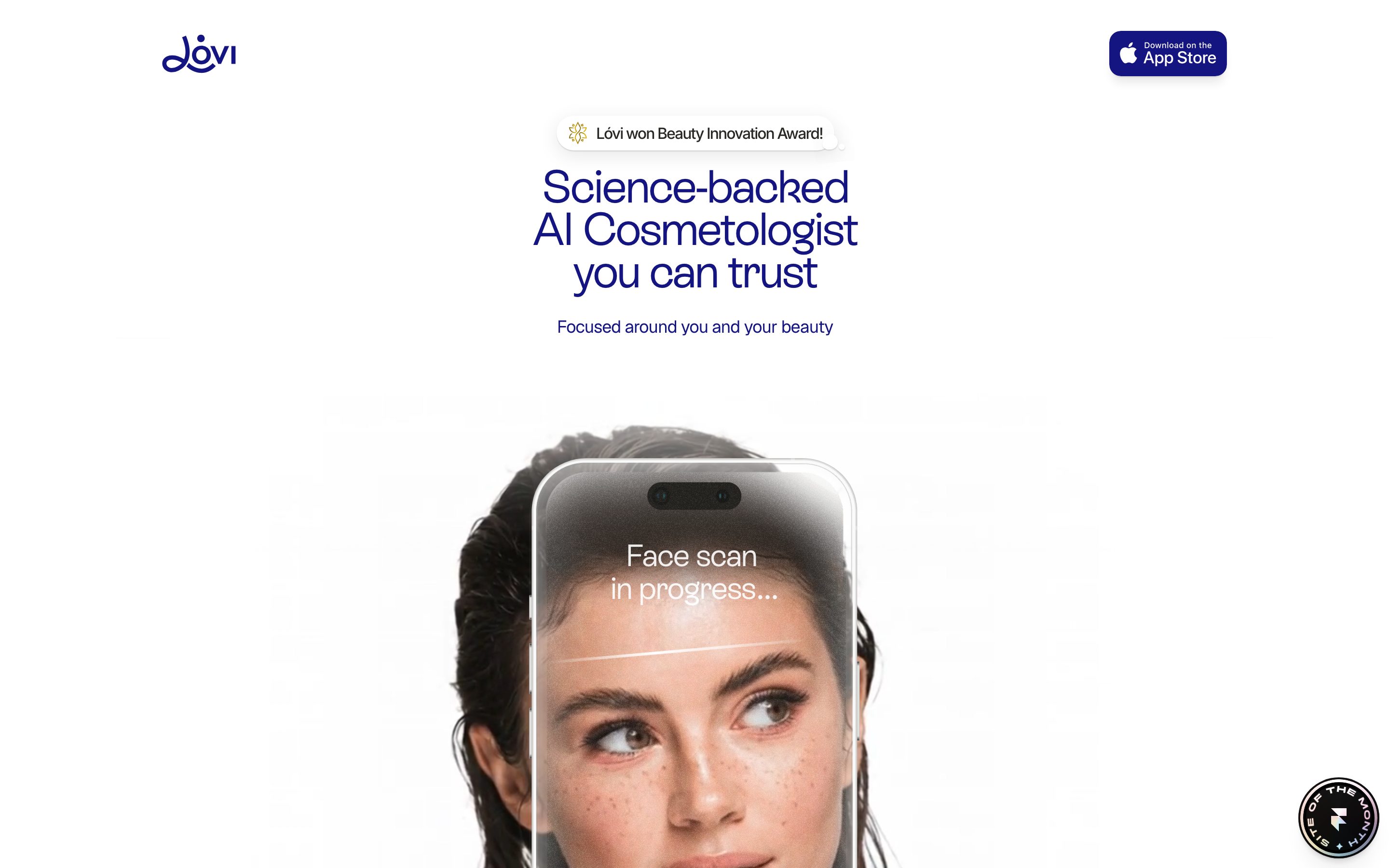
**`top-nav`** — Minimal white nav bar. Lóvi wordmark/logo at left (the script-style "Lóvi" in `{colors.brand}` indigo), with a single **`app-store-button`** at right. Background `{colors.canvas}`, no border, no shadow.
**`app-store-button`** — The "Download on the App Store" CTA. Dark fill `{colors.primary}` (#292824), white text/logo `{colors.on-primary}`, rounded `{rounded.lg}` (16px), padding 8px × 20px. The most prominent persistent CTA on the page.
### Buttons
**`button-primary`** — The standard CTA. Background `{colors.primary}` (#292824), text `{colors.on-primary}`, type `{typography.button}` (Geist 16px / 500), rounded `{rounded.sm}` (10px), padding 8px × 20px. Active/pressed state was not measured (see Known Gaps).
**`pill-cta`** — A fully-rounded accent action button (e.g. "What else can you do?" inside the AI demo). Background `{colors.accent-blue}` (#5163ff), text `{colors.on-primary}`, rounded `{rounded.pill}`, padding 12px × 20px.
### Badges & Banners
**`award-badge`** — The white pill above the hero h1 ("Lóvi won Beauty Innovation Award!"). Background `{colors.canvas}` with a soft shadow, text `{colors.brand}`, type `{typography.body-md}`, rounded `{rounded.pill}` (40px), padding 8px × 16px. Carries a small floral award icon at left.
**`cookie-banner`** — The floating consent pill at the bottom of the hero ("We use cookies here · OK"). Background `{colors.canvas}`, text `{colors.ink}` with an inline `{colors.link}` anchor, rounded `{rounded.pill}`, padding 8px × 12px, with an embedded dark `{component.button-primary}` "OK".
**`match-score-badge`** — A small green percentage chip (e.g. "60%", "89%") next to recommended products. Background `{colors.accent-green}`, text `{colors.on-primary}`, type `{typography.body-md}`, rounded `{rounded.xs}` (8px), padding 4px × 8px.
**`safety-check-badge`** — Ingredient-safety labels ("Safe to use", "Non-Allergen", "Non-Carcinogenic"). Background `{colors.surface-soft}`, text/check-icon in `{colors.trust-green}`, rounded `{rounded.xl}`, padding 8px × 12px.
### Cards & Containers
**`hero-band`** — Centered white hero carrying the award badge, the ES Rebond Grotesque h1 in `{colors.brand}`, a sub-line in `{typography.body-md}`, the App Store button, and the phone mockup below. Background `{colors.canvas}`, padding `{spacing.xxxl}` (32px).
**`phone-mockup-card`** — The hero's iPhone running a face-scan, with a white "Face scan in progress…" overlay (`{colors.on-primary}`) over a photographed face. Rounded `{rounded.jumbo}` (32px), carries deep multi-layer floating shadow.
**`feature-card`** — Large rounded white cards in 2-up feature bands (e.g. "Examine your face from all the angles"). Background `{colors.canvas}`, title in `{typography.display-md}` (`{colors.brand}`), rounded `{rounded.xxxl}` (26px), internal padding `{spacing.xxl}` (24px), soft card shadow. Holds embedded app screens.
**`feature-card-soft`** — A tinted variant for secondary feature modules. Background `{colors.surface-soft}`, title in `{typography.title-sm}`, rounded `{rounded.xxl}` (24px), padding `{spacing.xxl}` (24px).
**`skin-issue-chip`** — Small labeled chips inside the skin-condition map ("Pigmentation", "Acne", "Redness", "Whiteheads", "Visible pores"). Background `{colors.surface-tint}`, text `{colors.brand}`, type `{typography.body-md}`, rounded `{rounded.xl}`, padding 8px × 12px, each paired with a colored `{component.category-dot}`.
**`category-dot`** — A small saturated circle color-coding each skin-condition. Default token references `{colors.accent-violet}`; in practice rotates through the full pastel set (`{colors.accent-pink}`, `{colors.accent-orange}`, `{colors.accent-mint}`, `{colors.accent-sky}`, etc.). Rounded `{rounded.pill}`, ~24px.
**`chat-assistant-card`** — The "24/7 Cosmetologist in your pocket" demo — a simulated AI chat thread with a gradient skin-feel slider and product suggestions. Background `{colors.surface-soft}`, text `{colors.brand}`, type `{typography.body-md}`, rounded `{rounded.xxl}`, padding `{spacing.lg}` (16px).
**`product-recommendation-row`** — A single recommended-product row inside the chat demo (product name + price + match score). Background `{colors.canvas}`, text `{colors.ink}`, rounded `{rounded.lg}` (16px), padding `{spacing.sm}` (12px), carrying a `{component.match-score-badge}`.
**`testimonial-card`** — Customer-review cards ("Loved by both beginners & enthusiasts") with before/after photos, name, date, and quote. Background `{colors.canvas}`, text `{colors.brand}`, type `{typography.body-md}`, rounded `{rounded.xxl}`, padding `{spacing.xl}` (20px), with `{component.review-stars}` at top.
**`review-stars`** — Inline 5-star rating in `{colors.trust-green}` (#00b67a). Used in the testimonial header row.
**`specialist-card`** — The "Medically backed by professionals" cards showing headshots and credentials (e.g. "Nadia Kapieva, MS · Lóvi Medical Director"). Background `{colors.canvas}`, name in `{typography.title-sm}` (`{colors.brand}`), rounded `{rounded.xxxl}` (26px), padding `{spacing.xxl}` (24px).
## Do's and Don'ts
### Do
- Reserve `{colors.brand}` (#151581) for display headlines and brand-voiced text — it is the system's primary color signal.
- Use the dark pill CTA (`{colors.primary}` — #292824) for the App Store download and primary actions. Keep it warm-near-black, never pure black.
- Set every display headline in ES Rebond Grotesque at weight 400 with tight negative tracking (-1 to -2px). Pair with Geist body.
- Round cards heavily — `{rounded.xxl}`–`{rounded.xxxl}` (24–26px) for content cards, `{rounded.pill}` (40px) for badges and banners.
- Use the pastel set only to color-code skin-condition categories inside product UI fragments — small dots and chips, never large fills.
- Use diffuse, low-alpha shadows for elevation. Avoid hard 1px borders.
- Embed real app screens (face-scan, skin maps, AI chat) as the marketing imagery rather than illustrating around the product.
### Don't
- Don't apply pastel accents to CTAs — the action layer stays dark (`{colors.primary}`) or accent-blue pill.
- Don't bold the display face. ES Rebond Grotesque lives at weight 400; bolding reads as off-brand.
- Don't set body copy in ES Rebond Grotesque or headlines in Geist — the boundary is strict.
- Don't use sharp corners. The softest measured radius is 8px; the system's character lives in the larger 22–32px curves.
- Don't replace diffuse shadows with hard borders — depth is shadow + rounding only.
- Don't add hover-state styling beyond the documented default + pressed model.
## Responsive Behavior
| Name | Width | Key Changes |
|---|---|---|
| Mobile | < 768px | Hero stays single-column centered; feature 2-up grids collapse to 1-up; phone-mockup scales to fit; testimonial row scrolls/stacks |
| Tablet | 768–1024px | Feature cards 2-up; chat demo tightens; specialist cards wrap |
| Desktop | 1024–1440px | Full multi-column feature bands; centered hero with large phone mockup |
| Wide | > 1440px | Same as desktop with more outer breathing room |
### Touch Targets
- `{component.button-primary}` and `{component.app-store-button}` use 8px × 20px padding on 16px text — effective tap height clears comfortable minimums.
- `{component.skin-issue-chip}` and `{component.match-score-badge}` are display labels, not primary tap targets.
### Collapsing Strategy
- The centered hero composition stacks naturally: badge → headline → sub-line → CTA → phone mockup.
- Feature card grids reduce columns rather than shrinking cards.
- Embedded app screens and before/after photos retain aspect ratios while their containing cards resize.
### Image Behavior
- Phone mockups and photographed faces scale proportionally; the scan overlay text stays legible.
- Specialist headshots and testimonial before/after pairs crop inside rounded cards at every breakpoint.
## Iteration Guide
1. Focus on ONE component at a time. Reference its YAML key directly (`{component.feature-card}`, `{component.chat-assistant-card}`).
2. Variants of an existing component (`-soft`, `-active`, etc.) live as separate entries in `components:`.
3. Use `{token.refs}` everywhere — never inline a hex in a component.
4. Never document hover. Default and Active/Pressed states only.
5. Display headlines stay ES Rebond Grotesque 400 with negative tracking; body stays Geist. The pairing does not blur.
6. The pastel set is scarce, category-coding only — don't let it leak into CTAs or large surfaces.
7. When in doubt about emphasis: more indigo and more whitespace before more weight.
## Known Gaps
- **Active/pressed and disabled button states were not measured** — only the default `{component.button-primary}` (#292824 / 10px / 8px 20px) was captured. Press and disabled treatments need ground-truth before being documented.
- **ES Rebond Grotesque is a licensed commercial typeface** (Extraset); it is not flagged in `fonts_licensed` but cannot be redistributed — an open-source substitute is documented in the Typography section.
- **Body font family resolved to generic `sans-serif`** in the measurement; it is documented as Geist (derived) based on the explicit h4 Geist measurement and observed rendering.
- **The canvas/page background (#ffffff)** is inferred from screenshots and the `on-primary` measurement; it was not captured as a distinct background token.
- **Pastel accent hex values** (#5163ff, #de62de, #f08f2e, etc.) were measured at very low frequency (3–5 each) as small category dots; exact mapping of each color to each skin-condition label is approximate.
- **Animation and transition timings** (face-scan progress, chat slider gradient, floating orbs) are out of scope.
- **Form/input states** (search, scan upload) were not present on the captured landing page and are undocumented.
- **Only the landing page was captured** — interior app/marketing pages may introduce additional components and color usage.
<!-- Documented by duply · real-world design systems as ready-to-use DESIGN.md for AI coding agents · https://duply.ai/lovi/design-md -->
Color Palette
Accent
Neutrals
Typography
display-xl48px · 400 · 0.917
The quick brown fox jumpsdisplay-lg32px · 400 · 1.062
The quick brown fox jumpsdisplay-md28px · 400 · 1.143
The quick brown fox jumpstitle-sm18px · 400 · 1.222
The quick brown fox jumpsbody-md16px · 400 · 1.375
The quick brown fox jumpsbutton16px · 500 · 1.375
The quick brown fox jumpsSpacing & Shape
Spacing
| Name | Value | Preview |
|---|---|---|
| xxs | 4px | |
| xs | 8px | |
| sm | 12px | |
| md | 14px | |
| lg | 16px | |
| xl | 20px | |
| xxl | 24px | |
| xxxl | 32px |
Border Radius
| Name | Value | Preview |
|---|---|---|
| xs | 8px | |
| sm | 10px | |
| md | 12px | |
| lg | 16px | |
| xl | 22px | |
| xxl | 24px | |
| xxxl | 26px | |
| jumbo | 32px | |
| pill | 40px |
More like this


---
version: alpha
name: Lovi-design-analysis
description: A soft, science-meets-beauty consumer wellness interface on a white canvas, anchored by a deep indigo display voice (ES Rebond Grotesque) and a warm near-black pill CTA. The system reads as calm, premium, and clinically friendly — generously rounded white cards (22–26px radii), diffuse low-alpha shadows, embedded phone/face-scan mockups, and a confetti of pastel accent dots used to label skin-condition categories. Brand voltage comes from the indigo headline color and the rounded-card softness rather than from saturated UI chrome.

colors:
  ink: "#000000"
  brand: "#151581"
  primary: "#292824"
  on-primary: "#ffffff"
  link: "#0000ee"
  body: "#545151"
  canvas: "#ffffff"
  surface-soft: "#f6f5f4"
  surface-tint: "#f6f6fa"
  trust-green: "#00b67a"
  accent-blue: "#5163ff"
  accent-sky: "#20a2e3"
  accent-teal: "#00b3b0"
  accent-mint: "#2ad19f"
  accent-green: "#3bc439"
  accent-yellow: "#c7bf2a"
  accent-orange: "#f08f2e"
  accent-pink: "#fa7599"
  accent-rose: "#f25c75"
  accent-magenta: "#de62de"
  accent-violet: "#9f73e6"

typography:
  display-xl:
    fontFamily: "ES Rebond Grotesque, Geist, sans-serif"
    fontSize: 48px
    fontWeight: 400
    lineHeight: 0.917
    letterSpacing: -2px
  display-lg:
    fontFamily: "ES Rebond Grotesque, Geist, sans-serif"
    fontSize: 32px
    fontWeight: 400
    lineHeight: 1.062
    letterSpacing: -1px
  display-md:
    fontFamily: "ES Rebond Grotesque, Geist, sans-serif"
    fontSize: 28px
    fontWeight: 400
    lineHeight: 1.143
    letterSpacing: -1px
  title-sm:
    fontFamily: "Geist, sans-serif"
    fontSize: 18px
    fontWeight: 400
    lineHeight: 1.222
    letterSpacing: -0.5px
  body-md:
    fontFamily: "Geist, sans-serif"
    fontSize: 16px
    fontWeight: 400
    lineHeight: 1.375
    letterSpacing: -0.5px
  button:
    fontFamily: "Geist, sans-serif"
    fontSize: 16px
    fontWeight: 500
    lineHeight: 1.375
    letterSpacing: -0.5px

rounded:
  xs: 8px
  sm: 10px
  md: 12px
  lg: 16px
  xl: 22px
  xxl: 24px
  xxxl: 26px
  jumbo: 32px
  pill: 40px

spacing:
  xxs: 4px
  xs: 8px
  sm: 12px
  md: 14px
  lg: 16px
  xl: 20px
  xxl: 24px
  xxxl: 32px

components:
  top-nav:
    backgroundColor: "{colors.canvas}"
    textColor: "{colors.brand}"
    typography: "{typography.body-md}"
    padding: 20px 32px
  app-store-button:
    backgroundColor: "{colors.primary}"
    textColor: "{colors.on-primary}"
    typography: "{typography.button}"
    rounded: "{rounded.lg}"
    padding: 8px 20px
  button-primary:
    backgroundColor: "{colors.primary}"
    textColor: "{colors.on-primary}"
    typography: "{typography.button}"
    rounded: "{rounded.sm}"
    padding: 8px 20px
  award-badge:
    backgroundColor: "{colors.canvas}"
    textColor: "{colors.brand}"
    typography: "{typography.body-md}"
    rounded: "{rounded.pill}"
    padding: 8px 16px
  hero-band:
    backgroundColor: "{colors.canvas}"
    textColor: "{colors.brand}"
    typography: "{typography.display-xl}"
    padding: 32px
  phone-mockup-card:
    backgroundColor: "{colors.canvas}"
    textColor: "{colors.on-primary}"
    rounded: "{rounded.jumbo}"
  feature-card:
    backgroundColor: "{colors.canvas}"
    textColor: "{colors.brand}"
    typography: "{typography.display-md}"
    rounded: "{rounded.xxxl}"
    padding: 24px
  feature-card-soft:
    backgroundColor: "{colors.surface-soft}"
    textColor: "{colors.brand}"
    typography: "{typography.title-sm}"
    rounded: "{rounded.xxl}"
    padding: 24px
  skin-issue-chip:
    backgroundColor: "{colors.surface-tint}"
    textColor: "{colors.brand}"
    typography: "{typography.body-md}"
    rounded: "{rounded.xl}"
    padding: 8px 12px
  category-dot:
    backgroundColor: "{colors.accent-violet}"
    textColor: "{colors.on-primary}"
    rounded: "{rounded.pill}"
    size: 24px
  chat-assistant-card:
    backgroundColor: "{colors.surface-soft}"
    textColor: "{colors.brand}"
    typography: "{typography.body-md}"
    rounded: "{rounded.xxl}"
    padding: 16px
  product-recommendation-row:
    backgroundColor: "{colors.canvas}"
    textColor: "{colors.ink}"
    typography: "{typography.body-md}"
    rounded: "{rounded.lg}"
    padding: 12px
  match-score-badge:
    backgroundColor: "{colors.accent-green}"
    textColor: "{colors.on-primary}"
    typography: "{typography.body-md}"
    rounded: "{rounded.xs}"
    padding: 4px 8px
  safety-check-badge:
    backgroundColor: "{colors.surface-soft}"
    textColor: "{colors.trust-green}"
    typography: "{typography.body-md}"
    rounded: "{rounded.xl}"
    padding: 8px 12px
  testimonial-card:
    backgroundColor: "{colors.canvas}"
    textColor: "{colors.brand}"
    typography: "{typography.body-md}"
    rounded: "{rounded.xxl}"
    padding: 20px
  review-stars:
    backgroundColor: transparent
    textColor: "{colors.trust-green}"
    typography: "{typography.body-md}"
  specialist-card:
    backgroundColor: "{colors.canvas}"
    textColor: "{colors.brand}"
    typography: "{typography.title-sm}"
    rounded: "{rounded.xxxl}"
    padding: 24px
  cookie-banner:
    backgroundColor: "{colors.canvas}"
    textColor: "{colors.ink}"
    typography: "{typography.body-md}"
    rounded: "{rounded.pill}"
    padding: 8px 12px
  pill-cta:
    backgroundColor: "{colors.accent-blue}"
    textColor: "{colors.on-primary}"
    typography: "{typography.button}"
    rounded: "{rounded.pill}"
    padding: 12px 20px
---

## Overview

Lóvi's landing surface is a calm, premium consumer-wellness interface — a white canvas (`{colors.canvas}` — #ffffff) carrying a deep indigo display voice (`{colors.brand}` — #151581) and a single warm near-black pill CTA (`{colors.primary}` — #292824). The product is an "AI cosmetologist" app, and the page reads accordingly: clinical credibility delivered through soft, friendly geometry rather than hard chrome.

The type system splits into two roles: **ES Rebond Grotesque Regular** (the brand display face — used at weight 400 across h1/h2/h3 with aggressive negative tracking from -2px down to -1px) and **Geist** (the UI/body face — used for sub-titles, body copy, and buttons). The display face appearing at weight 400 rather than bold, combined with the tight tracking and indigo color, is what gives headlines their understated, editorial confidence.

Component voltage comes from two places. First, **embedded product mockups** — the hero shows an actual iPhone running a face-scan, and feature cards show the real app UI (skin-condition maps, an AI chat assistant, product match scores). Second, a **pastel accent confetti** — a set of saturated dots (`{colors.accent-violet}`, `{colors.accent-pink}`, `{colors.accent-orange}`, `{colors.accent-mint}`, etc.) used to color-code skin-issue categories like "Pigmentation", "Acne", "Redness". These pastels never touch CTAs; they live inside product UI fragments.

The surface stays overwhelmingly white, with a barely-warm gray (`{colors.surface-soft}` — #f6f5f4) and a cool tint (`{colors.surface-tint}` — #f6f6fa) used for soft card fills. Depth comes from generous corner radii (22–26px on most cards, up to 40px pills) and diffuse, very-low-alpha drop shadows — never heavy borders.

**Key Characteristics:**
- White canvas with a warm near-black pill CTA (`{colors.primary}` — #292824). The App Store button and primary buttons share this dark fill.
- Deep indigo (`{colors.brand}` — #151581) for all display headlines and most brand text — the system's single strongest color signal.
- ES Rebond Grotesque display headlines at weight 400 with tight negative tracking (-2px to -1px). Geist for body + buttons.
- Heavily rounded geometry — most content cards sit at `{rounded.xl}`–`{rounded.xxxl}` (22–26px); badges and banners use `{rounded.pill}` (40px).
- Diffuse, low-alpha drop shadows (e.g. `rgba(36,36,41,0.07) 0px 8px 34px`) — soft elevation, never hard outlines.
- A pastel accent set used only to color-code skin-condition categories inside product UI fragments.
- Embedded real app screens (face-scan phone, skin maps, AI chat) as the primary marketing imagery.

## Colors

### Brand & Accent
- **Brand** (`{colors.brand}` — #151581): The dominant brand signal — every display headline, sub-head, and most brand text sits in this deep indigo. High frequency (760) makes it the second most-used color after pure black body text.
- **Primary** (`{colors.primary}` — #292824): A warm near-black used as the button fill on the App Store CTA and primary buttons. Not pure black — it carries a faint warm cast.
- **Link** (`{colors.link}` — #0000ee): The classic browser-blue used on inline anchor text (e.g. the "cookies" link in the cookie banner).
- **Trust Green** (`{colors.trust-green}` — #00b67a): The Trustpilot-style green used on review stars and ingredient-safety checks.
- **Pastel category set** — Used exclusively to color-code skin-condition labels and small product-UI accents: `{colors.accent-blue}` (#5163ff), `{colors.accent-sky}` (#20a2e3), `{colors.accent-teal}` (#00b3b0), `{colors.accent-mint}` (#2ad19f), `{colors.accent-green}` (#3bc439), `{colors.accent-yellow}` (#c7bf2a), `{colors.accent-orange}` (#f08f2e), `{colors.accent-pink}` (#fa7599), `{colors.accent-rose}` (#f25c75), `{colors.accent-magenta}` (#de62de), `{colors.accent-violet}` (#9f73e6). These appear at very low frequency (3–5 each) — small dots and tags, never large fills or CTAs.

### Surface
- **Canvas** (`{colors.canvas}` — #ffffff): The default page floor and most card backgrounds.
- **Surface Soft** (`{colors.surface-soft}` — #f6f5f4): A barely-warm gray used for soft section bands and the AI chat assistant card.
- **Surface Tint** (`{colors.surface-tint}` — #f6f6fa): A cool near-white used for skin-issue chips and tinted card fills.

### Text
- **Ink** (`{colors.ink}` — #000000): Pure black — the single most frequent text color (1816 occurrences). Default running-text and dense UI labels.
- **Body** (`{colors.body}` — #545151): A soft warm gray used for secondary/supporting text.
- **Brand** (`{colors.brand}` — #151581): Headlines and brand-voiced text (see above).
- **On Primary** (`{colors.on-primary}` — #ffffff): Text on the dark pill CTA and inside the phone-mockup overlay ("Face scan in progress…").

## Typography

### Font Family
The system runs **ES Rebond Grotesque Regular** for display headlines and **Geist** for UI + body. ES Rebond Grotesque is a commercial grotesque from Extraset — distinctive for its soft, slightly humanist letterforms shown here at weight 400 with heavy negative tracking. Geist (Vercel's open-source UI typeface) handles sub-titles, body copy, and button labels. The measured body family resolves to a generic `sans-serif`; given h4 explicitly uses Geist, body and button roles are documented as Geist (derived) with a `sans-serif` fallback.

The split is functional:
- ES Rebond Grotesque (display, 400 weight, -1 to -2px tracking) — h1, h2, h3
- Geist (UI + body, 400–500 weight, -0.5px tracking) — sub-titles, paragraphs, buttons

### Hierarchy

| Token | Size | Weight | Line Height | Letter Spacing | Use |
|---|---|---|---|---|---|
| `{typography.display-xl}` | 48px | 400 | 0.917 | -2px | Hero h1 ("Science-backed AI Cosmetologist you can trust") — ES Rebond Grotesque |
| `{typography.display-lg}` | 32px | 400 | 1.062 | -1px | Section heads ("Scan your face to see it in its full glory") — ES Rebond Grotesque |
| `{typography.display-md}` | 28px | 400 | 1.143 | -1px | Sub-section heads, feature card titles — ES Rebond Grotesque |
| `{typography.title-sm}` | 18px | 400 | 1.222 | -0.5px | Card labels, list headings — Geist |
| `{typography.body-md}` | 16px | 400 | 1.375 | -0.5px | Default running-text, captions, sub-heads — Geist |
| `{typography.button}` | 16px | 500 | 1.375 | -0.5px | Button labels — Geist (medium) |

### Principles
ES Rebond Grotesque is the brand voice — every display headline uses it at weight 400, never bold. The tight negative tracking (-1px to -2px) is part of the voice; without it the headline reads as generic. Geist handles all supporting type at weight 400, with weight 500 reserved for button labels. The boundary is strict: never set body copy in ES Rebond Grotesque, never set display headlines in Geist.

### Note on Font Substitutes
ES Rebond Grotesque is a licensed commercial typeface and is not freely redistributable. If unavailable, **Geist** at weight 400 (or **General Sans** / **Hanken Grotesque**) with -0.04em letter-spacing is a usable approximation that preserves the soft-grotesque character and tight tracking. Never claim to ship ES Rebond Grotesque without a license. Geist itself is open-source (OFL) and can be shipped directly.

## Layout

### Spacing System
- **Base unit:** 4px (with some off-grid 6px / 10px / 14px values observed).
- **Tokens:** `{spacing.xxs}` 4px · `{spacing.xs}` 8px · `{spacing.sm}` 12px · `{spacing.md}` 14px · `{spacing.lg}` 16px · `{spacing.xl}` 20px · `{spacing.xxl}` 24px · `{spacing.xxxl}` 32px.
- **Most frequent steps:** 8px (183), 12px (162), 16px (57), 14px (44), 20px (40) — the system leans on a tight 8/12/16 inner rhythm.
- **Card internal padding:** `{spacing.xxl}` (24px) for feature and specialist cards; `{spacing.lg}` (16px) for the chat assistant card.

### Grid & Container
- **Hero:** centered single-column composition — award badge, h1, sub-line, App Store button, then the phone-mockup below, all centered on white.
- **Feature bands:** 2-up card grids (e.g. "Examine your face from all angles" + skin-condition map) that reduce to 1-up on narrow viewports.
- **Testimonials:** multi-column quote row.

### Whitespace Philosophy
Lóvi uses very generous vertical whitespace — large empty bands separate each feature section, letting the rounded white cards and embedded phone screens breathe. The inner rhythm is tight (8/12/16px), but the macro rhythm is airy. The result reads as calm and premium rather than dense.

## Elevation & Depth

| Level | Treatment | Use |
|---|---|---|
| Flat | No shadow, no border | Body sections, hero text, top nav |
| Soft card | `rgba(36,36,41,0.07) 0px 8px 34px, rgba(37,36,41,0.09) 0px 1px 2px` | Feature cards, content surfaces (most frequent shadow) |
| Lifted card | `rgba(157,129,129,0.15) 0px 3.3px 59.3px, rgba(0,0,0,0.1) 0px 0.8px 1.6px` | Elevated mockup cards with a warm-tinted ambient spread |
| Floating element | layered `rgba(0,0,0,0.09→0.16)` stacks up to `0px 20px 52px` | The phone mockup and floating UI fragments — deep multi-layer diffusion |
| Inset glow | `rgba(255,255,255,0) 0px 4px 24px inset` (transparent) | Decorative inset on tinted pastel chips |

The elevation philosophy is **soft and diffuse** — every shadow uses very low alpha (0.06–0.18) spread over large blur radii. There are no hard 1px borders carrying elevation; depth is entirely shadow + rounding. No neumorphism, no glassmorphism.

### Decorative Depth
- Floating pastel orbs/blobs drift in the white space between sections (visible as soft violet and pink shapes) — purely decorative ambient depth, not interactive tokens.
- The phone-mockup carries its own internal product chrome (camera notch, scan overlay) with native shadows shown as content.

## Shapes

### Border Radius Scale

| Token | Value | Use |
|---|---|---|
| `{rounded.xs}` | 8px | Small inline elements, match-score badges (most frequent radius — 102 occurrences) |
| `{rounded.sm}` | 10px | Primary button corners |
| `{rounded.md}` | 12px | Product recommendation rows |
| `{rounded.lg}` | 16px | App Store button, medium inner elements |
| `{rounded.xl}` | 22px | Skin-issue chips, inner card modules |
| `{rounded.xxl}` | 24px | Standard content cards, testimonial cards, chat assistant card |
| `{rounded.xxxl}` | 26px | Large feature cards, specialist cards |
| `{rounded.jumbo}` | 32px | Phone-mockup container, marquee surfaces |
| `{rounded.pill}` | 40px | Award badge, cookie banner, fully-rounded pills |

### Photography Geometry
Embedded phone mockups retain native device corner radii (rounded). Before/after testimonial photos and specialist headshots sit inside cards with `{rounded.xxl}`–`{rounded.xxxl}` corners. Skin-condition category dots are perfect circles (`{rounded.pill}`).

## Components

### Top Navigation

**`top-nav`** — Minimal white nav bar. Lóvi wordmark/logo at left (the script-style "Lóvi" in `{colors.brand}` indigo), with a single **`app-store-button`** at right. Background `{colors.canvas}`, no border, no shadow.

**`app-store-button`** — The "Download on the App Store" CTA. Dark fill `{colors.primary}` (#292824), white text/logo `{colors.on-primary}`, rounded `{rounded.lg}` (16px), padding 8px × 20px. The most prominent persistent CTA on the page.

### Buttons

**`button-primary`** — The standard CTA. Background `{colors.primary}` (#292824), text `{colors.on-primary}`, type `{typography.button}` (Geist 16px / 500), rounded `{rounded.sm}` (10px), padding 8px × 20px. Active/pressed state was not measured (see Known Gaps).

**`pill-cta`** — A fully-rounded accent action button (e.g. "What else can you do?" inside the AI demo). Background `{colors.accent-blue}` (#5163ff), text `{colors.on-primary}`, rounded `{rounded.pill}`, padding 12px × 20px.

### Badges & Banners

**`award-badge`** — The white pill above the hero h1 ("Lóvi won Beauty Innovation Award!"). Background `{colors.canvas}` with a soft shadow, text `{colors.brand}`, type `{typography.body-md}`, rounded `{rounded.pill}` (40px), padding 8px × 16px. Carries a small floral award icon at left.

**`cookie-banner`** — The floating consent pill at the bottom of the hero ("We use cookies here · OK"). Background `{colors.canvas}`, text `{colors.ink}` with an inline `{colors.link}` anchor, rounded `{rounded.pill}`, padding 8px × 12px, with an embedded dark `{component.button-primary}` "OK".

**`match-score-badge`** — A small green percentage chip (e.g. "60%", "89%") next to recommended products. Background `{colors.accent-green}`, text `{colors.on-primary}`, type `{typography.body-md}`, rounded `{rounded.xs}` (8px), padding 4px × 8px.

**`safety-check-badge`** — Ingredient-safety labels ("Safe to use", "Non-Allergen", "Non-Carcinogenic"). Background `{colors.surface-soft}`, text/check-icon in `{colors.trust-green}`, rounded `{rounded.xl}`, padding 8px × 12px.

### Cards & Containers

**`hero-band`** — Centered white hero carrying the award badge, the ES Rebond Grotesque h1 in `{colors.brand}`, a sub-line in `{typography.body-md}`, the App Store button, and the phone mockup below. Background `{colors.canvas}`, padding `{spacing.xxxl}` (32px).

**`phone-mockup-card`** — The hero's iPhone running a face-scan, with a white "Face scan in progress…" overlay (`{colors.on-primary}`) over a photographed face. Rounded `{rounded.jumbo}` (32px), carries deep multi-layer floating shadow.

**`feature-card`** — Large rounded white cards in 2-up feature bands (e.g. "Examine your face from all the angles"). Background `{colors.canvas}`, title in `{typography.display-md}` (`{colors.brand}`), rounded `{rounded.xxxl}` (26px), internal padding `{spacing.xxl}` (24px), soft card shadow. Holds embedded app screens.

**`feature-card-soft`** — A tinted variant for secondary feature modules. Background `{colors.surface-soft}`, title in `{typography.title-sm}`, rounded `{rounded.xxl}` (24px), padding `{spacing.xxl}` (24px).

**`skin-issue-chip`** — Small labeled chips inside the skin-condition map ("Pigmentation", "Acne", "Redness", "Whiteheads", "Visible pores"). Background `{colors.surface-tint}`, text `{colors.brand}`, type `{typography.body-md}`, rounded `{rounded.xl}`, padding 8px × 12px, each paired with a colored `{component.category-dot}`.

**`category-dot`** — A small saturated circle color-coding each skin-condition. Default token references `{colors.accent-violet}`; in practice rotates through the full pastel set (`{colors.accent-pink}`, `{colors.accent-orange}`, `{colors.accent-mint}`, `{colors.accent-sky}`, etc.). Rounded `{rounded.pill}`, ~24px.

**`chat-assistant-card`** — The "24/7 Cosmetologist in your pocket" demo — a simulated AI chat thread with a gradient skin-feel slider and product suggestions. Background `{colors.surface-soft}`, text `{colors.brand}`, type `{typography.body-md}`, rounded `{rounded.xxl}`, padding `{spacing.lg}` (16px).

**`product-recommendation-row`** — A single recommended-product row inside the chat demo (product name + price + match score). Background `{colors.canvas}`, text `{colors.ink}`, rounded `{rounded.lg}` (16px), padding `{spacing.sm}` (12px), carrying a `{component.match-score-badge}`.

**`testimonial-card`** — Customer-review cards ("Loved by both beginners & enthusiasts") with before/after photos, name, date, and quote. Background `{colors.canvas}`, text `{colors.brand}`, type `{typography.body-md}`, rounded `{rounded.xxl}`, padding `{spacing.xl}` (20px), with `{component.review-stars}` at top.

**`review-stars`** — Inline 5-star rating in `{colors.trust-green}` (#00b67a). Used in the testimonial header row.

**`specialist-card`** — The "Medically backed by professionals" cards showing headshots and credentials (e.g. "Nadia Kapieva, MS · Lóvi Medical Director"). Background `{colors.canvas}`, name in `{typography.title-sm}` (`{colors.brand}`), rounded `{rounded.xxxl}` (26px), padding `{spacing.xxl}` (24px).

## Do's and Don'ts

### Do
- Reserve `{colors.brand}` (#151581) for display headlines and brand-voiced text — it is the system's primary color signal.
- Use the dark pill CTA (`{colors.primary}` — #292824) for the App Store download and primary actions. Keep it warm-near-black, never pure black.
- Set every display headline in ES Rebond Grotesque at weight 400 with tight negative tracking (-1 to -2px). Pair with Geist body.
- Round cards heavily — `{rounded.xxl}`–`{rounded.xxxl}` (24–26px) for content cards, `{rounded.pill}` (40px) for badges and banners.
- Use the pastel set only to color-code skin-condition categories inside product UI fragments — small dots and chips, never large fills.
- Use diffuse, low-alpha shadows for elevation. Avoid hard 1px borders.
- Embed real app screens (face-scan, skin maps, AI chat) as the marketing imagery rather than illustrating around the product.

### Don't
- Don't apply pastel accents to CTAs — the action layer stays dark (`{colors.primary}`) or accent-blue pill.
- Don't bold the display face. ES Rebond Grotesque lives at weight 400; bolding reads as off-brand.
- Don't set body copy in ES Rebond Grotesque or headlines in Geist — the boundary is strict.
- Don't use sharp corners. The softest measured radius is 8px; the system's character lives in the larger 22–32px curves.
- Don't replace diffuse shadows with hard borders — depth is shadow + rounding only.
- Don't add hover-state styling beyond the documented default + pressed model.

## Responsive Behavior

| Name | Width | Key Changes |
|---|---|---|
| Mobile | < 768px | Hero stays single-column centered; feature 2-up grids collapse to 1-up; phone-mockup scales to fit; testimonial row scrolls/stacks |
| Tablet | 768–1024px | Feature cards 2-up; chat demo tightens; specialist cards wrap |
| Desktop | 1024–1440px | Full multi-column feature bands; centered hero with large phone mockup |
| Wide | > 1440px | Same as desktop with more outer breathing room |

### Touch Targets
- `{component.button-primary}` and `{component.app-store-button}` use 8px × 20px padding on 16px text — effective tap height clears comfortable minimums.
- `{component.skin-issue-chip}` and `{component.match-score-badge}` are display labels, not primary tap targets.

### Collapsing Strategy
- The centered hero composition stacks naturally: badge → headline → sub-line → CTA → phone mockup.
- Feature card grids reduce columns rather than shrinking cards.
- Embedded app screens and before/after photos retain aspect ratios while their containing cards resize.

### Image Behavior
- Phone mockups and photographed faces scale proportionally; the scan overlay text stays legible.
- Specialist headshots and testimonial before/after pairs crop inside rounded cards at every breakpoint.

## Iteration Guide

1. Focus on ONE component at a time. Reference its YAML key directly (`{component.feature-card}`, `{component.chat-assistant-card}`).
2. Variants of an existing component (`-soft`, `-active`, etc.) live as separate entries in `components:`.
3. Use `{token.refs}` everywhere — never inline a hex in a component.
4. Never document hover. Default and Active/Pressed states only.
5. Display headlines stay ES Rebond Grotesque 400 with negative tracking; body stays Geist. The pairing does not blur.
6. The pastel set is scarce, category-coding only — don't let it leak into CTAs or large surfaces.
7. When in doubt about emphasis: more indigo and more whitespace before more weight.

## Known Gaps

- **Active/pressed and disabled button states were not measured** — only the default `{component.button-primary}` (#292824 / 10px / 8px 20px) was captured. Press and disabled treatments need ground-truth before being documented.
- **ES Rebond Grotesque is a licensed commercial typeface** (Extraset); it is not flagged in `fonts_licensed` but cannot be redistributed — an open-source substitute is documented in the Typography section.
- **Body font family resolved to generic `sans-serif`** in the measurement; it is documented as Geist (derived) based on the explicit h4 Geist measurement and observed rendering.
- **The canvas/page background (#ffffff)** is inferred from screenshots and the `on-primary` measurement; it was not captured as a distinct background token.
- **Pastel accent hex values** (#5163ff, #de62de, #f08f2e, etc.) were measured at very low frequency (3–5 each) as small category dots; exact mapping of each color to each skin-condition label is approximate.
- **Animation and transition timings** (face-scan progress, chat slider gradient, floating orbs) are out of scope.
- **Form/input states** (search, scan upload) were not present on the captured landing page and are undocumented.
- **Only the landing page was captured** — interior app/marketing pages may introduce additional components and color usage.

<!-- Documented by duply · real-world design systems as ready-to-use DESIGN.md for AI coding agents · https://duply.ai/lovi/design-md -->