Browserbase
A developer-infrastructure marketing surface built on white canvas with pure-black UI and a single high-voltage orange (#ff4500) brand accent. The system reads as engineered, slightly playful and confidently technical — pale-blue hero band, dithered pixel-art mountain artwork, square-cornered product cards holding real browser/agent UI fragments, GT Planar display type, mono uppercase eyebrow labels, and a full-bleed orange footer that slams the page shut. Voltage comes from the orange highlight-marker headline treatment and from pastel accent surfaces (cyan, mint, indigo) used sparingly inside product mockups.
---
version: alpha
name: Browserbase-design-analysis
description: A developer-infrastructure marketing surface built on white canvas with pure-black UI and a single high-voltage orange (#ff4500) brand accent. The system reads as engineered, slightly playful and confidently technical — pale-blue hero band, dithered pixel-art mountain artwork, square-cornered product cards holding real browser/agent UI fragments, GT Planar display type, mono uppercase eyebrow labels, and a full-bleed orange footer that slams the page shut. Voltage comes from the orange highlight-marker headline treatment and from pastel accent surfaces (cyan, mint, indigo) used sparingly inside product mockups.
colors:
primary: "#000000"
ink: "#000000"
body: "#444444"
muted: "#686562"
canvas: "#ffffff"
on-primary: "#ffffff"
brand: "#ff4500"
on-brand: "#ffffff"
hero-surface: "#e2e9f3"
surface-blue: "#c5d3e8"
surface-blue-soft: "#d9e5f2"
surface-blue-faint: "#e1e9f2"
surface-cool: "#f0f4f8"
surface-pale: "#f8fafc"
surface-sand: "#f1f0ec"
surface-sand-soft: "#f8f7f4"
surface-cyan-pale: "#c4edff"
surface-yellow: "#fffde6"
slate-blue: "#7591c0"
accent-cyan: "#00b0ff"
accent-indigo: "#5956ff"
accent-mint: "#a4f9c6"
hairline: "#c5d3e8"
deep-red: "#880000"
typography:
display:
fontFamily: "gtPlanar, Inter, sans-serif"
fontSize: 45px
fontWeight: 500
lineHeight: 1.15
letterSpacing: -0.9px
title:
fontFamily: "plain, Inter, sans-serif"
fontSize: 16px
fontWeight: 500
lineHeight: 1.2
letterSpacing: 0.24px
mono-label:
fontFamily: "gtStandardMono, ui-monospace, monospace"
fontSize: 14px
fontWeight: 400
lineHeight: 1.2
letterSpacing: 0.84px
body:
fontFamily: "plain, Inter, sans-serif"
fontSize: 20px
fontWeight: 500
lineHeight: 1.16
letterSpacing: 0.4px
button:
fontFamily: "plain, Inter, sans-serif"
fontSize: 16px
fontWeight: 500
lineHeight: 1.0
letterSpacing: 0.16px
rounded:
none: 0px
xs: 4px
pill: 99px
full: 999px
spacing:
xxs: 4px
xtiny: 6px
xs: 8px
s: 10px
sm: 12px
md: 16px
lg: 24px
xl: 32px
xxl: 48px
components:
top-nav:
backgroundColor: "{colors.canvas}"
textColor: "{colors.ink}"
typography: "{typography.button}"
nav-link:
backgroundColor: transparent
textColor: "{colors.ink}"
typography: "{typography.button}"
button-primary:
backgroundColor: "{colors.primary}"
textColor: "{colors.on-primary}"
typography: "{typography.button}"
rounded: "{rounded.full}"
padding: 10px 16px
button-secondary:
backgroundColor: "{colors.surface-cool}"
textColor: "{colors.ink}"
typography: "{typography.button}"
rounded: "{rounded.full}"
padding: 10px 16px
hero-band:
backgroundColor: "{colors.hero-surface}"
textColor: "{colors.ink}"
typography: "{typography.display}"
padding: 48px
hero-headline-mark:
backgroundColor: "{colors.brand}"
textColor: "{colors.on-brand}"
typography: "{typography.display}"
padding: 6px 16px
mono-eyebrow:
backgroundColor: transparent
textColor: "{colors.muted}"
typography: "{typography.mono-label}"
feature-card:
backgroundColor: "{colors.canvas}"
textColor: "{colors.ink}"
typography: "{typography.title}"
rounded: "{rounded.none}"
padding: 24px
product-mockup-card:
backgroundColor: "{colors.surface-pale}"
textColor: "{colors.ink}"
rounded: "{rounded.none}"
padding: 16px
logo-cell:
backgroundColor: "{colors.canvas}"
textColor: "{colors.muted}"
rounded: "{rounded.none}"
padding: 24px
template-list-item:
backgroundColor: "{colors.canvas}"
textColor: "{colors.ink}"
typography: "{typography.title}"
rounded: "{rounded.full}"
padding: 12px 16px
template-card:
backgroundColor: "{colors.surface-yellow}"
textColor: "{colors.ink}"
typography: "{typography.body}"
rounded: "{rounded.none}"
padding: 24px
badge-pill:
backgroundColor: "{colors.canvas}"
textColor: "{colors.ink}"
typography: "{typography.mono-label}"
rounded: "{rounded.full}"
padding: 4px 12px
stat-cell:
backgroundColor: "{colors.surface-blue-faint}"
textColor: "{colors.ink}"
typography: "{typography.mono-label}"
rounded: "{rounded.none}"
padding: 16px
footer:
backgroundColor: "{colors.brand}"
textColor: "{colors.ink}"
typography: "{typography.mono-label}"
padding: 48px
---
## Overview
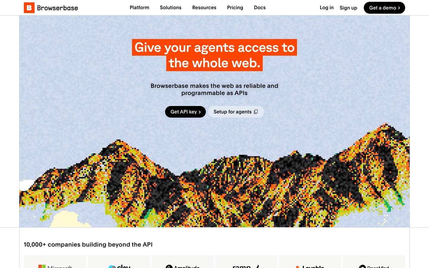
Browserbase's marketing surface is an engineered, developer-first interface built on a white canvas (`{colors.canvas}` — #ffffff) with pure-black UI (`{colors.primary}` — #000000) and a single high-voltage orange (`{colors.brand}` — #ff4500) doing all the brand work. The page opens on a pale-blue hero band (`{colors.hero-surface}` — #e2e9f3), runs through white product-card grids, and slams shut on a full-bleed orange footer. The voice is technical-but-playful: precise mono labels, a dithered pixel-art mountain illustration in the hero, and product UI fragments shown directly inside cards rather than marketing illustration.
Type voice splits three ways: **GT Planar** (the display face — used for h2 and hero headlines at weight 500 with negative tracking), **Plain** (the workhorse for titles, body and buttons), and **GT Standard Mono** (uppercase, wide-tracked eyebrow labels — the "developer" signal). All three are custom Grilli Type faces; open-source substitutes are documented in Typography.
Brand voltage comes from one move: the **orange highlight-marker headline** (`{component.hero-headline-mark}`) — white display text set on a solid orange box, mimicking a highlighter swipe across the headline. The same orange returns only at the footer; everything between stays near-monochrome with sparing pastel accents (cyan `{colors.accent-cyan}`, mint `{colors.accent-mint}`, indigo `{colors.accent-indigo}`) appearing inside product mockups and the trusted-by stat cells.
**Key Characteristics:**
- White canvas with pure-black CTAs (`{colors.primary}` — #000000) rendered as full pills (`{rounded.full}` — 999px). The hero "Get API key" and per-card "Get started" buttons are the recurring black-pill pattern.
- A single brand orange (`{colors.brand}` — #ff4500) used for the highlight-marker headline and the full-bleed footer — nowhere else as a fill.
- GT Planar display headlines at weight 500 with -0.9px tracking — confident, slightly condensed, never bold.
- GT Standard Mono uppercase eyebrows (`{typography.mono-label}`, +0.84px tracking) labeling sections and primitives — the system's "we're an API company" tell.
- Square-cornered cards (`{rounded.none}` — measured 0px) holding real product/agent UI fragments — sign-in screens, CAPTCHA prompts, booking widgets, data tables shown at small scale.
- Pale, low-chroma surface palette (blues `{colors.surface-blue}`, `{colors.surface-cool}`; sands `{colors.surface-sand}`; one yellow `{colors.surface-yellow}`) used to tint mockup backgrounds and the "There's a template for that" card.
- Nearly flat elevation — a single measured inset hairline shadow in `{colors.hairline}` (#c5d3e8); depth comes from color blocking, not shadow.
- Spacing rhythm on a 2px base, clustering at 8 / 16 / 24px for component and grid gaps.
## Colors
### Brand & Accent
- **Brand** (`{colors.brand}` — #ff4500): The signature orange. Used as the highlight-marker headline fill (`{component.hero-headline-mark}`) and the full-bleed footer background — the two loudest moments on the page. Never used on body CTAs.
- **Accent Cyan** (`{colors.accent-cyan}` — #00b0ff) / **Accent Indigo** (`{colors.accent-indigo}` — #5956ff) / **Accent Mint** (`{colors.accent-mint}` — #a4f9c6): Pastel/bright accents appearing inside product UI mockups (progress bars, status chips, scrollbar marks) and trusted-by stat cells. Sparing chromatic flourishes against the monochrome base.
- **Slate Blue** (`{colors.slate-blue}` — #7591c0): A mid-tone blue used for secondary marks and inline highlights inside the "Use the whole web like it's an API" code-style copy.
- **Deep Red** (`{colors.deep-red}` — #880000): A rare deep-red accent observed in product mockup states (e.g., error/alert chrome).
### Surface
- **Canvas** (`{colors.canvas}` — #ffffff): The default page floor and card surface.
- **Hero Surface** (`{colors.hero-surface}` — #e2e9f3): The pale-blue hero band behind the pixel-art mountain.
- **Surface Blue / Soft / Faint** (`{colors.surface-blue}` — #c5d3e8, `{colors.surface-blue-soft}` — #d9e5f2, `{colors.surface-blue-faint}` — #e1e9f2): Stepped cool tints for mockup backgrounds and stat cells.
- **Surface Cool** (`{colors.surface-cool}` — #f0f4f8) / **Surface Pale** (`{colors.surface-pale}` — #f8fafc): Very-soft neutral-blue fills for secondary buttons and product-mockup card backgrounds.
- **Surface Sand / Soft** (`{colors.surface-sand}` — #f1f0ec, `{colors.surface-sand-soft}` — #f8f7f4): Warm-neutral tints used as alternate section/mockup grounds.
- **Surface Cyan Pale** (`{colors.surface-cyan-pale}` — #c4edff) / **Surface Yellow** (`{colors.surface-yellow}` — #fffde6): Tinted card grounds — the yellow backs the "There's a template for that" card (`{component.template-card}`); the pale cyan tints stat cells.
### Text
- **Ink** (`{colors.ink}` — #000000): All headlines and primary text — pure black, the dominant text color (787 measured occurrences).
- **Body** (`{colors.body}` — #444444): Darker secondary running-text.
- **Muted** (`{colors.muted}` — #686562): Tertiary text — eyebrow labels, logo-row captions, fine print.
- **On Primary** (`{colors.on-primary}` — #ffffff): Text on black pill buttons.
- **On Brand** (`{colors.on-brand}` — #ffffff): The white headline text inside the orange highlight-marker.
### Hairline
- **Hairline** (`{colors.hairline}` — #c5d3e8): The 1px divider/inset tone — also the source of the only measured box-shadow (`rgb(197,211,232) 0 -1px 0 0 inset`).
## Typography
### Font Family
The system runs three custom Grilli Type faces: **GT Planar** for display, **Plain** for titles/body/buttons, and **GT Standard Mono** for uppercase eyebrow labels. The display face stays at weight 500 with tight negative tracking; the workhorse Plain sits at weight 500 with slightly positive tracking; mono labels are wide-tracked (+0.84px) and uppercase. The functional split:
- GT Planar (display, 500, -0.9px) — h2 + hero headlines
- Plain (titles, body, buttons, 500) — card titles, paragraphs, button labels
- GT Standard Mono (400, uppercase, +0.84px) — section eyebrows, primitive tags, footer column heads
### Hierarchy
| Token | Size | Weight | Line Height | Letter Spacing | Use |
|---|---|---|---|---|---|
| `{typography.display}` | 45px | 500 | 1.15 | -0.9px | h2 section heads + hero headline ("Give your agents access to the whole web.") — GT Planar |
| `{typography.body}` | 20px | 500 | 1.16 | 0.4px | Sub-heads, lead paragraphs ("Browserbase makes the web as reliable…") — Plain |
| `{typography.title}` | 16px | 500 | 1.2 | 0.24px | h3 card titles, list-row labels — Plain |
| `{typography.button}` | 16px | 500 | 1.0 | 0.16px | Button labels, nav links — Plain |
| `{typography.mono-label}` | 14px | 400 | 1.2 | 0.84px | Uppercase eyebrows, primitive tags, footer column heads — GT Standard Mono |
### Principles
GT Planar is the brand headline voice — every display moment uses it at weight 500 with negative tracking. Never push it to bold; the mid-weight is the point. Mono labels (`{typography.mono-label}`) carry the developer-product signal and should stay uppercase and wide-tracked. Body and titles share the Plain face; the boundary between them is size and role, not family.
### Note on Font Substitutes
GT Planar, Plain, and GT Standard Mono are commercial Grilli Type typefaces and are not shippable as open web fonts. Substitutes that preserve the signature:
- **GT Planar → Inter** (weight 500, ~-0.02em tracking) or **Space Grotesk** for a slightly more geometric display feel.
- **Plain → Inter** (weight 500) — a near-neutral grotesque match.
- **GT Standard Mono → Space Mono** or **JetBrains Mono** at weight 400, uppercased with wide letter-spacing.
## Layout
### Spacing System
- **Base unit:** 2px (values cluster on even multiples, with 6 and 10 as frequent mid-steps).
- **Tokens:** `{spacing.xxs}` 4px · `{spacing.xtiny}` 6px · `{spacing.xs}` 8px · `{spacing.s}` 10px · `{spacing.sm}` 12px · `{spacing.md}` 16px · `{spacing.lg}` 24px · `{spacing.xl}` 32px · `{spacing.xxl}` 48px.
- **Dominant gaps:** `{spacing.md}` (16px, 99 occurrences) and `{spacing.xs}` (8px, 97 occurrences) are the most common — tight, grid-driven internal spacing.
- **Card internal padding:** `{spacing.lg}` (24px) for feature cards; `{spacing.md}` (16px) inside product-mockup cards.
- **Larger section padding** clusters at `{spacing.xl}` (32px) and `{spacing.xxl}` (48px).
### Grid & Container
- **Feature grids:** 4-up at desktop ("Anything you can do in a browser, your agent can too.") with square cards, reducing columns at smaller widths.
- **Logo row:** 6-up bordered logo cells under the hero ("10,000+ companies building beyond the API").
- **Capability list:** left-aligned two-column split (label/description left, product mockup right) in the "See what agents can do" band.
- **Footer:** multi-column mono-headed link list (Primitives / Industries / Developers / Company) on the orange ground, with the oversized white "B" logotype.
### Whitespace Philosophy
Spacing is tight and grid-driven — this is a product/infra page, not an editorial one. Cards pack densely in 4-up rows with 16px gaps; mockups sit close to their labels. The breathing room comes from full-width band changes (pale-blue hero → white grids → orange footer) rather than large internal margins.
## Elevation & Depth
| Level | Treatment | Use |
|---|---|---|
| Flat | No shadow, no border, square corners (`{rounded.none}`) | Cards, mockups, most sections |
| Inset hairline | `rgb(197,211,232) 0 -1px 0 0 inset` (`{colors.hairline}`) | A single measured underline/inset divider |
| Color block | Full-bleed band color change | Hero (`{colors.hero-surface}`), footer (`{colors.brand}`) |
The elevation philosophy is **flat-and-blocked**. Depth comes from full-width color bands and from square-cornered cards sitting on white — not from shadows. The only measured shadow is a 1px inset hairline; cards explicitly carry `shadow: none`.
### Decorative Depth
- The hero's dithered pixel-art mountain (orange/yellow/black on pale blue) is the page's signature decorative artifact — it provides texture and visual energy without any shadow system.
- Product UI fragments inside cards carry their own native chrome (browser bars, form fields, tables); these are content, not system elevation tokens.
## Shapes
### Border Radius Scale
| Token | Value | Use |
|---|---|---|
| `{rounded.none}` | 0px | Cards, product mockups, logo cells, stat cells — the dominant card shape is square |
| `{rounded.xs}` | 4px | Small inline chips / minor rounding |
| `{rounded.pill}` | 99px | Pill elements (interchangeable with full at this scale) |
| `{rounded.full}` | 999px | Buttons, list-row pills, primitive tags — the dominant interactive shape |
The shape language is a deliberate contrast: **square cards, pill buttons**. Content containers stay sharp-cornered (0px), while every actionable element (buttons, template list rows, badge tags) is a full pill.
### Photography / Illustration Geometry
The hero artwork is a dithered pixel-art landscape with hard edges (no rounding). Product mockup screenshots retain their native browser chrome inside square-cornered cards.
## Components
### Top Navigation
**`top-nav`** — White nav bar across the top of every page. Background `{colors.canvas}`, text `{colors.ink}`. Carries the Browserbase "B" mark + wordmark at left, a center menu (Platform, Solutions, Resources, Pricing, Docs) in `{typography.button}`, and a right cluster of "Log in" / "Sign up" `{component.nav-link}` items plus a black-pill "Get a demo" `{component.button-primary}`.
**`nav-link`** — Inline text nav item, transparent background, `{colors.ink}` text, `{typography.button}`.
### Buttons
**`button-primary`** — The signature black pill CTA. Background `{colors.primary}` (#000000), text `{colors.on-primary}`, type `{typography.button}` (Plain 16px / 500), rounded `{rounded.full}` (999px). Used for "Get a demo", "Get API key", and the per-card "Get started" buttons.
**`button-secondary`** — Light companion pill. Background `{colors.surface-cool}`, text `{colors.ink}`, same type and pill radius. Used for "Setup for agents" and "Talk to sales".
### Hero
**`hero-band`** — Pale-blue hero section. Background `{colors.hero-surface}` (#e2e9f3) overlaid with the dithered pixel-art mountain. Holds the highlight-marker headline, a `{typography.body}` sub-line, and the `{component.button-primary}` + `{component.button-secondary}` pair.
**`hero-headline-mark`** — The signature highlight-marker headline. White display text (`{colors.on-brand}`) set on a solid orange box (`{colors.brand}`), type `{typography.display}`. Reads as a highlighter swipe across the hero headline — the system's single loudest brand move.
**`mono-eyebrow`** — Uppercase wide-tracked section label. Transparent background, `{colors.muted}` text, `{typography.mono-label}`. Used as eyebrows ("UNIQUE BROWSER SESSIONS", "PRIMITIVES", "OPEN SOURCE").
### Cards & Containers
**`feature-card`** — Square-cornered white card used in the 4-up "Anything you can do in a browser…" grid. Background `{colors.canvas}`, rounded `{rounded.none}` (0px), padding `{spacing.lg}` (24px). Carries a `{typography.title}` heading, a product UI mockup, a short description, and a `{component.button-primary}` "Get started" at the bottom.
**`product-mockup-card`** — Tinted container showing real product/agent UI fragments (sign-in screens, CAPTCHA prompts, booking widgets, data tables). Background `{colors.surface-pale}` (or other pale surface tints), rounded `{rounded.none}`, padding `{spacing.md}` (16px). The product UI inside carries its own chrome.
**`logo-cell`** — Bordered cell in the "10,000+ companies" logo row. Background `{colors.canvas}`, `{colors.muted}` logo treatment, square corners, padding `{spacing.lg}`.
**`template-list-item`** — Pill-shaped selectable row in the "There's a template for that" panel. Background `{colors.canvas}`, text `{colors.ink}`, `{typography.title}`, rounded `{rounded.full}`, padding 12px × 16px, with a trailing arrow glyph.
**`template-card`** — The accent card paired with the template list. Background `{colors.surface-yellow}` (#fffde6), text `{colors.ink}`, `{typography.body}`, square corners, padding `{spacing.lg}`. Holds the "Try template" pill and primitive tags.
**`stat-cell`** — Colored cell in the "Trusted by" row (weekly SDK downloads, developers, websites visited, years browsing). Background a tinted surface (e.g. `{colors.surface-blue-faint}`, with sibling cells in pale cyan/mint/yellow variants), big black numerals, `{typography.mono-label}` caption, square corners.
### Tags / Badges
**`badge-pill`** — Small outlined pill for primitives ("Browser CLI", "Stagehand SDK", "Search API", "Fetch API"). Background `{colors.canvas}`, text `{colors.ink}`, type `{typography.mono-label}`, rounded `{rounded.full}`, padding 4px × 12px.
### Footer
**`footer`** — Full-bleed orange footer that closes the page. Background `{colors.brand}` (#ff4500), text `{colors.ink}` (black), column heads in `{typography.mono-label}` (Primitives / Industries / Developers / Company). An oversized white "B" logotype anchors the lower-left. The orange footer is the page's second and final loud brand moment — it bookends the orange highlight-marker in the hero.
## Do's and Don'ts
### Do
- Reserve `{colors.brand}` (#ff4500) for exactly two moments: the highlight-marker headline and the footer. Its scarcity is what gives it voltage.
- Keep primary CTAs pure black (`{colors.primary}`) as full pills (`{rounded.full}`). The black-pill is the recurring action shape.
- Use square corners (`{rounded.none}`) for all content cards and mockups. Square cards + pill buttons is the system's shape contrast.
- Set section eyebrows in `{typography.mono-label}` — uppercase, wide-tracked. The mono labels are the developer-product signal.
- Embed real product/agent UI fragments inside `{component.product-mockup-card}` rather than illustrating the product.
- Keep display headlines GT Planar at weight 500 with negative tracking; pair with Plain body.
- Use pale surface tints (blues, sands) for mockup grounds; let bright pastels (cyan, mint, indigo) appear only inside the mockups and stat cells.
### Don't
- Don't introduce a third loud color — the palette is black + white + orange with low-chroma pastel support only.
- Don't paint orange onto body buttons or cards; it belongs to the headline marker and footer.
- Don't round content cards — they are measured at 0px radius. Rounding them breaks the square-card / pill-button contrast.
- Don't bold GT Planar past weight 500; the mid-weight is the brand.
- Don't lowercase or tighten the mono eyebrow labels — uppercase + 0.84px tracking is the voice.
- Don't add drop shadows; the system is flat, with at most the single inset hairline (`{colors.hairline}`).
- Don't document hover state — primary stays black; no other state is defined.
## Responsive Behavior
| Name | Width | Key Changes |
|---|---|---|
| Mobile | < 768px | Nav collapses to a hamburger; hero headline marker wraps to 2 lines; feature grid stacks 1-up; logo row wraps; footer columns stack |
| Tablet | 768–1024px | Horizontal nav tightens; feature grid 2-up; capability band keeps label/mockup split |
| Desktop | 1024–1440px | Full nav; 4-up feature grid; 6-up logo row; two-column capability split |
| Wide | > 1440px | Same as desktop with more outer margin; centered max content width |
### Touch Targets
- `{component.button-primary}` and `{component.button-secondary}` are pill buttons with ~10px × 16px padding; effective tap height comfortably clears minimum targets.
- `{component.template-list-item}` rows use 12px × 16px padding — full-width pill rows meet 44px+.
- Exact button heights were not measured (component capture returned 0px padding); pill sizing is documented from screenshot ground-truth. See Known Gaps.
### Collapsing Strategy
- Top nav collapses to a hamburger sheet at mobile.
- The 4-up feature grid reduces columns (4 → 2 → 1) rather than shrinking cards below legibility.
- The capability band's label/mockup two-column split stacks to single column on mobile.
- Footer columns reflow from multi-column to stacked; the oversized "B" logotype scales down.
### Image Behavior
- The hero pixel-art mountain crops/scales with the band; its hard-edged dither stays sharp.
- Product UI mockups retain native aspect ratios inside resizing square cards.
## Iteration Guide
1. Work on ONE component at a time, referencing its YAML key (`{component.feature-card}`, `{component.hero-headline-mark}`).
2. Variants (`-active`, `-disabled`, `-focused`) live as separate `components:` entries once measured.
3. Use `{token.refs}` everywhere — never inline hex in components.
4. Document default + active/pressed only; never hover.
5. Display stays GT Planar 500 / negative tracking; eyebrows stay GT Standard Mono uppercase; body stays Plain. The trinity does not blur.
6. Orange is scarce by design — adding a third orange surface dilutes the brand.
7. Square cards, pill buttons — preserve the shape contrast in any new component.
## Known Gaps
- The component crawler returned `button-primary` with `radius: 0px, padding: 0px` and `card` with `radius: 0px` — these capture an outer wrapper, not the visible pill buttons. Button radius is documented as `{rounded.full}` (999px, a measured radius token) and padding from screenshot ground-truth; exact button heights/padding are unconfirmed.
- No `primary-active` / pressed color was measured; press states for buttons are not documented.
- The three primary typefaces (GT Planar, Plain, GT Standard Mono) are commercial Grilli Type fonts; `fonts_licensed` was empty in the analysis, but they are not open-web fonts — open-source substitutes are documented in Typography.
- No small/caption text role (e.g. footer link size) was measured below 14px; footer body links are approximated from `{typography.mono-label}` / `{typography.title}` and may differ.
- The trusted-by stat cells appear in additional tints (a pink/rose cell is visible in the screenshot) that were not captured in the measured color set; `{component.stat-cell}` is documented against the measured pale-blue/cyan/yellow surfaces only.
- Only one box-shadow (an inset hairline) was measured; any subtle elevation on mockup chrome is product UI, not a system token.
- Animation, transition timings, and scroll-driven number counters (the "00,000,000" session counters) are out of scope.
- The pixel-art hero illustration's exact color stops are not tokenized beyond the orange/yellow/black/mint values present in the measured palette.
<!-- Documented by duply · real-world design systems as ready-to-use DESIGN.md for AI coding agents · https://duply.ai/browserbase/design-md -->
Color Palette
Accent
Neutrals
Typography
display45px · 500 · 1.15
The quick brown fox jumpstitle16px · 500 · 1.2
The quick brown fox jumpsmono-label14px · 400 · 1.2
The quick brown fox jumpsbody20px · 500 · 1.16
The quick brown fox jumpsbutton16px · 500 · 1
The quick brown fox jumpsSpacing & Shape
Spacing
| Name | Value | Preview |
|---|---|---|
| xxs | 4px | |
| xtiny | 6px | |
| xs | 8px | |
| s | 10px | |
| sm | 12px | |
| md | 16px | |
| lg | 24px | |
| xl | 32px | |
| xxl | 48px |
Border Radius
| Name | Value | Preview |
|---|---|---|
| none | 0px | |
| xs | 4px | |
| pill | 99px | |
| full | 999px |
More like this


---
version: alpha
name: Browserbase-design-analysis
description: A developer-infrastructure marketing surface built on white canvas with pure-black UI and a single high-voltage orange (#ff4500) brand accent. The system reads as engineered, slightly playful and confidently technical — pale-blue hero band, dithered pixel-art mountain artwork, square-cornered product cards holding real browser/agent UI fragments, GT Planar display type, mono uppercase eyebrow labels, and a full-bleed orange footer that slams the page shut. Voltage comes from the orange highlight-marker headline treatment and from pastel accent surfaces (cyan, mint, indigo) used sparingly inside product mockups.
colors:
  primary: "#000000"
  ink: "#000000"
  body: "#444444"
  muted: "#686562"
  canvas: "#ffffff"
  on-primary: "#ffffff"
  brand: "#ff4500"
  on-brand: "#ffffff"
  hero-surface: "#e2e9f3"
  surface-blue: "#c5d3e8"
  surface-blue-soft: "#d9e5f2"
  surface-blue-faint: "#e1e9f2"
  surface-cool: "#f0f4f8"
  surface-pale: "#f8fafc"
  surface-sand: "#f1f0ec"
  surface-sand-soft: "#f8f7f4"
  surface-cyan-pale: "#c4edff"
  surface-yellow: "#fffde6"
  slate-blue: "#7591c0"
  accent-cyan: "#00b0ff"
  accent-indigo: "#5956ff"
  accent-mint: "#a4f9c6"
  hairline: "#c5d3e8"
  deep-red: "#880000"
typography:
  display:
    fontFamily: "gtPlanar, Inter, sans-serif"
    fontSize: 45px
    fontWeight: 500
    lineHeight: 1.15
    letterSpacing: -0.9px
  title:
    fontFamily: "plain, Inter, sans-serif"
    fontSize: 16px
    fontWeight: 500
    lineHeight: 1.2
    letterSpacing: 0.24px
  mono-label:
    fontFamily: "gtStandardMono, ui-monospace, monospace"
    fontSize: 14px
    fontWeight: 400
    lineHeight: 1.2
    letterSpacing: 0.84px
  body:
    fontFamily: "plain, Inter, sans-serif"
    fontSize: 20px
    fontWeight: 500
    lineHeight: 1.16
    letterSpacing: 0.4px
  button:
    fontFamily: "plain, Inter, sans-serif"
    fontSize: 16px
    fontWeight: 500
    lineHeight: 1.0
    letterSpacing: 0.16px
rounded:
  none: 0px
  xs: 4px
  pill: 99px
  full: 999px
spacing:
  xxs: 4px
  xtiny: 6px
  xs: 8px
  s: 10px
  sm: 12px
  md: 16px
  lg: 24px
  xl: 32px
  xxl: 48px
components:
  top-nav:
    backgroundColor: "{colors.canvas}"
    textColor: "{colors.ink}"
    typography: "{typography.button}"
  nav-link:
    backgroundColor: transparent
    textColor: "{colors.ink}"
    typography: "{typography.button}"
  button-primary:
    backgroundColor: "{colors.primary}"
    textColor: "{colors.on-primary}"
    typography: "{typography.button}"
    rounded: "{rounded.full}"
    padding: 10px 16px
  button-secondary:
    backgroundColor: "{colors.surface-cool}"
    textColor: "{colors.ink}"
    typography: "{typography.button}"
    rounded: "{rounded.full}"
    padding: 10px 16px
  hero-band:
    backgroundColor: "{colors.hero-surface}"
    textColor: "{colors.ink}"
    typography: "{typography.display}"
    padding: 48px
  hero-headline-mark:
    backgroundColor: "{colors.brand}"
    textColor: "{colors.on-brand}"
    typography: "{typography.display}"
    padding: 6px 16px
  mono-eyebrow:
    backgroundColor: transparent
    textColor: "{colors.muted}"
    typography: "{typography.mono-label}"
  feature-card:
    backgroundColor: "{colors.canvas}"
    textColor: "{colors.ink}"
    typography: "{typography.title}"
    rounded: "{rounded.none}"
    padding: 24px
  product-mockup-card:
    backgroundColor: "{colors.surface-pale}"
    textColor: "{colors.ink}"
    rounded: "{rounded.none}"
    padding: 16px
  logo-cell:
    backgroundColor: "{colors.canvas}"
    textColor: "{colors.muted}"
    rounded: "{rounded.none}"
    padding: 24px
  template-list-item:
    backgroundColor: "{colors.canvas}"
    textColor: "{colors.ink}"
    typography: "{typography.title}"
    rounded: "{rounded.full}"
    padding: 12px 16px
  template-card:
    backgroundColor: "{colors.surface-yellow}"
    textColor: "{colors.ink}"
    typography: "{typography.body}"
    rounded: "{rounded.none}"
    padding: 24px
  badge-pill:
    backgroundColor: "{colors.canvas}"
    textColor: "{colors.ink}"
    typography: "{typography.mono-label}"
    rounded: "{rounded.full}"
    padding: 4px 12px
  stat-cell:
    backgroundColor: "{colors.surface-blue-faint}"
    textColor: "{colors.ink}"
    typography: "{typography.mono-label}"
    rounded: "{rounded.none}"
    padding: 16px
  footer:
    backgroundColor: "{colors.brand}"
    textColor: "{colors.ink}"
    typography: "{typography.mono-label}"
    padding: 48px
---

## Overview

Browserbase's marketing surface is an engineered, developer-first interface built on a white canvas (`{colors.canvas}` — #ffffff) with pure-black UI (`{colors.primary}` — #000000) and a single high-voltage orange (`{colors.brand}` — #ff4500) doing all the brand work. The page opens on a pale-blue hero band (`{colors.hero-surface}` — #e2e9f3), runs through white product-card grids, and slams shut on a full-bleed orange footer. The voice is technical-but-playful: precise mono labels, a dithered pixel-art mountain illustration in the hero, and product UI fragments shown directly inside cards rather than marketing illustration.

Type voice splits three ways: **GT Planar** (the display face — used for h2 and hero headlines at weight 500 with negative tracking), **Plain** (the workhorse for titles, body and buttons), and **GT Standard Mono** (uppercase, wide-tracked eyebrow labels — the "developer" signal). All three are custom Grilli Type faces; open-source substitutes are documented in Typography.

Brand voltage comes from one move: the **orange highlight-marker headline** (`{component.hero-headline-mark}`) — white display text set on a solid orange box, mimicking a highlighter swipe across the headline. The same orange returns only at the footer; everything between stays near-monochrome with sparing pastel accents (cyan `{colors.accent-cyan}`, mint `{colors.accent-mint}`, indigo `{colors.accent-indigo}`) appearing inside product mockups and the trusted-by stat cells.

**Key Characteristics:**
- White canvas with pure-black CTAs (`{colors.primary}` — #000000) rendered as full pills (`{rounded.full}` — 999px). The hero "Get API key" and per-card "Get started" buttons are the recurring black-pill pattern.
- A single brand orange (`{colors.brand}` — #ff4500) used for the highlight-marker headline and the full-bleed footer — nowhere else as a fill.
- GT Planar display headlines at weight 500 with -0.9px tracking — confident, slightly condensed, never bold.
- GT Standard Mono uppercase eyebrows (`{typography.mono-label}`, +0.84px tracking) labeling sections and primitives — the system's "we're an API company" tell.
- Square-cornered cards (`{rounded.none}` — measured 0px) holding real product/agent UI fragments — sign-in screens, CAPTCHA prompts, booking widgets, data tables shown at small scale.
- Pale, low-chroma surface palette (blues `{colors.surface-blue}`, `{colors.surface-cool}`; sands `{colors.surface-sand}`; one yellow `{colors.surface-yellow}`) used to tint mockup backgrounds and the "There's a template for that" card.
- Nearly flat elevation — a single measured inset hairline shadow in `{colors.hairline}` (#c5d3e8); depth comes from color blocking, not shadow.
- Spacing rhythm on a 2px base, clustering at 8 / 16 / 24px for component and grid gaps.

## Colors

### Brand & Accent
- **Brand** (`{colors.brand}` — #ff4500): The signature orange. Used as the highlight-marker headline fill (`{component.hero-headline-mark}`) and the full-bleed footer background — the two loudest moments on the page. Never used on body CTAs.
- **Accent Cyan** (`{colors.accent-cyan}` — #00b0ff) / **Accent Indigo** (`{colors.accent-indigo}` — #5956ff) / **Accent Mint** (`{colors.accent-mint}` — #a4f9c6): Pastel/bright accents appearing inside product UI mockups (progress bars, status chips, scrollbar marks) and trusted-by stat cells. Sparing chromatic flourishes against the monochrome base.
- **Slate Blue** (`{colors.slate-blue}` — #7591c0): A mid-tone blue used for secondary marks and inline highlights inside the "Use the whole web like it's an API" code-style copy.
- **Deep Red** (`{colors.deep-red}` — #880000): A rare deep-red accent observed in product mockup states (e.g., error/alert chrome).

### Surface
- **Canvas** (`{colors.canvas}` — #ffffff): The default page floor and card surface.
- **Hero Surface** (`{colors.hero-surface}` — #e2e9f3): The pale-blue hero band behind the pixel-art mountain.
- **Surface Blue / Soft / Faint** (`{colors.surface-blue}` — #c5d3e8, `{colors.surface-blue-soft}` — #d9e5f2, `{colors.surface-blue-faint}` — #e1e9f2): Stepped cool tints for mockup backgrounds and stat cells.
- **Surface Cool** (`{colors.surface-cool}` — #f0f4f8) / **Surface Pale** (`{colors.surface-pale}` — #f8fafc): Very-soft neutral-blue fills for secondary buttons and product-mockup card backgrounds.
- **Surface Sand / Soft** (`{colors.surface-sand}` — #f1f0ec, `{colors.surface-sand-soft}` — #f8f7f4): Warm-neutral tints used as alternate section/mockup grounds.
- **Surface Cyan Pale** (`{colors.surface-cyan-pale}` — #c4edff) / **Surface Yellow** (`{colors.surface-yellow}` — #fffde6): Tinted card grounds — the yellow backs the "There's a template for that" card (`{component.template-card}`); the pale cyan tints stat cells.

### Text
- **Ink** (`{colors.ink}` — #000000): All headlines and primary text — pure black, the dominant text color (787 measured occurrences).
- **Body** (`{colors.body}` — #444444): Darker secondary running-text.
- **Muted** (`{colors.muted}` — #686562): Tertiary text — eyebrow labels, logo-row captions, fine print.
- **On Primary** (`{colors.on-primary}` — #ffffff): Text on black pill buttons.
- **On Brand** (`{colors.on-brand}` — #ffffff): The white headline text inside the orange highlight-marker.

### Hairline
- **Hairline** (`{colors.hairline}` — #c5d3e8): The 1px divider/inset tone — also the source of the only measured box-shadow (`rgb(197,211,232) 0 -1px 0 0 inset`).

## Typography

### Font Family
The system runs three custom Grilli Type faces: **GT Planar** for display, **Plain** for titles/body/buttons, and **GT Standard Mono** for uppercase eyebrow labels. The display face stays at weight 500 with tight negative tracking; the workhorse Plain sits at weight 500 with slightly positive tracking; mono labels are wide-tracked (+0.84px) and uppercase. The functional split:
- GT Planar (display, 500, -0.9px) — h2 + hero headlines
- Plain (titles, body, buttons, 500) — card titles, paragraphs, button labels
- GT Standard Mono (400, uppercase, +0.84px) — section eyebrows, primitive tags, footer column heads

### Hierarchy

| Token | Size | Weight | Line Height | Letter Spacing | Use |
|---|---|---|---|---|---|
| `{typography.display}` | 45px | 500 | 1.15 | -0.9px | h2 section heads + hero headline ("Give your agents access to the whole web.") — GT Planar |
| `{typography.body}` | 20px | 500 | 1.16 | 0.4px | Sub-heads, lead paragraphs ("Browserbase makes the web as reliable…") — Plain |
| `{typography.title}` | 16px | 500 | 1.2 | 0.24px | h3 card titles, list-row labels — Plain |
| `{typography.button}` | 16px | 500 | 1.0 | 0.16px | Button labels, nav links — Plain |
| `{typography.mono-label}` | 14px | 400 | 1.2 | 0.84px | Uppercase eyebrows, primitive tags, footer column heads — GT Standard Mono |

### Principles
GT Planar is the brand headline voice — every display moment uses it at weight 500 with negative tracking. Never push it to bold; the mid-weight is the point. Mono labels (`{typography.mono-label}`) carry the developer-product signal and should stay uppercase and wide-tracked. Body and titles share the Plain face; the boundary between them is size and role, not family.

### Note on Font Substitutes
GT Planar, Plain, and GT Standard Mono are commercial Grilli Type typefaces and are not shippable as open web fonts. Substitutes that preserve the signature:
- **GT Planar → Inter** (weight 500, ~-0.02em tracking) or **Space Grotesk** for a slightly more geometric display feel.
- **Plain → Inter** (weight 500) — a near-neutral grotesque match.
- **GT Standard Mono → Space Mono** or **JetBrains Mono** at weight 400, uppercased with wide letter-spacing.

## Layout

### Spacing System
- **Base unit:** 2px (values cluster on even multiples, with 6 and 10 as frequent mid-steps).
- **Tokens:** `{spacing.xxs}` 4px · `{spacing.xtiny}` 6px · `{spacing.xs}` 8px · `{spacing.s}` 10px · `{spacing.sm}` 12px · `{spacing.md}` 16px · `{spacing.lg}` 24px · `{spacing.xl}` 32px · `{spacing.xxl}` 48px.
- **Dominant gaps:** `{spacing.md}` (16px, 99 occurrences) and `{spacing.xs}` (8px, 97 occurrences) are the most common — tight, grid-driven internal spacing.
- **Card internal padding:** `{spacing.lg}` (24px) for feature cards; `{spacing.md}` (16px) inside product-mockup cards.
- **Larger section padding** clusters at `{spacing.xl}` (32px) and `{spacing.xxl}` (48px).

### Grid & Container
- **Feature grids:** 4-up at desktop ("Anything you can do in a browser, your agent can too.") with square cards, reducing columns at smaller widths.
- **Logo row:** 6-up bordered logo cells under the hero ("10,000+ companies building beyond the API").
- **Capability list:** left-aligned two-column split (label/description left, product mockup right) in the "See what agents can do" band.
- **Footer:** multi-column mono-headed link list (Primitives / Industries / Developers / Company) on the orange ground, with the oversized white "B" logotype.

### Whitespace Philosophy
Spacing is tight and grid-driven — this is a product/infra page, not an editorial one. Cards pack densely in 4-up rows with 16px gaps; mockups sit close to their labels. The breathing room comes from full-width band changes (pale-blue hero → white grids → orange footer) rather than large internal margins.

## Elevation & Depth

| Level | Treatment | Use |
|---|---|---|
| Flat | No shadow, no border, square corners (`{rounded.none}`) | Cards, mockups, most sections |
| Inset hairline | `rgb(197,211,232) 0 -1px 0 0 inset` (`{colors.hairline}`) | A single measured underline/inset divider |
| Color block | Full-bleed band color change | Hero (`{colors.hero-surface}`), footer (`{colors.brand}`) |

The elevation philosophy is **flat-and-blocked**. Depth comes from full-width color bands and from square-cornered cards sitting on white — not from shadows. The only measured shadow is a 1px inset hairline; cards explicitly carry `shadow: none`.

### Decorative Depth
- The hero's dithered pixel-art mountain (orange/yellow/black on pale blue) is the page's signature decorative artifact — it provides texture and visual energy without any shadow system.
- Product UI fragments inside cards carry their own native chrome (browser bars, form fields, tables); these are content, not system elevation tokens.

## Shapes

### Border Radius Scale

| Token | Value | Use |
|---|---|---|
| `{rounded.none}` | 0px | Cards, product mockups, logo cells, stat cells — the dominant card shape is square |
| `{rounded.xs}` | 4px | Small inline chips / minor rounding |
| `{rounded.pill}` | 99px | Pill elements (interchangeable with full at this scale) |
| `{rounded.full}` | 999px | Buttons, list-row pills, primitive tags — the dominant interactive shape |

The shape language is a deliberate contrast: **square cards, pill buttons**. Content containers stay sharp-cornered (0px), while every actionable element (buttons, template list rows, badge tags) is a full pill.

### Photography / Illustration Geometry
The hero artwork is a dithered pixel-art landscape with hard edges (no rounding). Product mockup screenshots retain their native browser chrome inside square-cornered cards.

## Components

### Top Navigation

**`top-nav`** — White nav bar across the top of every page. Background `{colors.canvas}`, text `{colors.ink}`. Carries the Browserbase "B" mark + wordmark at left, a center menu (Platform, Solutions, Resources, Pricing, Docs) in `{typography.button}`, and a right cluster of "Log in" / "Sign up" `{component.nav-link}` items plus a black-pill "Get a demo" `{component.button-primary}`.

**`nav-link`** — Inline text nav item, transparent background, `{colors.ink}` text, `{typography.button}`.

### Buttons

**`button-primary`** — The signature black pill CTA. Background `{colors.primary}` (#000000), text `{colors.on-primary}`, type `{typography.button}` (Plain 16px / 500), rounded `{rounded.full}` (999px). Used for "Get a demo", "Get API key", and the per-card "Get started" buttons.

**`button-secondary`** — Light companion pill. Background `{colors.surface-cool}`, text `{colors.ink}`, same type and pill radius. Used for "Setup for agents" and "Talk to sales".

### Hero

**`hero-band`** — Pale-blue hero section. Background `{colors.hero-surface}` (#e2e9f3) overlaid with the dithered pixel-art mountain. Holds the highlight-marker headline, a `{typography.body}` sub-line, and the `{component.button-primary}` + `{component.button-secondary}` pair.

**`hero-headline-mark`** — The signature highlight-marker headline. White display text (`{colors.on-brand}`) set on a solid orange box (`{colors.brand}`), type `{typography.display}`. Reads as a highlighter swipe across the hero headline — the system's single loudest brand move.

**`mono-eyebrow`** — Uppercase wide-tracked section label. Transparent background, `{colors.muted}` text, `{typography.mono-label}`. Used as eyebrows ("UNIQUE BROWSER SESSIONS", "PRIMITIVES", "OPEN SOURCE").

### Cards & Containers

**`feature-card`** — Square-cornered white card used in the 4-up "Anything you can do in a browser…" grid. Background `{colors.canvas}`, rounded `{rounded.none}` (0px), padding `{spacing.lg}` (24px). Carries a `{typography.title}` heading, a product UI mockup, a short description, and a `{component.button-primary}` "Get started" at the bottom.

**`product-mockup-card`** — Tinted container showing real product/agent UI fragments (sign-in screens, CAPTCHA prompts, booking widgets, data tables). Background `{colors.surface-pale}` (or other pale surface tints), rounded `{rounded.none}`, padding `{spacing.md}` (16px). The product UI inside carries its own chrome.

**`logo-cell`** — Bordered cell in the "10,000+ companies" logo row. Background `{colors.canvas}`, `{colors.muted}` logo treatment, square corners, padding `{spacing.lg}`.

**`template-list-item`** — Pill-shaped selectable row in the "There's a template for that" panel. Background `{colors.canvas}`, text `{colors.ink}`, `{typography.title}`, rounded `{rounded.full}`, padding 12px × 16px, with a trailing arrow glyph.

**`template-card`** — The accent card paired with the template list. Background `{colors.surface-yellow}` (#fffde6), text `{colors.ink}`, `{typography.body}`, square corners, padding `{spacing.lg}`. Holds the "Try template" pill and primitive tags.

**`stat-cell`** — Colored cell in the "Trusted by" row (weekly SDK downloads, developers, websites visited, years browsing). Background a tinted surface (e.g. `{colors.surface-blue-faint}`, with sibling cells in pale cyan/mint/yellow variants), big black numerals, `{typography.mono-label}` caption, square corners.

### Tags / Badges

**`badge-pill`** — Small outlined pill for primitives ("Browser CLI", "Stagehand SDK", "Search API", "Fetch API"). Background `{colors.canvas}`, text `{colors.ink}`, type `{typography.mono-label}`, rounded `{rounded.full}`, padding 4px × 12px.

### Footer

**`footer`** — Full-bleed orange footer that closes the page. Background `{colors.brand}` (#ff4500), text `{colors.ink}` (black), column heads in `{typography.mono-label}` (Primitives / Industries / Developers / Company). An oversized white "B" logotype anchors the lower-left. The orange footer is the page's second and final loud brand moment — it bookends the orange highlight-marker in the hero.

## Do's and Don'ts

### Do
- Reserve `{colors.brand}` (#ff4500) for exactly two moments: the highlight-marker headline and the footer. Its scarcity is what gives it voltage.
- Keep primary CTAs pure black (`{colors.primary}`) as full pills (`{rounded.full}`). The black-pill is the recurring action shape.
- Use square corners (`{rounded.none}`) for all content cards and mockups. Square cards + pill buttons is the system's shape contrast.
- Set section eyebrows in `{typography.mono-label}` — uppercase, wide-tracked. The mono labels are the developer-product signal.
- Embed real product/agent UI fragments inside `{component.product-mockup-card}` rather than illustrating the product.
- Keep display headlines GT Planar at weight 500 with negative tracking; pair with Plain body.
- Use pale surface tints (blues, sands) for mockup grounds; let bright pastels (cyan, mint, indigo) appear only inside the mockups and stat cells.

### Don't
- Don't introduce a third loud color — the palette is black + white + orange with low-chroma pastel support only.
- Don't paint orange onto body buttons or cards; it belongs to the headline marker and footer.
- Don't round content cards — they are measured at 0px radius. Rounding them breaks the square-card / pill-button contrast.
- Don't bold GT Planar past weight 500; the mid-weight is the brand.
- Don't lowercase or tighten the mono eyebrow labels — uppercase + 0.84px tracking is the voice.
- Don't add drop shadows; the system is flat, with at most the single inset hairline (`{colors.hairline}`).
- Don't document hover state — primary stays black; no other state is defined.

## Responsive Behavior

| Name | Width | Key Changes |
|---|---|---|
| Mobile | < 768px | Nav collapses to a hamburger; hero headline marker wraps to 2 lines; feature grid stacks 1-up; logo row wraps; footer columns stack |
| Tablet | 768–1024px | Horizontal nav tightens; feature grid 2-up; capability band keeps label/mockup split |
| Desktop | 1024–1440px | Full nav; 4-up feature grid; 6-up logo row; two-column capability split |
| Wide | > 1440px | Same as desktop with more outer margin; centered max content width |

### Touch Targets
- `{component.button-primary}` and `{component.button-secondary}` are pill buttons with ~10px × 16px padding; effective tap height comfortably clears minimum targets.
- `{component.template-list-item}` rows use 12px × 16px padding — full-width pill rows meet 44px+.
- Exact button heights were not measured (component capture returned 0px padding); pill sizing is documented from screenshot ground-truth. See Known Gaps.

### Collapsing Strategy
- Top nav collapses to a hamburger sheet at mobile.
- The 4-up feature grid reduces columns (4 → 2 → 1) rather than shrinking cards below legibility.
- The capability band's label/mockup two-column split stacks to single column on mobile.
- Footer columns reflow from multi-column to stacked; the oversized "B" logotype scales down.

### Image Behavior
- The hero pixel-art mountain crops/scales with the band; its hard-edged dither stays sharp.
- Product UI mockups retain native aspect ratios inside resizing square cards.

## Iteration Guide

1. Work on ONE component at a time, referencing its YAML key (`{component.feature-card}`, `{component.hero-headline-mark}`).
2. Variants (`-active`, `-disabled`, `-focused`) live as separate `components:` entries once measured.
3. Use `{token.refs}` everywhere — never inline hex in components.
4. Document default + active/pressed only; never hover.
5. Display stays GT Planar 500 / negative tracking; eyebrows stay GT Standard Mono uppercase; body stays Plain. The trinity does not blur.
6. Orange is scarce by design — adding a third orange surface dilutes the brand.
7. Square cards, pill buttons — preserve the shape contrast in any new component.

## Known Gaps

- The component crawler returned `button-primary` with `radius: 0px, padding: 0px` and `card` with `radius: 0px` — these capture an outer wrapper, not the visible pill buttons. Button radius is documented as `{rounded.full}` (999px, a measured radius token) and padding from screenshot ground-truth; exact button heights/padding are unconfirmed.
- No `primary-active` / pressed color was measured; press states for buttons are not documented.
- The three primary typefaces (GT Planar, Plain, GT Standard Mono) are commercial Grilli Type fonts; `fonts_licensed` was empty in the analysis, but they are not open-web fonts — open-source substitutes are documented in Typography.
- No small/caption text role (e.g. footer link size) was measured below 14px; footer body links are approximated from `{typography.mono-label}` / `{typography.title}` and may differ.
- The trusted-by stat cells appear in additional tints (a pink/rose cell is visible in the screenshot) that were not captured in the measured color set; `{component.stat-cell}` is documented against the measured pale-blue/cyan/yellow surfaces only.
- Only one box-shadow (an inset hairline) was measured; any subtle elevation on mockup chrome is product UI, not a system token.
- Animation, transition timings, and scroll-driven number counters (the "00,000,000" session counters) are out of scope.
- The pixel-art hero illustration's exact color stops are not tokenized beyond the orange/yellow/black/mint values present in the measured palette.

<!-- Documented by duply · real-world design systems as ready-to-use DESIGN.md for AI coding agents · https://duply.ai/browserbase/design-md -->