WarpStream
A developer-infrastructure marketing surface built on a near-white canvas (#f8f8f8) with deep-navy ink (#040531) and an electric indigo brand accent (#3a21ed). The system reads as confident, technical, and slightly maximal — bold Plus Jakarta Sans headlines, sharp-cornered indigo CTAs with hard offset shadows, isometric 3D product illustrations rendered in indigo/red/navy, and dark-navy terminal/code surfaces dropped into an otherwise light page. Brand voltage comes from the saturated indigo accent and the isometric "diskless" cube artwork rather than from decorative color washes.
---
version: alpha
name: WarpStream-design-analysis
description: "A developer-infrastructure marketing surface built on a near-white canvas (#f8f8f8) with deep-navy ink (#040531) and an electric indigo brand accent (#3a21ed). The system reads as confident, technical, and slightly maximal — bold Plus Jakarta Sans headlines, sharp-cornered indigo CTAs with hard offset shadows, isometric 3D product illustrations rendered in indigo/red/navy, and dark-navy terminal/code surfaces dropped into an otherwise light page. Brand voltage comes from the saturated indigo accent and the isometric \"diskless\" cube artwork rather than from decorative color washes."
colors:
primary: "#3a21ed"
primary-deep: "#270b46"
ink: "#040531"
ink-soft: "#190430"
navy-card: "#1a1a2e"
body: "#333333"
muted: "#969696"
muted-soft: "#aaaaaa"
canvas: "#f8f8f8"
surface: "#ffffff"
surface-fafafa: "#fafafa"
surface-cream: "#fff8f0"
hairline: "#dddddd"
hairline-soft: "#eeeeee"
hairline-strong: "#cccccc"
dark: "#1a1a1a"
dark-soft: "#222222"
black: "#000000"
on-primary: "#ffffff"
cyan: "#21c8ed"
red: "#e52344"
typography:
display:
fontFamily: "Plus Jakarta Sans, sans-serif"
fontSize: 40px
fontWeight: 700
lineHeight: 1.2
letterSpacing: 0px
heading-xl:
fontFamily: "Plus Jakarta Sans, sans-serif"
fontSize: 40px
fontWeight: 600
lineHeight: 1.3
letterSpacing: 0px
heading:
fontFamily: "Plus Jakarta Sans, sans-serif"
fontSize: 32px
fontWeight: 700
lineHeight: 1.2
letterSpacing: 0px
body:
fontFamily: "Plus Jakarta Sans, sans-serif"
fontSize: 17.92px
fontWeight: 400
lineHeight: 1.5
letterSpacing: 0px
button:
fontFamily: "Plus Jakarta Sans, sans-serif"
fontSize: 12.8px
fontWeight: 600
lineHeight: 1.5
letterSpacing: 0px
rounded:
none: 0px
xs: 4px
sm: 6px
md: 8px
lg: 12px
xl: 24px
pill: 110px
full: 9999px
spacing:
xxs: 4px
xs: 8px
sm: 12px
md: 16px
lg: 20px
xl: 24px
components:
top-nav:
backgroundColor: "{colors.canvas}"
textColor: "{colors.ink}"
typography: "{typography.body}"
button-primary:
backgroundColor: "{colors.primary}"
textColor: "{colors.on-primary}"
typography: "{typography.button}"
rounded: "{rounded.none}"
padding: 22.4px 12.8px
button-secondary:
backgroundColor: "{colors.surface}"
textColor: "{colors.ink}"
typography: "{typography.button}"
rounded: "{rounded.none}"
padding: 22.4px 12.8px
eyebrow-label:
backgroundColor: transparent
textColor: "{colors.primary}"
typography: "{typography.body}"
card:
backgroundColor: "{colors.canvas}"
textColor: "{colors.ink}"
rounded: "{rounded.sm}"
feature-card:
backgroundColor: "{colors.surface}"
textColor: "{colors.ink}"
typography: "{typography.body}"
rounded: "{rounded.lg}"
customer-logo-cell:
backgroundColor: "{colors.surface}"
textColor: "{colors.ink}"
rounded: "{rounded.sm}"
toggle-pill:
backgroundColor: "{colors.surface-cream}"
textColor: "{colors.ink}"
typography: "{typography.button}"
rounded: "{rounded.xl}"
code-block:
backgroundColor: "{colors.ink}"
textColor: "{colors.on-primary}"
typography: "{typography.body}"
rounded: "{rounded.md}"
terminal-block:
backgroundColor: "{colors.ink}"
textColor: "{colors.on-primary}"
rounded: "{rounded.lg}"
demo-callout:
backgroundColor: "{colors.ink-soft}"
textColor: "{colors.on-primary}"
typography: "{typography.body}"
rounded: "{rounded.md}"
blog-card:
backgroundColor: "{colors.surface}"
textColor: "{colors.ink}"
typography: "{typography.body}"
rounded: "{rounded.lg}"
faq-item:
backgroundColor: "{colors.surface}"
textColor: "{colors.ink}"
typography: "{typography.body}"
download-banner:
backgroundColor: "{colors.primary}"
textColor: "{colors.on-primary}"
typography: "{typography.body}"
rounded: "{rounded.md}"
footer:
backgroundColor: "{colors.canvas}"
textColor: "{colors.body}"
typography: "{typography.body}"
---
## Overview
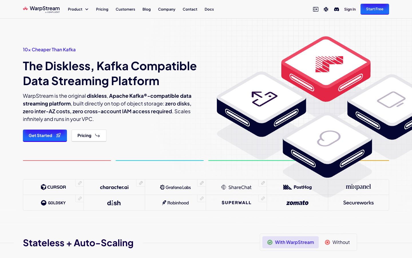
WarpStream's marketing surface is a developer-infrastructure landing page built on a near-white canvas (`{colors.canvas}` — #f8f8f8) with deep-navy ink (`{colors.ink}` — #040531) and a single saturated electric-indigo brand accent (`{colors.primary}` — #3a21ed). The system reads as technical and confident — heavy Plus Jakarta Sans headlines, sharp-cornered indigo CTAs, and big isometric 3D "diskless" cube illustrations rendered in indigo, red (`{colors.red}` — #e52344), and navy.
The type voice is monolithic: **Plus Jakarta Sans** carries everything from the 40px hero headline down to the 12.8px button label. There is no secondary typeface — hierarchy is built entirely from weight (400 / 600 / 700) and size. Headlines run weight 700 at tight 1.2 line-height; body runs weight 400 at relaxed 1.5.
Component voltage comes from two places: the **isometric product artwork** (the stacked 3D cube diagram showing the "diskless" architecture) and the **dark-navy terminal/code surfaces** (`{colors.ink}` — #040531) that drop into the otherwise light page to show install commands and Kafka config. Marketing claims sit on white feature cards; the actual developer experience is shown in dark code chrome.
The page stays light end-to-end — there is no inverted dark footer. Instead, contrast is delivered locally via the navy code/terminal blocks and the indigo CTA + download banner.
**Key Characteristics:**
- Near-white canvas (`{colors.canvas}` — #f8f8f8) with deep-navy ink (`{colors.ink}` — #040531). White (`{colors.surface}` — #ffffff) is reserved for elevated cards and logo cells.
- Single electric-indigo accent (`{colors.primary}` — #3a21ed) for primary CTAs, eyebrow labels, and the download banner. The brand is essentially monochrome-plus-indigo.
- One typeface — **Plus Jakarta Sans** — across display, headings, body, and buttons. Hierarchy from weight + size only.
- Sharp-cornered primary buttons (`{rounded.none}` — 0px measured) with a hard offset drop shadow, giving a slightly retro/technical feel.
- Isometric 3D product illustration in indigo / red / navy as the hero artifact — the "diskless" cube stack is the brand's signature visual.
- Dark-navy code blocks and a terminal callout (`{colors.ink}` — #040531) embedded inline to show real install commands and Kafka config.
- A red→cyan→green→yellow multicolor hairline rule under the hero (cyan `{colors.cyan}` and red `{colors.red}` measured; green/yellow are in Known Gaps).
- Radius is hierarchical and modest for UI (`{rounded.sm}` 6px cards, `{rounded.lg}` 12px feature/blog cards) with very large pill radii (110px) reserved for decorative blob shapes.
## Colors
### Brand & Accent
- **Primary** (`{colors.primary}` — #3a21ed): The dominant action color. "Get Started" / "Start Free" CTAs, the eyebrow "10× Cheaper Than Kafka", inline links, and the download banner. This is the only saturated hue used at the action layer.
- **Primary Deep** (`{colors.primary-deep}` — #270b46): A deep purple used in isometric artwork shading and dark decorative fills.
- **Cyan** (`{colors.cyan}` — #21c8ed): A secondary accent appearing in the multicolor hero rule and in the terminal/demo glow. Used sparingly.
- **Red** (`{colors.red}` — #e52344): The red isometric cube face and one segment of the multicolor hero rule. A spot accent, never on CTAs.
### Surface
- **Canvas** (`{colors.canvas}` — #f8f8f8): The default page floor and footer background.
- **Surface** (`{colors.surface}` — #ffffff): Elevated cards, customer-logo cells, feature panels, FAQ rows.
- **Surface fafafa** (`{colors.surface-fafafa}` — #fafafa): A barely-cooler off-white used for nested panels.
- **Surface Cream** (`{colors.surface-cream}` — #fff8f0): The warm-tinted background of the "With WarpStream / Without" toggle pill.
- **Ink** (`{colors.ink}` — #040531): Deep navy used both as primary text and as the dark code/terminal surface fill.
- **Ink Soft** (`{colors.ink-soft}` — #190430): A near-black purple used in the developer demo callout and deeper dark panels.
- **Navy Card** (`{colors.navy-card}` — #1a1a2e): A dark navy variant used in nested dark UI fragments.
- **Dark / Dark Soft** (`{colors.dark}` — #1a1a1a, `{colors.dark-soft}` — #222222): Near-black neutrals used in artwork and icon strokes.
- **Black** (`{colors.black}` — #000000): Pure black, used minimally in iconography.
### Hairlines
- **Hairline** (`{colors.hairline}` — #dddddd): The default 1px divider tone — logo-grid cell borders, card outlines, section dividers.
- **Hairline Soft** (`{colors.hairline-soft}` — #eeeeee): A fainter divider between sections that share the canvas.
- **Hairline Strong** (`{colors.hairline-strong}` — #cccccc): A slightly heavier border tone for emphasis.
### Text
- **Ink** (`{colors.ink}` — #040531): All headlines and primary text.
- **Body** (`{colors.body}` — #333333): Default link / running-text color.
- **Muted** (`{colors.muted}` — #969696): Secondary text, captions, fine-print.
- **Muted Soft** (`{colors.muted-soft}` — #aaaaaa): Tertiary text, disabled labels.
- **On Primary** (`{colors.on-primary}` — #ffffff): Text on indigo CTAs, the download banner, and dark code/terminal surfaces.
## Typography
### Font Family
The system runs a single typeface — **Plus Jakarta Sans** — across every role. Plus Jakarta Sans is an open-source Google font (`fonts_licensed` is empty in the measured data), so no substitution is required; the fallback stack walks `Plus Jakarta Sans, sans-serif`. Hierarchy is built entirely from weight (400 body, 600 heading-xl / button, 700 display / heading) and size, not from a typeface pairing.
### Hierarchy
| Token | Size | Weight | Line Height | Letter Spacing | Use |
|---|---|---|---|---|---|
| `{typography.display}` | 40px | 700 | 1.2 | 0px | Hero h1 ("The Diskless, Kafka Compatible Data Streaming Platform") |
| `{typography.heading-xl}` | 40px | 600 | 1.3 | 0px | Large weight-600 section heads (h4 role) |
| `{typography.heading}` | 32px | 700 | 1.2 | 0px | Section heads ("Stateless + Auto-Scaling", "Kafka On Easy Mode") — h2/h3 |
| `{typography.body}` | 17.92px | 400 | 1.5 | 0px | Default running-text, intro paragraphs, nav, footer |
| `{typography.button}` | 12.8px | 600 | 1.5 | 0px | Button labels, toggle-pill labels |
Note: `{typography.body}` (17.92px) and `{typography.button}` (12.8px) are the exact computed pixel values (derived from rem-based sizing — these are the measured fractional sizes, not rounded).
### Principles
Because there is only one typeface, the boundary between hierarchy levels is purely weight + size. Display and h2/h3 share weight 700 at 1.2 line-height; the distinguishing move is the 40px vs 32px size. The 40px heading-xl role is the one exception — it uses the lighter weight 600 at a looser 1.3 line-height for a calmer large heading. Body text stays at weight 400 / 1.5 line-height for comfortable reading. Buttons are tiny (12.8px) but bold (600) — the label compensates for size with weight, not with letter-spacing (tracking stays at 0 everywhere).
## Layout
### Spacing System
- **Base unit:** 4px (the most frequent measured increments cluster on 4 / 8 / 16).
- **Tokens:** `{spacing.xxs}` 4px · `{spacing.xs}` 8px · `{spacing.sm}` 12px · `{spacing.md}` 16px · `{spacing.lg}` 20px · `{spacing.xl}` 24px.
- 16px is by far the most frequent gap (measured 72×), making it the workhorse for card padding and inter-element spacing; 6px (40×) and 11px (32×) appear for tighter inline padding.
- **Card internal padding:** clusters around 16–24px on feature and blog cards.
### Grid & Container
- **Hero:** Two-column split — headline + sub-copy + button row on the left, isometric cube artwork on the right.
- **Customer logo grid:** A 6-column × 2-row bordered logo wall (`{component.customer-logo-cell}`) directly below the hero.
- **Feature bands:** Alternating two-column text + product-illustration / code rows.
- **Blog grid:** 3-up "Latest From the Blog" cards.
- **FAQ:** Two-column — heading + CTA on the left, accordion list on the right.
### Whitespace Philosophy
The layout breathes generously between bands — large vertical gaps separate the hero, architecture diagram, feature panels, and blog grid. Within bands, content is moderately dense (16px is the dominant gap). The result reads as a confident technical-SaaS page: airy at the macro level, compact at the component level.
## Elevation & Depth
| Level | Treatment | Use |
|---|---|---|
| Flat | No shadow, hairline border (`{colors.hairline}`) | Logo cells, section dividers, FAQ rows |
| Soft layered | `rgba(42,51,69,0.04) 0 1px 1px` → `0 12px 12px -6px` multi-stop (measured, 14×) | Default card elevation — feature cards, blog cards |
| Hard offset | `rgba(0,0,0,0.1) 2px 2px 0 0` (measured, 4×) and `rgba(4,5,49,0.1) 10px 10px 0 0` (measured) | The signature sharp-cornered button + card offset shadow — a flat retro drop with no blur |
| Deep drop | `rgba(0,0,0,0.18) 0 24px 48px -12px` (measured, 4×) | Strongly elevated panels / floating UI |
| Inset glow | `rgba(0,183,255,0.51) 0 -17px 14px 5px inset` (measured, 5×) | Cyan glow on dark cube faces / terminal accents |
The elevation philosophy mixes **soft modern layered shadows** for content cards with a **hard zero-blur offset shadow** for buttons and emphasis cards — that flat offset is part of the brand's slightly retro-technical voice. The inset cyan glow is reserved for the dark isometric artwork and terminal surfaces.
### Decorative Depth
- The isometric 3D cube stack (the "diskless" architecture diagram) carries its own rendered depth in indigo / red / navy — it is illustration, not a system token.
- The multicolor hairline rule under the hero (red `{colors.red}` → cyan `{colors.cyan}` → green → yellow) is a thin decorative divider; only the red and cyan segments are confirmed in the measured palette.
## Shapes
### Border Radius Scale
| Token | Value | Use |
|---|---|---|
| `{rounded.none}` | 0px | Primary + secondary buttons (measured 0px on the button component) |
| `{rounded.xs}` | 4px | Small inline chips, badges (measured 18×) |
| `{rounded.sm}` | 6px | Default cards, logo cells (measured 20× — the most common radius) |
| `{rounded.md}` | 8px | Code blocks, mid-size panels |
| `{rounded.lg}` | 12px | Feature cards, blog cards, terminal block |
| `{rounded.xl}` | 24px | Toggle pill, large rounded containers |
| `{rounded.pill}` | 110px | Large decorative blob shapes / pill artwork (measured 110px, 4×) |
| `{rounded.full}` | 9999px | Fully circular elements (measured 9999px, 1×) |
### Geometry Notes
The system pairs **sharp 0px corners on buttons** with **softly rounded 6–12px corners on cards** — a deliberate tension that gives CTAs a more "engineered" edge while content surfaces stay friendly. Very large radii (60 / 70 / 110px, measured) belong to decorative blob/pill artwork rather than UI chrome.
## Components
### Navigation
**`top-nav`** — Light nav bar pinned to the top of the page. Background `{colors.canvas}`, text `{colors.ink}`, type `{typography.body}`. Carries the WarpStream wordmark + "by Confluent" lockup at left, a horizontal menu (Product ▾, Pricing, Customers, Blog, Company, Contact, Docs) center, and a right cluster with social/icon links, a "Sign In" text link, and a `{component.button-primary}` "Start Free".
### Buttons
**`button-primary`** — The signature indigo CTA ("Get Started" / "Start Free"). Background `{colors.primary}` (#3a21ed), text `{colors.on-primary}`, type `{typography.button}` (Plus Jakarta Sans 12.8px / 600), padding 22.4px × 12.8px, radius `{rounded.none}` (0px, measured). Carries the hard offset drop shadow (`rgba(0,0,0,0.1) 2px 2px 0 0`). Often paired with a small inline icon (rocket / arrow).
**`button-secondary`** — White outline button ("Pricing"). Background `{colors.surface}`, text `{colors.ink}`, hairline border (`{colors.hairline}`), same padding + radius as primary. Paired beside the primary CTA in the hero.
### Labels
**`eyebrow-label`** — Small indigo kicker above headlines ("10× Cheaper Than Kafka", "Operationally Simple", "Made for Developers"). Transparent background, text `{colors.primary}`, type `{typography.body}`.
### Cards & Containers
**`card`** — Base card surface. Background `{colors.canvas}`, radius `{rounded.sm}` (6px), no shadow (per measured `card` component).
**`feature-card`** — Elevated content card used in feature bands ("Kafka On Easy Mode", "Plug & Play Kafka", "Bring Your Own Cloud"). Background `{colors.surface}` (#ffffff), text `{colors.ink}`, type `{typography.body}`, radius `{rounded.lg}` (12px), soft layered shadow.
**`customer-logo-cell`** — A bordered cell in the customer logo wall (Cursor, character.ai, Grafana, ShareChat, PostHog, Mixpanel, etc.). Background `{colors.surface}`, hairline border (`{colors.hairline}`), radius `{rounded.sm}`. Some cells carry a small external-link glyph in the corner.
**`toggle-pill`** — The "With WarpStream / Without" comparison switch. Background `{colors.surface-cream}` (#fff8f0), text `{colors.ink}`, type `{typography.button}`, radius `{rounded.xl}` (24px). The active "With WarpStream" segment carries a green check glyph; "Without" carries a red glyph.
**`blog-card`** — "Latest From the Blog" card. Background `{colors.surface}`, text `{colors.ink}`, type `{typography.body}`, radius `{rounded.lg}`. Carries an author avatar + name + date row at top, a headline, a short excerpt, and a "Read More" link.
### Code & Developer Surfaces
**`code-block`** — Inline dark config block showing Kafka producer config. Background `{colors.ink}` (#040531), text `{colors.on-primary}`, type `{typography.body}`, radius `{rounded.md}` (8px). Monospace rendering is product chrome, not a declared token.
**`terminal-block`** — A larger faux-terminal panel ("warpstream — zsh") with traffic-light dots. Background `{colors.ink}`, text `{colors.on-primary}`, radius `{rounded.lg}`. Used to show install commands.
**`demo-callout`** — The "Made for Developers — Try our demo in under 30 seconds" box nested inside the terminal, with the `curl https://...install.sh | sh` command. Background `{colors.ink-soft}` (#190430), text `{colors.on-primary}`, type `{typography.body}`, radius `{rounded.md}`, with a cyan accent border / glow (`{colors.cyan}`).
### FAQ & Banners
**`faq-item`** — Accordion row in the FAQ band. Background `{colors.surface}`, text `{colors.ink}`, type `{typography.body}`, with a `+` expand glyph at right and a hairline divider (`{colors.hairline}`) between rows.
**`download-banner`** — The full-width indigo "WarpStream Executive Summary" call-to-action strip. Background `{colors.primary}`, text `{colors.on-primary}`, type `{typography.body}`, radius `{rounded.md}`, with a "Download" action at right.
### Footer
**`footer`** — Light footer that closes the page on the canvas tone. Background `{colors.canvas}`, text `{colors.body}`, type `{typography.body}`. There is no inverted dark footer — the page stays light end-to-end, with the navy code/terminal blocks providing the only large dark surfaces.
## Do's and Don'ts
### Do
- Reserve `{colors.primary}` (#3a21ed) for primary CTAs, eyebrow labels, the download banner, and inline links. WarpStream is monochrome-plus-indigo.
- Use Plus Jakarta Sans everywhere; build hierarchy from weight (400 / 600 / 700) and size, not from a second typeface.
- Keep primary buttons sharp-cornered (`{rounded.none}`) with the hard offset shadow. That flat zero-blur drop is the brand's signature.
- Use white (`{colors.surface}`) cards on the `{colors.canvas}` (#f8f8f8) floor to signal elevation — the off-white-on-white relationship is the elevation cue.
- Show real developer experience in dark `{colors.ink}` code/terminal surfaces — install commands and Kafka config belong in dark chrome, marketing claims belong on white cards.
- Let the isometric cube artwork carry the visual voltage; the page palette stays restrained around it.
### Don't
- Don't introduce a second accent at the action layer — cyan (`{colors.cyan}`) and red (`{colors.red}`) are spot/illustration accents, never CTA fills.
- Don't round the primary button corners; the 0px edge is intentional.
- Don't invert the footer to a dark surface — contrast lives locally in the code/terminal blocks, not in a closing dark band.
- Don't mix weight 700 into body copy; body stays at weight 400 / 1.5 line-height.
- Don't apply the hard offset shadow and the soft layered shadow to the same element — buttons/emphasis use the offset; content cards use the soft layered stack.
- Don't add hover-state styling beyond the system's default/active treatment.
## Responsive Behavior
### Breakpoints
The two captured pages confirm a desktop layout and a tall single-column stacked composite. Specific breakpoint widths were not measured.
| Name | Behavior (observed / inferred) |
|---|---|
| Mobile | Nav likely collapses; hero stacks headline + copy + buttons above the isometric artwork; logo wall reflows to fewer columns; feature bands stack to single column; blog grid 3-up → 1-up |
| Tablet | Two-column feature bands tighten; logo wall reduces columns; toggle pill stays inline |
| Desktop | Full horizontal nav; two-column hero; 6-column logo wall; alternating two-column feature bands; 3-up blog grid |
### Touch Targets
- `{component.button-primary}` uses 22.4px × 12.8px padding around a 12.8px label — comfortably above minimum tap size with padding included.
- `{component.faq-item}` rows are full-width tap targets with a `+` affordance at right.
- Exact mobile target sizing was not measured — see Known Gaps.
### Collapsing Strategy
- Hero collapses from a two-column text/artwork split to a single column with artwork below the copy.
- The customer logo wall reduces from 6 columns toward 2–3 on narrow viewports.
- Alternating feature bands (text + illustration / code) stack vertically.
- The FAQ two-column layout collapses to a single stacked column.
## Iteration Guide
1. Focus on ONE component at a time. Reference its YAML key directly (`{component.feature-card}`, `{component.terminal-block}`).
2. Variants of an existing component (`-active`, `-disabled`, `-focused`) live as separate entries in `components:`.
3. Use `{token.refs}` everywhere — never inline a hex.
4. Never document hover. Default and Active/Pressed states only.
5. Hierarchy comes from weight + size in one typeface — when in doubt, go bigger or heavier in Plus Jakarta Sans rather than reaching for a new font.
6. The indigo accent is scarce by design — adding a second action color breaks the brand.
7. Keep the button edge sharp (`{rounded.none}`) and the card edge soft (`{rounded.sm}`/`{rounded.lg}`); that tension is intentional.
## Known Gaps
- The measured `button-primary` component reports `color: #040531` and `radius: 0px` from `computed:button` — this is the dark-text/outline button reading. The visible hero "Get Started" / "Start Free" CTA is indigo (`{colors.primary}`) with white text; the primary button is documented from screenshot ground-truth combined with the measured padding and 0px radius. The exact CTA radius (screenshots appear slightly softened) could not be confirmed beyond the measured 0px.
- The multicolor hero divider rule includes green and yellow segments visible in the screenshot, but only red (`{colors.red}`) and cyan (`{colors.cyan}`) were captured in the palette — the green and yellow hex values are not measured.
- No dedicated nav-link, eyebrow, or caption typography role was measured; nav and label text are documented against `{typography.body}` as the nearest measured role.
- Letter-spacing reported as "normal" for all roles; documented as 0px.
- Large radii of 20px, 60px, and 70px were measured but not assigned dedicated tokens — they belong to decorative/pill artwork and are folded into the nearest scale steps.
- Mobile and tablet breakpoint widths, touch-target minimums, and the responsive logo-wall column counts are inferred from the stacked composite screenshot, not measured.
- Animation/transition timings (toggle switch, FAQ accordion expand, terminal typing) are out of scope.
- Pricing-page-specific components (pricing tier cards) were not present in the component measurements and are not documented.
- Form/input states (text inputs, validation) were not extracted — the captured pages contain no form surfaces.
<!-- Documented by duply · real-world design systems as ready-to-use DESIGN.md for AI coding agents · https://duply.ai/warpstream/design-md -->
Color Palette
Accent
Neutrals
Typography
display40px · 700 · 1.2
The quick brown fox jumpsheading-xl40px · 600 · 1.3
The quick brown fox jumpsheading32px · 700 · 1.2
The quick brown fox jumpsbody17.92px · 400 · 1.5
The quick brown fox jumpsbutton12.8px · 600 · 1.5
The quick brown fox jumpsSpacing & Shape
Spacing
| Name | Value | Preview |
|---|---|---|
| xxs | 4px | |
| xs | 8px | |
| sm | 12px | |
| md | 16px | |
| lg | 20px | |
| xl | 24px |
Border Radius
| Name | Value | Preview |
|---|---|---|
| none | 0px | |
| xs | 4px | |
| sm | 6px | |
| md | 8px | |
| lg | 12px | |
| xl | 24px | |
| pill | 110px | |
| full | 9999px |
More like this


---
version: alpha
name: WarpStream-design-analysis
description: "A developer-infrastructure marketing surface built on a near-white canvas (#f8f8f8) with deep-navy ink (#040531) and an electric indigo brand accent (#3a21ed). The system reads as confident, technical, and slightly maximal — bold Plus Jakarta Sans headlines, sharp-cornered indigo CTAs with hard offset shadows, isometric 3D product illustrations rendered in indigo/red/navy, and dark-navy terminal/code surfaces dropped into an otherwise light page. Brand voltage comes from the saturated indigo accent and the isometric \"diskless\" cube artwork rather than from decorative color washes."

colors:
  primary: "#3a21ed"
  primary-deep: "#270b46"
  ink: "#040531"
  ink-soft: "#190430"
  navy-card: "#1a1a2e"
  body: "#333333"
  muted: "#969696"
  muted-soft: "#aaaaaa"
  canvas: "#f8f8f8"
  surface: "#ffffff"
  surface-fafafa: "#fafafa"
  surface-cream: "#fff8f0"
  hairline: "#dddddd"
  hairline-soft: "#eeeeee"
  hairline-strong: "#cccccc"
  dark: "#1a1a1a"
  dark-soft: "#222222"
  black: "#000000"
  on-primary: "#ffffff"
  cyan: "#21c8ed"
  red: "#e52344"

typography:
  display:
    fontFamily: "Plus Jakarta Sans, sans-serif"
    fontSize: 40px
    fontWeight: 700
    lineHeight: 1.2
    letterSpacing: 0px
  heading-xl:
    fontFamily: "Plus Jakarta Sans, sans-serif"
    fontSize: 40px
    fontWeight: 600
    lineHeight: 1.3
    letterSpacing: 0px
  heading:
    fontFamily: "Plus Jakarta Sans, sans-serif"
    fontSize: 32px
    fontWeight: 700
    lineHeight: 1.2
    letterSpacing: 0px
  body:
    fontFamily: "Plus Jakarta Sans, sans-serif"
    fontSize: 17.92px
    fontWeight: 400
    lineHeight: 1.5
    letterSpacing: 0px
  button:
    fontFamily: "Plus Jakarta Sans, sans-serif"
    fontSize: 12.8px
    fontWeight: 600
    lineHeight: 1.5
    letterSpacing: 0px

rounded:
  none: 0px
  xs: 4px
  sm: 6px
  md: 8px
  lg: 12px
  xl: 24px
  pill: 110px
  full: 9999px

spacing:
  xxs: 4px
  xs: 8px
  sm: 12px
  md: 16px
  lg: 20px
  xl: 24px

components:
  top-nav:
    backgroundColor: "{colors.canvas}"
    textColor: "{colors.ink}"
    typography: "{typography.body}"
  button-primary:
    backgroundColor: "{colors.primary}"
    textColor: "{colors.on-primary}"
    typography: "{typography.button}"
    rounded: "{rounded.none}"
    padding: 22.4px 12.8px
  button-secondary:
    backgroundColor: "{colors.surface}"
    textColor: "{colors.ink}"
    typography: "{typography.button}"
    rounded: "{rounded.none}"
    padding: 22.4px 12.8px
  eyebrow-label:
    backgroundColor: transparent
    textColor: "{colors.primary}"
    typography: "{typography.body}"
  card:
    backgroundColor: "{colors.canvas}"
    textColor: "{colors.ink}"
    rounded: "{rounded.sm}"
  feature-card:
    backgroundColor: "{colors.surface}"
    textColor: "{colors.ink}"
    typography: "{typography.body}"
    rounded: "{rounded.lg}"
  customer-logo-cell:
    backgroundColor: "{colors.surface}"
    textColor: "{colors.ink}"
    rounded: "{rounded.sm}"
  toggle-pill:
    backgroundColor: "{colors.surface-cream}"
    textColor: "{colors.ink}"
    typography: "{typography.button}"
    rounded: "{rounded.xl}"
  code-block:
    backgroundColor: "{colors.ink}"
    textColor: "{colors.on-primary}"
    typography: "{typography.body}"
    rounded: "{rounded.md}"
  terminal-block:
    backgroundColor: "{colors.ink}"
    textColor: "{colors.on-primary}"
    rounded: "{rounded.lg}"
  demo-callout:
    backgroundColor: "{colors.ink-soft}"
    textColor: "{colors.on-primary}"
    typography: "{typography.body}"
    rounded: "{rounded.md}"
  blog-card:
    backgroundColor: "{colors.surface}"
    textColor: "{colors.ink}"
    typography: "{typography.body}"
    rounded: "{rounded.lg}"
  faq-item:
    backgroundColor: "{colors.surface}"
    textColor: "{colors.ink}"
    typography: "{typography.body}"
  download-banner:
    backgroundColor: "{colors.primary}"
    textColor: "{colors.on-primary}"
    typography: "{typography.body}"
    rounded: "{rounded.md}"
  footer:
    backgroundColor: "{colors.canvas}"
    textColor: "{colors.body}"
    typography: "{typography.body}"
---

## Overview

WarpStream's marketing surface is a developer-infrastructure landing page built on a near-white canvas (`{colors.canvas}` — #f8f8f8) with deep-navy ink (`{colors.ink}` — #040531) and a single saturated electric-indigo brand accent (`{colors.primary}` — #3a21ed). The system reads as technical and confident — heavy Plus Jakarta Sans headlines, sharp-cornered indigo CTAs, and big isometric 3D "diskless" cube illustrations rendered in indigo, red (`{colors.red}` — #e52344), and navy.

The type voice is monolithic: **Plus Jakarta Sans** carries everything from the 40px hero headline down to the 12.8px button label. There is no secondary typeface — hierarchy is built entirely from weight (400 / 600 / 700) and size. Headlines run weight 700 at tight 1.2 line-height; body runs weight 400 at relaxed 1.5.

Component voltage comes from two places: the **isometric product artwork** (the stacked 3D cube diagram showing the "diskless" architecture) and the **dark-navy terminal/code surfaces** (`{colors.ink}` — #040531) that drop into the otherwise light page to show install commands and Kafka config. Marketing claims sit on white feature cards; the actual developer experience is shown in dark code chrome.

The page stays light end-to-end — there is no inverted dark footer. Instead, contrast is delivered locally via the navy code/terminal blocks and the indigo CTA + download banner.

**Key Characteristics:**
- Near-white canvas (`{colors.canvas}` — #f8f8f8) with deep-navy ink (`{colors.ink}` — #040531). White (`{colors.surface}` — #ffffff) is reserved for elevated cards and logo cells.
- Single electric-indigo accent (`{colors.primary}` — #3a21ed) for primary CTAs, eyebrow labels, and the download banner. The brand is essentially monochrome-plus-indigo.
- One typeface — **Plus Jakarta Sans** — across display, headings, body, and buttons. Hierarchy from weight + size only.
- Sharp-cornered primary buttons (`{rounded.none}` — 0px measured) with a hard offset drop shadow, giving a slightly retro/technical feel.
- Isometric 3D product illustration in indigo / red / navy as the hero artifact — the "diskless" cube stack is the brand's signature visual.
- Dark-navy code blocks and a terminal callout (`{colors.ink}` — #040531) embedded inline to show real install commands and Kafka config.
- A red→cyan→green→yellow multicolor hairline rule under the hero (cyan `{colors.cyan}` and red `{colors.red}` measured; green/yellow are in Known Gaps).
- Radius is hierarchical and modest for UI (`{rounded.sm}` 6px cards, `{rounded.lg}` 12px feature/blog cards) with very large pill radii (110px) reserved for decorative blob shapes.

## Colors

### Brand & Accent
- **Primary** (`{colors.primary}` — #3a21ed): The dominant action color. "Get Started" / "Start Free" CTAs, the eyebrow "10× Cheaper Than Kafka", inline links, and the download banner. This is the only saturated hue used at the action layer.
- **Primary Deep** (`{colors.primary-deep}` — #270b46): A deep purple used in isometric artwork shading and dark decorative fills.
- **Cyan** (`{colors.cyan}` — #21c8ed): A secondary accent appearing in the multicolor hero rule and in the terminal/demo glow. Used sparingly.
- **Red** (`{colors.red}` — #e52344): The red isometric cube face and one segment of the multicolor hero rule. A spot accent, never on CTAs.

### Surface
- **Canvas** (`{colors.canvas}` — #f8f8f8): The default page floor and footer background.
- **Surface** (`{colors.surface}` — #ffffff): Elevated cards, customer-logo cells, feature panels, FAQ rows.
- **Surface fafafa** (`{colors.surface-fafafa}` — #fafafa): A barely-cooler off-white used for nested panels.
- **Surface Cream** (`{colors.surface-cream}` — #fff8f0): The warm-tinted background of the "With WarpStream / Without" toggle pill.
- **Ink** (`{colors.ink}` — #040531): Deep navy used both as primary text and as the dark code/terminal surface fill.
- **Ink Soft** (`{colors.ink-soft}` — #190430): A near-black purple used in the developer demo callout and deeper dark panels.
- **Navy Card** (`{colors.navy-card}` — #1a1a2e): A dark navy variant used in nested dark UI fragments.
- **Dark / Dark Soft** (`{colors.dark}` — #1a1a1a, `{colors.dark-soft}` — #222222): Near-black neutrals used in artwork and icon strokes.
- **Black** (`{colors.black}` — #000000): Pure black, used minimally in iconography.

### Hairlines
- **Hairline** (`{colors.hairline}` — #dddddd): The default 1px divider tone — logo-grid cell borders, card outlines, section dividers.
- **Hairline Soft** (`{colors.hairline-soft}` — #eeeeee): A fainter divider between sections that share the canvas.
- **Hairline Strong** (`{colors.hairline-strong}` — #cccccc): A slightly heavier border tone for emphasis.

### Text
- **Ink** (`{colors.ink}` — #040531): All headlines and primary text.
- **Body** (`{colors.body}` — #333333): Default link / running-text color.
- **Muted** (`{colors.muted}` — #969696): Secondary text, captions, fine-print.
- **Muted Soft** (`{colors.muted-soft}` — #aaaaaa): Tertiary text, disabled labels.
- **On Primary** (`{colors.on-primary}` — #ffffff): Text on indigo CTAs, the download banner, and dark code/terminal surfaces.

## Typography

### Font Family
The system runs a single typeface — **Plus Jakarta Sans** — across every role. Plus Jakarta Sans is an open-source Google font (`fonts_licensed` is empty in the measured data), so no substitution is required; the fallback stack walks `Plus Jakarta Sans, sans-serif`. Hierarchy is built entirely from weight (400 body, 600 heading-xl / button, 700 display / heading) and size, not from a typeface pairing.

### Hierarchy

| Token | Size | Weight | Line Height | Letter Spacing | Use |
|---|---|---|---|---|---|
| `{typography.display}` | 40px | 700 | 1.2 | 0px | Hero h1 ("The Diskless, Kafka Compatible Data Streaming Platform") |
| `{typography.heading-xl}` | 40px | 600 | 1.3 | 0px | Large weight-600 section heads (h4 role) |
| `{typography.heading}` | 32px | 700 | 1.2 | 0px | Section heads ("Stateless + Auto-Scaling", "Kafka On Easy Mode") — h2/h3 |
| `{typography.body}` | 17.92px | 400 | 1.5 | 0px | Default running-text, intro paragraphs, nav, footer |
| `{typography.button}` | 12.8px | 600 | 1.5 | 0px | Button labels, toggle-pill labels |

Note: `{typography.body}` (17.92px) and `{typography.button}` (12.8px) are the exact computed pixel values (derived from rem-based sizing — these are the measured fractional sizes, not rounded).

### Principles
Because there is only one typeface, the boundary between hierarchy levels is purely weight + size. Display and h2/h3 share weight 700 at 1.2 line-height; the distinguishing move is the 40px vs 32px size. The 40px heading-xl role is the one exception — it uses the lighter weight 600 at a looser 1.3 line-height for a calmer large heading. Body text stays at weight 400 / 1.5 line-height for comfortable reading. Buttons are tiny (12.8px) but bold (600) — the label compensates for size with weight, not with letter-spacing (tracking stays at 0 everywhere).

## Layout

### Spacing System
- **Base unit:** 4px (the most frequent measured increments cluster on 4 / 8 / 16).
- **Tokens:** `{spacing.xxs}` 4px · `{spacing.xs}` 8px · `{spacing.sm}` 12px · `{spacing.md}` 16px · `{spacing.lg}` 20px · `{spacing.xl}` 24px.
- 16px is by far the most frequent gap (measured 72×), making it the workhorse for card padding and inter-element spacing; 6px (40×) and 11px (32×) appear for tighter inline padding.
- **Card internal padding:** clusters around 16–24px on feature and blog cards.

### Grid & Container
- **Hero:** Two-column split — headline + sub-copy + button row on the left, isometric cube artwork on the right.
- **Customer logo grid:** A 6-column × 2-row bordered logo wall (`{component.customer-logo-cell}`) directly below the hero.
- **Feature bands:** Alternating two-column text + product-illustration / code rows.
- **Blog grid:** 3-up "Latest From the Blog" cards.
- **FAQ:** Two-column — heading + CTA on the left, accordion list on the right.

### Whitespace Philosophy
The layout breathes generously between bands — large vertical gaps separate the hero, architecture diagram, feature panels, and blog grid. Within bands, content is moderately dense (16px is the dominant gap). The result reads as a confident technical-SaaS page: airy at the macro level, compact at the component level.

## Elevation & Depth

| Level | Treatment | Use |
|---|---|---|
| Flat | No shadow, hairline border (`{colors.hairline}`) | Logo cells, section dividers, FAQ rows |
| Soft layered | `rgba(42,51,69,0.04) 0 1px 1px` → `0 12px 12px -6px` multi-stop (measured, 14×) | Default card elevation — feature cards, blog cards |
| Hard offset | `rgba(0,0,0,0.1) 2px 2px 0 0` (measured, 4×) and `rgba(4,5,49,0.1) 10px 10px 0 0` (measured) | The signature sharp-cornered button + card offset shadow — a flat retro drop with no blur |
| Deep drop | `rgba(0,0,0,0.18) 0 24px 48px -12px` (measured, 4×) | Strongly elevated panels / floating UI |
| Inset glow | `rgba(0,183,255,0.51) 0 -17px 14px 5px inset` (measured, 5×) | Cyan glow on dark cube faces / terminal accents |

The elevation philosophy mixes **soft modern layered shadows** for content cards with a **hard zero-blur offset shadow** for buttons and emphasis cards — that flat offset is part of the brand's slightly retro-technical voice. The inset cyan glow is reserved for the dark isometric artwork and terminal surfaces.

### Decorative Depth
- The isometric 3D cube stack (the "diskless" architecture diagram) carries its own rendered depth in indigo / red / navy — it is illustration, not a system token.
- The multicolor hairline rule under the hero (red `{colors.red}` → cyan `{colors.cyan}` → green → yellow) is a thin decorative divider; only the red and cyan segments are confirmed in the measured palette.

## Shapes

### Border Radius Scale

| Token | Value | Use |
|---|---|---|
| `{rounded.none}` | 0px | Primary + secondary buttons (measured 0px on the button component) |
| `{rounded.xs}` | 4px | Small inline chips, badges (measured 18×) |
| `{rounded.sm}` | 6px | Default cards, logo cells (measured 20× — the most common radius) |
| `{rounded.md}` | 8px | Code blocks, mid-size panels |
| `{rounded.lg}` | 12px | Feature cards, blog cards, terminal block |
| `{rounded.xl}` | 24px | Toggle pill, large rounded containers |
| `{rounded.pill}` | 110px | Large decorative blob shapes / pill artwork (measured 110px, 4×) |
| `{rounded.full}` | 9999px | Fully circular elements (measured 9999px, 1×) |

### Geometry Notes
The system pairs **sharp 0px corners on buttons** with **softly rounded 6–12px corners on cards** — a deliberate tension that gives CTAs a more "engineered" edge while content surfaces stay friendly. Very large radii (60 / 70 / 110px, measured) belong to decorative blob/pill artwork rather than UI chrome.

## Components

### Navigation

**`top-nav`** — Light nav bar pinned to the top of the page. Background `{colors.canvas}`, text `{colors.ink}`, type `{typography.body}`. Carries the WarpStream wordmark + "by Confluent" lockup at left, a horizontal menu (Product ▾, Pricing, Customers, Blog, Company, Contact, Docs) center, and a right cluster with social/icon links, a "Sign In" text link, and a `{component.button-primary}` "Start Free".

### Buttons

**`button-primary`** — The signature indigo CTA ("Get Started" / "Start Free"). Background `{colors.primary}` (#3a21ed), text `{colors.on-primary}`, type `{typography.button}` (Plus Jakarta Sans 12.8px / 600), padding 22.4px × 12.8px, radius `{rounded.none}` (0px, measured). Carries the hard offset drop shadow (`rgba(0,0,0,0.1) 2px 2px 0 0`). Often paired with a small inline icon (rocket / arrow).

**`button-secondary`** — White outline button ("Pricing"). Background `{colors.surface}`, text `{colors.ink}`, hairline border (`{colors.hairline}`), same padding + radius as primary. Paired beside the primary CTA in the hero.

### Labels

**`eyebrow-label`** — Small indigo kicker above headlines ("10× Cheaper Than Kafka", "Operationally Simple", "Made for Developers"). Transparent background, text `{colors.primary}`, type `{typography.body}`.

### Cards & Containers

**`card`** — Base card surface. Background `{colors.canvas}`, radius `{rounded.sm}` (6px), no shadow (per measured `card` component).

**`feature-card`** — Elevated content card used in feature bands ("Kafka On Easy Mode", "Plug & Play Kafka", "Bring Your Own Cloud"). Background `{colors.surface}` (#ffffff), text `{colors.ink}`, type `{typography.body}`, radius `{rounded.lg}` (12px), soft layered shadow.

**`customer-logo-cell`** — A bordered cell in the customer logo wall (Cursor, character.ai, Grafana, ShareChat, PostHog, Mixpanel, etc.). Background `{colors.surface}`, hairline border (`{colors.hairline}`), radius `{rounded.sm}`. Some cells carry a small external-link glyph in the corner.

**`toggle-pill`** — The "With WarpStream / Without" comparison switch. Background `{colors.surface-cream}` (#fff8f0), text `{colors.ink}`, type `{typography.button}`, radius `{rounded.xl}` (24px). The active "With WarpStream" segment carries a green check glyph; "Without" carries a red glyph.

**`blog-card`** — "Latest From the Blog" card. Background `{colors.surface}`, text `{colors.ink}`, type `{typography.body}`, radius `{rounded.lg}`. Carries an author avatar + name + date row at top, a headline, a short excerpt, and a "Read More" link.

### Code & Developer Surfaces

**`code-block`** — Inline dark config block showing Kafka producer config. Background `{colors.ink}` (#040531), text `{colors.on-primary}`, type `{typography.body}`, radius `{rounded.md}` (8px). Monospace rendering is product chrome, not a declared token.

**`terminal-block`** — A larger faux-terminal panel ("warpstream — zsh") with traffic-light dots. Background `{colors.ink}`, text `{colors.on-primary}`, radius `{rounded.lg}`. Used to show install commands.

**`demo-callout`** — The "Made for Developers — Try our demo in under 30 seconds" box nested inside the terminal, with the `curl https://...install.sh | sh` command. Background `{colors.ink-soft}` (#190430), text `{colors.on-primary}`, type `{typography.body}`, radius `{rounded.md}`, with a cyan accent border / glow (`{colors.cyan}`).

### FAQ & Banners

**`faq-item`** — Accordion row in the FAQ band. Background `{colors.surface}`, text `{colors.ink}`, type `{typography.body}`, with a `+` expand glyph at right and a hairline divider (`{colors.hairline}`) between rows.

**`download-banner`** — The full-width indigo "WarpStream Executive Summary" call-to-action strip. Background `{colors.primary}`, text `{colors.on-primary}`, type `{typography.body}`, radius `{rounded.md}`, with a "Download" action at right.

### Footer

**`footer`** — Light footer that closes the page on the canvas tone. Background `{colors.canvas}`, text `{colors.body}`, type `{typography.body}`. There is no inverted dark footer — the page stays light end-to-end, with the navy code/terminal blocks providing the only large dark surfaces.

## Do's and Don'ts

### Do
- Reserve `{colors.primary}` (#3a21ed) for primary CTAs, eyebrow labels, the download banner, and inline links. WarpStream is monochrome-plus-indigo.
- Use Plus Jakarta Sans everywhere; build hierarchy from weight (400 / 600 / 700) and size, not from a second typeface.
- Keep primary buttons sharp-cornered (`{rounded.none}`) with the hard offset shadow. That flat zero-blur drop is the brand's signature.
- Use white (`{colors.surface}`) cards on the `{colors.canvas}` (#f8f8f8) floor to signal elevation — the off-white-on-white relationship is the elevation cue.
- Show real developer experience in dark `{colors.ink}` code/terminal surfaces — install commands and Kafka config belong in dark chrome, marketing claims belong on white cards.
- Let the isometric cube artwork carry the visual voltage; the page palette stays restrained around it.

### Don't
- Don't introduce a second accent at the action layer — cyan (`{colors.cyan}`) and red (`{colors.red}`) are spot/illustration accents, never CTA fills.
- Don't round the primary button corners; the 0px edge is intentional.
- Don't invert the footer to a dark surface — contrast lives locally in the code/terminal blocks, not in a closing dark band.
- Don't mix weight 700 into body copy; body stays at weight 400 / 1.5 line-height.
- Don't apply the hard offset shadow and the soft layered shadow to the same element — buttons/emphasis use the offset; content cards use the soft layered stack.
- Don't add hover-state styling beyond the system's default/active treatment.

## Responsive Behavior

### Breakpoints
The two captured pages confirm a desktop layout and a tall single-column stacked composite. Specific breakpoint widths were not measured.

| Name | Behavior (observed / inferred) |
|---|---|
| Mobile | Nav likely collapses; hero stacks headline + copy + buttons above the isometric artwork; logo wall reflows to fewer columns; feature bands stack to single column; blog grid 3-up → 1-up |
| Tablet | Two-column feature bands tighten; logo wall reduces columns; toggle pill stays inline |
| Desktop | Full horizontal nav; two-column hero; 6-column logo wall; alternating two-column feature bands; 3-up blog grid |

### Touch Targets
- `{component.button-primary}` uses 22.4px × 12.8px padding around a 12.8px label — comfortably above minimum tap size with padding included.
- `{component.faq-item}` rows are full-width tap targets with a `+` affordance at right.
- Exact mobile target sizing was not measured — see Known Gaps.

### Collapsing Strategy
- Hero collapses from a two-column text/artwork split to a single column with artwork below the copy.
- The customer logo wall reduces from 6 columns toward 2–3 on narrow viewports.
- Alternating feature bands (text + illustration / code) stack vertically.
- The FAQ two-column layout collapses to a single stacked column.

## Iteration Guide

1. Focus on ONE component at a time. Reference its YAML key directly (`{component.feature-card}`, `{component.terminal-block}`).
2. Variants of an existing component (`-active`, `-disabled`, `-focused`) live as separate entries in `components:`.
3. Use `{token.refs}` everywhere — never inline a hex.
4. Never document hover. Default and Active/Pressed states only.
5. Hierarchy comes from weight + size in one typeface — when in doubt, go bigger or heavier in Plus Jakarta Sans rather than reaching for a new font.
6. The indigo accent is scarce by design — adding a second action color breaks the brand.
7. Keep the button edge sharp (`{rounded.none}`) and the card edge soft (`{rounded.sm}`/`{rounded.lg}`); that tension is intentional.

## Known Gaps

- The measured `button-primary` component reports `color: #040531` and `radius: 0px` from `computed:button` — this is the dark-text/outline button reading. The visible hero "Get Started" / "Start Free" CTA is indigo (`{colors.primary}`) with white text; the primary button is documented from screenshot ground-truth combined with the measured padding and 0px radius. The exact CTA radius (screenshots appear slightly softened) could not be confirmed beyond the measured 0px.
- The multicolor hero divider rule includes green and yellow segments visible in the screenshot, but only red (`{colors.red}`) and cyan (`{colors.cyan}`) were captured in the palette — the green and yellow hex values are not measured.
- No dedicated nav-link, eyebrow, or caption typography role was measured; nav and label text are documented against `{typography.body}` as the nearest measured role.
- Letter-spacing reported as "normal" for all roles; documented as 0px.
- Large radii of 20px, 60px, and 70px were measured but not assigned dedicated tokens — they belong to decorative/pill artwork and are folded into the nearest scale steps.
- Mobile and tablet breakpoint widths, touch-target minimums, and the responsive logo-wall column counts are inferred from the stacked composite screenshot, not measured.
- Animation/transition timings (toggle switch, FAQ accordion expand, terminal typing) are out of scope.
- Pricing-page-specific components (pricing tier cards) were not present in the component measurements and are not documented.
- Form/input states (text inputs, validation) were not extracted — the captured pages contain no form surfaces.

<!-- Documented by duply · real-world design systems as ready-to-use DESIGN.md for AI coding agents · https://duply.ai/warpstream/design-md -->