Mistral
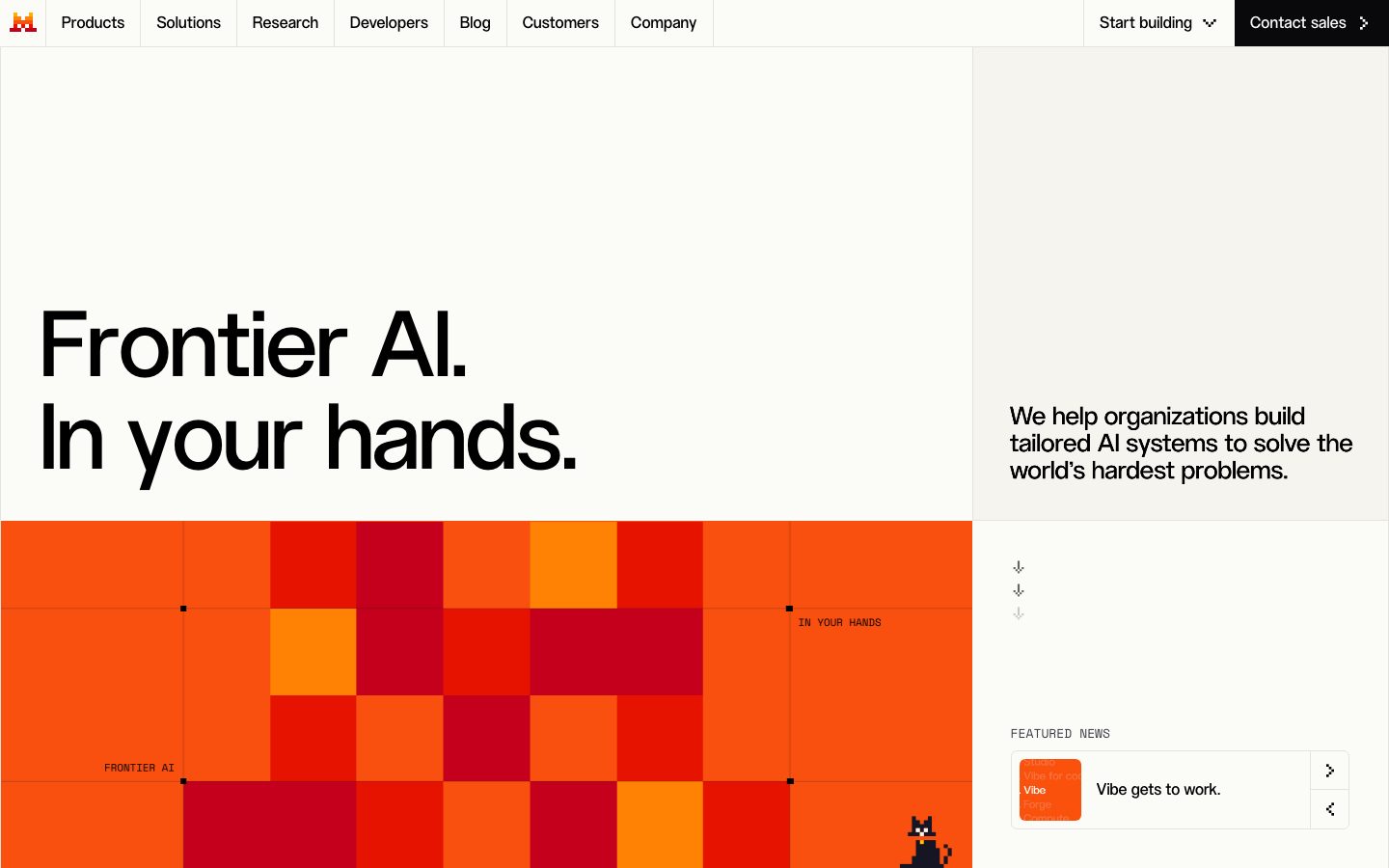
A sharp-cornered, editorial-engineering interface built on a warm off-white canvas (#fbfbf8) with pure-black ink and a single high-voltage orange (#ff5229) carried almost entirely through a pixel-grid hero artwork. The system reads as precise and technical — zero border-radius on buttons, cards, and inputs, a flat near-shadowless surface treatment, monospaced micro-labels over imagery, and a large geometric display face (ALTMistral) set against compact Inter body text. Brand voltage comes from the orange tile-grid and the hard-edged, grid-ruled layout rather than from color washes or soft cards.
---
version: alpha
name: Mistral-design-analysis
description: A sharp-cornered, editorial-engineering interface built on a warm off-white canvas (#fbfbf8) with pure-black ink and a single high-voltage orange (#ff5229) carried almost entirely through a pixel-grid hero artwork. The system reads as precise and technical — zero border-radius on buttons, cards, and inputs, a flat near-shadowless surface treatment, monospaced micro-labels over imagery, and a large geometric display face (ALTMistral) set against compact Inter body text. Brand voltage comes from the orange tile-grid and the hard-edged, grid-ruled layout rather than from color washes or soft cards.

colors:
  primary: "#000000"
  ink: "#000000"
  ink-near: "#07070b"
  canvas: "#fbfbf8"
  surface: "#f5f4ef"
  surface-soft: "#eceae1"
  surface-warm: "#ebe9e0"
  hairline: "#e4e3de"
  on-ink: "#ffffff"
  brand: "#ff5229"
  dark-900: "#121227"
  dark-800: "#151524"
  dark-700: "#242433"
  dark-600: "#31313a"
  dark-500: "#343446"
  blue: "#0087e9"
  blue-bright: "#3aa1f1"
  blue-soft: "#b9daff"
  warning: "#f59e0b"
  error: "#ef4444"
  success: "#45bf87"

typography:
  display:
    fontFamily: "ALTMistral, Inter, sans-serif"
    fontSize: 32px
    fontWeight: 500
    lineHeight: 1.25
    letterSpacing: normal
  heading:
    fontFamily: "Inter, sans-serif"
    fontSize: 16px
    fontWeight: 400
    lineHeight: 1.5
    letterSpacing: normal
  body:
    fontFamily: "Inter, sans-serif"
    fontSize: 16px
    fontWeight: 400
    lineHeight: 1.5
    letterSpacing: normal
  button:
    fontFamily: "Inter, sans-serif"
    fontSize: 16px
    fontWeight: 400
    lineHeight: 1.5
    letterSpacing: normal

rounded:
  none: 0px
  xs: 4px
  sm: 6px
  md: 8px
  lg: 12px
  xl: 32px

spacing:
  xxs: 4px
  xs: 8px
  sm: 12px
  md: 16px
  lg: 24px
  xl: 32px
  xxl: 40px
  xxxl: 48px
  huge: 56px
  section: 80px
  section-xl: 128px

components:
  top-nav:
    backgroundColor: "{colors.canvas}"
    textColor: "{colors.ink}"
    typography: "{typography.heading}"
    rounded: "{rounded.none}"
  button-primary:
    backgroundColor: "{colors.primary}"
    textColor: "{colors.on-ink}"
    typography: "{typography.button}"
    rounded: "{rounded.none}"
    padding: 16px
  button-contact-sales:
    backgroundColor: "{colors.primary}"
    textColor: "{colors.on-ink}"
    typography: "{typography.button}"
    rounded: "{rounded.none}"
    padding: 16px
  nav-link:
    backgroundColor: transparent
    textColor: "{colors.ink}"
    typography: "{typography.heading}"
    rounded: "{rounded.none}"
  hero-band:
    backgroundColor: "{colors.canvas}"
    textColor: "{colors.ink}"
    typography: "{typography.display}"
    rounded: "{rounded.none}"
  hero-grid-artwork:
    backgroundColor: "{colors.brand}"
    textColor: "{colors.ink}"
    rounded: "{rounded.none}"
  card:
    backgroundColor: "{colors.canvas}"
    textColor: "{colors.ink}"
    rounded: "{rounded.none}"
  featured-news-card:
    backgroundColor: "{colors.canvas}"
    textColor: "{colors.ink}"
    typography: "{typography.heading}"
    rounded: "{rounded.none}"
  testimonial-card:
    backgroundColor: "{colors.surface}"
    textColor: "{colors.ink}"
    typography: "{typography.body}"
    rounded: "{rounded.none}"
  logo-strip:
    backgroundColor: "{colors.canvas}"
    textColor: "{colors.ink}"
    rounded: "{rounded.none}"
  input:
    backgroundColor: "{colors.canvas}"
    textColor: "{colors.ink}"
    typography: "{typography.body}"
    rounded: "{rounded.none}"
  section-divider-label:
    backgroundColor: transparent
    textColor: "{colors.ink}"
    typography: "{typography.heading}"
    rounded: "{rounded.none}"

---

## Overview

Mistral's marketing surface is a sharp-cornered, editorial-engineering interface. The canvas is a warm off-white (`{colors.canvas}` — #fbfbf8), text is pure black (`{colors.ink}` — #000000), and the brand's single high-voltage color — orange (`{colors.brand}` — #ff5229) — arrives almost entirely through a pixel-grid hero artwork rather than through buttons or fills. The result reads as precise, technical, and confidently minimal.

The defining structural choice is **zero border-radius**: the measured `button-primary`, `card`, and `input` all render at 0px corners. Combined with grid-ruled section labels (rendered as small monospaced-style captions like "FRONTIER AI" and "IN YOUR HANDS" pinned to the artwork's grid lines) and an almost-flat shadow treatment, the system feels engineered and exacting rather than soft or consumer-friendly.

Type voice splits into two roles. **ALTMistral** — a large geometric display face — carries the marquee headlines ("Frontier AI. In your hands.", "Do it all with Mistral.") at 32px+, weight 500. Everything else (nav, body, buttons, section labels) runs in **Inter** at 16px / weight 400. The contrast between the large geometric display and the compact, unembellished Inter UI text is the core typographic tension.

**Key Characteristics:**
- Warm off-white canvas (`{colors.canvas}` — #fbfbf8) with pure-black ink — a deliberately paper-like, low-glare ground.
- Hard edges everywhere: `{rounded.none}` (0px) on buttons, cards, and inputs. No soft-rounded SaaS cards.
- Black primary button (`{colors.primary}` — #000000) with white label — the "Contact sales" / "Start building" CTAs. Orange is reserved for artwork, not CTAs.
- The orange pixel-grid hero (`{colors.brand}` — #ff5229) is the brand's voltage source — a tiled blocky artwork with grid registration marks and small monospaced labels.
- Large ALTMistral display headlines (custom face; substituted with Inter weight 500 here) over compact Inter body.
- Nearly flat elevation — a single, extremely faint multi-layer shadow at 2% alpha is the only measured shadow in the system.
- Grid-ruled section labels in small caps anchored to layout lines reinforce the technical, blueprint-like aesthetic.

## Colors

### Brand & Action
- **Primary / Ink** (`{colors.primary}` / `{colors.ink}` — #000000): The action color and all primary text. Primary CTAs ("Contact sales", "Start building") use a solid black fill with white labels.
- **Brand Orange** (`{colors.brand}` — #ff5229): The signature color, carried almost entirely through the pixel-grid hero artwork and small accent moments. It does not appear on primary buttons.
- **Ink Near-Black** (`{colors.ink-near}` — #07070b): A near-black used in dark UI fragments and deep artwork tiles.

### Surface
- **Canvas** (`{colors.canvas}` — #fbfbf8): The default warm off-white page floor.
- **Surface** (`{colors.surface}` — #f5f4ef): Soft beige section blocks and testimonial card grounds.
- **Surface Soft** (`{colors.surface-soft}` — #eceae1): A slightly deeper warm neutral for alternating bands.
- **Surface Warm** (`{colors.surface-warm}` — #ebe9e0): Another warm-neutral band tone.
- **Hairline** (`{colors.hairline}` — #e4e3de): The 1px divider / border tone on warm surfaces.

### Dark Tones
A small family of cool near-black blues used in dark UI fragments, product chrome, and deep imagery: `{colors.dark-900}` (#121227), `{colors.dark-800}` (#151524), `{colors.dark-700}` (#242433), `{colors.dark-600}` (#31313a), `{colors.dark-500}` (#343446). These are observed in product-UI artifacts and shadow tints (the system shadow is built on rgba(21,21,31,…)).

### Blue Accents
- **Blue** (`{colors.blue}` — #0087e9) and **Blue Bright** (`{colors.blue-bright}` — #3aa1f1): Link / interactive accent tones appearing in product UI fragments.
- **Blue Soft** (`{colors.blue-soft}` — #b9daff): A pale blue tint used in highlights and small UI accents.

### Semantic
- **Warning** (`{colors.warning}` — #f59e0b): Warning states in product UI.
- **Error** (`{colors.error}` — #ef4444): Validation / error states.
- **Success** (`{colors.success}` — #45bf87): Confirmation / success states.

## Typography

### Font Family
The system runs **ALTMistral** — Mistral's custom geometric display typeface — for large headlines, and **Inter** for all supporting UI text (navigation, body, buttons, and the small grid-ruled section labels). ALTMistral was captured at 32px / weight 500 / line-height 1.25; Inter is captured at 16px / weight 400 / line-height 1.5 across both heading (`h3`) and button roles.

The split is functional:
- ALTMistral (display, weight 500) — marquee headlines only ("Frontier AI. In your hands.", "Do it all with Mistral.")
- Inter (weight 400) — nav links, body copy, buttons, captions, section labels

### Hierarchy

| Token | Size | Weight | Line Height | Letter Spacing | Use |
|---|---|---|---|---|---|
| `{typography.display}` | 32px | 500 | 1.25 | normal | Marquee headlines — ALTMistral. At hero scale this size scales up substantially (see Known Gaps) |
| `{typography.heading}` | 16px | 400 | 1.5 | normal | `h3` headings, sub-section labels — Inter |
| `{typography.body}` | 16px | 400 | 1.5 | normal | Running body copy (derived — Inter 16px matches the measured heading/button role) |
| `{typography.button}` | 16px | 400 | 1.5 | normal | Button labels — Inter |

### Principles
ALTMistral owns the marquee headline voice; Inter handles everything supporting. The contrast is deliberately blunt — a large geometric display set against compact, unadorned Inter at a single 16px size. The boundary is strict: marquee headlines in ALTMistral, all functional UI text in Inter.

### Note on Font Substitutes
**ALTMistral is a custom typeface and is not available as a public web font.** If it is unavailable, **Inter** at weight 500 is the closest already-in-system fallback (and is declared in the display stack). **Space Grotesk** or **Archivo** at a medium weight are stronger geometric approximations of ALTMistral's display character. Never claim to ship ALTMistral itself — substitute and note the swap.

## Layout

### Spacing System
- **Base unit:** 4px.
- **Tokens:** `{spacing.xxs}` 4px · `{spacing.xs}` 8px · `{spacing.sm}` 12px · `{spacing.md}` 16px · `{spacing.lg}` 24px · `{spacing.xl}` 32px · `{spacing.xxl}` 40px · `{spacing.xxxl}` 48px · `{spacing.huge}` 56px · `{spacing.section}` 80px · `{spacing.section-xl}` 128px.
- **Dominant rhythm:** 16px (`{spacing.md}`) and 8px (`{spacing.xs}`) are by far the most frequent measured values — the tight UI rhythm. 80px and 128px (`{spacing.section}` / `{spacing.section-xl}`) handle the large vertical gaps between editorial bands.
- **Button padding:** 16px (`{spacing.md}`) — the measured primary-button inset.

### Grid & Container
- The landing layout uses a strong **two-column split** at the hero: a large left artwork/headline zone and a narrower right rail ("We help organizations build tailored AI systems…", featured-news card).
- Section content (feature blocks like "Autonomous work.", "Autonomous coding.") stacks as full-width editorial bands with left-aligned headlines and a right-aligned "Discover" link.
- A horizontal logo strip (HTM, AXA, Orange, IBM, ASML) and a testimonial carousel sit between bands.

### Whitespace Philosophy
Mistral uses generous vertical whitespace between bands (`{spacing.section}` 80px → `{spacing.section-xl}` 128px) while keeping intra-component spacing tight (8–16px). The effect is calm, blueprint-like pacing — large empty zones broken by precise, grid-aligned content.

## Elevation & Depth

| Level | Treatment | Use |
|---|---|---|
| Flat | No shadow, no border | Body sections, hero bands, buttons, most cards |
| Hairline | 1px `{colors.hairline}` (#e4e3de) divider | Section separators, warm-surface card edges |
| Faint lift | The single measured multi-layer shadow at 2% alpha (`rgba(21,21,31,0.02)` stacked at 0/1/2/4px offsets) | The rare elevated card / featured-news tile |

The elevation philosophy is **near-flat**. The only measured shadow in the entire system is an extremely subtle 2%-alpha multi-layer stack — barely perceptible. Depth is created by grid lines, registration marks, and color blocks (the orange artwork), not by shadow.

### Decorative Depth
- The hero pixel-grid artwork uses tonal variation within the orange family (lighter orange tiles to deep red-orange) plus thin black grid registration marks and corner ticks to create a technical, plotted-diagram feel.
- Grid-ruled micro-labels ("FRONTIER AI", "IN YOUR HANDS") pinned to the artwork's grid lines act as decorative annotations.

## Shapes

### Border Radius Scale

| Token | Value | Use |
|---|---|---|
| `{rounded.none}` | 0px | Buttons, cards, inputs — the dominant, defining radius of the system |
| `{rounded.xs}` | 4px | Small UI accents (measured, low frequency) |
| `{rounded.sm}` | 6px | Small chips / minor UI elements (most frequent of the non-zero radii) |
| `{rounded.md}` | 8px | Occasional small containers |
| `{rounded.lg}` | 12px | Rare — a single measured instance |
| `{rounded.xl}` | 32px | Rare large-radius elements (e.g. pill-like accents), measured at low frequency |

The system is overwhelmingly **hard-cornered**. The primary interactive elements (button, card, input) all render at 0px. The small non-zero radii (4–8px) appear on minor UI accents only; 32px is reserved for rare large pill-like moments.

### Photography & Artwork Geometry
The hero artwork is a hard-edged tile grid (square cells) with no rounding. Testimonial imagery (e.g. the HSBC lion photo) sits in square-cornered frames. Square corners are part of the brand voice — softening them reads as off-brand.

## Components

### Top Navigation

**`top-nav`** — A full-width bar on the warm canvas (`{colors.canvas}`), 0px corners. Carries the orange "M" pixel-logo at far left, a horizontal menu (Products, Solutions, Research, Developers, Blog, Customers, Company) in `{typography.heading}` (Inter 16), and a right-side cluster with a "Start building" dropdown link and a solid-black "Contact sales" button.

**`nav-link`** — Inline menu items, transparent background, `{colors.ink}` text, `{typography.heading}` (Inter 16 / 400).

### Buttons

**`button-primary`** — The signature CTA ("Start building"). Background `{colors.primary}` (#000000), label `{colors.on-ink}` (#ffffff), type `{typography.button}` (Inter 16 / 400), padding 16px, rounded `{rounded.none}` (0px). The hard-cornered black button is the system's only filled action style.

**`button-contact-sales`** — The top-right "Contact sales" button. Identical treatment to `button-primary`: black fill, white label, 0px corners, 16px padding. Distinguished only by position and a trailing arrow glyph.

### Cards & Containers

**`card`** — The base container. Background `{colors.canvas}`, rounded `{rounded.none}` (0px), no shadow (measured `shadow: none`). Mistral's cards are defined by square corners and the absence of elevation.

**`featured-news-card`** — The "FEATURED NEWS" tile in the hero right rail ("Vibe gets to work."). Background `{colors.canvas}`, 0px corners, with a small square thumbnail at left, a headline in `{typography.heading}`, and two stacked icon-action buttons at right.

**`testimonial-card`** — The customer-quote / case-study unit ("HSBC boosts productivity with Mistral."). Background `{colors.surface}` (#f5f4ef), 0px corners, holding a square photo, a customer logo, a small category label, a quote in `{typography.body}`, and a "Read more" link. Presented in a horizontal carousel flanked by Previous / Next controls.

**`logo-strip`** — A full-width band of customer logos (HTM, AXA, Orange, IBM, ASML) on `{colors.canvas}`, evenly spaced with hairline column dividers.

**`hero-band`** — The two-column hero on `{colors.canvas}`: large ALTMistral headline (`{typography.display}`) at left, supporting copy and featured-news card at right.

**`hero-grid-artwork`** — The signature orange pixel-grid artwork. Built on `{colors.brand}` (#ff5229) with tonal tile variation, thin black grid registration marks, corner ticks, and small grid-pinned labels. This is the system's primary brand-voltage element.

### Inputs & Forms

**`input`** — Text input. Background `{colors.canvas}`, text `{colors.ink}`, type `{typography.body}`, rounded `{rounded.none}` (0px). Square corners match the button and card geometry.

### Labels

**`section-divider-label`** — Small grid-ruled caption labels ("FRONTIER AI", "IN YOUR HANDS", and the all-caps feature tags such as "ENTERPRISE KNOWLEDGE SEARCH · STRUCTURED DATA ANALYSIS"). Transparent background, `{colors.ink}` text, `{typography.heading}`. Rendered in small caps and pinned to layout grid lines — a key signature of the technical/blueprint aesthetic.

## Do's and Don'ts

### Do
- Keep buttons, cards, and inputs at `{rounded.none}` (0px). The hard corner is the brand.
- Reserve `{colors.brand}` orange (#ff5229) for the pixel-grid artwork and rare accents — never for primary CTAs.
- Use solid-black `{colors.primary}` fills for primary actions, with white labels.
- Set marquee headlines in ALTMistral (substituted with Inter 500 here); keep all UI text in Inter 16.
- Use the warm off-white `{colors.canvas}` (#fbfbf8) as the default ground — not pure white.
- Keep elevation near-flat; lean on hairlines (`{colors.hairline}`) and grid lines for separation, not shadows.
- Use small-caps grid-ruled labels (`{component.section-divider-label}`) to annotate layout, reinforcing the technical voice.

### Don't
- Don't round the corners of buttons, cards, or inputs. Softening corners breaks the engineered aesthetic.
- Don't put orange on primary CTAs — the action layer stays black.
- Don't introduce heavy shadows or glassmorphism; the system is deliberately flat (a single 2% shadow is the maximum measured).
- Don't set body copy in ALTMistral, or marquee headlines in Inter — the boundary is strict.
- Don't use pure white (#ffffff) as a full-page background; the canvas is warm (#fbfbf8). Pure white is for inverted text only.
- Don't document hover styling — default and active/pressed states only.

## Responsive Behavior

### Breakpoints
The captures show a desktop landing layout and a compressed (narrow) rendering of the same page. Specific breakpoint widths were not measured.

| Name | Behavior (observed) |
|---|---|
| Desktop | Full horizontal nav (all 7 menu items + right cluster); two-column hero (artwork/headline left, copy + featured-news rail right); horizontal logo strip; feature bands as full-width editorial blocks |
| Narrow / Mobile | Hero collapses to single column — headline, then orange artwork, then supporting copy stacked; nav condenses; feature bands stack vertically with left-aligned headlines and right-aligned "Discover" links |

### Touch Targets
- `{component.button-primary}` carries 16px padding around a 16px label — comfortably tappable.
- Carousel Previous / Next controls and the featured-news icon buttons are small; exact dimensions were not measured (see Known Gaps).

### Collapsing Strategy
- The hero two-column split collapses to a single stacked column on narrow viewports.
- The logo strip and testimonial carousel remain horizontal, scaling logos down rather than reflowing.
- Feature bands ("Autonomous work.", "Autonomous coding.", etc.) remain full-width stacked blocks at all sizes.

## Iteration Guide

1. Focus on ONE component at a time. Reference its YAML key directly (`{component.button-primary}`, `{component.testimonial-card}`).
2. Variants of an existing component (`-active`, `-disabled`, `-focused`) live as separate entries in `components:`.
3. Use `{token.refs}` everywhere — never inline a hex in a component.
4. Never document hover. Default and Active/Pressed states only.
5. Hold the line on 0px corners — `{rounded.none}` is the system's defining trait.
6. Keep orange (`{colors.brand}`) in the artwork; keep the action layer black.
7. When in doubt about emphasis: bigger ALTMistral display, not a color change.

## Known Gaps

- **ALTMistral is a custom typeface** that is not publicly available; `fonts_licensed` was returned empty by the analyzer, but the family name clearly indicates a proprietary face. Substitutes (Inter 500, Space Grotesk, Archivo) are documented in the Typography section — do not claim to ship ALTMistral.
- Only three typography roles were measured (`h3`, the display headline, and `button`). The hero headline visibly renders far larger than the captured 32px; true display-scale sizes (48px+), as well as distinct h1/h2/caption roles, were not measured. The `body` role is derived from the matching 16px Inter heading/button measurement.
- Active/pressed, disabled, and focus states for buttons and inputs were not extracted — only default states are documented.
- Exact pixel dimensions (heights, widths) for nav bar, buttons, inputs, icon buttons, and carousel controls were not measured; only radius and padding were captured.
- The dark-tone family (`{colors.dark-900}`–`{colors.dark-500}`) and blue accents (`{colors.blue}`, `{colors.blue-bright}`, `{colors.blue-soft}`) were captured by frequency but their precise placement in product-UI fragments is inferred, not mapped.
- Responsive breakpoint widths and the mobile navigation pattern (hamburger vs. condensed bar) were not measured.
- Footer, pricing-page, and news-page component specifics were not separately extracted beyond the shared tokens above.
- Animation and transition timings (carousel, hero artwork, scroll behavior) are out of scope.

<!-- Documented by duply · real-world design systems as ready-to-use DESIGN.md for AI coding agents · https://duply.ai/mistral/design-md -->
Color Palette
Accent
Neutrals
Typography
display32px · 500 · 1.25
The quick brown fox jumpsheading16px · 400 · 1.5
The quick brown fox jumpsbody16px · 400 · 1.5
The quick brown fox jumpsbutton16px · 400 · 1.5
The quick brown fox jumpsSpacing & Shape
Spacing
| Name | Value | Preview |
|---|---|---|
| xxs | 4px | |
| xs | 8px | |
| sm | 12px | |
| md | 16px | |
| lg | 24px | |
| xl | 32px | |
| xxl | 40px | |
| xxxl | 48px | |
| huge | 56px | |
| section | 80px | |
| section-xl | 128px |
Border Radius
| Name | Value | Preview |
|---|---|---|
| none | 0px | |
| xs | 4px | |
| sm | 6px | |
| md | 8px | |
| lg | 12px | |
| xl | 32px |
More like this


---
version: alpha
name: Mistral-design-analysis
description: A sharp-cornered, editorial-engineering interface built on a warm off-white canvas (#fbfbf8) with pure-black ink and a single high-voltage orange (#ff5229) carried almost entirely through a pixel-grid hero artwork. The system reads as precise and technical — zero border-radius on buttons, cards, and inputs, a flat near-shadowless surface treatment, monospaced micro-labels over imagery, and a large geometric display face (ALTMistral) set against compact Inter body text. Brand voltage comes from the orange tile-grid and the hard-edged, grid-ruled layout rather than from color washes or soft cards.

colors:
  primary: "#000000"
  ink: "#000000"
  ink-near: "#07070b"
  canvas: "#fbfbf8"
  surface: "#f5f4ef"
  surface-soft: "#eceae1"
  surface-warm: "#ebe9e0"
  hairline: "#e4e3de"
  on-ink: "#ffffff"
  brand: "#ff5229"
  dark-900: "#121227"
  dark-800: "#151524"
  dark-700: "#242433"
  dark-600: "#31313a"
  dark-500: "#343446"
  blue: "#0087e9"
  blue-bright: "#3aa1f1"
  blue-soft: "#b9daff"
  warning: "#f59e0b"
  error: "#ef4444"
  success: "#45bf87"

typography:
  display:
    fontFamily: "ALTMistral, Inter, sans-serif"
    fontSize: 32px
    fontWeight: 500
    lineHeight: 1.25
    letterSpacing: normal
  heading:
    fontFamily: "Inter, sans-serif"
    fontSize: 16px
    fontWeight: 400
    lineHeight: 1.5
    letterSpacing: normal
  body:
    fontFamily: "Inter, sans-serif"
    fontSize: 16px
    fontWeight: 400
    lineHeight: 1.5
    letterSpacing: normal
  button:
    fontFamily: "Inter, sans-serif"
    fontSize: 16px
    fontWeight: 400
    lineHeight: 1.5
    letterSpacing: normal

rounded:
  none: 0px
  xs: 4px
  sm: 6px
  md: 8px
  lg: 12px
  xl: 32px

spacing:
  xxs: 4px
  xs: 8px
  sm: 12px
  md: 16px
  lg: 24px
  xl: 32px
  xxl: 40px
  xxxl: 48px
  huge: 56px
  section: 80px
  section-xl: 128px

components:
  top-nav:
    backgroundColor: "{colors.canvas}"
    textColor: "{colors.ink}"
    typography: "{typography.heading}"
    rounded: "{rounded.none}"
  button-primary:
    backgroundColor: "{colors.primary}"
    textColor: "{colors.on-ink}"
    typography: "{typography.button}"
    rounded: "{rounded.none}"
    padding: 16px
  button-contact-sales:
    backgroundColor: "{colors.primary}"
    textColor: "{colors.on-ink}"
    typography: "{typography.button}"
    rounded: "{rounded.none}"
    padding: 16px
  nav-link:
    backgroundColor: transparent
    textColor: "{colors.ink}"
    typography: "{typography.heading}"
    rounded: "{rounded.none}"
  hero-band:
    backgroundColor: "{colors.canvas}"
    textColor: "{colors.ink}"
    typography: "{typography.display}"
    rounded: "{rounded.none}"
  hero-grid-artwork:
    backgroundColor: "{colors.brand}"
    textColor: "{colors.ink}"
    rounded: "{rounded.none}"
  card:
    backgroundColor: "{colors.canvas}"
    textColor: "{colors.ink}"
    rounded: "{rounded.none}"
  featured-news-card:
    backgroundColor: "{colors.canvas}"
    textColor: "{colors.ink}"
    typography: "{typography.heading}"
    rounded: "{rounded.none}"
  testimonial-card:
    backgroundColor: "{colors.surface}"
    textColor: "{colors.ink}"
    typography: "{typography.body}"
    rounded: "{rounded.none}"
  logo-strip:
    backgroundColor: "{colors.canvas}"
    textColor: "{colors.ink}"
    rounded: "{rounded.none}"
  input:
    backgroundColor: "{colors.canvas}"
    textColor: "{colors.ink}"
    typography: "{typography.body}"
    rounded: "{rounded.none}"
  section-divider-label:
    backgroundColor: transparent
    textColor: "{colors.ink}"
    typography: "{typography.heading}"
    rounded: "{rounded.none}"

---

## Overview

Mistral's marketing surface is a sharp-cornered, editorial-engineering interface. The canvas is a warm off-white (`{colors.canvas}` — #fbfbf8), text is pure black (`{colors.ink}` — #000000), and the brand's single high-voltage color — orange (`{colors.brand}` — #ff5229) — arrives almost entirely through a pixel-grid hero artwork rather than through buttons or fills. The result reads as precise, technical, and confidently minimal.

The defining structural choice is **zero border-radius**: the measured `button-primary`, `card`, and `input` all render at 0px corners. Combined with grid-ruled section labels (rendered as small monospaced-style captions like "FRONTIER AI" and "IN YOUR HANDS" pinned to the artwork's grid lines) and an almost-flat shadow treatment, the system feels engineered and exacting rather than soft or consumer-friendly.

Type voice splits into two roles. **ALTMistral** — a large geometric display face — carries the marquee headlines ("Frontier AI. In your hands.", "Do it all with Mistral.") at 32px+, weight 500. Everything else (nav, body, buttons, section labels) runs in **Inter** at 16px / weight 400. The contrast between the large geometric display and the compact, unembellished Inter UI text is the core typographic tension.

**Key Characteristics:**
- Warm off-white canvas (`{colors.canvas}` — #fbfbf8) with pure-black ink — a deliberately paper-like, low-glare ground.
- Hard edges everywhere: `{rounded.none}` (0px) on buttons, cards, and inputs. No soft-rounded SaaS cards.
- Black primary button (`{colors.primary}` — #000000) with white label — the "Contact sales" / "Start building" CTAs. Orange is reserved for artwork, not CTAs.
- The orange pixel-grid hero (`{colors.brand}` — #ff5229) is the brand's voltage source — a tiled blocky artwork with grid registration marks and small monospaced labels.
- Large ALTMistral display headlines (custom face; substituted with Inter weight 500 here) over compact Inter body.
- Nearly flat elevation — a single, extremely faint multi-layer shadow at 2% alpha is the only measured shadow in the system.
- Grid-ruled section labels in small caps anchored to layout lines reinforce the technical, blueprint-like aesthetic.

## Colors

### Brand & Action
- **Primary / Ink** (`{colors.primary}` / `{colors.ink}` — #000000): The action color and all primary text. Primary CTAs ("Contact sales", "Start building") use a solid black fill with white labels.
- **Brand Orange** (`{colors.brand}` — #ff5229): The signature color, carried almost entirely through the pixel-grid hero artwork and small accent moments. It does not appear on primary buttons.
- **Ink Near-Black** (`{colors.ink-near}` — #07070b): A near-black used in dark UI fragments and deep artwork tiles.

### Surface
- **Canvas** (`{colors.canvas}` — #fbfbf8): The default warm off-white page floor.
- **Surface** (`{colors.surface}` — #f5f4ef): Soft beige section blocks and testimonial card grounds.
- **Surface Soft** (`{colors.surface-soft}` — #eceae1): A slightly deeper warm neutral for alternating bands.
- **Surface Warm** (`{colors.surface-warm}` — #ebe9e0): Another warm-neutral band tone.
- **Hairline** (`{colors.hairline}` — #e4e3de): The 1px divider / border tone on warm surfaces.

### Dark Tones
A small family of cool near-black blues used in dark UI fragments, product chrome, and deep imagery: `{colors.dark-900}` (#121227), `{colors.dark-800}` (#151524), `{colors.dark-700}` (#242433), `{colors.dark-600}` (#31313a), `{colors.dark-500}` (#343446). These are observed in product-UI artifacts and shadow tints (the system shadow is built on rgba(21,21,31,…)).

### Blue Accents
- **Blue** (`{colors.blue}` — #0087e9) and **Blue Bright** (`{colors.blue-bright}` — #3aa1f1): Link / interactive accent tones appearing in product UI fragments.
- **Blue Soft** (`{colors.blue-soft}` — #b9daff): A pale blue tint used in highlights and small UI accents.

### Semantic
- **Warning** (`{colors.warning}` — #f59e0b): Warning states in product UI.
- **Error** (`{colors.error}` — #ef4444): Validation / error states.
- **Success** (`{colors.success}` — #45bf87): Confirmation / success states.

## Typography

### Font Family
The system runs **ALTMistral** — Mistral's custom geometric display typeface — for large headlines, and **Inter** for all supporting UI text (navigation, body, buttons, and the small grid-ruled section labels). ALTMistral was captured at 32px / weight 500 / line-height 1.25; Inter is captured at 16px / weight 400 / line-height 1.5 across both heading (`h3`) and button roles.

The split is functional:
- ALTMistral (display, weight 500) — marquee headlines only ("Frontier AI. In your hands.", "Do it all with Mistral.")
- Inter (weight 400) — nav links, body copy, buttons, captions, section labels

### Hierarchy

| Token | Size | Weight | Line Height | Letter Spacing | Use |
|---|---|---|---|---|---|
| `{typography.display}` | 32px | 500 | 1.25 | normal | Marquee headlines — ALTMistral. At hero scale this size scales up substantially (see Known Gaps) |
| `{typography.heading}` | 16px | 400 | 1.5 | normal | `h3` headings, sub-section labels — Inter |
| `{typography.body}` | 16px | 400 | 1.5 | normal | Running body copy (derived — Inter 16px matches the measured heading/button role) |
| `{typography.button}` | 16px | 400 | 1.5 | normal | Button labels — Inter |

### Principles
ALTMistral owns the marquee headline voice; Inter handles everything supporting. The contrast is deliberately blunt — a large geometric display set against compact, unadorned Inter at a single 16px size. The boundary is strict: marquee headlines in ALTMistral, all functional UI text in Inter.

### Note on Font Substitutes
**ALTMistral is a custom typeface and is not available as a public web font.** If it is unavailable, **Inter** at weight 500 is the closest already-in-system fallback (and is declared in the display stack). **Space Grotesk** or **Archivo** at a medium weight are stronger geometric approximations of ALTMistral's display character. Never claim to ship ALTMistral itself — substitute and note the swap.

## Layout

### Spacing System
- **Base unit:** 4px.
- **Tokens:** `{spacing.xxs}` 4px · `{spacing.xs}` 8px · `{spacing.sm}` 12px · `{spacing.md}` 16px · `{spacing.lg}` 24px · `{spacing.xl}` 32px · `{spacing.xxl}` 40px · `{spacing.xxxl}` 48px · `{spacing.huge}` 56px · `{spacing.section}` 80px · `{spacing.section-xl}` 128px.
- **Dominant rhythm:** 16px (`{spacing.md}`) and 8px (`{spacing.xs}`) are by far the most frequent measured values — the tight UI rhythm. 80px and 128px (`{spacing.section}` / `{spacing.section-xl}`) handle the large vertical gaps between editorial bands.
- **Button padding:** 16px (`{spacing.md}`) — the measured primary-button inset.

### Grid & Container
- The landing layout uses a strong **two-column split** at the hero: a large left artwork/headline zone and a narrower right rail ("We help organizations build tailored AI systems…", featured-news card).
- Section content (feature blocks like "Autonomous work.", "Autonomous coding.") stacks as full-width editorial bands with left-aligned headlines and a right-aligned "Discover" link.
- A horizontal logo strip (HTM, AXA, Orange, IBM, ASML) and a testimonial carousel sit between bands.

### Whitespace Philosophy
Mistral uses generous vertical whitespace between bands (`{spacing.section}` 80px → `{spacing.section-xl}` 128px) while keeping intra-component spacing tight (8–16px). The effect is calm, blueprint-like pacing — large empty zones broken by precise, grid-aligned content.

## Elevation & Depth

| Level | Treatment | Use |
|---|---|---|
| Flat | No shadow, no border | Body sections, hero bands, buttons, most cards |
| Hairline | 1px `{colors.hairline}` (#e4e3de) divider | Section separators, warm-surface card edges |
| Faint lift | The single measured multi-layer shadow at 2% alpha (`rgba(21,21,31,0.02)` stacked at 0/1/2/4px offsets) | The rare elevated card / featured-news tile |

The elevation philosophy is **near-flat**. The only measured shadow in the entire system is an extremely subtle 2%-alpha multi-layer stack — barely perceptible. Depth is created by grid lines, registration marks, and color blocks (the orange artwork), not by shadow.

### Decorative Depth
- The hero pixel-grid artwork uses tonal variation within the orange family (lighter orange tiles to deep red-orange) plus thin black grid registration marks and corner ticks to create a technical, plotted-diagram feel.
- Grid-ruled micro-labels ("FRONTIER AI", "IN YOUR HANDS") pinned to the artwork's grid lines act as decorative annotations.

## Shapes

### Border Radius Scale

| Token | Value | Use |
|---|---|---|
| `{rounded.none}` | 0px | Buttons, cards, inputs — the dominant, defining radius of the system |
| `{rounded.xs}` | 4px | Small UI accents (measured, low frequency) |
| `{rounded.sm}` | 6px | Small chips / minor UI elements (most frequent of the non-zero radii) |
| `{rounded.md}` | 8px | Occasional small containers |
| `{rounded.lg}` | 12px | Rare — a single measured instance |
| `{rounded.xl}` | 32px | Rare large-radius elements (e.g. pill-like accents), measured at low frequency |

The system is overwhelmingly **hard-cornered**. The primary interactive elements (button, card, input) all render at 0px. The small non-zero radii (4–8px) appear on minor UI accents only; 32px is reserved for rare large pill-like moments.

### Photography & Artwork Geometry
The hero artwork is a hard-edged tile grid (square cells) with no rounding. Testimonial imagery (e.g. the HSBC lion photo) sits in square-cornered frames. Square corners are part of the brand voice — softening them reads as off-brand.

## Components

### Top Navigation

**`top-nav`** — A full-width bar on the warm canvas (`{colors.canvas}`), 0px corners. Carries the orange "M" pixel-logo at far left, a horizontal menu (Products, Solutions, Research, Developers, Blog, Customers, Company) in `{typography.heading}` (Inter 16), and a right-side cluster with a "Start building" dropdown link and a solid-black "Contact sales" button.

**`nav-link`** — Inline menu items, transparent background, `{colors.ink}` text, `{typography.heading}` (Inter 16 / 400).

### Buttons

**`button-primary`** — The signature CTA ("Start building"). Background `{colors.primary}` (#000000), label `{colors.on-ink}` (#ffffff), type `{typography.button}` (Inter 16 / 400), padding 16px, rounded `{rounded.none}` (0px). The hard-cornered black button is the system's only filled action style.

**`button-contact-sales`** — The top-right "Contact sales" button. Identical treatment to `button-primary`: black fill, white label, 0px corners, 16px padding. Distinguished only by position and a trailing arrow glyph.

### Cards & Containers

**`card`** — The base container. Background `{colors.canvas}`, rounded `{rounded.none}` (0px), no shadow (measured `shadow: none`). Mistral's cards are defined by square corners and the absence of elevation.

**`featured-news-card`** — The "FEATURED NEWS" tile in the hero right rail ("Vibe gets to work."). Background `{colors.canvas}`, 0px corners, with a small square thumbnail at left, a headline in `{typography.heading}`, and two stacked icon-action buttons at right.

**`testimonial-card`** — The customer-quote / case-study unit ("HSBC boosts productivity with Mistral."). Background `{colors.surface}` (#f5f4ef), 0px corners, holding a square photo, a customer logo, a small category label, a quote in `{typography.body}`, and a "Read more" link. Presented in a horizontal carousel flanked by Previous / Next controls.

**`logo-strip`** — A full-width band of customer logos (HTM, AXA, Orange, IBM, ASML) on `{colors.canvas}`, evenly spaced with hairline column dividers.

**`hero-band`** — The two-column hero on `{colors.canvas}`: large ALTMistral headline (`{typography.display}`) at left, supporting copy and featured-news card at right.

**`hero-grid-artwork`** — The signature orange pixel-grid artwork. Built on `{colors.brand}` (#ff5229) with tonal tile variation, thin black grid registration marks, corner ticks, and small grid-pinned labels. This is the system's primary brand-voltage element.

### Inputs & Forms

**`input`** — Text input. Background `{colors.canvas}`, text `{colors.ink}`, type `{typography.body}`, rounded `{rounded.none}` (0px). Square corners match the button and card geometry.

### Labels

**`section-divider-label`** — Small grid-ruled caption labels ("FRONTIER AI", "IN YOUR HANDS", and the all-caps feature tags such as "ENTERPRISE KNOWLEDGE SEARCH · STRUCTURED DATA ANALYSIS"). Transparent background, `{colors.ink}` text, `{typography.heading}`. Rendered in small caps and pinned to layout grid lines — a key signature of the technical/blueprint aesthetic.

## Do's and Don'ts

### Do
- Keep buttons, cards, and inputs at `{rounded.none}` (0px). The hard corner is the brand.
- Reserve `{colors.brand}` orange (#ff5229) for the pixel-grid artwork and rare accents — never for primary CTAs.
- Use solid-black `{colors.primary}` fills for primary actions, with white labels.
- Set marquee headlines in ALTMistral (substituted with Inter 500 here); keep all UI text in Inter 16.
- Use the warm off-white `{colors.canvas}` (#fbfbf8) as the default ground — not pure white.
- Keep elevation near-flat; lean on hairlines (`{colors.hairline}`) and grid lines for separation, not shadows.
- Use small-caps grid-ruled labels (`{component.section-divider-label}`) to annotate layout, reinforcing the technical voice.

### Don't
- Don't round the corners of buttons, cards, or inputs. Softening corners breaks the engineered aesthetic.
- Don't put orange on primary CTAs — the action layer stays black.
- Don't introduce heavy shadows or glassmorphism; the system is deliberately flat (a single 2% shadow is the maximum measured).
- Don't set body copy in ALTMistral, or marquee headlines in Inter — the boundary is strict.
- Don't use pure white (#ffffff) as a full-page background; the canvas is warm (#fbfbf8). Pure white is for inverted text only.
- Don't document hover styling — default and active/pressed states only.

## Responsive Behavior

### Breakpoints
The captures show a desktop landing layout and a compressed (narrow) rendering of the same page. Specific breakpoint widths were not measured.

| Name | Behavior (observed) |
|---|---|
| Desktop | Full horizontal nav (all 7 menu items + right cluster); two-column hero (artwork/headline left, copy + featured-news rail right); horizontal logo strip; feature bands as full-width editorial blocks |
| Narrow / Mobile | Hero collapses to single column — headline, then orange artwork, then supporting copy stacked; nav condenses; feature bands stack vertically with left-aligned headlines and right-aligned "Discover" links |

### Touch Targets
- `{component.button-primary}` carries 16px padding around a 16px label — comfortably tappable.
- Carousel Previous / Next controls and the featured-news icon buttons are small; exact dimensions were not measured (see Known Gaps).

### Collapsing Strategy
- The hero two-column split collapses to a single stacked column on narrow viewports.
- The logo strip and testimonial carousel remain horizontal, scaling logos down rather than reflowing.
- Feature bands ("Autonomous work.", "Autonomous coding.", etc.) remain full-width stacked blocks at all sizes.

## Iteration Guide

1. Focus on ONE component at a time. Reference its YAML key directly (`{component.button-primary}`, `{component.testimonial-card}`).
2. Variants of an existing component (`-active`, `-disabled`, `-focused`) live as separate entries in `components:`.
3. Use `{token.refs}` everywhere — never inline a hex in a component.
4. Never document hover. Default and Active/Pressed states only.
5. Hold the line on 0px corners — `{rounded.none}` is the system's defining trait.
6. Keep orange (`{colors.brand}`) in the artwork; keep the action layer black.
7. When in doubt about emphasis: bigger ALTMistral display, not a color change.

## Known Gaps

- **ALTMistral is a custom typeface** that is not publicly available; `fonts_licensed` was returned empty by the analyzer, but the family name clearly indicates a proprietary face. Substitutes (Inter 500, Space Grotesk, Archivo) are documented in the Typography section — do not claim to ship ALTMistral.
- Only three typography roles were measured (`h3`, the display headline, and `button`). The hero headline visibly renders far larger than the captured 32px; true display-scale sizes (48px+), as well as distinct h1/h2/caption roles, were not measured. The `body` role is derived from the matching 16px Inter heading/button measurement.
- Active/pressed, disabled, and focus states for buttons and inputs were not extracted — only default states are documented.
- Exact pixel dimensions (heights, widths) for nav bar, buttons, inputs, icon buttons, and carousel controls were not measured; only radius and padding were captured.
- The dark-tone family (`{colors.dark-900}`–`{colors.dark-500}`) and blue accents (`{colors.blue}`, `{colors.blue-bright}`, `{colors.blue-soft}`) were captured by frequency but their precise placement in product-UI fragments is inferred, not mapped.
- Responsive breakpoint widths and the mobile navigation pattern (hamburger vs. condensed bar) were not measured.
- Footer, pricing-page, and news-page component specifics were not separately extracted beyond the shared tokens above.
- Animation and transition timings (carousel, hero artwork, scroll behavior) are out of scope.

<!-- Documented by duply · real-world design systems as ready-to-use DESIGN.md for AI coding agents · https://duply.ai/mistral/design-md -->