Kestra
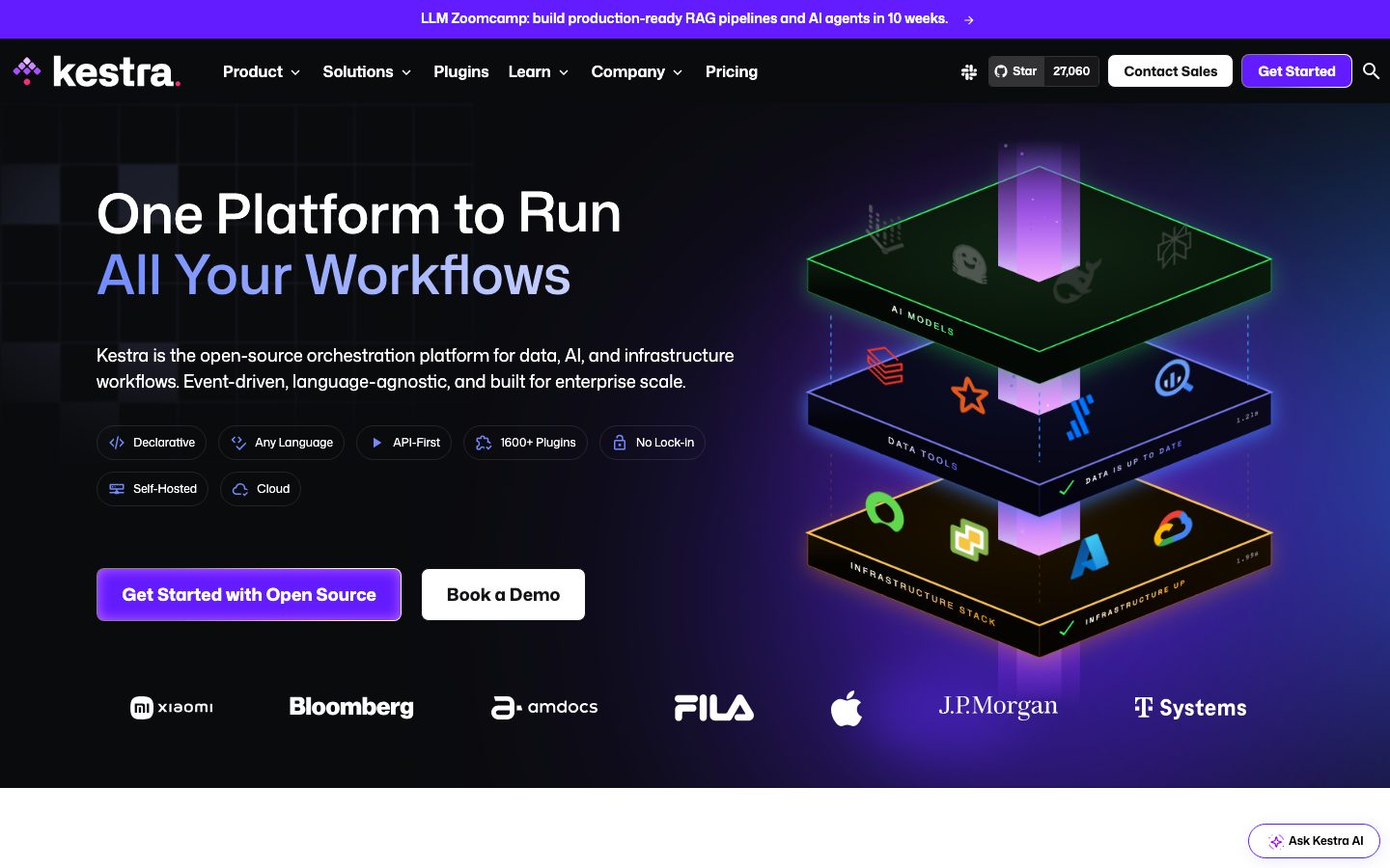
A developer-orchestration platform interface built on a dark near-black hero canvas with electric-violet accents, transitioning into bright white content sections below the fold. The system reads as confident open-source-enterprise tooling — Mona Sans typography throughout, generous 12px-radius white cards floating on soft blue-tinted shadows, pill-shaped feature chips, and a violet CTA that carries nearly all the brand voltage. The dark-to-light scroll rhythm and the single violet accent define the voice.
---
version: alpha
name: Kestra-design-analysis
description: A developer-orchestration platform interface built on a dark near-black hero canvas with electric-violet accents, transitioning into bright white content sections below the fold. The system reads as confident open-source-enterprise tooling — Mona Sans typography throughout, generous 12px-radius white cards floating on soft blue-tinted shadows, pill-shaped feature chips, and a violet CTA that carries nearly all the brand voltage. The dark-to-light scroll rhythm and the single violet accent define the voice.

colors:
  ink: "#131316"
  canvas: "#ffffff"
  link: "#000000"
  neutral-strong: "#212529"
  neutral: "#3b3a41"
  neutral-mid: "#404559"
  muted: "#6c757d"
  muted-soft: "#7f7f86"
  muted-light: "#9797a6"
  hairline: "#cfd3d6"
  surface-soft: "#f7f7f7"
  surface-soft-alt: "#f8f9fa"
  surface-accent-tint: "#f1efff"
  accent: "#631bff"
  accent-soft: "#8465ff"
  accent-blue: "#0d6efd"
  accent-blue-bright: "#3991ff"
  accent-blue-deep: "#1761fd"
  on-dark: "#ffffff"
  error: "#dc3545"
  success: "#198754"

typography:
  h1:
    fontFamily: "Mona Sans, Inter, sans-serif"
    fontSize: 56px
    fontWeight: 500
    lineHeight: 1.125
    letterSpacing: normal
  h2:
    fontFamily: "Mona Sans, Inter, sans-serif"
    fontSize: 32px
    fontWeight: 600
    lineHeight: 1.2
    letterSpacing: normal
  h4:
    fontFamily: "Mona Sans, Inter, sans-serif"
    fontSize: 24px
    fontWeight: 600
    lineHeight: 1.2
    letterSpacing: normal
  h3:
    fontFamily: "Mona Sans, Inter, sans-serif"
    fontSize: 20px
    fontWeight: 600
    lineHeight: 1.2
    letterSpacing: normal
  body:
    fontFamily: "Mona Sans, Inter, sans-serif"
    fontSize: 18px
    fontWeight: 400
    lineHeight: 1.5
    letterSpacing: normal
  button:
    fontFamily: "Mona Sans, Inter, sans-serif"
    fontSize: 16px
    fontWeight: 400
    lineHeight: 1.5
    letterSpacing: normal

rounded:
  xs: 4px
  sm: 6px
  md: 8px
  lg: 12px
  xl: 16px
  xxl: 32px
  pill: 40px
  full: 9999px

spacing:
  xxs: 4px
  xs: 8px
  sm: 12px
  md: 16px
  lg: 24px

components:
  promo-banner:
    backgroundColor: "{colors.accent}"
    textColor: "{colors.on-dark}"
    typography: "{typography.button}"
    padding: 16px
  top-nav:
    backgroundColor: "{colors.ink}"
    textColor: "{colors.on-dark}"
    typography: "{typography.button}"
    height: 72px
  button-primary:
    backgroundColor: "{colors.accent}"
    textColor: "{colors.on-dark}"
    typography: "{typography.button}"
    rounded: "{rounded.lg}"
    padding: 16px 24px
  button-secondary:
    backgroundColor: "{colors.canvas}"
    textColor: "{colors.ink}"
    typography: "{typography.button}"
    rounded: "{rounded.lg}"
    padding: 16px 24px
  button-nav-cta:
    backgroundColor: "{colors.accent}"
    textColor: "{colors.on-dark}"
    typography: "{typography.button}"
    rounded: "{rounded.md}"
    padding: 8px 16px
  feature-chip:
    backgroundColor: transparent
    textColor: "{colors.on-dark}"
    typography: "{typography.button}"
    rounded: "{rounded.pill}"
    padding: 8px 16px
  card:
    backgroundColor: "{colors.canvas}"
    textColor: "{colors.ink}"
    typography: "{typography.body}"
    rounded: "{rounded.md}"
    padding: 24px
  diagram-card-light:
    backgroundColor: "{colors.surface-soft}"
    textColor: "{colors.ink}"
    typography: "{typography.body}"
    rounded: "{rounded.lg}"
    padding: 24px
  diagram-card-dark:
    backgroundColor: "{colors.ink}"
    textColor: "{colors.on-dark}"
    typography: "{typography.body}"
    rounded: "{rounded.lg}"
    padding: 24px
  ask-ai-pill:
    backgroundColor: "{colors.canvas}"
    textColor: "{colors.ink}"
    typography: "{typography.button}"
    rounded: "{rounded.pill}"
    padding: 8px 16px
  stat-band:
    backgroundColor: "{colors.surface-accent-tint}"
    textColor: "{colors.ink}"
    typography: "{typography.h2}"
    padding: 24px
  input:
    backgroundColor: "{colors.canvas}"
    textColor: "{colors.ink}"
    typography: "{typography.body}"
    padding: 12px 16px
  text-link:
    backgroundColor: transparent
    textColor: "{colors.accent}"
    typography: "{typography.button}"
---

## Overview

Kestra's marketing surface is a developer-orchestration interface defined by a **dark-to-light scroll rhythm**. The hero opens on a near-black canvas (`{colors.ink}` — #131316) with an electric-violet accent (`{colors.accent}` — #631bff) carrying the brand voltage — the headline's second line, the primary CTA, and the top promo banner all run violet. As the page scrolls, sections flip to bright white (`{colors.canvas}` — #ffffff) and soft tints (`{colors.surface-soft}` — #f7f7f7, `{colors.surface-accent-tint}` — #f1efff), giving the long-scroll page a clear editorial cadence: dark hero → white feature bands → tinted stat band → dark "deploy anywhere" closer.

Typography is single-family: **Mona Sans** (GitHub's open-source variable typeface, self-hosted here) runs every role from the 56px h1 down to the 16px button label. There is no display/body split — hierarchy comes entirely from size and weight (h1 at weight 500, all sub-headings at 600, body at 400). Letter-spacing stays at the font's natural metrics throughout.

Component voltage comes from **floating white cards on faint blue-tinted shadows** (`rgba(57, 82, 242, 0.1)`) and from **pill-shaped feature chips** on the dark hero (Declarative, Any Language, API-First, 1600+ Plugins). The violet accent is scarce and deliberate — it appears on the CTA, the headline highlight, inline links, and the promo banner, never as a flood fill across cards.

**Key Characteristics:**
- Dark near-black hero (`{colors.ink}` — #131316) with electric-violet accent (`{colors.accent}` — #631bff). The violet is the single brand color.
- Mona Sans across every type role — open-source, self-hosted, weight 500 headline / 600 sub-heads / 400 body.
- White cards (`{component.card}`) at `{rounded.md}` (8px) on a faint blue-tinted shadow (`rgba(57, 82, 242, 0.1)`) — the signature elevation.
- Pill-shaped feature chips (`{component.feature-chip}`) at `{rounded.pill}` (40px) on the dark hero — outlined capsule tags with small leading icons.
- Dark-to-light scroll cadence: violet banner → dark hero → white feature bands → `{colors.surface-accent-tint}` stat band → dark closer.
- Hierarchical radius: `{rounded.md}` (8px) for cards, `{rounded.lg}` (12px) for diagram cards and CTAs, `{rounded.pill}` (40px) for chips and the floating "Ask Kestra AI" pill.
- Spacing rhythm built on a 4px base — `{spacing.sm}` (12px) and `{spacing.md}` (16px) dominate the measured padding/gap distribution.

## Colors

### Brand & Accent
- **Accent** (`{colors.accent}` — #631bff): The dominant brand color. Primary CTA fill, the second line of the hero headline ("All Your Workflows"), the promo banner, and inline section emphasis ("Kestra is Built for the Whole Organization").
- **Accent Soft** (`{colors.accent-soft}` — #8465ff): A lighter violet used for the headline gradient/highlight tone and softer accent moments.
- **Accent Blue** family (`{colors.accent-blue}` — #0d6efd, `{colors.accent-blue-bright}` — #3991ff, `{colors.accent-blue-deep}` — #1761fd): A blue accent set appearing in product diagram artifacts (the isometric stack illustration, integration tile glyphs) and the blue-tinted card shadow tone.

### Surface
- **Canvas** (`{colors.canvas}` — #ffffff): The default floor for content bands below the hero and the fill for floating cards.
- **Surface Soft** (`{colors.surface-soft}` — #f7f7f7) and **Surface Soft Alt** (`{colors.surface-soft-alt}` — #f8f9fa): Light section backgrounds and the "Legacy approach" diagram card fill.
- **Surface Accent Tint** (`{colors.surface-accent-tint}` — #f1efff): A pale violet wash used on the stat band and logo-strip sections — the only place the brand violet appears as a background.
- **Ink** (`{colors.ink}` — #131316): The dark hero background and the dark "Deploy Anywhere" closing band, plus all primary headline/body text on light surfaces.

### Text
- **Ink** (`{colors.ink}` — #131316): Headlines and primary text on light surfaces.
- **Link** (`{colors.link}` — #000000): Default measured link color (true black) for some anchor text.
- **Neutral** (`{colors.neutral}` — #3b3a41) and **Neutral Strong** (`{colors.neutral-strong}` — #212529): Dark body/secondary text tones.
- **Neutral Mid** (`{colors.neutral-mid}` — #404559): A blue-gray used in diagram labels.
- **Muted** (`{colors.muted}` — #6c757d), **Muted Soft** (`{colors.muted-soft}` — #7f7f86), **Muted Light** (`{colors.muted-light}` — #9797a6): Secondary, tertiary, and fine-print text tones.
- **On Dark** (`{colors.on-dark}` — #ffffff): All text and chip labels on the dark hero and dark closing band.

### Lines
- **Hairline** (`{colors.hairline}` — #cfd3d6): 1px borders, chip outlines, and divider tone on light surfaces.

### Semantic
- **Error** (`{colors.error}` — #dc3545): Validation / error states.
- **Success** (`{colors.success}` — #198754): Confirmation states and the green "DATA IS UP TO DATE" / checkmark cues in product illustrations.

## Typography

### Font Family
The system runs a single typeface: **Mona Sans** (GitHub's open-source variable font, self-hosted here under a hashed filename). It carries every role — headline, sub-heads, body, and button labels. The fallback stack walks `Inter, sans-serif`. Because Mona Sans is open-source, it can ship directly; no licensed substitute is required.

Hierarchy is built from size + weight alone, with letter-spacing left at the font's natural metrics ("normal") across all roles:
- Headline (h1): weight 500 — the marquee headline runs lighter than the sub-heads.
- Sub-heads (h2/h3/h4): weight 600.
- Body + buttons: weight 400.

### Hierarchy

| Token | Size | Weight | Line Height | Letter Spacing | Use |
|---|---|---|---|---|---|
| `{typography.h1}` | 56px | 500 | 1.125 | normal | Hero headline ("One Platform to Run / All Your Workflows") |
| `{typography.h2}` | 32px | 600 | 1.2 | normal | Section heads ("Adopt Once. Standardize Everywhere.") |
| `{typography.h4}` | 24px | 600 | 1.2 | normal | Larger card / sub-section titles |
| `{typography.h3}` | 20px | 600 | 1.2 | normal | Smaller card titles, list labels |
| `{typography.body}` | 18px | 400 | 1.5 | normal | Default running-text and hero sub-headline |
| `{typography.button}` | 16px | 400 | 1.5 | normal | Button labels, nav links, chip text |

Note: the measured h4 (24px) is larger than h3 (20px) — the system numbers its heading tags by usage role rather than strict size descent. Both are documented as measured.

### Principles
One family, weight-driven hierarchy. The h1 deliberately runs at weight 500 (lighter than the 600 sub-heads) — a confident, slightly airy marquee. Body stays at weight 400 / 18px with 1.5 line-height for comfortable long-form reading. Never bold the h1 to match the sub-heads; the weight contrast is intentional.

### Note on Font Substitutes
Mona Sans is open-source and ships directly. If unavailable, **Inter** (already in the fallback stack) is the documented substitute — it shares humanist proportions and a similar x-height, though Mona Sans's variable axes and slightly wider forms differ.

## Layout

### Spacing System
- **Base unit:** 4px.
- **Tokens:** `{spacing.xxs}` 4px · `{spacing.xs}` 8px · `{spacing.sm}` 12px · `{spacing.md}` 16px · `{spacing.lg}` 24px.
- **Dominant rhythm:** `{spacing.sm}` (12px) is the single most-measured value (gaps inside chips, button rows, card internals), with `{spacing.md}` (16px) and `{spacing.xs}` (8px) close behind.
- **Card internal padding:** `{spacing.lg}` (24px) for content cards and diagram cards.

### Grid & Container
- **Hero:** Two-column split — headline + sub-head + chips + CTA row on the left, the isometric "stack" product illustration on the right.
- **Feature bands:** Centered single-column heads with 2-up comparison cards ("Legacy approach" vs "The Kestra Way").
- **Logo strip:** Horizontal customer-logo row (Xiaomi, Bloomberg, amdocs, FILA, Apple, J.P.Morgan, T-Systems).
- **Stat band:** 3-up metric columns ("Billions", "< 3 Months", "100+") on `{colors.surface-accent-tint}`.

### Whitespace Philosophy
Kestra alternates large dark and light bands with generous vertical breathing room. The hero is dense (headline + sub-head + six chips + two CTAs + logo strip), but lower bands isolate a single statement per screen ("Adopt Once. Standardize Everywhere.") with substantial empty space — letting the product illustrations and diagrams carry the section.

## Elevation & Depth

| Level | Treatment | Use |
|---|---|---|
| Flat | No shadow | Dark hero band, light section backgrounds |
| Card soft | `rgba(57, 82, 242, 0.1) 0px 2px 4px 0px` | The most common elevation — buttons, small cards, chips (160 occurrences measured) |
| Card raised | `rgba(57, 82, 242, 0.1) 2px 3px 16px 0px` | Floating white content cards (`{component.card}`) |
| Dark card | `rgb(34, 34, 47) 2px 3px 16px 0px` | Dark diagram cards ("The Kestra Way") on light backgrounds |
| Violet glow | `rgba(144, 65, 255, 0.3) 0px 0px 6px 0px` | Accent glow on the "Ask Kestra AI" pill and hover-emphasis moments |
| Stacked / illustrative | `rgb(204, 203, 206) -3px 4px 0px, rgba(167, 150, 255, 0.3) -15px 20px 40px 0px` | The stacked-cards illustration ("One Platform. All Your Workflows.") — a layered drop with violet diffusion |

The shadow signature is the **blue-violet tint** — Kestra never uses neutral gray shadows. Even the softest card shadow carries `rgba(57, 82, 242, 0.1)`, tying the elevation system to the brand accent. Inset violet glows (`rgb(190, 98, 255) 0px 0px 14px inset`) appear on interactive accent surfaces.

### Decorative Depth
- The hero's isometric "stack" illustration (AI Models / Data Tools / Infrastructure Stack layers) uses neon edge-glows and a vertical violet light column — product chrome shown as hero art, not a system token.
- Violet radial glows bloom behind the dark closing band ("Deploy Anywhere. Keep Everything Governed.").

## Shapes

### Border Radius Scale

| Token | Value | Use |
|---|---|---|
| `{rounded.xs}` | 4px | Small inline elements, inner glyph tiles (101 occurrences) |
| `{rounded.sm}` | 6px | Minor controls |
| `{rounded.md}` | 8px | Content cards (`{component.card}`) |
| `{rounded.lg}` | 12px | Diagram cards, primary/secondary CTAs (195 occurrences — the dominant content radius) |
| `{rounded.xl}` | 16px | Larger panels |
| `{rounded.xxl}` | 32px | Large feature/illustration containers |
| `{rounded.pill}` | 40px | Feature chips, "Ask Kestra AI" pill, capsule tags |
| `{rounded.full}` | 9999px | Fully circular elements |

### Geometry
The system pairs **8–12px content cards** with **40px pill chips** — the contrast between gently-rounded rectangles and fully-capsule chips is a recurring motif. The hero feature chips (Declarative, Any Language, API-First, 1600+ Plugins, No Lock-In, Self-Hosted, Cloud) all use `{rounded.pill}` with small leading icons.

## Components

### Banner & Navigation

**`promo-banner`** — Full-width violet bar pinned above the nav. Background `{colors.accent}` (#631bff), text `{colors.on-dark}`, padding `{spacing.md}` (16px). Carries a single announcement line with a trailing arrow ("LLM Zoomcamp: build production-ready RAG pipelines…").

**`top-nav`** — Dark navigation bar over the hero. Background `{colors.ink}`, text `{colors.on-dark}`, ~72px tall (derived from screenshot). Carries the Kestra wordmark + violet dot logo at left, primary menu (Product, Solutions, Plugins, Learn, Company, Pricing) center, and a right cluster: Slack/GitHub-star count, a white `{component.button-secondary}` ("Contact Sales"), and a violet `{component.button-nav-cta}` ("Get Started") plus a search icon.

### Buttons

**`button-primary`** — The signature CTA ("Get Started with Open Source"). Background `{colors.accent}` (#631bff), text `{colors.on-dark}`, type `{typography.button}` (Mona Sans 16px / 400), rounded `{rounded.lg}` (12px, derived — the measured anchor reported 0px because the CTA is a styled link element), padding 16px × 24px. Carries a faint blue-tinted soft shadow.

**`button-secondary`** — White button with hairline outline ("Book a Demo", "Contact Sales"). Background `{colors.canvas}`, text `{colors.ink}`, type `{typography.button}`, rounded `{rounded.lg}` (derived), padding 16px × 24px.

**`button-nav-cta`** — Compact violet nav CTA ("Get Started" in the top bar). Background `{colors.accent}`, text `{colors.on-dark}`, rounded `{rounded.md}` (derived), padding 8px × 16px.

**`text-link`** — Inline accent link ("See product features →", "Read the story"). Transparent background, text `{colors.accent}`, type `{typography.button}`.

### Chips & Pills

**`feature-chip`** — Outlined capsule tags on the dark hero (Declarative, Any Language, API-First, 1600+ Plugins, No Lock-In, Self-Hosted, Cloud). Transparent background, text `{colors.on-dark}`, hairline outline, type `{typography.button}`, rounded `{rounded.pill}` (40px), padding 8px × 16px. Each carries a small leading line-icon.

**`ask-ai-pill`** — Floating bottom-right capsule ("Ask Kestra AI"). Background `{colors.canvas}`, text `{colors.ink}`, rounded `{rounded.pill}`, padding 8px × 16px, carrying the violet glow shadow (`rgba(144, 65, 255, 0.3) 0px 0px 6px`).

### Cards & Containers

**`card`** — The base floating white card. Background `{colors.canvas}`, text `{colors.ink}`, type `{typography.body}`, rounded `{rounded.md}` (8px), padding `{spacing.lg}` (24px), elevated on the raised blue-tinted shadow (`rgba(57, 82, 242, 0.1) 2px 3px 16px`).

**`diagram-card-light`** — The "Legacy approach" comparison card. Background `{colors.surface-soft}` (#f7f7f7), text `{colors.ink}`, rounded `{rounded.lg}` (12px), padding `{spacing.lg}`. Holds a small flow diagram (Data Orchestrator → Infra Tool → AI Scripts) with red error dots.

**`diagram-card-dark`** — The "Kestra Way" comparison card. Background `{colors.ink}`, text `{colors.on-dark}`, rounded `{rounded.lg}`, padding `{spacing.lg}`, raised on the dark shadow (`rgb(34, 34, 47) 2px 3px 16px`). Holds the unified-orchestration diagram (Data / Infra / AI under one Kestra node).

**`stat-band`** — The metrics row on a pale violet wash. Background `{colors.surface-accent-tint}` (#f1efff), text `{colors.ink}`, type `{typography.h2}` for the big numbers. Three columns: "Billions" / "< 3 Months" / "100+" with `{typography.body}` captions.

### Inputs

**`input`** — Text input. Background `{colors.canvas}`, text `{colors.ink}`, type `{typography.body}`, padding 12px × 16px. Measured border-radius was 0px (sharp corners); see Known Gaps.

## Do's and Don'ts

### Do
- Reserve `{colors.accent}` (#631bff) for the primary CTA, headline highlight, promo banner, and inline links. The violet is scarce and deliberate.
- Run Mona Sans for everything — let size and weight build hierarchy, not a second family.
- Keep the h1 at weight 500 (lighter than the 600 sub-heads). The weight contrast is the headline's character.
- Use the blue-tinted shadow (`rgba(57, 82, 242, 0.1)`) on floating cards — never a neutral gray shadow.
- Pair gently-rounded content cards (`{rounded.md}`/`{rounded.lg}`) with fully-capsule chips (`{rounded.pill}` 40px). The radius contrast is a signature.
- Alternate dark and light bands as you scroll — violet banner → dark hero → white feature bands → tinted stat band → dark closer.

### Don't
- Don't flood card backgrounds with violet — the accent stays on CTAs, links, and the single pale-violet stat band, not on every surface.
- Don't bold the hero headline to match the sub-heads; weight 500 is intentional.
- Don't introduce a second typeface — the system is single-family.
- Don't use neutral gray shadows; every elevation tier carries the blue-violet tint.
- Don't add a third radius personality — content rounds at 8–12px, chips capsule at 40px, and that's the whole vocabulary.
- Don't document hover state styling beyond default and active/pressed.

## Responsive Behavior

### Breakpoints

| Name | Width | Key Changes |
|---|---|---|
| Mobile | < 768px | Hamburger nav; hero collapses to single column (headline → sub-head → chips wrap → CTAs stack); comparison diagram cards stack 1-up; stat band 3 → 1 column; logo strip wraps |
| Tablet | 768–1024px | Nav tightens; hero illustration scales beside or below headline; comparison cards stay 2-up; chips wrap to multiple rows |
| Desktop | 1024–1440px | Full top-nav with all menu items; two-column hero with isometric illustration at right; 2-up diagram cards; 3-up stat band |
| Wide | > 1440px | Same as desktop with more outer breathing room |

### Touch Targets
- `{component.button-primary}` and `{component.button-secondary}` carry 16px × 24px padding with 16px type — comfortably above 44px effective height.
- `{component.feature-chip}` at 8px × 16px padding plus icon meets tap-area minimums via the pill silhouette.
- `{component.button-nav-cta}` is the most compact control (8px × 16px) — relies on the surrounding nav row spacing.

### Collapsing Strategy
- Top nav collapses to a hamburger sheet on mobile.
- The hero's two-column split stacks: headline + sub-head + chips + CTAs first, isometric illustration below.
- Feature chips wrap from a 5-up + 2-up row arrangement to multi-row on narrow widths rather than shrinking.
- Comparison diagram cards (`diagram-card-light` / `diagram-card-dark`) stack vertically on mobile.
- The stat band reduces 3 → 1 column.

### Image Behavior
- The hero isometric "stack" illustration scales proportionally and retains its neon edge-glows.
- Customer logos in the strip reflow into wrapping rows.

## Iteration Guide

1. Focus on ONE component at a time. Reference its YAML key directly (`{component.card}`, `{component.feature-chip}`).
2. Variants of an existing component (`-active`, `-disabled`, focus) live as separate entries in `components:`.
3. Use `{token.refs}` everywhere — never inline a hex.
4. Never document hover. Default and Active/Pressed states only.
5. The violet accent is scarce — when adding emphasis, prefer size/weight before adding more violet.
6. All shadows carry the blue-violet tint; don't introduce neutral-gray elevation.
7. Keep the dark-to-light scroll cadence intact when adding sections.

## Known Gaps

- The measured `button-primary` returned `color: #131316, radius: 0px, padding: 0px` — Kestra renders its CTAs as styled `<a>` link elements, so the button selector captured a degenerate box. CTA radius (`{rounded.lg}`), padding, and the violet fill are documented from screenshot ground-truth and flagged **derived** where used.
- The measured `input` returned `radius: 0px` (sharp corners). No fill, border, or focus-state color was captured; input styling beyond the measured radius is not documented.
- Nav height (72px) is **derived** from screenshot proportions, not a measured token.
- The dark footer below the "Deploy Anywhere" band was not captured in the analysis; its exact colors and layout are out of scope.
- The blue accent set (`{colors.accent-blue}`, `{colors.accent-blue-bright}`, `{colors.accent-blue-deep}`) was measured by frequency but its precise role mapping (which appears in product illustrations vs. UI chrome) is inferred from screenshots.
- Mona Sans is self-hosted under a hashed filename; the analysis did not flag it as licensed (it is GitHub's open-source typeface), so it ships directly with Inter as fallback.
- Animation and transition timings (hero illustration glow, card reveals, "See Kestra in 60 seconds" video trigger) are not in scope.
- Disabled, focus, and error/success form states were not extracted and would need a sign-up or contact flow to confirm.

<!-- Documented by duply · real-world design systems as ready-to-use DESIGN.md for AI coding agents · https://duply.ai/kestra/design-md -->
Color Palette
Accent
Neutrals
Typography
h156px · 500 · 1.125
The quick brown fox jumpsh232px · 600 · 1.2
The quick brown fox jumpsh424px · 600 · 1.2
The quick brown fox jumpsh320px · 600 · 1.2
The quick brown fox jumpsbody18px · 400 · 1.5
The quick brown fox jumpsbutton16px · 400 · 1.5
The quick brown fox jumpsSpacing & Shape
Spacing
| Name | Value | Preview |
|---|---|---|
| xxs | 4px | |
| xs | 8px | |
| sm | 12px | |
| md | 16px | |
| lg | 24px |
Border Radius
| Name | Value | Preview |
|---|---|---|
| xs | 4px | |
| sm | 6px | |
| md | 8px | |
| lg | 12px | |
| xl | 16px | |
| xxl | 32px | |
| pill | 40px | |
| full | 9999px |
More like this


---
version: alpha
name: Kestra-design-analysis
description: A developer-orchestration platform interface built on a dark near-black hero canvas with electric-violet accents, transitioning into bright white content sections below the fold. The system reads as confident open-source-enterprise tooling — Mona Sans typography throughout, generous 12px-radius white cards floating on soft blue-tinted shadows, pill-shaped feature chips, and a violet CTA that carries nearly all the brand voltage. The dark-to-light scroll rhythm and the single violet accent define the voice.

colors:
  ink: "#131316"
  canvas: "#ffffff"
  link: "#000000"
  neutral-strong: "#212529"
  neutral: "#3b3a41"
  neutral-mid: "#404559"
  muted: "#6c757d"
  muted-soft: "#7f7f86"
  muted-light: "#9797a6"
  hairline: "#cfd3d6"
  surface-soft: "#f7f7f7"
  surface-soft-alt: "#f8f9fa"
  surface-accent-tint: "#f1efff"
  accent: "#631bff"
  accent-soft: "#8465ff"
  accent-blue: "#0d6efd"
  accent-blue-bright: "#3991ff"
  accent-blue-deep: "#1761fd"
  on-dark: "#ffffff"
  error: "#dc3545"
  success: "#198754"

typography:
  h1:
    fontFamily: "Mona Sans, Inter, sans-serif"
    fontSize: 56px
    fontWeight: 500
    lineHeight: 1.125
    letterSpacing: normal
  h2:
    fontFamily: "Mona Sans, Inter, sans-serif"
    fontSize: 32px
    fontWeight: 600
    lineHeight: 1.2
    letterSpacing: normal
  h4:
    fontFamily: "Mona Sans, Inter, sans-serif"
    fontSize: 24px
    fontWeight: 600
    lineHeight: 1.2
    letterSpacing: normal
  h3:
    fontFamily: "Mona Sans, Inter, sans-serif"
    fontSize: 20px
    fontWeight: 600
    lineHeight: 1.2
    letterSpacing: normal
  body:
    fontFamily: "Mona Sans, Inter, sans-serif"
    fontSize: 18px
    fontWeight: 400
    lineHeight: 1.5
    letterSpacing: normal
  button:
    fontFamily: "Mona Sans, Inter, sans-serif"
    fontSize: 16px
    fontWeight: 400
    lineHeight: 1.5
    letterSpacing: normal

rounded:
  xs: 4px
  sm: 6px
  md: 8px
  lg: 12px
  xl: 16px
  xxl: 32px
  pill: 40px
  full: 9999px

spacing:
  xxs: 4px
  xs: 8px
  sm: 12px
  md: 16px
  lg: 24px

components:
  promo-banner:
    backgroundColor: "{colors.accent}"
    textColor: "{colors.on-dark}"
    typography: "{typography.button}"
    padding: 16px
  top-nav:
    backgroundColor: "{colors.ink}"
    textColor: "{colors.on-dark}"
    typography: "{typography.button}"
    height: 72px
  button-primary:
    backgroundColor: "{colors.accent}"
    textColor: "{colors.on-dark}"
    typography: "{typography.button}"
    rounded: "{rounded.lg}"
    padding: 16px 24px
  button-secondary:
    backgroundColor: "{colors.canvas}"
    textColor: "{colors.ink}"
    typography: "{typography.button}"
    rounded: "{rounded.lg}"
    padding: 16px 24px
  button-nav-cta:
    backgroundColor: "{colors.accent}"
    textColor: "{colors.on-dark}"
    typography: "{typography.button}"
    rounded: "{rounded.md}"
    padding: 8px 16px
  feature-chip:
    backgroundColor: transparent
    textColor: "{colors.on-dark}"
    typography: "{typography.button}"
    rounded: "{rounded.pill}"
    padding: 8px 16px
  card:
    backgroundColor: "{colors.canvas}"
    textColor: "{colors.ink}"
    typography: "{typography.body}"
    rounded: "{rounded.md}"
    padding: 24px
  diagram-card-light:
    backgroundColor: "{colors.surface-soft}"
    textColor: "{colors.ink}"
    typography: "{typography.body}"
    rounded: "{rounded.lg}"
    padding: 24px
  diagram-card-dark:
    backgroundColor: "{colors.ink}"
    textColor: "{colors.on-dark}"
    typography: "{typography.body}"
    rounded: "{rounded.lg}"
    padding: 24px
  ask-ai-pill:
    backgroundColor: "{colors.canvas}"
    textColor: "{colors.ink}"
    typography: "{typography.button}"
    rounded: "{rounded.pill}"
    padding: 8px 16px
  stat-band:
    backgroundColor: "{colors.surface-accent-tint}"
    textColor: "{colors.ink}"
    typography: "{typography.h2}"
    padding: 24px
  input:
    backgroundColor: "{colors.canvas}"
    textColor: "{colors.ink}"
    typography: "{typography.body}"
    padding: 12px 16px
  text-link:
    backgroundColor: transparent
    textColor: "{colors.accent}"
    typography: "{typography.button}"
---

## Overview

Kestra's marketing surface is a developer-orchestration interface defined by a **dark-to-light scroll rhythm**. The hero opens on a near-black canvas (`{colors.ink}` — #131316) with an electric-violet accent (`{colors.accent}` — #631bff) carrying the brand voltage — the headline's second line, the primary CTA, and the top promo banner all run violet. As the page scrolls, sections flip to bright white (`{colors.canvas}` — #ffffff) and soft tints (`{colors.surface-soft}` — #f7f7f7, `{colors.surface-accent-tint}` — #f1efff), giving the long-scroll page a clear editorial cadence: dark hero → white feature bands → tinted stat band → dark "deploy anywhere" closer.

Typography is single-family: **Mona Sans** (GitHub's open-source variable typeface, self-hosted here) runs every role from the 56px h1 down to the 16px button label. There is no display/body split — hierarchy comes entirely from size and weight (h1 at weight 500, all sub-headings at 600, body at 400). Letter-spacing stays at the font's natural metrics throughout.

Component voltage comes from **floating white cards on faint blue-tinted shadows** (`rgba(57, 82, 242, 0.1)`) and from **pill-shaped feature chips** on the dark hero (Declarative, Any Language, API-First, 1600+ Plugins). The violet accent is scarce and deliberate — it appears on the CTA, the headline highlight, inline links, and the promo banner, never as a flood fill across cards.

**Key Characteristics:**
- Dark near-black hero (`{colors.ink}` — #131316) with electric-violet accent (`{colors.accent}` — #631bff). The violet is the single brand color.
- Mona Sans across every type role — open-source, self-hosted, weight 500 headline / 600 sub-heads / 400 body.
- White cards (`{component.card}`) at `{rounded.md}` (8px) on a faint blue-tinted shadow (`rgba(57, 82, 242, 0.1)`) — the signature elevation.
- Pill-shaped feature chips (`{component.feature-chip}`) at `{rounded.pill}` (40px) on the dark hero — outlined capsule tags with small leading icons.
- Dark-to-light scroll cadence: violet banner → dark hero → white feature bands → `{colors.surface-accent-tint}` stat band → dark closer.
- Hierarchical radius: `{rounded.md}` (8px) for cards, `{rounded.lg}` (12px) for diagram cards and CTAs, `{rounded.pill}` (40px) for chips and the floating "Ask Kestra AI" pill.
- Spacing rhythm built on a 4px base — `{spacing.sm}` (12px) and `{spacing.md}` (16px) dominate the measured padding/gap distribution.

## Colors

### Brand & Accent
- **Accent** (`{colors.accent}` — #631bff): The dominant brand color. Primary CTA fill, the second line of the hero headline ("All Your Workflows"), the promo banner, and inline section emphasis ("Kestra is Built for the Whole Organization").
- **Accent Soft** (`{colors.accent-soft}` — #8465ff): A lighter violet used for the headline gradient/highlight tone and softer accent moments.
- **Accent Blue** family (`{colors.accent-blue}` — #0d6efd, `{colors.accent-blue-bright}` — #3991ff, `{colors.accent-blue-deep}` — #1761fd): A blue accent set appearing in product diagram artifacts (the isometric stack illustration, integration tile glyphs) and the blue-tinted card shadow tone.

### Surface
- **Canvas** (`{colors.canvas}` — #ffffff): The default floor for content bands below the hero and the fill for floating cards.
- **Surface Soft** (`{colors.surface-soft}` — #f7f7f7) and **Surface Soft Alt** (`{colors.surface-soft-alt}` — #f8f9fa): Light section backgrounds and the "Legacy approach" diagram card fill.
- **Surface Accent Tint** (`{colors.surface-accent-tint}` — #f1efff): A pale violet wash used on the stat band and logo-strip sections — the only place the brand violet appears as a background.
- **Ink** (`{colors.ink}` — #131316): The dark hero background and the dark "Deploy Anywhere" closing band, plus all primary headline/body text on light surfaces.

### Text
- **Ink** (`{colors.ink}` — #131316): Headlines and primary text on light surfaces.
- **Link** (`{colors.link}` — #000000): Default measured link color (true black) for some anchor text.
- **Neutral** (`{colors.neutral}` — #3b3a41) and **Neutral Strong** (`{colors.neutral-strong}` — #212529): Dark body/secondary text tones.
- **Neutral Mid** (`{colors.neutral-mid}` — #404559): A blue-gray used in diagram labels.
- **Muted** (`{colors.muted}` — #6c757d), **Muted Soft** (`{colors.muted-soft}` — #7f7f86), **Muted Light** (`{colors.muted-light}` — #9797a6): Secondary, tertiary, and fine-print text tones.
- **On Dark** (`{colors.on-dark}` — #ffffff): All text and chip labels on the dark hero and dark closing band.

### Lines
- **Hairline** (`{colors.hairline}` — #cfd3d6): 1px borders, chip outlines, and divider tone on light surfaces.

### Semantic
- **Error** (`{colors.error}` — #dc3545): Validation / error states.
- **Success** (`{colors.success}` — #198754): Confirmation states and the green "DATA IS UP TO DATE" / checkmark cues in product illustrations.

## Typography

### Font Family
The system runs a single typeface: **Mona Sans** (GitHub's open-source variable font, self-hosted here under a hashed filename). It carries every role — headline, sub-heads, body, and button labels. The fallback stack walks `Inter, sans-serif`. Because Mona Sans is open-source, it can ship directly; no licensed substitute is required.

Hierarchy is built from size + weight alone, with letter-spacing left at the font's natural metrics ("normal") across all roles:
- Headline (h1): weight 500 — the marquee headline runs lighter than the sub-heads.
- Sub-heads (h2/h3/h4): weight 600.
- Body + buttons: weight 400.

### Hierarchy

| Token | Size | Weight | Line Height | Letter Spacing | Use |
|---|---|---|---|---|---|
| `{typography.h1}` | 56px | 500 | 1.125 | normal | Hero headline ("One Platform to Run / All Your Workflows") |
| `{typography.h2}` | 32px | 600 | 1.2 | normal | Section heads ("Adopt Once. Standardize Everywhere.") |
| `{typography.h4}` | 24px | 600 | 1.2 | normal | Larger card / sub-section titles |
| `{typography.h3}` | 20px | 600 | 1.2 | normal | Smaller card titles, list labels |
| `{typography.body}` | 18px | 400 | 1.5 | normal | Default running-text and hero sub-headline |
| `{typography.button}` | 16px | 400 | 1.5 | normal | Button labels, nav links, chip text |

Note: the measured h4 (24px) is larger than h3 (20px) — the system numbers its heading tags by usage role rather than strict size descent. Both are documented as measured.

### Principles
One family, weight-driven hierarchy. The h1 deliberately runs at weight 500 (lighter than the 600 sub-heads) — a confident, slightly airy marquee. Body stays at weight 400 / 18px with 1.5 line-height for comfortable long-form reading. Never bold the h1 to match the sub-heads; the weight contrast is intentional.

### Note on Font Substitutes
Mona Sans is open-source and ships directly. If unavailable, **Inter** (already in the fallback stack) is the documented substitute — it shares humanist proportions and a similar x-height, though Mona Sans's variable axes and slightly wider forms differ.

## Layout

### Spacing System
- **Base unit:** 4px.
- **Tokens:** `{spacing.xxs}` 4px · `{spacing.xs}` 8px · `{spacing.sm}` 12px · `{spacing.md}` 16px · `{spacing.lg}` 24px.
- **Dominant rhythm:** `{spacing.sm}` (12px) is the single most-measured value (gaps inside chips, button rows, card internals), with `{spacing.md}` (16px) and `{spacing.xs}` (8px) close behind.
- **Card internal padding:** `{spacing.lg}` (24px) for content cards and diagram cards.

### Grid & Container
- **Hero:** Two-column split — headline + sub-head + chips + CTA row on the left, the isometric "stack" product illustration on the right.
- **Feature bands:** Centered single-column heads with 2-up comparison cards ("Legacy approach" vs "The Kestra Way").
- **Logo strip:** Horizontal customer-logo row (Xiaomi, Bloomberg, amdocs, FILA, Apple, J.P.Morgan, T-Systems).
- **Stat band:** 3-up metric columns ("Billions", "< 3 Months", "100+") on `{colors.surface-accent-tint}`.

### Whitespace Philosophy
Kestra alternates large dark and light bands with generous vertical breathing room. The hero is dense (headline + sub-head + six chips + two CTAs + logo strip), but lower bands isolate a single statement per screen ("Adopt Once. Standardize Everywhere.") with substantial empty space — letting the product illustrations and diagrams carry the section.

## Elevation & Depth

| Level | Treatment | Use |
|---|---|---|
| Flat | No shadow | Dark hero band, light section backgrounds |
| Card soft | `rgba(57, 82, 242, 0.1) 0px 2px 4px 0px` | The most common elevation — buttons, small cards, chips (160 occurrences measured) |
| Card raised | `rgba(57, 82, 242, 0.1) 2px 3px 16px 0px` | Floating white content cards (`{component.card}`) |
| Dark card | `rgb(34, 34, 47) 2px 3px 16px 0px` | Dark diagram cards ("The Kestra Way") on light backgrounds |
| Violet glow | `rgba(144, 65, 255, 0.3) 0px 0px 6px 0px` | Accent glow on the "Ask Kestra AI" pill and hover-emphasis moments |
| Stacked / illustrative | `rgb(204, 203, 206) -3px 4px 0px, rgba(167, 150, 255, 0.3) -15px 20px 40px 0px` | The stacked-cards illustration ("One Platform. All Your Workflows.") — a layered drop with violet diffusion |

The shadow signature is the **blue-violet tint** — Kestra never uses neutral gray shadows. Even the softest card shadow carries `rgba(57, 82, 242, 0.1)`, tying the elevation system to the brand accent. Inset violet glows (`rgb(190, 98, 255) 0px 0px 14px inset`) appear on interactive accent surfaces.

### Decorative Depth
- The hero's isometric "stack" illustration (AI Models / Data Tools / Infrastructure Stack layers) uses neon edge-glows and a vertical violet light column — product chrome shown as hero art, not a system token.
- Violet radial glows bloom behind the dark closing band ("Deploy Anywhere. Keep Everything Governed.").

## Shapes

### Border Radius Scale

| Token | Value | Use |
|---|---|---|
| `{rounded.xs}` | 4px | Small inline elements, inner glyph tiles (101 occurrences) |
| `{rounded.sm}` | 6px | Minor controls |
| `{rounded.md}` | 8px | Content cards (`{component.card}`) |
| `{rounded.lg}` | 12px | Diagram cards, primary/secondary CTAs (195 occurrences — the dominant content radius) |
| `{rounded.xl}` | 16px | Larger panels |
| `{rounded.xxl}` | 32px | Large feature/illustration containers |
| `{rounded.pill}` | 40px | Feature chips, "Ask Kestra AI" pill, capsule tags |
| `{rounded.full}` | 9999px | Fully circular elements |

### Geometry
The system pairs **8–12px content cards** with **40px pill chips** — the contrast between gently-rounded rectangles and fully-capsule chips is a recurring motif. The hero feature chips (Declarative, Any Language, API-First, 1600+ Plugins, No Lock-In, Self-Hosted, Cloud) all use `{rounded.pill}` with small leading icons.

## Components

### Banner & Navigation

**`promo-banner`** — Full-width violet bar pinned above the nav. Background `{colors.accent}` (#631bff), text `{colors.on-dark}`, padding `{spacing.md}` (16px). Carries a single announcement line with a trailing arrow ("LLM Zoomcamp: build production-ready RAG pipelines…").

**`top-nav`** — Dark navigation bar over the hero. Background `{colors.ink}`, text `{colors.on-dark}`, ~72px tall (derived from screenshot). Carries the Kestra wordmark + violet dot logo at left, primary menu (Product, Solutions, Plugins, Learn, Company, Pricing) center, and a right cluster: Slack/GitHub-star count, a white `{component.button-secondary}` ("Contact Sales"), and a violet `{component.button-nav-cta}` ("Get Started") plus a search icon.

### Buttons

**`button-primary`** — The signature CTA ("Get Started with Open Source"). Background `{colors.accent}` (#631bff), text `{colors.on-dark}`, type `{typography.button}` (Mona Sans 16px / 400), rounded `{rounded.lg}` (12px, derived — the measured anchor reported 0px because the CTA is a styled link element), padding 16px × 24px. Carries a faint blue-tinted soft shadow.

**`button-secondary`** — White button with hairline outline ("Book a Demo", "Contact Sales"). Background `{colors.canvas}`, text `{colors.ink}`, type `{typography.button}`, rounded `{rounded.lg}` (derived), padding 16px × 24px.

**`button-nav-cta`** — Compact violet nav CTA ("Get Started" in the top bar). Background `{colors.accent}`, text `{colors.on-dark}`, rounded `{rounded.md}` (derived), padding 8px × 16px.

**`text-link`** — Inline accent link ("See product features →", "Read the story"). Transparent background, text `{colors.accent}`, type `{typography.button}`.

### Chips & Pills

**`feature-chip`** — Outlined capsule tags on the dark hero (Declarative, Any Language, API-First, 1600+ Plugins, No Lock-In, Self-Hosted, Cloud). Transparent background, text `{colors.on-dark}`, hairline outline, type `{typography.button}`, rounded `{rounded.pill}` (40px), padding 8px × 16px. Each carries a small leading line-icon.

**`ask-ai-pill`** — Floating bottom-right capsule ("Ask Kestra AI"). Background `{colors.canvas}`, text `{colors.ink}`, rounded `{rounded.pill}`, padding 8px × 16px, carrying the violet glow shadow (`rgba(144, 65, 255, 0.3) 0px 0px 6px`).

### Cards & Containers

**`card`** — The base floating white card. Background `{colors.canvas}`, text `{colors.ink}`, type `{typography.body}`, rounded `{rounded.md}` (8px), padding `{spacing.lg}` (24px), elevated on the raised blue-tinted shadow (`rgba(57, 82, 242, 0.1) 2px 3px 16px`).

**`diagram-card-light`** — The "Legacy approach" comparison card. Background `{colors.surface-soft}` (#f7f7f7), text `{colors.ink}`, rounded `{rounded.lg}` (12px), padding `{spacing.lg}`. Holds a small flow diagram (Data Orchestrator → Infra Tool → AI Scripts) with red error dots.

**`diagram-card-dark`** — The "Kestra Way" comparison card. Background `{colors.ink}`, text `{colors.on-dark}`, rounded `{rounded.lg}`, padding `{spacing.lg}`, raised on the dark shadow (`rgb(34, 34, 47) 2px 3px 16px`). Holds the unified-orchestration diagram (Data / Infra / AI under one Kestra node).

**`stat-band`** — The metrics row on a pale violet wash. Background `{colors.surface-accent-tint}` (#f1efff), text `{colors.ink}`, type `{typography.h2}` for the big numbers. Three columns: "Billions" / "< 3 Months" / "100+" with `{typography.body}` captions.

### Inputs

**`input`** — Text input. Background `{colors.canvas}`, text `{colors.ink}`, type `{typography.body}`, padding 12px × 16px. Measured border-radius was 0px (sharp corners); see Known Gaps.

## Do's and Don'ts

### Do
- Reserve `{colors.accent}` (#631bff) for the primary CTA, headline highlight, promo banner, and inline links. The violet is scarce and deliberate.
- Run Mona Sans for everything — let size and weight build hierarchy, not a second family.
- Keep the h1 at weight 500 (lighter than the 600 sub-heads). The weight contrast is the headline's character.
- Use the blue-tinted shadow (`rgba(57, 82, 242, 0.1)`) on floating cards — never a neutral gray shadow.
- Pair gently-rounded content cards (`{rounded.md}`/`{rounded.lg}`) with fully-capsule chips (`{rounded.pill}` 40px). The radius contrast is a signature.
- Alternate dark and light bands as you scroll — violet banner → dark hero → white feature bands → tinted stat band → dark closer.

### Don't
- Don't flood card backgrounds with violet — the accent stays on CTAs, links, and the single pale-violet stat band, not on every surface.
- Don't bold the hero headline to match the sub-heads; weight 500 is intentional.
- Don't introduce a second typeface — the system is single-family.
- Don't use neutral gray shadows; every elevation tier carries the blue-violet tint.
- Don't add a third radius personality — content rounds at 8–12px, chips capsule at 40px, and that's the whole vocabulary.
- Don't document hover state styling beyond default and active/pressed.

## Responsive Behavior

### Breakpoints

| Name | Width | Key Changes |
|---|---|---|
| Mobile | < 768px | Hamburger nav; hero collapses to single column (headline → sub-head → chips wrap → CTAs stack); comparison diagram cards stack 1-up; stat band 3 → 1 column; logo strip wraps |
| Tablet | 768–1024px | Nav tightens; hero illustration scales beside or below headline; comparison cards stay 2-up; chips wrap to multiple rows |
| Desktop | 1024–1440px | Full top-nav with all menu items; two-column hero with isometric illustration at right; 2-up diagram cards; 3-up stat band |
| Wide | > 1440px | Same as desktop with more outer breathing room |

### Touch Targets
- `{component.button-primary}` and `{component.button-secondary}` carry 16px × 24px padding with 16px type — comfortably above 44px effective height.
- `{component.feature-chip}` at 8px × 16px padding plus icon meets tap-area minimums via the pill silhouette.
- `{component.button-nav-cta}` is the most compact control (8px × 16px) — relies on the surrounding nav row spacing.

### Collapsing Strategy
- Top nav collapses to a hamburger sheet on mobile.
- The hero's two-column split stacks: headline + sub-head + chips + CTAs first, isometric illustration below.
- Feature chips wrap from a 5-up + 2-up row arrangement to multi-row on narrow widths rather than shrinking.
- Comparison diagram cards (`diagram-card-light` / `diagram-card-dark`) stack vertically on mobile.
- The stat band reduces 3 → 1 column.

### Image Behavior
- The hero isometric "stack" illustration scales proportionally and retains its neon edge-glows.
- Customer logos in the strip reflow into wrapping rows.

## Iteration Guide

1. Focus on ONE component at a time. Reference its YAML key directly (`{component.card}`, `{component.feature-chip}`).
2. Variants of an existing component (`-active`, `-disabled`, focus) live as separate entries in `components:`.
3. Use `{token.refs}` everywhere — never inline a hex.
4. Never document hover. Default and Active/Pressed states only.
5. The violet accent is scarce — when adding emphasis, prefer size/weight before adding more violet.
6. All shadows carry the blue-violet tint; don't introduce neutral-gray elevation.
7. Keep the dark-to-light scroll cadence intact when adding sections.

## Known Gaps

- The measured `button-primary` returned `color: #131316, radius: 0px, padding: 0px` — Kestra renders its CTAs as styled `<a>` link elements, so the button selector captured a degenerate box. CTA radius (`{rounded.lg}`), padding, and the violet fill are documented from screenshot ground-truth and flagged **derived** where used.
- The measured `input` returned `radius: 0px` (sharp corners). No fill, border, or focus-state color was captured; input styling beyond the measured radius is not documented.
- Nav height (72px) is **derived** from screenshot proportions, not a measured token.
- The dark footer below the "Deploy Anywhere" band was not captured in the analysis; its exact colors and layout are out of scope.
- The blue accent set (`{colors.accent-blue}`, `{colors.accent-blue-bright}`, `{colors.accent-blue-deep}`) was measured by frequency but its precise role mapping (which appears in product illustrations vs. UI chrome) is inferred from screenshots.
- Mona Sans is self-hosted under a hashed filename; the analysis did not flag it as licensed (it is GitHub's open-source typeface), so it ships directly with Inter as fallback.
- Animation and transition timings (hero illustration glow, card reveals, "See Kestra in 60 seconds" video trigger) are not in scope.
- Disabled, focus, and error/success form states were not extracted and would need a sign-up or contact flow to confirm.

<!-- Documented by duply · real-world design systems as ready-to-use DESIGN.md for AI coding agents · https://duply.ai/kestra/design-md -->