Jitter
A bold, motion-design-software interface built on pure-white canvas with near-black ink and an oversized TWK Lausanne display headline. The system reads as confident, playful creative-tool branding — extreme display type at weight 800 with heavy negative tracking, soft-purple lilac CTAs, fully-rounded pill buttons and inputs, light-gray panels holding product UI fragments, and deep multi-layer soft shadows that float the product mockups off the page. Brand voltage comes from the huge condensed-feeling headline and a small bright accent palette (lilac, yellow, pink) pulled straight from the motion-canvas product.
---
version: alpha
name: Jitter-design-analysis
description: A bold, motion-design-software interface built on pure-white canvas with near-black ink and an oversized TWK Lausanne display headline. The system reads as confident, playful creative-tool branding — extreme display type at weight 800 with heavy negative tracking, soft-purple lilac CTAs, fully-rounded pill buttons and inputs, light-gray panels holding product UI fragments, and deep multi-layer soft shadows that float the product mockups off the page. Brand voltage comes from the huge condensed-feeling headline and a small bright accent palette (lilac, yellow, pink) pulled straight from the motion-canvas product.
colors:
ink: "#19171c"
ink-deep: "#1e1e1e"
black: "#000000"
body: "#6e6e73"
muted: "#808080"
muted-soft: "#97979b"
canvas: "#ffffff"
surface-soft: "#f2f1f3"
surface: "#e5e4e7"
hairline: "#d7d7db"
hairline-soft: "#e9e9e9"
divider: "#c3c3c6"
input-surface: "#2d2933"
on-primary: "#ffffff"
accent-deep: "#17082c"
accent-purple: "#7a40ed"
accent-lilac: "#a981ff"
accent-lilac-soft: "#b593ff"
accent-yellow: "#f5ff63"
accent-pink: "#ff58e0"
accent-blue: "#34abfc"
accent-red: "#ff0000"
typography:
display:
fontFamily: "TWK Lausanne, Inter Tight, sans-serif"
fontSize: 80px
fontWeight: 800
lineHeight: 0.9
letterSpacing: -2.4px
title:
fontFamily: "TWK Lausanne, Inter Tight, sans-serif"
fontSize: 21px
fontWeight: 800
lineHeight: 0.95
letterSpacing: -0.42px
subhead:
fontFamily: "Inter, sans-serif"
fontSize: 18px
fontWeight: 400
lineHeight: 1.5
letterSpacing: -0.396px
body:
fontFamily: "Inter, sans-serif"
fontSize: 20px
fontWeight: 600
lineHeight: 1.5
letterSpacing: -0.4px
button:
fontFamily: "TWK Lausanne, Inter Tight, sans-serif"
fontSize: 18px
fontWeight: 600
lineHeight: 1.0
letterSpacing: -0.36px
rounded:
sm: 18px
md: 20px
lg: 26px
xl: 40px
pill: 50px
full: 375px
spacing:
xxs: 4px
xs: 5px
sm: 8px
md: 10px
lg: 12px
xl: 20px
xxl: 30px
section: 40px
components:
top-nav:
backgroundColor: "{colors.canvas}"
textColor: "{colors.ink}"
typography: "{typography.button}"
padding: 20px
button-primary:
backgroundColor: "{colors.ink}"
textColor: "{colors.on-primary}"
typography: "{typography.button}"
rounded: "{rounded.pill}"
padding: 10px
button-cta:
backgroundColor: "{colors.accent-lilac}"
textColor: "{colors.ink}"
typography: "{typography.button}"
rounded: "{rounded.pill}"
padding: 10px
badge-pill:
backgroundColor: "{colors.surface-soft}"
textColor: "{colors.ink}"
typography: "{typography.subhead}"
rounded: "{rounded.pill}"
padding: 8px
card:
backgroundColor: "{colors.surface-soft}"
textColor: "{colors.ink}"
rounded: "{rounded.xl}"
section-panel:
backgroundColor: "{colors.surface-soft}"
textColor: "{colors.ink}"
rounded: "{rounded.xl}"
padding: 40px
product-mockup-card:
backgroundColor: "{colors.canvas}"
textColor: "{colors.ink}"
rounded: "{rounded.lg}"
padding: 12px
input:
backgroundColor: "{colors.input-surface}"
textColor: "{colors.on-primary}"
typography: "{typography.body}"
rounded: "{rounded.pill}"
padding: 10px
logo-row-item:
backgroundColor: transparent
textColor: "{colors.ink}"
typography: "{typography.subhead}"
---
## Overview
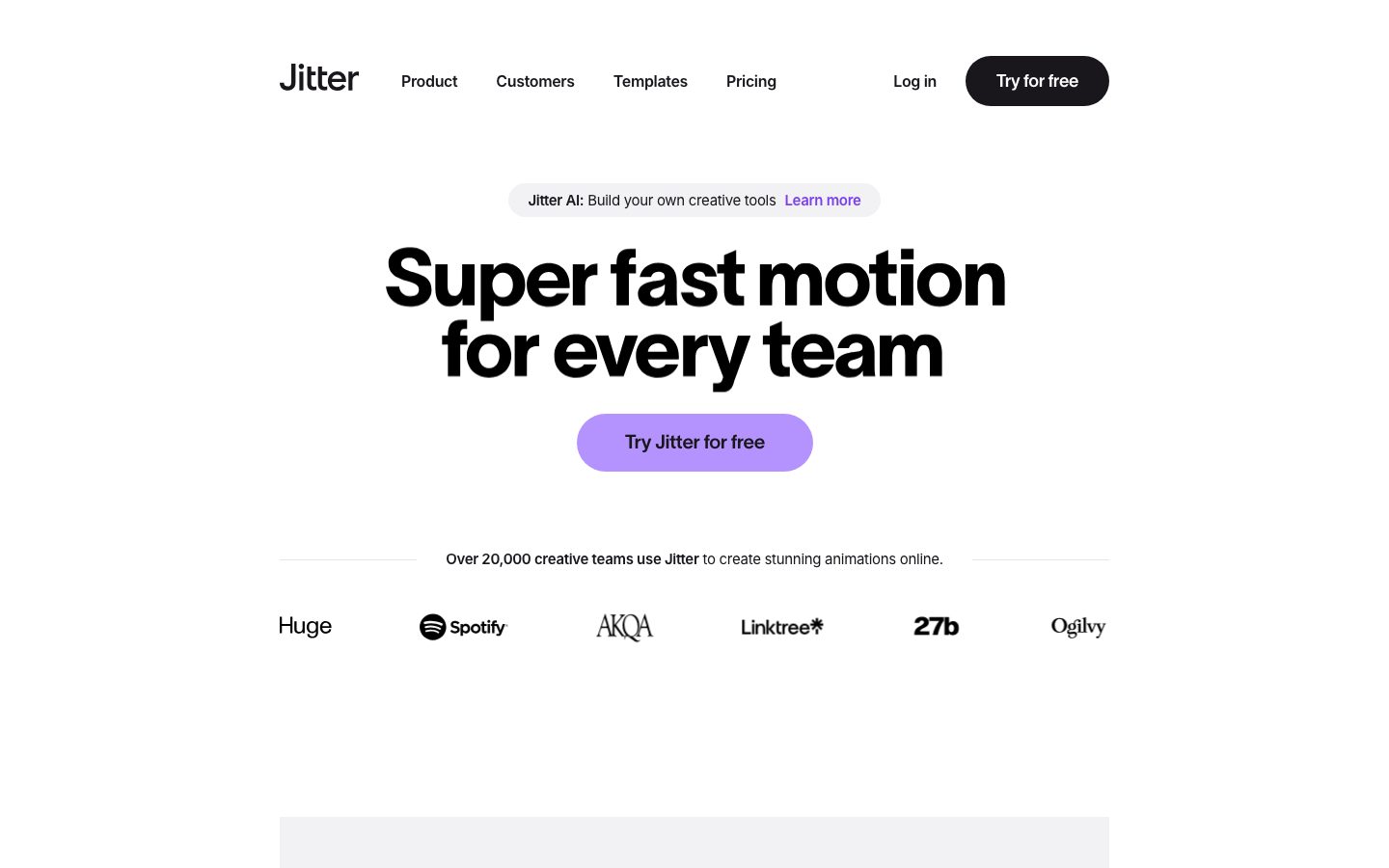
Jitter's marketing surface is a bold creative-tool interface — pure-white canvas (`{colors.canvas}` — #ffffff) with near-black ink (`{colors.ink}` — #19171c) and a single dominant brand gesture: an oversized **TWK Lausanne** display headline at 80px / weight 800 / -2.4px letter-spacing. The headline ("Super fast motion for every team") is the loudest thing on the page; everything else recedes into quiet grayscale support.
The type voice splits into two families: **TWK Lausanne** (the heavy grotesque display + button face, weight 800 for headlines, 600 for buttons, always with negative tracking) and **Inter** (the supporting body + subhead face, weights 400–600). The display face is huge and tightly tracked — it reads as energetic and confident, the way a motion-design tool wants to feel.
Color voltage comes from a small bright accent set lifted straight from the product canvas — a soft lilac (`{colors.accent-lilac}` — #a981ff) on the hero CTA, plus a scattering of product-UI accents (yellow `{colors.accent-yellow}`, pink `{colors.accent-pink}`, blue `{colors.accent-blue}`, purple `{colors.accent-purple}`). These appear in product mockups and on the primary action — never as flat marketing fills.
The page floats product UI fragments — the easing-curve picker, the timeline/canvas editor — on deep, multi-layer soft shadows that lift them well off the white. Light-gray panels (`{colors.surface-soft}` — #f2f1f3) frame these mockups with very large `{rounded.xl}` (40px) corners. Everything that can be rounded is rounded hard — buttons and inputs are full pills (`{rounded.pill}` — 50px).
**Key Characteristics:**
- Oversized TWK Lausanne display headline (80px / 800 / -2.4px) — the single dominant brand element. Negative tracking is part of the voice.
- Two pill CTAs coexist: black `{component.button-primary}` ("Try for free" in the nav) and lilac `{component.button-cta}` ("Try Jitter for free" in the hero). Both fully pill-rounded.
- Near-monochrome at the structural layer (ink, white, grays) with a small bright accent palette reserved for product UI and the primary action.
- Soft light-gray panels (`{colors.surface-soft}`) with very large 40px corners frame embedded product mockups.
- Deep, multi-layer soft drop shadows (up to ~237px blur, stacked at low alpha) float the product UI fragments off the canvas.
- Inputs render dark (`{colors.input-surface}` — #2d2933) with asymmetric pill ends — a distinct, product-derived form control.
- Radius is hierarchical: `{rounded.sm}`–`{rounded.lg}` (18/20/26px) for small chrome, `{rounded.xl}` (40px) for panels, `{rounded.pill}` (50px) for buttons + inputs, `{rounded.full}` (375px) for circular elements.
## Colors
### Brand & Accent
- **Ink** (`{colors.ink}` — #19171c): The dominant color — display headlines, body of black CTAs, logo wordmark, nav links. By far the most-used token (frequency 2111).
- **Accent Lilac** (`{colors.accent-lilac}` — #a981ff): The hero CTA fill ("Try Jitter for free"). The signature brand accent on the action layer. A softer tint `{colors.accent-lilac-soft}` (#b593ff) appears in adjacent product moments.
- **Accent Purple** (`{colors.accent-purple}` — #7a40ed): Used on inline highlight links (e.g. "Learn more" inside the announcement pill) and saturated product-canvas shapes.
- **Accent Deep** (`{colors.accent-deep}` — #17082c): A deep violet-black used in product-UI fills and dark gradient moments.
- **Product Accents** — A small bright set pulled from the motion canvas: `{colors.accent-yellow}` (#f5ff63), `{colors.accent-pink}` (#ff58e0), `{colors.accent-blue}` (#34abfc), and `{colors.accent-red}` (#ff0000). These appear only inside product UI fragments and demo thumbnails — never as flat marketing background fills.
### Surface
- **Canvas** (`{colors.canvas}` — #ffffff): The default page floor.
- **Surface Soft** (`{colors.surface-soft}` — #f2f1f3): Light-gray panels framing product mockups, the announcement badge pill, soft section blocks.
- **Surface** (`{colors.surface}` — #e5e4e7): A slightly deeper gray for nested panels and dividers.
- **Input Surface** (`{colors.input-surface}` — #2d2933): The dark fill of the text input control.
- **Black** (`{colors.black}` — #000000) / **Ink Deep** (`{colors.ink-deep}` — #1e1e1e): Used inside product chrome and dark UI mockups.
### Text
- **Ink** (`{colors.ink}` — #19171c): All headlines and primary text.
- **Body** (`{colors.body}` — #6e6e73): Secondary running text and muted supporting copy.
- **Muted** (`{colors.muted}` — #808080) / **Muted Soft** (`{colors.muted-soft}` — #97979b): Tertiary text, captions, faded "no learning curve" style lead-ins.
- **On Primary** (`{colors.on-primary}` — #ffffff): Text on the black primary button and dark input.
### Hairlines & Dividers
- **Hairline** (`{colors.hairline}` — #d7d7db) and **Hairline Soft** (`{colors.hairline-soft}` — #e9e9e9): The thin rule tones (e.g. the divider lines flanking "Over 20,000 creative teams use Jitter").
- **Divider** (`{colors.divider}` — #c3c3c6): A mid-gray for slightly stronger separators.
## Typography
### Font Family
The system runs **TWK Lausanne** for display headlines + button labels and **Inter** for body + subheads. TWK Lausanne is a heavy grotesque used at weight 800 (display, sub-titles) and 600 (buttons), always with negative letter-spacing. Inter carries running text at weight 600 and quieter subheads at weight 400.
The split is strict:
- TWK Lausanne (display 800, button 600, -0.36 to -2.4px tracking) — h1, h3, button labels
- Inter (400–600, ~-0.4px tracking) — body copy, h2/subhead lines
### Hierarchy
| Token | Family | Size | Weight | Line Height | Letter Spacing | Use |
|---|---|---|---|---|---|---|
| `{typography.display}` | TWK Lausanne | 80px | 800 | 0.9 | -2.4px | Hero h1 ("Super fast motion for every team") |
| `{typography.title}` | TWK Lausanne | 21px | 800 | 0.95 | -0.42px | Section sub-titles / h3 ("No learning curve", "Motion design made simple") |
| `{typography.subhead}` | Inter | 18px | 400 | 1.5 | -0.396px | h2 / supporting subhead lines, badge pill text |
| `{typography.body}` | Inter | 20px | 600 | 1.5 | -0.4px | Body copy ("Jitter makes motion accessible…") |
| `{typography.button}` | TWK Lausanne | 18px | 600 | 1.0 | -0.36px | Button labels, nav links |
### Principles
The display headline is the brand. TWK Lausanne at 800 with -2.4px tracking and a sub-1.0 line height (0.9) produces the dense, energetic two-line headline block that anchors the page. Never set body copy in TWK Lausanne; never set the hero headline in Inter.
Note that Jitter's "body" role measured at weight **600** — body copy here runs semibold, slightly heavier than typical, which keeps it visually balanced against the very heavy display type.
### Note on Font Substitutes
**TWK Lausanne** is a commercial licensed typeface (Weltkern) and is not free to redistribute as a web font. Where it is unavailable, **Inter Tight** at weight 800 (with tightened letter-spacing) is a usable approximation for the display role; **Hanken Grotesk** or **Space Grotesk** at heavy weights are alternative grotesque substitutes. The substitution preserves the heavy-weight + negative-tracking signature even though the letterforms differ. Body/subhead text already uses **Inter**, which is freely available.
## Layout
### Spacing System
- **Base unit:** ~4–5px (the two most frequent small steps; the system mixes a 4px and a 5px micro-grid — derived observation from the measured frequency clusters).
- **Tokens:** `{spacing.xxs}` 4px · `{spacing.xs}` 5px · `{spacing.sm}` 8px · `{spacing.md}` 10px · `{spacing.lg}` 12px · `{spacing.xl}` 20px · `{spacing.xxl}` 30px · `{spacing.section}` 40px.
- **Button padding:** ~10px (`{spacing.md}`) is the measured base padding on pill buttons.
- **Panel padding:** ~40px (`{spacing.section}`) around framed product mockups.
- **Nav padding:** ~20px (`{spacing.xl}`) vertical in the top bar.
### Grid & Container
- **Centered single-column hero:** the headline, sub-pill, CTA, and trust row stack centered on the white canvas.
- **Logo trust row:** a single horizontal band of partner wordmarks (Huge, Spotify, AKQA, Linktree, 27b, Ogilvy) below the hero.
- **Product mockup bands:** centered product-UI fragments framed by light-gray panels, alternating with body-copy blocks.
### Whitespace Philosophy
Jitter uses generous vertical whitespace and lets the oversized headline command the fold. The page breathes — large empty zones surround the centered hero, and product mockups float in spacious gray panels. The rhythm is calm and editorial despite the loud type.
## Elevation & Depth
| Level | Treatment | Use |
|---|---|---|
| Flat | No shadow, no border | Body sections, top nav, headline block |
| Panel | `{colors.surface-soft}` fill, no shadow | Light-gray framing panels around mockups |
| Floating mockup (soft) | Multi-layer low-alpha shadow, ~62–63px blur | Smaller product cards / thumbnails |
| Floating mockup (deep) | Stacked layers up to ~237px blur, peaking around `rgba(25,23,28,0.1)` | Hero product-UI fragments (easing-curve picker, editor canvas) |
| Modal / strong | `rgba(0,0,0,0.33) 0px 25px 52px` | Single strong-shadow element (e.g. a popover or floating control) |
The elevation philosophy is **deep, soft, and layered** — the product mockups are lifted dramatically off the white with multi-stop shadows (e.g. `rgba(25,23,28,0) 0px 237px 66px`, stepping down through `0px 152px`, `0px 85px`, `0px 38px`, to `0px 9px 21px`). These long, very-soft shadows are the system's signature depth move and make the product chrome feel like it's hovering in space.
### Decorative Depth
- A pair of thin white inset edge-shadows (`rgb(255,255,255) ±1px 0px`) appear on a few elements — used as crisp 1px side highlights, not drop shadows.
- Product UI fragments carry their own internal chrome and bright accent colors from the actual editor.
## Shapes
### Border Radius Scale
| Token | Value | Use |
|---|---|---|
| `{rounded.sm}` | 18px | Small inner chrome (rare) |
| `{rounded.md}` | 20px | Medium cards, inner panels |
| `{rounded.lg}` | 26px | Product mockup card containers |
| `{rounded.xl}` | 40px | Large light-gray framing panels (most frequent radius) |
| `{rounded.pill}` | 50px | Buttons, badge pills, input control |
| `{rounded.full}` | 375px | Fully circular elements / extreme pill |
### Geometry Notes
Jitter rounds aggressively. The most common measured radius is 40px (`{rounded.xl}`), used on the large gray panels, followed by 50px pill rounding on interactive controls. The **input** uses an asymmetric radius (`0px 50px 50px 0px`) — square on the left, fully pilled on the right — a distinctive product-derived form. Product-UI fragments inside mockups retain their own native cell radii.
## Components
### Top Navigation
**`top-nav`** — White nav bar across the top. Background `{colors.canvas}`, ink text/links, label type `{typography.button}` (TWK Lausanne 18px / 600). Carries the lowercase "Jitter" wordmark at left, a horizontal menu (Product, Customers, Templates, Pricing) center, and a right-side cluster with a "Log in" text link plus the black `{component.button-primary}` ("Try for free"). Vertical padding ~`{spacing.xl}` (20px).
### Buttons
**`button-primary`** — The black pill CTA in the nav. Background `{colors.ink}` (#19171c), text `{colors.on-primary}`, type `{typography.button}`, rounded `{rounded.pill}` (50px), padding ~`{spacing.md}` (10px). (Note: the analyzer reported `radius: 0px` for the measured button element, but the radius scale and screenshots confirm full 50px pill rounding — `{rounded.pill}` is the faithful reference.)
**`button-cta`** — The hero's lilac pill CTA ("Try Jitter for free"). Background `{colors.accent-lilac}` (#a981ff), text `{colors.ink}` (dark label on the soft purple), type `{typography.button}`, rounded `{rounded.pill}`, padding ~`{spacing.md}`. This is the only large color-filled action on the page.
### Badges & Pills
**`badge-pill`** — The announcement pill above the headline ("Jitter AI: Build your own creative tools — Learn more"). Background `{colors.surface-soft}` (#f2f1f3), text `{colors.ink}` with the "Learn more" link in `{colors.accent-purple}`, type `{typography.subhead}`, rounded `{rounded.pill}`, padding ~`{spacing.sm}` (8px).
### Cards & Panels
**`section-panel`** — The large light-gray panel that frames product mockups and section blocks. Background `{colors.surface-soft}`, rounded `{rounded.xl}` (40px), padding ~`{spacing.section}` (40px). These panels alternate with white bands down the page.
**`card`** — The base flat card. Background `{colors.surface-soft}`, rounded `{rounded.xl}`, no shadow. (Measured as `radius: 0px, shadow: none` on the generic card selector; the visible content cards round to the panel radius and are documented accordingly.)
**`product-mockup-card`** — A white card holding an actual product-UI fragment (easing-curve picker, editor canvas + timeline, demo thumbnail grid). Background `{colors.canvas}`, rounded `{rounded.lg}` (26px), padding ~`{spacing.lg}` (12px). These carry the deep multi-layer soft shadow (see Elevation) that floats them off the panel.
### Inputs
**`input`** — A dark text input. Background `{colors.input-surface}` (#2d2933), text `{colors.on-primary}`, type `{typography.body}`, rounded `{rounded.pill}` (asymmetric `0px 50px 50px 0px` as measured), padding ~`{spacing.md}`.
### Trust Row
**`logo-row-item`** — Partner wordmarks in the social-proof band (Huge, Spotify, AKQA, Linktree, 27b, Ogilvy). Rendered transparent with `{colors.ink}` marks, set near `{typography.subhead}` scale. A single horizontal strip below the hero.
## Do's and Don'ts
### Do
- Let the TWK Lausanne display headline dominate the fold — 80px / 800 / -2.4px tracking. Bigger before bolder.
- Keep the structural layer near-monochrome (ink, white, grays). Reserve bright accents for the product UI and the single lilac CTA.
- Use full pill rounding (`{rounded.pill}` — 50px) on buttons and inputs, and the large 40px `{rounded.xl}` radius on framing panels.
- Float product mockups on the deep multi-layer soft shadow — it's the system's signature depth move.
- Pair the black `{component.button-primary}` (nav) and lilac `{component.button-cta}` (hero) deliberately — black for the persistent nav action, lilac for the marquee conversion moment.
- Embed real product UI fragments inside white mockup cards rather than illustrating the product.
### Don't
- Don't set body copy in TWK Lausanne or the hero headline in Inter — the family boundary is strict.
- Don't drop the negative letter-spacing on display type; without it the headline reads off-brand.
- Don't scatter the bright accents (yellow, pink, blue, purple) as flat marketing fills — they belong to product UI and the single CTA.
- Don't use small/no radius on buttons; the brand is fully-pilled at the action layer.
- Don't flatten the product mockups — the deep soft shadow is essential to the floating effect.
- Don't add hover-state styling beyond default and pressed.
## Responsive Behavior
| Name | Width | Key Changes |
|---|---|---|
| Mobile | < 768px | Hamburger / collapsed nav; hero headline scales down from 80px; product mockups stack single-column inside panels; trust-row logos wrap |
| Tablet | 768–1024px | Top nav tightens; mockup panels reduce padding; centered hero retained |
| Desktop | 1024–1440px | Full horizontal nav; full 80px display headline; spacious centered hero |
| Wide | > 1440px | Same as desktop with more outer breathing room |
### Touch Targets
- `{component.button-primary}` and `{component.button-cta}` carry ~10px padding on the pill plus the button type's 18px cap height — comfortably tappable.
- `{component.input}` uses the body type scale (20px) with ~10px padding.
### Collapsing Strategy
- The centered hero stack (badge → headline → CTA → trust row) stays vertically ordered at all widths, scaling the headline down on small screens.
- Light-gray framing panels reduce padding rather than removing the rounding.
- Product mockup cards keep their aspect and shadow; the panel around them resizes.
(Exact breakpoint behavior is inferred — see Known Gaps.)
## Iteration Guide
1. Focus on ONE component at a time. Reference its YAML key directly (`{component.button-cta}`, `{component.product-mockup-card}`).
2. Variants of an existing component live as separate entries in `components:`.
3. Use `{token.refs}` everywhere — never inline a hex in a component.
4. Never document hover. Default and Active/Pressed states only.
5. Display headlines stay TWK Lausanne 800 with heavy negative tracking; body stays Inter. The split does not blur.
6. The lilac CTA is the single saturated action — don't dilute it with more color fills.
7. When emphasis is needed, scale up the display type before reaching for additional color.
## Known Gaps
- **TWK Lausanne** is a commercial licensed typeface (the analyzer's `fonts_licensed` list was empty, but the family is not freely redistributable); open-source substitutes are documented in the Typography section.
- The measured `button-primary` reported `radius: 0px` and `padding: 10px` while screenshots and the radius scale (50px, frequency 54) clearly show pill rounding — the discrepancy is noted and resolved in favor of `{rounded.pill}`. Exact button padding box (horizontal vs vertical) was not separately captured.
- Section-level vertical rhythm between major bands is not directly measured — the largest captured spacing token is 40px; larger inter-section gaps are likely but unconfirmed.
- The micro-grid mixes 4px and 5px steps (both high-frequency); whether the system intends a 4px or 5px base unit is ambiguous (derived).
- No footer was captured in the analysis — footer surface, color, and layout are unknown.
- Pricing and product page component specs beyond the landing hero are not fully extracted (cards, tables, toggles on the pricing page).
- Form states beyond the default dark input (focus, error, success) were not measured.
- Animation and transition timings — central to a motion-design product — are out of scope for this static analysis.
- The bright product accents (yellow, pink, blue, purple) are documented from low-frequency observed values inside product UI; their exact roles in the live editor may differ.
<!-- Documented by duply · real-world design systems as ready-to-use DESIGN.md for AI coding agents · https://duply.ai/jitter/design-md -->
Color Palette
Accent
Neutrals
Typography
display80px · 800 · 0.9
The quick brown fox jumpstitle21px · 800 · 0.95
The quick brown fox jumpssubhead18px · 400 · 1.5
The quick brown fox jumpsbody20px · 600 · 1.5
The quick brown fox jumpsbutton18px · 600 · 1
The quick brown fox jumpsSpacing & Shape
Spacing
| Name | Value | Preview |
|---|---|---|
| xxs | 4px | |
| xs | 5px | |
| sm | 8px | |
| md | 10px | |
| lg | 12px | |
| xl | 20px | |
| xxl | 30px | |
| section | 40px |
Border Radius
| Name | Value | Preview |
|---|---|---|
| sm | 18px | |
| md | 20px | |
| lg | 26px | |
| xl | 40px | |
| pill | 50px | |
| full | 375px |
More like this


---
version: alpha
name: Jitter-design-analysis
description: A bold, motion-design-software interface built on pure-white canvas with near-black ink and an oversized TWK Lausanne display headline. The system reads as confident, playful creative-tool branding — extreme display type at weight 800 with heavy negative tracking, soft-purple lilac CTAs, fully-rounded pill buttons and inputs, light-gray panels holding product UI fragments, and deep multi-layer soft shadows that float the product mockups off the page. Brand voltage comes from the huge condensed-feeling headline and a small bright accent palette (lilac, yellow, pink) pulled straight from the motion-canvas product.
colors:
  ink: "#19171c"
  ink-deep: "#1e1e1e"
  black: "#000000"
  body: "#6e6e73"
  muted: "#808080"
  muted-soft: "#97979b"
  canvas: "#ffffff"
  surface-soft: "#f2f1f3"
  surface: "#e5e4e7"
  hairline: "#d7d7db"
  hairline-soft: "#e9e9e9"
  divider: "#c3c3c6"
  input-surface: "#2d2933"
  on-primary: "#ffffff"
  accent-deep: "#17082c"
  accent-purple: "#7a40ed"
  accent-lilac: "#a981ff"
  accent-lilac-soft: "#b593ff"
  accent-yellow: "#f5ff63"
  accent-pink: "#ff58e0"
  accent-blue: "#34abfc"
  accent-red: "#ff0000"
typography:
  display:
    fontFamily: "TWK Lausanne, Inter Tight, sans-serif"
    fontSize: 80px
    fontWeight: 800
    lineHeight: 0.9
    letterSpacing: -2.4px
  title:
    fontFamily: "TWK Lausanne, Inter Tight, sans-serif"
    fontSize: 21px
    fontWeight: 800
    lineHeight: 0.95
    letterSpacing: -0.42px
  subhead:
    fontFamily: "Inter, sans-serif"
    fontSize: 18px
    fontWeight: 400
    lineHeight: 1.5
    letterSpacing: -0.396px
  body:
    fontFamily: "Inter, sans-serif"
    fontSize: 20px
    fontWeight: 600
    lineHeight: 1.5
    letterSpacing: -0.4px
  button:
    fontFamily: "TWK Lausanne, Inter Tight, sans-serif"
    fontSize: 18px
    fontWeight: 600
    lineHeight: 1.0
    letterSpacing: -0.36px
rounded:
  sm: 18px
  md: 20px
  lg: 26px
  xl: 40px
  pill: 50px
  full: 375px
spacing:
  xxs: 4px
  xs: 5px
  sm: 8px
  md: 10px
  lg: 12px
  xl: 20px
  xxl: 30px
  section: 40px
components:
  top-nav:
    backgroundColor: "{colors.canvas}"
    textColor: "{colors.ink}"
    typography: "{typography.button}"
    padding: 20px
  button-primary:
    backgroundColor: "{colors.ink}"
    textColor: "{colors.on-primary}"
    typography: "{typography.button}"
    rounded: "{rounded.pill}"
    padding: 10px
  button-cta:
    backgroundColor: "{colors.accent-lilac}"
    textColor: "{colors.ink}"
    typography: "{typography.button}"
    rounded: "{rounded.pill}"
    padding: 10px
  badge-pill:
    backgroundColor: "{colors.surface-soft}"
    textColor: "{colors.ink}"
    typography: "{typography.subhead}"
    rounded: "{rounded.pill}"
    padding: 8px
  card:
    backgroundColor: "{colors.surface-soft}"
    textColor: "{colors.ink}"
    rounded: "{rounded.xl}"
  section-panel:
    backgroundColor: "{colors.surface-soft}"
    textColor: "{colors.ink}"
    rounded: "{rounded.xl}"
    padding: 40px
  product-mockup-card:
    backgroundColor: "{colors.canvas}"
    textColor: "{colors.ink}"
    rounded: "{rounded.lg}"
    padding: 12px
  input:
    backgroundColor: "{colors.input-surface}"
    textColor: "{colors.on-primary}"
    typography: "{typography.body}"
    rounded: "{rounded.pill}"
    padding: 10px
  logo-row-item:
    backgroundColor: transparent
    textColor: "{colors.ink}"
    typography: "{typography.subhead}"
---

## Overview

Jitter's marketing surface is a bold creative-tool interface — pure-white canvas (`{colors.canvas}` — #ffffff) with near-black ink (`{colors.ink}` — #19171c) and a single dominant brand gesture: an oversized **TWK Lausanne** display headline at 80px / weight 800 / -2.4px letter-spacing. The headline ("Super fast motion for every team") is the loudest thing on the page; everything else recedes into quiet grayscale support.

The type voice splits into two families: **TWK Lausanne** (the heavy grotesque display + button face, weight 800 for headlines, 600 for buttons, always with negative tracking) and **Inter** (the supporting body + subhead face, weights 400–600). The display face is huge and tightly tracked — it reads as energetic and confident, the way a motion-design tool wants to feel.

Color voltage comes from a small bright accent set lifted straight from the product canvas — a soft lilac (`{colors.accent-lilac}` — #a981ff) on the hero CTA, plus a scattering of product-UI accents (yellow `{colors.accent-yellow}`, pink `{colors.accent-pink}`, blue `{colors.accent-blue}`, purple `{colors.accent-purple}`). These appear in product mockups and on the primary action — never as flat marketing fills.

The page floats product UI fragments — the easing-curve picker, the timeline/canvas editor — on deep, multi-layer soft shadows that lift them well off the white. Light-gray panels (`{colors.surface-soft}` — #f2f1f3) frame these mockups with very large `{rounded.xl}` (40px) corners. Everything that can be rounded is rounded hard — buttons and inputs are full pills (`{rounded.pill}` — 50px).

**Key Characteristics:**
- Oversized TWK Lausanne display headline (80px / 800 / -2.4px) — the single dominant brand element. Negative tracking is part of the voice.
- Two pill CTAs coexist: black `{component.button-primary}` ("Try for free" in the nav) and lilac `{component.button-cta}` ("Try Jitter for free" in the hero). Both fully pill-rounded.
- Near-monochrome at the structural layer (ink, white, grays) with a small bright accent palette reserved for product UI and the primary action.
- Soft light-gray panels (`{colors.surface-soft}`) with very large 40px corners frame embedded product mockups.
- Deep, multi-layer soft drop shadows (up to ~237px blur, stacked at low alpha) float the product UI fragments off the canvas.
- Inputs render dark (`{colors.input-surface}` — #2d2933) with asymmetric pill ends — a distinct, product-derived form control.
- Radius is hierarchical: `{rounded.sm}`–`{rounded.lg}` (18/20/26px) for small chrome, `{rounded.xl}` (40px) for panels, `{rounded.pill}` (50px) for buttons + inputs, `{rounded.full}` (375px) for circular elements.

## Colors

### Brand & Accent
- **Ink** (`{colors.ink}` — #19171c): The dominant color — display headlines, body of black CTAs, logo wordmark, nav links. By far the most-used token (frequency 2111).
- **Accent Lilac** (`{colors.accent-lilac}` — #a981ff): The hero CTA fill ("Try Jitter for free"). The signature brand accent on the action layer. A softer tint `{colors.accent-lilac-soft}` (#b593ff) appears in adjacent product moments.
- **Accent Purple** (`{colors.accent-purple}` — #7a40ed): Used on inline highlight links (e.g. "Learn more" inside the announcement pill) and saturated product-canvas shapes.
- **Accent Deep** (`{colors.accent-deep}` — #17082c): A deep violet-black used in product-UI fills and dark gradient moments.
- **Product Accents** — A small bright set pulled from the motion canvas: `{colors.accent-yellow}` (#f5ff63), `{colors.accent-pink}` (#ff58e0), `{colors.accent-blue}` (#34abfc), and `{colors.accent-red}` (#ff0000). These appear only inside product UI fragments and demo thumbnails — never as flat marketing background fills.

### Surface
- **Canvas** (`{colors.canvas}` — #ffffff): The default page floor.
- **Surface Soft** (`{colors.surface-soft}` — #f2f1f3): Light-gray panels framing product mockups, the announcement badge pill, soft section blocks.
- **Surface** (`{colors.surface}` — #e5e4e7): A slightly deeper gray for nested panels and dividers.
- **Input Surface** (`{colors.input-surface}` — #2d2933): The dark fill of the text input control.
- **Black** (`{colors.black}` — #000000) / **Ink Deep** (`{colors.ink-deep}` — #1e1e1e): Used inside product chrome and dark UI mockups.

### Text
- **Ink** (`{colors.ink}` — #19171c): All headlines and primary text.
- **Body** (`{colors.body}` — #6e6e73): Secondary running text and muted supporting copy.
- **Muted** (`{colors.muted}` — #808080) / **Muted Soft** (`{colors.muted-soft}` — #97979b): Tertiary text, captions, faded "no learning curve" style lead-ins.
- **On Primary** (`{colors.on-primary}` — #ffffff): Text on the black primary button and dark input.

### Hairlines & Dividers
- **Hairline** (`{colors.hairline}` — #d7d7db) and **Hairline Soft** (`{colors.hairline-soft}` — #e9e9e9): The thin rule tones (e.g. the divider lines flanking "Over 20,000 creative teams use Jitter").
- **Divider** (`{colors.divider}` — #c3c3c6): A mid-gray for slightly stronger separators.

## Typography

### Font Family
The system runs **TWK Lausanne** for display headlines + button labels and **Inter** for body + subheads. TWK Lausanne is a heavy grotesque used at weight 800 (display, sub-titles) and 600 (buttons), always with negative letter-spacing. Inter carries running text at weight 600 and quieter subheads at weight 400.

The split is strict:
- TWK Lausanne (display 800, button 600, -0.36 to -2.4px tracking) — h1, h3, button labels
- Inter (400–600, ~-0.4px tracking) — body copy, h2/subhead lines

### Hierarchy

| Token | Family | Size | Weight | Line Height | Letter Spacing | Use |
|---|---|---|---|---|---|---|
| `{typography.display}` | TWK Lausanne | 80px | 800 | 0.9 | -2.4px | Hero h1 ("Super fast motion for every team") |
| `{typography.title}` | TWK Lausanne | 21px | 800 | 0.95 | -0.42px | Section sub-titles / h3 ("No learning curve", "Motion design made simple") |
| `{typography.subhead}` | Inter | 18px | 400 | 1.5 | -0.396px | h2 / supporting subhead lines, badge pill text |
| `{typography.body}` | Inter | 20px | 600 | 1.5 | -0.4px | Body copy ("Jitter makes motion accessible…") |
| `{typography.button}` | TWK Lausanne | 18px | 600 | 1.0 | -0.36px | Button labels, nav links |

### Principles
The display headline is the brand. TWK Lausanne at 800 with -2.4px tracking and a sub-1.0 line height (0.9) produces the dense, energetic two-line headline block that anchors the page. Never set body copy in TWK Lausanne; never set the hero headline in Inter.

Note that Jitter's "body" role measured at weight **600** — body copy here runs semibold, slightly heavier than typical, which keeps it visually balanced against the very heavy display type.

### Note on Font Substitutes
**TWK Lausanne** is a commercial licensed typeface (Weltkern) and is not free to redistribute as a web font. Where it is unavailable, **Inter Tight** at weight 800 (with tightened letter-spacing) is a usable approximation for the display role; **Hanken Grotesk** or **Space Grotesk** at heavy weights are alternative grotesque substitutes. The substitution preserves the heavy-weight + negative-tracking signature even though the letterforms differ. Body/subhead text already uses **Inter**, which is freely available.

## Layout

### Spacing System
- **Base unit:** ~4–5px (the two most frequent small steps; the system mixes a 4px and a 5px micro-grid — derived observation from the measured frequency clusters).
- **Tokens:** `{spacing.xxs}` 4px · `{spacing.xs}` 5px · `{spacing.sm}` 8px · `{spacing.md}` 10px · `{spacing.lg}` 12px · `{spacing.xl}` 20px · `{spacing.xxl}` 30px · `{spacing.section}` 40px.
- **Button padding:** ~10px (`{spacing.md}`) is the measured base padding on pill buttons.
- **Panel padding:** ~40px (`{spacing.section}`) around framed product mockups.
- **Nav padding:** ~20px (`{spacing.xl}`) vertical in the top bar.

### Grid & Container
- **Centered single-column hero:** the headline, sub-pill, CTA, and trust row stack centered on the white canvas.
- **Logo trust row:** a single horizontal band of partner wordmarks (Huge, Spotify, AKQA, Linktree, 27b, Ogilvy) below the hero.
- **Product mockup bands:** centered product-UI fragments framed by light-gray panels, alternating with body-copy blocks.

### Whitespace Philosophy
Jitter uses generous vertical whitespace and lets the oversized headline command the fold. The page breathes — large empty zones surround the centered hero, and product mockups float in spacious gray panels. The rhythm is calm and editorial despite the loud type.

## Elevation & Depth

| Level | Treatment | Use |
|---|---|---|
| Flat | No shadow, no border | Body sections, top nav, headline block |
| Panel | `{colors.surface-soft}` fill, no shadow | Light-gray framing panels around mockups |
| Floating mockup (soft) | Multi-layer low-alpha shadow, ~62–63px blur | Smaller product cards / thumbnails |
| Floating mockup (deep) | Stacked layers up to ~237px blur, peaking around `rgba(25,23,28,0.1)` | Hero product-UI fragments (easing-curve picker, editor canvas) |
| Modal / strong | `rgba(0,0,0,0.33) 0px 25px 52px` | Single strong-shadow element (e.g. a popover or floating control) |

The elevation philosophy is **deep, soft, and layered** — the product mockups are lifted dramatically off the white with multi-stop shadows (e.g. `rgba(25,23,28,0) 0px 237px 66px`, stepping down through `0px 152px`, `0px 85px`, `0px 38px`, to `0px 9px 21px`). These long, very-soft shadows are the system's signature depth move and make the product chrome feel like it's hovering in space.

### Decorative Depth
- A pair of thin white inset edge-shadows (`rgb(255,255,255) ±1px 0px`) appear on a few elements — used as crisp 1px side highlights, not drop shadows.
- Product UI fragments carry their own internal chrome and bright accent colors from the actual editor.

## Shapes

### Border Radius Scale

| Token | Value | Use |
|---|---|---|
| `{rounded.sm}` | 18px | Small inner chrome (rare) |
| `{rounded.md}` | 20px | Medium cards, inner panels |
| `{rounded.lg}` | 26px | Product mockup card containers |
| `{rounded.xl}` | 40px | Large light-gray framing panels (most frequent radius) |
| `{rounded.pill}` | 50px | Buttons, badge pills, input control |
| `{rounded.full}` | 375px | Fully circular elements / extreme pill |

### Geometry Notes
Jitter rounds aggressively. The most common measured radius is 40px (`{rounded.xl}`), used on the large gray panels, followed by 50px pill rounding on interactive controls. The **input** uses an asymmetric radius (`0px 50px 50px 0px`) — square on the left, fully pilled on the right — a distinctive product-derived form. Product-UI fragments inside mockups retain their own native cell radii.

## Components

### Top Navigation

**`top-nav`** — White nav bar across the top. Background `{colors.canvas}`, ink text/links, label type `{typography.button}` (TWK Lausanne 18px / 600). Carries the lowercase "Jitter" wordmark at left, a horizontal menu (Product, Customers, Templates, Pricing) center, and a right-side cluster with a "Log in" text link plus the black `{component.button-primary}` ("Try for free"). Vertical padding ~`{spacing.xl}` (20px).

### Buttons

**`button-primary`** — The black pill CTA in the nav. Background `{colors.ink}` (#19171c), text `{colors.on-primary}`, type `{typography.button}`, rounded `{rounded.pill}` (50px), padding ~`{spacing.md}` (10px). (Note: the analyzer reported `radius: 0px` for the measured button element, but the radius scale and screenshots confirm full 50px pill rounding — `{rounded.pill}` is the faithful reference.)

**`button-cta`** — The hero's lilac pill CTA ("Try Jitter for free"). Background `{colors.accent-lilac}` (#a981ff), text `{colors.ink}` (dark label on the soft purple), type `{typography.button}`, rounded `{rounded.pill}`, padding ~`{spacing.md}`. This is the only large color-filled action on the page.

### Badges & Pills

**`badge-pill`** — The announcement pill above the headline ("Jitter AI: Build your own creative tools — Learn more"). Background `{colors.surface-soft}` (#f2f1f3), text `{colors.ink}` with the "Learn more" link in `{colors.accent-purple}`, type `{typography.subhead}`, rounded `{rounded.pill}`, padding ~`{spacing.sm}` (8px).

### Cards & Panels

**`section-panel`** — The large light-gray panel that frames product mockups and section blocks. Background `{colors.surface-soft}`, rounded `{rounded.xl}` (40px), padding ~`{spacing.section}` (40px). These panels alternate with white bands down the page.

**`card`** — The base flat card. Background `{colors.surface-soft}`, rounded `{rounded.xl}`, no shadow. (Measured as `radius: 0px, shadow: none` on the generic card selector; the visible content cards round to the panel radius and are documented accordingly.)

**`product-mockup-card`** — A white card holding an actual product-UI fragment (easing-curve picker, editor canvas + timeline, demo thumbnail grid). Background `{colors.canvas}`, rounded `{rounded.lg}` (26px), padding ~`{spacing.lg}` (12px). These carry the deep multi-layer soft shadow (see Elevation) that floats them off the panel.

### Inputs

**`input`** — A dark text input. Background `{colors.input-surface}` (#2d2933), text `{colors.on-primary}`, type `{typography.body}`, rounded `{rounded.pill}` (asymmetric `0px 50px 50px 0px` as measured), padding ~`{spacing.md}`.

### Trust Row

**`logo-row-item`** — Partner wordmarks in the social-proof band (Huge, Spotify, AKQA, Linktree, 27b, Ogilvy). Rendered transparent with `{colors.ink}` marks, set near `{typography.subhead}` scale. A single horizontal strip below the hero.

## Do's and Don'ts

### Do
- Let the TWK Lausanne display headline dominate the fold — 80px / 800 / -2.4px tracking. Bigger before bolder.
- Keep the structural layer near-monochrome (ink, white, grays). Reserve bright accents for the product UI and the single lilac CTA.
- Use full pill rounding (`{rounded.pill}` — 50px) on buttons and inputs, and the large 40px `{rounded.xl}` radius on framing panels.
- Float product mockups on the deep multi-layer soft shadow — it's the system's signature depth move.
- Pair the black `{component.button-primary}` (nav) and lilac `{component.button-cta}` (hero) deliberately — black for the persistent nav action, lilac for the marquee conversion moment.
- Embed real product UI fragments inside white mockup cards rather than illustrating the product.

### Don't
- Don't set body copy in TWK Lausanne or the hero headline in Inter — the family boundary is strict.
- Don't drop the negative letter-spacing on display type; without it the headline reads off-brand.
- Don't scatter the bright accents (yellow, pink, blue, purple) as flat marketing fills — they belong to product UI and the single CTA.
- Don't use small/no radius on buttons; the brand is fully-pilled at the action layer.
- Don't flatten the product mockups — the deep soft shadow is essential to the floating effect.
- Don't add hover-state styling beyond default and pressed.

## Responsive Behavior

| Name | Width | Key Changes |
|---|---|---|
| Mobile | < 768px | Hamburger / collapsed nav; hero headline scales down from 80px; product mockups stack single-column inside panels; trust-row logos wrap |
| Tablet | 768–1024px | Top nav tightens; mockup panels reduce padding; centered hero retained |
| Desktop | 1024–1440px | Full horizontal nav; full 80px display headline; spacious centered hero |
| Wide | > 1440px | Same as desktop with more outer breathing room |

### Touch Targets
- `{component.button-primary}` and `{component.button-cta}` carry ~10px padding on the pill plus the button type's 18px cap height — comfortably tappable.
- `{component.input}` uses the body type scale (20px) with ~10px padding.

### Collapsing Strategy
- The centered hero stack (badge → headline → CTA → trust row) stays vertically ordered at all widths, scaling the headline down on small screens.
- Light-gray framing panels reduce padding rather than removing the rounding.
- Product mockup cards keep their aspect and shadow; the panel around them resizes.

(Exact breakpoint behavior is inferred — see Known Gaps.)

## Iteration Guide

1. Focus on ONE component at a time. Reference its YAML key directly (`{component.button-cta}`, `{component.product-mockup-card}`).
2. Variants of an existing component live as separate entries in `components:`.
3. Use `{token.refs}` everywhere — never inline a hex in a component.
4. Never document hover. Default and Active/Pressed states only.
5. Display headlines stay TWK Lausanne 800 with heavy negative tracking; body stays Inter. The split does not blur.
6. The lilac CTA is the single saturated action — don't dilute it with more color fills.
7. When emphasis is needed, scale up the display type before reaching for additional color.

## Known Gaps

- **TWK Lausanne** is a commercial licensed typeface (the analyzer's `fonts_licensed` list was empty, but the family is not freely redistributable); open-source substitutes are documented in the Typography section.
- The measured `button-primary` reported `radius: 0px` and `padding: 10px` while screenshots and the radius scale (50px, frequency 54) clearly show pill rounding — the discrepancy is noted and resolved in favor of `{rounded.pill}`. Exact button padding box (horizontal vs vertical) was not separately captured.
- Section-level vertical rhythm between major bands is not directly measured — the largest captured spacing token is 40px; larger inter-section gaps are likely but unconfirmed.
- The micro-grid mixes 4px and 5px steps (both high-frequency); whether the system intends a 4px or 5px base unit is ambiguous (derived).
- No footer was captured in the analysis — footer surface, color, and layout are unknown.
- Pricing and product page component specs beyond the landing hero are not fully extracted (cards, tables, toggles on the pricing page).
- Form states beyond the default dark input (focus, error, success) were not measured.
- Animation and transition timings — central to a motion-design product — are out of scope for this static analysis.
- The bright product accents (yellow, pink, blue, purple) are documented from low-frequency observed values inside product UI; their exact roles in the live editor may differ.

<!-- Documented by duply · real-world design systems as ready-to-use DESIGN.md for AI coding agents · https://duply.ai/jitter/design-md -->