Nuraform
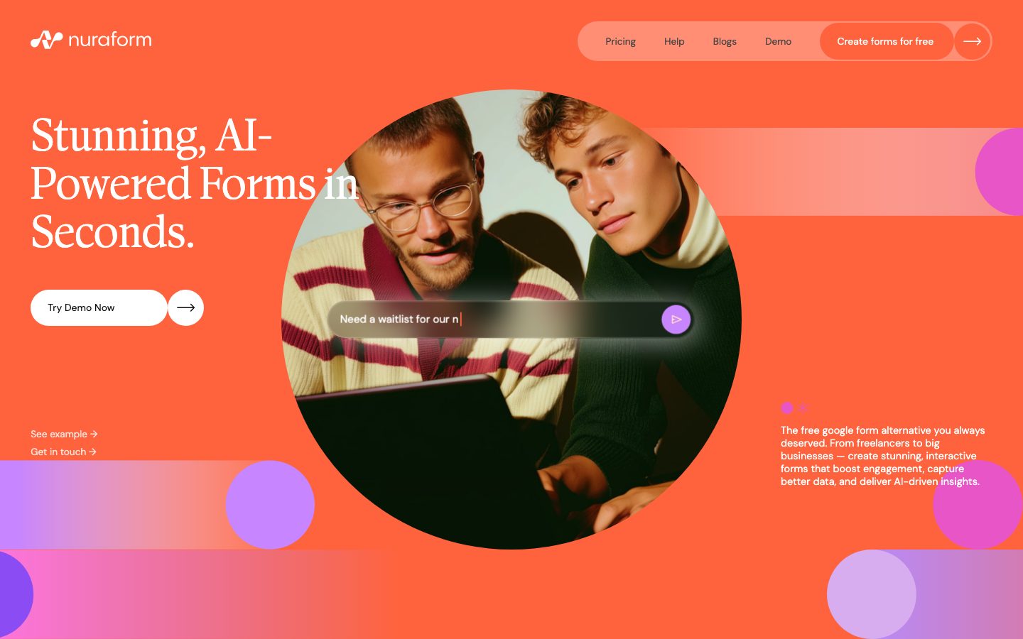
A bold, single-surface marketing interface that floods the entire viewport with a hot orange canvas (#ff633e), white serif display type (Antonia), and white pill-shaped CTAs. The system reads as confident, playful, AI-forward SaaS — a circular hero photo masked into the orange field, glassy in-photo search input, gradient bubble decorations bleeding off the edges, and a near-monochrome action layer of white-on-orange. Brand voltage comes from the high-contrast serif headline and the saturated orange flood rather than from layered UI chrome.
---
version: alpha
name: Nuraform-design-analysis
description: A bold, single-surface marketing interface that floods the entire viewport with a hot orange canvas (#ff633e), white serif display type (Antonia), and white pill-shaped CTAs. The system reads as confident, playful, AI-forward SaaS — a circular hero photo masked into the orange field, glassy in-photo search input, gradient bubble decorations bleeding off the edges, and a near-monochrome action layer of white-on-orange. Brand voltage comes from the high-contrast serif headline and the saturated orange flood rather than from layered UI chrome.

colors:
  brand: "#ff633e"
  brand-deep: "#ff5a3d"
  brand-alt: "#ff623d"
  canvas: "#ff633e"
  ink: "#ffffff"
  ink-dark: "#000000"
  surface-white: "#ffffff"
  surface-dark: "#0f0f0f"
  surface-soft: "#f7f7f7"
  surface-muted: "#eeeeee"
  hairline: "#e3e3e3"
  muted: "#7c7c7c"
  muted-soft: "#cfcfcf"
  neutral-mid: "#454545"
  neutral-dark: "#333333"
  bubble-violet: "#b88af7"
  bubble-magenta: "#ea38d0"
  accent-amber: "#f0a500"

typography:
  display-xl:
    fontFamily: "Antonia, Fraunces, Georgia, serif"
    fontSize: 64px
    fontWeight: 700
    lineHeight: 1.06
    letterSpacing: 0
  display-lg:
    fontFamily: "Antonia, Fraunces, Georgia, serif"
    fontSize: 64px
    fontWeight: 400
    lineHeight: 1.2
    letterSpacing: 0
  body:
    fontFamily: "Inter, system-ui, sans-serif"
    fontSize: 16px
    fontWeight: 400
    lineHeight: 1.5
    letterSpacing: 0
  button:
    fontFamily: "Inter, system-ui, sans-serif"
    fontSize: 16px
    fontWeight: 500
    lineHeight: 1
    letterSpacing: 0
  nav-link:
    fontFamily: "Inter, system-ui, sans-serif"
    fontSize: 16px
    fontWeight: 400
    lineHeight: 1.4
    letterSpacing: 0

rounded:
  md: 16px
  round: 100px
  pill: 500px
  full: 999px

spacing:
  xxs: 5px
  xs: 8px
  sm: 12px
  md: 16px
  lg: 24px
  xl: 40px
  xxl: 72px
  section: 86px

components:
  top-nav:
    backgroundColor: transparent
    textColor: "{colors.ink}"
    typography: "{typography.nav-link}"
    padding: 16px 40px
  nav-pill-group:
    backgroundColor: transparent
    textColor: "{colors.ink}"
    typography: "{typography.nav-link}"
    rounded: "{rounded.pill}"
    padding: 12px 24px
  nav-link:
    backgroundColor: transparent
    textColor: "{colors.ink}"
    typography: "{typography.nav-link}"
  button-primary:
    backgroundColor: "{colors.surface-white}"
    textColor: "{colors.ink-dark}"
    typography: "{typography.button}"
    rounded: "{rounded.pill}"
    padding: 16px 24px
  button-icon-circular:
    backgroundColor: "{colors.surface-white}"
    textColor: "{colors.ink-dark}"
    rounded: "{rounded.full}"
    size: 48px
  hero-band:
    backgroundColor: "{colors.canvas}"
    textColor: "{colors.ink}"
    typography: "{typography.display-xl}"
    padding: 86px
  hero-photo-circle:
    backgroundColor: "{colors.surface-dark}"
    textColor: "{colors.ink}"
    rounded: "{rounded.full}"
  search-input:
    backgroundColor: transparent
    textColor: "{colors.ink-dark}"
    typography: "{typography.body}"
    rounded: "{rounded.pill}"
    padding: 16px 24px
  search-send-button:
    backgroundColor: "{colors.bubble-violet}"
    textColor: "{colors.ink}"
    rounded: "{rounded.full}"
    size: 40px
  text-link:
    backgroundColor: transparent
    textColor: "{colors.ink}"
    typography: "{typography.body}"
  decorative-bubble:
    backgroundColor: "{colors.bubble-violet}"
    textColor: transparent
    rounded: "{rounded.full}"
  carousel-dot:
    backgroundColor: "{colors.ink}"
    textColor: transparent
    rounded: "{rounded.full}"
    size: 8px

---

## Overview

Nuraform's marketing surface is a single, fully-flooded orange canvas (`{colors.canvas}` — #ff633e) carrying white serif display type, white pill CTAs, and a masked circular hero photograph. The entire above-the-fold experience reads as one confident color field — there is no white page floor here; the orange IS the page.

Type voice is carried almost entirely by **Antonia**, a high-contrast display serif. The headline ("Stunning, AI-Powered Forms in Seconds.") runs at 64px / weight 700 (`{typography.display-xl}`), with a lighter 64px / weight 400 cut (`{typography.display-lg}`) reserved for secondary serif statements. Supporting copy (the paragraph at lower-right, nav links, button labels) is small white sans-serif text — its exact family was not measured (see Known Gaps).

Brand voltage comes from three sources: the saturated orange flood, the white high-contrast serif, and a set of **gradient bubble decorations** — violet (`{colors.bubble-violet}` — #b88af7) and magenta (`{colors.bubble-magenta}` — #ea38d0) soft circles that bleed off the bottom and right edges. A glassy in-photo **search input** with a violet send button sits over the circular hero image, demonstrating the product (AI form prompt) directly inside the marketing artwork.

**Key Characteristics:**
- Full-bleed orange canvas (`{colors.canvas}` — #ff633e) — no white page background anywhere above the fold. The orange is the brand.
- White pill CTAs (`{component.button-primary}`) at `{rounded.pill}` (500px) with black labels — the only action color is white-on-orange.
- High-contrast serif display type (**Antonia**, substituted here) at 64px — weight 700 for the hero h1, weight 400 for secondary serif lines.
- Circular hero photograph (`{component.hero-photo-circle}`) masked to a perfect circle (`{rounded.full}`) and floated over the orange field.
- Glassy in-photo `{component.search-input}` showing the actual AI-prompt product UI, with a violet (`{colors.bubble-violet}`) circular send button.
- Decorative gradient bubbles (`{component.decorative-bubble}`) in violet + magenta bleeding off the canvas edges — playful chromatic flourish against the monochrome action layer.
- Pill-grouped top navigation (`{component.nav-pill-group}`) wrapping the menu links + CTA in a single rounded container.
- Border radius is binary: large pills (`{rounded.pill}` 500px / `{rounded.full}` 999px) for buttons, nav, and circles; `{rounded.md}` (16px) for soft rectangular elements.

## Colors

### Brand & Accent
- **Brand / Canvas** (`{colors.brand}` / `{colors.canvas}` — #ff633e): The dominant, page-filling orange. It is simultaneously the background, the brand identity, and the negative space. Everything floats on it.
- **Brand Deep** (`{colors.brand-deep}` — #ff5a3d) and **Brand Alt** (`{colors.brand-alt}` — #ff623d): Two near-identical orange tones measured in the field — used for subtle gradient/overlay shifts within the canvas (e.g. the horizontal lighter-orange band behind the hero photo). Treat `{colors.brand-deep}` as the slightly deeper press/edge tone.
- **Bubble Violet** (`{colors.bubble-violet}` — #b88af7): The soft purple of the decorative edge bubbles and the search send button.
- **Bubble Magenta** (`{colors.bubble-magenta}` — #ea38d0): The hotter pink/magenta in the gradient bubbles.
- **Accent Amber** (`{colors.accent-amber}` — #f0a500): A minor warm accent measured at low frequency.

### Surface
- **Surface White** (`{colors.surface-white}` — #ffffff): Pill buttons, circular icon buttons, the glassy input fill.
- **Surface Dark** (`{colors.surface-dark}` — #0f0f0f): The dark zones inside the hero photo (laptop, dark clothing) and near-black UI shadows.
- **Surface Soft** (`{colors.surface-soft}` — #f7f7f7) / **Surface Muted** (`{colors.surface-muted}` — #eeeeee): Very light neutral tones measured in small amounts — used for subtle off-white fills.
- **Hairline** (`{colors.hairline}` — #e3e3e3): The faintest divider/border neutral.

### Text
- **Ink** (`{colors.ink}` — #ffffff): All headline and body text on the orange canvas is white. This is the default text color of the entire surface.
- **Ink Dark** (`{colors.ink-dark}` — #000000): Text on white pill buttons and the search-input placeholder.
- **Muted** (`{colors.muted}` — #7c7c7c) / **Muted Soft** (`{colors.muted-soft}` — #cfcfcf): Secondary/tertiary neutral text tones measured in the UI (e.g. inside the glassy input).
- **Neutral Mid / Dark** (`{colors.neutral-mid}` — #454545, `{colors.neutral-dark}` — #333333): Dark neutral text/icon tones.

### Note
Black (#000000) is the single highest-frequency measured value (306 hits) — but most of it is photographic (the laptop, dark clothing, image shadows) rather than UI chrome. The actual UI action layer is white-on-orange; black is reserved for button label text (`{colors.ink-dark}`).

## Typography

### Font Family
The display voice is **Antonia** — a high-contrast transitional/Didone-style serif. It carries the hero headline and any large serif statements. Antonia is the only family captured by the analyzer; supporting copy (paragraph text, nav links, button labels) renders in a small sans-serif whose family was not measured (documented as a gap).

### Hierarchy

| Token | Size | Weight | Line Height | Letter Spacing | Use |
|---|---|---|---|---|---|
| `{typography.display-xl}` | 64px | 700 | 1.06 | 0 | Hero h1 ("Stunning, AI-Powered Forms in Seconds.") — Antonia bold |
| `{typography.display-lg}` | 64px | 400 | 1.2 | 0 | Secondary serif statements — Antonia regular |
| `{typography.body}` | 16px | 400 | 1.5 | 0 | Paragraph copy, link labels — **derived** (sans family + size estimated from screenshot, not measured) |
| `{typography.button}` | 16px | 500 | 1 | 0 | Pill button labels — **derived** (estimated from screenshot, not measured) |
| `{typography.nav-link}` | 16px | 400 | 1.4 | 0 | Top-nav menu items — **derived** (estimated from screenshot, not measured) |

### Principles
The serif/sans split is strict and dramatic: Antonia owns every large statement, and a quiet sans handles all functional micro-copy. The hero headline's impact comes from sheer scale (64px) and the high-contrast serif stroke against the flat orange field — there is no letter-spacing manipulation (measured `normal` / 0 across both serif cuts). Weight 700 is for the marquee headline; weight 400 is the softer, more editorial serif voice.

### Note on Font Substitutes
**Antonia** is a commercial/licensed display serif and is not assumed to be freely redistributable. If Antonia is unavailable, **Fraunces** (variable, high-contrast, soft-serif) at the optical-display setting is the closest open-source approximation; **Playfair Display** is a second viable substitute that preserves the Didone contrast. Both should run at weight 700 for the hero and 400 for secondary serif lines. Never claim to ship Antonia itself.

## Layout

### Spacing System
- **Base unit:** roughly 8px, but the measured rhythm is irregular (5, 8, 12, 16, 17, 24, 40, 43, 72, 86px).
- **Tokens:** `{spacing.xxs}` 5px · `{spacing.xs}` 8px · `{spacing.sm}` 12px · `{spacing.md}` 16px · `{spacing.lg}` 24px · `{spacing.xl}` 40px · `{spacing.xxl}` 72px · `{spacing.section}` 86px.
- **Section / hero padding:** `{spacing.section}` (86px) is the outer breathing room of the hero band.
- **Component internal padding:** `{spacing.md}` (16px) and `{spacing.lg}` (24px) dominate inside pills, inputs, and nav groups.

### Grid & Container
- **Hero layout:** an asymmetric composition — h1 + CTA cluster anchored top-left, the circular hero photo floated center, a supporting paragraph parked bottom-right, and two text-links ("See example", "Get in touch") lower-left.
- **Full-bleed canvas:** content sits directly on the orange field rather than inside bounded cards — the page edge IS the container.
- **Decorative bubbles** anchor to the bottom and right edges, partially cropped off-screen.

### Whitespace Philosophy
The orange flood acts as generous negative space — Nuraform lets large empty stretches of saturated color carry the composition. The headline, CTA, photo, and paragraph are spread to the corners of the viewport with the orange between them doing the breathing.

## Elevation & Depth

| Level | Treatment | Use |
|---|---|---|
| Flat | No shadow — element sits directly on the orange canvas | Headline, text-links, nav |
| Soft float | `rgba(113, 113, 113, 0.19) 2px 5px 40px 0px` | Floated white pills, the search input, and the hero photo — a large, soft, low-alpha gray drop shadow |
| Glow float | `rgba(255, 255, 255, 0.57) 4px 4px 40px 0px` | A bright white glow used once — likely on the glassy in-photo search input to lift it off the dark photo |

The depth language is **soft and diffuse** — wide-radius (40px blur) low-opacity shadows that make white elements feel like they hover over the orange field. There is no hard border or heavy drop shadow; the gradient bubbles supply additional implied depth through their blurred, layered placement.

### Decorative Depth
- Gradient bubbles (`{component.decorative-bubble}`) in violet/magenta bleed off the canvas edges, creating layered foreground/background interest without literal elevation.
- The hero photo's masked circle carries its own internal photographic shadow (dark laptop foreground), reinforcing depth at the composition's center.

## Shapes

### Border Radius Scale

| Token | Value | Use |
|---|---|---|
| `{rounded.md}` | 16px | Soft rectangular elements / cards |
| `{rounded.round}` | 100px | Heavily rounded rectangles (large pill-leaning containers) |
| `{rounded.pill}` | 500px | Pill buttons, nav-pill-group, search input — fully rounded ends |
| `{rounded.full}` | 999px | Perfect circles — icon buttons, the hero photo mask, decorative bubbles, carousel dots |

The shape language is overwhelmingly **round**: every interactive element is a pill or a circle. Rectangular geometry (`{rounded.md}` 16px) is rare. The circular hero photo and circular icon/send buttons echo the round forms throughout.

### Photography Geometry
The hero image is masked to a perfect circle (`{rounded.full}`) and floated over the orange field — a signature compositional move. Decorative bubbles are also perfect circles. There is no rectangular photography on the captured surface.

## Components

### Navigation

**`top-nav`** — Transparent top bar over the orange canvas, full-width with the lowercase "nuraform" wordmark + waveform logo mark at left (white), and the nav cluster at right. Text in `{component.nav-link}` (white). No background fill — the nav sits directly on the orange.

**`nav-pill-group`** — A single rounded-pill container (`{rounded.pill}` — 500px) wrapping the menu links (Pricing, Help, Blogs, Demo), the "Create forms for free" primary CTA, and a trailing circular arrow button. Transparent/tinted fill against the orange, internal padding ~12px × 24px. The grouped pill is a signature interactive container.

**`nav-link`** — Inline white menu item in `{typography.nav-link}`. Transparent background.

### Buttons

**`button-primary`** — The signature white pill CTA ("Try Demo Now", "Create forms for free"). Background `{colors.surface-white}`, label `{colors.ink-dark}` (black), type `{typography.button}`, rounded `{rounded.pill}` (500px), padding ~16px × 24px. White-on-orange is the entire action voltage of the system. *(Note: the analyzer captured this button with radius 0px / padding 0px — those values are unreliable artifacts; the pill geometry and padding here are taken from screenshot ground-truth and marked **derived**.)*

**`button-icon-circular`** — A perfect-circle white icon button (`{rounded.full}`) carrying a black right-arrow (→). Appears beside the "Try Demo Now" pill and at the end of the nav-pill-group. ~48px diameter (derived from screenshot).

### Hero

**`hero-band`** — The full-bleed orange hero (`{colors.canvas}`), padding `{spacing.section}` (86px). Holds the h1 in `{typography.display-xl}`, CTA cluster, supporting paragraph, and the circular photo.

**`hero-photo-circle`** — A circular-masked photograph (`{rounded.full}`) of two people at a laptop, floated center-stage over the orange. Carries the soft-float shadow (`rgba(113,113,113,0.19) 2px 5px 40px`).

**`search-input`** — A glassy/translucent AI-prompt input floated over the hero photo, showing live placeholder text ("Need a waitlist for our n…"). Transparent/frosted fill, dark placeholder text (`{colors.ink-dark}`), rounded `{rounded.pill}`. Demonstrates the actual product inside the marketing artwork. Carries the white glow shadow (`rgba(255,255,255,0.57) 4px 4px 40px`).

**`search-send-button`** — A circular violet (`{colors.bubble-violet}`) send button at the right end of the search input, white play/arrow glyph, rounded `{rounded.full}`, ~40px.

### Links & Decoration

**`text-link`** — Inline white text-links with trailing arrows ("See example →", "Get in touch →") in the lower-left of the hero. Transparent background, `{colors.ink}` text, `{typography.body}`.

**`decorative-bubble`** — Soft gradient circles (`{rounded.full}`) in violet (`{colors.bubble-violet}`) and magenta (`{colors.bubble-magenta}`) that bleed off the bottom and right edges of the canvas. Purely decorative chromatic accents.

**`carousel-dot`** — Small white circular pagination dots (`{rounded.full}`, ~8px) indicating the hero photo carousel position.

## Do's and Don'ts

### Do
- Flood the full surface with `{colors.brand}` (#ff633e). The orange is the page, not a background accent.
- Keep all primary CTAs as white pills (`{component.button-primary}`) with black labels. White-on-orange is the only action treatment.
- Use Antonia (or Fraunces/Playfair substitute) for every large statement; keep functional micro-copy in a quiet sans.
- Mask hero photography to circles (`{rounded.full}`) and float them over the orange with the soft 40px-blur shadow.
- Let the gradient bubbles (violet + magenta) bleed off the canvas edges for playful depth.
- Group nav links + CTA inside the `{component.nav-pill-group}` pill container.
- Keep all interactive elements pill- or circle-shaped (`{rounded.pill}` / `{rounded.full}`).

### Don't
- Don't introduce a white page floor — the system has no light-background sections in the captured surface.
- Don't color CTAs with the orange or the bubble accents; the action layer is strictly white-on-orange.
- Don't set the serif headline in a sans, or body copy in Antonia — the serif/sans boundary is dramatic and deliberate.
- Don't use hard borders or heavy drop shadows; depth is soft, wide-radius, low-alpha glow.
- Don't add sharp-cornered rectangles into a composition built almost entirely from pills and circles.
- Don't document hover states — default and active/pressed only.

## Responsive Behavior

| Name | Width | Key Changes |
|---|---|---|
| Mobile | < 768px | Nav collapses (the pill-group reduces to wordmark + menu trigger); hero h1 scales down from 64px; circular photo shrinks and may stack below the headline; paragraph moves below photo; bubbles crop further |
| Tablet | 768–1024px | Nav-pill-group tightens; hero retains the floated circular photo but with reduced surrounding whitespace |
| Desktop | 1024–1440px | Full asymmetric hero — h1 top-left, circle center, paragraph bottom-right, bubbles bleeding off edges |
| Wide | > 1440px | Same composition with more orange breathing room around the floated elements |

### Touch Targets
- `{component.button-primary}` pills and `{component.button-icon-circular}` (~48px) comfortably exceed the 44px minimum.
- `{component.search-send-button}` (~40px) sits just under the 44px guideline; the circular silhouette plus surrounding input padding compensate.
- `{component.nav-link}` items inside the pill group rely on the surrounding pill padding for tap area.

### Image Behavior
- The circular hero photo scales proportionally and retains its `{rounded.full}` mask at every breakpoint.
- Decorative bubbles crop progressively off-canvas on smaller widths.

## Iteration Guide

1. Focus on ONE component at a time and reference its YAML key directly (`{component.button-primary}`, `{component.nav-pill-group}`).
2. Variants (`-active`, `-disabled`) live as separate entries in `components:`.
3. Use `{token.refs}` everywhere — never inline a hex in a component.
4. Never document hover. Default and Active/Pressed states only.
5. The orange canvas is non-negotiable as the surface; new sections inherit `{colors.canvas}` unless a deliberate dark/white band is introduced (which would be a net-new pattern, not in the captured set).
6. Keep the serif/sans split strict — Antonia for display, sans for everything functional.
7. When adding emphasis, scale the Antonia headline before reaching for accent color — the system stays near-monochrome at the action layer.

## Known Gaps

- **Body / UI sans typeface not measured.** Only Antonia (h1, h2) was captured. The paragraph copy, nav links, and button labels clearly use a sans-serif, but its family, size, and weight were not extracted — `{typography.body}`, `{typography.button}`, and `{typography.nav-link}` are **derived** estimates from screenshots and should be confirmed against the live CSS.
- **`button-primary` measurement is unreliable.** The analyzer returned radius 0px / padding 0px for the primary button; the pill radius and padding documented here are taken from screenshot ground-truth, not measurement.
- **Antonia is a commercial display serif** — substitutes (Fraunces / Playfair Display) are documented in Typography; the licensed face is not assumed to ship.
- **Only landing + pricing pages were captured, and the pricing screenshot was effectively blank below the hero** — all component documentation derives from the landing hero. Lower-page sections (feature bands, pricing tables, footer) are unobserved.
- **Translucent fills not resolved to tokens.** The nav-pill-group and search-input appear tinted/frosted; their exact background alpha values were not measured and are documented as `transparent`.
- **The two near-duplicate oranges** (`{colors.brand-deep}` #ff5a3d, `{colors.brand-alt}` #ff623d) are measured but their precise functional difference (gradient stop vs. overlay vs. press state) was not isolated.
- **Animation, carousel timing, and transition behavior** (hero photo carousel, bubble motion, input typing animation) are out of scope.
- **No footer, form-validation, or input focus states** were captured.

<!-- Documented by duply · real-world design systems as ready-to-use DESIGN.md for AI coding agents · https://duply.ai/nuraform/design-md -->
Color Palette
Accent
Neutrals
Typography
display-xl64px · 700 · 1.06
The quick brown fox jumpsdisplay-lg64px · 400 · 1.2
The quick brown fox jumpsbody16px · 400 · 1.5
The quick brown fox jumpsbutton16px · 500 · 1
The quick brown fox jumpsnav-link16px · 400 · 1.4
The quick brown fox jumpsSpacing & Shape
Spacing
| Name | Value | Preview |
|---|---|---|
| xxs | 5px | |
| xs | 8px | |
| sm | 12px | |
| md | 16px | |
| lg | 24px | |
| xl | 40px | |
| xxl | 72px | |
| section | 86px |
Border Radius
| Name | Value | Preview |
|---|---|---|
| md | 16px | |
| round | 100px | |
| pill | 500px | |
| full | 999px |
More like this


---
version: alpha
name: Nuraform-design-analysis
description: A bold, single-surface marketing interface that floods the entire viewport with a hot orange canvas (#ff633e), white serif display type (Antonia), and white pill-shaped CTAs. The system reads as confident, playful, AI-forward SaaS — a circular hero photo masked into the orange field, glassy in-photo search input, gradient bubble decorations bleeding off the edges, and a near-monochrome action layer of white-on-orange. Brand voltage comes from the high-contrast serif headline and the saturated orange flood rather than from layered UI chrome.

colors:
  brand: "#ff633e"
  brand-deep: "#ff5a3d"
  brand-alt: "#ff623d"
  canvas: "#ff633e"
  ink: "#ffffff"
  ink-dark: "#000000"
  surface-white: "#ffffff"
  surface-dark: "#0f0f0f"
  surface-soft: "#f7f7f7"
  surface-muted: "#eeeeee"
  hairline: "#e3e3e3"
  muted: "#7c7c7c"
  muted-soft: "#cfcfcf"
  neutral-mid: "#454545"
  neutral-dark: "#333333"
  bubble-violet: "#b88af7"
  bubble-magenta: "#ea38d0"
  accent-amber: "#f0a500"

typography:
  display-xl:
    fontFamily: "Antonia, Fraunces, Georgia, serif"
    fontSize: 64px
    fontWeight: 700
    lineHeight: 1.06
    letterSpacing: 0
  display-lg:
    fontFamily: "Antonia, Fraunces, Georgia, serif"
    fontSize: 64px
    fontWeight: 400
    lineHeight: 1.2
    letterSpacing: 0
  body:
    fontFamily: "Inter, system-ui, sans-serif"
    fontSize: 16px
    fontWeight: 400
    lineHeight: 1.5
    letterSpacing: 0
  button:
    fontFamily: "Inter, system-ui, sans-serif"
    fontSize: 16px
    fontWeight: 500
    lineHeight: 1
    letterSpacing: 0
  nav-link:
    fontFamily: "Inter, system-ui, sans-serif"
    fontSize: 16px
    fontWeight: 400
    lineHeight: 1.4
    letterSpacing: 0

rounded:
  md: 16px
  round: 100px
  pill: 500px
  full: 999px

spacing:
  xxs: 5px
  xs: 8px
  sm: 12px
  md: 16px
  lg: 24px
  xl: 40px
  xxl: 72px
  section: 86px

components:
  top-nav:
    backgroundColor: transparent
    textColor: "{colors.ink}"
    typography: "{typography.nav-link}"
    padding: 16px 40px
  nav-pill-group:
    backgroundColor: transparent
    textColor: "{colors.ink}"
    typography: "{typography.nav-link}"
    rounded: "{rounded.pill}"
    padding: 12px 24px
  nav-link:
    backgroundColor: transparent
    textColor: "{colors.ink}"
    typography: "{typography.nav-link}"
  button-primary:
    backgroundColor: "{colors.surface-white}"
    textColor: "{colors.ink-dark}"
    typography: "{typography.button}"
    rounded: "{rounded.pill}"
    padding: 16px 24px
  button-icon-circular:
    backgroundColor: "{colors.surface-white}"
    textColor: "{colors.ink-dark}"
    rounded: "{rounded.full}"
    size: 48px
  hero-band:
    backgroundColor: "{colors.canvas}"
    textColor: "{colors.ink}"
    typography: "{typography.display-xl}"
    padding: 86px
  hero-photo-circle:
    backgroundColor: "{colors.surface-dark}"
    textColor: "{colors.ink}"
    rounded: "{rounded.full}"
  search-input:
    backgroundColor: transparent
    textColor: "{colors.ink-dark}"
    typography: "{typography.body}"
    rounded: "{rounded.pill}"
    padding: 16px 24px
  search-send-button:
    backgroundColor: "{colors.bubble-violet}"
    textColor: "{colors.ink}"
    rounded: "{rounded.full}"
    size: 40px
  text-link:
    backgroundColor: transparent
    textColor: "{colors.ink}"
    typography: "{typography.body}"
  decorative-bubble:
    backgroundColor: "{colors.bubble-violet}"
    textColor: transparent
    rounded: "{rounded.full}"
  carousel-dot:
    backgroundColor: "{colors.ink}"
    textColor: transparent
    rounded: "{rounded.full}"
    size: 8px

---

## Overview

Nuraform's marketing surface is a single, fully-flooded orange canvas (`{colors.canvas}` — #ff633e) carrying white serif display type, white pill CTAs, and a masked circular hero photograph. The entire above-the-fold experience reads as one confident color field — there is no white page floor here; the orange IS the page.

Type voice is carried almost entirely by **Antonia**, a high-contrast display serif. The headline ("Stunning, AI-Powered Forms in Seconds.") runs at 64px / weight 700 (`{typography.display-xl}`), with a lighter 64px / weight 400 cut (`{typography.display-lg}`) reserved for secondary serif statements. Supporting copy (the paragraph at lower-right, nav links, button labels) is small white sans-serif text — its exact family was not measured (see Known Gaps).

Brand voltage comes from three sources: the saturated orange flood, the white high-contrast serif, and a set of **gradient bubble decorations** — violet (`{colors.bubble-violet}` — #b88af7) and magenta (`{colors.bubble-magenta}` — #ea38d0) soft circles that bleed off the bottom and right edges. A glassy in-photo **search input** with a violet send button sits over the circular hero image, demonstrating the product (AI form prompt) directly inside the marketing artwork.

**Key Characteristics:**
- Full-bleed orange canvas (`{colors.canvas}` — #ff633e) — no white page background anywhere above the fold. The orange is the brand.
- White pill CTAs (`{component.button-primary}`) at `{rounded.pill}` (500px) with black labels — the only action color is white-on-orange.
- High-contrast serif display type (**Antonia**, substituted here) at 64px — weight 700 for the hero h1, weight 400 for secondary serif lines.
- Circular hero photograph (`{component.hero-photo-circle}`) masked to a perfect circle (`{rounded.full}`) and floated over the orange field.
- Glassy in-photo `{component.search-input}` showing the actual AI-prompt product UI, with a violet (`{colors.bubble-violet}`) circular send button.
- Decorative gradient bubbles (`{component.decorative-bubble}`) in violet + magenta bleeding off the canvas edges — playful chromatic flourish against the monochrome action layer.
- Pill-grouped top navigation (`{component.nav-pill-group}`) wrapping the menu links + CTA in a single rounded container.
- Border radius is binary: large pills (`{rounded.pill}` 500px / `{rounded.full}` 999px) for buttons, nav, and circles; `{rounded.md}` (16px) for soft rectangular elements.

## Colors

### Brand & Accent
- **Brand / Canvas** (`{colors.brand}` / `{colors.canvas}` — #ff633e): The dominant, page-filling orange. It is simultaneously the background, the brand identity, and the negative space. Everything floats on it.
- **Brand Deep** (`{colors.brand-deep}` — #ff5a3d) and **Brand Alt** (`{colors.brand-alt}` — #ff623d): Two near-identical orange tones measured in the field — used for subtle gradient/overlay shifts within the canvas (e.g. the horizontal lighter-orange band behind the hero photo). Treat `{colors.brand-deep}` as the slightly deeper press/edge tone.
- **Bubble Violet** (`{colors.bubble-violet}` — #b88af7): The soft purple of the decorative edge bubbles and the search send button.
- **Bubble Magenta** (`{colors.bubble-magenta}` — #ea38d0): The hotter pink/magenta in the gradient bubbles.
- **Accent Amber** (`{colors.accent-amber}` — #f0a500): A minor warm accent measured at low frequency.

### Surface
- **Surface White** (`{colors.surface-white}` — #ffffff): Pill buttons, circular icon buttons, the glassy input fill.
- **Surface Dark** (`{colors.surface-dark}` — #0f0f0f): The dark zones inside the hero photo (laptop, dark clothing) and near-black UI shadows.
- **Surface Soft** (`{colors.surface-soft}` — #f7f7f7) / **Surface Muted** (`{colors.surface-muted}` — #eeeeee): Very light neutral tones measured in small amounts — used for subtle off-white fills.
- **Hairline** (`{colors.hairline}` — #e3e3e3): The faintest divider/border neutral.

### Text
- **Ink** (`{colors.ink}` — #ffffff): All headline and body text on the orange canvas is white. This is the default text color of the entire surface.
- **Ink Dark** (`{colors.ink-dark}` — #000000): Text on white pill buttons and the search-input placeholder.
- **Muted** (`{colors.muted}` — #7c7c7c) / **Muted Soft** (`{colors.muted-soft}` — #cfcfcf): Secondary/tertiary neutral text tones measured in the UI (e.g. inside the glassy input).
- **Neutral Mid / Dark** (`{colors.neutral-mid}` — #454545, `{colors.neutral-dark}` — #333333): Dark neutral text/icon tones.

### Note
Black (#000000) is the single highest-frequency measured value (306 hits) — but most of it is photographic (the laptop, dark clothing, image shadows) rather than UI chrome. The actual UI action layer is white-on-orange; black is reserved for button label text (`{colors.ink-dark}`).

## Typography

### Font Family
The display voice is **Antonia** — a high-contrast transitional/Didone-style serif. It carries the hero headline and any large serif statements. Antonia is the only family captured by the analyzer; supporting copy (paragraph text, nav links, button labels) renders in a small sans-serif whose family was not measured (documented as a gap).

### Hierarchy

| Token | Size | Weight | Line Height | Letter Spacing | Use |
|---|---|---|---|---|---|
| `{typography.display-xl}` | 64px | 700 | 1.06 | 0 | Hero h1 ("Stunning, AI-Powered Forms in Seconds.") — Antonia bold |
| `{typography.display-lg}` | 64px | 400 | 1.2 | 0 | Secondary serif statements — Antonia regular |
| `{typography.body}` | 16px | 400 | 1.5 | 0 | Paragraph copy, link labels — **derived** (sans family + size estimated from screenshot, not measured) |
| `{typography.button}` | 16px | 500 | 1 | 0 | Pill button labels — **derived** (estimated from screenshot, not measured) |
| `{typography.nav-link}` | 16px | 400 | 1.4 | 0 | Top-nav menu items — **derived** (estimated from screenshot, not measured) |

### Principles
The serif/sans split is strict and dramatic: Antonia owns every large statement, and a quiet sans handles all functional micro-copy. The hero headline's impact comes from sheer scale (64px) and the high-contrast serif stroke against the flat orange field — there is no letter-spacing manipulation (measured `normal` / 0 across both serif cuts). Weight 700 is for the marquee headline; weight 400 is the softer, more editorial serif voice.

### Note on Font Substitutes
**Antonia** is a commercial/licensed display serif and is not assumed to be freely redistributable. If Antonia is unavailable, **Fraunces** (variable, high-contrast, soft-serif) at the optical-display setting is the closest open-source approximation; **Playfair Display** is a second viable substitute that preserves the Didone contrast. Both should run at weight 700 for the hero and 400 for secondary serif lines. Never claim to ship Antonia itself.

## Layout

### Spacing System
- **Base unit:** roughly 8px, but the measured rhythm is irregular (5, 8, 12, 16, 17, 24, 40, 43, 72, 86px).
- **Tokens:** `{spacing.xxs}` 5px · `{spacing.xs}` 8px · `{spacing.sm}` 12px · `{spacing.md}` 16px · `{spacing.lg}` 24px · `{spacing.xl}` 40px · `{spacing.xxl}` 72px · `{spacing.section}` 86px.
- **Section / hero padding:** `{spacing.section}` (86px) is the outer breathing room of the hero band.
- **Component internal padding:** `{spacing.md}` (16px) and `{spacing.lg}` (24px) dominate inside pills, inputs, and nav groups.

### Grid & Container
- **Hero layout:** an asymmetric composition — h1 + CTA cluster anchored top-left, the circular hero photo floated center, a supporting paragraph parked bottom-right, and two text-links ("See example", "Get in touch") lower-left.
- **Full-bleed canvas:** content sits directly on the orange field rather than inside bounded cards — the page edge IS the container.
- **Decorative bubbles** anchor to the bottom and right edges, partially cropped off-screen.

### Whitespace Philosophy
The orange flood acts as generous negative space — Nuraform lets large empty stretches of saturated color carry the composition. The headline, CTA, photo, and paragraph are spread to the corners of the viewport with the orange between them doing the breathing.

## Elevation & Depth

| Level | Treatment | Use |
|---|---|---|
| Flat | No shadow — element sits directly on the orange canvas | Headline, text-links, nav |
| Soft float | `rgba(113, 113, 113, 0.19) 2px 5px 40px 0px` | Floated white pills, the search input, and the hero photo — a large, soft, low-alpha gray drop shadow |
| Glow float | `rgba(255, 255, 255, 0.57) 4px 4px 40px 0px` | A bright white glow used once — likely on the glassy in-photo search input to lift it off the dark photo |

The depth language is **soft and diffuse** — wide-radius (40px blur) low-opacity shadows that make white elements feel like they hover over the orange field. There is no hard border or heavy drop shadow; the gradient bubbles supply additional implied depth through their blurred, layered placement.

### Decorative Depth
- Gradient bubbles (`{component.decorative-bubble}`) in violet/magenta bleed off the canvas edges, creating layered foreground/background interest without literal elevation.
- The hero photo's masked circle carries its own internal photographic shadow (dark laptop foreground), reinforcing depth at the composition's center.

## Shapes

### Border Radius Scale

| Token | Value | Use |
|---|---|---|
| `{rounded.md}` | 16px | Soft rectangular elements / cards |
| `{rounded.round}` | 100px | Heavily rounded rectangles (large pill-leaning containers) |
| `{rounded.pill}` | 500px | Pill buttons, nav-pill-group, search input — fully rounded ends |
| `{rounded.full}` | 999px | Perfect circles — icon buttons, the hero photo mask, decorative bubbles, carousel dots |

The shape language is overwhelmingly **round**: every interactive element is a pill or a circle. Rectangular geometry (`{rounded.md}` 16px) is rare. The circular hero photo and circular icon/send buttons echo the round forms throughout.

### Photography Geometry
The hero image is masked to a perfect circle (`{rounded.full}`) and floated over the orange field — a signature compositional move. Decorative bubbles are also perfect circles. There is no rectangular photography on the captured surface.

## Components

### Navigation

**`top-nav`** — Transparent top bar over the orange canvas, full-width with the lowercase "nuraform" wordmark + waveform logo mark at left (white), and the nav cluster at right. Text in `{component.nav-link}` (white). No background fill — the nav sits directly on the orange.

**`nav-pill-group`** — A single rounded-pill container (`{rounded.pill}` — 500px) wrapping the menu links (Pricing, Help, Blogs, Demo), the "Create forms for free" primary CTA, and a trailing circular arrow button. Transparent/tinted fill against the orange, internal padding ~12px × 24px. The grouped pill is a signature interactive container.

**`nav-link`** — Inline white menu item in `{typography.nav-link}`. Transparent background.

### Buttons

**`button-primary`** — The signature white pill CTA ("Try Demo Now", "Create forms for free"). Background `{colors.surface-white}`, label `{colors.ink-dark}` (black), type `{typography.button}`, rounded `{rounded.pill}` (500px), padding ~16px × 24px. White-on-orange is the entire action voltage of the system. *(Note: the analyzer captured this button with radius 0px / padding 0px — those values are unreliable artifacts; the pill geometry and padding here are taken from screenshot ground-truth and marked **derived**.)*

**`button-icon-circular`** — A perfect-circle white icon button (`{rounded.full}`) carrying a black right-arrow (→). Appears beside the "Try Demo Now" pill and at the end of the nav-pill-group. ~48px diameter (derived from screenshot).

### Hero

**`hero-band`** — The full-bleed orange hero (`{colors.canvas}`), padding `{spacing.section}` (86px). Holds the h1 in `{typography.display-xl}`, CTA cluster, supporting paragraph, and the circular photo.

**`hero-photo-circle`** — A circular-masked photograph (`{rounded.full}`) of two people at a laptop, floated center-stage over the orange. Carries the soft-float shadow (`rgba(113,113,113,0.19) 2px 5px 40px`).

**`search-input`** — A glassy/translucent AI-prompt input floated over the hero photo, showing live placeholder text ("Need a waitlist for our n…"). Transparent/frosted fill, dark placeholder text (`{colors.ink-dark}`), rounded `{rounded.pill}`. Demonstrates the actual product inside the marketing artwork. Carries the white glow shadow (`rgba(255,255,255,0.57) 4px 4px 40px`).

**`search-send-button`** — A circular violet (`{colors.bubble-violet}`) send button at the right end of the search input, white play/arrow glyph, rounded `{rounded.full}`, ~40px.

### Links & Decoration

**`text-link`** — Inline white text-links with trailing arrows ("See example →", "Get in touch →") in the lower-left of the hero. Transparent background, `{colors.ink}` text, `{typography.body}`.

**`decorative-bubble`** — Soft gradient circles (`{rounded.full}`) in violet (`{colors.bubble-violet}`) and magenta (`{colors.bubble-magenta}`) that bleed off the bottom and right edges of the canvas. Purely decorative chromatic accents.

**`carousel-dot`** — Small white circular pagination dots (`{rounded.full}`, ~8px) indicating the hero photo carousel position.

## Do's and Don'ts

### Do
- Flood the full surface with `{colors.brand}` (#ff633e). The orange is the page, not a background accent.
- Keep all primary CTAs as white pills (`{component.button-primary}`) with black labels. White-on-orange is the only action treatment.
- Use Antonia (or Fraunces/Playfair substitute) for every large statement; keep functional micro-copy in a quiet sans.
- Mask hero photography to circles (`{rounded.full}`) and float them over the orange with the soft 40px-blur shadow.
- Let the gradient bubbles (violet + magenta) bleed off the canvas edges for playful depth.
- Group nav links + CTA inside the `{component.nav-pill-group}` pill container.
- Keep all interactive elements pill- or circle-shaped (`{rounded.pill}` / `{rounded.full}`).

### Don't
- Don't introduce a white page floor — the system has no light-background sections in the captured surface.
- Don't color CTAs with the orange or the bubble accents; the action layer is strictly white-on-orange.
- Don't set the serif headline in a sans, or body copy in Antonia — the serif/sans boundary is dramatic and deliberate.
- Don't use hard borders or heavy drop shadows; depth is soft, wide-radius, low-alpha glow.
- Don't add sharp-cornered rectangles into a composition built almost entirely from pills and circles.
- Don't document hover states — default and active/pressed only.

## Responsive Behavior

| Name | Width | Key Changes |
|---|---|---|
| Mobile | < 768px | Nav collapses (the pill-group reduces to wordmark + menu trigger); hero h1 scales down from 64px; circular photo shrinks and may stack below the headline; paragraph moves below photo; bubbles crop further |
| Tablet | 768–1024px | Nav-pill-group tightens; hero retains the floated circular photo but with reduced surrounding whitespace |
| Desktop | 1024–1440px | Full asymmetric hero — h1 top-left, circle center, paragraph bottom-right, bubbles bleeding off edges |
| Wide | > 1440px | Same composition with more orange breathing room around the floated elements |

### Touch Targets
- `{component.button-primary}` pills and `{component.button-icon-circular}` (~48px) comfortably exceed the 44px minimum.
- `{component.search-send-button}` (~40px) sits just under the 44px guideline; the circular silhouette plus surrounding input padding compensate.
- `{component.nav-link}` items inside the pill group rely on the surrounding pill padding for tap area.

### Image Behavior
- The circular hero photo scales proportionally and retains its `{rounded.full}` mask at every breakpoint.
- Decorative bubbles crop progressively off-canvas on smaller widths.

## Iteration Guide

1. Focus on ONE component at a time and reference its YAML key directly (`{component.button-primary}`, `{component.nav-pill-group}`).
2. Variants (`-active`, `-disabled`) live as separate entries in `components:`.
3. Use `{token.refs}` everywhere — never inline a hex in a component.
4. Never document hover. Default and Active/Pressed states only.
5. The orange canvas is non-negotiable as the surface; new sections inherit `{colors.canvas}` unless a deliberate dark/white band is introduced (which would be a net-new pattern, not in the captured set).
6. Keep the serif/sans split strict — Antonia for display, sans for everything functional.
7. When adding emphasis, scale the Antonia headline before reaching for accent color — the system stays near-monochrome at the action layer.

## Known Gaps

- **Body / UI sans typeface not measured.** Only Antonia (h1, h2) was captured. The paragraph copy, nav links, and button labels clearly use a sans-serif, but its family, size, and weight were not extracted — `{typography.body}`, `{typography.button}`, and `{typography.nav-link}` are **derived** estimates from screenshots and should be confirmed against the live CSS.
- **`button-primary` measurement is unreliable.** The analyzer returned radius 0px / padding 0px for the primary button; the pill radius and padding documented here are taken from screenshot ground-truth, not measurement.
- **Antonia is a commercial display serif** — substitutes (Fraunces / Playfair Display) are documented in Typography; the licensed face is not assumed to ship.
- **Only landing + pricing pages were captured, and the pricing screenshot was effectively blank below the hero** — all component documentation derives from the landing hero. Lower-page sections (feature bands, pricing tables, footer) are unobserved.
- **Translucent fills not resolved to tokens.** The nav-pill-group and search-input appear tinted/frosted; their exact background alpha values were not measured and are documented as `transparent`.
- **The two near-duplicate oranges** (`{colors.brand-deep}` #ff5a3d, `{colors.brand-alt}` #ff623d) are measured but their precise functional difference (gradient stop vs. overlay vs. press state) was not isolated.
- **Animation, carousel timing, and transition behavior** (hero photo carousel, bubble motion, input typing animation) are out of scope.
- **No footer, form-validation, or input focus states** were captured.

<!-- Documented by duply · real-world design systems as ready-to-use DESIGN.md for AI coding agents · https://duply.ai/nuraform/design-md -->