Slack
A bold, conversational SaaS marketing surface built on white canvas with a deep aubergine-purple brand action color, oversized geometric Avant-Garde display headlines, and squared-off (4px) primary buttons. The system reads as confident and playful-professional — generous whitespace, product UI mockups shown literally inside the page, deep-purple full-bleed bands that punctuate the scroll, and Slack's signature four-color brand palette (blue, green, red, purple) used sparingly as accent voltage rather than on primary actions.
---
version: alpha
name: Slack-design-analysis
description: A bold, conversational SaaS marketing surface built on white canvas with a deep aubergine-purple brand action color, oversized geometric Avant-Garde display headlines, and squared-off (4px) primary buttons. The system reads as confident and playful-professional — generous whitespace, product UI mockups shown literally inside the page, deep-purple full-bleed bands that punctuate the scroll, and Slack's signature four-color brand palette (blue, green, red, purple) used sparingly as accent voltage rather than on primary actions.
colors:
primary: "#611f69"
primary-deep: "#4a154b"
primary-deeper: "#481a54"
on-primary: "#ffffff"
canvas: "#ffffff"
ink: "#000000"
ink-soft: "#1d1d1d"
ink-aubergine: "#1d1c1d"
body: "#454245"
muted: "#696969"
muted-soft: "#717274"
link: "#1264a3"
accent-blue: "#36c5f0"
accent-green: "#007a5a"
accent-red: "#c01343"
accent-magenta: "#730394"
surface-soft: "#f5f4f5"
surface-lilac: "#f9f0ff"
surface-lilac-soft: "#f9edff"
hairline: "#ebeaeb"
hairline-soft: "#e8e8e8"
typography:
display-xl:
fontFamily: "Salesforce-Avant-Garde, Poppins, sans-serif"
fontSize: 64px
fontWeight: 700
lineHeight: 1.12
letterSpacing: -0.768px
display-lg:
fontFamily: "Salesforce-Avant-Garde, Poppins, sans-serif"
fontSize: 58px
fontWeight: 600
lineHeight: 1.25
letterSpacing: -0.464px
title-md:
fontFamily: "Salesforce-Avant-Garde, Poppins, sans-serif"
fontSize: 24px
fontWeight: 700
lineHeight: 1.25
letterSpacing: -0.096px
body-md:
fontFamily: "Salesforce-Sans, Lato, sans-serif"
fontSize: 18px
fontWeight: 400
lineHeight: 1.555
letterSpacing: -0.0216px
button:
fontFamily: "Salesforce-Sans, Lato, sans-serif"
fontSize: 14px
fontWeight: 700
lineHeight: 1.286
letterSpacing: 0.798px
rounded:
xs: 4px
sm: 8px
md: 12px
lg: 16px
xl: 48px
blob: 90px
pill: 999px
spacing:
xxs: 4px
tight: 6px
xs: 8px
sm: 12px
md: 16px
lg: 24px
xl: 32px
xxl: 40px
components:
button-primary:
backgroundColor: "{colors.primary}"
textColor: "{colors.on-primary}"
typography: "{typography.button}"
rounded: "{rounded.xs}"
padding: 19px 40px 20px
button-secondary:
backgroundColor: "{colors.canvas}"
textColor: "{colors.primary}"
typography: "{typography.button}"
rounded: "{rounded.xs}"
padding: 19px 40px 20px
top-nav:
backgroundColor: "{colors.canvas}"
textColor: "{colors.ink}"
typography: "{typography.button}"
nav-link:
backgroundColor: transparent
textColor: "{colors.ink}"
typography: "{typography.body-md}"
text-link:
backgroundColor: transparent
textColor: "{colors.link}"
typography: "{typography.body-md}"
hero-band:
backgroundColor: "{colors.canvas}"
textColor: "{colors.ink}"
typography: "{typography.display-xl}"
band-dark:
backgroundColor: "{colors.primary-deep}"
textColor: "{colors.on-primary}"
typography: "{typography.display-lg}"
band-lilac:
backgroundColor: "{colors.surface-lilac}"
textColor: "{colors.ink}"
typography: "{typography.display-lg}"
product-mockup-card:
backgroundColor: "{colors.canvas}"
textColor: "{colors.ink}"
rounded: "{rounded.lg}"
feature-card:
backgroundColor: "{colors.canvas}"
textColor: "{colors.ink}"
typography: "{typography.title-md}"
rounded: "{rounded.lg}"
padding: 24px
pill-tab:
backgroundColor: "{colors.surface-soft}"
textColor: "{colors.ink}"
typography: "{typography.button}"
rounded: "{rounded.pill}"
padding: 12px 24px
footer:
backgroundColor: "{colors.primary-deep}"
textColor: "{colors.on-primary}"
typography: "{typography.body-md}"
---
## Overview
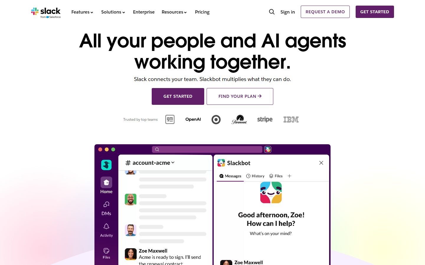
Slack's marketing surface is a bold, conversational SaaS interface — white canvas (`{colors.canvas}` — #ffffff) with a deep aubergine-purple primary action color (`{colors.primary}` — #611f69), oversized geometric Avant-Garde display headlines, and squared-off 4px buttons. The system reads as confident and playful-professional: generous whitespace, big friendly headlines, and product UI mockups shown literally inside the page rather than illustrated around.
Type voice splits cleanly into two roles: **Salesforce Avant Garde** (the geometric display face — used for h1, h2, h3 headlines) and **Salesforce Sans** (the humanist UI face — used for body copy and buttons). Both are custom Salesforce typefaces; open-source substitutes are documented in the Typography section. Display headlines are heavy (600–700 weight) with negative letter-spacing (-0.1px to -0.77px), making them feel tight and confident at large sizes.
Component voltage comes from **product UI fragments shown directly inside the page** — the Slack desktop app chrome, Slackbot panels, channel lists, and chart widgets are embedded as real product mockups in the hero and feature bands. Slack doesn't paint abstract marketing illustrations of the product; it shows the actual app at scale.
The scroll is punctuated by **full-bleed deep-purple bands** (`{colors.primary-deep}` — #4a154b) that break up the white canvas and carry inverted white headlines. The four-color Slack brand palette (`{colors.accent-blue}` #36c5f0, `{colors.accent-green}` #007a5a, `{colors.accent-red}` #c01343, `{colors.primary}` purple) appears sparingly as accent voltage — never on primary CTAs, which stay solid aubergine.
**Key Characteristics:**
- White canvas with deep-aubergine primary CTA (`{colors.primary}` — #611f69). Buttons are squared at `{rounded.xs}` (4px) with all-caps weight-700 labels and wide positive letter-spacing (0.798px).
- Custom `Salesforce Avant Garde` geometric display typeface for headlines (substituted with Poppins here). Heavy weights with negative tracking — big, tight, confident.
- Secondary buttons are outlined: white fill, purple text, 1px inset purple border (`rgb(97,31,105) 0px 0px 0px 1px inset`).
- Product UI mockups embedded directly in the page — real Slack app chrome (channel lists, Slackbot panels, charts) shown as content, carrying soft 32px-blur ambient shadows.
- Full-bleed deep-purple bands (`{colors.primary-deep}` — #4a154b) punctuate the long scroll with inverted white headlines.
- Pill-shaped feature tabs (`{rounded.pill}`) group capability filters (Knowledge / People / Process / Platform).
- Spacing rhythm built on a 4px base with frequent 6px and 16px steps.
- Border radius is hierarchical: `{rounded.xs}` (4px) for buttons, `{rounded.lg}` (16px) for content/product cards, large decorative radii (`{rounded.xl}` 48px, `{rounded.blob}` 90px) for the soft section-shaping blobs, `{rounded.pill}` for tabs.
## Colors
### Brand & Action
- **Primary** (`{colors.primary}` — #611f69): The dominant action color. All primary CTAs and the outline-button border. The most-measured brand color after the neutrals.
- **Primary Deep** (`{colors.primary-deep}` — #4a154b): The signature Slack aubergine. Used on full-bleed dark bands and the footer.
- **Primary Deeper** (`{colors.primary-deeper}` — #481a54): A near-identical deep aubergine used on nested dark surfaces and gradients within the dark bands.
### Slack Four-Color Accents
- **Accent Blue** (`{colors.accent-blue}` — #36c5f0): The Slack logo blue. Appears in product mockups and small brand moments.
- **Accent Green** (`{colors.accent-green}` — #007a5a): Logo green / success-style accents in product UI.
- **Accent Red** (`{colors.accent-red}` — #c01343): Logo magenta-red accent.
- **Accent Magenta** (`{colors.accent-magenta}` — #730394): A bright purple accent used for inline emphasis text inside headlines ("instant **context**", "connect like **people**").
- **Link** (`{colors.link}` — #1264a3): Inline text links ("Learn more about Slackbot →"). The classic Slack link blue — distinct from the four-color brand blue.
### Surface
- **Canvas** (`{colors.canvas}` — #ffffff): The default page floor.
- **Surface Soft** (`{colors.surface-soft}` — #f5f4f5): Pill-tab backgrounds, soft section dividers.
- **Surface Lilac** (`{colors.surface-lilac}` — #f9f0ff): Very-soft lilac tint band used behind the "connect like people" / "from one place" sections.
- **Surface Lilac Soft** (`{colors.surface-lilac-soft}` — #f9edff): A near-identical lilac wash used in gradient transitions.
- **Hairline** (`{colors.hairline}` — #ebeaeb): The 1px border/divider tone on light surfaces.
- **Hairline Soft** (`{colors.hairline-soft}` — #e8e8e8): A barely-visible divider between white sections.
### Text
- **Ink** (`{colors.ink}` — #000000): Headlines and primary display text.
- **Ink Soft** (`{colors.ink-soft}` — #1d1d1d): Dark UI text just shy of pure black.
- **Ink Aubergine** (`{colors.ink-aubergine}` — #1d1c1d): Slack's signature near-black text tone (used in the product UI chrome).
- **Body** (`{colors.body}` — #454245): Default running-text color.
- **Muted** (`{colors.muted}` — #696969): Secondary text — sub-headings, captions ("Trusted by top teams").
- **Muted Soft** (`{colors.muted-soft}` — #717274): Tertiary text — fine print, footnote markers.
- **On Primary** (`{colors.on-primary}` — #ffffff): Text on primary buttons and dark bands.
## Typography
### Font Family
The system runs **Salesforce Avant Garde** for display headlines and **Salesforce Sans** for body + UI. Both are custom Salesforce-owned typefaces. Avant Garde is a geometric display face (heavy weights, tight tracking); Salesforce Sans is a humanist UI sans used for body, buttons, and labels.
The split is functional:
- Salesforce Avant Garde (display, 600–700 weight, negative tracking) — h1, h2, h3
- Salesforce Sans (body + UI, 400–700 weight) — paragraphs, buttons, nav, captions
### Hierarchy
| Token | Size | Weight | Line Height | Letter Spacing | Use |
|---|---|---|---|---|---|
| `{typography.display-xl}` | 64px | 700 | 1.12 | -0.768px | Homepage h1 ("All your people and AI agents working together") — Avant Garde |
| `{typography.display-lg}` | 58px | 600 | 1.25 | -0.464px | Section heads ("Give everyone instant context.", "Secure. Scaleable. Silo-free.") — Avant Garde |
| `{typography.title-md}` | 24px | 700 | 1.25 | -0.096px | Card titles, sub-section heads, feature labels — Avant Garde |
| `{typography.body-md}` | 18px | 400 | 1.555 | -0.0216px | Default running-text, sub-headlines, link copy — Salesforce Sans |
| `{typography.button}` | 14px | 700 | 1.286 | 0.798px | All-caps button + nav labels — Salesforce Sans |
### Principles
Avant Garde is the brand voice — every display headline uses it at 600 or 700 weight with negative letter-spacing. Salesforce Sans handles all supporting type. The boundary is strict: never put body copy in Avant Garde, never put a display headline in Salesforce Sans.
Button labels are uppercase with wide **positive** letter-spacing (0.798px) — the inverse of the display headlines' negative tracking. This contrast (tight headlines vs. spaced-out caps buttons) is part of the system's voice.
### Note on Font Substitutes
Salesforce Avant Garde and Salesforce Sans are proprietary Salesforce typefaces and are not available as public web fonts; never claim to ship them. For Avant Garde, **Poppins** (weight 600–700) is a usable geometric substitute that preserves the heavy, tight display character; **Questrial** is a lighter alternative. For Salesforce Sans, **Lato** is the closest open-source match (Salesforce Sans descends from the Lato family); **Inter** at 400/700 is a serviceable fallback. The substitution preserves weight + tracking signature even though glyph forms differ.
## Layout
### Spacing System
- **Base unit:** 4px.
- **Tokens:** `{spacing.xxs}` 4px · `{spacing.tight}` 6px · `{spacing.xs}` 8px · `{spacing.sm}` 12px · `{spacing.md}` 16px · `{spacing.lg}` 24px · `{spacing.xl}` 32px · `{spacing.xxl}` 40px.
- **Most frequent steps:** 6px (gaps inside dense product UI and tab clusters) and 16px (the dominant card/content gap).
- **Button padding:** 19px top × 40px sides × 20px bottom — the asymmetric vertical padding is measured directly from the primary button.
- **Card internal padding:** `{spacing.lg}` (24px) for feature cards.
### Grid & Container
- **Editorial body:** Centered single-column hero with the h1 spanning a wide measure; supporting content below.
- **Feature card grids:** 3-up at desktop ("What's new in Slack" — Today View / Slackbot Native Charts / Web Search), reducing on smaller breakpoints.
- **Hero composition:** Centered h1 + sub-head + button row, with the product mockup card centered below.
- **Logo strip:** "Trusted by top teams" horizontal logo row (GM, OpenAI, Paramount, Stripe, IBM).
### Whitespace Philosophy
Slack uses generous whitespace around big headlines — the hero h1 dominates the upper fold with substantial vertical breathing room. Section bands alternate between white canvas, soft lilac washes, and full-bleed deep-purple, giving the long-scroll page clear rhythmic punctuation rather than a continuous flat field.
## Elevation & Depth
| Level | Treatment | Use |
|---|---|---|
| Flat | No shadow, no border | Body sections, top nav, dark bands |
| Card outline | 1px inset border (`rgb(97,31,105) 0px 0px 0px 1px inset` — primary purple) | Secondary/outline buttons |
| Ambient soft | `rgba(0,0,0,0.1) 0px 0px 32px 0px` | Product mockup cards — a soft, directionless 32px-blur glow (the most common shadow, 15 occurrences) |
| Subtle drop | `rgba(0,0,0,0.08) 0px 1px 3px 0px` | Small elevated UI chips, low-lift cards |
| Lifted drop | `rgba(0,0,0,0.2) 0px 1px 10px 0px` / `rgba(0,0,0,0.1) 0px 5px 20px 0px` | Floating menus, hovering mockup elements |
| White inset | `rgb(255,255,255) 0px 0px 0px 1px inset` | Light outline on dark surfaces |
The elevation philosophy is **soft and ambient** — the signature treatment is the directionless 32px-blur glow that floats product mockups off the canvas. No heavy directional shadows, no neumorphism. The 4px-radius squared cards and buttons keep things crisp; depth comes from the soft glow rather than hard borders.
### Decorative Depth
- The hero and feature bands carry soft pastel gradient blobs (lilac, blue, pink) bleeding behind the product mockups — these are background gradients, not tokenized shadows.
- Dark bands use the deep aubergine with subtle star/sparkle motifs as decorative texture.
## Shapes
### Border Radius Scale
| Token | Value | Use |
|---|---|---|
| `{rounded.xs}` | 4px | Primary + secondary buttons, small UI chips (the dominant interactive radius) |
| `{rounded.sm}` | 8px | Small cards, input fields |
| `{rounded.md}` | 12px | Mid-size cards (rare) |
| `{rounded.lg}` | 16px | Content cards, product mockup cards (second most common radius) |
| `{rounded.xl}` | 48px | Large decorative section-shaping curves |
| `{rounded.blob}` | 90px | Very-large soft blob shapes used to round section bands |
| `{rounded.pill}` | 999px | Pill tabs, capability filter chips |
### Photography Geometry
Customer-story / company-photo thumbnails ("The most innovative companies run their business in Slack") use `{rounded.lg}` (16px) corners. Product UI mockups retain their native app chrome with their own internal radii. The contrast between the squared 4px buttons and the soft 16px cards is intentional — actions are crisp, content is soft.
## Components
### Top Navigation
**`top-nav`** — White nav bar pinned to the top of every page. `{colors.canvas}` background. Carries the Slack-from-Salesforce wordmark + logo at left, a horizontal menu (Features ▾, Solutions ▾, Enterprise, Resources ▾, Pricing) center-left in `{typography.button}`-cased nav links, and a right cluster: a search icon, "Sign in" text-link, a "REQUEST A DEMO" `{component.button-secondary}`, and a "GET STARTED" `{component.button-primary}`.
**`nav-link`** — Top-nav menu items. Transparent background, `{colors.ink}` text. Dropdown carets on Features / Solutions / Resources.
### Buttons
**`button-primary`** — The signature primary CTA ("GET STARTED"). Background `{colors.primary}` (#611f69), text `{colors.on-primary}`, type `{typography.button}` (all-caps, 14px / 700, 0.798px tracking), squared at `{rounded.xs}` (4px), padding 19px × 40px × 20px (measured).
**`button-secondary`** — Outline button ("FIND YOUR PLAN", "REQUEST A DEMO"). White `{colors.canvas}` fill, `{colors.primary}` text, 1px inset purple border (`rgb(97,31,105) 0px 0px 0px 1px inset`), same squared `{rounded.xs}` radius and label styling as primary. Often carries a trailing arrow glyph ("FIND YOUR PLAN →").
**`text-link`** — Inline body links in `{colors.link}` (#1264a3), type `{typography.body-md}`, typically with a trailing "→" ("Learn more about Slackbot →", "See all integrations →").
### Bands & Containers
**`hero-band`** — White-canvas hero with centered h1 in `{typography.display-xl}`, a sub-headline in `{typography.body-md}`, a primary + secondary button row, the "Trusted by top teams" logo strip, and a centered `{component.product-mockup-card}` below.
**`band-dark`** — Full-bleed deep-purple band ("Reimagine what's possible with AI and agents."). Background `{colors.primary-deep}` (#4a154b), inverted white text, headlines in `{typography.display-lg}`. Carries star/sparkle decorative texture and an embedded product mockup. Used to punctuate the white scroll.
**`band-lilac`** — Soft lilac-tinted band ("Let your people connect like people."). Background `{colors.surface-lilac}` (#f9f0ff), `{colors.ink}` text with `{colors.accent-magenta}` inline emphasis words. Carries pastel gradient blobs behind content.
**`product-mockup-card`** — A card showing actual Slack app UI (channel list, Slackbot panel, charts). Background `{colors.canvas}`, rounded `{rounded.lg}` (16px), floated with the ambient `rgba(0,0,0,0.1) 0px 0px 32px 0px` glow. The product UI inside has its own internal chrome — these cards display the product, they don't decorate around it.
**`feature-card`** — Used in the 3-up "What's new in Slack" grid. Background `{colors.canvas}`, rounded `{rounded.lg}` (16px), internal padding `{spacing.lg}` (24px). Carries a product-UI thumbnail at top, a "NEW FEATURE" eyebrow, a title in `{typography.title-md}`, and a short description in `{typography.body-md}`.
### Tabs
**`pill-tab`** — Pill-shaped capability filter chip (Knowledge / People / Process / Platform; Ask Slackbot / Plan launches / Run projects). Background `{colors.surface-soft}` (#f5f4f5), `{colors.ink}` text, type `{typography.button}`, rounded `{rounded.pill}` (999px), padding ~12px × 24px.
### Footer
**`footer`** — Deep-purple footer that closes the page ("We're in the business of growing businesses."). Background `{colors.primary-deep}` (#4a154b), text `{colors.on-primary}`, body in `{typography.body-md}`. The deep aubergine inversion visually closes every long-scroll page.
## Do's and Don'ts
### Do
- Reserve `{colors.primary}` (#611f69) for primary CTAs. Slack's button is solid aubergine, never one of the four brand-color accents.
- Use Avant Garde for every display headline at 600–700 weight with negative letter-spacing. Pair with Salesforce Sans body. Never blur the boundary.
- Keep buttons squared at `{rounded.xs}` (4px) with all-caps, wide-tracked (0.798px) labels. The crisp-square button against soft 16px cards is the intended contrast.
- Embed real Slack product UI inside mockup cards. Show the product; don't illustrate around it.
- Float product mockups with the ambient `rgba(0,0,0,0.1) 0px 0px 32px 0px` glow rather than hard borders.
- Use the four-color accent palette and `{colors.accent-magenta}` sparingly — for inline emphasis words in headlines and small brand moments only.
- Punctuate long scrolls with full-bleed `{component.band-dark}` aubergine and `{component.band-lilac}` washes to break up the white canvas.
### Don't
- Don't put brand accent colors (blue, green, red, magenta) on primary CTAs. The action layer is monochrome aubergine.
- Don't round buttons beyond `{rounded.xs}` (4px). The squared button is a system signature.
- Don't set display headlines in Salesforce Sans or body copy in Avant Garde.
- Don't claim to ship Salesforce Avant Garde or Salesforce Sans — use the documented open substitutes.
- Don't add directional drop shadows to product mockups; the ambient glow is the system treatment.
- Don't run two consecutive identical bands — pacing alternates white → dark-purple → white → lilac → dark-footer.
## Responsive Behavior
### Breakpoints
| Name | Width | Key Changes |
|---|---|---|
| Mobile | < 768px | Hamburger nav; hero h1 scales down from 64px; button row stacks; feature grid 1-up; logo strip wraps |
| Tablet | 768–1024px | Nav tightens; feature cards 2-up; product mockups scale proportionally |
| Desktop | 1024–1440px | Full horizontal nav with all menu items; 3-up feature cards; centered wide hero |
| Wide | > 1440px | Same as desktop with more outer breathing room |
The reference capture shows a desktop landing (full nav, oversized 64px hero h1) and a narrow/mobile-width full-page render (stacked nav, compressed hero, single-column bands) — confirming the hero h1 scales down and the button row stacks at narrow widths.
### Touch Targets
- `{component.button-primary}` and `{component.button-secondary}` carry tall vertical padding (19/20px) — comfortably above 44px tap height.
- `{component.pill-tab}` chips have ~12px × 24px padding, meeting tap-target minimums with the pill silhouette.
### Collapsing Strategy
- Top nav collapses to a hamburger at mobile width.
- Hero button row (GET STARTED + FIND YOUR PLAN) stacks vertically on mobile.
- Feature grids reduce columns (3 → 2 → 1) rather than shrinking cards heavily.
- Full-bleed bands stay full-width at every breakpoint; their inner content reflows to single-column.
### Image Behavior
- Product UI mockups scale proportionally; app chrome stays legible.
- Customer-story photo thumbnails retain `{rounded.lg}` corners and crop to grid at every breakpoint.
## Iteration Guide
1. Focus on ONE component at a time. Reference its YAML key directly (`{component.button-primary}`, `{component.band-dark}`).
2. Variants of an existing component (`-active`, `-disabled`) live as separate entries in `components:`.
3. Use `{token.refs}` everywhere — never inline hex.
4. Never document hover. Default and Active/Pressed states only (not captured here — see Known Gaps).
5. Display headlines stay Avant Garde 600–700 with negative tracking; body stays Salesforce Sans 400. Buttons stay all-caps 700 with positive tracking.
6. Keep buttons squared (4px) and content cards soft (16px). Don't blur the two.
7. When in doubt about emphasis: bigger Avant Garde before adding accent color.
## Known Gaps
- Salesforce Avant Garde and Salesforce Sans are proprietary Salesforce typefaces, not public web fonts. `fonts_licensed` was empty in the analysis, but these families are custom; open-source substitutes (Poppins, Lato) are documented in the Typography section.
- Button active/pressed and disabled states were not measured — only the default primary and a derived outline secondary (inferred from the measured `rgb(97,31,105) 0px 0px 0px 1px inset` border shadow and screenshot ground-truth).
- The measured `card` component reports `radius: 0px, shadow: none`, which conflicts with the visibly rounded (16px) product/feature cards in the screenshots — the analyzer likely sampled a full-bleed band wrapper rather than the inner cards. Card radius is documented from the measured `{rounded.lg}` (16px) value and screenshot ground-truth.
- Large radii of 48px, 60px, and 90px were measured; 48px and 90px are documented as section-shaping/blob curves, but the 60px instance (single occurrence) is unmapped and may be a one-off decorative element.
- Exact hex values for the four-color brand accents inside product mockups are documented from frequency analysis; some appear inside rendered product chrome rather than the marketing layer itself.
- Section background gradient blobs (lilac/blue/pink) are visible in screenshots but were not captured as discrete gradient tokens — only flat band fills were measured.
- Animation, transition timings, dropdown-menu behavior, and the pricing-page layout were not extracted in detail.
<!-- Documented by duply · real-world design systems as ready-to-use DESIGN.md for AI coding agents · https://duply.ai/slack/design-md -->
Color Palette
Accent
Neutrals
Typography
display-xl64px · 700 · 1.12
The quick brown fox jumpsdisplay-lg58px · 600 · 1.25
The quick brown fox jumpstitle-md24px · 700 · 1.25
The quick brown fox jumpsbody-md18px · 400 · 1.555
The quick brown fox jumpsbutton14px · 700 · 1.286
The quick brown fox jumpsSpacing & Shape
Spacing
| Name | Value | Preview |
|---|---|---|
| xxs | 4px | |
| tight | 6px | |
| xs | 8px | |
| sm | 12px | |
| md | 16px | |
| lg | 24px | |
| xl | 32px | |
| xxl | 40px |
Border Radius
| Name | Value | Preview |
|---|---|---|
| xs | 4px | |
| sm | 8px | |
| md | 12px | |
| lg | 16px | |
| xl | 48px | |
| blob | 90px | |
| pill | 999px |
More like this


---
version: alpha
name: Slack-design-analysis
description: A bold, conversational SaaS marketing surface built on white canvas with a deep aubergine-purple brand action color, oversized geometric Avant-Garde display headlines, and squared-off (4px) primary buttons. The system reads as confident and playful-professional — generous whitespace, product UI mockups shown literally inside the page, deep-purple full-bleed bands that punctuate the scroll, and Slack's signature four-color brand palette (blue, green, red, purple) used sparingly as accent voltage rather than on primary actions.

colors:
  primary: "#611f69"
  primary-deep: "#4a154b"
  primary-deeper: "#481a54"
  on-primary: "#ffffff"
  canvas: "#ffffff"
  ink: "#000000"
  ink-soft: "#1d1d1d"
  ink-aubergine: "#1d1c1d"
  body: "#454245"
  muted: "#696969"
  muted-soft: "#717274"
  link: "#1264a3"
  accent-blue: "#36c5f0"
  accent-green: "#007a5a"
  accent-red: "#c01343"
  accent-magenta: "#730394"
  surface-soft: "#f5f4f5"
  surface-lilac: "#f9f0ff"
  surface-lilac-soft: "#f9edff"
  hairline: "#ebeaeb"
  hairline-soft: "#e8e8e8"

typography:
  display-xl:
    fontFamily: "Salesforce-Avant-Garde, Poppins, sans-serif"
    fontSize: 64px
    fontWeight: 700
    lineHeight: 1.12
    letterSpacing: -0.768px
  display-lg:
    fontFamily: "Salesforce-Avant-Garde, Poppins, sans-serif"
    fontSize: 58px
    fontWeight: 600
    lineHeight: 1.25
    letterSpacing: -0.464px
  title-md:
    fontFamily: "Salesforce-Avant-Garde, Poppins, sans-serif"
    fontSize: 24px
    fontWeight: 700
    lineHeight: 1.25
    letterSpacing: -0.096px
  body-md:
    fontFamily: "Salesforce-Sans, Lato, sans-serif"
    fontSize: 18px
    fontWeight: 400
    lineHeight: 1.555
    letterSpacing: -0.0216px
  button:
    fontFamily: "Salesforce-Sans, Lato, sans-serif"
    fontSize: 14px
    fontWeight: 700
    lineHeight: 1.286
    letterSpacing: 0.798px

rounded:
  xs: 4px
  sm: 8px
  md: 12px
  lg: 16px
  xl: 48px
  blob: 90px
  pill: 999px

spacing:
  xxs: 4px
  tight: 6px
  xs: 8px
  sm: 12px
  md: 16px
  lg: 24px
  xl: 32px
  xxl: 40px

components:
  button-primary:
    backgroundColor: "{colors.primary}"
    textColor: "{colors.on-primary}"
    typography: "{typography.button}"
    rounded: "{rounded.xs}"
    padding: 19px 40px 20px
  button-secondary:
    backgroundColor: "{colors.canvas}"
    textColor: "{colors.primary}"
    typography: "{typography.button}"
    rounded: "{rounded.xs}"
    padding: 19px 40px 20px
  top-nav:
    backgroundColor: "{colors.canvas}"
    textColor: "{colors.ink}"
    typography: "{typography.button}"
  nav-link:
    backgroundColor: transparent
    textColor: "{colors.ink}"
    typography: "{typography.body-md}"
  text-link:
    backgroundColor: transparent
    textColor: "{colors.link}"
    typography: "{typography.body-md}"
  hero-band:
    backgroundColor: "{colors.canvas}"
    textColor: "{colors.ink}"
    typography: "{typography.display-xl}"
  band-dark:
    backgroundColor: "{colors.primary-deep}"
    textColor: "{colors.on-primary}"
    typography: "{typography.display-lg}"
  band-lilac:
    backgroundColor: "{colors.surface-lilac}"
    textColor: "{colors.ink}"
    typography: "{typography.display-lg}"
  product-mockup-card:
    backgroundColor: "{colors.canvas}"
    textColor: "{colors.ink}"
    rounded: "{rounded.lg}"
  feature-card:
    backgroundColor: "{colors.canvas}"
    textColor: "{colors.ink}"
    typography: "{typography.title-md}"
    rounded: "{rounded.lg}"
    padding: 24px
  pill-tab:
    backgroundColor: "{colors.surface-soft}"
    textColor: "{colors.ink}"
    typography: "{typography.button}"
    rounded: "{rounded.pill}"
    padding: 12px 24px
  footer:
    backgroundColor: "{colors.primary-deep}"
    textColor: "{colors.on-primary}"
    typography: "{typography.body-md}"
---

## Overview

Slack's marketing surface is a bold, conversational SaaS interface — white canvas (`{colors.canvas}` — #ffffff) with a deep aubergine-purple primary action color (`{colors.primary}` — #611f69), oversized geometric Avant-Garde display headlines, and squared-off 4px buttons. The system reads as confident and playful-professional: generous whitespace, big friendly headlines, and product UI mockups shown literally inside the page rather than illustrated around.

Type voice splits cleanly into two roles: **Salesforce Avant Garde** (the geometric display face — used for h1, h2, h3 headlines) and **Salesforce Sans** (the humanist UI face — used for body copy and buttons). Both are custom Salesforce typefaces; open-source substitutes are documented in the Typography section. Display headlines are heavy (600–700 weight) with negative letter-spacing (-0.1px to -0.77px), making them feel tight and confident at large sizes.

Component voltage comes from **product UI fragments shown directly inside the page** — the Slack desktop app chrome, Slackbot panels, channel lists, and chart widgets are embedded as real product mockups in the hero and feature bands. Slack doesn't paint abstract marketing illustrations of the product; it shows the actual app at scale.

The scroll is punctuated by **full-bleed deep-purple bands** (`{colors.primary-deep}` — #4a154b) that break up the white canvas and carry inverted white headlines. The four-color Slack brand palette (`{colors.accent-blue}` #36c5f0, `{colors.accent-green}` #007a5a, `{colors.accent-red}` #c01343, `{colors.primary}` purple) appears sparingly as accent voltage — never on primary CTAs, which stay solid aubergine.

**Key Characteristics:**
- White canvas with deep-aubergine primary CTA (`{colors.primary}` — #611f69). Buttons are squared at `{rounded.xs}` (4px) with all-caps weight-700 labels and wide positive letter-spacing (0.798px).
- Custom `Salesforce Avant Garde` geometric display typeface for headlines (substituted with Poppins here). Heavy weights with negative tracking — big, tight, confident.
- Secondary buttons are outlined: white fill, purple text, 1px inset purple border (`rgb(97,31,105) 0px 0px 0px 1px inset`).
- Product UI mockups embedded directly in the page — real Slack app chrome (channel lists, Slackbot panels, charts) shown as content, carrying soft 32px-blur ambient shadows.
- Full-bleed deep-purple bands (`{colors.primary-deep}` — #4a154b) punctuate the long scroll with inverted white headlines.
- Pill-shaped feature tabs (`{rounded.pill}`) group capability filters (Knowledge / People / Process / Platform).
- Spacing rhythm built on a 4px base with frequent 6px and 16px steps.
- Border radius is hierarchical: `{rounded.xs}` (4px) for buttons, `{rounded.lg}` (16px) for content/product cards, large decorative radii (`{rounded.xl}` 48px, `{rounded.blob}` 90px) for the soft section-shaping blobs, `{rounded.pill}` for tabs.

## Colors

### Brand & Action
- **Primary** (`{colors.primary}` — #611f69): The dominant action color. All primary CTAs and the outline-button border. The most-measured brand color after the neutrals.
- **Primary Deep** (`{colors.primary-deep}` — #4a154b): The signature Slack aubergine. Used on full-bleed dark bands and the footer.
- **Primary Deeper** (`{colors.primary-deeper}` — #481a54): A near-identical deep aubergine used on nested dark surfaces and gradients within the dark bands.

### Slack Four-Color Accents
- **Accent Blue** (`{colors.accent-blue}` — #36c5f0): The Slack logo blue. Appears in product mockups and small brand moments.
- **Accent Green** (`{colors.accent-green}` — #007a5a): Logo green / success-style accents in product UI.
- **Accent Red** (`{colors.accent-red}` — #c01343): Logo magenta-red accent.
- **Accent Magenta** (`{colors.accent-magenta}` — #730394): A bright purple accent used for inline emphasis text inside headlines ("instant **context**", "connect like **people**").
- **Link** (`{colors.link}` — #1264a3): Inline text links ("Learn more about Slackbot →"). The classic Slack link blue — distinct from the four-color brand blue.

### Surface
- **Canvas** (`{colors.canvas}` — #ffffff): The default page floor.
- **Surface Soft** (`{colors.surface-soft}` — #f5f4f5): Pill-tab backgrounds, soft section dividers.
- **Surface Lilac** (`{colors.surface-lilac}` — #f9f0ff): Very-soft lilac tint band used behind the "connect like people" / "from one place" sections.
- **Surface Lilac Soft** (`{colors.surface-lilac-soft}` — #f9edff): A near-identical lilac wash used in gradient transitions.
- **Hairline** (`{colors.hairline}` — #ebeaeb): The 1px border/divider tone on light surfaces.
- **Hairline Soft** (`{colors.hairline-soft}` — #e8e8e8): A barely-visible divider between white sections.

### Text
- **Ink** (`{colors.ink}` — #000000): Headlines and primary display text.
- **Ink Soft** (`{colors.ink-soft}` — #1d1d1d): Dark UI text just shy of pure black.
- **Ink Aubergine** (`{colors.ink-aubergine}` — #1d1c1d): Slack's signature near-black text tone (used in the product UI chrome).
- **Body** (`{colors.body}` — #454245): Default running-text color.
- **Muted** (`{colors.muted}` — #696969): Secondary text — sub-headings, captions ("Trusted by top teams").
- **Muted Soft** (`{colors.muted-soft}` — #717274): Tertiary text — fine print, footnote markers.
- **On Primary** (`{colors.on-primary}` — #ffffff): Text on primary buttons and dark bands.

## Typography

### Font Family
The system runs **Salesforce Avant Garde** for display headlines and **Salesforce Sans** for body + UI. Both are custom Salesforce-owned typefaces. Avant Garde is a geometric display face (heavy weights, tight tracking); Salesforce Sans is a humanist UI sans used for body, buttons, and labels.

The split is functional:
- Salesforce Avant Garde (display, 600–700 weight, negative tracking) — h1, h2, h3
- Salesforce Sans (body + UI, 400–700 weight) — paragraphs, buttons, nav, captions

### Hierarchy

| Token | Size | Weight | Line Height | Letter Spacing | Use |
|---|---|---|---|---|---|
| `{typography.display-xl}` | 64px | 700 | 1.12 | -0.768px | Homepage h1 ("All your people and AI agents working together") — Avant Garde |
| `{typography.display-lg}` | 58px | 600 | 1.25 | -0.464px | Section heads ("Give everyone instant context.", "Secure. Scaleable. Silo-free.") — Avant Garde |
| `{typography.title-md}` | 24px | 700 | 1.25 | -0.096px | Card titles, sub-section heads, feature labels — Avant Garde |
| `{typography.body-md}` | 18px | 400 | 1.555 | -0.0216px | Default running-text, sub-headlines, link copy — Salesforce Sans |
| `{typography.button}` | 14px | 700 | 1.286 | 0.798px | All-caps button + nav labels — Salesforce Sans |

### Principles
Avant Garde is the brand voice — every display headline uses it at 600 or 700 weight with negative letter-spacing. Salesforce Sans handles all supporting type. The boundary is strict: never put body copy in Avant Garde, never put a display headline in Salesforce Sans.

Button labels are uppercase with wide **positive** letter-spacing (0.798px) — the inverse of the display headlines' negative tracking. This contrast (tight headlines vs. spaced-out caps buttons) is part of the system's voice.

### Note on Font Substitutes
Salesforce Avant Garde and Salesforce Sans are proprietary Salesforce typefaces and are not available as public web fonts; never claim to ship them. For Avant Garde, **Poppins** (weight 600–700) is a usable geometric substitute that preserves the heavy, tight display character; **Questrial** is a lighter alternative. For Salesforce Sans, **Lato** is the closest open-source match (Salesforce Sans descends from the Lato family); **Inter** at 400/700 is a serviceable fallback. The substitution preserves weight + tracking signature even though glyph forms differ.

## Layout

### Spacing System
- **Base unit:** 4px.
- **Tokens:** `{spacing.xxs}` 4px · `{spacing.tight}` 6px · `{spacing.xs}` 8px · `{spacing.sm}` 12px · `{spacing.md}` 16px · `{spacing.lg}` 24px · `{spacing.xl}` 32px · `{spacing.xxl}` 40px.
- **Most frequent steps:** 6px (gaps inside dense product UI and tab clusters) and 16px (the dominant card/content gap).
- **Button padding:** 19px top × 40px sides × 20px bottom — the asymmetric vertical padding is measured directly from the primary button.
- **Card internal padding:** `{spacing.lg}` (24px) for feature cards.

### Grid & Container
- **Editorial body:** Centered single-column hero with the h1 spanning a wide measure; supporting content below.
- **Feature card grids:** 3-up at desktop ("What's new in Slack" — Today View / Slackbot Native Charts / Web Search), reducing on smaller breakpoints.
- **Hero composition:** Centered h1 + sub-head + button row, with the product mockup card centered below.
- **Logo strip:** "Trusted by top teams" horizontal logo row (GM, OpenAI, Paramount, Stripe, IBM).

### Whitespace Philosophy
Slack uses generous whitespace around big headlines — the hero h1 dominates the upper fold with substantial vertical breathing room. Section bands alternate between white canvas, soft lilac washes, and full-bleed deep-purple, giving the long-scroll page clear rhythmic punctuation rather than a continuous flat field.

## Elevation & Depth

| Level | Treatment | Use |
|---|---|---|
| Flat | No shadow, no border | Body sections, top nav, dark bands |
| Card outline | 1px inset border (`rgb(97,31,105) 0px 0px 0px 1px inset` — primary purple) | Secondary/outline buttons |
| Ambient soft | `rgba(0,0,0,0.1) 0px 0px 32px 0px` | Product mockup cards — a soft, directionless 32px-blur glow (the most common shadow, 15 occurrences) |
| Subtle drop | `rgba(0,0,0,0.08) 0px 1px 3px 0px` | Small elevated UI chips, low-lift cards |
| Lifted drop | `rgba(0,0,0,0.2) 0px 1px 10px 0px` / `rgba(0,0,0,0.1) 0px 5px 20px 0px` | Floating menus, hovering mockup elements |
| White inset | `rgb(255,255,255) 0px 0px 0px 1px inset` | Light outline on dark surfaces |

The elevation philosophy is **soft and ambient** — the signature treatment is the directionless 32px-blur glow that floats product mockups off the canvas. No heavy directional shadows, no neumorphism. The 4px-radius squared cards and buttons keep things crisp; depth comes from the soft glow rather than hard borders.

### Decorative Depth
- The hero and feature bands carry soft pastel gradient blobs (lilac, blue, pink) bleeding behind the product mockups — these are background gradients, not tokenized shadows.
- Dark bands use the deep aubergine with subtle star/sparkle motifs as decorative texture.

## Shapes

### Border Radius Scale

| Token | Value | Use |
|---|---|---|
| `{rounded.xs}` | 4px | Primary + secondary buttons, small UI chips (the dominant interactive radius) |
| `{rounded.sm}` | 8px | Small cards, input fields |
| `{rounded.md}` | 12px | Mid-size cards (rare) |
| `{rounded.lg}` | 16px | Content cards, product mockup cards (second most common radius) |
| `{rounded.xl}` | 48px | Large decorative section-shaping curves |
| `{rounded.blob}` | 90px | Very-large soft blob shapes used to round section bands |
| `{rounded.pill}` | 999px | Pill tabs, capability filter chips |

### Photography Geometry
Customer-story / company-photo thumbnails ("The most innovative companies run their business in Slack") use `{rounded.lg}` (16px) corners. Product UI mockups retain their native app chrome with their own internal radii. The contrast between the squared 4px buttons and the soft 16px cards is intentional — actions are crisp, content is soft.

## Components

### Top Navigation

**`top-nav`** — White nav bar pinned to the top of every page. `{colors.canvas}` background. Carries the Slack-from-Salesforce wordmark + logo at left, a horizontal menu (Features ▾, Solutions ▾, Enterprise, Resources ▾, Pricing) center-left in `{typography.button}`-cased nav links, and a right cluster: a search icon, "Sign in" text-link, a "REQUEST A DEMO" `{component.button-secondary}`, and a "GET STARTED" `{component.button-primary}`.

**`nav-link`** — Top-nav menu items. Transparent background, `{colors.ink}` text. Dropdown carets on Features / Solutions / Resources.

### Buttons

**`button-primary`** — The signature primary CTA ("GET STARTED"). Background `{colors.primary}` (#611f69), text `{colors.on-primary}`, type `{typography.button}` (all-caps, 14px / 700, 0.798px tracking), squared at `{rounded.xs}` (4px), padding 19px × 40px × 20px (measured).

**`button-secondary`** — Outline button ("FIND YOUR PLAN", "REQUEST A DEMO"). White `{colors.canvas}` fill, `{colors.primary}` text, 1px inset purple border (`rgb(97,31,105) 0px 0px 0px 1px inset`), same squared `{rounded.xs}` radius and label styling as primary. Often carries a trailing arrow glyph ("FIND YOUR PLAN →").

**`text-link`** — Inline body links in `{colors.link}` (#1264a3), type `{typography.body-md}`, typically with a trailing "→" ("Learn more about Slackbot →", "See all integrations →").

### Bands & Containers

**`hero-band`** — White-canvas hero with centered h1 in `{typography.display-xl}`, a sub-headline in `{typography.body-md}`, a primary + secondary button row, the "Trusted by top teams" logo strip, and a centered `{component.product-mockup-card}` below.

**`band-dark`** — Full-bleed deep-purple band ("Reimagine what's possible with AI and agents."). Background `{colors.primary-deep}` (#4a154b), inverted white text, headlines in `{typography.display-lg}`. Carries star/sparkle decorative texture and an embedded product mockup. Used to punctuate the white scroll.

**`band-lilac`** — Soft lilac-tinted band ("Let your people connect like people."). Background `{colors.surface-lilac}` (#f9f0ff), `{colors.ink}` text with `{colors.accent-magenta}` inline emphasis words. Carries pastel gradient blobs behind content.

**`product-mockup-card`** — A card showing actual Slack app UI (channel list, Slackbot panel, charts). Background `{colors.canvas}`, rounded `{rounded.lg}` (16px), floated with the ambient `rgba(0,0,0,0.1) 0px 0px 32px 0px` glow. The product UI inside has its own internal chrome — these cards display the product, they don't decorate around it.

**`feature-card`** — Used in the 3-up "What's new in Slack" grid. Background `{colors.canvas}`, rounded `{rounded.lg}` (16px), internal padding `{spacing.lg}` (24px). Carries a product-UI thumbnail at top, a "NEW FEATURE" eyebrow, a title in `{typography.title-md}`, and a short description in `{typography.body-md}`.

### Tabs

**`pill-tab`** — Pill-shaped capability filter chip (Knowledge / People / Process / Platform; Ask Slackbot / Plan launches / Run projects). Background `{colors.surface-soft}` (#f5f4f5), `{colors.ink}` text, type `{typography.button}`, rounded `{rounded.pill}` (999px), padding ~12px × 24px.

### Footer

**`footer`** — Deep-purple footer that closes the page ("We're in the business of growing businesses."). Background `{colors.primary-deep}` (#4a154b), text `{colors.on-primary}`, body in `{typography.body-md}`. The deep aubergine inversion visually closes every long-scroll page.

## Do's and Don'ts

### Do
- Reserve `{colors.primary}` (#611f69) for primary CTAs. Slack's button is solid aubergine, never one of the four brand-color accents.
- Use Avant Garde for every display headline at 600–700 weight with negative letter-spacing. Pair with Salesforce Sans body. Never blur the boundary.
- Keep buttons squared at `{rounded.xs}` (4px) with all-caps, wide-tracked (0.798px) labels. The crisp-square button against soft 16px cards is the intended contrast.
- Embed real Slack product UI inside mockup cards. Show the product; don't illustrate around it.
- Float product mockups with the ambient `rgba(0,0,0,0.1) 0px 0px 32px 0px` glow rather than hard borders.
- Use the four-color accent palette and `{colors.accent-magenta}` sparingly — for inline emphasis words in headlines and small brand moments only.
- Punctuate long scrolls with full-bleed `{component.band-dark}` aubergine and `{component.band-lilac}` washes to break up the white canvas.

### Don't
- Don't put brand accent colors (blue, green, red, magenta) on primary CTAs. The action layer is monochrome aubergine.
- Don't round buttons beyond `{rounded.xs}` (4px). The squared button is a system signature.
- Don't set display headlines in Salesforce Sans or body copy in Avant Garde.
- Don't claim to ship Salesforce Avant Garde or Salesforce Sans — use the documented open substitutes.
- Don't add directional drop shadows to product mockups; the ambient glow is the system treatment.
- Don't run two consecutive identical bands — pacing alternates white → dark-purple → white → lilac → dark-footer.

## Responsive Behavior

### Breakpoints

| Name | Width | Key Changes |
|---|---|---|
| Mobile | < 768px | Hamburger nav; hero h1 scales down from 64px; button row stacks; feature grid 1-up; logo strip wraps |
| Tablet | 768–1024px | Nav tightens; feature cards 2-up; product mockups scale proportionally |
| Desktop | 1024–1440px | Full horizontal nav with all menu items; 3-up feature cards; centered wide hero |
| Wide | > 1440px | Same as desktop with more outer breathing room |

The reference capture shows a desktop landing (full nav, oversized 64px hero h1) and a narrow/mobile-width full-page render (stacked nav, compressed hero, single-column bands) — confirming the hero h1 scales down and the button row stacks at narrow widths.

### Touch Targets
- `{component.button-primary}` and `{component.button-secondary}` carry tall vertical padding (19/20px) — comfortably above 44px tap height.
- `{component.pill-tab}` chips have ~12px × 24px padding, meeting tap-target minimums with the pill silhouette.

### Collapsing Strategy
- Top nav collapses to a hamburger at mobile width.
- Hero button row (GET STARTED + FIND YOUR PLAN) stacks vertically on mobile.
- Feature grids reduce columns (3 → 2 → 1) rather than shrinking cards heavily.
- Full-bleed bands stay full-width at every breakpoint; their inner content reflows to single-column.

### Image Behavior
- Product UI mockups scale proportionally; app chrome stays legible.
- Customer-story photo thumbnails retain `{rounded.lg}` corners and crop to grid at every breakpoint.

## Iteration Guide

1. Focus on ONE component at a time. Reference its YAML key directly (`{component.button-primary}`, `{component.band-dark}`).
2. Variants of an existing component (`-active`, `-disabled`) live as separate entries in `components:`.
3. Use `{token.refs}` everywhere — never inline hex.
4. Never document hover. Default and Active/Pressed states only (not captured here — see Known Gaps).
5. Display headlines stay Avant Garde 600–700 with negative tracking; body stays Salesforce Sans 400. Buttons stay all-caps 700 with positive tracking.
6. Keep buttons squared (4px) and content cards soft (16px). Don't blur the two.
7. When in doubt about emphasis: bigger Avant Garde before adding accent color.

## Known Gaps

- Salesforce Avant Garde and Salesforce Sans are proprietary Salesforce typefaces, not public web fonts. `fonts_licensed` was empty in the analysis, but these families are custom; open-source substitutes (Poppins, Lato) are documented in the Typography section.
- Button active/pressed and disabled states were not measured — only the default primary and a derived outline secondary (inferred from the measured `rgb(97,31,105) 0px 0px 0px 1px inset` border shadow and screenshot ground-truth).
- The measured `card` component reports `radius: 0px, shadow: none`, which conflicts with the visibly rounded (16px) product/feature cards in the screenshots — the analyzer likely sampled a full-bleed band wrapper rather than the inner cards. Card radius is documented from the measured `{rounded.lg}` (16px) value and screenshot ground-truth.
- Large radii of 48px, 60px, and 90px were measured; 48px and 90px are documented as section-shaping/blob curves, but the 60px instance (single occurrence) is unmapped and may be a one-off decorative element.
- Exact hex values for the four-color brand accents inside product mockups are documented from frequency analysis; some appear inside rendered product chrome rather than the marketing layer itself.
- Section background gradient blobs (lilac/blue/pink) are visible in screenshots but were not captured as discrete gradient tokens — only flat band fills were measured.
- Animation, transition timings, dropdown-menu behavior, and the pricing-page layout were not extracted in detail.

<!-- Documented by duply · real-world design systems as ready-to-use DESIGN.md for AI coding agents · https://duply.ai/slack/design-md -->