Clay
A warm-paper, GTM-software marketing surface built on a cream-tinted off-white canvas with pure-black primary CTAs and the custom Roobert display typeface set at heavy negative tracking. The system reads as confident modern B2B SaaS — oversized black headlines, claymation 3D props, real product-UI screenshots embedded in rounded cards, and vivid color-block testimonial tiles punctuating an otherwise neutral, warm-gray palette.
---
version: alpha
name: Clay-design-analysis
description: A warm-paper, GTM-software marketing surface built on a cream-tinted off-white canvas with pure-black primary CTAs and the custom Roobert display typeface set at heavy negative tracking. The system reads as confident modern B2B SaaS — oversized black headlines, claymation 3D props, real product-UI screenshots embedded in rounded cards, and vivid color-block testimonial tiles punctuating an otherwise neutral, warm-gray palette.
colors:
ink: "#000000"
ink-soft: "#302f2c"
body: "#55534e"
muted: "#79756d"
muted-soft: "#9f9b93"
slate: "#676d7e"
canvas: "#ffffff"
surface-warm: "#f4f3f0"
surface-warm-soft: "#f9f8f6"
surface-warm-alt: "#f3f2ed"
surface-cream: "#eee9df"
border-warm: "#dad4c8"
surface-lilac: "#f5ebfd"
accent-magenta: "#911f6b"
accent-magenta-deep: "#8b045c"
accent-blue: "#3859f9"
surface-green-dark: "#03331d"
hairline: "#e6e8ec"
hairline-alt: "#e7e8ec"
neutral-300: "#cccccc"
on-ink: "#ffffff"
typography:
display-xl:
fontFamily: "Roobert, Inter, sans-serif"
fontSize: 80px
fontWeight: 600
lineHeight: 1.0
letterSpacing: -3.2px
display-md:
fontFamily: "Roobert, Inter, sans-serif"
fontSize: 44px
fontWeight: 500
lineHeight: 1.1
letterSpacing: -1.32px
heading:
fontFamily: "Roobert, Inter, sans-serif"
fontSize: 32px
fontWeight: 600
lineHeight: 1.1
letterSpacing: -0.64px
body:
fontFamily: "Roobert, Inter, sans-serif"
fontSize: 14px
fontWeight: 500
lineHeight: 1.5
letterSpacing: 0
button:
fontFamily: "Roobert, Inter, sans-serif"
fontSize: 12.8px
fontWeight: 400
lineHeight: 1.5
letterSpacing: 0
rounded:
xs: 4px
sm: 6px
md: 8px
lg: 12px
xl: 16px
xxl: 24px
pill: 40px
full: 1584px
spacing:
xxs: 4px
xs: 8px
sm: 12px
md: 16px
lg: 24px
xl: 32px
xxl: 48px
components:
top-nav:
backgroundColor: "{colors.canvas}"
textColor: "{colors.ink}"
typography: "{typography.body}"
padding: 16px
nav-link:
backgroundColor: transparent
textColor: "{colors.ink}"
typography: "{typography.body}"
button-primary:
backgroundColor: "{colors.ink}"
textColor: "{colors.on-ink}"
typography: "{typography.button}"
rounded: "{rounded.lg}"
padding: 6.4px
button-secondary:
backgroundColor: "{colors.surface-warm}"
textColor: "{colors.ink}"
typography: "{typography.button}"
rounded: "{rounded.lg}"
padding: 6.4px
cookie-button-accent:
backgroundColor: "{colors.canvas}"
textColor: "{colors.accent-magenta}"
typography: "{typography.button}"
rounded: "{rounded.md}"
padding: 8px
cookie-button-link:
backgroundColor: "{colors.canvas}"
textColor: "{colors.accent-blue}"
typography: "{typography.button}"
rounded: "{rounded.md}"
padding: 8px
card:
backgroundColor: "{colors.canvas}"
textColor: "{colors.ink}"
typography: "{typography.body}"
rounded: "{rounded.xl}"
padding: 24px
product-screenshot-card:
backgroundColor: "{colors.accent-blue}"
textColor: "{colors.on-ink}"
rounded: "{rounded.xl}"
padding: 24px
feature-card-dark:
backgroundColor: "{colors.surface-green-dark}"
textColor: "{colors.on-ink}"
typography: "{typography.body}"
rounded: "{rounded.xl}"
padding: 24px
feature-card-magenta:
backgroundColor: "{colors.accent-magenta}"
textColor: "{colors.on-ink}"
typography: "{typography.body}"
rounded: "{rounded.xl}"
padding: 24px
metric-callout-card:
backgroundColor: "{colors.surface-warm}"
textColor: "{colors.ink}"
typography: "{typography.body}"
rounded: "{rounded.lg}"
padding: 16px
stat-pill:
backgroundColor: "{colors.surface-green-dark}"
textColor: "{colors.on-ink}"
typography: "{typography.body}"
rounded: "{rounded.md}"
padding: 8px
badge-pill:
backgroundColor: "{colors.surface-lilac}"
textColor: "{colors.accent-magenta}"
typography: "{typography.button}"
rounded: "{rounded.pill}"
padding: 8px
cookie-banner:
backgroundColor: "{colors.canvas}"
textColor: "{colors.body}"
typography: "{typography.body}"
rounded: "{rounded.xl}"
padding: 24px
logo-cell:
backgroundColor: "{colors.canvas}"
textColor: "{colors.muted}"
typography: "{typography.body}"
text-input:
backgroundColor: "{colors.canvas}"
textColor: "{colors.ink}"
typography: "{typography.body}"
rounded: "{rounded.md}"
padding: 8px
---
## Overview
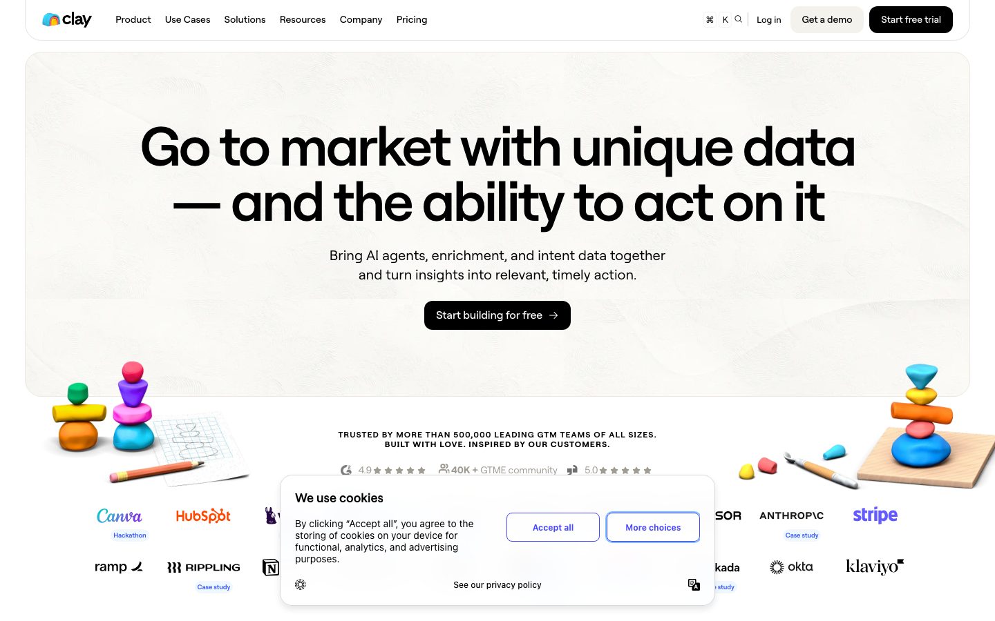
Clay's marketing surface is a warm-paper modern-B2B-SaaS interface. The page floor is not pure white — the hero band sits on `{colors.surface-warm}` (#f4f3f0), a cream-tinted off-white, while content sections alternate between true `{colors.canvas}` (#ffffff) and the warm neutrals. Against that quiet paper background, Clay drops **oversized pure-black headlines** in the custom Roobert display face (80px h1 with -3.2px tracking) and a single **pure-black primary CTA** (`{colors.ink}` — #000000).
The type voice is single-family: **Roobert** (a commercial geometric grotesque) carries everything — display, headings, body, and buttons. Hierarchy is built through size and weight contrast rather than family contrast: an 80px/600 hero headline collapses down to a 14px/500 body, with display weights swinging between 500 and 600 and heavy negative letter-spacing on the large sizes (-3.2px at 80px, -1.32px at 44px, -0.64px at 32px).
Component voltage comes from two places. First, **real product-UI screenshots embedded inside rounded cards** — Clay shows its actual table/enrichment interface inside a vivid `{colors.accent-blue}` (#3859f9) card, plus AI template pickers and workflow editors rendered as in-card chrome. Second, **vivid color-block tiles** — a dark forest-green `{colors.surface-green-dark}` (#03331d) card, magenta `{colors.accent-magenta}` (#911f6b) cards, and bright testimonial tiles — punctuate the otherwise neutral warm-gray editorial flow.
Surrounding all of this is **claymation 3D imagery** — stacked clay pebbles, pencils, erasers, and toolboxes — that gives the brand its playful, tactile signature against the restrained typography.
**Key Characteristics:**
- Warm off-white canvas (`{colors.surface-warm}` — #f4f3f0) under a pure-black hero headline, not the usual cold #ffffff.
- Roobert display typeface at heavy negative tracking (custom/commercial; substituted with Inter here). The single-family system builds hierarchy through size + weight, not family contrast.
- Pure-black primary CTA (`{colors.ink}` — #000000) with white label — the only black surface element in the action layer.
- Product screenshots shown directly inside rounded `{rounded.xl}` (16px) cards rather than abstracted into illustrations.
- Vivid color-block cards — blue (`{colors.accent-blue}`), magenta (`{colors.accent-magenta}`), and dark green (`{colors.surface-green-dark}`) — used as feature/testimonial tiles against the neutral flow.
- A warm neutral text ramp: `{colors.ink}` → `{colors.body}` (#55534e) → `{colors.muted}` (#79756d) → `{colors.muted-soft}` (#9f9b93).
- Radius is hierarchical: `{rounded.md}` (8px) for small chips and inputs, `{rounded.lg}` (12px) for buttons and callouts, `{rounded.xl}` (16px) for content/product cards, `{rounded.pill}` (40px) and `{rounded.full}` for pills and avatars.
## Colors
### Brand & Accent
- **Accent Blue** (`{colors.accent-blue}` — #3859f9): The brand's electric blue. Used on the hero product-screenshot card surface, primary in-product accents, and the "More choices" cookie link. The strongest chromatic moment in the system.
- **Accent Magenta** (`{colors.accent-magenta}` — #911f6b) / **Magenta Deep** (`{colors.accent-magenta-deep}` — #8b045c): Used on feature color-block cards and as the highlight text color (e.g. "Accept all" cookie action, lilac badge text). The deep variant appears in gradient/shadow edges of magenta surfaces.
- **Surface Green Dark** (`{colors.surface-green-dark}` — #03331d): A deep forest green used for the "Constantly update any tool" feature card and small stat pills (4h/week, 100+). The only dark card surface in the system.
- **Surface Lilac** (`{colors.surface-lilac}` — #f5ebfd): A pale lavender wash used behind badge pills and soft accent zones.
### Surface
- **Canvas** (`{colors.canvas}` — #ffffff): True white, used for content sections, the cookie banner, and logo cells.
- **Surface Warm** (`{colors.surface-warm}` — #f4f3f0): The signature cream-tinted off-white — hero band, secondary buttons, neutral callout cards.
- **Surface Warm Soft** (`{colors.surface-warm-soft}` — #f9f8f6) / **Warm Alt** (`{colors.surface-warm-alt}` — #f3f2ed) / **Cream** (`{colors.surface-cream}` — #eee9df): A family of barely-distinct warm paper tints used to separate adjacent bands without hard dividers.
- **Border Warm** (`{colors.border-warm}` — #dad4c8): The warm 1px border / divider tone on cream surfaces.
- **Hairline** (`{colors.hairline}` — #e6e8ec) / **Hairline Alt** (`{colors.hairline-alt}` — #e7e8ec): Cool 1px borders used on white surfaces and inside product-UI fragments.
- **Neutral 300** (`{colors.neutral-300}` — #cccccc): Low-emphasis borders, disabled chrome.
### Text
- **Ink** (`{colors.ink}` — #000000): All headlines and primary text. Pure black against warm paper.
- **Ink Soft** (`{colors.ink-soft}` — #302f2c): Near-black for dense secondary headings.
- **Body** (`{colors.body}` — #55534e): Default running-text — a warm dark gray, not pure black.
- **Muted** (`{colors.muted}` — #79756d): Secondary text, sub-labels.
- **Muted Soft** (`{colors.muted-soft}` — #9f9b93): Tertiary text, captions, eyebrow labels ("TRUSTED BY MORE THAN 500,000…").
- **Slate** (`{colors.slate}` — #676d7e): A cool gray used inside product-UI fragments and metadata.
- **On Ink** (`{colors.on-ink}` — #ffffff): White text on the black CTA and on dark/vivid cards.
## Typography
### Font Family
The system runs a single family — **Roobert** — across display, headings, body, and buttons. Roobert is a commercial geometric grotesque (by Displaay Type Foundry); the measured `font-family` token was `Roobertvf` (the variable-font build). Because hierarchy is carried by size and weight rather than by a second family, the system reads as quiet and confident: large headlines do the talking, supporting type stays small and neutral.
The signature move is **heavy negative letter-spacing on display sizes** — the 80px h1 tightens to -3.2px, the 44px h2 to -1.32px, the 32px h3 to -0.64px. Body and button sizes return to normal (0) tracking.
### Hierarchy
| Token | Size | Weight | Line Height | Letter Spacing | Use |
|---|---|---|---|---|---|
| `{typography.display-xl}` | 80px | 600 | 1.0 | -3.2px | Hero h1 ("Go to market with unique data — and the ability to act on it") |
| `{typography.display-md}` | 44px | 500 | 1.1 | -1.32px | Section heads ("Turn data into action with flexible, iterable workflows") |
| `{typography.heading}` | 32px | 600 | 1.1 | -0.64px | Sub-section heads, card titles ("Every GTM data point imaginable") |
| `{typography.body}` | 14px | 500 | 1.5 | 0 | Default running-text, nav links, descriptions |
| `{typography.button}` | 12.8px | 400 | 1.5 | 0 | Button labels, badge text |
### Principles
Size and weight do all the work. The hero headline is the loudest element on the page by a wide margin (80px) and steps down sharply to 44px and 32px section heads. Body copy is deliberately small (14px) and warm-gray, keeping it subordinate. Negative tracking is part of the brand voice at display sizes — Roobert set at normal tracking on a large headline reads as off-brand.
Display weight oscillates between 500 (h2) and 600 (h1, h3) — never heavier. The button label sits at the lightest measured weight (400) and smallest size (12.8px), so the black surface, not the type, carries the CTA's emphasis.
### Note on Font Substitutes
Roobert is a commercial typeface and is not free to redistribute. If Roobert is unavailable, **Inter** at the same weights with tightened tracking (approximately -0.04em on display sizes) is a usable approximation of the geometric-grotesque character. **Söhne** or **Geist** are closer commercial/near-open alternatives if the project can license them. Never ship "Roobert" without a license; fall back to the substitute stack declared in the typography tokens.
## Layout
### Spacing System
- **Base unit:** 4px (the measured scale clusters on 4 and 8).
- **Tokens:** `{spacing.xxs}` 4px · `{spacing.xs}` 8px · `{spacing.sm}` 12px · `{spacing.md}` 16px · `{spacing.lg}` 24px · `{spacing.xl}` 32px · `{spacing.xxl}` 48px.
- **Dominant rhythm:** 8px (`{spacing.xs}`) is the most frequent gap by a wide margin, followed by 16px (`{spacing.md}`). The micro-layer (component padding, icon gaps) lives at 4–8px; section-level breathing room uses 24–48px.
- **Card internal padding:** ~`{spacing.lg}` (24px) for content/feature cards; ~`{spacing.md}` (16px) for compact metric callouts.
### Grid & Container
- **Editorial body:** Centered single column with alternating warm/white bands.
- **Hero:** Full-width centered headline + sub-head + single CTA, flanked by claymation 3D props at the lower edges.
- **Feature sections:** Two-up split (product screenshot / dark card on one side, copy + bullets on the other), and 2×2 color-block card grids.
- **Logo wall:** Multi-column customer logo grid below the hero ("Trusted by more than 500,000 leading GTM teams").
- **Testimonial row:** Horizontal set of vivid color-block quote tiles ("What our customers say about us").
### Whitespace Philosophy
Clay leans on large vertical gaps between bands and very large headline type to create rhythm. The warm paper tints (`{colors.surface-warm}`, `{colors.surface-warm-soft}`, `{colors.surface-cream}`) separate adjacent sections softly — bands transition by tint shift rather than by hard rules. The result is calm and editorial, letting the oversized black headlines and the vivid product cards carry the visual energy.
## Elevation & Depth
| Level | Treatment | Use |
|---|---|---|
| Flat | No shadow, warm-tint background only | Hero band, content sections, color-block cards |
| Card (flat) | `{rounded.xl}` (16px) surface, `shadow: none` | Feature cards, product-screenshot cards (measured `card` component carries no shadow) |
| Subtle layered shadow | `rgba(0,0,0,0.1) 0px 1px 1px`, plus inset `rgba(0,0,0,0.04) 0px -1px 1px` and `rgba(0,0,0,0.05) 0px -0.5px 1px` | A small set of floating elements (cookie banner, pill buttons) — a tight, low-alpha bevel rather than a drop shadow |
The single measured shadow is a **layered micro-bevel**: a 1px top-light drop plus two faint inset bottom-edges. It reads as a crisp tactile lift on small floating UI (the cookie banner, pills) rather than as a broad card elevation. Content cards themselves are explicitly flat (`shadow: none`) — color contrast and rounding do the separation work.
### Decorative Depth
- **Claymation 3D props** — stacked clay pebbles, pencils, erasers, a toolbox spilling integration icons — provide the system's primary sense of depth and playfulness. These are rendered illustrations, not CSS effects, and carry their own soft shadows.
- Product-UI screenshots inside cards bring their own internal chrome shadows from the real product.
## Shapes
### Border Radius Scale
| Token | Value | Use |
|---|---|---|
| `{rounded.xs}` | 4px | Smallest inner chips, in-product table cells |
| `{rounded.sm}` | 6px | Small inline controls |
| `{rounded.md}` | 8px | Inputs, small chips, stat pills (the most frequent radius) |
| `{rounded.lg}` | 12px | Buttons, metric-callout cards |
| `{rounded.xl}` | 16px | Content cards, feature cards, product-screenshot cards, cookie banner |
| `{rounded.xxl}` | 24px | Large container cards / section panels |
| `{rounded.pill}` | 40px | Pill buttons and badge pills |
| `{rounded.full}` | 1584px | Fully-rounded avatars and circular controls |
### Photography & Geometry
Product-UI screenshots are framed in `{rounded.xl}` (16px) cards. Customer avatars in testimonial tiles use `{rounded.full}`. The claymation props are free-floating PNGs with no frame. The button radius is documented as `{rounded.lg}` (12px) — **derived** from the screenshots, since the measured `button-primary` element returned `0px` (it captured an inner span rather than the visible rounded CTA); see Known Gaps.
## Components
### Navigation
**`top-nav`** — White/transparent top bar carrying the rainbow "clay" wordmark at left, a horizontal menu (Product, Use Cases, Solutions, Resources, Company, Pricing) center, and a right cluster: a `⌘K` search affordance, a "Log in" `{component.nav-link}`, a "Get a demo" `{component.button-secondary}`, and a "Start free trial" `{component.button-primary}`. Type in `{typography.body}` (Roobert 14px / 500).
**`nav-link`** — Inline text nav item, transparent background, `{colors.ink}` text.
### Buttons
**`button-primary`** — The signature CTA. Background `{colors.ink}` (#000000), label `{colors.on-ink}` (#ffffff), type `{typography.button}` (Roobert 12.8px / 400), padding ~6.4px, rounded `{rounded.lg}` (derived). Used for "Start free trial", "Start building for free", "Start free trial" — the page's single repeated primary action.
**`button-secondary`** — Light pill used for "Get a demo" and secondary CTAs. Background `{colors.surface-warm}`, label `{colors.ink}`, same typography and radius as primary.
**`cookie-button-accent`** — The "Accept all" action in the cookie banner: white background, `{colors.accent-magenta}` label, `{rounded.md}`.
**`cookie-button-link`** — The "More choices" action: white background, `{colors.accent-blue}` label, `{rounded.md}` with a 1px accent-blue outline.
### Cards & Containers
**`card`** — The base content card. Background `{colors.canvas}`, rounded `{rounded.xl}` (16px), `shadow: none`. Holds headings + body + bullet lists.
**`product-screenshot-card`** — The hero/feature card that frames a real Clay product screenshot. Background `{colors.accent-blue}` (#3859f9), rounded `{rounded.xl}`, the product table UI floats inside on a white inner panel. This is the system's loudest single surface.
**`feature-card-dark`** — Deep-green feature tile ("Constantly update any tool — CRM, email sequencer, website builder, or more"). Background `{colors.surface-green-dark}` (#03331d), text `{colors.on-ink}`, rounded `{rounded.xl}`.
**`feature-card-magenta`** — Magenta feature tile ("Clean and format data with AI in seconds"). Background `{colors.accent-magenta}` (#911f6b), text `{colors.on-ink}`, rounded `{rounded.xl}`.
**`metric-callout-card`** — Small warm-gray proof card pairing a customer logo with a stat ("OpenAI — more than doubled enrichment coverage from 40% to high 80%"). Background `{colors.surface-warm}`, rounded `{rounded.lg}`, padding ~16px, with a small corner arrow link.
**`stat-pill`** — Dark-green stat chip embedded in testimonial cards (4h/week, 100+, 100%). Background `{colors.surface-green-dark}`, text `{colors.on-ink}`, rounded `{rounded.md}`.
**`badge-pill`** — Soft lavender label / eyebrow chip. Background `{colors.surface-lilac}`, text `{colors.accent-magenta}`, type `{typography.button}`, rounded `{rounded.pill}` (40px).
### Banner & Forms
**`cookie-banner`** — Floating consent card centered low on the hero. White background, rounded `{rounded.xl}`, `{typography.body}` copy, with the magenta and blue cookie buttons and a "See our privacy policy" link.
**`text-input`** — Search/field control shown inside product-UI fragments (e.g. "Search phone number"). Background `{colors.canvas}`, text `{colors.ink}`, rounded `{rounded.md}`, ~8px padding, 1px `{colors.hairline}` border.
### Logos
**`logo-cell`** — Customer logo slot in the trust wall (Canva, HubSpot, Notion, Ramp, Rippling, Okta, Klaviyo, Stripe, Anthropic). White background, monochrome logo, optional `{colors.muted}` "Case study" label beneath.
## Do's and Don'ts
### Do
- Reserve `{colors.ink}` (#000000) for headlines and the single primary CTA. The black button is the action anchor — keep it scarce.
- Set hero and section headlines in Roobert with heavy negative tracking (-3.2px at 80px, scaling down). The tightness is the brand voice.
- Use warm paper tints (`{colors.surface-warm}`, `{colors.surface-warm-soft}`, `{colors.surface-cream}`) to separate bands softly — shift the tint rather than drawing hard dividers.
- Show real product UI inside `{component.product-screenshot-card}` rather than abstracting the product into illustration.
- Use the vivid color-block cards (`{component.feature-card-dark}`, `{component.feature-card-magenta}`, `{component.product-screenshot-card}`) as punctuation against the neutral flow — one or two per band.
- Keep body text in the warm `{colors.body}` (#55534e), not pure black — pure black is reserved for headlines.
- Use claymation 3D props for warmth and depth; let the typography stay restrained.
### Don't
- Don't introduce a second display family. Hierarchy is built from Roobert size + weight only.
- Don't set large headlines at normal tracking — Roobert without negative letter-spacing reads as off-brand at display sizes.
- Don't push display weight above 600. The system stays between 500 and 600.
- Don't add drop shadows to content cards — they are flat (`shadow: none`); use color and rounding for separation. Reserve the layered micro-bevel for small floating UI like the cookie banner.
- Don't stack multiple vivid color-block cards adjacently without neutral breathing room — they are accents, not the field.
- Don't add hover-state styling beyond default and pressed.
## Responsive Behavior
| Name | Width | Key Changes |
|---|---|---|
| Mobile | < 768px | Hamburger nav; hero h1 scales down sharply from 80px; two-up feature splits stack to single column; color-block card grids go 1-up; claymation props shrink/crop to the band edges |
| Tablet | 768–1024px | Top nav tightens; feature splits may stay two-up or stack; card grids 2-up |
| Desktop | 1024–1440px | Full horizontal nav with all menu items + CTA cluster; two-up feature splits; 2×2 color-block grids; full-width 80px hero headline |
| Wide | > 1440px | Same as desktop with more outer margin; centered content column caps width |
### Touch Targets
- `{component.button-primary}` and `{component.button-secondary}` carry small measured padding (~6.4px); on touch they should expand to a minimum 44px tap height.
- `{component.text-input}` inside product fragments uses ~8px padding.
- Nav links should meet 44px effective tap area on mobile.
(Exact mobile type-scale and breakpoint values were not measured — see Known Gaps.)
### Collapsing Strategy
- Top nav collapses to a hamburger on mobile; the CTA cluster ("Get a demo" / "Start free trial") moves into the menu sheet.
- The hero centers and reflows; claymation props reposition to the band corners.
- Two-up feature splits stack copy below the product/dark card.
- Testimonial color-block tiles become a horizontal scroller or stack on mobile.
### Image Behavior
- Product-UI screenshots retain aspect ratio inside their `{rounded.xl}` cards and scale proportionally.
- Claymation props crop at the band edges rather than scaling to fit.
## Iteration Guide
1. Focus on ONE component at a time. Reference its YAML key directly (`{component.product-screenshot-card}`, `{component.feature-card-dark}`).
2. Variants of an existing component (`-active`, `-disabled`, etc.) live as separate entries in `components:`.
3. Use `{token.refs}` everywhere — never inline hex.
4. Never document hover. Default and Active/Pressed states only.
5. Headlines stay Roobert with negative tracking; body stays Roobert 14px/500. One family, hierarchy by size + weight.
6. The black CTA is the only black action surface — keep it singular per band.
7. When adding emphasis, reach for a vivid color-block card before adding shadow — the system is flat-card by default.
## Known Gaps
- **Roobert is a commercial typeface** (measured family `Roobertvf`); `fonts_licensed` came back empty in the analysis, but the face is not free to redistribute. Substitutes (Inter, or licensed Söhne/Geist) are documented in the Typography section — do not ship "Roobert" without a license.
- The measured `button-primary` returned `radius: 0px` and `padding: 6.4px` — this captured an inner element, not the visible rounded CTA. The button radius (`{rounded.lg}`) is **derived** from screenshot ground-truth; the warm secondary button background (`{colors.surface-warm}`) is also inferred from screenshots rather than a measured per-component value.
- **Vivid testimonial-tile colors** (the lime-green, orange, and bright-blue customer quote cards in "What our customers say about us") were not individually captured in the palette beyond the blue (`{colors.accent-blue}`), magenta, and green tokens. Those tile fills are documented as gaps.
- Several radius values appeared once or rarely (10px, 11px, 30px, 48px) and were folded into the nearest scale step rather than tokenized.
- No dark footer or pricing-table component was captured cleanly in the analysis; pricing-page specifics are out of scope.
- Mobile type scale, exact breakpoint widths, and transition/animation timings (claymation motion, card reveals) were not measured.
- Form validation, focus, and disabled states beyond the base `{component.text-input}` were not extracted.
- The cookie-banner micro-bevel shadow is the only measured `box-shadow`; broader elevation behavior on other floating elements is inferred from that single token.
<!-- Documented by duply · real-world design systems as ready-to-use DESIGN.md for AI coding agents · https://duply.ai/clay/design-md -->
Color Palette
Accent
Neutrals
Typography
display-xl80px · 600 · 1
The quick brown fox jumpsdisplay-md44px · 500 · 1.1
The quick brown fox jumpsheading32px · 600 · 1.1
The quick brown fox jumpsbody14px · 500 · 1.5
The quick brown fox jumpsbutton12.8px · 400 · 1.5
The quick brown fox jumpsSpacing & Shape
Spacing
| Name | Value | Preview |
|---|---|---|
| xxs | 4px | |
| xs | 8px | |
| sm | 12px | |
| md | 16px | |
| lg | 24px | |
| xl | 32px | |
| xxl | 48px |
Border Radius
| Name | Value | Preview |
|---|---|---|
| xs | 4px | |
| sm | 6px | |
| md | 8px | |
| lg | 12px | |
| xl | 16px | |
| xxl | 24px | |
| pill | 40px | |
| full | 1584px |
More like this


---
version: alpha
name: Clay-design-analysis
description: A warm-paper, GTM-software marketing surface built on a cream-tinted off-white canvas with pure-black primary CTAs and the custom Roobert display typeface set at heavy negative tracking. The system reads as confident modern B2B SaaS — oversized black headlines, claymation 3D props, real product-UI screenshots embedded in rounded cards, and vivid color-block testimonial tiles punctuating an otherwise neutral, warm-gray palette.

colors:
  ink: "#000000"
  ink-soft: "#302f2c"
  body: "#55534e"
  muted: "#79756d"
  muted-soft: "#9f9b93"
  slate: "#676d7e"
  canvas: "#ffffff"
  surface-warm: "#f4f3f0"
  surface-warm-soft: "#f9f8f6"
  surface-warm-alt: "#f3f2ed"
  surface-cream: "#eee9df"
  border-warm: "#dad4c8"
  surface-lilac: "#f5ebfd"
  accent-magenta: "#911f6b"
  accent-magenta-deep: "#8b045c"
  accent-blue: "#3859f9"
  surface-green-dark: "#03331d"
  hairline: "#e6e8ec"
  hairline-alt: "#e7e8ec"
  neutral-300: "#cccccc"
  on-ink: "#ffffff"

typography:
  display-xl:
    fontFamily: "Roobert, Inter, sans-serif"
    fontSize: 80px
    fontWeight: 600
    lineHeight: 1.0
    letterSpacing: -3.2px
  display-md:
    fontFamily: "Roobert, Inter, sans-serif"
    fontSize: 44px
    fontWeight: 500
    lineHeight: 1.1
    letterSpacing: -1.32px
  heading:
    fontFamily: "Roobert, Inter, sans-serif"
    fontSize: 32px
    fontWeight: 600
    lineHeight: 1.1
    letterSpacing: -0.64px
  body:
    fontFamily: "Roobert, Inter, sans-serif"
    fontSize: 14px
    fontWeight: 500
    lineHeight: 1.5
    letterSpacing: 0
  button:
    fontFamily: "Roobert, Inter, sans-serif"
    fontSize: 12.8px
    fontWeight: 400
    lineHeight: 1.5
    letterSpacing: 0

rounded:
  xs: 4px
  sm: 6px
  md: 8px
  lg: 12px
  xl: 16px
  xxl: 24px
  pill: 40px
  full: 1584px

spacing:
  xxs: 4px
  xs: 8px
  sm: 12px
  md: 16px
  lg: 24px
  xl: 32px
  xxl: 48px

components:
  top-nav:
    backgroundColor: "{colors.canvas}"
    textColor: "{colors.ink}"
    typography: "{typography.body}"
    padding: 16px
  nav-link:
    backgroundColor: transparent
    textColor: "{colors.ink}"
    typography: "{typography.body}"
  button-primary:
    backgroundColor: "{colors.ink}"
    textColor: "{colors.on-ink}"
    typography: "{typography.button}"
    rounded: "{rounded.lg}"
    padding: 6.4px
  button-secondary:
    backgroundColor: "{colors.surface-warm}"
    textColor: "{colors.ink}"
    typography: "{typography.button}"
    rounded: "{rounded.lg}"
    padding: 6.4px
  cookie-button-accent:
    backgroundColor: "{colors.canvas}"
    textColor: "{colors.accent-magenta}"
    typography: "{typography.button}"
    rounded: "{rounded.md}"
    padding: 8px
  cookie-button-link:
    backgroundColor: "{colors.canvas}"
    textColor: "{colors.accent-blue}"
    typography: "{typography.button}"
    rounded: "{rounded.md}"
    padding: 8px
  card:
    backgroundColor: "{colors.canvas}"
    textColor: "{colors.ink}"
    typography: "{typography.body}"
    rounded: "{rounded.xl}"
    padding: 24px
  product-screenshot-card:
    backgroundColor: "{colors.accent-blue}"
    textColor: "{colors.on-ink}"
    rounded: "{rounded.xl}"
    padding: 24px
  feature-card-dark:
    backgroundColor: "{colors.surface-green-dark}"
    textColor: "{colors.on-ink}"
    typography: "{typography.body}"
    rounded: "{rounded.xl}"
    padding: 24px
  feature-card-magenta:
    backgroundColor: "{colors.accent-magenta}"
    textColor: "{colors.on-ink}"
    typography: "{typography.body}"
    rounded: "{rounded.xl}"
    padding: 24px
  metric-callout-card:
    backgroundColor: "{colors.surface-warm}"
    textColor: "{colors.ink}"
    typography: "{typography.body}"
    rounded: "{rounded.lg}"
    padding: 16px
  stat-pill:
    backgroundColor: "{colors.surface-green-dark}"
    textColor: "{colors.on-ink}"
    typography: "{typography.body}"
    rounded: "{rounded.md}"
    padding: 8px
  badge-pill:
    backgroundColor: "{colors.surface-lilac}"
    textColor: "{colors.accent-magenta}"
    typography: "{typography.button}"
    rounded: "{rounded.pill}"
    padding: 8px
  cookie-banner:
    backgroundColor: "{colors.canvas}"
    textColor: "{colors.body}"
    typography: "{typography.body}"
    rounded: "{rounded.xl}"
    padding: 24px
  logo-cell:
    backgroundColor: "{colors.canvas}"
    textColor: "{colors.muted}"
    typography: "{typography.body}"
  text-input:
    backgroundColor: "{colors.canvas}"
    textColor: "{colors.ink}"
    typography: "{typography.body}"
    rounded: "{rounded.md}"
    padding: 8px
---

## Overview

Clay's marketing surface is a warm-paper modern-B2B-SaaS interface. The page floor is not pure white — the hero band sits on `{colors.surface-warm}` (#f4f3f0), a cream-tinted off-white, while content sections alternate between true `{colors.canvas}` (#ffffff) and the warm neutrals. Against that quiet paper background, Clay drops **oversized pure-black headlines** in the custom Roobert display face (80px h1 with -3.2px tracking) and a single **pure-black primary CTA** (`{colors.ink}` — #000000).

The type voice is single-family: **Roobert** (a commercial geometric grotesque) carries everything — display, headings, body, and buttons. Hierarchy is built through size and weight contrast rather than family contrast: an 80px/600 hero headline collapses down to a 14px/500 body, with display weights swinging between 500 and 600 and heavy negative letter-spacing on the large sizes (-3.2px at 80px, -1.32px at 44px, -0.64px at 32px).

Component voltage comes from two places. First, **real product-UI screenshots embedded inside rounded cards** — Clay shows its actual table/enrichment interface inside a vivid `{colors.accent-blue}` (#3859f9) card, plus AI template pickers and workflow editors rendered as in-card chrome. Second, **vivid color-block tiles** — a dark forest-green `{colors.surface-green-dark}` (#03331d) card, magenta `{colors.accent-magenta}` (#911f6b) cards, and bright testimonial tiles — punctuate the otherwise neutral warm-gray editorial flow.

Surrounding all of this is **claymation 3D imagery** — stacked clay pebbles, pencils, erasers, and toolboxes — that gives the brand its playful, tactile signature against the restrained typography.

**Key Characteristics:**
- Warm off-white canvas (`{colors.surface-warm}` — #f4f3f0) under a pure-black hero headline, not the usual cold #ffffff.
- Roobert display typeface at heavy negative tracking (custom/commercial; substituted with Inter here). The single-family system builds hierarchy through size + weight, not family contrast.
- Pure-black primary CTA (`{colors.ink}` — #000000) with white label — the only black surface element in the action layer.
- Product screenshots shown directly inside rounded `{rounded.xl}` (16px) cards rather than abstracted into illustrations.
- Vivid color-block cards — blue (`{colors.accent-blue}`), magenta (`{colors.accent-magenta}`), and dark green (`{colors.surface-green-dark}`) — used as feature/testimonial tiles against the neutral flow.
- A warm neutral text ramp: `{colors.ink}` → `{colors.body}` (#55534e) → `{colors.muted}` (#79756d) → `{colors.muted-soft}` (#9f9b93).
- Radius is hierarchical: `{rounded.md}` (8px) for small chips and inputs, `{rounded.lg}` (12px) for buttons and callouts, `{rounded.xl}` (16px) for content/product cards, `{rounded.pill}` (40px) and `{rounded.full}` for pills and avatars.

## Colors

### Brand & Accent
- **Accent Blue** (`{colors.accent-blue}` — #3859f9): The brand's electric blue. Used on the hero product-screenshot card surface, primary in-product accents, and the "More choices" cookie link. The strongest chromatic moment in the system.
- **Accent Magenta** (`{colors.accent-magenta}` — #911f6b) / **Magenta Deep** (`{colors.accent-magenta-deep}` — #8b045c): Used on feature color-block cards and as the highlight text color (e.g. "Accept all" cookie action, lilac badge text). The deep variant appears in gradient/shadow edges of magenta surfaces.
- **Surface Green Dark** (`{colors.surface-green-dark}` — #03331d): A deep forest green used for the "Constantly update any tool" feature card and small stat pills (4h/week, 100+). The only dark card surface in the system.
- **Surface Lilac** (`{colors.surface-lilac}` — #f5ebfd): A pale lavender wash used behind badge pills and soft accent zones.

### Surface
- **Canvas** (`{colors.canvas}` — #ffffff): True white, used for content sections, the cookie banner, and logo cells.
- **Surface Warm** (`{colors.surface-warm}` — #f4f3f0): The signature cream-tinted off-white — hero band, secondary buttons, neutral callout cards.
- **Surface Warm Soft** (`{colors.surface-warm-soft}` — #f9f8f6) / **Warm Alt** (`{colors.surface-warm-alt}` — #f3f2ed) / **Cream** (`{colors.surface-cream}` — #eee9df): A family of barely-distinct warm paper tints used to separate adjacent bands without hard dividers.
- **Border Warm** (`{colors.border-warm}` — #dad4c8): The warm 1px border / divider tone on cream surfaces.
- **Hairline** (`{colors.hairline}` — #e6e8ec) / **Hairline Alt** (`{colors.hairline-alt}` — #e7e8ec): Cool 1px borders used on white surfaces and inside product-UI fragments.
- **Neutral 300** (`{colors.neutral-300}` — #cccccc): Low-emphasis borders, disabled chrome.

### Text
- **Ink** (`{colors.ink}` — #000000): All headlines and primary text. Pure black against warm paper.
- **Ink Soft** (`{colors.ink-soft}` — #302f2c): Near-black for dense secondary headings.
- **Body** (`{colors.body}` — #55534e): Default running-text — a warm dark gray, not pure black.
- **Muted** (`{colors.muted}` — #79756d): Secondary text, sub-labels.
- **Muted Soft** (`{colors.muted-soft}` — #9f9b93): Tertiary text, captions, eyebrow labels ("TRUSTED BY MORE THAN 500,000…").
- **Slate** (`{colors.slate}` — #676d7e): A cool gray used inside product-UI fragments and metadata.
- **On Ink** (`{colors.on-ink}` — #ffffff): White text on the black CTA and on dark/vivid cards.

## Typography

### Font Family
The system runs a single family — **Roobert** — across display, headings, body, and buttons. Roobert is a commercial geometric grotesque (by Displaay Type Foundry); the measured `font-family` token was `Roobertvf` (the variable-font build). Because hierarchy is carried by size and weight rather than by a second family, the system reads as quiet and confident: large headlines do the talking, supporting type stays small and neutral.

The signature move is **heavy negative letter-spacing on display sizes** — the 80px h1 tightens to -3.2px, the 44px h2 to -1.32px, the 32px h3 to -0.64px. Body and button sizes return to normal (0) tracking.

### Hierarchy

| Token | Size | Weight | Line Height | Letter Spacing | Use |
|---|---|---|---|---|---|
| `{typography.display-xl}` | 80px | 600 | 1.0 | -3.2px | Hero h1 ("Go to market with unique data — and the ability to act on it") |
| `{typography.display-md}` | 44px | 500 | 1.1 | -1.32px | Section heads ("Turn data into action with flexible, iterable workflows") |
| `{typography.heading}` | 32px | 600 | 1.1 | -0.64px | Sub-section heads, card titles ("Every GTM data point imaginable") |
| `{typography.body}` | 14px | 500 | 1.5 | 0 | Default running-text, nav links, descriptions |
| `{typography.button}` | 12.8px | 400 | 1.5 | 0 | Button labels, badge text |

### Principles
Size and weight do all the work. The hero headline is the loudest element on the page by a wide margin (80px) and steps down sharply to 44px and 32px section heads. Body copy is deliberately small (14px) and warm-gray, keeping it subordinate. Negative tracking is part of the brand voice at display sizes — Roobert set at normal tracking on a large headline reads as off-brand.

Display weight oscillates between 500 (h2) and 600 (h1, h3) — never heavier. The button label sits at the lightest measured weight (400) and smallest size (12.8px), so the black surface, not the type, carries the CTA's emphasis.

### Note on Font Substitutes
Roobert is a commercial typeface and is not free to redistribute. If Roobert is unavailable, **Inter** at the same weights with tightened tracking (approximately -0.04em on display sizes) is a usable approximation of the geometric-grotesque character. **Söhne** or **Geist** are closer commercial/near-open alternatives if the project can license them. Never ship "Roobert" without a license; fall back to the substitute stack declared in the typography tokens.

## Layout

### Spacing System
- **Base unit:** 4px (the measured scale clusters on 4 and 8).
- **Tokens:** `{spacing.xxs}` 4px · `{spacing.xs}` 8px · `{spacing.sm}` 12px · `{spacing.md}` 16px · `{spacing.lg}` 24px · `{spacing.xl}` 32px · `{spacing.xxl}` 48px.
- **Dominant rhythm:** 8px (`{spacing.xs}`) is the most frequent gap by a wide margin, followed by 16px (`{spacing.md}`). The micro-layer (component padding, icon gaps) lives at 4–8px; section-level breathing room uses 24–48px.
- **Card internal padding:** ~`{spacing.lg}` (24px) for content/feature cards; ~`{spacing.md}` (16px) for compact metric callouts.

### Grid & Container
- **Editorial body:** Centered single column with alternating warm/white bands.
- **Hero:** Full-width centered headline + sub-head + single CTA, flanked by claymation 3D props at the lower edges.
- **Feature sections:** Two-up split (product screenshot / dark card on one side, copy + bullets on the other), and 2×2 color-block card grids.
- **Logo wall:** Multi-column customer logo grid below the hero ("Trusted by more than 500,000 leading GTM teams").
- **Testimonial row:** Horizontal set of vivid color-block quote tiles ("What our customers say about us").

### Whitespace Philosophy
Clay leans on large vertical gaps between bands and very large headline type to create rhythm. The warm paper tints (`{colors.surface-warm}`, `{colors.surface-warm-soft}`, `{colors.surface-cream}`) separate adjacent sections softly — bands transition by tint shift rather than by hard rules. The result is calm and editorial, letting the oversized black headlines and the vivid product cards carry the visual energy.

## Elevation & Depth

| Level | Treatment | Use |
|---|---|---|
| Flat | No shadow, warm-tint background only | Hero band, content sections, color-block cards |
| Card (flat) | `{rounded.xl}` (16px) surface, `shadow: none` | Feature cards, product-screenshot cards (measured `card` component carries no shadow) |
| Subtle layered shadow | `rgba(0,0,0,0.1) 0px 1px 1px`, plus inset `rgba(0,0,0,0.04) 0px -1px 1px` and `rgba(0,0,0,0.05) 0px -0.5px 1px` | A small set of floating elements (cookie banner, pill buttons) — a tight, low-alpha bevel rather than a drop shadow |

The single measured shadow is a **layered micro-bevel**: a 1px top-light drop plus two faint inset bottom-edges. It reads as a crisp tactile lift on small floating UI (the cookie banner, pills) rather than as a broad card elevation. Content cards themselves are explicitly flat (`shadow: none`) — color contrast and rounding do the separation work.

### Decorative Depth
- **Claymation 3D props** — stacked clay pebbles, pencils, erasers, a toolbox spilling integration icons — provide the system's primary sense of depth and playfulness. These are rendered illustrations, not CSS effects, and carry their own soft shadows.
- Product-UI screenshots inside cards bring their own internal chrome shadows from the real product.

## Shapes

### Border Radius Scale

| Token | Value | Use |
|---|---|---|
| `{rounded.xs}` | 4px | Smallest inner chips, in-product table cells |
| `{rounded.sm}` | 6px | Small inline controls |
| `{rounded.md}` | 8px | Inputs, small chips, stat pills (the most frequent radius) |
| `{rounded.lg}` | 12px | Buttons, metric-callout cards |
| `{rounded.xl}` | 16px | Content cards, feature cards, product-screenshot cards, cookie banner |
| `{rounded.xxl}` | 24px | Large container cards / section panels |
| `{rounded.pill}` | 40px | Pill buttons and badge pills |
| `{rounded.full}` | 1584px | Fully-rounded avatars and circular controls |

### Photography & Geometry
Product-UI screenshots are framed in `{rounded.xl}` (16px) cards. Customer avatars in testimonial tiles use `{rounded.full}`. The claymation props are free-floating PNGs with no frame. The button radius is documented as `{rounded.lg}` (12px) — **derived** from the screenshots, since the measured `button-primary` element returned `0px` (it captured an inner span rather than the visible rounded CTA); see Known Gaps.

## Components

### Navigation

**`top-nav`** — White/transparent top bar carrying the rainbow "clay" wordmark at left, a horizontal menu (Product, Use Cases, Solutions, Resources, Company, Pricing) center, and a right cluster: a `⌘K` search affordance, a "Log in" `{component.nav-link}`, a "Get a demo" `{component.button-secondary}`, and a "Start free trial" `{component.button-primary}`. Type in `{typography.body}` (Roobert 14px / 500).

**`nav-link`** — Inline text nav item, transparent background, `{colors.ink}` text.

### Buttons

**`button-primary`** — The signature CTA. Background `{colors.ink}` (#000000), label `{colors.on-ink}` (#ffffff), type `{typography.button}` (Roobert 12.8px / 400), padding ~6.4px, rounded `{rounded.lg}` (derived). Used for "Start free trial", "Start building for free", "Start free trial" — the page's single repeated primary action.

**`button-secondary`** — Light pill used for "Get a demo" and secondary CTAs. Background `{colors.surface-warm}`, label `{colors.ink}`, same typography and radius as primary.

**`cookie-button-accent`** — The "Accept all" action in the cookie banner: white background, `{colors.accent-magenta}` label, `{rounded.md}`.

**`cookie-button-link`** — The "More choices" action: white background, `{colors.accent-blue}` label, `{rounded.md}` with a 1px accent-blue outline.

### Cards & Containers

**`card`** — The base content card. Background `{colors.canvas}`, rounded `{rounded.xl}` (16px), `shadow: none`. Holds headings + body + bullet lists.

**`product-screenshot-card`** — The hero/feature card that frames a real Clay product screenshot. Background `{colors.accent-blue}` (#3859f9), rounded `{rounded.xl}`, the product table UI floats inside on a white inner panel. This is the system's loudest single surface.

**`feature-card-dark`** — Deep-green feature tile ("Constantly update any tool — CRM, email sequencer, website builder, or more"). Background `{colors.surface-green-dark}` (#03331d), text `{colors.on-ink}`, rounded `{rounded.xl}`.

**`feature-card-magenta`** — Magenta feature tile ("Clean and format data with AI in seconds"). Background `{colors.accent-magenta}` (#911f6b), text `{colors.on-ink}`, rounded `{rounded.xl}`.

**`metric-callout-card`** — Small warm-gray proof card pairing a customer logo with a stat ("OpenAI — more than doubled enrichment coverage from 40% to high 80%"). Background `{colors.surface-warm}`, rounded `{rounded.lg}`, padding ~16px, with a small corner arrow link.

**`stat-pill`** — Dark-green stat chip embedded in testimonial cards (4h/week, 100+, 100%). Background `{colors.surface-green-dark}`, text `{colors.on-ink}`, rounded `{rounded.md}`.

**`badge-pill`** — Soft lavender label / eyebrow chip. Background `{colors.surface-lilac}`, text `{colors.accent-magenta}`, type `{typography.button}`, rounded `{rounded.pill}` (40px).

### Banner & Forms

**`cookie-banner`** — Floating consent card centered low on the hero. White background, rounded `{rounded.xl}`, `{typography.body}` copy, with the magenta and blue cookie buttons and a "See our privacy policy" link.

**`text-input`** — Search/field control shown inside product-UI fragments (e.g. "Search phone number"). Background `{colors.canvas}`, text `{colors.ink}`, rounded `{rounded.md}`, ~8px padding, 1px `{colors.hairline}` border.

### Logos

**`logo-cell`** — Customer logo slot in the trust wall (Canva, HubSpot, Notion, Ramp, Rippling, Okta, Klaviyo, Stripe, Anthropic). White background, monochrome logo, optional `{colors.muted}` "Case study" label beneath.

## Do's and Don'ts

### Do
- Reserve `{colors.ink}` (#000000) for headlines and the single primary CTA. The black button is the action anchor — keep it scarce.
- Set hero and section headlines in Roobert with heavy negative tracking (-3.2px at 80px, scaling down). The tightness is the brand voice.
- Use warm paper tints (`{colors.surface-warm}`, `{colors.surface-warm-soft}`, `{colors.surface-cream}`) to separate bands softly — shift the tint rather than drawing hard dividers.
- Show real product UI inside `{component.product-screenshot-card}` rather than abstracting the product into illustration.
- Use the vivid color-block cards (`{component.feature-card-dark}`, `{component.feature-card-magenta}`, `{component.product-screenshot-card}`) as punctuation against the neutral flow — one or two per band.
- Keep body text in the warm `{colors.body}` (#55534e), not pure black — pure black is reserved for headlines.
- Use claymation 3D props for warmth and depth; let the typography stay restrained.

### Don't
- Don't introduce a second display family. Hierarchy is built from Roobert size + weight only.
- Don't set large headlines at normal tracking — Roobert without negative letter-spacing reads as off-brand at display sizes.
- Don't push display weight above 600. The system stays between 500 and 600.
- Don't add drop shadows to content cards — they are flat (`shadow: none`); use color and rounding for separation. Reserve the layered micro-bevel for small floating UI like the cookie banner.
- Don't stack multiple vivid color-block cards adjacently without neutral breathing room — they are accents, not the field.
- Don't add hover-state styling beyond default and pressed.

## Responsive Behavior

| Name | Width | Key Changes |
|---|---|---|
| Mobile | < 768px | Hamburger nav; hero h1 scales down sharply from 80px; two-up feature splits stack to single column; color-block card grids go 1-up; claymation props shrink/crop to the band edges |
| Tablet | 768–1024px | Top nav tightens; feature splits may stay two-up or stack; card grids 2-up |
| Desktop | 1024–1440px | Full horizontal nav with all menu items + CTA cluster; two-up feature splits; 2×2 color-block grids; full-width 80px hero headline |
| Wide | > 1440px | Same as desktop with more outer margin; centered content column caps width |

### Touch Targets
- `{component.button-primary}` and `{component.button-secondary}` carry small measured padding (~6.4px); on touch they should expand to a minimum 44px tap height.
- `{component.text-input}` inside product fragments uses ~8px padding.
- Nav links should meet 44px effective tap area on mobile.

(Exact mobile type-scale and breakpoint values were not measured — see Known Gaps.)

### Collapsing Strategy
- Top nav collapses to a hamburger on mobile; the CTA cluster ("Get a demo" / "Start free trial") moves into the menu sheet.
- The hero centers and reflows; claymation props reposition to the band corners.
- Two-up feature splits stack copy below the product/dark card.
- Testimonial color-block tiles become a horizontal scroller or stack on mobile.

### Image Behavior
- Product-UI screenshots retain aspect ratio inside their `{rounded.xl}` cards and scale proportionally.
- Claymation props crop at the band edges rather than scaling to fit.

## Iteration Guide

1. Focus on ONE component at a time. Reference its YAML key directly (`{component.product-screenshot-card}`, `{component.feature-card-dark}`).
2. Variants of an existing component (`-active`, `-disabled`, etc.) live as separate entries in `components:`.
3. Use `{token.refs}` everywhere — never inline hex.
4. Never document hover. Default and Active/Pressed states only.
5. Headlines stay Roobert with negative tracking; body stays Roobert 14px/500. One family, hierarchy by size + weight.
6. The black CTA is the only black action surface — keep it singular per band.
7. When adding emphasis, reach for a vivid color-block card before adding shadow — the system is flat-card by default.

## Known Gaps

- **Roobert is a commercial typeface** (measured family `Roobertvf`); `fonts_licensed` came back empty in the analysis, but the face is not free to redistribute. Substitutes (Inter, or licensed Söhne/Geist) are documented in the Typography section — do not ship "Roobert" without a license.
- The measured `button-primary` returned `radius: 0px` and `padding: 6.4px` — this captured an inner element, not the visible rounded CTA. The button radius (`{rounded.lg}`) is **derived** from screenshot ground-truth; the warm secondary button background (`{colors.surface-warm}`) is also inferred from screenshots rather than a measured per-component value.
- **Vivid testimonial-tile colors** (the lime-green, orange, and bright-blue customer quote cards in "What our customers say about us") were not individually captured in the palette beyond the blue (`{colors.accent-blue}`), magenta, and green tokens. Those tile fills are documented as gaps.
- Several radius values appeared once or rarely (10px, 11px, 30px, 48px) and were folded into the nearest scale step rather than tokenized.
- No dark footer or pricing-table component was captured cleanly in the analysis; pricing-page specifics are out of scope.
- Mobile type scale, exact breakpoint widths, and transition/animation timings (claymation motion, card reveals) were not measured.
- Form validation, focus, and disabled states beyond the base `{component.text-input}` were not extracted.
- The cookie-banner micro-bevel shadow is the only measured `box-shadow`; broader elevation behavior on other floating elements is inferred from that single token.

<!-- Documented by duply · real-world design systems as ready-to-use DESIGN.md for AI coding agents · https://duply.ai/clay/design-md -->