GlossGenius
A premium, editorial beauty-and-wellness SaaS interface built on a near-black warm ink (#17150e) and crisp white canvas, accented by a soft mint card surface (#f0f7f6). The system reads as confident and boutique — a large Basel Classic display serif-grotesk headline at 72px with tight negative tracking, flat shadow-free surfaces, generously rounded mint cards holding real product UI, and sparing rust / pink / navy accents. Brand voltage comes from the oversized display type and from product screenshots shown directly inside soft cards rather than from heavy color.
---
version: alpha
name: GlossGenius-design-analysis
description: A premium, editorial beauty-and-wellness SaaS interface built on a near-black warm ink (#17150e) and crisp white canvas, accented by a soft mint card surface (#f0f7f6). The system reads as confident and boutique — a large Basel Classic display serif-grotesk headline at 72px with tight negative tracking, flat shadow-free surfaces, generously rounded mint cards holding real product UI, and sparing rust / pink / navy accents. Brand voltage comes from the oversized display type and from product screenshots shown directly inside soft cards rather than from heavy color.
colors:
primary: "#17150e"
primary-active: "#18160f"
ink: "#17150e"
ink-warm: "#18160f"
ink-deep: "#060606"
ink-soft: "#222222"
ink-soft-alt: "#282828"
ink-mid: "#333333"
body: "#696969"
muted: "#868686"
hairline: "#dddddd"
hairline-soft: "#eeeeee"
border-mid: "#cccccc"
canvas: "#ffffff"
surface-soft: "#f8f8f8"
surface-gray: "#f2f2f2"
surface-gray-alt: "#efefef"
surface-mint: "#f0f7f6"
surface-dark: "#000000"
on-primary: "#ffffff"
on-dark: "#ffffff"
accent-rust: "#d14424"
accent-pink: "#ffc6e1"
accent-navy: "#27455c"
typography:
display-xl:
fontFamily: "Basel Classic Book, Georgia, serif"
fontSize: 72px
fontWeight: 500
lineHeight: 0.97
letterSpacing: "-2.16px"
title-lg:
fontFamily: "Basel Grotesk Book, Inter, sans-serif"
fontSize: 32px
fontWeight: 500
lineHeight: 1.1
letterSpacing: "-0.64px"
title-sm:
fontFamily: "Basel Grotesk Book, Inter, sans-serif"
fontSize: 16px
fontWeight: 500
lineHeight: 1.4
letterSpacing: "normal"
label:
fontFamily: "Basel Grotesk Book, Inter, sans-serif"
fontSize: 16px
fontWeight: 500
lineHeight: 1.2
letterSpacing: "normal"
body:
fontFamily: "Basel Grotesk Book, Inter, sans-serif"
fontSize: 16px
fontWeight: 500
lineHeight: 1.2
letterSpacing: "normal"
button:
fontFamily: "Basel Grotesk Book, Inter, sans-serif"
fontSize: 16px
fontWeight: 400
lineHeight: 1.5
letterSpacing: "normal"
rounded:
none: 0px
xs: 2px
md: 8px
lg: 16px
xl: 20px
xxl: 24px
full: 1440px
spacing:
xxs: 4px
xs: 8px
sm: 12px
md: 16px
lg: 24px
xl: 30px
xxl: 48px
huge: 56px
components:
top-nav:
backgroundColor: "{colors.canvas}"
textColor: "{colors.ink}"
typography: "{typography.body}"
button-primary:
backgroundColor: "{colors.primary}"
textColor: "{colors.on-primary}"
typography: "{typography.button}"
rounded: "{rounded.none}"
padding: 24px 12px
button-primary-active:
backgroundColor: "{colors.primary-active}"
textColor: "{colors.on-primary}"
rounded: "{rounded.none}"
button-pill:
backgroundColor: "{colors.primary}"
textColor: "{colors.on-primary}"
typography: "{typography.button}"
rounded: "{rounded.full}"
padding: 8px 24px
button-outline:
backgroundColor: transparent
textColor: "{colors.ink}"
typography: "{typography.button}"
rounded: "{rounded.full}"
padding: 8px 24px
cookie-cta:
backgroundColor: "{colors.accent-pink}"
textColor: "{colors.ink}"
typography: "{typography.button}"
rounded: "{rounded.md}"
padding: 12px 24px
card:
backgroundColor: "{colors.surface-mint}"
textColor: "{colors.ink}"
typography: "{typography.body}"
rounded: "{rounded.lg}"
padding: 24px
product-mockup-card:
backgroundColor: "{colors.canvas}"
textColor: "{colors.ink}"
rounded: "{rounded.lg}"
padding: 16px
stat-block:
backgroundColor: "{colors.surface-mint}"
textColor: "{colors.ink}"
typography: "{typography.display-xl}"
padding: 48px
benefit-card:
backgroundColor: "{colors.surface-soft}"
textColor: "{colors.ink}"
typography: "{typography.title-lg}"
rounded: "{rounded.lg}"
padding: 30px
footer:
backgroundColor: "{colors.surface-dark}"
textColor: "{colors.muted}"
typography: "{typography.body}"
padding: 48px
---
## Overview
GlossGenius's marketing surface is a premium, editorial beauty-and-wellness SaaS interface — crisp white canvas (`{colors.canvas}` — #ffffff) paired with a warm near-black ink (`{colors.ink}` — #17150e) and a signature soft-mint card surface (`{colors.surface-mint}` — #f0f7f6). The system reads boutique and confident rather than loud: oversized display headlines, generous whitespace, flat shadow-free surfaces, and product UI shown directly inside rounded cards.
Type voice splits into two roles from the **Basel** family: **Basel Classic Book** for the big display headline (72px, weight 500, -2.16px tracking — a refined display face that anchors the hero), and **Basel Grotesk Book** for everything supporting — titles, body, buttons, navigation. The headline's tight negative letter-spacing and sub-1.0 line-height (0.97) is the brand's most distinctive signal.
Component voltage comes from **real product UI fragments shown inside cards** — the analytics dashboard, revenue panels, and scheduling chrome appear at small scale inside the mint and white cards rather than as marketing illustrations. Color accents (rust `{colors.accent-rust}`, pink `{colors.accent-pink}`, navy `{colors.accent-navy}`) appear sparingly — the system is near-monochrome at the structural layer.
**Key Characteristics:**
- Warm near-black ink (`{colors.ink}` — #17150e) used for the oversized display headline and primary buttons — not a pure black, a warm charcoal-brown.
- Basel Classic Book display headline at 72px / weight 500 / -2.16px tracking — the marquee brand voice.
- Soft mint card surface (`{colors.surface-mint}` — #f0f7f6) for stat blocks and product-holding cards — the signature non-white surface.
- Flat, shadow-free elevation — the system uses color-block contrast and rounded corners, not drop shadows (only one faint shadow measured anywhere).
- Real product UI fragments embedded in cards rather than painted illustration.
- Hierarchical radius: `{rounded.md}` (8px) for small chips, `{rounded.lg}` (16px) for content cards, `{rounded.full}` for pill buttons.
- Dark footer (`{colors.surface-dark}` — #000000) with a giant ghosted "GLOSSGENIUS" wordmark watermark closing the page.
## Colors
### Brand & Accent
- **Primary / Ink** (`{colors.ink}` — #17150e): The dominant text and action color — a warm near-black. Used on the display headline, primary buttons, and most copy. Press state shifts to `{colors.primary-active}` (#18160f).
- **Accent Rust** (`{colors.accent-rust}` — #d14424): A sparing warm accent used on small highlights and product-UI moments. Never on primary CTAs.
- **Accent Pink** (`{colors.accent-pink}` — #ffc6e1): A soft pink used on consent-dialog CTAs and small accent fills.
- **Accent Navy** (`{colors.accent-navy}` — #27455c): A muted slate-navy used sparingly inside product UI fragments.
### Surface
- **Canvas** (`{colors.canvas}` — #ffffff): The default page floor.
- **Surface Soft** (`{colors.surface-soft}` — #f8f8f8): Very-soft section bands and benefit cards.
- **Surface Gray** (`{colors.surface-gray}` — #f2f2f2) / **Surface Gray Alt** (`{colors.surface-gray-alt}` — #efefef): Light neutral fills for dividers and nested surfaces.
- **Surface Mint** (`{colors.surface-mint}` — #f0f7f6): The signature non-white surface — stat blocks and product-holding cards. Note: this value was measured as the low-contrast "body text" computed color, but its frequency and the screenshots show it functioning as the dominant card/section background (derived role assignment).
- **Surface Dark** (`{colors.surface-dark}` — #000000): The footer background and dark hero overlays — the only true-black surface.
### Text
- **Ink** (`{colors.ink}` — #17150e): Headlines and primary text.
- **Ink Warm / Deep** (`{colors.ink-warm}` — #18160f, `{colors.ink-deep}` — #060606): Near-black variants used in dense type and dark fills.
- **Ink Soft** (`{colors.ink-soft}` — #222222, `{colors.ink-soft-alt}` — #282828, `{colors.ink-mid}` — #333333): Secondary dark text tones.
- **Body** (`{colors.body}` — #696969): Default secondary running-text color.
- **Muted** (`{colors.muted}` — #868686): Tertiary text — captions, footer link rows.
- **On Primary / On Dark** (`{colors.on-primary}` / `{colors.on-dark}` — #ffffff): Text on primary buttons and dark surfaces.
### Hairlines
- **Hairline** (`{colors.hairline}` — #dddddd) / **Hairline Soft** (`{colors.hairline-soft}` — #eeeeee) / **Border Mid** (`{colors.border-mid}` — #cccccc): 1px divider and border tones on light surfaces.
## Typography
### Font Family
The system runs the **Basel** family: **Basel Classic Book** for the display headline and **Basel Grotesk Book** for all supporting type (titles, body, buttons, nav). Basel Classic carries the editorial display voice — weight 500 at 72px with -2.16px tracking and 0.97 line-height. Basel Grotesk handles everything else at a consistent 16px base with weight 500 (and 400 for buttons).
The split is functional:
- Basel Classic Book (display, 500 weight, -2.16px tracking) — the hero h1 only
- Basel Grotesk Book (titles + UI + body, 400–500 weight) — section heads, paragraphs, labels, buttons, nav
### Hierarchy
| Token | Size | Weight | Line Height | Letter Spacing | Use |
|---|---|---|---|---|---|
| `{typography.display-xl}` | 72px | 500 | 0.97 | -2.16px | Hero h1 ("Scheduling, payments, and admin. Handled.") — Basel Classic |
| `{typography.title-lg}` | 32px | 500 | 1.1 | -0.64px | Section heads, card titles — Basel Grotesk |
| `{typography.title-sm}` | 16px | 500 | 1.4 | normal | Eyebrow / small section labels (h2) |
| `{typography.label}` | 16px | 500 | 1.2 | normal | Compact labels (h3) |
| `{typography.body}` | 16px | 500 | 1.2 | normal | Default running-text |
| `{typography.button}` | 16px | 400 | 1.5 | normal | Button labels |
### Principles
The display headline is the brand voice — only the hero h1 uses Basel Classic. Everything else stays in Basel Grotesk. The boundary is strict: never put body copy in Basel Classic, never push the headline into the grotesk. The headline's negative tracking (-2.16px) and sub-1.0 line-height are essential — without them it reads off-brand. Display weight stays at 500, never bolder.
### Note on Font Substitutes
**Basel Classic** and **Basel Grotesk** (Lineto) are commercial licensed typefaces and are not shipped here. For the display headline, a usable open-source approximation is a refined serif/contrast face such as **Fraunces** (optical weight 400–500, tight tracking) or, for a cleaner grotesk-display read, **Inter** weight 500 with -0.045em tracking. For the supporting grotesk, **Inter** at weight 500/400 is the closest open substitute. These preserve the weight + tight-tracking signature even though Basel's specific letterforms differ (derived substitution).
## Layout
### Spacing System
- **Base unit:** 4px.
- **Tokens:** `{spacing.xxs}` 4px · `{spacing.xs}` 8px · `{spacing.sm}` 12px · `{spacing.md}` 16px · `{spacing.lg}` 24px · `{spacing.xl}` 30px · `{spacing.xxl}` 48px · `{spacing.huge}` 56px.
- **Most-used steps:** 8px and 16px dominate (measured frequency 173 and 113), with 24px as the primary card gutter and 48px for section padding.
- **Card internal padding:** `{spacing.lg}` (24px) for mint cards; `{spacing.xl}` (30px) for benefit cards.
### Grid & Container
- **Editorial body:** centered single-column marketing bands with wide gutters.
- **Stat row:** 3-up horizontal row of large numeric stat blocks (26%, 75%, 40hrs).
- **Benefit cards:** stacked / grid list of "More new clients", "More revenue at checkout" cards.
- **Footer:** multi-column link list (Platform / Resources / Legal) at desktop.
### Whitespace Philosophy
GlossGenius uses generous, editorial whitespace — large empty zones around the oversized headline and stat numbers, letting the display type and product cards breathe. The rhythm favors big single statements over dense lists.
## Elevation & Depth
| Level | Treatment | Use |
|---|---|---|
| Flat | No shadow, no border | Body sections, nav, hero overlay |
| Color-block surface | `{colors.surface-mint}` / `{colors.surface-soft}` background — no shadow | Stat blocks, cards, benefit cards |
| Faint lift | `rgb(153,153,153) 0px 2px 10px -3px` (measured once) | Rare elevated product-mockup element |
The elevation philosophy is **flat and editorial** — color-block contrast and rounded corners do the depth work. Only a single subtle shadow was measured anywhere in the system; most surfaces carry an explicit `rgba(0,0,0,0) 0 0 0 0 inset` (no shadow). No neumorphism, no glassmorphism, no heavy drop shadows.
### Decorative Depth
- Product UI fragments embedded inside cards carry their own internal chrome (panel borders, tabs, avatars) — these are product content, not system tokens.
- The footer features a giant ghosted "GLOSSGENIUS" wordmark watermark behind the link columns — a decorative depth flourish rather than a shadow.
## Shapes
### Border Radius Scale
| Token | Value | Use |
|---|---|---|
| `{rounded.none}` | 0px | Primary button (measured square-cornered) |
| `{rounded.xs}` | 2px | Tiny chips / inline accents |
| `{rounded.md}` | 8px | Small fills, consent-dialog CTAs, nested elements |
| `{rounded.lg}` | 16px | Content cards, product-mockup cards (the dominant card radius) |
| `{rounded.xl}` | 20px | Occasional larger card |
| `{rounded.xxl}` | 24px | Largest soft container |
| `{rounded.full}` | 1440px | Pill buttons, fully-rounded nav CTAs and avatars |
### Photography Geometry
Hero and lifestyle photography sits in full-bleed or 16:9 panels with squared or softly-rounded corners. Product UI fragments inside cards retain their native chrome radii. Avatars in product UI use `{rounded.full}`.
## Components
### Top Navigation
**`top-nav`** — White nav bar with the GLOSSGENIUS wordmark at left, primary menu (How it works, Businesses, Pricing, Resources) center, and a right-side cluster: "Log in" text-link, "Book a demo" (`{component.button-outline}`), and "Start free trial" (`{component.button-pill}`). Menu items in `{typography.body}` (Basel Grotesk 16px / 500).
### Buttons
**`button-primary`** — The measured primary button. Background `{colors.primary}` (#17150e), text `{colors.on-primary}`, type `{typography.button}` (Basel Grotesk 16px / 400), square corners `{rounded.none}`, padding 24px × 12px (measured). Active state `button-primary-active` shifts to `{colors.primary-active}` (#18160f).
**`button-pill`** — The fully-rounded dark CTA seen in the nav ("Start free trial") and hero. Background `{colors.primary}`, text `{colors.on-primary}`, rounded `{rounded.full}`. Radius observed from screenshot ground-truth; padding is derived.
**`button-outline`** — Transparent pill button with a hairline border ("Book a demo"). Background transparent, text `{colors.ink}`, rounded `{rounded.full}`. Padding derived.
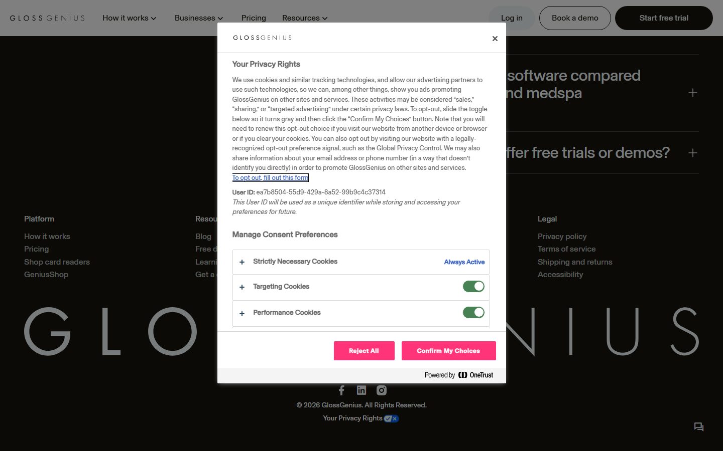
**`cookie-cta`** — The consent-dialog action buttons ("Reject All" / "Confirm My Choices"). Background `{colors.accent-pink}` (#ffc6e1), text `{colors.ink}`, rounded `{rounded.md}`. This is the only place the pink accent appears as a button fill.
### Cards & Containers
**`card`** — The measured card. Background `{colors.surface-mint}` (#f0f7f6), rounded `{rounded.lg}` (16px), no shadow, padding `{spacing.lg}` (24px). The dominant content surface — holds copy and product UI fragments.
**`product-mockup-card`** — A white card holding real GlossGenius product chrome (analytics dashboard, revenue panel, scheduling sidebar). Background `{colors.canvas}`, rounded `{rounded.lg}`, padding `{spacing.md}` (16px). The product UI inside carries its own internal chrome.
**`stat-block`** — Used in the 3-up proof row ("26%", "75%", "40hrs"). Numerals render in `{typography.display-xl}` (Basel Classic, large). Sits on `{colors.surface-mint}` with `{spacing.xxl}` (48px) section padding.
**`benefit-card`** — The "Here's why 120,000+ businesses made the switch" cards (More new clients, More revenue at checkout). Background `{colors.surface-soft}`, rounded `{rounded.lg}`, padding `{spacing.xl}` (30px), title in `{typography.title-lg}`, supporting copy in `{typography.body}`, with a "Learn more" text link.
### Footer
**`footer`** — Dark footer that closes the page. Background `{colors.surface-dark}` (#000000), text `{colors.muted}` (#868686). Multi-column link list (Platform / Resources / Legal), social icons, copyright line, and a giant ghosted "GLOSSGENIUS" wordmark watermark. Vertical padding `{spacing.xxl}` (48px).
## Do's and Don'ts
### Do
- Reserve `{colors.ink}` (#17150e) for the display headline and primary actions — it's a warm near-black, not pure black.
- Use Basel Classic for the hero headline only; keep all supporting type in Basel Grotesk.
- Apply the tight negative tracking (-2.16px) and 0.97 line-height to the display headline — it's the brand's signature.
- Use `{component.card}` (mint) for content + product cards; the mint surface is the system's defining non-white tone.
- Embed real product UI inside cards rather than marketing illustration.
- Keep surfaces flat — rely on color-block contrast and rounded corners, not drop shadows.
- End the page with the dark footer and its ghosted wordmark watermark.
### Don't
- Don't lean on accent colors (`{colors.accent-rust}`, `{colors.accent-pink}`, `{colors.accent-navy}`) for primary structure — they're sparing highlights.
- Don't add drop shadows to cards — the system is deliberately flat.
- Don't bold the display headline beyond weight 500.
- Don't put body copy in Basel Classic.
- Don't introduce dark surfaces outside the footer and hero overlays.
## Responsive Behavior
### Breakpoints
| Name | Width | Key Changes |
|---|---|---|
| Mobile | < 768px | Hamburger nav; hero h1 scales down from 72px; stat row stacks 1-up; benefit cards 1-up; footer columns collapse |
| Tablet | 768–1024px | Nav tightens; stat blocks 3-up may wrap; benefit cards 1–2-up |
| Desktop | 1024–1440px | Full nav; 3-up stat row; multi-column footer |
| Wide | > 1440px | Same as desktop with more outer breathing room |
### Touch Targets
- `{component.button-pill}` and `{component.button-outline}` render as comfortable pill targets in the nav.
- `{component.button-primary}` uses generous 24px vertical padding (measured), giving an ample tap area.
- Exact mobile target sizes were not measured — see Known Gaps.
### Collapsing Strategy
- Top nav collapses to hamburger on mobile.
- The 3-up stat row stacks vertically.
- Benefit cards reduce columns rather than shrinking type.
- Footer link columns collapse to stacked groups; the ghosted wordmark watermark scales with the footer.
### Image Behavior
- Hero and lifestyle photography stays full-bleed and crops to viewport at smaller widths.
- Product UI fragments retain native aspect ratios while their cards resize.
## Iteration Guide
1. Focus on ONE component at a time. Reference its YAML key directly (`{component.card}`, `{component.stat-block}`).
2. Variants of an existing component (`-active`, etc.) live as separate entries in `components:`.
3. Use `{token.refs}` everywhere — never inline hex.
4. Never document hover. Default and Active/Pressed states only.
5. The display headline stays Basel Classic 500 with -2.16px tracking; everything else stays Basel Grotesk. The split does not blur.
6. Keep surfaces flat — reach for the mint surface or a color block before adding a shadow.
7. When in doubt about emphasis: bigger Basel Classic before bolder.
## Known Gaps
- **Basel typefaces are commercial/licensed** (Lineto) and not shipped; open substitutes (Fraunces / Inter) are documented in Typography. `fonts_licensed` in the analysis was empty, but Basel Classic and Basel Grotesk are not free web fonts.
- The `{colors.surface-mint}` (#f0f7f6) value was measured under a "low-contrast body text" computed role; its real usage is a card/section background (the most frequent non-white surface). Role assignment is derived from frequency + screenshots.
- The hero CTA buttons appear in a chartreuse/yellow-green ("Get a demo") in the screenshots, but no green token was captured in the measured palette — documented as a gap rather than guessed.
- Only two components were measured directly (`button-primary`, `card`); nav, pill buttons, outline buttons, stat blocks, benefit cards, and footer are reconstructed from screenshot ground-truth with derived padding values.
- The measured `button-primary` radius is 0px with padding 24px × 12px (vertical-heavy); pill-shaped nav CTAs are visible in screenshots — both treatments appear to coexist; exact mapping is unconfirmed.
- Pricing-page-specific components were not isolated in the measured data despite the page being captured.
- Animation, transition timings, and form validation/focus states are not in scope.
- Mobile touch-target sizes and exact responsive breakpoints are inferred, not measured.
<!-- Documented by duply · real-world design systems as ready-to-use DESIGN.md for AI coding agents · https://duply.ai/glossgenius/design-md -->
Color Palette
Accent
Neutrals
Typography
display-xl72px · 500 · 0.97
The quick brown fox jumpstitle-lg32px · 500 · 1.1
The quick brown fox jumpstitle-sm16px · 500 · 1.4
The quick brown fox jumpslabel16px · 500 · 1.2
The quick brown fox jumpsbody16px · 500 · 1.2
The quick brown fox jumpsbutton16px · 400 · 1.5
The quick brown fox jumpsSpacing & Shape
Spacing
| Name | Value | Preview |
|---|---|---|
| xxs | 4px | |
| xs | 8px | |
| sm | 12px | |
| md | 16px | |
| lg | 24px | |
| xl | 30px | |
| xxl | 48px | |
| huge | 56px |
Border Radius
| Name | Value | Preview |
|---|---|---|
| none | 0px | |
| xs | 2px | |
| md | 8px | |
| lg | 16px | |
| xl | 20px | |
| xxl | 24px | |
| full | 1440px |
More like this


---
version: alpha
name: GlossGenius-design-analysis
description: A premium, editorial beauty-and-wellness SaaS interface built on a near-black warm ink (#17150e) and crisp white canvas, accented by a soft mint card surface (#f0f7f6). The system reads as confident and boutique — a large Basel Classic display serif-grotesk headline at 72px with tight negative tracking, flat shadow-free surfaces, generously rounded mint cards holding real product UI, and sparing rust / pink / navy accents. Brand voltage comes from the oversized display type and from product screenshots shown directly inside soft cards rather than from heavy color.

colors:
  primary: "#17150e"
  primary-active: "#18160f"
  ink: "#17150e"
  ink-warm: "#18160f"
  ink-deep: "#060606"
  ink-soft: "#222222"
  ink-soft-alt: "#282828"
  ink-mid: "#333333"
  body: "#696969"
  muted: "#868686"
  hairline: "#dddddd"
  hairline-soft: "#eeeeee"
  border-mid: "#cccccc"
  canvas: "#ffffff"
  surface-soft: "#f8f8f8"
  surface-gray: "#f2f2f2"
  surface-gray-alt: "#efefef"
  surface-mint: "#f0f7f6"
  surface-dark: "#000000"
  on-primary: "#ffffff"
  on-dark: "#ffffff"
  accent-rust: "#d14424"
  accent-pink: "#ffc6e1"
  accent-navy: "#27455c"

typography:
  display-xl:
    fontFamily: "Basel Classic Book, Georgia, serif"
    fontSize: 72px
    fontWeight: 500
    lineHeight: 0.97
    letterSpacing: "-2.16px"
  title-lg:
    fontFamily: "Basel Grotesk Book, Inter, sans-serif"
    fontSize: 32px
    fontWeight: 500
    lineHeight: 1.1
    letterSpacing: "-0.64px"
  title-sm:
    fontFamily: "Basel Grotesk Book, Inter, sans-serif"
    fontSize: 16px
    fontWeight: 500
    lineHeight: 1.4
    letterSpacing: "normal"
  label:
    fontFamily: "Basel Grotesk Book, Inter, sans-serif"
    fontSize: 16px
    fontWeight: 500
    lineHeight: 1.2
    letterSpacing: "normal"
  body:
    fontFamily: "Basel Grotesk Book, Inter, sans-serif"
    fontSize: 16px
    fontWeight: 500
    lineHeight: 1.2
    letterSpacing: "normal"
  button:
    fontFamily: "Basel Grotesk Book, Inter, sans-serif"
    fontSize: 16px
    fontWeight: 400
    lineHeight: 1.5
    letterSpacing: "normal"

rounded:
  none: 0px
  xs: 2px
  md: 8px
  lg: 16px
  xl: 20px
  xxl: 24px
  full: 1440px

spacing:
  xxs: 4px
  xs: 8px
  sm: 12px
  md: 16px
  lg: 24px
  xl: 30px
  xxl: 48px
  huge: 56px

components:
  top-nav:
    backgroundColor: "{colors.canvas}"
    textColor: "{colors.ink}"
    typography: "{typography.body}"
  button-primary:
    backgroundColor: "{colors.primary}"
    textColor: "{colors.on-primary}"
    typography: "{typography.button}"
    rounded: "{rounded.none}"
    padding: 24px 12px
  button-primary-active:
    backgroundColor: "{colors.primary-active}"
    textColor: "{colors.on-primary}"
    rounded: "{rounded.none}"
  button-pill:
    backgroundColor: "{colors.primary}"
    textColor: "{colors.on-primary}"
    typography: "{typography.button}"
    rounded: "{rounded.full}"
    padding: 8px 24px
  button-outline:
    backgroundColor: transparent
    textColor: "{colors.ink}"
    typography: "{typography.button}"
    rounded: "{rounded.full}"
    padding: 8px 24px
  cookie-cta:
    backgroundColor: "{colors.accent-pink}"
    textColor: "{colors.ink}"
    typography: "{typography.button}"
    rounded: "{rounded.md}"
    padding: 12px 24px
  card:
    backgroundColor: "{colors.surface-mint}"
    textColor: "{colors.ink}"
    typography: "{typography.body}"
    rounded: "{rounded.lg}"
    padding: 24px
  product-mockup-card:
    backgroundColor: "{colors.canvas}"
    textColor: "{colors.ink}"
    rounded: "{rounded.lg}"
    padding: 16px
  stat-block:
    backgroundColor: "{colors.surface-mint}"
    textColor: "{colors.ink}"
    typography: "{typography.display-xl}"
    padding: 48px
  benefit-card:
    backgroundColor: "{colors.surface-soft}"
    textColor: "{colors.ink}"
    typography: "{typography.title-lg}"
    rounded: "{rounded.lg}"
    padding: 30px
  footer:
    backgroundColor: "{colors.surface-dark}"
    textColor: "{colors.muted}"
    typography: "{typography.body}"
    padding: 48px
---

## Overview

GlossGenius's marketing surface is a premium, editorial beauty-and-wellness SaaS interface — crisp white canvas (`{colors.canvas}` — #ffffff) paired with a warm near-black ink (`{colors.ink}` — #17150e) and a signature soft-mint card surface (`{colors.surface-mint}` — #f0f7f6). The system reads boutique and confident rather than loud: oversized display headlines, generous whitespace, flat shadow-free surfaces, and product UI shown directly inside rounded cards.

Type voice splits into two roles from the **Basel** family: **Basel Classic Book** for the big display headline (72px, weight 500, -2.16px tracking — a refined display face that anchors the hero), and **Basel Grotesk Book** for everything supporting — titles, body, buttons, navigation. The headline's tight negative letter-spacing and sub-1.0 line-height (0.97) is the brand's most distinctive signal.

Component voltage comes from **real product UI fragments shown inside cards** — the analytics dashboard, revenue panels, and scheduling chrome appear at small scale inside the mint and white cards rather than as marketing illustrations. Color accents (rust `{colors.accent-rust}`, pink `{colors.accent-pink}`, navy `{colors.accent-navy}`) appear sparingly — the system is near-monochrome at the structural layer.

**Key Characteristics:**
- Warm near-black ink (`{colors.ink}` — #17150e) used for the oversized display headline and primary buttons — not a pure black, a warm charcoal-brown.
- Basel Classic Book display headline at 72px / weight 500 / -2.16px tracking — the marquee brand voice.
- Soft mint card surface (`{colors.surface-mint}` — #f0f7f6) for stat blocks and product-holding cards — the signature non-white surface.
- Flat, shadow-free elevation — the system uses color-block contrast and rounded corners, not drop shadows (only one faint shadow measured anywhere).
- Real product UI fragments embedded in cards rather than painted illustration.
- Hierarchical radius: `{rounded.md}` (8px) for small chips, `{rounded.lg}` (16px) for content cards, `{rounded.full}` for pill buttons.
- Dark footer (`{colors.surface-dark}` — #000000) with a giant ghosted "GLOSSGENIUS" wordmark watermark closing the page.

## Colors

### Brand & Accent
- **Primary / Ink** (`{colors.ink}` — #17150e): The dominant text and action color — a warm near-black. Used on the display headline, primary buttons, and most copy. Press state shifts to `{colors.primary-active}` (#18160f).
- **Accent Rust** (`{colors.accent-rust}` — #d14424): A sparing warm accent used on small highlights and product-UI moments. Never on primary CTAs.
- **Accent Pink** (`{colors.accent-pink}` — #ffc6e1): A soft pink used on consent-dialog CTAs and small accent fills.
- **Accent Navy** (`{colors.accent-navy}` — #27455c): A muted slate-navy used sparingly inside product UI fragments.

### Surface
- **Canvas** (`{colors.canvas}` — #ffffff): The default page floor.
- **Surface Soft** (`{colors.surface-soft}` — #f8f8f8): Very-soft section bands and benefit cards.
- **Surface Gray** (`{colors.surface-gray}` — #f2f2f2) / **Surface Gray Alt** (`{colors.surface-gray-alt}` — #efefef): Light neutral fills for dividers and nested surfaces.
- **Surface Mint** (`{colors.surface-mint}` — #f0f7f6): The signature non-white surface — stat blocks and product-holding cards. Note: this value was measured as the low-contrast "body text" computed color, but its frequency and the screenshots show it functioning as the dominant card/section background (derived role assignment).
- **Surface Dark** (`{colors.surface-dark}` — #000000): The footer background and dark hero overlays — the only true-black surface.

### Text
- **Ink** (`{colors.ink}` — #17150e): Headlines and primary text.
- **Ink Warm / Deep** (`{colors.ink-warm}` — #18160f, `{colors.ink-deep}` — #060606): Near-black variants used in dense type and dark fills.
- **Ink Soft** (`{colors.ink-soft}` — #222222, `{colors.ink-soft-alt}` — #282828, `{colors.ink-mid}` — #333333): Secondary dark text tones.
- **Body** (`{colors.body}` — #696969): Default secondary running-text color.
- **Muted** (`{colors.muted}` — #868686): Tertiary text — captions, footer link rows.
- **On Primary / On Dark** (`{colors.on-primary}` / `{colors.on-dark}` — #ffffff): Text on primary buttons and dark surfaces.

### Hairlines
- **Hairline** (`{colors.hairline}` — #dddddd) / **Hairline Soft** (`{colors.hairline-soft}` — #eeeeee) / **Border Mid** (`{colors.border-mid}` — #cccccc): 1px divider and border tones on light surfaces.

## Typography

### Font Family
The system runs the **Basel** family: **Basel Classic Book** for the display headline and **Basel Grotesk Book** for all supporting type (titles, body, buttons, nav). Basel Classic carries the editorial display voice — weight 500 at 72px with -2.16px tracking and 0.97 line-height. Basel Grotesk handles everything else at a consistent 16px base with weight 500 (and 400 for buttons).

The split is functional:
- Basel Classic Book (display, 500 weight, -2.16px tracking) — the hero h1 only
- Basel Grotesk Book (titles + UI + body, 400–500 weight) — section heads, paragraphs, labels, buttons, nav

### Hierarchy

| Token | Size | Weight | Line Height | Letter Spacing | Use |
|---|---|---|---|---|---|
| `{typography.display-xl}` | 72px | 500 | 0.97 | -2.16px | Hero h1 ("Scheduling, payments, and admin. Handled.") — Basel Classic |
| `{typography.title-lg}` | 32px | 500 | 1.1 | -0.64px | Section heads, card titles — Basel Grotesk |
| `{typography.title-sm}` | 16px | 500 | 1.4 | normal | Eyebrow / small section labels (h2) |
| `{typography.label}` | 16px | 500 | 1.2 | normal | Compact labels (h3) |
| `{typography.body}` | 16px | 500 | 1.2 | normal | Default running-text |
| `{typography.button}` | 16px | 400 | 1.5 | normal | Button labels |

### Principles
The display headline is the brand voice — only the hero h1 uses Basel Classic. Everything else stays in Basel Grotesk. The boundary is strict: never put body copy in Basel Classic, never push the headline into the grotesk. The headline's negative tracking (-2.16px) and sub-1.0 line-height are essential — without them it reads off-brand. Display weight stays at 500, never bolder.

### Note on Font Substitutes
**Basel Classic** and **Basel Grotesk** (Lineto) are commercial licensed typefaces and are not shipped here. For the display headline, a usable open-source approximation is a refined serif/contrast face such as **Fraunces** (optical weight 400–500, tight tracking) or, for a cleaner grotesk-display read, **Inter** weight 500 with -0.045em tracking. For the supporting grotesk, **Inter** at weight 500/400 is the closest open substitute. These preserve the weight + tight-tracking signature even though Basel's specific letterforms differ (derived substitution).

## Layout

### Spacing System
- **Base unit:** 4px.
- **Tokens:** `{spacing.xxs}` 4px · `{spacing.xs}` 8px · `{spacing.sm}` 12px · `{spacing.md}` 16px · `{spacing.lg}` 24px · `{spacing.xl}` 30px · `{spacing.xxl}` 48px · `{spacing.huge}` 56px.
- **Most-used steps:** 8px and 16px dominate (measured frequency 173 and 113), with 24px as the primary card gutter and 48px for section padding.
- **Card internal padding:** `{spacing.lg}` (24px) for mint cards; `{spacing.xl}` (30px) for benefit cards.

### Grid & Container
- **Editorial body:** centered single-column marketing bands with wide gutters.
- **Stat row:** 3-up horizontal row of large numeric stat blocks (26%, 75%, 40hrs).
- **Benefit cards:** stacked / grid list of "More new clients", "More revenue at checkout" cards.
- **Footer:** multi-column link list (Platform / Resources / Legal) at desktop.

### Whitespace Philosophy
GlossGenius uses generous, editorial whitespace — large empty zones around the oversized headline and stat numbers, letting the display type and product cards breathe. The rhythm favors big single statements over dense lists.

## Elevation & Depth

| Level | Treatment | Use |
|---|---|---|
| Flat | No shadow, no border | Body sections, nav, hero overlay |
| Color-block surface | `{colors.surface-mint}` / `{colors.surface-soft}` background — no shadow | Stat blocks, cards, benefit cards |
| Faint lift | `rgb(153,153,153) 0px 2px 10px -3px` (measured once) | Rare elevated product-mockup element |

The elevation philosophy is **flat and editorial** — color-block contrast and rounded corners do the depth work. Only a single subtle shadow was measured anywhere in the system; most surfaces carry an explicit `rgba(0,0,0,0) 0 0 0 0 inset` (no shadow). No neumorphism, no glassmorphism, no heavy drop shadows.

### Decorative Depth
- Product UI fragments embedded inside cards carry their own internal chrome (panel borders, tabs, avatars) — these are product content, not system tokens.
- The footer features a giant ghosted "GLOSSGENIUS" wordmark watermark behind the link columns — a decorative depth flourish rather than a shadow.

## Shapes

### Border Radius Scale

| Token | Value | Use |
|---|---|---|
| `{rounded.none}` | 0px | Primary button (measured square-cornered) |
| `{rounded.xs}` | 2px | Tiny chips / inline accents |
| `{rounded.md}` | 8px | Small fills, consent-dialog CTAs, nested elements |
| `{rounded.lg}` | 16px | Content cards, product-mockup cards (the dominant card radius) |
| `{rounded.xl}` | 20px | Occasional larger card |
| `{rounded.xxl}` | 24px | Largest soft container |
| `{rounded.full}` | 1440px | Pill buttons, fully-rounded nav CTAs and avatars |

### Photography Geometry
Hero and lifestyle photography sits in full-bleed or 16:9 panels with squared or softly-rounded corners. Product UI fragments inside cards retain their native chrome radii. Avatars in product UI use `{rounded.full}`.

## Components

### Top Navigation

**`top-nav`** — White nav bar with the GLOSSGENIUS wordmark at left, primary menu (How it works, Businesses, Pricing, Resources) center, and a right-side cluster: "Log in" text-link, "Book a demo" (`{component.button-outline}`), and "Start free trial" (`{component.button-pill}`). Menu items in `{typography.body}` (Basel Grotesk 16px / 500).

### Buttons

**`button-primary`** — The measured primary button. Background `{colors.primary}` (#17150e), text `{colors.on-primary}`, type `{typography.button}` (Basel Grotesk 16px / 400), square corners `{rounded.none}`, padding 24px × 12px (measured). Active state `button-primary-active` shifts to `{colors.primary-active}` (#18160f).

**`button-pill`** — The fully-rounded dark CTA seen in the nav ("Start free trial") and hero. Background `{colors.primary}`, text `{colors.on-primary}`, rounded `{rounded.full}`. Radius observed from screenshot ground-truth; padding is derived.

**`button-outline`** — Transparent pill button with a hairline border ("Book a demo"). Background transparent, text `{colors.ink}`, rounded `{rounded.full}`. Padding derived.

**`cookie-cta`** — The consent-dialog action buttons ("Reject All" / "Confirm My Choices"). Background `{colors.accent-pink}` (#ffc6e1), text `{colors.ink}`, rounded `{rounded.md}`. This is the only place the pink accent appears as a button fill.

### Cards & Containers

**`card`** — The measured card. Background `{colors.surface-mint}` (#f0f7f6), rounded `{rounded.lg}` (16px), no shadow, padding `{spacing.lg}` (24px). The dominant content surface — holds copy and product UI fragments.

**`product-mockup-card`** — A white card holding real GlossGenius product chrome (analytics dashboard, revenue panel, scheduling sidebar). Background `{colors.canvas}`, rounded `{rounded.lg}`, padding `{spacing.md}` (16px). The product UI inside carries its own internal chrome.

**`stat-block`** — Used in the 3-up proof row ("26%", "75%", "40hrs"). Numerals render in `{typography.display-xl}` (Basel Classic, large). Sits on `{colors.surface-mint}` with `{spacing.xxl}` (48px) section padding.

**`benefit-card`** — The "Here's why 120,000+ businesses made the switch" cards (More new clients, More revenue at checkout). Background `{colors.surface-soft}`, rounded `{rounded.lg}`, padding `{spacing.xl}` (30px), title in `{typography.title-lg}`, supporting copy in `{typography.body}`, with a "Learn more" text link.

### Footer

**`footer`** — Dark footer that closes the page. Background `{colors.surface-dark}` (#000000), text `{colors.muted}` (#868686). Multi-column link list (Platform / Resources / Legal), social icons, copyright line, and a giant ghosted "GLOSSGENIUS" wordmark watermark. Vertical padding `{spacing.xxl}` (48px).

## Do's and Don'ts

### Do
- Reserve `{colors.ink}` (#17150e) for the display headline and primary actions — it's a warm near-black, not pure black.
- Use Basel Classic for the hero headline only; keep all supporting type in Basel Grotesk.
- Apply the tight negative tracking (-2.16px) and 0.97 line-height to the display headline — it's the brand's signature.
- Use `{component.card}` (mint) for content + product cards; the mint surface is the system's defining non-white tone.
- Embed real product UI inside cards rather than marketing illustration.
- Keep surfaces flat — rely on color-block contrast and rounded corners, not drop shadows.
- End the page with the dark footer and its ghosted wordmark watermark.

### Don't
- Don't lean on accent colors (`{colors.accent-rust}`, `{colors.accent-pink}`, `{colors.accent-navy}`) for primary structure — they're sparing highlights.
- Don't add drop shadows to cards — the system is deliberately flat.
- Don't bold the display headline beyond weight 500.
- Don't put body copy in Basel Classic.
- Don't introduce dark surfaces outside the footer and hero overlays.

## Responsive Behavior

### Breakpoints

| Name | Width | Key Changes |
|---|---|---|
| Mobile | < 768px | Hamburger nav; hero h1 scales down from 72px; stat row stacks 1-up; benefit cards 1-up; footer columns collapse |
| Tablet | 768–1024px | Nav tightens; stat blocks 3-up may wrap; benefit cards 1–2-up |
| Desktop | 1024–1440px | Full nav; 3-up stat row; multi-column footer |
| Wide | > 1440px | Same as desktop with more outer breathing room |

### Touch Targets
- `{component.button-pill}` and `{component.button-outline}` render as comfortable pill targets in the nav.
- `{component.button-primary}` uses generous 24px vertical padding (measured), giving an ample tap area.
- Exact mobile target sizes were not measured — see Known Gaps.

### Collapsing Strategy
- Top nav collapses to hamburger on mobile.
- The 3-up stat row stacks vertically.
- Benefit cards reduce columns rather than shrinking type.
- Footer link columns collapse to stacked groups; the ghosted wordmark watermark scales with the footer.

### Image Behavior
- Hero and lifestyle photography stays full-bleed and crops to viewport at smaller widths.
- Product UI fragments retain native aspect ratios while their cards resize.

## Iteration Guide

1. Focus on ONE component at a time. Reference its YAML key directly (`{component.card}`, `{component.stat-block}`).
2. Variants of an existing component (`-active`, etc.) live as separate entries in `components:`.
3. Use `{token.refs}` everywhere — never inline hex.
4. Never document hover. Default and Active/Pressed states only.
5. The display headline stays Basel Classic 500 with -2.16px tracking; everything else stays Basel Grotesk. The split does not blur.
6. Keep surfaces flat — reach for the mint surface or a color block before adding a shadow.
7. When in doubt about emphasis: bigger Basel Classic before bolder.

## Known Gaps

- **Basel typefaces are commercial/licensed** (Lineto) and not shipped; open substitutes (Fraunces / Inter) are documented in Typography. `fonts_licensed` in the analysis was empty, but Basel Classic and Basel Grotesk are not free web fonts.
- The `{colors.surface-mint}` (#f0f7f6) value was measured under a "low-contrast body text" computed role; its real usage is a card/section background (the most frequent non-white surface). Role assignment is derived from frequency + screenshots.
- The hero CTA buttons appear in a chartreuse/yellow-green ("Get a demo") in the screenshots, but no green token was captured in the measured palette — documented as a gap rather than guessed.
- Only two components were measured directly (`button-primary`, `card`); nav, pill buttons, outline buttons, stat blocks, benefit cards, and footer are reconstructed from screenshot ground-truth with derived padding values.
- The measured `button-primary` radius is 0px with padding 24px × 12px (vertical-heavy); pill-shaped nav CTAs are visible in screenshots — both treatments appear to coexist; exact mapping is unconfirmed.
- Pricing-page-specific components were not isolated in the measured data despite the page being captured.
- Animation, transition timings, and form validation/focus states are not in scope.
- Mobile touch-target sizes and exact responsive breakpoints are inferred, not measured.

<!-- Documented by duply · real-world design systems as ready-to-use DESIGN.md for AI coding agents · https://duply.ai/glossgenius/design-md -->