peachweb
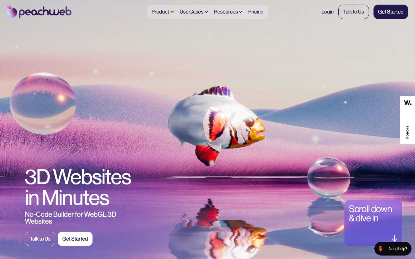
A dreamy, 3D-product-builder marketing surface that floats CGI imagery (a glassy fish, soap bubbles, a lilac dune-and-water horizon) over a white canvas, then anchors structure with deep-indigo ink, electric-cyan accents, and soft-rounded lavender content cards. The system reads as premium-creative-tech — generous airy whitespace, large tight-set display headlines, pill-shaped navigation, and big rounded cards (~16–24px) that carry product screenshots and promo claims. Brand voltage comes from the rendered 3D hero art and the indigo/cyan/violet accent trio rather than from dense UI chrome.
---
version: alpha
name: peachweb-design-analysis
description: A dreamy, 3D-product-builder marketing surface that floats CGI imagery (a glassy fish, soap bubbles, a lilac dune-and-water horizon) over a white canvas, then anchors structure with deep-indigo ink, electric-cyan accents, and soft-rounded lavender content cards. The system reads as premium-creative-tech — generous airy whitespace, large tight-set display headlines, pill-shaped navigation, and big rounded cards (~16–24px) that carry product screenshots and promo claims. Brand voltage comes from the rendered 3D hero art and the indigo/cyan/violet accent trio rather than from dense UI chrome.

colors:
  primary: "#20174e"
  primary-deep: "#120644"
  ink: "#000000"
  ink-soft: "#222222"
  body: "#63666a"
  muted: "#777777"
  hairline: "#dddde0"
  canvas: "#ffffff"
  surface-lavender: "#f6f5ff"
  accent-violet: "#5328ff"
  accent-cyan: "#00f0ff"
  accent-cyan-soft: "#00e2ff"
  on-primary: "#ffffff"
  on-dark: "#ffffff"

typography:
  display-xl:
    fontFamily: "Inter, Outfit, sans-serif"
    fontSize: 72px
    fontWeight: 500
    lineHeight: 1.0
    letterSpacing: -2px
  display-lg:
    fontFamily: "Inter, Outfit, sans-serif"
    fontSize: 40px
    fontWeight: 500
    lineHeight: 1.05
    letterSpacing: -1px
  title-lg:
    fontFamily: "Inter, Outfit, sans-serif"
    fontSize: 24px
    fontWeight: 500
    lineHeight: 1.2
    letterSpacing: -0.5px
  title-md:
    fontFamily: "Inter, Outfit, sans-serif"
    fontSize: 18px
    fontWeight: 500
    lineHeight: 1.3
    letterSpacing: 0
  body-md:
    fontFamily: "Inter, Outfit, sans-serif"
    fontSize: 16px
    fontWeight: 400
    lineHeight: 1.5
    letterSpacing: 0
  body-sm:
    fontFamily: "Inter, Outfit, sans-serif"
    fontSize: 14px
    fontWeight: 400
    lineHeight: 1.5
    letterSpacing: 0
  eyebrow:
    fontFamily: "Inter, Outfit, sans-serif"
    fontSize: 12px
    fontWeight: 500
    lineHeight: 1.4
    letterSpacing: 0.5px
  button:
    fontFamily: "Inter, Outfit, sans-serif"
    fontSize: 14px
    fontWeight: 500
    lineHeight: 1.0
    letterSpacing: 0
  nav-link:
    fontFamily: "Inter, Outfit, sans-serif"
    fontSize: 14px
    fontWeight: 500
    lineHeight: 1.4
    letterSpacing: 0

rounded:
  xs: 7px
  sm: 8px
  md: 16px
  lg: 20px
  xl: 24px
  xxl: 32px
  pill: 100px
  full: 999px

spacing:
  xxs: 6px
  xs: 8px
  sm: 12px
  md: 16px
  lg: 24px
  xl: 32px
  xxl: 40px
  huge: 72px
  section: 120px

components:
  top-nav:
    backgroundColor: transparent
    textColor: "{colors.ink}"
    typography: "{typography.nav-link}"
    padding: 16px
  nav-pill-group:
    backgroundColor: "{colors.canvas}"
    textColor: "{colors.ink}"
    typography: "{typography.nav-link}"
    rounded: "{rounded.pill}"
    padding: 8px 16px
  button-primary:
    backgroundColor: "{colors.primary}"
    textColor: "{colors.on-primary}"
    typography: "{typography.button}"
    rounded: "{rounded.pill}"
    padding: 12px 24px
  button-secondary:
    backgroundColor: transparent
    textColor: "{colors.ink}"
    typography: "{typography.button}"
    rounded: "{rounded.pill}"
    padding: 12px 24px
  button-light:
    backgroundColor: "{colors.canvas}"
    textColor: "{colors.ink}"
    typography: "{typography.button}"
    rounded: "{rounded.pill}"
    padding: 12px 24px
  hero-band:
    backgroundColor: "{colors.canvas}"
    textColor: "{colors.ink}"
    typography: "{typography.display-xl}"
    padding: 120px
  scroll-prompt-card:
    backgroundColor: "{colors.accent-violet}"
    textColor: "{colors.on-dark}"
    typography: "{typography.title-lg}"
    rounded: "{rounded.xl}"
    padding: 24px
  side-tab:
    backgroundColor: "{colors.canvas}"
    textColor: "{colors.ink}"
    typography: "{typography.eyebrow}"
    rounded: "{rounded.sm}"
    padding: 16px
  video-band:
    backgroundColor: "{colors.ink}"
    textColor: "{colors.on-dark}"
    rounded: "{rounded.xl}"
    padding: 24px
  step-card:
    backgroundColor: "{colors.surface-lavender}"
    textColor: "{colors.ink}"
    typography: "{typography.title-md}"
    rounded: "{rounded.xl}"
    padding: 24px
  feature-promo-card:
    backgroundColor: "{colors.surface-lavender}"
    textColor: "{colors.ink}"
    typography: "{typography.title-lg}"
    rounded: "{rounded.xl}"
    padding: 24px
  use-case-card:
    backgroundColor: "{colors.surface-lavender}"
    textColor: "{colors.ink}"
    typography: "{typography.display-lg}"
    rounded: "{rounded.xl}"
    padding: 32px
  help-pill:
    backgroundColor: "{colors.ink}"
    textColor: "{colors.on-dark}"
    typography: "{typography.body-sm}"
    rounded: "{rounded.pill}"
    padding: 8px 16px
  eyebrow-label:
    backgroundColor: transparent
    textColor: "{colors.accent-cyan}"
    typography: "{typography.eyebrow}"
---

## Overview

Peachweb is the marketing site for a no-code WebGL 3D website builder, and its surface behaves accordingly: a white canvas (`{colors.canvas}` — #ffffff) that lets large CGI hero art float free — a glassy 3D fish, refractive soap bubbles, a lilac dune-and-water horizon — while structure is held by deep-indigo ink (`{colors.primary}` — #20174e), electric-cyan accents (`{colors.accent-cyan}` — #00f0ff), and big soft-rounded lavender cards. The system reads as premium-creative-tech: airy, dreamy, confident, with most of the brand voltage coming from rendered 3D imagery rather than dense UI.

The layout rhythm is gallery-like. The hero fills the viewport with art and a tight-set display headline ("3D Websites in Minutes"); below it long stretches of white breathe between content clusters — a black video band, a 3-up "Step 1 / Step 2 / Step 3" how-it-works row in lavender cards, a 3-up promo row, and a cascade of tilted "use case" cards (Ecommerce / Tech / Creative / Storytelling). Whitespace is the dominant material; cards and color are punctuation.

Interactive chrome is pill-shaped. The top navigation groups its menu items inside a single rounded-pill wrapper (`{component.nav-pill-group}`), and every button — primary (`{colors.primary}` dark indigo), secondary (outlined), and light (white) — is a full pill (`{rounded.pill}` — 100px). Content surfaces, by contrast, use large but not pill radii: `{rounded.md}` (16px) through `{rounded.xl}` (24px).

**Key Characteristics:**
- White canvas hosting free-floating 3D hero renders — the product (3D websites) is demonstrated by the medium itself.
- Deep-indigo primary (`{colors.primary}` — #20174e) on pill-shaped CTAs; a deeper `{colors.primary-deep}` (#120644) for the densest indigo.
- Electric-cyan accent (`{colors.accent-cyan}` — #00f0ff) for eyebrow labels and small highlights against indigo/lavender; a violet (`{colors.accent-violet}` — #5328ff) for the gradient scroll-prompt card.
- Soft lavender content cards (`{colors.surface-lavender}` — #f6f5ff) with large rounded corners (16–24px) carrying steps, promos, and use cases.
- Pill navigation: a single rounded-pill wrapper around the menu links is the signature nav treatment.
- Large tight-set display type (negative letter-spacing) for headlines; clean neutral sans for body — derived from screenshots (see Typography + Known Gaps).
- A full-bleed near-black video band (`{colors.ink}` — #000000) provides the one dark moment in an otherwise light page.

## Colors

### Brand & Accent
- **Primary** (`{colors.primary}` — #20174e): The dominant brand color and the fill of the "Get Started" CTA. Also the wordmark and headline-adjacent ink tone. (A near-identical #20174f was also measured — treated as the same token.)
- **Primary Deep** (`{colors.primary-deep}` — #120644): The deepest indigo, used in gradient logo/glyph fills and the darkest indigo passages.
- **Accent Violet** (`{colors.accent-violet}` — #5328ff): The vivid violet of the "Scroll down & dive in" gradient prompt card and small interactive flourishes.
- **Accent Cyan** (`{colors.accent-cyan}` — #00f0ff): Electric cyan used for eyebrow / "USE CASE" labels and micro-highlights. `{colors.accent-cyan-soft}` (#00e2ff) is the slightly softer companion shade.

### Surface
- **Canvas** (`{colors.canvas}` — #ffffff): The default page floor and the field 3D art floats over.
- **Surface Lavender** (`{colors.surface-lavender}` — #f6f5ff): The pale lavender fill for step cards, promo cards, and use-case cards.
- **Ink (dark band)** (`{colors.ink}` — #000000): Background of the full-bleed video band and the floating "Need help?" pill.

### Text
- **Ink** (`{colors.ink}` — #000000): Headlines and primary text.
- **Ink Soft** (`{colors.ink-soft}` — #222222): Slightly softened heading/text tone.
- **Body** (`{colors.body}` — #63666a): Running body copy and secondary descriptions.
- **Muted** (`{colors.muted}` — #777777): Tertiary text, fine print, captions.
- **On Primary / On Dark** (`{colors.on-primary}` / `{colors.on-dark}` — #ffffff): Text on the indigo CTA, the violet prompt card, and the dark video band.

### Neutral / Hairline
- **Hairline** (`{colors.hairline}` — #dddde0): The 1px border tone — used on the secondary (outlined) button and the nav-pill wrapper edge.

## Typography

### Font Family
No typography was extracted in the measurement pass (the `typography` array in analysis.json is empty), so all type values below are **derived** from the reference screenshots and should be treated as approximations pending a measured pass. The display face reads as a clean geometric/grotesque sans with tight tracking on large sizes; body text reads as a neutral humanist sans. The frontmatter documents an open, freely-available substitute stack — **Inter** (with **Outfit** as a geometric alternate) — which preserves the weight + tracking character observed.

### Hierarchy

| Token | Size | Weight | Line Height | Letter Spacing | Use (derived) |
|---|---|---|---|---|---|
| `{typography.display-xl}` | 72px | 500 | 1.0 | -2px | Hero h1 ("3D Websites in Minutes") |
| `{typography.display-lg}` | 40px | 500 | 1.05 | -1px | Large card titles ("Ecommerce", "Tech", "Storytelling") |
| `{typography.title-lg}` | 24px | 500 | 1.2 | -0.5px | Promo card heads ("4x No-Code Site of the Month") |
| `{typography.title-md}` | 18px | 500 | 1.3 | 0 | Step card titles ("Tell us About Yourself") |
| `{typography.body-md}` | 16px | 400 | 1.5 | 0 | Default running text, hero sub-line |
| `{typography.body-sm}` | 14px | 400 | 1.5 | 0 | Card descriptions, fine print |
| `{typography.eyebrow}` | 12px | 500 | 1.4 | 0.5px | Eyebrow / category labels ("Step 1", "USE CASE") |
| `{typography.button}` | 14px | 500 | 1.0 | 0 | Button labels |
| `{typography.nav-link}` | 14px | 500 | 1.4 | 0 | Top-nav menu items |

### Principles
Display headlines run large with negative letter-spacing — the tightness is part of the calm, premium voice. Body copy stays at a neutral weight (400) for readability against busy 3D backgrounds. Keep the boundary clean: large tight-set sans for headlines, relaxed neutral sans for body. (All values derived — see Known Gaps.)

### Note on Font Substitutes
Because the actual typeface was not captured, **Inter** (weight 500 for display, 400 for body, with ~-0.03em tracking on large sizes) is the recommended open-source substitute. **Outfit** is a geometric alternative that better matches the slightly rounded display character seen in the screenshots. No licensed font is claimed to ship.

## Layout

### Spacing System
- **Base unit:** observed steps cluster on a ~8px grid with a 6px micro-step.
- **Tokens:** `{spacing.xxs}` 6px · `{spacing.xs}` 8px · `{spacing.sm}` 12px · `{spacing.md}` 16px · `{spacing.lg}` 24px · `{spacing.xl}` 32px · `{spacing.xxl}` 40px · `{spacing.huge}` 72px · `{spacing.section}` 120px.
- **Section padding:** `{spacing.section}` (120px) governs the generous vertical gaps between the hero, video band, step row, promo row, and use-case cascade.
- **Card internal padding:** `{spacing.lg}` (24px) for step/promo cards; `{spacing.xl}` (32px) for the larger use-case cards.
- **Inner element gaps:** `{spacing.md}` (16px) is the most-frequently-measured spacing value — the default gap between stacked text and controls.

### Grid & Container
- **Hero:** full-viewport art zone; headline + sub-line + button row anchored bottom-left, with a floating violet prompt card bottom-right and a vertical side-tab ("W. / Honors") pinned to the right edge.
- **Step row:** 3-up grid (Step 1 / Step 2 / Step 3) of equal lavender cards.
- **Promo row:** 3-up grid of lavender promo cards with eyebrow + title + link + small glyph.
- **Use-case cascade:** a staggered/tilted set of 4 lavender cards (Ecommerce / Tech / Creative / Storytelling) descending diagonally.
- **Max content width:** centered marketing column (not measured precisely — see Known Gaps).

### Whitespace Philosophy
Whitespace is the primary design material. Long stretches of white separate every content cluster, letting the 3D renders and lavender cards read as discrete, gallery-mounted objects. The page never crowds — emphasis is created by isolation, not density.

## Elevation & Depth

No shadow tokens were measured (`shadows` is empty in analysis.json), so elevation is documented from screenshot ground-truth only and carries no numeric shadow specs.

| Level | Treatment | Use |
|---|---|---|
| Flat | No shadow, no border | Body sections, top nav, hero text |
| Hairline | 1px `{colors.hairline}` border | Secondary (outlined) button, nav-pill wrapper edge |
| Color-block card | `{colors.surface-lavender}` fill, large radius | Step / promo / use-case cards — color and radius do the lifting, not shadow |
| Floating overlay | Card layered over hero art | Violet `{component.scroll-prompt-card}`, right-edge `{component.side-tab}`, "Need help?" pill |
| Dark band | `{colors.ink}` full-bleed | Video band — the page's single dark, recessed moment |

### Decorative Depth
The real depth in this design is the rendered 3D art itself — refractive soap bubbles, a glassy fish, reflective water — which carry their own internal lighting and shadow as image content, not as system tokens. The flat UI deliberately stays clean so the CGI provides the dimensionality.

## Shapes

### Border Radius Scale

| Token | Value | Use |
|---|---|---|
| `{rounded.xs}` | 7px | Smallest measured radius — minor accents / small chips |
| `{rounded.sm}` | 8px | Small controls, side-tab, tight inner elements |
| `{rounded.md}` | 16px | The most-frequent radius — standard content cards, media frames |
| `{rounded.lg}` | 20px | Mid cards (≈22px measurements fold into this step) |
| `{rounded.xl}` | 24px | Larger cards — step / promo / use-case / video band |
| `{rounded.xxl}` | 32px | The largest panel radius |
| `{rounded.pill}` | 100px | Buttons, nav-pill wrapper, help pill |
| `{rounded.full}` | 999px | Fully-round elements / circular glyphs |

### Photography & Render Geometry
The 3D hero renders are presented free-floating (no frame) directly on the white canvas. The video band and product screenshots inside step cards use `{rounded.xl}` (24px) corners. Cards never go fully pill-shaped — pills are reserved for interactive controls.

## Components

### Top Navigation

**`top-nav`** — Transparent bar over the hero. Left: the gradient peachweb wordmark + glyph. Center: the `{component.nav-pill-group}`. Right: a "Login" text link, the outlined `{component.button-secondary}` ("Talk to Us"), and the indigo `{component.button-primary}` ("Get Started"). Links use `{typography.nav-link}`.

**`nav-pill-group`** — A single rounded-pill wrapper (`{rounded.pill}` — 100px) on `{colors.canvas}` with a `{colors.hairline}` edge, holding the menu items (Product, Use Cases, Resources, Pricing) in `{typography.nav-link}`. The grouped-pill treatment is the system's signature nav element.

### Buttons

**`button-primary`** — The signature CTA ("Get Started"). Fill `{colors.primary}` (#20174e), text `{colors.on-primary}`, type `{typography.button}`, pill radius `{rounded.pill}`, padding ~12px × 24px.

**`button-secondary`** — Outlined pill ("Talk to Us"). Transparent background, `{colors.hairline}` border, `{colors.ink}` text, same pill radius and padding as primary.

**`button-light`** — White pill ("Get Started" in the hero button row, sitting on dark art). Background `{colors.canvas}`, `{colors.ink}` text, pill radius.

### Cards & Containers

**`hero-band`** — Full-viewport white-canvas hero hosting the 3D art. Bottom-left carries the `{typography.display-xl}` headline, a `{typography.body-md}` sub-line ("No-Code Builder for WebGL 3D Websites"), and a button row.

**`scroll-prompt-card`** — Violet floating prompt ("Scroll down & dive in" + down-arrow), bottom-right of the hero. Background `{colors.accent-violet}` (#5328ff), text `{colors.on-dark}`, rounded `{rounded.xl}` (24px), padding `{spacing.lg}`.

**`side-tab`** — A small vertical tab pinned to the hero's right edge ("W. / Honors"). White background, `{colors.ink}` text, `{typography.eyebrow}`, `{rounded.sm}`.

**`video-band`** — Full-bleed near-black media band (`{colors.ink}` — #000000) holding an embedded product video, rounded `{rounded.xl}`. The page's only dark surface.

**`step-card`** — Lavender how-it-works card (Step 1 / 2 / 3). Background `{colors.surface-lavender}`, eyebrow label in `{typography.eyebrow}`, title in `{typography.title-md}`, with a product screenshot or thumbnail grid inside. Rounded `{rounded.xl}`, padding `{spacing.lg}`.

**`feature-promo-card`** — Lavender promo card ("4x No-Code Site of the Month", "Top Web Design Trend 2025", "Trusted by the Best"). Eyebrow in `{typography.eyebrow}`, head in `{typography.title-lg}`, a body line in `{typography.body-sm}`, a text link, and a small brand glyph. Rounded `{rounded.xl}`, padding `{spacing.lg}`.

**`use-case-card`** — Large lavender cards in the staggered cascade (Ecommerce / Tech / Creative / Storytelling). Cyan "USE CASE" eyebrow (`{component.eyebrow-label}`), big `{typography.display-lg}` title, short description, and a "Explore More" link. Rounded `{rounded.xl}`, padding `{spacing.xl}`.

### Labels & Overlays

**`eyebrow-label`** — Small uppercase category label in `{colors.accent-cyan}` (#00f0ff), `{typography.eyebrow}`. Used for "USE CASE" tags and section eyebrows.

**`help-pill`** — Floating "Need help?" pill bottom-right. Background `{colors.ink}`, text `{colors.on-dark}`, `{typography.body-sm}`, pill radius.

## Do's and Don'ts

### Do
- Let 3D renders float free on the white canvas — the medium is the message for a 3D website builder.
- Reserve `{colors.primary}` (#20174e) for the primary CTA and brand marks; keep it the single decisive action color.
- Use `{colors.accent-cyan}` (#00f0ff) sparingly for eyebrow labels and micro-highlights — it is an accent, not a surface.
- Keep all interactive controls pill-shaped (`{rounded.pill}`) and all content surfaces at `{rounded.md}`–`{rounded.xl}` (16–24px). The distinction signals "tap me" vs "read me".
- Use `{colors.surface-lavender}` for content cards to keep the palette soft and cohesive against the white canvas.
- Set display headlines large with negative letter-spacing — the tight, calm voice is part of the brand.
- Use generous `{spacing.section}` (120px) gaps so each cluster reads as an isolated gallery object.

### Don't
- Don't frame the 3D hero art in a card or box — it should bleed onto the canvas.
- Don't make content cards fully pill-shaped; pills are reserved for buttons and nav.
- Don't add dark surfaces beyond the video band and small overlay pills — the page is fundamentally light.
- Don't crowd clusters together; whitespace, not density, creates emphasis.
- Don't put body copy in the tight display tracking — relax it to 0 letter-spacing at body sizes.
- Don't document hover states — default and active/pressed only.

## Responsive Behavior

The reference capture is a single desktop landing page, so breakpoint behavior below is inferred from layout structure, not measured.

### Breakpoints (inferred)

| Name | Width | Key Changes |
|---|---|---|
| Mobile | < 768px | Nav collapses to a menu trigger; hero headline scales down from 72px; button row stacks; 3-up step/promo rows go 1-up; use-case cascade stacks vertically |
| Tablet | 768–1024px | Nav-pill-group tightens; step/promo rows go 2-up; cascade reduces its diagonal offset |
| Desktop | 1024–1440px | Full pill nav, 3-up step/promo rows, full diagonal use-case cascade |
| Wide | > 1440px | More outer breathing room around the centered content column |

### Touch Targets
- Pill buttons carry ~12px × 24px padding — comfortably above 44px tall.
- The nav-pill links and the "Need help?" pill should retain ≥44px effective tap height on touch.

### Collapsing Strategy
- Hero art scales proportionally; the headline and button row anchor reliably bottom-left.
- 3-up grids reduce column count rather than shrinking cards below legibility.
- The staggered use-case cascade should flatten to a simple vertical stack on small screens.

(Exact responsive rules are out of scope — see Known Gaps.)

## Iteration Guide

1. Focus on ONE component at a time, referencing its YAML key (`{component.step-card}`, `{component.scroll-prompt-card}`).
2. Variants (`-active`, `-disabled`, `-focused`) live as separate entries in `components:`.
3. Use `{token.refs}` everywhere — never inline a hex into a component.
4. Document default and active/pressed only — never hover.
5. Pills are for actions; 16–24px radii are for content. Keep that boundary.
6. The page stays light — introduce dark surfaces only with deliberate scarcity (video band, overlay pills).
7. When in doubt about emphasis: more whitespace and bigger display type before more color.

## Known Gaps

- **Typography was not measured** — the `typography` array in analysis.json is empty. Every type value (family, size, weight, line-height, letter-spacing) is **derived** from screenshots and substituted with an open Inter/Outfit stack. A measured pass is required to confirm the true typeface and exact metrics.
- **No shadow tokens** were captured (`shadows` empty); elevation is described from visual ground-truth only, with no numeric shadow specs.
- **No component metrics** were extracted (`components` empty); all button/card padding, heights, and dimensions are inferred from screenshots and the measured spacing/radius scales.
- The mid-tone purple seen on the step/promo/use-case cards in the screenshots reads slightly more saturated than the measured `{colors.surface-lavender}` (#f6f5ff); the exact card fill was not captured precisely and is approximated to the nearest measured lavender token.
- Larger measured spacing values (150, 300, 340, 400, 450px) are likely image/render dimensions rather than layout spacing and were excluded from the spacing scale.
- Only the landing page was captured; inner pages, the actual builder product UI, dropdown menu contents, and form/input states are out of scope.
- Animation, scroll, and 3D interaction timings are not in scope.
- Responsive breakpoints are inferred from a single desktop capture, not measured.

<!-- Documented by duply · real-world design systems as ready-to-use DESIGN.md for AI coding agents · https://duply.ai/peachweb/design-md -->
Color Palette
Accent
Neutrals
Typography
display-xl72px · 500 · 1
The quick brown fox jumpsdisplay-lg40px · 500 · 1.05
The quick brown fox jumpstitle-lg24px · 500 · 1.2
The quick brown fox jumpstitle-md18px · 500 · 1.3
The quick brown fox jumpsbody-md16px · 400 · 1.5
The quick brown fox jumpsbody-sm14px · 400 · 1.5
The quick brown fox jumpsSpacing & Shape
Spacing
| Name | Value | Preview |
|---|---|---|
| xxs | 6px | |
| xs | 8px | |
| sm | 12px | |
| md | 16px | |
| lg | 24px | |
| xl | 32px | |
| xxl | 40px | |
| huge | 72px | |
| section | 120px |
Border Radius
| Name | Value | Preview |
|---|---|---|
| xs | 7px | |
| sm | 8px | |
| md | 16px | |
| lg | 20px | |
| xl | 24px | |
| xxl | 32px | |
| pill | 100px | |
| full | 999px |
More like this


---
version: alpha
name: peachweb-design-analysis
description: A dreamy, 3D-product-builder marketing surface that floats CGI imagery (a glassy fish, soap bubbles, a lilac dune-and-water horizon) over a white canvas, then anchors structure with deep-indigo ink, electric-cyan accents, and soft-rounded lavender content cards. The system reads as premium-creative-tech — generous airy whitespace, large tight-set display headlines, pill-shaped navigation, and big rounded cards (~16–24px) that carry product screenshots and promo claims. Brand voltage comes from the rendered 3D hero art and the indigo/cyan/violet accent trio rather than from dense UI chrome.

colors:
  primary: "#20174e"
  primary-deep: "#120644"
  ink: "#000000"
  ink-soft: "#222222"
  body: "#63666a"
  muted: "#777777"
  hairline: "#dddde0"
  canvas: "#ffffff"
  surface-lavender: "#f6f5ff"
  accent-violet: "#5328ff"
  accent-cyan: "#00f0ff"
  accent-cyan-soft: "#00e2ff"
  on-primary: "#ffffff"
  on-dark: "#ffffff"

typography:
  display-xl:
    fontFamily: "Inter, Outfit, sans-serif"
    fontSize: 72px
    fontWeight: 500
    lineHeight: 1.0
    letterSpacing: -2px
  display-lg:
    fontFamily: "Inter, Outfit, sans-serif"
    fontSize: 40px
    fontWeight: 500
    lineHeight: 1.05
    letterSpacing: -1px
  title-lg:
    fontFamily: "Inter, Outfit, sans-serif"
    fontSize: 24px
    fontWeight: 500
    lineHeight: 1.2
    letterSpacing: -0.5px
  title-md:
    fontFamily: "Inter, Outfit, sans-serif"
    fontSize: 18px
    fontWeight: 500
    lineHeight: 1.3
    letterSpacing: 0
  body-md:
    fontFamily: "Inter, Outfit, sans-serif"
    fontSize: 16px
    fontWeight: 400
    lineHeight: 1.5
    letterSpacing: 0
  body-sm:
    fontFamily: "Inter, Outfit, sans-serif"
    fontSize: 14px
    fontWeight: 400
    lineHeight: 1.5
    letterSpacing: 0
  eyebrow:
    fontFamily: "Inter, Outfit, sans-serif"
    fontSize: 12px
    fontWeight: 500
    lineHeight: 1.4
    letterSpacing: 0.5px
  button:
    fontFamily: "Inter, Outfit, sans-serif"
    fontSize: 14px
    fontWeight: 500
    lineHeight: 1.0
    letterSpacing: 0
  nav-link:
    fontFamily: "Inter, Outfit, sans-serif"
    fontSize: 14px
    fontWeight: 500
    lineHeight: 1.4
    letterSpacing: 0

rounded:
  xs: 7px
  sm: 8px
  md: 16px
  lg: 20px
  xl: 24px
  xxl: 32px
  pill: 100px
  full: 999px

spacing:
  xxs: 6px
  xs: 8px
  sm: 12px
  md: 16px
  lg: 24px
  xl: 32px
  xxl: 40px
  huge: 72px
  section: 120px

components:
  top-nav:
    backgroundColor: transparent
    textColor: "{colors.ink}"
    typography: "{typography.nav-link}"
    padding: 16px
  nav-pill-group:
    backgroundColor: "{colors.canvas}"
    textColor: "{colors.ink}"
    typography: "{typography.nav-link}"
    rounded: "{rounded.pill}"
    padding: 8px 16px
  button-primary:
    backgroundColor: "{colors.primary}"
    textColor: "{colors.on-primary}"
    typography: "{typography.button}"
    rounded: "{rounded.pill}"
    padding: 12px 24px
  button-secondary:
    backgroundColor: transparent
    textColor: "{colors.ink}"
    typography: "{typography.button}"
    rounded: "{rounded.pill}"
    padding: 12px 24px
  button-light:
    backgroundColor: "{colors.canvas}"
    textColor: "{colors.ink}"
    typography: "{typography.button}"
    rounded: "{rounded.pill}"
    padding: 12px 24px
  hero-band:
    backgroundColor: "{colors.canvas}"
    textColor: "{colors.ink}"
    typography: "{typography.display-xl}"
    padding: 120px
  scroll-prompt-card:
    backgroundColor: "{colors.accent-violet}"
    textColor: "{colors.on-dark}"
    typography: "{typography.title-lg}"
    rounded: "{rounded.xl}"
    padding: 24px
  side-tab:
    backgroundColor: "{colors.canvas}"
    textColor: "{colors.ink}"
    typography: "{typography.eyebrow}"
    rounded: "{rounded.sm}"
    padding: 16px
  video-band:
    backgroundColor: "{colors.ink}"
    textColor: "{colors.on-dark}"
    rounded: "{rounded.xl}"
    padding: 24px
  step-card:
    backgroundColor: "{colors.surface-lavender}"
    textColor: "{colors.ink}"
    typography: "{typography.title-md}"
    rounded: "{rounded.xl}"
    padding: 24px
  feature-promo-card:
    backgroundColor: "{colors.surface-lavender}"
    textColor: "{colors.ink}"
    typography: "{typography.title-lg}"
    rounded: "{rounded.xl}"
    padding: 24px
  use-case-card:
    backgroundColor: "{colors.surface-lavender}"
    textColor: "{colors.ink}"
    typography: "{typography.display-lg}"
    rounded: "{rounded.xl}"
    padding: 32px
  help-pill:
    backgroundColor: "{colors.ink}"
    textColor: "{colors.on-dark}"
    typography: "{typography.body-sm}"
    rounded: "{rounded.pill}"
    padding: 8px 16px
  eyebrow-label:
    backgroundColor: transparent
    textColor: "{colors.accent-cyan}"
    typography: "{typography.eyebrow}"
---

## Overview

Peachweb is the marketing site for a no-code WebGL 3D website builder, and its surface behaves accordingly: a white canvas (`{colors.canvas}` — #ffffff) that lets large CGI hero art float free — a glassy 3D fish, refractive soap bubbles, a lilac dune-and-water horizon — while structure is held by deep-indigo ink (`{colors.primary}` — #20174e), electric-cyan accents (`{colors.accent-cyan}` — #00f0ff), and big soft-rounded lavender cards. The system reads as premium-creative-tech: airy, dreamy, confident, with most of the brand voltage coming from rendered 3D imagery rather than dense UI.

The layout rhythm is gallery-like. The hero fills the viewport with art and a tight-set display headline ("3D Websites in Minutes"); below it long stretches of white breathe between content clusters — a black video band, a 3-up "Step 1 / Step 2 / Step 3" how-it-works row in lavender cards, a 3-up promo row, and a cascade of tilted "use case" cards (Ecommerce / Tech / Creative / Storytelling). Whitespace is the dominant material; cards and color are punctuation.

Interactive chrome is pill-shaped. The top navigation groups its menu items inside a single rounded-pill wrapper (`{component.nav-pill-group}`), and every button — primary (`{colors.primary}` dark indigo), secondary (outlined), and light (white) — is a full pill (`{rounded.pill}` — 100px). Content surfaces, by contrast, use large but not pill radii: `{rounded.md}` (16px) through `{rounded.xl}` (24px).

**Key Characteristics:**
- White canvas hosting free-floating 3D hero renders — the product (3D websites) is demonstrated by the medium itself.
- Deep-indigo primary (`{colors.primary}` — #20174e) on pill-shaped CTAs; a deeper `{colors.primary-deep}` (#120644) for the densest indigo.
- Electric-cyan accent (`{colors.accent-cyan}` — #00f0ff) for eyebrow labels and small highlights against indigo/lavender; a violet (`{colors.accent-violet}` — #5328ff) for the gradient scroll-prompt card.
- Soft lavender content cards (`{colors.surface-lavender}` — #f6f5ff) with large rounded corners (16–24px) carrying steps, promos, and use cases.
- Pill navigation: a single rounded-pill wrapper around the menu links is the signature nav treatment.
- Large tight-set display type (negative letter-spacing) for headlines; clean neutral sans for body — derived from screenshots (see Typography + Known Gaps).
- A full-bleed near-black video band (`{colors.ink}` — #000000) provides the one dark moment in an otherwise light page.

## Colors

### Brand & Accent
- **Primary** (`{colors.primary}` — #20174e): The dominant brand color and the fill of the "Get Started" CTA. Also the wordmark and headline-adjacent ink tone. (A near-identical #20174f was also measured — treated as the same token.)
- **Primary Deep** (`{colors.primary-deep}` — #120644): The deepest indigo, used in gradient logo/glyph fills and the darkest indigo passages.
- **Accent Violet** (`{colors.accent-violet}` — #5328ff): The vivid violet of the "Scroll down & dive in" gradient prompt card and small interactive flourishes.
- **Accent Cyan** (`{colors.accent-cyan}` — #00f0ff): Electric cyan used for eyebrow / "USE CASE" labels and micro-highlights. `{colors.accent-cyan-soft}` (#00e2ff) is the slightly softer companion shade.

### Surface
- **Canvas** (`{colors.canvas}` — #ffffff): The default page floor and the field 3D art floats over.
- **Surface Lavender** (`{colors.surface-lavender}` — #f6f5ff): The pale lavender fill for step cards, promo cards, and use-case cards.
- **Ink (dark band)** (`{colors.ink}` — #000000): Background of the full-bleed video band and the floating "Need help?" pill.

### Text
- **Ink** (`{colors.ink}` — #000000): Headlines and primary text.
- **Ink Soft** (`{colors.ink-soft}` — #222222): Slightly softened heading/text tone.
- **Body** (`{colors.body}` — #63666a): Running body copy and secondary descriptions.
- **Muted** (`{colors.muted}` — #777777): Tertiary text, fine print, captions.
- **On Primary / On Dark** (`{colors.on-primary}` / `{colors.on-dark}` — #ffffff): Text on the indigo CTA, the violet prompt card, and the dark video band.

### Neutral / Hairline
- **Hairline** (`{colors.hairline}` — #dddde0): The 1px border tone — used on the secondary (outlined) button and the nav-pill wrapper edge.

## Typography

### Font Family
No typography was extracted in the measurement pass (the `typography` array in analysis.json is empty), so all type values below are **derived** from the reference screenshots and should be treated as approximations pending a measured pass. The display face reads as a clean geometric/grotesque sans with tight tracking on large sizes; body text reads as a neutral humanist sans. The frontmatter documents an open, freely-available substitute stack — **Inter** (with **Outfit** as a geometric alternate) — which preserves the weight + tracking character observed.

### Hierarchy

| Token | Size | Weight | Line Height | Letter Spacing | Use (derived) |
|---|---|---|---|---|---|
| `{typography.display-xl}` | 72px | 500 | 1.0 | -2px | Hero h1 ("3D Websites in Minutes") |
| `{typography.display-lg}` | 40px | 500 | 1.05 | -1px | Large card titles ("Ecommerce", "Tech", "Storytelling") |
| `{typography.title-lg}` | 24px | 500 | 1.2 | -0.5px | Promo card heads ("4x No-Code Site of the Month") |
| `{typography.title-md}` | 18px | 500 | 1.3 | 0 | Step card titles ("Tell us About Yourself") |
| `{typography.body-md}` | 16px | 400 | 1.5 | 0 | Default running text, hero sub-line |
| `{typography.body-sm}` | 14px | 400 | 1.5 | 0 | Card descriptions, fine print |
| `{typography.eyebrow}` | 12px | 500 | 1.4 | 0.5px | Eyebrow / category labels ("Step 1", "USE CASE") |
| `{typography.button}` | 14px | 500 | 1.0 | 0 | Button labels |
| `{typography.nav-link}` | 14px | 500 | 1.4 | 0 | Top-nav menu items |

### Principles
Display headlines run large with negative letter-spacing — the tightness is part of the calm, premium voice. Body copy stays at a neutral weight (400) for readability against busy 3D backgrounds. Keep the boundary clean: large tight-set sans for headlines, relaxed neutral sans for body. (All values derived — see Known Gaps.)

### Note on Font Substitutes
Because the actual typeface was not captured, **Inter** (weight 500 for display, 400 for body, with ~-0.03em tracking on large sizes) is the recommended open-source substitute. **Outfit** is a geometric alternative that better matches the slightly rounded display character seen in the screenshots. No licensed font is claimed to ship.

## Layout

### Spacing System
- **Base unit:** observed steps cluster on a ~8px grid with a 6px micro-step.
- **Tokens:** `{spacing.xxs}` 6px · `{spacing.xs}` 8px · `{spacing.sm}` 12px · `{spacing.md}` 16px · `{spacing.lg}` 24px · `{spacing.xl}` 32px · `{spacing.xxl}` 40px · `{spacing.huge}` 72px · `{spacing.section}` 120px.
- **Section padding:** `{spacing.section}` (120px) governs the generous vertical gaps between the hero, video band, step row, promo row, and use-case cascade.
- **Card internal padding:** `{spacing.lg}` (24px) for step/promo cards; `{spacing.xl}` (32px) for the larger use-case cards.
- **Inner element gaps:** `{spacing.md}` (16px) is the most-frequently-measured spacing value — the default gap between stacked text and controls.

### Grid & Container
- **Hero:** full-viewport art zone; headline + sub-line + button row anchored bottom-left, with a floating violet prompt card bottom-right and a vertical side-tab ("W. / Honors") pinned to the right edge.
- **Step row:** 3-up grid (Step 1 / Step 2 / Step 3) of equal lavender cards.
- **Promo row:** 3-up grid of lavender promo cards with eyebrow + title + link + small glyph.
- **Use-case cascade:** a staggered/tilted set of 4 lavender cards (Ecommerce / Tech / Creative / Storytelling) descending diagonally.
- **Max content width:** centered marketing column (not measured precisely — see Known Gaps).

### Whitespace Philosophy
Whitespace is the primary design material. Long stretches of white separate every content cluster, letting the 3D renders and lavender cards read as discrete, gallery-mounted objects. The page never crowds — emphasis is created by isolation, not density.

## Elevation & Depth

No shadow tokens were measured (`shadows` is empty in analysis.json), so elevation is documented from screenshot ground-truth only and carries no numeric shadow specs.

| Level | Treatment | Use |
|---|---|---|
| Flat | No shadow, no border | Body sections, top nav, hero text |
| Hairline | 1px `{colors.hairline}` border | Secondary (outlined) button, nav-pill wrapper edge |
| Color-block card | `{colors.surface-lavender}` fill, large radius | Step / promo / use-case cards — color and radius do the lifting, not shadow |
| Floating overlay | Card layered over hero art | Violet `{component.scroll-prompt-card}`, right-edge `{component.side-tab}`, "Need help?" pill |
| Dark band | `{colors.ink}` full-bleed | Video band — the page's single dark, recessed moment |

### Decorative Depth
The real depth in this design is the rendered 3D art itself — refractive soap bubbles, a glassy fish, reflective water — which carry their own internal lighting and shadow as image content, not as system tokens. The flat UI deliberately stays clean so the CGI provides the dimensionality.

## Shapes

### Border Radius Scale

| Token | Value | Use |
|---|---|---|
| `{rounded.xs}` | 7px | Smallest measured radius — minor accents / small chips |
| `{rounded.sm}` | 8px | Small controls, side-tab, tight inner elements |
| `{rounded.md}` | 16px | The most-frequent radius — standard content cards, media frames |
| `{rounded.lg}` | 20px | Mid cards (≈22px measurements fold into this step) |
| `{rounded.xl}` | 24px | Larger cards — step / promo / use-case / video band |
| `{rounded.xxl}` | 32px | The largest panel radius |
| `{rounded.pill}` | 100px | Buttons, nav-pill wrapper, help pill |
| `{rounded.full}` | 999px | Fully-round elements / circular glyphs |

### Photography & Render Geometry
The 3D hero renders are presented free-floating (no frame) directly on the white canvas. The video band and product screenshots inside step cards use `{rounded.xl}` (24px) corners. Cards never go fully pill-shaped — pills are reserved for interactive controls.

## Components

### Top Navigation

**`top-nav`** — Transparent bar over the hero. Left: the gradient peachweb wordmark + glyph. Center: the `{component.nav-pill-group}`. Right: a "Login" text link, the outlined `{component.button-secondary}` ("Talk to Us"), and the indigo `{component.button-primary}` ("Get Started"). Links use `{typography.nav-link}`.

**`nav-pill-group`** — A single rounded-pill wrapper (`{rounded.pill}` — 100px) on `{colors.canvas}` with a `{colors.hairline}` edge, holding the menu items (Product, Use Cases, Resources, Pricing) in `{typography.nav-link}`. The grouped-pill treatment is the system's signature nav element.

### Buttons

**`button-primary`** — The signature CTA ("Get Started"). Fill `{colors.primary}` (#20174e), text `{colors.on-primary}`, type `{typography.button}`, pill radius `{rounded.pill}`, padding ~12px × 24px.

**`button-secondary`** — Outlined pill ("Talk to Us"). Transparent background, `{colors.hairline}` border, `{colors.ink}` text, same pill radius and padding as primary.

**`button-light`** — White pill ("Get Started" in the hero button row, sitting on dark art). Background `{colors.canvas}`, `{colors.ink}` text, pill radius.

### Cards & Containers

**`hero-band`** — Full-viewport white-canvas hero hosting the 3D art. Bottom-left carries the `{typography.display-xl}` headline, a `{typography.body-md}` sub-line ("No-Code Builder for WebGL 3D Websites"), and a button row.

**`scroll-prompt-card`** — Violet floating prompt ("Scroll down & dive in" + down-arrow), bottom-right of the hero. Background `{colors.accent-violet}` (#5328ff), text `{colors.on-dark}`, rounded `{rounded.xl}` (24px), padding `{spacing.lg}`.

**`side-tab`** — A small vertical tab pinned to the hero's right edge ("W. / Honors"). White background, `{colors.ink}` text, `{typography.eyebrow}`, `{rounded.sm}`.

**`video-band`** — Full-bleed near-black media band (`{colors.ink}` — #000000) holding an embedded product video, rounded `{rounded.xl}`. The page's only dark surface.

**`step-card`** — Lavender how-it-works card (Step 1 / 2 / 3). Background `{colors.surface-lavender}`, eyebrow label in `{typography.eyebrow}`, title in `{typography.title-md}`, with a product screenshot or thumbnail grid inside. Rounded `{rounded.xl}`, padding `{spacing.lg}`.

**`feature-promo-card`** — Lavender promo card ("4x No-Code Site of the Month", "Top Web Design Trend 2025", "Trusted by the Best"). Eyebrow in `{typography.eyebrow}`, head in `{typography.title-lg}`, a body line in `{typography.body-sm}`, a text link, and a small brand glyph. Rounded `{rounded.xl}`, padding `{spacing.lg}`.

**`use-case-card`** — Large lavender cards in the staggered cascade (Ecommerce / Tech / Creative / Storytelling). Cyan "USE CASE" eyebrow (`{component.eyebrow-label}`), big `{typography.display-lg}` title, short description, and a "Explore More" link. Rounded `{rounded.xl}`, padding `{spacing.xl}`.

### Labels & Overlays

**`eyebrow-label`** — Small uppercase category label in `{colors.accent-cyan}` (#00f0ff), `{typography.eyebrow}`. Used for "USE CASE" tags and section eyebrows.

**`help-pill`** — Floating "Need help?" pill bottom-right. Background `{colors.ink}`, text `{colors.on-dark}`, `{typography.body-sm}`, pill radius.

## Do's and Don'ts

### Do
- Let 3D renders float free on the white canvas — the medium is the message for a 3D website builder.
- Reserve `{colors.primary}` (#20174e) for the primary CTA and brand marks; keep it the single decisive action color.
- Use `{colors.accent-cyan}` (#00f0ff) sparingly for eyebrow labels and micro-highlights — it is an accent, not a surface.
- Keep all interactive controls pill-shaped (`{rounded.pill}`) and all content surfaces at `{rounded.md}`–`{rounded.xl}` (16–24px). The distinction signals "tap me" vs "read me".
- Use `{colors.surface-lavender}` for content cards to keep the palette soft and cohesive against the white canvas.
- Set display headlines large with negative letter-spacing — the tight, calm voice is part of the brand.
- Use generous `{spacing.section}` (120px) gaps so each cluster reads as an isolated gallery object.

### Don't
- Don't frame the 3D hero art in a card or box — it should bleed onto the canvas.
- Don't make content cards fully pill-shaped; pills are reserved for buttons and nav.
- Don't add dark surfaces beyond the video band and small overlay pills — the page is fundamentally light.
- Don't crowd clusters together; whitespace, not density, creates emphasis.
- Don't put body copy in the tight display tracking — relax it to 0 letter-spacing at body sizes.
- Don't document hover states — default and active/pressed only.

## Responsive Behavior

The reference capture is a single desktop landing page, so breakpoint behavior below is inferred from layout structure, not measured.

### Breakpoints (inferred)

| Name | Width | Key Changes |
|---|---|---|
| Mobile | < 768px | Nav collapses to a menu trigger; hero headline scales down from 72px; button row stacks; 3-up step/promo rows go 1-up; use-case cascade stacks vertically |
| Tablet | 768–1024px | Nav-pill-group tightens; step/promo rows go 2-up; cascade reduces its diagonal offset |
| Desktop | 1024–1440px | Full pill nav, 3-up step/promo rows, full diagonal use-case cascade |
| Wide | > 1440px | More outer breathing room around the centered content column |

### Touch Targets
- Pill buttons carry ~12px × 24px padding — comfortably above 44px tall.
- The nav-pill links and the "Need help?" pill should retain ≥44px effective tap height on touch.

### Collapsing Strategy
- Hero art scales proportionally; the headline and button row anchor reliably bottom-left.
- 3-up grids reduce column count rather than shrinking cards below legibility.
- The staggered use-case cascade should flatten to a simple vertical stack on small screens.

(Exact responsive rules are out of scope — see Known Gaps.)

## Iteration Guide

1. Focus on ONE component at a time, referencing its YAML key (`{component.step-card}`, `{component.scroll-prompt-card}`).
2. Variants (`-active`, `-disabled`, `-focused`) live as separate entries in `components:`.
3. Use `{token.refs}` everywhere — never inline a hex into a component.
4. Document default and active/pressed only — never hover.
5. Pills are for actions; 16–24px radii are for content. Keep that boundary.
6. The page stays light — introduce dark surfaces only with deliberate scarcity (video band, overlay pills).
7. When in doubt about emphasis: more whitespace and bigger display type before more color.

## Known Gaps

- **Typography was not measured** — the `typography` array in analysis.json is empty. Every type value (family, size, weight, line-height, letter-spacing) is **derived** from screenshots and substituted with an open Inter/Outfit stack. A measured pass is required to confirm the true typeface and exact metrics.
- **No shadow tokens** were captured (`shadows` empty); elevation is described from visual ground-truth only, with no numeric shadow specs.
- **No component metrics** were extracted (`components` empty); all button/card padding, heights, and dimensions are inferred from screenshots and the measured spacing/radius scales.
- The mid-tone purple seen on the step/promo/use-case cards in the screenshots reads slightly more saturated than the measured `{colors.surface-lavender}` (#f6f5ff); the exact card fill was not captured precisely and is approximated to the nearest measured lavender token.
- Larger measured spacing values (150, 300, 340, 400, 450px) are likely image/render dimensions rather than layout spacing and were excluded from the spacing scale.
- Only the landing page was captured; inner pages, the actual builder product UI, dropdown menu contents, and form/input states are out of scope.
- Animation, scroll, and 3D interaction timings are not in scope.
- Responsive breakpoints are inferred from a single desktop capture, not measured.

<!-- Documented by duply · real-world design systems as ready-to-use DESIGN.md for AI coding agents · https://duply.ai/peachweb/design-md -->