Pitch
A high-voltage, purple-saturated marketing surface for AI presentation software, anchored on deep-violet hero gradients with oversized Mark Pro display type, a lime-green primary CTA, and white prompt-input cards floating over template collages. The system reads as bold modern-SaaS — enormous condensed headlines (up to 180px), rounded pill controls, and a near-monochrome violet palette punctuated by a single electric lime accent.
---
version: alpha
name: Pitch-design-analysis
description: A high-voltage, purple-saturated marketing surface for AI presentation software, anchored on deep-violet hero gradients with oversized Mark Pro display type, a lime-green primary CTA, and white prompt-input cards floating over template collages. The system reads as bold modern-SaaS — enormous condensed headlines (up to 180px), rounded pill controls, and a near-monochrome violet palette punctuated by a single electric lime accent.
colors:
ink: "#000000"
canvas: "#ffffff"
link: "#0c021c"
primary: "#5318eb"
accent-blue: "#0000ee"
accent-blue-bright: "#1243fd"
accent-violet: "#6b53ff"
accent-violet-light: "#8d49f7"
accent-deep: "#280f62"
accent-lilac: "#c6a5ff"
accent-magenta: "#df05da"
accent-orange: "#ff9e2c"
accent-yellow: "#ffe600"
accent-lime: "#c4ee87"
surface-soft: "#f6f6f6"
surface-lilac: "#ebe3fe"
hairline: "#dddfe5"
neutral-dark: "#2b2a35"
neutral: "#363636"
muted: "#545465"
on-primary: "#ffffff"
on-dark: "#ffffff"
typography:
display:
fontFamily: "Mark Pro Bold, Montserrat, sans-serif"
fontSize: 180px
fontWeight: 700
lineHeight: 0.8
letterSpacing: -7.2px
heading:
fontFamily: "Mark Pro Bold, Montserrat, sans-serif"
fontSize: 32px
fontWeight: 700
lineHeight: 1.2
letterSpacing: -1.28px
subhead:
fontFamily: "Eina 03 Regular, Inter, sans-serif"
fontSize: 20px
fontWeight: 400
lineHeight: 1.6
letterSpacing: -0.4px
body:
fontFamily: "Eina 03 Regular, Inter, sans-serif"
fontSize: 16px
fontWeight: 400
lineHeight: 1.6
letterSpacing: -0.32px
label:
fontFamily: "Eina 03 Regular, Inter, sans-serif"
fontSize: 14px
fontWeight: 500
lineHeight: 1.4
letterSpacing: -0.28px
rounded:
xs: 4px
sm: 8px
md: 12px
lg: 20px
xl: 24px
xxl: 32px
xxxl: 40px
pill: 70px
full: 100px
spacing:
xxs: 4px
xs: 8px
sm: 12px
md: 16px
lg: 20px
xl: 24px
xxl: 32px
xxxl: 40px
huge: 52px
section: 64px
components:
announcement-bar:
backgroundColor: "{colors.accent-lilac}"
textColor: "{colors.ink}"
typography: "{typography.label}"
padding: 8px 24px
top-nav:
backgroundColor: transparent
textColor: "{colors.on-dark}"
typography: "{typography.label}"
padding: 24px 32px
nav-link:
backgroundColor: transparent
textColor: "{colors.on-dark}"
typography: "{typography.label}"
button-primary:
backgroundColor: "{colors.accent-lime}"
textColor: "{colors.ink}"
typography: "{typography.label}"
rounded: "{rounded.sm}"
padding: 12px 20px
button-login:
backgroundColor: "{colors.canvas}"
textColor: "{colors.ink}"
typography: "{typography.label}"
rounded: "{rounded.sm}"
padding: 12px 20px
button-generate:
backgroundColor: "{colors.accent-lilac}"
textColor: "{colors.on-primary}"
typography: "{typography.label}"
rounded: "{rounded.sm}"
padding: 10px 16px
prompt-input-card:
backgroundColor: "{colors.canvas}"
textColor: "{colors.muted}"
typography: "{typography.body}"
rounded: "{rounded.xl}"
padding: 24px
hero-band:
backgroundColor: "{colors.primary}"
textColor: "{colors.on-dark}"
typography: "{typography.display}"
padding: 64px
logo-cloud:
backgroundColor: "{colors.primary}"
textColor: "{colors.on-dark}"
typography: "{typography.label}"
padding: 32px
feature-section:
backgroundColor: "{colors.canvas}"
textColor: "{colors.ink}"
typography: "{typography.heading}"
padding: 64px
feature-card:
backgroundColor: "{colors.surface-lilac}"
textColor: "{colors.ink}"
typography: "{typography.body}"
rounded: "{rounded.xl}"
padding: 24px
section-index-label:
backgroundColor: transparent
textColor: "{colors.primary}"
typography: "{typography.heading}"
text-input:
backgroundColor: "{colors.canvas}"
textColor: "{colors.ink}"
typography: "{typography.body}"
rounded: "{rounded.xs}"
padding: 12px 16px
icon-button:
backgroundColor: "{colors.surface-lilac}"
textColor: "{colors.primary}"
rounded: "{rounded.full}"
size: 36px
---
## Overview
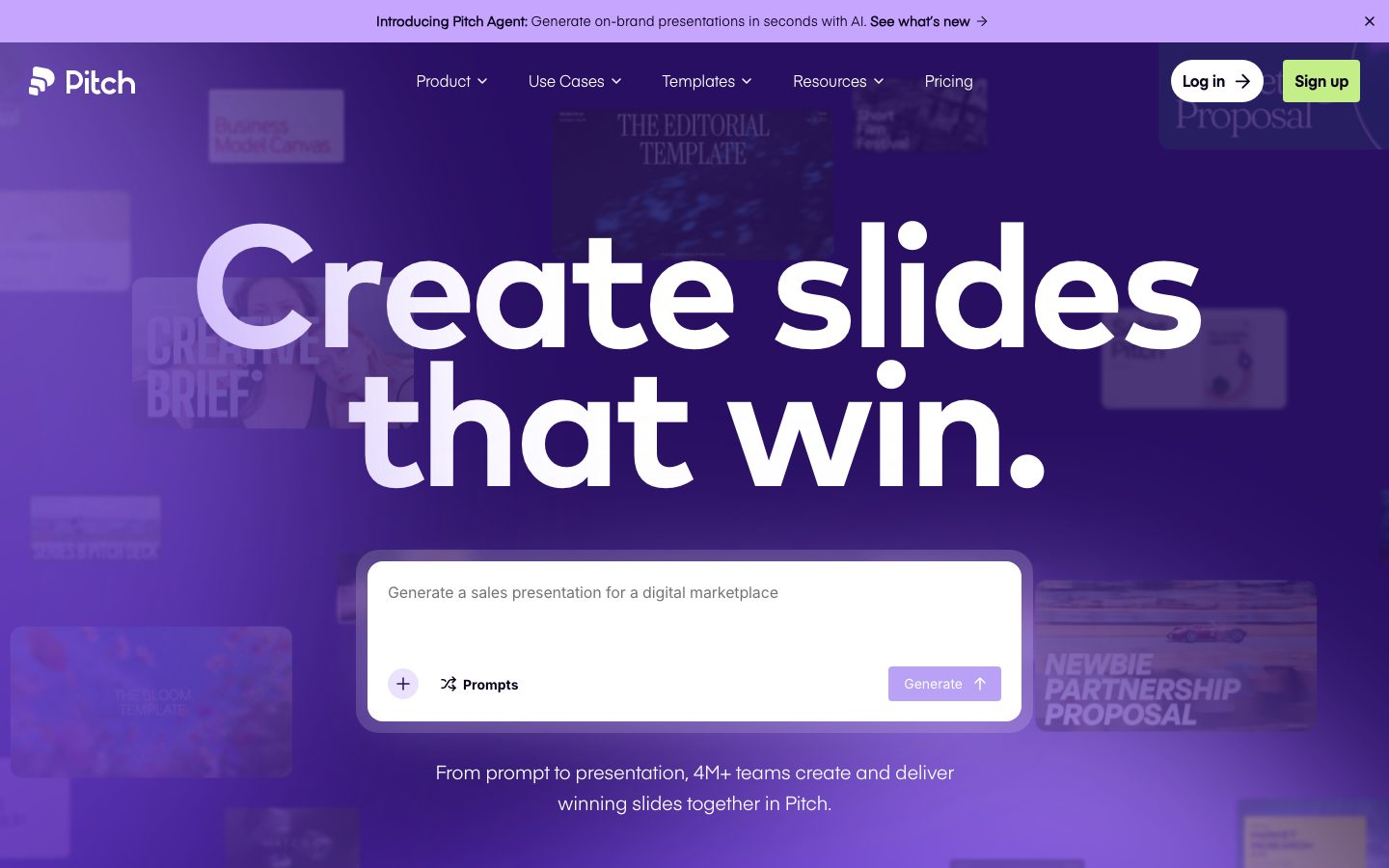
Pitch's marketing surface is a high-voltage, violet-saturated interface for AI presentation software. The hero opens on a deep-purple gradient band (`{colors.primary}` — #5318eb) with an enormous Mark Pro Bold headline ("Create slides that win.") at 180px, set in near-white over a faint collage of template thumbnails. The voice is bold, modern, and confidently consumer-SaaS — oversized condensed display type, rounded pill controls, and a single electric lime CTA (`{colors.accent-lime}` — #c4ee87) that pops against the purple.
Type voice splits cleanly into two roles: **Mark Pro Bold** (the display + heading face — weight 700, aggressive negative letter-spacing) and **Eina 03 Regular** (everything else — subheads and body, weight 400, gentle negative tracking). Both are commercial typefaces; open-source substitutes are documented in the Typography section.
The palette is essentially monochrome-violet with a deep stack of measured accent purples (`{colors.accent-blue}`, `{colors.accent-violet}`, `{colors.accent-violet-light}`, `{colors.accent-deep}`, `{colors.accent-lilac}`) plus a small set of bright punctuation hues (lime, magenta, orange, yellow) that appear inside product UI and template chrome. The white prompt-input card floating in the hero — the AI generation entry point — is the system's signature component, carried by a soft lilac glow shadow.
Below the hero the page flips to a white canvas for numbered feature sections ("(01) Create", "(02) Collab…"), each pairing a Mark Pro heading with lilac product-mockup cards (`{colors.surface-lilac}` — #ebe3fe) that show the actual Pitch editor at small scale.
**Key Characteristics:**
- Deep-violet hero band (`{colors.primary}` — #5318eb) with white oversized Mark Pro display type — the dominant brand moment.
- Single electric lime primary CTA (`{colors.accent-lime}` — #c4ee87) — the only warm accent on the action layer; everything else is violet or monochrome.
- Floating white prompt-input card (`{component.prompt-input-card}`) as the hero's interactive centerpiece, lifted by a lilac glow shadow.
- Mark Pro Bold display headlines with heavy negative letter-spacing (-7.2px at 180px, -1.28px at 32px) — condensed, oversized, distinctly Pitch.
- Rounded geometry throughout — content cards at `{rounded.xl}` (24px), pill controls up to `{rounded.full}` (100px).
- White feature sections below the hero hold lilac (`{colors.surface-lilac}`) product-mockup cards showing the real Pitch editor.
- Lilac announcement bar (`{colors.accent-lilac}`) pinned above the nav.
## Colors
### Brand & Accent
- **Primary** (`{colors.primary}` — #5318eb): The dominant brand violet. Hero gradient band, logo-cloud band, section index labels.
- **Accent Lime** (`{colors.accent-lime}` — #c4ee87): The signature primary CTA color ("Sign up"). The only warm action color — it exists to pop against the purple.
- **Accent Lilac** (`{colors.accent-lilac}` — #c6a5ff): The announcement bar, the "Generate" button fill, icon-button fills, and the hero glow shadow tone.
- **Accent Violets** — A deep stack of measured purples for gradients, links, and product chrome: `{colors.accent-blue}` (#0000ee), `{colors.accent-blue-bright}` (#1243fd), `{colors.accent-violet}` (#6b53ff), `{colors.accent-violet-light}` (#8d49f7), `{colors.accent-deep}` (#280f62).
- **Bright Punctuation** — Small accents observed inside template thumbnails and product UI: `{colors.accent-magenta}` (#df05da), `{colors.accent-orange}` (#ff9e2c), `{colors.accent-yellow}` (#ffe600). These never appear on hero CTAs.
### Surface
- **Canvas** (`{colors.canvas}` — #ffffff): The default page floor below the hero; the prompt-input card; the "Log in" pill.
- **Surface Soft** (`{colors.surface-soft}` — #f6f6f6): Soft section/panel dividers.
- **Surface Lilac** (`{colors.surface-lilac}` — #ebe3fe): Feature / product-mockup card backgrounds on white sections.
- **Hairline** (`{colors.hairline}` — #dddfe5): The 1px border tone on light surfaces — input outlines, card edges.
### Text
- **Ink** (`{colors.ink}` — #000000): Headlines and primary text on light surfaces; text on the lime CTA.
- **Link** (`{colors.link}` — #0c021c): Default anchor color — a near-black violet-black.
- **Muted** (`{colors.muted}` — #545465): Secondary text, placeholder text inside the prompt card.
- **Neutral / Neutral Dark** (`{colors.neutral}` — #363636, `{colors.neutral-dark}` — #2b2a35): Tertiary text and dark UI chrome.
- **On Primary / On Dark** (`{colors.on-primary}` / `{colors.on-dark}` — #ffffff): Text on the violet hero, logo cloud, and Generate button.
## Typography
### Font Family
The system runs **Mark Pro Bold** for display + headings and **Eina 03 Regular** for subheads + body. Mark Pro is a condensed-feeling geometric sans used at weight 700 with aggressive negative letter-spacing — it carries the oversized hero headline. Eina 03 is a humanist geometric sans used at weight 400 for everything supporting.
Both are commercial typefaces. They were not flagged in `fonts_licensed`, but neither ships as a free web font — substitutes are documented below and used in the fallback stacks.
The split is functional:
- Mark Pro Bold (display + headings, 700, heavy negative tracking) — h1, h3
- Eina 03 Regular (subheads + body, 400, gentle negative tracking) — h2, paragraphs, UI
### Hierarchy
| Token | Size | Weight | Line Height | Letter Spacing | Use |
|---|---|---|---|---|---|
| `{typography.display}` | 180px | 700 | 0.8 | -7.2px | Hero h1 ("Create slides that win.") — Mark Pro Bold |
| `{typography.heading}` | 32px | 700 | 1.2 | -1.28px | Section heads ("Create"), section index labels — Mark Pro Bold |
| `{typography.subhead}` | 20px | 400 | 1.6 | -0.4px | Sub-headlines / lead-in lines — Eina 03 |
| `{typography.body}` | 16px | 400 | 1.6 | -0.32px | Default running-text, card descriptions — Eina 03 |
| `{typography.label}` | 14px | 500 | 1.4 | -0.28px | Nav links, button labels, announcement bar — Eina 03 (derived) |
The `label` role is **derived** — buttons, nav links, and the announcement bar were not individually measured; values are interpolated from the Eina 03 body baseline scaled down for UI chrome.
### Principles
Mark Pro Bold is the brand voice — every display and section headline uses it at weight 700 with negative tracking. The 180px hero headline with -7.2px letter-spacing is the system's loudest gesture; the tight tracking is essential to the look. Eina 03 handles all supporting type and never carries a headline; Mark Pro never carries body copy.
### Note on Font Substitutes
Neither Mark Pro nor Eina 03 ships as an open web font. For **Mark Pro Bold**, use **Montserrat** at weight 700 (or 800 for the largest display) with negative letter-spacing of roughly -0.04em — it preserves the geometric, condensed feel. For **Eina 03 Regular**, use **Inter** at weight 400 with -0.02em tracking, or **Hanken Grotesk** as a closer geometric-humanist match. Do not claim to ship the licensed faces.
## Layout
### Spacing System
- **Base unit:** 4px.
- **Tokens:** `{spacing.xxs}` 4px · `{spacing.xs}` 8px · `{spacing.sm}` 12px · `{spacing.md}` 16px · `{spacing.lg}` 20px · `{spacing.xl}` 24px · `{spacing.xxl}` 32px · `{spacing.xxxl}` 40px · `{spacing.huge}` 52px · `{spacing.section}` 64px.
- **Most-frequent measured values:** 24px (86), 10px (69), 32px (38), 12px (37), 8px (32). The 10px value (a high-frequency outlier) is folded into the `{spacing.sm}` band for the token scale.
- **Section padding:** `{spacing.section}` (64px) — the largest measured vertical rhythm between bands.
- **Card internal padding:** `{spacing.xl}` (24px) for the prompt-input card and feature cards.
### Grid & Container
- **Hero:** full-bleed violet band; the oversized headline spans nearly the full width, with the prompt-input card centered below it.
- **Feature sections:** two-column split — Mark Pro heading + body description on one side, lilac product-mockup card on the other; sections are numbered ("(01)", "(02)").
- **Logo cloud:** single horizontal row of partner logos on the violet band.
### Whitespace Philosophy
Pitch trades on scale, not density — the hero spends most of its vertical budget on one enormous headline and one input card. Section padding tops out at 64px (measured); the oversized type does the heavy lifting for hierarchy, so supporting copy stays sparse and centered.
## Elevation & Depth
| Level | Treatment | Use |
|---|---|---|
| Flat | No shadow | Hero band, logo cloud, white feature sections |
| Hairline | 1px `{colors.hairline}` border | Inputs, card edges on white |
| Lilac glow | `rgba(198,165,255,0.35) 0px 20px 60px -20px` | The hero prompt-input card — the only measured shadow |
The single measured shadow is a soft, diffuse **lilac glow** (`{colors.accent-lilac}` at 35% alpha) lifting the white prompt-input card off the violet hero. This is the system's only elevation token — everything else is flat or color-block contrast. No heavy drop shadows, no neumorphism.
### Decorative Depth
- The hero's faint background collage of template thumbnails sits behind the headline at low opacity, adding depth without competing with the type.
- Product-mockup cards in feature sections carry their own internal editor chrome (toolbars, slide canvases) — these are product UI shown as content, not system tokens.
## Shapes
### Border Radius Scale
| Token | Value | Use |
|---|---|---|
| `{rounded.xs}` | 4px | Small inline elements, tight inputs |
| `{rounded.sm}` | 8px | Buttons (Sign up / Log in / Generate) |
| `{rounded.md}` | 12px | Small cards, dropdown panels |
| `{rounded.lg}` | 20px | Common card radius (most-frequent measured) |
| `{rounded.xl}` | 24px | Prompt-input card, feature / product-mockup cards |
| `{rounded.xxl}` | 32px | Larger panels |
| `{rounded.xxxl}` | 40px | Extra-large rounded surfaces |
| `{rounded.pill}` | 70px | Pill controls, capsule chips |
| `{rounded.full}` | 100px | Icon buttons, circular controls |
`{rounded.lg}` (20px) is the most frequently measured radius (31 occurrences), with `{rounded.xl}` (24px) and `{rounded.xxxl}` (40px) close behind — the system is broadly, generously rounded.
### Photography & Card Geometry
Template thumbnails and product-mockup cards use rounded corners in the `{rounded.lg}`–`{rounded.xl}` range. Icon buttons (e.g., the "+" inside the prompt card) are circular via `{rounded.full}`.
## Components
### Announcement & Navigation
**`announcement-bar`** — A lilac strip pinned above the nav (`{colors.accent-lilac}`), carrying the "Introducing Pitch Agent…" message in `{typography.label}` with a dismiss "×" at the right. Padding ~8px × 24px.
**`top-nav`** — Transparent nav overlaid on the violet hero. Carries the Pitch wordmark + logo at left, a centered menu (Product, Use Cases, Templates, Resources, Pricing — with dropdown carets), and a right cluster with `{component.button-login}` and `{component.button-primary}`. Menu items in `{typography.label}`, white on the violet band.
**`nav-link`** — Inline nav menu item, transparent background, white text (`{colors.on-dark}`) over the hero.
### Buttons
**`button-primary`** — The signature "Sign up" CTA. Background `{colors.accent-lime}` (#c4ee87), text `{colors.ink}`, type `{typography.label}`, rounded `{rounded.sm}` (8px), padding ~12px × 20px. The lime fill is the system's only warm action color.
**`button-login`** — White pill "Log in" button paired with the primary in the nav cluster. Background `{colors.canvas}`, text `{colors.ink}`, rounded `{rounded.sm}`, with a trailing arrow glyph.
**`button-generate`** — The AI action inside the prompt card ("Generate ↑"). Background `{colors.accent-lilac}`, text `{colors.on-primary}`, rounded `{rounded.sm}`, padding ~10px × 16px.
**`icon-button`** — Circular utility button (e.g., the "+" inside the prompt card). Background `{colors.surface-lilac}`, icon in `{colors.primary}`, rounded `{rounded.full}`, ~36px.
### Cards & Containers
**`prompt-input-card`** — The hero's interactive centerpiece. A white card floating over the violet band with placeholder text ("Generate a sales presentation for a digital marketplace") in `{colors.muted}`, a "Prompts" affordance row, the `{component.icon-button}` at left and `{component.button-generate}` at right. Background `{colors.canvas}`, rounded `{rounded.xl}` (24px), padding `{spacing.xl}` (24px), lifted by the lilac glow shadow.
**`hero-band`** — Full-bleed violet band (`{colors.primary}`) holding the 180px Mark Pro display headline in white, the prompt-input card, and a centered sub-line in `{typography.subhead}`. Vertical padding `{spacing.section}` (64px).
**`logo-cloud`** — A single-row partner-logo strip (synthesia, Pentagram, Kolo, perplexity, Thrive Global, Cleveland Browns, Linear) on the violet band, logos in white `{typography.label}`.
**`feature-section`** — White-canvas numbered band ("(01) Create"). Carries a Mark Pro `{typography.heading}` headline, a body description in `{typography.body}`, and a lilac product-mockup card. Vertical padding `{spacing.section}` (64px).
**`feature-card`** — Lilac product-mockup card showing the actual Pitch editor at small scale (toolbar, slide canvas, "Add brand kit"). Background `{colors.surface-lilac}` (#ebe3fe), rounded `{rounded.xl}` (24px), padding `{spacing.xl}` (24px).
**`section-index-label`** — The "(01)" / "(02)" numbering beside section headings, rendered in `{colors.primary}` with Mark Pro `{typography.heading}`.
### Inputs & Forms
**`text-input`** — Standard text input. Background `{colors.canvas}`, text `{colors.ink}`, type `{typography.body}`, rounded `{rounded.xs}` (the measured input radius was 0px; `{rounded.xs}` is applied as the visible-screenshot approximation — see Known Gaps), 1px `{colors.hairline}` border, padding ~12px × 16px.
## Do's and Don'ts
### Do
- Reserve `{colors.accent-lime}` (#c4ee87) for the single primary CTA. It is the only warm action color in the system.
- Use Mark Pro Bold for every display + section headline, with heavy negative letter-spacing. Pair with Eina 03 for body and UI.
- Set the hero headline at maximum scale — the 180px Mark Pro display is the brand's loudest gesture.
- Lift the prompt-input card with the lilac glow shadow (`rgba(198,165,255,0.35) 0px 20px 60px -20px`) over the violet band.
- Keep feature cards lilac (`{colors.surface-lilac}`) on white sections and show the real Pitch editor inside them.
- Use generous rounding — `{rounded.xl}` (24px) for content cards, pill/full radii for controls.
### Don't
- Don't put bright punctuation hues (magenta, orange, yellow) on primary CTAs — they belong inside template/product chrome only.
- Don't use Mark Pro for body copy or Eina 03 for headlines — the two-role split is strict.
- Don't drop the negative letter-spacing on display type; loose tracking reads as off-brand.
- Don't add dark cards or extra drop shadows — the system is flat except for the single lilac glow.
- Don't claim to ship Mark Pro or Eina 03 — use the documented Montserrat / Inter substitutes.
- Don't document hover states — default and active/pressed only.
## Responsive Behavior
### Breakpoints
The capture did not include measured breakpoint values; the following is the standard collapsing strategy inferred from the desktop and narrow-width screenshots (mark as approximate).
| Name | Width | Key Changes |
|---|---|---|
| Mobile | < 768px | Nav collapses to a compact bar; hero display type scales down dramatically from 180px; prompt-input card goes full-width; feature sections stack to single column |
| Tablet | 768–1024px | Nav tightens; logo cloud may wrap; feature sections keep two-column where space allows |
| Desktop | > 1024px | Full nav, full-scale 180px hero headline, two-column feature sections |
### Touch Targets
- `{component.button-primary}` and `{component.button-login}` carry ~12px × 20px padding — adequate tap area at the nav scale.
- `{component.icon-button}` at ~36px is slightly under WCAG 44×44 but the circular silhouette and surrounding card padding compensate.
### Collapsing Strategy
- The hero headline scales with the viewport — the 180px figure is the desktop maximum; the narrow capture shows it reduced substantially.
- The prompt-input card widens to fill available space and keeps the "Prompts" row and Generate button on one line until it wraps on mobile.
- Feature sections collapse from side-by-side heading + mockup to stacked single column.
## Iteration Guide
1. Focus on ONE component at a time. Reference its YAML key directly (`{component.prompt-input-card}`, `{component.feature-card}`).
2. Variants of an existing component (`-active`, `-disabled`, `-focused`) live as separate entries in `components:`.
3. Use `{token.refs}` everywhere — never inline hex.
4. Never document hover. Default and Active/Pressed states only.
5. Display headlines stay Mark Pro Bold 700 with negative letter-spacing; body stays Eina 03 400. The split does not blur.
6. The lime CTA is the only warm action color — keep it scarce.
7. When in doubt about emphasis: bigger Mark Pro before more color.
## Known Gaps
- The dembrandt button extractor returned `button-primary` with `radius: 0px, padding: 0px, color: #000000` and the input with `radius: 0px` — these almost certainly captured an unstyled base `<button>`/`<input>` element rather than the visible rounded pill controls. Button and input geometry in this doc is reconstructed from screenshot ground-truth; the radii (`{rounded.sm}`, `{rounded.xs}`) are approximations and should be re-measured against the live DOM.
- Mark Pro Bold and Eina 03 Regular are commercial typefaces but were NOT flagged in `fonts_licensed`; substitutes are documented defensively. Confirm licensing before shipping.
- The `label` typography role (nav links, buttons, announcement bar) is **derived** — not individually measured.
- Only one shadow was measured (the hero card lilac glow); elevation tokens for other surfaces are unconfirmed.
- Breakpoint widths and responsive type-scaling values were not measured; the responsive table is inferred from the desktop + narrow captures.
- Many accent hues (magenta, orange, yellow, the multiple violets) were measured at low frequency and likely originate inside template thumbnails / product UI; their exact application roles on marketing surfaces are not fully confirmed.
- The pricing and whats-new pages were captured but not separately analyzed for unique components; only landing-page components are documented.
- Animation, transition timings, and the AI-generation flow states are out of scope.
<!-- Documented by duply · real-world design systems as ready-to-use DESIGN.md for AI coding agents · https://duply.ai/pitch/design-md -->
Color Palette
Accent
Neutrals
Typography
display180px · 700 · 0.8
The quick brown fox jumpsheading32px · 700 · 1.2
The quick brown fox jumpssubhead20px · 400 · 1.6
The quick brown fox jumpsbody16px · 400 · 1.6
The quick brown fox jumpslabel14px · 500 · 1.4
The quick brown fox jumpsSpacing & Shape
Spacing
| Name | Value | Preview |
|---|---|---|
| xxs | 4px | |
| xs | 8px | |
| sm | 12px | |
| md | 16px | |
| lg | 20px | |
| xl | 24px | |
| xxl | 32px | |
| xxxl | 40px | |
| huge | 52px | |
| section | 64px |
Border Radius
| Name | Value | Preview |
|---|---|---|
| xs | 4px | |
| sm | 8px | |
| md | 12px | |
| lg | 20px | |
| xl | 24px | |
| xxl | 32px | |
| xxxl | 40px | |
| pill | 70px | |
| full | 100px |
More like this


---
version: alpha
name: Pitch-design-analysis
description: A high-voltage, purple-saturated marketing surface for AI presentation software, anchored on deep-violet hero gradients with oversized Mark Pro display type, a lime-green primary CTA, and white prompt-input cards floating over template collages. The system reads as bold modern-SaaS — enormous condensed headlines (up to 180px), rounded pill controls, and a near-monochrome violet palette punctuated by a single electric lime accent.

colors:
  ink: "#000000"
  canvas: "#ffffff"
  link: "#0c021c"
  primary: "#5318eb"
  accent-blue: "#0000ee"
  accent-blue-bright: "#1243fd"
  accent-violet: "#6b53ff"
  accent-violet-light: "#8d49f7"
  accent-deep: "#280f62"
  accent-lilac: "#c6a5ff"
  accent-magenta: "#df05da"
  accent-orange: "#ff9e2c"
  accent-yellow: "#ffe600"
  accent-lime: "#c4ee87"
  surface-soft: "#f6f6f6"
  surface-lilac: "#ebe3fe"
  hairline: "#dddfe5"
  neutral-dark: "#2b2a35"
  neutral: "#363636"
  muted: "#545465"
  on-primary: "#ffffff"
  on-dark: "#ffffff"

typography:
  display:
    fontFamily: "Mark Pro Bold, Montserrat, sans-serif"
    fontSize: 180px
    fontWeight: 700
    lineHeight: 0.8
    letterSpacing: -7.2px
  heading:
    fontFamily: "Mark Pro Bold, Montserrat, sans-serif"
    fontSize: 32px
    fontWeight: 700
    lineHeight: 1.2
    letterSpacing: -1.28px
  subhead:
    fontFamily: "Eina 03 Regular, Inter, sans-serif"
    fontSize: 20px
    fontWeight: 400
    lineHeight: 1.6
    letterSpacing: -0.4px
  body:
    fontFamily: "Eina 03 Regular, Inter, sans-serif"
    fontSize: 16px
    fontWeight: 400
    lineHeight: 1.6
    letterSpacing: -0.32px
  label:
    fontFamily: "Eina 03 Regular, Inter, sans-serif"
    fontSize: 14px
    fontWeight: 500
    lineHeight: 1.4
    letterSpacing: -0.28px

rounded:
  xs: 4px
  sm: 8px
  md: 12px
  lg: 20px
  xl: 24px
  xxl: 32px
  xxxl: 40px
  pill: 70px
  full: 100px

spacing:
  xxs: 4px
  xs: 8px
  sm: 12px
  md: 16px
  lg: 20px
  xl: 24px
  xxl: 32px
  xxxl: 40px
  huge: 52px
  section: 64px

components:
  announcement-bar:
    backgroundColor: "{colors.accent-lilac}"
    textColor: "{colors.ink}"
    typography: "{typography.label}"
    padding: 8px 24px
  top-nav:
    backgroundColor: transparent
    textColor: "{colors.on-dark}"
    typography: "{typography.label}"
    padding: 24px 32px
  nav-link:
    backgroundColor: transparent
    textColor: "{colors.on-dark}"
    typography: "{typography.label}"
  button-primary:
    backgroundColor: "{colors.accent-lime}"
    textColor: "{colors.ink}"
    typography: "{typography.label}"
    rounded: "{rounded.sm}"
    padding: 12px 20px
  button-login:
    backgroundColor: "{colors.canvas}"
    textColor: "{colors.ink}"
    typography: "{typography.label}"
    rounded: "{rounded.sm}"
    padding: 12px 20px
  button-generate:
    backgroundColor: "{colors.accent-lilac}"
    textColor: "{colors.on-primary}"
    typography: "{typography.label}"
    rounded: "{rounded.sm}"
    padding: 10px 16px
  prompt-input-card:
    backgroundColor: "{colors.canvas}"
    textColor: "{colors.muted}"
    typography: "{typography.body}"
    rounded: "{rounded.xl}"
    padding: 24px
  hero-band:
    backgroundColor: "{colors.primary}"
    textColor: "{colors.on-dark}"
    typography: "{typography.display}"
    padding: 64px
  logo-cloud:
    backgroundColor: "{colors.primary}"
    textColor: "{colors.on-dark}"
    typography: "{typography.label}"
    padding: 32px
  feature-section:
    backgroundColor: "{colors.canvas}"
    textColor: "{colors.ink}"
    typography: "{typography.heading}"
    padding: 64px
  feature-card:
    backgroundColor: "{colors.surface-lilac}"
    textColor: "{colors.ink}"
    typography: "{typography.body}"
    rounded: "{rounded.xl}"
    padding: 24px
  section-index-label:
    backgroundColor: transparent
    textColor: "{colors.primary}"
    typography: "{typography.heading}"
  text-input:
    backgroundColor: "{colors.canvas}"
    textColor: "{colors.ink}"
    typography: "{typography.body}"
    rounded: "{rounded.xs}"
    padding: 12px 16px
  icon-button:
    backgroundColor: "{colors.surface-lilac}"
    textColor: "{colors.primary}"
    rounded: "{rounded.full}"
    size: 36px
---

## Overview

Pitch's marketing surface is a high-voltage, violet-saturated interface for AI presentation software. The hero opens on a deep-purple gradient band (`{colors.primary}` — #5318eb) with an enormous Mark Pro Bold headline ("Create slides that win.") at 180px, set in near-white over a faint collage of template thumbnails. The voice is bold, modern, and confidently consumer-SaaS — oversized condensed display type, rounded pill controls, and a single electric lime CTA (`{colors.accent-lime}` — #c4ee87) that pops against the purple.

Type voice splits cleanly into two roles: **Mark Pro Bold** (the display + heading face — weight 700, aggressive negative letter-spacing) and **Eina 03 Regular** (everything else — subheads and body, weight 400, gentle negative tracking). Both are commercial typefaces; open-source substitutes are documented in the Typography section.

The palette is essentially monochrome-violet with a deep stack of measured accent purples (`{colors.accent-blue}`, `{colors.accent-violet}`, `{colors.accent-violet-light}`, `{colors.accent-deep}`, `{colors.accent-lilac}`) plus a small set of bright punctuation hues (lime, magenta, orange, yellow) that appear inside product UI and template chrome. The white prompt-input card floating in the hero — the AI generation entry point — is the system's signature component, carried by a soft lilac glow shadow.

Below the hero the page flips to a white canvas for numbered feature sections ("(01) Create", "(02) Collab…"), each pairing a Mark Pro heading with lilac product-mockup cards (`{colors.surface-lilac}` — #ebe3fe) that show the actual Pitch editor at small scale.

**Key Characteristics:**
- Deep-violet hero band (`{colors.primary}` — #5318eb) with white oversized Mark Pro display type — the dominant brand moment.
- Single electric lime primary CTA (`{colors.accent-lime}` — #c4ee87) — the only warm accent on the action layer; everything else is violet or monochrome.
- Floating white prompt-input card (`{component.prompt-input-card}`) as the hero's interactive centerpiece, lifted by a lilac glow shadow.
- Mark Pro Bold display headlines with heavy negative letter-spacing (-7.2px at 180px, -1.28px at 32px) — condensed, oversized, distinctly Pitch.
- Rounded geometry throughout — content cards at `{rounded.xl}` (24px), pill controls up to `{rounded.full}` (100px).
- White feature sections below the hero hold lilac (`{colors.surface-lilac}`) product-mockup cards showing the real Pitch editor.
- Lilac announcement bar (`{colors.accent-lilac}`) pinned above the nav.

## Colors

### Brand & Accent
- **Primary** (`{colors.primary}` — #5318eb): The dominant brand violet. Hero gradient band, logo-cloud band, section index labels.
- **Accent Lime** (`{colors.accent-lime}` — #c4ee87): The signature primary CTA color ("Sign up"). The only warm action color — it exists to pop against the purple.
- **Accent Lilac** (`{colors.accent-lilac}` — #c6a5ff): The announcement bar, the "Generate" button fill, icon-button fills, and the hero glow shadow tone.
- **Accent Violets** — A deep stack of measured purples for gradients, links, and product chrome: `{colors.accent-blue}` (#0000ee), `{colors.accent-blue-bright}` (#1243fd), `{colors.accent-violet}` (#6b53ff), `{colors.accent-violet-light}` (#8d49f7), `{colors.accent-deep}` (#280f62).
- **Bright Punctuation** — Small accents observed inside template thumbnails and product UI: `{colors.accent-magenta}` (#df05da), `{colors.accent-orange}` (#ff9e2c), `{colors.accent-yellow}` (#ffe600). These never appear on hero CTAs.

### Surface
- **Canvas** (`{colors.canvas}` — #ffffff): The default page floor below the hero; the prompt-input card; the "Log in" pill.
- **Surface Soft** (`{colors.surface-soft}` — #f6f6f6): Soft section/panel dividers.
- **Surface Lilac** (`{colors.surface-lilac}` — #ebe3fe): Feature / product-mockup card backgrounds on white sections.
- **Hairline** (`{colors.hairline}` — #dddfe5): The 1px border tone on light surfaces — input outlines, card edges.

### Text
- **Ink** (`{colors.ink}` — #000000): Headlines and primary text on light surfaces; text on the lime CTA.
- **Link** (`{colors.link}` — #0c021c): Default anchor color — a near-black violet-black.
- **Muted** (`{colors.muted}` — #545465): Secondary text, placeholder text inside the prompt card.
- **Neutral / Neutral Dark** (`{colors.neutral}` — #363636, `{colors.neutral-dark}` — #2b2a35): Tertiary text and dark UI chrome.
- **On Primary / On Dark** (`{colors.on-primary}` / `{colors.on-dark}` — #ffffff): Text on the violet hero, logo cloud, and Generate button.

## Typography

### Font Family
The system runs **Mark Pro Bold** for display + headings and **Eina 03 Regular** for subheads + body. Mark Pro is a condensed-feeling geometric sans used at weight 700 with aggressive negative letter-spacing — it carries the oversized hero headline. Eina 03 is a humanist geometric sans used at weight 400 for everything supporting.

Both are commercial typefaces. They were not flagged in `fonts_licensed`, but neither ships as a free web font — substitutes are documented below and used in the fallback stacks.

The split is functional:
- Mark Pro Bold (display + headings, 700, heavy negative tracking) — h1, h3
- Eina 03 Regular (subheads + body, 400, gentle negative tracking) — h2, paragraphs, UI

### Hierarchy

| Token | Size | Weight | Line Height | Letter Spacing | Use |
|---|---|---|---|---|---|
| `{typography.display}` | 180px | 700 | 0.8 | -7.2px | Hero h1 ("Create slides that win.") — Mark Pro Bold |
| `{typography.heading}` | 32px | 700 | 1.2 | -1.28px | Section heads ("Create"), section index labels — Mark Pro Bold |
| `{typography.subhead}` | 20px | 400 | 1.6 | -0.4px | Sub-headlines / lead-in lines — Eina 03 |
| `{typography.body}` | 16px | 400 | 1.6 | -0.32px | Default running-text, card descriptions — Eina 03 |
| `{typography.label}` | 14px | 500 | 1.4 | -0.28px | Nav links, button labels, announcement bar — Eina 03 (derived) |

The `label` role is **derived** — buttons, nav links, and the announcement bar were not individually measured; values are interpolated from the Eina 03 body baseline scaled down for UI chrome.

### Principles
Mark Pro Bold is the brand voice — every display and section headline uses it at weight 700 with negative tracking. The 180px hero headline with -7.2px letter-spacing is the system's loudest gesture; the tight tracking is essential to the look. Eina 03 handles all supporting type and never carries a headline; Mark Pro never carries body copy.

### Note on Font Substitutes
Neither Mark Pro nor Eina 03 ships as an open web font. For **Mark Pro Bold**, use **Montserrat** at weight 700 (or 800 for the largest display) with negative letter-spacing of roughly -0.04em — it preserves the geometric, condensed feel. For **Eina 03 Regular**, use **Inter** at weight 400 with -0.02em tracking, or **Hanken Grotesk** as a closer geometric-humanist match. Do not claim to ship the licensed faces.

## Layout

### Spacing System
- **Base unit:** 4px.
- **Tokens:** `{spacing.xxs}` 4px · `{spacing.xs}` 8px · `{spacing.sm}` 12px · `{spacing.md}` 16px · `{spacing.lg}` 20px · `{spacing.xl}` 24px · `{spacing.xxl}` 32px · `{spacing.xxxl}` 40px · `{spacing.huge}` 52px · `{spacing.section}` 64px.
- **Most-frequent measured values:** 24px (86), 10px (69), 32px (38), 12px (37), 8px (32). The 10px value (a high-frequency outlier) is folded into the `{spacing.sm}` band for the token scale.
- **Section padding:** `{spacing.section}` (64px) — the largest measured vertical rhythm between bands.
- **Card internal padding:** `{spacing.xl}` (24px) for the prompt-input card and feature cards.

### Grid & Container
- **Hero:** full-bleed violet band; the oversized headline spans nearly the full width, with the prompt-input card centered below it.
- **Feature sections:** two-column split — Mark Pro heading + body description on one side, lilac product-mockup card on the other; sections are numbered ("(01)", "(02)").
- **Logo cloud:** single horizontal row of partner logos on the violet band.

### Whitespace Philosophy
Pitch trades on scale, not density — the hero spends most of its vertical budget on one enormous headline and one input card. Section padding tops out at 64px (measured); the oversized type does the heavy lifting for hierarchy, so supporting copy stays sparse and centered.

## Elevation & Depth

| Level | Treatment | Use |
|---|---|---|
| Flat | No shadow | Hero band, logo cloud, white feature sections |
| Hairline | 1px `{colors.hairline}` border | Inputs, card edges on white |
| Lilac glow | `rgba(198,165,255,0.35) 0px 20px 60px -20px` | The hero prompt-input card — the only measured shadow |

The single measured shadow is a soft, diffuse **lilac glow** (`{colors.accent-lilac}` at 35% alpha) lifting the white prompt-input card off the violet hero. This is the system's only elevation token — everything else is flat or color-block contrast. No heavy drop shadows, no neumorphism.

### Decorative Depth
- The hero's faint background collage of template thumbnails sits behind the headline at low opacity, adding depth without competing with the type.
- Product-mockup cards in feature sections carry their own internal editor chrome (toolbars, slide canvases) — these are product UI shown as content, not system tokens.

## Shapes

### Border Radius Scale

| Token | Value | Use |
|---|---|---|
| `{rounded.xs}` | 4px | Small inline elements, tight inputs |
| `{rounded.sm}` | 8px | Buttons (Sign up / Log in / Generate) |
| `{rounded.md}` | 12px | Small cards, dropdown panels |
| `{rounded.lg}` | 20px | Common card radius (most-frequent measured) |
| `{rounded.xl}` | 24px | Prompt-input card, feature / product-mockup cards |
| `{rounded.xxl}` | 32px | Larger panels |
| `{rounded.xxxl}` | 40px | Extra-large rounded surfaces |
| `{rounded.pill}` | 70px | Pill controls, capsule chips |
| `{rounded.full}` | 100px | Icon buttons, circular controls |

`{rounded.lg}` (20px) is the most frequently measured radius (31 occurrences), with `{rounded.xl}` (24px) and `{rounded.xxxl}` (40px) close behind — the system is broadly, generously rounded.

### Photography & Card Geometry
Template thumbnails and product-mockup cards use rounded corners in the `{rounded.lg}`–`{rounded.xl}` range. Icon buttons (e.g., the "+" inside the prompt card) are circular via `{rounded.full}`.

## Components

### Announcement & Navigation

**`announcement-bar`** — A lilac strip pinned above the nav (`{colors.accent-lilac}`), carrying the "Introducing Pitch Agent…" message in `{typography.label}` with a dismiss "×" at the right. Padding ~8px × 24px.

**`top-nav`** — Transparent nav overlaid on the violet hero. Carries the Pitch wordmark + logo at left, a centered menu (Product, Use Cases, Templates, Resources, Pricing — with dropdown carets), and a right cluster with `{component.button-login}` and `{component.button-primary}`. Menu items in `{typography.label}`, white on the violet band.

**`nav-link`** — Inline nav menu item, transparent background, white text (`{colors.on-dark}`) over the hero.

### Buttons

**`button-primary`** — The signature "Sign up" CTA. Background `{colors.accent-lime}` (#c4ee87), text `{colors.ink}`, type `{typography.label}`, rounded `{rounded.sm}` (8px), padding ~12px × 20px. The lime fill is the system's only warm action color.

**`button-login`** — White pill "Log in" button paired with the primary in the nav cluster. Background `{colors.canvas}`, text `{colors.ink}`, rounded `{rounded.sm}`, with a trailing arrow glyph.

**`button-generate`** — The AI action inside the prompt card ("Generate ↑"). Background `{colors.accent-lilac}`, text `{colors.on-primary}`, rounded `{rounded.sm}`, padding ~10px × 16px.

**`icon-button`** — Circular utility button (e.g., the "+" inside the prompt card). Background `{colors.surface-lilac}`, icon in `{colors.primary}`, rounded `{rounded.full}`, ~36px.

### Cards & Containers

**`prompt-input-card`** — The hero's interactive centerpiece. A white card floating over the violet band with placeholder text ("Generate a sales presentation for a digital marketplace") in `{colors.muted}`, a "Prompts" affordance row, the `{component.icon-button}` at left and `{component.button-generate}` at right. Background `{colors.canvas}`, rounded `{rounded.xl}` (24px), padding `{spacing.xl}` (24px), lifted by the lilac glow shadow.

**`hero-band`** — Full-bleed violet band (`{colors.primary}`) holding the 180px Mark Pro display headline in white, the prompt-input card, and a centered sub-line in `{typography.subhead}`. Vertical padding `{spacing.section}` (64px).

**`logo-cloud`** — A single-row partner-logo strip (synthesia, Pentagram, Kolo, perplexity, Thrive Global, Cleveland Browns, Linear) on the violet band, logos in white `{typography.label}`.

**`feature-section`** — White-canvas numbered band ("(01) Create"). Carries a Mark Pro `{typography.heading}` headline, a body description in `{typography.body}`, and a lilac product-mockup card. Vertical padding `{spacing.section}` (64px).

**`feature-card`** — Lilac product-mockup card showing the actual Pitch editor at small scale (toolbar, slide canvas, "Add brand kit"). Background `{colors.surface-lilac}` (#ebe3fe), rounded `{rounded.xl}` (24px), padding `{spacing.xl}` (24px).

**`section-index-label`** — The "(01)" / "(02)" numbering beside section headings, rendered in `{colors.primary}` with Mark Pro `{typography.heading}`.

### Inputs & Forms

**`text-input`** — Standard text input. Background `{colors.canvas}`, text `{colors.ink}`, type `{typography.body}`, rounded `{rounded.xs}` (the measured input radius was 0px; `{rounded.xs}` is applied as the visible-screenshot approximation — see Known Gaps), 1px `{colors.hairline}` border, padding ~12px × 16px.

## Do's and Don'ts

### Do
- Reserve `{colors.accent-lime}` (#c4ee87) for the single primary CTA. It is the only warm action color in the system.
- Use Mark Pro Bold for every display + section headline, with heavy negative letter-spacing. Pair with Eina 03 for body and UI.
- Set the hero headline at maximum scale — the 180px Mark Pro display is the brand's loudest gesture.
- Lift the prompt-input card with the lilac glow shadow (`rgba(198,165,255,0.35) 0px 20px 60px -20px`) over the violet band.
- Keep feature cards lilac (`{colors.surface-lilac}`) on white sections and show the real Pitch editor inside them.
- Use generous rounding — `{rounded.xl}` (24px) for content cards, pill/full radii for controls.

### Don't
- Don't put bright punctuation hues (magenta, orange, yellow) on primary CTAs — they belong inside template/product chrome only.
- Don't use Mark Pro for body copy or Eina 03 for headlines — the two-role split is strict.
- Don't drop the negative letter-spacing on display type; loose tracking reads as off-brand.
- Don't add dark cards or extra drop shadows — the system is flat except for the single lilac glow.
- Don't claim to ship Mark Pro or Eina 03 — use the documented Montserrat / Inter substitutes.
- Don't document hover states — default and active/pressed only.

## Responsive Behavior

### Breakpoints
The capture did not include measured breakpoint values; the following is the standard collapsing strategy inferred from the desktop and narrow-width screenshots (mark as approximate).

| Name | Width | Key Changes |
|---|---|---|
| Mobile | < 768px | Nav collapses to a compact bar; hero display type scales down dramatically from 180px; prompt-input card goes full-width; feature sections stack to single column |
| Tablet | 768–1024px | Nav tightens; logo cloud may wrap; feature sections keep two-column where space allows |
| Desktop | > 1024px | Full nav, full-scale 180px hero headline, two-column feature sections |

### Touch Targets
- `{component.button-primary}` and `{component.button-login}` carry ~12px × 20px padding — adequate tap area at the nav scale.
- `{component.icon-button}` at ~36px is slightly under WCAG 44×44 but the circular silhouette and surrounding card padding compensate.

### Collapsing Strategy
- The hero headline scales with the viewport — the 180px figure is the desktop maximum; the narrow capture shows it reduced substantially.
- The prompt-input card widens to fill available space and keeps the "Prompts" row and Generate button on one line until it wraps on mobile.
- Feature sections collapse from side-by-side heading + mockup to stacked single column.

## Iteration Guide

1. Focus on ONE component at a time. Reference its YAML key directly (`{component.prompt-input-card}`, `{component.feature-card}`).
2. Variants of an existing component (`-active`, `-disabled`, `-focused`) live as separate entries in `components:`.
3. Use `{token.refs}` everywhere — never inline hex.
4. Never document hover. Default and Active/Pressed states only.
5. Display headlines stay Mark Pro Bold 700 with negative letter-spacing; body stays Eina 03 400. The split does not blur.
6. The lime CTA is the only warm action color — keep it scarce.
7. When in doubt about emphasis: bigger Mark Pro before more color.

## Known Gaps

- The dembrandt button extractor returned `button-primary` with `radius: 0px, padding: 0px, color: #000000` and the input with `radius: 0px` — these almost certainly captured an unstyled base `<button>`/`<input>` element rather than the visible rounded pill controls. Button and input geometry in this doc is reconstructed from screenshot ground-truth; the radii (`{rounded.sm}`, `{rounded.xs}`) are approximations and should be re-measured against the live DOM.
- Mark Pro Bold and Eina 03 Regular are commercial typefaces but were NOT flagged in `fonts_licensed`; substitutes are documented defensively. Confirm licensing before shipping.
- The `label` typography role (nav links, buttons, announcement bar) is **derived** — not individually measured.
- Only one shadow was measured (the hero card lilac glow); elevation tokens for other surfaces are unconfirmed.
- Breakpoint widths and responsive type-scaling values were not measured; the responsive table is inferred from the desktop + narrow captures.
- Many accent hues (magenta, orange, yellow, the multiple violets) were measured at low frequency and likely originate inside template thumbnails / product UI; their exact application roles on marketing surfaces are not fully confirmed.
- The pricing and whats-new pages were captured but not separately analyzed for unique components; only landing-page components are documented.
- Animation, transition timings, and the AI-generation flow states are out of scope.

<!-- Documented by duply · real-world design systems as ready-to-use DESIGN.md for AI coding agents · https://duply.ai/pitch/design-md -->