Chainguard
A high-trust developer-security marketing surface built on white canvas with near-black ink, electric-violet primary actions, and bold Gellix display headlines set with tight negative tracking. The system reads as engineered and confident — square-cornered violet CTAs, generously padded white stat and product cards on 16px-radius surfaces, a pastel-violet announcement bar, and a deep near-black footer that closes the page. Brand voltage comes from the violet accent and the heavy Gellix display face rather than from decorative imagery.
---
version: alpha
name: Chainguard-design-analysis
description: "A high-trust developer-security marketing surface built on white canvas with near-black ink, electric-violet primary actions, and bold Gellix display headlines set with tight negative tracking. The system reads as engineered and confident — square-cornered violet CTAs, generously padded white stat and product cards on 16px-radius surfaces, a pastel-violet announcement bar, and a deep near-black footer that closes the page. Brand voltage comes from the violet accent and the heavy Gellix display face rather than from decorative imagery."
colors:
ink: "#0d161c"
accent: "#6226fb"
accent-violet-deep: "#3200af"
accent-violet-light: "#9d7af6"
accent-blue: "#3443f4"
accent-orange: "#fe5b3c"
accent-magenta: "#eb02e0"
accent-magenta-deep: "#a10099"
accent-green: "#108000"
accent-cyan: "#006a97"
ink-violet-deep: "#14003d"
neutral: "#ffffff"
surface-soft: "#fbfbfd"
surface-violet-soft: "#f8f6fe"
surface-violet: "#f1ecfe"
surface-pink-soft: "#fef5fe"
surface-green-soft: "#f2fdf2"
hairline: "#ededed"
muted: "#565c60"
black: "#000000"
typography:
display-xl:
fontFamily: "Gellix, Inter, sans-serif"
fontSize: 64px
fontWeight: 400
lineHeight: 1.0
letterSpacing: -0.03em
heading:
fontFamily: "Gellix, Inter, sans-serif"
fontSize: 40px
fontWeight: 400
lineHeight: 1.2
letterSpacing: -0.03em
body:
fontFamily: "ui-sans-serif, system-ui, sans-serif"
fontSize: 14px
fontWeight: 400
lineHeight: 1.714
letterSpacing: 0
button:
fontFamily: "Gellix, Inter, sans-serif"
fontSize: 14px
fontWeight: 500
lineHeight: 1.429
letterSpacing: 0
rounded:
none: 0px
lg: 16px
spacing:
xxs: 6px
xs: 8px
sm: 12px
md: 16px
ml: 20px
lg: 24px
xl: 32px
xxl: 40px
section: 48px
components:
top-nav:
backgroundColor: "{colors.neutral}"
textColor: "{colors.ink}"
typography: "{typography.button}"
announcement-bar:
backgroundColor: "{colors.surface-violet-soft}"
textColor: "{colors.ink}"
typography: "{typography.body}"
nav-contact-button:
backgroundColor: "{colors.accent}"
textColor: "{colors.neutral}"
typography: "{typography.button}"
rounded: "{rounded.none}"
padding: 0px 24px
button-primary:
backgroundColor: "{colors.accent}"
textColor: "{colors.neutral}"
typography: "{typography.button}"
rounded: "{rounded.none}"
padding: 0px 24px
button-secondary:
backgroundColor: "{colors.surface-violet-soft}"
textColor: "{colors.accent}"
typography: "{typography.button}"
rounded: "{rounded.none}"
padding: 0px 24px
hero-band:
backgroundColor: "{colors.surface-violet-soft}"
textColor: "{colors.ink}"
typography: "{typography.display-xl}"
padding: 48px
stat-cell:
backgroundColor: "{colors.neutral}"
textColor: "{colors.ink}"
typography: "{typography.heading}"
padding: 24px
product-card:
backgroundColor: "{colors.neutral}"
textColor: "{colors.ink}"
typography: "{typography.body}"
rounded: "{rounded.lg}"
padding: 24px
card:
backgroundColor: "{colors.neutral}"
textColor: "{colors.ink}"
rounded: "{rounded.lg}"
card-elevated:
backgroundColor: "{colors.neutral}"
textColor: "{colors.ink}"
rounded: "{rounded.lg}"
feature-tile:
backgroundColor: "{colors.neutral}"
textColor: "{colors.ink}"
typography: "{typography.body}"
rounded: "{rounded.lg}"
padding: 24px
priority-list-item:
backgroundColor: transparent
textColor: "{colors.ink}"
typography: "{typography.body}"
padding: 16px
testimonial-card:
backgroundColor: "{colors.neutral}"
textColor: "{colors.ink}"
typography: "{typography.body}"
rounded: "{rounded.lg}"
padding: 32px
resource-card:
backgroundColor: "{colors.neutral}"
textColor: "{colors.ink}"
typography: "{typography.body}"
rounded: "{rounded.lg}"
padding: 24px
badge-pill:
backgroundColor: "{colors.accent}"
textColor: "{colors.neutral}"
typography: "{typography.button}"
rounded: "{rounded.none}"
padding: 6px 12px
cta-band-dark:
backgroundColor: "{colors.black}"
textColor: "{colors.neutral}"
typography: "{typography.body}"
padding: 48px
footer:
backgroundColor: "{colors.ink-violet-deep}"
textColor: "{colors.neutral}"
typography: "{typography.body}"
padding: 48px
---
## Overview
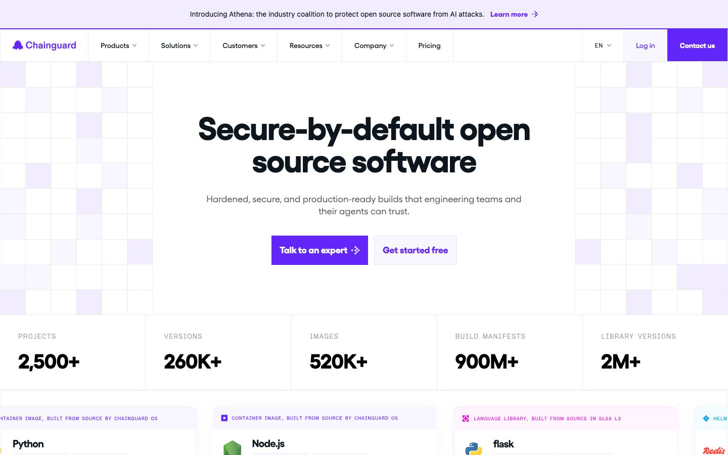
Chainguard's marketing surface is a high-trust developer-security interface — predominantly white canvas (`{colors.neutral}` — #ffffff) with near-black ink (`{colors.ink}` — #0d161c) and a single dominant brand color: electric violet (`{colors.accent}` — #6226fb). The system reads as engineered and confident: heavy Gellix display headlines, square-cornered violet CTAs, and generously padded white cards arranged on a calm pastel-violet field.
Type voice splits into two roles. **Gellix** (a bold, slightly geometric display face) carries every headline — the hero h1 runs 64px with tight -0.03em tracking, and all section heads (h2/h3/h4) share a single 40px treatment. Running body and supporting text drop to a neutral `ui-sans-serif` system stack at 14px with an open 1.714 line height — a calm, technical body voice that lets the headlines do the shouting.
Component voltage comes from the violet accent and from the square button geometry. Unlike most modern-SaaS systems, Chainguard's buttons are **not** rounded — they measure a 0px corner radius with 24px horizontal padding, which gives the brand a precise, terminal-adjacent feel. Cards, by contrast, use a generous 16px radius, so the system holds a deliberate contrast between sharp interactive elements and soft content containers.
The hero sits on a faint pastel-violet field (`{colors.surface-violet-soft}` — #f8f6fe), and a deep near-black/indigo footer (`{colors.ink-violet-deep}` — #14003d) plus a pure-black terminal CTA band (`{colors.black}`) close the page. These are the only dark surfaces in the system — everything above stays white-on-pastel.
**Key Characteristics:**
- White canvas with one electric-violet brand action (`{colors.accent}` — #6226fb). Primary CTAs are violet with white labels.
- **Square buttons** — 0px corner radius (`{rounded.none}`), 24px horizontal padding. The sharp button silhouette is a brand signature against the soft 16px card corners.
- Bold **Gellix** display typeface for all headlines (substituted with Inter here). Tight -0.03em tracking on display and heading roles.
- A single soft drop shadow (`rgba(13,22,28,0.03) 0px 4px 35px`) used sparingly on elevated cards; most cards are flat.
- Pastel accent surfaces — violet (`{colors.surface-violet-soft}`, `{colors.surface-violet}`), pink (`{colors.surface-pink-soft}`), and green (`{colors.surface-green-soft}`) tints used as soft section/row washes rather than as type colors.
- A dominant 32px spacing rhythm (by far the most frequent gap/padding value), with 48px and 24px as secondary steps.
- Dark page-closing surfaces: an indigo footer and a pure-black terminal CTA band.
## Colors
### Brand & Accent
- **Accent** (`{colors.accent}` — #6226fb): The dominant brand color. Primary CTAs, the nav "Contact us" button, inline link emphasis, and badge fills. Chainguard is a near-monochrome-plus-violet brand.
- **Accent Violet Deep** (`{colors.accent-violet-deep}` — #3200af): A darker violet used for emphasis and link states.
- **Accent Violet Light** (`{colors.accent-violet-light}` — #9d7af6): A lighter violet seen in the checkerboard hero pattern and soft accents.
- **Accent Blue** (`{colors.accent-blue}` — #3443f4): A secondary blue used inside product/status UI fragments.
- **Accent Orange** (`{colors.accent-orange}` — #fe5b3c): Used on rating stars and small highlight moments; also appears in product status graphics.
- **Accent Magenta / Magenta Deep** (`{colors.accent-magenta}` — #eb02e0, `{colors.accent-magenta-deep}` — #a10099): Appear in product-UI charts and category badges.
- **Accent Green** (`{colors.accent-green}` — #108000): "Built securely" / success-leaning callouts and status indicators.
- **Accent Cyan** (`{colors.accent-cyan}` — #006a97): A teal-blue used in product chart fragments.
### Surface
- **Neutral** (`{colors.neutral}` — #ffffff): The default page floor and card surface.
- **Surface Soft** (`{colors.surface-soft}` — #fbfbfd): Near-white section wash, barely off-white.
- **Surface Violet Soft** (`{colors.surface-violet-soft}` — #f8f6fe): The hero field, announcement bar, and secondary button background.
- **Surface Violet** (`{colors.surface-violet}` — #f1ecfe): A slightly stronger violet wash for highlighted rows.
- **Surface Pink Soft** (`{colors.surface-pink-soft}` — #fef5fe): A pale pink row wash (e.g., "Proven engineering success").
- **Surface Green Soft** (`{colors.surface-green-soft}` — #f2fdf2): A pale green row wash (e.g., "Built securely from the ground up").
- **Ink Violet Deep** (`{colors.ink-violet-deep}` — #14003d): The footer background — a deep indigo near-black.
- **Black** (`{colors.black}` — #000000): The terminal-style pre-footer CTA band.
- **Hairline** (`{colors.hairline}` — #ededed): The 1px divider tone between stat cells and content rows.
### Text
- **Ink** (`{colors.ink}` — #0d161c): All headlines and primary text.
- **Muted** (`{colors.muted}` — #565c60): Secondary text — labels, captions, sub-descriptions.
- **Neutral** (`{colors.neutral}` — #ffffff): Text on violet buttons and on the dark footer / terminal band.
## Typography
### Font Family
The system runs **Gellix** for display + headlines + button labels, and a neutral `ui-sans-serif` system stack for body copy. Gellix is a bold, slightly geometric display face that carries the brand's confident, engineered voice. Notably, the headline weight is measured at **400** despite the family being labelled "gellixBold" — the weight is baked into the named font file rather than expressed as a numeric weight. Button labels use the medium cut (gellixMedium, weight 500).
The split is functional:
- Gellix (display + headings, tight -0.03em tracking) — hero h1 and all section heads
- Gellix Medium (weight 500) — button and CTA labels
- `ui-sans-serif` system stack (weight 400, open 1.714 line height) — running body and supporting text
### Hierarchy
| Token | Size | Weight | Line Height | Letter Spacing | Use |
|---|---|---|---|---|---|
| `{typography.display-xl}` | 64px | 400 | 1.0 | -0.03em | Hero h1 ("Secure-by-default open source software") — Gellix |
| `{typography.heading}` | 40px | 400 | 1.2 | -0.03em | All section heads h2/h3/h4 (single shared treatment) — Gellix |
| `{typography.body}` | 14px | 400 | 1.714 | 0 | Running text, descriptions, footer links — system sans |
| `{typography.button}` | 14px | 500 | 1.429 | 0 | Button + CTA labels, nav links — Gellix Medium |
### Principles
Gellix is the brand voice — every headline uses it with -0.03em tracking. The hero h1 (64px) and section heads (40px) carry the entire display range; there is no intermediate display step measured. Body copy stays small (14px) but opens up vertically (1.714 line height), giving technical paragraphs room to breathe under heavy headlines.
### Note on Font Substitutes
**Gellix** is a commercial typeface (Indian Type Foundry) and is not freely redistributable, so it must not be shipped directly. **Inter** at the heaviest available weight with -0.03em tracking is a usable approximation for the headline role; **Manrope** (700) is another close geometric alternative. The body role already uses a generic `ui-sans-serif` system stack and needs no substitute. (`fonts_licensed` was reported empty in the analysis — the licensing note here is derived from the Gellix family being a known commercial face.)
## Layout
### Spacing System
- **Base unit:** the system gravitates to multiples of 8 with a strongly dominant 32px step.
- **Tokens:** `{spacing.xxs}` 6px · `{spacing.xs}` 8px · `{spacing.sm}` 12px · `{spacing.md}` 16px · `{spacing.ml}` 20px · `{spacing.lg}` 24px · `{spacing.xl}` 32px · `{spacing.xxl}` 40px · `{spacing.section}` 48px.
- **Dominant rhythm:** 32px (`{spacing.xl}`) is by far the most frequently measured value — it governs most grid gaps and card internal padding.
- **Secondary steps:** 48px (`{spacing.section}`) for larger band separation and 24px (`{spacing.lg}`) / 16px (`{spacing.md}`) for tighter internal spacing.
### Grid & Container
- **Stat strip:** 5-up grid of stat cells separated by `{colors.hairline}` 1px dividers (PROJECTS / VERSIONS / IMAGES / BUILD MANIFESTS / LIBRARY VERSIONS).
- **Product card row:** horizontally arranged equal-width white cards (Python / Node.js / flask / …) shown with edge-bleed scroll.
- **Platform overview grid:** 6-up feature tiles (Containers / Libraries / VMs / OS Packages / Actions / Agent Skills) at desktop.
- **Resources / testimonials:** 3-up card carousels.
- **Footer:** multi-column link list grouped under Products / Solutions / Resources / Company.
### Whitespace Philosophy
Chainguard uses confident, even spacing built on a 32px rhythm. Section bands carry a single 40px head plus supporting body and a card grid — never densely packed. The pastel row washes (violet / pink / green) segment the "Why Chainguard?" priority list without adding borders, keeping the page calm despite high information density.
## Elevation & Depth
| Level | Treatment | Use |
|---|---|---|
| Flat | No shadow, no border | Body sections, hero, stat cells (hairline-divided only) |
| Hairline | 1px `{colors.hairline}` divider | Between stat cells and list rows |
| Soft card shadow | `rgba(13,22,28,0.03) 0px 4px 35px 0px` | Elevated cards (`{component.card-elevated}`) — a very low-alpha, wide-spread lift |
| Dark close | `{colors.ink-violet-deep}` / `{colors.black}` solid fills | Footer and terminal CTA band — color contrast does the depth work |
The elevation philosophy is **soft and minimal**. The single measured shadow is extremely subtle (3% alpha, 35px blur) — it whispers rather than lifts. Most cards are flat white on white-or-pastel, relying on the 16px radius and spacing for separation. The dark footer and black terminal band provide the only strong contrast moments.
## Shapes
### Border Radius Scale
| Token | Value | Use |
|---|---|---|
| `{rounded.none}` | 0px | Buttons + CTAs — the square silhouette is a brand signature |
| `{rounded.lg}` | 16px | Content cards (product cards, feature tiles, testimonial / resource cards) |
The system holds a deliberate contrast: **sharp 0px corners on every interactive button**, and **soft 16px corners on every content card**. There is no intermediate radius measured — the two values do all the work.
### Imagery Geometry
Product cards display real Chainguard product fragments (container-image cards, status charts, severity bars) inside 16px-radius white containers. The hero carries a faint violet checkerboard pattern (`{colors.accent-violet-light}` tints) as a decorative field behind the headline rather than photographic imagery.
## Components
### Top Navigation
**`top-nav`** — White nav bar (`{colors.neutral}`) carrying the Chainguard wordmark + logo at left, a horizontal menu (Products, Solutions, Customers, Resources, Company, Pricing) center, a language selector and "Log in" text-link at right, and a violet **`nav-contact-button`** ("Contact us") at the far right. Menu items use `{typography.button}` (Gellix Medium 14px).
**`announcement-bar`** — A full-width pastel-violet strip (`{colors.surface-violet-soft}`) above the nav carrying a single announcement line + "Learn more" link in `{typography.body}`.
### Buttons
**`button-primary`** — The signature CTA ("Talk to an expert"). Background `{colors.accent}` (#6226fb), label `{colors.neutral}`, type `{typography.button}`, **0px corner radius** (`{rounded.none}`), padding 0px × 24px. The square corners are intentional and brand-defining.
**`button-secondary`** — The softer CTA ("Get started free"). Background `{colors.surface-violet-soft}`, label `{colors.accent}`, same square radius and 24px horizontal padding.
**`nav-contact-button`** — The persistent violet nav CTA ("Contact us"). Background `{colors.accent}`, white label, square corners.
### Cards & Containers
**`hero-band`** — Pastel-violet field (`{colors.surface-violet-soft}`) hosting the centered hero: 64px Gellix h1, a `{typography.body}` sub-headline, and a row of `{component.button-primary}` + `{component.button-secondary}`. A faint violet checkerboard pattern sits behind.
**`stat-cell`** — One unit of the 5-up metrics strip. White background, big number in `{typography.heading}`, an uppercase label above in `{typography.body}` (muted). Cells are divided by `{colors.hairline}` 1px rules rather than card chrome.
**`product-card`** — White card (`{rounded.lg}` 16px) showing a real Chainguard image artifact (Python / Node.js / flask) with a small category tag, an icon, the package name, and inline status metrics. Padding `{spacing.lg}` (24px).
**`card`** — The generic 16px-radius white container, no shadow by default.
**`card-elevated`** — The variant carrying the single soft drop shadow (`rgba(13,22,28,0.03) 0px 4px 35px`). Used where a card needs to lift off the pastel field.
**`feature-tile`** — One unit of the 6-up platform-overview grid (Containers / Libraries / VMs / OS Packages / Actions / Agent Skills). White, 16px radius, an icon at top, a `{typography.heading}`-scaled title, a short body description, and a "Learn more →" link.
**`priority-list-item`** — A row inside the "Your top priorities, shipped" accordion. Transparent background, ink text, `{typography.body}`. Selected rows reveal an embedded product chart fragment alongside.
**`testimonial-card`** — Customer-quote card. White, 16px radius, padding `{spacing.xl}` (32px), quote in `{typography.body}` with a name + role beneath.
**`resource-card`** — Related-resource card carrying a category `{component.badge-pill}` (WHITEPAPER / BLOG POST), a `{typography.heading}`-scaled title, and a "Read now →" link.
### Tags / Badges
**`badge-pill`** — Small uppercase category label (WHITEPAPER, BLOG POST). Background `{colors.accent}`, text `{colors.neutral}`, type `{typography.button}`, square corners (`{rounded.none}`), padding 6px × 12px.
### CTA / Footer
**`cta-band-dark`** — The pre-footer terminal-style band ("$ chainguard learn --more / contact us"). Pure-black background (`{colors.black}`), white text, evoking a command line. Carries a dashed-outline "contact us" action.
**`footer`** — Deep indigo footer (`{colors.ink-violet-deep}` — #14003d) that closes the page. White text in `{typography.body}`, multi-column link list (Products / Solutions / Resources / Company / Customers), a final "Talk to an expert" `{component.button-primary}`, and legal links along the bottom.
## Do's and Don'ts
### Do
- Reserve `{colors.accent}` (#6226fb) for primary actions, nav CTA, and badge fills. Chainguard's brand is monochrome ink + one violet.
- Keep buttons square (`{rounded.none}`). The 0px corner is a brand signature — don't round them.
- Use the 16px card radius (`{rounded.lg}`) for content containers, holding the deliberate sharp-button / soft-card contrast.
- Use Gellix for every headline with -0.03em tracking; keep body in the neutral system sans at 14px / 1.714.
- Use pastel washes (`{colors.surface-violet-soft}`, `{colors.surface-pink-soft}`, `{colors.surface-green-soft}`) to segment list rows without borders.
- Show real Chainguard product fragments inside `{component.product-card}` rather than illustrating around them.
- Let the dark footer (`{colors.ink-violet-deep}`) and black terminal band (`{colors.black}`) close the page — they are the only dark surfaces.
### Don't
- Don't round buttons. The square corner is intentional.
- Don't introduce additional accent colors at the action layer — the magenta / green / blue / orange tones belong inside product-UI fragments and charts, not on CTAs.
- Don't apply the soft card shadow everywhere — it is a scarce, very-low-alpha lift, not a default.
- Don't set body copy in Gellix or headlines in the system sans — the boundary is strict.
- Don't add dark surfaces casually outside the footer and terminal band.
- Don't document hover styling — only default and active/pressed states are in scope.
## Responsive Behavior
### Breakpoints
| Name | Width | Key Changes |
|---|---|---|
| Mobile | < 768px | Hamburger nav; hero h1 scales down from 64px; stat strip stacks; product cards become a horizontal scroll; feature tiles 1–2 up; footer columns collapse |
| Tablet | 768–1024px | Tightened horizontal nav; stat strip 2–3 up; feature tiles 2–3 up |
| Desktop | 1024–1440px | Full nav with all menu items; 5-up stat strip; 6-up platform tiles; 3-up resource/testimonial carousels |
| Wide | > 1440px | Same as desktop with more outer breathing room |
(Breakpoint widths are derived conventions — exact values were not measured; see Known Gaps.)
### Touch Targets
- `{component.button-primary}` uses 24px horizontal padding; vertical height was not measured (see Known Gaps).
- Nav links and `{component.nav-contact-button}` sit in the 64px-tall top bar (observed from screenshot).
### Collapsing Strategy
- Top nav collapses to a hamburger on mobile.
- The 5-up stat strip stacks vertically, keeping hairline dividers between cells.
- Product cards retain native size and scroll horizontally (edge-bleed observed in the landing capture).
- Feature tiles reduce column count rather than shrinking individual tiles.
- Footer link columns wrap to fewer columns; the dark indigo surface persists at every breakpoint.
### Image Behavior
- Product-UI fragments inside cards keep native aspect ratios; cards resize around them.
- The hero violet checkerboard pattern scales with the hero band.
## Iteration Guide
1. Focus on ONE component at a time. Reference its YAML key directly (`{component.product-card}`, `{component.feature-tile}`).
2. Variants of an existing component (e.g. `card` vs `card-elevated`) live as separate entries in `components:`.
3. Use `{token.refs}` everywhere — never inline hex.
4. Never document hover. Default and Active/Pressed states only.
5. Headlines stay Gellix with -0.03em tracking; body stays the neutral system sans at 14px / 1.714.
6. Buttons stay square (`{rounded.none}`); cards stay 16px (`{rounded.lg}`). The contrast is the brand.
7. The violet accent is scarce at the action layer — when in doubt, reach for ink + spacing before another color.
## Known Gaps
- **Button heights / vertical padding** were not captured — `{component.button-primary}` reports only `padding: 0px 24px` and `radius: 0px`. The vertical metric must be confirmed from a live build.
- **Primary button color conflict:** the analysis reported the measured button `color` as `{colors.ink}` (#0d161c), but screenshot ground-truth shows white labels on a violet fill. The component is documented as violet-background / white-label per the screenshot; the measured ink value likely captured a secondary/outline button's text color. Confirm against the rendered CTA.
- **Gellix is a commercial typeface** (the `fonts_licensed` array was reported empty, but the family is a known paid face). It must not be shipped directly; substitutes are documented in the Typography section.
- **Headline weight** is measured at 400 for the "gellixBold" family — the weight is encoded in the named font file, not the numeric `font-weight`. A real implementation must load the bold cut explicitly.
- **Single radius and single shadow** were measured (16px, one box-shadow). Any additional radii or elevation tiers used elsewhere on the site are not captured.
- **Breakpoint widths and responsive column counts** are derived conventions, not measured values.
- **Section-level vertical padding** beyond 48px was not measured; larger band spacing may exist on the live pages.
- **Pricing-page-specific components** (plan tiers, comparison tables) were captured as a page but not surfaced as distinct components in the analysis — their specs would need a dedicated extraction.
<!-- Documented by duply · real-world design systems as ready-to-use DESIGN.md for AI coding agents · https://duply.ai/chainguard/design-md -->
Color Palette
Accent
Neutrals
Typography
display-xl64px · 400 · 1
The quick brown fox jumpsheading40px · 400 · 1.2
The quick brown fox jumpsbody14px · 400 · 1.714
The quick brown fox jumpsbutton14px · 500 · 1.429
The quick brown fox jumpsSpacing & Shape
Spacing
| Name | Value | Preview |
|---|---|---|
| xxs | 6px | |
| xs | 8px | |
| sm | 12px | |
| md | 16px | |
| ml | 20px | |
| lg | 24px | |
| xl | 32px | |
| xxl | 40px | |
| section | 48px |
Border Radius
| Name | Value | Preview |
|---|---|---|
| none | 0px | |
| lg | 16px |
More like this


---
version: alpha
name: Chainguard-design-analysis
description: "A high-trust developer-security marketing surface built on white canvas with near-black ink, electric-violet primary actions, and bold Gellix display headlines set with tight negative tracking. The system reads as engineered and confident — square-cornered violet CTAs, generously padded white stat and product cards on 16px-radius surfaces, a pastel-violet announcement bar, and a deep near-black footer that closes the page. Brand voltage comes from the violet accent and the heavy Gellix display face rather than from decorative imagery."
colors:
  ink: "#0d161c"
  accent: "#6226fb"
  accent-violet-deep: "#3200af"
  accent-violet-light: "#9d7af6"
  accent-blue: "#3443f4"
  accent-orange: "#fe5b3c"
  accent-magenta: "#eb02e0"
  accent-magenta-deep: "#a10099"
  accent-green: "#108000"
  accent-cyan: "#006a97"
  ink-violet-deep: "#14003d"
  neutral: "#ffffff"
  surface-soft: "#fbfbfd"
  surface-violet-soft: "#f8f6fe"
  surface-violet: "#f1ecfe"
  surface-pink-soft: "#fef5fe"
  surface-green-soft: "#f2fdf2"
  hairline: "#ededed"
  muted: "#565c60"
  black: "#000000"
typography:
  display-xl:
    fontFamily: "Gellix, Inter, sans-serif"
    fontSize: 64px
    fontWeight: 400
    lineHeight: 1.0
    letterSpacing: -0.03em
  heading:
    fontFamily: "Gellix, Inter, sans-serif"
    fontSize: 40px
    fontWeight: 400
    lineHeight: 1.2
    letterSpacing: -0.03em
  body:
    fontFamily: "ui-sans-serif, system-ui, sans-serif"
    fontSize: 14px
    fontWeight: 400
    lineHeight: 1.714
    letterSpacing: 0
  button:
    fontFamily: "Gellix, Inter, sans-serif"
    fontSize: 14px
    fontWeight: 500
    lineHeight: 1.429
    letterSpacing: 0
rounded:
  none: 0px
  lg: 16px
spacing:
  xxs: 6px
  xs: 8px
  sm: 12px
  md: 16px
  ml: 20px
  lg: 24px
  xl: 32px
  xxl: 40px
  section: 48px
components:
  top-nav:
    backgroundColor: "{colors.neutral}"
    textColor: "{colors.ink}"
    typography: "{typography.button}"
  announcement-bar:
    backgroundColor: "{colors.surface-violet-soft}"
    textColor: "{colors.ink}"
    typography: "{typography.body}"
  nav-contact-button:
    backgroundColor: "{colors.accent}"
    textColor: "{colors.neutral}"
    typography: "{typography.button}"
    rounded: "{rounded.none}"
    padding: 0px 24px
  button-primary:
    backgroundColor: "{colors.accent}"
    textColor: "{colors.neutral}"
    typography: "{typography.button}"
    rounded: "{rounded.none}"
    padding: 0px 24px
  button-secondary:
    backgroundColor: "{colors.surface-violet-soft}"
    textColor: "{colors.accent}"
    typography: "{typography.button}"
    rounded: "{rounded.none}"
    padding: 0px 24px
  hero-band:
    backgroundColor: "{colors.surface-violet-soft}"
    textColor: "{colors.ink}"
    typography: "{typography.display-xl}"
    padding: 48px
  stat-cell:
    backgroundColor: "{colors.neutral}"
    textColor: "{colors.ink}"
    typography: "{typography.heading}"
    padding: 24px
  product-card:
    backgroundColor: "{colors.neutral}"
    textColor: "{colors.ink}"
    typography: "{typography.body}"
    rounded: "{rounded.lg}"
    padding: 24px
  card:
    backgroundColor: "{colors.neutral}"
    textColor: "{colors.ink}"
    rounded: "{rounded.lg}"
  card-elevated:
    backgroundColor: "{colors.neutral}"
    textColor: "{colors.ink}"
    rounded: "{rounded.lg}"
  feature-tile:
    backgroundColor: "{colors.neutral}"
    textColor: "{colors.ink}"
    typography: "{typography.body}"
    rounded: "{rounded.lg}"
    padding: 24px
  priority-list-item:
    backgroundColor: transparent
    textColor: "{colors.ink}"
    typography: "{typography.body}"
    padding: 16px
  testimonial-card:
    backgroundColor: "{colors.neutral}"
    textColor: "{colors.ink}"
    typography: "{typography.body}"
    rounded: "{rounded.lg}"
    padding: 32px
  resource-card:
    backgroundColor: "{colors.neutral}"
    textColor: "{colors.ink}"
    typography: "{typography.body}"
    rounded: "{rounded.lg}"
    padding: 24px
  badge-pill:
    backgroundColor: "{colors.accent}"
    textColor: "{colors.neutral}"
    typography: "{typography.button}"
    rounded: "{rounded.none}"
    padding: 6px 12px
  cta-band-dark:
    backgroundColor: "{colors.black}"
    textColor: "{colors.neutral}"
    typography: "{typography.body}"
    padding: 48px
  footer:
    backgroundColor: "{colors.ink-violet-deep}"
    textColor: "{colors.neutral}"
    typography: "{typography.body}"
    padding: 48px
---

## Overview

Chainguard's marketing surface is a high-trust developer-security interface — predominantly white canvas (`{colors.neutral}` — #ffffff) with near-black ink (`{colors.ink}` — #0d161c) and a single dominant brand color: electric violet (`{colors.accent}` — #6226fb). The system reads as engineered and confident: heavy Gellix display headlines, square-cornered violet CTAs, and generously padded white cards arranged on a calm pastel-violet field.

Type voice splits into two roles. **Gellix** (a bold, slightly geometric display face) carries every headline — the hero h1 runs 64px with tight -0.03em tracking, and all section heads (h2/h3/h4) share a single 40px treatment. Running body and supporting text drop to a neutral `ui-sans-serif` system stack at 14px with an open 1.714 line height — a calm, technical body voice that lets the headlines do the shouting.

Component voltage comes from the violet accent and from the square button geometry. Unlike most modern-SaaS systems, Chainguard's buttons are **not** rounded — they measure a 0px corner radius with 24px horizontal padding, which gives the brand a precise, terminal-adjacent feel. Cards, by contrast, use a generous 16px radius, so the system holds a deliberate contrast between sharp interactive elements and soft content containers.

The hero sits on a faint pastel-violet field (`{colors.surface-violet-soft}` — #f8f6fe), and a deep near-black/indigo footer (`{colors.ink-violet-deep}` — #14003d) plus a pure-black terminal CTA band (`{colors.black}`) close the page. These are the only dark surfaces in the system — everything above stays white-on-pastel.

**Key Characteristics:**
- White canvas with one electric-violet brand action (`{colors.accent}` — #6226fb). Primary CTAs are violet with white labels.
- **Square buttons** — 0px corner radius (`{rounded.none}`), 24px horizontal padding. The sharp button silhouette is a brand signature against the soft 16px card corners.
- Bold **Gellix** display typeface for all headlines (substituted with Inter here). Tight -0.03em tracking on display and heading roles.
- A single soft drop shadow (`rgba(13,22,28,0.03) 0px 4px 35px`) used sparingly on elevated cards; most cards are flat.
- Pastel accent surfaces — violet (`{colors.surface-violet-soft}`, `{colors.surface-violet}`), pink (`{colors.surface-pink-soft}`), and green (`{colors.surface-green-soft}`) tints used as soft section/row washes rather than as type colors.
- A dominant 32px spacing rhythm (by far the most frequent gap/padding value), with 48px and 24px as secondary steps.
- Dark page-closing surfaces: an indigo footer and a pure-black terminal CTA band.

## Colors

### Brand & Accent
- **Accent** (`{colors.accent}` — #6226fb): The dominant brand color. Primary CTAs, the nav "Contact us" button, inline link emphasis, and badge fills. Chainguard is a near-monochrome-plus-violet brand.
- **Accent Violet Deep** (`{colors.accent-violet-deep}` — #3200af): A darker violet used for emphasis and link states.
- **Accent Violet Light** (`{colors.accent-violet-light}` — #9d7af6): A lighter violet seen in the checkerboard hero pattern and soft accents.
- **Accent Blue** (`{colors.accent-blue}` — #3443f4): A secondary blue used inside product/status UI fragments.
- **Accent Orange** (`{colors.accent-orange}` — #fe5b3c): Used on rating stars and small highlight moments; also appears in product status graphics.
- **Accent Magenta / Magenta Deep** (`{colors.accent-magenta}` — #eb02e0, `{colors.accent-magenta-deep}` — #a10099): Appear in product-UI charts and category badges.
- **Accent Green** (`{colors.accent-green}` — #108000): "Built securely" / success-leaning callouts and status indicators.
- **Accent Cyan** (`{colors.accent-cyan}` — #006a97): A teal-blue used in product chart fragments.

### Surface
- **Neutral** (`{colors.neutral}` — #ffffff): The default page floor and card surface.
- **Surface Soft** (`{colors.surface-soft}` — #fbfbfd): Near-white section wash, barely off-white.
- **Surface Violet Soft** (`{colors.surface-violet-soft}` — #f8f6fe): The hero field, announcement bar, and secondary button background.
- **Surface Violet** (`{colors.surface-violet}` — #f1ecfe): A slightly stronger violet wash for highlighted rows.
- **Surface Pink Soft** (`{colors.surface-pink-soft}` — #fef5fe): A pale pink row wash (e.g., "Proven engineering success").
- **Surface Green Soft** (`{colors.surface-green-soft}` — #f2fdf2): A pale green row wash (e.g., "Built securely from the ground up").
- **Ink Violet Deep** (`{colors.ink-violet-deep}` — #14003d): The footer background — a deep indigo near-black.
- **Black** (`{colors.black}` — #000000): The terminal-style pre-footer CTA band.
- **Hairline** (`{colors.hairline}` — #ededed): The 1px divider tone between stat cells and content rows.

### Text
- **Ink** (`{colors.ink}` — #0d161c): All headlines and primary text.
- **Muted** (`{colors.muted}` — #565c60): Secondary text — labels, captions, sub-descriptions.
- **Neutral** (`{colors.neutral}` — #ffffff): Text on violet buttons and on the dark footer / terminal band.

## Typography

### Font Family
The system runs **Gellix** for display + headlines + button labels, and a neutral `ui-sans-serif` system stack for body copy. Gellix is a bold, slightly geometric display face that carries the brand's confident, engineered voice. Notably, the headline weight is measured at **400** despite the family being labelled "gellixBold" — the weight is baked into the named font file rather than expressed as a numeric weight. Button labels use the medium cut (gellixMedium, weight 500).

The split is functional:
- Gellix (display + headings, tight -0.03em tracking) — hero h1 and all section heads
- Gellix Medium (weight 500) — button and CTA labels
- `ui-sans-serif` system stack (weight 400, open 1.714 line height) — running body and supporting text

### Hierarchy

| Token | Size | Weight | Line Height | Letter Spacing | Use |
|---|---|---|---|---|---|
| `{typography.display-xl}` | 64px | 400 | 1.0 | -0.03em | Hero h1 ("Secure-by-default open source software") — Gellix |
| `{typography.heading}` | 40px | 400 | 1.2 | -0.03em | All section heads h2/h3/h4 (single shared treatment) — Gellix |
| `{typography.body}` | 14px | 400 | 1.714 | 0 | Running text, descriptions, footer links — system sans |
| `{typography.button}` | 14px | 500 | 1.429 | 0 | Button + CTA labels, nav links — Gellix Medium |

### Principles
Gellix is the brand voice — every headline uses it with -0.03em tracking. The hero h1 (64px) and section heads (40px) carry the entire display range; there is no intermediate display step measured. Body copy stays small (14px) but opens up vertically (1.714 line height), giving technical paragraphs room to breathe under heavy headlines.

### Note on Font Substitutes
**Gellix** is a commercial typeface (Indian Type Foundry) and is not freely redistributable, so it must not be shipped directly. **Inter** at the heaviest available weight with -0.03em tracking is a usable approximation for the headline role; **Manrope** (700) is another close geometric alternative. The body role already uses a generic `ui-sans-serif` system stack and needs no substitute. (`fonts_licensed` was reported empty in the analysis — the licensing note here is derived from the Gellix family being a known commercial face.)

## Layout

### Spacing System
- **Base unit:** the system gravitates to multiples of 8 with a strongly dominant 32px step.
- **Tokens:** `{spacing.xxs}` 6px · `{spacing.xs}` 8px · `{spacing.sm}` 12px · `{spacing.md}` 16px · `{spacing.ml}` 20px · `{spacing.lg}` 24px · `{spacing.xl}` 32px · `{spacing.xxl}` 40px · `{spacing.section}` 48px.
- **Dominant rhythm:** 32px (`{spacing.xl}`) is by far the most frequently measured value — it governs most grid gaps and card internal padding.
- **Secondary steps:** 48px (`{spacing.section}`) for larger band separation and 24px (`{spacing.lg}`) / 16px (`{spacing.md}`) for tighter internal spacing.

### Grid & Container
- **Stat strip:** 5-up grid of stat cells separated by `{colors.hairline}` 1px dividers (PROJECTS / VERSIONS / IMAGES / BUILD MANIFESTS / LIBRARY VERSIONS).
- **Product card row:** horizontally arranged equal-width white cards (Python / Node.js / flask / …) shown with edge-bleed scroll.
- **Platform overview grid:** 6-up feature tiles (Containers / Libraries / VMs / OS Packages / Actions / Agent Skills) at desktop.
- **Resources / testimonials:** 3-up card carousels.
- **Footer:** multi-column link list grouped under Products / Solutions / Resources / Company.

### Whitespace Philosophy
Chainguard uses confident, even spacing built on a 32px rhythm. Section bands carry a single 40px head plus supporting body and a card grid — never densely packed. The pastel row washes (violet / pink / green) segment the "Why Chainguard?" priority list without adding borders, keeping the page calm despite high information density.

## Elevation & Depth

| Level | Treatment | Use |
|---|---|---|
| Flat | No shadow, no border | Body sections, hero, stat cells (hairline-divided only) |
| Hairline | 1px `{colors.hairline}` divider | Between stat cells and list rows |
| Soft card shadow | `rgba(13,22,28,0.03) 0px 4px 35px 0px` | Elevated cards (`{component.card-elevated}`) — a very low-alpha, wide-spread lift |
| Dark close | `{colors.ink-violet-deep}` / `{colors.black}` solid fills | Footer and terminal CTA band — color contrast does the depth work |

The elevation philosophy is **soft and minimal**. The single measured shadow is extremely subtle (3% alpha, 35px blur) — it whispers rather than lifts. Most cards are flat white on white-or-pastel, relying on the 16px radius and spacing for separation. The dark footer and black terminal band provide the only strong contrast moments.

## Shapes

### Border Radius Scale

| Token | Value | Use |
|---|---|---|
| `{rounded.none}` | 0px | Buttons + CTAs — the square silhouette is a brand signature |
| `{rounded.lg}` | 16px | Content cards (product cards, feature tiles, testimonial / resource cards) |

The system holds a deliberate contrast: **sharp 0px corners on every interactive button**, and **soft 16px corners on every content card**. There is no intermediate radius measured — the two values do all the work.

### Imagery Geometry
Product cards display real Chainguard product fragments (container-image cards, status charts, severity bars) inside 16px-radius white containers. The hero carries a faint violet checkerboard pattern (`{colors.accent-violet-light}` tints) as a decorative field behind the headline rather than photographic imagery.

## Components

### Top Navigation

**`top-nav`** — White nav bar (`{colors.neutral}`) carrying the Chainguard wordmark + logo at left, a horizontal menu (Products, Solutions, Customers, Resources, Company, Pricing) center, a language selector and "Log in" text-link at right, and a violet **`nav-contact-button`** ("Contact us") at the far right. Menu items use `{typography.button}` (Gellix Medium 14px).

**`announcement-bar`** — A full-width pastel-violet strip (`{colors.surface-violet-soft}`) above the nav carrying a single announcement line + "Learn more" link in `{typography.body}`.

### Buttons

**`button-primary`** — The signature CTA ("Talk to an expert"). Background `{colors.accent}` (#6226fb), label `{colors.neutral}`, type `{typography.button}`, **0px corner radius** (`{rounded.none}`), padding 0px × 24px. The square corners are intentional and brand-defining.

**`button-secondary`** — The softer CTA ("Get started free"). Background `{colors.surface-violet-soft}`, label `{colors.accent}`, same square radius and 24px horizontal padding.

**`nav-contact-button`** — The persistent violet nav CTA ("Contact us"). Background `{colors.accent}`, white label, square corners.

### Cards & Containers

**`hero-band`** — Pastel-violet field (`{colors.surface-violet-soft}`) hosting the centered hero: 64px Gellix h1, a `{typography.body}` sub-headline, and a row of `{component.button-primary}` + `{component.button-secondary}`. A faint violet checkerboard pattern sits behind.

**`stat-cell`** — One unit of the 5-up metrics strip. White background, big number in `{typography.heading}`, an uppercase label above in `{typography.body}` (muted). Cells are divided by `{colors.hairline}` 1px rules rather than card chrome.

**`product-card`** — White card (`{rounded.lg}` 16px) showing a real Chainguard image artifact (Python / Node.js / flask) with a small category tag, an icon, the package name, and inline status metrics. Padding `{spacing.lg}` (24px).

**`card`** — The generic 16px-radius white container, no shadow by default.

**`card-elevated`** — The variant carrying the single soft drop shadow (`rgba(13,22,28,0.03) 0px 4px 35px`). Used where a card needs to lift off the pastel field.

**`feature-tile`** — One unit of the 6-up platform-overview grid (Containers / Libraries / VMs / OS Packages / Actions / Agent Skills). White, 16px radius, an icon at top, a `{typography.heading}`-scaled title, a short body description, and a "Learn more →" link.

**`priority-list-item`** — A row inside the "Your top priorities, shipped" accordion. Transparent background, ink text, `{typography.body}`. Selected rows reveal an embedded product chart fragment alongside.

**`testimonial-card`** — Customer-quote card. White, 16px radius, padding `{spacing.xl}` (32px), quote in `{typography.body}` with a name + role beneath.

**`resource-card`** — Related-resource card carrying a category `{component.badge-pill}` (WHITEPAPER / BLOG POST), a `{typography.heading}`-scaled title, and a "Read now →" link.

### Tags / Badges

**`badge-pill`** — Small uppercase category label (WHITEPAPER, BLOG POST). Background `{colors.accent}`, text `{colors.neutral}`, type `{typography.button}`, square corners (`{rounded.none}`), padding 6px × 12px.

### CTA / Footer

**`cta-band-dark`** — The pre-footer terminal-style band ("$ chainguard learn --more / contact us"). Pure-black background (`{colors.black}`), white text, evoking a command line. Carries a dashed-outline "contact us" action.

**`footer`** — Deep indigo footer (`{colors.ink-violet-deep}` — #14003d) that closes the page. White text in `{typography.body}`, multi-column link list (Products / Solutions / Resources / Company / Customers), a final "Talk to an expert" `{component.button-primary}`, and legal links along the bottom.

## Do's and Don'ts

### Do
- Reserve `{colors.accent}` (#6226fb) for primary actions, nav CTA, and badge fills. Chainguard's brand is monochrome ink + one violet.
- Keep buttons square (`{rounded.none}`). The 0px corner is a brand signature — don't round them.
- Use the 16px card radius (`{rounded.lg}`) for content containers, holding the deliberate sharp-button / soft-card contrast.
- Use Gellix for every headline with -0.03em tracking; keep body in the neutral system sans at 14px / 1.714.
- Use pastel washes (`{colors.surface-violet-soft}`, `{colors.surface-pink-soft}`, `{colors.surface-green-soft}`) to segment list rows without borders.
- Show real Chainguard product fragments inside `{component.product-card}` rather than illustrating around them.
- Let the dark footer (`{colors.ink-violet-deep}`) and black terminal band (`{colors.black}`) close the page — they are the only dark surfaces.

### Don't
- Don't round buttons. The square corner is intentional.
- Don't introduce additional accent colors at the action layer — the magenta / green / blue / orange tones belong inside product-UI fragments and charts, not on CTAs.
- Don't apply the soft card shadow everywhere — it is a scarce, very-low-alpha lift, not a default.
- Don't set body copy in Gellix or headlines in the system sans — the boundary is strict.
- Don't add dark surfaces casually outside the footer and terminal band.
- Don't document hover styling — only default and active/pressed states are in scope.

## Responsive Behavior

### Breakpoints

| Name | Width | Key Changes |
|---|---|---|
| Mobile | < 768px | Hamburger nav; hero h1 scales down from 64px; stat strip stacks; product cards become a horizontal scroll; feature tiles 1–2 up; footer columns collapse |
| Tablet | 768–1024px | Tightened horizontal nav; stat strip 2–3 up; feature tiles 2–3 up |
| Desktop | 1024–1440px | Full nav with all menu items; 5-up stat strip; 6-up platform tiles; 3-up resource/testimonial carousels |
| Wide | > 1440px | Same as desktop with more outer breathing room |

(Breakpoint widths are derived conventions — exact values were not measured; see Known Gaps.)

### Touch Targets
- `{component.button-primary}` uses 24px horizontal padding; vertical height was not measured (see Known Gaps).
- Nav links and `{component.nav-contact-button}` sit in the 64px-tall top bar (observed from screenshot).

### Collapsing Strategy
- Top nav collapses to a hamburger on mobile.
- The 5-up stat strip stacks vertically, keeping hairline dividers between cells.
- Product cards retain native size and scroll horizontally (edge-bleed observed in the landing capture).
- Feature tiles reduce column count rather than shrinking individual tiles.
- Footer link columns wrap to fewer columns; the dark indigo surface persists at every breakpoint.

### Image Behavior
- Product-UI fragments inside cards keep native aspect ratios; cards resize around them.
- The hero violet checkerboard pattern scales with the hero band.

## Iteration Guide

1. Focus on ONE component at a time. Reference its YAML key directly (`{component.product-card}`, `{component.feature-tile}`).
2. Variants of an existing component (e.g. `card` vs `card-elevated`) live as separate entries in `components:`.
3. Use `{token.refs}` everywhere — never inline hex.
4. Never document hover. Default and Active/Pressed states only.
5. Headlines stay Gellix with -0.03em tracking; body stays the neutral system sans at 14px / 1.714.
6. Buttons stay square (`{rounded.none}`); cards stay 16px (`{rounded.lg}`). The contrast is the brand.
7. The violet accent is scarce at the action layer — when in doubt, reach for ink + spacing before another color.

## Known Gaps

- **Button heights / vertical padding** were not captured — `{component.button-primary}` reports only `padding: 0px 24px` and `radius: 0px`. The vertical metric must be confirmed from a live build.
- **Primary button color conflict:** the analysis reported the measured button `color` as `{colors.ink}` (#0d161c), but screenshot ground-truth shows white labels on a violet fill. The component is documented as violet-background / white-label per the screenshot; the measured ink value likely captured a secondary/outline button's text color. Confirm against the rendered CTA.
- **Gellix is a commercial typeface** (the `fonts_licensed` array was reported empty, but the family is a known paid face). It must not be shipped directly; substitutes are documented in the Typography section.
- **Headline weight** is measured at 400 for the "gellixBold" family — the weight is encoded in the named font file, not the numeric `font-weight`. A real implementation must load the bold cut explicitly.
- **Single radius and single shadow** were measured (16px, one box-shadow). Any additional radii or elevation tiers used elsewhere on the site are not captured.
- **Breakpoint widths and responsive column counts** are derived conventions, not measured values.
- **Section-level vertical padding** beyond 48px was not measured; larger band spacing may exist on the live pages.
- **Pricing-page-specific components** (plan tiers, comparison tables) were captured as a page but not surfaced as distinct components in the analysis — their specs would need a dedicated extraction.

<!-- Documented by duply · real-world design systems as ready-to-use DESIGN.md for AI coding agents · https://duply.ai/chainguard/design-md -->