Token-Security
A confident cybersecurity-SaaS interface built on deep forest-green hero canvases, near-black green ink, and a single high-voltage lime CTA. The system pairs the custom PP Neue Corp display face with DM Sans body type, near-square cards (5px radius), generous white content bands, and a recurring green-on-green palette punctuated by a lime "Let's talk" button and a soft mint-green glow. Brand voltage comes from the dark-green-to-lime contrast and animated cloud/gradient illustration backgrounds.
---
version: alpha
name: Token-Security-design-analysis
description: A confident cybersecurity-SaaS interface built on deep forest-green hero canvases, near-black green ink, and a single high-voltage lime CTA. The system pairs the custom PP Neue Corp display face with DM Sans body type, near-square cards (5px radius), generous white content bands, and a recurring green-on-green palette punctuated by a lime "Let's talk" button and a soft mint-green glow. Brand voltage comes from the dark-green-to-lime contrast and animated cloud/gradient illustration backgrounds.
colors:
ink: "#1a3027"
ink-soft: "#222222"
accent-deep: "#0e1914"
hero-dark: "#003524"
surface-dark: "#00352a"
accent-lime: "#cff851"
accent-green: "#20d27e"
accent-green-soft: "#3cc982"
surface-mint: "#effbf2"
accent-blue: "#3898ec"
link: "#333333"
black: "#000000"
canvas: "#ffffff"
on-dark: "#ffffff"
surface-soft: "#fafafa"
surface-muted: "#f3f3f2"
surface-200: "#f2f2f2"
surface-300: "#ededec"
hairline: "#e1e1e1"
neutral-300: "#dcdcdc"
neutral-400: "#cccccc"
typography:
display-xl:
fontFamily: "PP Neue Corp, Space Grotesk, sans-serif"
fontSize: 55px
fontWeight: 500
lineHeight: 1.2
letterSpacing: normal
display-lg:
fontFamily: "PP Neue Corp, Space Grotesk, sans-serif"
fontSize: 45px
fontWeight: 500
lineHeight: 1.1
letterSpacing: normal
title:
fontFamily: "PP Neue Corp, Space Grotesk, sans-serif"
fontSize: 22px
fontWeight: 500
lineHeight: 1.2
letterSpacing: normal
title-tight:
fontFamily: "PP Neue Corp, Space Grotesk, sans-serif"
fontSize: 22px
fontWeight: 500
lineHeight: 1.2
letterSpacing: -0.33px
body:
fontFamily: "DM Sans, sans-serif"
fontSize: 18px
fontWeight: 400
lineHeight: 1.6
letterSpacing: normal
button:
fontFamily: "DM Sans, sans-serif"
fontSize: 18px
fontWeight: 400
lineHeight: 1.6
letterSpacing: normal
rounded:
xs: 4px
sm: 5px
lg: 20px
pill: 100px
full: 200px
spacing:
xxs: 5px
xs: 8px
sm: 10px
md: 14px
lg: 20px
xl: 24px
xxl: 30px
huge: 35px
components:
announcement-bar:
backgroundColor: "{colors.accent-green}"
textColor: "{colors.ink}"
typography: "{typography.body}"
padding: 20px
top-nav:
backgroundColor: "{colors.canvas}"
textColor: "{colors.ink}"
typography: "{typography.body}"
padding: 20px 30px
nav-link:
backgroundColor: transparent
textColor: "{colors.ink}"
typography: "{typography.body}"
button-primary:
backgroundColor: "{colors.accent-lime}"
textColor: "{colors.ink}"
typography: "{typography.button}"
rounded: "{rounded.sm}"
padding: 14px 20px
button-demo:
backgroundColor: "{colors.accent-deep}"
textColor: "{colors.on-dark}"
typography: "{typography.button}"
rounded: "{rounded.sm}"
padding: 14px 24px
button-report-pill:
backgroundColor: transparent
textColor: "{colors.ink}"
typography: "{typography.body}"
rounded: "{rounded.pill}"
padding: 10px 24px
hero-band:
backgroundColor: "{colors.hero-dark}"
textColor: "{colors.on-dark}"
typography: "{typography.display-xl}"
padding: 30px
hero-subtext:
backgroundColor: transparent
textColor: "{colors.on-dark}"
typography: "{typography.body}"
logo-strip:
backgroundColor: "{colors.canvas}"
textColor: "{colors.ink}"
typography: "{typography.body}"
padding: 30px
product-feature-band:
backgroundColor: "{colors.surface-dark}"
textColor: "{colors.on-dark}"
typography: "{typography.display-lg}"
padding: 30px
feature-accordion-row:
backgroundColor: transparent
textColor: "{colors.on-dark}"
typography: "{typography.title}"
rounded: "{rounded.sm}"
padding: 20px
card:
backgroundColor: "{colors.canvas}"
textColor: "{colors.ink}"
rounded: "{rounded.sm}"
padding: 30px
testimonial-card:
backgroundColor: "{colors.surface-mint}"
textColor: "{colors.ink}"
typography: "{typography.body}"
rounded: "{rounded.sm}"
padding: 30px
cta-band:
backgroundColor: "{colors.hero-dark}"
textColor: "{colors.on-dark}"
typography: "{typography.display-lg}"
padding: 30px
footer:
backgroundColor: "{colors.hero-dark}"
textColor: "{colors.on-dark}"
typography: "{typography.body}"
padding: 30px
---
## Overview
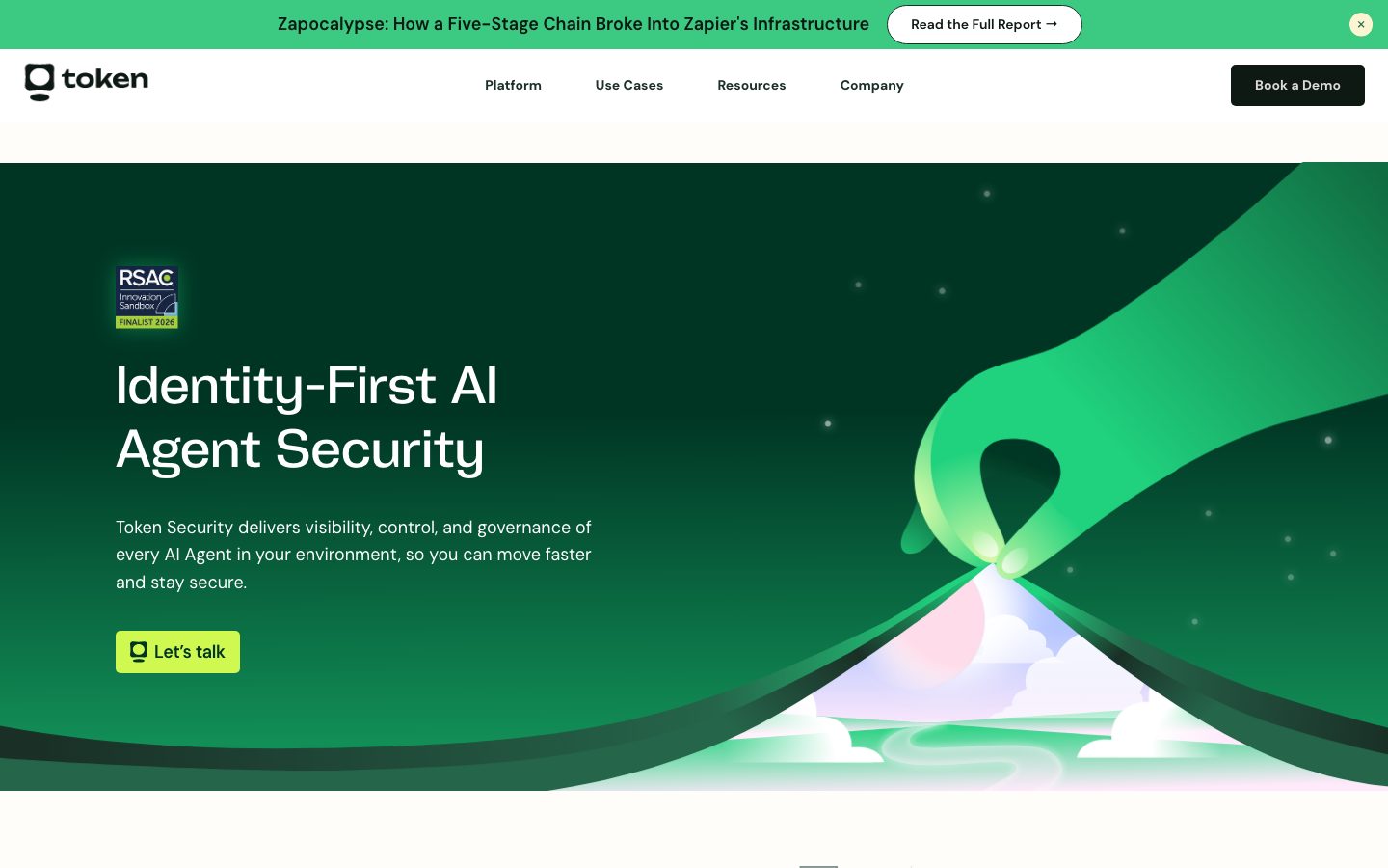
Token Security's marketing surface is a confident cybersecurity-SaaS interface that runs on a strict green system: a deep forest-green hero canvas (`{colors.hero-dark}` — #003524), near-black green ink for headlines (`{colors.ink}` — #1a3027), and a single high-voltage lime CTA (`{colors.accent-lime}` — #cff851). The page alternates between dark-green editorial bands and bright white content sections, so the lime button and the green-to-mint illustration backgrounds carry all of the brand voltage.
Type voice splits into two roles. **PP Neue Corp** (a custom display face, used at weight 500) carries every headline — the hero "Identity-First AI Agent Security", section heads, and card titles. **DM Sans** at weight 400 handles body copy and button labels. The display face stays at a single 500 weight across all sizes; it never goes heavy. Letter-spacing is `normal` everywhere except the h4 role (`title-tight`), which carries a measured -0.33px.
Component voltage comes from the **green-on-green contrast** and the animated cloud/gradient illustrations that fill the right half of the hero and the lower CTA band. The illustration system uses soft mint, lime, and bright green (`{colors.accent-green}` — #20d27e) cloud forms over the dark canvas. Surfaces stay near-square — the dominant measured radius is just 5px (`{rounded.sm}`), so cards read as crisp and engineered rather than soft and consumer-friendly.
**Key Characteristics:**
- Deep forest-green hero canvas (`{colors.hero-dark}` — #003524) with white display headline. The hero is the brand's signature surface.
- A single lime primary CTA (`{colors.accent-lime}` — #cff851 on `{colors.ink}` text). The "Let's talk" button is the only high-chroma action color.
- Custom **PP Neue Corp** display type (substituted with Space Grotesk here) at a single weight 500 across all headline sizes.
- **DM Sans** body + button type at weight 400, line-height 1.6 — comfortable, neutral, readable.
- Near-square geometry — 5px (`{rounded.sm}`) is by far the most-used radius (measured 32×), with pill (`{rounded.pill}` — 100px) reserved for the announcement-bar report link.
- A soft green glow shadow (`rgba(32, 210, 126, 0.4) 0px 0px 20px`) — the system's only measured box-shadow, used as an accent halo.
- Bright-green announcement bar (`{colors.accent-green}` — #20d27e) pinned above the nav, carrying a security-report teaser.
- Mint-tinted testimonial cards (`{colors.surface-mint}` — #effbf2) on the white content bands.
## Colors
### Brand & Accent
- **Lime** (`{colors.accent-lime}` — #cff851): The signature action color — the "Let's talk" CTA. Used only on primary buttons. Paired with `{colors.ink}` text.
- **Bright Green** (`{colors.accent-green}` — #20d27e): The announcement-bar background and the source color for the green glow shadow. The brightest broad-surface green in the system.
- **Soft Green** (`{colors.accent-green-soft}` — #3cc982): A secondary green used in illustration gradients and decorative cloud forms.
- **Accent Blue** (`{colors.accent-blue}` — #3898ec): A rare cool accent — appears inside product UI fragments / integration tiles, never on CTAs.
### Surface
- **Canvas** (`{colors.canvas}` — #ffffff): The default content-band background.
- **Hero Dark** (`{colors.hero-dark}` — #003524): The hero band, CTA band, and footer background — the deep forest green that frames the page top and bottom.
- **Surface Dark** (`{colors.surface-dark}` — #00352a): The dark product-feature band (the "Identity-First AI Agent Security" mid-page section).
- **Accent Deep** (`{colors.accent-deep}` — #0e1914): Near-black green used for the dark "Book a Demo" button and high-contrast surfaces.
- **Surface Mint** (`{colors.surface-mint}` — #effbf2): Testimonial-card fill — a barely-there green tint on the white bands.
- **Surface Soft** (`{colors.surface-soft}` — #fafafa), **Surface Muted** (`{colors.surface-muted}` — #f3f3f2), **Surface 200** (`{colors.surface-200}` — #f2f2f2), **Surface 300** (`{colors.surface-300}` — #ededec): A ladder of near-white grays used for section dividers and subtle panel fills.
- **Hairline** (`{colors.hairline}` — #e1e1e1), **Neutral 300** (`{colors.neutral-300}` — #dcdcdc), **Neutral 400** (`{colors.neutral-400}` — #cccccc): Border and divider tones on light surfaces.
### Text
- **Ink** (`{colors.ink}` — #1a3027): All headlines and primary text on light surfaces — a dark green, not pure black.
- **Ink Soft** (`{colors.ink-soft}` — #222222): Secondary near-black text.
- **Link** (`{colors.link}` — #333333): Inline anchor text color.
- **Black** (`{colors.black}` — #000000): Logo and maximum-contrast marks.
- **On Dark** (`{colors.on-dark}` — #ffffff): All text on the dark green hero, feature, CTA, and footer bands.
## Typography
### Font Family
The system runs **PP Neue Corp** for display + headlines and **DM Sans** for body + buttons. PP Neue Corp is a custom commercial display face (Pangram Pangram) — used here at weight 500 with `normal` tracking. DM Sans (open-source, Google Fonts) handles every paragraph, label, and button at weight 400 with a relaxed 1.6 line-height.
The split is functional:
- PP Neue Corp (display, weight 500) — h1, h2, h3, h4, card titles
- DM Sans (body + UI, weight 400) — paragraphs, buttons, nav links
### Hierarchy
| Token | Size | Weight | Line Height | Letter Spacing | Use |
|---|---|---|---|---|---|
| `{typography.display-xl}` | 55px | 500 | 1.2 | normal | Hero h1 ("Identity-First AI Agent Security") — PP Neue Corp |
| `{typography.display-lg}` | 45px | 500 | 1.1 | normal | Section heads, CTA-band head — PP Neue Corp |
| `{typography.title}` | 22px | 500 | 1.2 | normal | h3 card titles, accordion-row labels — PP Neue Corp |
| `{typography.title-tight}` | 22px | 500 | 1.2 | -0.33px | h4 sub-titles (measured negative tracking) — PP Neue Corp |
| `{typography.body}` | 18px | 400 | 1.6 | normal | Running text, hero sub-text, nav links — DM Sans |
| `{typography.button}` | 18px | 400 | 1.6 | normal | Button labels — DM Sans |
### Principles
PP Neue Corp is the brand voice — every headline uses it at a single weight 500. DM Sans handles all supporting type. The boundary is strict: never set body copy in PP Neue Corp, never set a headline in DM Sans. Display type stays at 500 — it never goes 700 — which keeps the security-product voice precise rather than loud. Body copy carries a generous 1.6 line-height for readability of dense product explanations.
### Note on Font Substitutes
PP Neue Corp is a licensed commercial typeface and is not shipped here. **Space Grotesk** (open-source, Google Fonts) at weight 500 is the closest substitute — it shares the geometric, slightly technical character. **Inter** weight 500 is a safer fallback if a more neutral grotesque is preferred. DM Sans is already open-source and is used directly. The button label `{typography.button}` is identical to `{typography.body}` (DM Sans 18px / 400) — the system does not give buttons a distinct type treatment.
## Layout
### Spacing System
- **Base unit:** ~5px (the smallest measured value), with 10px and 20px as the dominant rhythm steps.
- **Tokens:** `{spacing.xxs}` 5px · `{spacing.xs}` 8px · `{spacing.sm}` 10px · `{spacing.md}` 14px · `{spacing.lg}` 20px · `{spacing.xl}` 24px · `{spacing.xxl}` 30px · `{spacing.huge}` 35px.
- **Most-used steps:** 10px (measured 17×) and 20px (measured 19×) are the primary gap/padding values; 24px and 30px handle larger card and band padding.
- **Card internal padding:** `{spacing.xxl}` (30px) for content cards and testimonials.
### Grid & Container
- **Hero:** A two-column split — display headline + sub-text + CTA on the left, animated green-gradient illustration filling the right half (derived from screenshots; exact column widths not measured).
- **Logo strip:** A single horizontal row of customer logos (AlphaSense, PROS, betterhelp, GitLab, HP Enterprise, dayforce, HiBob) below the hero.
- **Product-feature band:** A two-column layout — an accordion list of feature rows on the left, a product-UI dashboard mockup on the right.
- **Testimonial grid:** Multi-up cards on the white band.
### Whitespace Philosophy
The page alternates dark-green bands (hero, feature, CTA, footer) with tall white content sections. The white bands carry significant vertical breathing room, letting the dark editorial bands act as visual punctuation. Spacing values cluster tightly (5/10/20/30) — the rhythm is calibrated for crisp, engineered density rather than airy consumer spacing.
## Elevation & Depth
| Level | Treatment | Use |
|---|---|---|
| Flat | No shadow, no border | Cards (measured `shadow: none`), content bands, nav |
| Green glow | `rgba(32, 210, 126, 0.4) 0px 0px 20px 0px` | Accent halo — the system's only measured box-shadow, used on a highlighted product/illustration element |
| Color-block | Dark green band vs white band | The primary depth cue — band-level color contrast does the elevation work |
The elevation philosophy is **flat with color-block contrast**. The measured `card` component has no shadow and a 5px radius — cards sit flat on their bands. Depth comes from alternating dark-green and white sections and from the single green glow accent.
### Decorative Depth
- Animated cloud/gradient illustrations (mint, lime, bright green) fill the hero right-half and the lower CTA band, creating soft atmospheric depth without true shadows.
- The product dashboard mockup inside the dark feature band carries its own internal UI chrome shown at small scale.
## Shapes
### Border Radius Scale
| Token | Value | Use |
|---|---|---|
| `{rounded.xs}` | 4px | Minor inline elements (measured 2×) |
| `{rounded.sm}` | 5px | The dominant radius (measured 32×) — buttons, cards, accordion rows, panels |
| `{rounded.lg}` | 20px | Larger rounded container (measured 1×) |
| `{rounded.pill}` | 100px | Announcement-bar "Read the Full Report" pill, fully-rounded chips (measured 5×) |
| `{rounded.full}` | 200px | Maximum pill / circular elements (measured 1×) |
### Geometry
The system is near-square — 5px radius dominates, giving cards and buttons a crisp, technical silhouette. Pill radii (100px / 200px) are reserved for the announcement-bar report link and small chips. Illustration cloud forms are organic and use no fixed radius.
## Components
### Top Bar & Navigation
**`announcement-bar`** — Bright-green strip pinned above the nav. Background `{colors.accent-green}` (#20d27e), dark `{colors.ink}` text in `{typography.body}`. Carries a security-report teaser ("Zapocalypse: How a Five-Stage Chain Broke Into Zapier's Infrastructure") and a `{component.button-report-pill}` ("Read the Full Report →"), plus a dismiss "×" at the right.
**`top-nav`** — White nav bar with the Token wordmark + logo at left, primary menu (Platform, Use Cases, Resources, Company) center, and a `{component.button-demo}` ("Book a Demo") at right. Menu items use `{component.nav-link}` in `{typography.body}`.
**`nav-link`** — Inline nav menu item, transparent background, `{colors.ink}` text.
### Buttons
**`button-primary`** — The signature lime CTA ("Let's talk"). Background `{colors.accent-lime}` (#cff851), text `{colors.ink}`, type `{typography.button}` (DM Sans 18px / 400), rounded `{rounded.sm}` (5px). Carries a small leading icon. The only high-chroma action color in the system.
**`button-demo`** — The dark "Book a Demo" nav button. Background `{colors.accent-deep}` (#0e1914), text `{colors.on-dark}`, type `{typography.button}`, rounded `{rounded.sm}`.
**`button-report-pill`** — The fully-rounded report link inside the announcement bar. Transparent background with a 1px border, `{colors.ink}` text, rounded `{rounded.pill}` (100px).
### Bands & Cards
**`hero-band`** — Deep forest-green hero. Background `{colors.hero-dark}` (#003524), white display headline in `{typography.display-xl}`, sub-text in `{component.hero-subtext}`, and the lime `{component.button-primary}`. The right half carries the animated green-gradient cloud illustration and an RSAC "Innovation Sandbox Finalist 2026" badge top-left.
**`hero-subtext`** — Supporting hero paragraph. Transparent background, `{colors.on-dark}` text, `{typography.body}`.
**`logo-strip`** — White band of customer logos below the hero. Background `{colors.canvas}`, grayscale logo marks.
**`product-feature-band`** — Dark mid-page band ("Identity-First AI Agent Security"). Background `{colors.surface-dark}` (#00352a), white head in `{typography.display-lg}`, an accordion of feature rows on the left, and a product-dashboard mockup on the right.
**`feature-accordion-row`** — Expandable feature row inside the dark band (e.g., "AI Agent & MCP Server Discovery"). Transparent background, `{colors.on-dark}` text, title in `{typography.title}`, with a "Learn More ›" affordance and a "+" expand control. Rounded `{rounded.sm}`.
**`card`** — Generic content card. Background `{colors.canvas}`, `{colors.ink}` text, rounded `{rounded.sm}` (5px), no shadow (measured `shadow: none`). Padding `{spacing.xxl}` (30px).
**`testimonial-card`** — Customer-quote card on the white band. Background `{colors.surface-mint}` (#effbf2), `{colors.ink}` text in `{typography.body}`, rounded `{rounded.sm}`. Top row carries the customer logo (HiBob, Udemy); below sits the quote and an attribution line.
### CTA & Footer
**`cta-band`** — Pre-footer "Ready to Control the Chaos of AI Identity?" band. Background `{colors.hero-dark}` (#003524), white head in `{typography.display-lg}`, a `{component.button-primary}` ("Let's talk"), and the green cloud illustration system.
**`footer`** — Dark green footer that closes the page. Background `{colors.hero-dark}`, `{colors.on-dark}` text in `{typography.body}`. Carries the wordmark and navigation columns. The dark-green footer mirrors the dark-green hero, framing the white content between them.
## Do's and Don'ts
### Do
- Reserve `{colors.accent-lime}` (#cff851) for the single primary CTA. The lime is the only high-chroma action color — keep it scarce.
- Use PP Neue Corp (substituted with Space Grotesk) for every headline at weight 500. Pair with DM Sans body. Never blur the boundary.
- Keep the dark-green-to-white band alternation. The hero, feature, CTA, and footer bands frame white content in between.
- Keep cards near-square — `{rounded.sm}` (5px) is the system's default radius.
- Use `{colors.surface-mint}` for testimonial cards — the faint green tint connects them to the brand without competing with the lime CTA.
- Use the green glow shadow (`rgba(32, 210, 126, 0.4) 0px 0px 20px`) sparingly as an accent halo, not a general card shadow.
### Don't
- Don't bolden display type beyond weight 500 — PP Neue Corp stays at 500 across all sizes.
- Don't use the accent blue (`{colors.accent-blue}`) on CTAs — it belongs to product-UI fragments only.
- Don't add drop shadows to cards — measured cards are flat (`shadow: none`).
- Don't introduce large radii on cards or buttons — pill radii (100px/200px) are reserved for the announcement-bar report link and chips.
- Don't repeat the same band color in two consecutive sections — the pacing alternates dark green → white → dark green.
- Don't document hover styling beyond default and pressed states.
## Responsive Behavior
The capture includes a full-width desktop landing and a narrow stacked rendering (≈480px) of the same page, which confirms the mobile collapse behavior below. Specific breakpoint pixel values were not measured.
### Breakpoints (observed)
| Name | Behavior |
|---|---|
| Mobile (narrow) | Hero collapses to single column — headline + sub-text + CTA stack above the illustration; nav condenses; logo strip wraps; testimonial cards drop to 1-up; feature band stacks accordion above the dashboard mockup |
| Desktop | Two-column hero (text left, illustration right); horizontal nav with full menu; multi-up testimonial grid; two-column product-feature band |
### Touch Targets
- `{component.button-primary}` and `{component.button-demo}` carry 14px+ vertical padding around an 18px label — comfortably above minimum tap size.
- Nav links and the announcement-bar pill use the `{spacing.sm}`–`{spacing.lg}` (10–20px) padding rhythm.
### Collapsing Strategy
- Hero two-column split collapses to single column on mobile; the gradient illustration moves below the text block.
- Customer logo strip wraps to multiple rows.
- The product-feature accordion stacks above the dashboard mockup.
- Testimonial cards reduce to 1-up.
- Dark hero, feature, CTA, and footer bands retain their color identity at every width.
## Iteration Guide
1. Focus on ONE component at a time. Reference its YAML key directly (`{component.button-primary}`, `{component.testimonial-card}`).
2. Variants of an existing component live as separate entries in `components:`.
3. Use `{token.refs}` everywhere — never inline hex.
4. Never document hover. Default and Active/Pressed states only.
5. Headlines stay PP Neue Corp 500; body stays DM Sans 400. The pairing does not blur.
6. The lime CTA is the only high-chroma action color — keep it to a single primary action per band.
7. When in doubt about emphasis: bigger PP Neue Corp before heavier — the weight never changes.
## Known Gaps
- The measured `button-primary` component returned `color: #1a3027, radius: 0px, padding: 0px` — a degenerate capture of the link wrapper rather than the visible lime button. The lime fill (`{colors.accent-lime}`), `{rounded.sm}` radius, and padding are documented from screenshot ground-truth; exact button radius/padding should be confirmed against source CSS.
- **PP Neue Corp** is a licensed commercial typeface (not flagged in `fonts_licensed`, but confirmed by the family name) and is not shipped here; Space Grotesk / Inter substitutes are documented in Typography.
- Color `role` labels in the source data are unreliable (e.g., #ffffff tagged as "muted") — roles here were reassigned from frequency, contrast, and screenshot context.
- Only two components (`button-primary`, `card`) were programmatically measured; all other component entries are derived from the landing + product screenshots and may need confirmation against source markup.
- The deep-green set (#003524, #00352a, #0e1914) reads as several near-identical greens; their exact assignment to hero vs feature vs button surfaces is interpreted from screenshots.
- Exact grid column widths, container max-width, and responsive breakpoint pixel values were not measured.
- Animation/transition timings for the cloud-gradient illustrations and accordion expand behavior are out of scope.
- Form/input states and the in-product dashboard surface (shown as a mockup) are not part of this marketing-page extraction.
<!-- Documented by duply · real-world design systems as ready-to-use DESIGN.md for AI coding agents · https://duply.ai/token/design-md -->
Color Palette
Accent
Neutrals
Typography
display-xl55px · 500 · 1.2
The quick brown fox jumpsdisplay-lg45px · 500 · 1.1
The quick brown fox jumpstitle22px · 500 · 1.2
The quick brown fox jumpstitle-tight22px · 500 · 1.2
The quick brown fox jumpsbody18px · 400 · 1.6
The quick brown fox jumpsbutton18px · 400 · 1.6
The quick brown fox jumpsSpacing & Shape
Spacing
| Name | Value | Preview |
|---|---|---|
| xxs | 5px | |
| xs | 8px | |
| sm | 10px | |
| md | 14px | |
| lg | 20px | |
| xl | 24px | |
| xxl | 30px | |
| huge | 35px |
Border Radius
| Name | Value | Preview |
|---|---|---|
| xs | 4px | |
| sm | 5px | |
| lg | 20px | |
| pill | 100px | |
| full | 200px |
More like this


---
version: alpha
name: Token-Security-design-analysis
description: A confident cybersecurity-SaaS interface built on deep forest-green hero canvases, near-black green ink, and a single high-voltage lime CTA. The system pairs the custom PP Neue Corp display face with DM Sans body type, near-square cards (5px radius), generous white content bands, and a recurring green-on-green palette punctuated by a lime "Let's talk" button and a soft mint-green glow. Brand voltage comes from the dark-green-to-lime contrast and animated cloud/gradient illustration backgrounds.

colors:
  ink: "#1a3027"
  ink-soft: "#222222"
  accent-deep: "#0e1914"
  hero-dark: "#003524"
  surface-dark: "#00352a"
  accent-lime: "#cff851"
  accent-green: "#20d27e"
  accent-green-soft: "#3cc982"
  surface-mint: "#effbf2"
  accent-blue: "#3898ec"
  link: "#333333"
  black: "#000000"
  canvas: "#ffffff"
  on-dark: "#ffffff"
  surface-soft: "#fafafa"
  surface-muted: "#f3f3f2"
  surface-200: "#f2f2f2"
  surface-300: "#ededec"
  hairline: "#e1e1e1"
  neutral-300: "#dcdcdc"
  neutral-400: "#cccccc"

typography:
  display-xl:
    fontFamily: "PP Neue Corp, Space Grotesk, sans-serif"
    fontSize: 55px
    fontWeight: 500
    lineHeight: 1.2
    letterSpacing: normal
  display-lg:
    fontFamily: "PP Neue Corp, Space Grotesk, sans-serif"
    fontSize: 45px
    fontWeight: 500
    lineHeight: 1.1
    letterSpacing: normal
  title:
    fontFamily: "PP Neue Corp, Space Grotesk, sans-serif"
    fontSize: 22px
    fontWeight: 500
    lineHeight: 1.2
    letterSpacing: normal
  title-tight:
    fontFamily: "PP Neue Corp, Space Grotesk, sans-serif"
    fontSize: 22px
    fontWeight: 500
    lineHeight: 1.2
    letterSpacing: -0.33px
  body:
    fontFamily: "DM Sans, sans-serif"
    fontSize: 18px
    fontWeight: 400
    lineHeight: 1.6
    letterSpacing: normal
  button:
    fontFamily: "DM Sans, sans-serif"
    fontSize: 18px
    fontWeight: 400
    lineHeight: 1.6
    letterSpacing: normal

rounded:
  xs: 4px
  sm: 5px
  lg: 20px
  pill: 100px
  full: 200px

spacing:
  xxs: 5px
  xs: 8px
  sm: 10px
  md: 14px
  lg: 20px
  xl: 24px
  xxl: 30px
  huge: 35px

components:
  announcement-bar:
    backgroundColor: "{colors.accent-green}"
    textColor: "{colors.ink}"
    typography: "{typography.body}"
    padding: 20px
  top-nav:
    backgroundColor: "{colors.canvas}"
    textColor: "{colors.ink}"
    typography: "{typography.body}"
    padding: 20px 30px
  nav-link:
    backgroundColor: transparent
    textColor: "{colors.ink}"
    typography: "{typography.body}"
  button-primary:
    backgroundColor: "{colors.accent-lime}"
    textColor: "{colors.ink}"
    typography: "{typography.button}"
    rounded: "{rounded.sm}"
    padding: 14px 20px
  button-demo:
    backgroundColor: "{colors.accent-deep}"
    textColor: "{colors.on-dark}"
    typography: "{typography.button}"
    rounded: "{rounded.sm}"
    padding: 14px 24px
  button-report-pill:
    backgroundColor: transparent
    textColor: "{colors.ink}"
    typography: "{typography.body}"
    rounded: "{rounded.pill}"
    padding: 10px 24px
  hero-band:
    backgroundColor: "{colors.hero-dark}"
    textColor: "{colors.on-dark}"
    typography: "{typography.display-xl}"
    padding: 30px
  hero-subtext:
    backgroundColor: transparent
    textColor: "{colors.on-dark}"
    typography: "{typography.body}"
  logo-strip:
    backgroundColor: "{colors.canvas}"
    textColor: "{colors.ink}"
    typography: "{typography.body}"
    padding: 30px
  product-feature-band:
    backgroundColor: "{colors.surface-dark}"
    textColor: "{colors.on-dark}"
    typography: "{typography.display-lg}"
    padding: 30px
  feature-accordion-row:
    backgroundColor: transparent
    textColor: "{colors.on-dark}"
    typography: "{typography.title}"
    rounded: "{rounded.sm}"
    padding: 20px
  card:
    backgroundColor: "{colors.canvas}"
    textColor: "{colors.ink}"
    rounded: "{rounded.sm}"
    padding: 30px
  testimonial-card:
    backgroundColor: "{colors.surface-mint}"
    textColor: "{colors.ink}"
    typography: "{typography.body}"
    rounded: "{rounded.sm}"
    padding: 30px
  cta-band:
    backgroundColor: "{colors.hero-dark}"
    textColor: "{colors.on-dark}"
    typography: "{typography.display-lg}"
    padding: 30px
  footer:
    backgroundColor: "{colors.hero-dark}"
    textColor: "{colors.on-dark}"
    typography: "{typography.body}"
    padding: 30px
---

## Overview

Token Security's marketing surface is a confident cybersecurity-SaaS interface that runs on a strict green system: a deep forest-green hero canvas (`{colors.hero-dark}` — #003524), near-black green ink for headlines (`{colors.ink}` — #1a3027), and a single high-voltage lime CTA (`{colors.accent-lime}` — #cff851). The page alternates between dark-green editorial bands and bright white content sections, so the lime button and the green-to-mint illustration backgrounds carry all of the brand voltage.

Type voice splits into two roles. **PP Neue Corp** (a custom display face, used at weight 500) carries every headline — the hero "Identity-First AI Agent Security", section heads, and card titles. **DM Sans** at weight 400 handles body copy and button labels. The display face stays at a single 500 weight across all sizes; it never goes heavy. Letter-spacing is `normal` everywhere except the h4 role (`title-tight`), which carries a measured -0.33px.

Component voltage comes from the **green-on-green contrast** and the animated cloud/gradient illustrations that fill the right half of the hero and the lower CTA band. The illustration system uses soft mint, lime, and bright green (`{colors.accent-green}` — #20d27e) cloud forms over the dark canvas. Surfaces stay near-square — the dominant measured radius is just 5px (`{rounded.sm}`), so cards read as crisp and engineered rather than soft and consumer-friendly.

**Key Characteristics:**
- Deep forest-green hero canvas (`{colors.hero-dark}` — #003524) with white display headline. The hero is the brand's signature surface.
- A single lime primary CTA (`{colors.accent-lime}` — #cff851 on `{colors.ink}` text). The "Let's talk" button is the only high-chroma action color.
- Custom **PP Neue Corp** display type (substituted with Space Grotesk here) at a single weight 500 across all headline sizes.
- **DM Sans** body + button type at weight 400, line-height 1.6 — comfortable, neutral, readable.
- Near-square geometry — 5px (`{rounded.sm}`) is by far the most-used radius (measured 32×), with pill (`{rounded.pill}` — 100px) reserved for the announcement-bar report link.
- A soft green glow shadow (`rgba(32, 210, 126, 0.4) 0px 0px 20px`) — the system's only measured box-shadow, used as an accent halo.
- Bright-green announcement bar (`{colors.accent-green}` — #20d27e) pinned above the nav, carrying a security-report teaser.
- Mint-tinted testimonial cards (`{colors.surface-mint}` — #effbf2) on the white content bands.

## Colors

### Brand & Accent
- **Lime** (`{colors.accent-lime}` — #cff851): The signature action color — the "Let's talk" CTA. Used only on primary buttons. Paired with `{colors.ink}` text.
- **Bright Green** (`{colors.accent-green}` — #20d27e): The announcement-bar background and the source color for the green glow shadow. The brightest broad-surface green in the system.
- **Soft Green** (`{colors.accent-green-soft}` — #3cc982): A secondary green used in illustration gradients and decorative cloud forms.
- **Accent Blue** (`{colors.accent-blue}` — #3898ec): A rare cool accent — appears inside product UI fragments / integration tiles, never on CTAs.

### Surface
- **Canvas** (`{colors.canvas}` — #ffffff): The default content-band background.
- **Hero Dark** (`{colors.hero-dark}` — #003524): The hero band, CTA band, and footer background — the deep forest green that frames the page top and bottom.
- **Surface Dark** (`{colors.surface-dark}` — #00352a): The dark product-feature band (the "Identity-First AI Agent Security" mid-page section).
- **Accent Deep** (`{colors.accent-deep}` — #0e1914): Near-black green used for the dark "Book a Demo" button and high-contrast surfaces.
- **Surface Mint** (`{colors.surface-mint}` — #effbf2): Testimonial-card fill — a barely-there green tint on the white bands.
- **Surface Soft** (`{colors.surface-soft}` — #fafafa), **Surface Muted** (`{colors.surface-muted}` — #f3f3f2), **Surface 200** (`{colors.surface-200}` — #f2f2f2), **Surface 300** (`{colors.surface-300}` — #ededec): A ladder of near-white grays used for section dividers and subtle panel fills.
- **Hairline** (`{colors.hairline}` — #e1e1e1), **Neutral 300** (`{colors.neutral-300}` — #dcdcdc), **Neutral 400** (`{colors.neutral-400}` — #cccccc): Border and divider tones on light surfaces.

### Text
- **Ink** (`{colors.ink}` — #1a3027): All headlines and primary text on light surfaces — a dark green, not pure black.
- **Ink Soft** (`{colors.ink-soft}` — #222222): Secondary near-black text.
- **Link** (`{colors.link}` — #333333): Inline anchor text color.
- **Black** (`{colors.black}` — #000000): Logo and maximum-contrast marks.
- **On Dark** (`{colors.on-dark}` — #ffffff): All text on the dark green hero, feature, CTA, and footer bands.

## Typography

### Font Family
The system runs **PP Neue Corp** for display + headlines and **DM Sans** for body + buttons. PP Neue Corp is a custom commercial display face (Pangram Pangram) — used here at weight 500 with `normal` tracking. DM Sans (open-source, Google Fonts) handles every paragraph, label, and button at weight 400 with a relaxed 1.6 line-height.

The split is functional:
- PP Neue Corp (display, weight 500) — h1, h2, h3, h4, card titles
- DM Sans (body + UI, weight 400) — paragraphs, buttons, nav links

### Hierarchy

| Token | Size | Weight | Line Height | Letter Spacing | Use |
|---|---|---|---|---|---|
| `{typography.display-xl}` | 55px | 500 | 1.2 | normal | Hero h1 ("Identity-First AI Agent Security") — PP Neue Corp |
| `{typography.display-lg}` | 45px | 500 | 1.1 | normal | Section heads, CTA-band head — PP Neue Corp |
| `{typography.title}` | 22px | 500 | 1.2 | normal | h3 card titles, accordion-row labels — PP Neue Corp |
| `{typography.title-tight}` | 22px | 500 | 1.2 | -0.33px | h4 sub-titles (measured negative tracking) — PP Neue Corp |
| `{typography.body}` | 18px | 400 | 1.6 | normal | Running text, hero sub-text, nav links — DM Sans |
| `{typography.button}` | 18px | 400 | 1.6 | normal | Button labels — DM Sans |

### Principles
PP Neue Corp is the brand voice — every headline uses it at a single weight 500. DM Sans handles all supporting type. The boundary is strict: never set body copy in PP Neue Corp, never set a headline in DM Sans. Display type stays at 500 — it never goes 700 — which keeps the security-product voice precise rather than loud. Body copy carries a generous 1.6 line-height for readability of dense product explanations.

### Note on Font Substitutes
PP Neue Corp is a licensed commercial typeface and is not shipped here. **Space Grotesk** (open-source, Google Fonts) at weight 500 is the closest substitute — it shares the geometric, slightly technical character. **Inter** weight 500 is a safer fallback if a more neutral grotesque is preferred. DM Sans is already open-source and is used directly. The button label `{typography.button}` is identical to `{typography.body}` (DM Sans 18px / 400) — the system does not give buttons a distinct type treatment.

## Layout

### Spacing System
- **Base unit:** ~5px (the smallest measured value), with 10px and 20px as the dominant rhythm steps.
- **Tokens:** `{spacing.xxs}` 5px · `{spacing.xs}` 8px · `{spacing.sm}` 10px · `{spacing.md}` 14px · `{spacing.lg}` 20px · `{spacing.xl}` 24px · `{spacing.xxl}` 30px · `{spacing.huge}` 35px.
- **Most-used steps:** 10px (measured 17×) and 20px (measured 19×) are the primary gap/padding values; 24px and 30px handle larger card and band padding.
- **Card internal padding:** `{spacing.xxl}` (30px) for content cards and testimonials.

### Grid & Container
- **Hero:** A two-column split — display headline + sub-text + CTA on the left, animated green-gradient illustration filling the right half (derived from screenshots; exact column widths not measured).
- **Logo strip:** A single horizontal row of customer logos (AlphaSense, PROS, betterhelp, GitLab, HP Enterprise, dayforce, HiBob) below the hero.
- **Product-feature band:** A two-column layout — an accordion list of feature rows on the left, a product-UI dashboard mockup on the right.
- **Testimonial grid:** Multi-up cards on the white band.

### Whitespace Philosophy
The page alternates dark-green bands (hero, feature, CTA, footer) with tall white content sections. The white bands carry significant vertical breathing room, letting the dark editorial bands act as visual punctuation. Spacing values cluster tightly (5/10/20/30) — the rhythm is calibrated for crisp, engineered density rather than airy consumer spacing.

## Elevation & Depth

| Level | Treatment | Use |
|---|---|---|
| Flat | No shadow, no border | Cards (measured `shadow: none`), content bands, nav |
| Green glow | `rgba(32, 210, 126, 0.4) 0px 0px 20px 0px` | Accent halo — the system's only measured box-shadow, used on a highlighted product/illustration element |
| Color-block | Dark green band vs white band | The primary depth cue — band-level color contrast does the elevation work |

The elevation philosophy is **flat with color-block contrast**. The measured `card` component has no shadow and a 5px radius — cards sit flat on their bands. Depth comes from alternating dark-green and white sections and from the single green glow accent.

### Decorative Depth
- Animated cloud/gradient illustrations (mint, lime, bright green) fill the hero right-half and the lower CTA band, creating soft atmospheric depth without true shadows.
- The product dashboard mockup inside the dark feature band carries its own internal UI chrome shown at small scale.

## Shapes

### Border Radius Scale

| Token | Value | Use |
|---|---|---|
| `{rounded.xs}` | 4px | Minor inline elements (measured 2×) |
| `{rounded.sm}` | 5px | The dominant radius (measured 32×) — buttons, cards, accordion rows, panels |
| `{rounded.lg}` | 20px | Larger rounded container (measured 1×) |
| `{rounded.pill}` | 100px | Announcement-bar "Read the Full Report" pill, fully-rounded chips (measured 5×) |
| `{rounded.full}` | 200px | Maximum pill / circular elements (measured 1×) |

### Geometry
The system is near-square — 5px radius dominates, giving cards and buttons a crisp, technical silhouette. Pill radii (100px / 200px) are reserved for the announcement-bar report link and small chips. Illustration cloud forms are organic and use no fixed radius.

## Components

### Top Bar & Navigation

**`announcement-bar`** — Bright-green strip pinned above the nav. Background `{colors.accent-green}` (#20d27e), dark `{colors.ink}` text in `{typography.body}`. Carries a security-report teaser ("Zapocalypse: How a Five-Stage Chain Broke Into Zapier's Infrastructure") and a `{component.button-report-pill}` ("Read the Full Report →"), plus a dismiss "×" at the right.

**`top-nav`** — White nav bar with the Token wordmark + logo at left, primary menu (Platform, Use Cases, Resources, Company) center, and a `{component.button-demo}` ("Book a Demo") at right. Menu items use `{component.nav-link}` in `{typography.body}`.

**`nav-link`** — Inline nav menu item, transparent background, `{colors.ink}` text.

### Buttons

**`button-primary`** — The signature lime CTA ("Let's talk"). Background `{colors.accent-lime}` (#cff851), text `{colors.ink}`, type `{typography.button}` (DM Sans 18px / 400), rounded `{rounded.sm}` (5px). Carries a small leading icon. The only high-chroma action color in the system.

**`button-demo`** — The dark "Book a Demo" nav button. Background `{colors.accent-deep}` (#0e1914), text `{colors.on-dark}`, type `{typography.button}`, rounded `{rounded.sm}`.

**`button-report-pill`** — The fully-rounded report link inside the announcement bar. Transparent background with a 1px border, `{colors.ink}` text, rounded `{rounded.pill}` (100px).

### Bands & Cards

**`hero-band`** — Deep forest-green hero. Background `{colors.hero-dark}` (#003524), white display headline in `{typography.display-xl}`, sub-text in `{component.hero-subtext}`, and the lime `{component.button-primary}`. The right half carries the animated green-gradient cloud illustration and an RSAC "Innovation Sandbox Finalist 2026" badge top-left.

**`hero-subtext`** — Supporting hero paragraph. Transparent background, `{colors.on-dark}` text, `{typography.body}`.

**`logo-strip`** — White band of customer logos below the hero. Background `{colors.canvas}`, grayscale logo marks.

**`product-feature-band`** — Dark mid-page band ("Identity-First AI Agent Security"). Background `{colors.surface-dark}` (#00352a), white head in `{typography.display-lg}`, an accordion of feature rows on the left, and a product-dashboard mockup on the right.

**`feature-accordion-row`** — Expandable feature row inside the dark band (e.g., "AI Agent & MCP Server Discovery"). Transparent background, `{colors.on-dark}` text, title in `{typography.title}`, with a "Learn More ›" affordance and a "+" expand control. Rounded `{rounded.sm}`.

**`card`** — Generic content card. Background `{colors.canvas}`, `{colors.ink}` text, rounded `{rounded.sm}` (5px), no shadow (measured `shadow: none`). Padding `{spacing.xxl}` (30px).

**`testimonial-card`** — Customer-quote card on the white band. Background `{colors.surface-mint}` (#effbf2), `{colors.ink}` text in `{typography.body}`, rounded `{rounded.sm}`. Top row carries the customer logo (HiBob, Udemy); below sits the quote and an attribution line.

### CTA & Footer

**`cta-band`** — Pre-footer "Ready to Control the Chaos of AI Identity?" band. Background `{colors.hero-dark}` (#003524), white head in `{typography.display-lg}`, a `{component.button-primary}` ("Let's talk"), and the green cloud illustration system.

**`footer`** — Dark green footer that closes the page. Background `{colors.hero-dark}`, `{colors.on-dark}` text in `{typography.body}`. Carries the wordmark and navigation columns. The dark-green footer mirrors the dark-green hero, framing the white content between them.

## Do's and Don'ts

### Do
- Reserve `{colors.accent-lime}` (#cff851) for the single primary CTA. The lime is the only high-chroma action color — keep it scarce.
- Use PP Neue Corp (substituted with Space Grotesk) for every headline at weight 500. Pair with DM Sans body. Never blur the boundary.
- Keep the dark-green-to-white band alternation. The hero, feature, CTA, and footer bands frame white content in between.
- Keep cards near-square — `{rounded.sm}` (5px) is the system's default radius.
- Use `{colors.surface-mint}` for testimonial cards — the faint green tint connects them to the brand without competing with the lime CTA.
- Use the green glow shadow (`rgba(32, 210, 126, 0.4) 0px 0px 20px`) sparingly as an accent halo, not a general card shadow.

### Don't
- Don't bolden display type beyond weight 500 — PP Neue Corp stays at 500 across all sizes.
- Don't use the accent blue (`{colors.accent-blue}`) on CTAs — it belongs to product-UI fragments only.
- Don't add drop shadows to cards — measured cards are flat (`shadow: none`).
- Don't introduce large radii on cards or buttons — pill radii (100px/200px) are reserved for the announcement-bar report link and chips.
- Don't repeat the same band color in two consecutive sections — the pacing alternates dark green → white → dark green.
- Don't document hover styling beyond default and pressed states.

## Responsive Behavior

The capture includes a full-width desktop landing and a narrow stacked rendering (≈480px) of the same page, which confirms the mobile collapse behavior below. Specific breakpoint pixel values were not measured.

### Breakpoints (observed)

| Name | Behavior |
|---|---|
| Mobile (narrow) | Hero collapses to single column — headline + sub-text + CTA stack above the illustration; nav condenses; logo strip wraps; testimonial cards drop to 1-up; feature band stacks accordion above the dashboard mockup |
| Desktop | Two-column hero (text left, illustration right); horizontal nav with full menu; multi-up testimonial grid; two-column product-feature band |

### Touch Targets
- `{component.button-primary}` and `{component.button-demo}` carry 14px+ vertical padding around an 18px label — comfortably above minimum tap size.
- Nav links and the announcement-bar pill use the `{spacing.sm}`–`{spacing.lg}` (10–20px) padding rhythm.

### Collapsing Strategy
- Hero two-column split collapses to single column on mobile; the gradient illustration moves below the text block.
- Customer logo strip wraps to multiple rows.
- The product-feature accordion stacks above the dashboard mockup.
- Testimonial cards reduce to 1-up.
- Dark hero, feature, CTA, and footer bands retain their color identity at every width.

## Iteration Guide

1. Focus on ONE component at a time. Reference its YAML key directly (`{component.button-primary}`, `{component.testimonial-card}`).
2. Variants of an existing component live as separate entries in `components:`.
3. Use `{token.refs}` everywhere — never inline hex.
4. Never document hover. Default and Active/Pressed states only.
5. Headlines stay PP Neue Corp 500; body stays DM Sans 400. The pairing does not blur.
6. The lime CTA is the only high-chroma action color — keep it to a single primary action per band.
7. When in doubt about emphasis: bigger PP Neue Corp before heavier — the weight never changes.

## Known Gaps

- The measured `button-primary` component returned `color: #1a3027, radius: 0px, padding: 0px` — a degenerate capture of the link wrapper rather than the visible lime button. The lime fill (`{colors.accent-lime}`), `{rounded.sm}` radius, and padding are documented from screenshot ground-truth; exact button radius/padding should be confirmed against source CSS.
- **PP Neue Corp** is a licensed commercial typeface (not flagged in `fonts_licensed`, but confirmed by the family name) and is not shipped here; Space Grotesk / Inter substitutes are documented in Typography.
- Color `role` labels in the source data are unreliable (e.g., #ffffff tagged as "muted") — roles here were reassigned from frequency, contrast, and screenshot context.
- Only two components (`button-primary`, `card`) were programmatically measured; all other component entries are derived from the landing + product screenshots and may need confirmation against source markup.
- The deep-green set (#003524, #00352a, #0e1914) reads as several near-identical greens; their exact assignment to hero vs feature vs button surfaces is interpreted from screenshots.
- Exact grid column widths, container max-width, and responsive breakpoint pixel values were not measured.
- Animation/transition timings for the cloud-gradient illustrations and accordion expand behavior are out of scope.
- Form/input states and the in-product dashboard surface (shown as a mockup) are not part of this marketing-page extraction.

<!-- Documented by duply · real-world design systems as ready-to-use DESIGN.md for AI coding agents · https://duply.ai/token/design-md -->