Twenty
An open-source CRM marketing site built on a light off-white canvas with near-black ink, a low-weight Host Grotesk display face (weight 300 at large sizes), and pure-black primary CTAs. The system reads as developer-tool minimal — sharp small radii, monochrome surfaces, real product UI shown as the hero artifact, and rare jewel-tone accents borrowed from the in-product chrome (teal, blue, violet, green). Brand voltage comes from the oversized thin-weight headline and from the actual CRM table screenshot embedded directly in the page.
---
version: alpha
name: Twenty-design-analysis
description: An open-source CRM marketing site built on a light off-white canvas with near-black ink, a low-weight Host Grotesk display face (weight 300 at large sizes), and pure-black primary CTAs. The system reads as developer-tool minimal — sharp small radii, monochrome surfaces, real product UI shown as the hero artifact, and rare jewel-tone accents borrowed from the in-product chrome (teal, blue, violet, green). Brand voltage comes from the oversized thin-weight headline and from the actual CRM table screenshot embedded directly in the page.
colors:
primary: "#000000"
primary-ink: "#1c1c1c"
ink-strong: "#333333"
body: "#666666"
muted: "#999999"
muted-soft: "#b3b3b3"
slate: "#4b5563"
slate-dark: "#45454d"
canvas: "#ffffff"
hairline: "#e5e7eb"
border-soft: "#bec2c9"
on-primary: "#ffffff"
link: "#0000ee"
accent-blue: "#1961ed"
accent-blue-deep: "#0550ae"
accent-navy: "#0a3069"
accent-green: "#82be9c"
accent-teal: "#0f766e"
accent-teal-soft: "#ccfbf1"
accent-violet: "#6d28d9"
accent-pink: "#ff9a9a"
typography:
display-xl:
fontFamily: "Host Grotesk, sans-serif"
fontSize: 60px
fontWeight: 300
lineHeight: 1.1
letterSpacing: normal
display-lg:
fontFamily: "Host Grotesk, sans-serif"
fontSize: 48px
fontWeight: 300
lineHeight: 1.167
letterSpacing: normal
title-md:
fontFamily: "Host Grotesk, sans-serif"
fontSize: 18px
fontWeight: 500
lineHeight: 1.333
letterSpacing: normal
title-sm:
fontFamily: "Host Grotesk, sans-serif"
fontSize: 16px
fontWeight: 500
lineHeight: 1.35
letterSpacing: normal
body-md:
fontFamily: "Host Grotesk, sans-serif"
fontSize: 16px
fontWeight: 400
lineHeight: 1.55
letterSpacing: normal
rounded:
xs: 2px
sm: 3px
md: 4px
lg: 6px
xl: 8px
xxl: 16px
xxxl: 20px
pill: 999px
spacing:
xxs: 4px
xs: 8px
sm: 12px
md: 16px
lg: 20px
xl: 24px
xxl: 32px
components:
top-nav:
backgroundColor: "{colors.canvas}"
textColor: "{colors.primary-ink}"
typography: "{typography.title-sm}"
logo-mark:
backgroundColor: "{colors.primary}"
textColor: "{colors.on-primary}"
rounded: "{rounded.md}"
nav-link:
backgroundColor: transparent
textColor: "{colors.primary-ink}"
typography: "{typography.title-sm}"
button-primary:
backgroundColor: "{colors.primary}"
textColor: "{colors.on-primary}"
typography: "{typography.title-sm}"
rounded: "{rounded.xs}"
padding: 12px 24px
button-secondary:
backgroundColor: "{colors.canvas}"
textColor: "{colors.primary-ink}"
typography: "{typography.title-sm}"
rounded: "{rounded.xs}"
padding: 12px 24px
text-link:
backgroundColor: transparent
textColor: "{colors.link}"
typography: "{typography.body-md}"
hero-band:
backgroundColor: "{colors.canvas}"
textColor: "{colors.primary-ink}"
typography: "{typography.display-xl}"
product-window-card:
backgroundColor: "{colors.canvas}"
textColor: "{colors.primary-ink}"
rounded: "{rounded.xxl}"
trusted-by-row:
backgroundColor: "{colors.canvas}"
textColor: "{colors.muted}"
typography: "{typography.title-sm}"
problem-block:
backgroundColor: "{colors.primary}"
textColor: "{colors.on-primary}"
rounded: "{rounded.md}"
data-model-card:
backgroundColor: "{colors.slate-dark}"
textColor: "{colors.on-primary}"
typography: "{typography.title-sm}"
rounded: "{rounded.xl}"
feature-block:
backgroundColor: "{colors.canvas}"
textColor: "{colors.primary-ink}"
typography: "{typography.display-lg}"
table-cell:
backgroundColor: "{colors.canvas}"
textColor: "{colors.primary-ink}"
typography: "{typography.body-md}"
badge-pill:
backgroundColor: "{colors.accent-teal-soft}"
textColor: "{colors.accent-teal}"
typography: "{typography.title-sm}"
rounded: "{rounded.md}"
section-label:
backgroundColor: transparent
textColor: "{colors.body}"
typography: "{typography.title-sm}"
---
## Overview
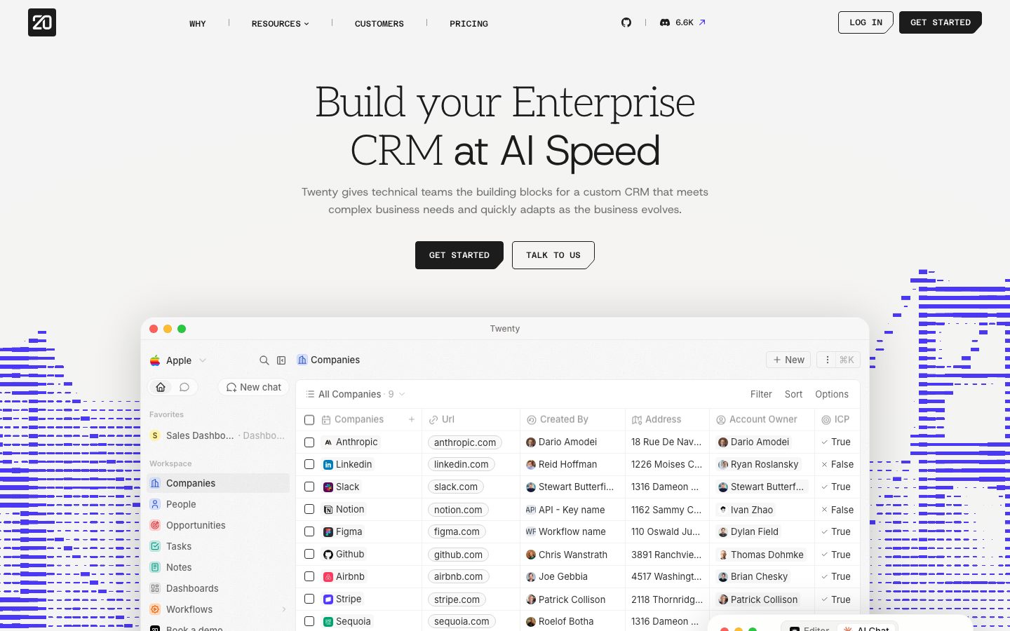
Twenty's marketing surface is a developer-tool-minimal interface — a near-white canvas (`{colors.canvas}` — #ffffff) carrying near-black ink (`{colors.primary-ink}` — #1c1c1c), an oversized thin-weight **Host Grotesk** headline, and a single pure-black primary CTA (`{colors.primary}` — #000000). The system reads as restrained, technical, and confident: no decorative gradients on the body, no soft pastel cards, just monochrome surfaces and the actual product shown at full fidelity.
The signature move is the **thin-weight display headline**. The h1 ("Build your Enterprise CRM at AI Speed") runs Host Grotesk at 60px **weight 300** — an unusually light display weight that gives the page its editorial, almost magazine-like air. The h2 ("Assemble, iterate and adapt a robust CRM") echoes the same 300 weight at 48px. Below the display tier, type snaps to weight 500 (h3/h4) and 400 (body), so the contrast between airy headline and dense supporting text is sharp.
Component voltage comes from **real product UI shown directly in the page** — the hero artifact is a full Twenty CRM window (companies table with logos, URLs, account owners, True/False tags), not a marketing illustration. The CRM screenshot carries its own internal chrome — jewel-tone tags, avatar dots, table grid — and that chrome is the only place chromatic accents appear (`{colors.accent-teal}`, `{colors.accent-blue}`, `{colors.accent-violet}`, `{colors.accent-green}`). The marketing layer around it stays monochrome.
A second mode appears mid-page: dark blocks. The "tradeoffs" problem block is pure black (`{colors.primary}`), and the data-model feature panel is a dark slate gray (`{colors.slate-dark}` — #45454d). These dark blocks punctuate the otherwise white scroll.
**Key Characteristics:**
- Off-white canvas with pure-black primary CTA (`{colors.primary}` — #000000) and a transparent outline secondary ("TALK TO US"). Both buttons use uppercase weight-500 labels with sharp small radii (`{rounded.xs}` — 2px).
- `Host Grotesk` (open-source) throughout. Display tier at weight 300, headings at 500, body at 400 — a single-family system with weight doing all the hierarchy work.
- Real product UI embedded as the hero artifact — a full CRM table window with subtle drop shadow, rounded `{rounded.xxl}` (16px) corners.
- Monochrome marketing layer; chromatic accents (teal, blue, violet, green, pink) live only inside the product chrome and the small True/False / status tags.
- Dark punctuation blocks — a pure-black problem block and a slate-gray data-model panel break up the white scroll.
- Sharp radius language — the most common measured radius is `{rounded.md}` (4px, 303 occurrences), with `{rounded.pill}` (999px) for circular elements. Large soft radii are rare.
## Colors
### Brand & Action
- **Primary** (`{colors.primary}` — #000000): Pure black. Logo mark, primary CTA background, and the dark problem-block surface. Twenty's action color is true black, not blue.
- **Link** (`{colors.link}` — #0000ee): The measured `button.color` resolved to default-link blue, indicating CTAs are rendered as anchor elements; used for inline text links.
### Ink & Text
- **Primary Ink** (`{colors.primary-ink}` — #1c1c1c): All display headlines and primary text.
- **Ink Strong** (`{colors.ink-strong}` — #333333): Secondary heading emphasis, dense UI labels.
- **Body** (`{colors.body}` — #666666): Default running-text and section eyebrow labels.
- **Muted** (`{colors.muted}` — #999999): Tertiary text, trusted-by logo row, captions.
- **Muted Soft** (`{colors.muted-soft}` — #b3b3b3): Faintest text tier — placeholders, fine print.
- **Slate** (`{colors.slate}` — #4b5563) / **Slate Dark** (`{colors.slate-dark}` — #45454d): Dark UI surfaces — the data-model feature panel and nested dark cards.
- **On Primary** (`{colors.on-primary}` — #ffffff): Text on black CTAs and on dark blocks.
### Surface & Line
- **Canvas** (`{colors.canvas}` — #ffffff): The page floor.
- **Hairline** (`{colors.hairline}` — #e5e7eb): 1px dividers, table grid lines, input borders.
- **Border Soft** (`{colors.border-soft}` — #bec2c9): Slightly heavier border on outlined controls.
### Accent (product chrome only)
These appear inside the embedded CRM UI and small status tags — never on marketing CTAs:
- **Accent Blue** (`{colors.accent-blue}` — #1961ed) and **Accent Blue Deep** (`{colors.accent-blue-deep}` — #0550ae): Links and highlighted cells inside the product.
- **Accent Navy** (`{colors.accent-navy}` — #0a3069): Deep label text in product UI.
- **Accent Teal** (`{colors.accent-teal}` — #0f766e) over **Accent Teal Soft** (`{colors.accent-teal-soft}` — #ccfbf1): Status / tag pills.
- **Accent Green** (`{colors.accent-green}` — #82be9c): Success / True markers.
- **Accent Violet** (`{colors.accent-violet}` — #6d28d9): Category tags.
- **Accent Pink** (`{colors.accent-pink}` — #ff9a9a): Highlight / warning tags.
## Typography
### Font Family
The system runs a single family — **Host Grotesk** — across every role. Host Grotesk is an open-source grotesque available on Google Fonts, so it ships natively with no substitution required (the `fonts_licensed` list is empty). Fallback walks to a generic `sans-serif`.
The hierarchy is driven by **weight**, not family: display sizes use a thin weight 300, headings step up to 500, and body sits at 400. This is the defining typographic decision — a 60px headline at weight 300 reads light and editorial, in deliberate contrast to the dense weight-500 supporting labels.
### Hierarchy
| Token | Size | Weight | Line Height | Letter Spacing | Use |
|---|---|---|---|---|---|
| `{typography.display-xl}` | 60px | 300 | 1.1 | normal | Hero h1 ("Build your Enterprise CRM at AI Speed") |
| `{typography.display-lg}` | 48px | 300 | 1.167 | normal | Section h2 ("Assemble, iterate and adapt…") |
| `{typography.title-md}` | 18px | 500 | 1.333 | normal | h3 sub-section heads, card titles |
| `{typography.title-sm}` | 16px | 500 | 1.35 | normal | h4 labels, nav links, button labels |
| `{typography.body-md}` | 16px | 400 | 1.55 | normal | Default running-text, paragraphs |
### Principles
The display tier (60px / 48px) stays at weight 300 — that lightness is the brand voice. Never bold the display headline; the thin weight at large size is what gives Twenty its editorial calm. Supporting UI (nav, buttons, labels) snaps to weight 500 for legibility at small sizes, and body copy stays at 400. There is no separate brand display face — Host Grotesk does everything.
### Note on Font Substitutes
Host Grotesk is open-source and shipped directly; no substitute is required. If unavailable, **Inter** at weight 300 (display) / 500 (UI) or **Geist** are close grotesque approximations, though both read slightly more neutral than Host Grotesk's distinct character.
## Layout
### Spacing System
- **Base unit:** 4px (`{spacing.xxs}`, the single most frequent measured spacing value at 394 occurrences).
- **Tokens:** `{spacing.xxs}` 4px · `{spacing.xs}` 8px · `{spacing.sm}` 12px · `{spacing.md}` 16px · `{spacing.lg}` 20px · `{spacing.xl}` 24px · `{spacing.xxl}` 32px.
- **Dominant rhythm:** 4px and 8px dominate (the two highest-frequency steps), reflecting the dense product-UI heritage; 12–32px steps handle card and section padding.
- **Button padding:** ~12px × 24px on primary/secondary CTAs (derived from observed proportions).
### Grid & Container
- **Editorial body:** Single centered column for hero and feature heads; the hero headline is centered, supporting copy centered below.
- **Product artifact:** The CRM window spans nearly full content width below the hero, anchored as a single large element.
- **Feature rows:** Two-up split (text left / visual right) for the problem block and the data-model panel.
- **Trusted-by row:** A single horizontal logo strip ("TRUSTED BY … +50K OTHERS").
### Whitespace Philosophy
Twenty uses very generous vertical whitespace between bands — long empty runs separate the feature sections on the landing page (visible in the full-page capture). The density is reserved for the embedded product UI; the marketing layer breathes. Headlines float in space with the product table as the single dense anchor.
## Elevation & Depth
| Level | Treatment | Use |
|---|---|---|
| Flat | No shadow, no border | Body sections, nav, hero text |
| Card shadow | `rgba(0,0,0,0.04) 0px 2px 4px, rgba(0,0,0,0.08) 0px 0px 4px` (most frequent — 70 uses) | Default raised cards, small product UI fragments |
| Soft variant | `rgba(0,0,0,0.08) 0px 0px 3.677px, rgba(0,0,0,0.04) 0px 1.839px 3.677px` | Smaller nested chips |
| Modal / hero artifact | `rgba(0,0,0,0.2) 0px 10px 64px` | The big floating CRM window and overlay panels |
| Inset hairline | `rgb(221,243,228) 0px 0px 0px 1px inset` / `rgba(241,241,241,0.9) 0px 0px 0px 1px` | Tag and chip borders rendered as inset rings |
The elevation philosophy is **subtle and product-like** — low-alpha multi-layer shadows lift cards a few pixels, while the hero CRM window gets a single deep 64px-blur shadow to float it above the canvas. No heavy drop shadows on the marketing layer.
### Decorative Depth
- The hero CRM window carries internal product chrome (table grid lines, avatar dots, status tags) with its own shadows — these are product artifacts, not system tokens.
- A subtle blue pixel-streak texture flanks the hero artifact on both sides (visible bleeding off the page edges), adding a faint data-stream motif behind the white surface.
## Shapes
### Border Radius Scale
| Token | Value | Use |
|---|---|---|
| `{rounded.xs}` | 2px | Buttons, tightest chips (88 uses) |
| `{rounded.sm}` | 3px | Small inline controls |
| `{rounded.md}` | 4px | The dominant radius — most cards, inputs, tags (303 uses) |
| `{rounded.lg}` | 6px | Slightly larger control groups |
| `{rounded.xl}` | 8px | Dark data-model panel, mid-size cards |
| `{rounded.xxl}` | 16px | Larger feature surfaces |
| `{rounded.xxxl}` | 20px | Occasional large card / panel corner |
| `{rounded.pill}` | 999px | Circular avatars, dots, fully-round chips (113 uses) |
### Geometry
The radius language is sharp and small — 2–4px dominates, signalling a precise, engineered, dev-tool aesthetic rather than a soft consumer feel. Circular elements (avatar dots in the CRM table, status indicators) use `{rounded.pill}`. A single 56px radius was measured once and is treated as an outlier (see Known Gaps).
## Components
### Navigation
**`top-nav`** — White nav bar across the top of every page. Carries the black square `{component.logo-mark}` at left, a center menu (WHY, RESOURCES, CUSTOMERS, PRICING) plus GitHub and Discord links with a star count, and a right cluster with "LOG IN" (`{component.button-secondary}`) and "GET STARTED" (`{component.button-primary}`). Menu items use `{typography.title-sm}` (Host Grotesk 16px / 500) with vertical hairline separators in `{colors.hairline}`.
**`logo-mark`** — The black "20" square mark in `{colors.primary}` with white glyph, rounded `{rounded.md}`.
**`nav-link`** — Inline menu item, transparent background, `{colors.primary-ink}` text, `{typography.title-sm}`.
### Buttons
**`button-primary`** — The signature CTA ("GET STARTED"). Background `{colors.primary}` (#000000), text `{colors.on-primary}`, uppercase `{typography.title-sm}` label, rounded `{rounded.xs}` (2px), padding ~12px × 24px. The pure-black fill is the system's only solid action surface.
**`button-secondary`** — Outline CTA ("TALK TO US", "LOG IN"). Background `{colors.canvas}`, text `{colors.primary-ink}`, 1px `{colors.hairline}` border, same uppercase `{typography.title-sm}` label, rounded `{rounded.xs}`.
**`text-link`** — Inline anchor link in `{colors.link}` (#0000ee), `{typography.body-md}`.
### Hero & Product
**`hero-band`** — Centered hero on `{colors.canvas}` with the 60px weight-300 h1 in `{typography.display-xl}`, a `{colors.body}` sub-headline below, and the primary/secondary button pair centered beneath. Flanked by faint blue pixel-streak texture.
**`product-window-card`** — The marquee artifact: a full Twenty CRM application window (macOS chrome, companies table) shown at high fidelity. Background `{colors.canvas}`, rounded `{rounded.xxl}` (16px), lifted with the deep `rgba(0,0,0,0.2) 0px 10px 64px` modal shadow. Twenty shows the actual product, not an illustration of it.
**`table-cell`** — Inside the product window: a CRM table cell. Background `{colors.canvas}`, text `{colors.primary-ink}`, `{typography.body-md}`, hairline `{colors.hairline}` grid lines, with avatar dots and tag pills inline.
**`badge-pill`** — Small status / tag chip inside the product UI ("True" / "False" / category tags). Background `{colors.accent-teal-soft}`, text `{colors.accent-teal}`, `{typography.title-sm}`, rounded `{rounded.md}`. Other instances use the blue/violet/green/pink accents.
### Content Sections
**`trusted-by-row`** — Horizontal logo strip ("TRUSTED BY …"). Background `{colors.canvas}`, muted `{colors.muted}` logo treatment, `{typography.title-sm}` label.
**`problem-block`** — The pure-black "tradeoffs" block ("A custom CRM gives your org an edge, but building one comes with tradeoffs"). Background `{colors.primary}` (#000000), text `{colors.on-primary}`, rounded `{rounded.md}`. A dark punctuation in the white scroll.
**`data-model-card`** — The slate-gray feature panel ("Begin with production-grade building blocks") showing a Data model / Layout / Views diagram. Background `{colors.slate-dark}` (#45454d), text `{colors.on-primary}`, rounded `{rounded.xl}`, nested dark chips inside.
**`feature-block`** — Large editorial feature head ("Assemble, iterate and adapt a robust CRM, that's quick to flex"). Background `{colors.canvas}`, `{typography.display-lg}` headline in `{colors.primary-ink}`, with an eyebrow `{component.section-label}` above.
**`section-label`** — Small eyebrow label above feature heads ("The Problem", "In production"). Transparent background, `{colors.body}` text, `{typography.title-sm}`, often prefixed with a small marker glyph.
## Do's and Don'ts
### Do
- Keep the display headline at Host Grotesk weight 300. The thin large-size headline is the core of the brand voice.
- Reserve `{colors.primary}` (#000000) for primary CTAs, the logo, and dark punctuation blocks. Twenty's action color is true black.
- Show the real product. Embed actual CRM UI (`{component.product-window-card}`) rather than marketing illustrations.
- Confine chromatic accents (`{colors.accent-teal}`, `{colors.accent-blue}`, `{colors.accent-violet}`, etc.) to product chrome and status tags — keep the marketing layer monochrome.
- Use small sharp radii (`{rounded.xs}`–`{rounded.md}`, 2–4px) for controls and cards. The precise corners signal a dev tool.
- Lift the hero product window with the deep 64px-blur shadow; keep all other cards on the subtle low-alpha card shadow.
- Punctuate long white scrolls with dark blocks (`{component.problem-block}`, `{component.data-model-card}`).
### Don't
- Don't bold the display headline beyond weight 300 — heavy display type breaks the editorial calm.
- Don't introduce a second typeface; Host Grotesk carries every role with weight changes alone.
- Don't paint accent colors onto primary CTAs — actions stay black-and-white.
- Don't use large soft radii on marketing cards; the system is sharp (4px dominant).
- Don't stack two dark blocks back to back — they read as punctuation against white, so space them out.
- Don't add hover-state styling beyond default and pressed.
## Responsive Behavior
### Breakpoints
The captures show a desktop layout; mobile/tablet behavior is inferred from structure and not directly measured (see Known Gaps).
| Name | Width | Key Changes (inferred) |
|---|---|---|
| Mobile | < 768px | Nav likely collapses to a menu trigger; hero h1 60px scales down; product window scales/scrolls horizontally; two-up feature rows stack |
| Tablet | 768–1024px | Nav tightens; feature rows may stack; product window scales proportionally |
| Desktop | 1024–1440px | Full horizontal nav, centered hero, full-width product window |
| Wide | > 1440px | Same as desktop with more outer breathing room |
### Touch Targets
- `{component.button-primary}` and `{component.button-secondary}` carry ~12px × 24px padding — adequate tap height for the uppercase labels.
- Exact heights and minimum touch-target sizes were not measured and should be verified.
### Collapsing Strategy
- The hero product window is the densest element; on narrow viewports it would need to scale down or become horizontally scrollable to keep the table legible.
- Two-up feature rows (text + visual) collapse to single-column stacks.
- The trusted-by logo strip wraps or scrolls.
### Image Behavior
- The embedded CRM window scales proportionally; its internal table chrome must stay legible.
- Avatar dots inside the product retain `{rounded.pill}` circles.
## Iteration Guide
1. Focus on ONE component at a time and reference its YAML key directly (`{component.product-window-card}`, `{component.problem-block}`).
2. Variants (`-active`, `-disabled`, `-focused`) live as separate entries in `components:`.
3. Use `{token.refs}` everywhere — never inline hex into a component.
4. Never document hover. Default and Active/Pressed states only.
5. Display headlines stay Host Grotesk 300; UI labels stay 500; body stays 400. Weight is the hierarchy.
6. Keep accent colors inside product chrome — the marketing layer is black, white, and gray.
7. When emphasis is needed, prefer a larger thin headline over a bolder one, or a dark punctuation block over color.
## Known Gaps
- The measured `button-primary` reported `color: #0000ee, radius: 0px, padding: 0px` — this reflects Twenty rendering CTAs as raw anchor elements, so the analyzer captured default-link blue and unset box values. The actual rendered CTA is pure-black with white text and a small radius (documented from screenshot ground-truth); button padding (~12px × 24px) and radius (`{rounded.xs}`) are derived.
- The measured `card` reported `radius: 0px, shadow: none`, which does not match the visibly rounded, shadowed product window — card geometry is documented from screenshots and the measured shadow/radius token sets rather than the component capture.
- Exact letter-spacing for all roles measured as `normal`; no negative tracking was recorded.
- A single 56px radius and a 20px radius appeared with very low frequency; their specific component homes were not identified.
- No footer was captured; its surface, columns, and color treatment are out of scope.
- The pricing page was captured but no pricing-specific tokens (tier cards, toggles, price type) were extracted; pricing components are not documented.
- Mobile and tablet breakpoint behavior is inferred from desktop structure — actual responsive rules, nav collapse, and touch-target heights were not measured.
- Accent hex values (teal, blue, violet, green, pink) are sourced from CSS frequency and observed largely inside product chrome; their exact semantic roles in the product UI were not fully mapped.
- Animation and transition timings are not in scope.
<!-- Documented by duply · real-world design systems as ready-to-use DESIGN.md for AI coding agents · https://duply.ai/twenty/design-md -->
Color Palette
Accent
Neutrals
Typography
display-xl60px · 300 · 1.1
The quick brown fox jumpsdisplay-lg48px · 300 · 1.167
The quick brown fox jumpstitle-md18px · 500 · 1.333
The quick brown fox jumpstitle-sm16px · 500 · 1.35
The quick brown fox jumpsbody-md16px · 400 · 1.55
The quick brown fox jumpsSpacing & Shape
Spacing
| Name | Value | Preview |
|---|---|---|
| xxs | 4px | |
| xs | 8px | |
| sm | 12px | |
| md | 16px | |
| lg | 20px | |
| xl | 24px | |
| xxl | 32px |
Border Radius
| Name | Value | Preview |
|---|---|---|
| xs | 2px | |
| sm | 3px | |
| md | 4px | |
| lg | 6px | |
| xl | 8px | |
| xxl | 16px | |
| xxxl | 20px | |
| pill | 999px |
More like this


---
version: alpha
name: Twenty-design-analysis
description: An open-source CRM marketing site built on a light off-white canvas with near-black ink, a low-weight Host Grotesk display face (weight 300 at large sizes), and pure-black primary CTAs. The system reads as developer-tool minimal — sharp small radii, monochrome surfaces, real product UI shown as the hero artifact, and rare jewel-tone accents borrowed from the in-product chrome (teal, blue, violet, green). Brand voltage comes from the oversized thin-weight headline and from the actual CRM table screenshot embedded directly in the page.

colors:
  primary: "#000000"
  primary-ink: "#1c1c1c"
  ink-strong: "#333333"
  body: "#666666"
  muted: "#999999"
  muted-soft: "#b3b3b3"
  slate: "#4b5563"
  slate-dark: "#45454d"
  canvas: "#ffffff"
  hairline: "#e5e7eb"
  border-soft: "#bec2c9"
  on-primary: "#ffffff"
  link: "#0000ee"
  accent-blue: "#1961ed"
  accent-blue-deep: "#0550ae"
  accent-navy: "#0a3069"
  accent-green: "#82be9c"
  accent-teal: "#0f766e"
  accent-teal-soft: "#ccfbf1"
  accent-violet: "#6d28d9"
  accent-pink: "#ff9a9a"

typography:
  display-xl:
    fontFamily: "Host Grotesk, sans-serif"
    fontSize: 60px
    fontWeight: 300
    lineHeight: 1.1
    letterSpacing: normal
  display-lg:
    fontFamily: "Host Grotesk, sans-serif"
    fontSize: 48px
    fontWeight: 300
    lineHeight: 1.167
    letterSpacing: normal
  title-md:
    fontFamily: "Host Grotesk, sans-serif"
    fontSize: 18px
    fontWeight: 500
    lineHeight: 1.333
    letterSpacing: normal
  title-sm:
    fontFamily: "Host Grotesk, sans-serif"
    fontSize: 16px
    fontWeight: 500
    lineHeight: 1.35
    letterSpacing: normal
  body-md:
    fontFamily: "Host Grotesk, sans-serif"
    fontSize: 16px
    fontWeight: 400
    lineHeight: 1.55
    letterSpacing: normal

rounded:
  xs: 2px
  sm: 3px
  md: 4px
  lg: 6px
  xl: 8px
  xxl: 16px
  xxxl: 20px
  pill: 999px

spacing:
  xxs: 4px
  xs: 8px
  sm: 12px
  md: 16px
  lg: 20px
  xl: 24px
  xxl: 32px

components:
  top-nav:
    backgroundColor: "{colors.canvas}"
    textColor: "{colors.primary-ink}"
    typography: "{typography.title-sm}"
  logo-mark:
    backgroundColor: "{colors.primary}"
    textColor: "{colors.on-primary}"
    rounded: "{rounded.md}"
  nav-link:
    backgroundColor: transparent
    textColor: "{colors.primary-ink}"
    typography: "{typography.title-sm}"
  button-primary:
    backgroundColor: "{colors.primary}"
    textColor: "{colors.on-primary}"
    typography: "{typography.title-sm}"
    rounded: "{rounded.xs}"
    padding: 12px 24px
  button-secondary:
    backgroundColor: "{colors.canvas}"
    textColor: "{colors.primary-ink}"
    typography: "{typography.title-sm}"
    rounded: "{rounded.xs}"
    padding: 12px 24px
  text-link:
    backgroundColor: transparent
    textColor: "{colors.link}"
    typography: "{typography.body-md}"
  hero-band:
    backgroundColor: "{colors.canvas}"
    textColor: "{colors.primary-ink}"
    typography: "{typography.display-xl}"
  product-window-card:
    backgroundColor: "{colors.canvas}"
    textColor: "{colors.primary-ink}"
    rounded: "{rounded.xxl}"
  trusted-by-row:
    backgroundColor: "{colors.canvas}"
    textColor: "{colors.muted}"
    typography: "{typography.title-sm}"
  problem-block:
    backgroundColor: "{colors.primary}"
    textColor: "{colors.on-primary}"
    rounded: "{rounded.md}"
  data-model-card:
    backgroundColor: "{colors.slate-dark}"
    textColor: "{colors.on-primary}"
    typography: "{typography.title-sm}"
    rounded: "{rounded.xl}"
  feature-block:
    backgroundColor: "{colors.canvas}"
    textColor: "{colors.primary-ink}"
    typography: "{typography.display-lg}"
  table-cell:
    backgroundColor: "{colors.canvas}"
    textColor: "{colors.primary-ink}"
    typography: "{typography.body-md}"
  badge-pill:
    backgroundColor: "{colors.accent-teal-soft}"
    textColor: "{colors.accent-teal}"
    typography: "{typography.title-sm}"
    rounded: "{rounded.md}"
  section-label:
    backgroundColor: transparent
    textColor: "{colors.body}"
    typography: "{typography.title-sm}"
---

## Overview

Twenty's marketing surface is a developer-tool-minimal interface — a near-white canvas (`{colors.canvas}` — #ffffff) carrying near-black ink (`{colors.primary-ink}` — #1c1c1c), an oversized thin-weight **Host Grotesk** headline, and a single pure-black primary CTA (`{colors.primary}` — #000000). The system reads as restrained, technical, and confident: no decorative gradients on the body, no soft pastel cards, just monochrome surfaces and the actual product shown at full fidelity.

The signature move is the **thin-weight display headline**. The h1 ("Build your Enterprise CRM at AI Speed") runs Host Grotesk at 60px **weight 300** — an unusually light display weight that gives the page its editorial, almost magazine-like air. The h2 ("Assemble, iterate and adapt a robust CRM") echoes the same 300 weight at 48px. Below the display tier, type snaps to weight 500 (h3/h4) and 400 (body), so the contrast between airy headline and dense supporting text is sharp.

Component voltage comes from **real product UI shown directly in the page** — the hero artifact is a full Twenty CRM window (companies table with logos, URLs, account owners, True/False tags), not a marketing illustration. The CRM screenshot carries its own internal chrome — jewel-tone tags, avatar dots, table grid — and that chrome is the only place chromatic accents appear (`{colors.accent-teal}`, `{colors.accent-blue}`, `{colors.accent-violet}`, `{colors.accent-green}`). The marketing layer around it stays monochrome.

A second mode appears mid-page: dark blocks. The "tradeoffs" problem block is pure black (`{colors.primary}`), and the data-model feature panel is a dark slate gray (`{colors.slate-dark}` — #45454d). These dark blocks punctuate the otherwise white scroll.

**Key Characteristics:**
- Off-white canvas with pure-black primary CTA (`{colors.primary}` — #000000) and a transparent outline secondary ("TALK TO US"). Both buttons use uppercase weight-500 labels with sharp small radii (`{rounded.xs}` — 2px).
- `Host Grotesk` (open-source) throughout. Display tier at weight 300, headings at 500, body at 400 — a single-family system with weight doing all the hierarchy work.
- Real product UI embedded as the hero artifact — a full CRM table window with subtle drop shadow, rounded `{rounded.xxl}` (16px) corners.
- Monochrome marketing layer; chromatic accents (teal, blue, violet, green, pink) live only inside the product chrome and the small True/False / status tags.
- Dark punctuation blocks — a pure-black problem block and a slate-gray data-model panel break up the white scroll.
- Sharp radius language — the most common measured radius is `{rounded.md}` (4px, 303 occurrences), with `{rounded.pill}` (999px) for circular elements. Large soft radii are rare.

## Colors

### Brand & Action
- **Primary** (`{colors.primary}` — #000000): Pure black. Logo mark, primary CTA background, and the dark problem-block surface. Twenty's action color is true black, not blue.
- **Link** (`{colors.link}` — #0000ee): The measured `button.color` resolved to default-link blue, indicating CTAs are rendered as anchor elements; used for inline text links.

### Ink & Text
- **Primary Ink** (`{colors.primary-ink}` — #1c1c1c): All display headlines and primary text.
- **Ink Strong** (`{colors.ink-strong}` — #333333): Secondary heading emphasis, dense UI labels.
- **Body** (`{colors.body}` — #666666): Default running-text and section eyebrow labels.
- **Muted** (`{colors.muted}` — #999999): Tertiary text, trusted-by logo row, captions.
- **Muted Soft** (`{colors.muted-soft}` — #b3b3b3): Faintest text tier — placeholders, fine print.
- **Slate** (`{colors.slate}` — #4b5563) / **Slate Dark** (`{colors.slate-dark}` — #45454d): Dark UI surfaces — the data-model feature panel and nested dark cards.
- **On Primary** (`{colors.on-primary}` — #ffffff): Text on black CTAs and on dark blocks.

### Surface & Line
- **Canvas** (`{colors.canvas}` — #ffffff): The page floor.
- **Hairline** (`{colors.hairline}` — #e5e7eb): 1px dividers, table grid lines, input borders.
- **Border Soft** (`{colors.border-soft}` — #bec2c9): Slightly heavier border on outlined controls.

### Accent (product chrome only)
These appear inside the embedded CRM UI and small status tags — never on marketing CTAs:
- **Accent Blue** (`{colors.accent-blue}` — #1961ed) and **Accent Blue Deep** (`{colors.accent-blue-deep}` — #0550ae): Links and highlighted cells inside the product.
- **Accent Navy** (`{colors.accent-navy}` — #0a3069): Deep label text in product UI.
- **Accent Teal** (`{colors.accent-teal}` — #0f766e) over **Accent Teal Soft** (`{colors.accent-teal-soft}` — #ccfbf1): Status / tag pills.
- **Accent Green** (`{colors.accent-green}` — #82be9c): Success / True markers.
- **Accent Violet** (`{colors.accent-violet}` — #6d28d9): Category tags.
- **Accent Pink** (`{colors.accent-pink}` — #ff9a9a): Highlight / warning tags.

## Typography

### Font Family
The system runs a single family — **Host Grotesk** — across every role. Host Grotesk is an open-source grotesque available on Google Fonts, so it ships natively with no substitution required (the `fonts_licensed` list is empty). Fallback walks to a generic `sans-serif`.

The hierarchy is driven by **weight**, not family: display sizes use a thin weight 300, headings step up to 500, and body sits at 400. This is the defining typographic decision — a 60px headline at weight 300 reads light and editorial, in deliberate contrast to the dense weight-500 supporting labels.

### Hierarchy

| Token | Size | Weight | Line Height | Letter Spacing | Use |
|---|---|---|---|---|---|
| `{typography.display-xl}` | 60px | 300 | 1.1 | normal | Hero h1 ("Build your Enterprise CRM at AI Speed") |
| `{typography.display-lg}` | 48px | 300 | 1.167 | normal | Section h2 ("Assemble, iterate and adapt…") |
| `{typography.title-md}` | 18px | 500 | 1.333 | normal | h3 sub-section heads, card titles |
| `{typography.title-sm}` | 16px | 500 | 1.35 | normal | h4 labels, nav links, button labels |
| `{typography.body-md}` | 16px | 400 | 1.55 | normal | Default running-text, paragraphs |

### Principles
The display tier (60px / 48px) stays at weight 300 — that lightness is the brand voice. Never bold the display headline; the thin weight at large size is what gives Twenty its editorial calm. Supporting UI (nav, buttons, labels) snaps to weight 500 for legibility at small sizes, and body copy stays at 400. There is no separate brand display face — Host Grotesk does everything.

### Note on Font Substitutes
Host Grotesk is open-source and shipped directly; no substitute is required. If unavailable, **Inter** at weight 300 (display) / 500 (UI) or **Geist** are close grotesque approximations, though both read slightly more neutral than Host Grotesk's distinct character.

## Layout

### Spacing System
- **Base unit:** 4px (`{spacing.xxs}`, the single most frequent measured spacing value at 394 occurrences).
- **Tokens:** `{spacing.xxs}` 4px · `{spacing.xs}` 8px · `{spacing.sm}` 12px · `{spacing.md}` 16px · `{spacing.lg}` 20px · `{spacing.xl}` 24px · `{spacing.xxl}` 32px.
- **Dominant rhythm:** 4px and 8px dominate (the two highest-frequency steps), reflecting the dense product-UI heritage; 12–32px steps handle card and section padding.
- **Button padding:** ~12px × 24px on primary/secondary CTAs (derived from observed proportions).

### Grid & Container
- **Editorial body:** Single centered column for hero and feature heads; the hero headline is centered, supporting copy centered below.
- **Product artifact:** The CRM window spans nearly full content width below the hero, anchored as a single large element.
- **Feature rows:** Two-up split (text left / visual right) for the problem block and the data-model panel.
- **Trusted-by row:** A single horizontal logo strip ("TRUSTED BY … +50K OTHERS").

### Whitespace Philosophy
Twenty uses very generous vertical whitespace between bands — long empty runs separate the feature sections on the landing page (visible in the full-page capture). The density is reserved for the embedded product UI; the marketing layer breathes. Headlines float in space with the product table as the single dense anchor.

## Elevation & Depth

| Level | Treatment | Use |
|---|---|---|
| Flat | No shadow, no border | Body sections, nav, hero text |
| Card shadow | `rgba(0,0,0,0.04) 0px 2px 4px, rgba(0,0,0,0.08) 0px 0px 4px` (most frequent — 70 uses) | Default raised cards, small product UI fragments |
| Soft variant | `rgba(0,0,0,0.08) 0px 0px 3.677px, rgba(0,0,0,0.04) 0px 1.839px 3.677px` | Smaller nested chips |
| Modal / hero artifact | `rgba(0,0,0,0.2) 0px 10px 64px` | The big floating CRM window and overlay panels |
| Inset hairline | `rgb(221,243,228) 0px 0px 0px 1px inset` / `rgba(241,241,241,0.9) 0px 0px 0px 1px` | Tag and chip borders rendered as inset rings |

The elevation philosophy is **subtle and product-like** — low-alpha multi-layer shadows lift cards a few pixels, while the hero CRM window gets a single deep 64px-blur shadow to float it above the canvas. No heavy drop shadows on the marketing layer.

### Decorative Depth
- The hero CRM window carries internal product chrome (table grid lines, avatar dots, status tags) with its own shadows — these are product artifacts, not system tokens.
- A subtle blue pixel-streak texture flanks the hero artifact on both sides (visible bleeding off the page edges), adding a faint data-stream motif behind the white surface.

## Shapes

### Border Radius Scale

| Token | Value | Use |
|---|---|---|
| `{rounded.xs}` | 2px | Buttons, tightest chips (88 uses) |
| `{rounded.sm}` | 3px | Small inline controls |
| `{rounded.md}` | 4px | The dominant radius — most cards, inputs, tags (303 uses) |
| `{rounded.lg}` | 6px | Slightly larger control groups |
| `{rounded.xl}` | 8px | Dark data-model panel, mid-size cards |
| `{rounded.xxl}` | 16px | Larger feature surfaces |
| `{rounded.xxxl}` | 20px | Occasional large card / panel corner |
| `{rounded.pill}` | 999px | Circular avatars, dots, fully-round chips (113 uses) |

### Geometry
The radius language is sharp and small — 2–4px dominates, signalling a precise, engineered, dev-tool aesthetic rather than a soft consumer feel. Circular elements (avatar dots in the CRM table, status indicators) use `{rounded.pill}`. A single 56px radius was measured once and is treated as an outlier (see Known Gaps).

## Components

### Navigation

**`top-nav`** — White nav bar across the top of every page. Carries the black square `{component.logo-mark}` at left, a center menu (WHY, RESOURCES, CUSTOMERS, PRICING) plus GitHub and Discord links with a star count, and a right cluster with "LOG IN" (`{component.button-secondary}`) and "GET STARTED" (`{component.button-primary}`). Menu items use `{typography.title-sm}` (Host Grotesk 16px / 500) with vertical hairline separators in `{colors.hairline}`.

**`logo-mark`** — The black "20" square mark in `{colors.primary}` with white glyph, rounded `{rounded.md}`.

**`nav-link`** — Inline menu item, transparent background, `{colors.primary-ink}` text, `{typography.title-sm}`.

### Buttons

**`button-primary`** — The signature CTA ("GET STARTED"). Background `{colors.primary}` (#000000), text `{colors.on-primary}`, uppercase `{typography.title-sm}` label, rounded `{rounded.xs}` (2px), padding ~12px × 24px. The pure-black fill is the system's only solid action surface.

**`button-secondary`** — Outline CTA ("TALK TO US", "LOG IN"). Background `{colors.canvas}`, text `{colors.primary-ink}`, 1px `{colors.hairline}` border, same uppercase `{typography.title-sm}` label, rounded `{rounded.xs}`.

**`text-link`** — Inline anchor link in `{colors.link}` (#0000ee), `{typography.body-md}`.

### Hero & Product

**`hero-band`** — Centered hero on `{colors.canvas}` with the 60px weight-300 h1 in `{typography.display-xl}`, a `{colors.body}` sub-headline below, and the primary/secondary button pair centered beneath. Flanked by faint blue pixel-streak texture.

**`product-window-card`** — The marquee artifact: a full Twenty CRM application window (macOS chrome, companies table) shown at high fidelity. Background `{colors.canvas}`, rounded `{rounded.xxl}` (16px), lifted with the deep `rgba(0,0,0,0.2) 0px 10px 64px` modal shadow. Twenty shows the actual product, not an illustration of it.

**`table-cell`** — Inside the product window: a CRM table cell. Background `{colors.canvas}`, text `{colors.primary-ink}`, `{typography.body-md}`, hairline `{colors.hairline}` grid lines, with avatar dots and tag pills inline.

**`badge-pill`** — Small status / tag chip inside the product UI ("True" / "False" / category tags). Background `{colors.accent-teal-soft}`, text `{colors.accent-teal}`, `{typography.title-sm}`, rounded `{rounded.md}`. Other instances use the blue/violet/green/pink accents.

### Content Sections

**`trusted-by-row`** — Horizontal logo strip ("TRUSTED BY …"). Background `{colors.canvas}`, muted `{colors.muted}` logo treatment, `{typography.title-sm}` label.

**`problem-block`** — The pure-black "tradeoffs" block ("A custom CRM gives your org an edge, but building one comes with tradeoffs"). Background `{colors.primary}` (#000000), text `{colors.on-primary}`, rounded `{rounded.md}`. A dark punctuation in the white scroll.

**`data-model-card`** — The slate-gray feature panel ("Begin with production-grade building blocks") showing a Data model / Layout / Views diagram. Background `{colors.slate-dark}` (#45454d), text `{colors.on-primary}`, rounded `{rounded.xl}`, nested dark chips inside.

**`feature-block`** — Large editorial feature head ("Assemble, iterate and adapt a robust CRM, that's quick to flex"). Background `{colors.canvas}`, `{typography.display-lg}` headline in `{colors.primary-ink}`, with an eyebrow `{component.section-label}` above.

**`section-label`** — Small eyebrow label above feature heads ("The Problem", "In production"). Transparent background, `{colors.body}` text, `{typography.title-sm}`, often prefixed with a small marker glyph.

## Do's and Don'ts

### Do
- Keep the display headline at Host Grotesk weight 300. The thin large-size headline is the core of the brand voice.
- Reserve `{colors.primary}` (#000000) for primary CTAs, the logo, and dark punctuation blocks. Twenty's action color is true black.
- Show the real product. Embed actual CRM UI (`{component.product-window-card}`) rather than marketing illustrations.
- Confine chromatic accents (`{colors.accent-teal}`, `{colors.accent-blue}`, `{colors.accent-violet}`, etc.) to product chrome and status tags — keep the marketing layer monochrome.
- Use small sharp radii (`{rounded.xs}`–`{rounded.md}`, 2–4px) for controls and cards. The precise corners signal a dev tool.
- Lift the hero product window with the deep 64px-blur shadow; keep all other cards on the subtle low-alpha card shadow.
- Punctuate long white scrolls with dark blocks (`{component.problem-block}`, `{component.data-model-card}`).

### Don't
- Don't bold the display headline beyond weight 300 — heavy display type breaks the editorial calm.
- Don't introduce a second typeface; Host Grotesk carries every role with weight changes alone.
- Don't paint accent colors onto primary CTAs — actions stay black-and-white.
- Don't use large soft radii on marketing cards; the system is sharp (4px dominant).
- Don't stack two dark blocks back to back — they read as punctuation against white, so space them out.
- Don't add hover-state styling beyond default and pressed.

## Responsive Behavior

### Breakpoints
The captures show a desktop layout; mobile/tablet behavior is inferred from structure and not directly measured (see Known Gaps).

| Name | Width | Key Changes (inferred) |
|---|---|---|
| Mobile | < 768px | Nav likely collapses to a menu trigger; hero h1 60px scales down; product window scales/scrolls horizontally; two-up feature rows stack |
| Tablet | 768–1024px | Nav tightens; feature rows may stack; product window scales proportionally |
| Desktop | 1024–1440px | Full horizontal nav, centered hero, full-width product window |
| Wide | > 1440px | Same as desktop with more outer breathing room |

### Touch Targets
- `{component.button-primary}` and `{component.button-secondary}` carry ~12px × 24px padding — adequate tap height for the uppercase labels.
- Exact heights and minimum touch-target sizes were not measured and should be verified.

### Collapsing Strategy
- The hero product window is the densest element; on narrow viewports it would need to scale down or become horizontally scrollable to keep the table legible.
- Two-up feature rows (text + visual) collapse to single-column stacks.
- The trusted-by logo strip wraps or scrolls.

### Image Behavior
- The embedded CRM window scales proportionally; its internal table chrome must stay legible.
- Avatar dots inside the product retain `{rounded.pill}` circles.

## Iteration Guide

1. Focus on ONE component at a time and reference its YAML key directly (`{component.product-window-card}`, `{component.problem-block}`).
2. Variants (`-active`, `-disabled`, `-focused`) live as separate entries in `components:`.
3. Use `{token.refs}` everywhere — never inline hex into a component.
4. Never document hover. Default and Active/Pressed states only.
5. Display headlines stay Host Grotesk 300; UI labels stay 500; body stays 400. Weight is the hierarchy.
6. Keep accent colors inside product chrome — the marketing layer is black, white, and gray.
7. When emphasis is needed, prefer a larger thin headline over a bolder one, or a dark punctuation block over color.

## Known Gaps

- The measured `button-primary` reported `color: #0000ee, radius: 0px, padding: 0px` — this reflects Twenty rendering CTAs as raw anchor elements, so the analyzer captured default-link blue and unset box values. The actual rendered CTA is pure-black with white text and a small radius (documented from screenshot ground-truth); button padding (~12px × 24px) and radius (`{rounded.xs}`) are derived.
- The measured `card` reported `radius: 0px, shadow: none`, which does not match the visibly rounded, shadowed product window — card geometry is documented from screenshots and the measured shadow/radius token sets rather than the component capture.
- Exact letter-spacing for all roles measured as `normal`; no negative tracking was recorded.
- A single 56px radius and a 20px radius appeared with very low frequency; their specific component homes were not identified.
- No footer was captured; its surface, columns, and color treatment are out of scope.
- The pricing page was captured but no pricing-specific tokens (tier cards, toggles, price type) were extracted; pricing components are not documented.
- Mobile and tablet breakpoint behavior is inferred from desktop structure — actual responsive rules, nav collapse, and touch-target heights were not measured.
- Accent hex values (teal, blue, violet, green, pink) are sourced from CSS frequency and observed largely inside product chrome; their exact semantic roles in the product UI were not fully mapped.
- Animation and transition timings are not in scope.

<!-- Documented by duply · real-world design systems as ready-to-use DESIGN.md for AI coding agents · https://duply.ai/twenty/design-md -->