Greptime
A warm-canvas, developer-database marketing surface anchored on an off-white paper background (#f9f8f7) with a distinctive deep-purple ink (#473460) and a monospace display voice (Geist Mono, weight 800). The system reads as engineering-precise and slightly retro-terminal — sharp-cornered buttons and inputs (0px radius), low-radius cards (2–4px), a single yellow accent badge, and purple links. Brand voltage comes from the all-monospace headline treatment and the purple/yellow pairing rather than from large color fields.
---
version: alpha
name: Greptime-design-analysis
description: "A warm-canvas, developer-database marketing surface anchored on an off-white paper background (#f9f8f7) with a distinctive deep-purple ink (#473460) and a monospace display voice (Geist Mono, weight 800). The system reads as engineering-precise and slightly retro-terminal — sharp-cornered buttons and inputs (0px radius), low-radius cards (2–4px), a single yellow accent badge, and purple links. Brand voltage comes from the all-monospace headline treatment and the purple/yellow pairing rather than from large color fields."
colors:
primary: "#473460"
primary-active: "#191919"
ink: "#473460"
ink-strong: "#191919"
body: "#3a3a3a"
muted: "#5f6368"
canvas: "#f9f8f7"
surface: "#ffffff"
surface-soft: "#f9fafb"
surface-warm: "#e6e3dd"
hairline: "#ebebeb"
hairline-soft: "#cccccc"
accent-yellow: "#fdd254"
link: "#792af6"
accent-blue: "#0070f4"
accent-blue-soft: "#3a99ff"
accent-blue-strong: "#005fcc"
on-primary: "#ffffff"
typography:
h1:
fontFamily: "Geist Mono, ui-monospace, monospace"
fontSize: 40px
fontWeight: 800
lineHeight: 1.2
letterSpacing: normal
h2:
fontFamily: "Geist Mono, ui-monospace, monospace"
fontSize: 34px
fontWeight: 800
lineHeight: 1.25
letterSpacing: normal
h3:
fontFamily: "Geist Mono, ui-monospace, monospace"
fontSize: 24px
fontWeight: 700
lineHeight: 1.2
letterSpacing: normal
h4:
fontFamily: "Geist Mono, ui-monospace, monospace"
fontSize: 14px
fontWeight: 600
lineHeight: 1.5
letterSpacing: normal
body-md:
fontFamily: "Geist, sans-serif"
fontSize: 16px
fontWeight: 400
lineHeight: 1.5
letterSpacing: normal
button:
fontFamily: "Geist, sans-serif"
fontSize: 16px
fontWeight: 400
lineHeight: 1.15
letterSpacing: normal
rounded:
none: 0px
xs: 2px
sm: 4px
md: 8px
full: 9999px
spacing:
xxs: 4px
xs: 8px
inline: 10px
sm: 12px
md: 16px
lg: 20px
xl: 24px
xxl: 36px
section: 48px
components:
button-primary:
backgroundColor: "{colors.primary}"
textColor: "{colors.on-primary}"
typography: "{typography.button}"
rounded: "{rounded.none}"
padding: 0px 12px
button-primary-active:
backgroundColor: "{colors.primary-active}"
textColor: "{colors.on-primary}"
rounded: "{rounded.none}"
button-secondary:
backgroundColor: "{colors.surface}"
textColor: "{colors.ink}"
typography: "{typography.button}"
rounded: "{rounded.none}"
padding: 0px 12px
github-badge:
backgroundColor: "{colors.accent-yellow}"
textColor: "{colors.ink}"
typography: "{typography.h4}"
rounded: "{rounded.sm}"
padding: 0px 12px
card:
backgroundColor: "{colors.canvas}"
textColor: "{colors.body}"
typography: "{typography.body-md}"
rounded: "{rounded.sm}"
card-white:
backgroundColor: "{colors.surface}"
textColor: "{colors.body}"
typography: "{typography.body-md}"
rounded: "{rounded.sm}"
diagram-block-dark:
backgroundColor: "{colors.primary}"
textColor: "{colors.on-primary}"
typography: "{typography.h4}"
rounded: "{rounded.xs}"
input:
backgroundColor: "{colors.surface}"
textColor: "{colors.body}"
typography: "{typography.body-md}"
rounded: "{rounded.none}"
top-nav:
backgroundColor: "{colors.canvas}"
textColor: "{colors.ink}"
typography: "{typography.body-md}"
text-link:
backgroundColor: transparent
textColor: "{colors.link}"
typography: "{typography.body-md}"
footer:
backgroundColor: "{colors.canvas}"
textColor: "{colors.body}"
typography: "{typography.body-md}"
---
## Overview
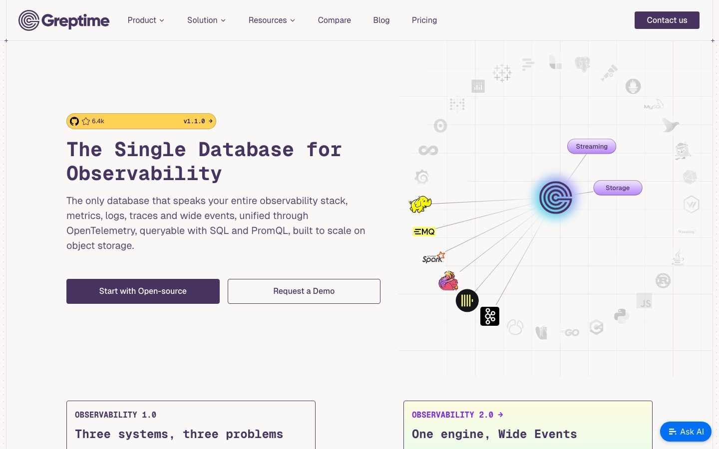
Greptime's marketing surface is a warm, developer-database interface — an off-white paper canvas (`{colors.canvas}` — #f9f8f7) carrying a distinctive deep-purple ink (`{colors.ink}` — #473460) and an all-monospace display voice. The system reads as engineering-precise and slightly retro-terminal: headlines are set in **Geist Mono** at heavy weight (800), buttons and inputs render with sharp 0px corners, and cards carry only a minimal 2–4px radius. The whole page feels like a precisely typeset technical document rather than a glossy consumer SaaS landing page.
Type voice is dominated by **Geist Mono** — h1 through h4 all run monospace, giving headlines their terminal/code character. **Geist** (the proportional sans companion) handles button labels and body copy. This is an unusually monospace-forward system: the marketing headline "The Single Database for Observability" is itself rendered in monospace, which is the brand's central signature.
Color voltage is narrow and deliberate. The deep purple (`{colors.ink}` / `{colors.primary}` — #473460) does almost everything — headlines, primary button fill, and as a translucent inset border on cards. A single warm yellow (`{colors.accent-yellow}` — #fdd254) appears on the GitHub-star badge above the hero headline. Links use a brighter violet (`{colors.link}` — #792af6). Blues (`{colors.accent-blue}` family) appear only inside product diagrams.
**Key Characteristics:**
- Warm paper canvas (`{colors.canvas}` — #f9f8f7) instead of pure white — the page reads soft and document-like.
- All-monospace headlines (Geist Mono, weight 800/700) — the central brand signature. Body and buttons use proportional Geist.
- Sharp-cornered interactive elements — `{component.button-primary}` and `{component.input}` both render with `{rounded.none}` (0px). Cards soften only slightly to `{rounded.sm}` (4px) or `{rounded.xs}` (2px).
- Deep-purple primary (`{colors.primary}` — #473460) carries headlines, button fill, and inset card borders. Near-monochrome at the action layer.
- A single yellow accent (`{colors.accent-yellow}` — #fdd254) on the GitHub-star badge — a deliberate scarce highlight.
- Product architecture is shown as in-page diagrams (data-source / application / in-database-computing blocks), some inverted to the dark purple `{component.diagram-block-dark}`.
- Tight, grid-aligned spacing rhythm built on a small base unit, with `{spacing.section}` (48px) as the dominant band separator.
## Colors
### Brand & Accent
- **Primary / Ink** (`{colors.primary}` / `{colors.ink}` — #473460): The dominant color — every headline, the primary CTA fill, and translucent inset card borders. The brand is near-monochrome around this deep purple.
- **Ink Strong** (`{colors.ink-strong}` — #191919): A near-black neutral used for the deepest text and as the derived press state for the primary button (`{colors.primary-active}`).
- **Accent Yellow** (`{colors.accent-yellow}` — #fdd254): The one warm highlight — used on the GitHub-star badge above the hero headline. A scarce, deliberate accent.
- **Link** (`{colors.link}` — #792af6): A brighter violet for inline links and "Observability 2.0 →" style callouts.
- **Accent Blue family** (`{colors.accent-blue}` — #0070f4, `{colors.accent-blue-soft}` — #3a99ff, `{colors.accent-blue-strong}` — #005fcc): Appear only inside product architecture diagrams, never on marketing CTAs.
### Surface
- **Canvas** (`{colors.canvas}` — #f9f8f7): The warm off-white page floor and default card background.
- **Surface** (`{colors.surface}` — #ffffff): Pure-white cards (e.g., testimonial / trusted-by panels) that lift slightly off the warm canvas.
- **Surface Soft** (`{colors.surface-soft}` — #f9fafb): A barely-cool near-white used in nested panels.
- **Surface Warm** (`{colors.surface-warm}` — #e6e3dd): A warm taupe used for soft dividers and section accents.
- **Hairline** (`{colors.hairline}` — #ebebeb): The 1px divider tone on light surfaces.
- **Hairline Soft** (`{colors.hairline-soft}` — #cccccc): A slightly stronger border/divider tone.
### Text
- **Ink** (`{colors.ink}` — #473460): Headlines and primary display text.
- **Body** (`{colors.body}` — #3a3a3a): Default running-text color.
- **Muted** (`{colors.muted}` — #5f6368): Secondary text — captions, metadata, fine print.
- **On Primary** (`{colors.on-primary}` — #ffffff): Text on the purple primary button and inside dark diagram blocks.
## Typography
### Font Family
The system runs **Geist Mono** for all headings (h1–h4) and **Geist** for body copy and button labels. Both are open-source typefaces from Vercel (SIL Open Font License), so they ship directly — no substitution required. The monospace headline treatment is the brand's defining trait; the proportional Geist supplies legible running text.
The split is functional:
- Geist Mono (display, weight 600–800) — h1, h2, h3, h4, badge labels, diagram labels
- Geist (body + UI, weight 400) — paragraphs, button labels
### Hierarchy
| Token | Size | Weight | Line Height | Letter Spacing | Use |
|---|---|---|---|---|---|
| `{typography.h1}` | 40px | 800 | 1.2 | normal | Hero headline ("The Single Database for Observability") — Geist Mono |
| `{typography.h2}` | 34px | 800 | 1.25 | normal | Section heads ("Plan That Fits Your Needs") — Geist Mono |
| `{typography.h3}` | 24px | 700 | 1.2 | normal | Sub-section / card titles ("Three systems, three problems") — Geist Mono |
| `{typography.h4}` | 14px | 600 | 1.5 | normal | Small labels, badge text, diagram block labels — Geist Mono |
| `{typography.body-md}` | 16px | 400 | 1.5 | normal | Default running-text — Geist (derived: family taken from the measured `button` role; body size/line-height standardized) |
| `{typography.button}` | 16px | 400 | 1.15 | normal | Button labels — Geist |
### Principles
Geist Mono is the brand voice — every headline, no matter how large or small, is monospace. Body copy and button labels drop to proportional Geist. The boundary is strict: headlines never go proportional, body copy never goes monospace. Display weight is heavy (800 at h1/h2, 700 at h3) — the monospace face at heavy weight is what gives the terminal-precise character without italics or color tricks.
### Note on Font Substitutes
Both Geist and Geist Mono are open-source (SIL OFL). No licensed/custom typeface is in use, so no substitute is required. If unavailable, `ui-monospace, monospace` covers the Geist Mono fallback and a generic `sans-serif` covers Geist.
## Layout
### Spacing System
- **Base unit:** small (4px), but the page mixes 6/8/10/12px micro-steps heavily.
- **Tokens:** `{spacing.xxs}` 4px · `{spacing.xs}` 8px · `{spacing.inline}` 10px · `{spacing.sm}` 12px · `{spacing.md}` 16px · `{spacing.lg}` 20px · `{spacing.xl}` 24px · `{spacing.xxl}` 36px · `{spacing.section}` 48px.
- **Most frequent steps:** 12px (measured 77×) and 24px (measured 61×) dominate the internal rhythm; 16px (40×) and 48px (22×) follow.
- **Section padding:** `{spacing.section}` (48px) is the largest measured spacing step — the band separator.
- **Inline padding:** Buttons measure 0px vertical × 12px horizontal padding (`{spacing.sm}`).
### Grid & Container
- **Editorial body:** Hero uses a roughly even left/right split — headline + sub-copy + button row on the left, the animated ecosystem-graph illustration on the right.
- **Feature panels:** 2-up paired cards (e.g., "Observability 1.0" vs "Observability 2.0").
- **Architecture diagram:** A centered multi-block stack (Data sources / Applications → standard protocols → in-database computing → object storage).
- **Plans:** 2-up ("Open source" / "Enterprise").
- **Footer:** Multi-column link list (Products / Resources / Community / Company).
### Whitespace Philosophy
The page is grid-aligned and dense in a documentation-like way — content sits inside framed panels with thin inset borders rather than floating in open whitespace. The 48px section rhythm separates major bands, while the heavy use of 12px/24px steps keeps panel internals tight and tabular.
## Elevation & Depth
| Level | Treatment | Use |
|---|---|---|
| Flat | No shadow, warm-canvas background | Body sections, top nav, most cards |
| Inset border | `rgba(71,52,96,0.45) 0px 0px 0px 1px inset` | Purple-tinted inset outline on framed panels (uses `{colors.primary}` at 45% alpha) |
| Hairline ring | `rgba(255,255,255,0.196) 0px 0px 0px 1px` | Subtle 1px ring on elements over darker fields |
| Soft drop | `rgba(0,0,0,0.05) 0px 1px 2px` | Faint lift on small interactive chips |
| Card drop | `rgba(0,0,0,0.08) 0px 4px 12px` | Lifted cards (testimonial / trusted-by panels) |
| Strong drop | `rgba(0,0,0,0.1) 0px 12px 32px, rgba(0,0,0,0.08) 0px 2px 6px` | The most-elevated single element (e.g., a focused/overlay panel) |
The elevation philosophy is **flat-with-thin-borders**. The signature depth cue is the purple inset border (`{colors.primary}` at 45% alpha) rather than drop shadows — content is framed, not floated. Drop shadows appear sparingly on a few lifted panels.
## Shapes
### Border Radius Scale
| Token | Value | Use |
|---|---|---|
| `{rounded.none}` | 0px | Buttons (`{component.button-primary}`) and inputs (`{component.input}`) — the sharp-corner signature |
| `{rounded.xs}` | 2px | Most-frequent radius (measured 40×) — diagram blocks, small chips |
| `{rounded.sm}` | 4px | Card corners (measured 31×) — the standard content-card radius |
| `{rounded.md}` | 8px | Rare (measured 1×) — occasional larger panel |
| `{rounded.full}` | 9999px | Pill chips ("Streaming" / "Storage" tags in the hero graph) |
### Geometry
The system is corner-sharp: primary actions and form fields render at exactly 0px radius, giving the interface its precise, terminal-like edge. Cards relax only to 2–4px — just enough to read as panels, never as soft consumer cards. Only the small in-graph category tags ("Streaming", "Storage") use full pill radius.
## Components
### Top Navigation
**`top-nav`** — Warm-canvas nav bar across the top of every page. Carries the Greptime wordmark + spiral logo at left, a horizontal menu center (Product, Solution, Resources, Compare, Blog, Pricing), and a "Contact us" `{component.button-primary}` at right. Menu items in `{colors.ink}`, type from `{typography.body-md}`.
### Buttons
**`button-primary`** — The signature primary CTA. Background `{colors.primary}` (#473460), text `{colors.on-primary}`, type `{typography.button}` (Geist 16px / 400), padding 0px × 12px, rounded `{rounded.none}` (sharp 0px corners). Used for "Start with Open-source" and "Contact us". Press state `button-primary-active` shifts to `{colors.primary-active}` (#191919) — derived from the measured near-black neutral.
**`button-secondary`** — White / outlined companion button (e.g., "Request a Demo"). Background `{colors.surface}`, text `{colors.ink}`, hairline border, same sharp `{rounded.none}` corners and 0×12 padding as primary. Derived from screenshot ground-truth — its measured fill matches the white surface.
### Badges & Chips
**`github-badge`** — The yellow GitHub-star badge above the hero headline. Background `{colors.accent-yellow}` (#fdd254), text `{colors.ink}`, type `{typography.h4}` (Geist Mono 14px / 600), rounded `{rounded.sm}`, padding 0×12. Shows the star count ("6.4k") and release tag ("v1.1.0 →"). The only place the yellow accent appears.
### Cards & Containers
**`card`** — Standard framed panel on the warm canvas. Background `{colors.canvas}` (#f9f8f7), rounded `{rounded.sm}` (4px), no drop shadow — depth comes from the purple inset border (`{colors.primary}` at 45% alpha). Used for the "Observability 1.0 / 2.0" comparison panels, plan cards, and blog cards.
**`card-white`** — A lifted white variant. Background `{colors.surface}` (#ffffff), rounded `{rounded.sm}`, carries a soft drop shadow (`rgba(0,0,0,0.08) 0px 4px 12px`). Used for the testimonial / trusted-by panel that needs to lift off the warm canvas.
**`diagram-block-dark`** — Inverted blocks inside the product architecture diagram (e.g., "In-Database Computing", "GreptimeDB", "Object Storage"). Background `{colors.primary}` (#473460), text `{colors.on-primary}`, type `{typography.h4}`, rounded `{rounded.xs}` (2px). The dark purple fill marks the database's own engine layers within the diagram.
### Inputs & Forms
**`input`** — Text inputs (e.g., the newsletter "Email Address" field). Background `{colors.surface}`, text `{colors.body}`, type `{typography.body-md}`, rounded `{rounded.none}` (sharp 0px corners). The sharp-corner treatment matches the buttons.
### Links
**`text-link`** — Inline links in `{colors.link}` (#792af6) — a brighter violet than the ink. Used for "Observability 2.0 →", "In-depth Comparison", "View All Blogs", and footer links.
### Footer
**`footer`** — Warm-canvas footer (background `{colors.canvas}`) carrying the Greptime wordmark, address block, newsletter signup with `{component.input}` + a `{component.button-primary}` ("Subscribe"), and a multi-column link list (Products / Resources / Community / Company). Body text in `{colors.body}`, type `{typography.body-md}`. Unlike many systems, the footer stays light — Greptime has no dark closing band.
## Do's and Don'ts
### Do
- Set every headline in **Geist Mono** (weight 800 at h1/h2, 700 at h3). The monospace headline is the brand's defining trait.
- Reserve `{colors.primary}` (#473460) for headlines, primary CTAs, and inset card borders. The system is near-monochrome around this purple.
- Keep buttons and inputs sharp-cornered (`{rounded.none}` — 0px). The crisp edge is part of the engineering-precise voice.
- Use the warm canvas (`{colors.canvas}` — #f9f8f7), not pure white, as the page floor. The paper tone is intentional.
- Limit `{colors.accent-yellow}` to the GitHub-star badge — keep it a scarce, single highlight.
- Frame content with the purple inset border rather than heavy shadows. Panels are framed, not floated.
- Use `{colors.link}` (#792af6) for inline links so they read distinct from the deeper ink headlines.
### Don't
- Don't set headlines in a proportional font or body copy in monospace — the boundary is strict.
- Don't round buttons or inputs. Sharp 0px corners are the signature; consumer-style pill buttons read off-brand.
- Don't use the blue accents (`{colors.accent-blue}` family) outside product diagrams — they are diagram-only.
- Don't spread the yellow accent across multiple UI elements; it belongs to the GitHub badge.
- Don't introduce a dark footer or other dark bands — the architecture `{component.diagram-block-dark}` blocks are the only dark surfaces.
- Don't add hover state styling beyond what's encoded — primary darkens on press; nothing else changes.
## Responsive Behavior
### Breakpoints
The captured pages were measured at desktop width. Specific breakpoint values were not extracted; the descriptions below are inferred from layout structure and should be confirmed against the live site.
| Name | Width | Key Changes (inferred) |
|---|---|---|
| Mobile | < 768px | Hero splits to single column — headline + copy + buttons first, ecosystem graph below; paired panels stack 1-up; footer columns collapse |
| Tablet | 768–1024px | Nav tightens; paired panels may stay 2-up or wrap; architecture diagram scales down |
| Desktop | > 1024px | Full horizontal nav, even hero split, 2-up panels, full multi-column footer |
### Touch Targets
- Button vertical padding measures 0px — effective tap height is driven by the button's line box and any container padding; confirm against live measurements to ensure ≥44px tap targets.
- `{component.input}` and `{component.button-primary}` heights were not measured.
### Collapsing Strategy
- The hero's two-column split (headline left / ecosystem-graph illustration right) collapses to single column on narrow viewports.
- Paired comparison and plan panels reduce from 2-up to 1-up.
- The architecture diagram (a wide multi-block flow) is the most fragile element on small screens and likely scales or scrolls.
### Image Behavior
- The hero ecosystem graph (animated connection diagram with integration logos) and the isometric "why the architecture works" illustrations are decorative SVG/graphic compositions; exact responsive scaling was not measured.
## Iteration Guide
1. Focus on ONE component at a time. Reference its YAML key directly (`{component.button-primary}`, `{component.card}`).
2. Variants of an existing component (`-active`, secondary forms) live as separate entries in `components:`.
3. Use `{token.refs}` everywhere — never inline hex.
4. Never document hover. Default and Active/Pressed states only.
5. Headlines stay Geist Mono (800/700), body stays Geist 400 — the monospace/proportional split does not blur.
6. Keep interactive elements sharp-cornered; cards relax only to 2–4px.
7. When in doubt about emphasis: heavier Geist Mono and the purple ink, not new colors.
## Known Gaps
- **Body and nav typography were not directly measured.** Only h1–h4 (Geist Mono) and the button role (Geist) were captured. `{typography.body-md}` is derived (family from the measured button role; size/line-height standardized) — confirm against the live CSS.
- **Button and input heights were not measured.** Padding was captured (0px × 12px for buttons) but vertical sizing / min tap height needs confirmation.
- **`button-primary-active` (#191919) is derived** from the measured near-black neutral; the true pressed-state color was not captured.
- **`button-secondary` fill/border** is documented from screenshot ground-truth (the outlined "Request a Demo" button); its border color was not isolated in the measurement.
- **Breakpoint values are inferred**, not measured — only desktop renders were captured.
- **Semantic states** (success / warning / error, form validation) were not extracted; the blue accents appear only inside product diagrams in the captured pages.
- **Animation and transition timings** (hero ecosystem-graph motion, diagram reveals) are out of scope.
- The exact role of several measured neutral grays (#2a2a2a, #333333, #363636, #4a4a4a, #000000) was not isolated; they were collapsed into `{colors.body}` / `{colors.ink-strong}` for documentation.
<!-- Documented by duply · real-world design systems as ready-to-use DESIGN.md for AI coding agents · https://duply.ai/greptime/design-md -->
Color Palette
Accent
Neutrals
Typography
h140px · 800 · 1.2
The quick brown fox jumpsh234px · 800 · 1.25
The quick brown fox jumpsh324px · 700 · 1.2
The quick brown fox jumpsh414px · 600 · 1.5
The quick brown fox jumpsbody-md16px · 400 · 1.5
The quick brown fox jumpsbutton16px · 400 · 1.15
The quick brown fox jumpsSpacing & Shape
Spacing
| Name | Value | Preview |
|---|---|---|
| xxs | 4px | |
| xs | 8px | |
| inline | 10px | |
| sm | 12px | |
| md | 16px | |
| lg | 20px | |
| xl | 24px | |
| xxl | 36px | |
| section | 48px |
Border Radius
| Name | Value | Preview |
|---|---|---|
| none | 0px | |
| xs | 2px | |
| sm | 4px | |
| md | 8px | |
| full | 9999px |
More like this


---
version: alpha
name: Greptime-design-analysis
description: "A warm-canvas, developer-database marketing surface anchored on an off-white paper background (#f9f8f7) with a distinctive deep-purple ink (#473460) and a monospace display voice (Geist Mono, weight 800). The system reads as engineering-precise and slightly retro-terminal — sharp-cornered buttons and inputs (0px radius), low-radius cards (2–4px), a single yellow accent badge, and purple links. Brand voltage comes from the all-monospace headline treatment and the purple/yellow pairing rather than from large color fields."
colors:
  primary: "#473460"
  primary-active: "#191919"
  ink: "#473460"
  ink-strong: "#191919"
  body: "#3a3a3a"
  muted: "#5f6368"
  canvas: "#f9f8f7"
  surface: "#ffffff"
  surface-soft: "#f9fafb"
  surface-warm: "#e6e3dd"
  hairline: "#ebebeb"
  hairline-soft: "#cccccc"
  accent-yellow: "#fdd254"
  link: "#792af6"
  accent-blue: "#0070f4"
  accent-blue-soft: "#3a99ff"
  accent-blue-strong: "#005fcc"
  on-primary: "#ffffff"
typography:
  h1:
    fontFamily: "Geist Mono, ui-monospace, monospace"
    fontSize: 40px
    fontWeight: 800
    lineHeight: 1.2
    letterSpacing: normal
  h2:
    fontFamily: "Geist Mono, ui-monospace, monospace"
    fontSize: 34px
    fontWeight: 800
    lineHeight: 1.25
    letterSpacing: normal
  h3:
    fontFamily: "Geist Mono, ui-monospace, monospace"
    fontSize: 24px
    fontWeight: 700
    lineHeight: 1.2
    letterSpacing: normal
  h4:
    fontFamily: "Geist Mono, ui-monospace, monospace"
    fontSize: 14px
    fontWeight: 600
    lineHeight: 1.5
    letterSpacing: normal
  body-md:
    fontFamily: "Geist, sans-serif"
    fontSize: 16px
    fontWeight: 400
    lineHeight: 1.5
    letterSpacing: normal
  button:
    fontFamily: "Geist, sans-serif"
    fontSize: 16px
    fontWeight: 400
    lineHeight: 1.15
    letterSpacing: normal
rounded:
  none: 0px
  xs: 2px
  sm: 4px
  md: 8px
  full: 9999px
spacing:
  xxs: 4px
  xs: 8px
  inline: 10px
  sm: 12px
  md: 16px
  lg: 20px
  xl: 24px
  xxl: 36px
  section: 48px
components:
  button-primary:
    backgroundColor: "{colors.primary}"
    textColor: "{colors.on-primary}"
    typography: "{typography.button}"
    rounded: "{rounded.none}"
    padding: 0px 12px
  button-primary-active:
    backgroundColor: "{colors.primary-active}"
    textColor: "{colors.on-primary}"
    rounded: "{rounded.none}"
  button-secondary:
    backgroundColor: "{colors.surface}"
    textColor: "{colors.ink}"
    typography: "{typography.button}"
    rounded: "{rounded.none}"
    padding: 0px 12px
  github-badge:
    backgroundColor: "{colors.accent-yellow}"
    textColor: "{colors.ink}"
    typography: "{typography.h4}"
    rounded: "{rounded.sm}"
    padding: 0px 12px
  card:
    backgroundColor: "{colors.canvas}"
    textColor: "{colors.body}"
    typography: "{typography.body-md}"
    rounded: "{rounded.sm}"
  card-white:
    backgroundColor: "{colors.surface}"
    textColor: "{colors.body}"
    typography: "{typography.body-md}"
    rounded: "{rounded.sm}"
  diagram-block-dark:
    backgroundColor: "{colors.primary}"
    textColor: "{colors.on-primary}"
    typography: "{typography.h4}"
    rounded: "{rounded.xs}"
  input:
    backgroundColor: "{colors.surface}"
    textColor: "{colors.body}"
    typography: "{typography.body-md}"
    rounded: "{rounded.none}"
  top-nav:
    backgroundColor: "{colors.canvas}"
    textColor: "{colors.ink}"
    typography: "{typography.body-md}"
  text-link:
    backgroundColor: transparent
    textColor: "{colors.link}"
    typography: "{typography.body-md}"
  footer:
    backgroundColor: "{colors.canvas}"
    textColor: "{colors.body}"
    typography: "{typography.body-md}"
---

## Overview

Greptime's marketing surface is a warm, developer-database interface — an off-white paper canvas (`{colors.canvas}` — #f9f8f7) carrying a distinctive deep-purple ink (`{colors.ink}` — #473460) and an all-monospace display voice. The system reads as engineering-precise and slightly retro-terminal: headlines are set in **Geist Mono** at heavy weight (800), buttons and inputs render with sharp 0px corners, and cards carry only a minimal 2–4px radius. The whole page feels like a precisely typeset technical document rather than a glossy consumer SaaS landing page.

Type voice is dominated by **Geist Mono** — h1 through h4 all run monospace, giving headlines their terminal/code character. **Geist** (the proportional sans companion) handles button labels and body copy. This is an unusually monospace-forward system: the marketing headline "The Single Database for Observability" is itself rendered in monospace, which is the brand's central signature.

Color voltage is narrow and deliberate. The deep purple (`{colors.ink}` / `{colors.primary}` — #473460) does almost everything — headlines, primary button fill, and as a translucent inset border on cards. A single warm yellow (`{colors.accent-yellow}` — #fdd254) appears on the GitHub-star badge above the hero headline. Links use a brighter violet (`{colors.link}` — #792af6). Blues (`{colors.accent-blue}` family) appear only inside product diagrams.

**Key Characteristics:**
- Warm paper canvas (`{colors.canvas}` — #f9f8f7) instead of pure white — the page reads soft and document-like.
- All-monospace headlines (Geist Mono, weight 800/700) — the central brand signature. Body and buttons use proportional Geist.
- Sharp-cornered interactive elements — `{component.button-primary}` and `{component.input}` both render with `{rounded.none}` (0px). Cards soften only slightly to `{rounded.sm}` (4px) or `{rounded.xs}` (2px).
- Deep-purple primary (`{colors.primary}` — #473460) carries headlines, button fill, and inset card borders. Near-monochrome at the action layer.
- A single yellow accent (`{colors.accent-yellow}` — #fdd254) on the GitHub-star badge — a deliberate scarce highlight.
- Product architecture is shown as in-page diagrams (data-source / application / in-database-computing blocks), some inverted to the dark purple `{component.diagram-block-dark}`.
- Tight, grid-aligned spacing rhythm built on a small base unit, with `{spacing.section}` (48px) as the dominant band separator.

## Colors

### Brand & Accent
- **Primary / Ink** (`{colors.primary}` / `{colors.ink}` — #473460): The dominant color — every headline, the primary CTA fill, and translucent inset card borders. The brand is near-monochrome around this deep purple.
- **Ink Strong** (`{colors.ink-strong}` — #191919): A near-black neutral used for the deepest text and as the derived press state for the primary button (`{colors.primary-active}`).
- **Accent Yellow** (`{colors.accent-yellow}` — #fdd254): The one warm highlight — used on the GitHub-star badge above the hero headline. A scarce, deliberate accent.
- **Link** (`{colors.link}` — #792af6): A brighter violet for inline links and "Observability 2.0 →" style callouts.
- **Accent Blue family** (`{colors.accent-blue}` — #0070f4, `{colors.accent-blue-soft}` — #3a99ff, `{colors.accent-blue-strong}` — #005fcc): Appear only inside product architecture diagrams, never on marketing CTAs.

### Surface
- **Canvas** (`{colors.canvas}` — #f9f8f7): The warm off-white page floor and default card background.
- **Surface** (`{colors.surface}` — #ffffff): Pure-white cards (e.g., testimonial / trusted-by panels) that lift slightly off the warm canvas.
- **Surface Soft** (`{colors.surface-soft}` — #f9fafb): A barely-cool near-white used in nested panels.
- **Surface Warm** (`{colors.surface-warm}` — #e6e3dd): A warm taupe used for soft dividers and section accents.
- **Hairline** (`{colors.hairline}` — #ebebeb): The 1px divider tone on light surfaces.
- **Hairline Soft** (`{colors.hairline-soft}` — #cccccc): A slightly stronger border/divider tone.

### Text
- **Ink** (`{colors.ink}` — #473460): Headlines and primary display text.
- **Body** (`{colors.body}` — #3a3a3a): Default running-text color.
- **Muted** (`{colors.muted}` — #5f6368): Secondary text — captions, metadata, fine print.
- **On Primary** (`{colors.on-primary}` — #ffffff): Text on the purple primary button and inside dark diagram blocks.

## Typography

### Font Family
The system runs **Geist Mono** for all headings (h1–h4) and **Geist** for body copy and button labels. Both are open-source typefaces from Vercel (SIL Open Font License), so they ship directly — no substitution required. The monospace headline treatment is the brand's defining trait; the proportional Geist supplies legible running text.

The split is functional:
- Geist Mono (display, weight 600–800) — h1, h2, h3, h4, badge labels, diagram labels
- Geist (body + UI, weight 400) — paragraphs, button labels

### Hierarchy

| Token | Size | Weight | Line Height | Letter Spacing | Use |
|---|---|---|---|---|---|
| `{typography.h1}` | 40px | 800 | 1.2 | normal | Hero headline ("The Single Database for Observability") — Geist Mono |
| `{typography.h2}` | 34px | 800 | 1.25 | normal | Section heads ("Plan That Fits Your Needs") — Geist Mono |
| `{typography.h3}` | 24px | 700 | 1.2 | normal | Sub-section / card titles ("Three systems, three problems") — Geist Mono |
| `{typography.h4}` | 14px | 600 | 1.5 | normal | Small labels, badge text, diagram block labels — Geist Mono |
| `{typography.body-md}` | 16px | 400 | 1.5 | normal | Default running-text — Geist (derived: family taken from the measured `button` role; body size/line-height standardized) |
| `{typography.button}` | 16px | 400 | 1.15 | normal | Button labels — Geist |

### Principles
Geist Mono is the brand voice — every headline, no matter how large or small, is monospace. Body copy and button labels drop to proportional Geist. The boundary is strict: headlines never go proportional, body copy never goes monospace. Display weight is heavy (800 at h1/h2, 700 at h3) — the monospace face at heavy weight is what gives the terminal-precise character without italics or color tricks.

### Note on Font Substitutes
Both Geist and Geist Mono are open-source (SIL OFL). No licensed/custom typeface is in use, so no substitute is required. If unavailable, `ui-monospace, monospace` covers the Geist Mono fallback and a generic `sans-serif` covers Geist.

## Layout

### Spacing System
- **Base unit:** small (4px), but the page mixes 6/8/10/12px micro-steps heavily.
- **Tokens:** `{spacing.xxs}` 4px · `{spacing.xs}` 8px · `{spacing.inline}` 10px · `{spacing.sm}` 12px · `{spacing.md}` 16px · `{spacing.lg}` 20px · `{spacing.xl}` 24px · `{spacing.xxl}` 36px · `{spacing.section}` 48px.
- **Most frequent steps:** 12px (measured 77×) and 24px (measured 61×) dominate the internal rhythm; 16px (40×) and 48px (22×) follow.
- **Section padding:** `{spacing.section}` (48px) is the largest measured spacing step — the band separator.
- **Inline padding:** Buttons measure 0px vertical × 12px horizontal padding (`{spacing.sm}`).

### Grid & Container
- **Editorial body:** Hero uses a roughly even left/right split — headline + sub-copy + button row on the left, the animated ecosystem-graph illustration on the right.
- **Feature panels:** 2-up paired cards (e.g., "Observability 1.0" vs "Observability 2.0").
- **Architecture diagram:** A centered multi-block stack (Data sources / Applications → standard protocols → in-database computing → object storage).
- **Plans:** 2-up ("Open source" / "Enterprise").
- **Footer:** Multi-column link list (Products / Resources / Community / Company).

### Whitespace Philosophy
The page is grid-aligned and dense in a documentation-like way — content sits inside framed panels with thin inset borders rather than floating in open whitespace. The 48px section rhythm separates major bands, while the heavy use of 12px/24px steps keeps panel internals tight and tabular.

## Elevation & Depth

| Level | Treatment | Use |
|---|---|---|
| Flat | No shadow, warm-canvas background | Body sections, top nav, most cards |
| Inset border | `rgba(71,52,96,0.45) 0px 0px 0px 1px inset` | Purple-tinted inset outline on framed panels (uses `{colors.primary}` at 45% alpha) |
| Hairline ring | `rgba(255,255,255,0.196) 0px 0px 0px 1px` | Subtle 1px ring on elements over darker fields |
| Soft drop | `rgba(0,0,0,0.05) 0px 1px 2px` | Faint lift on small interactive chips |
| Card drop | `rgba(0,0,0,0.08) 0px 4px 12px` | Lifted cards (testimonial / trusted-by panels) |
| Strong drop | `rgba(0,0,0,0.1) 0px 12px 32px, rgba(0,0,0,0.08) 0px 2px 6px` | The most-elevated single element (e.g., a focused/overlay panel) |

The elevation philosophy is **flat-with-thin-borders**. The signature depth cue is the purple inset border (`{colors.primary}` at 45% alpha) rather than drop shadows — content is framed, not floated. Drop shadows appear sparingly on a few lifted panels.

## Shapes

### Border Radius Scale

| Token | Value | Use |
|---|---|---|
| `{rounded.none}` | 0px | Buttons (`{component.button-primary}`) and inputs (`{component.input}`) — the sharp-corner signature |
| `{rounded.xs}` | 2px | Most-frequent radius (measured 40×) — diagram blocks, small chips |
| `{rounded.sm}` | 4px | Card corners (measured 31×) — the standard content-card radius |
| `{rounded.md}` | 8px | Rare (measured 1×) — occasional larger panel |
| `{rounded.full}` | 9999px | Pill chips ("Streaming" / "Storage" tags in the hero graph) |

### Geometry
The system is corner-sharp: primary actions and form fields render at exactly 0px radius, giving the interface its precise, terminal-like edge. Cards relax only to 2–4px — just enough to read as panels, never as soft consumer cards. Only the small in-graph category tags ("Streaming", "Storage") use full pill radius.

## Components

### Top Navigation

**`top-nav`** — Warm-canvas nav bar across the top of every page. Carries the Greptime wordmark + spiral logo at left, a horizontal menu center (Product, Solution, Resources, Compare, Blog, Pricing), and a "Contact us" `{component.button-primary}` at right. Menu items in `{colors.ink}`, type from `{typography.body-md}`.

### Buttons

**`button-primary`** — The signature primary CTA. Background `{colors.primary}` (#473460), text `{colors.on-primary}`, type `{typography.button}` (Geist 16px / 400), padding 0px × 12px, rounded `{rounded.none}` (sharp 0px corners). Used for "Start with Open-source" and "Contact us". Press state `button-primary-active` shifts to `{colors.primary-active}` (#191919) — derived from the measured near-black neutral.

**`button-secondary`** — White / outlined companion button (e.g., "Request a Demo"). Background `{colors.surface}`, text `{colors.ink}`, hairline border, same sharp `{rounded.none}` corners and 0×12 padding as primary. Derived from screenshot ground-truth — its measured fill matches the white surface.

### Badges & Chips

**`github-badge`** — The yellow GitHub-star badge above the hero headline. Background `{colors.accent-yellow}` (#fdd254), text `{colors.ink}`, type `{typography.h4}` (Geist Mono 14px / 600), rounded `{rounded.sm}`, padding 0×12. Shows the star count ("6.4k") and release tag ("v1.1.0 →"). The only place the yellow accent appears.

### Cards & Containers

**`card`** — Standard framed panel on the warm canvas. Background `{colors.canvas}` (#f9f8f7), rounded `{rounded.sm}` (4px), no drop shadow — depth comes from the purple inset border (`{colors.primary}` at 45% alpha). Used for the "Observability 1.0 / 2.0" comparison panels, plan cards, and blog cards.

**`card-white`** — A lifted white variant. Background `{colors.surface}` (#ffffff), rounded `{rounded.sm}`, carries a soft drop shadow (`rgba(0,0,0,0.08) 0px 4px 12px`). Used for the testimonial / trusted-by panel that needs to lift off the warm canvas.

**`diagram-block-dark`** — Inverted blocks inside the product architecture diagram (e.g., "In-Database Computing", "GreptimeDB", "Object Storage"). Background `{colors.primary}` (#473460), text `{colors.on-primary}`, type `{typography.h4}`, rounded `{rounded.xs}` (2px). The dark purple fill marks the database's own engine layers within the diagram.

### Inputs & Forms

**`input`** — Text inputs (e.g., the newsletter "Email Address" field). Background `{colors.surface}`, text `{colors.body}`, type `{typography.body-md}`, rounded `{rounded.none}` (sharp 0px corners). The sharp-corner treatment matches the buttons.

### Links

**`text-link`** — Inline links in `{colors.link}` (#792af6) — a brighter violet than the ink. Used for "Observability 2.0 →", "In-depth Comparison", "View All Blogs", and footer links.

### Footer

**`footer`** — Warm-canvas footer (background `{colors.canvas}`) carrying the Greptime wordmark, address block, newsletter signup with `{component.input}` + a `{component.button-primary}` ("Subscribe"), and a multi-column link list (Products / Resources / Community / Company). Body text in `{colors.body}`, type `{typography.body-md}`. Unlike many systems, the footer stays light — Greptime has no dark closing band.

## Do's and Don'ts

### Do
- Set every headline in **Geist Mono** (weight 800 at h1/h2, 700 at h3). The monospace headline is the brand's defining trait.
- Reserve `{colors.primary}` (#473460) for headlines, primary CTAs, and inset card borders. The system is near-monochrome around this purple.
- Keep buttons and inputs sharp-cornered (`{rounded.none}` — 0px). The crisp edge is part of the engineering-precise voice.
- Use the warm canvas (`{colors.canvas}` — #f9f8f7), not pure white, as the page floor. The paper tone is intentional.
- Limit `{colors.accent-yellow}` to the GitHub-star badge — keep it a scarce, single highlight.
- Frame content with the purple inset border rather than heavy shadows. Panels are framed, not floated.
- Use `{colors.link}` (#792af6) for inline links so they read distinct from the deeper ink headlines.

### Don't
- Don't set headlines in a proportional font or body copy in monospace — the boundary is strict.
- Don't round buttons or inputs. Sharp 0px corners are the signature; consumer-style pill buttons read off-brand.
- Don't use the blue accents (`{colors.accent-blue}` family) outside product diagrams — they are diagram-only.
- Don't spread the yellow accent across multiple UI elements; it belongs to the GitHub badge.
- Don't introduce a dark footer or other dark bands — the architecture `{component.diagram-block-dark}` blocks are the only dark surfaces.
- Don't add hover state styling beyond what's encoded — primary darkens on press; nothing else changes.

## Responsive Behavior

### Breakpoints
The captured pages were measured at desktop width. Specific breakpoint values were not extracted; the descriptions below are inferred from layout structure and should be confirmed against the live site.

| Name | Width | Key Changes (inferred) |
|---|---|---|
| Mobile | < 768px | Hero splits to single column — headline + copy + buttons first, ecosystem graph below; paired panels stack 1-up; footer columns collapse |
| Tablet | 768–1024px | Nav tightens; paired panels may stay 2-up or wrap; architecture diagram scales down |
| Desktop | > 1024px | Full horizontal nav, even hero split, 2-up panels, full multi-column footer |

### Touch Targets
- Button vertical padding measures 0px — effective tap height is driven by the button's line box and any container padding; confirm against live measurements to ensure ≥44px tap targets.
- `{component.input}` and `{component.button-primary}` heights were not measured.

### Collapsing Strategy
- The hero's two-column split (headline left / ecosystem-graph illustration right) collapses to single column on narrow viewports.
- Paired comparison and plan panels reduce from 2-up to 1-up.
- The architecture diagram (a wide multi-block flow) is the most fragile element on small screens and likely scales or scrolls.

### Image Behavior
- The hero ecosystem graph (animated connection diagram with integration logos) and the isometric "why the architecture works" illustrations are decorative SVG/graphic compositions; exact responsive scaling was not measured.

## Iteration Guide

1. Focus on ONE component at a time. Reference its YAML key directly (`{component.button-primary}`, `{component.card}`).
2. Variants of an existing component (`-active`, secondary forms) live as separate entries in `components:`.
3. Use `{token.refs}` everywhere — never inline hex.
4. Never document hover. Default and Active/Pressed states only.
5. Headlines stay Geist Mono (800/700), body stays Geist 400 — the monospace/proportional split does not blur.
6. Keep interactive elements sharp-cornered; cards relax only to 2–4px.
7. When in doubt about emphasis: heavier Geist Mono and the purple ink, not new colors.

## Known Gaps

- **Body and nav typography were not directly measured.** Only h1–h4 (Geist Mono) and the button role (Geist) were captured. `{typography.body-md}` is derived (family from the measured button role; size/line-height standardized) — confirm against the live CSS.
- **Button and input heights were not measured.** Padding was captured (0px × 12px for buttons) but vertical sizing / min tap height needs confirmation.
- **`button-primary-active` (#191919) is derived** from the measured near-black neutral; the true pressed-state color was not captured.
- **`button-secondary` fill/border** is documented from screenshot ground-truth (the outlined "Request a Demo" button); its border color was not isolated in the measurement.
- **Breakpoint values are inferred**, not measured — only desktop renders were captured.
- **Semantic states** (success / warning / error, form validation) were not extracted; the blue accents appear only inside product diagrams in the captured pages.
- **Animation and transition timings** (hero ecosystem-graph motion, diagram reveals) are out of scope.
- The exact role of several measured neutral grays (#2a2a2a, #333333, #363636, #4a4a4a, #000000) was not isolated; they were collapsed into `{colors.body}` / `{colors.ink-strong}` for documentation.

<!-- Documented by duply · real-world design systems as ready-to-use DESIGN.md for AI coding agents · https://duply.ai/greptime/design-md -->