Decagon
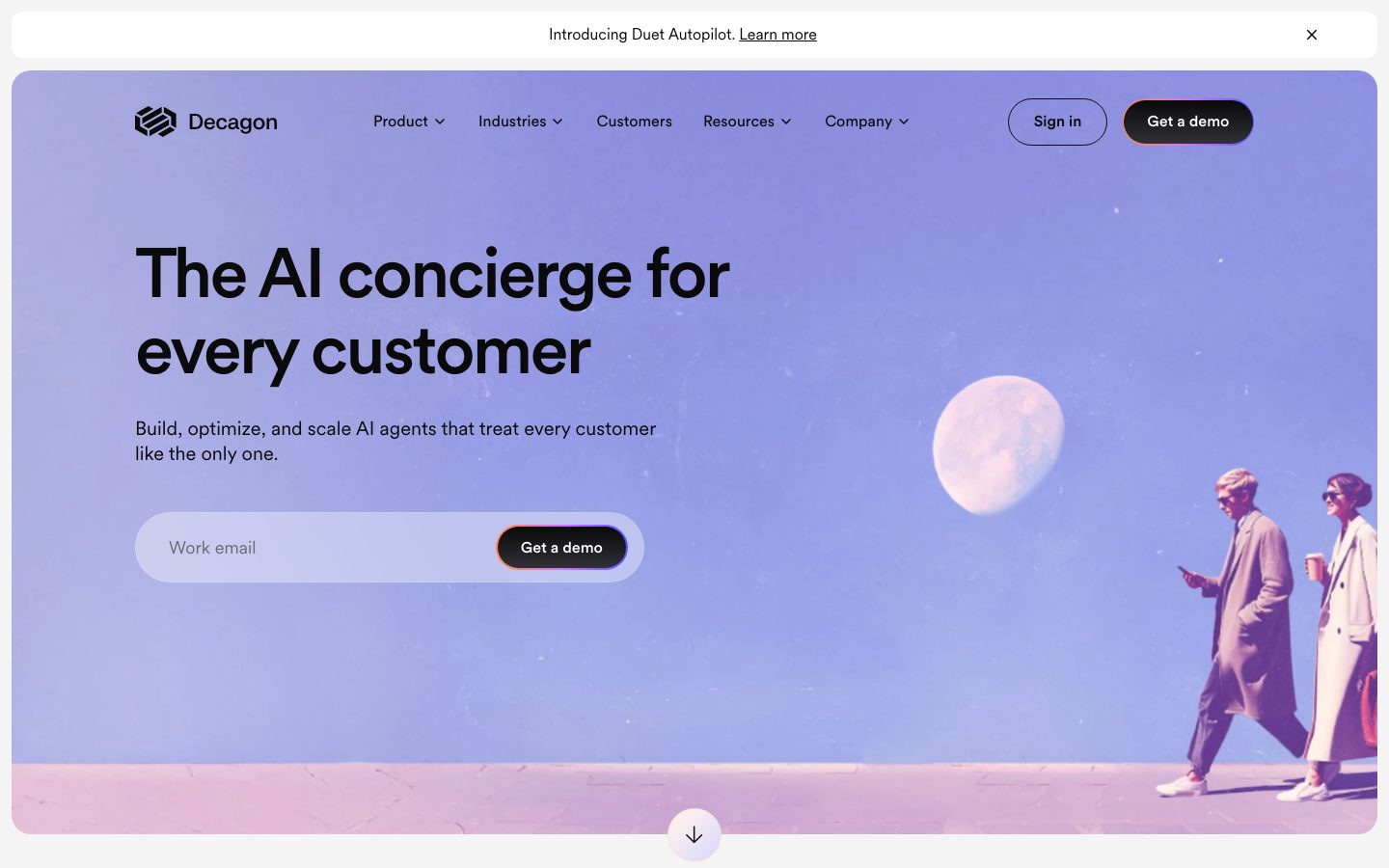
A confident enterprise-AI marketing surface built on a soft indigo-to-lavender gradient hero, near-black pill CTAs with a warm orange edge-glow, and the geometric Circular display typeface. The system reads as premium-modern-SaaS — large rounded display headlines, generous whitespace, a full-bleed dark "platform" band that anchors the mid-page, and a row of saturated stat-metric blocks that inject color. Brand voltage comes from the indigo accent (#5754ff), the gradient hero atmosphere, and the dark CTA pill rimmed in orange.
---
version: alpha
name: Decagon-design-analysis
description: A confident enterprise-AI marketing surface built on a soft indigo-to-lavender gradient hero, near-black pill CTAs with a warm orange edge-glow, and the geometric Circular display typeface. The system reads as premium-modern-SaaS — large rounded display headlines, generous whitespace, a full-bleed dark "platform" band that anchors the mid-page, and a row of saturated stat-metric blocks that inject color. Brand voltage comes from the indigo accent (#5754ff), the gradient hero atmosphere, and the dark CTA pill rimmed in orange.
colors:
  primary: "#5754ff"
  primary-active: "#4643cc"
  ink: "#0a0a0b"
  neutral-black: "#131313"
  pure-black: "#000000"
  body: "#898994"
  canvas: "#ffffff"
  surface-dark: "#131313"
  surface-dark-elevated: "#222222"
  surface-dark-soft: "#303030"
  surface-strong: "#d4d4d8"
  muted: "#eaeaec"
  hairline: "#e0e1e0"
  hairline-soft: "#eeeeee"
  accent-orange: "#ff6f22"
  accent-lavender: "#d499fe"
  accent-green-dark: "#0f281b"
  accent-green: "#2b4539"
  tint-indigo: "#e1e1ff"
  tint-indigo-soft: "#f0f0ff"
  tint-peach: "#fff2eb"
  on-primary: "#ffffff"
  on-dark: "#ffffff"
typography:
  display:
    fontFamily: "Circularxx, Inter, sans-serif"
    fontSize: 72px
    fontWeight: 500
    lineHeight: 1.1
    letterSpacing: -2.88px
  title:
    fontFamily: "Circularxx Book, Inter, sans-serif"
    fontSize: 40px
    fontWeight: 450
    lineHeight: 1.2
    letterSpacing: -1px
  heading:
    fontFamily: "Circularxx, Inter, sans-serif"
    fontSize: 30px
    fontWeight: 400
    lineHeight: 1.2
    letterSpacing: -0.3px
  body:
    fontFamily: "Circularxx Book, Inter, sans-serif"
    fontSize: 16px
    fontWeight: 450
    lineHeight: 1.3
    letterSpacing: 0
  button:
    fontFamily: "FK Grotesk Neue, Inter, sans-serif"
    fontSize: 16px
    fontWeight: 500
    lineHeight: 1.5
    letterSpacing: 0
rounded:
  sm: 4px
  md: 12px
  lg: 16px
  xl: 20px
  xxl: 24px
  full: 9999px
spacing:
  xxs: 4px
  xs: 8px
  sm: 12px
  md: 16px
  lg: 24px
  xl: 32px
  xxl: 48px
  xxxl: 64px
  huge: 100px
  section: 128px
components:
  top-nav:
    backgroundColor: transparent
    textColor: "{colors.ink}"
    typography: "{typography.button}"
  nav-link:
    backgroundColor: transparent
    textColor: "{colors.ink}"
    typography: "{typography.button}"
  button-primary:
    backgroundColor: "{colors.neutral-black}"
    textColor: "{colors.on-dark}"
    typography: "{typography.button}"
    rounded: "{rounded.full}"
    padding: 12px 24px
  button-primary-active:
    backgroundColor: "{colors.pure-black}"
    textColor: "{colors.on-dark}"
    rounded: "{rounded.full}"
  button-secondary:
    backgroundColor: transparent
    textColor: "{colors.ink}"
    typography: "{typography.button}"
    rounded: "{rounded.full}"
    padding: 12px 24px
  hero-band:
    backgroundColor: "{colors.tint-indigo}"
    textColor: "{colors.ink}"
    typography: "{typography.display}"
    rounded: "{rounded.xxl}"
    padding: 64px
  email-capture:
    backgroundColor: "{colors.muted}"
    textColor: "{colors.body}"
    typography: "{typography.body}"
    rounded: "{rounded.full}"
    padding: 8px
  input:
    backgroundColor: transparent
    textColor: "{colors.body}"
    typography: "{typography.body}"
    rounded: "{rounded.full}"
    padding: 12px 16px
  logo-wall:
    backgroundColor: "{colors.canvas}"
    textColor: "{colors.surface-strong}"
    typography: "{typography.body}"
    padding: 48px
  card:
    backgroundColor: "{colors.canvas}"
    textColor: "{colors.ink}"
    typography: "{typography.body}"
    rounded: "{rounded.lg}"
    padding: 24px
  testimonial-card:
    backgroundColor: "{colors.canvas}"
    textColor: "{colors.ink}"
    typography: "{typography.body}"
    rounded: "{rounded.lg}"
    padding: 32px
  platform-band:
    backgroundColor: "{colors.surface-dark}"
    textColor: "{colors.on-dark}"
    typography: "{typography.title}"
    rounded: "{rounded.xxl}"
    padding: 64px
  platform-inset-card:
    backgroundColor: "{colors.surface-dark-elevated}"
    textColor: "{colors.on-dark}"
    typography: "{typography.body}"
    rounded: "{rounded.lg}"
    padding: 24px
  metric-card:
    backgroundColor: "{colors.accent-green}"
    textColor: "{colors.on-dark}"
    typography: "{typography.title}"
    rounded: "{rounded.md}"
    padding: 24px
  metric-card-indigo:
    backgroundColor: "{colors.primary}"
    textColor: "{colors.on-dark}"
    typography: "{typography.title}"
    rounded: "{rounded.md}"
    padding: 24px
  metric-card-orange:
    backgroundColor: "{colors.accent-orange}"
    textColor: "{colors.on-dark}"
    typography: "{typography.title}"
    rounded: "{rounded.md}"
    padding: 24px
  pill-tag:
    backgroundColor: "{colors.canvas}"
    textColor: "{colors.ink}"
    typography: "{typography.body}"
    rounded: "{rounded.full}"
    padding: 8px 16px
  footer:
    backgroundColor: "{colors.surface-dark}"
    textColor: "{colors.on-dark}"
    typography: "{typography.display}"
    padding: 64px
---

## Overview

Decagon's marketing surface is a premium enterprise-AI interface built around a **soft indigo-to-lavender gradient hero** (`{colors.tint-indigo}` — #e1e1ff as the closest measured tint) holding near-black display type, paired with crisp white editorial bands below. The system reads as confident-modern-SaaS — large geometric Circular headlines, generous whitespace, a full-bleed dark "platform" band (`{colors.surface-dark}` — #131313) that anchors the page's middle, and a row of saturated stat-metric blocks that inject sudden color into an otherwise restrained palette.

The type voice is **Circular** (the brand's geometric display face — used for h1, h2, h3, body) with **FK Grotesk Neue** reserved for button labels. Circular at weight 500/450/400 with aggressive negative letter-spacing on the display size (-2.88px) gives the headlines a tight, modern, slightly-condensed presence.

Brand voltage comes from three places: the **indigo accent** (`{colors.primary}` — #5754ff) used on inline links, statistics, and one metric block; the **gradient hero atmosphere** (lavender-into-peach sky behind editorial walking figures); and the signature **dark CTA pill rimmed with a warm orange edge-glow** (`{colors.accent-orange}` — #ff6f22) that makes "Get a demo" the unmistakable primary action.

The mid-page flips to a full-bleed dark surface (`{colors.surface-dark}` — #131313) carrying the "Build / Optimize / Scale your agent" narrative with embedded product-UI fragments. This is the only large dark zone above the footer, and like the footer it visually divides the long-scroll page into chapters.

**Key Characteristics:**
- Indigo-lavender gradient hero with near-black Circular display type. Soft, atmospheric, premium.
- Pill-shaped CTAs (`{rounded.full}`) everywhere — primary is near-black (`{colors.neutral-black}` — #131313) with a warm orange edge-glow; secondary is an outlined transparent pill.
- Indigo accent (`{colors.primary}` — #5754ff) used sparingly for links, big statistics, and one metric block. The brand is near-monochrome at the action layer except for the dark+orange CTA.
- A full-bleed dark platform band (`{colors.surface-dark}` — #131313) mid-page carrying product UI fragments and the three-step "Build / Optimize / Scale" narrative.
- A row of saturated metric blocks (green, blue, indigo, orange) presenting ROI statistics — the single loudest splash of color on the page.
- Circular display typeface with strong negative tracking; FK Grotesk Neue for button labels only.
- Hierarchical radius: `{rounded.sm}` (4px) the most common UI radius, `{rounded.md}`–`{rounded.xxl}` (12–24px) for cards and bands, `{rounded.full}` for pills and CTAs.

## Colors

### Brand & Accent
- **Primary** (`{colors.primary}` — #5754ff): The indigo brand accent. Inline links ("Agent Operating Procedures"), large statistics ("70% chat and voice resolution"), and one metric block. Press/deeper state is `{colors.primary-active}` (#4643cc).
- **Accent Orange** (`{colors.accent-orange}` — #ff6f22): The warm edge-glow ringing the primary "Get a demo" pill, and one of the metric blocks. The single warm note in a cool palette.
- **Accent Lavender** (`{colors.accent-lavender}` — #d499fe): A soft purple used in gradient atmospherics and small product-UI accents.
- **Accent Greens** (`{colors.accent-green}` — #2b4539, `{colors.accent-green-dark}` — #0f281b): Deep greens used on a metric block and dark accent fills.
- **Indigo Tints** (`{colors.tint-indigo}` — #e1e1ff, `{colors.tint-indigo-soft}` — #f0f0ff): Very light indigo washes — hero gradient zone, soft section backgrounds, badge fills.
- **Peach Tint** (`{colors.tint-peach}` — #fff2eb): A barely-warm wash that pairs with the orange accent in soft callouts.

### Surface
- **Canvas** (`{colors.canvas}` — #ffffff): The default page floor for all editorial bands.
- **Surface Dark** (`{colors.surface-dark}` — #131313): The mid-page platform band and the footer — the two large dark zones.
- **Surface Dark Elevated** (`{colors.surface-dark-elevated}` — #222222): Nested cards inside the dark platform band.
- **Surface Dark Soft** (`{colors.surface-dark-soft}` — #303030): Softer dark surface for inset panels within the dark band.
- **Surface Strong** (`{colors.surface-strong}` — #d4d4d8): Muted gray for the logo-wall (dimmed customer logos) and strong dividers.
- **Muted** (`{colors.muted}` — #eaeaec): The hero email-capture field fill; low-emphasis surfaces.
- **Hairline** (`{colors.hairline}` — #e0e1e0): The 1px divider tone on light surfaces.
- **Hairline Soft** (`{colors.hairline-soft}` — #eeeeee): A barely-visible divider between white sections.

### Text
- **Ink** (`{colors.ink}` — #0a0a0b): All headlines and primary text — maximum contrast against canvas.
- **Neutral Black** (`{colors.neutral-black}` — #131313): The primary-button surface and dense text blocks; the system's highest-frequency color.
- **Pure Black** (`{colors.pure-black}` — #000000): The deepest accent — button press state, hard outlines.
- **Body** (`{colors.body}` — #898994): Secondary running-text and placeholder text (e.g., "Work email" in the hero input).
- **On Primary / On Dark** (`{colors.on-primary}` / `{colors.on-dark}` — #ffffff): Text on the dark CTA, dark platform band, footer, and saturated metric blocks.

## Typography

### Font Family
The system runs **Circular** (declared as `Circularxx` / `Circularxx Book`) for all display and editorial text and **FK Grotesk Neue** for button labels. Circular is a geometric sans with clean circular bowls; FK Grotesk Neue is a tighter grotesque used only on interactive labels. The fallback stack walks `Inter, sans-serif` for both families.

The split is functional:
- Circular (display + body, weight 400–500, negative tracking on large sizes) — h1, h2, h3, paragraphs
- FK Grotesk Neue (weight 500, 0 tracking) — button labels

### Hierarchy

| Token | Size | Weight | Line Height | Letter Spacing | Use |
|---|---|---|---|---|---|
| `{typography.display}` | 72px | 500 | 1.1 | -2.88px | Hero h1 ("The AI concierge for every customer") — Circular |
| `{typography.title}` | 40px | 450 | 1.2 | -1px | Section heads ("Build once. Deploy everywhere.") — Circular Book |
| `{typography.heading}` | 30px | 400 | 1.2 | -0.3px | Sub-section heads, card titles — Circular |
| `{typography.body}` | 16px | 450 | 1.3 | 0 | Default running-text, sub-headlines — Circular Book |
| `{typography.button}` | 16px | 500 | 1.5 | 0 | Button labels — FK Grotesk Neue |

### Principles
Circular is the brand voice — every headline and paragraph uses it. The display size carries dramatic negative tracking (-2.88px); the tracking softens as size decreases (-1px at title, -0.3px at heading, 0 at body). Never set body copy with the display tracking, and never render a headline without it — the tight tracking is part of the voice. Button labels are the one place FK Grotesk Neue appears.

### Note on Font Substitutes
**Circular** and **FK Grotesk Neue** are commercial licensed typefaces (`fonts_licensed` was reported empty, but both faces are paid web fonts and cannot be shipped freely). If unavailable, **Inter** at weight 500 with roughly -0.04em letter-spacing is a usable approximation for Circular's display sizes; **Manrope** weight 500 is a close geometric alternative. For FK Grotesk Neue, **Inter** weight 500 preserves the label voltage. Substitutions preserve the weight + tracking signature but differ in the geometric circular bowls of true Circular.

## Layout

### Spacing System
- **Base unit:** 4px.
- **Tokens:** `{spacing.xxs}` 4px · `{spacing.xs}` 8px · `{spacing.sm}` 12px · `{spacing.md}` 16px · `{spacing.lg}` 24px · `{spacing.xl}` 32px · `{spacing.xxl}` 48px · `{spacing.xxxl}` 64px · `{spacing.huge}` 100px · `{spacing.section}` 128px.
- **Dominant rhythm:** `{spacing.xs}` (8px) and `{spacing.md}` (16px) are the highest-frequency values — used for inner element gaps and padding.
- **Section padding:** `{spacing.xxxl}` (64px) to `{spacing.section}` (128px) between major bands.
- **Card internal padding:** `{spacing.lg}` (24px) to `{spacing.xl}` (32px).

> Note: measured spacing also includes 40px, 80px, and 160px at lower frequency; these are used as occasional one-off section gaps and are derived back into the nearest core tokens above.

### Grid & Container
- **Editorial body:** Single centered content column with multi-column sub-grids (two-column narrative + product UI on the dark band, three-step list inside the platform band).
- **Logo wall:** 6-up grid of dimmed customer logos at desktop.
- **Metric block row:** 5-up horizontal row of saturated stat cards.
- **Hero:** Left-aligned h1 + sub-head + email-capture, with editorial photography filling the right of the gradient band.

### Whitespace Philosophy
Decagon uses generous whitespace with confident large type. Bands alternate white-canvas editorial sections with one large dark platform band, creating a clear chaptered rhythm. The hero is a rounded, inset gradient panel (not full-bleed to the viewport edge) — a signature framing device repeated by the footer.

## Elevation & Depth

| Level | Treatment | Use |
|---|---|---|
| Flat | No shadow, no border | Body sections, top nav, hero text |
| Soft hairline | 1px `{colors.hairline}` border | Card outlines, dividers |
| Subtle drop shadow | `rgba(0,0,0,0.1) 0px 4px 10px 0px` | Floating product-UI fragments, elevated cards |
| Glow ring (transparent) | `rgba(255,255,255,0) 0px 0px 16px 0px` | Reserved glow slots on interactive elements (e.g., CTA edge-glow) |
| Dark band | `{colors.surface-dark}` background — no shadow | Platform band + footer; color contrast does the elevation work |

The elevation philosophy is **soft and atmospheric** — a single low-alpha drop shadow for floating product cards, color-block contrast (the dark band) for major separation, and a transparent glow utility used to ring the primary CTA in warm orange. No heavy shadows, no neumorphism.

### Decorative Depth
- The hero gradient (indigo into lavender into peach) with editorial walking figures and a moon creates atmospheric depth without using shadow tokens.
- Floating product-UI fragments (resolution-rate cards, CSAT cards, analytics chart stacks) inside the dark band carry their own internal chrome and the measured `rgba(0,0,0,0.1)` shadow.

## Shapes

### Border Radius Scale

| Token | Value | Use |
|---|---|---|
| `{rounded.sm}` | 4px | Most common UI radius — small chips, inner elements, tight cards |
| `{rounded.md}` | 12px | Metric blocks, mid cards |
| `{rounded.lg}` | 16px | Content cards, product-UI fragment cards |
| `{rounded.xl}` | 20px | Larger panels |
| `{rounded.xxl}` | 24px | Hero gradient panel, dark platform band corners |
| `{rounded.full}` | 9999px | Pill CTAs, secondary outline buttons, email-capture field, pill tags |

`{rounded.full}` and `{rounded.sm}` (4px) are the two highest-frequency radii — the system pairs fully-pill interactive elements with lightly-rounded cards.

### Photography Geometry
Hero and editorial imagery sit inside large-radius rounded panels (`{rounded.lg}`–`{rounded.xxl}`). Customer logos in the logo-wall render flat (no container). Avatar in the testimonial row is a small circle (`{rounded.full}`).

## Components

### Navigation

**`top-nav`** — Transparent nav over the gradient hero. Carries the Decagon wordmark + stacked-square logo at left, a horizontal menu (Product, Industries, Customers, Resources, Company) center, and a right cluster with a `{component.button-secondary}` "Sign in" and a `{component.button-primary}` "Get a demo". Menu items in `{typography.button}` text color `{colors.ink}`. Above the nav sits a thin white announcement strip ("Introducing Duet Autopilot — Learn more").

**`nav-link`** — Inline nav menu items, transparent background, `{colors.ink}` text, `{typography.button}`.

### Buttons

**`button-primary`** — The signature CTA. Background `{colors.neutral-black}` (#131313), text `{colors.on-dark}`, type `{typography.button}` (FK Grotesk Neue 16px / 500), pill radius `{rounded.full}`, padding ~12px × 24px. Ringed with a warm orange edge-glow (`{colors.accent-orange}` — #ff6f22) — the defining detail of "Get a demo". Press state `button-primary-active` deepens to `{colors.pure-black}`.

**`button-secondary`** — Outlined transparent pill. Background transparent, `{colors.ink}` text, 1px hairline border, pill radius, same padding as primary. Used for "Sign in".

### Hero & Inputs

**`hero-band`** — A large rounded, inset panel filled with the indigo-lavender gradient (`{colors.tint-indigo}` as the closest measured tint). Holds the h1 in `{typography.display}`, a sub-head in `{typography.body}`, and the email-capture row. Editorial photography (walking figures, moon) fills the right. Corners `{rounded.xxl}` (24px), padding `{spacing.xxxl}` (64px).

**`email-capture`** — A pill-shaped capture row holding the email input and an embedded `{component.button-primary}`. Background `{colors.muted}` (#eaeaec), pill radius `{rounded.full}`, padding `{spacing.xs}` (8px).

**`input`** — The text field inside the email-capture. Transparent background, placeholder text `{colors.body}` (#898994), type `{typography.body}`, pill radius `{rounded.full}`, padding 12px × 16px.

### Cards & Containers

**`logo-wall`** — A grid of dimmed customer logos (Hertz, Oura, NOOM, Duolingo, Figma, Dropbox, Notion, etc.) on white canvas. Logos render in `{colors.surface-strong}` (#d4d4d8) low-emphasis gray. Padding `{spacing.xxl}` (48px).

**`card`** — Standard white content card. Background `{colors.canvas}`, `{colors.ink}` text, type `{typography.body}`, radius `{rounded.lg}` (16px), padding `{spacing.lg}` (24px).

**`testimonial-card`** — Customer-quote block (e.g., the Chime quote with a large indigo "70%" statistic). Background `{colors.canvas}`, radius `{rounded.lg}`, padding `{spacing.xl}` (32px). Carries a small circular avatar, name + role, the quote in `{typography.body}`, and a big statistic in `{colors.primary}`.

**`pill-tag`** — Small pill label used for section eyebrows ("✦ The Decagon difference", "✦ Complete, unified platform"). Background `{colors.canvas}`, `{colors.ink}` text, pill radius `{rounded.full}`, padding 8px × 16px.

### Dark Platform Band

**`platform-band`** — The full-bleed dark mid-page section carrying the "Build / Optimize / Scale your agent" three-step narrative alongside product-UI fragments. Background `{colors.surface-dark}` (#131313), text `{colors.on-dark}`, section heads in `{typography.title}`, corners `{rounded.xxl}`, padding `{spacing.xxxl}` (64px). Step labels ("Build", "Optimize", "Scale") render in `{colors.primary}`.

**`platform-inset-card`** — Nested cards inside the dark band (resolution-rate / CSAT panels, analytics chart stacks). Background `{colors.surface-dark-elevated}` (#222222), text `{colors.on-dark}`, radius `{rounded.lg}`, padding `{spacing.lg}`. Carry the measured `rgba(0,0,0,0.1)` floating shadow.

### Metric Blocks

**`metric-card`** — Saturated stat blocks in a 5-up ROI row. Default green variant: background `{colors.accent-green}` (#2b4539), text `{colors.on-dark}`, big number in `{typography.title}`, label in `{typography.body}`, radius `{rounded.md}` (12px), padding `{spacing.lg}`.

**`metric-card-indigo`** — Indigo variant: background `{colors.primary}` (#5754ff), text `{colors.on-dark}`. Used for the "65% reduction in costs" block.

**`metric-card-orange`** — Orange variant: background `{colors.accent-orange}` (#ff6f22), text `{colors.on-dark}`. Used for the rightmost "50%+" block. The row of metric blocks is the loudest color moment on the page.

### Footer

**`footer`** — A dark band that closes the page, repeating the hero headline "The AI concierge for every customer." in large `{typography.display}` type. Background `{colors.surface-dark}` (#131313), text `{colors.on-dark}`, padding `{spacing.xxxl}` (64px). The dark footer mirrors the dark platform band, bookending the white editorial center.

## Do's and Don'ts

### Do
- Reserve the dark+orange-glow `{component.button-primary}` for the single most important action ("Get a demo"). The warm edge-glow is the brand's signature CTA detail.
- Use Circular for every headline and paragraph; reserve FK Grotesk Neue for button labels only.
- Apply the negative letter-spacing that scales with size (-2.88px at display, -1px at title). Circular without it reads as off-brand.
- Use the indigo accent (`{colors.primary}` — #5754ff) sparingly — links, statistics, one metric block, platform step labels.
- Keep CTAs and the email-capture field fully pill-shaped (`{rounded.full}`).
- Use the dark platform band (`{colors.surface-dark}`) and dark footer as the two chapter dividers; alternate white editorial bands between them.
- Embed real product-UI fragments inside the dark band — resolution-rate cards, CSAT panels, analytics charts — rather than abstract illustrations.

### Don't
- Don't use saturated metric-block colors (`{colors.accent-green}`, `{colors.accent-orange}`, `{colors.primary}`) on CTAs — those are reserved for the ROI stat row.
- Don't bold Circular display beyond weight 500. The system stays at 400–500.
- Don't add additional dark surfaces beyond the platform band and footer — the dark zones are deliberate, scarce chapter markers.
- Don't drop the orange edge-glow from the primary CTA; without it the button reads as generic black-pill.
- Don't put body copy in FK Grotesk Neue, or button labels in Circular.
- Don't add hover-state styling beyond the documented default + press states.

## Responsive Behavior

### Breakpoints

| Name | Width | Key Changes |
|---|---|---|
| Mobile | < 768px | Hamburger nav; hero h1 72→~36px; email-capture stacks input above CTA; logo-wall 2–3-up; metric row scrolls horizontally; platform band stacks narrative above product UI |
| Tablet | 768–1024px | Nav tightens but stays horizontal; logo-wall 4-up; metric row 3-up wrapping; dark band two-column narrative holds |
| Desktop | 1024–1440px | Full nav; 6-up logo wall; 5-up metric row; hero left-text + right-photo split |
| Wide | > 1440px | Same as desktop with more outer breathing room; content column caps centered |

### Touch Targets
- `{component.button-primary}` and `{component.button-secondary}` pills meet comfortable tap sizes with 12px × 24px padding.
- `{component.email-capture}` embeds the CTA within the field at 8px inner padding; the embedded button stays tappable.
- Nav links rely on the announcement strip + nav height for vertical tap room.

### Collapsing Strategy
- Top nav collapses to a hamburger on mobile; the announcement strip persists.
- Hero gradient panel keeps its rounded inset framing at all breakpoints; the right-side photography crops on mobile.
- Logo-wall reduces columns rather than scaling logos down.
- The 5-up metric block row becomes a horizontal scroll / wrapping grid on small screens; each block keeps its saturated fill.
- The dark platform band's two-column (narrative + product UI) layout stacks to single-column on mobile.

### Image Behavior
- Hero editorial photography (walking figures, moon) crops within the rounded gradient panel.
- Product-UI fragments inside the dark band retain native aspect ratios; the band resizes around them.
- Customer logos scale proportionally within the logo-wall grid.

## Iteration Guide

1. Focus on ONE component at a time. Reference its YAML key directly (`{component.metric-card}`, `{component.platform-band}`).
2. Variants of a component (`-active`, color-variant metric cards) live as separate entries in `components:`.
3. Use `{token.refs}` everywhere — never inline hex.
4. Never document hover. Default and Active/Pressed states only.
5. Display headlines stay Circular 400–500 with size-scaled negative tracking. Button labels stay FK Grotesk Neue. The split does not blur.
6. The dark platform band and dark footer are the only large dark surfaces. Don't add more casually.
7. The dark+orange-glow primary CTA is the single loudest interactive element — keep it scarce.
8. When in doubt about emphasis: bigger Circular before bolder Circular.

## Known Gaps

- The computed component extractor returned `radius: 0px` and `padding: 0px` for `button-primary`, `card`, and `input` — these conflict with the screenshot ground-truth (pill-shaped CTAs, rounded cards, pill email field). Component radii here are documented from screenshots + the measured radius scale (`{rounded.full}` dominates at 53 occurrences); the 0px readings likely captured an unstyled wrapper element.
- Circular (`Circularxx` / `Circularxx Book`) and FK Grotesk Neue are commercial licensed typefaces even though `fonts_licensed` was reported empty; open-source substitutes are documented in Typography.
- The hero gradient is an image/CSS gradient (indigo → lavender → peach); only discrete tint stops (`{colors.tint-indigo}`, `{colors.accent-lavender}`, `{colors.tint-peach}`) were measured, not the gradient definition itself.
- The exact orange edge-glow treatment on the primary CTA (blur radius, spread) was not captured as a precise box-shadow token; only a transparent-white glow slot and a low-alpha drop shadow were measured.
- Metric-block exact fills beyond green/indigo/orange (the blue and bright-green blocks visible in the screenshot) were not all isolated as named tokens; additional saturated variants may exist.
- Animation and transition timings (scroll-down indicator, carousel arrows on the testimonial/logo sections, metric reveal) are not in scope.
- Form validation, focus, and error states for the email-capture input were not extracted.
- Spacing values 40px, 80px, and 160px were measured at low frequency and folded into the nearest core tokens rather than declared separately.

<!-- Documented by duply · real-world design systems as ready-to-use DESIGN.md for AI coding agents · https://duply.ai/decagon/design-md -->
Color Palette
Accent
Neutrals
Typography
display72px · 500 · 1.1
The quick brown fox jumpstitle40px · 450 · 1.2
The quick brown fox jumpsheading30px · 400 · 1.2
The quick brown fox jumpsbody16px · 450 · 1.3
The quick brown fox jumpsbutton16px · 500 · 1.5
The quick brown fox jumpsSpacing & Shape
Spacing
| Name | Value | Preview |
|---|---|---|
| xxs | 4px | |
| xs | 8px | |
| sm | 12px | |
| md | 16px | |
| lg | 24px | |
| xl | 32px | |
| xxl | 48px | |
| xxxl | 64px | |
| huge | 100px | |
| section | 128px |
Border Radius
| Name | Value | Preview |
|---|---|---|
| sm | 4px | |
| md | 12px | |
| lg | 16px | |
| xl | 20px | |
| xxl | 24px | |
| full | 9999px |
More like this


---
version: alpha
name: Decagon-design-analysis
description: A confident enterprise-AI marketing surface built on a soft indigo-to-lavender gradient hero, near-black pill CTAs with a warm orange edge-glow, and the geometric Circular display typeface. The system reads as premium-modern-SaaS — large rounded display headlines, generous whitespace, a full-bleed dark "platform" band that anchors the mid-page, and a row of saturated stat-metric blocks that inject color. Brand voltage comes from the indigo accent (#5754ff), the gradient hero atmosphere, and the dark CTA pill rimmed in orange.
colors:
  primary: "#5754ff"
  primary-active: "#4643cc"
  ink: "#0a0a0b"
  neutral-black: "#131313"
  pure-black: "#000000"
  body: "#898994"
  canvas: "#ffffff"
  surface-dark: "#131313"
  surface-dark-elevated: "#222222"
  surface-dark-soft: "#303030"
  surface-strong: "#d4d4d8"
  muted: "#eaeaec"
  hairline: "#e0e1e0"
  hairline-soft: "#eeeeee"
  accent-orange: "#ff6f22"
  accent-lavender: "#d499fe"
  accent-green-dark: "#0f281b"
  accent-green: "#2b4539"
  tint-indigo: "#e1e1ff"
  tint-indigo-soft: "#f0f0ff"
  tint-peach: "#fff2eb"
  on-primary: "#ffffff"
  on-dark: "#ffffff"
typography:
  display:
    fontFamily: "Circularxx, Inter, sans-serif"
    fontSize: 72px
    fontWeight: 500
    lineHeight: 1.1
    letterSpacing: -2.88px
  title:
    fontFamily: "Circularxx Book, Inter, sans-serif"
    fontSize: 40px
    fontWeight: 450
    lineHeight: 1.2
    letterSpacing: -1px
  heading:
    fontFamily: "Circularxx, Inter, sans-serif"
    fontSize: 30px
    fontWeight: 400
    lineHeight: 1.2
    letterSpacing: -0.3px
  body:
    fontFamily: "Circularxx Book, Inter, sans-serif"
    fontSize: 16px
    fontWeight: 450
    lineHeight: 1.3
    letterSpacing: 0
  button:
    fontFamily: "FK Grotesk Neue, Inter, sans-serif"
    fontSize: 16px
    fontWeight: 500
    lineHeight: 1.5
    letterSpacing: 0
rounded:
  sm: 4px
  md: 12px
  lg: 16px
  xl: 20px
  xxl: 24px
  full: 9999px
spacing:
  xxs: 4px
  xs: 8px
  sm: 12px
  md: 16px
  lg: 24px
  xl: 32px
  xxl: 48px
  xxxl: 64px
  huge: 100px
  section: 128px
components:
  top-nav:
    backgroundColor: transparent
    textColor: "{colors.ink}"
    typography: "{typography.button}"
  nav-link:
    backgroundColor: transparent
    textColor: "{colors.ink}"
    typography: "{typography.button}"
  button-primary:
    backgroundColor: "{colors.neutral-black}"
    textColor: "{colors.on-dark}"
    typography: "{typography.button}"
    rounded: "{rounded.full}"
    padding: 12px 24px
  button-primary-active:
    backgroundColor: "{colors.pure-black}"
    textColor: "{colors.on-dark}"
    rounded: "{rounded.full}"
  button-secondary:
    backgroundColor: transparent
    textColor: "{colors.ink}"
    typography: "{typography.button}"
    rounded: "{rounded.full}"
    padding: 12px 24px
  hero-band:
    backgroundColor: "{colors.tint-indigo}"
    textColor: "{colors.ink}"
    typography: "{typography.display}"
    rounded: "{rounded.xxl}"
    padding: 64px
  email-capture:
    backgroundColor: "{colors.muted}"
    textColor: "{colors.body}"
    typography: "{typography.body}"
    rounded: "{rounded.full}"
    padding: 8px
  input:
    backgroundColor: transparent
    textColor: "{colors.body}"
    typography: "{typography.body}"
    rounded: "{rounded.full}"
    padding: 12px 16px
  logo-wall:
    backgroundColor: "{colors.canvas}"
    textColor: "{colors.surface-strong}"
    typography: "{typography.body}"
    padding: 48px
  card:
    backgroundColor: "{colors.canvas}"
    textColor: "{colors.ink}"
    typography: "{typography.body}"
    rounded: "{rounded.lg}"
    padding: 24px
  testimonial-card:
    backgroundColor: "{colors.canvas}"
    textColor: "{colors.ink}"
    typography: "{typography.body}"
    rounded: "{rounded.lg}"
    padding: 32px
  platform-band:
    backgroundColor: "{colors.surface-dark}"
    textColor: "{colors.on-dark}"
    typography: "{typography.title}"
    rounded: "{rounded.xxl}"
    padding: 64px
  platform-inset-card:
    backgroundColor: "{colors.surface-dark-elevated}"
    textColor: "{colors.on-dark}"
    typography: "{typography.body}"
    rounded: "{rounded.lg}"
    padding: 24px
  metric-card:
    backgroundColor: "{colors.accent-green}"
    textColor: "{colors.on-dark}"
    typography: "{typography.title}"
    rounded: "{rounded.md}"
    padding: 24px
  metric-card-indigo:
    backgroundColor: "{colors.primary}"
    textColor: "{colors.on-dark}"
    typography: "{typography.title}"
    rounded: "{rounded.md}"
    padding: 24px
  metric-card-orange:
    backgroundColor: "{colors.accent-orange}"
    textColor: "{colors.on-dark}"
    typography: "{typography.title}"
    rounded: "{rounded.md}"
    padding: 24px
  pill-tag:
    backgroundColor: "{colors.canvas}"
    textColor: "{colors.ink}"
    typography: "{typography.body}"
    rounded: "{rounded.full}"
    padding: 8px 16px
  footer:
    backgroundColor: "{colors.surface-dark}"
    textColor: "{colors.on-dark}"
    typography: "{typography.display}"
    padding: 64px
---

## Overview

Decagon's marketing surface is a premium enterprise-AI interface built around a **soft indigo-to-lavender gradient hero** (`{colors.tint-indigo}` — #e1e1ff as the closest measured tint) holding near-black display type, paired with crisp white editorial bands below. The system reads as confident-modern-SaaS — large geometric Circular headlines, generous whitespace, a full-bleed dark "platform" band (`{colors.surface-dark}` — #131313) that anchors the page's middle, and a row of saturated stat-metric blocks that inject sudden color into an otherwise restrained palette.

The type voice is **Circular** (the brand's geometric display face — used for h1, h2, h3, body) with **FK Grotesk Neue** reserved for button labels. Circular at weight 500/450/400 with aggressive negative letter-spacing on the display size (-2.88px) gives the headlines a tight, modern, slightly-condensed presence.

Brand voltage comes from three places: the **indigo accent** (`{colors.primary}` — #5754ff) used on inline links, statistics, and one metric block; the **gradient hero atmosphere** (lavender-into-peach sky behind editorial walking figures); and the signature **dark CTA pill rimmed with a warm orange edge-glow** (`{colors.accent-orange}` — #ff6f22) that makes "Get a demo" the unmistakable primary action.

The mid-page flips to a full-bleed dark surface (`{colors.surface-dark}` — #131313) carrying the "Build / Optimize / Scale your agent" narrative with embedded product-UI fragments. This is the only large dark zone above the footer, and like the footer it visually divides the long-scroll page into chapters.

**Key Characteristics:**
- Indigo-lavender gradient hero with near-black Circular display type. Soft, atmospheric, premium.
- Pill-shaped CTAs (`{rounded.full}`) everywhere — primary is near-black (`{colors.neutral-black}` — #131313) with a warm orange edge-glow; secondary is an outlined transparent pill.
- Indigo accent (`{colors.primary}` — #5754ff) used sparingly for links, big statistics, and one metric block. The brand is near-monochrome at the action layer except for the dark+orange CTA.
- A full-bleed dark platform band (`{colors.surface-dark}` — #131313) mid-page carrying product UI fragments and the three-step "Build / Optimize / Scale" narrative.
- A row of saturated metric blocks (green, blue, indigo, orange) presenting ROI statistics — the single loudest splash of color on the page.
- Circular display typeface with strong negative tracking; FK Grotesk Neue for button labels only.
- Hierarchical radius: `{rounded.sm}` (4px) the most common UI radius, `{rounded.md}`–`{rounded.xxl}` (12–24px) for cards and bands, `{rounded.full}` for pills and CTAs.

## Colors

### Brand & Accent
- **Primary** (`{colors.primary}` — #5754ff): The indigo brand accent. Inline links ("Agent Operating Procedures"), large statistics ("70% chat and voice resolution"), and one metric block. Press/deeper state is `{colors.primary-active}` (#4643cc).
- **Accent Orange** (`{colors.accent-orange}` — #ff6f22): The warm edge-glow ringing the primary "Get a demo" pill, and one of the metric blocks. The single warm note in a cool palette.
- **Accent Lavender** (`{colors.accent-lavender}` — #d499fe): A soft purple used in gradient atmospherics and small product-UI accents.
- **Accent Greens** (`{colors.accent-green}` — #2b4539, `{colors.accent-green-dark}` — #0f281b): Deep greens used on a metric block and dark accent fills.
- **Indigo Tints** (`{colors.tint-indigo}` — #e1e1ff, `{colors.tint-indigo-soft}` — #f0f0ff): Very light indigo washes — hero gradient zone, soft section backgrounds, badge fills.
- **Peach Tint** (`{colors.tint-peach}` — #fff2eb): A barely-warm wash that pairs with the orange accent in soft callouts.

### Surface
- **Canvas** (`{colors.canvas}` — #ffffff): The default page floor for all editorial bands.
- **Surface Dark** (`{colors.surface-dark}` — #131313): The mid-page platform band and the footer — the two large dark zones.
- **Surface Dark Elevated** (`{colors.surface-dark-elevated}` — #222222): Nested cards inside the dark platform band.
- **Surface Dark Soft** (`{colors.surface-dark-soft}` — #303030): Softer dark surface for inset panels within the dark band.
- **Surface Strong** (`{colors.surface-strong}` — #d4d4d8): Muted gray for the logo-wall (dimmed customer logos) and strong dividers.
- **Muted** (`{colors.muted}` — #eaeaec): The hero email-capture field fill; low-emphasis surfaces.
- **Hairline** (`{colors.hairline}` — #e0e1e0): The 1px divider tone on light surfaces.
- **Hairline Soft** (`{colors.hairline-soft}` — #eeeeee): A barely-visible divider between white sections.

### Text
- **Ink** (`{colors.ink}` — #0a0a0b): All headlines and primary text — maximum contrast against canvas.
- **Neutral Black** (`{colors.neutral-black}` — #131313): The primary-button surface and dense text blocks; the system's highest-frequency color.
- **Pure Black** (`{colors.pure-black}` — #000000): The deepest accent — button press state, hard outlines.
- **Body** (`{colors.body}` — #898994): Secondary running-text and placeholder text (e.g., "Work email" in the hero input).
- **On Primary / On Dark** (`{colors.on-primary}` / `{colors.on-dark}` — #ffffff): Text on the dark CTA, dark platform band, footer, and saturated metric blocks.

## Typography

### Font Family
The system runs **Circular** (declared as `Circularxx` / `Circularxx Book`) for all display and editorial text and **FK Grotesk Neue** for button labels. Circular is a geometric sans with clean circular bowls; FK Grotesk Neue is a tighter grotesque used only on interactive labels. The fallback stack walks `Inter, sans-serif` for both families.

The split is functional:
- Circular (display + body, weight 400–500, negative tracking on large sizes) — h1, h2, h3, paragraphs
- FK Grotesk Neue (weight 500, 0 tracking) — button labels

### Hierarchy

| Token | Size | Weight | Line Height | Letter Spacing | Use |
|---|---|---|---|---|---|
| `{typography.display}` | 72px | 500 | 1.1 | -2.88px | Hero h1 ("The AI concierge for every customer") — Circular |
| `{typography.title}` | 40px | 450 | 1.2 | -1px | Section heads ("Build once. Deploy everywhere.") — Circular Book |
| `{typography.heading}` | 30px | 400 | 1.2 | -0.3px | Sub-section heads, card titles — Circular |
| `{typography.body}` | 16px | 450 | 1.3 | 0 | Default running-text, sub-headlines — Circular Book |
| `{typography.button}` | 16px | 500 | 1.5 | 0 | Button labels — FK Grotesk Neue |

### Principles
Circular is the brand voice — every headline and paragraph uses it. The display size carries dramatic negative tracking (-2.88px); the tracking softens as size decreases (-1px at title, -0.3px at heading, 0 at body). Never set body copy with the display tracking, and never render a headline without it — the tight tracking is part of the voice. Button labels are the one place FK Grotesk Neue appears.

### Note on Font Substitutes
**Circular** and **FK Grotesk Neue** are commercial licensed typefaces (`fonts_licensed` was reported empty, but both faces are paid web fonts and cannot be shipped freely). If unavailable, **Inter** at weight 500 with roughly -0.04em letter-spacing is a usable approximation for Circular's display sizes; **Manrope** weight 500 is a close geometric alternative. For FK Grotesk Neue, **Inter** weight 500 preserves the label voltage. Substitutions preserve the weight + tracking signature but differ in the geometric circular bowls of true Circular.

## Layout

### Spacing System
- **Base unit:** 4px.
- **Tokens:** `{spacing.xxs}` 4px · `{spacing.xs}` 8px · `{spacing.sm}` 12px · `{spacing.md}` 16px · `{spacing.lg}` 24px · `{spacing.xl}` 32px · `{spacing.xxl}` 48px · `{spacing.xxxl}` 64px · `{spacing.huge}` 100px · `{spacing.section}` 128px.
- **Dominant rhythm:** `{spacing.xs}` (8px) and `{spacing.md}` (16px) are the highest-frequency values — used for inner element gaps and padding.
- **Section padding:** `{spacing.xxxl}` (64px) to `{spacing.section}` (128px) between major bands.
- **Card internal padding:** `{spacing.lg}` (24px) to `{spacing.xl}` (32px).

> Note: measured spacing also includes 40px, 80px, and 160px at lower frequency; these are used as occasional one-off section gaps and are derived back into the nearest core tokens above.

### Grid & Container
- **Editorial body:** Single centered content column with multi-column sub-grids (two-column narrative + product UI on the dark band, three-step list inside the platform band).
- **Logo wall:** 6-up grid of dimmed customer logos at desktop.
- **Metric block row:** 5-up horizontal row of saturated stat cards.
- **Hero:** Left-aligned h1 + sub-head + email-capture, with editorial photography filling the right of the gradient band.

### Whitespace Philosophy
Decagon uses generous whitespace with confident large type. Bands alternate white-canvas editorial sections with one large dark platform band, creating a clear chaptered rhythm. The hero is a rounded, inset gradient panel (not full-bleed to the viewport edge) — a signature framing device repeated by the footer.

## Elevation & Depth

| Level | Treatment | Use |
|---|---|---|
| Flat | No shadow, no border | Body sections, top nav, hero text |
| Soft hairline | 1px `{colors.hairline}` border | Card outlines, dividers |
| Subtle drop shadow | `rgba(0,0,0,0.1) 0px 4px 10px 0px` | Floating product-UI fragments, elevated cards |
| Glow ring (transparent) | `rgba(255,255,255,0) 0px 0px 16px 0px` | Reserved glow slots on interactive elements (e.g., CTA edge-glow) |
| Dark band | `{colors.surface-dark}` background — no shadow | Platform band + footer; color contrast does the elevation work |

The elevation philosophy is **soft and atmospheric** — a single low-alpha drop shadow for floating product cards, color-block contrast (the dark band) for major separation, and a transparent glow utility used to ring the primary CTA in warm orange. No heavy shadows, no neumorphism.

### Decorative Depth
- The hero gradient (indigo into lavender into peach) with editorial walking figures and a moon creates atmospheric depth without using shadow tokens.
- Floating product-UI fragments (resolution-rate cards, CSAT cards, analytics chart stacks) inside the dark band carry their own internal chrome and the measured `rgba(0,0,0,0.1)` shadow.

## Shapes

### Border Radius Scale

| Token | Value | Use |
|---|---|---|
| `{rounded.sm}` | 4px | Most common UI radius — small chips, inner elements, tight cards |
| `{rounded.md}` | 12px | Metric blocks, mid cards |
| `{rounded.lg}` | 16px | Content cards, product-UI fragment cards |
| `{rounded.xl}` | 20px | Larger panels |
| `{rounded.xxl}` | 24px | Hero gradient panel, dark platform band corners |
| `{rounded.full}` | 9999px | Pill CTAs, secondary outline buttons, email-capture field, pill tags |

`{rounded.full}` and `{rounded.sm}` (4px) are the two highest-frequency radii — the system pairs fully-pill interactive elements with lightly-rounded cards.

### Photography Geometry
Hero and editorial imagery sit inside large-radius rounded panels (`{rounded.lg}`–`{rounded.xxl}`). Customer logos in the logo-wall render flat (no container). Avatar in the testimonial row is a small circle (`{rounded.full}`).

## Components

### Navigation

**`top-nav`** — Transparent nav over the gradient hero. Carries the Decagon wordmark + stacked-square logo at left, a horizontal menu (Product, Industries, Customers, Resources, Company) center, and a right cluster with a `{component.button-secondary}` "Sign in" and a `{component.button-primary}` "Get a demo". Menu items in `{typography.button}` text color `{colors.ink}`. Above the nav sits a thin white announcement strip ("Introducing Duet Autopilot — Learn more").

**`nav-link`** — Inline nav menu items, transparent background, `{colors.ink}` text, `{typography.button}`.

### Buttons

**`button-primary`** — The signature CTA. Background `{colors.neutral-black}` (#131313), text `{colors.on-dark}`, type `{typography.button}` (FK Grotesk Neue 16px / 500), pill radius `{rounded.full}`, padding ~12px × 24px. Ringed with a warm orange edge-glow (`{colors.accent-orange}` — #ff6f22) — the defining detail of "Get a demo". Press state `button-primary-active` deepens to `{colors.pure-black}`.

**`button-secondary`** — Outlined transparent pill. Background transparent, `{colors.ink}` text, 1px hairline border, pill radius, same padding as primary. Used for "Sign in".

### Hero & Inputs

**`hero-band`** — A large rounded, inset panel filled with the indigo-lavender gradient (`{colors.tint-indigo}` as the closest measured tint). Holds the h1 in `{typography.display}`, a sub-head in `{typography.body}`, and the email-capture row. Editorial photography (walking figures, moon) fills the right. Corners `{rounded.xxl}` (24px), padding `{spacing.xxxl}` (64px).

**`email-capture`** — A pill-shaped capture row holding the email input and an embedded `{component.button-primary}`. Background `{colors.muted}` (#eaeaec), pill radius `{rounded.full}`, padding `{spacing.xs}` (8px).

**`input`** — The text field inside the email-capture. Transparent background, placeholder text `{colors.body}` (#898994), type `{typography.body}`, pill radius `{rounded.full}`, padding 12px × 16px.

### Cards & Containers

**`logo-wall`** — A grid of dimmed customer logos (Hertz, Oura, NOOM, Duolingo, Figma, Dropbox, Notion, etc.) on white canvas. Logos render in `{colors.surface-strong}` (#d4d4d8) low-emphasis gray. Padding `{spacing.xxl}` (48px).

**`card`** — Standard white content card. Background `{colors.canvas}`, `{colors.ink}` text, type `{typography.body}`, radius `{rounded.lg}` (16px), padding `{spacing.lg}` (24px).

**`testimonial-card`** — Customer-quote block (e.g., the Chime quote with a large indigo "70%" statistic). Background `{colors.canvas}`, radius `{rounded.lg}`, padding `{spacing.xl}` (32px). Carries a small circular avatar, name + role, the quote in `{typography.body}`, and a big statistic in `{colors.primary}`.

**`pill-tag`** — Small pill label used for section eyebrows ("✦ The Decagon difference", "✦ Complete, unified platform"). Background `{colors.canvas}`, `{colors.ink}` text, pill radius `{rounded.full}`, padding 8px × 16px.

### Dark Platform Band

**`platform-band`** — The full-bleed dark mid-page section carrying the "Build / Optimize / Scale your agent" three-step narrative alongside product-UI fragments. Background `{colors.surface-dark}` (#131313), text `{colors.on-dark}`, section heads in `{typography.title}`, corners `{rounded.xxl}`, padding `{spacing.xxxl}` (64px). Step labels ("Build", "Optimize", "Scale") render in `{colors.primary}`.

**`platform-inset-card`** — Nested cards inside the dark band (resolution-rate / CSAT panels, analytics chart stacks). Background `{colors.surface-dark-elevated}` (#222222), text `{colors.on-dark}`, radius `{rounded.lg}`, padding `{spacing.lg}`. Carry the measured `rgba(0,0,0,0.1)` floating shadow.

### Metric Blocks

**`metric-card`** — Saturated stat blocks in a 5-up ROI row. Default green variant: background `{colors.accent-green}` (#2b4539), text `{colors.on-dark}`, big number in `{typography.title}`, label in `{typography.body}`, radius `{rounded.md}` (12px), padding `{spacing.lg}`.

**`metric-card-indigo`** — Indigo variant: background `{colors.primary}` (#5754ff), text `{colors.on-dark}`. Used for the "65% reduction in costs" block.

**`metric-card-orange`** — Orange variant: background `{colors.accent-orange}` (#ff6f22), text `{colors.on-dark}`. Used for the rightmost "50%+" block. The row of metric blocks is the loudest color moment on the page.

### Footer

**`footer`** — A dark band that closes the page, repeating the hero headline "The AI concierge for every customer." in large `{typography.display}` type. Background `{colors.surface-dark}` (#131313), text `{colors.on-dark}`, padding `{spacing.xxxl}` (64px). The dark footer mirrors the dark platform band, bookending the white editorial center.

## Do's and Don'ts

### Do
- Reserve the dark+orange-glow `{component.button-primary}` for the single most important action ("Get a demo"). The warm edge-glow is the brand's signature CTA detail.
- Use Circular for every headline and paragraph; reserve FK Grotesk Neue for button labels only.
- Apply the negative letter-spacing that scales with size (-2.88px at display, -1px at title). Circular without it reads as off-brand.
- Use the indigo accent (`{colors.primary}` — #5754ff) sparingly — links, statistics, one metric block, platform step labels.
- Keep CTAs and the email-capture field fully pill-shaped (`{rounded.full}`).
- Use the dark platform band (`{colors.surface-dark}`) and dark footer as the two chapter dividers; alternate white editorial bands between them.
- Embed real product-UI fragments inside the dark band — resolution-rate cards, CSAT panels, analytics charts — rather than abstract illustrations.

### Don't
- Don't use saturated metric-block colors (`{colors.accent-green}`, `{colors.accent-orange}`, `{colors.primary}`) on CTAs — those are reserved for the ROI stat row.
- Don't bold Circular display beyond weight 500. The system stays at 400–500.
- Don't add additional dark surfaces beyond the platform band and footer — the dark zones are deliberate, scarce chapter markers.
- Don't drop the orange edge-glow from the primary CTA; without it the button reads as generic black-pill.
- Don't put body copy in FK Grotesk Neue, or button labels in Circular.
- Don't add hover-state styling beyond the documented default + press states.

## Responsive Behavior

### Breakpoints

| Name | Width | Key Changes |
|---|---|---|
| Mobile | < 768px | Hamburger nav; hero h1 72→~36px; email-capture stacks input above CTA; logo-wall 2–3-up; metric row scrolls horizontally; platform band stacks narrative above product UI |
| Tablet | 768–1024px | Nav tightens but stays horizontal; logo-wall 4-up; metric row 3-up wrapping; dark band two-column narrative holds |
| Desktop | 1024–1440px | Full nav; 6-up logo wall; 5-up metric row; hero left-text + right-photo split |
| Wide | > 1440px | Same as desktop with more outer breathing room; content column caps centered |

### Touch Targets
- `{component.button-primary}` and `{component.button-secondary}` pills meet comfortable tap sizes with 12px × 24px padding.
- `{component.email-capture}` embeds the CTA within the field at 8px inner padding; the embedded button stays tappable.
- Nav links rely on the announcement strip + nav height for vertical tap room.

### Collapsing Strategy
- Top nav collapses to a hamburger on mobile; the announcement strip persists.
- Hero gradient panel keeps its rounded inset framing at all breakpoints; the right-side photography crops on mobile.
- Logo-wall reduces columns rather than scaling logos down.
- The 5-up metric block row becomes a horizontal scroll / wrapping grid on small screens; each block keeps its saturated fill.
- The dark platform band's two-column (narrative + product UI) layout stacks to single-column on mobile.

### Image Behavior
- Hero editorial photography (walking figures, moon) crops within the rounded gradient panel.
- Product-UI fragments inside the dark band retain native aspect ratios; the band resizes around them.
- Customer logos scale proportionally within the logo-wall grid.

## Iteration Guide

1. Focus on ONE component at a time. Reference its YAML key directly (`{component.metric-card}`, `{component.platform-band}`).
2. Variants of a component (`-active`, color-variant metric cards) live as separate entries in `components:`.
3. Use `{token.refs}` everywhere — never inline hex.
4. Never document hover. Default and Active/Pressed states only.
5. Display headlines stay Circular 400–500 with size-scaled negative tracking. Button labels stay FK Grotesk Neue. The split does not blur.
6. The dark platform band and dark footer are the only large dark surfaces. Don't add more casually.
7. The dark+orange-glow primary CTA is the single loudest interactive element — keep it scarce.
8. When in doubt about emphasis: bigger Circular before bolder Circular.

## Known Gaps

- The computed component extractor returned `radius: 0px` and `padding: 0px` for `button-primary`, `card`, and `input` — these conflict with the screenshot ground-truth (pill-shaped CTAs, rounded cards, pill email field). Component radii here are documented from screenshots + the measured radius scale (`{rounded.full}` dominates at 53 occurrences); the 0px readings likely captured an unstyled wrapper element.
- Circular (`Circularxx` / `Circularxx Book`) and FK Grotesk Neue are commercial licensed typefaces even though `fonts_licensed` was reported empty; open-source substitutes are documented in Typography.
- The hero gradient is an image/CSS gradient (indigo → lavender → peach); only discrete tint stops (`{colors.tint-indigo}`, `{colors.accent-lavender}`, `{colors.tint-peach}`) were measured, not the gradient definition itself.
- The exact orange edge-glow treatment on the primary CTA (blur radius, spread) was not captured as a precise box-shadow token; only a transparent-white glow slot and a low-alpha drop shadow were measured.
- Metric-block exact fills beyond green/indigo/orange (the blue and bright-green blocks visible in the screenshot) were not all isolated as named tokens; additional saturated variants may exist.
- Animation and transition timings (scroll-down indicator, carousel arrows on the testimonial/logo sections, metric reveal) are not in scope.
- Form validation, focus, and error states for the email-capture input were not extracted.
- Spacing values 40px, 80px, and 160px were measured at low frequency and folded into the nearest core tokens rather than declared separately.

<!-- Documented by duply · real-world design systems as ready-to-use DESIGN.md for AI coding agents · https://duply.ai/decagon/design-md -->