Earthly-Lunar
A dark, engineering-first developer-tooling interface built on a near-black navy canvas with electric cyan and acid-green as the only chromatic voltage. The system reads as a serious AI-era platform — flat dark surfaces, a glowing cyan-to-green gradient primary CTA, a product dashboard mockup shown directly in the hero, and Roboto used at heavy weights for headlines. Brand energy comes from the neon cyan/green pairing against deep navy and from real product chrome rendered inside the marketing flow.
---
version: alpha
name: Earthly-Lunar-design-analysis
description: A dark, engineering-first developer-tooling interface built on a near-black navy canvas with electric cyan and acid-green as the only chromatic voltage. The system reads as a serious AI-era platform — flat dark surfaces, a glowing cyan-to-green gradient primary CTA, a product dashboard mockup shown directly in the hero, and Roboto used at heavy weights for headlines. Brand energy comes from the neon cyan/green pairing against deep navy and from real product chrome rendered inside the marketing flow.
colors:
ink: "#f5f5f5"
on-surface: "#ffffff"
body: "#c9d1d9"
text-soft: "#c7d2e0"
muted: "#a0aec0"
muted-soft: "#9ca3af"
neutral: "#8b949e"
slate: "#718096"
slate-strong: "#6b7280"
border: "#4b5563"
border-strong: "#4a5568"
canvas: "#0a0e1a"
surface: "#0d1117"
accent-cyan: "#00d4ff"
accent-green: "#00ff88"
accent-mint: "#34f8b6"
link-raw: "#0000ee"
warning: "#fbbf24"
error: "#ff6464"
violet: "#d8b4fe"
typography:
display:
fontFamily: "Roboto, sans-serif"
fontSize: 46px
fontWeight: 800
lineHeight: 1.1
letterSpacing: 0
h2:
fontFamily: "Roboto, sans-serif"
fontSize: 40px
fontWeight: 700
lineHeight: 1.2
letterSpacing: 0.1px
h3:
fontFamily: "Roboto, sans-serif"
fontSize: 24px
fontWeight: 700
lineHeight: 1.333
letterSpacing: 0
label:
fontFamily: "Roboto, sans-serif"
fontSize: 15px
fontWeight: 600
lineHeight: 1.867
letterSpacing: 0
body:
fontFamily: "Roboto, sans-serif"
fontSize: 24px
fontWeight: 400
lineHeight: 1.417
letterSpacing: 0
button:
fontFamily: "Roboto, sans-serif"
fontSize: 16px
fontWeight: 700
lineHeight: 1.25
letterSpacing: 0.32px
rounded:
xs: 4px
sm: 6px
md: 8px
lg: 10px
xl: 12px
xxl: 16px
xxxl: 20px
full: 9999px
spacing:
xxs: 4px
xs: 8px
sm: 10px
md: 12px
lg: 16px
xl: 20px
xxl: 24px
components:
top-nav:
backgroundColor: "{colors.canvas}"
textColor: "{colors.ink}"
typography: "{typography.label}"
nav-link:
backgroundColor: transparent
textColor: "{colors.ink}"
typography: "{typography.label}"
nav-link-active:
backgroundColor: transparent
textColor: "{colors.accent-cyan}"
typography: "{typography.label}"
button-demo:
backgroundColor: transparent
textColor: "{colors.ink}"
typography: "{typography.button}"
rounded: "{rounded.md}"
padding: 10px 20px
button-primary:
backgroundColor: "{colors.accent-green}"
textColor: "{colors.canvas}"
typography: "{typography.button}"
rounded: "{rounded.lg}"
padding: 10px 20px
button-secondary:
backgroundColor: transparent
textColor: "{colors.accent-cyan}"
typography: "{typography.button}"
rounded: "{rounded.lg}"
padding: 10px 20px
cta-pill:
backgroundColor: "{colors.accent-green}"
textColor: "{colors.canvas}"
typography: "{typography.button}"
rounded: "{rounded.lg}"
padding: 10px 24px
text-link:
backgroundColor: transparent
textColor: "{colors.accent-cyan}"
typography: "{typography.label}"
dashboard-mockup-card:
backgroundColor: "{colors.surface}"
textColor: "{colors.ink}"
rounded: "{rounded.xl}"
padding: 20px
feature-card:
backgroundColor: "{colors.surface}"
textColor: "{colors.ink}"
typography: "{typography.h3}"
rounded: "{rounded.md}"
padding: 24px
initiative-tile:
backgroundColor: "{colors.surface}"
textColor: "{colors.ink}"
typography: "{typography.label}"
rounded: "{rounded.md}"
padding: 12px
metric-badge:
backgroundColor: transparent
textColor: "{colors.accent-green}"
typography: "{typography.h2}"
rounded: "{rounded.md}"
padding: 8px
guardrail-card:
backgroundColor: "{colors.surface}"
textColor: "{colors.ink}"
typography: "{typography.label}"
rounded: "{rounded.md}"
padding: 16px
backer-bar:
backgroundColor: "{colors.surface}"
textColor: "{colors.muted}"
typography: "{typography.label}"
padding: 16px
avatar-circle:
backgroundColor: "{colors.surface}"
textColor: "{colors.ink}"
rounded: "{rounded.full}"
size: 36px
---
## Overview
Earthly Lunar's marketing surface is a dark, engineering-first interface built on a deep navy canvas (`{colors.canvas}` — #0a0e1a) with a slightly lifted near-black surface (`{colors.surface}` — #0d1117) for cards. The brand's entire chromatic voltage comes from two neon accents: electric cyan (`{colors.accent-cyan}` — #00d4ff) and acid green (`{colors.accent-green}` — #00ff88), used together as the primary CTA gradient and individually as headline highlights and link colors. Everything else is grayscale-on-dark.
The headline voice is **Roboto at heavy weights** — the hero h1 runs 46px / 800 with a 1.1 line height (`{typography.display}`), and section heads run 40px / 700 (`{typography.h2}`). Body copy is notably large in the hero (24px / 400 — `{typography.body}`), which makes the opening read as a confident product statement rather than dense marketing prose.
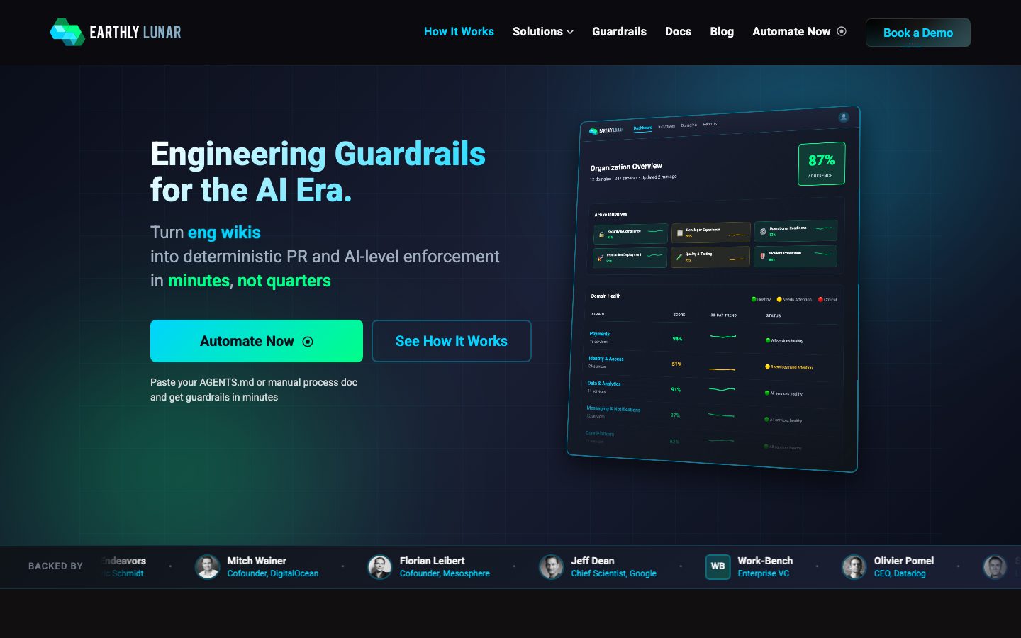
Component voltage comes from a **real product dashboard mockup shown directly in the hero** — an "Organization Overview" panel with a green 87% adherence badge, initiative tiles, and a domain-health table. Earthly doesn't illustrate the product abstractly; it renders actual product chrome at small scale (`{component.dashboard-mockup-card}`) inside the marketing flow.
The whole page is dark end-to-end — there is no light mode. Sections alternate between the base canvas and the marginally-lighter surface tone, and depth is carried by soft drop shadows plus the glow of the cyan/green accents rather than by color-block contrast.
**Key Characteristics:**
- Deep navy canvas (`{colors.canvas}` — #0a0e1a) with near-black raised cards (`{colors.surface}` — #0d1117). A single-mode dark system.
- Acid-green primary CTA (`{colors.accent-green}` — #00ff88) carrying dark text — the brightest element on every band. In the live UI it renders as a cyan-to-green gradient (see Iteration Guide).
- Electric cyan (`{colors.accent-cyan}` — #00d4ff) for links, headline highlight words ("Engineering Guardrails", "One Prompt Away"), and the secondary outline button.
- Roboto throughout at heavy display weights (800 / 700) — no custom or licensed typeface.
- A real product dashboard mockup (`{component.dashboard-mockup-card}`) anchored in the hero — product chrome as content, not illustration.
- A horizontal investor/backer bar with circular avatars (`{component.avatar-circle}`) directly under the hero.
- Hierarchical radius: `{rounded.md}` (8px) for cards and tiles, `{rounded.lg}` (10px) for the primary CTA, `{rounded.xl}` (12px) for the dashboard mockup container.
- Semantic accents appear inside product chrome only: amber (`{colors.warning}` — #fbbf24) and red (`{colors.error}` — #ff6464) for "needs attention" / "critical" status rows.
## Colors
### Brand & Accent
- **Accent Cyan** (`{colors.accent-cyan}` — #00d4ff): The dominant accent. Used for inline links, highlighted headline words, the secondary button outline + label, and active nav items. This is the brand's signature glow color.
- **Accent Green** (`{colors.accent-green}` — #00ff88): The primary CTA fill and pre-footer pill fill. The brightest color in the system, carrying dark text for contrast. Also reads as a success/healthy signal inside product chrome.
- **Accent Mint** (`{colors.accent-mint}` — #34f8b6): A softer green used in gradient transitions and secondary green accents inside the dashboard mockup.
- **Violet** (`{colors.violet}` — #d8b4fe): A rare accent appearing on small product-chrome tags inside the lifecycle/timeline section.
### Surface
- **Canvas** (`{colors.canvas}` — #0a0e1a): The base page floor — deep near-black navy. Every band sits on this.
- **Surface** (`{colors.surface}` — #0d1117): The marginally-lifted card and tile tone. Feature cards, the dashboard mockup, initiative tiles, and the backer bar all use it.
- **Border** (`{colors.border}` — #4b5563) and **Border Strong** (`{colors.border-strong}` — #4a5568): Slate hairline tones for card outlines and 1px inset borders on dark surfaces.
### Text
- **Ink** (`{colors.ink}` — #f5f5f5): Headlines and primary text on the dark canvas.
- **On Surface** (`{colors.on-surface}` — #ffffff): Pure-white text used inside product chrome and high-emphasis labels.
- **Body** (`{colors.body}` — #c9d1d9) and **Text Soft** (`{colors.text-soft}` — #c7d2e0): Running-text tones — light slate-white for paragraphs.
- **Muted** (`{colors.muted}` — #a0aec0) and **Muted Soft** (`{colors.muted-soft}` — #9ca3af): Secondary text — sub-lines, captions, fine print.
- **Neutral** (`{colors.neutral}` — #8b949e), **Slate** (`{colors.slate}` — #718096), **Slate Strong** (`{colors.slate-strong}` — #6b7280): Tertiary text and de-emphasized labels (e.g., "BACKED BY", domain sub-counts).
### Semantic (product chrome only)
- **Warning** (`{colors.warning}` — #fbbf24): Amber "needs attention" status dots and rows inside the dashboard mockup.
- **Error** (`{colors.error}` — #ff6464): Red "critical" status and the "difficult to change" emphasis word in section heads.
- **Accent Green** doubles as the "healthy/passing" semantic color in product chrome.
### Raw Link
- **Link Raw** (`{colors.link-raw}` — #0000ee): A measured browser-default anchor blue appearing on unstyled links; see Known Gaps.
## Typography
### Font Family
The system runs **Roboto** for everything — display headlines, body copy, labels, and buttons. There is no secondary face and no licensed/custom typeface (`fonts_licensed` is empty). The fallback stack is `Roboto, sans-serif`. Roboto is open-source (Apache 2.0) and ships directly — no substitution required.
The voice is carried entirely by weight, not by family contrast: display headlines push to 800, section heads and h3s to 700, and body drops to 400. The heavy display weights give the dark UI a technical, confident tone.
### Hierarchy
| Token | Size | Weight | Line Height | Letter Spacing | Use |
|---|---|---|---|---|---|
| `{typography.display}` | 46px | 800 | 1.1 | 0 | Hero h1 ("Engineering Guardrails for the AI Era.") |
| `{typography.h2}` | 40px | 700 | 1.2 | 0.1px | Section heads ("Any Guardrail, One Prompt Away") and the 87% metric value |
| `{typography.h3}` | 24px | 700 | 1.333 | 0 | Feature card titles, sub-section heads |
| `{typography.body}` | 24px | 400 | 1.417 | 0 | Hero sub-headline / large lead paragraphs |
| `{typography.label}` | 15px | 600 | 1.867 | 0 | Nav items, small card labels, backer-bar names, eyebrow text |
| `{typography.button}` | 16px | 700 | 1.25 | 0.32px | All button labels |
### Principles
Roboto carries the whole system; hierarchy is expressed through size + weight only. Display copy runs at 800 with a tight 1.1 line height — it should never drop below 700 or it loses the technical, dense character. Body copy is unusually large (24px) in the hero, which is intentional: the opening lines read as product statements, not paragraph prose. Button labels carry slight positive tracking (0.32px) for legibility on the bright green fill.
### Note on Font Substitutes
No substitution needed — Roboto is fully open-source and ships as-is. If a heavier display alternative is ever wanted, **Inter** at weight 800 is a close metric-compatible swap.
## Layout
### Spacing System
- **Base unit:** ~2px effective, but the measured rhythm clusters around 8/10/12/16/20/24px.
- **Tokens:** `{spacing.xxs}` 4px · `{spacing.xs}` 8px · `{spacing.sm}` 10px · `{spacing.md}` 12px · `{spacing.lg}` 16px · `{spacing.xl}` 20px · `{spacing.xxl}` 24px.
- **Most frequent value:** 10px (`{spacing.sm}`) by a wide margin — the default gap between inline elements and within button padding.
- **Card internal padding:** `{spacing.xxl}` (24px) for feature cards; `{spacing.lg}` (16px) for guardrail cards and the backer bar; `{spacing.md}` (12px) for dense initiative tiles.
### Grid & Container
- **Hero:** Two-column split — h1 + sub-head + button row on the left, `{component.dashboard-mockup-card}` on the right.
- **Feature grids:** 3-up at desktop (the "AI Generates Code Fast" benefit cards).
- **Guardrail grid:** 2-up rows of icon + label cards ("200+ Guardrails Included").
- **Backer bar:** A single horizontal row of avatar + name/role pairs, scrolling/wrapping on narrow widths.
### Whitespace Philosophy
The layout breathes with generous vertical gaps between dark bands; because every surface is dark, separation is created by spacing and faint shadow rather than by background-color blocks. Content columns stay centered with comfortable side gutters, and the hero deliberately keeps the left text column narrow so the product mockup gets near-equal visual weight.
## Elevation & Depth
| Level | Treatment | Use |
|---|---|---|
| Flat | No shadow | Base canvas bands, nav |
| Soft card | `rgba(0,0,0,0.3) 0px 2px 8px` | Small cards, tiles |
| Lifted card | `rgba(0,0,0,0.1) 0px 4px 12px` | Feature cards |
| Floating panel | `rgba(0,0,0,0.3) 0px 12px 40px` | The dashboard mockup at rest |
| Deep float | `rgba(0,0,0,0.5) 0px 16px 48px` + `rgba(255,255,255,0.05) 0px 0px 0px 1px inset` | Large hero mockup / overlay panels |
| Maximum float | `rgba(0,0,0,0.6) 0px 30px 80px` + inset hairline | The deepest elevated artifact |
| Glow CTA | `rgba(255,255,255,0.2) 0px 2px 0px inset, rgba(0,214,255,0.15) 0px 2px 8px, rgba(0,214,255,0.04) 0px 1px 4px` | The primary CTA — a cyan glow plus a top inset highlight |
The elevation philosophy is **dark-mode depth**: shadows are deep and dark (rgba black up to 0.6 alpha), and elevated panels carry a faint 1px white inset border (`rgba(255,255,255,0.05)`) to define their edge against the near-black canvas. The primary CTA is the only element with a colored (cyan) glow shadow — its light is part of the brand signal.
### Decorative Depth
- The dashboard mockup carries its own internal product-chrome shadows (status dots, score rows) — these are content, not system tokens.
- The cyan glow on the primary CTA is the system's signature depth flourish; it reinforces the neon-on-dark identity.
## Shapes
### Border Radius Scale
| Token | Value | Use |
|---|---|---|
| `{rounded.xs}` | 4px | Small inline chips, status dots |
| `{rounded.sm}` | 6px | Minor controls |
| `{rounded.md}` | 8px | Feature cards, initiative tiles, guardrail cards (most common) |
| `{rounded.lg}` | 10px | Primary CTA, pre-footer pill |
| `{rounded.xl}` | 12px | Dashboard mockup container |
| `{rounded.xxl}` | 16px | Larger panels (rare) |
| `{rounded.xxxl}` | 20px | Largest rounded surfaces (rare) |
| `{rounded.full}` | 9999px | Circular avatars (derived from the circular avatars in the backer bar; an exact radius token was not measured) |
### Photography Geometry
Investor/backer avatars render as perfect circles (`{rounded.full}`, ~36px) in the backer bar. The dashboard mockup and product chrome retain their own native internal radii. No marketing photography is present beyond avatar headshots.
## Components
### Top Navigation
**`top-nav`** — Dark navigation bar pinned to the top, `{colors.canvas}` background. Carries the "EARTHLY LUNAR" wordmark + logo at left, a horizontal menu (How It Works, Solutions, Guardrails, Docs, Blog, Automate Now) center-right, and a "Book a Demo" button at far right. Menu items use `{typography.label}` (Roboto 15px / 600).
**`nav-link`** / **`nav-link-active`** — Inactive items render in `{colors.ink}`; the active item ("How It Works") renders in `{colors.accent-cyan}`. Transparent backgrounds.
**`button-demo`** — The "Book a Demo" nav button. Transparent fill with a faint outline, `{colors.ink}` label, rounded `{rounded.md}`. Sits in the nav's far-right slot.
### Buttons
**`button-primary`** — The signature CTA ("Automate Now"). Background `{colors.accent-green}` (#00ff88) with dark `{colors.canvas}` text for contrast, type `{typography.button}` (Roboto 16px / 700, 0.32px tracking), rounded `{rounded.lg}` (10px), padding ~10px × 20px. Carries the cyan glow shadow described in Elevation. In the live UI the fill is a cyan→green gradient; the documented token is the dominant green stop (see Iteration Guide).
**`button-secondary`** — The "See How It Works" outline button. Transparent background, `{colors.accent-cyan}` label and outline, rounded `{rounded.lg}`, matching padding. Sits beside the primary in the hero button row.
**`cta-pill`** — A mid-page green pill ("Explore 200+ Built-in Guardrails"). Background `{colors.accent-green}`, dark text, rounded `{rounded.lg}`, padding ~10px × 24px.
**`text-link`** — Inline cyan links in `{colors.accent-cyan}`, type `{typography.label}` (e.g., "Learn more →", "See the full approach →").
### Cards & Containers
**`dashboard-mockup-card`** — The hero's right-side artifact: a real "Organization Overview" product panel. Background `{colors.surface}`, rounded `{rounded.xl}` (12px), with a deep floating shadow and a faint inset hairline. Contains the 87% adherence `{component.metric-badge}`, a grid of `{component.initiative-tile}`s, and a domain-health table with colored status rows.
**`metric-badge`** — The green "87% ADHERENCE" badge inside the dashboard. Transparent/subtle fill, `{colors.accent-green}` value text in `{typography.h2}`, rounded `{rounded.md}`.
**`initiative-tile`** — Small status tiles inside the dashboard ("Security & Compliance", "Developer Experience"). Background `{colors.surface}`, `{colors.ink}` label in `{typography.label}`, rounded `{rounded.md}`, padding `{spacing.md}` (12px).
**`feature-card`** — Used in the 3-up benefit grid ("Deterministic, Not Stochastic", "Central Instrumentation"). Background `{colors.surface}`, rounded `{rounded.md}` (8px), padding `{spacing.xxl}` (24px). Carries an icon, a cyan/ink title in `{typography.h3}`, and a muted-tone description.
**`guardrail-card`** — Icon + label cards in the "200+ Guardrails Included" grid ("CodeCov required", "SBOM generation in CI/CD"). Background `{colors.surface}`, rounded `{rounded.md}`, padding `{spacing.lg}` (16px), label in `{typography.label}`.
### Social Proof
**`backer-bar`** — Horizontal investor strip directly under the hero ("BACKED BY …"). Background `{colors.surface}`, padding `{spacing.lg}` (16px). Each entry pairs a `{component.avatar-circle}` with a name in `{typography.label}` and a role in `{colors.muted}`.
**`avatar-circle`** — ~36px circular headshot, rounded `{rounded.full}`, on a `{colors.surface}` fallback fill.
## Do's and Don'ts
### Do
- Keep the system dark end-to-end. Build every band on `{colors.canvas}` with `{colors.surface}` cards — there is no light mode.
- Reserve `{colors.accent-green}` for the primary CTA and "healthy/passing" signals. It is the single brightest element on each band.
- Use `{colors.accent-cyan}` for links, highlighted headline words, and the secondary outline button — the cyan/green pairing IS the brand.
- Put dark text (`{colors.canvas}`) on the green CTA — never light text on green.
- Show real product chrome via `{component.dashboard-mockup-card}` instead of abstract illustration.
- Apply the cyan glow shadow to the primary CTA — its light is part of the identity.
- Keep display headlines at Roboto 800; section heads at 700. Hierarchy is weight + size, not family.
### Don't
- Don't introduce a light background band — color-block contrast is not part of this system; depth comes from spacing and dark shadows.
- Don't use the semantic amber (`{colors.warning}`) or red (`{colors.error}`) outside product chrome / emphasis words.
- Don't drop display weight below 700 — Roboto at 400/500 reads as off-brand for headlines.
- Don't add a colored glow to any element other than the primary CTA.
- Don't put body copy in cyan or green; reserve the accents for links, highlights, and CTAs.
- Don't document hover states — primary darkens/brightens on press; nothing else changes.
## Responsive Behavior
### Breakpoints
| Name | Width | Key Changes |
|---|---|---|
| Mobile | < 768px | Hamburger nav; hero two-column collapses to single column (h1 + sub-head + buttons first, dashboard mockup below); feature grid 1-up; backer bar scrolls horizontally |
| Tablet | 768–1024px | Nav tightens; hero may stay split or stack; feature cards 2-up; guardrail grid 2-up |
| Desktop | 1024–1440px | Full horizontal nav; hero two-column split; 3-up feature cards |
| Wide | > 1440px | Same as desktop with more outer breathing room |
### Touch Targets
- `{component.button-primary}` and `{component.button-secondary}` use ~10px × 20px padding with 16px / 700 labels — comfortably above 44px effective height.
- `{component.button-demo}` in the nav is smaller; tap area is padded to meet target minimums.
- `{component.avatar-circle}` at ~36px is presentational, not a primary tap target.
### Collapsing Strategy
- Hero collapses from a two-column split to a single column; the dashboard mockup reflows below the copy.
- Feature grids reduce column count rather than scaling cards down.
- The backer bar becomes a horizontally-scrolling row on narrow widths.
- The dashboard mockup scales proportionally; status rows and the 87% badge stay legible.
### Image Behavior
- Avatars crop to circles at every breakpoint.
- Product chrome inside `{component.dashboard-mockup-card}` retains its aspect ratio while the card resizes.
## Iteration Guide
1. Focus on ONE component at a time. Reference its YAML key directly (`{component.feature-card}`, `{component.dashboard-mockup-card}`).
2. Variants of an existing component (`-active`, etc.) live as separate entries in `components:`.
3. Use `{token.refs}` everywhere — never inline a hex in a component prop.
4. Never document hover. Default and Active/Pressed states only.
5. The primary CTA renders as a cyan→green gradient in the live UI; the design tokens express only the dominant green stop (`{colors.accent-green}`) plus the cyan glow shadow — derived from the measured glow shadow and the green card fill. If implementing the gradient, interpolate between `{colors.accent-cyan}` and `{colors.accent-green}`.
6. Keep the page dark — do not add light bands. Separation comes from spacing + shadow.
7. When in doubt about emphasis: brighter accent (cyan/green) before heavier weight.
## Known Gaps
- **Primary CTA radius conflict:** the measured `button` element reported `radius: 0px` with `padding: 10px 0px` and a light text color (#f5f5f5) — likely a text/link-style button, not the green CTA. The green CTA spec is derived from the measured `card` token (#00ff88, 10px radius); its rounded value (`{rounded.lg}`) is therefore derived rather than directly measured on the CTA element.
- **Gradient fill not captured:** the analyzer recorded the CTA as a flat #00ff88. The cyan→green gradient visible in screenshots is documented in the Iteration Guide but not expressed as a single token.
- **Circular avatar radius:** no explicit full/pill radius was measured; `{rounded.full}` (9999px) is derived from the visibly circular backer-bar avatars.
- **`{colors.link-raw}` (#0000ee):** a measured browser-default anchor blue; it appears on unstyled links and is not part of the intended palette.
- **Small body size not measured:** only the 24px hero body was captured; a standard ~16px paragraph size likely exists deeper in the page but was not extracted.
- **Off-grid spacing:** 7px and 14px values appear frequently in the measurement but don't fit the 8/10/12/16/20/24 rhythm; they were treated as incidental and omitted from the token scale.
- **Animation/transition timings** (CTA glow, dashboard reveals, timeline progress) are out of scope.
- **Interior bands beyond the hero** (lifecycle timeline, "Your top priorities" tabs, impact section) were captured only in the long screenshot; their exact component tokens may need a dedicated pass.
<!-- Documented by duply · real-world design systems as ready-to-use DESIGN.md for AI coding agents · https://duply.ai/earthly/design-md -->
Color Palette
Accent
Neutrals
Typography
display46px · 800 · 1.1
The quick brown fox jumpsh240px · 700 · 1.2
The quick brown fox jumpsh324px · 700 · 1.333
The quick brown fox jumpslabel15px · 600 · 1.867
The quick brown fox jumpsbody24px · 400 · 1.417
The quick brown fox jumpsbutton16px · 700 · 1.25
The quick brown fox jumpsSpacing & Shape
Spacing
| Name | Value | Preview |
|---|---|---|
| xxs | 4px | |
| xs | 8px | |
| sm | 10px | |
| md | 12px | |
| lg | 16px | |
| xl | 20px | |
| xxl | 24px |
Border Radius
| Name | Value | Preview |
|---|---|---|
| xs | 4px | |
| sm | 6px | |
| md | 8px | |
| lg | 10px | |
| xl | 12px | |
| xxl | 16px | |
| xxxl | 20px | |
| full | 9999px |
More like this


---
version: alpha
name: Earthly-Lunar-design-analysis
description: A dark, engineering-first developer-tooling interface built on a near-black navy canvas with electric cyan and acid-green as the only chromatic voltage. The system reads as a serious AI-era platform — flat dark surfaces, a glowing cyan-to-green gradient primary CTA, a product dashboard mockup shown directly in the hero, and Roboto used at heavy weights for headlines. Brand energy comes from the neon cyan/green pairing against deep navy and from real product chrome rendered inside the marketing flow.

colors:
  ink: "#f5f5f5"
  on-surface: "#ffffff"
  body: "#c9d1d9"
  text-soft: "#c7d2e0"
  muted: "#a0aec0"
  muted-soft: "#9ca3af"
  neutral: "#8b949e"
  slate: "#718096"
  slate-strong: "#6b7280"
  border: "#4b5563"
  border-strong: "#4a5568"
  canvas: "#0a0e1a"
  surface: "#0d1117"
  accent-cyan: "#00d4ff"
  accent-green: "#00ff88"
  accent-mint: "#34f8b6"
  link-raw: "#0000ee"
  warning: "#fbbf24"
  error: "#ff6464"
  violet: "#d8b4fe"

typography:
  display:
    fontFamily: "Roboto, sans-serif"
    fontSize: 46px
    fontWeight: 800
    lineHeight: 1.1
    letterSpacing: 0
  h2:
    fontFamily: "Roboto, sans-serif"
    fontSize: 40px
    fontWeight: 700
    lineHeight: 1.2
    letterSpacing: 0.1px
  h3:
    fontFamily: "Roboto, sans-serif"
    fontSize: 24px
    fontWeight: 700
    lineHeight: 1.333
    letterSpacing: 0
  label:
    fontFamily: "Roboto, sans-serif"
    fontSize: 15px
    fontWeight: 600
    lineHeight: 1.867
    letterSpacing: 0
  body:
    fontFamily: "Roboto, sans-serif"
    fontSize: 24px
    fontWeight: 400
    lineHeight: 1.417
    letterSpacing: 0
  button:
    fontFamily: "Roboto, sans-serif"
    fontSize: 16px
    fontWeight: 700
    lineHeight: 1.25
    letterSpacing: 0.32px

rounded:
  xs: 4px
  sm: 6px
  md: 8px
  lg: 10px
  xl: 12px
  xxl: 16px
  xxxl: 20px
  full: 9999px

spacing:
  xxs: 4px
  xs: 8px
  sm: 10px
  md: 12px
  lg: 16px
  xl: 20px
  xxl: 24px

components:
  top-nav:
    backgroundColor: "{colors.canvas}"
    textColor: "{colors.ink}"
    typography: "{typography.label}"
  nav-link:
    backgroundColor: transparent
    textColor: "{colors.ink}"
    typography: "{typography.label}"
  nav-link-active:
    backgroundColor: transparent
    textColor: "{colors.accent-cyan}"
    typography: "{typography.label}"
  button-demo:
    backgroundColor: transparent
    textColor: "{colors.ink}"
    typography: "{typography.button}"
    rounded: "{rounded.md}"
    padding: 10px 20px
  button-primary:
    backgroundColor: "{colors.accent-green}"
    textColor: "{colors.canvas}"
    typography: "{typography.button}"
    rounded: "{rounded.lg}"
    padding: 10px 20px
  button-secondary:
    backgroundColor: transparent
    textColor: "{colors.accent-cyan}"
    typography: "{typography.button}"
    rounded: "{rounded.lg}"
    padding: 10px 20px
  cta-pill:
    backgroundColor: "{colors.accent-green}"
    textColor: "{colors.canvas}"
    typography: "{typography.button}"
    rounded: "{rounded.lg}"
    padding: 10px 24px
  text-link:
    backgroundColor: transparent
    textColor: "{colors.accent-cyan}"
    typography: "{typography.label}"
  dashboard-mockup-card:
    backgroundColor: "{colors.surface}"
    textColor: "{colors.ink}"
    rounded: "{rounded.xl}"
    padding: 20px
  feature-card:
    backgroundColor: "{colors.surface}"
    textColor: "{colors.ink}"
    typography: "{typography.h3}"
    rounded: "{rounded.md}"
    padding: 24px
  initiative-tile:
    backgroundColor: "{colors.surface}"
    textColor: "{colors.ink}"
    typography: "{typography.label}"
    rounded: "{rounded.md}"
    padding: 12px
  metric-badge:
    backgroundColor: transparent
    textColor: "{colors.accent-green}"
    typography: "{typography.h2}"
    rounded: "{rounded.md}"
    padding: 8px
  guardrail-card:
    backgroundColor: "{colors.surface}"
    textColor: "{colors.ink}"
    typography: "{typography.label}"
    rounded: "{rounded.md}"
    padding: 16px
  backer-bar:
    backgroundColor: "{colors.surface}"
    textColor: "{colors.muted}"
    typography: "{typography.label}"
    padding: 16px
  avatar-circle:
    backgroundColor: "{colors.surface}"
    textColor: "{colors.ink}"
    rounded: "{rounded.full}"
    size: 36px
---

## Overview

Earthly Lunar's marketing surface is a dark, engineering-first interface built on a deep navy canvas (`{colors.canvas}` — #0a0e1a) with a slightly lifted near-black surface (`{colors.surface}` — #0d1117) for cards. The brand's entire chromatic voltage comes from two neon accents: electric cyan (`{colors.accent-cyan}` — #00d4ff) and acid green (`{colors.accent-green}` — #00ff88), used together as the primary CTA gradient and individually as headline highlights and link colors. Everything else is grayscale-on-dark.

The headline voice is **Roboto at heavy weights** — the hero h1 runs 46px / 800 with a 1.1 line height (`{typography.display}`), and section heads run 40px / 700 (`{typography.h2}`). Body copy is notably large in the hero (24px / 400 — `{typography.body}`), which makes the opening read as a confident product statement rather than dense marketing prose.

Component voltage comes from a **real product dashboard mockup shown directly in the hero** — an "Organization Overview" panel with a green 87% adherence badge, initiative tiles, and a domain-health table. Earthly doesn't illustrate the product abstractly; it renders actual product chrome at small scale (`{component.dashboard-mockup-card}`) inside the marketing flow.

The whole page is dark end-to-end — there is no light mode. Sections alternate between the base canvas and the marginally-lighter surface tone, and depth is carried by soft drop shadows plus the glow of the cyan/green accents rather than by color-block contrast.

**Key Characteristics:**
- Deep navy canvas (`{colors.canvas}` — #0a0e1a) with near-black raised cards (`{colors.surface}` — #0d1117). A single-mode dark system.
- Acid-green primary CTA (`{colors.accent-green}` — #00ff88) carrying dark text — the brightest element on every band. In the live UI it renders as a cyan-to-green gradient (see Iteration Guide).
- Electric cyan (`{colors.accent-cyan}` — #00d4ff) for links, headline highlight words ("Engineering Guardrails", "One Prompt Away"), and the secondary outline button.
- Roboto throughout at heavy display weights (800 / 700) — no custom or licensed typeface.
- A real product dashboard mockup (`{component.dashboard-mockup-card}`) anchored in the hero — product chrome as content, not illustration.
- A horizontal investor/backer bar with circular avatars (`{component.avatar-circle}`) directly under the hero.
- Hierarchical radius: `{rounded.md}` (8px) for cards and tiles, `{rounded.lg}` (10px) for the primary CTA, `{rounded.xl}` (12px) for the dashboard mockup container.
- Semantic accents appear inside product chrome only: amber (`{colors.warning}` — #fbbf24) and red (`{colors.error}` — #ff6464) for "needs attention" / "critical" status rows.

## Colors

### Brand & Accent
- **Accent Cyan** (`{colors.accent-cyan}` — #00d4ff): The dominant accent. Used for inline links, highlighted headline words, the secondary button outline + label, and active nav items. This is the brand's signature glow color.
- **Accent Green** (`{colors.accent-green}` — #00ff88): The primary CTA fill and pre-footer pill fill. The brightest color in the system, carrying dark text for contrast. Also reads as a success/healthy signal inside product chrome.
- **Accent Mint** (`{colors.accent-mint}` — #34f8b6): A softer green used in gradient transitions and secondary green accents inside the dashboard mockup.
- **Violet** (`{colors.violet}` — #d8b4fe): A rare accent appearing on small product-chrome tags inside the lifecycle/timeline section.

### Surface
- **Canvas** (`{colors.canvas}` — #0a0e1a): The base page floor — deep near-black navy. Every band sits on this.
- **Surface** (`{colors.surface}` — #0d1117): The marginally-lifted card and tile tone. Feature cards, the dashboard mockup, initiative tiles, and the backer bar all use it.
- **Border** (`{colors.border}` — #4b5563) and **Border Strong** (`{colors.border-strong}` — #4a5568): Slate hairline tones for card outlines and 1px inset borders on dark surfaces.

### Text
- **Ink** (`{colors.ink}` — #f5f5f5): Headlines and primary text on the dark canvas.
- **On Surface** (`{colors.on-surface}` — #ffffff): Pure-white text used inside product chrome and high-emphasis labels.
- **Body** (`{colors.body}` — #c9d1d9) and **Text Soft** (`{colors.text-soft}` — #c7d2e0): Running-text tones — light slate-white for paragraphs.
- **Muted** (`{colors.muted}` — #a0aec0) and **Muted Soft** (`{colors.muted-soft}` — #9ca3af): Secondary text — sub-lines, captions, fine print.
- **Neutral** (`{colors.neutral}` — #8b949e), **Slate** (`{colors.slate}` — #718096), **Slate Strong** (`{colors.slate-strong}` — #6b7280): Tertiary text and de-emphasized labels (e.g., "BACKED BY", domain sub-counts).

### Semantic (product chrome only)
- **Warning** (`{colors.warning}` — #fbbf24): Amber "needs attention" status dots and rows inside the dashboard mockup.
- **Error** (`{colors.error}` — #ff6464): Red "critical" status and the "difficult to change" emphasis word in section heads.
- **Accent Green** doubles as the "healthy/passing" semantic color in product chrome.

### Raw Link
- **Link Raw** (`{colors.link-raw}` — #0000ee): A measured browser-default anchor blue appearing on unstyled links; see Known Gaps.

## Typography

### Font Family
The system runs **Roboto** for everything — display headlines, body copy, labels, and buttons. There is no secondary face and no licensed/custom typeface (`fonts_licensed` is empty). The fallback stack is `Roboto, sans-serif`. Roboto is open-source (Apache 2.0) and ships directly — no substitution required.

The voice is carried entirely by weight, not by family contrast: display headlines push to 800, section heads and h3s to 700, and body drops to 400. The heavy display weights give the dark UI a technical, confident tone.

### Hierarchy

| Token | Size | Weight | Line Height | Letter Spacing | Use |
|---|---|---|---|---|---|
| `{typography.display}` | 46px | 800 | 1.1 | 0 | Hero h1 ("Engineering Guardrails for the AI Era.") |
| `{typography.h2}` | 40px | 700 | 1.2 | 0.1px | Section heads ("Any Guardrail, One Prompt Away") and the 87% metric value |
| `{typography.h3}` | 24px | 700 | 1.333 | 0 | Feature card titles, sub-section heads |
| `{typography.body}` | 24px | 400 | 1.417 | 0 | Hero sub-headline / large lead paragraphs |
| `{typography.label}` | 15px | 600 | 1.867 | 0 | Nav items, small card labels, backer-bar names, eyebrow text |
| `{typography.button}` | 16px | 700 | 1.25 | 0.32px | All button labels |

### Principles
Roboto carries the whole system; hierarchy is expressed through size + weight only. Display copy runs at 800 with a tight 1.1 line height — it should never drop below 700 or it loses the technical, dense character. Body copy is unusually large (24px) in the hero, which is intentional: the opening lines read as product statements, not paragraph prose. Button labels carry slight positive tracking (0.32px) for legibility on the bright green fill.

### Note on Font Substitutes
No substitution needed — Roboto is fully open-source and ships as-is. If a heavier display alternative is ever wanted, **Inter** at weight 800 is a close metric-compatible swap.

## Layout

### Spacing System
- **Base unit:** ~2px effective, but the measured rhythm clusters around 8/10/12/16/20/24px.
- **Tokens:** `{spacing.xxs}` 4px · `{spacing.xs}` 8px · `{spacing.sm}` 10px · `{spacing.md}` 12px · `{spacing.lg}` 16px · `{spacing.xl}` 20px · `{spacing.xxl}` 24px.
- **Most frequent value:** 10px (`{spacing.sm}`) by a wide margin — the default gap between inline elements and within button padding.
- **Card internal padding:** `{spacing.xxl}` (24px) for feature cards; `{spacing.lg}` (16px) for guardrail cards and the backer bar; `{spacing.md}` (12px) for dense initiative tiles.

### Grid & Container
- **Hero:** Two-column split — h1 + sub-head + button row on the left, `{component.dashboard-mockup-card}` on the right.
- **Feature grids:** 3-up at desktop (the "AI Generates Code Fast" benefit cards).
- **Guardrail grid:** 2-up rows of icon + label cards ("200+ Guardrails Included").
- **Backer bar:** A single horizontal row of avatar + name/role pairs, scrolling/wrapping on narrow widths.

### Whitespace Philosophy
The layout breathes with generous vertical gaps between dark bands; because every surface is dark, separation is created by spacing and faint shadow rather than by background-color blocks. Content columns stay centered with comfortable side gutters, and the hero deliberately keeps the left text column narrow so the product mockup gets near-equal visual weight.

## Elevation & Depth

| Level | Treatment | Use |
|---|---|---|
| Flat | No shadow | Base canvas bands, nav |
| Soft card | `rgba(0,0,0,0.3) 0px 2px 8px` | Small cards, tiles |
| Lifted card | `rgba(0,0,0,0.1) 0px 4px 12px` | Feature cards |
| Floating panel | `rgba(0,0,0,0.3) 0px 12px 40px` | The dashboard mockup at rest |
| Deep float | `rgba(0,0,0,0.5) 0px 16px 48px` + `rgba(255,255,255,0.05) 0px 0px 0px 1px inset` | Large hero mockup / overlay panels |
| Maximum float | `rgba(0,0,0,0.6) 0px 30px 80px` + inset hairline | The deepest elevated artifact |
| Glow CTA | `rgba(255,255,255,0.2) 0px 2px 0px inset, rgba(0,214,255,0.15) 0px 2px 8px, rgba(0,214,255,0.04) 0px 1px 4px` | The primary CTA — a cyan glow plus a top inset highlight |

The elevation philosophy is **dark-mode depth**: shadows are deep and dark (rgba black up to 0.6 alpha), and elevated panels carry a faint 1px white inset border (`rgba(255,255,255,0.05)`) to define their edge against the near-black canvas. The primary CTA is the only element with a colored (cyan) glow shadow — its light is part of the brand signal.

### Decorative Depth
- The dashboard mockup carries its own internal product-chrome shadows (status dots, score rows) — these are content, not system tokens.
- The cyan glow on the primary CTA is the system's signature depth flourish; it reinforces the neon-on-dark identity.

## Shapes

### Border Radius Scale

| Token | Value | Use |
|---|---|---|
| `{rounded.xs}` | 4px | Small inline chips, status dots |
| `{rounded.sm}` | 6px | Minor controls |
| `{rounded.md}` | 8px | Feature cards, initiative tiles, guardrail cards (most common) |
| `{rounded.lg}` | 10px | Primary CTA, pre-footer pill |
| `{rounded.xl}` | 12px | Dashboard mockup container |
| `{rounded.xxl}` | 16px | Larger panels (rare) |
| `{rounded.xxxl}` | 20px | Largest rounded surfaces (rare) |
| `{rounded.full}` | 9999px | Circular avatars (derived from the circular avatars in the backer bar; an exact radius token was not measured) |

### Photography Geometry
Investor/backer avatars render as perfect circles (`{rounded.full}`, ~36px) in the backer bar. The dashboard mockup and product chrome retain their own native internal radii. No marketing photography is present beyond avatar headshots.

## Components

### Top Navigation

**`top-nav`** — Dark navigation bar pinned to the top, `{colors.canvas}` background. Carries the "EARTHLY LUNAR" wordmark + logo at left, a horizontal menu (How It Works, Solutions, Guardrails, Docs, Blog, Automate Now) center-right, and a "Book a Demo" button at far right. Menu items use `{typography.label}` (Roboto 15px / 600).

**`nav-link`** / **`nav-link-active`** — Inactive items render in `{colors.ink}`; the active item ("How It Works") renders in `{colors.accent-cyan}`. Transparent backgrounds.

**`button-demo`** — The "Book a Demo" nav button. Transparent fill with a faint outline, `{colors.ink}` label, rounded `{rounded.md}`. Sits in the nav's far-right slot.

### Buttons

**`button-primary`** — The signature CTA ("Automate Now"). Background `{colors.accent-green}` (#00ff88) with dark `{colors.canvas}` text for contrast, type `{typography.button}` (Roboto 16px / 700, 0.32px tracking), rounded `{rounded.lg}` (10px), padding ~10px × 20px. Carries the cyan glow shadow described in Elevation. In the live UI the fill is a cyan→green gradient; the documented token is the dominant green stop (see Iteration Guide).

**`button-secondary`** — The "See How It Works" outline button. Transparent background, `{colors.accent-cyan}` label and outline, rounded `{rounded.lg}`, matching padding. Sits beside the primary in the hero button row.

**`cta-pill`** — A mid-page green pill ("Explore 200+ Built-in Guardrails"). Background `{colors.accent-green}`, dark text, rounded `{rounded.lg}`, padding ~10px × 24px.

**`text-link`** — Inline cyan links in `{colors.accent-cyan}`, type `{typography.label}` (e.g., "Learn more →", "See the full approach →").

### Cards & Containers

**`dashboard-mockup-card`** — The hero's right-side artifact: a real "Organization Overview" product panel. Background `{colors.surface}`, rounded `{rounded.xl}` (12px), with a deep floating shadow and a faint inset hairline. Contains the 87% adherence `{component.metric-badge}`, a grid of `{component.initiative-tile}`s, and a domain-health table with colored status rows.

**`metric-badge`** — The green "87% ADHERENCE" badge inside the dashboard. Transparent/subtle fill, `{colors.accent-green}` value text in `{typography.h2}`, rounded `{rounded.md}`.

**`initiative-tile`** — Small status tiles inside the dashboard ("Security & Compliance", "Developer Experience"). Background `{colors.surface}`, `{colors.ink}` label in `{typography.label}`, rounded `{rounded.md}`, padding `{spacing.md}` (12px).

**`feature-card`** — Used in the 3-up benefit grid ("Deterministic, Not Stochastic", "Central Instrumentation"). Background `{colors.surface}`, rounded `{rounded.md}` (8px), padding `{spacing.xxl}` (24px). Carries an icon, a cyan/ink title in `{typography.h3}`, and a muted-tone description.

**`guardrail-card`** — Icon + label cards in the "200+ Guardrails Included" grid ("CodeCov required", "SBOM generation in CI/CD"). Background `{colors.surface}`, rounded `{rounded.md}`, padding `{spacing.lg}` (16px), label in `{typography.label}`.

### Social Proof

**`backer-bar`** — Horizontal investor strip directly under the hero ("BACKED BY …"). Background `{colors.surface}`, padding `{spacing.lg}` (16px). Each entry pairs a `{component.avatar-circle}` with a name in `{typography.label}` and a role in `{colors.muted}`.

**`avatar-circle`** — ~36px circular headshot, rounded `{rounded.full}`, on a `{colors.surface}` fallback fill.

## Do's and Don'ts

### Do
- Keep the system dark end-to-end. Build every band on `{colors.canvas}` with `{colors.surface}` cards — there is no light mode.
- Reserve `{colors.accent-green}` for the primary CTA and "healthy/passing" signals. It is the single brightest element on each band.
- Use `{colors.accent-cyan}` for links, highlighted headline words, and the secondary outline button — the cyan/green pairing IS the brand.
- Put dark text (`{colors.canvas}`) on the green CTA — never light text on green.
- Show real product chrome via `{component.dashboard-mockup-card}` instead of abstract illustration.
- Apply the cyan glow shadow to the primary CTA — its light is part of the identity.
- Keep display headlines at Roboto 800; section heads at 700. Hierarchy is weight + size, not family.

### Don't
- Don't introduce a light background band — color-block contrast is not part of this system; depth comes from spacing and dark shadows.
- Don't use the semantic amber (`{colors.warning}`) or red (`{colors.error}`) outside product chrome / emphasis words.
- Don't drop display weight below 700 — Roboto at 400/500 reads as off-brand for headlines.
- Don't add a colored glow to any element other than the primary CTA.
- Don't put body copy in cyan or green; reserve the accents for links, highlights, and CTAs.
- Don't document hover states — primary darkens/brightens on press; nothing else changes.

## Responsive Behavior

### Breakpoints

| Name | Width | Key Changes |
|---|---|---|
| Mobile | < 768px | Hamburger nav; hero two-column collapses to single column (h1 + sub-head + buttons first, dashboard mockup below); feature grid 1-up; backer bar scrolls horizontally |
| Tablet | 768–1024px | Nav tightens; hero may stay split or stack; feature cards 2-up; guardrail grid 2-up |
| Desktop | 1024–1440px | Full horizontal nav; hero two-column split; 3-up feature cards |
| Wide | > 1440px | Same as desktop with more outer breathing room |

### Touch Targets
- `{component.button-primary}` and `{component.button-secondary}` use ~10px × 20px padding with 16px / 700 labels — comfortably above 44px effective height.
- `{component.button-demo}` in the nav is smaller; tap area is padded to meet target minimums.
- `{component.avatar-circle}` at ~36px is presentational, not a primary tap target.

### Collapsing Strategy
- Hero collapses from a two-column split to a single column; the dashboard mockup reflows below the copy.
- Feature grids reduce column count rather than scaling cards down.
- The backer bar becomes a horizontally-scrolling row on narrow widths.
- The dashboard mockup scales proportionally; status rows and the 87% badge stay legible.

### Image Behavior
- Avatars crop to circles at every breakpoint.
- Product chrome inside `{component.dashboard-mockup-card}` retains its aspect ratio while the card resizes.

## Iteration Guide

1. Focus on ONE component at a time. Reference its YAML key directly (`{component.feature-card}`, `{component.dashboard-mockup-card}`).
2. Variants of an existing component (`-active`, etc.) live as separate entries in `components:`.
3. Use `{token.refs}` everywhere — never inline a hex in a component prop.
4. Never document hover. Default and Active/Pressed states only.
5. The primary CTA renders as a cyan→green gradient in the live UI; the design tokens express only the dominant green stop (`{colors.accent-green}`) plus the cyan glow shadow — derived from the measured glow shadow and the green card fill. If implementing the gradient, interpolate between `{colors.accent-cyan}` and `{colors.accent-green}`.
6. Keep the page dark — do not add light bands. Separation comes from spacing + shadow.
7. When in doubt about emphasis: brighter accent (cyan/green) before heavier weight.

## Known Gaps

- **Primary CTA radius conflict:** the measured `button` element reported `radius: 0px` with `padding: 10px 0px` and a light text color (#f5f5f5) — likely a text/link-style button, not the green CTA. The green CTA spec is derived from the measured `card` token (#00ff88, 10px radius); its rounded value (`{rounded.lg}`) is therefore derived rather than directly measured on the CTA element.
- **Gradient fill not captured:** the analyzer recorded the CTA as a flat #00ff88. The cyan→green gradient visible in screenshots is documented in the Iteration Guide but not expressed as a single token.
- **Circular avatar radius:** no explicit full/pill radius was measured; `{rounded.full}` (9999px) is derived from the visibly circular backer-bar avatars.
- **`{colors.link-raw}` (#0000ee):** a measured browser-default anchor blue; it appears on unstyled links and is not part of the intended palette.
- **Small body size not measured:** only the 24px hero body was captured; a standard ~16px paragraph size likely exists deeper in the page but was not extracted.
- **Off-grid spacing:** 7px and 14px values appear frequently in the measurement but don't fit the 8/10/12/16/20/24 rhythm; they were treated as incidental and omitted from the token scale.
- **Animation/transition timings** (CTA glow, dashboard reveals, timeline progress) are out of scope.
- **Interior bands beyond the hero** (lifecycle timeline, "Your top priorities" tabs, impact section) were captured only in the long screenshot; their exact component tokens may need a dedicated pass.

<!-- Documented by duply · real-world design systems as ready-to-use DESIGN.md for AI coding agents · https://duply.ai/earthly/design-md -->