Axiom
A pure-black, terminal-native observability marketing site built on Berkeley Mono display type and Inter body, with a single burnt-orange CTA accent. The system reads as engineer-first and machine-precise — near-black canvas, monospace headlines, ASCII-art motifs, sharp-cornered cards, and real product-UI fragments shown directly in the page. Brand voltage comes from the monospace voice and the lone orange action color rather than from color variety.
---
version: alpha
name: Axiom-design-analysis
description: A pure-black, terminal-native observability marketing site built on Berkeley Mono display type and Inter body, with a single burnt-orange CTA accent. The system reads as engineer-first and machine-precise — near-black canvas, monospace headlines, ASCII-art motifs, sharp-cornered cards, and real product-UI fragments shown directly in the page. Brand voltage comes from the monospace voice and the lone orange action color rather than from color variety.
colors:
canvas: "#000000"
ink: "#eeeeee"
ink-soft: "#d4d4d4"
white: "#ffffff"
on-primary: "#b4b4b4"
muted: "#202020"
neutral: "#606060"
surface: "#171717"
surface-soft: "#111111"
hairline: "#404040"
accent: "#da5c2c"
accent-blue: "#2563eb"
text-muted: "#6b7280"
text-soft: "#9ca3af"
typography:
display:
fontFamily: "Berkeley Mono, ui-monospace, monospace"
fontSize: 32px
fontWeight: 400
lineHeight: 1.25
letterSpacing: normal
mono-label:
fontFamily: "Berkeley Mono, ui-monospace, monospace"
fontSize: 14px
fontWeight: 400
lineHeight: 1.571
letterSpacing: normal
mono-sm:
fontFamily: "Berkeley Mono, ui-monospace, monospace"
fontSize: 12px
fontWeight: 400
lineHeight: 1.333
letterSpacing: normal
mono-sm-bold:
fontFamily: "Berkeley Mono, ui-monospace, monospace"
fontSize: 12px
fontWeight: 700
lineHeight: 1.333
letterSpacing: normal
body:
fontFamily: "Inter, sans-serif"
fontSize: 14px
fontWeight: 400
lineHeight: 1.429
letterSpacing: normal
button:
fontFamily: "Inter, sans-serif"
fontSize: 12px
fontWeight: 400
lineHeight: 1.333
letterSpacing: normal
rounded:
none: 0px
xs: 2px
sm: 4px
pill: 9999px
full: 9999px
spacing:
xxs: 4px
xs: 8px
sm: 12px
md: 16px
lg: 24px
xl: 32px
xxl: 48px
huge: 64px
section: 96px
components:
top-nav:
backgroundColor: "{colors.canvas}"
textColor: "{colors.ink}"
typography: "{typography.body}"
height: 64px
nav-link:
backgroundColor: transparent
textColor: "{colors.ink}"
typography: "{typography.body}"
announcement-bar:
backgroundColor: "{colors.canvas}"
textColor: "{colors.text-soft}"
typography: "{typography.mono-sm}"
padding: 16px
button-primary:
backgroundColor: "{colors.accent}"
textColor: "{colors.white}"
typography: "{typography.button}"
rounded: "{rounded.xs}"
padding: 12px 20px
button-secondary:
backgroundColor: transparent
textColor: "{colors.ink}"
typography: "{typography.button}"
rounded: "{rounded.xs}"
padding: 12px 20px
button-outline:
backgroundColor: transparent
textColor: "{colors.ink}"
typography: "{typography.button}"
rounded: "{rounded.xs}"
padding: 12px 20px
hero-band:
backgroundColor: "{colors.canvas}"
textColor: "{colors.ink}"
typography: "{typography.display}"
padding: 96px
product-mockup-card:
backgroundColor: "{colors.surface-soft}"
textColor: "{colors.ink}"
rounded: "{rounded.sm}"
padding: 16px
feature-card:
backgroundColor: "{colors.surface}"
textColor: "{colors.ink}"
typography: "{typography.mono-sm}"
rounded: "{rounded.sm}"
padding: 32px
card-accent:
backgroundColor: "{colors.accent}"
textColor: "{colors.white}"
rounded: "{rounded.sm}"
padding: 32px
testimonial-card:
backgroundColor: "{colors.surface-soft}"
textColor: "{colors.ink-soft}"
typography: "{typography.body}"
rounded: "{rounded.sm}"
padding: 24px
logo-cell:
backgroundColor: "{colors.canvas}"
textColor: "{colors.neutral}"
rounded: "{rounded.none}"
padding: 32px
pricing-card:
backgroundColor: "{colors.surface-soft}"
textColor: "{colors.ink}"
typography: "{typography.mono-label}"
rounded: "{rounded.sm}"
padding: 32px
tab:
backgroundColor: transparent
textColor: "{colors.neutral}"
typography: "{typography.mono-sm}"
padding: 8px 12px
tab-active:
backgroundColor: transparent
textColor: "{colors.ink}"
typography: "{typography.mono-sm}"
padding: 8px 12px
sidebar-nav:
backgroundColor: "{colors.canvas}"
textColor: "{colors.neutral}"
typography: "{typography.mono-sm}"
padding: 12px
footer:
backgroundColor: "{colors.canvas}"
textColor: "{colors.text-muted}"
typography: "{typography.body}"
padding: 64px
---
## Overview
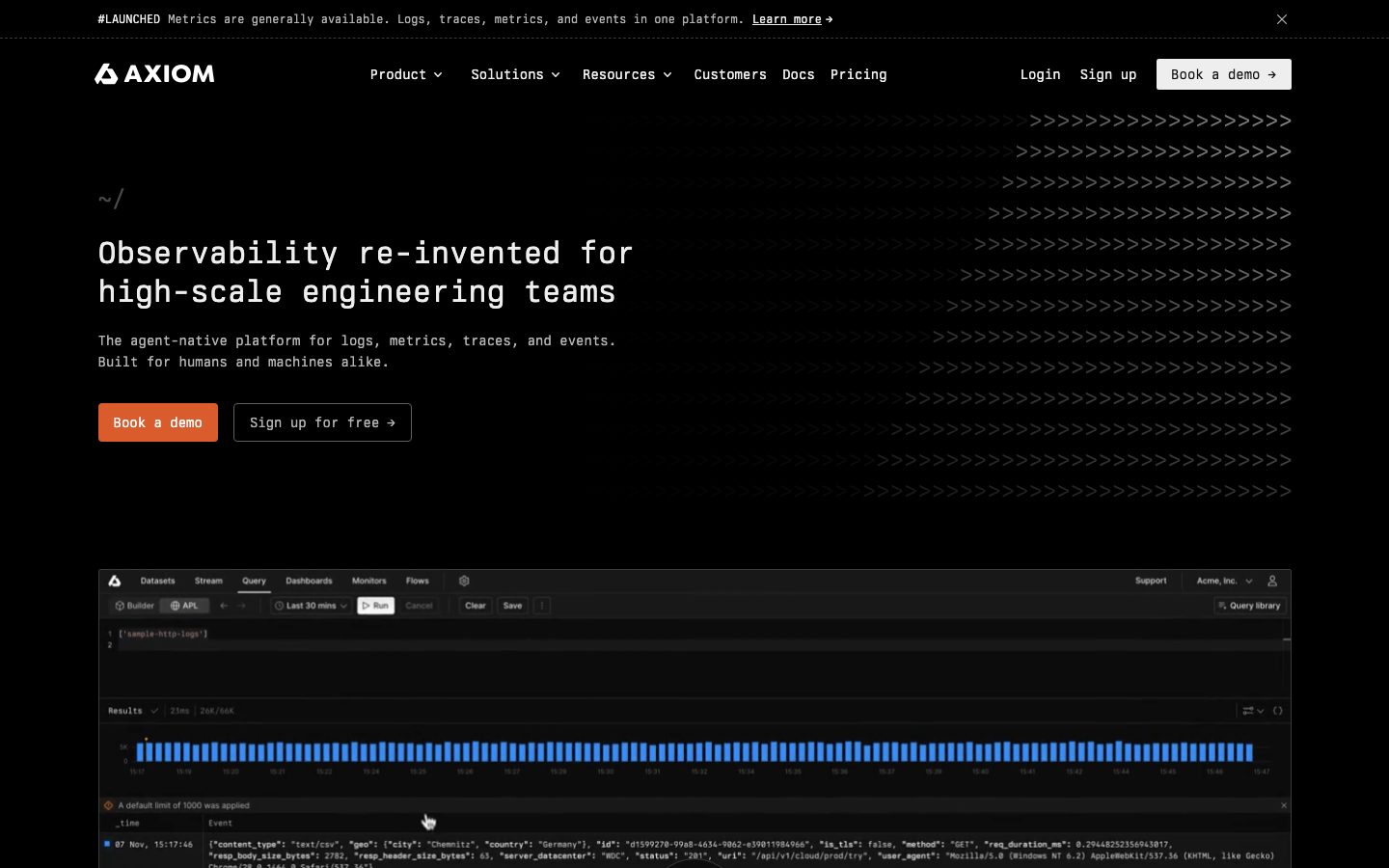
Axiom's marketing surface is a pure-black, terminal-native interface — `{colors.canvas}` (#000000) floor, near-white monospace headlines (`{colors.ink}` — #eeeeee) set in **Berkeley Mono**, and a single burnt-orange action color (`{colors.accent}` — #da5c2c) reserved for the primary "Book a demo" CTA. The system reads as engineer-first: it shows the actual product (query builder, results histogram, log stream, event-store diagrams) directly in the page rather than illustrating around it, and it leans on ASCII-art chevron and dot motifs as ambient decoration.
Type voice splits into two roles: **Berkeley Mono** (the monospace display + label face — used for h1 through h4, nav-mode labels, and code-flavored microcopy) and **Inter** (used for running body copy and button labels). The h1 is set at a restrained 32px / weight 400 — Axiom never shouts in giant type; the monospace voice itself is the brand signal. Headings stay at weight 400 across the board, with only h4 stepping to weight 700.
Component voltage comes from **embedded product chrome** — the hero's right-side query console, the blue results histogram (`{colors.accent-blue}` — #2563eb), the event-store architecture diagram — shown at near-native scale on the black canvas. Color is otherwise scarce: the page is built almost entirely from black, dark-gray surfaces (`{colors.surface}` — #171717, `{colors.surface-soft}` — #111111), and gray text steps, with orange as the only chromatic accent in the brand chrome.
**Key Characteristics:**
- Pure-black canvas (`{colors.canvas}` — #000000) end to end. No dark-to-light inversion anywhere — the whole page is one continuous near-black surface.
- Monospace display typography (**Berkeley Mono**, substituted here) for every heading. Headlines are small (32px h1) and stay weight 400 — the monospace face carries the voice, not the scale.
- A single orange accent (`{colors.accent}` — #da5c2c) used only on the primary CTA and one accent card. Everything else is grayscale.
- Sharp-to-soft radius: buttons are effectively square (`{rounded.xs}` — 2px / measured 0px), cards step to `{rounded.sm}` (4px), and only pills/avatars reach `{rounded.full}`.
- Dark-gray cards (`{colors.surface}` — #171717, `{colors.surface-soft}` — #111111) hold ASCII-art motifs and product-UI fragments.
- Real product UI shown in-page — the query console, results histogram, and event-store diagram are the hero artifacts, not marketing illustrations.
- Tight, dense rhythm — heavy use of 16px and 32px spacing, with 96px reserved for major band separation.
## Colors
### Brand & Accent
- **Accent** (`{colors.accent}` — #da5c2c): The lone brand color — burnt orange. Used on the primary "Book a demo" CTA and on one accent card surface. Axiom is a near-monochrome brand; the orange appears sparingly and never on body text.
- **Accent Blue** (`{colors.accent-blue}` — #2563eb): Appears inside embedded product UI — the results histogram bars in the query console. This is product chrome shown as content, not a marketing accent applied to layout.
### Surface
- **Canvas** (`{colors.canvas}` — #000000): The universal page floor — every band sits on pure black.
- **Surface** (`{colors.surface}` — #171717): Feature cards and raised content blocks.
- **Surface Soft** (`{colors.surface-soft}` — #111111): Product-mockup cards, testimonial cards, pricing cards — a barely-lifted near-black panel.
- **Muted** (`{colors.muted}` — #202020): Very-low-contrast fills and faint section dividers / ASCII-motif tones.
- **Hairline** (`{colors.hairline}` — #404040): The 1px border tone separating cards from the black canvas.
### Text
- **Ink** (`{colors.ink}` — #eeeeee): All headlines and primary text.
- **Ink Soft** (`{colors.ink-soft}` — #d4d4d4): Secondary near-white text — testimonial quotes, sub-headings.
- **White** (`{colors.white}` — #ffffff): Reserved for text on the orange CTA and high-contrast emphasis.
- **On Primary** (`{colors.on-primary}` — #b4b4b4): The measured button text tone — a light gray used on secondary/outline button labels.
- **Neutral** (`{colors.neutral}` — #606060): Tertiary text — logo-cell wordmarks, inactive tabs, sidebar items.
- **Text Muted** (`{colors.text-muted}` — #6b7280): Footer body and fine-print.
- **Text Soft** (`{colors.text-soft}` — #9ca3af): Announcement-bar copy and muted captions.
### Note
The system carries no documented semantic success/warning/error palette on the marketing surface — those states live in the product app, which is out of scope. See Known Gaps.
## Typography
### Font Family
The system runs **Berkeley Mono** for all display + label roles and **Inter** for body and button text. Berkeley Mono is a commercial, licensed monospace typeface — it is the brand's defining voice (terminal aesthetic, fixed-width precision). Inter handles running paragraphs and button labels.
The split is functional:
- Berkeley Mono (monospace, weight 400, occasionally 700) — h1, h2, h3, h4, nav-mode labels, code-flavored microcopy
- Inter (weight 400) — body paragraphs, button labels
### Hierarchy
| Token | Size | Weight | Line Height | Letter Spacing | Use |
|---|---|---|---|---|---|
| `{typography.display}` | 32px | 400 | 1.25 | normal | Hero h1 ("Observability re-invented for high-scale engineering teams") — Berkeley Mono |
| `{typography.mono-label}` | 14px | 400 | 1.571 | normal | Section heads / h2 labels — Berkeley Mono |
| `{typography.mono-sm}` | 12px | 400 | 1.333 | normal | h3, tab labels, sidebar items, ASCII captions — Berkeley Mono |
| `{typography.mono-sm-bold}` | 12px | 700 | 1.333 | normal | h4 emphasis labels — Berkeley Mono |
| `{typography.body}` | 14px | 400 | 1.429 | normal | Default running body — Inter |
| `{typography.button}` | 12px | 400 | 1.333 | normal | Button labels — Inter |
### Principles
Berkeley Mono is the brand voice — every heading uses it, and the monospace forms (fixed-width characters, terminal cadence) are inseparable from Axiom's identity. The h1 stays deliberately small (32px) and at weight 400; Axiom signals confidence through the monospace voice and dense layout, not through display scale. Never set body paragraphs in Berkeley Mono, and never set a heading in Inter — the boundary is strict.
### Note on Font Substitutes
**Berkeley Mono** is a paid, licensed typeface and cannot be shipped freely. Open-source substitutes that preserve the fixed-width terminal character: **JetBrains Mono** (weight 400), **IBM Plex Mono**, or **Space Mono**. Use weight 400 to match Axiom's restrained headings; reserve weight 700 for the h4 role only. Inter is itself open-source and ships as-is.
## Layout
### Spacing System
- **Base unit:** 4px.
- **Tokens:** `{spacing.xxs}` 4px · `{spacing.xs}` 8px · `{spacing.sm}` 12px · `{spacing.md}` 16px · `{spacing.lg}` 24px · `{spacing.xl}` 32px · `{spacing.xxl}` 48px · `{spacing.huge}` 64px · `{spacing.section}` 96px.
- **Dominant rhythm:** 16px and 32px carry the bulk of internal spacing (highest measured frequencies); 96px separates major editorial bands.
- **Card internal padding:** `{spacing.xl}` (32px) for feature/pricing cards; `{spacing.lg}` (24px) for testimonial cards; `{spacing.md}` (16px) for product-mockup cards.
- **Larger gaps** of 80px and 112px appear occasionally at band transitions (measured but used sparingly).
### Grid & Container
- **Editorial body:** Hero uses a wide left-aligned column with the product console artifact below the headline at full width.
- **Logo wall:** Multi-column grid of partner logo cells (asana, Netflix, Vercel, Cal.com, plex, hapn, etc.).
- **Feature grids:** 3-up at desktop for the "Discover the full potential" cards.
- **Pricing:** 2-up cards ("Axiom Cloud" / "Fair, self-serve enterprise").
- **Testimonials:** Horizontally scrollable multi-card row with arrow controls.
- **Platform/console section:** Left sidebar-nav (Event store, Data loading, API, Security, Query, Reporting, Monitoring, Management) paired with a right-side diagram panel.
### Whitespace Philosophy
Axiom's layout is dense and information-forward — tight 16px/32px spacing inside content, with 96px breathing room reserved for separating major bands. The aesthetic favors packed, terminal-like density over generous SaaS whitespace; the black canvas does the visual quieting that whitespace would do on a light site.
## Elevation & Depth
| Level | Treatment | Use |
|---|---|---|
| Flat | No shadow, no border | Body sections, hero band, logo cells |
| Hairline | 1px `{colors.hairline}` (#404040) border on `{colors.surface}` | Feature cards, pricing cards separated from the black canvas |
| Subtle shadow | `rgba(0,0,0,0.05) 0px 1px 2px` | Cards (measured) — barely registers on a black canvas; carries over mainly inside embedded light product UI |
| Lifted | `rgba(0,0,0,0.1) 0px 20px 25px -5px, rgba(0,0,0,0.1) 0px 8px 10px -6px` | Floating product-mockup panels |
| Deep | `rgba(0,0,0,0.25) 0px 25px 50px -12px` | Largest elevated console / diagram artifacts |
On a pure-black canvas, shadows do almost no elevation work — depth is communicated instead by **surface-tone steps** (#000000 → #111111 → #171717 → #202020) and 1px `{colors.hairline}` borders. The drop shadows are most visible inside the embedded product UI fragments, which carry their own light chrome.
### Decorative Depth
- ASCII-art motifs (chevron rows `>>>`, dot fields, hatch patterns) fill negative space in the hero and feature cards in low-contrast `{colors.muted}` / `{colors.neutral}` tones — ambient terminal texture rather than literal elevation.
- The blue results histogram (`{colors.accent-blue}`) inside the query console is the single brightest chromatic moment on the page.
## Shapes
### Border Radius Scale
| Token | Value | Use |
|---|---|---|
| `{rounded.none}` | 0px | Logo cells, measured button corners — the system's default is square |
| `{rounded.xs}` | 2px | CTA buttons (a near-imperceptible softening) |
| `{rounded.sm}` | 4px | Content cards (feature, pricing, testimonial, product-mockup) |
| `{rounded.pill}` | 9999px | Pill toggles / small status chips |
| `{rounded.full}` | 9999px | Avatars (testimonial author photos) |
The radius language is sharp — Axiom defaults to square corners (terminal-grid aesthetic), softening only to 2px on buttons and 4px on cards. Nothing on the marketing surface uses large rounding.
### Photography Geometry
Testimonial author avatars use `{rounded.full}` circles at small scale. Partner logos sit in flat, square `{rounded.none}` cells. Product-UI fragments retain their native chrome and aspect ratios.
## Components
### Top Navigation & Announcement
**`announcement-bar`** — A slim top strip above the nav carrying a `#LAUNCHED` monospace tag plus a one-line update ("Metrics are generally available...") and a "Learn more" link. Background `{colors.canvas}`, text `{colors.text-soft}`, type `{typography.mono-sm}`, dismissible via an × at the right.
**`top-nav`** — Black nav bar with the AXIOM wordmark + glyph at left, center menu (Product, Solutions, Resources, Customers, Docs, Pricing), and a right cluster (Login, Sign up text-links + a "Book a demo →" outline button). Background `{colors.canvas}`, ~64px tall, links in `{typography.body}`.
**`nav-link`** — Inline menu item, transparent background, `{colors.ink}` text. Dropdown chevrons on Product / Solutions / Resources.
### Buttons
**`button-primary`** — The signature orange CTA ("Book a demo"). Background `{colors.accent}` (#da5c2c), text `{colors.white}`, type `{typography.button}` (Inter 12px / 400), rounded `{rounded.xs}` (2px). Padding `12px 20px` is derived from screenshot proportions — the measured button reported `0px` padding (likely an unstyled wrapper capture), so the listed value is derived.
**`button-secondary`** — Outlined "Sign up for free →" button. Transparent background, `{colors.ink}` text, 1px `{colors.hairline}` border, same radius and padding as primary. Measured button label color is `{colors.on-primary}` (#b4b4b4) — the light-gray secondary text tone.
**`button-outline`** — The compact "Book a demo →" outline button in the top-nav right cluster. Transparent background, `{colors.ink}` text, hairline border.
### Cards & Containers
**`hero-band`** — Black hero with a left-aligned `~/` terminal prompt, the 32px monospace h1, an Inter sub-line, and the `button-primary` + `button-secondary` row. Right and surrounding negative space carries ASCII chevron motifs. Vertical padding `{spacing.section}` (96px).
**`product-mockup-card`** — The hero's query-console artifact (Datasets / Stream / Query / Dashboards tabs, APL editor, blue results histogram, log-event table). Background `{colors.surface-soft}`, rounded `{rounded.sm}` (4px), 16px internal padding, deep drop shadow. Shows the actual product, not an illustration.
**`feature-card`** — Used in the "Discover the full potential" 3-up grid ("Slash observability costs", "Accelerate AI engineering", "Unlock predictive insights"). Background `{colors.surface}` (#171717), rounded `{rounded.sm}`, padding `{spacing.xl}` (32px). Each carries an ASCII-art motif block, a `{typography.mono-sm-bold}` title, and a `{typography.mono-sm}` description.
**`card-accent`** — The single orange accent surface (measured background `{colors.accent}` — #da5c2c, rounded `{rounded.sm}`, subtle shadow). Text `{colors.white}`. Used scarcely as a chromatic highlight — never repeated densely.
**`logo-cell`** — Flat square cell in the "Fueling data-driven decisions for 40,000+ organizations" logo wall. Background `{colors.canvas}`, wordmark in `{colors.neutral}`, `{rounded.none}`, 32px padding.
**`testimonial-card`** — Customer-quote card (hapn, Cal.com, plex). Background `{colors.surface-soft}`, rounded `{rounded.sm}`, padding `{spacing.lg}` (24px). Carries the quote in `{typography.body}` (`{colors.ink-soft}`), an author row with a `{rounded.full}` avatar, name, role, and a "case study →" link.
**`pricing-card`** — Tier card ("Axiom Cloud" / "Fair, self-serve enterprise"). Background `{colors.surface-soft}`, rounded `{rounded.sm}`, padding `{spacing.xl}` (32px). Carries a monospace tier name in `{typography.mono-label}`, a checklist of features, and a CTA (`button-primary` for Cloud / outline for enterprise).
### Navigation Within Content
**`tab`** + **`tab-active`** — The "Solve today's challenges" switcher (Log management, Distributed tracing, AI engineering, Build on Axiom). Inactive: transparent, `{colors.neutral}` text. Active: transparent, `{colors.ink}` text with an underline indicator. Type `{typography.mono-sm}`, padding `8px 12px`.
**`sidebar-nav`** — The platform/console left rail (Event store, Data loading, API, Security, Query, Reporting, Monitoring, Management). Background `{colors.canvas}`, items in `{colors.neutral}` (`{typography.mono-sm}`), active item in `{colors.ink}`, 12px item padding.
### Footer
**`footer`** — Black footer closing the page ("Stay up-to-date with our latest announcements..."), carrying a latest-posts row and standard link columns. Background `{colors.canvas}`, text `{colors.text-muted}`, type `{typography.body}`, padding `{spacing.huge}` (64px). No inversion — the footer is the same black as the rest of the page.
## Do's and Don'ts
### Do
- Keep `{colors.accent}` (#da5c2c) scarce — primary CTA and the single accent card only. Axiom is monochrome at the action layer except for that one orange.
- Set every heading in Berkeley Mono (or a monospace substitute) at weight 400. The fixed-width voice is the brand.
- Keep the h1 small (32px). Signal confidence through the monospace voice and dense layout, not giant type.
- Build depth from surface-tone steps (#000000 → #111111 → #171717) and 1px `{colors.hairline}` borders rather than shadows — shadows barely register on black.
- Show real product UI (query console, histogram, event-store diagram) in-page. Axiom demonstrates the product rather than illustrating it.
- Use ASCII-art motifs (chevrons, dot fields) in `{colors.muted}` / `{colors.neutral}` as ambient texture in negative space.
- Default to square corners; soften only to `{rounded.xs}` on buttons and `{rounded.sm}` on cards.
### Don't
- Don't introduce additional accent colors. Blue (`{colors.accent-blue}`) belongs to product chrome only — don't apply it to marketing layout.
- Don't set body copy in Berkeley Mono or headings in Inter. The boundary is strict.
- Don't add large border radii — nothing on the marketing surface rounds past 4px except avatars/pills.
- Don't invert to a light surface. The whole experience is one continuous black canvas.
- Don't lean on drop shadows for elevation on the black canvas — use tone steps and hairlines.
- Don't bolden headings beyond weight 400 (except the h4 700 role) — the monospace cadence carries hierarchy.
## Responsive Behavior
### Breakpoints
Exact breakpoints were not measured. Inferred from the captured desktop layout and standard practice:
| Name | Width | Key Changes |
|---|---|---|
| Mobile | < 768px | Top nav collapses to a menu trigger; hero h1 holds near 32px; feature grid 3-up → 1-up; pricing 2-up → 1-up; sidebar-nav stacks above its diagram panel |
| Tablet | 768–1024px | Nav tightens; feature cards 2-up; logo wall reflows columns; testimonial row stays horizontally scrollable |
| Desktop | 1024–1440px | Full nav; 3-up feature cards; 2-up pricing; sidebar-nav + diagram side by side |
| Wide | > 1440px | Same as desktop with more outer black margin |
### Touch Targets
- `{component.button-primary}` and outline buttons use `12px 20px` (derived) padding — adequate tap height at desktop; verify ≥44px minimum on mobile.
- `{component.tab}` uses `8px 12px` padding — small; tap area should be padded on mobile.
- Sidebar-nav items at 12px padding need enlargement for touch.
### Collapsing Strategy
- The hero product-console artifact scales proportionally; the embedded histogram and log table remain the focal element below the headline.
- Feature and pricing grids reduce column count rather than shrinking type.
- The testimonial row and logo wall use horizontal scroll / arrow controls and stay grid-aligned.
### Image Behavior
- Product-UI fragments retain native aspect ratios; cards resize around them.
- ASCII-art motif blocks crop gracefully into available negative space.
- Avatars stay `{rounded.full}` circles at every breakpoint.
## Iteration Guide
1. Focus on ONE component at a time. Reference its YAML key directly (`{component.feature-card}`, `{component.product-mockup-card}`).
2. Variants of an existing component live as separate entries in `components:` (e.g., `button-outline`, `tab-active`).
3. Use `{token.refs}` everywhere — never inline a hex in a component.
4. Never document hover. Default and active/pressed states only.
5. Headings stay Berkeley Mono 400; body stays Inter 400. The two-font split does not blur.
6. Orange (`{colors.accent}`) is scarce — adding a second accent surface dilutes the signal.
7. When in doubt about emphasis, prefer a tone step (#111111 → #171717) or a hairline over a shadow.
## Known Gaps
- **Berkeley Mono is a commercial, licensed typeface** and is not flagged in `fonts_licensed` but cannot be shipped freely; open-source substitutes (JetBrains Mono / IBM Plex Mono / Space Mono) are documented in the Typography section.
- The measured `button-primary` reported `color: #b4b4b4`, `radius: 0px`, `padding: 0px` — this looks like an unstyled wrapper capture. The orange background, white label, 2px radius, and `12px 20px` padding are derived from screenshot ground-truth and may differ from production CSS.
- The measured `card` component returned background `#da5c2c` (the orange accent), captured as `card-accent`; the dark feature/pricing/testimonial card surfaces (`#171717` / `#111111`) are read from screenshots, not from a measured card token.
- Letter-spacing reported as `normal` for all type roles — no explicit tracking values were captured.
- No semantic success/warning/error palette was measured on the marketing surface; those states live in the product app and are out of scope.
- Hover, focus, and form-input states (search, sign-up fields) were not captured.
- Exact responsive breakpoints, animation/transition timings (histogram render, tab switch, testimonial carousel), and the embedded query-console interaction states are not in scope.
- Several measured grays (`#6b7280`, `#9ca3af`, `#d1d5db`, `#e5e7eb`, `#374151`, `#111827`) likely originate from embedded product-UI screenshots rather than the marketing layout; only the prominent, layout-relevant tones were promoted to tokens.
<!-- Documented by duply · real-world design systems as ready-to-use DESIGN.md for AI coding agents · https://duply.ai/axiom/design-md -->
Color Palette
Accent
Neutrals
Typography
display32px · 400 · 1.25
The quick brown fox jumpsmono-label14px · 400 · 1.571
The quick brown fox jumpsmono-sm12px · 400 · 1.333
The quick brown fox jumpsmono-sm-bold12px · 700 · 1.333
The quick brown fox jumpsbody14px · 400 · 1.429
The quick brown fox jumpsbutton12px · 400 · 1.333
The quick brown fox jumpsSpacing & Shape
Spacing
| Name | Value | Preview |
|---|---|---|
| xxs | 4px | |
| xs | 8px | |
| sm | 12px | |
| md | 16px | |
| lg | 24px | |
| xl | 32px | |
| xxl | 48px | |
| huge | 64px | |
| section | 96px |
Border Radius
| Name | Value | Preview |
|---|---|---|
| none | 0px | |
| xs | 2px | |
| sm | 4px | |
| pill | 9999px | |
| full | 9999px |
More like this


---
version: alpha
name: Axiom-design-analysis
description: A pure-black, terminal-native observability marketing site built on Berkeley Mono display type and Inter body, with a single burnt-orange CTA accent. The system reads as engineer-first and machine-precise — near-black canvas, monospace headlines, ASCII-art motifs, sharp-cornered cards, and real product-UI fragments shown directly in the page. Brand voltage comes from the monospace voice and the lone orange action color rather than from color variety.

colors:
  canvas: "#000000"
  ink: "#eeeeee"
  ink-soft: "#d4d4d4"
  white: "#ffffff"
  on-primary: "#b4b4b4"
  muted: "#202020"
  neutral: "#606060"
  surface: "#171717"
  surface-soft: "#111111"
  hairline: "#404040"
  accent: "#da5c2c"
  accent-blue: "#2563eb"
  text-muted: "#6b7280"
  text-soft: "#9ca3af"

typography:
  display:
    fontFamily: "Berkeley Mono, ui-monospace, monospace"
    fontSize: 32px
    fontWeight: 400
    lineHeight: 1.25
    letterSpacing: normal
  mono-label:
    fontFamily: "Berkeley Mono, ui-monospace, monospace"
    fontSize: 14px
    fontWeight: 400
    lineHeight: 1.571
    letterSpacing: normal
  mono-sm:
    fontFamily: "Berkeley Mono, ui-monospace, monospace"
    fontSize: 12px
    fontWeight: 400
    lineHeight: 1.333
    letterSpacing: normal
  mono-sm-bold:
    fontFamily: "Berkeley Mono, ui-monospace, monospace"
    fontSize: 12px
    fontWeight: 700
    lineHeight: 1.333
    letterSpacing: normal
  body:
    fontFamily: "Inter, sans-serif"
    fontSize: 14px
    fontWeight: 400
    lineHeight: 1.429
    letterSpacing: normal
  button:
    fontFamily: "Inter, sans-serif"
    fontSize: 12px
    fontWeight: 400
    lineHeight: 1.333
    letterSpacing: normal

rounded:
  none: 0px
  xs: 2px
  sm: 4px
  pill: 9999px
  full: 9999px

spacing:
  xxs: 4px
  xs: 8px
  sm: 12px
  md: 16px
  lg: 24px
  xl: 32px
  xxl: 48px
  huge: 64px
  section: 96px

components:
  top-nav:
    backgroundColor: "{colors.canvas}"
    textColor: "{colors.ink}"
    typography: "{typography.body}"
    height: 64px
  nav-link:
    backgroundColor: transparent
    textColor: "{colors.ink}"
    typography: "{typography.body}"
  announcement-bar:
    backgroundColor: "{colors.canvas}"
    textColor: "{colors.text-soft}"
    typography: "{typography.mono-sm}"
    padding: 16px
  button-primary:
    backgroundColor: "{colors.accent}"
    textColor: "{colors.white}"
    typography: "{typography.button}"
    rounded: "{rounded.xs}"
    padding: 12px 20px
  button-secondary:
    backgroundColor: transparent
    textColor: "{colors.ink}"
    typography: "{typography.button}"
    rounded: "{rounded.xs}"
    padding: 12px 20px
  button-outline:
    backgroundColor: transparent
    textColor: "{colors.ink}"
    typography: "{typography.button}"
    rounded: "{rounded.xs}"
    padding: 12px 20px
  hero-band:
    backgroundColor: "{colors.canvas}"
    textColor: "{colors.ink}"
    typography: "{typography.display}"
    padding: 96px
  product-mockup-card:
    backgroundColor: "{colors.surface-soft}"
    textColor: "{colors.ink}"
    rounded: "{rounded.sm}"
    padding: 16px
  feature-card:
    backgroundColor: "{colors.surface}"
    textColor: "{colors.ink}"
    typography: "{typography.mono-sm}"
    rounded: "{rounded.sm}"
    padding: 32px
  card-accent:
    backgroundColor: "{colors.accent}"
    textColor: "{colors.white}"
    rounded: "{rounded.sm}"
    padding: 32px
  testimonial-card:
    backgroundColor: "{colors.surface-soft}"
    textColor: "{colors.ink-soft}"
    typography: "{typography.body}"
    rounded: "{rounded.sm}"
    padding: 24px
  logo-cell:
    backgroundColor: "{colors.canvas}"
    textColor: "{colors.neutral}"
    rounded: "{rounded.none}"
    padding: 32px
  pricing-card:
    backgroundColor: "{colors.surface-soft}"
    textColor: "{colors.ink}"
    typography: "{typography.mono-label}"
    rounded: "{rounded.sm}"
    padding: 32px
  tab:
    backgroundColor: transparent
    textColor: "{colors.neutral}"
    typography: "{typography.mono-sm}"
    padding: 8px 12px
  tab-active:
    backgroundColor: transparent
    textColor: "{colors.ink}"
    typography: "{typography.mono-sm}"
    padding: 8px 12px
  sidebar-nav:
    backgroundColor: "{colors.canvas}"
    textColor: "{colors.neutral}"
    typography: "{typography.mono-sm}"
    padding: 12px
  footer:
    backgroundColor: "{colors.canvas}"
    textColor: "{colors.text-muted}"
    typography: "{typography.body}"
    padding: 64px

---

## Overview

Axiom's marketing surface is a pure-black, terminal-native interface — `{colors.canvas}` (#000000) floor, near-white monospace headlines (`{colors.ink}` — #eeeeee) set in **Berkeley Mono**, and a single burnt-orange action color (`{colors.accent}` — #da5c2c) reserved for the primary "Book a demo" CTA. The system reads as engineer-first: it shows the actual product (query builder, results histogram, log stream, event-store diagrams) directly in the page rather than illustrating around it, and it leans on ASCII-art chevron and dot motifs as ambient decoration.

Type voice splits into two roles: **Berkeley Mono** (the monospace display + label face — used for h1 through h4, nav-mode labels, and code-flavored microcopy) and **Inter** (used for running body copy and button labels). The h1 is set at a restrained 32px / weight 400 — Axiom never shouts in giant type; the monospace voice itself is the brand signal. Headings stay at weight 400 across the board, with only h4 stepping to weight 700.

Component voltage comes from **embedded product chrome** — the hero's right-side query console, the blue results histogram (`{colors.accent-blue}` — #2563eb), the event-store architecture diagram — shown at near-native scale on the black canvas. Color is otherwise scarce: the page is built almost entirely from black, dark-gray surfaces (`{colors.surface}` — #171717, `{colors.surface-soft}` — #111111), and gray text steps, with orange as the only chromatic accent in the brand chrome.

**Key Characteristics:**
- Pure-black canvas (`{colors.canvas}` — #000000) end to end. No dark-to-light inversion anywhere — the whole page is one continuous near-black surface.
- Monospace display typography (**Berkeley Mono**, substituted here) for every heading. Headlines are small (32px h1) and stay weight 400 — the monospace face carries the voice, not the scale.
- A single orange accent (`{colors.accent}` — #da5c2c) used only on the primary CTA and one accent card. Everything else is grayscale.
- Sharp-to-soft radius: buttons are effectively square (`{rounded.xs}` — 2px / measured 0px), cards step to `{rounded.sm}` (4px), and only pills/avatars reach `{rounded.full}`.
- Dark-gray cards (`{colors.surface}` — #171717, `{colors.surface-soft}` — #111111) hold ASCII-art motifs and product-UI fragments.
- Real product UI shown in-page — the query console, results histogram, and event-store diagram are the hero artifacts, not marketing illustrations.
- Tight, dense rhythm — heavy use of 16px and 32px spacing, with 96px reserved for major band separation.

## Colors

### Brand & Accent
- **Accent** (`{colors.accent}` — #da5c2c): The lone brand color — burnt orange. Used on the primary "Book a demo" CTA and on one accent card surface. Axiom is a near-monochrome brand; the orange appears sparingly and never on body text.
- **Accent Blue** (`{colors.accent-blue}` — #2563eb): Appears inside embedded product UI — the results histogram bars in the query console. This is product chrome shown as content, not a marketing accent applied to layout.

### Surface
- **Canvas** (`{colors.canvas}` — #000000): The universal page floor — every band sits on pure black.
- **Surface** (`{colors.surface}` — #171717): Feature cards and raised content blocks.
- **Surface Soft** (`{colors.surface-soft}` — #111111): Product-mockup cards, testimonial cards, pricing cards — a barely-lifted near-black panel.
- **Muted** (`{colors.muted}` — #202020): Very-low-contrast fills and faint section dividers / ASCII-motif tones.
- **Hairline** (`{colors.hairline}` — #404040): The 1px border tone separating cards from the black canvas.

### Text
- **Ink** (`{colors.ink}` — #eeeeee): All headlines and primary text.
- **Ink Soft** (`{colors.ink-soft}` — #d4d4d4): Secondary near-white text — testimonial quotes, sub-headings.
- **White** (`{colors.white}` — #ffffff): Reserved for text on the orange CTA and high-contrast emphasis.
- **On Primary** (`{colors.on-primary}` — #b4b4b4): The measured button text tone — a light gray used on secondary/outline button labels.
- **Neutral** (`{colors.neutral}` — #606060): Tertiary text — logo-cell wordmarks, inactive tabs, sidebar items.
- **Text Muted** (`{colors.text-muted}` — #6b7280): Footer body and fine-print.
- **Text Soft** (`{colors.text-soft}` — #9ca3af): Announcement-bar copy and muted captions.

### Note
The system carries no documented semantic success/warning/error palette on the marketing surface — those states live in the product app, which is out of scope. See Known Gaps.

## Typography

### Font Family
The system runs **Berkeley Mono** for all display + label roles and **Inter** for body and button text. Berkeley Mono is a commercial, licensed monospace typeface — it is the brand's defining voice (terminal aesthetic, fixed-width precision). Inter handles running paragraphs and button labels.

The split is functional:
- Berkeley Mono (monospace, weight 400, occasionally 700) — h1, h2, h3, h4, nav-mode labels, code-flavored microcopy
- Inter (weight 400) — body paragraphs, button labels

### Hierarchy

| Token | Size | Weight | Line Height | Letter Spacing | Use |
|---|---|---|---|---|---|
| `{typography.display}` | 32px | 400 | 1.25 | normal | Hero h1 ("Observability re-invented for high-scale engineering teams") — Berkeley Mono |
| `{typography.mono-label}` | 14px | 400 | 1.571 | normal | Section heads / h2 labels — Berkeley Mono |
| `{typography.mono-sm}` | 12px | 400 | 1.333 | normal | h3, tab labels, sidebar items, ASCII captions — Berkeley Mono |
| `{typography.mono-sm-bold}` | 12px | 700 | 1.333 | normal | h4 emphasis labels — Berkeley Mono |
| `{typography.body}` | 14px | 400 | 1.429 | normal | Default running body — Inter |
| `{typography.button}` | 12px | 400 | 1.333 | normal | Button labels — Inter |

### Principles
Berkeley Mono is the brand voice — every heading uses it, and the monospace forms (fixed-width characters, terminal cadence) are inseparable from Axiom's identity. The h1 stays deliberately small (32px) and at weight 400; Axiom signals confidence through the monospace voice and dense layout, not through display scale. Never set body paragraphs in Berkeley Mono, and never set a heading in Inter — the boundary is strict.

### Note on Font Substitutes
**Berkeley Mono** is a paid, licensed typeface and cannot be shipped freely. Open-source substitutes that preserve the fixed-width terminal character: **JetBrains Mono** (weight 400), **IBM Plex Mono**, or **Space Mono**. Use weight 400 to match Axiom's restrained headings; reserve weight 700 for the h4 role only. Inter is itself open-source and ships as-is.

## Layout

### Spacing System
- **Base unit:** 4px.
- **Tokens:** `{spacing.xxs}` 4px · `{spacing.xs}` 8px · `{spacing.sm}` 12px · `{spacing.md}` 16px · `{spacing.lg}` 24px · `{spacing.xl}` 32px · `{spacing.xxl}` 48px · `{spacing.huge}` 64px · `{spacing.section}` 96px.
- **Dominant rhythm:** 16px and 32px carry the bulk of internal spacing (highest measured frequencies); 96px separates major editorial bands.
- **Card internal padding:** `{spacing.xl}` (32px) for feature/pricing cards; `{spacing.lg}` (24px) for testimonial cards; `{spacing.md}` (16px) for product-mockup cards.
- **Larger gaps** of 80px and 112px appear occasionally at band transitions (measured but used sparingly).

### Grid & Container
- **Editorial body:** Hero uses a wide left-aligned column with the product console artifact below the headline at full width.
- **Logo wall:** Multi-column grid of partner logo cells (asana, Netflix, Vercel, Cal.com, plex, hapn, etc.).
- **Feature grids:** 3-up at desktop for the "Discover the full potential" cards.
- **Pricing:** 2-up cards ("Axiom Cloud" / "Fair, self-serve enterprise").
- **Testimonials:** Horizontally scrollable multi-card row with arrow controls.
- **Platform/console section:** Left sidebar-nav (Event store, Data loading, API, Security, Query, Reporting, Monitoring, Management) paired with a right-side diagram panel.

### Whitespace Philosophy
Axiom's layout is dense and information-forward — tight 16px/32px spacing inside content, with 96px breathing room reserved for separating major bands. The aesthetic favors packed, terminal-like density over generous SaaS whitespace; the black canvas does the visual quieting that whitespace would do on a light site.

## Elevation & Depth

| Level | Treatment | Use |
|---|---|---|
| Flat | No shadow, no border | Body sections, hero band, logo cells |
| Hairline | 1px `{colors.hairline}` (#404040) border on `{colors.surface}` | Feature cards, pricing cards separated from the black canvas |
| Subtle shadow | `rgba(0,0,0,0.05) 0px 1px 2px` | Cards (measured) — barely registers on a black canvas; carries over mainly inside embedded light product UI |
| Lifted | `rgba(0,0,0,0.1) 0px 20px 25px -5px, rgba(0,0,0,0.1) 0px 8px 10px -6px` | Floating product-mockup panels |
| Deep | `rgba(0,0,0,0.25) 0px 25px 50px -12px` | Largest elevated console / diagram artifacts |

On a pure-black canvas, shadows do almost no elevation work — depth is communicated instead by **surface-tone steps** (#000000 → #111111 → #171717 → #202020) and 1px `{colors.hairline}` borders. The drop shadows are most visible inside the embedded product UI fragments, which carry their own light chrome.

### Decorative Depth
- ASCII-art motifs (chevron rows `>>>`, dot fields, hatch patterns) fill negative space in the hero and feature cards in low-contrast `{colors.muted}` / `{colors.neutral}` tones — ambient terminal texture rather than literal elevation.
- The blue results histogram (`{colors.accent-blue}`) inside the query console is the single brightest chromatic moment on the page.

## Shapes

### Border Radius Scale

| Token | Value | Use |
|---|---|---|
| `{rounded.none}` | 0px | Logo cells, measured button corners — the system's default is square |
| `{rounded.xs}` | 2px | CTA buttons (a near-imperceptible softening) |
| `{rounded.sm}` | 4px | Content cards (feature, pricing, testimonial, product-mockup) |
| `{rounded.pill}` | 9999px | Pill toggles / small status chips |
| `{rounded.full}` | 9999px | Avatars (testimonial author photos) |

The radius language is sharp — Axiom defaults to square corners (terminal-grid aesthetic), softening only to 2px on buttons and 4px on cards. Nothing on the marketing surface uses large rounding.

### Photography Geometry
Testimonial author avatars use `{rounded.full}` circles at small scale. Partner logos sit in flat, square `{rounded.none}` cells. Product-UI fragments retain their native chrome and aspect ratios.

## Components

### Top Navigation & Announcement

**`announcement-bar`** — A slim top strip above the nav carrying a `#LAUNCHED` monospace tag plus a one-line update ("Metrics are generally available...") and a "Learn more" link. Background `{colors.canvas}`, text `{colors.text-soft}`, type `{typography.mono-sm}`, dismissible via an × at the right.

**`top-nav`** — Black nav bar with the AXIOM wordmark + glyph at left, center menu (Product, Solutions, Resources, Customers, Docs, Pricing), and a right cluster (Login, Sign up text-links + a "Book a demo →" outline button). Background `{colors.canvas}`, ~64px tall, links in `{typography.body}`.

**`nav-link`** — Inline menu item, transparent background, `{colors.ink}` text. Dropdown chevrons on Product / Solutions / Resources.

### Buttons

**`button-primary`** — The signature orange CTA ("Book a demo"). Background `{colors.accent}` (#da5c2c), text `{colors.white}`, type `{typography.button}` (Inter 12px / 400), rounded `{rounded.xs}` (2px). Padding `12px 20px` is derived from screenshot proportions — the measured button reported `0px` padding (likely an unstyled wrapper capture), so the listed value is derived.

**`button-secondary`** — Outlined "Sign up for free →" button. Transparent background, `{colors.ink}` text, 1px `{colors.hairline}` border, same radius and padding as primary. Measured button label color is `{colors.on-primary}` (#b4b4b4) — the light-gray secondary text tone.

**`button-outline`** — The compact "Book a demo →" outline button in the top-nav right cluster. Transparent background, `{colors.ink}` text, hairline border.

### Cards & Containers

**`hero-band`** — Black hero with a left-aligned `~/` terminal prompt, the 32px monospace h1, an Inter sub-line, and the `button-primary` + `button-secondary` row. Right and surrounding negative space carries ASCII chevron motifs. Vertical padding `{spacing.section}` (96px).

**`product-mockup-card`** — The hero's query-console artifact (Datasets / Stream / Query / Dashboards tabs, APL editor, blue results histogram, log-event table). Background `{colors.surface-soft}`, rounded `{rounded.sm}` (4px), 16px internal padding, deep drop shadow. Shows the actual product, not an illustration.

**`feature-card`** — Used in the "Discover the full potential" 3-up grid ("Slash observability costs", "Accelerate AI engineering", "Unlock predictive insights"). Background `{colors.surface}` (#171717), rounded `{rounded.sm}`, padding `{spacing.xl}` (32px). Each carries an ASCII-art motif block, a `{typography.mono-sm-bold}` title, and a `{typography.mono-sm}` description.

**`card-accent`** — The single orange accent surface (measured background `{colors.accent}` — #da5c2c, rounded `{rounded.sm}`, subtle shadow). Text `{colors.white}`. Used scarcely as a chromatic highlight — never repeated densely.

**`logo-cell`** — Flat square cell in the "Fueling data-driven decisions for 40,000+ organizations" logo wall. Background `{colors.canvas}`, wordmark in `{colors.neutral}`, `{rounded.none}`, 32px padding.

**`testimonial-card`** — Customer-quote card (hapn, Cal.com, plex). Background `{colors.surface-soft}`, rounded `{rounded.sm}`, padding `{spacing.lg}` (24px). Carries the quote in `{typography.body}` (`{colors.ink-soft}`), an author row with a `{rounded.full}` avatar, name, role, and a "case study →" link.

**`pricing-card`** — Tier card ("Axiom Cloud" / "Fair, self-serve enterprise"). Background `{colors.surface-soft}`, rounded `{rounded.sm}`, padding `{spacing.xl}` (32px). Carries a monospace tier name in `{typography.mono-label}`, a checklist of features, and a CTA (`button-primary` for Cloud / outline for enterprise).

### Navigation Within Content

**`tab`** + **`tab-active`** — The "Solve today's challenges" switcher (Log management, Distributed tracing, AI engineering, Build on Axiom). Inactive: transparent, `{colors.neutral}` text. Active: transparent, `{colors.ink}` text with an underline indicator. Type `{typography.mono-sm}`, padding `8px 12px`.

**`sidebar-nav`** — The platform/console left rail (Event store, Data loading, API, Security, Query, Reporting, Monitoring, Management). Background `{colors.canvas}`, items in `{colors.neutral}` (`{typography.mono-sm}`), active item in `{colors.ink}`, 12px item padding.

### Footer

**`footer`** — Black footer closing the page ("Stay up-to-date with our latest announcements..."), carrying a latest-posts row and standard link columns. Background `{colors.canvas}`, text `{colors.text-muted}`, type `{typography.body}`, padding `{spacing.huge}` (64px). No inversion — the footer is the same black as the rest of the page.

## Do's and Don'ts

### Do
- Keep `{colors.accent}` (#da5c2c) scarce — primary CTA and the single accent card only. Axiom is monochrome at the action layer except for that one orange.
- Set every heading in Berkeley Mono (or a monospace substitute) at weight 400. The fixed-width voice is the brand.
- Keep the h1 small (32px). Signal confidence through the monospace voice and dense layout, not giant type.
- Build depth from surface-tone steps (#000000 → #111111 → #171717) and 1px `{colors.hairline}` borders rather than shadows — shadows barely register on black.
- Show real product UI (query console, histogram, event-store diagram) in-page. Axiom demonstrates the product rather than illustrating it.
- Use ASCII-art motifs (chevrons, dot fields) in `{colors.muted}` / `{colors.neutral}` as ambient texture in negative space.
- Default to square corners; soften only to `{rounded.xs}` on buttons and `{rounded.sm}` on cards.

### Don't
- Don't introduce additional accent colors. Blue (`{colors.accent-blue}`) belongs to product chrome only — don't apply it to marketing layout.
- Don't set body copy in Berkeley Mono or headings in Inter. The boundary is strict.
- Don't add large border radii — nothing on the marketing surface rounds past 4px except avatars/pills.
- Don't invert to a light surface. The whole experience is one continuous black canvas.
- Don't lean on drop shadows for elevation on the black canvas — use tone steps and hairlines.
- Don't bolden headings beyond weight 400 (except the h4 700 role) — the monospace cadence carries hierarchy.

## Responsive Behavior

### Breakpoints
Exact breakpoints were not measured. Inferred from the captured desktop layout and standard practice:

| Name | Width | Key Changes |
|---|---|---|
| Mobile | < 768px | Top nav collapses to a menu trigger; hero h1 holds near 32px; feature grid 3-up → 1-up; pricing 2-up → 1-up; sidebar-nav stacks above its diagram panel |
| Tablet | 768–1024px | Nav tightens; feature cards 2-up; logo wall reflows columns; testimonial row stays horizontally scrollable |
| Desktop | 1024–1440px | Full nav; 3-up feature cards; 2-up pricing; sidebar-nav + diagram side by side |
| Wide | > 1440px | Same as desktop with more outer black margin |

### Touch Targets
- `{component.button-primary}` and outline buttons use `12px 20px` (derived) padding — adequate tap height at desktop; verify ≥44px minimum on mobile.
- `{component.tab}` uses `8px 12px` padding — small; tap area should be padded on mobile.
- Sidebar-nav items at 12px padding need enlargement for touch.

### Collapsing Strategy
- The hero product-console artifact scales proportionally; the embedded histogram and log table remain the focal element below the headline.
- Feature and pricing grids reduce column count rather than shrinking type.
- The testimonial row and logo wall use horizontal scroll / arrow controls and stay grid-aligned.

### Image Behavior
- Product-UI fragments retain native aspect ratios; cards resize around them.
- ASCII-art motif blocks crop gracefully into available negative space.
- Avatars stay `{rounded.full}` circles at every breakpoint.

## Iteration Guide

1. Focus on ONE component at a time. Reference its YAML key directly (`{component.feature-card}`, `{component.product-mockup-card}`).
2. Variants of an existing component live as separate entries in `components:` (e.g., `button-outline`, `tab-active`).
3. Use `{token.refs}` everywhere — never inline a hex in a component.
4. Never document hover. Default and active/pressed states only.
5. Headings stay Berkeley Mono 400; body stays Inter 400. The two-font split does not blur.
6. Orange (`{colors.accent}`) is scarce — adding a second accent surface dilutes the signal.
7. When in doubt about emphasis, prefer a tone step (#111111 → #171717) or a hairline over a shadow.

## Known Gaps

- **Berkeley Mono is a commercial, licensed typeface** and is not flagged in `fonts_licensed` but cannot be shipped freely; open-source substitutes (JetBrains Mono / IBM Plex Mono / Space Mono) are documented in the Typography section.
- The measured `button-primary` reported `color: #b4b4b4`, `radius: 0px`, `padding: 0px` — this looks like an unstyled wrapper capture. The orange background, white label, 2px radius, and `12px 20px` padding are derived from screenshot ground-truth and may differ from production CSS.
- The measured `card` component returned background `#da5c2c` (the orange accent), captured as `card-accent`; the dark feature/pricing/testimonial card surfaces (`#171717` / `#111111`) are read from screenshots, not from a measured card token.
- Letter-spacing reported as `normal` for all type roles — no explicit tracking values were captured.
- No semantic success/warning/error palette was measured on the marketing surface; those states live in the product app and are out of scope.
- Hover, focus, and form-input states (search, sign-up fields) were not captured.
- Exact responsive breakpoints, animation/transition timings (histogram render, tab switch, testimonial carousel), and the embedded query-console interaction states are not in scope.
- Several measured grays (`#6b7280`, `#9ca3af`, `#d1d5db`, `#e5e7eb`, `#374151`, `#111827`) likely originate from embedded product-UI screenshots rather than the marketing layout; only the prominent, layout-relevant tones were promoted to tokens.

<!-- Documented by duply · real-world design systems as ready-to-use DESIGN.md for AI coding agents · https://duply.ai/axiom/design-md -->