Voiceflow
An editorial, enterprise-AI marketing surface built on a warm off-white canvas (#f5f5f5) with a serif Tiempos Headline display voice paired against the compact Selecta UI face. The system reads as restrained-but-confident B2B software — square-cornered editorial cards, near-monochrome neutrals, an electric-blue action color (#1956f3) used as a pill CTA and announcement bar, and a sparing orange eyebrow accent (#f55c15). A dark slate footer closes long-scroll pages while the body stays light and gallery-like.
---
version: alpha
name: Voiceflow-design-analysis
description: "An editorial, enterprise-AI marketing surface built on a warm off-white canvas (#f5f5f5) with a serif Tiempos Headline display voice paired against the compact Selecta UI face. The system reads as restrained-but-confident B2B software — square-cornered editorial cards, near-monochrome neutrals, an electric-blue action color (#1956f3) used as a pill CTA and announcement bar, and a sparing orange eyebrow accent (#f55c15). A dark slate footer closes long-scroll pages while the body stays light and gallery-like."
colors:
accent-blue: "#1956f3"
accent-orange: "#f55c15"
ink: "#000000"
body: "#222222"
muted: "#737373"
neutral-500: "#7c7c7c"
neutral-550: "#525252"
neutral-600: "#404040"
neutral-700: "#333333"
neutral-800: "#262626"
hairline: "#e5e5e5"
neutral-300: "#d4d4d4"
surface-soft: "#f1f2f2"
surface-light: "#f8f7f7"
canvas: "#f5f5f5"
slate-dark: "#1f2428"
slate: "#3e4852"
slate-muted: "#9aa1a3"
blue-grey: "#9aa8b1"
on-dark: "#ffffff"
typography:
display:
fontFamily: "Tiempos Headline, Inter, serif"
fontSize: 64px
fontWeight: 300
lineHeight: 1.125
letterSpacing: -2.56px
eyebrow:
fontFamily: "Selecta, Inter, sans-serif"
fontSize: 14px
fontWeight: 400
lineHeight: 1.16
letterSpacing: 0.32px
body-lg:
fontFamily: "Selecta, Inter, sans-serif"
fontSize: 20px
fontWeight: 600
lineHeight: 1.21
letterSpacing: 0.28px
button-micro:
fontFamily: "Selecta, Inter, sans-serif"
fontSize: 8px
fontWeight: 400
lineHeight: 1.0
letterSpacing: 0.32px
rounded:
none: 0px
xs: 3px
sm: 4px
md: 5px
lg: 20px
pill: 100px
full: 999px
spacing:
xxs: 4px
xs: 8px
sm: 12px
md: 16px
lg: 20px
xl: 24px
xxl: 32px
huge: 40px
components:
announcement-bar:
backgroundColor: "{colors.accent-blue}"
textColor: "{colors.on-dark}"
typography: "{typography.eyebrow}"
rounded: "{rounded.none}"
padding: 12px 24px
top-nav:
backgroundColor: "{colors.canvas}"
textColor: "{colors.body}"
typography: "{typography.eyebrow}"
rounded: "{rounded.none}"
padding: 20px 24px
nav-link:
backgroundColor: transparent
textColor: "{colors.body}"
typography: "{typography.eyebrow}"
button-demo:
backgroundColor: "{colors.accent-blue}"
textColor: "{colors.on-dark}"
typography: "{typography.eyebrow}"
rounded: "{rounded.full}"
padding: 12px 24px
button-primary:
backgroundColor: transparent
textColor: "{colors.muted}"
typography: "{typography.button-micro}"
rounded: "{rounded.none}"
padding: 0px
eyebrow-label:
backgroundColor: transparent
textColor: "{colors.accent-orange}"
typography: "{typography.eyebrow}"
card:
backgroundColor: "{colors.surface-light}"
textColor: "{colors.body}"
rounded: "{rounded.none}"
product-mockup-card:
backgroundColor: "{colors.surface-light}"
textColor: "{colors.body}"
rounded: "{rounded.none}"
testimonial-card:
backgroundColor: "{colors.surface-light}"
textColor: "{colors.body}"
typography: "{typography.body-lg}"
rounded: "{rounded.none}"
stat-block:
backgroundColor: transparent
textColor: "{colors.body}"
typography: "{typography.display}"
footer:
backgroundColor: "{colors.slate-dark}"
textColor: "{colors.on-dark}"
typography: "{typography.eyebrow}"
rounded: "{rounded.none}"
padding: 40px
---
## Overview
Voiceflow's marketing surface is a restrained, editorial enterprise-AI interface. The page floor is a warm off-white `{colors.canvas}` (#f5f5f5) — not pure white — which gives the long-scroll a gallery quality. Type voice is a two-face split: **Tiempos Headline** (a licensed serif display face) carries the big editorial headlines at weight 300 with aggressive negative tracking (-2.56px), while **Selecta** (a compact grotesque) carries eyebrow labels, body, and UI text. The combination reads as confident B2B software that wants to look considered rather than loud.
The action layer is near-monochrome with one electric accent: `{colors.accent-blue}` (#1956f3) powers the top announcement bar and the rounded "Book a demo" pill CTA. A second accent, `{colors.accent-orange}` (#f55c15), appears only as small eyebrow labels ("Security", "Why Voiceflow", "Real-time collaboration") above section headings — it is never used on a surface or a button.
Structurally the system is square. Cards measured with `0px` radius — feature mockups, testimonial cards, and the platform grid are all hard-cornered rectangles separated by hairlines (`{colors.hairline}` — #e5e5e5) rather than shadows. The only rounding in the system is on the blue CTA pill (`{rounded.full}`) and a few `{rounded.lg}` (20px) media containers. The page closes on a dark slate footer (`{colors.slate-dark}` — #1f2428), the single dark surface in an otherwise light document.
**Key Characteristics:**
- Warm off-white canvas (`{colors.canvas}` — #f5f5f5) instead of pure white — the document reads as a light gallery, not a white SaaS page.
- Serif display headlines in **Tiempos Headline** at weight 300 with -2.56px tracking — editorial, light, wide-set. Substituted with Inter here.
- Compact **Selecta** grotesque for eyebrows, body, and UI — measured eyebrow at 14px/400 and body at 20px/600.
- Square geometry — cards and surfaces measured at `0px` radius; structure comes from hairlines, not shadows.
- One electric-blue action color (`{colors.accent-blue}` — #1956f3) for the announcement bar and the single rounded pill CTA.
- A sparing orange eyebrow accent (`{colors.accent-orange}` — #f55c15) above section headings only — never on surfaces.
- Product UI fragments shown directly inside square cards (workflow builder, chat respond box, resolution chart) rather than illustrated.
- A dark slate footer (`{colors.slate-dark}` — #1f2428) closes the page — the only dark band in the system.
## Colors
### Brand & Accent
- **Accent Blue** (`{colors.accent-blue}` — #1956f3): The single action color. Powers the top `announcement-bar` and the rounded "Book a demo" `button-demo`. The most chromatic element in the system; everything else is neutral.
- **Accent Orange** (`{colors.accent-orange}` — #f55c15): Used exclusively as small eyebrow labels above section headings ("Security", "Why Voiceflow"). Never appears on a surface, button, or body text.
### Surface
- **Canvas** (`{colors.canvas}` — #f5f5f5): The warm off-white page floor, measured as `body.background`.
- **Surface Light** (`{colors.surface-light}` — #f8f7f7): Card and mockup surfaces sitting one shade above the canvas.
- **Surface Soft** (`{colors.surface-soft}` — #f1f2f2): A second light fill used for subtle section blocks.
- **Slate Dark** (`{colors.slate-dark}` — #1f2428): The footer background — the only dark surface on the page.
- **Slate** (`{colors.slate}` — #3e4852): A mid-dark slate used inside dark/footer contexts.
### Text
- **Ink** (`{colors.ink}` — #000000): Pure black, used for high-contrast display moments.
- **Body** (`{colors.body}` — #222222): Default running-text color, measured on `p`.
- **Muted** (`{colors.muted}` — #737373): Secondary / low-contrast text — sub-labels, captions, the measured small button text.
- **Neutral ramp** (`{colors.neutral-500}` #7c7c7c · `{colors.neutral-550}` #525252 · `{colors.neutral-600}` #404040 · `{colors.neutral-700}` #333333 · `{colors.neutral-800}` #262626): A dense gray ramp used for tiered text and small UI chrome.
- **Slate Muted** (`{colors.slate-muted}` — #9aa1a3) and **Blue Grey** (`{colors.blue-grey}` — #9aa8b1): Cool grays used for muted text on lighter slate panels and logo rows.
- **On Dark** (`{colors.on-dark}` — #ffffff): White text on the blue bar, blue pill, and dark footer. (#ffffff was measured as the dominant link/`a` color.)
### Hairline
- **Hairline** (`{colors.hairline}` — #e5e5e5): The 1px divider tone separating square cards and section rows — the primary structural device in a near-shadowless system.
- **Neutral 300** (`{colors.neutral-300}` — #d4d4d4): A slightly stronger hairline / border tone.
## Typography
### Font Family
The system runs two licensed/custom faces. **Tiempos Headline** (a Klim serif) carries the large editorial display headlines; **Selecta** (a compact grotesque) carries eyebrow labels, body copy, and UI text. Tiempos was flagged as licensed in analysis and substitutes to **Inter**; Selecta is also a custom/foundry face and substitutes to **Inter** here as well (see Known Gaps).
The split is functional:
- Tiempos Headline (display, weight 300, -2.56px tracking) — h1 / hero headlines, big stat numerals
- Selecta (eyebrow + body + UI, 400–600 weight) — section eyebrows, paragraphs, nav, buttons
### Hierarchy
| Token | Size | Weight | Line Height | Letter Spacing | Use |
|---|---|---|---|---|---|
| `{typography.display}` | 64px | 300 | 1.125 | -2.56px | Hero h1, large stat numerals — Tiempos Headline |
| `{typography.eyebrow}` | 14px | 400 | 1.16 | 0.32px | Section eyebrows (h2), nav links, small labels — Selecta |
| `{typography.body-lg}` | 20px | 600 | 1.21 | 0.28px | Lead body / testimonial quotes — Selecta |
| `{typography.button-micro}` | 8px | 400 | 1.0 | 0.32px | Captured button label (see Known Gaps) — Selecta |
### Principles
The voice is the serif/grotesque contrast: light, wide-set Tiempos for the editorial headline and compact Selecta for everything functional. Tiempos display lives at weight **300** — its lightness plus the -2.56px negative tracking is the brand signature; rendering it heavier reads as off-brand. Selecta carries positive tracking (0.28–0.32px), the opposite of the headline, which keeps small text legible at the compact sizes used.
### Note on Font Substitutes
**Tiempos Headline** is licensed (Klim Type Foundry) and not freely redistributable; **Inter** is the documented substitute, though as a sans it loses the serif character — for closer fidelity a free serif such as **Source Serif 4** or **Lora** at a light weight better approximates the wide, light display feel. **Selecta** (the UI face) is likewise a foundry face; **Inter** is a reasonable open substitute for body/UI text. Neither licensed face ships with this system.
## Layout
### Spacing System
- **Base unit:** 4px.
- **Tokens:** `{spacing.xxs}` 4px · `{spacing.xs}` 8px · `{spacing.sm}` 12px · `{spacing.md}` 16px · `{spacing.lg}` 20px · `{spacing.xl}` 24px · `{spacing.xxl}` 32px · `{spacing.huge}` 40px.
- The most frequent measured steps are 20px, 24px, 12px, and 32px — the editorial rhythm is built on 20/24 increments rather than a strict 8px ladder.
- Larger section-band spacing was not reliably measured; treat values above 40px as derived from the screenshot rhythm rather than tokenized.
### Grid & Container
- **Editorial bands:** Centered single-column content with multi-up card rows.
- **Feature mockup row:** 3-up at desktop (Build / Launch / Iterate), each a square product-mockup card.
- **Testimonial grid:** 2-up at desktop (logo + quote + portrait).
- **Platform grid:** 4-up column header row (Product / CX & support leaders / Engineers / Enterprise teams).
- **Footer:** Multi-column dark band closing the page.
### Whitespace Philosophy
Voiceflow leans into generous editorial whitespace — large empty bands between the hero, the stat block, and the testimonial wall. Square cards float in this whitespace separated by hairlines rather than shadows, which gives the long scroll a calm, document-like cadence.
## Elevation & Depth
| Level | Treatment | Use |
|---|---|---|
| Flat | No shadow, no border | Most sections on the canvas |
| Hairline | 1px `{colors.hairline}` divider (measured `rgb(229,229,229) 0px 1px 0px 0px`) | Section row separators, nav underlines |
| Square card | `{colors.surface-light}` fill, `0px` radius, no shadow | Feature mockups, testimonial cards, platform grid |
| Floating panel | Measured multi-layer shadow `rgba(80,80,80,0.12) 0px 9px 46px 8px, rgba(80,80,80,0.14) 0px 24px 38px 3px, rgba(80,80,80,0.2) 0px 11px 15px -7px` | A single elevated overlay/panel (e.g. modal or floating product card) |
| Dark footer | `{colors.slate-dark}` band | Closes the page via color inversion, no shadow |
The elevation philosophy is **flat and editorial** — structure comes from hairlines and color blocks, not shadow. Only one deep multi-layer shadow was measured, reserved for a single floating panel; it is not a repeating card treatment.
## Shapes
### Border Radius Scale
| Token | Value | Use |
|---|---|---|
| `{rounded.none}` | 0px | Cards, mockups, testimonial blocks, the measured button — the default square geometry |
| `{rounded.xs}` | 3px | Small inline chrome |
| `{rounded.sm}` | 4px | Minor inputs / chips |
| `{rounded.md}` | 5px | Small UI elements |
| `{rounded.lg}` | 20px | Larger media / panel containers |
| `{rounded.pill}` | 100px | Pill chips |
| `{rounded.full}` | 999px | The blue "Book a demo" CTA, fully-rounded badges |
The system is dominantly square (`0px`); the only consistently rounded element is the blue pill CTA.
### Photography Geometry
Testimonial portraits and case-study imagery sit in hard-cornered (`0px`) rectangles. Product UI fragments inside cards retain their own native chrome. The single rounded media treatment uses `{rounded.lg}` (20px).
## Components
### Top Navigation & Announcement
**`announcement-bar`** — Full-width blue bar pinned above the nav. Background `{colors.accent-blue}`, text `{colors.on-dark}` in `{typography.eyebrow}`, carries a short message plus a "Watch recording" chip. Padding ~12px × 24px, square (`{rounded.none}`).
**`top-nav`** — White-on-canvas nav, `{colors.canvas}` background, `{colors.body}` text. Carries the Voiceflow wordmark left, center menu (Platform, Resources, Customers, Pricing) in `{typography.eyebrow}`, and a right cluster of Login / Sign up text links plus the `button-demo` pill.
**`nav-link`** — Inline menu item, transparent background, `{colors.body}` text, `{typography.eyebrow}`.
### Buttons
**`button-demo`** — The signature CTA ("Book a demo"). Background `{colors.accent-blue}`, text `{colors.on-dark}`, `{typography.eyebrow}` label, fully rounded `{rounded.full}`, padding ~12px × 24px. The blue-pill color and full radius are assigned from the screenshot and the measured accent-blue + full-radius tokens (derived: the analyzer's `button` capture did not bind to this element).
**`button-primary`** — As measured: transparent background, `{colors.muted}` text, `{typography.button-micro}` label, square `{rounded.none}`, `0px` padding. This reflects a captured low-emphasis text/icon button rather than the visual primary CTA (see Known Gaps).
**`eyebrow-label`** — Small orange section eyebrow ("Security", "Why Voiceflow"). Transparent background, `{colors.accent-orange}` text, `{typography.eyebrow}`. Sits above display headings.
### Cards & Containers
**`card`** — The base square container, as measured: `0px` radius, no shadow, `{colors.surface-light}` fill. Structure comes from surrounding hairlines.
**`product-mockup-card`** — Square card holding actual Voiceflow product UI (workflow builder, "Respond…" chat box, resolution chart with 84% pass rate). Background `{colors.surface-light}`, `{rounded.none}`. The product chrome is shown as content, not illustrated.
**`testimonial-card`** — Customer-quote block in the testimonial wall (Sanlam, Turo, JPMorgan Chase, Optum). Background `{colors.surface-light}`, text `{colors.body}`, quote in `{typography.body-lg}`, with a logo + portrait + name/role row. Square (`{rounded.none}`).
**`stat-block`** — Large editorial stat numerals (Latency for voice, Messages per minute, Live agents in production). Transparent, numerals in `{typography.display}` (Tiempos light), labels in `{typography.eyebrow}`.
### Footer
**`footer`** — Dark slate band that closes the page ("Purpose-built for enterprise scale"). Background `{colors.slate-dark}`, text `{colors.on-dark}` with muted cool-gray sub-text, `{typography.eyebrow}` link rows, square geometry, padding ~40px. The only dark surface in the system.
## Do's and Don'ts
### Do
- Keep the page on the warm off-white `{colors.canvas}` (#f5f5f5) — not pure white. The slight warmth is part of the editorial voice.
- Reserve `{colors.accent-blue}` for the announcement bar and the single pill CTA. It is the only action color.
- Use `{colors.accent-orange}` only as small section eyebrows — never on a surface or button.
- Set display headlines in Tiempos Headline at weight 300 with negative tracking. The lightness is the signature.
- Keep cards square (`{rounded.none}`) and separate them with `{colors.hairline}` dividers instead of shadows.
- Show real product UI inside `product-mockup-card` rather than illustrating the product.
- End the page on the dark `{colors.slate-dark}` footer — the only dark band.
### Don't
- Don't render Tiempos display at a heavy weight — it lives at 300.
- Don't add rounded corners to content cards; the square geometry is deliberate (only the blue CTA is a pill).
- Don't introduce additional dark surfaces above the footer.
- Don't apply shadows to standard cards — the measured deep shadow is reserved for a single floating panel.
- Don't use the orange accent on any interactive element; it is a label color only.
- Don't document hover states — default and active/pressed only.
## Responsive Behavior
### Breakpoints
Breakpoint widths were not measured. The captured layouts imply:
| Name | Behavior (observed) |
|---|---|
| Mobile | Nav collapses; hero display scales down from 64px; 3-up feature row stacks to 1-up; testimonial grid 2→1; footer columns stack |
| Tablet | Menu tightens; feature cards 3→2; testimonial grid stays 2-up |
| Desktop | Full nav; 3-up feature mockups; 2-up testimonials; 4-up platform header row |
### Touch Targets
- `button-demo` is a comfortable pill; the measured `button-primary` at `0px` padding and an 8px label is below any usable tap minimum and should not be relied upon as captured.
- Exact control heights were not measured.
### Collapsing Strategy
- The hero display headline scales down on narrow viewports.
- The 3-up feature mockup row reduces columns rather than shrinking the product UI past legibility.
- The testimonial wall collapses 2→1 while keeping square cards.
- The dark footer stacks its columns and remains the page-closing band.
## Iteration Guide
1. Focus on ONE component at a time and reference its YAML key directly (`{component.testimonial-card}`, `{component.button-demo}`).
2. Variants live as separate `components:` entries.
3. Use `{token.refs}` everywhere — never inline a hex.
4. Document default and active/pressed only — never hover.
5. Display stays Tiempos Headline 300 with negative tracking; UI stays Selecta. The two-face split does not blur.
6. Keep geometry square (`{rounded.none}`); the blue pill is the only intentional `{rounded.full}` element.
7. When adding emphasis, prefer the blue accent or larger Tiempos — not the orange (which is reserved for eyebrows).
## Known Gaps
- The captured `button-primary` props (`color: #737373`, `radius: 0px`, `padding: 0px`, 8px font) clearly bound to a low-emphasis text/icon element, not the visible blue "Book a demo" CTA. The `button-demo` blue/pill spec is derived from the screenshot plus the measured `accent-blue` and `full` radius tokens; padding and height are estimates.
- Only four typography roles were measured. Intermediate heading sizes (h2 visual headlines like "AI agents without blackbox limitations"), small body, and caption sizes were not captured and are not tokenized — do not invent them.
- The measured h2 (14px Selecta) corresponds to the small eyebrow label role, not the large serif sub-headlines seen in screenshots; those larger serif headings were not individually measured.
- **Tiempos Headline** is licensed and **Selecta** is a custom/foundry face; both are substituted with Inter (and an optional free serif for the display role). Neither ships with this system.
- Section-level vertical spacing (large band gaps) exceeds the measured spacing ceiling of 40px and is treated as derived from the screenshot rhythm.
- Only two box-shadow values were measured (a 1px hairline and one deep multi-layer panel shadow); a full elevation ramp is not available.
- Exact breakpoint widths, control heights, and animation/transition timings were not captured.
- Much of the lower page (platform grid, "Built for omnichannel experiences", enterprise-scale band) is rendered as near-empty layout in the captures; its component fills and exact colors could not be fully measured.
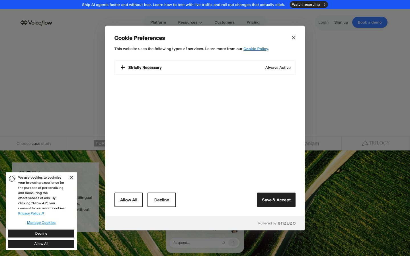
- A cookie-preferences modal overlays the landing capture; its styling is third-party (Enzuzo) and out of scope.
<!-- Documented by duply · real-world design systems as ready-to-use DESIGN.md for AI coding agents · https://duply.ai/voiceflow/design-md -->
Color Palette
Accent
Neutrals
Typography
display64px · 300 · 1.125
The quick brown fox jumpseyebrow14px · 400 · 1.16
The quick brown fox jumpsbody-lg20px · 600 · 1.21
The quick brown fox jumpsbutton-micro8px · 400 · 1
The quick brown fox jumpsSpacing & Shape
Spacing
| Name | Value | Preview |
|---|---|---|
| xxs | 4px | |
| xs | 8px | |
| sm | 12px | |
| md | 16px | |
| lg | 20px | |
| xl | 24px | |
| xxl | 32px | |
| huge | 40px |
Border Radius
| Name | Value | Preview |
|---|---|---|
| none | 0px | |
| xs | 3px | |
| sm | 4px | |
| md | 5px | |
| lg | 20px | |
| pill | 100px | |
| full | 999px |
More like this


---
version: alpha
name: Voiceflow-design-analysis
description: "An editorial, enterprise-AI marketing surface built on a warm off-white canvas (#f5f5f5) with a serif Tiempos Headline display voice paired against the compact Selecta UI face. The system reads as restrained-but-confident B2B software — square-cornered editorial cards, near-monochrome neutrals, an electric-blue action color (#1956f3) used as a pill CTA and announcement bar, and a sparing orange eyebrow accent (#f55c15). A dark slate footer closes long-scroll pages while the body stays light and gallery-like."
colors:
  accent-blue: "#1956f3"
  accent-orange: "#f55c15"
  ink: "#000000"
  body: "#222222"
  muted: "#737373"
  neutral-500: "#7c7c7c"
  neutral-550: "#525252"
  neutral-600: "#404040"
  neutral-700: "#333333"
  neutral-800: "#262626"
  hairline: "#e5e5e5"
  neutral-300: "#d4d4d4"
  surface-soft: "#f1f2f2"
  surface-light: "#f8f7f7"
  canvas: "#f5f5f5"
  slate-dark: "#1f2428"
  slate: "#3e4852"
  slate-muted: "#9aa1a3"
  blue-grey: "#9aa8b1"
  on-dark: "#ffffff"
typography:
  display:
    fontFamily: "Tiempos Headline, Inter, serif"
    fontSize: 64px
    fontWeight: 300
    lineHeight: 1.125
    letterSpacing: -2.56px
  eyebrow:
    fontFamily: "Selecta, Inter, sans-serif"
    fontSize: 14px
    fontWeight: 400
    lineHeight: 1.16
    letterSpacing: 0.32px
  body-lg:
    fontFamily: "Selecta, Inter, sans-serif"
    fontSize: 20px
    fontWeight: 600
    lineHeight: 1.21
    letterSpacing: 0.28px
  button-micro:
    fontFamily: "Selecta, Inter, sans-serif"
    fontSize: 8px
    fontWeight: 400
    lineHeight: 1.0
    letterSpacing: 0.32px
rounded:
  none: 0px
  xs: 3px
  sm: 4px
  md: 5px
  lg: 20px
  pill: 100px
  full: 999px
spacing:
  xxs: 4px
  xs: 8px
  sm: 12px
  md: 16px
  lg: 20px
  xl: 24px
  xxl: 32px
  huge: 40px
components:
  announcement-bar:
    backgroundColor: "{colors.accent-blue}"
    textColor: "{colors.on-dark}"
    typography: "{typography.eyebrow}"
    rounded: "{rounded.none}"
    padding: 12px 24px
  top-nav:
    backgroundColor: "{colors.canvas}"
    textColor: "{colors.body}"
    typography: "{typography.eyebrow}"
    rounded: "{rounded.none}"
    padding: 20px 24px
  nav-link:
    backgroundColor: transparent
    textColor: "{colors.body}"
    typography: "{typography.eyebrow}"
  button-demo:
    backgroundColor: "{colors.accent-blue}"
    textColor: "{colors.on-dark}"
    typography: "{typography.eyebrow}"
    rounded: "{rounded.full}"
    padding: 12px 24px
  button-primary:
    backgroundColor: transparent
    textColor: "{colors.muted}"
    typography: "{typography.button-micro}"
    rounded: "{rounded.none}"
    padding: 0px
  eyebrow-label:
    backgroundColor: transparent
    textColor: "{colors.accent-orange}"
    typography: "{typography.eyebrow}"
  card:
    backgroundColor: "{colors.surface-light}"
    textColor: "{colors.body}"
    rounded: "{rounded.none}"
  product-mockup-card:
    backgroundColor: "{colors.surface-light}"
    textColor: "{colors.body}"
    rounded: "{rounded.none}"
  testimonial-card:
    backgroundColor: "{colors.surface-light}"
    textColor: "{colors.body}"
    typography: "{typography.body-lg}"
    rounded: "{rounded.none}"
  stat-block:
    backgroundColor: transparent
    textColor: "{colors.body}"
    typography: "{typography.display}"
  footer:
    backgroundColor: "{colors.slate-dark}"
    textColor: "{colors.on-dark}"
    typography: "{typography.eyebrow}"
    rounded: "{rounded.none}"
    padding: 40px
---

## Overview

Voiceflow's marketing surface is a restrained, editorial enterprise-AI interface. The page floor is a warm off-white `{colors.canvas}` (#f5f5f5) — not pure white — which gives the long-scroll a gallery quality. Type voice is a two-face split: **Tiempos Headline** (a licensed serif display face) carries the big editorial headlines at weight 300 with aggressive negative tracking (-2.56px), while **Selecta** (a compact grotesque) carries eyebrow labels, body, and UI text. The combination reads as confident B2B software that wants to look considered rather than loud.

The action layer is near-monochrome with one electric accent: `{colors.accent-blue}` (#1956f3) powers the top announcement bar and the rounded "Book a demo" pill CTA. A second accent, `{colors.accent-orange}` (#f55c15), appears only as small eyebrow labels ("Security", "Why Voiceflow", "Real-time collaboration") above section headings — it is never used on a surface or a button.

Structurally the system is square. Cards measured with `0px` radius — feature mockups, testimonial cards, and the platform grid are all hard-cornered rectangles separated by hairlines (`{colors.hairline}` — #e5e5e5) rather than shadows. The only rounding in the system is on the blue CTA pill (`{rounded.full}`) and a few `{rounded.lg}` (20px) media containers. The page closes on a dark slate footer (`{colors.slate-dark}` — #1f2428), the single dark surface in an otherwise light document.

**Key Characteristics:**
- Warm off-white canvas (`{colors.canvas}` — #f5f5f5) instead of pure white — the document reads as a light gallery, not a white SaaS page.
- Serif display headlines in **Tiempos Headline** at weight 300 with -2.56px tracking — editorial, light, wide-set. Substituted with Inter here.
- Compact **Selecta** grotesque for eyebrows, body, and UI — measured eyebrow at 14px/400 and body at 20px/600.
- Square geometry — cards and surfaces measured at `0px` radius; structure comes from hairlines, not shadows.
- One electric-blue action color (`{colors.accent-blue}` — #1956f3) for the announcement bar and the single rounded pill CTA.
- A sparing orange eyebrow accent (`{colors.accent-orange}` — #f55c15) above section headings only — never on surfaces.
- Product UI fragments shown directly inside square cards (workflow builder, chat respond box, resolution chart) rather than illustrated.
- A dark slate footer (`{colors.slate-dark}` — #1f2428) closes the page — the only dark band in the system.

## Colors

### Brand & Accent
- **Accent Blue** (`{colors.accent-blue}` — #1956f3): The single action color. Powers the top `announcement-bar` and the rounded "Book a demo" `button-demo`. The most chromatic element in the system; everything else is neutral.
- **Accent Orange** (`{colors.accent-orange}` — #f55c15): Used exclusively as small eyebrow labels above section headings ("Security", "Why Voiceflow"). Never appears on a surface, button, or body text.

### Surface
- **Canvas** (`{colors.canvas}` — #f5f5f5): The warm off-white page floor, measured as `body.background`.
- **Surface Light** (`{colors.surface-light}` — #f8f7f7): Card and mockup surfaces sitting one shade above the canvas.
- **Surface Soft** (`{colors.surface-soft}` — #f1f2f2): A second light fill used for subtle section blocks.
- **Slate Dark** (`{colors.slate-dark}` — #1f2428): The footer background — the only dark surface on the page.
- **Slate** (`{colors.slate}` — #3e4852): A mid-dark slate used inside dark/footer contexts.

### Text
- **Ink** (`{colors.ink}` — #000000): Pure black, used for high-contrast display moments.
- **Body** (`{colors.body}` — #222222): Default running-text color, measured on `p`.
- **Muted** (`{colors.muted}` — #737373): Secondary / low-contrast text — sub-labels, captions, the measured small button text.
- **Neutral ramp** (`{colors.neutral-500}` #7c7c7c · `{colors.neutral-550}` #525252 · `{colors.neutral-600}` #404040 · `{colors.neutral-700}` #333333 · `{colors.neutral-800}` #262626): A dense gray ramp used for tiered text and small UI chrome.
- **Slate Muted** (`{colors.slate-muted}` — #9aa1a3) and **Blue Grey** (`{colors.blue-grey}` — #9aa8b1): Cool grays used for muted text on lighter slate panels and logo rows.
- **On Dark** (`{colors.on-dark}` — #ffffff): White text on the blue bar, blue pill, and dark footer. (#ffffff was measured as the dominant link/`a` color.)

### Hairline
- **Hairline** (`{colors.hairline}` — #e5e5e5): The 1px divider tone separating square cards and section rows — the primary structural device in a near-shadowless system.
- **Neutral 300** (`{colors.neutral-300}` — #d4d4d4): A slightly stronger hairline / border tone.

## Typography

### Font Family
The system runs two licensed/custom faces. **Tiempos Headline** (a Klim serif) carries the large editorial display headlines; **Selecta** (a compact grotesque) carries eyebrow labels, body copy, and UI text. Tiempos was flagged as licensed in analysis and substitutes to **Inter**; Selecta is also a custom/foundry face and substitutes to **Inter** here as well (see Known Gaps).

The split is functional:
- Tiempos Headline (display, weight 300, -2.56px tracking) — h1 / hero headlines, big stat numerals
- Selecta (eyebrow + body + UI, 400–600 weight) — section eyebrows, paragraphs, nav, buttons

### Hierarchy

| Token | Size | Weight | Line Height | Letter Spacing | Use |
|---|---|---|---|---|---|
| `{typography.display}` | 64px | 300 | 1.125 | -2.56px | Hero h1, large stat numerals — Tiempos Headline |
| `{typography.eyebrow}` | 14px | 400 | 1.16 | 0.32px | Section eyebrows (h2), nav links, small labels — Selecta |
| `{typography.body-lg}` | 20px | 600 | 1.21 | 0.28px | Lead body / testimonial quotes — Selecta |
| `{typography.button-micro}` | 8px | 400 | 1.0 | 0.32px | Captured button label (see Known Gaps) — Selecta |

### Principles
The voice is the serif/grotesque contrast: light, wide-set Tiempos for the editorial headline and compact Selecta for everything functional. Tiempos display lives at weight **300** — its lightness plus the -2.56px negative tracking is the brand signature; rendering it heavier reads as off-brand. Selecta carries positive tracking (0.28–0.32px), the opposite of the headline, which keeps small text legible at the compact sizes used.

### Note on Font Substitutes
**Tiempos Headline** is licensed (Klim Type Foundry) and not freely redistributable; **Inter** is the documented substitute, though as a sans it loses the serif character — for closer fidelity a free serif such as **Source Serif 4** or **Lora** at a light weight better approximates the wide, light display feel. **Selecta** (the UI face) is likewise a foundry face; **Inter** is a reasonable open substitute for body/UI text. Neither licensed face ships with this system.

## Layout

### Spacing System
- **Base unit:** 4px.
- **Tokens:** `{spacing.xxs}` 4px · `{spacing.xs}` 8px · `{spacing.sm}` 12px · `{spacing.md}` 16px · `{spacing.lg}` 20px · `{spacing.xl}` 24px · `{spacing.xxl}` 32px · `{spacing.huge}` 40px.
- The most frequent measured steps are 20px, 24px, 12px, and 32px — the editorial rhythm is built on 20/24 increments rather than a strict 8px ladder.
- Larger section-band spacing was not reliably measured; treat values above 40px as derived from the screenshot rhythm rather than tokenized.

### Grid & Container
- **Editorial bands:** Centered single-column content with multi-up card rows.
- **Feature mockup row:** 3-up at desktop (Build / Launch / Iterate), each a square product-mockup card.
- **Testimonial grid:** 2-up at desktop (logo + quote + portrait).
- **Platform grid:** 4-up column header row (Product / CX & support leaders / Engineers / Enterprise teams).
- **Footer:** Multi-column dark band closing the page.

### Whitespace Philosophy
Voiceflow leans into generous editorial whitespace — large empty bands between the hero, the stat block, and the testimonial wall. Square cards float in this whitespace separated by hairlines rather than shadows, which gives the long scroll a calm, document-like cadence.

## Elevation & Depth

| Level | Treatment | Use |
|---|---|---|
| Flat | No shadow, no border | Most sections on the canvas |
| Hairline | 1px `{colors.hairline}` divider (measured `rgb(229,229,229) 0px 1px 0px 0px`) | Section row separators, nav underlines |
| Square card | `{colors.surface-light}` fill, `0px` radius, no shadow | Feature mockups, testimonial cards, platform grid |
| Floating panel | Measured multi-layer shadow `rgba(80,80,80,0.12) 0px 9px 46px 8px, rgba(80,80,80,0.14) 0px 24px 38px 3px, rgba(80,80,80,0.2) 0px 11px 15px -7px` | A single elevated overlay/panel (e.g. modal or floating product card) |
| Dark footer | `{colors.slate-dark}` band | Closes the page via color inversion, no shadow |

The elevation philosophy is **flat and editorial** — structure comes from hairlines and color blocks, not shadow. Only one deep multi-layer shadow was measured, reserved for a single floating panel; it is not a repeating card treatment.

## Shapes

### Border Radius Scale

| Token | Value | Use |
|---|---|---|
| `{rounded.none}` | 0px | Cards, mockups, testimonial blocks, the measured button — the default square geometry |
| `{rounded.xs}` | 3px | Small inline chrome |
| `{rounded.sm}` | 4px | Minor inputs / chips |
| `{rounded.md}` | 5px | Small UI elements |
| `{rounded.lg}` | 20px | Larger media / panel containers |
| `{rounded.pill}` | 100px | Pill chips |
| `{rounded.full}` | 999px | The blue "Book a demo" CTA, fully-rounded badges |

The system is dominantly square (`0px`); the only consistently rounded element is the blue pill CTA.

### Photography Geometry
Testimonial portraits and case-study imagery sit in hard-cornered (`0px`) rectangles. Product UI fragments inside cards retain their own native chrome. The single rounded media treatment uses `{rounded.lg}` (20px).

## Components

### Top Navigation & Announcement

**`announcement-bar`** — Full-width blue bar pinned above the nav. Background `{colors.accent-blue}`, text `{colors.on-dark}` in `{typography.eyebrow}`, carries a short message plus a "Watch recording" chip. Padding ~12px × 24px, square (`{rounded.none}`).

**`top-nav`** — White-on-canvas nav, `{colors.canvas}` background, `{colors.body}` text. Carries the Voiceflow wordmark left, center menu (Platform, Resources, Customers, Pricing) in `{typography.eyebrow}`, and a right cluster of Login / Sign up text links plus the `button-demo` pill.

**`nav-link`** — Inline menu item, transparent background, `{colors.body}` text, `{typography.eyebrow}`.

### Buttons

**`button-demo`** — The signature CTA ("Book a demo"). Background `{colors.accent-blue}`, text `{colors.on-dark}`, `{typography.eyebrow}` label, fully rounded `{rounded.full}`, padding ~12px × 24px. The blue-pill color and full radius are assigned from the screenshot and the measured accent-blue + full-radius tokens (derived: the analyzer's `button` capture did not bind to this element).

**`button-primary`** — As measured: transparent background, `{colors.muted}` text, `{typography.button-micro}` label, square `{rounded.none}`, `0px` padding. This reflects a captured low-emphasis text/icon button rather than the visual primary CTA (see Known Gaps).

**`eyebrow-label`** — Small orange section eyebrow ("Security", "Why Voiceflow"). Transparent background, `{colors.accent-orange}` text, `{typography.eyebrow}`. Sits above display headings.

### Cards & Containers

**`card`** — The base square container, as measured: `0px` radius, no shadow, `{colors.surface-light}` fill. Structure comes from surrounding hairlines.

**`product-mockup-card`** — Square card holding actual Voiceflow product UI (workflow builder, "Respond…" chat box, resolution chart with 84% pass rate). Background `{colors.surface-light}`, `{rounded.none}`. The product chrome is shown as content, not illustrated.

**`testimonial-card`** — Customer-quote block in the testimonial wall (Sanlam, Turo, JPMorgan Chase, Optum). Background `{colors.surface-light}`, text `{colors.body}`, quote in `{typography.body-lg}`, with a logo + portrait + name/role row. Square (`{rounded.none}`).

**`stat-block`** — Large editorial stat numerals (Latency for voice, Messages per minute, Live agents in production). Transparent, numerals in `{typography.display}` (Tiempos light), labels in `{typography.eyebrow}`.

### Footer

**`footer`** — Dark slate band that closes the page ("Purpose-built for enterprise scale"). Background `{colors.slate-dark}`, text `{colors.on-dark}` with muted cool-gray sub-text, `{typography.eyebrow}` link rows, square geometry, padding ~40px. The only dark surface in the system.

## Do's and Don'ts

### Do
- Keep the page on the warm off-white `{colors.canvas}` (#f5f5f5) — not pure white. The slight warmth is part of the editorial voice.
- Reserve `{colors.accent-blue}` for the announcement bar and the single pill CTA. It is the only action color.
- Use `{colors.accent-orange}` only as small section eyebrows — never on a surface or button.
- Set display headlines in Tiempos Headline at weight 300 with negative tracking. The lightness is the signature.
- Keep cards square (`{rounded.none}`) and separate them with `{colors.hairline}` dividers instead of shadows.
- Show real product UI inside `product-mockup-card` rather than illustrating the product.
- End the page on the dark `{colors.slate-dark}` footer — the only dark band.

### Don't
- Don't render Tiempos display at a heavy weight — it lives at 300.
- Don't add rounded corners to content cards; the square geometry is deliberate (only the blue CTA is a pill).
- Don't introduce additional dark surfaces above the footer.
- Don't apply shadows to standard cards — the measured deep shadow is reserved for a single floating panel.
- Don't use the orange accent on any interactive element; it is a label color only.
- Don't document hover states — default and active/pressed only.

## Responsive Behavior

### Breakpoints
Breakpoint widths were not measured. The captured layouts imply:

| Name | Behavior (observed) |
|---|---|
| Mobile | Nav collapses; hero display scales down from 64px; 3-up feature row stacks to 1-up; testimonial grid 2→1; footer columns stack |
| Tablet | Menu tightens; feature cards 3→2; testimonial grid stays 2-up |
| Desktop | Full nav; 3-up feature mockups; 2-up testimonials; 4-up platform header row |

### Touch Targets
- `button-demo` is a comfortable pill; the measured `button-primary` at `0px` padding and an 8px label is below any usable tap minimum and should not be relied upon as captured.
- Exact control heights were not measured.

### Collapsing Strategy
- The hero display headline scales down on narrow viewports.
- The 3-up feature mockup row reduces columns rather than shrinking the product UI past legibility.
- The testimonial wall collapses 2→1 while keeping square cards.
- The dark footer stacks its columns and remains the page-closing band.

## Iteration Guide

1. Focus on ONE component at a time and reference its YAML key directly (`{component.testimonial-card}`, `{component.button-demo}`).
2. Variants live as separate `components:` entries.
3. Use `{token.refs}` everywhere — never inline a hex.
4. Document default and active/pressed only — never hover.
5. Display stays Tiempos Headline 300 with negative tracking; UI stays Selecta. The two-face split does not blur.
6. Keep geometry square (`{rounded.none}`); the blue pill is the only intentional `{rounded.full}` element.
7. When adding emphasis, prefer the blue accent or larger Tiempos — not the orange (which is reserved for eyebrows).

## Known Gaps

- The captured `button-primary` props (`color: #737373`, `radius: 0px`, `padding: 0px`, 8px font) clearly bound to a low-emphasis text/icon element, not the visible blue "Book a demo" CTA. The `button-demo` blue/pill spec is derived from the screenshot plus the measured `accent-blue` and `full` radius tokens; padding and height are estimates.
- Only four typography roles were measured. Intermediate heading sizes (h2 visual headlines like "AI agents without blackbox limitations"), small body, and caption sizes were not captured and are not tokenized — do not invent them.
- The measured h2 (14px Selecta) corresponds to the small eyebrow label role, not the large serif sub-headlines seen in screenshots; those larger serif headings were not individually measured.
- **Tiempos Headline** is licensed and **Selecta** is a custom/foundry face; both are substituted with Inter (and an optional free serif for the display role). Neither ships with this system.
- Section-level vertical spacing (large band gaps) exceeds the measured spacing ceiling of 40px and is treated as derived from the screenshot rhythm.
- Only two box-shadow values were measured (a 1px hairline and one deep multi-layer panel shadow); a full elevation ramp is not available.
- Exact breakpoint widths, control heights, and animation/transition timings were not captured.
- Much of the lower page (platform grid, "Built for omnichannel experiences", enterprise-scale band) is rendered as near-empty layout in the captures; its component fills and exact colors could not be fully measured.
- A cookie-preferences modal overlays the landing capture; its styling is third-party (Enzuzo) and out of scope.

<!-- Documented by duply · real-world design systems as ready-to-use DESIGN.md for AI coding agents · https://duply.ai/voiceflow/design-md -->