Bytewax
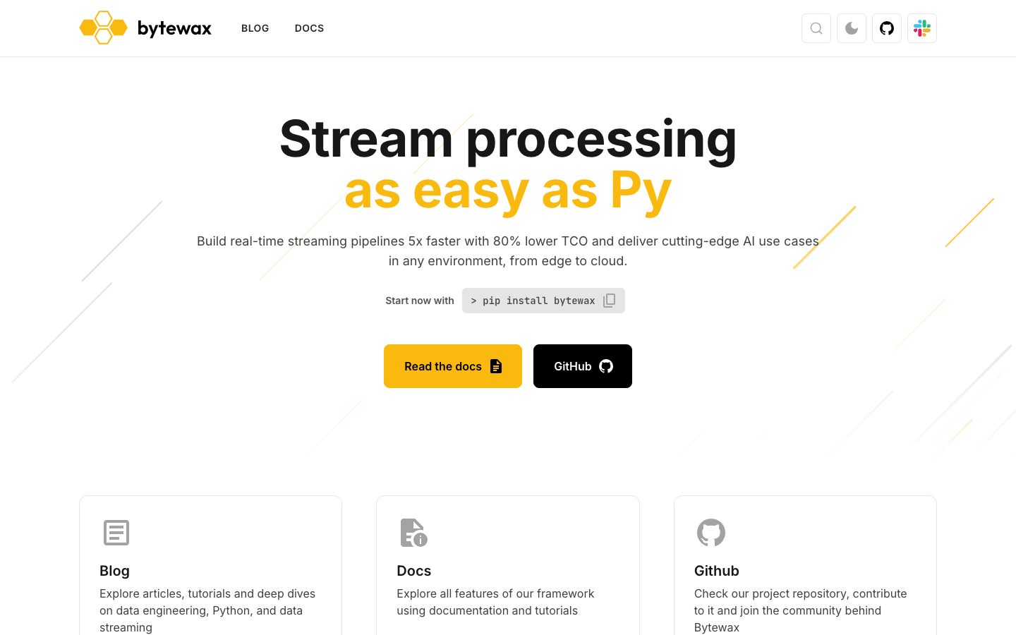
A bright, developer-tool landing surface built on white canvas with near-black Inter headlines and a single high-voltage yellow accent. The system reads as clean modern open-source SaaS — a huge 72px hero headline whose second line flips to brand yellow, a monospace install pill, paired accent + black CTA buttons, and a row of flat light-gray-bordered feature cards. Brand voltage comes almost entirely from the yellow accent (#fab90f) against an otherwise grayscale palette.
---
version: alpha
name: Bytewax-design-analysis
description: "A bright, developer-tool landing surface built on white canvas with near-black Inter headlines and a single high-voltage yellow accent. The system reads as clean modern open-source SaaS — a huge 72px hero headline whose second line flips to brand yellow, a monospace install pill, paired accent + black CTA buttons, and a row of flat light-gray-bordered feature cards. Brand voltage comes almost entirely from the yellow accent (#fab90f) against an otherwise grayscale palette."

colors:
  canvas: "#ffffff"
  ink: "#404040"
  ink-strong: "#171717"
  black: "#000000"
  muted: "#737373"
  muted-deep: "#525252"
  on-primary: "#a3a3a3"
  surface: "#e5e5e5"
  surface-dark: "#262626"
  accent: "#fab90f"

typography:
  display:
    fontFamily: "Inter, sans-serif"
    fontSize: 72px
    fontWeight: 700
    lineHeight: 1.0
    letterSpacing: -0.72px
  title:
    fontFamily: "Inter, sans-serif"
    fontSize: 20px
    fontWeight: 600
    lineHeight: 1.4
    letterSpacing: 0
  body:
    fontFamily: "Inter, sans-serif"
    fontSize: 18px
    fontWeight: 400
    lineHeight: 1.556
    letterSpacing: 0
  button:
    fontFamily: "Inter, sans-serif"
    fontSize: 16px
    fontWeight: 400
    lineHeight: 1.5
    letterSpacing: 0

rounded:
  sm: 6px
  md: 8px
  lg: 12px

spacing:
  xxs: 6px
  xs: 8px
  sm: 12px
  md: 16px
  lg: 24px
  xl: 28px
  xxl: 32px
  huge: 48px
  section: 80px

components:
  top-nav:
    backgroundColor: "{colors.canvas}"
    textColor: "{colors.ink-strong}"
    typography: "{typography.button}"
  button-primary:
    backgroundColor: "{colors.canvas}"
    textColor: "{colors.on-primary}"
    typography: "{typography.button}"
    rounded: "{rounded.sm}"
    padding: 0px 11px
  button-cta-accent:
    backgroundColor: "{colors.accent}"
    textColor: "{colors.ink-strong}"
    typography: "{typography.button}"
    rounded: "{rounded.sm}"
  button-cta-dark:
    backgroundColor: "{colors.black}"
    textColor: "{colors.canvas}"
    typography: "{typography.button}"
    rounded: "{rounded.sm}"
  install-pill:
    backgroundColor: "{colors.surface}"
    textColor: "{colors.ink}"
    typography: "{typography.button}"
    rounded: "{rounded.sm}"
  card:
    backgroundColor: "{colors.surface}"
    textColor: "{colors.ink}"
    rounded: "{rounded.sm}"
  feature-card:
    backgroundColor: "{colors.canvas}"
    textColor: "{colors.ink}"
    typography: "{typography.body}"
    rounded: "{rounded.lg}"
  feature-card-title:
    backgroundColor: transparent
    textColor: "{colors.ink-strong}"
    typography: "{typography.title}"
  feature-card-link:
    backgroundColor: transparent
    textColor: "{colors.muted}"
    typography: "{typography.button}"
  footer:
    backgroundColor: "{colors.canvas}"
    textColor: "{colors.muted}"
    typography: "{typography.body}"
---

## Overview

Bytewax's landing page is a bright, developer-tool marketing surface — white canvas (`{colors.canvas}` — #ffffff) with near-black Inter headlines (`{colors.ink-strong}` — #171717) and a single high-voltage yellow accent (`{colors.accent}` — #fab90f) doing almost all the brand work. The system reads as clean, confident, open-source SaaS: one enormous hero headline, a monospace install pill, two paired CTA buttons (yellow + black), and a flat row of feature cards.

The type system is single-family: **Inter** at every role. The hero headline is the marquee moment — 72px, weight 700, negative letter-spacing (-0.72px), with the second line ("as easy as Py") flipping to brand yellow against the grayscale first line. Everything below the hero is supporting type at modest sizes (20px section titles, 18px body).

Color voltage is concentrated. The palette is fundamentally grayscale — text steps from `{colors.ink}` (#404040) through `{colors.muted}` (#737373) down to disabled-gray (`{colors.on-primary}` — #a3a3a3) — and the only chromatic signal is the yellow accent, used on the hero's highlight line and on the primary "Read the docs" CTA. The secondary "GitHub" CTA goes pure black (`{colors.black}` — #000000). This two-tone CTA pairing (yellow + black) is the system's signature interactive moment.

**Key Characteristics:**
- White canvas with a single yellow accent (`{colors.accent}` — #fab90f). The system is grayscale-plus-one-color.
- Single-family Inter typography across all roles. The 72px / 700 / -0.72px hero headline is the brand's loudest gesture.
- Two-tone CTA pairing — yellow accent button (`{component.button-cta-accent}`) beside a black button (`{component.button-cta-dark}`), both `{rounded.sm}` (6px).
- A monospace-style install pill (`{component.install-pill}`) on `{colors.surface}` (#e5e5e5) for the `pip install bytewax` command.
- Flat feature cards (`{component.feature-card}`) — no shadows anywhere in the system; depth comes purely from hairline borders and the light-gray card surface.
- Tight radius scale: `{rounded.sm}` (6px) dominates buttons, pills, and cards; `{rounded.lg}` (12px) on the larger bordered feature cards.
- Decorative thin diagonal lines (gray + yellow) scatter behind the hero — a subtle "data stream" motif, purely decorative.

## Colors

### Brand & Accent
- **Accent** (`{colors.accent}` — #fab90f): The single brand color. Used on the hero's second headline line ("as easy as Py") and on the primary "Read the docs" CTA. Everything else in the system is grayscale — the yellow is scarce and deliberate.

### Surface
- **Canvas** (`{colors.canvas}` — #ffffff): The default page floor, top-nav background, feature-card background, and the measured background of the small primary pill button.
- **Surface** (`{colors.surface}` — #e5e5e5): The install-pill background and the light-gray card fill. Also the hairline-border tone on feature cards.
- **Surface Dark** (`{colors.surface-dark}` — #262626): A dark neutral measured at low frequency — used for dark UI chrome / icon fills.

### Text & Ink
- **Ink** (`{colors.ink}` — #404040): The dominant running-text color — body copy and card descriptions.
- **Ink Strong** (`{colors.ink-strong}` — #171717): Near-black for the hero headline's first line and card titles.
- **Black** (`{colors.black}` — #000000): Pure black, used on the dark "GitHub" CTA button.
- **Muted** (`{colors.muted}` — #737373): Secondary text — card link labels ("CHECK OUR BLOG →"), footer copyright.
- **Muted Deep** (`{colors.muted-deep}` — #525252): A slightly darker muted tone for tertiary text.
- **On Primary** (`{colors.on-primary}` — #a3a3a3): The text color measured inside the primary pill button — reads as a low-emphasis / disabled-gray label.

## Typography

### Font Family
The system runs **Inter** at every role — display, title, body, and button. Inter is open-source (SIL Open Font License), so no substitution is required; the production stack should fall back to `Inter, sans-serif`. There are no licensed or custom typefaces in this system.

The hierarchy is shallow and developer-tool-typical: one very large display size for the hero, then a tight cluster of small supporting sizes. The brand voice lives entirely in the hero's 72px / 700-weight headline with negative tracking — everything else stays calm and functional.

### Hierarchy

| Token | Size | Weight | Line Height | Letter Spacing | Use |
|---|---|---|---|---|---|
| `{typography.display}` | 72px | 700 | 1.0 | -0.72px | Hero headline ("Stream processing / as easy as Py") |
| `{typography.title}` | 20px | 600 | 1.4 | 0 | Feature-card titles (Blog, Docs, Github) |
| `{typography.body}` | 18px | 400 | 1.556 | 0 | Hero sub-headline, card descriptions, running text |
| `{typography.button}` | 16px | 400 | 1.5 | 0 | Button labels, install pill, nav links |

### Principles
The display size carries the entire brand weight — 72px, bold (700), tight tracking. The second line flips to `{colors.accent}` while the first stays `{colors.ink-strong}`, splitting one headline across two color values. Supporting type stays small and regular-weight (the measured button label is weight 400 — Bytewax does not bold its button text by default).

There is no separate code/mono token measured; the `pip install bytewax` pill renders in a monospace style on screen but its family was not captured (see Known Gaps).

### Note on Font Substitutes
No substitution needed — Inter is open-source and shipped directly. No licensed faces were flagged in this capture.

## Layout

### Spacing System
- **Base unit:** Inconsistent / not strictly 4px-derived; measured values cluster around 28px and 32px (the most frequent gaps).
- **Tokens:** `{spacing.xxs}` 6px · `{spacing.xs}` 8px · `{spacing.sm}` 12px · `{spacing.md}` 16px · `{spacing.lg}` 24px · `{spacing.xl}` 28px · `{spacing.xxl}` 32px · `{spacing.huge}` 48px · `{spacing.section}` 80px.
- **Section rhythm:** `{spacing.section}` (80px) is the largest measured gap — the vertical breathing room between the hero band and the feature-card row.
- **Card / component internal padding:** clusters at `{spacing.xl}` (28px) and `{spacing.xxl}` (32px) — the two highest-frequency spacing values.

### Grid & Container
- **Feature-card grid:** 3-up at desktop (Blog / Docs / Github), evenly distributed across the content width.
- **Hero:** single centered column — headline, sub-headline, install pill, and the CTA button pair all center-aligned.
- **Top nav:** logo + wordmark left, BLOG / DOCS links center-left, utility icon cluster (search, theme toggle, GitHub, Slack) right.

### Whitespace Philosophy
Generous vertical whitespace around the hero (80px section gap) keeps the 72px headline from feeling cramped, while the feature cards below sit on a tight, scannable 3-up grid. The page is short and focused — one hero, one card row, one footer.

## Elevation & Depth

| Level | Treatment | Use |
|---|---|---|
| Flat | No shadow at all | Every surface — measured `shadows: []` |
| Hairline border | 1px `{colors.surface}` (#e5e5e5) outline | Feature cards, install pill, nav utility buttons |
| Light-gray fill | `{colors.surface}` background | Install pill, the measured card surface |

The system has **zero measured shadows** — depth is communicated entirely through hairline borders and light-gray fills. This is a flat, modern developer-tool aesthetic.

### Decorative Depth
- Thin diagonal lines (faint gray and yellow strokes) scatter behind the hero — a "data stream / pipeline" motif. Purely decorative; not a depth or elevation token.

## Shapes

### Border Radius Scale

| Token | Value | Use |
|---|---|---|
| `{rounded.sm}` | 6px | The dominant radius — CTA buttons, install pill, the measured card |
| `{rounded.md}` | 8px | Occasional — nav utility buttons / small chips |
| `{rounded.lg}` | 12px | The larger bordered feature cards in the 3-up row |

The radius system is small and consistent — `{rounded.sm}` (6px) appears most frequently (measured 11×), giving buttons and pills a gently-softened rather than pill-shaped silhouette.

### Iconography
Feature cards lead with simple line-icons (document, file-info, GitHub mark) in a muted gray. Nav utility icons (search, theme toggle, GitHub, Slack) sit inside small rounded square chips.

## Components

### Top Navigation

**`top-nav`** — White nav bar across the top. Carries the bytewax hexagon logo + lowercase wordmark at left, BLOG / DOCS text links (`{typography.button}`) center-left, and a right-side utility cluster of small icon buttons (search, light/dark theme toggle, GitHub, Slack). Background `{colors.canvas}`, link text `{colors.ink-strong}`.

### Buttons

**`button-primary`** — The measured small pill button: background `{colors.canvas}`, text `{colors.on-primary}` (#a3a3a3 — low-emphasis gray), type `{typography.button}`, rounded `{rounded.sm}` (6px), padding 0px × 11px. This is the compact copy/utility pill (e.g. the copy-to-clipboard control beside the install command).

**`button-cta-accent`** — The primary hero CTA ("Read the docs"). Background `{colors.accent}` (#fab90f), text `{colors.ink-strong}`, type `{typography.button}`, rounded `{rounded.sm}`. The yellow CTA is the system's loudest interactive element. (Exact padding/height not captured — see Known Gaps.)

**`button-cta-dark`** — The secondary hero CTA ("GitHub"). Background `{colors.black}` (#000000), text `{colors.canvas}`, type `{typography.button}`, rounded `{rounded.sm}`. Sits immediately right of the accent button to form the signature two-tone CTA pair.

**`install-pill`** — The `> pip install bytewax` command chip. Background `{colors.surface}` (#e5e5e5), text `{colors.ink}`, monospace-style rendering, rounded `{rounded.sm}`. Preceded by a "Start now with" label and followed by a copy icon.

### Cards

**`card`** — The measured generic card: background `{colors.surface}` (#e5e5e5), rounded `{rounded.sm}` (6px), no shadow.

**`feature-card`** — The 3-up bottom-row cards (Blog / Docs / Github). Background `{colors.canvas}` with a hairline `{colors.surface}` border, rounded `{rounded.lg}` (12px), no shadow. Each carries a line-icon at top, a `{component.feature-card-title}` in `{typography.title}`, a `{typography.body}` description, and a `{component.feature-card-link}` row at the bottom.

**`feature-card-title`** — Card heading in `{colors.ink-strong}`, type `{typography.title}` (Inter 20px / 600).

**`feature-card-link`** — Uppercase muted action link ("CHECK OUR BLOG →", "READ THE DOCS →", "GITHUB →") in `{colors.muted}`, type `{typography.button}`.

### Footer

**`footer`** — Minimal closing band on white canvas. Left: "© 2026 bytewax. All rights reserved" in `{colors.muted}` (`{typography.body}`). Right: a small row of social icon chips (GitHub, Slack, X, LinkedIn). No dark surface — the page stays white top to bottom.

## Do's and Don'ts

### Do
- Reserve `{colors.accent}` (#fab90f) for the hero highlight line and the single primary CTA. The yellow is the only color in a grayscale system — keep it scarce.
- Pair the accent CTA with the black CTA (`{component.button-cta-dark}`). The yellow + black two-tone pairing is the signature interactive moment.
- Keep the hero headline at Inter 72px / 700 with -0.72px tracking. The shrunken negative tracking and the color split across two lines are the brand voice.
- Use flat surfaces with hairline `{colors.surface}` borders for cards. The system has no shadows — keep it flat.
- Render the install command as a monospace chip on `{colors.surface}` (`{component.install-pill}`). The terminal cue signals "developer tool".
- Keep body and button text at regular weight (400). Bytewax does not bold its supporting type.

### Don't
- Don't introduce a second accent color. The palette is grayscale-plus-yellow by design.
- Don't add drop shadows. Depth comes from borders and light-gray fills only (measured `shadows: []`).
- Don't bold body or button labels — the measured button weight is 400.
- Don't enlarge the radius beyond `{rounded.lg}` (12px) on cards or pill-shape the CTAs; the system stays gently-softened at 6px.
- Don't put body copy in the display size — the 72px / 700 weight is reserved for the single hero headline.
- Don't darken the page. Bytewax stays on white canvas top to bottom, including the footer.

## Responsive Behavior

| Name | Width | Key Changes |
|---|---|---|
| Mobile | < 768px | Hero headline scales down from 72px; CTA pair stacks; feature cards collapse 3-up → 1-up; nav collapses utility cluster |
| Tablet | 768–1024px | Feature cards 2-up or 3-up depending on width; hero stays centered single-column |
| Desktop | > 1024px | Full 3-up feature-card row; hero headline at full 72px; nav shows all links + utility icons |

### Touch Targets
- The hero CTAs (`{component.button-cta-accent}`, `{component.button-cta-dark}`) are the largest tap targets; exact heights were not captured.
- The measured `{component.button-primary}` padding (0px × 11px) is very compact — likely an inline icon/copy control rather than a standalone CTA, so its tap area depends on icon size (not captured).

### Collapsing Strategy
- Hero is a single centered column at every breakpoint — only the headline scale and the CTA stacking change.
- Feature cards reduce column count (3 → 2 → 1) rather than scaling down.
- Top-nav utility icon cluster collapses on small screens.

### Image Behavior
- The decorative diagonal "stream" lines behind the hero are background decoration and should be allowed to crop/fade on narrow viewports.

## Iteration Guide

1. Focus on ONE component at a time. Reference its YAML key directly (`{component.button-cta-accent}`, `{component.feature-card}`).
2. Variants live as separate `components:` entries.
3. Use `{token.refs}` everywhere — never inline hex.
4. Never document hover. Default and Active/Pressed states only.
5. Keep the palette grayscale-plus-yellow. Any new color is off-brand.
6. The hero headline is the loudest element — when in doubt, bigger display before more color.
7. Stay flat — no shadows. Add a hairline border before reaching for elevation.

## Known Gaps

- The two prominent hero CTA buttons ("Read the docs" yellow, "GitHub" black) were not captured as discrete button tokens — only a small white pill button (`button-primary`, white bg / #a3a3a3 text) was measured. The accent and dark CTA components are documented from screenshot ground-truth using declared color tokens; their exact padding, height, and label weight (the screenshot shows bolder labels than the measured weight-400 button) were **not** measured — these are derived from the reference screenshots.
- The `pip install bytewax` pill renders in a monospace style on screen, but no monospace font family was captured. No mono typography token is declared.
- Letter-spacing for `title`, `body`, and `button` is recorded as "normal" and represented as `0`.
- The spacing scale is not cleanly 4px/8px-derived; tokens are mapped directly from the measured cluster (28px and 32px were the highest-frequency values). Some intermediate values (10px, 11px, 18px, 36px) were folded into the nearest declared token.
- `{colors.surface-dark}` (#262626) and `{colors.muted-deep}` (#525252) were measured at low frequency; their exact roles (dark icon chrome / tertiary text) are inferred.
- No shadows were measured (`shadows: []`); the system is documented as fully flat.
- Dark-mode styling: the nav shows a light/dark theme toggle, but only the light theme was captured — dark-mode token values are out of scope.
- Animation, transition timings, and hover/focus states are not in scope.
- Only the landing page was captured; interior pages (blog, docs) are not represented.

<!-- Documented by duply · real-world design systems as ready-to-use DESIGN.md for AI coding agents · https://duply.ai/bytewax/design-md -->
Color Palette
Accent
Neutrals
Typography
display72px · 700 · 1
The quick brown fox jumpstitle20px · 600 · 1.4
The quick brown fox jumpsbody18px · 400 · 1.556
The quick brown fox jumpsbutton16px · 400 · 1.5
The quick brown fox jumpsSpacing & Shape
Spacing
| Name | Value | Preview |
|---|---|---|
| xxs | 6px | |
| xs | 8px | |
| sm | 12px | |
| md | 16px | |
| lg | 24px | |
| xl | 28px | |
| xxl | 32px | |
| huge | 48px | |
| section | 80px |
Border Radius
| Name | Value | Preview |
|---|---|---|
| sm | 6px | |
| md | 8px | |
| lg | 12px |
More like this


---
version: alpha
name: Bytewax-design-analysis
description: "A bright, developer-tool landing surface built on white canvas with near-black Inter headlines and a single high-voltage yellow accent. The system reads as clean modern open-source SaaS — a huge 72px hero headline whose second line flips to brand yellow, a monospace install pill, paired accent + black CTA buttons, and a row of flat light-gray-bordered feature cards. Brand voltage comes almost entirely from the yellow accent (#fab90f) against an otherwise grayscale palette."

colors:
  canvas: "#ffffff"
  ink: "#404040"
  ink-strong: "#171717"
  black: "#000000"
  muted: "#737373"
  muted-deep: "#525252"
  on-primary: "#a3a3a3"
  surface: "#e5e5e5"
  surface-dark: "#262626"
  accent: "#fab90f"

typography:
  display:
    fontFamily: "Inter, sans-serif"
    fontSize: 72px
    fontWeight: 700
    lineHeight: 1.0
    letterSpacing: -0.72px
  title:
    fontFamily: "Inter, sans-serif"
    fontSize: 20px
    fontWeight: 600
    lineHeight: 1.4
    letterSpacing: 0
  body:
    fontFamily: "Inter, sans-serif"
    fontSize: 18px
    fontWeight: 400
    lineHeight: 1.556
    letterSpacing: 0
  button:
    fontFamily: "Inter, sans-serif"
    fontSize: 16px
    fontWeight: 400
    lineHeight: 1.5
    letterSpacing: 0

rounded:
  sm: 6px
  md: 8px
  lg: 12px

spacing:
  xxs: 6px
  xs: 8px
  sm: 12px
  md: 16px
  lg: 24px
  xl: 28px
  xxl: 32px
  huge: 48px
  section: 80px

components:
  top-nav:
    backgroundColor: "{colors.canvas}"
    textColor: "{colors.ink-strong}"
    typography: "{typography.button}"
  button-primary:
    backgroundColor: "{colors.canvas}"
    textColor: "{colors.on-primary}"
    typography: "{typography.button}"
    rounded: "{rounded.sm}"
    padding: 0px 11px
  button-cta-accent:
    backgroundColor: "{colors.accent}"
    textColor: "{colors.ink-strong}"
    typography: "{typography.button}"
    rounded: "{rounded.sm}"
  button-cta-dark:
    backgroundColor: "{colors.black}"
    textColor: "{colors.canvas}"
    typography: "{typography.button}"
    rounded: "{rounded.sm}"
  install-pill:
    backgroundColor: "{colors.surface}"
    textColor: "{colors.ink}"
    typography: "{typography.button}"
    rounded: "{rounded.sm}"
  card:
    backgroundColor: "{colors.surface}"
    textColor: "{colors.ink}"
    rounded: "{rounded.sm}"
  feature-card:
    backgroundColor: "{colors.canvas}"
    textColor: "{colors.ink}"
    typography: "{typography.body}"
    rounded: "{rounded.lg}"
  feature-card-title:
    backgroundColor: transparent
    textColor: "{colors.ink-strong}"
    typography: "{typography.title}"
  feature-card-link:
    backgroundColor: transparent
    textColor: "{colors.muted}"
    typography: "{typography.button}"
  footer:
    backgroundColor: "{colors.canvas}"
    textColor: "{colors.muted}"
    typography: "{typography.body}"
---

## Overview

Bytewax's landing page is a bright, developer-tool marketing surface — white canvas (`{colors.canvas}` — #ffffff) with near-black Inter headlines (`{colors.ink-strong}` — #171717) and a single high-voltage yellow accent (`{colors.accent}` — #fab90f) doing almost all the brand work. The system reads as clean, confident, open-source SaaS: one enormous hero headline, a monospace install pill, two paired CTA buttons (yellow + black), and a flat row of feature cards.

The type system is single-family: **Inter** at every role. The hero headline is the marquee moment — 72px, weight 700, negative letter-spacing (-0.72px), with the second line ("as easy as Py") flipping to brand yellow against the grayscale first line. Everything below the hero is supporting type at modest sizes (20px section titles, 18px body).

Color voltage is concentrated. The palette is fundamentally grayscale — text steps from `{colors.ink}` (#404040) through `{colors.muted}` (#737373) down to disabled-gray (`{colors.on-primary}` — #a3a3a3) — and the only chromatic signal is the yellow accent, used on the hero's highlight line and on the primary "Read the docs" CTA. The secondary "GitHub" CTA goes pure black (`{colors.black}` — #000000). This two-tone CTA pairing (yellow + black) is the system's signature interactive moment.

**Key Characteristics:**
- White canvas with a single yellow accent (`{colors.accent}` — #fab90f). The system is grayscale-plus-one-color.
- Single-family Inter typography across all roles. The 72px / 700 / -0.72px hero headline is the brand's loudest gesture.
- Two-tone CTA pairing — yellow accent button (`{component.button-cta-accent}`) beside a black button (`{component.button-cta-dark}`), both `{rounded.sm}` (6px).
- A monospace-style install pill (`{component.install-pill}`) on `{colors.surface}` (#e5e5e5) for the `pip install bytewax` command.
- Flat feature cards (`{component.feature-card}`) — no shadows anywhere in the system; depth comes purely from hairline borders and the light-gray card surface.
- Tight radius scale: `{rounded.sm}` (6px) dominates buttons, pills, and cards; `{rounded.lg}` (12px) on the larger bordered feature cards.
- Decorative thin diagonal lines (gray + yellow) scatter behind the hero — a subtle "data stream" motif, purely decorative.

## Colors

### Brand & Accent
- **Accent** (`{colors.accent}` — #fab90f): The single brand color. Used on the hero's second headline line ("as easy as Py") and on the primary "Read the docs" CTA. Everything else in the system is grayscale — the yellow is scarce and deliberate.

### Surface
- **Canvas** (`{colors.canvas}` — #ffffff): The default page floor, top-nav background, feature-card background, and the measured background of the small primary pill button.
- **Surface** (`{colors.surface}` — #e5e5e5): The install-pill background and the light-gray card fill. Also the hairline-border tone on feature cards.
- **Surface Dark** (`{colors.surface-dark}` — #262626): A dark neutral measured at low frequency — used for dark UI chrome / icon fills.

### Text & Ink
- **Ink** (`{colors.ink}` — #404040): The dominant running-text color — body copy and card descriptions.
- **Ink Strong** (`{colors.ink-strong}` — #171717): Near-black for the hero headline's first line and card titles.
- **Black** (`{colors.black}` — #000000): Pure black, used on the dark "GitHub" CTA button.
- **Muted** (`{colors.muted}` — #737373): Secondary text — card link labels ("CHECK OUR BLOG →"), footer copyright.
- **Muted Deep** (`{colors.muted-deep}` — #525252): A slightly darker muted tone for tertiary text.
- **On Primary** (`{colors.on-primary}` — #a3a3a3): The text color measured inside the primary pill button — reads as a low-emphasis / disabled-gray label.

## Typography

### Font Family
The system runs **Inter** at every role — display, title, body, and button. Inter is open-source (SIL Open Font License), so no substitution is required; the production stack should fall back to `Inter, sans-serif`. There are no licensed or custom typefaces in this system.

The hierarchy is shallow and developer-tool-typical: one very large display size for the hero, then a tight cluster of small supporting sizes. The brand voice lives entirely in the hero's 72px / 700-weight headline with negative tracking — everything else stays calm and functional.

### Hierarchy

| Token | Size | Weight | Line Height | Letter Spacing | Use |
|---|---|---|---|---|---|
| `{typography.display}` | 72px | 700 | 1.0 | -0.72px | Hero headline ("Stream processing / as easy as Py") |
| `{typography.title}` | 20px | 600 | 1.4 | 0 | Feature-card titles (Blog, Docs, Github) |
| `{typography.body}` | 18px | 400 | 1.556 | 0 | Hero sub-headline, card descriptions, running text |
| `{typography.button}` | 16px | 400 | 1.5 | 0 | Button labels, install pill, nav links |

### Principles
The display size carries the entire brand weight — 72px, bold (700), tight tracking. The second line flips to `{colors.accent}` while the first stays `{colors.ink-strong}`, splitting one headline across two color values. Supporting type stays small and regular-weight (the measured button label is weight 400 — Bytewax does not bold its button text by default).

There is no separate code/mono token measured; the `pip install bytewax` pill renders in a monospace style on screen but its family was not captured (see Known Gaps).

### Note on Font Substitutes
No substitution needed — Inter is open-source and shipped directly. No licensed faces were flagged in this capture.

## Layout

### Spacing System
- **Base unit:** Inconsistent / not strictly 4px-derived; measured values cluster around 28px and 32px (the most frequent gaps).
- **Tokens:** `{spacing.xxs}` 6px · `{spacing.xs}` 8px · `{spacing.sm}` 12px · `{spacing.md}` 16px · `{spacing.lg}` 24px · `{spacing.xl}` 28px · `{spacing.xxl}` 32px · `{spacing.huge}` 48px · `{spacing.section}` 80px.
- **Section rhythm:** `{spacing.section}` (80px) is the largest measured gap — the vertical breathing room between the hero band and the feature-card row.
- **Card / component internal padding:** clusters at `{spacing.xl}` (28px) and `{spacing.xxl}` (32px) — the two highest-frequency spacing values.

### Grid & Container
- **Feature-card grid:** 3-up at desktop (Blog / Docs / Github), evenly distributed across the content width.
- **Hero:** single centered column — headline, sub-headline, install pill, and the CTA button pair all center-aligned.
- **Top nav:** logo + wordmark left, BLOG / DOCS links center-left, utility icon cluster (search, theme toggle, GitHub, Slack) right.

### Whitespace Philosophy
Generous vertical whitespace around the hero (80px section gap) keeps the 72px headline from feeling cramped, while the feature cards below sit on a tight, scannable 3-up grid. The page is short and focused — one hero, one card row, one footer.

## Elevation & Depth

| Level | Treatment | Use |
|---|---|---|
| Flat | No shadow at all | Every surface — measured `shadows: []` |
| Hairline border | 1px `{colors.surface}` (#e5e5e5) outline | Feature cards, install pill, nav utility buttons |
| Light-gray fill | `{colors.surface}` background | Install pill, the measured card surface |

The system has **zero measured shadows** — depth is communicated entirely through hairline borders and light-gray fills. This is a flat, modern developer-tool aesthetic.

### Decorative Depth
- Thin diagonal lines (faint gray and yellow strokes) scatter behind the hero — a "data stream / pipeline" motif. Purely decorative; not a depth or elevation token.

## Shapes

### Border Radius Scale

| Token | Value | Use |
|---|---|---|
| `{rounded.sm}` | 6px | The dominant radius — CTA buttons, install pill, the measured card |
| `{rounded.md}` | 8px | Occasional — nav utility buttons / small chips |
| `{rounded.lg}` | 12px | The larger bordered feature cards in the 3-up row |

The radius system is small and consistent — `{rounded.sm}` (6px) appears most frequently (measured 11×), giving buttons and pills a gently-softened rather than pill-shaped silhouette.

### Iconography
Feature cards lead with simple line-icons (document, file-info, GitHub mark) in a muted gray. Nav utility icons (search, theme toggle, GitHub, Slack) sit inside small rounded square chips.

## Components

### Top Navigation

**`top-nav`** — White nav bar across the top. Carries the bytewax hexagon logo + lowercase wordmark at left, BLOG / DOCS text links (`{typography.button}`) center-left, and a right-side utility cluster of small icon buttons (search, light/dark theme toggle, GitHub, Slack). Background `{colors.canvas}`, link text `{colors.ink-strong}`.

### Buttons

**`button-primary`** — The measured small pill button: background `{colors.canvas}`, text `{colors.on-primary}` (#a3a3a3 — low-emphasis gray), type `{typography.button}`, rounded `{rounded.sm}` (6px), padding 0px × 11px. This is the compact copy/utility pill (e.g. the copy-to-clipboard control beside the install command).

**`button-cta-accent`** — The primary hero CTA ("Read the docs"). Background `{colors.accent}` (#fab90f), text `{colors.ink-strong}`, type `{typography.button}`, rounded `{rounded.sm}`. The yellow CTA is the system's loudest interactive element. (Exact padding/height not captured — see Known Gaps.)

**`button-cta-dark`** — The secondary hero CTA ("GitHub"). Background `{colors.black}` (#000000), text `{colors.canvas}`, type `{typography.button}`, rounded `{rounded.sm}`. Sits immediately right of the accent button to form the signature two-tone CTA pair.

**`install-pill`** — The `> pip install bytewax` command chip. Background `{colors.surface}` (#e5e5e5), text `{colors.ink}`, monospace-style rendering, rounded `{rounded.sm}`. Preceded by a "Start now with" label and followed by a copy icon.

### Cards

**`card`** — The measured generic card: background `{colors.surface}` (#e5e5e5), rounded `{rounded.sm}` (6px), no shadow.

**`feature-card`** — The 3-up bottom-row cards (Blog / Docs / Github). Background `{colors.canvas}` with a hairline `{colors.surface}` border, rounded `{rounded.lg}` (12px), no shadow. Each carries a line-icon at top, a `{component.feature-card-title}` in `{typography.title}`, a `{typography.body}` description, and a `{component.feature-card-link}` row at the bottom.

**`feature-card-title`** — Card heading in `{colors.ink-strong}`, type `{typography.title}` (Inter 20px / 600).

**`feature-card-link`** — Uppercase muted action link ("CHECK OUR BLOG →", "READ THE DOCS →", "GITHUB →") in `{colors.muted}`, type `{typography.button}`.

### Footer

**`footer`** — Minimal closing band on white canvas. Left: "© 2026 bytewax. All rights reserved" in `{colors.muted}` (`{typography.body}`). Right: a small row of social icon chips (GitHub, Slack, X, LinkedIn). No dark surface — the page stays white top to bottom.

## Do's and Don'ts

### Do
- Reserve `{colors.accent}` (#fab90f) for the hero highlight line and the single primary CTA. The yellow is the only color in a grayscale system — keep it scarce.
- Pair the accent CTA with the black CTA (`{component.button-cta-dark}`). The yellow + black two-tone pairing is the signature interactive moment.
- Keep the hero headline at Inter 72px / 700 with -0.72px tracking. The shrunken negative tracking and the color split across two lines are the brand voice.
- Use flat surfaces with hairline `{colors.surface}` borders for cards. The system has no shadows — keep it flat.
- Render the install command as a monospace chip on `{colors.surface}` (`{component.install-pill}`). The terminal cue signals "developer tool".
- Keep body and button text at regular weight (400). Bytewax does not bold its supporting type.

### Don't
- Don't introduce a second accent color. The palette is grayscale-plus-yellow by design.
- Don't add drop shadows. Depth comes from borders and light-gray fills only (measured `shadows: []`).
- Don't bold body or button labels — the measured button weight is 400.
- Don't enlarge the radius beyond `{rounded.lg}` (12px) on cards or pill-shape the CTAs; the system stays gently-softened at 6px.
- Don't put body copy in the display size — the 72px / 700 weight is reserved for the single hero headline.
- Don't darken the page. Bytewax stays on white canvas top to bottom, including the footer.

## Responsive Behavior

| Name | Width | Key Changes |
|---|---|---|
| Mobile | < 768px | Hero headline scales down from 72px; CTA pair stacks; feature cards collapse 3-up → 1-up; nav collapses utility cluster |
| Tablet | 768–1024px | Feature cards 2-up or 3-up depending on width; hero stays centered single-column |
| Desktop | > 1024px | Full 3-up feature-card row; hero headline at full 72px; nav shows all links + utility icons |

### Touch Targets
- The hero CTAs (`{component.button-cta-accent}`, `{component.button-cta-dark}`) are the largest tap targets; exact heights were not captured.
- The measured `{component.button-primary}` padding (0px × 11px) is very compact — likely an inline icon/copy control rather than a standalone CTA, so its tap area depends on icon size (not captured).

### Collapsing Strategy
- Hero is a single centered column at every breakpoint — only the headline scale and the CTA stacking change.
- Feature cards reduce column count (3 → 2 → 1) rather than scaling down.
- Top-nav utility icon cluster collapses on small screens.

### Image Behavior
- The decorative diagonal "stream" lines behind the hero are background decoration and should be allowed to crop/fade on narrow viewports.

## Iteration Guide

1. Focus on ONE component at a time. Reference its YAML key directly (`{component.button-cta-accent}`, `{component.feature-card}`).
2. Variants live as separate `components:` entries.
3. Use `{token.refs}` everywhere — never inline hex.
4. Never document hover. Default and Active/Pressed states only.
5. Keep the palette grayscale-plus-yellow. Any new color is off-brand.
6. The hero headline is the loudest element — when in doubt, bigger display before more color.
7. Stay flat — no shadows. Add a hairline border before reaching for elevation.

## Known Gaps

- The two prominent hero CTA buttons ("Read the docs" yellow, "GitHub" black) were not captured as discrete button tokens — only a small white pill button (`button-primary`, white bg / #a3a3a3 text) was measured. The accent and dark CTA components are documented from screenshot ground-truth using declared color tokens; their exact padding, height, and label weight (the screenshot shows bolder labels than the measured weight-400 button) were **not** measured — these are derived from the reference screenshots.
- The `pip install bytewax` pill renders in a monospace style on screen, but no monospace font family was captured. No mono typography token is declared.
- Letter-spacing for `title`, `body`, and `button` is recorded as "normal" and represented as `0`.
- The spacing scale is not cleanly 4px/8px-derived; tokens are mapped directly from the measured cluster (28px and 32px were the highest-frequency values). Some intermediate values (10px, 11px, 18px, 36px) were folded into the nearest declared token.
- `{colors.surface-dark}` (#262626) and `{colors.muted-deep}` (#525252) were measured at low frequency; their exact roles (dark icon chrome / tertiary text) are inferred.
- No shadows were measured (`shadows: []`); the system is documented as fully flat.
- Dark-mode styling: the nav shows a light/dark theme toggle, but only the light theme was captured — dark-mode token values are out of scope.
- Animation, transition timings, and hover/focus states are not in scope.
- Only the landing page was captured; interior pages (blog, docs) are not represented.

<!-- Documented by duply · real-world design systems as ready-to-use DESIGN.md for AI coding agents · https://duply.ai/bytewax/design-md -->