trychroma
A developer-tool, open-source-infrastructure interface anchored on white canvas with pure-black primary CTAs and small-scale Inter typography. The system reads as engineered and utilitarian — compact 12-16px type, square-cornered inputs, hard offset drop-shadows (no blur), and dark monospace-style terminal/code panels embedded directly in the marketing flow. Brand voltage comes from real product chrome (chat agents, terminal output, latency tables) shown in-page rather than from accent color.
---
version: alpha
name: trychroma-design-analysis
description: "A developer-tool, open-source-infrastructure interface anchored on white canvas with pure-black primary CTAs and small-scale Inter typography. The system reads as engineered and utilitarian — compact 12-16px type, square-cornered inputs, hard offset drop-shadows (no blur), and dark monospace-style terminal/code panels embedded directly in the marketing flow. Brand voltage comes from real product chrome (chat agents, terminal output, latency tables) shown in-page rather than from accent color."
colors:
primary: "#000000"
ink: "#111111"
ink-strong: "#0a0a0a"
ink-elevated: "#24292e"
body: "#364153"
body-soft: "#4a5565"
muted: "#6a7282"
muted-soft: "#99a1af"
border: "#d1d5dc"
border-soft: "#cccccc"
hairline: "#e5e7eb"
hairline-soft: "#f1f5f9"
canvas: "#ffffff"
surface-soft: "#fafafa"
surface-card: "#f5f5f5"
surface-dark: "#101828"
surface-dark-soft: "#171717"
on-primary: "#ffffff"
brand-accent: "#327eff"
code-keyword: "#d73a49"
code-string: "#005cc5"
typography:
title:
fontFamily: "Inter, sans-serif"
fontSize: 24px
fontWeight: 400
lineHeight: 1.5
letterSpacing: normal
heading:
fontFamily: "Inter, sans-serif"
fontSize: 16px
fontWeight: 400
lineHeight: 1.5
letterSpacing: normal
label:
fontFamily: "Inter, sans-serif"
fontSize: 14px
fontWeight: 600
lineHeight: 1.429
letterSpacing: normal
body:
fontFamily: "Inter, sans-serif"
fontSize: 12px
fontWeight: 400
lineHeight: 1.333
letterSpacing: normal
button:
fontFamily: "Inter, sans-serif"
fontSize: 16px
fontWeight: 400
lineHeight: 1.5
letterSpacing: normal
rounded:
none: 0px
xs: 2px
sm: 4px
md: 6px
lg: 8px
xl: 10px
spacing:
xxs: 4px
xs: 8px
sm: 12px
md: 16px
lg: 20px
xl: 24px
xxl: 32px
xxxl: 48px
section: 80px
section-lg: 120px
components:
top-nav:
backgroundColor: "{colors.canvas}"
textColor: "{colors.ink}"
typography: "{typography.heading}"
padding: 16px
nav-link:
backgroundColor: transparent
textColor: "{colors.ink}"
typography: "{typography.heading}"
button-primary:
backgroundColor: "{colors.primary}"
textColor: "{colors.on-primary}"
typography: "{typography.button}"
rounded: "{rounded.lg}"
padding: 8px 6px 8px 8px
button-secondary:
backgroundColor: "{colors.canvas}"
textColor: "{colors.ink}"
typography: "{typography.button}"
rounded: "{rounded.lg}"
padding: 8px 6px 8px 8px
text-link:
backgroundColor: transparent
textColor: "{colors.ink}"
typography: "{typography.body}"
input:
backgroundColor: "{colors.canvas}"
textColor: "{colors.ink}"
typography: "{typography.body}"
rounded: "{rounded.none}"
padding: 8px
tab:
backgroundColor: transparent
textColor: "{colors.muted}"
typography: "{typography.label}"
rounded: "{rounded.md}"
padding: 8px 16px
tab-active:
backgroundColor: "{colors.primary}"
textColor: "{colors.on-primary}"
typography: "{typography.label}"
rounded: "{rounded.md}"
padding: 8px 16px
logo-strip:
backgroundColor: "{colors.canvas}"
textColor: "{colors.muted}"
padding: 24px
feature-card:
backgroundColor: "{colors.canvas}"
textColor: "{colors.body}"
typography: "{typography.body}"
rounded: "{rounded.md}"
padding: 16px
spec-card:
backgroundColor: "{colors.surface-soft}"
textColor: "{colors.body}"
typography: "{typography.body}"
rounded: "{rounded.lg}"
padding: 24px
product-demo-panel:
backgroundColor: "{colors.surface-card}"
textColor: "{colors.ink}"
typography: "{typography.body}"
rounded: "{rounded.lg}"
padding: 16px
code-block:
backgroundColor: "{colors.surface-dark}"
textColor: "{colors.on-primary}"
typography: "{typography.body}"
rounded: "{rounded.none}"
padding: 16px
terminal-output:
backgroundColor: "{colors.surface-dark-soft}"
textColor: "{colors.on-primary}"
typography: "{typography.body}"
rounded: "{rounded.none}"
padding: 16px
data-table-header:
backgroundColor: "{colors.primary}"
textColor: "{colors.on-primary}"
typography: "{typography.label}"
padding: 8px
section-banner:
backgroundColor: "{colors.primary}"
textColor: "{colors.on-primary}"
typography: "{typography.label}"
padding: 8px 16px
---
## Overview
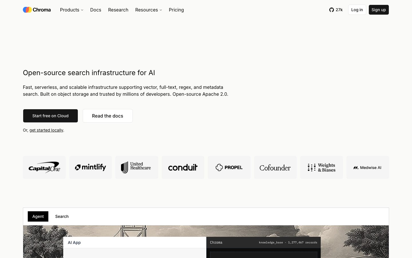
Chroma's marketing surface (trychroma.com) is a developer-tool, open-source-infrastructure interface — white canvas (`{colors.canvas}` — #ffffff) with pure-black primary CTAs (`{colors.primary}` — #000000) and compact Inter typography that reads as engineered rather than promotional. The page feels like documentation that happens to be a landing page: small type sizes (12–24px), square-cornered form fields, hard offset shadows, and dark terminal/code panels embedded directly into the editorial flow.
The type voice is single-family **Inter** across every role. There is no display face — even the hero h1 sits at a restrained 24px / weight 400. Hierarchy is built from size and a single weight bump (600 on small labels), not from a separate display typeface. This is deliberately understated: the product is search infrastructure for engineers, and the type treatment signals "tool, not brochure."
Component voltage comes from **real product chrome shown in-page** — a chat-agent demo panel, syntax-highlighted code blocks with a TypeScript/Python/Rust language switcher, dark terminal output, and monospace-styled latency/spec tables with inverted black header rows. Chroma doesn't illustrate the product; it pastes the product (and its CLI output) into the marketing surface.
The signature texture is a **hard offset drop-shadow** — `rgb(240, 240, 240) 6px 6px 0px 0px` (no blur, light-gray, down-right) — used on demo panels and cards. Combined with `{colors.brand-accent}` (#327eff) used sparingly for links/highlights, the system stays near-monochrome with occasional product-UI color.
**Key Characteristics:**
- White canvas with pure-black primary CTA (`{colors.primary}` — #000000), rounded `{rounded.lg}` (8px). The secondary "Read the docs" button is a white box with a hairline border.
- Single typeface — Inter — across all roles, at small scale. Hero h1 is only 24px / 400; body runs at 12px / 400.
- Square-cornered inputs (`{rounded.none}` — measured 0px) — form fields are deliberately unrounded, reinforcing the terminal/tool aesthetic.
- Hard offset shadow `rgb(240, 240, 240) 6px 6px 0px 0px` — a blur-free, light-gray drop applied to cards and demo panels. This is the system's one signature depth gesture.
- Dark code/terminal panels (`{colors.surface-dark}` — #101828, `{colors.surface-dark-soft}` — #171717) embedded in-page, with `{colors.code-keyword}` (#d73a49) and `{colors.code-string}` (#005cc5) syntax accents.
- Inverted black banner/header strips (`{colors.primary}` background, white text) label sections ("Videos", "Open source community", "Latency", "Technical specs") — a terminal-window-titlebar motif.
- Pill-free tabs: the Agent/Search switcher renders the active tab as a solid black `{rounded.md}` block, inactive as plain muted text.
- Tight, dense spacing rhythm — 8px and 16px dominate the measured spacing (133 and 136 occurrences), with 80px and 120px reserved for major section gaps.
## Colors
### Brand & Accent
- **Primary** (`{colors.primary}` — #000000): The dominant action and emphasis color. Primary CTA fills, inverted section banners, data-table header rows. Chroma's black is pure #000000, not a near-black.
- **Brand Accent** (`{colors.brand-accent}` — #327eff): A pure blue used sparingly — inline links, focus highlights, and small interactive accents. The only chromatic brand color; appears rarely against the monochrome field.
### Text
- **Ink** (`{colors.ink}` — #111111): Headlines and primary text.
- **Ink Strong** (`{colors.ink-strong}` — #0a0a0a): Deepest text / near-black surfaces.
- **Ink Elevated** (`{colors.ink-elevated}` — #24292e): A dark slate used in code-chrome text and GitHub-style UI fragments.
- **Body** (`{colors.body}` — #364153): Default running-text tone.
- **Body Soft** (`{colors.body-soft}` — #4a5565): Secondary body copy.
- **Muted** (`{colors.muted}` — #6a7282): Captions, sub-labels, tertiary text.
- **Muted Soft** (`{colors.muted-soft}` — #99a1af): Faintest labels, placeholder text, disabled states.
- **On Primary** (`{colors.on-primary}` — #ffffff): Text on black fills, banners, and dark code panels.
### Surface
- **Canvas** (`{colors.canvas}` — #ffffff): The default page floor.
- **Surface Soft** (`{colors.surface-soft}` — #fafafa): Spec cards, very-soft section blocks.
- **Surface Card** (`{colors.surface-card}` — #f5f5f5): Demo-panel backgrounds, light card fills.
- **Surface Dark** (`{colors.surface-dark}` — #101828): Code-block background — the dark navy-black of embedded syntax panels.
- **Surface Dark Soft** (`{colors.surface-dark-soft}` — #171717): Terminal-output panels — a slightly warmer near-black.
### Borders
- **Border** (`{colors.border}` — #d1d5dc): Standard 1px component border.
- **Border Soft** (`{colors.border-soft}` — #cccccc): Lighter divider tone.
- **Hairline** (`{colors.hairline}` — #e5e7eb): Faint dividers between sections and rows.
- **Hairline Soft** (`{colors.hairline-soft}` — #f1f5f9): Barely-visible separators on the white canvas.
### Code Syntax
- **Code Keyword** (`{colors.code-keyword}` — #d73a49): Syntax-highlight red for keywords inside dark code blocks.
- **Code String** (`{colors.code-string}` — #005cc5): Syntax-highlight blue for strings/values inside code blocks.
## Typography
### Font Family
The system runs a single typeface — **Inter** — across every role: hero headline, body, labels, buttons, and code-chrome labels. There is no display or brand face. The fallback stack walks `Inter, -apple-system, BlinkMacSystemFont, "Segoe UI", Roboto, sans-serif`.
Hierarchy is unusually flat. The largest measured size is 24px (the hero h1), and most text sits at 12–16px. Weight is mostly 400, with a single 600 step reserved for small labels (h3). This is a deliberately documentation-like type voice — restrained, dense, engineered.
### Hierarchy
| Token | Size | Weight | Line Height | Letter Spacing | Use |
|---|---|---|---|---|---|
| `{typography.title}` | 24px | 400 | 1.5 | normal | Hero h1 ("Open-source search infrastructure for AI"), section titles |
| `{typography.heading}` | 16px | 400 | 1.5 | normal | h2 sub-heads, nav links, button labels |
| `{typography.label}` | 14px | 600 | 1.429 | normal | h3 small labels, active tabs, table header text — the only weight-600 role |
| `{typography.body}` | 12px | 400 | 1.333 | normal | Default running text, captions, spec rows, code/terminal text |
| `{typography.button}` | 16px | 400 | 1.5 | normal | CTA button labels |
### Principles
The whole system is built from one family at small sizes. Emphasis comes from size (24 → 16 → 14 → 12) and from inversion (black fills, dark panels) rather than from heavy weights. Only the 14px label role uses weight 600 — everything else is 400. Never introduce a second typeface or a display weight; the understated single-family treatment is the brand's tool-not-brochure signal.
### Note on Font Substitutes
No licensed or custom typefaces were detected (`fonts_licensed` is empty). Inter is open-source (SIL Open Font License) and ships directly — no substitution required. Code panels appear to use a monospace face for terminal/code text, but the exact family was not measured (see Known Gaps).
## Layout
### Spacing System
- **Base unit:** 4px.
- **Tokens:** `{spacing.xxs}` 4px · `{spacing.xs}` 8px · `{spacing.sm}` 12px · `{spacing.md}` 16px · `{spacing.lg}` 20px · `{spacing.xl}` 24px · `{spacing.xxl}` 32px · `{spacing.xxxl}` 48px · `{spacing.section}` 80px · `{spacing.section-lg}` 120px.
- **Dominant rhythm:** 8px (133 occurrences) and 16px (136 occurrences) carry almost all internal padding and gaps — the layout is dense and tight.
- **Section gaps:** 80px and 120px are reserved for the largest band-to-band separations (each measured only 3 times).
- **Card padding:** `{spacing.md}` (16px) for feature/demo cards; `{spacing.xl}` (24px) for spec cards.
### Grid & Container
- **Hero band:** Left-aligned single column — h1, sub-paragraph, button row, and a "get started locally" text link, all flush-left within a centered content column.
- **Logo strip:** Horizontal row of partner/customer logos (Capital One, Mintlify, United Healthcare, Conduit, Propel, Cofounder, Weights & Biases, Medwise AI) in `{colors.muted}` monochrome.
- **Feature lists:** Left rail of feature labels paired with a right-side code/terminal panel.
- **Spec/performance bands:** Two-column — descriptive text left, dark monospace data panel right.
- **Footer/community blocks:** Multi-column grids labeled by inverted black banner strips.
### Whitespace Philosophy
Chroma's spacing is tight and information-dense — closer to a docs site than a typical SaaS marketing page. The 8/16px dominance keeps cards compact; the rare 80/120px gaps create the only real breathing room between major sections. The result reads as efficient and engineered, not airy.
## Elevation & Depth
| Level | Treatment | Use |
|---|---|---|
| Flat | No shadow, no border | Body sections, hero, top nav |
| Hairline | 1px `{colors.border}` / `{colors.hairline}` | Inputs, table rows, card outlines |
| Hard offset shadow | `rgb(240, 240, 240) 6px 6px 0px 0px` (no blur) | Demo panels, cards — the signature depth gesture |
| Dark panel inversion | `{colors.surface-dark}` / `{colors.surface-dark-soft}` fill | Code blocks, terminal output — color contrast does the elevation work |
The single measured shadow is a **hard, blur-free offset** in light gray (`#f0f0f0`), pushed 6px down and 6px right. It reads like a flat sticker-drop or a hand-drawn box shadow — distinctly un-glossy, reinforcing the utilitarian aesthetic. There is no soft ambient shadow, no blur, no layered elevation. Depth otherwise comes entirely from surface inversion (dark code/terminal panels and black banner strips against white).
### Decorative Depth
- Embedded product UI (chat-agent demo, terminal output, latency tables) carries its own internal chrome and is shown as content, not decorated around.
- The hero demo panel sits over a sepia-toned engraving/illustration background — a textured backdrop unique to the hero, not a system token.
## Shapes
### Border Radius Scale
| Token | Value | Use |
|---|---|---|
| `{rounded.none}` | 0px | Inputs and code/terminal panels — square corners (measured on `input`) |
| `{rounded.xs}` | 2px | Smallest accents, tight inline chips |
| `{rounded.sm}` | 4px | Small controls |
| `{rounded.md}` | 6px | Tabs, small buttons, badge-like blocks (most common radius) |
| `{rounded.lg}` | 8px | Primary/secondary CTA buttons, cards (measured on `button-primary`) |
| `{rounded.xl}` | 10px | Largest measured radius — occasional larger card |
### Geometry Notes
Chroma's radius scale is small and shallow (max 10px) — nothing is pill-shaped or heavily rounded. The most distinctive choice is the **square-cornered input** (`{rounded.none}`), which gives forms a terminal/code-field character. Cards and buttons use the modest 6–8px range. Partner logos render as flat monochrome marks with no container chrome.
## Components
### Navigation
**`top-nav`** — White top bar carrying the Chroma wordmark + gradient logo dot at left, primary horizontal menu (Products, Docs, Research, Resources, Pricing) center, and a right cluster with a GitHub star count ("27k"), "Log in" text link, and a "Sign up" `{component.button-primary}`. Menu items use `{typography.heading}` (Inter 16px / 400).
**`nav-link`** — Inline nav menu item, transparent background, `{colors.ink}` text.
### Buttons
**`button-primary`** — The signature CTA ("Start free on Cloud", "Sign up"). Background `{colors.primary}` (#000000), text `{colors.on-primary}`, type `{typography.button}` (Inter 16px / 400), rounded `{rounded.lg}` (8px), padding 8px 6px 8px 8px (measured).
**`button-secondary`** — White outline button ("Read the docs"). Background `{colors.canvas}`, text `{colors.ink}`, 1px `{colors.border}` border, same radius and padding as primary.
**`text-link`** — Inline body link ("get started locally"). Transparent, `{colors.ink}` text in `{typography.body}`, underlined.
### Inputs
**`input`** — Square-cornered text field. Background `{colors.canvas}`, text `{colors.ink}`, type `{typography.body}`, rounded `{rounded.none}` (0px — measured), padding 8px. The unrounded corners are deliberate and part of the tool aesthetic.
### Tabs
**`tab`** + **`tab-active`** — The Agent/Search demo switcher. Inactive tab: transparent background, `{colors.muted}` text, `{typography.label}`. Active tab: solid `{colors.primary}` (#000000) block, `{colors.on-primary}` text, rounded `{rounded.md}`, padding 8px 16px.
### Cards & Panels
**`logo-strip`** — Horizontal customer-logo row. Background `{colors.canvas}`, logos in `{colors.muted}` monochrome, padding `{spacing.xl}` (24px).
**`feature-card`** — Compact feature block in the lower feature grids ("15M+ monthly downloads", "Low latency search", etc.). Background `{colors.canvas}`, text `{colors.body}` in `{typography.body}`, rounded `{rounded.md}`, padding `{spacing.md}` (16px). Carries a small icon + short label + description.
**`spec-card`** — Soft-surface card used in performance/spec bands. Background `{colors.surface-soft}` (#fafafa), text `{colors.body}`, rounded `{rounded.lg}`, padding `{spacing.xl}` (24px).
**`product-demo-panel`** — The hero's interactive demo container (chat-agent "AI App" / "Ask a question" panel). Background `{colors.surface-card}` (#f5f5f5), text `{colors.ink}`, rounded `{rounded.lg}`, padding `{spacing.md}`. Carries the hard offset shadow (`rgb(240,240,240) 6px 6px 0px 0px`) and sits over the sepia engraving backdrop.
### Code & Data
**`code-block`** — Dark syntax-highlighted code panel with a TypeScript / Python / Rust language switcher and a "Copy" affordance. Background `{colors.surface-dark}` (#101828), text `{colors.on-primary}`, rounded `{rounded.none}`, padding `{spacing.md}`. Syntax accents use `{colors.code-keyword}` (#d73a49) and `{colors.code-string}` (#005cc5).
**`terminal-output`** — The CLI/output panel beneath code blocks. Background `{colors.surface-dark-soft}` (#171717), text `{colors.on-primary}`, monospace-style `{typography.body}`, square corners, padding `{spacing.md}`.
**`data-table-header`** — Inverted black header row for latency / technical-spec tables. Background `{colors.primary}` (#000000), text `{colors.on-primary}` in `{typography.label}`, padding `{spacing.xs}`. The body rows below render on light surface with `{colors.body}` text.
**`section-banner`** — Inverted black title strip labeling whole sections ("[▸] Videos", "[▲] Open source community", "[●] Updates"). Background `{colors.primary}`, text `{colors.on-primary}` in `{typography.label}`, padding 8px 16px. A terminal-window-titlebar motif used repeatedly down the page.
## Do's and Don'ts
### Do
- Reserve `{colors.primary}` (#000000) for primary CTAs, inverted banners, and table headers. Chroma's emphasis color is pure black.
- Use Inter at small sizes across everything. The hero h1 is only 24px / 400 — keep the type restrained and documentation-like.
- Keep inputs square-cornered (`{rounded.none}`). The unrounded form field is part of the tool aesthetic.
- Apply the hard offset shadow (`rgb(240,240,240) 6px 6px 0px 0px`) to demo panels and cards — no blur, down-right, light gray.
- Embed real product chrome — chat-agent demos, syntax-highlighted code, terminal output, monospace data tables. Show the product, don't illustrate it.
- Use inverted black `{component.section-banner}` strips to label sections — they read as terminal title bars and carry the brand voice.
- Keep `{colors.brand-accent}` (#327eff) scarce — inline links and small highlights only.
### Don't
- Don't introduce a second typeface or a display weight. The single-family Inter treatment is deliberate.
- Don't round inputs or use radii larger than `{rounded.xl}` (10px). The scale is shallow on purpose.
- Don't add soft/blurred ambient shadows. The system's only depth gesture is the hard offset drop.
- Don't put the blue accent on primary CTAs — actions stay black-on-white.
- Don't lighten the code/terminal panels; `{colors.surface-dark}` and `{colors.surface-dark-soft}` are the only dark surfaces and they carry the engineering tone.
- Don't loosen the dense 8/16px spacing rhythm into airy marketing-page whitespace except at the rare 80/120px section gaps.
## Responsive Behavior
The two captured pages (landing, pricing) were measured at desktop width. The screenshots show a full horizontal top nav, a left-aligned hero, an 8-up logo strip, and multi-column spec/community grids. Mobile and tablet breakpoints were not directly measured.
### Likely Collapsing Strategy (derived)
- Top nav likely collapses to a menu trigger at narrow widths; the GitHub star count + Sign up button stay prominent. (derived — not measured)
- The 8-up logo strip likely wraps to 3–4 per row, then 2-up on mobile. (derived)
- Two-column spec/performance bands (text + dark panel) likely stack to single column, panel below text. (derived)
- Feature grids likely reduce column count rather than scaling cards. (derived)
### Touch Targets
- `{component.button-primary}` measured padding is 8px 6px 8px 8px — compact; effective tap height depends on the 16px label line box. Larger touch padding may be needed on mobile (derived).
- Exact breakpoint widths, container max-widths, and mobile type scaling were not measured (see Known Gaps).
## Iteration Guide
1. Focus on ONE component at a time. Reference its YAML key directly (`{component.code-block}`, `{component.section-banner}`).
2. Variants of an existing component (`-active`, `-secondary`) live as separate entries in `components:`.
3. Use `{token.refs}` everywhere — never inline a hex in a component.
4. Never document hover. Default and active/pressed states only.
5. Keep the type single-family Inter at small scale. Emphasis comes from size and inversion, not from new fonts or weights.
6. The hard offset shadow is the only depth gesture — don't add blurred shadows.
7. Square inputs, shallow radii (≤10px), black-on-white actions, dark embedded code/terminal panels — these four signatures define the brand.
## Known Gaps
- **Code/terminal font family not measured.** Code blocks and terminal output clearly use a monospace face, but the typography extractor only captured Inter roles. The mono family (and its size/weight) should be confirmed from source before shipping code panels.
- **Pricing page tokens.** The pricing page was captured but no pricing-specific components (tier cards, toggles) appear in the measured component set; pricing-tier styling is undocumented.
- **Responsive breakpoints.** Both pages were measured at desktop only. Breakpoint widths, mobile type scaling, and collapse behavior are derived from screenshot inference, not measurement.
- **Shadow usage scope.** Only one shadow (`rgb(240,240,240) 6px 6px 0px 0px`, 7 occurrences) was measured; whether other elevation treatments exist on interactive states is unconfirmed.
- **Button height & full padding rhythm.** `button-primary` padding measured as 8px 6px 8px 8px (asymmetric, likely accommodating a trailing icon); explicit button height was not captured.
- **Accent-color application.** `{colors.brand-accent}` (#327eff) was measured at moderate frequency but its exact placements (links vs. focus rings vs. product UI) are inferred.
- **Active/pressed states.** Pressed/disabled token values for buttons and inputs were not extracted; only default appearances are documented.
- **Gradient logo mark.** The Chroma wordmark dot appears to use a multi-color gradient in the screenshots; its exact stops were not measured and are not tokenized here.
<!-- Documented by duply · real-world design systems as ready-to-use DESIGN.md for AI coding agents · https://duply.ai/trychroma/design-md -->
Color Palette
Accent
Neutrals
Typography
title24px · 400 · 1.5
The quick brown fox jumpsheading16px · 400 · 1.5
The quick brown fox jumpslabel14px · 600 · 1.429
The quick brown fox jumpsbody12px · 400 · 1.333
The quick brown fox jumpsbutton16px · 400 · 1.5
The quick brown fox jumpsSpacing & Shape
Spacing
| Name | Value | Preview |
|---|---|---|
| xxs | 4px | |
| xs | 8px | |
| sm | 12px | |
| md | 16px | |
| lg | 20px | |
| xl | 24px | |
| xxl | 32px | |
| xxxl | 48px | |
| section | 80px | |
| section-lg | 120px |
Border Radius
| Name | Value | Preview |
|---|---|---|
| none | 0px | |
| xs | 2px | |
| sm | 4px | |
| md | 6px | |
| lg | 8px | |
| xl | 10px |
More like this


---
version: alpha
name: trychroma-design-analysis
description: "A developer-tool, open-source-infrastructure interface anchored on white canvas with pure-black primary CTAs and small-scale Inter typography. The system reads as engineered and utilitarian — compact 12-16px type, square-cornered inputs, hard offset drop-shadows (no blur), and dark monospace-style terminal/code panels embedded directly in the marketing flow. Brand voltage comes from real product chrome (chat agents, terminal output, latency tables) shown in-page rather than from accent color."
colors:
  primary: "#000000"
  ink: "#111111"
  ink-strong: "#0a0a0a"
  ink-elevated: "#24292e"
  body: "#364153"
  body-soft: "#4a5565"
  muted: "#6a7282"
  muted-soft: "#99a1af"
  border: "#d1d5dc"
  border-soft: "#cccccc"
  hairline: "#e5e7eb"
  hairline-soft: "#f1f5f9"
  canvas: "#ffffff"
  surface-soft: "#fafafa"
  surface-card: "#f5f5f5"
  surface-dark: "#101828"
  surface-dark-soft: "#171717"
  on-primary: "#ffffff"
  brand-accent: "#327eff"
  code-keyword: "#d73a49"
  code-string: "#005cc5"

typography:
  title:
    fontFamily: "Inter, sans-serif"
    fontSize: 24px
    fontWeight: 400
    lineHeight: 1.5
    letterSpacing: normal
  heading:
    fontFamily: "Inter, sans-serif"
    fontSize: 16px
    fontWeight: 400
    lineHeight: 1.5
    letterSpacing: normal
  label:
    fontFamily: "Inter, sans-serif"
    fontSize: 14px
    fontWeight: 600
    lineHeight: 1.429
    letterSpacing: normal
  body:
    fontFamily: "Inter, sans-serif"
    fontSize: 12px
    fontWeight: 400
    lineHeight: 1.333
    letterSpacing: normal
  button:
    fontFamily: "Inter, sans-serif"
    fontSize: 16px
    fontWeight: 400
    lineHeight: 1.5
    letterSpacing: normal

rounded:
  none: 0px
  xs: 2px
  sm: 4px
  md: 6px
  lg: 8px
  xl: 10px

spacing:
  xxs: 4px
  xs: 8px
  sm: 12px
  md: 16px
  lg: 20px
  xl: 24px
  xxl: 32px
  xxxl: 48px
  section: 80px
  section-lg: 120px

components:
  top-nav:
    backgroundColor: "{colors.canvas}"
    textColor: "{colors.ink}"
    typography: "{typography.heading}"
    padding: 16px
  nav-link:
    backgroundColor: transparent
    textColor: "{colors.ink}"
    typography: "{typography.heading}"
  button-primary:
    backgroundColor: "{colors.primary}"
    textColor: "{colors.on-primary}"
    typography: "{typography.button}"
    rounded: "{rounded.lg}"
    padding: 8px 6px 8px 8px
  button-secondary:
    backgroundColor: "{colors.canvas}"
    textColor: "{colors.ink}"
    typography: "{typography.button}"
    rounded: "{rounded.lg}"
    padding: 8px 6px 8px 8px
  text-link:
    backgroundColor: transparent
    textColor: "{colors.ink}"
    typography: "{typography.body}"
  input:
    backgroundColor: "{colors.canvas}"
    textColor: "{colors.ink}"
    typography: "{typography.body}"
    rounded: "{rounded.none}"
    padding: 8px
  tab:
    backgroundColor: transparent
    textColor: "{colors.muted}"
    typography: "{typography.label}"
    rounded: "{rounded.md}"
    padding: 8px 16px
  tab-active:
    backgroundColor: "{colors.primary}"
    textColor: "{colors.on-primary}"
    typography: "{typography.label}"
    rounded: "{rounded.md}"
    padding: 8px 16px
  logo-strip:
    backgroundColor: "{colors.canvas}"
    textColor: "{colors.muted}"
    padding: 24px
  feature-card:
    backgroundColor: "{colors.canvas}"
    textColor: "{colors.body}"
    typography: "{typography.body}"
    rounded: "{rounded.md}"
    padding: 16px
  spec-card:
    backgroundColor: "{colors.surface-soft}"
    textColor: "{colors.body}"
    typography: "{typography.body}"
    rounded: "{rounded.lg}"
    padding: 24px
  product-demo-panel:
    backgroundColor: "{colors.surface-card}"
    textColor: "{colors.ink}"
    typography: "{typography.body}"
    rounded: "{rounded.lg}"
    padding: 16px
  code-block:
    backgroundColor: "{colors.surface-dark}"
    textColor: "{colors.on-primary}"
    typography: "{typography.body}"
    rounded: "{rounded.none}"
    padding: 16px
  terminal-output:
    backgroundColor: "{colors.surface-dark-soft}"
    textColor: "{colors.on-primary}"
    typography: "{typography.body}"
    rounded: "{rounded.none}"
    padding: 16px
  data-table-header:
    backgroundColor: "{colors.primary}"
    textColor: "{colors.on-primary}"
    typography: "{typography.label}"
    padding: 8px
  section-banner:
    backgroundColor: "{colors.primary}"
    textColor: "{colors.on-primary}"
    typography: "{typography.label}"
    padding: 8px 16px
---

## Overview

Chroma's marketing surface (trychroma.com) is a developer-tool, open-source-infrastructure interface — white canvas (`{colors.canvas}` — #ffffff) with pure-black primary CTAs (`{colors.primary}` — #000000) and compact Inter typography that reads as engineered rather than promotional. The page feels like documentation that happens to be a landing page: small type sizes (12–24px), square-cornered form fields, hard offset shadows, and dark terminal/code panels embedded directly into the editorial flow.

The type voice is single-family **Inter** across every role. There is no display face — even the hero h1 sits at a restrained 24px / weight 400. Hierarchy is built from size and a single weight bump (600 on small labels), not from a separate display typeface. This is deliberately understated: the product is search infrastructure for engineers, and the type treatment signals "tool, not brochure."

Component voltage comes from **real product chrome shown in-page** — a chat-agent demo panel, syntax-highlighted code blocks with a TypeScript/Python/Rust language switcher, dark terminal output, and monospace-styled latency/spec tables with inverted black header rows. Chroma doesn't illustrate the product; it pastes the product (and its CLI output) into the marketing surface.

The signature texture is a **hard offset drop-shadow** — `rgb(240, 240, 240) 6px 6px 0px 0px` (no blur, light-gray, down-right) — used on demo panels and cards. Combined with `{colors.brand-accent}` (#327eff) used sparingly for links/highlights, the system stays near-monochrome with occasional product-UI color.

**Key Characteristics:**
- White canvas with pure-black primary CTA (`{colors.primary}` — #000000), rounded `{rounded.lg}` (8px). The secondary "Read the docs" button is a white box with a hairline border.
- Single typeface — Inter — across all roles, at small scale. Hero h1 is only 24px / 400; body runs at 12px / 400.
- Square-cornered inputs (`{rounded.none}` — measured 0px) — form fields are deliberately unrounded, reinforcing the terminal/tool aesthetic.
- Hard offset shadow `rgb(240, 240, 240) 6px 6px 0px 0px` — a blur-free, light-gray drop applied to cards and demo panels. This is the system's one signature depth gesture.
- Dark code/terminal panels (`{colors.surface-dark}` — #101828, `{colors.surface-dark-soft}` — #171717) embedded in-page, with `{colors.code-keyword}` (#d73a49) and `{colors.code-string}` (#005cc5) syntax accents.
- Inverted black banner/header strips (`{colors.primary}` background, white text) label sections ("Videos", "Open source community", "Latency", "Technical specs") — a terminal-window-titlebar motif.
- Pill-free tabs: the Agent/Search switcher renders the active tab as a solid black `{rounded.md}` block, inactive as plain muted text.
- Tight, dense spacing rhythm — 8px and 16px dominate the measured spacing (133 and 136 occurrences), with 80px and 120px reserved for major section gaps.

## Colors

### Brand & Accent
- **Primary** (`{colors.primary}` — #000000): The dominant action and emphasis color. Primary CTA fills, inverted section banners, data-table header rows. Chroma's black is pure #000000, not a near-black.
- **Brand Accent** (`{colors.brand-accent}` — #327eff): A pure blue used sparingly — inline links, focus highlights, and small interactive accents. The only chromatic brand color; appears rarely against the monochrome field.

### Text
- **Ink** (`{colors.ink}` — #111111): Headlines and primary text.
- **Ink Strong** (`{colors.ink-strong}` — #0a0a0a): Deepest text / near-black surfaces.
- **Ink Elevated** (`{colors.ink-elevated}` — #24292e): A dark slate used in code-chrome text and GitHub-style UI fragments.
- **Body** (`{colors.body}` — #364153): Default running-text tone.
- **Body Soft** (`{colors.body-soft}` — #4a5565): Secondary body copy.
- **Muted** (`{colors.muted}` — #6a7282): Captions, sub-labels, tertiary text.
- **Muted Soft** (`{colors.muted-soft}` — #99a1af): Faintest labels, placeholder text, disabled states.
- **On Primary** (`{colors.on-primary}` — #ffffff): Text on black fills, banners, and dark code panels.

### Surface
- **Canvas** (`{colors.canvas}` — #ffffff): The default page floor.
- **Surface Soft** (`{colors.surface-soft}` — #fafafa): Spec cards, very-soft section blocks.
- **Surface Card** (`{colors.surface-card}` — #f5f5f5): Demo-panel backgrounds, light card fills.
- **Surface Dark** (`{colors.surface-dark}` — #101828): Code-block background — the dark navy-black of embedded syntax panels.
- **Surface Dark Soft** (`{colors.surface-dark-soft}` — #171717): Terminal-output panels — a slightly warmer near-black.

### Borders
- **Border** (`{colors.border}` — #d1d5dc): Standard 1px component border.
- **Border Soft** (`{colors.border-soft}` — #cccccc): Lighter divider tone.
- **Hairline** (`{colors.hairline}` — #e5e7eb): Faint dividers between sections and rows.
- **Hairline Soft** (`{colors.hairline-soft}` — #f1f5f9): Barely-visible separators on the white canvas.

### Code Syntax
- **Code Keyword** (`{colors.code-keyword}` — #d73a49): Syntax-highlight red for keywords inside dark code blocks.
- **Code String** (`{colors.code-string}` — #005cc5): Syntax-highlight blue for strings/values inside code blocks.

## Typography

### Font Family
The system runs a single typeface — **Inter** — across every role: hero headline, body, labels, buttons, and code-chrome labels. There is no display or brand face. The fallback stack walks `Inter, -apple-system, BlinkMacSystemFont, "Segoe UI", Roboto, sans-serif`.

Hierarchy is unusually flat. The largest measured size is 24px (the hero h1), and most text sits at 12–16px. Weight is mostly 400, with a single 600 step reserved for small labels (h3). This is a deliberately documentation-like type voice — restrained, dense, engineered.

### Hierarchy

| Token | Size | Weight | Line Height | Letter Spacing | Use |
|---|---|---|---|---|---|
| `{typography.title}` | 24px | 400 | 1.5 | normal | Hero h1 ("Open-source search infrastructure for AI"), section titles |
| `{typography.heading}` | 16px | 400 | 1.5 | normal | h2 sub-heads, nav links, button labels |
| `{typography.label}` | 14px | 600 | 1.429 | normal | h3 small labels, active tabs, table header text — the only weight-600 role |
| `{typography.body}` | 12px | 400 | 1.333 | normal | Default running text, captions, spec rows, code/terminal text |
| `{typography.button}` | 16px | 400 | 1.5 | normal | CTA button labels |

### Principles
The whole system is built from one family at small sizes. Emphasis comes from size (24 → 16 → 14 → 12) and from inversion (black fills, dark panels) rather than from heavy weights. Only the 14px label role uses weight 600 — everything else is 400. Never introduce a second typeface or a display weight; the understated single-family treatment is the brand's tool-not-brochure signal.

### Note on Font Substitutes
No licensed or custom typefaces were detected (`fonts_licensed` is empty). Inter is open-source (SIL Open Font License) and ships directly — no substitution required. Code panels appear to use a monospace face for terminal/code text, but the exact family was not measured (see Known Gaps).

## Layout

### Spacing System
- **Base unit:** 4px.
- **Tokens:** `{spacing.xxs}` 4px · `{spacing.xs}` 8px · `{spacing.sm}` 12px · `{spacing.md}` 16px · `{spacing.lg}` 20px · `{spacing.xl}` 24px · `{spacing.xxl}` 32px · `{spacing.xxxl}` 48px · `{spacing.section}` 80px · `{spacing.section-lg}` 120px.
- **Dominant rhythm:** 8px (133 occurrences) and 16px (136 occurrences) carry almost all internal padding and gaps — the layout is dense and tight.
- **Section gaps:** 80px and 120px are reserved for the largest band-to-band separations (each measured only 3 times).
- **Card padding:** `{spacing.md}` (16px) for feature/demo cards; `{spacing.xl}` (24px) for spec cards.

### Grid & Container
- **Hero band:** Left-aligned single column — h1, sub-paragraph, button row, and a "get started locally" text link, all flush-left within a centered content column.
- **Logo strip:** Horizontal row of partner/customer logos (Capital One, Mintlify, United Healthcare, Conduit, Propel, Cofounder, Weights & Biases, Medwise AI) in `{colors.muted}` monochrome.
- **Feature lists:** Left rail of feature labels paired with a right-side code/terminal panel.
- **Spec/performance bands:** Two-column — descriptive text left, dark monospace data panel right.
- **Footer/community blocks:** Multi-column grids labeled by inverted black banner strips.

### Whitespace Philosophy
Chroma's spacing is tight and information-dense — closer to a docs site than a typical SaaS marketing page. The 8/16px dominance keeps cards compact; the rare 80/120px gaps create the only real breathing room between major sections. The result reads as efficient and engineered, not airy.

## Elevation & Depth

| Level | Treatment | Use |
|---|---|---|
| Flat | No shadow, no border | Body sections, hero, top nav |
| Hairline | 1px `{colors.border}` / `{colors.hairline}` | Inputs, table rows, card outlines |
| Hard offset shadow | `rgb(240, 240, 240) 6px 6px 0px 0px` (no blur) | Demo panels, cards — the signature depth gesture |
| Dark panel inversion | `{colors.surface-dark}` / `{colors.surface-dark-soft}` fill | Code blocks, terminal output — color contrast does the elevation work |

The single measured shadow is a **hard, blur-free offset** in light gray (`#f0f0f0`), pushed 6px down and 6px right. It reads like a flat sticker-drop or a hand-drawn box shadow — distinctly un-glossy, reinforcing the utilitarian aesthetic. There is no soft ambient shadow, no blur, no layered elevation. Depth otherwise comes entirely from surface inversion (dark code/terminal panels and black banner strips against white).

### Decorative Depth
- Embedded product UI (chat-agent demo, terminal output, latency tables) carries its own internal chrome and is shown as content, not decorated around.
- The hero demo panel sits over a sepia-toned engraving/illustration background — a textured backdrop unique to the hero, not a system token.

## Shapes

### Border Radius Scale

| Token | Value | Use |
|---|---|---|
| `{rounded.none}` | 0px | Inputs and code/terminal panels — square corners (measured on `input`) |
| `{rounded.xs}` | 2px | Smallest accents, tight inline chips |
| `{rounded.sm}` | 4px | Small controls |
| `{rounded.md}` | 6px | Tabs, small buttons, badge-like blocks (most common radius) |
| `{rounded.lg}` | 8px | Primary/secondary CTA buttons, cards (measured on `button-primary`) |
| `{rounded.xl}` | 10px | Largest measured radius — occasional larger card |

### Geometry Notes
Chroma's radius scale is small and shallow (max 10px) — nothing is pill-shaped or heavily rounded. The most distinctive choice is the **square-cornered input** (`{rounded.none}`), which gives forms a terminal/code-field character. Cards and buttons use the modest 6–8px range. Partner logos render as flat monochrome marks with no container chrome.

## Components

### Navigation

**`top-nav`** — White top bar carrying the Chroma wordmark + gradient logo dot at left, primary horizontal menu (Products, Docs, Research, Resources, Pricing) center, and a right cluster with a GitHub star count ("27k"), "Log in" text link, and a "Sign up" `{component.button-primary}`. Menu items use `{typography.heading}` (Inter 16px / 400).

**`nav-link`** — Inline nav menu item, transparent background, `{colors.ink}` text.

### Buttons

**`button-primary`** — The signature CTA ("Start free on Cloud", "Sign up"). Background `{colors.primary}` (#000000), text `{colors.on-primary}`, type `{typography.button}` (Inter 16px / 400), rounded `{rounded.lg}` (8px), padding 8px 6px 8px 8px (measured).

**`button-secondary`** — White outline button ("Read the docs"). Background `{colors.canvas}`, text `{colors.ink}`, 1px `{colors.border}` border, same radius and padding as primary.

**`text-link`** — Inline body link ("get started locally"). Transparent, `{colors.ink}` text in `{typography.body}`, underlined.

### Inputs

**`input`** — Square-cornered text field. Background `{colors.canvas}`, text `{colors.ink}`, type `{typography.body}`, rounded `{rounded.none}` (0px — measured), padding 8px. The unrounded corners are deliberate and part of the tool aesthetic.

### Tabs

**`tab`** + **`tab-active`** — The Agent/Search demo switcher. Inactive tab: transparent background, `{colors.muted}` text, `{typography.label}`. Active tab: solid `{colors.primary}` (#000000) block, `{colors.on-primary}` text, rounded `{rounded.md}`, padding 8px 16px.

### Cards & Panels

**`logo-strip`** — Horizontal customer-logo row. Background `{colors.canvas}`, logos in `{colors.muted}` monochrome, padding `{spacing.xl}` (24px).

**`feature-card`** — Compact feature block in the lower feature grids ("15M+ monthly downloads", "Low latency search", etc.). Background `{colors.canvas}`, text `{colors.body}` in `{typography.body}`, rounded `{rounded.md}`, padding `{spacing.md}` (16px). Carries a small icon + short label + description.

**`spec-card`** — Soft-surface card used in performance/spec bands. Background `{colors.surface-soft}` (#fafafa), text `{colors.body}`, rounded `{rounded.lg}`, padding `{spacing.xl}` (24px).

**`product-demo-panel`** — The hero's interactive demo container (chat-agent "AI App" / "Ask a question" panel). Background `{colors.surface-card}` (#f5f5f5), text `{colors.ink}`, rounded `{rounded.lg}`, padding `{spacing.md}`. Carries the hard offset shadow (`rgb(240,240,240) 6px 6px 0px 0px`) and sits over the sepia engraving backdrop.

### Code & Data

**`code-block`** — Dark syntax-highlighted code panel with a TypeScript / Python / Rust language switcher and a "Copy" affordance. Background `{colors.surface-dark}` (#101828), text `{colors.on-primary}`, rounded `{rounded.none}`, padding `{spacing.md}`. Syntax accents use `{colors.code-keyword}` (#d73a49) and `{colors.code-string}` (#005cc5).

**`terminal-output`** — The CLI/output panel beneath code blocks. Background `{colors.surface-dark-soft}` (#171717), text `{colors.on-primary}`, monospace-style `{typography.body}`, square corners, padding `{spacing.md}`.

**`data-table-header`** — Inverted black header row for latency / technical-spec tables. Background `{colors.primary}` (#000000), text `{colors.on-primary}` in `{typography.label}`, padding `{spacing.xs}`. The body rows below render on light surface with `{colors.body}` text.

**`section-banner`** — Inverted black title strip labeling whole sections ("[▸] Videos", "[▲] Open source community", "[●] Updates"). Background `{colors.primary}`, text `{colors.on-primary}` in `{typography.label}`, padding 8px 16px. A terminal-window-titlebar motif used repeatedly down the page.

## Do's and Don'ts

### Do
- Reserve `{colors.primary}` (#000000) for primary CTAs, inverted banners, and table headers. Chroma's emphasis color is pure black.
- Use Inter at small sizes across everything. The hero h1 is only 24px / 400 — keep the type restrained and documentation-like.
- Keep inputs square-cornered (`{rounded.none}`). The unrounded form field is part of the tool aesthetic.
- Apply the hard offset shadow (`rgb(240,240,240) 6px 6px 0px 0px`) to demo panels and cards — no blur, down-right, light gray.
- Embed real product chrome — chat-agent demos, syntax-highlighted code, terminal output, monospace data tables. Show the product, don't illustrate it.
- Use inverted black `{component.section-banner}` strips to label sections — they read as terminal title bars and carry the brand voice.
- Keep `{colors.brand-accent}` (#327eff) scarce — inline links and small highlights only.

### Don't
- Don't introduce a second typeface or a display weight. The single-family Inter treatment is deliberate.
- Don't round inputs or use radii larger than `{rounded.xl}` (10px). The scale is shallow on purpose.
- Don't add soft/blurred ambient shadows. The system's only depth gesture is the hard offset drop.
- Don't put the blue accent on primary CTAs — actions stay black-on-white.
- Don't lighten the code/terminal panels; `{colors.surface-dark}` and `{colors.surface-dark-soft}` are the only dark surfaces and they carry the engineering tone.
- Don't loosen the dense 8/16px spacing rhythm into airy marketing-page whitespace except at the rare 80/120px section gaps.

## Responsive Behavior

The two captured pages (landing, pricing) were measured at desktop width. The screenshots show a full horizontal top nav, a left-aligned hero, an 8-up logo strip, and multi-column spec/community grids. Mobile and tablet breakpoints were not directly measured.

### Likely Collapsing Strategy (derived)
- Top nav likely collapses to a menu trigger at narrow widths; the GitHub star count + Sign up button stay prominent. (derived — not measured)
- The 8-up logo strip likely wraps to 3–4 per row, then 2-up on mobile. (derived)
- Two-column spec/performance bands (text + dark panel) likely stack to single column, panel below text. (derived)
- Feature grids likely reduce column count rather than scaling cards. (derived)

### Touch Targets
- `{component.button-primary}` measured padding is 8px 6px 8px 8px — compact; effective tap height depends on the 16px label line box. Larger touch padding may be needed on mobile (derived).
- Exact breakpoint widths, container max-widths, and mobile type scaling were not measured (see Known Gaps).

## Iteration Guide

1. Focus on ONE component at a time. Reference its YAML key directly (`{component.code-block}`, `{component.section-banner}`).
2. Variants of an existing component (`-active`, `-secondary`) live as separate entries in `components:`.
3. Use `{token.refs}` everywhere — never inline a hex in a component.
4. Never document hover. Default and active/pressed states only.
5. Keep the type single-family Inter at small scale. Emphasis comes from size and inversion, not from new fonts or weights.
6. The hard offset shadow is the only depth gesture — don't add blurred shadows.
7. Square inputs, shallow radii (≤10px), black-on-white actions, dark embedded code/terminal panels — these four signatures define the brand.

## Known Gaps

- **Code/terminal font family not measured.** Code blocks and terminal output clearly use a monospace face, but the typography extractor only captured Inter roles. The mono family (and its size/weight) should be confirmed from source before shipping code panels.
- **Pricing page tokens.** The pricing page was captured but no pricing-specific components (tier cards, toggles) appear in the measured component set; pricing-tier styling is undocumented.
- **Responsive breakpoints.** Both pages were measured at desktop only. Breakpoint widths, mobile type scaling, and collapse behavior are derived from screenshot inference, not measurement.
- **Shadow usage scope.** Only one shadow (`rgb(240,240,240) 6px 6px 0px 0px`, 7 occurrences) was measured; whether other elevation treatments exist on interactive states is unconfirmed.
- **Button height & full padding rhythm.** `button-primary` padding measured as 8px 6px 8px 8px (asymmetric, likely accommodating a trailing icon); explicit button height was not captured.
- **Accent-color application.** `{colors.brand-accent}` (#327eff) was measured at moderate frequency but its exact placements (links vs. focus rings vs. product UI) are inferred.
- **Active/pressed states.** Pressed/disabled token values for buttons and inputs were not extracted; only default appearances are documented.
- **Gradient logo mark.** The Chroma wordmark dot appears to use a multi-color gradient in the screenshots; its exact stops were not measured and are not tokenized here.

<!-- Documented by duply · real-world design systems as ready-to-use DESIGN.md for AI coding agents · https://duply.ai/trychroma/design-md -->