Namespace
A precise, developer-infrastructure marketing interface built on a white canvas with near-black Inter display headlines and a single electric-blue primary CTA. The system reads as engineered-and-fast — tight hairline-bordered product demo cards showing real CI/terminal chrome, a hard 3px offset shadow on buttons that gives a crisp tactile edge, light-gray feature grids, and a deep midnight-navy Enterprise band that anchors the lower page. Brand voltage comes from the electric blue (#1c32ff) used sparingly on the primary action and from real product UI shown inside bordered cards.
---
version: alpha
name: Namespace-design-analysis
description: A precise, developer-infrastructure marketing interface built on a white canvas with near-black Inter display headlines and a single electric-blue primary CTA. The system reads as engineered-and-fast — tight hairline-bordered product demo cards showing real CI/terminal chrome, a hard 3px offset shadow on buttons that gives a crisp tactile edge, light-gray feature grids, and a deep midnight-navy Enterprise band that anchors the lower page. Brand voltage comes from the electric blue (#1c32ff) used sparingly on the primary action and from real product UI shown inside bordered cards.
colors:
primary: "#1c32ff"
primary-deep: "#1423b4"
ink: "#000000"
ink-strong: "#1f2937"
link: "#111827"
body: "#374151"
muted: "#4b5563"
neutral: "#6b7280"
neutral-soft: "#9ca3af"
neutral-faint: "#cccccc"
canvas: "#ffffff"
surface-soft: "#f9fafb"
surface-card: "#f3f4f6"
surface-muted: "#eceff4"
hairline: "#e5e7eb"
surface-dark: "#171c2b"
surface-ink: "#121314"
on-primary: "#ffffff"
on-dark: "#ffffff"
accent-green: "#8ec43d"
terminal-base: "#002b36"
terminal-paper: "#fdf6e3"
terminal-muted: "#839496"
typography:
h1:
fontFamily: "Inter, sans-serif"
fontSize: 48px
fontWeight: 800
lineHeight: 1.1
letterSpacing: -1.2px
h3:
fontFamily: "Inter, sans-serif"
fontSize: 30px
fontWeight: 700
lineHeight: 1.2
letterSpacing: -0.75px
h2:
fontFamily: "Inter, sans-serif"
fontSize: 20px
fontWeight: 600
lineHeight: 1.4
letterSpacing: -1px
body:
fontFamily: "Inter, sans-serif"
fontSize: 14px
fontWeight: 500
lineHeight: 1.43
letterSpacing: 0
button:
fontFamily: "Inter, sans-serif"
fontSize: 15px
fontWeight: 500
lineHeight: 1.5
letterSpacing: 0
rounded:
xs: 2px
sm: 4px
md: 6px
lg: 8px
xl: 12px
full: 9999px
spacing:
xxs: 4px
xs: 8px
sm: 12px
md: 16px
lg: 24px
xl: 32px
xxl: 48px
huge: 64px
section: 96px
mega: 160px
components:
top-nav:
backgroundColor: "{colors.canvas}"
textColor: "{colors.link}"
typography: "{typography.body}"
padding: 24px 32px
nav-link:
backgroundColor: transparent
textColor: "{colors.link}"
typography: "{typography.body}"
login-button:
backgroundColor: "{colors.surface-card}"
textColor: "{colors.body}"
typography: "{typography.button}"
rounded: "{rounded.md}"
padding: 8px 16px
button-primary:
backgroundColor: "{colors.primary}"
textColor: "{colors.on-primary}"
typography: "{typography.button}"
rounded: "{rounded.md}"
padding: 12px 20px
button-primary-active:
backgroundColor: "{colors.primary-deep}"
textColor: "{colors.on-primary}"
rounded: "{rounded.md}"
button-secondary:
backgroundColor: "{colors.canvas}"
textColor: "{colors.body}"
typography: "{typography.button}"
rounded: "{rounded.md}"
padding: 12px 20px
text-link:
backgroundColor: transparent
textColor: "{colors.primary}"
typography: "{typography.body}"
hero-band:
backgroundColor: "{colors.canvas}"
textColor: "{colors.ink}"
typography: "{typography.h1}"
padding: 96px 32px
product-demo-card:
backgroundColor: "{colors.canvas}"
textColor: "{colors.ink-strong}"
typography: "{typography.body}"
rounded: "{rounded.xl}"
padding: 16px
logo-strip:
backgroundColor: "{colors.surface-soft}"
textColor: "{colors.muted}"
typography: "{typography.body}"
padding: 32px
feature-card:
backgroundColor: "{colors.canvas}"
textColor: "{colors.ink}"
typography: "{typography.h2}"
rounded: "{rounded.lg}"
padding: 24px
benefit-card:
backgroundColor: "{colors.canvas}"
textColor: "{colors.ink}"
typography: "{typography.h2}"
rounded: "{rounded.lg}"
padding: 24px
testimonial-card:
backgroundColor: "{colors.canvas}"
textColor: "{colors.body}"
typography: "{typography.body}"
rounded: "{rounded.lg}"
padding: 24px
enterprise-section:
backgroundColor: "{colors.surface-dark}"
textColor: "{colors.on-dark}"
typography: "{typography.h1}"
padding: 96px 32px
enterprise-card:
backgroundColor: "{colors.surface-ink}"
textColor: "{colors.on-dark}"
typography: "{typography.h2}"
rounded: "{rounded.lg}"
padding: 24px
badge-pill:
backgroundColor: "{colors.surface-card}"
textColor: "{colors.body}"
typography: "{typography.body}"
rounded: "{rounded.full}"
padding: 4px 12px
cta-band:
backgroundColor: "{colors.primary}"
textColor: "{colors.on-primary}"
typography: "{typography.h3}"
padding: 64px 32px
text-input:
backgroundColor: "{colors.canvas}"
textColor: "{colors.ink-strong}"
typography: "{typography.body}"
rounded: "{rounded.md}"
padding: 8px 12px
---
## Overview
Namespace's marketing surface is a precise, developer-infrastructure interface — white canvas (`{colors.canvas}` — #ffffff) with near-black Inter display headlines (`{colors.ink}` — #000000) and a single electric-blue primary action (`{colors.primary}` — #1c32ff). The system reads as engineered, fast, and confident: every band leads with a tight Inter headline and supports the claim with a real product UI fragment shown inside a hairline-bordered card rather than a marketing illustration.
The type system is single-family — **Inter** does everything, from the heavy 800-weight hero headline down to 14px body copy. The brand carries weight contrast (800 / 700 / 600 / 500) and negative letter-spacing rather than a second display face. The h1 ("We design & build really fast cloud computers") pairs a muted-gray first line with a black second line — the contrast is part of the editorial voice.
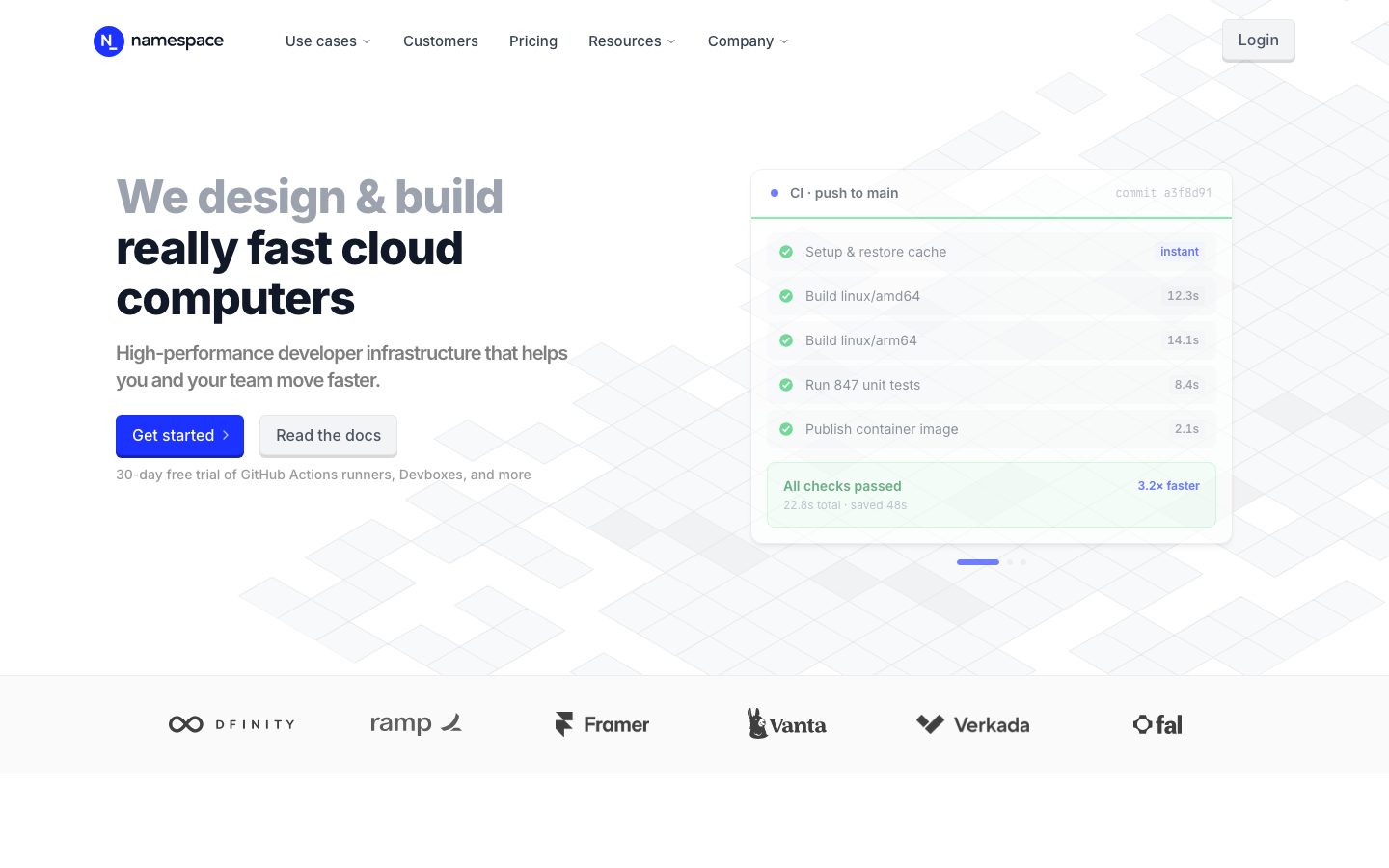
Component voltage comes from **real product chrome embedded in cards** — CI pipeline runs with green check rows, agent terminals, Bazel build logs, Solarized-themed code panels. The hero's flagship card shows a live "CI · push to main" run with timing badges and an "All checks passed · 3.2× faster" success footer. Namespace shows the actual product at small scale, not a painting of it.
The Enterprise band flips to a deep midnight-navy (`{colors.surface-dark}` — #171c2b) — the single dark zone on the page — to signal a step up in seriousness, then the page closes on an electric-blue CTA band (`{colors.primary}`).
**Key Characteristics:**
- White canvas with one electric-blue primary CTA (`{colors.primary}` — #1c32ff). Brand voltage is concentrated in a single action color; everything else is monochrome neutral.
- Buttons carry a distinctive **hard 3px offset shadow** (no blur) — `rgba(0,0,0,0.15) 0 3px 0 0` on the secondary button and a blue `rgb(20,35,180) 0 3px 0 0` on the primary. This gives a crisp, tactile, slightly-pressable edge unique to the system.
- Single-family Inter typography across all roles. Hierarchy comes from weight (800 → 500) and negative letter-spacing (-1.2px to -0.75px on display), not from a second typeface.
- Hairline-bordered product demo cards (`{colors.hairline}` — #e5e7eb) holding real CI / terminal / build-log UI. The product is the marketing artwork.
- Light neutral grid surfaces (`{colors.surface-soft}` — #f9fafb, `{colors.surface-card}` — #f3f4f6) for the logo strip and feature backgrounds.
- A single dark Enterprise band (`{colors.surface-dark}` — #171c2b) with nested near-black cards (`{colors.surface-ink}` — #121314).
- Solarized-palette terminal/code colors (`{colors.terminal-base}` #002b36, `{colors.terminal-paper}` #fdf6e3, `{colors.terminal-muted}` #839496) appear inside code-mockup fragments — content chrome, not UI tokens.
- Tight border-radius scale: `{rounded.md}` (6px) on buttons, `{rounded.lg}` (8px) on cards, `{rounded.xl}` (12px) on the hero demo card, `{rounded.full}` for pills and the avatar logo.
## Colors
### Brand & Accent
- **Primary** (`{colors.primary}` — #1c32ff): The single electric-blue action color. Used on the "Get started" CTA and the closing CTA band. The most saturated color in the system, applied sparingly.
- **Primary Deep** (`{colors.primary-deep}` — #1423b4): The darker blue used for the primary button's hard 3px offset shadow; documented here as the pressed/active fill (derived — measured as a shadow color `rgb(20,35,180)`, reused as the active state).
- **Accent Green** (`{colors.accent-green}` — #8ec43d): A lime-green appearing in success check rows and the "Workflow Analytics" heatmap inside product fragments. Confirmation / success accent only.
### Text
- **Ink** (`{colors.ink}` — #000000): Headlines and primary display type — the bold second line of the hero h1.
- **Ink Strong** (`{colors.ink-strong}` — #1f2937): Card titles and strong UI text inside product fragments.
- **Link** (`{colors.link}` — #111827): Nav links and primary anchor text.
- **Body** (`{colors.body}` — #374151): Default running-text color; also the secondary button label color.
- **Muted** (`{colors.muted}` — #4b5563): The muted-gray first line of the hero h1, sub-headings, secondary copy.
- **Neutral** (`{colors.neutral}` — #6b7280): Tertiary labels and captions.
- **Neutral Soft** (`{colors.neutral-soft}` — #9ca3af): Fine print, the "30-day free trial…" microcopy.
- **Neutral Faint** (`{colors.neutral-faint}` — #cccccc): Faintest dividers and disabled glyphs.
- **On Primary / On Dark** (`{colors.on-primary}` / `{colors.on-dark}` — #ffffff): Text on the blue CTA and on the dark Enterprise band.
### Surface
- **Canvas** (`{colors.canvas}` — #ffffff): The default page floor and product-card background.
- **Surface Soft** (`{colors.surface-soft}` — #f9fafb): The logo-strip band and very-soft section dividers.
- **Surface Card** (`{colors.surface-card}` — #f3f4f6): Light fill for the Login button, badge pills, soft card backgrounds.
- **Surface Muted** (`{colors.surface-muted}` — #eceff4): A slightly cooler neutral used in nested panels.
- **Hairline** (`{colors.hairline}` — #e5e7eb): The 1px border tone on light surfaces — product demo cards, feature cards, inputs.
- **Surface Dark** (`{colors.surface-dark}` — #171c2b): The Enterprise band background — the only dark zone on the page.
- **Surface Ink** (`{colors.surface-ink}` — #121314): Near-black fill for cards nested inside the dark Enterprise band.
### Terminal / Code (content chrome)
- **Terminal Base** (`{colors.terminal-base}` — #002b36), **Terminal Paper** (`{colors.terminal-paper}` — #fdf6e3), **Terminal Muted** (`{colors.terminal-muted}` — #839496): A Solarized-derived palette that appears only inside code/terminal mockups shown as product content. Not used in chrome or layout.
## Typography
### Font Family
The system runs **Inter** for everything — display headlines, body, buttons, nav, captions. There is no second typeface. The fallback stack walks `Inter, -apple-system, BlinkMacSystemFont, "Segoe UI", Roboto, sans-serif`. No licensed/custom typeface was detected (`fonts_licensed` is empty), so Inter ships as-is.
Hierarchy is carried entirely by weight and letter-spacing:
- Display headlines: Inter 800 / 700 / 600 with negative tracking (-1.2px to -0.75px)
- Body + UI: Inter 500 at 14–15px, normal tracking
### Hierarchy
| Token | Size | Weight | Line Height | Letter Spacing | Use |
|---|---|---|---|---|---|
| `{typography.h1}` | 48px | 800 | 1.1 | -1.2px | Hero headline ("We design & build really fast cloud computers") |
| `{typography.h3}` | 30px | 700 | 1.2 | -0.75px | Section heads ("Designed to help you be efficient", "Built for Enterprise"), CTA-band head |
| `{typography.h2}` | 20px | 600 | 1.4 | -1px | Card titles, feature/benefit headings |
| `{typography.body}` | 14px | 500 | 1.43 | 0 | Default running-text, nav links, captions, fine print |
| `{typography.button}` | 15px | 500 | 1.5 | 0 | Button labels |
### Principles
Weight is the primary hierarchy lever. The hero h1 jumps to 800 — heavier than most SaaS marketing — and pairs a `{colors.muted}` first line with an `{colors.ink}` second line for a two-tone editorial effect. Section heads drop to 700 at 30px, card titles to 600 at 20px. Body copy is a compact 14px / 500 — denser than the 16px norm, which reinforces the dev-tool, information-rich voice.
Negative letter-spacing is applied to every display size; the h2 actually carries the tightest tracking (-1px) despite being smaller. Keep the negative tracking — Inter at these weights reads loose and generic without it.
### Note on Font Substitutes
No licensed font is in use. Inter is open-source (SIL Open Font License) and ships directly. If Inter is unavailable, **system-ui** or **Roboto** at matching weights with the documented negative letter-spacing is an acceptable fallback.
## Layout
### Spacing System
- **Base unit:** 4px (the most frequent small step; 8px is the single most-used value).
- **Tokens:** `{spacing.xxs}` 4px · `{spacing.xs}` 8px · `{spacing.sm}` 12px · `{spacing.md}` 16px · `{spacing.lg}` 24px · `{spacing.xl}` 32px · `{spacing.xxl}` 48px · `{spacing.huge}` 64px · `{spacing.section}` 96px · `{spacing.mega}` 160px.
- **Section padding:** `{spacing.section}` (96px) for major editorial bands; `{spacing.mega}` (160px) appears on the largest vertical gaps between hero and first content band.
- **Card internal padding:** `{spacing.lg}` (24px) for feature, benefit, and testimonial cards; `{spacing.md}` (16px) inside product-demo cards.
- **Micro-spacing:** 6px and 8px dominate tight rows (check-list rows inside product fragments, badge padding).
### Grid & Container
- **Max content width:** ~1200px centered on marketing pages.
- **Hero:** Two-column split — h1 + sub-head + button row on the left, the `{component.product-demo-card}` (CI run) on the right.
- **Feature grids:** 3-up at desktop for the "Powerful built-ins" grid; the "Why choose Namespace?" grid runs 2-up/3-up mixed.
- **Logo strip:** Single horizontal row of 6 customer logos on `{colors.surface-soft}`.
- **Testimonials:** 3-column quote grid.
- **Enterprise band:** Asymmetric grid of dark cards (large "Built for Enterprise" intro + 4 supporting `{component.enterprise-card}` panels).
### Whitespace Philosophy
Namespace pairs generous section spacing (96–160px between major bands) with dense interior content — product fragments pack many small rows. The rhythm alternates breathing-room bands with information-rich cards, reinforcing a "lots of capability, calmly presented" voice.
## Elevation & Depth
| Level | Treatment | Use |
|---|---|---|
| Flat | No shadow, no border | Body sections, top nav, hero text column |
| Hairline | 1px `{colors.hairline}` border | Product demo cards, feature cards, inputs |
| Hard offset (neutral) | `rgba(0,0,0,0.15) 0 3px 0 0` — no blur | Secondary button ("Read the docs", Login) — gives a crisp pressable edge |
| Hard offset (blue) | `rgb(20,35,180) 0 3px 0 0` — no blur | Primary button ("Get started") — the blue underglow matches the fill |
| Soft drop shadow | `rgba(0,0,0,0.1) 0 4px 6px -1px, rgba(0,0,0,0.1) 0 2px 4px -2px` | Floating product demo cards lifted off the canvas |
The signature elevation is the **hard 3px offset shadow** with zero blur — a flat, tactile lip beneath buttons rather than a soft glow. The blue variant under the primary button reinforces the brand color. Floating product cards use a conventional soft two-layer drop shadow.
### Decorative Depth
- The hero background carries a faint isometric-diamond grid pattern — a subtle decorative texture behind the headline, rendered in barely-there neutral tones.
- Product UI fragments carry their own internal chrome (terminal panels, check-row borders, chart fills) — these are content, not system elevation tokens.
## Shapes
### Border Radius Scale
| Token | Value | Use |
|---|---|---|
| `{rounded.xs}` | 2px | Smallest inset chips inside product fragments |
| `{rounded.sm}` | 4px | Small inline elements, tags, code-row corners (most frequent radius) |
| `{rounded.md}` | 6px | Buttons, Login pill, inputs |
| `{rounded.lg}` | 8px | Feature, benefit, testimonial, and enterprise cards |
| `{rounded.xl}` | 12px | The hero product-demo card (slightly larger for the marquee artifact) |
| `{rounded.full}` | 9999px | The "N" avatar logo, badge pills, carousel dots |
### Photography / Logo Geometry
The Namespace logomark is a circular avatar (`{rounded.full}`) holding a stylized "N". Customer logos in the strip render as flat monochrome wordmarks on `{colors.surface-soft}`. Product fragments retain their native UI radii (4px code rows, 6px panels) inside the larger cards.
## Components
### Top Navigation
**`top-nav`** — White nav bar across the top of every page. `{colors.canvas}` background, ~24×32 padding. Carries the circular "N" avatar logo + "namespace" wordmark at left, a horizontal menu (Use cases ▾, Customers, Pricing, Resources ▾, Company ▾) center, and a `{component.login-button}` at far right. Menu items use `{typography.body}` (Inter 14px / 500) in `{colors.link}`.
**`nav-link`** — Inline nav menu item, transparent background, `{colors.link}` text. Dropdown items carry a small chevron glyph.
**`login-button`** — Small light pill at top-right. Background `{colors.surface-card}`, text `{colors.body}`, rounded `{rounded.md}`, padding 8×16. Carries a subtle hard offset shadow consistent with the button system.
### Buttons
**`button-primary`** — The signature CTA. Background `{colors.primary}` (#1c32ff), text `{colors.on-primary}`, type `{typography.button}` (Inter 15px / 500), rounded `{rounded.md}` (6px), padding ~12×20, with a hard 3px blue offset shadow (`{colors.primary-deep}`). Carries a trailing chevron ("Get started ›"). Active state `button-primary-active` flattens to `{colors.primary-deep}`.
**`button-secondary`** — The "Read the docs" button. Background `{colors.canvas}`, text `{colors.body}`, 1px hairline edge, rounded `{rounded.md}`, with the neutral hard 3px offset shadow (`rgba(0,0,0,0.15)`). Same padding + radius as primary.
**`text-link`** — Inline "Learn more →" links inside feature sections. Transparent background, `{colors.primary}` text, `{typography.body}`, trailing arrow.
### Cards & Containers
**`hero-band`** — White-canvas hero with a faint isometric-grid background texture and a two-column split: two-tone h1 (`{colors.muted}` line 1 + `{colors.ink}` line 2) + sub-head + button row on the left, `{component.product-demo-card}` on the right. Vertical padding `{spacing.section}` (96px).
**`product-demo-card`** — The flagship artifact: a card showing a live "CI · push to main" run with green `{colors.accent-green}` check rows, per-step timing badges ("12.3s", "8.4s"), a monospace commit hash, and an "All checks passed · 3.2× faster" success footer in a tinted panel. Background `{colors.canvas}`, 1px `{colors.hairline}` border, rounded `{rounded.xl}` (12px), soft two-layer drop shadow. Other product fragments (agent terminal, Bazel build log, Devbox panel) reuse this pattern at `{rounded.lg}`.
**`logo-strip`** — Full-width band of 6 monochrome customer wordmarks (DFINITY, Ramp, Framer, Vanta, Verkada, fal). Background `{colors.surface-soft}` (#f9fafb), logos in `{colors.muted}`, vertical padding `{spacing.xl}`.
**`feature-card`** — Used in the "Powerful built-ins" 3-up grid. Background `{colors.canvas}`, 1px hairline border, rounded `{rounded.lg}` (8px), padding `{spacing.lg}` (24px). Carries an `{typography.h2}` title ("Turbo Docker Builds", "Workflow Analytics"), a short `{typography.body}` description, and an embedded product mini-fragment (chart, heatmap, build list).
**`benefit-card`** — Used in the "Why choose Namespace?" grid. Same construction as `feature-card` — `{colors.canvas}`, hairline border, `{rounded.lg}`, 24px padding — carrying an `{typography.h2}` title and `{typography.body}` rationale.
**`testimonial-card`** — Customer-quote card in a 3-column grid. Background `{colors.canvas}`, hairline border, rounded `{rounded.lg}`, padding `{spacing.lg}`. Leads with a large stat ("7.2× faster builds", "70% lower cost", "zero maintenance"), a supporting quote in `{typography.body}`, and a name + company wordmark row at the bottom.
### Enterprise (Dark Band)
**`enterprise-section`** — The single dark band. Background `{colors.surface-dark}` (#171c2b), text `{colors.on-dark}`, vertical padding `{spacing.section}` (96px). Carries a large "Built for Enterprise" `{typography.h1}`/`{typography.h3}` head, a compliance checklist (SOC 2, SAML SSO, etc.), and a grid of nested dark cards.
**`enterprise-card`** — Cards nested inside the dark band ("Usage and access controls", "Audit logs", "Network controls"). Background `{colors.surface-ink}` (#121314), text `{colors.on-dark}`, rounded `{rounded.lg}`, padding `{spacing.lg}`. Each carries an `{typography.h2}` title and supporting `{typography.body}` copy.
### Tags / Inputs / CTA
**`badge-pill`** — Small status/label pill (e.g. "instant", section eyebrow tags). Background `{colors.surface-card}`, text `{colors.body}`, type `{typography.body}`, rounded `{rounded.full}`, padding 4×12.
**`text-input`** — Form input. Background `{colors.canvas}`, text `{colors.ink-strong}`, type `{typography.body}`, rounded `{rounded.md}`, padding 8×12, 1px `{colors.hairline}` border. (Documented from layout convention; see Known Gaps.)
**`cta-band`** — The closing full-width call-to-action band ("Accelerate your developer team"). Background `{colors.primary}` (#1c32ff), text `{colors.on-primary}`, head in `{typography.h3}`, vertical padding `{spacing.huge}` (64px). The blue band visually closes the page.
## Do's and Don'ts
### Do
- Reserve `{colors.primary}` (#1c32ff) for the primary CTA and the closing CTA band. The blue is scarce and high-voltage; one action per band.
- Use the hard 3px offset shadow on buttons — blue (`{colors.primary-deep}`) under primary, neutral under secondary. The zero-blur lip is the signature tactile detail.
- Carry hierarchy with Inter weight (800 → 700 → 600 → 500) and negative letter-spacing, not with a second typeface.
- Use the two-tone hero headline — `{colors.muted}` first line, `{colors.ink}` second line.
- Embed real product UI fragments inside hairline-bordered cards. Show the CI run, the build log, the terminal — don't paint an abstraction.
- Keep the dark Enterprise band as the single dark zone. The light-to-dark step signals a tier change.
- Use `{colors.accent-green}` only for success/confirmation states (check rows, passing builds).
### Don't
- Don't introduce a second accent color. The system is monochrome neutral plus one blue plus a success green.
- Don't apply soft blurred shadows to buttons — the hard offset is the system's identity; reserve soft drop shadows for floating product cards.
- Don't drop the negative letter-spacing on display type — Inter reads loose and generic without it.
- Don't use radius beyond `{rounded.xl}` (12px). The system stays tight and engineered, not consumer-soft.
- Don't add dark surfaces outside the Enterprise band and its nested cards.
- Don't set body copy heavier or lighter than 500, or larger than 14px — the compact dense body is part of the dev-tool voice.
- Don't add hover-state styling beyond the documented active/pressed flatten on the primary button.
## Responsive Behavior
### Breakpoints
| Name | Width | Key Changes |
|---|---|---|
| Mobile | < 768px | Hamburger nav; hero h1 48→~32px; product-demo-card stacks below the headline; feature/benefit grids 1-up; testimonials 1-up; logo strip wraps |
| Tablet | 768–1024px | Top nav tightens but stays horizontal; feature grids 2-up; enterprise cards 2-up |
| Desktop | 1024–1440px | Full top-nav with all menu items; hero two-column split; 3-up feature grid; 3-up testimonials |
| Wide | > 1440px | As desktop with more outer breathing room; content caps at ~1200px |
### Touch Targets
- `{component.button-primary}` and `{component.button-secondary}` clear 40px+ effective height with 12×20 padding.
- `{component.login-button}` at 8×16 padding reaches a comfortable tap area.
- `{component.nav-link}` items sit in a 24px-padded nav bar; effective tap rows meet 44px+.
### Collapsing Strategy
- Top nav collapses to a hamburger sheet below the tablet breakpoint.
- The hero's two-column split stacks: headline + sub-head + buttons first, then the CI product-demo card below.
- Feature and benefit grids reduce column count (3 → 2 → 1) rather than shrinking cards.
- The dark Enterprise card grid collapses to 1-up; the dark band stays visually distinct at every width.
- Product demo cards scale proportionally; embedded check rows and timing badges stay legible.
### Image Behavior
- Customer logos in the strip stay monochrome and wrap to multiple rows on narrow widths.
- Product UI fragments inside cards retain native aspect ratios; the cards resize around them.
- The hero's isometric-grid background texture scales to fill the band.
## Iteration Guide
1. Focus on ONE component at a time. Reference its YAML key directly (`{component.product-demo-card}`, `{component.enterprise-card}`).
2. Variants of an existing component (`-active`, `-secondary`) live as separate entries in `components:`.
3. Use `{token.refs}` everywhere — never inline hex.
4. Never document hover. Default and Active/Pressed only.
5. Keep the blue scarce — primary CTA and closing band only. When you need emphasis elsewhere, reach for weight and size, not a new color.
6. The hard 3px offset shadow defines the button identity; don't swap it for a soft glow.
7. The dark Enterprise band is the only dark zone — don't add dark cards casually.
## Known Gaps
- The measured `button-primary` component returned degenerate props (`color: #374151`, `radius: 0px`, `padding: 0px`) — the extractor appears to have captured the secondary/light button's text color rather than the blue CTA. Primary button color, radius, and padding are documented from screenshot ground-truth (electric blue fill, white label, ~6px radius, hard blue 3px offset shadow).
- `{colors.primary-deep}` (#1423b4) is documented as the active/pressed fill but was measured as a *shadow* color (`rgb(20,35,180)`), not a sampled fill — its use as an active background is **derived**.
- The pricing page was captured but no pricing-specific components (tier cards, toggles) were extracted; pricing-tier specs are out of scope of this entry.
- Form input styling (`{component.text-input}`) is inferred from layout convention and the hairline/radius system; no input was directly measured, and focus/error states are unknown.
- The Solarized-family terminal colors (`{colors.terminal-base}`, `{colors.terminal-paper}`, `{colors.terminal-muted}`) appear inside product code mockups; they are content chrome and their exact application may vary per fragment.
- Animation and transition timings (hero card carousel, the dot pager, hover-reveals) are not in scope.
- The hero background isometric-grid texture is observed in screenshots but its exact tones/opacity were not measured as tokens.
- Exact section vertical paddings between every band are approximated from the measured spacing scale (96px / 160px observed as the dominant large steps).
<!-- Documented by duply · real-world design systems as ready-to-use DESIGN.md for AI coding agents · https://duply.ai/namespace/design-md -->
Color Palette
Accent
Neutrals
Typography
h148px · 800 · 1.1
The quick brown fox jumpsh330px · 700 · 1.2
The quick brown fox jumpsh220px · 600 · 1.4
The quick brown fox jumpsbody14px · 500 · 1.43
The quick brown fox jumpsbutton15px · 500 · 1.5
The quick brown fox jumpsSpacing & Shape
Spacing
| Name | Value | Preview |
|---|---|---|
| xxs | 4px | |
| xs | 8px | |
| sm | 12px | |
| md | 16px | |
| lg | 24px | |
| xl | 32px | |
| xxl | 48px | |
| huge | 64px | |
| section | 96px | |
| mega | 160px |
Border Radius
| Name | Value | Preview |
|---|---|---|
| xs | 2px | |
| sm | 4px | |
| md | 6px | |
| lg | 8px | |
| xl | 12px | |
| full | 9999px |
More like this


---
version: alpha
name: Namespace-design-analysis
description: A precise, developer-infrastructure marketing interface built on a white canvas with near-black Inter display headlines and a single electric-blue primary CTA. The system reads as engineered-and-fast — tight hairline-bordered product demo cards showing real CI/terminal chrome, a hard 3px offset shadow on buttons that gives a crisp tactile edge, light-gray feature grids, and a deep midnight-navy Enterprise band that anchors the lower page. Brand voltage comes from the electric blue (#1c32ff) used sparingly on the primary action and from real product UI shown inside bordered cards.

colors:
  primary: "#1c32ff"
  primary-deep: "#1423b4"
  ink: "#000000"
  ink-strong: "#1f2937"
  link: "#111827"
  body: "#374151"
  muted: "#4b5563"
  neutral: "#6b7280"
  neutral-soft: "#9ca3af"
  neutral-faint: "#cccccc"
  canvas: "#ffffff"
  surface-soft: "#f9fafb"
  surface-card: "#f3f4f6"
  surface-muted: "#eceff4"
  hairline: "#e5e7eb"
  surface-dark: "#171c2b"
  surface-ink: "#121314"
  on-primary: "#ffffff"
  on-dark: "#ffffff"
  accent-green: "#8ec43d"
  terminal-base: "#002b36"
  terminal-paper: "#fdf6e3"
  terminal-muted: "#839496"

typography:
  h1:
    fontFamily: "Inter, sans-serif"
    fontSize: 48px
    fontWeight: 800
    lineHeight: 1.1
    letterSpacing: -1.2px
  h3:
    fontFamily: "Inter, sans-serif"
    fontSize: 30px
    fontWeight: 700
    lineHeight: 1.2
    letterSpacing: -0.75px
  h2:
    fontFamily: "Inter, sans-serif"
    fontSize: 20px
    fontWeight: 600
    lineHeight: 1.4
    letterSpacing: -1px
  body:
    fontFamily: "Inter, sans-serif"
    fontSize: 14px
    fontWeight: 500
    lineHeight: 1.43
    letterSpacing: 0
  button:
    fontFamily: "Inter, sans-serif"
    fontSize: 15px
    fontWeight: 500
    lineHeight: 1.5
    letterSpacing: 0

rounded:
  xs: 2px
  sm: 4px
  md: 6px
  lg: 8px
  xl: 12px
  full: 9999px

spacing:
  xxs: 4px
  xs: 8px
  sm: 12px
  md: 16px
  lg: 24px
  xl: 32px
  xxl: 48px
  huge: 64px
  section: 96px
  mega: 160px

components:
  top-nav:
    backgroundColor: "{colors.canvas}"
    textColor: "{colors.link}"
    typography: "{typography.body}"
    padding: 24px 32px
  nav-link:
    backgroundColor: transparent
    textColor: "{colors.link}"
    typography: "{typography.body}"
  login-button:
    backgroundColor: "{colors.surface-card}"
    textColor: "{colors.body}"
    typography: "{typography.button}"
    rounded: "{rounded.md}"
    padding: 8px 16px
  button-primary:
    backgroundColor: "{colors.primary}"
    textColor: "{colors.on-primary}"
    typography: "{typography.button}"
    rounded: "{rounded.md}"
    padding: 12px 20px
  button-primary-active:
    backgroundColor: "{colors.primary-deep}"
    textColor: "{colors.on-primary}"
    rounded: "{rounded.md}"
  button-secondary:
    backgroundColor: "{colors.canvas}"
    textColor: "{colors.body}"
    typography: "{typography.button}"
    rounded: "{rounded.md}"
    padding: 12px 20px
  text-link:
    backgroundColor: transparent
    textColor: "{colors.primary}"
    typography: "{typography.body}"
  hero-band:
    backgroundColor: "{colors.canvas}"
    textColor: "{colors.ink}"
    typography: "{typography.h1}"
    padding: 96px 32px
  product-demo-card:
    backgroundColor: "{colors.canvas}"
    textColor: "{colors.ink-strong}"
    typography: "{typography.body}"
    rounded: "{rounded.xl}"
    padding: 16px
  logo-strip:
    backgroundColor: "{colors.surface-soft}"
    textColor: "{colors.muted}"
    typography: "{typography.body}"
    padding: 32px
  feature-card:
    backgroundColor: "{colors.canvas}"
    textColor: "{colors.ink}"
    typography: "{typography.h2}"
    rounded: "{rounded.lg}"
    padding: 24px
  benefit-card:
    backgroundColor: "{colors.canvas}"
    textColor: "{colors.ink}"
    typography: "{typography.h2}"
    rounded: "{rounded.lg}"
    padding: 24px
  testimonial-card:
    backgroundColor: "{colors.canvas}"
    textColor: "{colors.body}"
    typography: "{typography.body}"
    rounded: "{rounded.lg}"
    padding: 24px
  enterprise-section:
    backgroundColor: "{colors.surface-dark}"
    textColor: "{colors.on-dark}"
    typography: "{typography.h1}"
    padding: 96px 32px
  enterprise-card:
    backgroundColor: "{colors.surface-ink}"
    textColor: "{colors.on-dark}"
    typography: "{typography.h2}"
    rounded: "{rounded.lg}"
    padding: 24px
  badge-pill:
    backgroundColor: "{colors.surface-card}"
    textColor: "{colors.body}"
    typography: "{typography.body}"
    rounded: "{rounded.full}"
    padding: 4px 12px
  cta-band:
    backgroundColor: "{colors.primary}"
    textColor: "{colors.on-primary}"
    typography: "{typography.h3}"
    padding: 64px 32px
  text-input:
    backgroundColor: "{colors.canvas}"
    textColor: "{colors.ink-strong}"
    typography: "{typography.body}"
    rounded: "{rounded.md}"
    padding: 8px 12px
---

## Overview

Namespace's marketing surface is a precise, developer-infrastructure interface — white canvas (`{colors.canvas}` — #ffffff) with near-black Inter display headlines (`{colors.ink}` — #000000) and a single electric-blue primary action (`{colors.primary}` — #1c32ff). The system reads as engineered, fast, and confident: every band leads with a tight Inter headline and supports the claim with a real product UI fragment shown inside a hairline-bordered card rather than a marketing illustration.

The type system is single-family — **Inter** does everything, from the heavy 800-weight hero headline down to 14px body copy. The brand carries weight contrast (800 / 700 / 600 / 500) and negative letter-spacing rather than a second display face. The h1 ("We design & build really fast cloud computers") pairs a muted-gray first line with a black second line — the contrast is part of the editorial voice.

Component voltage comes from **real product chrome embedded in cards** — CI pipeline runs with green check rows, agent terminals, Bazel build logs, Solarized-themed code panels. The hero's flagship card shows a live "CI · push to main" run with timing badges and an "All checks passed · 3.2× faster" success footer. Namespace shows the actual product at small scale, not a painting of it.

The Enterprise band flips to a deep midnight-navy (`{colors.surface-dark}` — #171c2b) — the single dark zone on the page — to signal a step up in seriousness, then the page closes on an electric-blue CTA band (`{colors.primary}`).

**Key Characteristics:**
- White canvas with one electric-blue primary CTA (`{colors.primary}` — #1c32ff). Brand voltage is concentrated in a single action color; everything else is monochrome neutral.
- Buttons carry a distinctive **hard 3px offset shadow** (no blur) — `rgba(0,0,0,0.15) 0 3px 0 0` on the secondary button and a blue `rgb(20,35,180) 0 3px 0 0` on the primary. This gives a crisp, tactile, slightly-pressable edge unique to the system.
- Single-family Inter typography across all roles. Hierarchy comes from weight (800 → 500) and negative letter-spacing (-1.2px to -0.75px on display), not from a second typeface.
- Hairline-bordered product demo cards (`{colors.hairline}` — #e5e7eb) holding real CI / terminal / build-log UI. The product is the marketing artwork.
- Light neutral grid surfaces (`{colors.surface-soft}` — #f9fafb, `{colors.surface-card}` — #f3f4f6) for the logo strip and feature backgrounds.
- A single dark Enterprise band (`{colors.surface-dark}` — #171c2b) with nested near-black cards (`{colors.surface-ink}` — #121314).
- Solarized-palette terminal/code colors (`{colors.terminal-base}` #002b36, `{colors.terminal-paper}` #fdf6e3, `{colors.terminal-muted}` #839496) appear inside code-mockup fragments — content chrome, not UI tokens.
- Tight border-radius scale: `{rounded.md}` (6px) on buttons, `{rounded.lg}` (8px) on cards, `{rounded.xl}` (12px) on the hero demo card, `{rounded.full}` for pills and the avatar logo.

## Colors

### Brand & Accent
- **Primary** (`{colors.primary}` — #1c32ff): The single electric-blue action color. Used on the "Get started" CTA and the closing CTA band. The most saturated color in the system, applied sparingly.
- **Primary Deep** (`{colors.primary-deep}` — #1423b4): The darker blue used for the primary button's hard 3px offset shadow; documented here as the pressed/active fill (derived — measured as a shadow color `rgb(20,35,180)`, reused as the active state).
- **Accent Green** (`{colors.accent-green}` — #8ec43d): A lime-green appearing in success check rows and the "Workflow Analytics" heatmap inside product fragments. Confirmation / success accent only.

### Text
- **Ink** (`{colors.ink}` — #000000): Headlines and primary display type — the bold second line of the hero h1.
- **Ink Strong** (`{colors.ink-strong}` — #1f2937): Card titles and strong UI text inside product fragments.
- **Link** (`{colors.link}` — #111827): Nav links and primary anchor text.
- **Body** (`{colors.body}` — #374151): Default running-text color; also the secondary button label color.
- **Muted** (`{colors.muted}` — #4b5563): The muted-gray first line of the hero h1, sub-headings, secondary copy.
- **Neutral** (`{colors.neutral}` — #6b7280): Tertiary labels and captions.
- **Neutral Soft** (`{colors.neutral-soft}` — #9ca3af): Fine print, the "30-day free trial…" microcopy.
- **Neutral Faint** (`{colors.neutral-faint}` — #cccccc): Faintest dividers and disabled glyphs.
- **On Primary / On Dark** (`{colors.on-primary}` / `{colors.on-dark}` — #ffffff): Text on the blue CTA and on the dark Enterprise band.

### Surface
- **Canvas** (`{colors.canvas}` — #ffffff): The default page floor and product-card background.
- **Surface Soft** (`{colors.surface-soft}` — #f9fafb): The logo-strip band and very-soft section dividers.
- **Surface Card** (`{colors.surface-card}` — #f3f4f6): Light fill for the Login button, badge pills, soft card backgrounds.
- **Surface Muted** (`{colors.surface-muted}` — #eceff4): A slightly cooler neutral used in nested panels.
- **Hairline** (`{colors.hairline}` — #e5e7eb): The 1px border tone on light surfaces — product demo cards, feature cards, inputs.
- **Surface Dark** (`{colors.surface-dark}` — #171c2b): The Enterprise band background — the only dark zone on the page.
- **Surface Ink** (`{colors.surface-ink}` — #121314): Near-black fill for cards nested inside the dark Enterprise band.

### Terminal / Code (content chrome)
- **Terminal Base** (`{colors.terminal-base}` — #002b36), **Terminal Paper** (`{colors.terminal-paper}` — #fdf6e3), **Terminal Muted** (`{colors.terminal-muted}` — #839496): A Solarized-derived palette that appears only inside code/terminal mockups shown as product content. Not used in chrome or layout.

## Typography

### Font Family
The system runs **Inter** for everything — display headlines, body, buttons, nav, captions. There is no second typeface. The fallback stack walks `Inter, -apple-system, BlinkMacSystemFont, "Segoe UI", Roboto, sans-serif`. No licensed/custom typeface was detected (`fonts_licensed` is empty), so Inter ships as-is.

Hierarchy is carried entirely by weight and letter-spacing:
- Display headlines: Inter 800 / 700 / 600 with negative tracking (-1.2px to -0.75px)
- Body + UI: Inter 500 at 14–15px, normal tracking

### Hierarchy

| Token | Size | Weight | Line Height | Letter Spacing | Use |
|---|---|---|---|---|---|
| `{typography.h1}` | 48px | 800 | 1.1 | -1.2px | Hero headline ("We design & build really fast cloud computers") |
| `{typography.h3}` | 30px | 700 | 1.2 | -0.75px | Section heads ("Designed to help you be efficient", "Built for Enterprise"), CTA-band head |
| `{typography.h2}` | 20px | 600 | 1.4 | -1px | Card titles, feature/benefit headings |
| `{typography.body}` | 14px | 500 | 1.43 | 0 | Default running-text, nav links, captions, fine print |
| `{typography.button}` | 15px | 500 | 1.5 | 0 | Button labels |

### Principles
Weight is the primary hierarchy lever. The hero h1 jumps to 800 — heavier than most SaaS marketing — and pairs a `{colors.muted}` first line with an `{colors.ink}` second line for a two-tone editorial effect. Section heads drop to 700 at 30px, card titles to 600 at 20px. Body copy is a compact 14px / 500 — denser than the 16px norm, which reinforces the dev-tool, information-rich voice.

Negative letter-spacing is applied to every display size; the h2 actually carries the tightest tracking (-1px) despite being smaller. Keep the negative tracking — Inter at these weights reads loose and generic without it.

### Note on Font Substitutes
No licensed font is in use. Inter is open-source (SIL Open Font License) and ships directly. If Inter is unavailable, **system-ui** or **Roboto** at matching weights with the documented negative letter-spacing is an acceptable fallback.

## Layout

### Spacing System
- **Base unit:** 4px (the most frequent small step; 8px is the single most-used value).
- **Tokens:** `{spacing.xxs}` 4px · `{spacing.xs}` 8px · `{spacing.sm}` 12px · `{spacing.md}` 16px · `{spacing.lg}` 24px · `{spacing.xl}` 32px · `{spacing.xxl}` 48px · `{spacing.huge}` 64px · `{spacing.section}` 96px · `{spacing.mega}` 160px.
- **Section padding:** `{spacing.section}` (96px) for major editorial bands; `{spacing.mega}` (160px) appears on the largest vertical gaps between hero and first content band.
- **Card internal padding:** `{spacing.lg}` (24px) for feature, benefit, and testimonial cards; `{spacing.md}` (16px) inside product-demo cards.
- **Micro-spacing:** 6px and 8px dominate tight rows (check-list rows inside product fragments, badge padding).

### Grid & Container
- **Max content width:** ~1200px centered on marketing pages.
- **Hero:** Two-column split — h1 + sub-head + button row on the left, the `{component.product-demo-card}` (CI run) on the right.
- **Feature grids:** 3-up at desktop for the "Powerful built-ins" grid; the "Why choose Namespace?" grid runs 2-up/3-up mixed.
- **Logo strip:** Single horizontal row of 6 customer logos on `{colors.surface-soft}`.
- **Testimonials:** 3-column quote grid.
- **Enterprise band:** Asymmetric grid of dark cards (large "Built for Enterprise" intro + 4 supporting `{component.enterprise-card}` panels).

### Whitespace Philosophy
Namespace pairs generous section spacing (96–160px between major bands) with dense interior content — product fragments pack many small rows. The rhythm alternates breathing-room bands with information-rich cards, reinforcing a "lots of capability, calmly presented" voice.

## Elevation & Depth

| Level | Treatment | Use |
|---|---|---|
| Flat | No shadow, no border | Body sections, top nav, hero text column |
| Hairline | 1px `{colors.hairline}` border | Product demo cards, feature cards, inputs |
| Hard offset (neutral) | `rgba(0,0,0,0.15) 0 3px 0 0` — no blur | Secondary button ("Read the docs", Login) — gives a crisp pressable edge |
| Hard offset (blue) | `rgb(20,35,180) 0 3px 0 0` — no blur | Primary button ("Get started") — the blue underglow matches the fill |
| Soft drop shadow | `rgba(0,0,0,0.1) 0 4px 6px -1px, rgba(0,0,0,0.1) 0 2px 4px -2px` | Floating product demo cards lifted off the canvas |

The signature elevation is the **hard 3px offset shadow** with zero blur — a flat, tactile lip beneath buttons rather than a soft glow. The blue variant under the primary button reinforces the brand color. Floating product cards use a conventional soft two-layer drop shadow.

### Decorative Depth
- The hero background carries a faint isometric-diamond grid pattern — a subtle decorative texture behind the headline, rendered in barely-there neutral tones.
- Product UI fragments carry their own internal chrome (terminal panels, check-row borders, chart fills) — these are content, not system elevation tokens.

## Shapes

### Border Radius Scale

| Token | Value | Use |
|---|---|---|
| `{rounded.xs}` | 2px | Smallest inset chips inside product fragments |
| `{rounded.sm}` | 4px | Small inline elements, tags, code-row corners (most frequent radius) |
| `{rounded.md}` | 6px | Buttons, Login pill, inputs |
| `{rounded.lg}` | 8px | Feature, benefit, testimonial, and enterprise cards |
| `{rounded.xl}` | 12px | The hero product-demo card (slightly larger for the marquee artifact) |
| `{rounded.full}` | 9999px | The "N" avatar logo, badge pills, carousel dots |

### Photography / Logo Geometry
The Namespace logomark is a circular avatar (`{rounded.full}`) holding a stylized "N". Customer logos in the strip render as flat monochrome wordmarks on `{colors.surface-soft}`. Product fragments retain their native UI radii (4px code rows, 6px panels) inside the larger cards.

## Components

### Top Navigation

**`top-nav`** — White nav bar across the top of every page. `{colors.canvas}` background, ~24×32 padding. Carries the circular "N" avatar logo + "namespace" wordmark at left, a horizontal menu (Use cases ▾, Customers, Pricing, Resources ▾, Company ▾) center, and a `{component.login-button}` at far right. Menu items use `{typography.body}` (Inter 14px / 500) in `{colors.link}`.

**`nav-link`** — Inline nav menu item, transparent background, `{colors.link}` text. Dropdown items carry a small chevron glyph.

**`login-button`** — Small light pill at top-right. Background `{colors.surface-card}`, text `{colors.body}`, rounded `{rounded.md}`, padding 8×16. Carries a subtle hard offset shadow consistent with the button system.

### Buttons

**`button-primary`** — The signature CTA. Background `{colors.primary}` (#1c32ff), text `{colors.on-primary}`, type `{typography.button}` (Inter 15px / 500), rounded `{rounded.md}` (6px), padding ~12×20, with a hard 3px blue offset shadow (`{colors.primary-deep}`). Carries a trailing chevron ("Get started ›"). Active state `button-primary-active` flattens to `{colors.primary-deep}`.

**`button-secondary`** — The "Read the docs" button. Background `{colors.canvas}`, text `{colors.body}`, 1px hairline edge, rounded `{rounded.md}`, with the neutral hard 3px offset shadow (`rgba(0,0,0,0.15)`). Same padding + radius as primary.

**`text-link`** — Inline "Learn more →" links inside feature sections. Transparent background, `{colors.primary}` text, `{typography.body}`, trailing arrow.

### Cards & Containers

**`hero-band`** — White-canvas hero with a faint isometric-grid background texture and a two-column split: two-tone h1 (`{colors.muted}` line 1 + `{colors.ink}` line 2) + sub-head + button row on the left, `{component.product-demo-card}` on the right. Vertical padding `{spacing.section}` (96px).

**`product-demo-card`** — The flagship artifact: a card showing a live "CI · push to main" run with green `{colors.accent-green}` check rows, per-step timing badges ("12.3s", "8.4s"), a monospace commit hash, and an "All checks passed · 3.2× faster" success footer in a tinted panel. Background `{colors.canvas}`, 1px `{colors.hairline}` border, rounded `{rounded.xl}` (12px), soft two-layer drop shadow. Other product fragments (agent terminal, Bazel build log, Devbox panel) reuse this pattern at `{rounded.lg}`.

**`logo-strip`** — Full-width band of 6 monochrome customer wordmarks (DFINITY, Ramp, Framer, Vanta, Verkada, fal). Background `{colors.surface-soft}` (#f9fafb), logos in `{colors.muted}`, vertical padding `{spacing.xl}`.

**`feature-card`** — Used in the "Powerful built-ins" 3-up grid. Background `{colors.canvas}`, 1px hairline border, rounded `{rounded.lg}` (8px), padding `{spacing.lg}` (24px). Carries an `{typography.h2}` title ("Turbo Docker Builds", "Workflow Analytics"), a short `{typography.body}` description, and an embedded product mini-fragment (chart, heatmap, build list).

**`benefit-card`** — Used in the "Why choose Namespace?" grid. Same construction as `feature-card` — `{colors.canvas}`, hairline border, `{rounded.lg}`, 24px padding — carrying an `{typography.h2}` title and `{typography.body}` rationale.

**`testimonial-card`** — Customer-quote card in a 3-column grid. Background `{colors.canvas}`, hairline border, rounded `{rounded.lg}`, padding `{spacing.lg}`. Leads with a large stat ("7.2× faster builds", "70% lower cost", "zero maintenance"), a supporting quote in `{typography.body}`, and a name + company wordmark row at the bottom.

### Enterprise (Dark Band)

**`enterprise-section`** — The single dark band. Background `{colors.surface-dark}` (#171c2b), text `{colors.on-dark}`, vertical padding `{spacing.section}` (96px). Carries a large "Built for Enterprise" `{typography.h1}`/`{typography.h3}` head, a compliance checklist (SOC 2, SAML SSO, etc.), and a grid of nested dark cards.

**`enterprise-card`** — Cards nested inside the dark band ("Usage and access controls", "Audit logs", "Network controls"). Background `{colors.surface-ink}` (#121314), text `{colors.on-dark}`, rounded `{rounded.lg}`, padding `{spacing.lg}`. Each carries an `{typography.h2}` title and supporting `{typography.body}` copy.

### Tags / Inputs / CTA

**`badge-pill`** — Small status/label pill (e.g. "instant", section eyebrow tags). Background `{colors.surface-card}`, text `{colors.body}`, type `{typography.body}`, rounded `{rounded.full}`, padding 4×12.

**`text-input`** — Form input. Background `{colors.canvas}`, text `{colors.ink-strong}`, type `{typography.body}`, rounded `{rounded.md}`, padding 8×12, 1px `{colors.hairline}` border. (Documented from layout convention; see Known Gaps.)

**`cta-band`** — The closing full-width call-to-action band ("Accelerate your developer team"). Background `{colors.primary}` (#1c32ff), text `{colors.on-primary}`, head in `{typography.h3}`, vertical padding `{spacing.huge}` (64px). The blue band visually closes the page.

## Do's and Don'ts

### Do
- Reserve `{colors.primary}` (#1c32ff) for the primary CTA and the closing CTA band. The blue is scarce and high-voltage; one action per band.
- Use the hard 3px offset shadow on buttons — blue (`{colors.primary-deep}`) under primary, neutral under secondary. The zero-blur lip is the signature tactile detail.
- Carry hierarchy with Inter weight (800 → 700 → 600 → 500) and negative letter-spacing, not with a second typeface.
- Use the two-tone hero headline — `{colors.muted}` first line, `{colors.ink}` second line.
- Embed real product UI fragments inside hairline-bordered cards. Show the CI run, the build log, the terminal — don't paint an abstraction.
- Keep the dark Enterprise band as the single dark zone. The light-to-dark step signals a tier change.
- Use `{colors.accent-green}` only for success/confirmation states (check rows, passing builds).

### Don't
- Don't introduce a second accent color. The system is monochrome neutral plus one blue plus a success green.
- Don't apply soft blurred shadows to buttons — the hard offset is the system's identity; reserve soft drop shadows for floating product cards.
- Don't drop the negative letter-spacing on display type — Inter reads loose and generic without it.
- Don't use radius beyond `{rounded.xl}` (12px). The system stays tight and engineered, not consumer-soft.
- Don't add dark surfaces outside the Enterprise band and its nested cards.
- Don't set body copy heavier or lighter than 500, or larger than 14px — the compact dense body is part of the dev-tool voice.
- Don't add hover-state styling beyond the documented active/pressed flatten on the primary button.

## Responsive Behavior

### Breakpoints

| Name | Width | Key Changes |
|---|---|---|
| Mobile | < 768px | Hamburger nav; hero h1 48→~32px; product-demo-card stacks below the headline; feature/benefit grids 1-up; testimonials 1-up; logo strip wraps |
| Tablet | 768–1024px | Top nav tightens but stays horizontal; feature grids 2-up; enterprise cards 2-up |
| Desktop | 1024–1440px | Full top-nav with all menu items; hero two-column split; 3-up feature grid; 3-up testimonials |
| Wide | > 1440px | As desktop with more outer breathing room; content caps at ~1200px |

### Touch Targets
- `{component.button-primary}` and `{component.button-secondary}` clear 40px+ effective height with 12×20 padding.
- `{component.login-button}` at 8×16 padding reaches a comfortable tap area.
- `{component.nav-link}` items sit in a 24px-padded nav bar; effective tap rows meet 44px+.

### Collapsing Strategy
- Top nav collapses to a hamburger sheet below the tablet breakpoint.
- The hero's two-column split stacks: headline + sub-head + buttons first, then the CI product-demo card below.
- Feature and benefit grids reduce column count (3 → 2 → 1) rather than shrinking cards.
- The dark Enterprise card grid collapses to 1-up; the dark band stays visually distinct at every width.
- Product demo cards scale proportionally; embedded check rows and timing badges stay legible.

### Image Behavior
- Customer logos in the strip stay monochrome and wrap to multiple rows on narrow widths.
- Product UI fragments inside cards retain native aspect ratios; the cards resize around them.
- The hero's isometric-grid background texture scales to fill the band.

## Iteration Guide

1. Focus on ONE component at a time. Reference its YAML key directly (`{component.product-demo-card}`, `{component.enterprise-card}`).
2. Variants of an existing component (`-active`, `-secondary`) live as separate entries in `components:`.
3. Use `{token.refs}` everywhere — never inline hex.
4. Never document hover. Default and Active/Pressed only.
5. Keep the blue scarce — primary CTA and closing band only. When you need emphasis elsewhere, reach for weight and size, not a new color.
6. The hard 3px offset shadow defines the button identity; don't swap it for a soft glow.
7. The dark Enterprise band is the only dark zone — don't add dark cards casually.

## Known Gaps

- The measured `button-primary` component returned degenerate props (`color: #374151`, `radius: 0px`, `padding: 0px`) — the extractor appears to have captured the secondary/light button's text color rather than the blue CTA. Primary button color, radius, and padding are documented from screenshot ground-truth (electric blue fill, white label, ~6px radius, hard blue 3px offset shadow).
- `{colors.primary-deep}` (#1423b4) is documented as the active/pressed fill but was measured as a *shadow* color (`rgb(20,35,180)`), not a sampled fill — its use as an active background is **derived**.
- The pricing page was captured but no pricing-specific components (tier cards, toggles) were extracted; pricing-tier specs are out of scope of this entry.
- Form input styling (`{component.text-input}`) is inferred from layout convention and the hairline/radius system; no input was directly measured, and focus/error states are unknown.
- The Solarized-family terminal colors (`{colors.terminal-base}`, `{colors.terminal-paper}`, `{colors.terminal-muted}`) appear inside product code mockups; they are content chrome and their exact application may vary per fragment.
- Animation and transition timings (hero card carousel, the dot pager, hover-reveals) are not in scope.
- The hero background isometric-grid texture is observed in screenshots but its exact tones/opacity were not measured as tokens.
- Exact section vertical paddings between every band are approximated from the measured spacing scale (96px / 160px observed as the dominant large steps).

<!-- Documented by duply · real-world design systems as ready-to-use DESIGN.md for AI coding agents · https://duply.ai/namespace/design-md -->