Scalar
A clean, developer-documentation-first marketing surface built on pure white canvas with near-black ink type and a black primary CTA. The system reads as precise, technical, and open-source — Inter throughout, tight 3px radii on UI chrome, real product UI (API client, docs sidebar, code blocks) embedded directly in the page, and a scarce red brand accent. Brand voltage comes from showing the actual product chrome rather than from decorative color.
---
version: alpha
name: Scalar-design-analysis
description: A clean, developer-documentation-first marketing surface built on pure white canvas with near-black ink type and a black primary CTA. The system reads as precise, technical, and open-source — Inter throughout, tight 3px radii on UI chrome, real product UI (API client, docs sidebar, code blocks) embedded directly in the page, and a scarce red brand accent. Brand voltage comes from showing the actual product chrome rather than from decorative color.
colors:
ink: "#1b1b1b"
ink-strong: "#0d0d0d"
black: "#000000"
body: "#757575"
muted: "#8e8e8e"
muted-soft: "#a4a4a4"
canvas: "#ffffff"
surface-soft: "#f6f6f6"
surface-muted: "#eeeeed"
hairline: "#dfdfdf"
hairline-soft: "#e7e7e7"
on-ink: "#ffffff"
accent-red: "#dc2626"
accent-blue: "#3b82f6"
accent-cyan: "#0099ff"
accent-sky: "#00aeff"
typography:
title:
fontFamily: "Inter, sans-serif"
fontSize: 24px
fontWeight: 600
lineHeight: 1.33
letterSpacing: normal
body:
fontFamily: "Inter, sans-serif"
fontSize: 14px
fontWeight: 400
lineHeight: 1.714
letterSpacing: normal
rounded:
xs: 2px
sm: 3px
md: 6px
lg: 8px
xl: 16px
xxl: 20px
round: 50px
pill: 9999px
spacing:
xxs: 4px
xs: 6px
sm: 8px
md: 10px
base: 12px
lg: 16px
xl: 24px
xxl: 32px
section: 44px
components:
top-nav:
backgroundColor: "{colors.canvas}"
textColor: "{colors.ink}"
typography: "{typography.body}"
sidebar-nav:
backgroundColor: "{colors.canvas}"
textColor: "{colors.body}"
typography: "{typography.body}"
sidebar-item-active:
backgroundColor: "{colors.surface-soft}"
textColor: "{colors.ink}"
typography: "{typography.body}"
rounded: "{rounded.md}"
button-primary:
backgroundColor: "{colors.ink}"
textColor: "{colors.on-ink}"
typography: "{typography.body}"
rounded: "{rounded.sm}"
padding: 12px 24px
button-secondary:
backgroundColor: "{colors.canvas}"
textColor: "{colors.ink}"
typography: "{typography.body}"
rounded: "{rounded.sm}"
padding: 12px 24px
search-input:
backgroundColor: "{colors.canvas}"
textColor: "{colors.body}"
typography: "{typography.body}"
rounded: "{rounded.round}"
padding: 8px 12px
ask-ai-input:
backgroundColor: "{colors.canvas}"
textColor: "{colors.body}"
typography: "{typography.body}"
rounded: "{rounded.round}"
padding: 12px
tab:
backgroundColor: transparent
textColor: "{colors.body}"
typography: "{typography.body}"
tab-active:
backgroundColor: transparent
textColor: "{colors.ink}"
typography: "{typography.body}"
product-mockup-card:
backgroundColor: "{colors.canvas}"
textColor: "{colors.ink}"
rounded: "{rounded.lg}"
padding: 12px
testimonial-card:
backgroundColor: "{colors.canvas}"
textColor: "{colors.body}"
typography: "{typography.body}"
rounded: "{rounded.md}"
padding: 24px
code-block:
backgroundColor: "{colors.surface-soft}"
textColor: "{colors.ink}"
typography: "{typography.body}"
rounded: "{rounded.lg}"
padding: 16px
footer:
backgroundColor: "{colors.canvas}"
textColor: "{colors.body}"
typography: "{typography.body}"
padding: 44px
---
## Overview
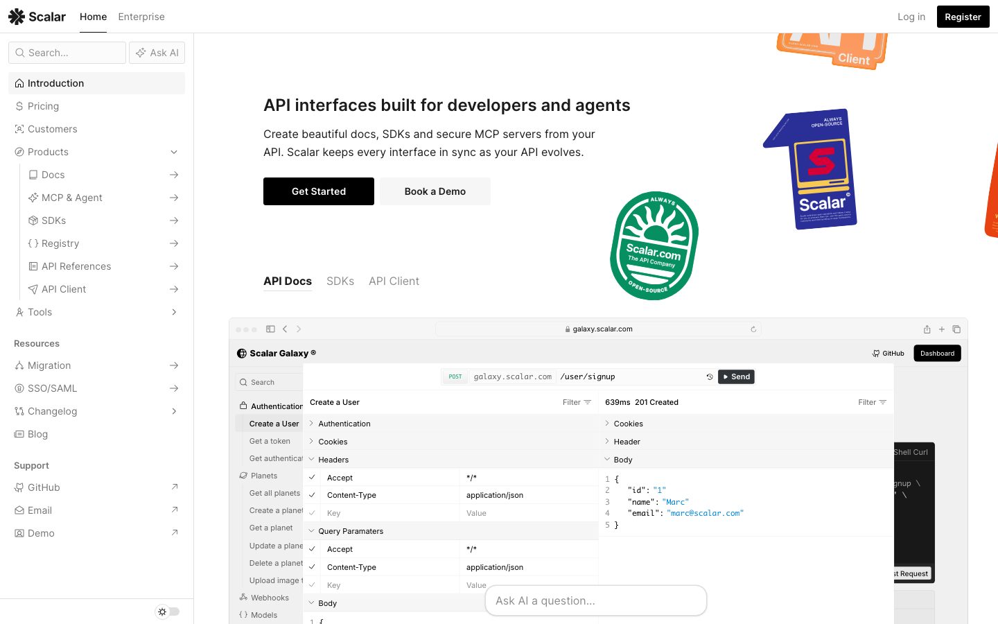
Scalar's marketing surface is a clean, developer-documentation-first interface — pure white canvas (`{colors.canvas}` — #ffffff) with near-black ink type (`{colors.ink}` — #1b1b1b) and a black primary CTA. The page is laid out like a docs product itself: a persistent left sidebar of navigation links, a content column to the right, and large embedded product mockups (the API client, docs sidebar, code samples) shown directly inline. The system reads as precise, technical, and confidently open-source rather than glossy-marketing.
Type is a single-family system: **Inter** for everything. Headings run at weight 600 (`{typography.title}` — 24px), and running body text sits at weight 400 / 14px with a generous 1.714 line-height that gives long technical paragraphs room to breathe. There is no display face — the restraint is part of the developer-tooling voice.
Component voltage comes from **real product UI fragments shown directly in the page** — the in-browser API client with request/response panels, the docs sidebar with endpoint trees, syntax-highlighted code blocks. Scalar shows the actual product chrome at scale rather than illustrating it. Accent color is scarce: a brand red (`{colors.accent-red}` — #dc2626) appears on the Scalar wordmark/badge and small accents, and link-blue tones (`{colors.accent-blue}`, `{colors.accent-cyan}`, `{colors.accent-sky}`) show up inside product UI and feature link rows.
UI chrome is tight: radii cluster around `{rounded.sm}` (3px), the dominant measured radius. Inputs are the exception — the search and "Ask AI" fields use `{rounded.round}` (50px) fully-pill capsules.
**Key Characteristics:**
- Pure white canvas (`{colors.canvas}`) with near-black ink (`{colors.ink}` — #1b1b1b). No dark sections; even the footer stays white.
- Single-family typography — Inter at 600 for titles, 400 for body. No display typeface.
- Black primary CTA (`{component.button-primary}`) paired with a white outline secondary (`{component.button-secondary}`) — the "Get Started" / "Book a Demo" pairing.
- Tight 3px radii (`{rounded.sm}`) on most UI chrome; pill-capsule inputs at `{rounded.round}` (50px).
- Real product UI embedded inline — API client, docs sidebar, code samples shown as content, not illustration.
- Scarce red brand accent (`{colors.accent-red}` — #dc2626) on the wordmark and badges; blues reserved for product UI and inline links.
- Soft single-layer shadows (`rgba(0,0,0,0.11) 0px 1px 3px`) on cards; one deep modal-style shadow for the floating product mockup.
- Persistent docs-style left sidebar navigation as the primary site frame.
## Colors
### Brand & Accent
- **Accent Red** (`{colors.accent-red}` — #dc2626): The scarce brand red — appears on the Scalar wordmark "S" badge and small accent moments. Never used as a button fill or large surface.
- **Accent Blue / Cyan / Sky** (`{colors.accent-blue}` — #3b82f6, `{colors.accent-cyan}` — #0099ff, `{colors.accent-sky}` — #00aeff): Link tones and product-UI highlights — feature link rows ("OpenAPI-First", "Code Samples"), syntax highlighting, and the embedded API client chrome. Used sparely.
### Surface
- **Canvas** (`{colors.canvas}` — #ffffff): The default page floor — every band, including the footer, stays white.
- **Surface Soft** (`{colors.surface-soft}` — #f6f6f6): Active sidebar item background, code-block background, soft section fills.
- **Surface Muted** (`{colors.surface-muted}` — #eeeeed): A barely-darker neutral fill for nested UI surfaces.
- **Hairline** (`{colors.hairline}` — #dfdfdf): 1px border tone on cards and dividers (also seen as a `0px 0px 0px 0.5px` ring in the measured shadow stack).
- **Hairline Soft** (`{colors.hairline-soft}` — #e7e7e7): A lighter divider tone between sections that share the white canvas.
### Text
- **Ink** (`{colors.ink}` — #1b1b1b): All headings and primary text; also the primary-button fill.
- **Ink Strong** (`{colors.ink-strong}` — #0d0d0d) / **Black** (`{colors.black}` — #000000): Deepest near-black tones used on dense UI chrome and logo marks.
- **Body** (`{colors.body}` — #757575): Default secondary / running-text color in sidebar links and supporting copy.
- **Muted** (`{colors.muted}` — #8e8e8e): Tertiary text — captions, inactive labels.
- **Muted Soft** (`{colors.muted-soft}` — #a4a4a4): Faintest text — fine-print, placeholder text.
- **On Ink** (`{colors.on-ink}` — #ffffff): Text on the black primary button.
## Typography
### Font Family
The system runs **Inter** for the entire interface — headings, body, navigation, buttons, and labels. There is no separate display face; hierarchy is built purely from size and weight. The fallback stack walks `Inter, sans-serif`.
Only two roles were measured directly:
- Inter 600 / 24px — section headings (`{typography.title}`)
- Inter 400 / 14px — body and UI text (`{typography.body}`)
### Hierarchy
| Token | Size | Weight | Line Height | Letter Spacing | Use |
|---|---|---|---|---|---|
| `{typography.title}` | 24px | 600 | 1.33 | normal | Section headings ("The Modern Documentation Platform", "Take their word for it") |
| `{typography.body}` | 14px | 400 | 1.714 | normal | Running text, sidebar links, buttons, captions, nav |
### Principles
The single-family discipline is the voice — Inter at 600 for emphasis, 400 for everything else. The generous 1.714 body line-height is deliberate: it makes dense technical paragraphs and feature lists comfortable to scan. Headings stay at weight 600 (never 700) to keep the developer-tooling restraint.
### Note on Font Substitutes
No licensed/custom typefaces were flagged (`fonts_licensed` is empty). Inter is an open-source webfont and ships directly — no substitution required.
## Layout
### Spacing System
- **Base unit:** measured spacing clusters strongly around 8px and 12px (the two highest-frequency values), with a 4px sub-grid.
- **Tokens:** `{spacing.xxs}` 4px · `{spacing.xs}` 6px · `{spacing.sm}` 8px · `{spacing.md}` 10px · `{spacing.base}` 12px · `{spacing.lg}` 16px · `{spacing.xl}` 24px · `{spacing.xxl}` 32px · `{spacing.section}` 44px.
- **Dominant rhythm:** `{spacing.sm}` (8px, frequency 73) and `{spacing.base}` (12px, frequency 49) drive most internal padding and gaps in nav rows, list items, and UI chrome.
- **Larger steps:** `{spacing.xl}` (24px) for card padding and content-block separation; `{spacing.section}` (44px) for the widest measured gaps.
### Grid & Container
- **Primary frame:** persistent left sidebar navigation + right content column — the docs-product layout applied to the marketing site.
- **Content bands:** feature sections alternate a text column with a large embedded product-mockup or code-block column.
- **Footer:** multi-column link list (Products / Company) at desktop.
Exact container max-width and column counts were not measured — see Known Gaps.
### Whitespace Philosophy
Whitespace is calm and technical — tight 8–12px rhythm inside dense UI chrome (sidebar, nav, lists), opening to 24px+ between content blocks. The generous body line-height does much of the breathing work, so vertical block spacing stays modest.
## Elevation & Depth
| Level | Treatment | Use |
|---|---|---|
| Flat | No shadow, no border | Body sections, footer, nav |
| Soft card | `rgba(0,0,0,0.11) 0px 1px 3px 0px` | Standard cards, embedded UI panels (measured, frequency 8) |
| Soft card + ring | `rgba(0,0,0,0.11) 0px 1px 3px 0px, rgb(223,223,223) 0px 0px 0px 0.5px` | Cards with a hairline ring (`{colors.hairline}`) |
| Deep float | `rgba(0,0,0,0.3) 0px 32px 68px 0px` | The large floating product-mockup card (the hero API client) |
| Inset outline | `rgb(27,27,27) 0px 0px 0px 1px inset` | A 1px inset ink ring (`{colors.ink}`) — used as a focus/emphasis outline on UI chrome |
The elevation philosophy is **soft and minimal** — a single low-alpha 1px/3px drop shadow does almost all the work, with one dramatic `0 32px 68px` shadow reserved for the floating hero product card. No neumorphism, no glassmorphism.
### Decorative Depth
- Embedded product UI fragments (API client, docs sidebar, code blocks) carry their own internal chrome — these are the product shown as content, not system tokens.
- Floating sticker-style brand artifacts (the "Scalar.com" badge, "API Client" sticker) sit over the canvas as decorative depth.
## Shapes
### Border Radius Scale
| Token | Value | Use |
|---|---|---|
| `{rounded.xs}` | 2px | Minimal accents on small UI chrome |
| `{rounded.sm}` | 3px | The dominant radius (frequency 33) — buttons, list items, small UI elements |
| `{rounded.md}` | 6px | Cards, nav items, medium chrome |
| `{rounded.lg}` | 8px | Larger cards, code blocks, product-mockup containers |
| `{rounded.xl}` | 16px | Large feature panels |
| `{rounded.xxl}` | 20px | Largest rounded surfaces |
| `{rounded.round}` | 50px | Search and "Ask AI" pill-capsule inputs |
| `{rounded.pill}` | 9999px | Fully-rounded pill elements |
### Photography & Artifact Geometry
Embedded product UI fragments retain their native chrome and radii. Brand sticker artifacts (badges, "API Client" tags) sit at angled rotations over the canvas as floating accents.
## Components
### Navigation
**`top-nav`** — White top bar carrying the Scalar wordmark + red "S" badge at left, primary links (Home, Enterprise) center-left, and "Log in" + black "Register" CTA at right. Background `{colors.canvas}`, text `{colors.ink}`, type `{typography.body}`.
**`sidebar-nav`** — The persistent left navigation, structured like the docs product itself: a search field at top, then grouped link sections (Introduction, Pricing, Customers, Products tree, Resources, Support). Background `{colors.canvas}`, link text `{colors.body}` in `{typography.body}`.
**`sidebar-item-active`** — The selected nav row (e.g. "Introduction"). Background `{colors.surface-soft}` (#f6f6f6), text `{colors.ink}`, rounded `{rounded.md}`.
### Buttons
**`button-primary`** — The black primary CTA ("Get Started", "Register"). Fill `{colors.ink}` (#1b1b1b), label `{colors.on-ink}` in `{typography.body}`. The measured button radius was 0px on the raw element; `{rounded.sm}` (3px) is applied per the system's dominant chrome radius (derived). Padding ~12px × 24px.
**`button-secondary`** — The white outline CTA ("Book a Demo"). Background `{colors.canvas}`, text `{colors.ink}`, 1px `{colors.hairline}` border, same padding and radius as primary.
### Inputs
**`search-input`** — The sidebar search field. Pill-capsule shape at `{rounded.round}` (50px, measured), background `{colors.canvas}`, placeholder text `{colors.body}`, type `{typography.body}`.
**`ask-ai-input`** — The "Ask AI a question…" floating field. Same pill-capsule `{rounded.round}` treatment as search, slightly larger padding.
### Tabs
**`tab`** + **`tab-active`** — The "API Docs / SDKs / API Client" content switcher. Inactive: `{colors.body}` text, transparent background. Active: `{colors.ink}` text with an underline indicator, transparent background. Type `{typography.body}`.
### Cards & Containers
**`product-mockup-card`** — The large embedded product-UI panels (the in-browser API client, docs sidebar, endpoint trees). Background `{colors.canvas}`, rounded `{rounded.lg}`, with the deep `0 32px 68px` float shadow on the hero instance and the soft `0 1px 3px` shadow on inline instances. These show the actual product, not illustrations of it.
**`testimonial-card`** — Customer-quote blocks in the "Take their word for it" band. Background `{colors.canvas}`, body text `{colors.body}` in `{typography.body}`, rounded `{rounded.md}`, padding `{spacing.xl}` (24px). Carries the quote, then name + role in muted text.
**`code-block`** — Syntax-highlighted code samples (the "One Commit To Update All Your SDKs" panel). Background `{colors.surface-soft}`, rounded `{rounded.lg}`, padding `{spacing.lg}` (16px). Syntax tokens use the accent-blue/cyan tones.
### Footer
**`footer`** — White footer closing the page. Background `{colors.canvas}`, link text `{colors.body}` in `{typography.body}`. Multi-column link list (Products / Company), Scalar wordmark + tagline at left, compliance badges, and a decorative full-spectrum color bar at the bottom. Padding ~44px (`{spacing.section}`).
## Do's and Don'ts
### Do
- Keep the canvas pure white (`{colors.canvas}`) across all bands, including the footer. Scalar has no dark sections.
- Use Inter for everything — 600 for titles, 400 for body. Build hierarchy from size and weight, not from a second typeface.
- Reserve `{colors.ink}` (#1b1b1b) for the black primary CTA and headings. The button is near-black, not colored.
- Embed real product UI (API client, docs sidebar, code blocks) directly in the page. Show the product, don't illustrate it.
- Keep UI chrome tight at `{rounded.sm}` (3px); reserve `{rounded.round}` (50px) for search/Ask-AI pill inputs.
- Use the brand red (`{colors.accent-red}`) sparingly — wordmark and badges only.
- Use the single soft `0 1px 3px` shadow for cards; reserve the deep `0 32px 68px` float for the hero product mockup only.
- Pair generous body line-height (1.714) with the tight 8–12px chrome spacing for the docs-product feel.
### Don't
- Don't introduce dark surfaces or dark footers — the system stays white throughout.
- Don't use accent blues or red as button fills; they belong in product UI and inline links.
- Don't bold headings past 600.
- Don't round buttons or cards to large radii — keep chrome at 3–8px; only inputs go fully pill.
- Don't replace embedded product UI with marketing illustrations.
- Don't add hover-state styling beyond default and active/pressed.
## Responsive Behavior
The reference captures were desktop-width. The site's docs-style frame (persistent left sidebar + content column) implies standard collapsing behavior, but specific breakpoints, mobile sidebar/hamburger treatment, and column-reflow values were not measured — see Known Gaps.
### Touch Targets
- `{component.button-primary}` and `{component.button-secondary}` carry ~12px × 24px padding, giving comfortable tap height.
- `{component.search-input}` / `{component.ask-ai-input}` use pill capsules with ~8–12px internal padding.
- Sidebar nav rows use the dominant 8–12px spacing; exact tap-height was not measured.
### Collapsing Strategy
Not measured. The left sidebar would typically collapse to a drawer/hamburger at narrow widths, and the alternating text + product-mockup bands would stack to single-column — but this is unconfirmed.
## Iteration Guide
1. Focus on ONE component at a time. Reference its YAML key directly (`{component.product-mockup-card}`, `{component.button-primary}`).
2. Variants of an existing component (`-active`, `-secondary`) live as separate entries in `components:`.
3. Use `{token.refs}` everywhere — never inline hex.
4. Never document hover. Default and Active/Pressed states only.
5. Hierarchy comes from Inter size + weight, never a second typeface.
6. Keep the canvas white — resist adding dark sections.
7. When emphasizing: bigger or weight-600 Inter, not a colored fill.
## Known Gaps
- Only two typography roles (h2 title and body) were measured. Display/hero headline sizes (e.g. "API interfaces built for developers and agents"), nav-link, caption, and button-label type specs are inferred from the body role and not directly captured.
- The raw `button-primary` measurement reported `radius: 0px` and `padding: 0px` — the CTA is likely a styled link element, so its real radius (`{rounded.sm}`, derived from the dominant 3px chrome radius) and padding (~12px × 24px) are estimated from screenshot ground-truth.
- Container max-width, grid column counts, and section vertical rhythm beyond the measured 44px were not extracted.
- Responsive breakpoints, mobile sidebar/hamburger behavior, and column-reflow were not measured (desktop captures only).
- Accent-color usage (red vs. blue/cyan/sky) is documented from low-frequency measurements and screenshot inspection; exact application rules inside the embedded product UI are out of scope.
- The decorative full-spectrum footer color bar and floating brand stickers are observed but not tokenized — they are content/brand artifacts rather than system tokens.
- Form validation, focus, and disabled states beyond the measured inset `0 0 0 1px` ink ring were not extracted.
- Animation and transition timings are not in scope.
<!-- Documented by duply · real-world design systems as ready-to-use DESIGN.md for AI coding agents · https://duply.ai/scalar/design-md -->
Color Palette
Accent
Neutrals
Typography
title24px · 600 · 1.33
The quick brown fox jumpsbody14px · 400 · 1.714
The quick brown fox jumpsSpacing & Shape
Spacing
| Name | Value | Preview |
|---|---|---|
| xxs | 4px | |
| xs | 6px | |
| sm | 8px | |
| md | 10px | |
| base | 12px | |
| lg | 16px | |
| xl | 24px | |
| xxl | 32px | |
| section | 44px |
Border Radius
| Name | Value | Preview |
|---|---|---|
| xs | 2px | |
| sm | 3px | |
| md | 6px | |
| lg | 8px | |
| xl | 16px | |
| xxl | 20px | |
| round | 50px | |
| pill | 9999px |
More like this


---
version: alpha
name: Scalar-design-analysis
description: A clean, developer-documentation-first marketing surface built on pure white canvas with near-black ink type and a black primary CTA. The system reads as precise, technical, and open-source — Inter throughout, tight 3px radii on UI chrome, real product UI (API client, docs sidebar, code blocks) embedded directly in the page, and a scarce red brand accent. Brand voltage comes from showing the actual product chrome rather than from decorative color.

colors:
  ink: "#1b1b1b"
  ink-strong: "#0d0d0d"
  black: "#000000"
  body: "#757575"
  muted: "#8e8e8e"
  muted-soft: "#a4a4a4"
  canvas: "#ffffff"
  surface-soft: "#f6f6f6"
  surface-muted: "#eeeeed"
  hairline: "#dfdfdf"
  hairline-soft: "#e7e7e7"
  on-ink: "#ffffff"
  accent-red: "#dc2626"
  accent-blue: "#3b82f6"
  accent-cyan: "#0099ff"
  accent-sky: "#00aeff"

typography:
  title:
    fontFamily: "Inter, sans-serif"
    fontSize: 24px
    fontWeight: 600
    lineHeight: 1.33
    letterSpacing: normal
  body:
    fontFamily: "Inter, sans-serif"
    fontSize: 14px
    fontWeight: 400
    lineHeight: 1.714
    letterSpacing: normal

rounded:
  xs: 2px
  sm: 3px
  md: 6px
  lg: 8px
  xl: 16px
  xxl: 20px
  round: 50px
  pill: 9999px

spacing:
  xxs: 4px
  xs: 6px
  sm: 8px
  md: 10px
  base: 12px
  lg: 16px
  xl: 24px
  xxl: 32px
  section: 44px

components:
  top-nav:
    backgroundColor: "{colors.canvas}"
    textColor: "{colors.ink}"
    typography: "{typography.body}"
  sidebar-nav:
    backgroundColor: "{colors.canvas}"
    textColor: "{colors.body}"
    typography: "{typography.body}"
  sidebar-item-active:
    backgroundColor: "{colors.surface-soft}"
    textColor: "{colors.ink}"
    typography: "{typography.body}"
    rounded: "{rounded.md}"
  button-primary:
    backgroundColor: "{colors.ink}"
    textColor: "{colors.on-ink}"
    typography: "{typography.body}"
    rounded: "{rounded.sm}"
    padding: 12px 24px
  button-secondary:
    backgroundColor: "{colors.canvas}"
    textColor: "{colors.ink}"
    typography: "{typography.body}"
    rounded: "{rounded.sm}"
    padding: 12px 24px
  search-input:
    backgroundColor: "{colors.canvas}"
    textColor: "{colors.body}"
    typography: "{typography.body}"
    rounded: "{rounded.round}"
    padding: 8px 12px
  ask-ai-input:
    backgroundColor: "{colors.canvas}"
    textColor: "{colors.body}"
    typography: "{typography.body}"
    rounded: "{rounded.round}"
    padding: 12px
  tab:
    backgroundColor: transparent
    textColor: "{colors.body}"
    typography: "{typography.body}"
  tab-active:
    backgroundColor: transparent
    textColor: "{colors.ink}"
    typography: "{typography.body}"
  product-mockup-card:
    backgroundColor: "{colors.canvas}"
    textColor: "{colors.ink}"
    rounded: "{rounded.lg}"
    padding: 12px
  testimonial-card:
    backgroundColor: "{colors.canvas}"
    textColor: "{colors.body}"
    typography: "{typography.body}"
    rounded: "{rounded.md}"
    padding: 24px
  code-block:
    backgroundColor: "{colors.surface-soft}"
    textColor: "{colors.ink}"
    typography: "{typography.body}"
    rounded: "{rounded.lg}"
    padding: 16px
  footer:
    backgroundColor: "{colors.canvas}"
    textColor: "{colors.body}"
    typography: "{typography.body}"
    padding: 44px
---

## Overview

Scalar's marketing surface is a clean, developer-documentation-first interface — pure white canvas (`{colors.canvas}` — #ffffff) with near-black ink type (`{colors.ink}` — #1b1b1b) and a black primary CTA. The page is laid out like a docs product itself: a persistent left sidebar of navigation links, a content column to the right, and large embedded product mockups (the API client, docs sidebar, code samples) shown directly inline. The system reads as precise, technical, and confidently open-source rather than glossy-marketing.

Type is a single-family system: **Inter** for everything. Headings run at weight 600 (`{typography.title}` — 24px), and running body text sits at weight 400 / 14px with a generous 1.714 line-height that gives long technical paragraphs room to breathe. There is no display face — the restraint is part of the developer-tooling voice.

Component voltage comes from **real product UI fragments shown directly in the page** — the in-browser API client with request/response panels, the docs sidebar with endpoint trees, syntax-highlighted code blocks. Scalar shows the actual product chrome at scale rather than illustrating it. Accent color is scarce: a brand red (`{colors.accent-red}` — #dc2626) appears on the Scalar wordmark/badge and small accents, and link-blue tones (`{colors.accent-blue}`, `{colors.accent-cyan}`, `{colors.accent-sky}`) show up inside product UI and feature link rows.

UI chrome is tight: radii cluster around `{rounded.sm}` (3px), the dominant measured radius. Inputs are the exception — the search and "Ask AI" fields use `{rounded.round}` (50px) fully-pill capsules.

**Key Characteristics:**
- Pure white canvas (`{colors.canvas}`) with near-black ink (`{colors.ink}` — #1b1b1b). No dark sections; even the footer stays white.
- Single-family typography — Inter at 600 for titles, 400 for body. No display typeface.
- Black primary CTA (`{component.button-primary}`) paired with a white outline secondary (`{component.button-secondary}`) — the "Get Started" / "Book a Demo" pairing.
- Tight 3px radii (`{rounded.sm}`) on most UI chrome; pill-capsule inputs at `{rounded.round}` (50px).
- Real product UI embedded inline — API client, docs sidebar, code samples shown as content, not illustration.
- Scarce red brand accent (`{colors.accent-red}` — #dc2626) on the wordmark and badges; blues reserved for product UI and inline links.
- Soft single-layer shadows (`rgba(0,0,0,0.11) 0px 1px 3px`) on cards; one deep modal-style shadow for the floating product mockup.
- Persistent docs-style left sidebar navigation as the primary site frame.

## Colors

### Brand & Accent
- **Accent Red** (`{colors.accent-red}` — #dc2626): The scarce brand red — appears on the Scalar wordmark "S" badge and small accent moments. Never used as a button fill or large surface.
- **Accent Blue / Cyan / Sky** (`{colors.accent-blue}` — #3b82f6, `{colors.accent-cyan}` — #0099ff, `{colors.accent-sky}` — #00aeff): Link tones and product-UI highlights — feature link rows ("OpenAPI-First", "Code Samples"), syntax highlighting, and the embedded API client chrome. Used sparely.

### Surface
- **Canvas** (`{colors.canvas}` — #ffffff): The default page floor — every band, including the footer, stays white.
- **Surface Soft** (`{colors.surface-soft}` — #f6f6f6): Active sidebar item background, code-block background, soft section fills.
- **Surface Muted** (`{colors.surface-muted}` — #eeeeed): A barely-darker neutral fill for nested UI surfaces.
- **Hairline** (`{colors.hairline}` — #dfdfdf): 1px border tone on cards and dividers (also seen as a `0px 0px 0px 0.5px` ring in the measured shadow stack).
- **Hairline Soft** (`{colors.hairline-soft}` — #e7e7e7): A lighter divider tone between sections that share the white canvas.

### Text
- **Ink** (`{colors.ink}` — #1b1b1b): All headings and primary text; also the primary-button fill.
- **Ink Strong** (`{colors.ink-strong}` — #0d0d0d) / **Black** (`{colors.black}` — #000000): Deepest near-black tones used on dense UI chrome and logo marks.
- **Body** (`{colors.body}` — #757575): Default secondary / running-text color in sidebar links and supporting copy.
- **Muted** (`{colors.muted}` — #8e8e8e): Tertiary text — captions, inactive labels.
- **Muted Soft** (`{colors.muted-soft}` — #a4a4a4): Faintest text — fine-print, placeholder text.
- **On Ink** (`{colors.on-ink}` — #ffffff): Text on the black primary button.

## Typography

### Font Family
The system runs **Inter** for the entire interface — headings, body, navigation, buttons, and labels. There is no separate display face; hierarchy is built purely from size and weight. The fallback stack walks `Inter, sans-serif`.

Only two roles were measured directly:
- Inter 600 / 24px — section headings (`{typography.title}`)
- Inter 400 / 14px — body and UI text (`{typography.body}`)

### Hierarchy

| Token | Size | Weight | Line Height | Letter Spacing | Use |
|---|---|---|---|---|---|
| `{typography.title}` | 24px | 600 | 1.33 | normal | Section headings ("The Modern Documentation Platform", "Take their word for it") |
| `{typography.body}` | 14px | 400 | 1.714 | normal | Running text, sidebar links, buttons, captions, nav |

### Principles
The single-family discipline is the voice — Inter at 600 for emphasis, 400 for everything else. The generous 1.714 body line-height is deliberate: it makes dense technical paragraphs and feature lists comfortable to scan. Headings stay at weight 600 (never 700) to keep the developer-tooling restraint.

### Note on Font Substitutes
No licensed/custom typefaces were flagged (`fonts_licensed` is empty). Inter is an open-source webfont and ships directly — no substitution required.

## Layout

### Spacing System
- **Base unit:** measured spacing clusters strongly around 8px and 12px (the two highest-frequency values), with a 4px sub-grid.
- **Tokens:** `{spacing.xxs}` 4px · `{spacing.xs}` 6px · `{spacing.sm}` 8px · `{spacing.md}` 10px · `{spacing.base}` 12px · `{spacing.lg}` 16px · `{spacing.xl}` 24px · `{spacing.xxl}` 32px · `{spacing.section}` 44px.
- **Dominant rhythm:** `{spacing.sm}` (8px, frequency 73) and `{spacing.base}` (12px, frequency 49) drive most internal padding and gaps in nav rows, list items, and UI chrome.
- **Larger steps:** `{spacing.xl}` (24px) for card padding and content-block separation; `{spacing.section}` (44px) for the widest measured gaps.

### Grid & Container
- **Primary frame:** persistent left sidebar navigation + right content column — the docs-product layout applied to the marketing site.
- **Content bands:** feature sections alternate a text column with a large embedded product-mockup or code-block column.
- **Footer:** multi-column link list (Products / Company) at desktop.

Exact container max-width and column counts were not measured — see Known Gaps.

### Whitespace Philosophy
Whitespace is calm and technical — tight 8–12px rhythm inside dense UI chrome (sidebar, nav, lists), opening to 24px+ between content blocks. The generous body line-height does much of the breathing work, so vertical block spacing stays modest.

## Elevation & Depth

| Level | Treatment | Use |
|---|---|---|
| Flat | No shadow, no border | Body sections, footer, nav |
| Soft card | `rgba(0,0,0,0.11) 0px 1px 3px 0px` | Standard cards, embedded UI panels (measured, frequency 8) |
| Soft card + ring | `rgba(0,0,0,0.11) 0px 1px 3px 0px, rgb(223,223,223) 0px 0px 0px 0.5px` | Cards with a hairline ring (`{colors.hairline}`) |
| Deep float | `rgba(0,0,0,0.3) 0px 32px 68px 0px` | The large floating product-mockup card (the hero API client) |
| Inset outline | `rgb(27,27,27) 0px 0px 0px 1px inset` | A 1px inset ink ring (`{colors.ink}`) — used as a focus/emphasis outline on UI chrome |

The elevation philosophy is **soft and minimal** — a single low-alpha 1px/3px drop shadow does almost all the work, with one dramatic `0 32px 68px` shadow reserved for the floating hero product card. No neumorphism, no glassmorphism.

### Decorative Depth
- Embedded product UI fragments (API client, docs sidebar, code blocks) carry their own internal chrome — these are the product shown as content, not system tokens.
- Floating sticker-style brand artifacts (the "Scalar.com" badge, "API Client" sticker) sit over the canvas as decorative depth.

## Shapes

### Border Radius Scale

| Token | Value | Use |
|---|---|---|
| `{rounded.xs}` | 2px | Minimal accents on small UI chrome |
| `{rounded.sm}` | 3px | The dominant radius (frequency 33) — buttons, list items, small UI elements |
| `{rounded.md}` | 6px | Cards, nav items, medium chrome |
| `{rounded.lg}` | 8px | Larger cards, code blocks, product-mockup containers |
| `{rounded.xl}` | 16px | Large feature panels |
| `{rounded.xxl}` | 20px | Largest rounded surfaces |
| `{rounded.round}` | 50px | Search and "Ask AI" pill-capsule inputs |
| `{rounded.pill}` | 9999px | Fully-rounded pill elements |

### Photography & Artifact Geometry
Embedded product UI fragments retain their native chrome and radii. Brand sticker artifacts (badges, "API Client" tags) sit at angled rotations over the canvas as floating accents.

## Components

### Navigation

**`top-nav`** — White top bar carrying the Scalar wordmark + red "S" badge at left, primary links (Home, Enterprise) center-left, and "Log in" + black "Register" CTA at right. Background `{colors.canvas}`, text `{colors.ink}`, type `{typography.body}`.

**`sidebar-nav`** — The persistent left navigation, structured like the docs product itself: a search field at top, then grouped link sections (Introduction, Pricing, Customers, Products tree, Resources, Support). Background `{colors.canvas}`, link text `{colors.body}` in `{typography.body}`.

**`sidebar-item-active`** — The selected nav row (e.g. "Introduction"). Background `{colors.surface-soft}` (#f6f6f6), text `{colors.ink}`, rounded `{rounded.md}`.

### Buttons

**`button-primary`** — The black primary CTA ("Get Started", "Register"). Fill `{colors.ink}` (#1b1b1b), label `{colors.on-ink}` in `{typography.body}`. The measured button radius was 0px on the raw element; `{rounded.sm}` (3px) is applied per the system's dominant chrome radius (derived). Padding ~12px × 24px.

**`button-secondary`** — The white outline CTA ("Book a Demo"). Background `{colors.canvas}`, text `{colors.ink}`, 1px `{colors.hairline}` border, same padding and radius as primary.

### Inputs

**`search-input`** — The sidebar search field. Pill-capsule shape at `{rounded.round}` (50px, measured), background `{colors.canvas}`, placeholder text `{colors.body}`, type `{typography.body}`.

**`ask-ai-input`** — The "Ask AI a question…" floating field. Same pill-capsule `{rounded.round}` treatment as search, slightly larger padding.

### Tabs

**`tab`** + **`tab-active`** — The "API Docs / SDKs / API Client" content switcher. Inactive: `{colors.body}` text, transparent background. Active: `{colors.ink}` text with an underline indicator, transparent background. Type `{typography.body}`.

### Cards & Containers

**`product-mockup-card`** — The large embedded product-UI panels (the in-browser API client, docs sidebar, endpoint trees). Background `{colors.canvas}`, rounded `{rounded.lg}`, with the deep `0 32px 68px` float shadow on the hero instance and the soft `0 1px 3px` shadow on inline instances. These show the actual product, not illustrations of it.

**`testimonial-card`** — Customer-quote blocks in the "Take their word for it" band. Background `{colors.canvas}`, body text `{colors.body}` in `{typography.body}`, rounded `{rounded.md}`, padding `{spacing.xl}` (24px). Carries the quote, then name + role in muted text.

**`code-block`** — Syntax-highlighted code samples (the "One Commit To Update All Your SDKs" panel). Background `{colors.surface-soft}`, rounded `{rounded.lg}`, padding `{spacing.lg}` (16px). Syntax tokens use the accent-blue/cyan tones.

### Footer

**`footer`** — White footer closing the page. Background `{colors.canvas}`, link text `{colors.body}` in `{typography.body}`. Multi-column link list (Products / Company), Scalar wordmark + tagline at left, compliance badges, and a decorative full-spectrum color bar at the bottom. Padding ~44px (`{spacing.section}`).

## Do's and Don'ts

### Do
- Keep the canvas pure white (`{colors.canvas}`) across all bands, including the footer. Scalar has no dark sections.
- Use Inter for everything — 600 for titles, 400 for body. Build hierarchy from size and weight, not from a second typeface.
- Reserve `{colors.ink}` (#1b1b1b) for the black primary CTA and headings. The button is near-black, not colored.
- Embed real product UI (API client, docs sidebar, code blocks) directly in the page. Show the product, don't illustrate it.
- Keep UI chrome tight at `{rounded.sm}` (3px); reserve `{rounded.round}` (50px) for search/Ask-AI pill inputs.
- Use the brand red (`{colors.accent-red}`) sparingly — wordmark and badges only.
- Use the single soft `0 1px 3px` shadow for cards; reserve the deep `0 32px 68px` float for the hero product mockup only.
- Pair generous body line-height (1.714) with the tight 8–12px chrome spacing for the docs-product feel.

### Don't
- Don't introduce dark surfaces or dark footers — the system stays white throughout.
- Don't use accent blues or red as button fills; they belong in product UI and inline links.
- Don't bold headings past 600.
- Don't round buttons or cards to large radii — keep chrome at 3–8px; only inputs go fully pill.
- Don't replace embedded product UI with marketing illustrations.
- Don't add hover-state styling beyond default and active/pressed.

## Responsive Behavior

The reference captures were desktop-width. The site's docs-style frame (persistent left sidebar + content column) implies standard collapsing behavior, but specific breakpoints, mobile sidebar/hamburger treatment, and column-reflow values were not measured — see Known Gaps.

### Touch Targets
- `{component.button-primary}` and `{component.button-secondary}` carry ~12px × 24px padding, giving comfortable tap height.
- `{component.search-input}` / `{component.ask-ai-input}` use pill capsules with ~8–12px internal padding.
- Sidebar nav rows use the dominant 8–12px spacing; exact tap-height was not measured.

### Collapsing Strategy
Not measured. The left sidebar would typically collapse to a drawer/hamburger at narrow widths, and the alternating text + product-mockup bands would stack to single-column — but this is unconfirmed.

## Iteration Guide

1. Focus on ONE component at a time. Reference its YAML key directly (`{component.product-mockup-card}`, `{component.button-primary}`).
2. Variants of an existing component (`-active`, `-secondary`) live as separate entries in `components:`.
3. Use `{token.refs}` everywhere — never inline hex.
4. Never document hover. Default and Active/Pressed states only.
5. Hierarchy comes from Inter size + weight, never a second typeface.
6. Keep the canvas white — resist adding dark sections.
7. When emphasizing: bigger or weight-600 Inter, not a colored fill.

## Known Gaps

- Only two typography roles (h2 title and body) were measured. Display/hero headline sizes (e.g. "API interfaces built for developers and agents"), nav-link, caption, and button-label type specs are inferred from the body role and not directly captured.
- The raw `button-primary` measurement reported `radius: 0px` and `padding: 0px` — the CTA is likely a styled link element, so its real radius (`{rounded.sm}`, derived from the dominant 3px chrome radius) and padding (~12px × 24px) are estimated from screenshot ground-truth.
- Container max-width, grid column counts, and section vertical rhythm beyond the measured 44px were not extracted.
- Responsive breakpoints, mobile sidebar/hamburger behavior, and column-reflow were not measured (desktop captures only).
- Accent-color usage (red vs. blue/cyan/sky) is documented from low-frequency measurements and screenshot inspection; exact application rules inside the embedded product UI are out of scope.
- The decorative full-spectrum footer color bar and floating brand stickers are observed but not tokenized — they are content/brand artifacts rather than system tokens.
- Form validation, focus, and disabled states beyond the measured inset `0 0 0 1px` ink ring were not extracted.
- Animation and transition timings are not in scope.

<!-- Documented by duply · real-world design systems as ready-to-use DESIGN.md for AI coding agents · https://duply.ai/scalar/design-md -->