Browser-Use
A near-black developer-infrastructure interface where AI-agent tooling is presented with editorial confidence — a deep #09090b canvas, a single high-voltage orange CTA, and oversized Playfair Display serif headlines that mix roman and italic. The system reads as a precise, terminal-flavored product page: monochrome zinc text on black, code/terminal fragments shown as content, and orange reserved almost exclusively for the primary action.
---
version: alpha
name: Browser-Use-design-analysis
description: "A near-black developer-infrastructure interface where AI-agent tooling is presented with editorial confidence — a deep #09090b canvas, a single high-voltage orange CTA, and oversized Playfair Display serif headlines that mix roman and italic. The system reads as a precise, terminal-flavored product page: monochrome zinc text on black, code/terminal fragments shown as content, and orange reserved almost exclusively for the primary action."
colors:
accent: "#fe750e"
accent-light: "#fe8f3c"
accent-soft: "#ffa969"
accent-faint: "#ffddc5"
accent-deep: "#512704"
success: "#10b981"
canvas: "#09090b"
surface: "#0b0b0e"
surface-raised: "#18181b"
surface-strong: "#27272a"
border: "#3f3f46"
ink: "#ffffff"
link: "#fafafa"
body: "#d4d4d8"
muted: "#a1a1aa"
muted-strong: "#71717a"
neutral: "#52525b"
on-accent: "#111827"
hairline: "#e5e7eb"
hairline-soft: "#9ca3af"
typography:
display-xl:
fontFamily: "Playfair Display, Georgia, serif"
fontSize: 60px
fontWeight: 400
lineHeight: 1.0
letterSpacing: normal
display-lg:
fontFamily: "Playfair Display, Georgia, serif"
fontSize: 48px
fontWeight: 400
lineHeight: 1.0
letterSpacing: normal
label-serif:
fontFamily: "Playfair Display, Georgia, serif"
fontSize: 14px
fontWeight: 400
lineHeight: 1.429
letterSpacing: normal
wordmark:
fontFamily: "Geist, system-ui, sans-serif"
fontSize: 16px
fontWeight: 400
lineHeight: 1.0
letterSpacing: normal
body:
fontFamily: "Geist, system-ui, sans-serif"
fontSize: 16px
fontWeight: 400
lineHeight: 1.5
letterSpacing: 0.4px
button:
fontFamily: "Geist, system-ui, sans-serif"
fontSize: 13px
fontWeight: 400
lineHeight: 1.5
letterSpacing: normal
rounded:
none: 0px
sm: 4px
pill: 9999px
full: 9999px
spacing:
xxs: 4px
xs: 8px
sm: 12px
md: 16px
lg: 20px
xl: 24px
xxl: 32px
section: 64px
section-lg: 128px
components:
top-nav:
backgroundColor: "{colors.canvas}"
textColor: "{colors.body}"
typography: "{typography.wordmark}"
rounded: "{rounded.none}"
nav-link:
backgroundColor: transparent
textColor: "{colors.body}"
typography: "{typography.body}"
announcement-banner:
backgroundColor: "{colors.accent-deep}"
textColor: "{colors.accent-soft}"
typography: "{typography.button}"
rounded: "{rounded.none}"
button-primary:
backgroundColor: "{colors.accent}"
textColor: "{colors.on-accent}"
typography: "{typography.button}"
rounded: "{rounded.none}"
padding: 14px 20px
button-nav-cloud:
backgroundColor: "{colors.accent}"
textColor: "{colors.on-accent}"
typography: "{typography.button}"
rounded: "{rounded.none}"
padding: 8px 16px
github-stat:
backgroundColor: transparent
textColor: "{colors.body}"
typography: "{typography.button}"
toggle-pill:
backgroundColor: "{colors.surface-raised}"
textColor: "{colors.muted}"
typography: "{typography.button}"
rounded: "{rounded.pill}"
padding: 4px
toggle-pill-active:
backgroundColor: "{colors.surface-strong}"
textColor: "{colors.ink}"
typography: "{typography.button}"
rounded: "{rounded.pill}"
feature-heading:
backgroundColor: transparent
textColor: "{colors.ink}"
typography: "{typography.display-lg}"
feature-body:
backgroundColor: transparent
textColor: "{colors.muted-strong}"
typography: "{typography.body}"
code-fragment:
backgroundColor: transparent
textColor: "{colors.body}"
typography: "{typography.button}"
rounded: "{rounded.none}"
code-label:
backgroundColor: transparent
textColor: "{colors.accent}"
typography: "{typography.button}"
data-bar:
backgroundColor: "{colors.surface-strong}"
textColor: "{colors.body}"
rounded: "{rounded.none}"
data-bar-highlight:
backgroundColor: "{colors.accent}"
textColor: "{colors.on-accent}"
rounded: "{rounded.none}"
footer:
backgroundColor: "{colors.canvas}"
textColor: "{colors.muted}"
typography: "{typography.button}"
footer-link:
backgroundColor: transparent
textColor: "{colors.muted}"
typography: "{typography.button}"
---
## Overview
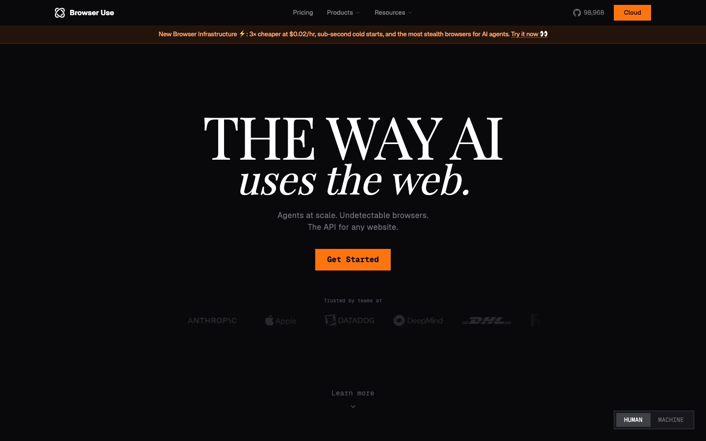
Browser Use is a developer-infrastructure product page rendered almost entirely in near-black. The canvas is `{colors.canvas}` (#09090b) — a deep, slightly blue-black — and the entire page floor stays at that value, with no light surfaces anywhere. The voice is terminal-meets-editorial: oversized Playfair Display serif headlines sit on top of monospace-styled code/terminal fragments shown as live product content, and a single saturated orange (`{colors.accent}` — #fe750e) carries every primary action.
The type story is the surprise. Where most dev-tool pages use a geometric sans for everything, Browser Use pairs **Playfair Display** (a high-contrast transitional serif) for display headlines — "THE WAY AI *uses the web.*" mixes roman caps and italic lowercase — with **Geist** (a clean grotesque) for body copy, navigation, buttons, and the code fragments. The serif gives the page its magazine-cover confidence; Geist keeps the supporting copy unfussy and machine-precise.
Color is overwhelmingly monochrome. The brand runs a full zinc/neutral ramp from `{colors.ink}` (#ffffff) down through `{colors.body}` (#d4d4d8), `{colors.muted}` (#a1a1aa), `{colors.muted-strong}` (#71717a), and `{colors.neutral}` (#52525b) — text descends in lightness to signal hierarchy on the black floor. Orange is the only chromatic voltage, and it is rationed: the Get Started button, the Cloud nav button, the announcement-banner accents, and a single highlighted data bar. A secondary `{colors.success}` green (#10b981) appears only inside terminal fragments to mark "passed / residential / unique" status lines.
**Key Characteristics:**
- Single near-black canvas (`{colors.canvas}` — #09090b) across the whole page — no light mode, no card surfaces lifting off the floor with light fills.
- Oversized **Playfair Display** serif headlines (48–60px) mixing roman and italic — the dominant editorial signal.
- **Geist** sans for body, nav, buttons, and code fragments — quiet, precise, machine-grade.
- One saturated orange (`{colors.accent}` — #fe750e) reserved for primary CTAs; everything else is monochrome zinc.
- Square-cornered primary buttons — `{rounded.none}` (0px) measured on the Get Started / Cloud buttons gives a sharp, terminal feel.
- Pill-shaped (`{rounded.pill}`) HUMAN/MACHINE toggle in the lower-right — the only fully-rounded interactive element.
- Code and terminal fragments (`helpers.py`, fingerprint scans, proxy tables, chat logs) shown directly as section content, with orange and green syntax accents.
- Generous vertical rhythm — `{spacing.section}` (64px) and `{spacing.section-lg}` (128px) separate the alternating left/right feature bands.
## Colors
### Accent
- **Accent** (`{colors.accent}` — #fe750e): The single brand voltage. Primary CTAs (Get Started, Cloud), the highlighted "bu" data bar, code-label highlights, and announcement-banner text accents. Rationed deliberately — orange means "action" or "us."
- **Accent Light / Soft / Faint** (`{colors.accent-light}` — #fe8f3c, `{colors.accent-soft}` — #ffa969, `{colors.accent-faint}` — #ffddc5): A warm ramp used for banner text, hover/secondary orange states, and pale highlight fills inside code fragments.
- **Accent Deep** (`{colors.accent-deep}` — #512704): The dark-brown fill behind the top announcement banner — a muted, low-luminance orange that lets the lighter banner text read.
- **Success** (`{colors.success}` — #10b981): Green used exclusively inside terminal/code fragments to mark positive status lines ("residential", "unique", "passed").
### Surface
- **Canvas** (`{colors.canvas}` — #09090b): The universal page floor — every section sits on it.
- **Surface** (`{colors.surface}` — #0b0b0e): A barely-perceptible step up from canvas for nested zones.
- **Surface Raised** (`{colors.surface-raised}` — #18181b): The toggle-pill track and other faintly-lifted controls.
- **Surface Strong** (`{colors.surface-strong}` — #27272a): The active toggle segment, inert data-bar tracks.
- **Border** (`{colors.border}` — #3f3f46): The 1px divider/hairline tone on the dark floor (footer rule, section separators).
### Text
- **Ink** (`{colors.ink}` — #ffffff): Display headlines and max-contrast feature titles.
- **Link** (`{colors.link}` — #fafafa): The near-white used for link text and high-emphasis interactive labels.
- **Body** (`{colors.body}` — #d4d4d8): Default running-text on the black floor.
- **Muted** (`{colors.muted}` — #a1a1aa): Secondary text — footer links, nav supporting copy.
- **Muted Strong** (`{colors.muted-strong}` — #71717a): Tertiary descriptive text under feature headings.
- **Neutral** (`{colors.neutral}` — #52525b): The lowest-emphasis text — captions, faded logo wall, "Learn more" hints.
- **On Accent** (`{colors.on-accent}` — #111827): The dark near-navy text printed on orange buttons (the CTA label is dark-on-orange, not white-on-orange).
### Utility Neutrals
- **Hairline / Hairline Soft** (`{colors.hairline}` — #e5e7eb, `{colors.hairline-soft}` — #9ca3af): Light neutrals measured in the system; used sparingly for high-contrast iconography and fine dividers where a near-white edge is needed.
## Typography
### Font Family
The system pairs two open-source families: **Playfair Display** (a high-contrast transitional serif with a true italic) for display headlines, and **Geist** (Vercel's open grotesque) for body, navigation, buttons, and code-styled fragments. Both are freely available web fonts — no licensed typeface was flagged in the analysis, so this entry ships the real faces rather than substitutes.
The split is strict and expressive:
- **Playfair Display** (400 weight) — all large editorial headlines; roman caps and italic lowercase are mixed within a single headline for contrast.
- **Geist** (400 weight) — body copy, nav links, button labels, footer, and code fragments.
### Hierarchy
| Token | Family | Size | Weight | Line Height | Letter Spacing | Use |
|---|---|---|---|---|---|---|
| `{typography.display-xl}` | Playfair Display | 60px | 400 | 1.0 | normal | Largest hero/feature headlines ("THE WAY AI") |
| `{typography.display-lg}` | Playfair Display | 48px | 400 | 1.0 | normal | Section/feature headings ("Browser Harness", "Stealth Browsers") |
| `{typography.label-serif}` | Playfair Display | 14px | 400 | 1.429 | normal | Small serif labels / sub-headings |
| `{typography.wordmark}` | Geist | 16px | 400 | 1.0 | normal | "Browser Use" wordmark / nav brand (measured as h1) |
| `{typography.body}` | Geist | 16px | 400 | 1.5 | 0.4px | Running text, feature descriptions, nav links |
| `{typography.button}` | Geist | 13px | 400 | 1.5 | normal | Button labels, code fragments, footer links |
### Principles
Playfair Display is the brand's whole personality — large, roman-and-italic, high-stroke-contrast. It only ever appears at display scale; never set body copy in the serif. Geist carries everything functional and stays at weight 400 throughout (the analysis measured no bold weights), so hierarchy comes from **size and color descent** (#ffffff → #d4d4d8 → #71717a → #52525b) rather than from weight contrast.
The body face carries a deliberate +0.4px letter-spacing, giving running copy a slightly airy, technical cadence that suits the terminal-flavored content.
### Note on Code Fragments
The code and terminal fragments shown across feature bands (`helpers.py`, fingerprint scans, proxy tables) render with monospace-style alignment in the screenshots, but the analysis only measured a Geist button role. A dedicated monospace token (e.g. a Geist Mono / `ui-monospace` stack) is the likely production face for those blocks — see Known Gaps.
## Layout
### Spacing System
- **Base unit:** 4px.
- **Tokens:** `{spacing.xxs}` 4px · `{spacing.xs}` 8px · `{spacing.sm}` 12px · `{spacing.md}` 16px · `{spacing.lg}` 20px · `{spacing.xl}` 24px · `{spacing.xxl}` 32px · `{spacing.section}` 64px · `{spacing.section-lg}` 128px.
- **Dominant step:** `{spacing.lg}` (20px) is by far the most frequent measured value — it governs most internal padding and gaps.
- **Section rhythm:** `{spacing.section}` (64px) and `{spacing.section-lg}` (128px) separate the alternating feature bands down the long-scroll page. Intermediate gaps at 48px and 112px were also measured (used sparingly — see Known Gaps).
### Grid & Container
- **Hero:** Centered single-column — oversized headline, supporting line, single CTA, then a faded "Trusted by teams at" logo wall.
- **Feature bands:** Alternating two-column layout — heading + description on one side, code/terminal/data fragment on the other (Browser Harness left-text/right-code, Stealth Browsers left-code/right-text, and so on down the page).
- **Footer:** Four-column link list (Product / Resources / Company / Connect) above a centered baseline rule.
### Whitespace Philosophy
The page uses very generous vertical whitespace on the black floor — feature bands are spaced far apart (64–128px), letting each serif headline and its code fragment breathe in isolation. The effect is editorial pacing: one idea per screen, scrolled slowly, with the black void doing the framing work that cards and borders do on light interfaces.
## Elevation & Depth
| Level | Treatment | Use |
|---|---|---|
| Flat (floor) | `{colors.canvas}` (#09090b), no shadow, no border | Entire page body, hero, feature bands, footer |
| Faint surface step | `{colors.surface}` / `{colors.surface-raised}` fill, no shadow | Toggle-pill track, faintly nested zones |
| Control surface | `{colors.surface-strong}` fill | Active toggle segment, inert data-bar tracks |
| Hairline | 1px `{colors.border}` (#3f3f46) | Footer rule, section dividers |
The analysis measured **no box-shadows anywhere** (`shadows: []`). Depth is created entirely by lightness steps in the near-black ramp (#09090b → #0b0b0e → #18181b → #27272a) and by hairline borders — never by drop shadows. This is a flat, shadowless dark system: contrast and color do all the layering work.
## Shapes
### Border Radius Scale
| Token | Value | Use |
|---|---|---|
| `{rounded.none}` | 0px | Primary buttons (Get Started, Cloud) and code-block edges — sharp, terminal-flavored |
| `{rounded.sm}` | 4px | Small inline chips, subtle rounded controls |
| `{rounded.pill}` / `{rounded.full}` | 9999px | The HUMAN/MACHINE toggle and any fully-rounded pill controls |
Only two radii were measured: **4px** (frequency 17) and **9999px** (frequency 48, the dominant). The primary button itself measured **0px** — square corners — which is the defining shape signal of the system: blocky, sharp CTAs against pill-shaped toggles. There is no medium/large card radius because there are no lifted cards.
### Photography / Content Geometry
There are no marketing photographs. The "imagery" is code and terminal fragments rendered as text — `helpers.py` snippets, fingerprint-scan tables, proxy GET listings, and a chat log. These sit directly on the canvas with no frame, no card, no radius. Data bars (the "Tasks per $1" chart) are sharp-cornered rectangular fills.
## Components
### Navigation
**`top-nav`** — Transparent-over-canvas top bar. Carries the Browser Use logo + wordmark (`{typography.wordmark}`) at left, center menu (Pricing, Products, Resources) in `{typography.body}`, and a right cluster with a GitHub star count and the orange Cloud button. Background reads as `{colors.canvas}`.
**`nav-link`** — Inline menu items, transparent background, `{colors.body}` text in `{typography.body}`.
**`github-stat`** — The "98,968" GitHub star indicator with mark, transparent background, `{colors.body}` text in `{typography.button}`.
**`announcement-banner`** — Full-width strip directly under the nav announcing new infrastructure. Background `{colors.accent-deep}` (#512704 — dark brown), text in `{colors.accent-soft}` with an inline "Try it now" link. Squared corners.
### Buttons
**`button-primary`** — The signature CTA (Get Started). Background `{colors.accent}` (#fe750e), label in `{colors.on-accent}` (#111827, dark-on-orange), typography `{typography.button}` (Geist 13px). Square corners (`{rounded.none}` — 0px). Padding documented as 14px × 20px (derived from the 20px dominant spacing step; the analyzer reported 0px padding which reflects an unstyled measurement — see Known Gaps).
**`button-nav-cloud`** — The compact orange Cloud button in the top-right nav. Same `{colors.accent}` fill and `{colors.on-accent}` label, smaller padding, square corners.
### Toggle
**`toggle-pill`** + **`toggle-pill-active`** — The HUMAN/MACHINE switch pinned bottom-right. Track is `{colors.surface-raised}` with `{rounded.pill}` and 4px internal padding; inactive label in `{colors.muted}`. The active segment fills `{colors.surface-strong}` with `{colors.ink}` text. The only fully-rounded interactive element in the system.
### Feature Bands
**`feature-heading`** — Large Playfair Display section title in `{colors.ink}` using `{typography.display-lg}` ("Browser Harness", "Stealth Browsers", "Custom Models", "Fully Hosted Web Agents", "Proxies").
**`feature-body`** — Supporting description in `{colors.muted-strong}` (#71717a) using `{typography.body}` — deliberately low-contrast so the serif heading dominates.
**`code-fragment`** — Monospace-aligned code/terminal blocks shown as content on the bare canvas (`helpers.py`, fingerprint scan, proxy table, chat log). Text in `{colors.body}` (`{typography.button}` scale), with `{colors.accent}` orange and `{colors.success}` green syntax/status accents. No background fill, no border, square edges.
**`code-label`** — Small orange section labels above code fragments ("EXTRACTION", "FINGERPRINT SCAN") in `{colors.accent}`, `{typography.button}`.
**`data-bar`** + **`data-bar-highlight`** — The "Tasks per $1" comparison bars. Inert competitor bars fill `{colors.surface-strong}`; the highlighted "bu" bar fills `{colors.accent}` with `{colors.on-accent}` value text. Square corners.
### Footer
**`footer`** — Sits on `{colors.canvas}`, separated by a `{colors.border}` hairline rule. Four link columns (Product / Resources / Company / Connect). Column headings in `{colors.body}`; links via `footer-link`.
**`footer-link`** — Footer link items in `{colors.muted}` (#a1a1aa) using `{typography.button}`. A centered baseline line and an "Operational" status dot in `{colors.success}` close the page.
## Do's and Don'ts
### Do
- Keep the entire page on `{colors.canvas}` (#09090b). The shadowless black floor is the system — don't introduce light cards.
- Reserve `{colors.accent}` orange for primary actions and the single highlighted data bar. Scarcity is what gives it voltage.
- Set display headlines in Playfair Display and mix roman caps with italic lowercase, exactly as "THE WAY AI *uses the web.*" does.
- Print CTA labels in dark `{colors.on-accent}` (#111827) on the orange — dark-on-orange, not white-on-orange.
- Keep primary buttons square (`{rounded.none}`) and reserve `{rounded.pill}` for the toggle. The contrast between sharp CTAs and round toggles is intentional.
- Build hierarchy with the zinc lightness ramp (#ffffff → #d4d4d8 → #71717a → #52525b), since weight stays at 400 throughout.
- Show code and terminal fragments as content, with `{colors.success}` green reserved for positive status lines.
### Don't
- Don't add box-shadows. The system measured none — depth comes from lightness steps and hairlines only.
- Don't set body copy in Playfair Display, and don't set headlines in Geist. The serif/sans boundary is the brand.
- Don't use `{colors.success}` green outside terminal/code fragments — it is a status color, not a brand accent.
- Don't round the primary buttons. Square corners are the terminal signal.
- Don't introduce additional saturated colors; orange is the only chromatic voltage on a monochrome field.
- Don't document hover states — default and active (e.g. `toggle-pill-active`) only.
## Responsive Behavior
### Breakpoints
The analysis captured desktop renders only; the values below are derived from the two-column feature layout and standard practice — treat exact breakpoints as unverified (see Known Gaps).
| Name | Width | Key Changes (derived) |
|---|---|---|
| Mobile | < 768px | Hero headline scales down from 60px; feature bands collapse two-column heading/code pairs to single-column; footer 4 cols → 1–2; nav likely collapses to a menu |
| Tablet | 768–1024px | Feature bands stay two-column but tighten; footer 4 cols → 2 |
| Desktop | > 1024px | Full alternating two-column feature bands; centered hero; 4-column footer |
### Touch Targets
- `{component.button-primary}` and `{component.button-nav-cloud}` carry enough padding to clear comfortable tap sizing; exact heights were not measured.
- `{component.toggle-pill}` with 4px track padding houses two tap segments; effective hit area depends on segment width (not measured).
### Collapsing Strategy
- Alternating left-text / right-code feature bands stack to single column on narrow screens — heading first, then the code/terminal fragment.
- Code fragments retain monospace alignment; horizontal overflow on the proxy/table fragments would need confirmation on mobile.
- The hero serif headline is the primary scaling concern — at 60px it must reduce substantially to fit small viewports.
## Iteration Guide
1. Focus on ONE component at a time. Reference its YAML key directly (`{component.button-primary}`, `{component.code-fragment}`).
2. Variants of an existing component (`-active`) live as separate entries in `components:` (e.g. `toggle-pill` / `toggle-pill-active`).
3. Use `{token.refs}` everywhere — never inline a hex into a component color prop.
4. Never document hover. Default and Active/Pressed states only.
5. Display headlines stay Playfair Display 400 with roman/italic mixing; body stays Geist 400. The serif/sans split does not blur.
6. Orange is scarce by design — adding a second orange surface dilutes the CTA. When emphasis is needed, descend the zinc ramp or go bigger in Playfair, not more colorful.
7. No shadows — reach for a lightness step or hairline before any glow or drop shadow.
## Known Gaps
- The component analyzer captured only `button-primary` and reported `padding: 0px` and `radius: 0px` — the 0px radius (square corners) is consistent with the screenshots, but the 0px padding reflects an unstyled/base measurement; button padding (documented as 14px × 20px) is **derived** from the dominant 20px spacing step and should be confirmed against production CSS.
- The h1 was measured as Geist 16px / 400 — this is the wordmark, not a hero headline. The visible hero ("THE WAY AI") is Playfair Display at display scale (h2 48px / h3 60px); the true rendered hero size may exceed 60px and was not isolated.
- Code/terminal fragments render in a monospace style in the screenshots, but no monospace typography role was measured. A dedicated mono token (Geist Mono / `ui-monospace`) is the likely production face and should be added when confirmed.
- No box-shadows were measured (`shadows: []`); if any subtle glows exist on the orange CTA they were not captured.
- Spacing values 48px (freq 3) and 112px (freq 1) were measured but not promoted to named tokens; their roles (intermediate band gaps) are inferred.
- The hairline neutrals `{colors.hairline}` (#e5e7eb) and `{colors.hairline-soft}` (#9ca3af) were measured at low frequency; their precise placement on the dark UI is inferred and may belong to iconography or imported logos.
- Only landing and pricing pages were captured at desktop width; all breakpoint and touch-target behavior is derived, not measured. The pricing page layout itself is not separately documented.
- Animation, transitions, and the HUMAN/MACHINE toggle's content-switching behavior are out of scope.
<!-- Documented by duply · real-world design systems as ready-to-use DESIGN.md for AI coding agents · https://duply.ai/browser-use/design-md -->
Color Palette
Accent
Neutrals
Typography
display-xl60px · 400 · 1
The quick brown fox jumpsdisplay-lg48px · 400 · 1
The quick brown fox jumpslabel-serif14px · 400 · 1.429
The quick brown fox jumpswordmark16px · 400 · 1
The quick brown fox jumpsbody16px · 400 · 1.5
The quick brown fox jumpsbutton13px · 400 · 1.5
The quick brown fox jumpsSpacing & Shape
Spacing
| Name | Value | Preview |
|---|---|---|
| xxs | 4px | |
| xs | 8px | |
| sm | 12px | |
| md | 16px | |
| lg | 20px | |
| xl | 24px | |
| xxl | 32px | |
| section | 64px | |
| section-lg | 128px |
Border Radius
| Name | Value | Preview |
|---|---|---|
| none | 0px | |
| sm | 4px | |
| pill | 9999px | |
| full | 9999px |
More like this


---
version: alpha
name: Browser-Use-design-analysis
description: "A near-black developer-infrastructure interface where AI-agent tooling is presented with editorial confidence — a deep #09090b canvas, a single high-voltage orange CTA, and oversized Playfair Display serif headlines that mix roman and italic. The system reads as a precise, terminal-flavored product page: monochrome zinc text on black, code/terminal fragments shown as content, and orange reserved almost exclusively for the primary action."
colors:
  accent: "#fe750e"
  accent-light: "#fe8f3c"
  accent-soft: "#ffa969"
  accent-faint: "#ffddc5"
  accent-deep: "#512704"
  success: "#10b981"
  canvas: "#09090b"
  surface: "#0b0b0e"
  surface-raised: "#18181b"
  surface-strong: "#27272a"
  border: "#3f3f46"
  ink: "#ffffff"
  link: "#fafafa"
  body: "#d4d4d8"
  muted: "#a1a1aa"
  muted-strong: "#71717a"
  neutral: "#52525b"
  on-accent: "#111827"
  hairline: "#e5e7eb"
  hairline-soft: "#9ca3af"

typography:
  display-xl:
    fontFamily: "Playfair Display, Georgia, serif"
    fontSize: 60px
    fontWeight: 400
    lineHeight: 1.0
    letterSpacing: normal
  display-lg:
    fontFamily: "Playfair Display, Georgia, serif"
    fontSize: 48px
    fontWeight: 400
    lineHeight: 1.0
    letterSpacing: normal
  label-serif:
    fontFamily: "Playfair Display, Georgia, serif"
    fontSize: 14px
    fontWeight: 400
    lineHeight: 1.429
    letterSpacing: normal
  wordmark:
    fontFamily: "Geist, system-ui, sans-serif"
    fontSize: 16px
    fontWeight: 400
    lineHeight: 1.0
    letterSpacing: normal
  body:
    fontFamily: "Geist, system-ui, sans-serif"
    fontSize: 16px
    fontWeight: 400
    lineHeight: 1.5
    letterSpacing: 0.4px
  button:
    fontFamily: "Geist, system-ui, sans-serif"
    fontSize: 13px
    fontWeight: 400
    lineHeight: 1.5
    letterSpacing: normal

rounded:
  none: 0px
  sm: 4px
  pill: 9999px
  full: 9999px

spacing:
  xxs: 4px
  xs: 8px
  sm: 12px
  md: 16px
  lg: 20px
  xl: 24px
  xxl: 32px
  section: 64px
  section-lg: 128px

components:
  top-nav:
    backgroundColor: "{colors.canvas}"
    textColor: "{colors.body}"
    typography: "{typography.wordmark}"
    rounded: "{rounded.none}"
  nav-link:
    backgroundColor: transparent
    textColor: "{colors.body}"
    typography: "{typography.body}"
  announcement-banner:
    backgroundColor: "{colors.accent-deep}"
    textColor: "{colors.accent-soft}"
    typography: "{typography.button}"
    rounded: "{rounded.none}"
  button-primary:
    backgroundColor: "{colors.accent}"
    textColor: "{colors.on-accent}"
    typography: "{typography.button}"
    rounded: "{rounded.none}"
    padding: 14px 20px
  button-nav-cloud:
    backgroundColor: "{colors.accent}"
    textColor: "{colors.on-accent}"
    typography: "{typography.button}"
    rounded: "{rounded.none}"
    padding: 8px 16px
  github-stat:
    backgroundColor: transparent
    textColor: "{colors.body}"
    typography: "{typography.button}"
  toggle-pill:
    backgroundColor: "{colors.surface-raised}"
    textColor: "{colors.muted}"
    typography: "{typography.button}"
    rounded: "{rounded.pill}"
    padding: 4px
  toggle-pill-active:
    backgroundColor: "{colors.surface-strong}"
    textColor: "{colors.ink}"
    typography: "{typography.button}"
    rounded: "{rounded.pill}"
  feature-heading:
    backgroundColor: transparent
    textColor: "{colors.ink}"
    typography: "{typography.display-lg}"
  feature-body:
    backgroundColor: transparent
    textColor: "{colors.muted-strong}"
    typography: "{typography.body}"
  code-fragment:
    backgroundColor: transparent
    textColor: "{colors.body}"
    typography: "{typography.button}"
    rounded: "{rounded.none}"
  code-label:
    backgroundColor: transparent
    textColor: "{colors.accent}"
    typography: "{typography.button}"
  data-bar:
    backgroundColor: "{colors.surface-strong}"
    textColor: "{colors.body}"
    rounded: "{rounded.none}"
  data-bar-highlight:
    backgroundColor: "{colors.accent}"
    textColor: "{colors.on-accent}"
    rounded: "{rounded.none}"
  footer:
    backgroundColor: "{colors.canvas}"
    textColor: "{colors.muted}"
    typography: "{typography.button}"
  footer-link:
    backgroundColor: transparent
    textColor: "{colors.muted}"
    typography: "{typography.button}"
---

## Overview

Browser Use is a developer-infrastructure product page rendered almost entirely in near-black. The canvas is `{colors.canvas}` (#09090b) — a deep, slightly blue-black — and the entire page floor stays at that value, with no light surfaces anywhere. The voice is terminal-meets-editorial: oversized Playfair Display serif headlines sit on top of monospace-styled code/terminal fragments shown as live product content, and a single saturated orange (`{colors.accent}` — #fe750e) carries every primary action.

The type story is the surprise. Where most dev-tool pages use a geometric sans for everything, Browser Use pairs **Playfair Display** (a high-contrast transitional serif) for display headlines — "THE WAY AI *uses the web.*" mixes roman caps and italic lowercase — with **Geist** (a clean grotesque) for body copy, navigation, buttons, and the code fragments. The serif gives the page its magazine-cover confidence; Geist keeps the supporting copy unfussy and machine-precise.

Color is overwhelmingly monochrome. The brand runs a full zinc/neutral ramp from `{colors.ink}` (#ffffff) down through `{colors.body}` (#d4d4d8), `{colors.muted}` (#a1a1aa), `{colors.muted-strong}` (#71717a), and `{colors.neutral}` (#52525b) — text descends in lightness to signal hierarchy on the black floor. Orange is the only chromatic voltage, and it is rationed: the Get Started button, the Cloud nav button, the announcement-banner accents, and a single highlighted data bar. A secondary `{colors.success}` green (#10b981) appears only inside terminal fragments to mark "passed / residential / unique" status lines.

**Key Characteristics:**
- Single near-black canvas (`{colors.canvas}` — #09090b) across the whole page — no light mode, no card surfaces lifting off the floor with light fills.
- Oversized **Playfair Display** serif headlines (48–60px) mixing roman and italic — the dominant editorial signal.
- **Geist** sans for body, nav, buttons, and code fragments — quiet, precise, machine-grade.
- One saturated orange (`{colors.accent}` — #fe750e) reserved for primary CTAs; everything else is monochrome zinc.
- Square-cornered primary buttons — `{rounded.none}` (0px) measured on the Get Started / Cloud buttons gives a sharp, terminal feel.
- Pill-shaped (`{rounded.pill}`) HUMAN/MACHINE toggle in the lower-right — the only fully-rounded interactive element.
- Code and terminal fragments (`helpers.py`, fingerprint scans, proxy tables, chat logs) shown directly as section content, with orange and green syntax accents.
- Generous vertical rhythm — `{spacing.section}` (64px) and `{spacing.section-lg}` (128px) separate the alternating left/right feature bands.

## Colors

### Accent
- **Accent** (`{colors.accent}` — #fe750e): The single brand voltage. Primary CTAs (Get Started, Cloud), the highlighted "bu" data bar, code-label highlights, and announcement-banner text accents. Rationed deliberately — orange means "action" or "us."
- **Accent Light / Soft / Faint** (`{colors.accent-light}` — #fe8f3c, `{colors.accent-soft}` — #ffa969, `{colors.accent-faint}` — #ffddc5): A warm ramp used for banner text, hover/secondary orange states, and pale highlight fills inside code fragments.
- **Accent Deep** (`{colors.accent-deep}` — #512704): The dark-brown fill behind the top announcement banner — a muted, low-luminance orange that lets the lighter banner text read.
- **Success** (`{colors.success}` — #10b981): Green used exclusively inside terminal/code fragments to mark positive status lines ("residential", "unique", "passed").

### Surface
- **Canvas** (`{colors.canvas}` — #09090b): The universal page floor — every section sits on it.
- **Surface** (`{colors.surface}` — #0b0b0e): A barely-perceptible step up from canvas for nested zones.
- **Surface Raised** (`{colors.surface-raised}` — #18181b): The toggle-pill track and other faintly-lifted controls.
- **Surface Strong** (`{colors.surface-strong}` — #27272a): The active toggle segment, inert data-bar tracks.
- **Border** (`{colors.border}` — #3f3f46): The 1px divider/hairline tone on the dark floor (footer rule, section separators).

### Text
- **Ink** (`{colors.ink}` — #ffffff): Display headlines and max-contrast feature titles.
- **Link** (`{colors.link}` — #fafafa): The near-white used for link text and high-emphasis interactive labels.
- **Body** (`{colors.body}` — #d4d4d8): Default running-text on the black floor.
- **Muted** (`{colors.muted}` — #a1a1aa): Secondary text — footer links, nav supporting copy.
- **Muted Strong** (`{colors.muted-strong}` — #71717a): Tertiary descriptive text under feature headings.
- **Neutral** (`{colors.neutral}` — #52525b): The lowest-emphasis text — captions, faded logo wall, "Learn more" hints.
- **On Accent** (`{colors.on-accent}` — #111827): The dark near-navy text printed on orange buttons (the CTA label is dark-on-orange, not white-on-orange).

### Utility Neutrals
- **Hairline / Hairline Soft** (`{colors.hairline}` — #e5e7eb, `{colors.hairline-soft}` — #9ca3af): Light neutrals measured in the system; used sparingly for high-contrast iconography and fine dividers where a near-white edge is needed.

## Typography

### Font Family
The system pairs two open-source families: **Playfair Display** (a high-contrast transitional serif with a true italic) for display headlines, and **Geist** (Vercel's open grotesque) for body, navigation, buttons, and code-styled fragments. Both are freely available web fonts — no licensed typeface was flagged in the analysis, so this entry ships the real faces rather than substitutes.

The split is strict and expressive:
- **Playfair Display** (400 weight) — all large editorial headlines; roman caps and italic lowercase are mixed within a single headline for contrast.
- **Geist** (400 weight) — body copy, nav links, button labels, footer, and code fragments.

### Hierarchy

| Token | Family | Size | Weight | Line Height | Letter Spacing | Use |
|---|---|---|---|---|---|---|
| `{typography.display-xl}` | Playfair Display | 60px | 400 | 1.0 | normal | Largest hero/feature headlines ("THE WAY AI") |
| `{typography.display-lg}` | Playfair Display | 48px | 400 | 1.0 | normal | Section/feature headings ("Browser Harness", "Stealth Browsers") |
| `{typography.label-serif}` | Playfair Display | 14px | 400 | 1.429 | normal | Small serif labels / sub-headings |
| `{typography.wordmark}` | Geist | 16px | 400 | 1.0 | normal | "Browser Use" wordmark / nav brand (measured as h1) |
| `{typography.body}` | Geist | 16px | 400 | 1.5 | 0.4px | Running text, feature descriptions, nav links |
| `{typography.button}` | Geist | 13px | 400 | 1.5 | normal | Button labels, code fragments, footer links |

### Principles
Playfair Display is the brand's whole personality — large, roman-and-italic, high-stroke-contrast. It only ever appears at display scale; never set body copy in the serif. Geist carries everything functional and stays at weight 400 throughout (the analysis measured no bold weights), so hierarchy comes from **size and color descent** (#ffffff → #d4d4d8 → #71717a → #52525b) rather than from weight contrast.

The body face carries a deliberate +0.4px letter-spacing, giving running copy a slightly airy, technical cadence that suits the terminal-flavored content.

### Note on Code Fragments
The code and terminal fragments shown across feature bands (`helpers.py`, fingerprint scans, proxy tables) render with monospace-style alignment in the screenshots, but the analysis only measured a Geist button role. A dedicated monospace token (e.g. a Geist Mono / `ui-monospace` stack) is the likely production face for those blocks — see Known Gaps.

## Layout

### Spacing System
- **Base unit:** 4px.
- **Tokens:** `{spacing.xxs}` 4px · `{spacing.xs}` 8px · `{spacing.sm}` 12px · `{spacing.md}` 16px · `{spacing.lg}` 20px · `{spacing.xl}` 24px · `{spacing.xxl}` 32px · `{spacing.section}` 64px · `{spacing.section-lg}` 128px.
- **Dominant step:** `{spacing.lg}` (20px) is by far the most frequent measured value — it governs most internal padding and gaps.
- **Section rhythm:** `{spacing.section}` (64px) and `{spacing.section-lg}` (128px) separate the alternating feature bands down the long-scroll page. Intermediate gaps at 48px and 112px were also measured (used sparingly — see Known Gaps).

### Grid & Container
- **Hero:** Centered single-column — oversized headline, supporting line, single CTA, then a faded "Trusted by teams at" logo wall.
- **Feature bands:** Alternating two-column layout — heading + description on one side, code/terminal/data fragment on the other (Browser Harness left-text/right-code, Stealth Browsers left-code/right-text, and so on down the page).
- **Footer:** Four-column link list (Product / Resources / Company / Connect) above a centered baseline rule.

### Whitespace Philosophy
The page uses very generous vertical whitespace on the black floor — feature bands are spaced far apart (64–128px), letting each serif headline and its code fragment breathe in isolation. The effect is editorial pacing: one idea per screen, scrolled slowly, with the black void doing the framing work that cards and borders do on light interfaces.

## Elevation & Depth

| Level | Treatment | Use |
|---|---|---|
| Flat (floor) | `{colors.canvas}` (#09090b), no shadow, no border | Entire page body, hero, feature bands, footer |
| Faint surface step | `{colors.surface}` / `{colors.surface-raised}` fill, no shadow | Toggle-pill track, faintly nested zones |
| Control surface | `{colors.surface-strong}` fill | Active toggle segment, inert data-bar tracks |
| Hairline | 1px `{colors.border}` (#3f3f46) | Footer rule, section dividers |

The analysis measured **no box-shadows anywhere** (`shadows: []`). Depth is created entirely by lightness steps in the near-black ramp (#09090b → #0b0b0e → #18181b → #27272a) and by hairline borders — never by drop shadows. This is a flat, shadowless dark system: contrast and color do all the layering work.

## Shapes

### Border Radius Scale

| Token | Value | Use |
|---|---|---|
| `{rounded.none}` | 0px | Primary buttons (Get Started, Cloud) and code-block edges — sharp, terminal-flavored |
| `{rounded.sm}` | 4px | Small inline chips, subtle rounded controls |
| `{rounded.pill}` / `{rounded.full}` | 9999px | The HUMAN/MACHINE toggle and any fully-rounded pill controls |

Only two radii were measured: **4px** (frequency 17) and **9999px** (frequency 48, the dominant). The primary button itself measured **0px** — square corners — which is the defining shape signal of the system: blocky, sharp CTAs against pill-shaped toggles. There is no medium/large card radius because there are no lifted cards.

### Photography / Content Geometry
There are no marketing photographs. The "imagery" is code and terminal fragments rendered as text — `helpers.py` snippets, fingerprint-scan tables, proxy GET listings, and a chat log. These sit directly on the canvas with no frame, no card, no radius. Data bars (the "Tasks per $1" chart) are sharp-cornered rectangular fills.

## Components

### Navigation

**`top-nav`** — Transparent-over-canvas top bar. Carries the Browser Use logo + wordmark (`{typography.wordmark}`) at left, center menu (Pricing, Products, Resources) in `{typography.body}`, and a right cluster with a GitHub star count and the orange Cloud button. Background reads as `{colors.canvas}`.

**`nav-link`** — Inline menu items, transparent background, `{colors.body}` text in `{typography.body}`.

**`github-stat`** — The "98,968" GitHub star indicator with mark, transparent background, `{colors.body}` text in `{typography.button}`.

**`announcement-banner`** — Full-width strip directly under the nav announcing new infrastructure. Background `{colors.accent-deep}` (#512704 — dark brown), text in `{colors.accent-soft}` with an inline "Try it now" link. Squared corners.

### Buttons

**`button-primary`** — The signature CTA (Get Started). Background `{colors.accent}` (#fe750e), label in `{colors.on-accent}` (#111827, dark-on-orange), typography `{typography.button}` (Geist 13px). Square corners (`{rounded.none}` — 0px). Padding documented as 14px × 20px (derived from the 20px dominant spacing step; the analyzer reported 0px padding which reflects an unstyled measurement — see Known Gaps).

**`button-nav-cloud`** — The compact orange Cloud button in the top-right nav. Same `{colors.accent}` fill and `{colors.on-accent}` label, smaller padding, square corners.

### Toggle

**`toggle-pill`** + **`toggle-pill-active`** — The HUMAN/MACHINE switch pinned bottom-right. Track is `{colors.surface-raised}` with `{rounded.pill}` and 4px internal padding; inactive label in `{colors.muted}`. The active segment fills `{colors.surface-strong}` with `{colors.ink}` text. The only fully-rounded interactive element in the system.

### Feature Bands

**`feature-heading`** — Large Playfair Display section title in `{colors.ink}` using `{typography.display-lg}` ("Browser Harness", "Stealth Browsers", "Custom Models", "Fully Hosted Web Agents", "Proxies").

**`feature-body`** — Supporting description in `{colors.muted-strong}` (#71717a) using `{typography.body}` — deliberately low-contrast so the serif heading dominates.

**`code-fragment`** — Monospace-aligned code/terminal blocks shown as content on the bare canvas (`helpers.py`, fingerprint scan, proxy table, chat log). Text in `{colors.body}` (`{typography.button}` scale), with `{colors.accent}` orange and `{colors.success}` green syntax/status accents. No background fill, no border, square edges.

**`code-label`** — Small orange section labels above code fragments ("EXTRACTION", "FINGERPRINT SCAN") in `{colors.accent}`, `{typography.button}`.

**`data-bar`** + **`data-bar-highlight`** — The "Tasks per $1" comparison bars. Inert competitor bars fill `{colors.surface-strong}`; the highlighted "bu" bar fills `{colors.accent}` with `{colors.on-accent}` value text. Square corners.

### Footer

**`footer`** — Sits on `{colors.canvas}`, separated by a `{colors.border}` hairline rule. Four link columns (Product / Resources / Company / Connect). Column headings in `{colors.body}`; links via `footer-link`.

**`footer-link`** — Footer link items in `{colors.muted}` (#a1a1aa) using `{typography.button}`. A centered baseline line and an "Operational" status dot in `{colors.success}` close the page.

## Do's and Don'ts

### Do
- Keep the entire page on `{colors.canvas}` (#09090b). The shadowless black floor is the system — don't introduce light cards.
- Reserve `{colors.accent}` orange for primary actions and the single highlighted data bar. Scarcity is what gives it voltage.
- Set display headlines in Playfair Display and mix roman caps with italic lowercase, exactly as "THE WAY AI *uses the web.*" does.
- Print CTA labels in dark `{colors.on-accent}` (#111827) on the orange — dark-on-orange, not white-on-orange.
- Keep primary buttons square (`{rounded.none}`) and reserve `{rounded.pill}` for the toggle. The contrast between sharp CTAs and round toggles is intentional.
- Build hierarchy with the zinc lightness ramp (#ffffff → #d4d4d8 → #71717a → #52525b), since weight stays at 400 throughout.
- Show code and terminal fragments as content, with `{colors.success}` green reserved for positive status lines.

### Don't
- Don't add box-shadows. The system measured none — depth comes from lightness steps and hairlines only.
- Don't set body copy in Playfair Display, and don't set headlines in Geist. The serif/sans boundary is the brand.
- Don't use `{colors.success}` green outside terminal/code fragments — it is a status color, not a brand accent.
- Don't round the primary buttons. Square corners are the terminal signal.
- Don't introduce additional saturated colors; orange is the only chromatic voltage on a monochrome field.
- Don't document hover states — default and active (e.g. `toggle-pill-active`) only.

## Responsive Behavior

### Breakpoints
The analysis captured desktop renders only; the values below are derived from the two-column feature layout and standard practice — treat exact breakpoints as unverified (see Known Gaps).

| Name | Width | Key Changes (derived) |
|---|---|---|
| Mobile | < 768px | Hero headline scales down from 60px; feature bands collapse two-column heading/code pairs to single-column; footer 4 cols → 1–2; nav likely collapses to a menu |
| Tablet | 768–1024px | Feature bands stay two-column but tighten; footer 4 cols → 2 |
| Desktop | > 1024px | Full alternating two-column feature bands; centered hero; 4-column footer |

### Touch Targets
- `{component.button-primary}` and `{component.button-nav-cloud}` carry enough padding to clear comfortable tap sizing; exact heights were not measured.
- `{component.toggle-pill}` with 4px track padding houses two tap segments; effective hit area depends on segment width (not measured).

### Collapsing Strategy
- Alternating left-text / right-code feature bands stack to single column on narrow screens — heading first, then the code/terminal fragment.
- Code fragments retain monospace alignment; horizontal overflow on the proxy/table fragments would need confirmation on mobile.
- The hero serif headline is the primary scaling concern — at 60px it must reduce substantially to fit small viewports.

## Iteration Guide

1. Focus on ONE component at a time. Reference its YAML key directly (`{component.button-primary}`, `{component.code-fragment}`).
2. Variants of an existing component (`-active`) live as separate entries in `components:` (e.g. `toggle-pill` / `toggle-pill-active`).
3. Use `{token.refs}` everywhere — never inline a hex into a component color prop.
4. Never document hover. Default and Active/Pressed states only.
5. Display headlines stay Playfair Display 400 with roman/italic mixing; body stays Geist 400. The serif/sans split does not blur.
6. Orange is scarce by design — adding a second orange surface dilutes the CTA. When emphasis is needed, descend the zinc ramp or go bigger in Playfair, not more colorful.
7. No shadows — reach for a lightness step or hairline before any glow or drop shadow.

## Known Gaps

- The component analyzer captured only `button-primary` and reported `padding: 0px` and `radius: 0px` — the 0px radius (square corners) is consistent with the screenshots, but the 0px padding reflects an unstyled/base measurement; button padding (documented as 14px × 20px) is **derived** from the dominant 20px spacing step and should be confirmed against production CSS.
- The h1 was measured as Geist 16px / 400 — this is the wordmark, not a hero headline. The visible hero ("THE WAY AI") is Playfair Display at display scale (h2 48px / h3 60px); the true rendered hero size may exceed 60px and was not isolated.
- Code/terminal fragments render in a monospace style in the screenshots, but no monospace typography role was measured. A dedicated mono token (Geist Mono / `ui-monospace`) is the likely production face and should be added when confirmed.
- No box-shadows were measured (`shadows: []`); if any subtle glows exist on the orange CTA they were not captured.
- Spacing values 48px (freq 3) and 112px (freq 1) were measured but not promoted to named tokens; their roles (intermediate band gaps) are inferred.
- The hairline neutrals `{colors.hairline}` (#e5e7eb) and `{colors.hairline-soft}` (#9ca3af) were measured at low frequency; their precise placement on the dark UI is inferred and may belong to iconography or imported logos.
- Only landing and pricing pages were captured at desktop width; all breakpoint and touch-target behavior is derived, not measured. The pricing page layout itself is not separately documented.
- Animation, transitions, and the HUMAN/MACHINE toggle's content-switching behavior are out of scope.

<!-- Documented by duply · real-world design systems as ready-to-use DESIGN.md for AI coding agents · https://duply.ai/browser-use/design-md -->