
Turnkey
A precise, infrastructure-grade crypto-developer interface built on a white canvas with deep-black dark bands, near-black pill CTAs, and the ABC Favorit display typeface set with aggressive negative letter-spacing. The system reads as serious wallet infrastructure for engineers — high contrast, abundant black, pill-radius controls, and a single violet (#4c48ff) accent that flares in the hero gradient headline and small UI labels.
Works withClaude CodeCursorCodexGemini CLICopilotv0LovableBoltWindsurfReplit
---
version: alpha
name: Turnkey-design-analysis
description: A precise, infrastructure-grade crypto-developer interface built on a white canvas with deep-black dark bands, near-black pill CTAs, and the ABC Favorit display typeface set with aggressive negative letter-spacing. The system reads as serious wallet infrastructure for engineers — high contrast, abundant black, pill-radius controls, and a single violet (#4c48ff) accent that flares in the hero gradient headline and small UI labels.

colors:
  ink: "#111111"
  canvas: "#ffffff"
  surface-dark: "#000000"
  surface-dark-soft: "#222222"
  surface-dark-elevated: "#333333"
  surface-soft: "#fafafa"
  surface-soft-alt: "#f0f0f0"
  on-dark: "#ffffff"
  body-on-dark: "#d0d0d0"
  muted: "#b2b7bc"
  muted-soft: "#999999"
  neutral-mid: "#505454"
  neutral-300: "#cccccc"
  neutral-200: "#dddddd"
  hairline: "#e2e2e2"
  accent: "#4c48ff"
  accent-blue: "#1863dc"
  accent-sky: "#3898ec"
  accent-orange: "#ff8d3c"
  accent-slate: "#5d6c7b"

typography:
  display-xl:
    fontFamily: "ABC Favorit, Inter, sans-serif"
    fontSize: 78.1px
    fontWeight: 400
    lineHeight: 1.1
    letterSpacing: -3px
  display-lg:
    fontFamily: "ABC Favorit, Inter, sans-serif"
    fontSize: 45.71px
    fontWeight: 400
    lineHeight: 1.1
    letterSpacing: -2.29px
  display-md:
    fontFamily: "ABC Favorit, Inter, sans-serif"
    fontSize: 24.76px
    fontWeight: 400
    lineHeight: 1.1
    letterSpacing: -0.5px
  body:
    fontFamily: "Inter, sans-serif"
    fontSize: 14px
    fontWeight: 400
    lineHeight: 1.5
    letterSpacing: -0.2px
  button:
    fontFamily: "Inter, sans-serif"
    fontSize: 14px
    fontWeight: 500
    lineHeight: 1
    letterSpacing: -0.2px
  nav-link:
    fontFamily: "Inter, sans-serif"
    fontSize: 14px
    fontWeight: 500
    lineHeight: 1.4
    letterSpacing: -0.2px

rounded:
  xs: 2px
  sm: 6px
  md: 8px
  pill-tight: 50px
  pill: 100px

spacing:
  xxs: 4px
  xs: 8px
  sm: 12px
  md: 16px
  lg: 24px
  xl: 32px
  xxl: 40px
  huge: 56px

components:
  top-nav:
    backgroundColor: "{colors.canvas}"
    textColor: "{colors.ink}"
    typography: "{typography.nav-link}"
    height: 72px
    padding: 24px 32px
  button-primary:
    backgroundColor: "{colors.ink}"
    textColor: "{colors.on-dark}"
    typography: "{typography.button}"
    rounded: "{rounded.pill}"
    padding: 12px 24px
  button-primary-active:
    backgroundColor: "{colors.surface-dark-soft}"
    textColor: "{colors.on-dark}"
    rounded: "{rounded.pill}"
  button-secondary:
    backgroundColor: "{colors.canvas}"
    textColor: "{colors.ink}"
    typography: "{typography.button}"
    rounded: "{rounded.pill}"
    padding: 12px 24px
  button-ghost-dark:
    backgroundColor: "{colors.surface-dark-soft}"
    textColor: "{colors.on-dark}"
    typography: "{typography.button}"
    rounded: "{rounded.pill}"
    padding: 12px 24px
  nav-pill:
    backgroundColor: "{colors.surface-soft}"
    textColor: "{colors.ink}"
    typography: "{typography.nav-link}"
    rounded: "{rounded.pill}"
    padding: 8px 16px
  hero-band:
    backgroundColor: "{colors.surface-dark}"
    textColor: "{colors.on-dark}"
    typography: "{typography.display-xl}"
    padding: 56px 32px
  logo-strip:
    backgroundColor: "{colors.surface-dark}"
    textColor: "{colors.muted}"
    typography: "{typography.body}"
    padding: 24px 32px
  section-light:
    backgroundColor: "{colors.canvas}"
    textColor: "{colors.ink}"
    typography: "{typography.display-lg}"
    padding: 56px 32px
  testimonial-band:
    backgroundColor: "{colors.surface-dark}"
    textColor: "{colors.on-dark}"
    typography: "{typography.display-md}"
    rounded: "{rounded.md}"
    padding: 40px 32px
  feature-list-item:
    backgroundColor: transparent
    textColor: "{colors.muted}"
    typography: "{typography.display-md}"
    rounded: "{rounded.md}"
    padding: 16px 24px
  feature-list-item-active:
    backgroundColor: "{colors.canvas}"
    textColor: "{colors.ink}"
    typography: "{typography.display-md}"
    rounded: "{rounded.md}"
    padding: 16px 24px
  security-band:
    backgroundColor: "{colors.surface-dark}"
    textColor: "{colors.on-dark}"
    typography: "{typography.display-lg}"
    padding: 56px 32px
  audit-row:
    backgroundColor: "{colors.canvas}"
    textColor: "{colors.ink}"
    typography: "{typography.body}"
    padding: 24px 32px
  cta-band:
    backgroundColor: "{colors.surface-dark}"
    textColor: "{colors.on-dark}"
    typography: "{typography.display-lg}"
    rounded: "{rounded.md}"
    padding: 40px 32px
  footer:
    backgroundColor: "{colors.surface-dark}"
    textColor: "{colors.muted}"
    typography: "{typography.body}"
    padding: 40px 32px
  text-input:
    backgroundColor: "{colors.surface-soft}"
    textColor: "{colors.ink}"
    typography: "{typography.body}"
    rounded: "{rounded.pill-tight}"
    padding: 8px 16px
---

## Overview

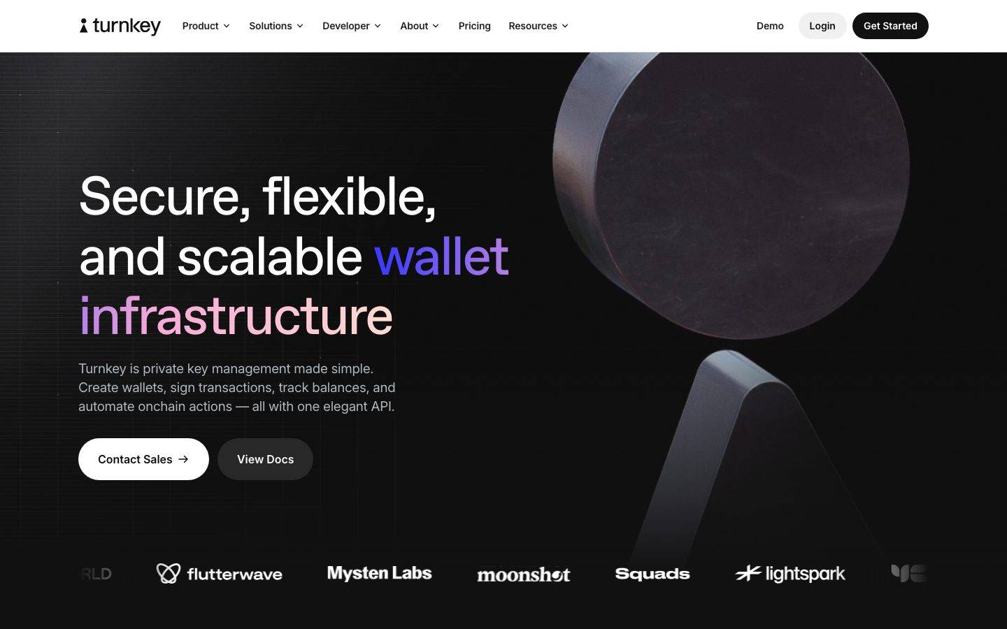
Turnkey's marketing surface is a high-contrast, infrastructure-grade developer interface. It alternates between a clean white canvas (`{colors.canvas}` — #ffffff) and full deep-black bands (`{colors.surface-dark}` — #000000), with near-black pill CTAs (`{colors.ink}` — #111111) and the **ABC Favorit** display typeface set in light weight 400 with aggressive negative letter-spacing. The result reads as serious wallet infrastructure built for engineers — precise, dense at the edges, confident with black.

Type voice splits into two roles: **ABC Favorit** (the brand display face — used for h1, h2, h3 and hero headlines, always weight 400 with tight tracking from -0.5px to -3px) and **Inter** (used for body copy, buttons, and navigation at 14px). The light-weight display face paired with extreme negative tracking is the brand's signature — it makes large headlines feel taut and engineered rather than loud.

Brand voltage is almost entirely monochrome — black, white, and a wide neutral gray ramp — punctuated by a single violet accent (`{colors.accent}` — #4c48ff) that appears in the hero's gradient "wallet infrastructure" headline and small section labels ("The Turnkey Approach"). A small secondary accent family (blue, sky, orange, slate) shows up only in tiny moments such as audit status checkmarks.

The page rhythm flips repeatedly between light and dark: white nav → black hero → white feature section → dark testimonial band → white tabs → black security band → white audits → dark CTA → dark footer. The black footer closes the page, but unlike a mostly-light system the dark surface is a recurring structural element, not a one-off.

**Key Characteristics:**
- White top nav with black pill primary CTA (`{component.button-primary}`) and a soft-gray "Login" pill (`{component.nav-pill}`). Controls are pill-radius (`{rounded.pill}` — 100px), not the usual small-radius SaaS button.
- ABC Favorit display headlines in weight 400 with negative tracking down to -3px on the hero — the defining typographic signature (substituted with Inter here; see Typography).
- Full-bleed black bands (`{colors.surface-dark}` — #000000) used for the hero, testimonials, the security feature, the CTA, and the footer — dark is a primary surface, not just the footer.
- Single violet accent (`{colors.accent}` — #4c48ff) reserved for the hero gradient headline and small eyebrow labels. The system is otherwise monochrome.
- Light-on-dark body text uses `{colors.body-on-dark}` (#d0d0d0) and `{colors.muted}` (#b2b7bc) rather than pure white, softening dense paragraphs on black.
- A vertical feature-list selector (`{component.feature-list-item}`) where the active row flips to a white card while inactive rows stay muted-gray — the system's signature interactive component.
- Soft, deep drop shadows for elevated cards (`rgba(0,0,0,0.3) 0 32px 68px` and `rgba(0,0,0,0.09) 0 14px 64px`).

## Colors

### Brand & Accent
- **Accent** (`{colors.accent}` — #4c48ff): The single hero accent. Used in the gradient "wallet infrastructure" headline and small eyebrow labels. The only chromatic voltage in the system.
- **Accent Blue / Sky** (`{colors.accent-blue}` — #1863dc, `{colors.accent-sky}` — #3898ec): Secondary blues that appear in small UI moments (status checkmarks, link accents, the measured input fill). Used sparingly.
- **Accent Orange** (`{colors.accent-orange}` — #ff8d3c): A warm accent observed in small highlight moments; never on primary CTAs.
- **Accent Slate** (`{colors.accent-slate}` — #5d6c7b): A desaturated blue-gray for low-emphasis accent text.

### Surface
- **Canvas** (`{colors.canvas}` — #ffffff): The default light page floor for feature, tab, and audit sections.
- **Surface Soft** (`{colors.surface-soft}` — #fafafa): Soft fills — the Login pill, low-contrast input backgrounds.
- **Surface Soft Alt** (`{colors.surface-soft-alt}` — #f0f0f0): A slightly stronger soft fill for nested panels and dividers.
- **Surface Dark** (`{colors.surface-dark}` — #000000): The full-bleed black band — hero, testimonial, security, CTA, and footer. The system's primary dark surface.
- **Surface Dark Soft** (`{colors.surface-dark-soft}` — #222222): Elevated dark controls — the "View Docs" ghost pill on the dark hero, pressed primary state.
- **Surface Dark Elevated** (`{colors.surface-dark-elevated}` — #333333): Nested elements inside dark bands.

### Text
- **Ink** (`{colors.ink}` — #111111): All headlines and primary text on light surfaces; the primary CTA fill.
- **On Dark** (`{colors.on-dark}` — #ffffff): Headlines and high-emphasis text on black bands.
- **Body on Dark** (`{colors.body-on-dark}` — #d0d0d0): Default running-text color on dark surfaces (the measured `p.color`).
- **Muted** (`{colors.muted}` — #b2b7bc): Secondary text — logo-strip labels, footer links, inactive list items.
- **Muted Soft** (`{colors.muted-soft}` — #999999): Tertiary text and fine print.
- **Neutral Mid** (`{colors.neutral-mid}` — #505454): Mid-emphasis labels.

### Lines & Neutrals
- **Hairline** (`{colors.hairline}` — #e2e2e2): The 1px divider tone on light surfaces.
- **Neutral 200 / 300** (`{colors.neutral-200}` — #dddddd, `{colors.neutral-300}` — #cccccc): Light borders and disabled tones.

## Typography

### Font Family
The system runs **ABC Favorit** for all display headlines and **Inter** (measured as "Intervariable", the Inter variable font) for body, buttons, and navigation. ABC Favorit is a neo-grotesque display face used here in its light weight (400) with heavy negative letter-spacing — large headlines feel taut and precisely engineered.

The split is strict:
- ABC Favorit (display, weight 400, -0.5px to -3px tracking) — h1, h2, h3
- Inter (body + UI, weight 400-500, -0.2px tracking) — paragraphs, labels, buttons, nav

### Hierarchy

| Token | Size | Weight | Line Height | Letter Spacing | Use |
|---|---|---|---|---|---|
| `{typography.display-xl}` | 78.1px | 400 | 1.1 | -3px | Hero h1 ("Secure, flexible, and scalable wallet infrastructure") — ABC Favorit |
| `{typography.display-lg}` | 45.71px | 400 | 1.1 | -2.29px | Section heads ("A powerful and modular operating system for wallets") — ABC Favorit |
| `{typography.display-md}` | 24.76px | 400 | 1.1 | -0.5px | Sub-section heads, feature list rows, testimonial quotes — ABC Favorit |
| `{typography.body}` | 14px | 400 | 1.5 | -0.2px | Default running-text, paragraphs |
| `{typography.button}` | 14px | 500 | 1.0 | -0.2px | Button labels — Inter (weight 500 derived; not directly measured) |
| `{typography.nav-link}` | 14px | 500 | 1.4 | -0.2px | Top-nav menu items — Inter (weight 500 derived; not directly measured) |

### Principles
ABC Favorit is the brand voice — every display headline uses it at weight 400. The negative tracking scales with size: -3px at hero, -2.29px at section heads, -0.5px at sub-heads. ABC Favorit without negative tracking reads as off-brand. Body copy is always Inter at 14px with a slight -0.2px tracking. Never set body in ABC Favorit; never set headlines in Inter.

The light display weight (400) is deliberate — it keeps large headlines elegant and infrastructural rather than heavy. Do not bold the display face.

### Note on Font Substitutes
**ABC Favorit** is a commercial typeface licensed from Dinamo Typefaces and is not available as a free web font — never ship it without a license. A usable open-source substitute is **Inter** at weight 400 with -0.04em letter-spacing, or **Hanken Grotesk** weight 400 for a closer neo-grotesque character. The substitution preserves the light-weight + tight-tracking signature even if the letterforms differ. The Inter body face itself is open-source and ships as-is.

## Layout

### Spacing System
- **Base unit:** 4px (the most frequent measured increments cluster on 4/8/12/16/24/32).
- **Tokens:** `{spacing.xxs}` 4px · `{spacing.xs}` 8px · `{spacing.sm}` 12px · `{spacing.md}` 16px · `{spacing.lg}` 24px · `{spacing.xl}` 32px · `{spacing.xxl}` 40px · `{spacing.huge}` 56px.
- **Most common gap/padding:** 32px (`{spacing.xl}`) and 12px (`{spacing.sm}`) dominate the measured set — 32px for section gutters, 12px for tight control padding.
- **Off-grid values:** the analysis also captured 6, 10, 13, 18, 20, 22, 27, 28px increments — these are minor and not tokenized; treat them as derived in-betweens, not part of the canonical scale.

### Grid & Container
- **Editorial body:** Hero uses a 50/50 split — headline + CTA cluster on the left, dark sculptural render on the right.
- **Logo strip:** Single horizontal row of partner logos pinned under the hero.
- **Feature selector:** A two-column layout — vertical list of selectable rows on the left, visual panel on the right.
- **Footer:** 5-column link list (Product / Solutions / Features / Developer / About / Resources) at desktop.

### Whitespace Philosophy
Turnkey uses large vertical breathing room between bands (~56px section padding) but keeps controls tight (8-12px internal padding). The alternation between light and dark bands does much of the structural work — each surface change signals a new content section without heavy dividers.

## Elevation & Depth

| Level | Treatment | Use |
|---|---|---|
| Flat | No shadow, no border | Body sections, top nav, dark bands |
| Hairline | 1px `{colors.hairline}` border | Light dividers between sections, audit rows |
| Soft deep shadow | `rgba(0,0,0,0.09) 0px 14px 64px 0px` | Elevated light cards (active feature row, floating panels) |
| Strong deep shadow | `rgba(0,0,0,0.3) 0px 32px 68px 0px` | The marquee elevated element / sculptural render container |

The elevation philosophy is **deep but soft** — large blur radii (64-68px) at low-to-medium alpha create a floating effect rather than a hard drop shadow. No neumorphism, no glassmorphism. On dark bands, contrast and color-block transitions do the elevation work instead of shadows.

### Decorative Depth
- The hero render — a black sculptural 3D form lit from one side — sits on the black band and provides depth through lighting, not shadow tokens.
- Active feature-list rows lift off the light canvas with the soft deep shadow, making the selected primitive feel like a floating white card.

## Shapes

### Border Radius Scale

| Token | Value | Use |
|---|---|---|
| `{rounded.xs}` | 2px | Smallest UI accents, fine inline chips |
| `{rounded.sm}` | 6px | Small inline elements |
| `{rounded.md}` | 8px | Cards, content panels, dark bands with rounded corners |
| `{rounded.pill-tight}` | 50px | Input fields, smaller pill controls |
| `{rounded.pill}` | 100px | Primary/secondary CTAs, nav pills, ghost buttons |

The radius story is bimodal: small (2-8px) for content surfaces and cards, and full pill (50-100px) for every interactive control. There is no mid-range button radius — Turnkey's buttons are fully rounded pills, which is the system's most recognizable shape signature.

### Photography & Render Geometry
Hero and security renders are dark sculptural 3D forms presented full-bleed on black. Partner logos in the logo strip are monochrome (white/gray) lockups. Testimonial bands use full-bleed gradient photography (deep purple) behind light text.

## Components

### Top Navigation

**`top-nav`** — White nav bar pinned to the top. `{colors.canvas}` background, ~72px tall, ink-colored wordmark "turnkey" at left, horizontal menu (Product, Solutions, Developer, About, Pricing, Resources) center, right-side cluster with "Demo" text-link, a `{component.nav-pill}` "Login", and the `{component.button-primary}` "Get Started". Menu items in `{typography.nav-link}` (Inter 14px / 500).

**`nav-pill`** — Soft-gray rounded pill used for the "Login" control. Background `{colors.surface-soft}`, text `{colors.ink}`, rounded `{rounded.pill}`, padding 8px × 16px.

### Buttons

**`button-primary`** — The signature primary CTA ("Get Started"). Background `{colors.ink}` (#111111), text `{colors.on-dark}`, type `{typography.button}`, rounded `{rounded.pill}` (100px), padding 12px × 24px. Active state `button-primary-active` shifts to `{colors.surface-dark-soft}` (#222222).

**`button-secondary`** — White pill CTA used on dark surfaces ("Contact Sales" with arrow). Background `{colors.canvas}`, text `{colors.ink}`, rounded `{rounded.pill}`, same padding as primary.

**`button-ghost-dark`** — Translucent dark pill used beside the white CTA on the dark hero ("View Docs"). Background `{colors.surface-dark-soft}`, text `{colors.on-dark}`, rounded `{rounded.pill}`, padding 12px × 24px.

### Bands & Sections

**`hero-band`** — Full-bleed black hero. Background `{colors.surface-dark}` (#000000), 50/50 split: `{typography.display-xl}` headline (with the violet gradient "wallet infrastructure" run), a `{typography.body}` sub-line in `{colors.body-on-dark}`, and a CTA row (`{component.button-secondary}` + `{component.button-ghost-dark}`) on the left; sculptural 3D render on the right. Vertical padding `{spacing.huge}` (56px).

**`logo-strip`** — Partner logo row pinned beneath the hero on the same black band. Background `{colors.surface-dark}`, monochrome logos in `{colors.muted}` tones.

**`section-light`** — Standard white content band. Background `{colors.canvas}`, headlines in `{typography.display-lg}` (`{colors.ink}`), eyebrow labels in `{colors.accent}`.

**`testimonial-band`** — Full-bleed gradient/dark testimonial band. Background `{colors.surface-dark}` with gradient photography overlay, quote in `{typography.display-md}` (`{colors.on-dark}`), avatar + attribution row, and carousel dots. Rounded `{rounded.md}` where contained.

**`feature-list-item`** + **`feature-list-item-active`** — A vertical selector of key-management primitives ("Authentication", "Wallets & Signing", "Policy Engine", "Sessions"). Inactive rows: transparent background, `{colors.muted}` text. Active row: `{colors.canvas}` fill with the soft deep shadow, `{colors.ink}` text, rounded `{rounded.md}`. The active row lifts off the page as a floating white card. Padding 16px × 24px.

**`security-band`** — Full-bleed black feature band ("Cryptographic security from first principles"). Background `{colors.surface-dark}`, headline in `{typography.display-lg}` (`{colors.on-dark}`), a `{component.button-ghost-dark}` "Learn more", and a glowing chip render at left.

**`audit-row`** — Light horizontal row listing audit firms (Distrust, Cure53, Trail of Bits, Zellic, SOC 2) with dates and "COMPLETE" status marks. Background `{colors.canvas}`, body text in `{typography.body}`, status checkmarks in `{colors.accent-blue}`.

**`cta-band`** — Pre-footer "Get started with Turnkey today" band over dark gradient photography. Background `{colors.surface-dark}`, headline `{typography.display-lg}` (`{colors.on-dark}`), a `{component.button-secondary}` "Contact Sales" at right, rounded `{rounded.md}`, padding `{spacing.xxl}` (40px).

**`footer`** — Black footer that closes the page. Background `{colors.surface-dark}` (#000000), link text `{colors.muted}`. 5-column link list (Product / Solutions / Features / Developer / About / Resources), wordmark top-left in `{colors.on-dark}`, social icons + legal row at the bottom. Vertical padding `{spacing.xxl}` (40px).

### Inputs & Forms

**`text-input`** — Pill-radius input field. Background `{colors.surface-soft}`, text `{colors.ink}`, type `{typography.body}`, rounded `{rounded.pill-tight}` (50px), padding 8px × 16px. (See Known Gaps — input measurement was ambiguous.)

## Do's and Don'ts

### Do
- Reserve `{colors.ink}` (#111111) for the primary pill CTA and light-surface headlines. Turnkey's primary button is near-black, not violet.
- Use ABC Favorit at weight 400 for every display headline, with negative tracking scaled to size (-0.5px to -3px). Pair with Inter body — never blur the boundary.
- Treat black (`{colors.surface-dark}` — #000000) as a primary surface, not just a footer. The light↔dark band alternation IS the page rhythm.
- Reserve the violet accent (`{colors.accent}`) for the hero gradient headline and small eyebrow labels. Keep everything else monochrome.
- Make every interactive control a full pill (`{rounded.pill}` / `{rounded.pill-tight}`). Pill controls are the shape signature.
- Use `{colors.body-on-dark}` (#d0d0d0) and `{colors.muted}` for paragraphs on black — never pure white body copy.
- Let the active feature-list row flip to a floating white card with the soft deep shadow; keep inactive rows muted.

### Don't
- Don't bold the display face. ABC Favorit stays at weight 400 — heavier weights break the engineered, taut feel.
- Don't add small-radius (4-8px) buttons. Buttons are full pills; reserve small radii for cards and panels.
- Don't introduce additional accent colors onto CTAs. The secondary accent family (blue, sky, orange, slate) is for tiny status moments only.
- Don't set body copy in ABC Favorit or headlines in Inter.
- Don't drop the negative letter-spacing on display headlines — untracked ABC Favorit reads as off-brand.
- Don't add hover-state styling beyond what the system encodes — primary darkens to `{colors.surface-dark-soft}` on press; nothing else changes.

## Responsive Behavior

### Breakpoints

| Name | Width | Key Changes |
|---|---|---|
| Mobile | < 768px | Hamburger nav; hero h1 78→~40px; hero render moves above/behind headline; CTAs stack; logo strip wraps; footer columns collapse to 1-2 |
| Tablet | 768–1024px | Top nav tightens; hero 50/50 may stack; feature list and visual panel stack; footer 5 cols → 2-3 |
| Desktop | 1024–1440px | Full horizontal nav; 50/50 hero; two-column feature selector; 5-column footer |
| Wide | > 1440px | Same as desktop with more outer breathing room; bands stay full-bleed |

### Touch Targets
- `{component.button-primary}` and `{component.button-secondary}` at 12px × 24px padding clear the 44px minimum tap height.
- `{component.nav-pill}` at 8px × 16px padding — effective tap area meets minimums with the pill silhouette.
- `{component.feature-list-item}` rows are large, full-width tap targets at 16px × 24px padding.

### Collapsing Strategy
- Top nav collapses to a hamburger at mobile; the menu opens as a sheet.
- The hero 50/50 split stacks to single column — headline + CTAs first, render below or behind.
- The feature selector stacks the row list above its visual panel.
- Full-bleed dark bands remain full-bleed at every breakpoint; only their internal grids reflow.
- Footer columns reduce from 5 to 2-3 to 1.

### Image Behavior
- Sculptural 3D renders scale proportionally and stay on the black band.
- Partner logos in the strip stay monochrome and wrap to multiple rows on narrow screens.
- Testimonial gradient photography stays full-bleed and crops at the edges.

## Iteration Guide

1. Focus on ONE component at a time. Reference its YAML key directly (`{component.feature-list-item-active}`, `{component.hero-band}`).
2. Variants of an existing component (`-active`, `-disabled`) live as separate entries in `components:`.
3. Use `{token.refs}` everywhere — never inline hex.
4. Never document hover. Default and Active/Pressed states only.
5. Display headlines stay ABC Favorit weight 400 with negative tracking; body stays Inter 14px. The split does not blur.
6. Black is a primary surface — alternate light and dark bands deliberately; don't run two identical surfaces back-to-back.
7. When in doubt about emphasis: bigger ABC Favorit before bolder. The face is never bolded.

## Known Gaps

- The measured `button-primary` component returned `color: #d0d0d0, radius: 0px, padding: 0px` — this is almost certainly a mis-captured element (likely an icon or link wrapper), not the visible pill CTA. Button styles are documented from screenshot ground-truth (black pill, white pill, dark ghost pill); padding values are derived from standard pill proportions.
- The measured `input` returned `background: #1863dc, radius: 50px` — the blue fill is ambiguous (possibly a focused or accent-styled control). The `{component.text-input}` background is documented as `{colors.surface-soft}` from visual inspection; confirm against a live form. The 50px (`{rounded.pill-tight}`) radius is taken as measured.
- `ABC Favorit` is a commercial Dinamo typeface (not flagged in `fonts_licensed`, but confirmed licensed); an open-source substitute is documented in Typography. Never ship ABC Favorit without a license.
- Button and nav-link font weights (500) are derived, not directly measured — only the 14px body weight (400) was captured for Inter.
- Off-grid spacing increments (6, 10, 13, 18, 20, 22, 27, 28px) were measured but not tokenized; the canonical scale uses the 4px-based cluster.
- Animation and transition timings (hero gradient, feature-tab switching, testimonial carousel, security chip glow) are not in scope.
- Form validation states (error / success) were not extracted — no sign-up flow was captured.
- The pricing page was captured but no pricing-specific tokens (tier cards, toggles) surfaced in the measured component set; pricing component specs are a gap.

<!-- Documented by Duply · real-world design systems as ready-to-use DESIGN.md for AI coding agents · https://duply.ai/turnkey/design-md -->
Color Palette
Accent
Neutrals
Typography
display-xl78.1px · 400 · 1.1
The quick brown fox jumpsdisplay-lg45.71px · 400 · 1.1
The quick brown fox jumpsdisplay-md24.76px · 400 · 1.1
The quick brown fox jumpsbody14px · 400 · 1.5
The quick brown fox jumpsbutton14px · 500 · 1
The quick brown fox jumpsnav-link14px · 500 · 1.4
The quick brown fox jumpsSpacing & Shape
Spacing
| Name | Value | Preview |
|---|---|---|
| xxs | 4px | |
| xs | 8px | |
| sm | 12px | |
| md | 16px | |
| lg | 24px | |
| xl | 32px | |
| xxl | 40px | |
| huge | 56px |
Border Radius
| Name | Value | Preview |
|---|---|---|
| xs | 2px | |
| sm | 6px | |
| md | 8px | |
| pill-tight | 50px | |
| pill | 100px |
FAQ
- What colors does Turnkey use?
- Turnkey's core palette includes #111111, #ffffff, #000000, #222222, #333333. The full color set with usage roles (canvas, ink, surfaces, accent, semantic) is documented in the Turnkey DESIGN.md.
- What font does Turnkey use?
- Turnkey's primary typeface is ABC Favorit. The complete type scale (sizes, weights, line-height and letter-spacing per role), with an open substitute where the original is licensed, is documented in the DESIGN.md.
- What is the Turnkey design system?
- A precise, infrastructure-grade crypto-developer interface built on a white canvas with deep-black dark bands, near-black pill CTAs, and the ABC Favorit display typeface set with aggressive negative letter-spacing. The system reads as serious wallet infrastructure for engineers — high contrast
Get this as a working kit
Turnkey Launch Kit + DESIGN.md
$299$225
One-time payment
- A complete production-stack template, styled like Turnkey, fully built and wired.
- One-time payment and the codebase is yours. No platform fees, no subscription.
Open it with Claude Code, Cursor, or any coding agent and build in plain language, then ship a complete web app.
- Your private DESIGN.md
- Marketing pages, blog, SEO & legal
- Email capture, newsletter & contact
- Accept payments (Stripe)
- Analytics (GA4 + PostHog)
- One-click deploy
- Auth, login & roles
- A full app dashboard, when you grow
More like this

---
version: alpha
name: Turnkey-design-analysis
description: A precise, infrastructure-grade crypto-developer interface built on a white canvas with deep-black dark bands, near-black pill CTAs, and the ABC Favorit display typeface set with aggressive negative letter-spacing. The system reads as serious wallet infrastructure for engineers — high contrast, abundant black, pill-radius controls, and a single violet (#4c48ff) accent that flares in the hero gradient headline and small UI labels.

colors:
  ink: "#111111"
  canvas: "#ffffff"
  surface-dark: "#000000"
  surface-dark-soft: "#222222"
  surface-dark-elevated: "#333333"
  surface-soft: "#fafafa"
  surface-soft-alt: "#f0f0f0"
  on-dark: "#ffffff"
  body-on-dark: "#d0d0d0"
  muted: "#b2b7bc"
  muted-soft: "#999999"
  neutral-mid: "#505454"
  neutral-300: "#cccccc"
  neutral-200: "#dddddd"
  hairline: "#e2e2e2"
  accent: "#4c48ff"
  accent-blue: "#1863dc"
  accent-sky: "#3898ec"
  accent-orange: "#ff8d3c"
  accent-slate: "#5d6c7b"

typography:
  display-xl:
    fontFamily: "ABC Favorit, Inter, sans-serif"
    fontSize: 78.1px
    fontWeight: 400
    lineHeight: 1.1
    letterSpacing: -3px
  display-lg:
    fontFamily: "ABC Favorit, Inter, sans-serif"
    fontSize: 45.71px
    fontWeight: 400
    lineHeight: 1.1
    letterSpacing: -2.29px
  display-md:
    fontFamily: "ABC Favorit, Inter, sans-serif"
    fontSize: 24.76px
    fontWeight: 400
    lineHeight: 1.1
    letterSpacing: -0.5px
  body:
    fontFamily: "Inter, sans-serif"
    fontSize: 14px
    fontWeight: 400
    lineHeight: 1.5
    letterSpacing: -0.2px
  button:
    fontFamily: "Inter, sans-serif"
    fontSize: 14px
    fontWeight: 500
    lineHeight: 1
    letterSpacing: -0.2px
  nav-link:
    fontFamily: "Inter, sans-serif"
    fontSize: 14px
    fontWeight: 500
    lineHeight: 1.4
    letterSpacing: -0.2px

rounded:
  xs: 2px
  sm: 6px
  md: 8px
  pill-tight: 50px
  pill: 100px

spacing:
  xxs: 4px
  xs: 8px
  sm: 12px
  md: 16px
  lg: 24px
  xl: 32px
  xxl: 40px
  huge: 56px

components:
  top-nav:
    backgroundColor: "{colors.canvas}"
    textColor: "{colors.ink}"
    typography: "{typography.nav-link}"
    height: 72px
    padding: 24px 32px
  button-primary:
    backgroundColor: "{colors.ink}"
    textColor: "{colors.on-dark}"
    typography: "{typography.button}"
    rounded: "{rounded.pill}"
    padding: 12px 24px
  button-primary-active:
    backgroundColor: "{colors.surface-dark-soft}"
    textColor: "{colors.on-dark}"
    rounded: "{rounded.pill}"
  button-secondary:
    backgroundColor: "{colors.canvas}"
    textColor: "{colors.ink}"
    typography: "{typography.button}"
    rounded: "{rounded.pill}"
    padding: 12px 24px
  button-ghost-dark:
    backgroundColor: "{colors.surface-dark-soft}"
    textColor: "{colors.on-dark}"
    typography: "{typography.button}"
    rounded: "{rounded.pill}"
    padding: 12px 24px
  nav-pill:
    backgroundColor: "{colors.surface-soft}"
    textColor: "{colors.ink}"
    typography: "{typography.nav-link}"
    rounded: "{rounded.pill}"
    padding: 8px 16px
  hero-band:
    backgroundColor: "{colors.surface-dark}"
    textColor: "{colors.on-dark}"
    typography: "{typography.display-xl}"
    padding: 56px 32px
  logo-strip:
    backgroundColor: "{colors.surface-dark}"
    textColor: "{colors.muted}"
    typography: "{typography.body}"
    padding: 24px 32px
  section-light:
    backgroundColor: "{colors.canvas}"
    textColor: "{colors.ink}"
    typography: "{typography.display-lg}"
    padding: 56px 32px
  testimonial-band:
    backgroundColor: "{colors.surface-dark}"
    textColor: "{colors.on-dark}"
    typography: "{typography.display-md}"
    rounded: "{rounded.md}"
    padding: 40px 32px
  feature-list-item:
    backgroundColor: transparent
    textColor: "{colors.muted}"
    typography: "{typography.display-md}"
    rounded: "{rounded.md}"
    padding: 16px 24px
  feature-list-item-active:
    backgroundColor: "{colors.canvas}"
    textColor: "{colors.ink}"
    typography: "{typography.display-md}"
    rounded: "{rounded.md}"
    padding: 16px 24px
  security-band:
    backgroundColor: "{colors.surface-dark}"
    textColor: "{colors.on-dark}"
    typography: "{typography.display-lg}"
    padding: 56px 32px
  audit-row:
    backgroundColor: "{colors.canvas}"
    textColor: "{colors.ink}"
    typography: "{typography.body}"
    padding: 24px 32px
  cta-band:
    backgroundColor: "{colors.surface-dark}"
    textColor: "{colors.on-dark}"
    typography: "{typography.display-lg}"
    rounded: "{rounded.md}"
    padding: 40px 32px
  footer:
    backgroundColor: "{colors.surface-dark}"
    textColor: "{colors.muted}"
    typography: "{typography.body}"
    padding: 40px 32px
  text-input:
    backgroundColor: "{colors.surface-soft}"
    textColor: "{colors.ink}"
    typography: "{typography.body}"
    rounded: "{rounded.pill-tight}"
    padding: 8px 16px
---

## Overview

Turnkey's marketing surface is a high-contrast, infrastructure-grade developer interface. It alternates between a clean white canvas (`{colors.canvas}` — #ffffff) and full deep-black bands (`{colors.surface-dark}` — #000000), with near-black pill CTAs (`{colors.ink}` — #111111) and the **ABC Favorit** display typeface set in light weight 400 with aggressive negative letter-spacing. The result reads as serious wallet infrastructure built for engineers — precise, dense at the edges, confident with black.

Type voice splits into two roles: **ABC Favorit** (the brand display face — used for h1, h2, h3 and hero headlines, always weight 400 with tight tracking from -0.5px to -3px) and **Inter** (used for body copy, buttons, and navigation at 14px). The light-weight display face paired with extreme negative tracking is the brand's signature — it makes large headlines feel taut and engineered rather than loud.

Brand voltage is almost entirely monochrome — black, white, and a wide neutral gray ramp — punctuated by a single violet accent (`{colors.accent}` — #4c48ff) that appears in the hero's gradient "wallet infrastructure" headline and small section labels ("The Turnkey Approach"). A small secondary accent family (blue, sky, orange, slate) shows up only in tiny moments such as audit status checkmarks.

The page rhythm flips repeatedly between light and dark: white nav → black hero → white feature section → dark testimonial band → white tabs → black security band → white audits → dark CTA → dark footer. The black footer closes the page, but unlike a mostly-light system the dark surface is a recurring structural element, not a one-off.

**Key Characteristics:**
- White top nav with black pill primary CTA (`{component.button-primary}`) and a soft-gray "Login" pill (`{component.nav-pill}`). Controls are pill-radius (`{rounded.pill}` — 100px), not the usual small-radius SaaS button.
- ABC Favorit display headlines in weight 400 with negative tracking down to -3px on the hero — the defining typographic signature (substituted with Inter here; see Typography).
- Full-bleed black bands (`{colors.surface-dark}` — #000000) used for the hero, testimonials, the security feature, the CTA, and the footer — dark is a primary surface, not just the footer.
- Single violet accent (`{colors.accent}` — #4c48ff) reserved for the hero gradient headline and small eyebrow labels. The system is otherwise monochrome.
- Light-on-dark body text uses `{colors.body-on-dark}` (#d0d0d0) and `{colors.muted}` (#b2b7bc) rather than pure white, softening dense paragraphs on black.
- A vertical feature-list selector (`{component.feature-list-item}`) where the active row flips to a white card while inactive rows stay muted-gray — the system's signature interactive component.
- Soft, deep drop shadows for elevated cards (`rgba(0,0,0,0.3) 0 32px 68px` and `rgba(0,0,0,0.09) 0 14px 64px`).

## Colors

### Brand & Accent
- **Accent** (`{colors.accent}` — #4c48ff): The single hero accent. Used in the gradient "wallet infrastructure" headline and small eyebrow labels. The only chromatic voltage in the system.
- **Accent Blue / Sky** (`{colors.accent-blue}` — #1863dc, `{colors.accent-sky}` — #3898ec): Secondary blues that appear in small UI moments (status checkmarks, link accents, the measured input fill). Used sparingly.
- **Accent Orange** (`{colors.accent-orange}` — #ff8d3c): A warm accent observed in small highlight moments; never on primary CTAs.
- **Accent Slate** (`{colors.accent-slate}` — #5d6c7b): A desaturated blue-gray for low-emphasis accent text.

### Surface
- **Canvas** (`{colors.canvas}` — #ffffff): The default light page floor for feature, tab, and audit sections.
- **Surface Soft** (`{colors.surface-soft}` — #fafafa): Soft fills — the Login pill, low-contrast input backgrounds.
- **Surface Soft Alt** (`{colors.surface-soft-alt}` — #f0f0f0): A slightly stronger soft fill for nested panels and dividers.
- **Surface Dark** (`{colors.surface-dark}` — #000000): The full-bleed black band — hero, testimonial, security, CTA, and footer. The system's primary dark surface.
- **Surface Dark Soft** (`{colors.surface-dark-soft}` — #222222): Elevated dark controls — the "View Docs" ghost pill on the dark hero, pressed primary state.
- **Surface Dark Elevated** (`{colors.surface-dark-elevated}` — #333333): Nested elements inside dark bands.

### Text
- **Ink** (`{colors.ink}` — #111111): All headlines and primary text on light surfaces; the primary CTA fill.
- **On Dark** (`{colors.on-dark}` — #ffffff): Headlines and high-emphasis text on black bands.
- **Body on Dark** (`{colors.body-on-dark}` — #d0d0d0): Default running-text color on dark surfaces (the measured `p.color`).
- **Muted** (`{colors.muted}` — #b2b7bc): Secondary text — logo-strip labels, footer links, inactive list items.
- **Muted Soft** (`{colors.muted-soft}` — #999999): Tertiary text and fine print.
- **Neutral Mid** (`{colors.neutral-mid}` — #505454): Mid-emphasis labels.

### Lines & Neutrals
- **Hairline** (`{colors.hairline}` — #e2e2e2): The 1px divider tone on light surfaces.
- **Neutral 200 / 300** (`{colors.neutral-200}` — #dddddd, `{colors.neutral-300}` — #cccccc): Light borders and disabled tones.

## Typography

### Font Family
The system runs **ABC Favorit** for all display headlines and **Inter** (measured as "Intervariable", the Inter variable font) for body, buttons, and navigation. ABC Favorit is a neo-grotesque display face used here in its light weight (400) with heavy negative letter-spacing — large headlines feel taut and precisely engineered.

The split is strict:
- ABC Favorit (display, weight 400, -0.5px to -3px tracking) — h1, h2, h3
- Inter (body + UI, weight 400-500, -0.2px tracking) — paragraphs, labels, buttons, nav

### Hierarchy

| Token | Size | Weight | Line Height | Letter Spacing | Use |
|---|---|---|---|---|---|
| `{typography.display-xl}` | 78.1px | 400 | 1.1 | -3px | Hero h1 ("Secure, flexible, and scalable wallet infrastructure") — ABC Favorit |
| `{typography.display-lg}` | 45.71px | 400 | 1.1 | -2.29px | Section heads ("A powerful and modular operating system for wallets") — ABC Favorit |
| `{typography.display-md}` | 24.76px | 400 | 1.1 | -0.5px | Sub-section heads, feature list rows, testimonial quotes — ABC Favorit |
| `{typography.body}` | 14px | 400 | 1.5 | -0.2px | Default running-text, paragraphs |
| `{typography.button}` | 14px | 500 | 1.0 | -0.2px | Button labels — Inter (weight 500 derived; not directly measured) |
| `{typography.nav-link}` | 14px | 500 | 1.4 | -0.2px | Top-nav menu items — Inter (weight 500 derived; not directly measured) |

### Principles
ABC Favorit is the brand voice — every display headline uses it at weight 400. The negative tracking scales with size: -3px at hero, -2.29px at section heads, -0.5px at sub-heads. ABC Favorit without negative tracking reads as off-brand. Body copy is always Inter at 14px with a slight -0.2px tracking. Never set body in ABC Favorit; never set headlines in Inter.

The light display weight (400) is deliberate — it keeps large headlines elegant and infrastructural rather than heavy. Do not bold the display face.

### Note on Font Substitutes
**ABC Favorit** is a commercial typeface licensed from Dinamo Typefaces and is not available as a free web font — never ship it without a license. A usable open-source substitute is **Inter** at weight 400 with -0.04em letter-spacing, or **Hanken Grotesk** weight 400 for a closer neo-grotesque character. The substitution preserves the light-weight + tight-tracking signature even if the letterforms differ. The Inter body face itself is open-source and ships as-is.

## Layout

### Spacing System
- **Base unit:** 4px (the most frequent measured increments cluster on 4/8/12/16/24/32).
- **Tokens:** `{spacing.xxs}` 4px · `{spacing.xs}` 8px · `{spacing.sm}` 12px · `{spacing.md}` 16px · `{spacing.lg}` 24px · `{spacing.xl}` 32px · `{spacing.xxl}` 40px · `{spacing.huge}` 56px.
- **Most common gap/padding:** 32px (`{spacing.xl}`) and 12px (`{spacing.sm}`) dominate the measured set — 32px for section gutters, 12px for tight control padding.
- **Off-grid values:** the analysis also captured 6, 10, 13, 18, 20, 22, 27, 28px increments — these are minor and not tokenized; treat them as derived in-betweens, not part of the canonical scale.

### Grid & Container
- **Editorial body:** Hero uses a 50/50 split — headline + CTA cluster on the left, dark sculptural render on the right.
- **Logo strip:** Single horizontal row of partner logos pinned under the hero.
- **Feature selector:** A two-column layout — vertical list of selectable rows on the left, visual panel on the right.
- **Footer:** 5-column link list (Product / Solutions / Features / Developer / About / Resources) at desktop.

### Whitespace Philosophy
Turnkey uses large vertical breathing room between bands (~56px section padding) but keeps controls tight (8-12px internal padding). The alternation between light and dark bands does much of the structural work — each surface change signals a new content section without heavy dividers.

## Elevation & Depth

| Level | Treatment | Use |
|---|---|---|
| Flat | No shadow, no border | Body sections, top nav, dark bands |
| Hairline | 1px `{colors.hairline}` border | Light dividers between sections, audit rows |
| Soft deep shadow | `rgba(0,0,0,0.09) 0px 14px 64px 0px` | Elevated light cards (active feature row, floating panels) |
| Strong deep shadow | `rgba(0,0,0,0.3) 0px 32px 68px 0px` | The marquee elevated element / sculptural render container |

The elevation philosophy is **deep but soft** — large blur radii (64-68px) at low-to-medium alpha create a floating effect rather than a hard drop shadow. No neumorphism, no glassmorphism. On dark bands, contrast and color-block transitions do the elevation work instead of shadows.

### Decorative Depth
- The hero render — a black sculptural 3D form lit from one side — sits on the black band and provides depth through lighting, not shadow tokens.
- Active feature-list rows lift off the light canvas with the soft deep shadow, making the selected primitive feel like a floating white card.

## Shapes

### Border Radius Scale

| Token | Value | Use |
|---|---|---|
| `{rounded.xs}` | 2px | Smallest UI accents, fine inline chips |
| `{rounded.sm}` | 6px | Small inline elements |
| `{rounded.md}` | 8px | Cards, content panels, dark bands with rounded corners |
| `{rounded.pill-tight}` | 50px | Input fields, smaller pill controls |
| `{rounded.pill}` | 100px | Primary/secondary CTAs, nav pills, ghost buttons |

The radius story is bimodal: small (2-8px) for content surfaces and cards, and full pill (50-100px) for every interactive control. There is no mid-range button radius — Turnkey's buttons are fully rounded pills, which is the system's most recognizable shape signature.

### Photography & Render Geometry
Hero and security renders are dark sculptural 3D forms presented full-bleed on black. Partner logos in the logo strip are monochrome (white/gray) lockups. Testimonial bands use full-bleed gradient photography (deep purple) behind light text.

## Components

### Top Navigation

**`top-nav`** — White nav bar pinned to the top. `{colors.canvas}` background, ~72px tall, ink-colored wordmark "turnkey" at left, horizontal menu (Product, Solutions, Developer, About, Pricing, Resources) center, right-side cluster with "Demo" text-link, a `{component.nav-pill}` "Login", and the `{component.button-primary}` "Get Started". Menu items in `{typography.nav-link}` (Inter 14px / 500).

**`nav-pill`** — Soft-gray rounded pill used for the "Login" control. Background `{colors.surface-soft}`, text `{colors.ink}`, rounded `{rounded.pill}`, padding 8px × 16px.

### Buttons

**`button-primary`** — The signature primary CTA ("Get Started"). Background `{colors.ink}` (#111111), text `{colors.on-dark}`, type `{typography.button}`, rounded `{rounded.pill}` (100px), padding 12px × 24px. Active state `button-primary-active` shifts to `{colors.surface-dark-soft}` (#222222).

**`button-secondary`** — White pill CTA used on dark surfaces ("Contact Sales" with arrow). Background `{colors.canvas}`, text `{colors.ink}`, rounded `{rounded.pill}`, same padding as primary.

**`button-ghost-dark`** — Translucent dark pill used beside the white CTA on the dark hero ("View Docs"). Background `{colors.surface-dark-soft}`, text `{colors.on-dark}`, rounded `{rounded.pill}`, padding 12px × 24px.

### Bands & Sections

**`hero-band`** — Full-bleed black hero. Background `{colors.surface-dark}` (#000000), 50/50 split: `{typography.display-xl}` headline (with the violet gradient "wallet infrastructure" run), a `{typography.body}` sub-line in `{colors.body-on-dark}`, and a CTA row (`{component.button-secondary}` + `{component.button-ghost-dark}`) on the left; sculptural 3D render on the right. Vertical padding `{spacing.huge}` (56px).

**`logo-strip`** — Partner logo row pinned beneath the hero on the same black band. Background `{colors.surface-dark}`, monochrome logos in `{colors.muted}` tones.

**`section-light`** — Standard white content band. Background `{colors.canvas}`, headlines in `{typography.display-lg}` (`{colors.ink}`), eyebrow labels in `{colors.accent}`.

**`testimonial-band`** — Full-bleed gradient/dark testimonial band. Background `{colors.surface-dark}` with gradient photography overlay, quote in `{typography.display-md}` (`{colors.on-dark}`), avatar + attribution row, and carousel dots. Rounded `{rounded.md}` where contained.

**`feature-list-item`** + **`feature-list-item-active`** — A vertical selector of key-management primitives ("Authentication", "Wallets & Signing", "Policy Engine", "Sessions"). Inactive rows: transparent background, `{colors.muted}` text. Active row: `{colors.canvas}` fill with the soft deep shadow, `{colors.ink}` text, rounded `{rounded.md}`. The active row lifts off the page as a floating white card. Padding 16px × 24px.

**`security-band`** — Full-bleed black feature band ("Cryptographic security from first principles"). Background `{colors.surface-dark}`, headline in `{typography.display-lg}` (`{colors.on-dark}`), a `{component.button-ghost-dark}` "Learn more", and a glowing chip render at left.

**`audit-row`** — Light horizontal row listing audit firms (Distrust, Cure53, Trail of Bits, Zellic, SOC 2) with dates and "COMPLETE" status marks. Background `{colors.canvas}`, body text in `{typography.body}`, status checkmarks in `{colors.accent-blue}`.

**`cta-band`** — Pre-footer "Get started with Turnkey today" band over dark gradient photography. Background `{colors.surface-dark}`, headline `{typography.display-lg}` (`{colors.on-dark}`), a `{component.button-secondary}` "Contact Sales" at right, rounded `{rounded.md}`, padding `{spacing.xxl}` (40px).

**`footer`** — Black footer that closes the page. Background `{colors.surface-dark}` (#000000), link text `{colors.muted}`. 5-column link list (Product / Solutions / Features / Developer / About / Resources), wordmark top-left in `{colors.on-dark}`, social icons + legal row at the bottom. Vertical padding `{spacing.xxl}` (40px).

### Inputs & Forms

**`text-input`** — Pill-radius input field. Background `{colors.surface-soft}`, text `{colors.ink}`, type `{typography.body}`, rounded `{rounded.pill-tight}` (50px), padding 8px × 16px. (See Known Gaps — input measurement was ambiguous.)

## Do's and Don'ts

### Do
- Reserve `{colors.ink}` (#111111) for the primary pill CTA and light-surface headlines. Turnkey's primary button is near-black, not violet.
- Use ABC Favorit at weight 400 for every display headline, with negative tracking scaled to size (-0.5px to -3px). Pair with Inter body — never blur the boundary.
- Treat black (`{colors.surface-dark}` — #000000) as a primary surface, not just a footer. The light↔dark band alternation IS the page rhythm.
- Reserve the violet accent (`{colors.accent}`) for the hero gradient headline and small eyebrow labels. Keep everything else monochrome.
- Make every interactive control a full pill (`{rounded.pill}` / `{rounded.pill-tight}`). Pill controls are the shape signature.
- Use `{colors.body-on-dark}` (#d0d0d0) and `{colors.muted}` for paragraphs on black — never pure white body copy.
- Let the active feature-list row flip to a floating white card with the soft deep shadow; keep inactive rows muted.

### Don't
- Don't bold the display face. ABC Favorit stays at weight 400 — heavier weights break the engineered, taut feel.
- Don't add small-radius (4-8px) buttons. Buttons are full pills; reserve small radii for cards and panels.
- Don't introduce additional accent colors onto CTAs. The secondary accent family (blue, sky, orange, slate) is for tiny status moments only.
- Don't set body copy in ABC Favorit or headlines in Inter.
- Don't drop the negative letter-spacing on display headlines — untracked ABC Favorit reads as off-brand.
- Don't add hover-state styling beyond what the system encodes — primary darkens to `{colors.surface-dark-soft}` on press; nothing else changes.

## Responsive Behavior

### Breakpoints

| Name | Width | Key Changes |
|---|---|---|
| Mobile | < 768px | Hamburger nav; hero h1 78→~40px; hero render moves above/behind headline; CTAs stack; logo strip wraps; footer columns collapse to 1-2 |
| Tablet | 768–1024px | Top nav tightens; hero 50/50 may stack; feature list and visual panel stack; footer 5 cols → 2-3 |
| Desktop | 1024–1440px | Full horizontal nav; 50/50 hero; two-column feature selector; 5-column footer |
| Wide | > 1440px | Same as desktop with more outer breathing room; bands stay full-bleed |

### Touch Targets
- `{component.button-primary}` and `{component.button-secondary}` at 12px × 24px padding clear the 44px minimum tap height.
- `{component.nav-pill}` at 8px × 16px padding — effective tap area meets minimums with the pill silhouette.
- `{component.feature-list-item}` rows are large, full-width tap targets at 16px × 24px padding.

### Collapsing Strategy
- Top nav collapses to a hamburger at mobile; the menu opens as a sheet.
- The hero 50/50 split stacks to single column — headline + CTAs first, render below or behind.
- The feature selector stacks the row list above its visual panel.
- Full-bleed dark bands remain full-bleed at every breakpoint; only their internal grids reflow.
- Footer columns reduce from 5 to 2-3 to 1.

### Image Behavior
- Sculptural 3D renders scale proportionally and stay on the black band.
- Partner logos in the strip stay monochrome and wrap to multiple rows on narrow screens.
- Testimonial gradient photography stays full-bleed and crops at the edges.

## Iteration Guide

1. Focus on ONE component at a time. Reference its YAML key directly (`{component.feature-list-item-active}`, `{component.hero-band}`).
2. Variants of an existing component (`-active`, `-disabled`) live as separate entries in `components:`.
3. Use `{token.refs}` everywhere — never inline hex.
4. Never document hover. Default and Active/Pressed states only.
5. Display headlines stay ABC Favorit weight 400 with negative tracking; body stays Inter 14px. The split does not blur.
6. Black is a primary surface — alternate light and dark bands deliberately; don't run two identical surfaces back-to-back.
7. When in doubt about emphasis: bigger ABC Favorit before bolder. The face is never bolded.

## Known Gaps

- The measured `button-primary` component returned `color: #d0d0d0, radius: 0px, padding: 0px` — this is almost certainly a mis-captured element (likely an icon or link wrapper), not the visible pill CTA. Button styles are documented from screenshot ground-truth (black pill, white pill, dark ghost pill); padding values are derived from standard pill proportions.
- The measured `input` returned `background: #1863dc, radius: 50px` — the blue fill is ambiguous (possibly a focused or accent-styled control). The `{component.text-input}` background is documented as `{colors.surface-soft}` from visual inspection; confirm against a live form. The 50px (`{rounded.pill-tight}`) radius is taken as measured.
- `ABC Favorit` is a commercial Dinamo typeface (not flagged in `fonts_licensed`, but confirmed licensed); an open-source substitute is documented in Typography. Never ship ABC Favorit without a license.
- Button and nav-link font weights (500) are derived, not directly measured — only the 14px body weight (400) was captured for Inter.
- Off-grid spacing increments (6, 10, 13, 18, 20, 22, 27, 28px) were measured but not tokenized; the canonical scale uses the 4px-based cluster.
- Animation and transition timings (hero gradient, feature-tab switching, testimonial carousel, security chip glow) are not in scope.
- Form validation states (error / success) were not extracted — no sign-up flow was captured.
- The pricing page was captured but no pricing-specific tokens (tier cards, toggles) surfaced in the measured component set; pricing component specs are a gap.

<!-- Documented by Duply · real-world design systems as ready-to-use DESIGN.md for AI coding agents · https://duply.ai/turnkey/design-md -->