Corbado
A precise, security-SaaS marketing interface built on a white-to-pale-blue canvas with an electric royal-blue primary action (#1953ff) and Space Grotesk display typography set in heavy weight 800 with tight negative tracking. The system reads as engineered and trustworthy — light surfaces, soft-rounded cards, dense data-table comparison blocks, and dark navy product-dashboard frames that show the actual passkey-analytics product embedded in the page rather than illustrated.
---
version: alpha
name: Corbado-design-analysis
description: "A precise, security-SaaS marketing interface built on a white-to-pale-blue canvas with an electric royal-blue primary action (#1953ff) and Space Grotesk display typography set in heavy weight 800 with tight negative tracking. The system reads as engineered and trustworthy — light surfaces, soft-rounded cards, dense data-table comparison blocks, and dark navy product-dashboard frames that show the actual passkey-analytics product embedded in the page rather than illustrated."
colors:
primary: "#1953ff"
primary-active: "#1447e6"
primary-alt: "#1a57ff"
ink: "#000000"
body: "#364153"
muted: "#4a5565"
muted-soft: "#6a7282"
muted-faint: "#99a1af"
canvas: "#ffffff"
surface-soft: "#f9fafb"
surface-card: "#f3f4f6"
surface-blue-tint: "#edf6ff"
hairline: "#e5e7eb"
hairline-strong: "#d1d5dc"
border-faint: "#cccccc"
surface-dark: "#101828"
surface-darker: "#1e2939"
surface-darkest: "#090f1f"
surface-black: "#030712"
on-primary: "#ffffff"
on-dark: "#ffffff"
warning: "#f99c00"
typography:
h1:
fontFamily: "Space Grotesk, sans-serif"
fontSize: 49.6px
fontWeight: 800
lineHeight: 1.25
letterSpacing: -1.24px
h2:
fontFamily: "Space Grotesk, sans-serif"
fontSize: 30px
fontWeight: 800
lineHeight: 1.2
letterSpacing: -0.75px
h3:
fontFamily: "Space Grotesk, sans-serif"
fontSize: 20px
fontWeight: 700
lineHeight: 1.4
letterSpacing: normal
h4:
fontFamily: "Space Grotesk, sans-serif"
fontSize: 18px
fontWeight: 600
lineHeight: 1.556
letterSpacing: normal
body:
fontFamily: "Space Grotesk, sans-serif"
fontSize: 14px
fontWeight: 700
lineHeight: 1.429
letterSpacing: normal
button:
fontFamily: "Inter, sans-serif"
fontSize: 14px
fontWeight: 500
lineHeight: 1.429
letterSpacing: normal
rounded:
sm: 8px
md: 10px
lg: 14px
xl: 16px
xxl: 24px
xxxl: 28px
pill: 30px
hero: 32px
spacing:
xxs: 4px
micro: 6px
xs: 8px
sm: 12px
md: 16px
lg: 24px
xl: 32px
xxl: 48px
xxxl: 64px
section: 80px
components:
announcement-bar:
backgroundColor: "{colors.canvas}"
textColor: "{colors.ink}"
typography: "{typography.button}"
padding: 8px 16px
top-nav:
backgroundColor: "{colors.canvas}"
textColor: "{colors.ink}"
typography: "{typography.button}"
padding: 16px 24px
button-primary:
backgroundColor: "{colors.primary}"
textColor: "{colors.on-primary}"
typography: "{typography.button}"
rounded: "{rounded.sm}"
padding: 8px 16px
button-primary-active:
backgroundColor: "{colors.primary-active}"
textColor: "{colors.on-primary}"
rounded: "{rounded.sm}"
button-secondary:
backgroundColor: "{colors.canvas}"
textColor: "{colors.primary}"
typography: "{typography.button}"
rounded: "{rounded.sm}"
padding: 8px 16px
button-outline:
backgroundColor: transparent
textColor: "{colors.primary}"
typography: "{typography.button}"
rounded: "{rounded.sm}"
padding: 8px 16px
text-link:
backgroundColor: transparent
textColor: "{colors.muted}"
typography: "{typography.button}"
badge-pill:
backgroundColor: "{colors.canvas}"
textColor: "{colors.primary}"
typography: "{typography.button}"
rounded: "{rounded.pill}"
padding: 6px 16px
hero-band:
backgroundColor: "{colors.surface-soft}"
textColor: "{colors.ink}"
typography: "{typography.h1}"
padding: 80px
card:
backgroundColor: "{colors.canvas}"
textColor: "{colors.body}"
typography: "{typography.body}"
rounded: "{rounded.xl}"
padding: 24px
stat-card:
backgroundColor: "{colors.canvas}"
textColor: "{colors.ink}"
typography: "{typography.h2}"
rounded: "{rounded.xl}"
padding: 16px
comparison-table:
backgroundColor: "{colors.canvas}"
textColor: "{colors.body}"
typography: "{typography.body}"
rounded: "{rounded.xl}"
padding: 16px
tab-pill-active:
backgroundColor: "{colors.surface-blue-tint}"
textColor: "{colors.primary}"
typography: "{typography.button}"
rounded: "{rounded.md}"
padding: 8px 16px
tab-pill:
backgroundColor: transparent
textColor: "{colors.muted}"
typography: "{typography.button}"
rounded: "{rounded.md}"
padding: 8px 16px
media-frame-dark:
backgroundColor: "{colors.surface-dark}"
textColor: "{colors.on-dark}"
rounded: "{rounded.hero}"
padding: 16px
footer:
backgroundColor: "{colors.surface-dark}"
textColor: "{colors.on-dark}"
typography: "{typography.body}"
padding: 64px
---
## Overview
Corbado's marketing surface is a precise, security-SaaS interface built on a white canvas (`{colors.canvas}` — #ffffff) that warms into a pale-blue wash at the top of the page (`{colors.surface-soft}` — #f9fafb). The brand action color is an electric royal blue (`{colors.primary}` — #1953ff), and headlines run in **Space Grotesk** at weight 800 with tight negative letter-spacing. The system reads as engineered, analytical, and trustworthy — exactly the voice a passkey-analytics platform needs.
Type voice is dominated by a single family: **Space Grotesk** carries h1 through body, while **Inter** is reserved for button labels. Space Grotesk's geometric, slightly mechanical character at heavy weight (800 for h1/h2) plus negative tracking (-1.24px on h1) is the brand's primary voltage — there are no decorative flourishes elsewhere.
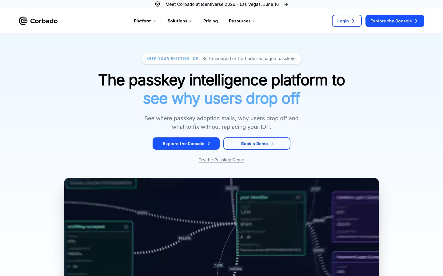
Component voltage comes from **product UI shown directly inside dark frames** — the hero's dashboard image (`{component.media-frame-dark}`) and the in-page analytics frames are near-black navy (`{colors.surface-dark}` — #101828) holding the actual passkey-funnel product chrome. Most of the page is light: white cards, hairline borders, and dense comparison tables ("With Corbado" vs "Without Corbado") that do the persuasion work.
**Key Characteristics:**
- White / pale-blue canvas with an electric royal-blue primary CTA (`{colors.primary}` — #1953ff). Buttons are small-radius (`{rounded.sm}` — 8px) with Inter 14px / 500 labels and tight 8px × 16px padding.
- Space Grotesk display typography in weight 800 with strong negative tracking — the dominant brand signal.
- A two-color headline trick in the hero: black ink line over a blue second line (`{colors.primary}`) — "The passkey intelligence platform to / see why users drop off".
- Dense comparison and value tables as a primary persuasion device, built from white cards with hairline dividers.
- Dark navy product frames (`{colors.surface-dark}` — #101828) embedding the real analytics dashboard rather than illustrations.
- Soft hierarchical radii: `{rounded.sm}` (8px) for buttons, `{rounded.xl}` (16px) for cards, up to `{rounded.hero}` (32px) for the marquee dashboard frame, and `{rounded.pill}` (30px) for the hero eyebrow badge.
## Colors
### Brand & Accent
- **Primary** (`{colors.primary}` — #1953ff): The dominant action color — primary CTAs ("Explore the Console"), the second hero headline line, link text, active tab pills. Press/active state shifts to `{colors.primary-active}` (#1447e6).
- **Primary Alt** (`{colors.primary-alt}` — #1a57ff): A near-identical royal blue measured alongside primary; appears on gradient fills and secondary blue surfaces. derived treatment — use only where the primary blue needs a hairline tonal shift.
- **Warning** (`{colors.warning}` — #f99c00): An amber accent used sparingly on small status / highlight moments inside product UI fragments. The only warm color in an otherwise blue-and-neutral palette.
### Surface
- **Canvas** (`{colors.canvas}` — #ffffff): The default page floor and card surface.
- **Surface Soft** (`{colors.surface-soft}` — #f9fafb): The hero's pale wash and section dividers.
- **Surface Card** (`{colors.surface-card}` — #f3f4f6): Slightly deeper gray for nested cards and inactive table cells.
- **Surface Blue Tint** (`{colors.surface-blue-tint}` — #edf6ff): A pale-blue fill for active tab pills and highlighted callout rows.
- **Surface Dark** (`{colors.surface-dark}` — #101828): The dark navy used for the hero dashboard frame, in-page product frames, and the footer.
- **Surface Darker / Darkest / Black** (`{colors.surface-darker}` — #1e2939, `{colors.surface-darkest}` — #090f1f, `{colors.surface-black}` — #030712): Nested dark tones inside the product dashboard chrome — used for panels-within-panels in the embedded analytics UI.
### Hairlines & Borders
- **Hairline** (`{colors.hairline}` — #e5e7eb): The 1px border tone on light surfaces — card outlines, table dividers, input borders.
- **Hairline Strong** (`{colors.hairline-strong}` — #d1d5dc): A slightly heavier divider for emphasized table edges.
- **Border Faint** (`{colors.border-faint}` — #cccccc): A faint neutral border seen on certain low-emphasis containers.
### Text
- **Ink** (`{colors.ink}` — #000000): Headlines and primary text — true black, not softened.
- **Body** (`{colors.body}` — #364153): Default running-text color.
- **Muted** (`{colors.muted}` — #4a5565): Secondary text and sub-labels.
- **Muted Soft** (`{colors.muted-soft}` — #6a7282): Tertiary text, captions, fine print.
- **Muted Faint** (`{colors.muted-faint}` — #99a1af): Lowest-emphasis text — eyebrow labels, disabled states.
- **On Primary / On Dark** (`{colors.on-primary}` / `{colors.on-dark}` — #ffffff): Text on blue buttons and dark navy surfaces.
## Typography
### Font Family
The system runs **Space Grotesk** for nearly everything — h1, h2, h3, h4, and body — and reserves **Inter** for button labels only. Space Grotesk is an open-source geometric sans (freely available via Google Fonts), so it ships directly with no substitution required. Its slightly mechanical, monospace-influenced character at heavy weight gives Corbado its engineered, security-product voice. Inter handles button text, where a neutral, highly legible UI sans is preferable.
Notable: body text is measured at Space Grotesk **weight 700** (not a typical 400) — Corbado runs a heavier body than most marketing sites, which reinforces the dense, technical tone.
### Hierarchy
| Token | Size | Weight | Line Height | Letter Spacing | Use |
|---|---|---|---|---|---|
| `{typography.h1}` | 49.6px | 800 | 1.25 | -1.24px | Hero headline ("The passkey intelligence platform…") — Space Grotesk |
| `{typography.h2}` | 30px | 800 | 1.2 | -0.75px | Section heads, stat figures (+80%, -30%) |
| `{typography.h3}` | 20px | 700 | 1.4 | normal | Card titles, sub-section heads |
| `{typography.h4}` | 18px | 600 | 1.556 | normal | Small card titles, list labels |
| `{typography.body}` | 14px | 700 | 1.429 | normal | Running text, table cells, descriptions |
| `{typography.button}` | 14px | 500 | 1.429 | normal | Button labels, nav links — Inter |
### Principles
Space Grotesk is the brand voice — display headlines stay at weight 800 with negative tracking (-1.24px at h1, -0.75px at h2). The tight tracking is essential; Space Grotesk set loose reads as off-brand. Weight steps down with size: 800 for h1/h2, 700 for h3 and body, 600 for h4. Inter appears only on buttons — never blur the boundary by setting headlines in Inter or body links in Space Grotesk button style.
### Note on Font Substitutes
No licensed/custom typefaces were detected (`fonts_licensed` is empty). Both **Space Grotesk** and **Inter** are open-source and available via Google Fonts, so they ship directly. If Space Grotesk is unavailable, **Inter** or **IBM Plex Sans** at weight 700-800 with -0.03em tracking is a usable fallback, though the geometric monospace flavor of Space Grotesk is lost.
## Layout
### Spacing System
- **Base unit:** 4px (with a frequent 6px half-step).
- **Tokens:** `{spacing.xxs}` 4px · `{spacing.micro}` 6px · `{spacing.xs}` 8px · `{spacing.sm}` 12px · `{spacing.md}` 16px · `{spacing.lg}` 24px · `{spacing.xl}` 32px · `{spacing.xxl}` 48px · `{spacing.xxxl}` 64px · `{spacing.section}` 80px.
- **Most frequent values:** 16px (146×), 8px (126×), 12px (85×) — the page is built on a tight 8/12/16 rhythm, consistent with dense data-product layouts.
- **Section padding:** `{spacing.section}` (80px) is the largest vertical rhythm; major editorial bands use 64–80px.
- **Card internal padding:** `{spacing.lg}` (24px) for content cards, `{spacing.md}` (16px) for stat cards and table cells.
### Grid & Container
- **Editorial body:** Centered single column with a max content width (~1200px observed in screenshots).
- **Hero:** Single centered column — eyebrow badge, two-line headline, sub-line, button row, then the full-width dark dashboard frame below.
- **Stat rows:** 4-up metric grids (+80% / +10% / -30% / <1 day).
- **Comparison tables:** Two- and three-column "With Corbado / Without Corbado" grids built from white cells with hairline dividers.
- **Logo / proof rows:** Horizontal identity-provider logo strips (Okta, Auth0, Ping, etc.).
### Whitespace Philosophy
Corbado uses tight, information-dense spacing — the dominant 8/12/16 rhythm packs comparison tables, stat grids, and feature lists efficiently. Whitespace opens up at section boundaries (64–80px) but stays disciplined within content blocks. The result reads as a data product's marketing site: thorough, scannable, not airy.
## Elevation & Depth
| Level | Treatment | Use |
|---|---|---|
| Flat | No shadow, no border | Body sections, hero band, top nav |
| Hairline | 1px `{colors.hairline}` border | Cards, table cells, inputs |
| Soft card | `rgba(0,0,0,0.1) 0px 1px 3px`, `0px 1px 2px -1px` | Default card shadow (the most common shadow, 26×) |
| Mid lift | `rgba(0,0,0,0.1) 0px 4px 6px -1px` / `0px 10px 15px -3px` | Elevated cards, dropdowns |
| Deep lift | `rgba(0,0,0,0.15) 0px 20px 50px` / `rgba(0,0,0,0.25) 0px 25px 50px -12px` | The hero dashboard frame and large floating product mockups |
The elevation philosophy is **soft and layered** — most cards carry only the faint 1px/3px shadow, while the marquee dark dashboard frames get a deep, diffuse drop shadow to lift them off the page. No neumorphism, no glow effects.
### Decorative Depth
- The dark navy product frames (`{component.media-frame-dark}`) carry their own internal panel chrome at progressively darker tones (`{colors.surface-darker}`, `{colors.surface-darkest}`, `{colors.surface-black}`) — these are product UI shown as content, not system surfaces.
## Shapes
### Border Radius Scale
| Token | Value | Use |
|---|---|---|
| `{rounded.sm}` | 8px | Buttons (primary, secondary, outline) |
| `{rounded.md}` | 10px | Tab pills, small inputs, inline chips |
| `{rounded.lg}` | 14px | Occasional mid-size containers |
| `{rounded.xl}` | 16px | Content cards, comparison tables (most common card radius, 35×) |
| `{rounded.xxl}` | 24px | Larger feature cards |
| `{rounded.xxxl}` | 28px | Big rounded panels |
| `{rounded.pill}` | 30px | Hero eyebrow badge, fully-rounded pill labels |
| `{rounded.hero}` | 32px | The hero dark dashboard frame — the largest radius in the system |
### Imagery Geometry
Product dashboard screenshots sit inside dark frames with `{rounded.hero}` (32px) or `{rounded.xxl}` (24px) corners. Logo strips (identity providers, award badges) display at native proportions on white. There are no circular avatars in the captured marketing pages.
## Components
### Navigation
**`announcement-bar`** — A thin white bar pinned above the nav ("Meet Corbado at Identiverse 2026 – Las Vegas, June 16 →"). Background `{colors.canvas}`, ink text, centered, `{typography.button}` (Inter 14px / 500), 8px × 16px padding.
**`top-nav`** — White nav bar with the Corbado wordmark + logo at left, center menu (Platform, Solutions, Pricing, Resources) with dropdown carets, and a right cluster: `{component.button-outline}` ("Login") + `{component.button-primary}` ("Explore the Console"). Menu items in `{typography.button}`.
### Buttons
**`button-primary`** — The signature CTA. Background `{colors.primary}` (#1953ff), text `{colors.on-primary}`, type `{typography.button}` (Inter 14px / 500), rounded `{rounded.sm}` (8px), padding 8px × 16px, often with a trailing chevron. Active state `button-primary-active` shifts to `{colors.primary-active}` (#1447e6).
> Note: the measured component captured a text color of #000000 on the generic button selector; the visible primary CTA renders as a blue fill with white label per the screenshots. The blue background is documented from the measured `{colors.primary}` token — see Known Gaps.
**`button-secondary`** — White button with a blue outline and blue label ("Book a Demo"). Background `{colors.canvas}`, text `{colors.primary}`, 1px blue border, same radius + padding as primary.
**`button-outline`** — The "Login" button: transparent / white fill, blue label, blue hairline border, rounded `{rounded.sm}`.
**`text-link`** — Inline underlined text link ("Try the Passkey Demo"). Transparent background, `{colors.muted}` text, `{typography.button}`.
### Badges & Pills
**`badge-pill`** — The hero eyebrow badge ("KEEP YOUR EXISTING IDP · Self-managed or Corbado-managed passkeys"). White fill, blue small-caps label, rounded `{rounded.pill}` (30px), padding 6px × 16px, subtle hairline border.
### Cards & Containers
**`hero-band`** — The top band on `{colors.surface-soft}` (#f9fafb) pale-blue wash. Holds the eyebrow badge, the two-line `{typography.h1}` headline (black line + blue line), a sub-line in `{colors.muted}`, the button row, and the `{component.text-link}` below.
**`card`** — Standard white content card. Background `{colors.canvas}`, body text `{colors.body}`, rounded `{rounded.xl}` (16px), padding `{spacing.lg}` (24px), soft 1px/3px shadow. Used for proof cards, feature cards, "How it works" steps.
**`stat-card`** — Compact metric card for the outcomes row (+80%, +10%, -30%, <1 day). Big figure in `{typography.h2}`, supporting label in `{colors.muted}`, rounded `{rounded.xl}`, padding `{spacing.md}` (16px).
**`comparison-table`** — The signature persuasion component ("Without Corbado" / "With Corbado" rows). White cells, hairline dividers (`{colors.hairline}`), red-x vs check markers, rounded `{rounded.xl}` outer container, `{typography.body}` cell text. Also used for the "Build vs Buy" value table.
**`media-frame-dark`** — The dark navy product frame holding the actual passkey-analytics dashboard. Background `{colors.surface-dark}` (#101828), rounded `{rounded.hero}` (32px), deep drop shadow. Nested panels inside use `{colors.surface-darker}`, `{colors.surface-darkest}`, and `{colors.surface-black}`. Used in the hero and in the in-page "WITH CORBADO IN PRACTICE" sections.
### Tabs
**`tab-pill-active`** / **`tab-pill`** — Segmented filter pills used in the "Build vs Buy" and "Value across the buying group" sections. Active: `{colors.surface-blue-tint}` (#edf6ff) fill, `{colors.primary}` text, rounded `{rounded.md}`. Inactive: transparent, `{colors.muted}` text. Padding 8px × 16px.
### Footer
**`footer`** — Dark navy footer that closes the page. Background `{colors.surface-dark}` (#101828), text `{colors.on-dark}`, `{typography.body}`, padding `{spacing.xxxl}` (64px). The dark inversion mirrors the product dashboard frames and visually closes the long-scroll page.
## Do's and Don'ts
### Do
- Reserve `{colors.primary}` (#1953ff) for primary CTAs, links, the blue hero headline line, and active states. It's the single brand voltage on a neutral page.
- Use Space Grotesk weight 800 with negative tracking for headlines; the tight tracking is part of the brand.
- Set body in Space Grotesk weight 700 (heavier than typical) — this is the measured default and keeps the dense technical tone.
- Use Inter only for button labels.
- Build comparison and value content as hairline-divided tables on white cards — it's Corbado's primary persuasion device.
- Embed the real product dashboard inside `{component.media-frame-dark}` navy frames rather than illustrating it.
- Keep buttons tight and small-radius (`{rounded.sm}`, 8px × 16px) — they read as utilitarian, product-grade controls.
### Don't
- Don't introduce additional accent hues beyond blue and the sparing amber (`{colors.warning}`). The palette is blue + neutral.
- Don't set Space Grotesk loose — the negative letter-spacing is mandatory on display sizes.
- Don't push card radius beyond `{rounded.hero}` (32px); reserve the largest radius for the marquee dashboard frame only.
- Don't place dark navy surfaces anywhere except product frames and the footer — they're scarce, deliberate signals.
- Don't add hover styling beyond the documented active/press shift (primary → `{colors.primary-active}`).
## Responsive Behavior
### Breakpoints
The captured set includes a desktop landing and a long stacked mobile-width composite; exact breakpoint pixel values were not measured. Inferred behavior:
| Name | Width | Key Changes |
|---|---|---|
| Mobile | < 768px | Nav collapses to hamburger; hero headline scales down from 49.6px; button row stacks; stat grid 4-up → 2-up or 1-up; comparison tables scroll or stack |
| Tablet | 768–1024px | Horizontal nav tightens; stat grid 2-up; tables retain columns with reduced padding |
| Desktop | > 1024px | Full nav with all menu items; 4-up stat row; full multi-column comparison tables; full-width dark dashboard frame |
### Touch Targets
- `{component.button-primary}` at 8px × 16px padding with 14px label yields roughly a ~36px tall control — at the low end of comfortable; verify against 44px minimum on touch.
- `{component.tab-pill}` and `{component.button-outline}` share the same compact padding.
### Collapsing Strategy
- Top nav collapses to a hamburger sheet at mobile width.
- Hero stays single-column; the dark dashboard frame scales proportionally below the headline + buttons.
- Stat rows reduce columns rather than shrinking figures.
- Comparison tables are the highest collapse risk — they likely become horizontally scrollable or stacked card lists on mobile (exact behavior not measured).
### Image Behavior
- Dark dashboard frames scale proportionally and retain their `{rounded.hero}` corners.
- Identity-provider logo strips wrap to multiple rows on narrow widths.
## Iteration Guide
1. Focus on ONE component at a time. Reference its YAML key directly (`{component.comparison-table}`, `{component.media-frame-dark}`).
2. Variants of an existing component (`-active`, `-secondary`, `-outline`) live as separate entries in `components:`.
3. Use `{token.refs}` everywhere — never inline a hex in a component.
4. Never document hover. Default and Active/Pressed states only.
5. Headlines stay Space Grotesk 800 with negative tracking; body stays Space Grotesk 700; buttons stay Inter 500. The split does not blur.
6. Blue (`{colors.primary}`) is the only action color — don't dilute it with secondary accents.
7. Dark navy is scarce: product frames and footer only.
## Known Gaps
- The measured `button-primary` component reported `color: #000000` (a text-color read on a generic button selector) with no captured background fill. The visible primary CTA is a royal-blue fill with white label per the screenshots, so `{colors.primary}` background + `{colors.on-primary}` label are documented from the palette and ground-truth imagery. Confirm the exact background token against production CSS.
- The captured `card` component reported a `radius` of `3.35544e+07px` — a sentinel/overflow value indicating a fully-rounded (pill/circle) computed style on a non-rectangular element. It was discarded; card radii are documented from the measured radius scale (most commonly `{rounded.xl}` 16px).
- Exact responsive breakpoint pixel values were not measured; the breakpoint table is inferred from the desktop and stacked-mobile screenshots.
- Shadow values were captured as truncated strings; the elevation table reconstructs them from the readable portions — verify the full shadow definitions in production.
- The amber `{colors.warning}` (#f99c00) appeared at low frequency inside product UI fragments; its exact usage rules outside the embedded dashboard are unconfirmed.
- No avatar, form-validation, or footer link-column specifics were captured; footer structure beyond surface color and padding is out of scope.
- Animation and transition timings (tab switches, dashboard reveals) were not measured.
<!-- Documented by duply · real-world design systems as ready-to-use DESIGN.md for AI coding agents · https://duply.ai/corbado/design-md -->
Color Palette
Accent
Neutrals
Typography
h149.6px · 800 · 1.25
The quick brown fox jumpsh230px · 800 · 1.2
The quick brown fox jumpsh320px · 700 · 1.4
The quick brown fox jumpsh418px · 600 · 1.556
The quick brown fox jumpsbody14px · 700 · 1.429
The quick brown fox jumpsbutton14px · 500 · 1.429
The quick brown fox jumpsSpacing & Shape
Spacing
| Name | Value | Preview |
|---|---|---|
| xxs | 4px | |
| micro | 6px | |
| xs | 8px | |
| sm | 12px | |
| md | 16px | |
| lg | 24px | |
| xl | 32px | |
| xxl | 48px | |
| xxxl | 64px | |
| section | 80px |
Border Radius
| Name | Value | Preview |
|---|---|---|
| sm | 8px | |
| md | 10px | |
| lg | 14px | |
| xl | 16px | |
| xxl | 24px | |
| xxxl | 28px | |
| pill | 30px | |
| hero | 32px |
More like this


---
version: alpha
name: Corbado-design-analysis
description: "A precise, security-SaaS marketing interface built on a white-to-pale-blue canvas with an electric royal-blue primary action (#1953ff) and Space Grotesk display typography set in heavy weight 800 with tight negative tracking. The system reads as engineered and trustworthy — light surfaces, soft-rounded cards, dense data-table comparison blocks, and dark navy product-dashboard frames that show the actual passkey-analytics product embedded in the page rather than illustrated."

colors:
  primary: "#1953ff"
  primary-active: "#1447e6"
  primary-alt: "#1a57ff"
  ink: "#000000"
  body: "#364153"
  muted: "#4a5565"
  muted-soft: "#6a7282"
  muted-faint: "#99a1af"
  canvas: "#ffffff"
  surface-soft: "#f9fafb"
  surface-card: "#f3f4f6"
  surface-blue-tint: "#edf6ff"
  hairline: "#e5e7eb"
  hairline-strong: "#d1d5dc"
  border-faint: "#cccccc"
  surface-dark: "#101828"
  surface-darker: "#1e2939"
  surface-darkest: "#090f1f"
  surface-black: "#030712"
  on-primary: "#ffffff"
  on-dark: "#ffffff"
  warning: "#f99c00"

typography:
  h1:
    fontFamily: "Space Grotesk, sans-serif"
    fontSize: 49.6px
    fontWeight: 800
    lineHeight: 1.25
    letterSpacing: -1.24px
  h2:
    fontFamily: "Space Grotesk, sans-serif"
    fontSize: 30px
    fontWeight: 800
    lineHeight: 1.2
    letterSpacing: -0.75px
  h3:
    fontFamily: "Space Grotesk, sans-serif"
    fontSize: 20px
    fontWeight: 700
    lineHeight: 1.4
    letterSpacing: normal
  h4:
    fontFamily: "Space Grotesk, sans-serif"
    fontSize: 18px
    fontWeight: 600
    lineHeight: 1.556
    letterSpacing: normal
  body:
    fontFamily: "Space Grotesk, sans-serif"
    fontSize: 14px
    fontWeight: 700
    lineHeight: 1.429
    letterSpacing: normal
  button:
    fontFamily: "Inter, sans-serif"
    fontSize: 14px
    fontWeight: 500
    lineHeight: 1.429
    letterSpacing: normal

rounded:
  sm: 8px
  md: 10px
  lg: 14px
  xl: 16px
  xxl: 24px
  xxxl: 28px
  pill: 30px
  hero: 32px

spacing:
  xxs: 4px
  micro: 6px
  xs: 8px
  sm: 12px
  md: 16px
  lg: 24px
  xl: 32px
  xxl: 48px
  xxxl: 64px
  section: 80px

components:
  announcement-bar:
    backgroundColor: "{colors.canvas}"
    textColor: "{colors.ink}"
    typography: "{typography.button}"
    padding: 8px 16px
  top-nav:
    backgroundColor: "{colors.canvas}"
    textColor: "{colors.ink}"
    typography: "{typography.button}"
    padding: 16px 24px
  button-primary:
    backgroundColor: "{colors.primary}"
    textColor: "{colors.on-primary}"
    typography: "{typography.button}"
    rounded: "{rounded.sm}"
    padding: 8px 16px
  button-primary-active:
    backgroundColor: "{colors.primary-active}"
    textColor: "{colors.on-primary}"
    rounded: "{rounded.sm}"
  button-secondary:
    backgroundColor: "{colors.canvas}"
    textColor: "{colors.primary}"
    typography: "{typography.button}"
    rounded: "{rounded.sm}"
    padding: 8px 16px
  button-outline:
    backgroundColor: transparent
    textColor: "{colors.primary}"
    typography: "{typography.button}"
    rounded: "{rounded.sm}"
    padding: 8px 16px
  text-link:
    backgroundColor: transparent
    textColor: "{colors.muted}"
    typography: "{typography.button}"
  badge-pill:
    backgroundColor: "{colors.canvas}"
    textColor: "{colors.primary}"
    typography: "{typography.button}"
    rounded: "{rounded.pill}"
    padding: 6px 16px
  hero-band:
    backgroundColor: "{colors.surface-soft}"
    textColor: "{colors.ink}"
    typography: "{typography.h1}"
    padding: 80px
  card:
    backgroundColor: "{colors.canvas}"
    textColor: "{colors.body}"
    typography: "{typography.body}"
    rounded: "{rounded.xl}"
    padding: 24px
  stat-card:
    backgroundColor: "{colors.canvas}"
    textColor: "{colors.ink}"
    typography: "{typography.h2}"
    rounded: "{rounded.xl}"
    padding: 16px
  comparison-table:
    backgroundColor: "{colors.canvas}"
    textColor: "{colors.body}"
    typography: "{typography.body}"
    rounded: "{rounded.xl}"
    padding: 16px
  tab-pill-active:
    backgroundColor: "{colors.surface-blue-tint}"
    textColor: "{colors.primary}"
    typography: "{typography.button}"
    rounded: "{rounded.md}"
    padding: 8px 16px
  tab-pill:
    backgroundColor: transparent
    textColor: "{colors.muted}"
    typography: "{typography.button}"
    rounded: "{rounded.md}"
    padding: 8px 16px
  media-frame-dark:
    backgroundColor: "{colors.surface-dark}"
    textColor: "{colors.on-dark}"
    rounded: "{rounded.hero}"
    padding: 16px
  footer:
    backgroundColor: "{colors.surface-dark}"
    textColor: "{colors.on-dark}"
    typography: "{typography.body}"
    padding: 64px
---

## Overview

Corbado's marketing surface is a precise, security-SaaS interface built on a white canvas (`{colors.canvas}` — #ffffff) that warms into a pale-blue wash at the top of the page (`{colors.surface-soft}` — #f9fafb). The brand action color is an electric royal blue (`{colors.primary}` — #1953ff), and headlines run in **Space Grotesk** at weight 800 with tight negative letter-spacing. The system reads as engineered, analytical, and trustworthy — exactly the voice a passkey-analytics platform needs.

Type voice is dominated by a single family: **Space Grotesk** carries h1 through body, while **Inter** is reserved for button labels. Space Grotesk's geometric, slightly mechanical character at heavy weight (800 for h1/h2) plus negative tracking (-1.24px on h1) is the brand's primary voltage — there are no decorative flourishes elsewhere.

Component voltage comes from **product UI shown directly inside dark frames** — the hero's dashboard image (`{component.media-frame-dark}`) and the in-page analytics frames are near-black navy (`{colors.surface-dark}` — #101828) holding the actual passkey-funnel product chrome. Most of the page is light: white cards, hairline borders, and dense comparison tables ("With Corbado" vs "Without Corbado") that do the persuasion work.

**Key Characteristics:**
- White / pale-blue canvas with an electric royal-blue primary CTA (`{colors.primary}` — #1953ff). Buttons are small-radius (`{rounded.sm}` — 8px) with Inter 14px / 500 labels and tight 8px × 16px padding.
- Space Grotesk display typography in weight 800 with strong negative tracking — the dominant brand signal.
- A two-color headline trick in the hero: black ink line over a blue second line (`{colors.primary}`) — "The passkey intelligence platform to / see why users drop off".
- Dense comparison and value tables as a primary persuasion device, built from white cards with hairline dividers.
- Dark navy product frames (`{colors.surface-dark}` — #101828) embedding the real analytics dashboard rather than illustrations.
- Soft hierarchical radii: `{rounded.sm}` (8px) for buttons, `{rounded.xl}` (16px) for cards, up to `{rounded.hero}` (32px) for the marquee dashboard frame, and `{rounded.pill}` (30px) for the hero eyebrow badge.

## Colors

### Brand & Accent
- **Primary** (`{colors.primary}` — #1953ff): The dominant action color — primary CTAs ("Explore the Console"), the second hero headline line, link text, active tab pills. Press/active state shifts to `{colors.primary-active}` (#1447e6).
- **Primary Alt** (`{colors.primary-alt}` — #1a57ff): A near-identical royal blue measured alongside primary; appears on gradient fills and secondary blue surfaces. derived treatment — use only where the primary blue needs a hairline tonal shift.
- **Warning** (`{colors.warning}` — #f99c00): An amber accent used sparingly on small status / highlight moments inside product UI fragments. The only warm color in an otherwise blue-and-neutral palette.

### Surface
- **Canvas** (`{colors.canvas}` — #ffffff): The default page floor and card surface.
- **Surface Soft** (`{colors.surface-soft}` — #f9fafb): The hero's pale wash and section dividers.
- **Surface Card** (`{colors.surface-card}` — #f3f4f6): Slightly deeper gray for nested cards and inactive table cells.
- **Surface Blue Tint** (`{colors.surface-blue-tint}` — #edf6ff): A pale-blue fill for active tab pills and highlighted callout rows.
- **Surface Dark** (`{colors.surface-dark}` — #101828): The dark navy used for the hero dashboard frame, in-page product frames, and the footer.
- **Surface Darker / Darkest / Black** (`{colors.surface-darker}` — #1e2939, `{colors.surface-darkest}` — #090f1f, `{colors.surface-black}` — #030712): Nested dark tones inside the product dashboard chrome — used for panels-within-panels in the embedded analytics UI.

### Hairlines & Borders
- **Hairline** (`{colors.hairline}` — #e5e7eb): The 1px border tone on light surfaces — card outlines, table dividers, input borders.
- **Hairline Strong** (`{colors.hairline-strong}` — #d1d5dc): A slightly heavier divider for emphasized table edges.
- **Border Faint** (`{colors.border-faint}` — #cccccc): A faint neutral border seen on certain low-emphasis containers.

### Text
- **Ink** (`{colors.ink}` — #000000): Headlines and primary text — true black, not softened.
- **Body** (`{colors.body}` — #364153): Default running-text color.
- **Muted** (`{colors.muted}` — #4a5565): Secondary text and sub-labels.
- **Muted Soft** (`{colors.muted-soft}` — #6a7282): Tertiary text, captions, fine print.
- **Muted Faint** (`{colors.muted-faint}` — #99a1af): Lowest-emphasis text — eyebrow labels, disabled states.
- **On Primary / On Dark** (`{colors.on-primary}` / `{colors.on-dark}` — #ffffff): Text on blue buttons and dark navy surfaces.

## Typography

### Font Family
The system runs **Space Grotesk** for nearly everything — h1, h2, h3, h4, and body — and reserves **Inter** for button labels only. Space Grotesk is an open-source geometric sans (freely available via Google Fonts), so it ships directly with no substitution required. Its slightly mechanical, monospace-influenced character at heavy weight gives Corbado its engineered, security-product voice. Inter handles button text, where a neutral, highly legible UI sans is preferable.

Notable: body text is measured at Space Grotesk **weight 700** (not a typical 400) — Corbado runs a heavier body than most marketing sites, which reinforces the dense, technical tone.

### Hierarchy

| Token | Size | Weight | Line Height | Letter Spacing | Use |
|---|---|---|---|---|---|
| `{typography.h1}` | 49.6px | 800 | 1.25 | -1.24px | Hero headline ("The passkey intelligence platform…") — Space Grotesk |
| `{typography.h2}` | 30px | 800 | 1.2 | -0.75px | Section heads, stat figures (+80%, -30%) |
| `{typography.h3}` | 20px | 700 | 1.4 | normal | Card titles, sub-section heads |
| `{typography.h4}` | 18px | 600 | 1.556 | normal | Small card titles, list labels |
| `{typography.body}` | 14px | 700 | 1.429 | normal | Running text, table cells, descriptions |
| `{typography.button}` | 14px | 500 | 1.429 | normal | Button labels, nav links — Inter |

### Principles
Space Grotesk is the brand voice — display headlines stay at weight 800 with negative tracking (-1.24px at h1, -0.75px at h2). The tight tracking is essential; Space Grotesk set loose reads as off-brand. Weight steps down with size: 800 for h1/h2, 700 for h3 and body, 600 for h4. Inter appears only on buttons — never blur the boundary by setting headlines in Inter or body links in Space Grotesk button style.

### Note on Font Substitutes
No licensed/custom typefaces were detected (`fonts_licensed` is empty). Both **Space Grotesk** and **Inter** are open-source and available via Google Fonts, so they ship directly. If Space Grotesk is unavailable, **Inter** or **IBM Plex Sans** at weight 700-800 with -0.03em tracking is a usable fallback, though the geometric monospace flavor of Space Grotesk is lost.

## Layout

### Spacing System
- **Base unit:** 4px (with a frequent 6px half-step).
- **Tokens:** `{spacing.xxs}` 4px · `{spacing.micro}` 6px · `{spacing.xs}` 8px · `{spacing.sm}` 12px · `{spacing.md}` 16px · `{spacing.lg}` 24px · `{spacing.xl}` 32px · `{spacing.xxl}` 48px · `{spacing.xxxl}` 64px · `{spacing.section}` 80px.
- **Most frequent values:** 16px (146×), 8px (126×), 12px (85×) — the page is built on a tight 8/12/16 rhythm, consistent with dense data-product layouts.
- **Section padding:** `{spacing.section}` (80px) is the largest vertical rhythm; major editorial bands use 64–80px.
- **Card internal padding:** `{spacing.lg}` (24px) for content cards, `{spacing.md}` (16px) for stat cards and table cells.

### Grid & Container
- **Editorial body:** Centered single column with a max content width (~1200px observed in screenshots).
- **Hero:** Single centered column — eyebrow badge, two-line headline, sub-line, button row, then the full-width dark dashboard frame below.
- **Stat rows:** 4-up metric grids (+80% / +10% / -30% / <1 day).
- **Comparison tables:** Two- and three-column "With Corbado / Without Corbado" grids built from white cells with hairline dividers.
- **Logo / proof rows:** Horizontal identity-provider logo strips (Okta, Auth0, Ping, etc.).

### Whitespace Philosophy
Corbado uses tight, information-dense spacing — the dominant 8/12/16 rhythm packs comparison tables, stat grids, and feature lists efficiently. Whitespace opens up at section boundaries (64–80px) but stays disciplined within content blocks. The result reads as a data product's marketing site: thorough, scannable, not airy.

## Elevation & Depth

| Level | Treatment | Use |
|---|---|---|
| Flat | No shadow, no border | Body sections, hero band, top nav |
| Hairline | 1px `{colors.hairline}` border | Cards, table cells, inputs |
| Soft card | `rgba(0,0,0,0.1) 0px 1px 3px`, `0px 1px 2px -1px` | Default card shadow (the most common shadow, 26×) |
| Mid lift | `rgba(0,0,0,0.1) 0px 4px 6px -1px` / `0px 10px 15px -3px` | Elevated cards, dropdowns |
| Deep lift | `rgba(0,0,0,0.15) 0px 20px 50px` / `rgba(0,0,0,0.25) 0px 25px 50px -12px` | The hero dashboard frame and large floating product mockups |

The elevation philosophy is **soft and layered** — most cards carry only the faint 1px/3px shadow, while the marquee dark dashboard frames get a deep, diffuse drop shadow to lift them off the page. No neumorphism, no glow effects.

### Decorative Depth
- The dark navy product frames (`{component.media-frame-dark}`) carry their own internal panel chrome at progressively darker tones (`{colors.surface-darker}`, `{colors.surface-darkest}`, `{colors.surface-black}`) — these are product UI shown as content, not system surfaces.

## Shapes

### Border Radius Scale

| Token | Value | Use |
|---|---|---|
| `{rounded.sm}` | 8px | Buttons (primary, secondary, outline) |
| `{rounded.md}` | 10px | Tab pills, small inputs, inline chips |
| `{rounded.lg}` | 14px | Occasional mid-size containers |
| `{rounded.xl}` | 16px | Content cards, comparison tables (most common card radius, 35×) |
| `{rounded.xxl}` | 24px | Larger feature cards |
| `{rounded.xxxl}` | 28px | Big rounded panels |
| `{rounded.pill}` | 30px | Hero eyebrow badge, fully-rounded pill labels |
| `{rounded.hero}` | 32px | The hero dark dashboard frame — the largest radius in the system |

### Imagery Geometry
Product dashboard screenshots sit inside dark frames with `{rounded.hero}` (32px) or `{rounded.xxl}` (24px) corners. Logo strips (identity providers, award badges) display at native proportions on white. There are no circular avatars in the captured marketing pages.

## Components

### Navigation

**`announcement-bar`** — A thin white bar pinned above the nav ("Meet Corbado at Identiverse 2026 – Las Vegas, June 16 →"). Background `{colors.canvas}`, ink text, centered, `{typography.button}` (Inter 14px / 500), 8px × 16px padding.

**`top-nav`** — White nav bar with the Corbado wordmark + logo at left, center menu (Platform, Solutions, Pricing, Resources) with dropdown carets, and a right cluster: `{component.button-outline}` ("Login") + `{component.button-primary}` ("Explore the Console"). Menu items in `{typography.button}`.

### Buttons

**`button-primary`** — The signature CTA. Background `{colors.primary}` (#1953ff), text `{colors.on-primary}`, type `{typography.button}` (Inter 14px / 500), rounded `{rounded.sm}` (8px), padding 8px × 16px, often with a trailing chevron. Active state `button-primary-active` shifts to `{colors.primary-active}` (#1447e6).

> Note: the measured component captured a text color of #000000 on the generic button selector; the visible primary CTA renders as a blue fill with white label per the screenshots. The blue background is documented from the measured `{colors.primary}` token — see Known Gaps.

**`button-secondary`** — White button with a blue outline and blue label ("Book a Demo"). Background `{colors.canvas}`, text `{colors.primary}`, 1px blue border, same radius + padding as primary.

**`button-outline`** — The "Login" button: transparent / white fill, blue label, blue hairline border, rounded `{rounded.sm}`.

**`text-link`** — Inline underlined text link ("Try the Passkey Demo"). Transparent background, `{colors.muted}` text, `{typography.button}`.

### Badges & Pills

**`badge-pill`** — The hero eyebrow badge ("KEEP YOUR EXISTING IDP · Self-managed or Corbado-managed passkeys"). White fill, blue small-caps label, rounded `{rounded.pill}` (30px), padding 6px × 16px, subtle hairline border.

### Cards & Containers

**`hero-band`** — The top band on `{colors.surface-soft}` (#f9fafb) pale-blue wash. Holds the eyebrow badge, the two-line `{typography.h1}` headline (black line + blue line), a sub-line in `{colors.muted}`, the button row, and the `{component.text-link}` below.

**`card`** — Standard white content card. Background `{colors.canvas}`, body text `{colors.body}`, rounded `{rounded.xl}` (16px), padding `{spacing.lg}` (24px), soft 1px/3px shadow. Used for proof cards, feature cards, "How it works" steps.

**`stat-card`** — Compact metric card for the outcomes row (+80%, +10%, -30%, <1 day). Big figure in `{typography.h2}`, supporting label in `{colors.muted}`, rounded `{rounded.xl}`, padding `{spacing.md}` (16px).

**`comparison-table`** — The signature persuasion component ("Without Corbado" / "With Corbado" rows). White cells, hairline dividers (`{colors.hairline}`), red-x vs check markers, rounded `{rounded.xl}` outer container, `{typography.body}` cell text. Also used for the "Build vs Buy" value table.

**`media-frame-dark`** — The dark navy product frame holding the actual passkey-analytics dashboard. Background `{colors.surface-dark}` (#101828), rounded `{rounded.hero}` (32px), deep drop shadow. Nested panels inside use `{colors.surface-darker}`, `{colors.surface-darkest}`, and `{colors.surface-black}`. Used in the hero and in the in-page "WITH CORBADO IN PRACTICE" sections.

### Tabs

**`tab-pill-active`** / **`tab-pill`** — Segmented filter pills used in the "Build vs Buy" and "Value across the buying group" sections. Active: `{colors.surface-blue-tint}` (#edf6ff) fill, `{colors.primary}` text, rounded `{rounded.md}`. Inactive: transparent, `{colors.muted}` text. Padding 8px × 16px.

### Footer

**`footer`** — Dark navy footer that closes the page. Background `{colors.surface-dark}` (#101828), text `{colors.on-dark}`, `{typography.body}`, padding `{spacing.xxxl}` (64px). The dark inversion mirrors the product dashboard frames and visually closes the long-scroll page.

## Do's and Don'ts

### Do
- Reserve `{colors.primary}` (#1953ff) for primary CTAs, links, the blue hero headline line, and active states. It's the single brand voltage on a neutral page.
- Use Space Grotesk weight 800 with negative tracking for headlines; the tight tracking is part of the brand.
- Set body in Space Grotesk weight 700 (heavier than typical) — this is the measured default and keeps the dense technical tone.
- Use Inter only for button labels.
- Build comparison and value content as hairline-divided tables on white cards — it's Corbado's primary persuasion device.
- Embed the real product dashboard inside `{component.media-frame-dark}` navy frames rather than illustrating it.
- Keep buttons tight and small-radius (`{rounded.sm}`, 8px × 16px) — they read as utilitarian, product-grade controls.

### Don't
- Don't introduce additional accent hues beyond blue and the sparing amber (`{colors.warning}`). The palette is blue + neutral.
- Don't set Space Grotesk loose — the negative letter-spacing is mandatory on display sizes.
- Don't push card radius beyond `{rounded.hero}` (32px); reserve the largest radius for the marquee dashboard frame only.
- Don't place dark navy surfaces anywhere except product frames and the footer — they're scarce, deliberate signals.
- Don't add hover styling beyond the documented active/press shift (primary → `{colors.primary-active}`).

## Responsive Behavior

### Breakpoints
The captured set includes a desktop landing and a long stacked mobile-width composite; exact breakpoint pixel values were not measured. Inferred behavior:

| Name | Width | Key Changes |
|---|---|---|
| Mobile | < 768px | Nav collapses to hamburger; hero headline scales down from 49.6px; button row stacks; stat grid 4-up → 2-up or 1-up; comparison tables scroll or stack |
| Tablet | 768–1024px | Horizontal nav tightens; stat grid 2-up; tables retain columns with reduced padding |
| Desktop | > 1024px | Full nav with all menu items; 4-up stat row; full multi-column comparison tables; full-width dark dashboard frame |

### Touch Targets
- `{component.button-primary}` at 8px × 16px padding with 14px label yields roughly a ~36px tall control — at the low end of comfortable; verify against 44px minimum on touch.
- `{component.tab-pill}` and `{component.button-outline}` share the same compact padding.

### Collapsing Strategy
- Top nav collapses to a hamburger sheet at mobile width.
- Hero stays single-column; the dark dashboard frame scales proportionally below the headline + buttons.
- Stat rows reduce columns rather than shrinking figures.
- Comparison tables are the highest collapse risk — they likely become horizontally scrollable or stacked card lists on mobile (exact behavior not measured).

### Image Behavior
- Dark dashboard frames scale proportionally and retain their `{rounded.hero}` corners.
- Identity-provider logo strips wrap to multiple rows on narrow widths.

## Iteration Guide

1. Focus on ONE component at a time. Reference its YAML key directly (`{component.comparison-table}`, `{component.media-frame-dark}`).
2. Variants of an existing component (`-active`, `-secondary`, `-outline`) live as separate entries in `components:`.
3. Use `{token.refs}` everywhere — never inline a hex in a component.
4. Never document hover. Default and Active/Pressed states only.
5. Headlines stay Space Grotesk 800 with negative tracking; body stays Space Grotesk 700; buttons stay Inter 500. The split does not blur.
6. Blue (`{colors.primary}`) is the only action color — don't dilute it with secondary accents.
7. Dark navy is scarce: product frames and footer only.

## Known Gaps

- The measured `button-primary` component reported `color: #000000` (a text-color read on a generic button selector) with no captured background fill. The visible primary CTA is a royal-blue fill with white label per the screenshots, so `{colors.primary}` background + `{colors.on-primary}` label are documented from the palette and ground-truth imagery. Confirm the exact background token against production CSS.
- The captured `card` component reported a `radius` of `3.35544e+07px` — a sentinel/overflow value indicating a fully-rounded (pill/circle) computed style on a non-rectangular element. It was discarded; card radii are documented from the measured radius scale (most commonly `{rounded.xl}` 16px).
- Exact responsive breakpoint pixel values were not measured; the breakpoint table is inferred from the desktop and stacked-mobile screenshots.
- Shadow values were captured as truncated strings; the elevation table reconstructs them from the readable portions — verify the full shadow definitions in production.
- The amber `{colors.warning}` (#f99c00) appeared at low frequency inside product UI fragments; its exact usage rules outside the embedded dashboard are unconfirmed.
- No avatar, form-validation, or footer link-column specifics were captured; footer structure beyond surface color and padding is out of scope.
- Animation and transition timings (tab switches, dashboard reveals) were not measured.

<!-- Documented by duply · real-world design systems as ready-to-use DESIGN.md for AI coding agents · https://duply.ai/corbado/design-md -->