TravelPerk
A bold, business-software-first marketing surface built on warm off-white canvas, near-black warm ink, and a single high-voltage lime-green (#beff50) brand accent. The system reads as confident modern fintech/SaaS — oversized OTSono display headlines with tight negative tracking, heavily rounded pill buttons and large 26-28px rounded cards, embedded product UI fragments (Reporting dashboards, mobile itineraries, virtual cards) shown directly inside the marketing flow, and a lime accent that carries every primary action and announcement.
---
version: alpha
name: TravelPerk-design-analysis
description: A bold, business-software-first marketing surface built on warm off-white canvas, near-black warm ink, and a single high-voltage lime-green (#beff50) brand accent. The system reads as confident modern fintech/SaaS — oversized OTSono display headlines with tight negative tracking, heavily rounded pill buttons and large 26-28px rounded cards, embedded product UI fragments (Reporting dashboards, mobile itineraries, virtual cards) shown directly inside the marketing flow, and a lime accent that carries every primary action and announcement.
colors:
ink: "#14140f"
link: "#000000"
ink-warm: "#19190f"
canvas: "#ffffff"
muted: "#6e6e64"
surface-soft: "#fafaf5"
surface-cream: "#f5f5eb"
brand-lime: "#beff50"
hairline: "#d2d2c8"
typography:
display-xl:
fontFamily: "OTSono, Archivo, sans-serif"
fontSize: 80px
fontWeight: 500
lineHeight: 0.9
letterSpacing: -2.4px
display-lg:
fontFamily: "OTSono, Archivo, sans-serif"
fontSize: 60px
fontWeight: 500
lineHeight: 1.0
letterSpacing: -1.8px
title-md:
fontFamily: "OTSono, Archivo, sans-serif"
fontSize: 28px
fontWeight: 500
lineHeight: 1.143
letterSpacing: -0.56px
body:
fontFamily: "OTSono, Archivo, sans-serif"
fontSize: 14px
fontWeight: 500
lineHeight: 1.286
letterSpacing: 0
button:
fontFamily: "OTSono, Archivo, sans-serif"
fontSize: 16px
fontWeight: 400
lineHeight: 1.5
letterSpacing: 0
rounded:
xs: 4px
sm: 8px
md: 18px
lg: 26px
xl: 28px
full: 9999px
spacing:
xxs: 4px
xs: 8px
sm: 12px
md: 16px
lg: 24px
xl: 40px
xxl: 60px
xxxl: 80px
section: 96px
components:
announcement-bar:
backgroundColor: "{colors.brand-lime}"
textColor: "{colors.ink}"
typography: "{typography.body}"
padding: 16px 24px
top-nav:
backgroundColor: "{colors.surface-soft}"
textColor: "{colors.ink}"
typography: "{typography.button}"
padding: 24px
button-primary:
backgroundColor: "{colors.brand-lime}"
textColor: "{colors.ink}"
typography: "{typography.button}"
rounded: "{rounded.full}"
padding: 16px 24px
button-secondary:
backgroundColor: "{colors.canvas}"
textColor: "{colors.ink}"
typography: "{typography.button}"
rounded: "{rounded.full}"
padding: 16px 24px
card-lime:
backgroundColor: "{colors.brand-lime}"
textColor: "{colors.ink}"
typography: "{typography.title-md}"
rounded: "{rounded.xl}"
padding: 24px
card-neutral:
backgroundColor: "{colors.surface-soft}"
textColor: "{colors.ink}"
typography: "{typography.title-md}"
rounded: "{rounded.xl}"
padding: 24px
product-mockup-card:
backgroundColor: "{colors.canvas}"
textColor: "{colors.ink}"
rounded: "{rounded.lg}"
padding: 24px
input:
backgroundColor: "{colors.canvas}"
textColor: "{colors.ink}"
typography: "{typography.body}"
padding: 8px 16px
tab-pill:
backgroundColor: "{colors.brand-lime}"
textColor: "{colors.ink}"
typography: "{typography.body}"
rounded: "{rounded.full}"
padding: 8px 24px
footer:
backgroundColor: "{colors.ink}"
textColor: "{colors.canvas}"
typography: "{typography.display-lg}"
padding: 80px
---
## Overview
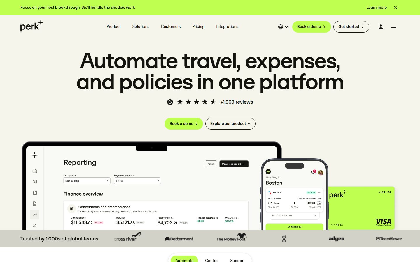
TravelPerk's marketing surface is a bold, business-software-first interface anchored on a warm off-white canvas (`{colors.surface-soft}` — #fafaf5) with near-black warm ink (`{colors.ink}` — #14140f) and a single high-voltage lime-green accent (`{colors.brand-lime}` — #beff50) that carries every primary action, the top announcement bar, and the marquee feature cards. The system reads as confident modern fintech/SaaS — oversized display headlines, heavily rounded pill buttons and cards, and real product UI shown directly inside the flow.
The type voice is monolithic: **OTSono** runs everything from the 80px hero headline down to 14px body copy. Display sizes carry aggressive negative letter-spacing (-2.4px at h1, -1.8px at h2) and a tight 0.9 line-height at the largest size, giving the headlines a compact, almost-touching presence. There is no secondary type family — the whole system speaks in one face at different scales and weights (500 for display + body, 400 for buttons).
Brand voltage comes from two places: the **lime-green accent** (#beff50) used sparingly but loudly on CTAs, the announcement bar, and signature feature cards; and **embedded product UI fragments** — the Reporting dashboard, mobile trip itinerary, and the lime VISA "Perk Card" are shown directly inside the hero rather than illustrated. TravelPerk shows the actual product chrome at scale instead of decorating around it.
**Key Characteristics:**
- Warm off-white canvas (`{colors.surface-soft}` — #fafaf5), not pure white, with warm near-black ink (`{colors.ink}` — #14140f).
- A single lime-green accent (`{colors.brand-lime}` — #beff50) carries primary CTAs, the announcement bar, tab pills, and marquee cards. It is the system's only chromatic signal.
- One typeface — **OTSono** — across all roles, at 80/60/28/16/14px sizes. Display sizes use heavy negative tracking.
- Pill-shaped buttons (`{rounded.full}`) and large soft-rounded cards (`{rounded.lg}` 26px / `{rounded.xl}` 28px) define the silhouette.
- Embedded product UI fragments (Reporting dashboard, mobile itinerary card, virtual Perk Card) shown directly inside the hero.
- A single soft layered drop shadow used sparingly for elevated cards.
- Dark closing footer band (`{colors.ink}` — #14140f) with a "Ready to get to work?" headline that visually closes the long-scroll page.
## Colors
### Brand & Accent
- **Brand Lime** (`{colors.brand-lime}` — #beff50): The system's single accent. Used on the primary CTA pill ("Book a demo"), the top announcement bar, active tab pills, marquee feature cards, and the virtual Perk Card artifact. Loud but scarce — it never appears as body text or large flat fills beyond cards and buttons.
### Text
- **Ink** (`{colors.ink}` — #14140f): The dominant text color — headlines, body, labels. A warm near-black, not pure #000.
- **Ink Warm** (`{colors.ink-warm}` — #19190f): A secondary near-black observed on accent/emphasis text and dense UI fragments — effectively interchangeable with ink at small sizes.
- **Link** (`{colors.link}` — #000000): Pure black used on anchor text and the dark footer CTA labels.
- **Muted** (`{colors.muted}` — #6e6e64): Secondary text — sub-headings, captions, supporting copy under feature cards.
### Surface
- **Canvas** (`{colors.canvas}` — #ffffff): Pure white used for product-mockup cards, inputs, and white outline buttons.
- **Surface Soft** (`{colors.surface-soft}` — #fafaf5): The warm off-white page floor and nav background — the default canvas across the marketing body.
- **Surface Cream** (`{colors.surface-cream}` — #f5f5eb): A slightly warmer neutral card/section tone used behind editorial card rows.
- **Hairline** (`{colors.hairline}` — #d2d2c8): The 1px divider / border tone on light surfaces — outline buttons, card edges, section dividers.
## Typography
### Font Family
The system runs a single typeface — **OTSono** — across every role. OTSono is a distinctive display-grotesque with a compact, slightly geometric character; TravelPerk uses it for the 80px hero headline, 60px section heads, 28px card titles, 14px body, and 16px buttons alike. The fallback stack walks `Archivo, sans-serif`.
There is no secondary family. The hierarchy is created entirely through size, weight (500 for display + body, 400 for buttons), and letter-spacing rather than a display/body split.
### Hierarchy
| Token | Size | Weight | Line Height | Letter Spacing | Use |
|---|---|---|---|---|---|
| `{typography.display-xl}` | 80px | 500 | 0.9 | -2.4px | Hero h1 ("Automate travel, expenses, and policies in one platform") |
| `{typography.display-lg}` | 60px | 500 | 1.0 | -1.8px | Section heads ("Wave goodbye to the work behind the work", "Ready to get to work?") |
| `{typography.title-md}` | 28px | 500 | 1.143 | -0.56px | Card titles, feature card headlines |
| `{typography.body}` | 14px | 500 | 1.286 | 0 | Default running-text, supporting copy, captions |
| `{typography.button}` | 16px | 400 | 1.5 | 0 | Button labels, nav links |
### Principles
The negative letter-spacing on display sizes (-2.4px / -1.8px / -0.56px) is the brand's signature — OTSono headlines are tracked tight, with a sub-1.0 line-height at the largest size so the two hero lines sit almost edge-to-edge. Body copy at 14px weight-500 stays warm and readable. Never set display headlines without the negative tracking — it is core to the voice.
### Note on Font Substitutes
**OTSono** is a custom/foundry display face and is not a freely available web font. If it is unavailable, **Archivo** (or **Archivo Expanded** at the largest sizes) is a usable open-source approximation that preserves the compact grotesque character; apply -0.03em letter-spacing at display sizes to match the tracking signature. **Space Grotesk** is a secondary alternative for headline-only use. (derived — substitute recommendation based on visual match, not measured.)
## Layout
### Spacing System
- **Base unit:** 8px (the dominant measured rhythm, with 16px and 24px the most frequent values).
- **Tokens:** `{spacing.xxs}` 4px · `{spacing.xs}` 8px · `{spacing.sm}` 12px · `{spacing.md}` 16px · `{spacing.lg}` 24px · `{spacing.xl}` 40px · `{spacing.xxl}` 60px · `{spacing.xxxl}` 80px · `{spacing.section}` 96px.
- **Card internal padding:** `{spacing.lg}` (24px) is the dominant card padding.
- **Section padding:** large bands use `{spacing.xxxl}` (80px) to `{spacing.section}` (96px) vertical rhythm.
- **Gutters:** `{spacing.md}` (16px) and `{spacing.lg}` (24px) between cards in horizontal feature rows.
### Grid & Container
- **Editorial body:** Centered single column with full-width hero headline; the hero centers its h1, review row, and CTA pair.
- **Feature card rows:** Horizontal scroll / carousel rows of 3-4 cards at desktop with paging arrows ("Show all features").
- **Logo strip:** A "Trusted by 1,000s of global teams" row of partner logos below the hero.
- **Editorial card grids:** 3-4 up resource/blog cards at desktop.
### Whitespace Philosophy
TravelPerk uses generous vertical whitespace between bands (80-96px) while keeping card internals tight (24px). The hero headline is given maximal room — oversized, tightly tracked, and centered — before the product mockup and logo strip anchor it. The pacing alternates centered editorial heads with horizontal card carousels.
## Elevation & Depth
| Level | Treatment | Use |
|---|---|---|
| Flat | No shadow, no border | Body sections, nav, lime cards, announcement bar |
| Soft hairline | 1px `{colors.hairline}` border | Outline buttons, input edges, editorial card outlines |
| Layered soft shadow | `0 3px 12px rgba(0,0,0,0.08)`, `0 1px 6px rgba(0,0,0,0.08)`, `0 0 2px rgba(0,0,0,0.12)` | Elevated product-mockup cards and floating UI fragments (the hero dashboard, mobile card) |
The system's single measured shadow is a soft, low-alpha multi-layer stack used sparingly to float the product UI fragments above the canvas. Most surfaces are flat — color contrast (lime on off-white, or the dark footer) does the elevation work rather than heavy shadows.
### Decorative Depth
- Embedded product UI fragments (the Reporting dashboard, the Boston-trip mobile itinerary, the virtual Perk Card) carry their own internal chrome and shadows from the product itself — these are content, not system tokens.
- The lime virtual card and lime feature cards sit flat against the canvas; their chromatic contrast provides the only "lift" they need.
## Shapes
### Border Radius Scale
| Token | Value | Use |
|---|---|---|
| `{rounded.xs}` | 4px | Rare — small inline accents |
| `{rounded.sm}` | 8px | Small UI elements, minor controls |
| `{rounded.md}` | 18px | Mid-size containers, nested UI panels |
| `{rounded.lg}` | 26px | The dominant card radius — feature cards, content cards |
| `{rounded.xl}` | 28px | Large marquee cards (lime feature cards) |
| `{rounded.full}` | 9999px | Pill buttons, tab pills, review avatars |
The shape language is **heavily rounded**: cards sit at 26-28px radius and all buttons are full pills. The combination of large soft-rounded cards and pill CTAs is the system's visual fingerprint. Inputs are the one square-cornered exception (measured radius 0px).
### Photography Geometry
Feature cards mix flat lime fills, illustrated 3D objects (orange laptop, suitcase), and photographic imagery (workers, people) — all clipped to the `{rounded.lg}`/`{rounded.xl}` card corners. Review/approval avatars are circular (`{rounded.full}`).
## Components
### Announcement Bar
**`announcement-bar`** — The full-width lime band pinned at the very top ("Focus on your next breakthrough. We'll handle the shadow work."). Background `{colors.brand-lime}`, text `{colors.ink}`, with a "Learn more" link at right and a dismiss (×) control. Body type `{typography.body}`.
### Top Navigation
**`top-nav`** — Off-white nav bar (`{colors.surface-soft}`) carrying the "perk⁺" wordmark at left, a center menu (Product, Solutions, Customers, Pricing, Integrations) in `{typography.button}`, and a right cluster: language selector, a lime `{component.button-primary}` ("Book a demo"), a white `{component.button-secondary}` ("Get started"), an account icon, and a hamburger.
### Buttons
**`button-primary`** — The signature lime pill CTA. Background `{colors.brand-lime}` (#beff50), text `{colors.ink}`, type `{typography.button}` (OTSono 16px / 400), rounded `{rounded.full}`, padding ~16px × 24px. Carries a trailing chevron/arrow. Used for "Book a demo", "Get started", "Get to know us". (Measured button component returned radius 0 / padding 0 — the pill geometry and padding are documented from screenshot ground-truth; see Known Gaps.)
**`button-secondary`** — White outline pill. Background `{colors.canvas}`, text `{colors.ink}`, 1px `{colors.hairline}` border, rounded `{rounded.full}`. Used for "Explore our product" and the secondary nav action.
### Cards & Containers
**`card-lime`** — The marquee feature card. Background `{colors.brand-lime}`, text `{colors.ink}`, rounded `{rounded.xl}` (28px), padding `{spacing.lg}`. Carries a `{typography.title-md}` headline, body copy, and an inline "Learn more" link. The lime fill is the in-row attention signal ("Seamlessly book and manage trips", "Real-time visibility & actionable insights").
**`card-neutral`** — A neutral feature/editorial card. Background `{colors.surface-soft}` or `{colors.surface-cream}`, text `{colors.ink}`, rounded `{rounded.xl}`, padding `{spacing.lg}`. Used for the non-lime cards in feature and resource rows.
**`product-mockup-card`** — A white card showing actual TravelPerk product UI fragments (the Reporting dashboard, mobile trip itinerary, virtual Perk Card). Background `{colors.canvas}`, rounded `{rounded.lg}`, padding `{spacing.lg}`, lifted with the layered soft shadow. These display the real product chrome at scale.
### Inputs & Forms
**`input`** — Square-cornered text/select input. Background `{colors.canvas}`, text `{colors.ink}`, type `{typography.body}`, padding ~8px × 16px. Measured border-radius is 0px — inputs are the system's one non-rounded element (e.g., the "Date period" / "Payment recipient" selects inside the Reporting mockup).
### Tabs
**`tab-pill`** — Pill-shaped segmented tab used below the hero ("Automate / Control / Support"). Active state: background `{colors.brand-lime}`, text `{colors.ink}`, rounded `{rounded.full}`, padding ~8px × 24px. Inactive segments render as plain ink text with transparent background.
### Footer
**`footer`** — The dark closing band ("Ready to get to work?"). Background `{colors.ink}` (#14140f), text `{colors.canvas}`, headline in `{typography.display-lg}`, vertical padding `{spacing.xxxl}` (80px). Carries a lime `{component.button-primary}` ("Get to know us") and a white-outline `{component.button-secondary}` ("Join the team"). The dark band is the only dark surface and visually closes the long-scroll page.
## Do's and Don'ts
### Do
- Reserve `{colors.brand-lime}` (#beff50) for primary CTAs, the announcement bar, active tab pills, and marquee feature cards. It is loud — use it scarcely.
- Use OTSono for everything, leaning on size + tracking for hierarchy.
- Apply the negative letter-spacing on display headlines (-2.4px at h1, -1.8px at h2). Tightly-tracked OTSono is the brand voice.
- Make buttons full pills (`{rounded.full}`) and cards heavily rounded (`{rounded.lg}`/`{rounded.xl}`).
- Embed real product UI fragments (Reporting dashboard, mobile itinerary, Perk Card) inside white mockup cards rather than illustrating around the product.
- Keep the canvas warm off-white (`{colors.surface-soft}`), not pure white, with warm near-black ink.
- Close long pages with the dark `{component.footer}` band.
### Don't
- Don't introduce a second accent color — the system is monochrome-plus-lime.
- Don't set display headlines without negative tracking; loosely-tracked OTSono reads as off-brand.
- Don't round inputs — inputs stay square (measured 0px) while everything else is heavily rounded.
- Don't bold display past weight 500; the system never goes to 700.
- Don't use the dark surface anywhere except the closing footer band.
- Don't add hover-state styling beyond default and active/pressed.
## Responsive Behavior
### Breakpoints
| Name | Width | Key Changes |
|---|---|---|
| Mobile | < 768px | Hamburger nav; hero h1 scales down from 80px; feature carousels become single-card swipe rows; CTA pills stack |
| Tablet | 768–1024px | Nav tightens; feature rows show 2 cards; product mockup scales proportionally |
| Desktop | 1024–1440px | Full nav with all menu items; 3-4 card feature carousels with paging arrows |
| Wide | > 1440px | Same as desktop with more outer breathing room; centered hero caps width |
### Touch Targets
- `{component.button-primary}` and `{component.button-secondary}` are full pills with ~16px × 24px padding — comfortably above 44px.
- `{component.tab-pill}` segments use ~8px × 24px padding; the pill silhouette keeps the tap area generous.
- Carousel paging arrows are circular controls within feature rows.
### Collapsing Strategy
- Top nav collapses to the hamburger at mobile; the lime "Book a demo" pill remains visible.
- The hero's product-mockup cluster (dashboard + mobile + Perk Card) scales down proportionally and stacks behind the headline.
- Feature card rows convert from multi-up carousels to single-card swipe with the paging dots/arrows.
- Resource/blog grids reduce columns rather than shrinking cards.
### Image Behavior
- Product UI fragments retain native aspect ratios; their containing cards resize.
- Avatars crop to circles at every breakpoint.
## Iteration Guide
1. Focus on ONE component at a time. Reference its YAML key directly (`{component.card-lime}`, `{component.button-primary}`).
2. Variants (`-active`, `-disabled`, `-focused`) live as separate entries in `components:`.
3. Use `{token.refs}` everywhere — never inline hex in components.
4. Never document hover. Default and Active/Pressed states only.
5. Display headlines stay OTSono 500 with negative letter-spacing. The single-family voice does not blur.
6. Lime is scarce and loud — don't spread it onto neutral surfaces.
7. When in doubt about emphasis: bigger OTSono before a second color.
## Known Gaps
- The measured `button-primary` component returned `color #14140f`, `radius 0px`, `padding 0px` — these reflect a text/inner-element measurement, not the visible lime pill. The pill geometry (`{rounded.full}`), lime background (`{colors.brand-lime}`), and padding are documented from screenshot ground-truth.
- **OTSono** is a custom/foundry display face not flagged in `fonts_licensed` but not freely available as a web font; an open-source substitute (Archivo) is documented in the Typography section. The substitute recommendation is derived, not measured.
- Letter-spacing for `{typography.body}` and `{typography.button}` measured as `normal` and is documented as 0.
- Only the landing page was captured; interior pages (Pricing, Product, Customers) and their component variants are out of scope.
- Hover, focus, and disabled states for buttons, inputs, and tabs were not extracted — only default/active are documented.
- Only one box-shadow value was measured; additional elevation levels (if any) on interior surfaces are unconfirmed.
- Exact section-band background assignments (which bands use `{colors.surface-soft}` vs `{colors.surface-cream}`) are inferred from screenshots; precise per-section mapping was not measured.
- Animation, transition, and carousel timing are not in scope.
<!-- Documented by duply · real-world design systems as ready-to-use DESIGN.md for AI coding agents · https://duply.ai/travelperk/design-md -->
Color Palette
Accent
Neutrals
Typography
display-xl80px · 500 · 0.9
The quick brown fox jumpsdisplay-lg60px · 500 · 1
The quick brown fox jumpstitle-md28px · 500 · 1.143
The quick brown fox jumpsbody14px · 500 · 1.286
The quick brown fox jumpsbutton16px · 400 · 1.5
The quick brown fox jumpsSpacing & Shape
Spacing
| Name | Value | Preview |
|---|---|---|
| xxs | 4px | |
| xs | 8px | |
| sm | 12px | |
| md | 16px | |
| lg | 24px | |
| xl | 40px | |
| xxl | 60px | |
| xxxl | 80px | |
| section | 96px |
Border Radius
| Name | Value | Preview |
|---|---|---|
| xs | 4px | |
| sm | 8px | |
| md | 18px | |
| lg | 26px | |
| xl | 28px | |
| full | 9999px |
More like this


---
version: alpha
name: TravelPerk-design-analysis
description: A bold, business-software-first marketing surface built on warm off-white canvas, near-black warm ink, and a single high-voltage lime-green (#beff50) brand accent. The system reads as confident modern fintech/SaaS — oversized OTSono display headlines with tight negative tracking, heavily rounded pill buttons and large 26-28px rounded cards, embedded product UI fragments (Reporting dashboards, mobile itineraries, virtual cards) shown directly inside the marketing flow, and a lime accent that carries every primary action and announcement.
colors:
  ink: "#14140f"
  link: "#000000"
  ink-warm: "#19190f"
  canvas: "#ffffff"
  muted: "#6e6e64"
  surface-soft: "#fafaf5"
  surface-cream: "#f5f5eb"
  brand-lime: "#beff50"
  hairline: "#d2d2c8"
typography:
  display-xl:
    fontFamily: "OTSono, Archivo, sans-serif"
    fontSize: 80px
    fontWeight: 500
    lineHeight: 0.9
    letterSpacing: -2.4px
  display-lg:
    fontFamily: "OTSono, Archivo, sans-serif"
    fontSize: 60px
    fontWeight: 500
    lineHeight: 1.0
    letterSpacing: -1.8px
  title-md:
    fontFamily: "OTSono, Archivo, sans-serif"
    fontSize: 28px
    fontWeight: 500
    lineHeight: 1.143
    letterSpacing: -0.56px
  body:
    fontFamily: "OTSono, Archivo, sans-serif"
    fontSize: 14px
    fontWeight: 500
    lineHeight: 1.286
    letterSpacing: 0
  button:
    fontFamily: "OTSono, Archivo, sans-serif"
    fontSize: 16px
    fontWeight: 400
    lineHeight: 1.5
    letterSpacing: 0
rounded:
  xs: 4px
  sm: 8px
  md: 18px
  lg: 26px
  xl: 28px
  full: 9999px
spacing:
  xxs: 4px
  xs: 8px
  sm: 12px
  md: 16px
  lg: 24px
  xl: 40px
  xxl: 60px
  xxxl: 80px
  section: 96px
components:
  announcement-bar:
    backgroundColor: "{colors.brand-lime}"
    textColor: "{colors.ink}"
    typography: "{typography.body}"
    padding: 16px 24px
  top-nav:
    backgroundColor: "{colors.surface-soft}"
    textColor: "{colors.ink}"
    typography: "{typography.button}"
    padding: 24px
  button-primary:
    backgroundColor: "{colors.brand-lime}"
    textColor: "{colors.ink}"
    typography: "{typography.button}"
    rounded: "{rounded.full}"
    padding: 16px 24px
  button-secondary:
    backgroundColor: "{colors.canvas}"
    textColor: "{colors.ink}"
    typography: "{typography.button}"
    rounded: "{rounded.full}"
    padding: 16px 24px
  card-lime:
    backgroundColor: "{colors.brand-lime}"
    textColor: "{colors.ink}"
    typography: "{typography.title-md}"
    rounded: "{rounded.xl}"
    padding: 24px
  card-neutral:
    backgroundColor: "{colors.surface-soft}"
    textColor: "{colors.ink}"
    typography: "{typography.title-md}"
    rounded: "{rounded.xl}"
    padding: 24px
  product-mockup-card:
    backgroundColor: "{colors.canvas}"
    textColor: "{colors.ink}"
    rounded: "{rounded.lg}"
    padding: 24px
  input:
    backgroundColor: "{colors.canvas}"
    textColor: "{colors.ink}"
    typography: "{typography.body}"
    padding: 8px 16px
  tab-pill:
    backgroundColor: "{colors.brand-lime}"
    textColor: "{colors.ink}"
    typography: "{typography.body}"
    rounded: "{rounded.full}"
    padding: 8px 24px
  footer:
    backgroundColor: "{colors.ink}"
    textColor: "{colors.canvas}"
    typography: "{typography.display-lg}"
    padding: 80px
---

## Overview

TravelPerk's marketing surface is a bold, business-software-first interface anchored on a warm off-white canvas (`{colors.surface-soft}` — #fafaf5) with near-black warm ink (`{colors.ink}` — #14140f) and a single high-voltage lime-green accent (`{colors.brand-lime}` — #beff50) that carries every primary action, the top announcement bar, and the marquee feature cards. The system reads as confident modern fintech/SaaS — oversized display headlines, heavily rounded pill buttons and cards, and real product UI shown directly inside the flow.

The type voice is monolithic: **OTSono** runs everything from the 80px hero headline down to 14px body copy. Display sizes carry aggressive negative letter-spacing (-2.4px at h1, -1.8px at h2) and a tight 0.9 line-height at the largest size, giving the headlines a compact, almost-touching presence. There is no secondary type family — the whole system speaks in one face at different scales and weights (500 for display + body, 400 for buttons).

Brand voltage comes from two places: the **lime-green accent** (#beff50) used sparingly but loudly on CTAs, the announcement bar, and signature feature cards; and **embedded product UI fragments** — the Reporting dashboard, mobile trip itinerary, and the lime VISA "Perk Card" are shown directly inside the hero rather than illustrated. TravelPerk shows the actual product chrome at scale instead of decorating around it.

**Key Characteristics:**
- Warm off-white canvas (`{colors.surface-soft}` — #fafaf5), not pure white, with warm near-black ink (`{colors.ink}` — #14140f).
- A single lime-green accent (`{colors.brand-lime}` — #beff50) carries primary CTAs, the announcement bar, tab pills, and marquee cards. It is the system's only chromatic signal.
- One typeface — **OTSono** — across all roles, at 80/60/28/16/14px sizes. Display sizes use heavy negative tracking.
- Pill-shaped buttons (`{rounded.full}`) and large soft-rounded cards (`{rounded.lg}` 26px / `{rounded.xl}` 28px) define the silhouette.
- Embedded product UI fragments (Reporting dashboard, mobile itinerary card, virtual Perk Card) shown directly inside the hero.
- A single soft layered drop shadow used sparingly for elevated cards.
- Dark closing footer band (`{colors.ink}` — #14140f) with a "Ready to get to work?" headline that visually closes the long-scroll page.

## Colors

### Brand & Accent
- **Brand Lime** (`{colors.brand-lime}` — #beff50): The system's single accent. Used on the primary CTA pill ("Book a demo"), the top announcement bar, active tab pills, marquee feature cards, and the virtual Perk Card artifact. Loud but scarce — it never appears as body text or large flat fills beyond cards and buttons.

### Text
- **Ink** (`{colors.ink}` — #14140f): The dominant text color — headlines, body, labels. A warm near-black, not pure #000.
- **Ink Warm** (`{colors.ink-warm}` — #19190f): A secondary near-black observed on accent/emphasis text and dense UI fragments — effectively interchangeable with ink at small sizes.
- **Link** (`{colors.link}` — #000000): Pure black used on anchor text and the dark footer CTA labels.
- **Muted** (`{colors.muted}` — #6e6e64): Secondary text — sub-headings, captions, supporting copy under feature cards.

### Surface
- **Canvas** (`{colors.canvas}` — #ffffff): Pure white used for product-mockup cards, inputs, and white outline buttons.
- **Surface Soft** (`{colors.surface-soft}` — #fafaf5): The warm off-white page floor and nav background — the default canvas across the marketing body.
- **Surface Cream** (`{colors.surface-cream}` — #f5f5eb): A slightly warmer neutral card/section tone used behind editorial card rows.
- **Hairline** (`{colors.hairline}` — #d2d2c8): The 1px divider / border tone on light surfaces — outline buttons, card edges, section dividers.

## Typography

### Font Family
The system runs a single typeface — **OTSono** — across every role. OTSono is a distinctive display-grotesque with a compact, slightly geometric character; TravelPerk uses it for the 80px hero headline, 60px section heads, 28px card titles, 14px body, and 16px buttons alike. The fallback stack walks `Archivo, sans-serif`.

There is no secondary family. The hierarchy is created entirely through size, weight (500 for display + body, 400 for buttons), and letter-spacing rather than a display/body split.

### Hierarchy

| Token | Size | Weight | Line Height | Letter Spacing | Use |
|---|---|---|---|---|---|
| `{typography.display-xl}` | 80px | 500 | 0.9 | -2.4px | Hero h1 ("Automate travel, expenses, and policies in one platform") |
| `{typography.display-lg}` | 60px | 500 | 1.0 | -1.8px | Section heads ("Wave goodbye to the work behind the work", "Ready to get to work?") |
| `{typography.title-md}` | 28px | 500 | 1.143 | -0.56px | Card titles, feature card headlines |
| `{typography.body}` | 14px | 500 | 1.286 | 0 | Default running-text, supporting copy, captions |
| `{typography.button}` | 16px | 400 | 1.5 | 0 | Button labels, nav links |

### Principles
The negative letter-spacing on display sizes (-2.4px / -1.8px / -0.56px) is the brand's signature — OTSono headlines are tracked tight, with a sub-1.0 line-height at the largest size so the two hero lines sit almost edge-to-edge. Body copy at 14px weight-500 stays warm and readable. Never set display headlines without the negative tracking — it is core to the voice.

### Note on Font Substitutes
**OTSono** is a custom/foundry display face and is not a freely available web font. If it is unavailable, **Archivo** (or **Archivo Expanded** at the largest sizes) is a usable open-source approximation that preserves the compact grotesque character; apply -0.03em letter-spacing at display sizes to match the tracking signature. **Space Grotesk** is a secondary alternative for headline-only use. (derived — substitute recommendation based on visual match, not measured.)

## Layout

### Spacing System
- **Base unit:** 8px (the dominant measured rhythm, with 16px and 24px the most frequent values).
- **Tokens:** `{spacing.xxs}` 4px · `{spacing.xs}` 8px · `{spacing.sm}` 12px · `{spacing.md}` 16px · `{spacing.lg}` 24px · `{spacing.xl}` 40px · `{spacing.xxl}` 60px · `{spacing.xxxl}` 80px · `{spacing.section}` 96px.
- **Card internal padding:** `{spacing.lg}` (24px) is the dominant card padding.
- **Section padding:** large bands use `{spacing.xxxl}` (80px) to `{spacing.section}` (96px) vertical rhythm.
- **Gutters:** `{spacing.md}` (16px) and `{spacing.lg}` (24px) between cards in horizontal feature rows.

### Grid & Container
- **Editorial body:** Centered single column with full-width hero headline; the hero centers its h1, review row, and CTA pair.
- **Feature card rows:** Horizontal scroll / carousel rows of 3-4 cards at desktop with paging arrows ("Show all features").
- **Logo strip:** A "Trusted by 1,000s of global teams" row of partner logos below the hero.
- **Editorial card grids:** 3-4 up resource/blog cards at desktop.

### Whitespace Philosophy
TravelPerk uses generous vertical whitespace between bands (80-96px) while keeping card internals tight (24px). The hero headline is given maximal room — oversized, tightly tracked, and centered — before the product mockup and logo strip anchor it. The pacing alternates centered editorial heads with horizontal card carousels.

## Elevation & Depth

| Level | Treatment | Use |
|---|---|---|
| Flat | No shadow, no border | Body sections, nav, lime cards, announcement bar |
| Soft hairline | 1px `{colors.hairline}` border | Outline buttons, input edges, editorial card outlines |
| Layered soft shadow | `0 3px 12px rgba(0,0,0,0.08)`, `0 1px 6px rgba(0,0,0,0.08)`, `0 0 2px rgba(0,0,0,0.12)` | Elevated product-mockup cards and floating UI fragments (the hero dashboard, mobile card) |

The system's single measured shadow is a soft, low-alpha multi-layer stack used sparingly to float the product UI fragments above the canvas. Most surfaces are flat — color contrast (lime on off-white, or the dark footer) does the elevation work rather than heavy shadows.

### Decorative Depth
- Embedded product UI fragments (the Reporting dashboard, the Boston-trip mobile itinerary, the virtual Perk Card) carry their own internal chrome and shadows from the product itself — these are content, not system tokens.
- The lime virtual card and lime feature cards sit flat against the canvas; their chromatic contrast provides the only "lift" they need.

## Shapes

### Border Radius Scale

| Token | Value | Use |
|---|---|---|
| `{rounded.xs}` | 4px | Rare — small inline accents |
| `{rounded.sm}` | 8px | Small UI elements, minor controls |
| `{rounded.md}` | 18px | Mid-size containers, nested UI panels |
| `{rounded.lg}` | 26px | The dominant card radius — feature cards, content cards |
| `{rounded.xl}` | 28px | Large marquee cards (lime feature cards) |
| `{rounded.full}` | 9999px | Pill buttons, tab pills, review avatars |

The shape language is **heavily rounded**: cards sit at 26-28px radius and all buttons are full pills. The combination of large soft-rounded cards and pill CTAs is the system's visual fingerprint. Inputs are the one square-cornered exception (measured radius 0px).

### Photography Geometry
Feature cards mix flat lime fills, illustrated 3D objects (orange laptop, suitcase), and photographic imagery (workers, people) — all clipped to the `{rounded.lg}`/`{rounded.xl}` card corners. Review/approval avatars are circular (`{rounded.full}`).

## Components

### Announcement Bar

**`announcement-bar`** — The full-width lime band pinned at the very top ("Focus on your next breakthrough. We'll handle the shadow work."). Background `{colors.brand-lime}`, text `{colors.ink}`, with a "Learn more" link at right and a dismiss (×) control. Body type `{typography.body}`.

### Top Navigation

**`top-nav`** — Off-white nav bar (`{colors.surface-soft}`) carrying the "perk⁺" wordmark at left, a center menu (Product, Solutions, Customers, Pricing, Integrations) in `{typography.button}`, and a right cluster: language selector, a lime `{component.button-primary}` ("Book a demo"), a white `{component.button-secondary}` ("Get started"), an account icon, and a hamburger.

### Buttons

**`button-primary`** — The signature lime pill CTA. Background `{colors.brand-lime}` (#beff50), text `{colors.ink}`, type `{typography.button}` (OTSono 16px / 400), rounded `{rounded.full}`, padding ~16px × 24px. Carries a trailing chevron/arrow. Used for "Book a demo", "Get started", "Get to know us". (Measured button component returned radius 0 / padding 0 — the pill geometry and padding are documented from screenshot ground-truth; see Known Gaps.)

**`button-secondary`** — White outline pill. Background `{colors.canvas}`, text `{colors.ink}`, 1px `{colors.hairline}` border, rounded `{rounded.full}`. Used for "Explore our product" and the secondary nav action.

### Cards & Containers

**`card-lime`** — The marquee feature card. Background `{colors.brand-lime}`, text `{colors.ink}`, rounded `{rounded.xl}` (28px), padding `{spacing.lg}`. Carries a `{typography.title-md}` headline, body copy, and an inline "Learn more" link. The lime fill is the in-row attention signal ("Seamlessly book and manage trips", "Real-time visibility & actionable insights").

**`card-neutral`** — A neutral feature/editorial card. Background `{colors.surface-soft}` or `{colors.surface-cream}`, text `{colors.ink}`, rounded `{rounded.xl}`, padding `{spacing.lg}`. Used for the non-lime cards in feature and resource rows.

**`product-mockup-card`** — A white card showing actual TravelPerk product UI fragments (the Reporting dashboard, mobile trip itinerary, virtual Perk Card). Background `{colors.canvas}`, rounded `{rounded.lg}`, padding `{spacing.lg}`, lifted with the layered soft shadow. These display the real product chrome at scale.

### Inputs & Forms

**`input`** — Square-cornered text/select input. Background `{colors.canvas}`, text `{colors.ink}`, type `{typography.body}`, padding ~8px × 16px. Measured border-radius is 0px — inputs are the system's one non-rounded element (e.g., the "Date period" / "Payment recipient" selects inside the Reporting mockup).

### Tabs

**`tab-pill`** — Pill-shaped segmented tab used below the hero ("Automate / Control / Support"). Active state: background `{colors.brand-lime}`, text `{colors.ink}`, rounded `{rounded.full}`, padding ~8px × 24px. Inactive segments render as plain ink text with transparent background.

### Footer

**`footer`** — The dark closing band ("Ready to get to work?"). Background `{colors.ink}` (#14140f), text `{colors.canvas}`, headline in `{typography.display-lg}`, vertical padding `{spacing.xxxl}` (80px). Carries a lime `{component.button-primary}` ("Get to know us") and a white-outline `{component.button-secondary}` ("Join the team"). The dark band is the only dark surface and visually closes the long-scroll page.

## Do's and Don'ts

### Do
- Reserve `{colors.brand-lime}` (#beff50) for primary CTAs, the announcement bar, active tab pills, and marquee feature cards. It is loud — use it scarcely.
- Use OTSono for everything, leaning on size + tracking for hierarchy.
- Apply the negative letter-spacing on display headlines (-2.4px at h1, -1.8px at h2). Tightly-tracked OTSono is the brand voice.
- Make buttons full pills (`{rounded.full}`) and cards heavily rounded (`{rounded.lg}`/`{rounded.xl}`).
- Embed real product UI fragments (Reporting dashboard, mobile itinerary, Perk Card) inside white mockup cards rather than illustrating around the product.
- Keep the canvas warm off-white (`{colors.surface-soft}`), not pure white, with warm near-black ink.
- Close long pages with the dark `{component.footer}` band.

### Don't
- Don't introduce a second accent color — the system is monochrome-plus-lime.
- Don't set display headlines without negative tracking; loosely-tracked OTSono reads as off-brand.
- Don't round inputs — inputs stay square (measured 0px) while everything else is heavily rounded.
- Don't bold display past weight 500; the system never goes to 700.
- Don't use the dark surface anywhere except the closing footer band.
- Don't add hover-state styling beyond default and active/pressed.

## Responsive Behavior

### Breakpoints

| Name | Width | Key Changes |
|---|---|---|
| Mobile | < 768px | Hamburger nav; hero h1 scales down from 80px; feature carousels become single-card swipe rows; CTA pills stack |
| Tablet | 768–1024px | Nav tightens; feature rows show 2 cards; product mockup scales proportionally |
| Desktop | 1024–1440px | Full nav with all menu items; 3-4 card feature carousels with paging arrows |
| Wide | > 1440px | Same as desktop with more outer breathing room; centered hero caps width |

### Touch Targets
- `{component.button-primary}` and `{component.button-secondary}` are full pills with ~16px × 24px padding — comfortably above 44px.
- `{component.tab-pill}` segments use ~8px × 24px padding; the pill silhouette keeps the tap area generous.
- Carousel paging arrows are circular controls within feature rows.

### Collapsing Strategy
- Top nav collapses to the hamburger at mobile; the lime "Book a demo" pill remains visible.
- The hero's product-mockup cluster (dashboard + mobile + Perk Card) scales down proportionally and stacks behind the headline.
- Feature card rows convert from multi-up carousels to single-card swipe with the paging dots/arrows.
- Resource/blog grids reduce columns rather than shrinking cards.

### Image Behavior
- Product UI fragments retain native aspect ratios; their containing cards resize.
- Avatars crop to circles at every breakpoint.

## Iteration Guide

1. Focus on ONE component at a time. Reference its YAML key directly (`{component.card-lime}`, `{component.button-primary}`).
2. Variants (`-active`, `-disabled`, `-focused`) live as separate entries in `components:`.
3. Use `{token.refs}` everywhere — never inline hex in components.
4. Never document hover. Default and Active/Pressed states only.
5. Display headlines stay OTSono 500 with negative letter-spacing. The single-family voice does not blur.
6. Lime is scarce and loud — don't spread it onto neutral surfaces.
7. When in doubt about emphasis: bigger OTSono before a second color.

## Known Gaps

- The measured `button-primary` component returned `color #14140f`, `radius 0px`, `padding 0px` — these reflect a text/inner-element measurement, not the visible lime pill. The pill geometry (`{rounded.full}`), lime background (`{colors.brand-lime}`), and padding are documented from screenshot ground-truth.
- **OTSono** is a custom/foundry display face not flagged in `fonts_licensed` but not freely available as a web font; an open-source substitute (Archivo) is documented in the Typography section. The substitute recommendation is derived, not measured.
- Letter-spacing for `{typography.body}` and `{typography.button}` measured as `normal` and is documented as 0.
- Only the landing page was captured; interior pages (Pricing, Product, Customers) and their component variants are out of scope.
- Hover, focus, and disabled states for buttons, inputs, and tabs were not extracted — only default/active are documented.
- Only one box-shadow value was measured; additional elevation levels (if any) on interior surfaces are unconfirmed.
- Exact section-band background assignments (which bands use `{colors.surface-soft}` vs `{colors.surface-cream}`) are inferred from screenshots; precise per-section mapping was not measured.
- Animation, transition, and carousel timing are not in scope.

<!-- Documented by duply · real-world design systems as ready-to-use DESIGN.md for AI coding agents · https://duply.ai/travelperk/design-md -->