Stack-Auth
A developer-first authentication product surface rendered almost entirely in near-black dark mode (#131316 canvas) with crisp white headlines in Geist Sans, an indigo-violet accent spectrum (#6b5df7 family), and inverted white pill CTAs. The system reads as precise modern-dev-tooling — code windows shown in-card, generous vertical rhythm, rounded-pill buttons, and a faint cool-toned glow lighting the hero. Brand voltage comes from the violet/blue accent gradient prism and from real product UI fragments shown inside dark cards.
---
version: alpha
name: Stack-Auth-design-analysis
description: A developer-first authentication product surface rendered almost entirely in near-black dark mode (#131316 canvas) with crisp white headlines in Geist Sans, an indigo-violet accent spectrum (#6b5df7 family), and inverted white pill CTAs. The system reads as precise modern-dev-tooling — code windows shown in-card, generous vertical rhythm, rounded-pill buttons, and a faint cool-toned glow lighting the hero. Brand voltage comes from the violet/blue accent gradient prism and from real product UI fragments shown inside dark cards.
colors:
ink: "#ffffff"
muted: "#a0a0ab"
muted-soft: "#aeaeb6"
muted-softer: "#9e9ea8"
neutral: "#e4e4e7"
neutral-mid: "#51525c"
neutral-strong: "#3f3f46"
canvas: "#131316"
surface: "#1a1a1e"
surface-ink-dark: "#1f2937"
accent: "#6b5df7"
accent-deep: "#6346ec"
accent-indigo: "#4f46e5"
accent-violet: "#7f7cfd"
accent-purple: "#a855f7"
accent-blue: "#5faef7"
accent-blue-bright: "#3c88f5"
accent-lilac: "#c5caff"
accent-lavender: "#e9d5ff"
accent-ghost: "#edf0ff"
on-primary: "#131316"
typography:
display-xl:
fontFamily: "Geist Sans, Inter, sans-serif"
fontSize: 72px
fontWeight: 600
lineHeight: 1.0
letterSpacing: normal
display-lg:
fontFamily: "Geist Sans, Inter, sans-serif"
fontSize: 48px
fontWeight: 600
lineHeight: 1.0
letterSpacing: normal
title:
fontFamily: "Geist Sans, Inter, sans-serif"
fontSize: 18px
fontWeight: 500
lineHeight: 1.556
letterSpacing: normal
body:
fontFamily: "Geist Sans, Inter, sans-serif"
fontSize: 14px
fontWeight: 400
lineHeight: 1.429
letterSpacing: normal
button:
fontFamily: "Geist Sans, Inter, sans-serif"
fontSize: 16px
fontWeight: 400
lineHeight: 1.5
letterSpacing: normal
rounded:
xs: 4px
sm: 6px
md: 8px
lg: 12px
xl: 16px
pill: 9999px
full: 9999px
spacing:
xxs: 4px
xs: 8px
sm: 12px
md: 16px
lg: 24px
xl: 32px
xxl: 40px
huge: 64px
section: 128px
components:
top-nav:
backgroundColor: "{colors.canvas}"
textColor: "{colors.ink}"
typography: "{typography.body}"
button-primary:
backgroundColor: "{colors.ink}"
textColor: "{colors.on-primary}"
typography: "{typography.button}"
rounded: "{rounded.pill}"
padding: 8px 16px
button-secondary:
backgroundColor: "{colors.neutral}"
textColor: "{colors.on-primary}"
typography: "{typography.button}"
rounded: "{rounded.md}"
padding: 8px 16px
cli-pill:
backgroundColor: "{colors.surface}"
textColor: "{colors.ink}"
typography: "{typography.body}"
rounded: "{rounded.md}"
padding: 12px 16px
badge-pill:
backgroundColor: "{colors.surface}"
textColor: "{colors.muted}"
typography: "{typography.body}"
rounded: "{rounded.pill}"
padding: 8px 12px
card:
backgroundColor: "{colors.ink}"
textColor: "{colors.on-primary}"
rounded: "{rounded.sm}"
code-card:
backgroundColor: "{colors.canvas}"
textColor: "{colors.ink}"
typography: "{typography.body}"
rounded: "{rounded.lg}"
padding: 24px
feature-card:
backgroundColor: "{colors.surface}"
textColor: "{colors.ink}"
typography: "{typography.title}"
rounded: "{rounded.md}"
padding: 24px
input:
backgroundColor: "{colors.canvas}"
textColor: "{colors.ink}"
typography: "{typography.body}"
rounded: "{rounded.xs}"
padding: 8px 12px
newsletter-input:
backgroundColor: "{colors.canvas}"
textColor: "{colors.ink}"
typography: "{typography.body}"
rounded: "{rounded.md}"
padding: 8px 12px
footer:
backgroundColor: "{colors.canvas}"
textColor: "{colors.muted}"
typography: "{typography.body}"
padding: 64px
---
## Overview
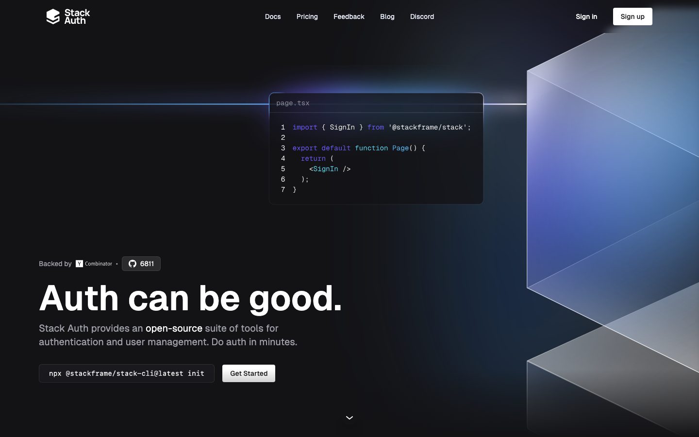
Stack Auth's marketing surface is a developer-first authentication product shown in near-total dark mode. The page floor is `{colors.canvas}` (#131316) — a near-black with a faint blue undertone — and headlines render in pure white (`{colors.ink}` — #ffffff) using **Geist Sans**, Vercel's open geometric sans. The system reads as precise, engineered, and confident: a single oversized hero headline ("Auth can be good."), a live code window floating in the hero, and a cool-toned prism glow lighting the top-right corner.
Type voice is monolithic — every role runs **Geist Sans**, splitting only by size and weight. The hero h1 is enormous (72px, weight 600, line-height 1.0) and tightly stacked; body copy drops to 14px in a muted gray (`{colors.muted}` — #a0a0ab). The contrast between giant white display type and small muted body is the core hierarchy device.
Brand voltage comes from two places: the **indigo-violet accent spectrum** (`{colors.accent}` — #6b5df7 and its siblings) that lights syntax highlighting, the prism gradient, and the brand mark; and from **real product UI fragments shown inside dark cards** — code editors, permission widgets, password fields, shadcn/ui chrome. Stack Auth shows the actual product at small scale rather than illustrating it.
CTAs invert the dark theme: the primary "Sign up" button is a **white pill** (`{colors.ink}` background, `{colors.on-primary}` text, `{rounded.pill}`). Secondary CTAs use lighter neutral fills. This light-on-dark inversion is the action-layer signature.
**Key Characteristics:**
- Near-black canvas (`{colors.canvas}` — #131316) across the entire page; there is no light mode in the marketing surface.
- Pure-white Geist Sans headlines (`{colors.ink}`) at large sizes (72px / 48px) with weight 600 and line-height 1.0 — tight, monumental display stacks.
- Inverted white pill CTAs (`{component.button-primary}`) — `{rounded.pill}` (9999px), the dominant interactive shape.
- Indigo-violet accent spectrum (`{colors.accent}` #6b5df7, `{colors.accent-violet}` #7f7cfd, `{colors.accent-indigo}` #4f46e5, `{colors.accent-purple}` #a855f7) lighting syntax, prism gradient, and brand mark; cool blues (`{colors.accent-blue}` #5faef7, `{colors.accent-blue-bright}` #3c88f5) appear in the hero glow.
- Real product UI shown inside cards — code windows, permission editors, password components, webhook tiles — rather than marketing illustration.
- Hierarchical radius: `{rounded.xs}` (4px) for inputs, `{rounded.sm}` (6px) for the inverted white card, `{rounded.md}` (8px) for feature cards and pills, `{rounded.lg}` (12px) for the hero code window, `{rounded.pill}` for primary buttons and badges.
- Generous vertical rhythm — section gaps reach `{spacing.section}` (128px) and beyond, giving the dark page room to breathe.
## Colors
### Brand & Accent
Stack Auth's accent layer is a cool **indigo → violet → blue spectrum** used for syntax highlighting, the hero prism gradient, and the brand mark — never for primary CTAs (which stay monochrome-inverted white).
- **Accent** (`{colors.accent}` — #6b5df7): The primary indigo-violet — the most frequent accent, used on the brand mark and key syntax tokens.
- **Accent Deep** (`{colors.accent-deep}` — #6346ec) and **Accent Indigo** (`{colors.accent-indigo}` — #4f46e5): Deeper indigo variants for the prism gradient's saturated core.
- **Accent Violet** (`{colors.accent-violet}` — #7f7cfd) and **Accent Purple** (`{colors.accent-purple}` — #a855f7): Lighter violet/purple notes in syntax and gradient.
- **Accent Blue** (`{colors.accent-blue}` — #5faef7) and **Accent Blue Bright** (`{colors.accent-blue-bright}` — #3c88f5): Cool blues lighting the hero horizon line and prism reflections.
- **Accent Lilac / Lavender / Ghost** (`{colors.accent-lilac}` #c5caff, `{colors.accent-lavender}` #e9d5ff, `{colors.accent-ghost}` #edf0ff): Near-white cool tints used for soft glows and the faint `rgba(237,240,255,0.65)` 1px halo shadow.
### Surface
- **Canvas** (`{colors.canvas}` — #131316): The default page floor and the code-window / input background. The whole page sits on this near-black.
- **Surface** (`{colors.surface}` — #1a1a1e): Slightly raised dark surface for feature cards, badge pills, and the CLI snippet pill.
- **Surface Ink Dark** (`{colors.surface-ink-dark}` — #1f2937): A cool slate used inside product UI fragments and deep panel chrome.
### Text
- **Ink** (`{colors.ink}` — #ffffff): All headlines and high-emphasis text — the dominant text color on this dark surface.
- **Muted** (`{colors.muted}` — #a0a0ab): Default body / sub-headline gray.
- **Muted Soft / Softer** (`{colors.muted-soft}` #aeaeb6, `{colors.muted-softer}` #9e9ea8): Tertiary captions, fine print, footer links.
- **Neutral** (`{colors.neutral}` — #e4e4e7): Light neutral fills (e.g. secondary button surface).
- **Neutral Mid / Strong** (`{colors.neutral-mid}` #51525c, `{colors.neutral-strong}` #3f3f46): Hairline borders and divider tones on the dark canvas.
### On-Color
- **On Primary** (`{colors.on-primary}` — #131316): Dark text placed on the inverted white pill buttons and white card surface.
## Typography
### Font Family
The system runs a single typeface — **Geist Sans** (Vercel's open-source geometric sans, observed as `__GeistSans_3a0388`) — for every role. There is no secondary face; hierarchy is built purely from size and weight. The fallback stack walks `Inter, sans-serif`.
Geist Sans is openly licensed (SIL Open Font License) and ships directly — no substitute is strictly required, but `Inter` is the documented fallback if Geist fails to load.
### Hierarchy
| Token | Size | Weight | Line Height | Letter Spacing | Use |
|---|---|---|---|---|---|
| `{typography.display-xl}` | 72px | 600 | 1.0 | normal | Hero h1 ("Auth can be good.") |
| `{typography.display-lg}` | 48px | 600 | 1.0 | normal | Section heads ("Wide range of features…", "Seamless integration…") |
| `{typography.title}` | 18px | 500 | 1.556 | normal | Card titles, feature labels, sub-section heads |
| `{typography.body}` | 14px | 400 | 1.429 | normal | Default running text, nav links, captions |
| `{typography.button}` | 16px | 400 | 1.5 | normal | Button labels |
### Principles
The hierarchy is intentionally sparse — two giant display sizes (72px / 48px), one mid title (18px), and one small body (14px). The drama comes entirely from the jump between monumental white display type and small muted-gray body text. Display weight stays at 600 (never 700); line-height collapses to 1.0 at display sizes for tight, monumental stacks.
### Note on Font Substitutes
Geist Sans is open-source and ships as-is. If unavailable, **Inter** at matching weights is the documented fallback. No licensed typeface is used in this system (`fonts_licensed` is empty).
## Layout
### Spacing System
- **Base unit:** 4px.
- **Tokens:** `{spacing.xxs}` 4px · `{spacing.xs}` 8px · `{spacing.sm}` 12px · `{spacing.md}` 16px · `{spacing.lg}` 24px · `{spacing.xl}` 32px · `{spacing.xxl}` 40px · `{spacing.huge}` 64px · `{spacing.section}` 128px.
- **Dominant rhythm:** `{spacing.lg}` (24px, the single most frequent value) and `{spacing.xs}` (8px) drive internal card and component spacing; `{spacing.md}` (16px) is the secondary step.
- **Section padding:** Large band gaps reach `{spacing.section}` (128px) and beyond (measured values of 144px, 240px, 256px, 320px appear for the most generous editorial breaks — derived as one-off large spacers, not a regular step).
- **Card internal padding:** `{spacing.lg}` (24px) for feature and code cards.
### Grid & Container
- **Hero:** Left-aligned headline + CTA stack with the floating code-window card positioned upper-center/right and a prism graphic bleeding off the right edge.
- **Feature showcase:** 3-up card grid at desktop (Password / Impersonation / Headless UI on top row; Rest API / No JWT / Webhooks below).
- **Testimonial wall:** Multi-column quote grid in lower-emphasis muted text.
- **Footer:** 4-column link list (Products / Company / Legal + brand block).
### Whitespace Philosophy
The dark canvas uses generous vertical whitespace — large empty bands between sections let the white display type and glowing accents carry the page. Density is low and deliberate: one big idea per band, never packed lists.
## Elevation & Depth
| Level | Treatment | Use |
|---|---|---|
| Flat | No shadow | Body sections on the dark canvas |
| Soft drop | `rgba(0,0,0,0.1) 0px 2px 4px` | Small raised chips, pills, buttons (most frequent shadow) |
| Medium lift | `0px 10px 15px -3px` + `0px 4px 6px -4px` at 0.1 alpha | Cards lifted off the canvas |
| Large lift | `0px 20px 25px -5px` + `0px 8px 10px -6px` at 0.1 alpha | The hero code window and prominent floating cards |
| Cool halo | `rgba(237,240,255,0.65) 0px 0px 1px` | A faint near-white 1px glow ring on accent elements |
| Focus ring | `#ffffff 0 0 0 2px` + `#70707b 0 0 0 6px` + large lift | Focused interactive element (white inner ring, gray outer ring) |
The elevation philosophy is **soft layered shadows plus cool glow** — because the page is near-black, drop shadows read subtly, and the system leans on the faint blue/lilac halo (`rgba(237,240,255,0.65)`) and the hero prism gradient to create luminous depth rather than heavy shadow.
### Decorative Depth
- The hero prism graphic (a translucent angular gradient in indigo/blue) bleeds off the top-right edge — the single largest decorative depth element, lit with the accent-blue spectrum.
- A faint horizontal glow line cuts across the hero at the code-window level.
- Product UI fragments inside cards carry their own internal chrome shadows — these are product, shown as content.
## Shapes
### Border Radius Scale
| Token | Value | Use |
|---|---|---|
| `{rounded.xs}` | 4px | Text inputs (`{component.input}`) |
| `{rounded.sm}` | 6px | The inverted white card surface (`{component.card}`) |
| `{rounded.md}` | 8px | Feature cards, badge/CLI pills, secondary buttons (the most frequent non-pill radius) |
| `{rounded.lg}` | 12px | The hero code window (`{component.code-card}`) |
| `{rounded.xl}` | 16px | Largest panel radius (rare) |
| `{rounded.pill}` | 9999px | Primary buttons, GitHub badge pills, the most frequent radius overall |
A measured `921px` radius appears once as an outlier (effectively a fully-rounded large element) and is treated as `{rounded.pill}` in practice.
### Photography Geometry
The system uses no marketing photography — visual interest comes from product UI fragments and the prism gradient. UI fragments retain their native chrome radii (code-cell rows, avatar circles, button rows).
## Components
### Top Navigation
**`top-nav`** — Transparent bar over the dark canvas (`{colors.canvas}`). Carries the "Stack Auth" wordmark + cube logo at left, a centered horizontal menu (Docs, Pricing, Feedback, Blog, Discord) in `{typography.body}` muted/white, and a right cluster with "Sign in" text and the white "Sign up" `{component.button-primary}` pill.
### Buttons
**`button-primary`** — The inverted white pill CTA ("Sign up"). Background `{colors.ink}` (#ffffff), text `{colors.on-primary}` (#131316), type `{typography.button}`, rounded `{rounded.pill}` (9999px). Padding is derived (~8px × 16px) — the measured `0px` reflects an inner-flex layout rather than the visual chip padding.
**`button-secondary`** — Lighter neutral CTA ("Get Started"). Background `{colors.neutral}` (#e4e4e7), text `{colors.on-primary}`, type `{typography.button}`, rounded `{rounded.md}` (8px). Used as the secondary action next to the CLI pill in the hero.
**`cli-pill`** — A dark monospace command chip (`npx @stackframe/stack-cli@latest init`). Background `{colors.surface}` (#1a1a1e), text `{colors.ink}`, rounded `{rounded.md}`. Sits beside the Get Started button in the hero. (derived padding ~12px × 16px)
### Badges
**`badge-pill`** — Small rounded-pill labels (e.g. the GitHub "6811" star count, "Backed by Y Combinator" chip). Background `{colors.surface}`, text `{colors.muted}`, type `{typography.body}`, rounded `{rounded.pill}`.
### Cards & Containers
**`code-card`** — The hero's floating code window ("page.tsx"). Background `{colors.canvas}` (#131316), rounded `{rounded.lg}` (12px), large-lift shadow, with a title bar and syntax-highlighted code using the accent spectrum (`{colors.accent}`, `{colors.accent-blue}`, `{colors.accent-purple}`). Internal padding `{spacing.lg}` (24px). The system's marquee artifact — it shows the actual product import, not an illustration.
**`feature-card`** — Used in the 3-up "Wide range of features" showcase grid (Password, Impersonation, Headless UI, Rest API, No JWT, Webhooks). Background `{colors.surface}` (#1a1a1e), rounded `{rounded.md}` (8px), internal padding `{spacing.lg}` (24px). Each carries a product UI fragment at top, an `{typography.title}` label, and a `{typography.body}` muted description.
**`card`** — The inverted light card surface (measured). Background `{colors.ink}` (#ffffff), text `{colors.on-primary}`, rounded `{rounded.sm}` (6px), no shadow. Used where the system flips to a light panel inside the dark layout.
### Inputs & Forms
**`input`** — Standard text input. Background `{colors.canvas}` (#131316), text `{colors.ink}`, type `{typography.body}`, rounded `{rounded.xs}` (4px). Borders use the neutral dark tones (`{colors.neutral-strong}`).
**`newsletter-input`** — The "Your email" subscribe field in the showcase band, paired with a Subscribe button. Background `{colors.canvas}`, text `{colors.ink}`, rounded `{rounded.md}` (8px). (derived from screenshot)
### Footer
**`footer`** — Closes the page on the same `{colors.canvas}` dark floor. Brand block + tagline at left, 4-column link list (Products / Company / Legal) in `{typography.body}` muted (`{colors.muted}`). Vertical padding `{spacing.huge}` (64px). Copyright line in `{colors.muted-softer}`.
## Do's and Don'ts
### Do
- Keep the entire surface on `{colors.canvas}` (#131316). Stack Auth has no light marketing mode.
- Use pure white (`{colors.ink}`) for headlines and the inverted pill CTAs — the light-on-dark inversion is the action-layer signature.
- Reserve the indigo-violet accent spectrum for syntax highlighting, the prism gradient, and the brand mark — never for primary CTAs.
- Show real product UI inside cards (code windows, permission editors, password fields). Don't illustrate the product when you can render it.
- Use Geist Sans at weight 600 for display and 400 for body. Let the size jump (72px vs 14px) carry the hierarchy.
- Use `{rounded.pill}` for primary buttons and badges; `{rounded.md}` for feature cards.
- Keep body copy in `{colors.muted}` (#a0a0ab) — high-emphasis white is reserved for headlines and key inline highlights.
### Don't
- Don't tint the primary CTA with accent color. The action layer is monochrome-inverted white.
- Don't bold display weight past 600 — Geist at 600 with line-height 1.0 is the intended monumental feel.
- Don't introduce a second typeface; the system is single-family Geist Sans.
- Don't overuse the cool halo glow — it's a faint 1px accent, not a heavy shadow.
- Don't pack bands densely. Each section is one idea with generous surrounding whitespace.
- Don't add hover-state styling beyond the system — default and pressed only.
## Responsive Behavior
### Breakpoints
The captured analysis does not include explicit breakpoint measurements; the following is derived from the desktop and full-page screenshots.
| Name | Width | Key Changes (derived) |
|---|---|---|
| Mobile | < 768px | Nav collapses; hero h1 scales down from 72px; code window stacks below or shrinks; feature grid 1-up; footer columns stack |
| Tablet | 768–1024px | Feature grid 2-up; hero prism graphic tightens to the right edge |
| Desktop | 1024–1440px | Full horizontal nav; 3-up feature grid; hero headline at full 72px with the floating code card and prism |
| Wide | > 1440px | Same as desktop with more outer breathing room |
### Touch Targets
- `{component.button-primary}` and `{component.button-secondary}` render with pill / 8px-radius chips at ~8px × 16px padding; effective tap area meets standard minimums with the surrounding chip.
- `{component.input}` and `{component.newsletter-input}` are standard text fields.
### Collapsing Strategy (derived)
- The hero's headline-left / code-window-right composition collapses to a single column on mobile.
- The feature showcase reduces columns (3 → 2 → 1) rather than scaling cards.
- The prism graphic is decorative and clips at the viewport edge at all sizes.
- The footer's 4-column link list wraps to fewer columns on narrow screens.
### Image Behavior
- Product UI fragments inside cards retain native aspect ratios; cards resize around them.
- The hero prism gradient scales/clips proportionally and bleeds off the top-right.
## Iteration Guide
1. Focus on ONE component at a time. Reference its YAML key directly (`{component.code-card}`, `{component.feature-card}`).
2. Variants of an existing component (`-active`, `-disabled`, `-focused`) live as separate entries in `components:`.
3. Use `{token.refs}` everywhere — never inline hex.
4. Never document hover. Default and Active/Pressed states only.
5. Keep the canvas dark (`{colors.canvas}`) and CTAs inverted white. The contrast model is the brand.
6. Display headlines stay Geist Sans 600 with line-height 1.0; body stays Geist 400 muted. The single-family discipline does not blur.
7. When in doubt about emphasis: bigger white Geist before adding accent color.
## Known Gaps
- No licensed fonts were flagged (`fonts_licensed` is empty); Geist Sans is open-source and documented as the shipping face with Inter as fallback.
- Button padding was measured as `0px` (an inner-flex artifact); the chip padding (~8px × 16px) is derived from the screenshots and should be confirmed against the live CSS.
- The accent spectrum (indigo / violet / blue / lilac / lavender) is documented from frequency-ranked computed colors; exact gradient stop placement in the hero prism was not extracted.
- Breakpoint widths and the responsive collapse behavior are derived from desktop + full-page screenshots, not measured media queries.
- A `921px` border-radius value appears once as an outlier and is treated as a fully-rounded (`{rounded.pill}`) element.
- The measured `card` background of `#ffffff` reflects an inverted light panel inside the dark layout; its exact placement and frequency on the live site need confirmation.
- Section-level vertical spacing above 128px (144 / 240 / 256 / 320px) appears as one-off large spacers rather than a regular scale step.
- Animation, transition timings, and the hero prism / glow motion are not in scope.
- The pricing page and interior "page" routes were captured but their unique component specs (pricing tiers, doc layouts) were not separately measured.
- Form validation, error, and disabled states were not extracted — only the base input was measured.
<!-- Documented by duply · real-world design systems as ready-to-use DESIGN.md for AI coding agents · https://duply.ai/stack-auth/design-md -->
Color Palette
Accent
Neutrals
Typography
display-xl72px · 600 · 1
The quick brown fox jumpsdisplay-lg48px · 600 · 1
The quick brown fox jumpstitle18px · 500 · 1.556
The quick brown fox jumpsbody14px · 400 · 1.429
The quick brown fox jumpsbutton16px · 400 · 1.5
The quick brown fox jumpsSpacing & Shape
Spacing
| Name | Value | Preview |
|---|---|---|
| xxs | 4px | |
| xs | 8px | |
| sm | 12px | |
| md | 16px | |
| lg | 24px | |
| xl | 32px | |
| xxl | 40px | |
| huge | 64px | |
| section | 128px |
Border Radius
| Name | Value | Preview |
|---|---|---|
| xs | 4px | |
| sm | 6px | |
| md | 8px | |
| lg | 12px | |
| xl | 16px | |
| pill | 9999px | |
| full | 9999px |
More like this


---
version: alpha
name: Stack-Auth-design-analysis
description: A developer-first authentication product surface rendered almost entirely in near-black dark mode (#131316 canvas) with crisp white headlines in Geist Sans, an indigo-violet accent spectrum (#6b5df7 family), and inverted white pill CTAs. The system reads as precise modern-dev-tooling — code windows shown in-card, generous vertical rhythm, rounded-pill buttons, and a faint cool-toned glow lighting the hero. Brand voltage comes from the violet/blue accent gradient prism and from real product UI fragments shown inside dark cards.

colors:
  ink: "#ffffff"
  muted: "#a0a0ab"
  muted-soft: "#aeaeb6"
  muted-softer: "#9e9ea8"
  neutral: "#e4e4e7"
  neutral-mid: "#51525c"
  neutral-strong: "#3f3f46"
  canvas: "#131316"
  surface: "#1a1a1e"
  surface-ink-dark: "#1f2937"
  accent: "#6b5df7"
  accent-deep: "#6346ec"
  accent-indigo: "#4f46e5"
  accent-violet: "#7f7cfd"
  accent-purple: "#a855f7"
  accent-blue: "#5faef7"
  accent-blue-bright: "#3c88f5"
  accent-lilac: "#c5caff"
  accent-lavender: "#e9d5ff"
  accent-ghost: "#edf0ff"
  on-primary: "#131316"

typography:
  display-xl:
    fontFamily: "Geist Sans, Inter, sans-serif"
    fontSize: 72px
    fontWeight: 600
    lineHeight: 1.0
    letterSpacing: normal
  display-lg:
    fontFamily: "Geist Sans, Inter, sans-serif"
    fontSize: 48px
    fontWeight: 600
    lineHeight: 1.0
    letterSpacing: normal
  title:
    fontFamily: "Geist Sans, Inter, sans-serif"
    fontSize: 18px
    fontWeight: 500
    lineHeight: 1.556
    letterSpacing: normal
  body:
    fontFamily: "Geist Sans, Inter, sans-serif"
    fontSize: 14px
    fontWeight: 400
    lineHeight: 1.429
    letterSpacing: normal
  button:
    fontFamily: "Geist Sans, Inter, sans-serif"
    fontSize: 16px
    fontWeight: 400
    lineHeight: 1.5
    letterSpacing: normal

rounded:
  xs: 4px
  sm: 6px
  md: 8px
  lg: 12px
  xl: 16px
  pill: 9999px
  full: 9999px

spacing:
  xxs: 4px
  xs: 8px
  sm: 12px
  md: 16px
  lg: 24px
  xl: 32px
  xxl: 40px
  huge: 64px
  section: 128px

components:
  top-nav:
    backgroundColor: "{colors.canvas}"
    textColor: "{colors.ink}"
    typography: "{typography.body}"
  button-primary:
    backgroundColor: "{colors.ink}"
    textColor: "{colors.on-primary}"
    typography: "{typography.button}"
    rounded: "{rounded.pill}"
    padding: 8px 16px
  button-secondary:
    backgroundColor: "{colors.neutral}"
    textColor: "{colors.on-primary}"
    typography: "{typography.button}"
    rounded: "{rounded.md}"
    padding: 8px 16px
  cli-pill:
    backgroundColor: "{colors.surface}"
    textColor: "{colors.ink}"
    typography: "{typography.body}"
    rounded: "{rounded.md}"
    padding: 12px 16px
  badge-pill:
    backgroundColor: "{colors.surface}"
    textColor: "{colors.muted}"
    typography: "{typography.body}"
    rounded: "{rounded.pill}"
    padding: 8px 12px
  card:
    backgroundColor: "{colors.ink}"
    textColor: "{colors.on-primary}"
    rounded: "{rounded.sm}"
  code-card:
    backgroundColor: "{colors.canvas}"
    textColor: "{colors.ink}"
    typography: "{typography.body}"
    rounded: "{rounded.lg}"
    padding: 24px
  feature-card:
    backgroundColor: "{colors.surface}"
    textColor: "{colors.ink}"
    typography: "{typography.title}"
    rounded: "{rounded.md}"
    padding: 24px
  input:
    backgroundColor: "{colors.canvas}"
    textColor: "{colors.ink}"
    typography: "{typography.body}"
    rounded: "{rounded.xs}"
    padding: 8px 12px
  newsletter-input:
    backgroundColor: "{colors.canvas}"
    textColor: "{colors.ink}"
    typography: "{typography.body}"
    rounded: "{rounded.md}"
    padding: 8px 12px
  footer:
    backgroundColor: "{colors.canvas}"
    textColor: "{colors.muted}"
    typography: "{typography.body}"
    padding: 64px
---

## Overview

Stack Auth's marketing surface is a developer-first authentication product shown in near-total dark mode. The page floor is `{colors.canvas}` (#131316) — a near-black with a faint blue undertone — and headlines render in pure white (`{colors.ink}` — #ffffff) using **Geist Sans**, Vercel's open geometric sans. The system reads as precise, engineered, and confident: a single oversized hero headline ("Auth can be good."), a live code window floating in the hero, and a cool-toned prism glow lighting the top-right corner.

Type voice is monolithic — every role runs **Geist Sans**, splitting only by size and weight. The hero h1 is enormous (72px, weight 600, line-height 1.0) and tightly stacked; body copy drops to 14px in a muted gray (`{colors.muted}` — #a0a0ab). The contrast between giant white display type and small muted body is the core hierarchy device.

Brand voltage comes from two places: the **indigo-violet accent spectrum** (`{colors.accent}` — #6b5df7 and its siblings) that lights syntax highlighting, the prism gradient, and the brand mark; and from **real product UI fragments shown inside dark cards** — code editors, permission widgets, password fields, shadcn/ui chrome. Stack Auth shows the actual product at small scale rather than illustrating it.

CTAs invert the dark theme: the primary "Sign up" button is a **white pill** (`{colors.ink}` background, `{colors.on-primary}` text, `{rounded.pill}`). Secondary CTAs use lighter neutral fills. This light-on-dark inversion is the action-layer signature.

**Key Characteristics:**
- Near-black canvas (`{colors.canvas}` — #131316) across the entire page; there is no light mode in the marketing surface.
- Pure-white Geist Sans headlines (`{colors.ink}`) at large sizes (72px / 48px) with weight 600 and line-height 1.0 — tight, monumental display stacks.
- Inverted white pill CTAs (`{component.button-primary}`) — `{rounded.pill}` (9999px), the dominant interactive shape.
- Indigo-violet accent spectrum (`{colors.accent}` #6b5df7, `{colors.accent-violet}` #7f7cfd, `{colors.accent-indigo}` #4f46e5, `{colors.accent-purple}` #a855f7) lighting syntax, prism gradient, and brand mark; cool blues (`{colors.accent-blue}` #5faef7, `{colors.accent-blue-bright}` #3c88f5) appear in the hero glow.
- Real product UI shown inside cards — code windows, permission editors, password components, webhook tiles — rather than marketing illustration.
- Hierarchical radius: `{rounded.xs}` (4px) for inputs, `{rounded.sm}` (6px) for the inverted white card, `{rounded.md}` (8px) for feature cards and pills, `{rounded.lg}` (12px) for the hero code window, `{rounded.pill}` for primary buttons and badges.
- Generous vertical rhythm — section gaps reach `{spacing.section}` (128px) and beyond, giving the dark page room to breathe.

## Colors

### Brand & Accent
Stack Auth's accent layer is a cool **indigo → violet → blue spectrum** used for syntax highlighting, the hero prism gradient, and the brand mark — never for primary CTAs (which stay monochrome-inverted white).

- **Accent** (`{colors.accent}` — #6b5df7): The primary indigo-violet — the most frequent accent, used on the brand mark and key syntax tokens.
- **Accent Deep** (`{colors.accent-deep}` — #6346ec) and **Accent Indigo** (`{colors.accent-indigo}` — #4f46e5): Deeper indigo variants for the prism gradient's saturated core.
- **Accent Violet** (`{colors.accent-violet}` — #7f7cfd) and **Accent Purple** (`{colors.accent-purple}` — #a855f7): Lighter violet/purple notes in syntax and gradient.
- **Accent Blue** (`{colors.accent-blue}` — #5faef7) and **Accent Blue Bright** (`{colors.accent-blue-bright}` — #3c88f5): Cool blues lighting the hero horizon line and prism reflections.
- **Accent Lilac / Lavender / Ghost** (`{colors.accent-lilac}` #c5caff, `{colors.accent-lavender}` #e9d5ff, `{colors.accent-ghost}` #edf0ff): Near-white cool tints used for soft glows and the faint `rgba(237,240,255,0.65)` 1px halo shadow.

### Surface
- **Canvas** (`{colors.canvas}` — #131316): The default page floor and the code-window / input background. The whole page sits on this near-black.
- **Surface** (`{colors.surface}` — #1a1a1e): Slightly raised dark surface for feature cards, badge pills, and the CLI snippet pill.
- **Surface Ink Dark** (`{colors.surface-ink-dark}` — #1f2937): A cool slate used inside product UI fragments and deep panel chrome.

### Text
- **Ink** (`{colors.ink}` — #ffffff): All headlines and high-emphasis text — the dominant text color on this dark surface.
- **Muted** (`{colors.muted}` — #a0a0ab): Default body / sub-headline gray.
- **Muted Soft / Softer** (`{colors.muted-soft}` #aeaeb6, `{colors.muted-softer}` #9e9ea8): Tertiary captions, fine print, footer links.
- **Neutral** (`{colors.neutral}` — #e4e4e7): Light neutral fills (e.g. secondary button surface).
- **Neutral Mid / Strong** (`{colors.neutral-mid}` #51525c, `{colors.neutral-strong}` #3f3f46): Hairline borders and divider tones on the dark canvas.

### On-Color
- **On Primary** (`{colors.on-primary}` — #131316): Dark text placed on the inverted white pill buttons and white card surface.

## Typography

### Font Family
The system runs a single typeface — **Geist Sans** (Vercel's open-source geometric sans, observed as `__GeistSans_3a0388`) — for every role. There is no secondary face; hierarchy is built purely from size and weight. The fallback stack walks `Inter, sans-serif`.

Geist Sans is openly licensed (SIL Open Font License) and ships directly — no substitute is strictly required, but `Inter` is the documented fallback if Geist fails to load.

### Hierarchy

| Token | Size | Weight | Line Height | Letter Spacing | Use |
|---|---|---|---|---|---|
| `{typography.display-xl}` | 72px | 600 | 1.0 | normal | Hero h1 ("Auth can be good.") |
| `{typography.display-lg}` | 48px | 600 | 1.0 | normal | Section heads ("Wide range of features…", "Seamless integration…") |
| `{typography.title}` | 18px | 500 | 1.556 | normal | Card titles, feature labels, sub-section heads |
| `{typography.body}` | 14px | 400 | 1.429 | normal | Default running text, nav links, captions |
| `{typography.button}` | 16px | 400 | 1.5 | normal | Button labels |

### Principles
The hierarchy is intentionally sparse — two giant display sizes (72px / 48px), one mid title (18px), and one small body (14px). The drama comes entirely from the jump between monumental white display type and small muted-gray body text. Display weight stays at 600 (never 700); line-height collapses to 1.0 at display sizes for tight, monumental stacks.

### Note on Font Substitutes
Geist Sans is open-source and ships as-is. If unavailable, **Inter** at matching weights is the documented fallback. No licensed typeface is used in this system (`fonts_licensed` is empty).

## Layout

### Spacing System
- **Base unit:** 4px.
- **Tokens:** `{spacing.xxs}` 4px · `{spacing.xs}` 8px · `{spacing.sm}` 12px · `{spacing.md}` 16px · `{spacing.lg}` 24px · `{spacing.xl}` 32px · `{spacing.xxl}` 40px · `{spacing.huge}` 64px · `{spacing.section}` 128px.
- **Dominant rhythm:** `{spacing.lg}` (24px, the single most frequent value) and `{spacing.xs}` (8px) drive internal card and component spacing; `{spacing.md}` (16px) is the secondary step.
- **Section padding:** Large band gaps reach `{spacing.section}` (128px) and beyond (measured values of 144px, 240px, 256px, 320px appear for the most generous editorial breaks — derived as one-off large spacers, not a regular step).
- **Card internal padding:** `{spacing.lg}` (24px) for feature and code cards.

### Grid & Container
- **Hero:** Left-aligned headline + CTA stack with the floating code-window card positioned upper-center/right and a prism graphic bleeding off the right edge.
- **Feature showcase:** 3-up card grid at desktop (Password / Impersonation / Headless UI on top row; Rest API / No JWT / Webhooks below).
- **Testimonial wall:** Multi-column quote grid in lower-emphasis muted text.
- **Footer:** 4-column link list (Products / Company / Legal + brand block).

### Whitespace Philosophy
The dark canvas uses generous vertical whitespace — large empty bands between sections let the white display type and glowing accents carry the page. Density is low and deliberate: one big idea per band, never packed lists.

## Elevation & Depth

| Level | Treatment | Use |
|---|---|---|
| Flat | No shadow | Body sections on the dark canvas |
| Soft drop | `rgba(0,0,0,0.1) 0px 2px 4px` | Small raised chips, pills, buttons (most frequent shadow) |
| Medium lift | `0px 10px 15px -3px` + `0px 4px 6px -4px` at 0.1 alpha | Cards lifted off the canvas |
| Large lift | `0px 20px 25px -5px` + `0px 8px 10px -6px` at 0.1 alpha | The hero code window and prominent floating cards |
| Cool halo | `rgba(237,240,255,0.65) 0px 0px 1px` | A faint near-white 1px glow ring on accent elements |
| Focus ring | `#ffffff 0 0 0 2px` + `#70707b 0 0 0 6px` + large lift | Focused interactive element (white inner ring, gray outer ring) |

The elevation philosophy is **soft layered shadows plus cool glow** — because the page is near-black, drop shadows read subtly, and the system leans on the faint blue/lilac halo (`rgba(237,240,255,0.65)`) and the hero prism gradient to create luminous depth rather than heavy shadow.

### Decorative Depth
- The hero prism graphic (a translucent angular gradient in indigo/blue) bleeds off the top-right edge — the single largest decorative depth element, lit with the accent-blue spectrum.
- A faint horizontal glow line cuts across the hero at the code-window level.
- Product UI fragments inside cards carry their own internal chrome shadows — these are product, shown as content.

## Shapes

### Border Radius Scale

| Token | Value | Use |
|---|---|---|
| `{rounded.xs}` | 4px | Text inputs (`{component.input}`) |
| `{rounded.sm}` | 6px | The inverted white card surface (`{component.card}`) |
| `{rounded.md}` | 8px | Feature cards, badge/CLI pills, secondary buttons (the most frequent non-pill radius) |
| `{rounded.lg}` | 12px | The hero code window (`{component.code-card}`) |
| `{rounded.xl}` | 16px | Largest panel radius (rare) |
| `{rounded.pill}` | 9999px | Primary buttons, GitHub badge pills, the most frequent radius overall |

A measured `921px` radius appears once as an outlier (effectively a fully-rounded large element) and is treated as `{rounded.pill}` in practice.

### Photography Geometry
The system uses no marketing photography — visual interest comes from product UI fragments and the prism gradient. UI fragments retain their native chrome radii (code-cell rows, avatar circles, button rows).

## Components

### Top Navigation

**`top-nav`** — Transparent bar over the dark canvas (`{colors.canvas}`). Carries the "Stack Auth" wordmark + cube logo at left, a centered horizontal menu (Docs, Pricing, Feedback, Blog, Discord) in `{typography.body}` muted/white, and a right cluster with "Sign in" text and the white "Sign up" `{component.button-primary}` pill.

### Buttons

**`button-primary`** — The inverted white pill CTA ("Sign up"). Background `{colors.ink}` (#ffffff), text `{colors.on-primary}` (#131316), type `{typography.button}`, rounded `{rounded.pill}` (9999px). Padding is derived (~8px × 16px) — the measured `0px` reflects an inner-flex layout rather than the visual chip padding.

**`button-secondary`** — Lighter neutral CTA ("Get Started"). Background `{colors.neutral}` (#e4e4e7), text `{colors.on-primary}`, type `{typography.button}`, rounded `{rounded.md}` (8px). Used as the secondary action next to the CLI pill in the hero.

**`cli-pill`** — A dark monospace command chip (`npx @stackframe/stack-cli@latest init`). Background `{colors.surface}` (#1a1a1e), text `{colors.ink}`, rounded `{rounded.md}`. Sits beside the Get Started button in the hero. (derived padding ~12px × 16px)

### Badges

**`badge-pill`** — Small rounded-pill labels (e.g. the GitHub "6811" star count, "Backed by Y Combinator" chip). Background `{colors.surface}`, text `{colors.muted}`, type `{typography.body}`, rounded `{rounded.pill}`.

### Cards & Containers

**`code-card`** — The hero's floating code window ("page.tsx"). Background `{colors.canvas}` (#131316), rounded `{rounded.lg}` (12px), large-lift shadow, with a title bar and syntax-highlighted code using the accent spectrum (`{colors.accent}`, `{colors.accent-blue}`, `{colors.accent-purple}`). Internal padding `{spacing.lg}` (24px). The system's marquee artifact — it shows the actual product import, not an illustration.

**`feature-card`** — Used in the 3-up "Wide range of features" showcase grid (Password, Impersonation, Headless UI, Rest API, No JWT, Webhooks). Background `{colors.surface}` (#1a1a1e), rounded `{rounded.md}` (8px), internal padding `{spacing.lg}` (24px). Each carries a product UI fragment at top, an `{typography.title}` label, and a `{typography.body}` muted description.

**`card`** — The inverted light card surface (measured). Background `{colors.ink}` (#ffffff), text `{colors.on-primary}`, rounded `{rounded.sm}` (6px), no shadow. Used where the system flips to a light panel inside the dark layout.

### Inputs & Forms

**`input`** — Standard text input. Background `{colors.canvas}` (#131316), text `{colors.ink}`, type `{typography.body}`, rounded `{rounded.xs}` (4px). Borders use the neutral dark tones (`{colors.neutral-strong}`).

**`newsletter-input`** — The "Your email" subscribe field in the showcase band, paired with a Subscribe button. Background `{colors.canvas}`, text `{colors.ink}`, rounded `{rounded.md}` (8px). (derived from screenshot)

### Footer

**`footer`** — Closes the page on the same `{colors.canvas}` dark floor. Brand block + tagline at left, 4-column link list (Products / Company / Legal) in `{typography.body}` muted (`{colors.muted}`). Vertical padding `{spacing.huge}` (64px). Copyright line in `{colors.muted-softer}`.

## Do's and Don'ts

### Do
- Keep the entire surface on `{colors.canvas}` (#131316). Stack Auth has no light marketing mode.
- Use pure white (`{colors.ink}`) for headlines and the inverted pill CTAs — the light-on-dark inversion is the action-layer signature.
- Reserve the indigo-violet accent spectrum for syntax highlighting, the prism gradient, and the brand mark — never for primary CTAs.
- Show real product UI inside cards (code windows, permission editors, password fields). Don't illustrate the product when you can render it.
- Use Geist Sans at weight 600 for display and 400 for body. Let the size jump (72px vs 14px) carry the hierarchy.
- Use `{rounded.pill}` for primary buttons and badges; `{rounded.md}` for feature cards.
- Keep body copy in `{colors.muted}` (#a0a0ab) — high-emphasis white is reserved for headlines and key inline highlights.

### Don't
- Don't tint the primary CTA with accent color. The action layer is monochrome-inverted white.
- Don't bold display weight past 600 — Geist at 600 with line-height 1.0 is the intended monumental feel.
- Don't introduce a second typeface; the system is single-family Geist Sans.
- Don't overuse the cool halo glow — it's a faint 1px accent, not a heavy shadow.
- Don't pack bands densely. Each section is one idea with generous surrounding whitespace.
- Don't add hover-state styling beyond the system — default and pressed only.

## Responsive Behavior

### Breakpoints
The captured analysis does not include explicit breakpoint measurements; the following is derived from the desktop and full-page screenshots.

| Name | Width | Key Changes (derived) |
|---|---|---|
| Mobile | < 768px | Nav collapses; hero h1 scales down from 72px; code window stacks below or shrinks; feature grid 1-up; footer columns stack |
| Tablet | 768–1024px | Feature grid 2-up; hero prism graphic tightens to the right edge |
| Desktop | 1024–1440px | Full horizontal nav; 3-up feature grid; hero headline at full 72px with the floating code card and prism |
| Wide | > 1440px | Same as desktop with more outer breathing room |

### Touch Targets
- `{component.button-primary}` and `{component.button-secondary}` render with pill / 8px-radius chips at ~8px × 16px padding; effective tap area meets standard minimums with the surrounding chip.
- `{component.input}` and `{component.newsletter-input}` are standard text fields.

### Collapsing Strategy (derived)
- The hero's headline-left / code-window-right composition collapses to a single column on mobile.
- The feature showcase reduces columns (3 → 2 → 1) rather than scaling cards.
- The prism graphic is decorative and clips at the viewport edge at all sizes.
- The footer's 4-column link list wraps to fewer columns on narrow screens.

### Image Behavior
- Product UI fragments inside cards retain native aspect ratios; cards resize around them.
- The hero prism gradient scales/clips proportionally and bleeds off the top-right.

## Iteration Guide

1. Focus on ONE component at a time. Reference its YAML key directly (`{component.code-card}`, `{component.feature-card}`).
2. Variants of an existing component (`-active`, `-disabled`, `-focused`) live as separate entries in `components:`.
3. Use `{token.refs}` everywhere — never inline hex.
4. Never document hover. Default and Active/Pressed states only.
5. Keep the canvas dark (`{colors.canvas}`) and CTAs inverted white. The contrast model is the brand.
6. Display headlines stay Geist Sans 600 with line-height 1.0; body stays Geist 400 muted. The single-family discipline does not blur.
7. When in doubt about emphasis: bigger white Geist before adding accent color.

## Known Gaps

- No licensed fonts were flagged (`fonts_licensed` is empty); Geist Sans is open-source and documented as the shipping face with Inter as fallback.
- Button padding was measured as `0px` (an inner-flex artifact); the chip padding (~8px × 16px) is derived from the screenshots and should be confirmed against the live CSS.
- The accent spectrum (indigo / violet / blue / lilac / lavender) is documented from frequency-ranked computed colors; exact gradient stop placement in the hero prism was not extracted.
- Breakpoint widths and the responsive collapse behavior are derived from desktop + full-page screenshots, not measured media queries.
- A `921px` border-radius value appears once as an outlier and is treated as a fully-rounded (`{rounded.pill}`) element.
- The measured `card` background of `#ffffff` reflects an inverted light panel inside the dark layout; its exact placement and frequency on the live site need confirmation.
- Section-level vertical spacing above 128px (144 / 240 / 256 / 320px) appears as one-off large spacers rather than a regular scale step.
- Animation, transition timings, and the hero prism / glow motion are not in scope.
- The pricing page and interior "page" routes were captured but their unique component specs (pricing tiers, doc layouts) were not separately measured.
- Form validation, error, and disabled states were not extracted — only the base input was measured.

<!-- Documented by duply · real-world design systems as ready-to-use DESIGN.md for AI coding agents · https://duply.ai/stack-auth/design-md -->