Rive
A dark-canvas, engineering-forward marketing interface for an interactive-graphics tool, built on pure black (#000000) with white technical typography in the geometric Tomorrow typeface. The system reads as precise and product-first — tight uppercase wide-tracked labels, near-black elevated cards holding live product/animation fragments, a single warm amber accent reserved for eyebrow labels and the brand CTA, and raw browser-blue underlined links in the footer. Brand voltage comes from the Tomorrow wordmark and from real Rive runtime artifacts shown in dark cards rather than from a broad color palette.
---
version: alpha
name: Rive-design-analysis
description: A dark-canvas, engineering-forward marketing interface for an interactive-graphics tool, built on pure black (#000000) with white technical typography in the geometric Tomorrow typeface. The system reads as precise and product-first — tight uppercase wide-tracked labels, near-black elevated cards holding live product/animation fragments, a single warm amber accent reserved for eyebrow labels and the brand CTA, and raw browser-blue underlined links in the footer. Brand voltage comes from the Tomorrow wordmark and from real Rive runtime artifacts shown in dark cards rather than from a broad color palette.
colors:
link: "#0000ee"
canvas: "#000000"
ink: "#ffffff"
primary: "#1d1d1d"
on-primary: "#000000"
accent: "#ffa41c"
muted: "#999999"
muted-soft: "#aaaaaa"
surface-dark: "#121212"
surface-dark-elevated: "#262626"
surface-near-black: "#111111"
surface-light: "#f1f1f1"
surface-light-alt: "#f2f0f0"
surface-light-soft: "#ebebeb"
typography:
display:
fontFamily: "Tomorrow, sans-serif"
fontSize: 40px
fontWeight: 500
lineHeight: 1.2
letterSpacing: 0.4px
eyebrow:
fontFamily: "Tomorrow, sans-serif"
fontSize: 12px
fontWeight: 500
lineHeight: 1.2
letterSpacing: 0.84px
label:
fontFamily: "Tomorrow, sans-serif"
fontSize: 14px
fontWeight: 500
lineHeight: 1.0
letterSpacing: 1.4px
body:
fontFamily: "Tomorrow, sans-serif"
fontSize: 12px
fontWeight: 500
lineHeight: 1.2
letterSpacing: normal
rounded:
none: 0px
xs: 4px
sm: 5px
md: 8px
lg: 20px
spacing:
xxs: 5px
xs: 8px
sm: 10px
md: 12px
lg: 16px
xl: 20px
xxl: 30px
huge: 40px
max: 50px
components:
top-nav:
backgroundColor: "{colors.canvas}"
textColor: "{colors.ink}"
typography: "{typography.label}"
button-primary:
backgroundColor: "{colors.primary}"
textColor: "{colors.on-primary}"
typography: "{typography.label}"
rounded: "{rounded.md}"
padding: 0px 16px
button-secondary:
backgroundColor: "{colors.surface-dark}"
textColor: "{colors.ink}"
typography: "{typography.label}"
rounded: "{rounded.md}"
padding: 0px 16px
use-case-card:
backgroundColor: "{colors.surface-dark}"
textColor: "{colors.ink}"
typography: "{typography.label}"
rounded: "{rounded.md}"
product-mockup-card:
backgroundColor: "{colors.surface-dark}"
textColor: "{colors.ink}"
rounded: "{rounded.md}"
testimonial-card:
backgroundColor: "{colors.surface-dark}"
textColor: "{colors.muted}"
typography: "{typography.body}"
rounded: "{rounded.md}"
padding: 16px
eyebrow-label:
backgroundColor: transparent
textColor: "{colors.accent}"
typography: "{typography.eyebrow}"
input:
backgroundColor: "{colors.ink}"
textColor: "{colors.canvas}"
typography: "{typography.body}"
rounded: "{rounded.none}"
newsletter-input:
backgroundColor: "{colors.ink}"
textColor: "{colors.canvas}"
typography: "{typography.body}"
rounded: "{rounded.none}"
footer:
backgroundColor: "{colors.canvas}"
textColor: "{colors.muted}"
typography: "{typography.body}"
footer-link:
backgroundColor: transparent
textColor: "{colors.link}"
typography: "{typography.body}"
---
## Overview
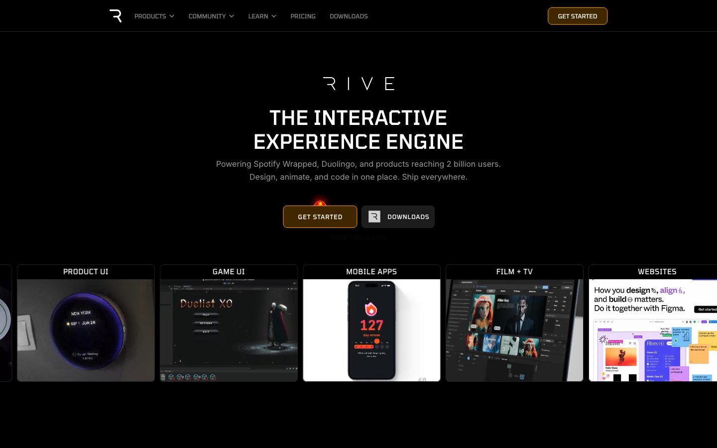
Rive's marketing surface is a dark, engineering-forward interface anchored on pure black (`{colors.canvas}` — #000000) with white technical type (`{colors.ink}` — #ffffff) in the geometric **Tomorrow** typeface. It reads as a precise developer/designer tool — every heading is set tight and wide-tracked, cards are near-black elevations holding live product fragments, and color is rationed to a single warm amber (`{colors.accent}` — #ffa41c) used only on small eyebrow labels and the brand's CTA glow.
The type voice is monolithic: **Tomorrow** carries everything — display headlines, eyebrow labels, navigation, body copy. There is no secondary family. What varies is size and letter-spacing: the bigger the role, the tighter the tracking ratio feels relative to its mass; the smaller the role, the wider the uppercase tracking (the 14px label runs at 1.4px tracking, the 12px eyebrow at 0.84px). This produces the "control-panel" aesthetic — labels that read like UI chrome, not marketing prose.
Component voltage comes from **real Rive product and runtime artifacts shown inside dark cards** — a live animated weather widget, a game UI, a mobile streak counter, platform runtime icons. Rive doesn't illustrate the product; it embeds the actual rendered output in near-black cards (`{colors.surface-dark}` — #121212) so the marketing page itself behaves like a demo reel.
A distinctive quirk: footer navigation links render in raw browser blue (`{colors.link}` — #0000ee), underlined and unstyled. On the otherwise tightly-controlled black canvas this reads as a deliberate "developer document" signal rather than an oversight.
**Key Characteristics:**
- Pure-black canvas (`{colors.canvas}` — #000000) under white Tomorrow type — a true dark-mode-first marketing surface, not a dark section within a light page.
- Single typeface system: **Tomorrow** (weight 500) across display, eyebrow, label, and body. Hierarchy is driven by size + letter-spacing, never by family switching.
- Amber accent (`{colors.accent}` — #ffa41c) rationed to eyebrow labels ("RIVE EDITOR", "RIVE RUNTIMES") and the GET STARTED CTA glow — never on body or large surfaces.
- Near-black elevated cards (`{colors.surface-dark}` — #121212, `{colors.surface-dark-elevated}` — #262626) hold live product fragments and testimonials.
- Primary CTA is a dark pill (`{colors.primary}` — #1d1d1d) with `{rounded.md}` (8px) corners and wide-tracked label type.
- Raw browser-blue underlined footer links (`{colors.link}` — #0000ee) — a deliberate unstyled developer-document signal.
- Tight, control-panel spacing rhythm built on 5px and 10px increments, with the highest-frequency gap at 10px.
- Flat depth — the only measured shadow is a fully-transparent inset, so elevation is communicated by surface-color steps (black → #121212 → #262626) rather than drop shadows.
## Colors
### Brand & Accent
- **Accent** (`{colors.accent}` — #ffa41c): The single warm amber in the system. Reserved for eyebrow labels ("RIVE EDITOR", "RIVE RUNTIMES", "PRODUCTS BUILT WITH RIVE…") and the small glow above the GET STARTED CTA. Frequency is extremely low (measured 2 occurrences) — it is a spotlight color, never a fill.
- **Link** (`{colors.link}` — #0000ee): Raw browser-default blue, used heavily (measured 365 occurrences) on footer and inline navigation links, rendered underlined. The system leaves these unstyled as a deliberate developer-document texture.
### Surface
- **Canvas** (`{colors.canvas}` — #000000): The default page floor — true black, the dominant surface (measured 303 occurrences).
- **Surface Dark** (`{colors.surface-dark}` — #121212): Elevated cards — use-case tiles, product-mockup cards, testimonial cards.
- **Surface Dark Elevated** (`{colors.surface-dark-elevated}` — #262626): A second elevation step for nested chrome inside dark cards and hairline-like dividers.
- **Surface Near-Black** (`{colors.surface-near-black}` — #111111): A barely-distinct dark used for adjacent bands and card backers.
- **Surface Light / Light-Alt / Light-Soft** (`{colors.surface-light}` — #f1f1f1, `{colors.surface-light-alt}` — #f2f0f0, `{colors.surface-light-soft}` — #ebebeb): Light tones that appear inside embedded product artifacts (e.g., the white mobile-app and Figma website mockups shown within cards). These are content surfaces, not page surfaces.
### Text
- **Ink** (`{colors.ink}` — #ffffff): All headlines and primary text; also the white fill of form inputs.
- **Muted** (`{colors.muted}` — #999999): Secondary running text — hero sub-headline, body paragraphs, footer copy.
- **Muted Soft** (`{colors.muted-soft}` — #aaaaaa): Tertiary text — captions and fine print.
- **On Primary** (`{colors.on-primary}` — #000000): The measured text color on the primary button — black-on-dark. See Known Gaps regarding contrast.
### Action
- **Primary** (`{colors.primary}` — #1d1d1d): The CTA pill background — a dark near-black that sits just above the canvas. The button's amber glow accent (`{colors.accent}`) does the actual attention work.
## Typography
### Font Family
The entire system runs on **Tomorrow** — a geometric, slightly squared technical sans (an open-source Google Font, so it ships directly; no substitution required). The fallback stack is `Tomorrow, sans-serif`. There is no secondary family; body, labels, navigation, and display all share Tomorrow at weight 500.
The system distinguishes roles by **size and letter-spacing**, not weight or family:
- Display (40px, 0.4px tracking) — hero headline ("THE INTERACTIVE EXPERIENCE ENGINE")
- Label (14px, wide 1.4px tracking) — uppercase card labels, CTA labels, nav chrome
- Eyebrow (12px, 0.84px tracking) — amber section labels
- Body (12px, normal tracking) — running text
### Hierarchy
| Token | Size | Weight | Line Height | Letter Spacing | Use |
|---|---|---|---|---|---|
| `{typography.display}` | 40px | 500 | 1.2 | 0.4px | Hero h1 ("THE INTERACTIVE EXPERIENCE ENGINE") |
| `{typography.label}` | 14px | 500 | 1.0 | 1.4px | Uppercase card labels ("PRODUCT UI", "GAME UI"), CTA labels, section titles |
| `{typography.eyebrow}` | 12px | 500 | 1.2 | 0.84px | Amber eyebrow labels ("RIVE EDITOR", "RIVE RUNTIMES") |
| `{typography.body}` | 12px | 500 | 1.2 | normal | Body copy, testimonials, footer links |
### Principles
Weight stays at 500 everywhere — Tomorrow is never bolded to 700, never dropped to 400. Emphasis comes from size jumps and from the uppercase + wide-tracking treatment on labels. The wide letter-spacing on the 14px label role (1.4px) is the system's signature: it makes section titles read like instrument-panel chrome rather than editorial headings.
Body copy is unusually small (12px) — appropriate for a dense, technically-literate audience but a key constraint to respect when scaling the system (see Responsive Behavior).
### Note on Font Substitutes
**Tomorrow** is open-source (available via Google Fonts) and ships directly — no licensed-font substitution is needed. If unavailable, a geometric technical sans such as **Chakra Petch** or **Rajdhani** at weight 500 preserves the squared, control-panel character; a generic `sans-serif` fallback will lose the brand's mechanical voice.
## Layout
### Spacing System
- **Base increments:** The system mixes a 5px ladder (5 / 10 / 15 / 20 / 30 / 40 / 50) with an 8px ladder (8 / 16 / 24 / 32). The dominant measured gap is `{spacing.sm}` (10px, 91 occurrences), followed by `{spacing.md}` (12px, 54 occurrences).
- **Tokens:** `{spacing.xxs}` 5px · `{spacing.xs}` 8px · `{spacing.sm}` 10px · `{spacing.md}` 12px · `{spacing.lg}` 16px · `{spacing.xl}` 20px · `{spacing.xxl}` 30px · `{spacing.huge}` 40px · `{spacing.max}` 50px.
- **Component padding:** Buttons use 16px horizontal padding (`{spacing.lg}`) with zero vertical padding (height comes from line-box). Cards and testimonials cluster around `{spacing.lg}` (16px) internal padding.
- **Gutters:** Card grids use the 10–12px range between tiles.
### Grid & Container
- **Hero:** Centered single-column — wordmark, h1, sub-headline, dual-CTA row, all axis-centered.
- **Use-case strip:** Horizontal row of equal-width dark cards (PRODUCT UI / GAME UI / MOBILE APPS / FILM + TV / WEBSITES) that overflows the viewport edge as a scrollable rail.
- **Runtime grid:** Multi-column icon grid (Web / iOS / macOS / Android / Flutter / React / …) paired with a right-side copy block.
- **Testimonials:** 3-up grid of small dark quote cards at desktop.
- **Footer:** 6-column link list (Product / Community / Learn / Company / Use Cases / Case Studies).
### Whitespace Philosophy
Spacing is tight and instrument-dense rather than airy — the 10px dominant gap and 12px body size produce a compact, information-rich layout. Generous space is reserved for the hero (which floats the wordmark and headline in black emptiness) so the live product cards below land with impact.
## Elevation & Depth
| Level | Treatment | Use |
|---|---|---|
| Flat | No shadow — pure `{colors.canvas}` | Hero, body bands, nav |
| Surface step 1 | `{colors.surface-dark}` (#121212) on black | Use-case cards, testimonial cards, product mockups |
| Surface step 2 | `{colors.surface-dark-elevated}` (#262626) | Nested chrome / dividers inside dark cards |
| CTA glow | `{colors.accent}` light bloom above the primary button | The single attention accent in the hero |
The only measured box-shadow is `rgba(0,0,0,0) 0px 0px 0px 1px inset` — a fully transparent inset, i.e. effectively no shadow. Depth in this system is communicated entirely by **surface-color steps** (black → #121212 → #262626), not by drop shadows or blur. This is consistent with the flat, screen-native aesthetic.
### Decorative Depth
- Embedded product artifacts (the animated weather widget, game UI, mobile streak counter) carry their own internal lighting and rendered shadows — these are product chrome shown as content, not system tokens.
- The amber CTA glow above GET STARTED is the one decorative light source on the page.
## Shapes
### Border Radius Scale
| Token | Value | Use |
|---|---|---|
| `{rounded.none}` | 0px | Form inputs — sharp-cornered white fields |
| `{rounded.xs}` | 4px | Small chips and inner chrome (measured 54 occurrences) |
| `{rounded.sm}` | 5px | Secondary small elements (measured 36 occurrences) |
| `{rounded.md}` | 8px | Primary/secondary buttons, cards (measured 45 occurrences) |
| `{rounded.lg}` | 20px | Rare large-radius element (measured once) |
Radius use is restrained and small — the system clusters tightly at 4–8px, giving a precise, hardware/tool feel rather than a soft consumer-app rounding. Inputs are notably square (`{rounded.none}` — 0px), which reinforces the form-as-instrument character.
### Photography & Artifact Geometry
Embedded product cards use `{rounded.md}` (8px) outer corners. The live artifacts inside (mobile device frames, editor panels, weather widgets) retain their native geometry. There is no circular-avatar treatment in the measured set — testimonial author marks appear as small square/rounded chips inside the dark cards.
## Components
### Navigation
**`top-nav`** — Black bar across the top of every page. Background `{colors.canvas}`, the Rive "R" mark at left, horizontal menu (PRODUCTS, COMMUNITY, LEARN, PRICING, DOWNLOADS) in `{typography.label}` (Tomorrow 14px / 500, wide tracking), and a `{component.button-primary}` "GET STARTED" pinned right. Menu dropdowns carry the chevron affordance.
### Buttons
**`button-primary`** — The brand CTA. Background `{colors.primary}` (#1d1d1d), label in `{typography.label}`, rounded `{rounded.md}` (8px), padding 0px × 16px (height from line-box). In the hero it carries the amber `{colors.accent}` glow bloom above it. Text color is measured at `{colors.on-primary}` (#000000) — see Known Gaps.
**`button-secondary`** — The paired "DOWNLOADS" CTA. Background `{colors.surface-dark}` with the Rive mark + label in `{typography.label}`, rounded `{rounded.md}`, same 16px horizontal padding. *(Surface mapping derived from screenshot ground-truth; only `button-primary` was measured from computed styles.)*
### Cards & Containers
**`use-case-card`** — Equal-width tiles in the horizontal use-case rail (PRODUCT UI / GAME UI / MOBILE APPS / FILM + TV / WEBSITES). Background `{colors.surface-dark}` (#121212), a `{typography.label}` uppercase title at top, and a live embedded product image filling the body. Rounded `{rounded.md}`.
**`product-mockup-card`** — Cards showing rendered Rive output (animated widgets, editor panels, runtime demos). Background `{colors.surface-dark}`, rounded `{rounded.md}`. The artifact inside retains its own chrome; the card frames the live product rather than decorating around it.
**`testimonial-card`** — Small dark quote cards in the 3-up testimonial grid. Background `{colors.surface-dark}`, quote body in `{typography.body}` / `{colors.muted}`, author name in `{typography.label}`, padding `{spacing.lg}` (16px), rounded `{rounded.md}`.
### Labels
**`eyebrow-label`** — Small amber uppercase section markers ("RIVE EDITOR", "RIVE RUNTIMES", "PRODUCTS BUILT WITH RIVE…"). Transparent background, text `{colors.accent}`, type `{typography.eyebrow}` (12px / 0.84px tracking). The only place amber appears on text.
### Inputs & Forms
**`input`** — Standard text input. Background `{colors.ink}` (#ffffff — a white field on the black canvas), text `{colors.canvas}`, type `{typography.body}`, rounded `{rounded.none}` (0px — deliberately square corners).
**`newsletter-input`** — The "email@rive.app" field in the JOIN OUR NEWSLETTER band, paired with a Sign Up button. Same white-field, square-corner treatment as `input`.
### Footer
**`footer`** — Black footer continuous with the page canvas (`{colors.canvas}`). 6-column link list (Product / Community / Learn / Company / Use Cases / Case Studies). Column headings in `{typography.label}` / `{colors.muted}`, copyright fine-print in `{typography.body}`. The Rive wordmark sits bottom-left with social icons at right.
**`footer-link`** — Individual footer navigation links. Transparent background, text `{colors.link}` (#0000ee), underlined — raw browser-blue, unstyled. This is the system's signature developer-document texture.
## Do's and Don'ts
### Do
- Keep the canvas pure black (`{colors.canvas}`) and build elevation with surface-color steps (#121212 → #262626), not shadows.
- Set everything in **Tomorrow** weight 500. Drive hierarchy with size and letter-spacing.
- Reserve `{colors.accent}` (#ffa41c) for eyebrow labels and the single CTA glow. It is a spotlight, never a fill.
- Use uppercase, wide-tracked `{typography.label}` for section titles and card labels — this is the control-panel voice.
- Embed real rendered Rive output inside `{component.use-case-card}` / `{component.product-mockup-card}`. Show the product running, don't illustrate it.
- Keep form inputs square (`{rounded.none}`) and white — the deliberate field-as-instrument treatment.
- Keep card radii small (`{rounded.md}` 8px). The hardware-precise feel depends on tight corners.
### Don't
- Don't introduce a second typeface. Tomorrow carries the entire system.
- Don't bold past weight 500 or drop below it — emphasis is size + tracking, not weight.
- Don't spread amber across surfaces or body text. Two accent touches per band is the ceiling.
- Don't add drop shadows; the system is flat by measurement. If you need depth, step the surface color.
- Don't style footer links away from `{colors.link}` browser-blue if matching the captured brand exactly — the raw blue is intentional.
- Don't add hover-state styling beyond default + pressed. Variants live as separate component entries.
## Responsive Behavior
### Breakpoints
| Name | Width | Key Changes |
|---|---|---|
| Mobile | < 768px | Nav collapses to hamburger; hero stays centered single-column; use-case cards become a swipeable horizontal rail; testimonials 1-up; footer columns stack |
| Tablet | 768–1024px | Horizontal nav tightens; use-case rail shows ~3 cards; testimonials 2-up; runtime icon grid reduces columns |
| Desktop | 1024–1440px | Full nav; full use-case rail; testimonials 3-up; 6-column footer |
| Wide | > 1440px | Same as desktop with additional black breathing room around centered content |
*(Breakpoint behavior is inferred from the captured desktop and narrow-width screenshots; exact breakpoint pixel values were not measured — see Known Gaps.)*
### Touch Targets
- `{component.button-primary}` uses 16px horizontal padding with line-box height; verify the rendered height meets a 44px tap minimum on touch.
- The 12px body size and 10px gap rhythm are dense — confirm tap separation on the use-case rail and footer-link columns at mobile.
### Collapsing Strategy
- The use-case strip is a horizontal overflow rail at all sizes — it scrolls rather than reflowing into a vertical stack.
- The runtime icon grid reduces column count rather than scaling icons down.
- Footer's 6 columns wrap progressively to fewer columns on narrower viewports.
### Image / Artifact Behavior
- Embedded product artifacts retain native aspect ratios; the dark cards resize around them.
- The hero floats in black space and recenters at every breakpoint.
## Iteration Guide
1. Focus on ONE component at a time and reference its YAML key directly (`{component.use-case-card}`, `{component.button-primary}`).
2. Variants (`-secondary`, future `-disabled`, `-active`) live as separate entries under `components:`.
3. Use `{token.refs}` everywhere — never inline a hex in a component.
4. Document default + active/pressed only; never hover.
5. Type stays Tomorrow 500. To increase emphasis, go bigger or widen tracking — never switch family or weight.
6. Keep amber scarce. If a second accent moment appears in a band, reconsider.
7. Build depth with surface steps (black → #121212 → #262626), not shadows.
## Known Gaps
- **Primary button text color reads as `{colors.on-primary}` (#000000) on a `{colors.primary}` (#1d1d1d) background** — a near-black-on-dark pairing that would fail contrast. The screenshots show the GET STARTED label as white/amber-tinted. The measured value is reported faithfully, but the true rendered label color (likely `{colors.ink}` or `{colors.accent}`) could not be confirmed from computed styles; treat the button text color as unresolved.
- Only `button-primary` and `input` were captured from computed component styles. `button-secondary`, card, testimonial, and footer props are mapped from screenshot ground-truth against measured tokens and are flagged as derived.
- No measured button or input height — vertical sizing comes from line-box and padding only; confirm against a 44px touch target.
- Typography captured only four roles (display / eyebrow / label / body). Intermediate heading sizes, the pricing-page table type, and any monospace/code styling were not extracted.
- Letter-spacing for the body role is "normal" (browser default) rather than an explicit value.
- Breakpoint pixel values, animation/transition timings (the live Rive artifacts are animated), and form focus/error states were not measured and are out of scope.
- The amber accent (`{colors.accent}`) and light surfaces (#f1f1f1 / #f2f0f0 / #ebebeb) are very low-frequency; the light tones largely originate from embedded product imagery rather than the system chrome itself.
- The raw browser-blue link color (`{colors.link}` — #0000ee) is documented as observed; whether it is intentional brand styling or an unstyled default could not be confirmed.
<!-- Documented by duply · real-world design systems as ready-to-use DESIGN.md for AI coding agents · https://duply.ai/rive/design-md -->
Color Palette
Accent
Neutrals
Typography
display40px · 500 · 1.2
The quick brown fox jumpseyebrow12px · 500 · 1.2
The quick brown fox jumpslabel14px · 500 · 1
The quick brown fox jumpsbody12px · 500 · 1.2
The quick brown fox jumpsSpacing & Shape
Spacing
| Name | Value | Preview |
|---|---|---|
| xxs | 5px | |
| xs | 8px | |
| sm | 10px | |
| md | 12px | |
| lg | 16px | |
| xl | 20px | |
| xxl | 30px | |
| huge | 40px | |
| max | 50px |
Border Radius
| Name | Value | Preview |
|---|---|---|
| none | 0px | |
| xs | 4px | |
| sm | 5px | |
| md | 8px | |
| lg | 20px |
More like this


---
version: alpha
name: Rive-design-analysis
description: A dark-canvas, engineering-forward marketing interface for an interactive-graphics tool, built on pure black (#000000) with white technical typography in the geometric Tomorrow typeface. The system reads as precise and product-first — tight uppercase wide-tracked labels, near-black elevated cards holding live product/animation fragments, a single warm amber accent reserved for eyebrow labels and the brand CTA, and raw browser-blue underlined links in the footer. Brand voltage comes from the Tomorrow wordmark and from real Rive runtime artifacts shown in dark cards rather than from a broad color palette.

colors:
  link: "#0000ee"
  canvas: "#000000"
  ink: "#ffffff"
  primary: "#1d1d1d"
  on-primary: "#000000"
  accent: "#ffa41c"
  muted: "#999999"
  muted-soft: "#aaaaaa"
  surface-dark: "#121212"
  surface-dark-elevated: "#262626"
  surface-near-black: "#111111"
  surface-light: "#f1f1f1"
  surface-light-alt: "#f2f0f0"
  surface-light-soft: "#ebebeb"

typography:
  display:
    fontFamily: "Tomorrow, sans-serif"
    fontSize: 40px
    fontWeight: 500
    lineHeight: 1.2
    letterSpacing: 0.4px
  eyebrow:
    fontFamily: "Tomorrow, sans-serif"
    fontSize: 12px
    fontWeight: 500
    lineHeight: 1.2
    letterSpacing: 0.84px
  label:
    fontFamily: "Tomorrow, sans-serif"
    fontSize: 14px
    fontWeight: 500
    lineHeight: 1.0
    letterSpacing: 1.4px
  body:
    fontFamily: "Tomorrow, sans-serif"
    fontSize: 12px
    fontWeight: 500
    lineHeight: 1.2
    letterSpacing: normal

rounded:
  none: 0px
  xs: 4px
  sm: 5px
  md: 8px
  lg: 20px

spacing:
  xxs: 5px
  xs: 8px
  sm: 10px
  md: 12px
  lg: 16px
  xl: 20px
  xxl: 30px
  huge: 40px
  max: 50px

components:
  top-nav:
    backgroundColor: "{colors.canvas}"
    textColor: "{colors.ink}"
    typography: "{typography.label}"
  button-primary:
    backgroundColor: "{colors.primary}"
    textColor: "{colors.on-primary}"
    typography: "{typography.label}"
    rounded: "{rounded.md}"
    padding: 0px 16px
  button-secondary:
    backgroundColor: "{colors.surface-dark}"
    textColor: "{colors.ink}"
    typography: "{typography.label}"
    rounded: "{rounded.md}"
    padding: 0px 16px
  use-case-card:
    backgroundColor: "{colors.surface-dark}"
    textColor: "{colors.ink}"
    typography: "{typography.label}"
    rounded: "{rounded.md}"
  product-mockup-card:
    backgroundColor: "{colors.surface-dark}"
    textColor: "{colors.ink}"
    rounded: "{rounded.md}"
  testimonial-card:
    backgroundColor: "{colors.surface-dark}"
    textColor: "{colors.muted}"
    typography: "{typography.body}"
    rounded: "{rounded.md}"
    padding: 16px
  eyebrow-label:
    backgroundColor: transparent
    textColor: "{colors.accent}"
    typography: "{typography.eyebrow}"
  input:
    backgroundColor: "{colors.ink}"
    textColor: "{colors.canvas}"
    typography: "{typography.body}"
    rounded: "{rounded.none}"
  newsletter-input:
    backgroundColor: "{colors.ink}"
    textColor: "{colors.canvas}"
    typography: "{typography.body}"
    rounded: "{rounded.none}"
  footer:
    backgroundColor: "{colors.canvas}"
    textColor: "{colors.muted}"
    typography: "{typography.body}"
  footer-link:
    backgroundColor: transparent
    textColor: "{colors.link}"
    typography: "{typography.body}"
---

## Overview

Rive's marketing surface is a dark, engineering-forward interface anchored on pure black (`{colors.canvas}` — #000000) with white technical type (`{colors.ink}` — #ffffff) in the geometric **Tomorrow** typeface. It reads as a precise developer/designer tool — every heading is set tight and wide-tracked, cards are near-black elevations holding live product fragments, and color is rationed to a single warm amber (`{colors.accent}` — #ffa41c) used only on small eyebrow labels and the brand's CTA glow.

The type voice is monolithic: **Tomorrow** carries everything — display headlines, eyebrow labels, navigation, body copy. There is no secondary family. What varies is size and letter-spacing: the bigger the role, the tighter the tracking ratio feels relative to its mass; the smaller the role, the wider the uppercase tracking (the 14px label runs at 1.4px tracking, the 12px eyebrow at 0.84px). This produces the "control-panel" aesthetic — labels that read like UI chrome, not marketing prose.

Component voltage comes from **real Rive product and runtime artifacts shown inside dark cards** — a live animated weather widget, a game UI, a mobile streak counter, platform runtime icons. Rive doesn't illustrate the product; it embeds the actual rendered output in near-black cards (`{colors.surface-dark}` — #121212) so the marketing page itself behaves like a demo reel.

A distinctive quirk: footer navigation links render in raw browser blue (`{colors.link}` — #0000ee), underlined and unstyled. On the otherwise tightly-controlled black canvas this reads as a deliberate "developer document" signal rather than an oversight.

**Key Characteristics:**
- Pure-black canvas (`{colors.canvas}` — #000000) under white Tomorrow type — a true dark-mode-first marketing surface, not a dark section within a light page.
- Single typeface system: **Tomorrow** (weight 500) across display, eyebrow, label, and body. Hierarchy is driven by size + letter-spacing, never by family switching.
- Amber accent (`{colors.accent}` — #ffa41c) rationed to eyebrow labels ("RIVE EDITOR", "RIVE RUNTIMES") and the GET STARTED CTA glow — never on body or large surfaces.
- Near-black elevated cards (`{colors.surface-dark}` — #121212, `{colors.surface-dark-elevated}` — #262626) hold live product fragments and testimonials.
- Primary CTA is a dark pill (`{colors.primary}` — #1d1d1d) with `{rounded.md}` (8px) corners and wide-tracked label type.
- Raw browser-blue underlined footer links (`{colors.link}` — #0000ee) — a deliberate unstyled developer-document signal.
- Tight, control-panel spacing rhythm built on 5px and 10px increments, with the highest-frequency gap at 10px.
- Flat depth — the only measured shadow is a fully-transparent inset, so elevation is communicated by surface-color steps (black → #121212 → #262626) rather than drop shadows.

## Colors

### Brand & Accent
- **Accent** (`{colors.accent}` — #ffa41c): The single warm amber in the system. Reserved for eyebrow labels ("RIVE EDITOR", "RIVE RUNTIMES", "PRODUCTS BUILT WITH RIVE…") and the small glow above the GET STARTED CTA. Frequency is extremely low (measured 2 occurrences) — it is a spotlight color, never a fill.
- **Link** (`{colors.link}` — #0000ee): Raw browser-default blue, used heavily (measured 365 occurrences) on footer and inline navigation links, rendered underlined. The system leaves these unstyled as a deliberate developer-document texture.

### Surface
- **Canvas** (`{colors.canvas}` — #000000): The default page floor — true black, the dominant surface (measured 303 occurrences).
- **Surface Dark** (`{colors.surface-dark}` — #121212): Elevated cards — use-case tiles, product-mockup cards, testimonial cards.
- **Surface Dark Elevated** (`{colors.surface-dark-elevated}` — #262626): A second elevation step for nested chrome inside dark cards and hairline-like dividers.
- **Surface Near-Black** (`{colors.surface-near-black}` — #111111): A barely-distinct dark used for adjacent bands and card backers.
- **Surface Light / Light-Alt / Light-Soft** (`{colors.surface-light}` — #f1f1f1, `{colors.surface-light-alt}` — #f2f0f0, `{colors.surface-light-soft}` — #ebebeb): Light tones that appear inside embedded product artifacts (e.g., the white mobile-app and Figma website mockups shown within cards). These are content surfaces, not page surfaces.

### Text
- **Ink** (`{colors.ink}` — #ffffff): All headlines and primary text; also the white fill of form inputs.
- **Muted** (`{colors.muted}` — #999999): Secondary running text — hero sub-headline, body paragraphs, footer copy.
- **Muted Soft** (`{colors.muted-soft}` — #aaaaaa): Tertiary text — captions and fine print.
- **On Primary** (`{colors.on-primary}` — #000000): The measured text color on the primary button — black-on-dark. See Known Gaps regarding contrast.

### Action
- **Primary** (`{colors.primary}` — #1d1d1d): The CTA pill background — a dark near-black that sits just above the canvas. The button's amber glow accent (`{colors.accent}`) does the actual attention work.

## Typography

### Font Family
The entire system runs on **Tomorrow** — a geometric, slightly squared technical sans (an open-source Google Font, so it ships directly; no substitution required). The fallback stack is `Tomorrow, sans-serif`. There is no secondary family; body, labels, navigation, and display all share Tomorrow at weight 500.

The system distinguishes roles by **size and letter-spacing**, not weight or family:
- Display (40px, 0.4px tracking) — hero headline ("THE INTERACTIVE EXPERIENCE ENGINE")
- Label (14px, wide 1.4px tracking) — uppercase card labels, CTA labels, nav chrome
- Eyebrow (12px, 0.84px tracking) — amber section labels
- Body (12px, normal tracking) — running text

### Hierarchy

| Token | Size | Weight | Line Height | Letter Spacing | Use |
|---|---|---|---|---|---|
| `{typography.display}` | 40px | 500 | 1.2 | 0.4px | Hero h1 ("THE INTERACTIVE EXPERIENCE ENGINE") |
| `{typography.label}` | 14px | 500 | 1.0 | 1.4px | Uppercase card labels ("PRODUCT UI", "GAME UI"), CTA labels, section titles |
| `{typography.eyebrow}` | 12px | 500 | 1.2 | 0.84px | Amber eyebrow labels ("RIVE EDITOR", "RIVE RUNTIMES") |
| `{typography.body}` | 12px | 500 | 1.2 | normal | Body copy, testimonials, footer links |

### Principles
Weight stays at 500 everywhere — Tomorrow is never bolded to 700, never dropped to 400. Emphasis comes from size jumps and from the uppercase + wide-tracking treatment on labels. The wide letter-spacing on the 14px label role (1.4px) is the system's signature: it makes section titles read like instrument-panel chrome rather than editorial headings.

Body copy is unusually small (12px) — appropriate for a dense, technically-literate audience but a key constraint to respect when scaling the system (see Responsive Behavior).

### Note on Font Substitutes
**Tomorrow** is open-source (available via Google Fonts) and ships directly — no licensed-font substitution is needed. If unavailable, a geometric technical sans such as **Chakra Petch** or **Rajdhani** at weight 500 preserves the squared, control-panel character; a generic `sans-serif` fallback will lose the brand's mechanical voice.

## Layout

### Spacing System
- **Base increments:** The system mixes a 5px ladder (5 / 10 / 15 / 20 / 30 / 40 / 50) with an 8px ladder (8 / 16 / 24 / 32). The dominant measured gap is `{spacing.sm}` (10px, 91 occurrences), followed by `{spacing.md}` (12px, 54 occurrences).
- **Tokens:** `{spacing.xxs}` 5px · `{spacing.xs}` 8px · `{spacing.sm}` 10px · `{spacing.md}` 12px · `{spacing.lg}` 16px · `{spacing.xl}` 20px · `{spacing.xxl}` 30px · `{spacing.huge}` 40px · `{spacing.max}` 50px.
- **Component padding:** Buttons use 16px horizontal padding (`{spacing.lg}`) with zero vertical padding (height comes from line-box). Cards and testimonials cluster around `{spacing.lg}` (16px) internal padding.
- **Gutters:** Card grids use the 10–12px range between tiles.

### Grid & Container
- **Hero:** Centered single-column — wordmark, h1, sub-headline, dual-CTA row, all axis-centered.
- **Use-case strip:** Horizontal row of equal-width dark cards (PRODUCT UI / GAME UI / MOBILE APPS / FILM + TV / WEBSITES) that overflows the viewport edge as a scrollable rail.
- **Runtime grid:** Multi-column icon grid (Web / iOS / macOS / Android / Flutter / React / …) paired with a right-side copy block.
- **Testimonials:** 3-up grid of small dark quote cards at desktop.
- **Footer:** 6-column link list (Product / Community / Learn / Company / Use Cases / Case Studies).

### Whitespace Philosophy
Spacing is tight and instrument-dense rather than airy — the 10px dominant gap and 12px body size produce a compact, information-rich layout. Generous space is reserved for the hero (which floats the wordmark and headline in black emptiness) so the live product cards below land with impact.

## Elevation & Depth

| Level | Treatment | Use |
|---|---|---|
| Flat | No shadow — pure `{colors.canvas}` | Hero, body bands, nav |
| Surface step 1 | `{colors.surface-dark}` (#121212) on black | Use-case cards, testimonial cards, product mockups |
| Surface step 2 | `{colors.surface-dark-elevated}` (#262626) | Nested chrome / dividers inside dark cards |
| CTA glow | `{colors.accent}` light bloom above the primary button | The single attention accent in the hero |

The only measured box-shadow is `rgba(0,0,0,0) 0px 0px 0px 1px inset` — a fully transparent inset, i.e. effectively no shadow. Depth in this system is communicated entirely by **surface-color steps** (black → #121212 → #262626), not by drop shadows or blur. This is consistent with the flat, screen-native aesthetic.

### Decorative Depth
- Embedded product artifacts (the animated weather widget, game UI, mobile streak counter) carry their own internal lighting and rendered shadows — these are product chrome shown as content, not system tokens.
- The amber CTA glow above GET STARTED is the one decorative light source on the page.

## Shapes

### Border Radius Scale

| Token | Value | Use |
|---|---|---|
| `{rounded.none}` | 0px | Form inputs — sharp-cornered white fields |
| `{rounded.xs}` | 4px | Small chips and inner chrome (measured 54 occurrences) |
| `{rounded.sm}` | 5px | Secondary small elements (measured 36 occurrences) |
| `{rounded.md}` | 8px | Primary/secondary buttons, cards (measured 45 occurrences) |
| `{rounded.lg}` | 20px | Rare large-radius element (measured once) |

Radius use is restrained and small — the system clusters tightly at 4–8px, giving a precise, hardware/tool feel rather than a soft consumer-app rounding. Inputs are notably square (`{rounded.none}` — 0px), which reinforces the form-as-instrument character.

### Photography & Artifact Geometry
Embedded product cards use `{rounded.md}` (8px) outer corners. The live artifacts inside (mobile device frames, editor panels, weather widgets) retain their native geometry. There is no circular-avatar treatment in the measured set — testimonial author marks appear as small square/rounded chips inside the dark cards.

## Components

### Navigation

**`top-nav`** — Black bar across the top of every page. Background `{colors.canvas}`, the Rive "R" mark at left, horizontal menu (PRODUCTS, COMMUNITY, LEARN, PRICING, DOWNLOADS) in `{typography.label}` (Tomorrow 14px / 500, wide tracking), and a `{component.button-primary}` "GET STARTED" pinned right. Menu dropdowns carry the chevron affordance.

### Buttons

**`button-primary`** — The brand CTA. Background `{colors.primary}` (#1d1d1d), label in `{typography.label}`, rounded `{rounded.md}` (8px), padding 0px × 16px (height from line-box). In the hero it carries the amber `{colors.accent}` glow bloom above it. Text color is measured at `{colors.on-primary}` (#000000) — see Known Gaps.

**`button-secondary`** — The paired "DOWNLOADS" CTA. Background `{colors.surface-dark}` with the Rive mark + label in `{typography.label}`, rounded `{rounded.md}`, same 16px horizontal padding. *(Surface mapping derived from screenshot ground-truth; only `button-primary` was measured from computed styles.)*

### Cards & Containers

**`use-case-card`** — Equal-width tiles in the horizontal use-case rail (PRODUCT UI / GAME UI / MOBILE APPS / FILM + TV / WEBSITES). Background `{colors.surface-dark}` (#121212), a `{typography.label}` uppercase title at top, and a live embedded product image filling the body. Rounded `{rounded.md}`.

**`product-mockup-card`** — Cards showing rendered Rive output (animated widgets, editor panels, runtime demos). Background `{colors.surface-dark}`, rounded `{rounded.md}`. The artifact inside retains its own chrome; the card frames the live product rather than decorating around it.

**`testimonial-card`** — Small dark quote cards in the 3-up testimonial grid. Background `{colors.surface-dark}`, quote body in `{typography.body}` / `{colors.muted}`, author name in `{typography.label}`, padding `{spacing.lg}` (16px), rounded `{rounded.md}`.

### Labels

**`eyebrow-label`** — Small amber uppercase section markers ("RIVE EDITOR", "RIVE RUNTIMES", "PRODUCTS BUILT WITH RIVE…"). Transparent background, text `{colors.accent}`, type `{typography.eyebrow}` (12px / 0.84px tracking). The only place amber appears on text.

### Inputs & Forms

**`input`** — Standard text input. Background `{colors.ink}` (#ffffff — a white field on the black canvas), text `{colors.canvas}`, type `{typography.body}`, rounded `{rounded.none}` (0px — deliberately square corners).

**`newsletter-input`** — The "email@rive.app" field in the JOIN OUR NEWSLETTER band, paired with a Sign Up button. Same white-field, square-corner treatment as `input`.

### Footer

**`footer`** — Black footer continuous with the page canvas (`{colors.canvas}`). 6-column link list (Product / Community / Learn / Company / Use Cases / Case Studies). Column headings in `{typography.label}` / `{colors.muted}`, copyright fine-print in `{typography.body}`. The Rive wordmark sits bottom-left with social icons at right.

**`footer-link`** — Individual footer navigation links. Transparent background, text `{colors.link}` (#0000ee), underlined — raw browser-blue, unstyled. This is the system's signature developer-document texture.

## Do's and Don'ts

### Do
- Keep the canvas pure black (`{colors.canvas}`) and build elevation with surface-color steps (#121212 → #262626), not shadows.
- Set everything in **Tomorrow** weight 500. Drive hierarchy with size and letter-spacing.
- Reserve `{colors.accent}` (#ffa41c) for eyebrow labels and the single CTA glow. It is a spotlight, never a fill.
- Use uppercase, wide-tracked `{typography.label}` for section titles and card labels — this is the control-panel voice.
- Embed real rendered Rive output inside `{component.use-case-card}` / `{component.product-mockup-card}`. Show the product running, don't illustrate it.
- Keep form inputs square (`{rounded.none}`) and white — the deliberate field-as-instrument treatment.
- Keep card radii small (`{rounded.md}` 8px). The hardware-precise feel depends on tight corners.

### Don't
- Don't introduce a second typeface. Tomorrow carries the entire system.
- Don't bold past weight 500 or drop below it — emphasis is size + tracking, not weight.
- Don't spread amber across surfaces or body text. Two accent touches per band is the ceiling.
- Don't add drop shadows; the system is flat by measurement. If you need depth, step the surface color.
- Don't style footer links away from `{colors.link}` browser-blue if matching the captured brand exactly — the raw blue is intentional.
- Don't add hover-state styling beyond default + pressed. Variants live as separate component entries.

## Responsive Behavior

### Breakpoints

| Name | Width | Key Changes |
|---|---|---|
| Mobile | < 768px | Nav collapses to hamburger; hero stays centered single-column; use-case cards become a swipeable horizontal rail; testimonials 1-up; footer columns stack |
| Tablet | 768–1024px | Horizontal nav tightens; use-case rail shows ~3 cards; testimonials 2-up; runtime icon grid reduces columns |
| Desktop | 1024–1440px | Full nav; full use-case rail; testimonials 3-up; 6-column footer |
| Wide | > 1440px | Same as desktop with additional black breathing room around centered content |

*(Breakpoint behavior is inferred from the captured desktop and narrow-width screenshots; exact breakpoint pixel values were not measured — see Known Gaps.)*

### Touch Targets
- `{component.button-primary}` uses 16px horizontal padding with line-box height; verify the rendered height meets a 44px tap minimum on touch.
- The 12px body size and 10px gap rhythm are dense — confirm tap separation on the use-case rail and footer-link columns at mobile.

### Collapsing Strategy
- The use-case strip is a horizontal overflow rail at all sizes — it scrolls rather than reflowing into a vertical stack.
- The runtime icon grid reduces column count rather than scaling icons down.
- Footer's 6 columns wrap progressively to fewer columns on narrower viewports.

### Image / Artifact Behavior
- Embedded product artifacts retain native aspect ratios; the dark cards resize around them.
- The hero floats in black space and recenters at every breakpoint.

## Iteration Guide

1. Focus on ONE component at a time and reference its YAML key directly (`{component.use-case-card}`, `{component.button-primary}`).
2. Variants (`-secondary`, future `-disabled`, `-active`) live as separate entries under `components:`.
3. Use `{token.refs}` everywhere — never inline a hex in a component.
4. Document default + active/pressed only; never hover.
5. Type stays Tomorrow 500. To increase emphasis, go bigger or widen tracking — never switch family or weight.
6. Keep amber scarce. If a second accent moment appears in a band, reconsider.
7. Build depth with surface steps (black → #121212 → #262626), not shadows.

## Known Gaps

- **Primary button text color reads as `{colors.on-primary}` (#000000) on a `{colors.primary}` (#1d1d1d) background** — a near-black-on-dark pairing that would fail contrast. The screenshots show the GET STARTED label as white/amber-tinted. The measured value is reported faithfully, but the true rendered label color (likely `{colors.ink}` or `{colors.accent}`) could not be confirmed from computed styles; treat the button text color as unresolved.
- Only `button-primary` and `input` were captured from computed component styles. `button-secondary`, card, testimonial, and footer props are mapped from screenshot ground-truth against measured tokens and are flagged as derived.
- No measured button or input height — vertical sizing comes from line-box and padding only; confirm against a 44px touch target.
- Typography captured only four roles (display / eyebrow / label / body). Intermediate heading sizes, the pricing-page table type, and any monospace/code styling were not extracted.
- Letter-spacing for the body role is "normal" (browser default) rather than an explicit value.
- Breakpoint pixel values, animation/transition timings (the live Rive artifacts are animated), and form focus/error states were not measured and are out of scope.
- The amber accent (`{colors.accent}`) and light surfaces (#f1f1f1 / #f2f0f0 / #ebebeb) are very low-frequency; the light tones largely originate from embedded product imagery rather than the system chrome itself.
- The raw browser-blue link color (`{colors.link}` — #0000ee) is documented as observed; whether it is intentional brand styling or an unstyled default could not be confirmed.

<!-- Documented by duply · real-world design systems as ready-to-use DESIGN.md for AI coding agents · https://duply.ai/rive/design-md -->