PostHog
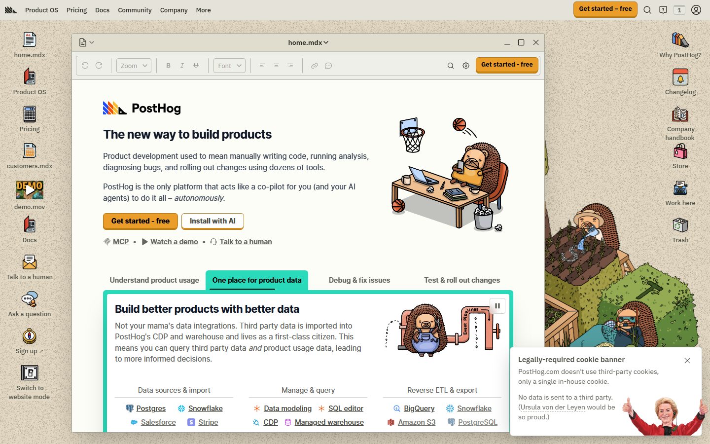
A playful skeuomorphic desktop-OS interface where the marketing site is dressed as a tan-canvas operating system — file icons line the edges, the main content sits inside a draggable "home.mdx" application window with title bar and toolbar chrome, and hand-drawn hedgehog illustrations supply brand warmth. Voltage comes from a single hot-orange CTA (#f54e00) against a warm beige (#e1d7c2) desktop, the rounded Open Runde display face, and the deliberately retro window-frame metaphor rather than from gradients or photography.
---
version: alpha
name: PostHog-design-analysis
description: A playful skeuomorphic desktop-OS interface where the marketing site is dressed as a tan-canvas operating system — file icons line the edges, the main content sits inside a draggable "home.mdx" application window with title bar and toolbar chrome, and hand-drawn hedgehog illustrations supply brand warmth. Voltage comes from a single hot-orange CTA (#f54e00) against a warm beige (#e1d7c2) desktop, the rounded Open Runde display face, and the deliberately retro window-frame metaphor rather than from gradients or photography.

colors:
  primary: "#f54e00"
  on-primary: "#000000"
  ink: "#374151"
  ink-strong: "#1a1a1a"
  ink-black: "#131316"
  body: "#4d4f46"
  muted: "#65675e"
  muted-soft: "#9ea096"
  link: "#23251d"
  accent-ink: "#111827"
  canvas: "#e1d7c2"
  surface: "#ffffff"
  surface-soft: "#eeefe9"
  surface-alt: "#e5e7e0"
  hairline: "#b6b7af"
  on-dark: "#ffffff"
  accent-purple: "#b62ad9"
  accent-amber: "#eb9d2a"
  accent-gold: "#cd8407"
  accent-yellow: "#f7a501"
  success: "#107a4d"

typography:
  h1:
    fontFamily: "Open Runde, system-ui, sans-serif"
    fontSize: 24px
    fontWeight: 800
    lineHeight: 1.333
    letterSpacing: -0.6px
  h2:
    fontFamily: "Open Runde, system-ui, sans-serif"
    fontSize: 21.43px
    fontWeight: 700
    lineHeight: 1.4
    letterSpacing: -0.535714px
  h3:
    fontFamily: "Open Runde, system-ui, sans-serif"
    fontSize: 19.29px
    fontWeight: 600
    lineHeight: 1.556
    letterSpacing: -0.482143px
  body:
    fontFamily: "Open Runde, system-ui, sans-serif"
    fontSize: 15px
    fontWeight: 400
    lineHeight: 1.5
    letterSpacing: normal
  button:
    fontFamily: "IBM Plex Sans Variable, system-ui, sans-serif"
    fontSize: 16px
    fontWeight: 400
    lineHeight: 1.5
    letterSpacing: normal

rounded:
  none: 0px
  xs: 2px
  sm: 4px
  md: 6px
  lg: 8px
  full: 9999px

spacing:
  xxs: 4px
  xs: 6px
  sm: 8px
  md: 12px
  lg: 16px
  xl: 24px
  xxl: 32px
  section: 64px

components:
  top-nav:
    backgroundColor: "{colors.canvas}"
    textColor: "{colors.ink}"
    typography: "{typography.body}"
  button-primary:
    backgroundColor: "{colors.primary}"
    textColor: "{colors.on-primary}"
    typography: "{typography.button}"
    rounded: "{rounded.none}"
    padding: 2px 0px
  button-secondary:
    backgroundColor: "{colors.surface}"
    textColor: "{colors.ink}"
    typography: "{typography.button}"
    rounded: "{rounded.none}"
    padding: 2px 0px
  window-card:
    backgroundColor: "{colors.surface}"
    textColor: "{colors.ink}"
    rounded: "{rounded.none}"
  window-title-bar:
    backgroundColor: "{colors.surface-soft}"
    textColor: "{colors.ink}"
    typography: "{typography.body}"
  window-toolbar:
    backgroundColor: "{colors.surface-soft}"
    textColor: "{colors.muted}"
    typography: "{typography.body}"
  card:
    backgroundColor: "{colors.surface}"
    textColor: "{colors.ink}"
    rounded: "{rounded.none}"
  tab:
    backgroundColor: transparent
    textColor: "{colors.muted}"
    typography: "{typography.body}"
  tab-active:
    backgroundColor: transparent
    textColor: "{colors.accent-ink}"
    typography: "{typography.body}"
  desktop-icon-label:
    backgroundColor: transparent
    textColor: "{colors.ink}"
    typography: "{typography.body}"
  inline-link:
    backgroundColor: transparent
    textColor: "{colors.link}"
    typography: "{typography.body}"
  cookie-banner:
    backgroundColor: "{colors.surface}"
    textColor: "{colors.ink}"
    typography: "{typography.body}"
    rounded: "{rounded.lg}"
  pill-badge:
    backgroundColor: "{colors.surface-alt}"
    textColor: "{colors.ink}"
    typography: "{typography.body}"
    rounded: "{rounded.full}"

---

## Overview

PostHog's marketing surface is one of the most distinctive on the web: the entire site is dressed as a **skeuomorphic desktop operating system**. A warm beige canvas (`{colors.canvas}` — #e1d7c2) plays the role of the desktop wallpaper, file-manager icons (home.mdx, Product OS, Pricing, customers.mdx, demo.mov, Docs) line the left and right edges like shortcuts, and the actual marketing content lives inside a draggable **"home.mdx" application window** — complete with a title bar, minimize/maximize/close buttons, and a document-editor toolbar (undo/redo, zoom, B/I/U, font selector). The aesthetic is deliberately retro-playful, reinforced by hand-drawn hedgehog illustrations scattered through the scene.

Brand voltage comes from exactly one hot color: **`{colors.primary}` (#f54e00)** — a saturated orange used only on the "Get started – free" CTA. Everything else is warm-neutral: greyed greens (`{colors.body}` — #4d4f46), slate ink (`{colors.ink}` — #374151), and tan/cream surfaces. The single window floats on the desktop with a deep drop shadow, which is the system's primary elevation device.

Type voice is **Open Runde** — a rounded, friendly geometric sans used for all headings and body copy — paired with **IBM Plex Sans Variable** on interactive button labels. Both are open-source faces (no licensed fonts were flagged), so the system ships exactly what it measures.

**Key Characteristics:**
- Beige "desktop" canvas (`{colors.canvas}` — #e1d7c2) with content rendered inside a window-chrome card (`{component.window-card}`) sitting on top of it.
- A single hot-orange CTA (`{colors.primary}` — #f54e00) with black label text (`{colors.on-primary}` — #000000). The orange appears nowhere else — it is the action signal.
- Open Runde rounded display type for h1–h3, with tight negative letter-spacing (-0.6px on h1) and a heavy 800 weight at the top of the scale.
- IBM Plex Sans Variable on button labels (`{typography.button}`) — a deliberate type-pairing break that mimics a real desktop app's UI font.
- Window chrome: title bar (`{component.window-title-bar}`), document toolbar (`{component.window-toolbar}`), and underlined tabs (`{component.tab-active}`) all reinforce the OS metaphor.
- Mostly sharp / minimal corners — measured button and card radius is `{rounded.none}` (0px), with small `{rounded.sm}`–`{rounded.md}` rounding on inner UI elements and `{rounded.full}` reserved for pill badges.
- Hand-drawn hedgehog illustrations supply warmth and personality in place of stock photography or gradients.
- Floating-window depth: the main content window carries a deep `0 25px 50px -12px rgba(0,0,0,0.25)` drop shadow.

## Colors

### Brand & Accent
- **Primary** (`{colors.primary}` — #f54e00): The signature hot orange. Reserved exclusively for the "Get started – free" CTA, in both the top nav and inside the window. Label text on it is black (`{colors.on-primary}`).
- **Accent Purple** (`{colors.accent-purple}` — #b62ad9), **Accent Amber** (`{colors.accent-amber}` — #eb9d2a), **Accent Gold** (`{colors.accent-gold}` — #cd8407), **Accent Yellow** (`{colors.accent-yellow}` — #f7a501): A small chromatic set appearing in the logomark, illustration accents, and integration-tile icons. These never appear on primary actions — they live inside illustrations and product-icon grids.
- **Success** (`{colors.success}` — #107a4d): A green used for positive/state callouts and inline product-UI accents.

### Surface
- **Canvas** (`{colors.canvas}` — #e1d7c2): The beige "desktop wallpaper" floor of every page.
- **Surface** (`{colors.surface}` — #ffffff): The application-window interior, cards, and the cookie banner.
- **Surface Soft** (`{colors.surface-soft}` — #eeefe9): Title-bar and toolbar chrome — a cream tone slightly off-white.
- **Surface Alt** (`{colors.surface-alt}` — #e5e7e0): Pill badges, soft section blocks, alternate fills.
- **Hairline** (`{colors.hairline}` — #b6b7af): The 1px divider tone for toolbar separators and table rows.

### Text
- **Ink** (`{colors.ink}` — #374151): Default heading and primary text color inside the window.
- **Ink Strong** (`{colors.ink-strong}` — #1a1a1a) / **Ink Black** (`{colors.ink-black}` — #131316): Near-black tones used for the heaviest h1 weight and high-contrast labels.
- **Body** (`{colors.body}` — #4d4f46): The most frequently measured tone — warm grey-green running text on the beige canvas.
- **Muted** (`{colors.muted}` — #65675e): Secondary text, toolbar labels, captions.
- **Muted Soft** (`{colors.muted-soft}` — #9ea096): Tertiary / disabled text and faint desktop-icon detail.
- **Link** (`{colors.link}` — #23251d): Inline links — kept near-black with underline rather than colored, preserving the monochrome reading layer.
- **Accent Ink** (`{colors.accent-ink}` — #111827): Active-tab and emphasized-label color — a cool near-black.
- **On Primary** (`{colors.on-primary}` — #000000): Text on the orange CTA.
- **On Dark** (`{colors.on-dark}` — #ffffff): Reserved for text on dark / saturated surfaces.

## Typography

### Font Family
The system runs **Open Runde** for all headings and body copy and **IBM Plex Sans Variable** for button labels. Open Runde is an open-source rounded geometric sans (a rounded derivative of Inter) — friendly, soft-cornered, and well-suited to PostHog's playful tone. IBM Plex Sans is IBM's open-source corporate humanist sans; using it on buttons reads as an intentional "system UI font" cue that supports the desktop-OS metaphor. Both ship as-is — no licensed substitutes are required.

The split is functional:
- Open Runde (headings 600–800, body 400) — h1, h2, h3, paragraphs, links, captions
- IBM Plex Sans Variable (400) — interactive button labels only

### Hierarchy

| Token | Size | Weight | Line Height | Letter Spacing | Use |
|---|---|---|---|---|---|
| `{typography.h1}` | 24px | 800 | 1.333 | -0.6px | Window headline ("The new way to build products") — Open Runde |
| `{typography.h2}` | 21.43px | 700 | 1.4 | -0.535714px | Section heads ("Build better products with better data") |
| `{typography.h3}` | 19.29px | 600 | 1.556 | -0.482143px | Sub-section heads, card titles |
| `{typography.body}` | 15px | 400 | 1.5 | normal | Running text, links, captions, nav items |
| `{typography.button}` | 16px | 400 | 1.5 | normal | Button / CTA labels — IBM Plex Sans Variable |

### Principles
The measured headings are relatively small (h1 at 24px) — this is a marketing surface that mimics a document editor, so headline scale stays restrained rather than billboard-sized. The heaviness (800 weight on h1) and tight negative tracking carry the emphasis instead of raw size. Open Runde's rounded terminals are central to the brand's friendly voice; never substitute a sharp grotesque. Keep body at weight 400 and let weight (not color) drive hierarchy, since the palette is near-monochrome.

### Note on Font Substitutes
No licensed typefaces were detected (`fonts_licensed` is empty). Both Open Runde and IBM Plex Sans are freely available open-source families and should be used directly. If Open Runde is unavailable, **Nunito** or **Quicksand** approximate its rounded geometric character; if IBM Plex Sans is unavailable, any neutral humanist sans (e.g. **Inter**) is a reasonable fallback for button labels.

## Layout

### Spacing System
- **Base unit:** 4px (with frequent 6px and 8px steps).
- **Tokens:** `{spacing.xxs}` 4px · `{spacing.xs}` 6px · `{spacing.sm}` 8px · `{spacing.md}` 12px · `{spacing.lg}` 16px · `{spacing.xl}` 24px · `{spacing.xxl}` 32px · `{spacing.section}` 64px.
- The most-measured increments are 4, 6, and 8px — a tight, UI-dense rhythm consistent with the document-editor aesthetic.
- A 17px value also appears frequently in measurement (derived from a ~1.1rem inset); it is treated here as a near-`{spacing.lg}` (16px) alias rather than a distinct token.
- **Section rhythm:** `{spacing.section}` (64px) is the largest measured spacing step and governs major vertical breaks.

### Grid & Container
- The marketing content is bounded by the **application window** rather than a fluid full-width grid — the window is the container, centered on the beige desktop with icon rails on either side.
- Inside the window, content uses a single editorial column with multi-column sub-grids (e.g. the "Data sources / Manage & query / Reverse ETL" 3-up integration grid).
- Desktop file-icon rails flank the window left and right at desktop widths.

### Whitespace Philosophy
The window interior uses comfortable but compact spacing — this is a deliberately "app-like" density, not airy marketing whitespace. The beige desktop margin around the window provides the breathing room; the window itself packs content efficiently.

## Elevation & Depth

| Level | Treatment | Use |
|---|---|---|
| Desktop floor | Flat beige `{colors.canvas}`, no shadow | Wallpaper layer holding the icons |
| Floating window | `0 25px 50px -12px rgba(0,0,0,0.25)` | The main "home.mdx" application window and modal-like cards (measured, frequency 3) |
| Focus glow | `0 0 6px 2px rgba(255,255,255,0.4)` | A soft white glow used as a highlight/focus accent (measured, frequency 1) |
| Flat content | No shadow, no border | Cards inside the window (`{component.card}` measured shadow: none) |

The elevation philosophy is **single-object floating** — the entire content window casts one deep, soft drop shadow to sell the "floating app on a desktop" illusion. Content *inside* the window is flat, relying on the window frame and hairline dividers for structure rather than per-card shadows.

### Decorative Depth
- Hand-drawn hedgehog illustrations (basketball-playing, machine-cranking) supply spatial depth and personality without photographic shadow systems.
- Window chrome (title bar, toolbar, traffic-light buttons) is the primary depth metaphor — depth here is *narrative* (it looks like an app) more than literal layering.

## Shapes

### Border Radius Scale

| Token | Value | Use |
|---|---|---|
| `{rounded.none}` | 0px | Measured radius of buttons (`{component.button-primary}`) and cards (`{component.card}`) — sharp window-content edges |
| `{rounded.xs}` | 2px | Tiny inner-UI rounding (toolbar controls) |
| `{rounded.sm}` | 4px | Most common small rounding — inputs, tiles, integration chips |
| `{rounded.md}` | 6px | Buttons / chips with visible softening |
| `{rounded.lg}` | 8px | Larger blocks, cookie banner |
| `{rounded.full}` | 9999px | Pill badges, circular controls |

The radius system is mixed-mode: the headline content cards and primary button measured as fully square (0px), reinforcing the document-window look, while smaller interior UI controls carry gentle 2–6px rounding. `{rounded.full}` is reserved for pills and circular elements.

### Photography Geometry
There is no stock photography — the system uses **flat hand-drawn illustrations** with no enforced crop geometry. Illustrations sit directly on the canvas or window interior without containing frames.

## Components

### Desktop & Window Chrome

**`top-nav`** — The OS menu bar pinned to the very top of the page. Background matches the desktop `{colors.canvas}`, ink text in `{typography.body}`. Carries the PostHog hedgehog logomark at far left, primary menu items (Product OS, Pricing, Docs, Community, Company, More) center-left, and a right cluster with search, notifications, account, and the orange `{component.button-primary}` ("Get started – free").

**`window-card`** — The marquee container: the "home.mdx" application window. Background `{colors.surface}` (#ffffff), square corners (`{rounded.none}`), and the deep floating drop shadow. All marketing content lives inside it.

**`window-title-bar`** — The window's top bar showing the document name ("home.mdx") centered, with minimize/maximize/close controls at right and a file menu at left. Background `{colors.surface-soft}`, text `{colors.ink}`.

**`window-toolbar`** — A faux document-editor toolbar beneath the title bar: undo/redo, zoom dropdown, B/I/U, font selector, alignment, link/comment, search, settings, and a repeated orange CTA. Background `{colors.surface-soft}`, controls in `{colors.muted}`. Purely decorative-metaphorical — it sells the "editing a document" concept.

**`desktop-icon-label`** — File-manager icon labels lining the left/right desktop rails (Product OS, Pricing, customers.mdx, demo.mov, Docs, Trash, etc.). Transparent background, `{colors.ink}` label text in `{typography.body}`.

### Buttons

**`button-primary`** — The signature CTA. Background `{colors.primary}` (#f54e00), label `{colors.on-primary}` (#000000) in `{typography.button}` (IBM Plex Sans 16px). Measured radius `{rounded.none}` and padding `2px 0px` (see Known Gaps — padding is a measurement artifact; the rendered button has fuller internal padding). Appears in the top nav, the window toolbar, and inside the hero ("Get started - free").

**`button-secondary`** — The neutral alternative ("Install with AI"). Background `{colors.surface}` (white), text `{colors.ink}`, same typography and square framing as primary, distinguished by a hairline outline.

### Content

**`card`** — Generic content block inside the window. Background `{colors.surface}`, square corners (`{rounded.none}`), no shadow (measured). Holds feature copy, integration grids, and product fragments. Structure comes from hairline dividers and column labels rather than elevation.

**`tab`** / **`tab-active`** — The horizontal feature switcher ("Understand product usage", "One place for product data", "Debug & fix issues", "Test & roll out changes"). Inactive tabs use `{colors.muted}` text on transparent background; the active tab uses `{colors.accent-ink}` text with an underline indicator, both in `{typography.body}`.

**`inline-link`** — Inline text links (MCP, Watch a demo, Talk to a human, integration names). Text `{colors.link}` (#23251d) — near-black with underline rather than a colored link tone.

**`pill-badge`** — Small rounded-full label/tag. Background `{colors.surface-alt}`, text `{colors.ink}`, `{rounded.full}`.

### Overlays

**`cookie-banner`** — The bottom-right "Legally-required cookie banner" card with PostHog's signature copy. Background `{colors.surface}` (white), ink text, rounded `{rounded.lg}`, accompanied by a hand-drawn illustration. Includes a close control at top-right.

## Do's and Don'ts

### Do
- Reserve `{colors.primary}` (#f54e00) for the single primary CTA. The orange is the only hot color — its scarcity is what makes it read as "the action".
- Render the marketing content inside the window-chrome metaphor (`{component.window-card}` + `{component.window-title-bar}` + `{component.window-toolbar}`). The OS framing is the brand.
- Keep the beige desktop canvas (`{colors.canvas}`) as the page floor and let the white window float on it with the deep drop shadow.
- Use Open Runde for all headings and body; reserve IBM Plex Sans Variable for button labels only.
- Drive heading emphasis with weight (up to 800) and tight tracking, not large type sizes — the editor metaphor keeps headlines small.
- Lean on hand-drawn hedgehog illustrations for warmth instead of stock photography or gradients.
- Keep inline links near-black (`{colors.link}`) with underlines rather than coloring them.

### Don't
- Don't introduce a second saturated CTA color. The accents (purple, amber, gold, yellow) belong to illustrations and product-icon grids, never to primary buttons.
- Don't add per-card drop shadows inside the window — interior content is flat; only the window itself floats.
- Don't swap Open Runde for a sharp grotesque; the rounded terminals are core to the voice.
- Don't blow up headline sizes to billboard scale — the document-editor density caps the hierarchy.
- Don't blur the type pairing: never set body in IBM Plex Sans or button labels in Open Runde.
- Don't break the desktop-OS frame on marketing pages — the icons, title bar, and toolbar are the identity, not decoration.

## Responsive Behavior

The analysis captured desktop renders only; the following reflects observed desktop structure and standard collapse logic for the metaphor. Mobile breakpoints were not measured (see Known Gaps).

### Breakpoints (inferred)

| Name | Width | Key Changes |
|---|---|---|
| Mobile | < 768px | Desktop icon rails drop; the window expands to full bleed; top-nav collapses to a menu trigger; multi-column integration grids stack 1-up |
| Tablet | 768–1024px | One icon rail may persist; window narrows; feature grids reduce to 2-up |
| Desktop | > 1024px | Full desktop metaphor: both icon rails, floating window centered, 3-up integration grids, full top-nav |

### Touch Targets
- `{component.button-primary}` and `{component.button-secondary}` should meet a 44px minimum effective tap height (the measured `2px 0px` padding is an extraction artifact, not the rendered size).
- Window title-bar controls (minimize/maximize/close) and toolbar icons are small at desktop and would need enlargement for touch.

### Collapsing Strategy
- The desktop icon rails are the first elements to drop on narrow screens.
- The application window transitions from "floating object with margin" to near-full-bleed.
- Integration grids collapse column count rather than scaling tiles.

## Iteration Guide

1. Focus on ONE component at a time. Reference its YAML key directly (`{component.window-card}`, `{component.button-primary}`).
2. Variants live as separate `components:` entries (e.g. `tab` vs `tab-active`).
3. Use `{token.refs}` everywhere — never inline a hex in a component.
4. Never document hover. Default and active/pressed states only.
5. The orange CTA is the only hot color — keep it scarce.
6. Preserve the desktop-OS metaphor: the window chrome is not optional decoration, it is the brand system.
7. When in doubt about emphasis: heavier Open Runde and tighter tracking before larger type.

## Known Gaps

- **Button radius and padding are suspect.** The measured `{component.button-primary}` reported `radius: 0px` and `padding: 2px 0px` — the padding in particular is almost certainly a capture artifact (the rendered CTA has substantial internal padding and likely a small radius). Treat button geometry as ground-truth-from-screenshot, not from the measured numbers.
- **No mobile/tablet captures.** Only desktop renders were analyzed; all responsive behavior above is inferred from the desktop structure and the OS metaphor.
- **Footer not captured.** No footer surface appears in the analyzed pages; its tokens are unknown.
- **Dark mode unknown.** PostHog ships a dark theme on the live site, but no dark-surface tokens were measured here.
- **Accent color roles are approximate.** The purple/amber/gold/yellow accents (`#b62ad9`, `#eb9d2a`, `#cd8407`, `#f7a501`) were measured at low frequency and assigned to illustrations/product icons by inference; their precise semantic roles are not confirmed.
- **The 17px spacing value** appears frequently in measurement and is treated here as a ~16px alias; whether it is an intentional distinct token is unconfirmed.
- **Pricing and product-analytics page specifics** were captured but their unique components (pricing tables, calculators, comparison grids) are not individually documented — only shared system tokens are covered.
- **Animation/transition timings** (tab switching, window interactions, the play/pause control on illustrations) are out of scope.

<!-- Documented by duply · real-world design systems as ready-to-use DESIGN.md for AI coding agents · https://duply.ai/posthog/design-md -->
Color Palette
Accent
Neutrals
Typography
h124px · 800 · 1.333
The quick brown fox jumpsh221.43px · 700 · 1.4
The quick brown fox jumpsh319.29px · 600 · 1.556
The quick brown fox jumpsbody15px · 400 · 1.5
The quick brown fox jumpsbutton16px · 400 · 1.5
The quick brown fox jumpsSpacing & Shape
Spacing
| Name | Value | Preview |
|---|---|---|
| xxs | 4px | |
| xs | 6px | |
| sm | 8px | |
| md | 12px | |
| lg | 16px | |
| xl | 24px | |
| xxl | 32px | |
| section | 64px |
Border Radius
| Name | Value | Preview |
|---|---|---|
| none | 0px | |
| xs | 2px | |
| sm | 4px | |
| md | 6px | |
| lg | 8px | |
| full | 9999px |
More like this


---
version: alpha
name: PostHog-design-analysis
description: A playful skeuomorphic desktop-OS interface where the marketing site is dressed as a tan-canvas operating system — file icons line the edges, the main content sits inside a draggable "home.mdx" application window with title bar and toolbar chrome, and hand-drawn hedgehog illustrations supply brand warmth. Voltage comes from a single hot-orange CTA (#f54e00) against a warm beige (#e1d7c2) desktop, the rounded Open Runde display face, and the deliberately retro window-frame metaphor rather than from gradients or photography.

colors:
  primary: "#f54e00"
  on-primary: "#000000"
  ink: "#374151"
  ink-strong: "#1a1a1a"
  ink-black: "#131316"
  body: "#4d4f46"
  muted: "#65675e"
  muted-soft: "#9ea096"
  link: "#23251d"
  accent-ink: "#111827"
  canvas: "#e1d7c2"
  surface: "#ffffff"
  surface-soft: "#eeefe9"
  surface-alt: "#e5e7e0"
  hairline: "#b6b7af"
  on-dark: "#ffffff"
  accent-purple: "#b62ad9"
  accent-amber: "#eb9d2a"
  accent-gold: "#cd8407"
  accent-yellow: "#f7a501"
  success: "#107a4d"

typography:
  h1:
    fontFamily: "Open Runde, system-ui, sans-serif"
    fontSize: 24px
    fontWeight: 800
    lineHeight: 1.333
    letterSpacing: -0.6px
  h2:
    fontFamily: "Open Runde, system-ui, sans-serif"
    fontSize: 21.43px
    fontWeight: 700
    lineHeight: 1.4
    letterSpacing: -0.535714px
  h3:
    fontFamily: "Open Runde, system-ui, sans-serif"
    fontSize: 19.29px
    fontWeight: 600
    lineHeight: 1.556
    letterSpacing: -0.482143px
  body:
    fontFamily: "Open Runde, system-ui, sans-serif"
    fontSize: 15px
    fontWeight: 400
    lineHeight: 1.5
    letterSpacing: normal
  button:
    fontFamily: "IBM Plex Sans Variable, system-ui, sans-serif"
    fontSize: 16px
    fontWeight: 400
    lineHeight: 1.5
    letterSpacing: normal

rounded:
  none: 0px
  xs: 2px
  sm: 4px
  md: 6px
  lg: 8px
  full: 9999px

spacing:
  xxs: 4px
  xs: 6px
  sm: 8px
  md: 12px
  lg: 16px
  xl: 24px
  xxl: 32px
  section: 64px

components:
  top-nav:
    backgroundColor: "{colors.canvas}"
    textColor: "{colors.ink}"
    typography: "{typography.body}"
  button-primary:
    backgroundColor: "{colors.primary}"
    textColor: "{colors.on-primary}"
    typography: "{typography.button}"
    rounded: "{rounded.none}"
    padding: 2px 0px
  button-secondary:
    backgroundColor: "{colors.surface}"
    textColor: "{colors.ink}"
    typography: "{typography.button}"
    rounded: "{rounded.none}"
    padding: 2px 0px
  window-card:
    backgroundColor: "{colors.surface}"
    textColor: "{colors.ink}"
    rounded: "{rounded.none}"
  window-title-bar:
    backgroundColor: "{colors.surface-soft}"
    textColor: "{colors.ink}"
    typography: "{typography.body}"
  window-toolbar:
    backgroundColor: "{colors.surface-soft}"
    textColor: "{colors.muted}"
    typography: "{typography.body}"
  card:
    backgroundColor: "{colors.surface}"
    textColor: "{colors.ink}"
    rounded: "{rounded.none}"
  tab:
    backgroundColor: transparent
    textColor: "{colors.muted}"
    typography: "{typography.body}"
  tab-active:
    backgroundColor: transparent
    textColor: "{colors.accent-ink}"
    typography: "{typography.body}"
  desktop-icon-label:
    backgroundColor: transparent
    textColor: "{colors.ink}"
    typography: "{typography.body}"
  inline-link:
    backgroundColor: transparent
    textColor: "{colors.link}"
    typography: "{typography.body}"
  cookie-banner:
    backgroundColor: "{colors.surface}"
    textColor: "{colors.ink}"
    typography: "{typography.body}"
    rounded: "{rounded.lg}"
  pill-badge:
    backgroundColor: "{colors.surface-alt}"
    textColor: "{colors.ink}"
    typography: "{typography.body}"
    rounded: "{rounded.full}"

---

## Overview

PostHog's marketing surface is one of the most distinctive on the web: the entire site is dressed as a **skeuomorphic desktop operating system**. A warm beige canvas (`{colors.canvas}` — #e1d7c2) plays the role of the desktop wallpaper, file-manager icons (home.mdx, Product OS, Pricing, customers.mdx, demo.mov, Docs) line the left and right edges like shortcuts, and the actual marketing content lives inside a draggable **"home.mdx" application window** — complete with a title bar, minimize/maximize/close buttons, and a document-editor toolbar (undo/redo, zoom, B/I/U, font selector). The aesthetic is deliberately retro-playful, reinforced by hand-drawn hedgehog illustrations scattered through the scene.

Brand voltage comes from exactly one hot color: **`{colors.primary}` (#f54e00)** — a saturated orange used only on the "Get started – free" CTA. Everything else is warm-neutral: greyed greens (`{colors.body}` — #4d4f46), slate ink (`{colors.ink}` — #374151), and tan/cream surfaces. The single window floats on the desktop with a deep drop shadow, which is the system's primary elevation device.

Type voice is **Open Runde** — a rounded, friendly geometric sans used for all headings and body copy — paired with **IBM Plex Sans Variable** on interactive button labels. Both are open-source faces (no licensed fonts were flagged), so the system ships exactly what it measures.

**Key Characteristics:**
- Beige "desktop" canvas (`{colors.canvas}` — #e1d7c2) with content rendered inside a window-chrome card (`{component.window-card}`) sitting on top of it.
- A single hot-orange CTA (`{colors.primary}` — #f54e00) with black label text (`{colors.on-primary}` — #000000). The orange appears nowhere else — it is the action signal.
- Open Runde rounded display type for h1–h3, with tight negative letter-spacing (-0.6px on h1) and a heavy 800 weight at the top of the scale.
- IBM Plex Sans Variable on button labels (`{typography.button}`) — a deliberate type-pairing break that mimics a real desktop app's UI font.
- Window chrome: title bar (`{component.window-title-bar}`), document toolbar (`{component.window-toolbar}`), and underlined tabs (`{component.tab-active}`) all reinforce the OS metaphor.
- Mostly sharp / minimal corners — measured button and card radius is `{rounded.none}` (0px), with small `{rounded.sm}`–`{rounded.md}` rounding on inner UI elements and `{rounded.full}` reserved for pill badges.
- Hand-drawn hedgehog illustrations supply warmth and personality in place of stock photography or gradients.
- Floating-window depth: the main content window carries a deep `0 25px 50px -12px rgba(0,0,0,0.25)` drop shadow.

## Colors

### Brand & Accent
- **Primary** (`{colors.primary}` — #f54e00): The signature hot orange. Reserved exclusively for the "Get started – free" CTA, in both the top nav and inside the window. Label text on it is black (`{colors.on-primary}`).
- **Accent Purple** (`{colors.accent-purple}` — #b62ad9), **Accent Amber** (`{colors.accent-amber}` — #eb9d2a), **Accent Gold** (`{colors.accent-gold}` — #cd8407), **Accent Yellow** (`{colors.accent-yellow}` — #f7a501): A small chromatic set appearing in the logomark, illustration accents, and integration-tile icons. These never appear on primary actions — they live inside illustrations and product-icon grids.
- **Success** (`{colors.success}` — #107a4d): A green used for positive/state callouts and inline product-UI accents.

### Surface
- **Canvas** (`{colors.canvas}` — #e1d7c2): The beige "desktop wallpaper" floor of every page.
- **Surface** (`{colors.surface}` — #ffffff): The application-window interior, cards, and the cookie banner.
- **Surface Soft** (`{colors.surface-soft}` — #eeefe9): Title-bar and toolbar chrome — a cream tone slightly off-white.
- **Surface Alt** (`{colors.surface-alt}` — #e5e7e0): Pill badges, soft section blocks, alternate fills.
- **Hairline** (`{colors.hairline}` — #b6b7af): The 1px divider tone for toolbar separators and table rows.

### Text
- **Ink** (`{colors.ink}` — #374151): Default heading and primary text color inside the window.
- **Ink Strong** (`{colors.ink-strong}` — #1a1a1a) / **Ink Black** (`{colors.ink-black}` — #131316): Near-black tones used for the heaviest h1 weight and high-contrast labels.
- **Body** (`{colors.body}` — #4d4f46): The most frequently measured tone — warm grey-green running text on the beige canvas.
- **Muted** (`{colors.muted}` — #65675e): Secondary text, toolbar labels, captions.
- **Muted Soft** (`{colors.muted-soft}` — #9ea096): Tertiary / disabled text and faint desktop-icon detail.
- **Link** (`{colors.link}` — #23251d): Inline links — kept near-black with underline rather than colored, preserving the monochrome reading layer.
- **Accent Ink** (`{colors.accent-ink}` — #111827): Active-tab and emphasized-label color — a cool near-black.
- **On Primary** (`{colors.on-primary}` — #000000): Text on the orange CTA.
- **On Dark** (`{colors.on-dark}` — #ffffff): Reserved for text on dark / saturated surfaces.

## Typography

### Font Family
The system runs **Open Runde** for all headings and body copy and **IBM Plex Sans Variable** for button labels. Open Runde is an open-source rounded geometric sans (a rounded derivative of Inter) — friendly, soft-cornered, and well-suited to PostHog's playful tone. IBM Plex Sans is IBM's open-source corporate humanist sans; using it on buttons reads as an intentional "system UI font" cue that supports the desktop-OS metaphor. Both ship as-is — no licensed substitutes are required.

The split is functional:
- Open Runde (headings 600–800, body 400) — h1, h2, h3, paragraphs, links, captions
- IBM Plex Sans Variable (400) — interactive button labels only

### Hierarchy

| Token | Size | Weight | Line Height | Letter Spacing | Use |
|---|---|---|---|---|---|
| `{typography.h1}` | 24px | 800 | 1.333 | -0.6px | Window headline ("The new way to build products") — Open Runde |
| `{typography.h2}` | 21.43px | 700 | 1.4 | -0.535714px | Section heads ("Build better products with better data") |
| `{typography.h3}` | 19.29px | 600 | 1.556 | -0.482143px | Sub-section heads, card titles |
| `{typography.body}` | 15px | 400 | 1.5 | normal | Running text, links, captions, nav items |
| `{typography.button}` | 16px | 400 | 1.5 | normal | Button / CTA labels — IBM Plex Sans Variable |

### Principles
The measured headings are relatively small (h1 at 24px) — this is a marketing surface that mimics a document editor, so headline scale stays restrained rather than billboard-sized. The heaviness (800 weight on h1) and tight negative tracking carry the emphasis instead of raw size. Open Runde's rounded terminals are central to the brand's friendly voice; never substitute a sharp grotesque. Keep body at weight 400 and let weight (not color) drive hierarchy, since the palette is near-monochrome.

### Note on Font Substitutes
No licensed typefaces were detected (`fonts_licensed` is empty). Both Open Runde and IBM Plex Sans are freely available open-source families and should be used directly. If Open Runde is unavailable, **Nunito** or **Quicksand** approximate its rounded geometric character; if IBM Plex Sans is unavailable, any neutral humanist sans (e.g. **Inter**) is a reasonable fallback for button labels.

## Layout

### Spacing System
- **Base unit:** 4px (with frequent 6px and 8px steps).
- **Tokens:** `{spacing.xxs}` 4px · `{spacing.xs}` 6px · `{spacing.sm}` 8px · `{spacing.md}` 12px · `{spacing.lg}` 16px · `{spacing.xl}` 24px · `{spacing.xxl}` 32px · `{spacing.section}` 64px.
- The most-measured increments are 4, 6, and 8px — a tight, UI-dense rhythm consistent with the document-editor aesthetic.
- A 17px value also appears frequently in measurement (derived from a ~1.1rem inset); it is treated here as a near-`{spacing.lg}` (16px) alias rather than a distinct token.
- **Section rhythm:** `{spacing.section}` (64px) is the largest measured spacing step and governs major vertical breaks.

### Grid & Container
- The marketing content is bounded by the **application window** rather than a fluid full-width grid — the window is the container, centered on the beige desktop with icon rails on either side.
- Inside the window, content uses a single editorial column with multi-column sub-grids (e.g. the "Data sources / Manage & query / Reverse ETL" 3-up integration grid).
- Desktop file-icon rails flank the window left and right at desktop widths.

### Whitespace Philosophy
The window interior uses comfortable but compact spacing — this is a deliberately "app-like" density, not airy marketing whitespace. The beige desktop margin around the window provides the breathing room; the window itself packs content efficiently.

## Elevation & Depth

| Level | Treatment | Use |
|---|---|---|
| Desktop floor | Flat beige `{colors.canvas}`, no shadow | Wallpaper layer holding the icons |
| Floating window | `0 25px 50px -12px rgba(0,0,0,0.25)` | The main "home.mdx" application window and modal-like cards (measured, frequency 3) |
| Focus glow | `0 0 6px 2px rgba(255,255,255,0.4)` | A soft white glow used as a highlight/focus accent (measured, frequency 1) |
| Flat content | No shadow, no border | Cards inside the window (`{component.card}` measured shadow: none) |

The elevation philosophy is **single-object floating** — the entire content window casts one deep, soft drop shadow to sell the "floating app on a desktop" illusion. Content *inside* the window is flat, relying on the window frame and hairline dividers for structure rather than per-card shadows.

### Decorative Depth
- Hand-drawn hedgehog illustrations (basketball-playing, machine-cranking) supply spatial depth and personality without photographic shadow systems.
- Window chrome (title bar, toolbar, traffic-light buttons) is the primary depth metaphor — depth here is *narrative* (it looks like an app) more than literal layering.

## Shapes

### Border Radius Scale

| Token | Value | Use |
|---|---|---|
| `{rounded.none}` | 0px | Measured radius of buttons (`{component.button-primary}`) and cards (`{component.card}`) — sharp window-content edges |
| `{rounded.xs}` | 2px | Tiny inner-UI rounding (toolbar controls) |
| `{rounded.sm}` | 4px | Most common small rounding — inputs, tiles, integration chips |
| `{rounded.md}` | 6px | Buttons / chips with visible softening |
| `{rounded.lg}` | 8px | Larger blocks, cookie banner |
| `{rounded.full}` | 9999px | Pill badges, circular controls |

The radius system is mixed-mode: the headline content cards and primary button measured as fully square (0px), reinforcing the document-window look, while smaller interior UI controls carry gentle 2–6px rounding. `{rounded.full}` is reserved for pills and circular elements.

### Photography Geometry
There is no stock photography — the system uses **flat hand-drawn illustrations** with no enforced crop geometry. Illustrations sit directly on the canvas or window interior without containing frames.

## Components

### Desktop & Window Chrome

**`top-nav`** — The OS menu bar pinned to the very top of the page. Background matches the desktop `{colors.canvas}`, ink text in `{typography.body}`. Carries the PostHog hedgehog logomark at far left, primary menu items (Product OS, Pricing, Docs, Community, Company, More) center-left, and a right cluster with search, notifications, account, and the orange `{component.button-primary}` ("Get started – free").

**`window-card`** — The marquee container: the "home.mdx" application window. Background `{colors.surface}` (#ffffff), square corners (`{rounded.none}`), and the deep floating drop shadow. All marketing content lives inside it.

**`window-title-bar`** — The window's top bar showing the document name ("home.mdx") centered, with minimize/maximize/close controls at right and a file menu at left. Background `{colors.surface-soft}`, text `{colors.ink}`.

**`window-toolbar`** — A faux document-editor toolbar beneath the title bar: undo/redo, zoom dropdown, B/I/U, font selector, alignment, link/comment, search, settings, and a repeated orange CTA. Background `{colors.surface-soft}`, controls in `{colors.muted}`. Purely decorative-metaphorical — it sells the "editing a document" concept.

**`desktop-icon-label`** — File-manager icon labels lining the left/right desktop rails (Product OS, Pricing, customers.mdx, demo.mov, Docs, Trash, etc.). Transparent background, `{colors.ink}` label text in `{typography.body}`.

### Buttons

**`button-primary`** — The signature CTA. Background `{colors.primary}` (#f54e00), label `{colors.on-primary}` (#000000) in `{typography.button}` (IBM Plex Sans 16px). Measured radius `{rounded.none}` and padding `2px 0px` (see Known Gaps — padding is a measurement artifact; the rendered button has fuller internal padding). Appears in the top nav, the window toolbar, and inside the hero ("Get started - free").

**`button-secondary`** — The neutral alternative ("Install with AI"). Background `{colors.surface}` (white), text `{colors.ink}`, same typography and square framing as primary, distinguished by a hairline outline.

### Content

**`card`** — Generic content block inside the window. Background `{colors.surface}`, square corners (`{rounded.none}`), no shadow (measured). Holds feature copy, integration grids, and product fragments. Structure comes from hairline dividers and column labels rather than elevation.

**`tab`** / **`tab-active`** — The horizontal feature switcher ("Understand product usage", "One place for product data", "Debug & fix issues", "Test & roll out changes"). Inactive tabs use `{colors.muted}` text on transparent background; the active tab uses `{colors.accent-ink}` text with an underline indicator, both in `{typography.body}`.

**`inline-link`** — Inline text links (MCP, Watch a demo, Talk to a human, integration names). Text `{colors.link}` (#23251d) — near-black with underline rather than a colored link tone.

**`pill-badge`** — Small rounded-full label/tag. Background `{colors.surface-alt}`, text `{colors.ink}`, `{rounded.full}`.

### Overlays

**`cookie-banner`** — The bottom-right "Legally-required cookie banner" card with PostHog's signature copy. Background `{colors.surface}` (white), ink text, rounded `{rounded.lg}`, accompanied by a hand-drawn illustration. Includes a close control at top-right.

## Do's and Don'ts

### Do
- Reserve `{colors.primary}` (#f54e00) for the single primary CTA. The orange is the only hot color — its scarcity is what makes it read as "the action".
- Render the marketing content inside the window-chrome metaphor (`{component.window-card}` + `{component.window-title-bar}` + `{component.window-toolbar}`). The OS framing is the brand.
- Keep the beige desktop canvas (`{colors.canvas}`) as the page floor and let the white window float on it with the deep drop shadow.
- Use Open Runde for all headings and body; reserve IBM Plex Sans Variable for button labels only.
- Drive heading emphasis with weight (up to 800) and tight tracking, not large type sizes — the editor metaphor keeps headlines small.
- Lean on hand-drawn hedgehog illustrations for warmth instead of stock photography or gradients.
- Keep inline links near-black (`{colors.link}`) with underlines rather than coloring them.

### Don't
- Don't introduce a second saturated CTA color. The accents (purple, amber, gold, yellow) belong to illustrations and product-icon grids, never to primary buttons.
- Don't add per-card drop shadows inside the window — interior content is flat; only the window itself floats.
- Don't swap Open Runde for a sharp grotesque; the rounded terminals are core to the voice.
- Don't blow up headline sizes to billboard scale — the document-editor density caps the hierarchy.
- Don't blur the type pairing: never set body in IBM Plex Sans or button labels in Open Runde.
- Don't break the desktop-OS frame on marketing pages — the icons, title bar, and toolbar are the identity, not decoration.

## Responsive Behavior

The analysis captured desktop renders only; the following reflects observed desktop structure and standard collapse logic for the metaphor. Mobile breakpoints were not measured (see Known Gaps).

### Breakpoints (inferred)

| Name | Width | Key Changes |
|---|---|---|
| Mobile | < 768px | Desktop icon rails drop; the window expands to full bleed; top-nav collapses to a menu trigger; multi-column integration grids stack 1-up |
| Tablet | 768–1024px | One icon rail may persist; window narrows; feature grids reduce to 2-up |
| Desktop | > 1024px | Full desktop metaphor: both icon rails, floating window centered, 3-up integration grids, full top-nav |

### Touch Targets
- `{component.button-primary}` and `{component.button-secondary}` should meet a 44px minimum effective tap height (the measured `2px 0px` padding is an extraction artifact, not the rendered size).
- Window title-bar controls (minimize/maximize/close) and toolbar icons are small at desktop and would need enlargement for touch.

### Collapsing Strategy
- The desktop icon rails are the first elements to drop on narrow screens.
- The application window transitions from "floating object with margin" to near-full-bleed.
- Integration grids collapse column count rather than scaling tiles.

## Iteration Guide

1. Focus on ONE component at a time. Reference its YAML key directly (`{component.window-card}`, `{component.button-primary}`).
2. Variants live as separate `components:` entries (e.g. `tab` vs `tab-active`).
3. Use `{token.refs}` everywhere — never inline a hex in a component.
4. Never document hover. Default and active/pressed states only.
5. The orange CTA is the only hot color — keep it scarce.
6. Preserve the desktop-OS metaphor: the window chrome is not optional decoration, it is the brand system.
7. When in doubt about emphasis: heavier Open Runde and tighter tracking before larger type.

## Known Gaps

- **Button radius and padding are suspect.** The measured `{component.button-primary}` reported `radius: 0px` and `padding: 2px 0px` — the padding in particular is almost certainly a capture artifact (the rendered CTA has substantial internal padding and likely a small radius). Treat button geometry as ground-truth-from-screenshot, not from the measured numbers.
- **No mobile/tablet captures.** Only desktop renders were analyzed; all responsive behavior above is inferred from the desktop structure and the OS metaphor.
- **Footer not captured.** No footer surface appears in the analyzed pages; its tokens are unknown.
- **Dark mode unknown.** PostHog ships a dark theme on the live site, but no dark-surface tokens were measured here.
- **Accent color roles are approximate.** The purple/amber/gold/yellow accents (`#b62ad9`, `#eb9d2a`, `#cd8407`, `#f7a501`) were measured at low frequency and assigned to illustrations/product icons by inference; their precise semantic roles are not confirmed.
- **The 17px spacing value** appears frequently in measurement and is treated here as a ~16px alias; whether it is an intentional distinct token is unconfirmed.
- **Pricing and product-analytics page specifics** were captured but their unique components (pricing tables, calculators, comparison grids) are not individually documented — only shared system tokens are covered.
- **Animation/transition timings** (tab switching, window interactions, the play/pause control on illustrations) are out of scope.

<!-- Documented by duply · real-world design systems as ready-to-use DESIGN.md for AI coding agents · https://duply.ai/posthog/design-md -->