Phantom
A full-bleed, edge-to-edge gallery interface for a technology-led creative agency, built on a pure-black canvas (#000000) where rounded-corner project tiles tile the entire viewport like a contact sheet. The system is near-monochrome — black ground, white text and floating white pill controls — punctuated by saturated accent greens, teals, and orange that surface only inside project artwork. Typography is a single confident grotesque (Helvetica Now) used at a tight, oversized display weight, and the UI chrome (floating nav pill, "Let's Talk" pill, cookie card) hovers above the gallery as soft white capsules.
---
version: alpha
name: Phantom-design-analysis
description: A full-bleed, edge-to-edge gallery interface for a technology-led creative agency, built on a pure-black canvas (#000000) where rounded-corner project tiles tile the entire viewport like a contact sheet. The system is near-monochrome — black ground, white text and floating white pill controls — punctuated by saturated accent greens, teals, and orange that surface only inside project artwork. Typography is a single confident grotesque (Helvetica Now) used at a tight, oversized display weight, and the UI chrome (floating nav pill, "Let's Talk" pill, cookie card) hovers above the gallery as soft white capsules.
colors:
canvas: "#000000"
ink: "#000000"
on-dark: "#ffffff"
surface-light: "#ffffff"
neutral-dark: "#222222"
muted: "#929292"
accent-orange: "#ff6b00"
accent-teal: "#50baa3"
accent-green: "#1eff66"
accent-mint: "#a1f4e2"
accent-cyan: "#03fdc7"
typography:
display:
fontFamily: "Helvetica Now, Helvetica Neue, Arial, sans-serif"
fontSize: 56px
fontWeight: 700
lineHeight: 0.929
letterSpacing: normal
button:
fontFamily: "Helvetica Now, Helvetica Neue, Arial, sans-serif"
fontSize: 14px
fontWeight: 500
lineHeight: 1.1
letterSpacing: normal
rounded:
md: 14px
lg: 32px
xl: 40px
xxl: 48px
spacing:
xs: 8px
sm: 16px
md: 24px
lg: 32px
xl: 40px
components:
gallery-tile:
backgroundColor: "{colors.canvas}"
textColor: "{colors.on-dark}"
typography: "{typography.button}"
rounded: "{rounded.md}"
padding: 16px
tile-meta-label:
backgroundColor: transparent
textColor: "{colors.on-dark}"
typography: "{typography.button}"
nav-pill-bar:
backgroundColor: "{colors.surface-light}"
textColor: "{colors.ink}"
typography: "{typography.button}"
rounded: "{rounded.xxl}"
padding: 16px 32px
button-primary:
backgroundColor: "{colors.surface-light}"
textColor: "{colors.ink}"
typography: "{typography.button}"
rounded: "{rounded.xxl}"
padding: 16px 24px
cookie-card:
backgroundColor: "{colors.surface-light}"
textColor: "{colors.ink}"
typography: "{typography.button}"
rounded: "{rounded.xl}"
padding: 32px
cookie-accept:
backgroundColor: transparent
textColor: "{colors.ink}"
typography: "{typography.display}"
cookie-decline:
backgroundColor: transparent
textColor: "{colors.muted}"
typography: "{typography.display}"
brand-mark:
backgroundColor: transparent
textColor: "{colors.on-dark}"
---
## Overview
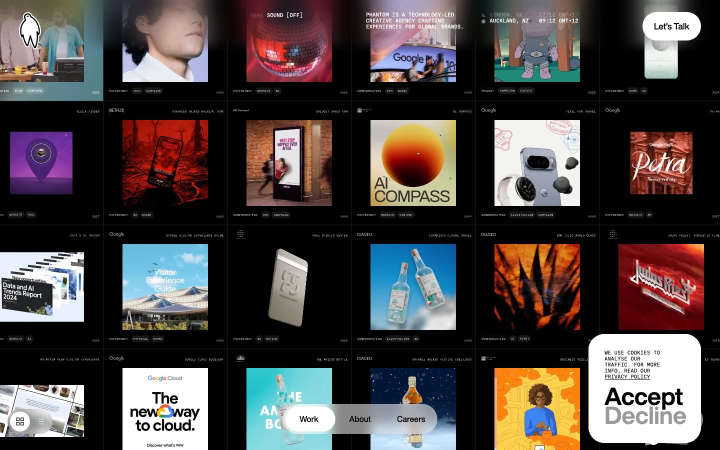
Phantom's landing surface is a full-bleed **contact-sheet gallery** — a pure-black canvas (`{colors.canvas}` — #000000) tiled edge-to-edge with rounded-corner project thumbnails. There is no hero band, no marketing copy column, no scroll-spaced editorial rhythm in the conventional sense; the work *is* the page. Each tile is a project (Netflix, Google, Diageo, Judas Priest) carrying its own full-bleed artwork plus a thin white meta-label row (client name top-left, discipline tags like `EXPERIENCE / TOOL / CAMPAIGN` top-right, year bottom-right).
The system is aggressively **near-monochrome at the chrome layer**: black ground, white text (`{colors.on-dark}` — #ffffff is the single most frequent color, 1872 occurrences), and white floating pill controls. All chroma — the saturated greens, teals, mint, cyan, and orange (`{colors.accent-green}` #1eff66, `{colors.accent-teal}` #50baa3, `{colors.accent-mint}` #a1f4e2, `{colors.accent-cyan}` #03fdc7, `{colors.accent-orange}` #ff6b00) — lives *inside* the project artwork, never on the UI chrome. The interface itself stays black-and-white so the work can be loud.
UI chrome floats above the gallery as **soft white capsules**: a centered floating nav pill (`Work / About / Careers`), a top-right "Let's Talk" pill, a bottom-left view-mode toggle, and a bottom-right cookie card. These hover over the tiled grid rather than sitting in a fixed bar.
Type is a single confident grotesque — **Helvetica Now** — used at a tight oversized display weight (56px / 700 / 0.929 line-height) for the few large statements, and 14px / 500 for UI labels and tags. The line-height under 1.0 on display type is a signature: headlines are set tight enough to nearly touch, reinforcing the editorial, design-studio voice.
**Key Characteristics:**
- Pure-black canvas (`{colors.canvas}` — #000000) tiled edge-to-edge with rounded project thumbnails. The gallery is the layout.
- Tiles use `{rounded.md}` (14px) corners — the single most frequent radius in the system (351 occurrences). Every project thumbnail shares this radius.
- Near-monochrome chrome: white text + white floating pills, black ground. Saturation is confined to project artwork.
- Helvetica Now display type set tight — 56px / 700 with 0.929 line-height (sub-1.0).
- Floating white pill controls (`{component.nav-pill-bar}`, `{component.button-primary}`) use the largest measured radius `{rounded.xxl}` (48px) to read as full capsules.
- Monospace-style uppercase meta labels on every tile (client, discipline tags, year) in `{typography.button}` (14px / 500).
- Flat — no measured shadows. Depth comes from the white pills sitting over dark tiles, not from elevation tokens.
## Colors
### Brand & Chrome
- **Canvas** (`{colors.canvas}` — #000000): The page floor. The entire interface sits on black; tiles, pills, and text all read against it.
- **On-Dark** (`{colors.on-dark}` — #ffffff): The dominant text and label color across the gallery — tile meta labels, the brand mark, and link text. By far the most frequent color measured (1872 occurrences).
- **Surface-Light** (`{colors.surface-light}` — #ffffff): The fill of every floating chrome capsule — the nav pill, the "Let's Talk" button, and the cookie card. The same white as text, repurposed as a surface.
- **Ink** (`{colors.ink}` — #000000): Text color *on* the white pills — black-on-white inside `{component.nav-pill-bar}`, `{component.button-primary}`, and the cookie card.
### Neutrals
- **Neutral-Dark** (`{colors.neutral-dark}` — #222222): A near-black step used for subtle separations against the pure-black canvas.
- **Muted** (`{colors.muted}` — #929292): Secondary / de-emphasized text — e.g., the "Decline" label in the cookie card reads in this muted gray against the bolder "Accept".
### Accents (artwork-only)
These appear inside project thumbnails and animated artwork, never on UI chrome:
- **Accent Orange** (`{colors.accent-orange}` — #ff6b00): The warmest accent — appears in artwork and warm-toned project tiles.
- **Accent Teal** (`{colors.accent-teal}` — #50baa3) and **Accent Mint** (`{colors.accent-mint}` — #a1f4e2): Cool blue-green tones.
- **Accent Green** (`{colors.accent-green}` — #1eff66) and **Accent Cyan** (`{colors.accent-cyan}` — #03fdc7): High-voltage electric greens — the brand's most energetic chroma, surfacing in motion and 3D project artwork.
These accents are low-frequency (1–3 occurrences each) precisely because they're reserved for project content, not interface. The interface stays black-and-white.
## Typography
### Font Family
The system runs a single typeface — **Helvetica Now** — across display headlines and UI labels alike. There is no secondary face; hierarchy comes entirely from size, weight, and line-height rather than from contrasting families. The fallback stack walks `Helvetica Neue, Arial, sans-serif`.
Two roles were measured:
- **Display** (56px / 700 / 0.929 line-height) — the few oversized statements and large interactive text (e.g., the "Accept / Decline" cookie actions render at display scale).
- **Button / Label** (14px / 500 / 1.1 line-height) — all UI chrome: nav pill items, "Let's Talk", tile meta labels, discipline tags.
### Hierarchy
| Token | Size | Weight | Line Height | Letter Spacing | Use |
|---|---|---|---|---|---|
| `{typography.display}` | 56px | 700 | 0.929 | normal | h2 / h3 statements; large interactive text (cookie Accept/Decline) |
| `{typography.button}` | 14px | 500 | 1.1 | normal | Nav pill items, "Let's Talk", tile client + tag + year labels |
### Principles
The display line-height of 0.929 (sub-1.0) is the signature move — headlines set tight enough that ascenders and descenders nearly touch across lines, giving the studio-editorial, poster-like density. Weight 700 carries the display voice; UI labels drop to weight 500 at small size. There is no italic, no condensed variant, no secondary family — the whole voice is one grotesque used confidently.
### Note on Font Substitutes
**Helvetica Now** is a commercial Monotype typeface and is not freely redistributable as a web font. While it was not flagged in the analysis's `fonts_licensed` list, it should be treated as licensed. A close open-source substitute is **Inter** (weight 700 for display, 500 for labels) or **Helvetica Neue**'s metric-compatible open equivalent **TeX Gyre Heros**. To preserve the tight display character, set the substitute headline at line-height ~0.93 with no letter-spacing. Never ship Helvetica Now without a license.
## Layout
### Spacing System
- **Base unit:** 8px. The system's dominant spacing values are all multiples of 8 — `{spacing.xs}` 8px (106 occurrences), `{spacing.sm}` 16px (444 occurrences, the single most common), `{spacing.lg}` 32px (96 occurrences), `{spacing.xl}` 40px (91 occurrences).
- **Tokens:** `{spacing.xs}` 8px · `{spacing.sm}` 16px · `{spacing.md}` 24px · `{spacing.lg}` 32px · `{spacing.xl}` 40px.
- **Tile padding / gutters:** `{spacing.sm}` (16px) is the workhorse — used for the inset of meta labels within tiles and the grid gaps between thumbnails.
- **Pill interior:** `{spacing.lg}`–`{spacing.xl}` (32–40px) horizontal padding on floating capsules.
### Grid & Container
- **Full-bleed gallery grid:** The page is a multi-column tile grid filling the entire viewport edge-to-edge — roughly 6 columns of project thumbnails at desktop width, each tile near-portrait aspect.
- **No centered max-width container:** Unlike a marketing page, content runs to the viewport edges. There is no narrow editorial column.
- **Floating chrome layer:** UI controls are absolutely positioned over the grid — nav pill centered along the bottom edge, "Let's Talk" pinned top-right, view-toggle bottom-left, cookie card bottom-right.
### Whitespace Philosophy
Whitespace is minimal and deliberate — the gallery is dense by design, tiles abutting with only thin 16px gutters so the page reads as a saturated contact sheet. Breathing room exists *inside* the floating white pills, not between tiles. The density is the point: a studio showing the volume and range of its work at a glance.
## Elevation & Depth
| Level | Treatment | Use |
|---|---|---|
| Flat ground | No shadow | The black canvas and all project tiles |
| Floating capsule | White fill over dark tiles — no measured shadow | Nav pill, "Let's Talk", cookie card |
The analysis measured **zero shadow tokens** — the system is flat. Depth is communicated purely through **color contrast and layering**: bright white pill capsules read as floating above the dark gallery because of the stark value jump, not because of drop shadows. The view-mode toggle and brand mark also sit on this floating layer.
### Decorative Depth
Apparent depth inside the gallery comes from the **project artwork itself** — 3D renders (the orange AI Compass sphere, the chrome bottle, the Google Pixel hardware) carry their own internal lighting and shadow as content. These are not system elevation tokens; they're imagery shown at tile scale.
## Shapes
### Border Radius Scale
| Token | Value | Use |
|---|---|---|
| `{rounded.md}` | 14px | Every project thumbnail tile — the dominant radius (351 occurrences) |
| `{rounded.lg}` | 32px | Larger rounded containers / inset panels |
| `{rounded.xl}` | 40px | Cookie card; large floating panels |
| `{rounded.xxl}` | 48px | Fully-capsule pill controls (nav pill, "Let's Talk") — *derived* as the closest measured radius producing a full pill at the control's height |
### Photography Geometry
All project thumbnails are clipped to `{rounded.md}` (14px) rounded rectangles in a near-portrait aspect. Artwork bleeds fully to the tile's rounded edge — no inner padding around imagery. The white pill controls are the only true capsule shapes, achieved with the largest measured radii applied to short-height elements.
## Components
### Brand & Navigation
**`brand-mark`** — The Phantom "ghost" logomark sits top-left over the first gallery tile, rendered in `{colors.on-dark}` (white). No background plate; it floats directly on the artwork.
**`nav-pill-bar`** — The signature floating navigation: a centered white capsule along the bottom edge carrying `Work / About / Careers`. Background `{colors.surface-light}`, text `{colors.ink}`, type `{typography.button}` (Helvetica Now 14px / 500), rounded `{rounded.xxl}` (48px), padding ~16px × 32px. The active item ("Work") sits inside its own inset white sub-pill. This pill-in-pill floats over the gallery rather than docking to a bar.
**`button-primary`** — The "Let's Talk" CTA pinned top-right. Background `{colors.surface-light}`, text `{colors.ink}`, type `{typography.button}`, rounded `{rounded.xxl}` (48px), padding ~16px × 24px. (Note: the automated button selector measured this element with radius 0 / padding 0 — the visible capsule geometry is documented from screenshot ground-truth; see Known Gaps.)
### Gallery
**`gallery-tile`** — The core repeating unit. A full-bleed project thumbnail clipped to `{rounded.md}` (14px). Background `{colors.canvas}` behind the artwork, meta text in `{colors.on-dark}`, type `{typography.button}`. Internal label inset ~`{spacing.sm}` (16px). Each tile carries a client name (top-left), discipline tags top-right, and a year bottom-right.
**`tile-meta-label`** — The thin uppercase label rows on each tile (e.g., `EXPERIENCE TOOL CAMPAIGN`, `2025`). Transparent background, `{colors.on-dark}` text, `{typography.button}` at small size. These overlay directly on artwork with no plate.
### Overlays
**`cookie-card`** — The bottom-right consent card. Background `{colors.surface-light}`, text `{colors.ink}`, rounded `{rounded.xl}` (40px), padding `{spacing.lg}` (32px). Carries fine-print body in `{typography.button}` scale plus two large display-scale actions.
**`cookie-accept`** — The "Accept" action rendered at `{typography.display}` (56px / 700) scale in `{colors.ink}` — the bolder, darker, primary choice.
**`cookie-decline`** — The "Decline" action, same display scale but in `{colors.muted}` (#929292) — visually subordinated to Accept by color value alone.
## Do's and Don'ts
### Do
- Keep all UI chrome monochrome — white pills, white text, black ground. Let the accent colors live only inside project artwork.
- Clip every project thumbnail to `{rounded.md}` (14px). This single radius is the visual constant binding the gallery.
- Set display type tight — `{typography.display}` at 0.929 line-height. The sub-1.0 line-height is the studio voice.
- Float chrome capsules over the gallery using `{rounded.xxl}` (48px) for full-pill silhouettes.
- Use `{spacing.sm}` (16px) as the default gutter and label inset — it's the system's workhorse.
- Tag every tile with uppercase discipline labels in `{typography.button}` (client / disciplines / year).
- Use color value (ink vs. muted) to rank choices, as in `{component.cookie-accept}` vs `{component.cookie-decline}`.
### Don't
- Don't apply accent colors (`{colors.accent-green}`, `{colors.accent-orange}`, etc.) to buttons, nav, or text — they belong to artwork only.
- Don't introduce drop shadows; the system is flat. Depth comes from white-on-black value contrast.
- Don't add a second typeface. Helvetica Now (or its substitute) carries every role.
- Don't pad the gallery into a narrow centered column — tiles run edge-to-edge.
- Don't loosen display line-height toward 1.0 or above; it breaks the tight poster density.
- Don't add hover-state docs — default and pressed only.
## Responsive Behavior
### Breakpoints
The analysis captured a single desktop landing render, so breakpoint behavior is inferred from the layout structure rather than measured.
| Name | Width | Key Changes (inferred) |
|---|---|---|
| Mobile | < 768px | Gallery collapses to 1–2 tile columns; floating nav pill stays bottom-centered; "Let's Talk" may dock or shrink |
| Tablet | 768–1024px | 3–4 tile columns; chrome capsules retain pill geometry |
| Desktop | 1024–1440px | ~6 tile columns filling the viewport edge-to-edge (measured) |
| Wide | > 1440px | More columns / larger tiles; chrome capsule sizes hold |
### Touch Targets
- `{component.nav-pill-bar}` items carry ~16px × 32px padding — comfortably above 44px effective tap height inside the capsule.
- `{component.button-primary}` ("Let's Talk") reads as a full-height pill — adequate touch area.
- The bottom-left view-mode toggle (grid / list icons) is a small capsule — its exact dimensions were not measured.
### Collapsing Strategy
- The gallery reduces column count rather than scaling individual tiles down beyond legibility.
- Floating chrome (nav pill, CTA, cookie card) stays pinned to its viewport corner/edge across sizes.
- Tile meta labels (`{component.tile-meta-label}`) hold `{typography.button}` size; tags may truncate on narrow tiles.
### Image Behavior
- Project artwork bleeds fully to each tile's `{rounded.md}` (14px) edge and crops to the tile's near-portrait aspect at every breakpoint.
- 3D and motion artwork inside tiles retains its native rendering; tiles resize around it.
## Iteration Guide
1. Focus on ONE component at a time. Reference its YAML key directly (`{component.gallery-tile}`, `{component.nav-pill-bar}`).
2. Variants live as separate entries in `components:` (e.g., a list-view tile would be its own key).
3. Use `{token.refs}` everywhere — never inline a hex.
4. Never document hover. Default and Active/Pressed states only.
5. Keep chrome monochrome; route all chroma into artwork content.
6. The display line-height (0.929) and single-typeface rule do not blur — size and weight carry hierarchy.
7. When adding controls, default to the white pill capsule pattern (`{colors.surface-light}` + `{rounded.xxl}`).
## Known Gaps
- Only the desktop landing page was captured; tablet/mobile breakpoints and the interior About/Careers/case-study pages are not in scope. Responsive behavior is inferred from the gallery grid structure.
- The automated `button-primary` measurement returned color #000000 with radius 0px and padding 0px — this captured an underlying link/text element, not the visible white capsule. The pill geometry (white fill, capsule radius, padding) is documented from screenshot ground-truth and marked as derived; exact measured padding/radius for the CTA is a gap.
- A true pill radius (9999px / 50%) was not measured; the capsule controls are documented using the largest measured radius (`{rounded.xxl}` 48px) as the closest faithful value.
- Body / paragraph typography was not measured — only display (56px) and button/label (14px) roles were captured. Running-text size, weight, and line-height are unknown.
- Helvetica Now is a commercial typeface but was NOT flagged in `fonts_licensed`; it is treated as licensed here and an open substitute is documented. Confirm licensing before shipping.
- Accent color hex values (orange/teal/green/mint/cyan) were measured at very low frequency (1–3 occurrences) because they live inside project artwork; their exact roles within imagery and any animated states are out of scope.
- No shadow, transition, or animation tokens were captured. The site features motion (animated tiles, sound toggle, hover-reveals) that is not represented in the static analysis.
- The view-mode toggle (grid/list) bottom-left and the live world-clock label ("LONDON / AUCKLAND") top-right were observed in screenshots but not measured as discrete components.
<!-- Documented by duply · real-world design systems as ready-to-use DESIGN.md for AI coding agents · https://duply.ai/phantom/design-md -->
Color Palette
Accent
Neutrals
Typography
display56px · 700 · 0.929
The quick brown fox jumpsbutton14px · 500 · 1.1
The quick brown fox jumpsSpacing & Shape
Spacing
| Name | Value | Preview |
|---|---|---|
| xs | 8px | |
| sm | 16px | |
| md | 24px | |
| lg | 32px | |
| xl | 40px |
Border Radius
| Name | Value | Preview |
|---|---|---|
| md | 14px | |
| lg | 32px | |
| xl | 40px | |
| xxl | 48px |
More like this


---
version: alpha
name: Phantom-design-analysis
description: A full-bleed, edge-to-edge gallery interface for a technology-led creative agency, built on a pure-black canvas (#000000) where rounded-corner project tiles tile the entire viewport like a contact sheet. The system is near-monochrome — black ground, white text and floating white pill controls — punctuated by saturated accent greens, teals, and orange that surface only inside project artwork. Typography is a single confident grotesque (Helvetica Now) used at a tight, oversized display weight, and the UI chrome (floating nav pill, "Let's Talk" pill, cookie card) hovers above the gallery as soft white capsules.

colors:
  canvas: "#000000"
  ink: "#000000"
  on-dark: "#ffffff"
  surface-light: "#ffffff"
  neutral-dark: "#222222"
  muted: "#929292"
  accent-orange: "#ff6b00"
  accent-teal: "#50baa3"
  accent-green: "#1eff66"
  accent-mint: "#a1f4e2"
  accent-cyan: "#03fdc7"

typography:
  display:
    fontFamily: "Helvetica Now, Helvetica Neue, Arial, sans-serif"
    fontSize: 56px
    fontWeight: 700
    lineHeight: 0.929
    letterSpacing: normal
  button:
    fontFamily: "Helvetica Now, Helvetica Neue, Arial, sans-serif"
    fontSize: 14px
    fontWeight: 500
    lineHeight: 1.1
    letterSpacing: normal

rounded:
  md: 14px
  lg: 32px
  xl: 40px
  xxl: 48px

spacing:
  xs: 8px
  sm: 16px
  md: 24px
  lg: 32px
  xl: 40px

components:
  gallery-tile:
    backgroundColor: "{colors.canvas}"
    textColor: "{colors.on-dark}"
    typography: "{typography.button}"
    rounded: "{rounded.md}"
    padding: 16px
  tile-meta-label:
    backgroundColor: transparent
    textColor: "{colors.on-dark}"
    typography: "{typography.button}"
  nav-pill-bar:
    backgroundColor: "{colors.surface-light}"
    textColor: "{colors.ink}"
    typography: "{typography.button}"
    rounded: "{rounded.xxl}"
    padding: 16px 32px
  button-primary:
    backgroundColor: "{colors.surface-light}"
    textColor: "{colors.ink}"
    typography: "{typography.button}"
    rounded: "{rounded.xxl}"
    padding: 16px 24px
  cookie-card:
    backgroundColor: "{colors.surface-light}"
    textColor: "{colors.ink}"
    typography: "{typography.button}"
    rounded: "{rounded.xl}"
    padding: 32px
  cookie-accept:
    backgroundColor: transparent
    textColor: "{colors.ink}"
    typography: "{typography.display}"
  cookie-decline:
    backgroundColor: transparent
    textColor: "{colors.muted}"
    typography: "{typography.display}"
  brand-mark:
    backgroundColor: transparent
    textColor: "{colors.on-dark}"
---

## Overview

Phantom's landing surface is a full-bleed **contact-sheet gallery** — a pure-black canvas (`{colors.canvas}` — #000000) tiled edge-to-edge with rounded-corner project thumbnails. There is no hero band, no marketing copy column, no scroll-spaced editorial rhythm in the conventional sense; the work *is* the page. Each tile is a project (Netflix, Google, Diageo, Judas Priest) carrying its own full-bleed artwork plus a thin white meta-label row (client name top-left, discipline tags like `EXPERIENCE / TOOL / CAMPAIGN` top-right, year bottom-right).

The system is aggressively **near-monochrome at the chrome layer**: black ground, white text (`{colors.on-dark}` — #ffffff is the single most frequent color, 1872 occurrences), and white floating pill controls. All chroma — the saturated greens, teals, mint, cyan, and orange (`{colors.accent-green}` #1eff66, `{colors.accent-teal}` #50baa3, `{colors.accent-mint}` #a1f4e2, `{colors.accent-cyan}` #03fdc7, `{colors.accent-orange}` #ff6b00) — lives *inside* the project artwork, never on the UI chrome. The interface itself stays black-and-white so the work can be loud.

UI chrome floats above the gallery as **soft white capsules**: a centered floating nav pill (`Work / About / Careers`), a top-right "Let's Talk" pill, a bottom-left view-mode toggle, and a bottom-right cookie card. These hover over the tiled grid rather than sitting in a fixed bar.

Type is a single confident grotesque — **Helvetica Now** — used at a tight oversized display weight (56px / 700 / 0.929 line-height) for the few large statements, and 14px / 500 for UI labels and tags. The line-height under 1.0 on display type is a signature: headlines are set tight enough to nearly touch, reinforcing the editorial, design-studio voice.

**Key Characteristics:**
- Pure-black canvas (`{colors.canvas}` — #000000) tiled edge-to-edge with rounded project thumbnails. The gallery is the layout.
- Tiles use `{rounded.md}` (14px) corners — the single most frequent radius in the system (351 occurrences). Every project thumbnail shares this radius.
- Near-monochrome chrome: white text + white floating pills, black ground. Saturation is confined to project artwork.
- Helvetica Now display type set tight — 56px / 700 with 0.929 line-height (sub-1.0).
- Floating white pill controls (`{component.nav-pill-bar}`, `{component.button-primary}`) use the largest measured radius `{rounded.xxl}` (48px) to read as full capsules.
- Monospace-style uppercase meta labels on every tile (client, discipline tags, year) in `{typography.button}` (14px / 500).
- Flat — no measured shadows. Depth comes from the white pills sitting over dark tiles, not from elevation tokens.

## Colors

### Brand & Chrome
- **Canvas** (`{colors.canvas}` — #000000): The page floor. The entire interface sits on black; tiles, pills, and text all read against it.
- **On-Dark** (`{colors.on-dark}` — #ffffff): The dominant text and label color across the gallery — tile meta labels, the brand mark, and link text. By far the most frequent color measured (1872 occurrences).
- **Surface-Light** (`{colors.surface-light}` — #ffffff): The fill of every floating chrome capsule — the nav pill, the "Let's Talk" button, and the cookie card. The same white as text, repurposed as a surface.
- **Ink** (`{colors.ink}` — #000000): Text color *on* the white pills — black-on-white inside `{component.nav-pill-bar}`, `{component.button-primary}`, and the cookie card.

### Neutrals
- **Neutral-Dark** (`{colors.neutral-dark}` — #222222): A near-black step used for subtle separations against the pure-black canvas.
- **Muted** (`{colors.muted}` — #929292): Secondary / de-emphasized text — e.g., the "Decline" label in the cookie card reads in this muted gray against the bolder "Accept".

### Accents (artwork-only)
These appear inside project thumbnails and animated artwork, never on UI chrome:
- **Accent Orange** (`{colors.accent-orange}` — #ff6b00): The warmest accent — appears in artwork and warm-toned project tiles.
- **Accent Teal** (`{colors.accent-teal}` — #50baa3) and **Accent Mint** (`{colors.accent-mint}` — #a1f4e2): Cool blue-green tones.
- **Accent Green** (`{colors.accent-green}` — #1eff66) and **Accent Cyan** (`{colors.accent-cyan}` — #03fdc7): High-voltage electric greens — the brand's most energetic chroma, surfacing in motion and 3D project artwork.

These accents are low-frequency (1–3 occurrences each) precisely because they're reserved for project content, not interface. The interface stays black-and-white.

## Typography

### Font Family
The system runs a single typeface — **Helvetica Now** — across display headlines and UI labels alike. There is no secondary face; hierarchy comes entirely from size, weight, and line-height rather than from contrasting families. The fallback stack walks `Helvetica Neue, Arial, sans-serif`.

Two roles were measured:
- **Display** (56px / 700 / 0.929 line-height) — the few oversized statements and large interactive text (e.g., the "Accept / Decline" cookie actions render at display scale).
- **Button / Label** (14px / 500 / 1.1 line-height) — all UI chrome: nav pill items, "Let's Talk", tile meta labels, discipline tags.

### Hierarchy

| Token | Size | Weight | Line Height | Letter Spacing | Use |
|---|---|---|---|---|---|
| `{typography.display}` | 56px | 700 | 0.929 | normal | h2 / h3 statements; large interactive text (cookie Accept/Decline) |
| `{typography.button}` | 14px | 500 | 1.1 | normal | Nav pill items, "Let's Talk", tile client + tag + year labels |

### Principles
The display line-height of 0.929 (sub-1.0) is the signature move — headlines set tight enough that ascenders and descenders nearly touch across lines, giving the studio-editorial, poster-like density. Weight 700 carries the display voice; UI labels drop to weight 500 at small size. There is no italic, no condensed variant, no secondary family — the whole voice is one grotesque used confidently.

### Note on Font Substitutes
**Helvetica Now** is a commercial Monotype typeface and is not freely redistributable as a web font. While it was not flagged in the analysis's `fonts_licensed` list, it should be treated as licensed. A close open-source substitute is **Inter** (weight 700 for display, 500 for labels) or **Helvetica Neue**'s metric-compatible open equivalent **TeX Gyre Heros**. To preserve the tight display character, set the substitute headline at line-height ~0.93 with no letter-spacing. Never ship Helvetica Now without a license.

## Layout

### Spacing System
- **Base unit:** 8px. The system's dominant spacing values are all multiples of 8 — `{spacing.xs}` 8px (106 occurrences), `{spacing.sm}` 16px (444 occurrences, the single most common), `{spacing.lg}` 32px (96 occurrences), `{spacing.xl}` 40px (91 occurrences).
- **Tokens:** `{spacing.xs}` 8px · `{spacing.sm}` 16px · `{spacing.md}` 24px · `{spacing.lg}` 32px · `{spacing.xl}` 40px.
- **Tile padding / gutters:** `{spacing.sm}` (16px) is the workhorse — used for the inset of meta labels within tiles and the grid gaps between thumbnails.
- **Pill interior:** `{spacing.lg}`–`{spacing.xl}` (32–40px) horizontal padding on floating capsules.

### Grid & Container
- **Full-bleed gallery grid:** The page is a multi-column tile grid filling the entire viewport edge-to-edge — roughly 6 columns of project thumbnails at desktop width, each tile near-portrait aspect.
- **No centered max-width container:** Unlike a marketing page, content runs to the viewport edges. There is no narrow editorial column.
- **Floating chrome layer:** UI controls are absolutely positioned over the grid — nav pill centered along the bottom edge, "Let's Talk" pinned top-right, view-toggle bottom-left, cookie card bottom-right.

### Whitespace Philosophy
Whitespace is minimal and deliberate — the gallery is dense by design, tiles abutting with only thin 16px gutters so the page reads as a saturated contact sheet. Breathing room exists *inside* the floating white pills, not between tiles. The density is the point: a studio showing the volume and range of its work at a glance.

## Elevation & Depth

| Level | Treatment | Use |
|---|---|---|
| Flat ground | No shadow | The black canvas and all project tiles |
| Floating capsule | White fill over dark tiles — no measured shadow | Nav pill, "Let's Talk", cookie card |

The analysis measured **zero shadow tokens** — the system is flat. Depth is communicated purely through **color contrast and layering**: bright white pill capsules read as floating above the dark gallery because of the stark value jump, not because of drop shadows. The view-mode toggle and brand mark also sit on this floating layer.

### Decorative Depth
Apparent depth inside the gallery comes from the **project artwork itself** — 3D renders (the orange AI Compass sphere, the chrome bottle, the Google Pixel hardware) carry their own internal lighting and shadow as content. These are not system elevation tokens; they're imagery shown at tile scale.

## Shapes

### Border Radius Scale

| Token | Value | Use |
|---|---|---|
| `{rounded.md}` | 14px | Every project thumbnail tile — the dominant radius (351 occurrences) |
| `{rounded.lg}` | 32px | Larger rounded containers / inset panels |
| `{rounded.xl}` | 40px | Cookie card; large floating panels |
| `{rounded.xxl}` | 48px | Fully-capsule pill controls (nav pill, "Let's Talk") — *derived* as the closest measured radius producing a full pill at the control's height |

### Photography Geometry
All project thumbnails are clipped to `{rounded.md}` (14px) rounded rectangles in a near-portrait aspect. Artwork bleeds fully to the tile's rounded edge — no inner padding around imagery. The white pill controls are the only true capsule shapes, achieved with the largest measured radii applied to short-height elements.

## Components

### Brand & Navigation

**`brand-mark`** — The Phantom "ghost" logomark sits top-left over the first gallery tile, rendered in `{colors.on-dark}` (white). No background plate; it floats directly on the artwork.

**`nav-pill-bar`** — The signature floating navigation: a centered white capsule along the bottom edge carrying `Work / About / Careers`. Background `{colors.surface-light}`, text `{colors.ink}`, type `{typography.button}` (Helvetica Now 14px / 500), rounded `{rounded.xxl}` (48px), padding ~16px × 32px. The active item ("Work") sits inside its own inset white sub-pill. This pill-in-pill floats over the gallery rather than docking to a bar.

**`button-primary`** — The "Let's Talk" CTA pinned top-right. Background `{colors.surface-light}`, text `{colors.ink}`, type `{typography.button}`, rounded `{rounded.xxl}` (48px), padding ~16px × 24px. (Note: the automated button selector measured this element with radius 0 / padding 0 — the visible capsule geometry is documented from screenshot ground-truth; see Known Gaps.)

### Gallery

**`gallery-tile`** — The core repeating unit. A full-bleed project thumbnail clipped to `{rounded.md}` (14px). Background `{colors.canvas}` behind the artwork, meta text in `{colors.on-dark}`, type `{typography.button}`. Internal label inset ~`{spacing.sm}` (16px). Each tile carries a client name (top-left), discipline tags top-right, and a year bottom-right.

**`tile-meta-label`** — The thin uppercase label rows on each tile (e.g., `EXPERIENCE  TOOL  CAMPAIGN`, `2025`). Transparent background, `{colors.on-dark}` text, `{typography.button}` at small size. These overlay directly on artwork with no plate.

### Overlays

**`cookie-card`** — The bottom-right consent card. Background `{colors.surface-light}`, text `{colors.ink}`, rounded `{rounded.xl}` (40px), padding `{spacing.lg}` (32px). Carries fine-print body in `{typography.button}` scale plus two large display-scale actions.

**`cookie-accept`** — The "Accept" action rendered at `{typography.display}` (56px / 700) scale in `{colors.ink}` — the bolder, darker, primary choice.

**`cookie-decline`** — The "Decline" action, same display scale but in `{colors.muted}` (#929292) — visually subordinated to Accept by color value alone.

## Do's and Don'ts

### Do
- Keep all UI chrome monochrome — white pills, white text, black ground. Let the accent colors live only inside project artwork.
- Clip every project thumbnail to `{rounded.md}` (14px). This single radius is the visual constant binding the gallery.
- Set display type tight — `{typography.display}` at 0.929 line-height. The sub-1.0 line-height is the studio voice.
- Float chrome capsules over the gallery using `{rounded.xxl}` (48px) for full-pill silhouettes.
- Use `{spacing.sm}` (16px) as the default gutter and label inset — it's the system's workhorse.
- Tag every tile with uppercase discipline labels in `{typography.button}` (client / disciplines / year).
- Use color value (ink vs. muted) to rank choices, as in `{component.cookie-accept}` vs `{component.cookie-decline}`.

### Don't
- Don't apply accent colors (`{colors.accent-green}`, `{colors.accent-orange}`, etc.) to buttons, nav, or text — they belong to artwork only.
- Don't introduce drop shadows; the system is flat. Depth comes from white-on-black value contrast.
- Don't add a second typeface. Helvetica Now (or its substitute) carries every role.
- Don't pad the gallery into a narrow centered column — tiles run edge-to-edge.
- Don't loosen display line-height toward 1.0 or above; it breaks the tight poster density.
- Don't add hover-state docs — default and pressed only.

## Responsive Behavior

### Breakpoints
The analysis captured a single desktop landing render, so breakpoint behavior is inferred from the layout structure rather than measured.

| Name | Width | Key Changes (inferred) |
|---|---|---|
| Mobile | < 768px | Gallery collapses to 1–2 tile columns; floating nav pill stays bottom-centered; "Let's Talk" may dock or shrink |
| Tablet | 768–1024px | 3–4 tile columns; chrome capsules retain pill geometry |
| Desktop | 1024–1440px | ~6 tile columns filling the viewport edge-to-edge (measured) |
| Wide | > 1440px | More columns / larger tiles; chrome capsule sizes hold |

### Touch Targets
- `{component.nav-pill-bar}` items carry ~16px × 32px padding — comfortably above 44px effective tap height inside the capsule.
- `{component.button-primary}` ("Let's Talk") reads as a full-height pill — adequate touch area.
- The bottom-left view-mode toggle (grid / list icons) is a small capsule — its exact dimensions were not measured.

### Collapsing Strategy
- The gallery reduces column count rather than scaling individual tiles down beyond legibility.
- Floating chrome (nav pill, CTA, cookie card) stays pinned to its viewport corner/edge across sizes.
- Tile meta labels (`{component.tile-meta-label}`) hold `{typography.button}` size; tags may truncate on narrow tiles.

### Image Behavior
- Project artwork bleeds fully to each tile's `{rounded.md}` (14px) edge and crops to the tile's near-portrait aspect at every breakpoint.
- 3D and motion artwork inside tiles retains its native rendering; tiles resize around it.

## Iteration Guide

1. Focus on ONE component at a time. Reference its YAML key directly (`{component.gallery-tile}`, `{component.nav-pill-bar}`).
2. Variants live as separate entries in `components:` (e.g., a list-view tile would be its own key).
3. Use `{token.refs}` everywhere — never inline a hex.
4. Never document hover. Default and Active/Pressed states only.
5. Keep chrome monochrome; route all chroma into artwork content.
6. The display line-height (0.929) and single-typeface rule do not blur — size and weight carry hierarchy.
7. When adding controls, default to the white pill capsule pattern (`{colors.surface-light}` + `{rounded.xxl}`).

## Known Gaps

- Only the desktop landing page was captured; tablet/mobile breakpoints and the interior About/Careers/case-study pages are not in scope. Responsive behavior is inferred from the gallery grid structure.
- The automated `button-primary` measurement returned color #000000 with radius 0px and padding 0px — this captured an underlying link/text element, not the visible white capsule. The pill geometry (white fill, capsule radius, padding) is documented from screenshot ground-truth and marked as derived; exact measured padding/radius for the CTA is a gap.
- A true pill radius (9999px / 50%) was not measured; the capsule controls are documented using the largest measured radius (`{rounded.xxl}` 48px) as the closest faithful value.
- Body / paragraph typography was not measured — only display (56px) and button/label (14px) roles were captured. Running-text size, weight, and line-height are unknown.
- Helvetica Now is a commercial typeface but was NOT flagged in `fonts_licensed`; it is treated as licensed here and an open substitute is documented. Confirm licensing before shipping.
- Accent color hex values (orange/teal/green/mint/cyan) were measured at very low frequency (1–3 occurrences) because they live inside project artwork; their exact roles within imagery and any animated states are out of scope.
- No shadow, transition, or animation tokens were captured. The site features motion (animated tiles, sound toggle, hover-reveals) that is not represented in the static analysis.
- The view-mode toggle (grid/list) bottom-left and the live world-clock label ("LONDON / AUCKLAND") top-right were observed in screenshots but not measured as discrete components.

<!-- Documented by duply · real-world design systems as ready-to-use DESIGN.md for AI coding agents · https://duply.ai/phantom/design-md -->