Monad
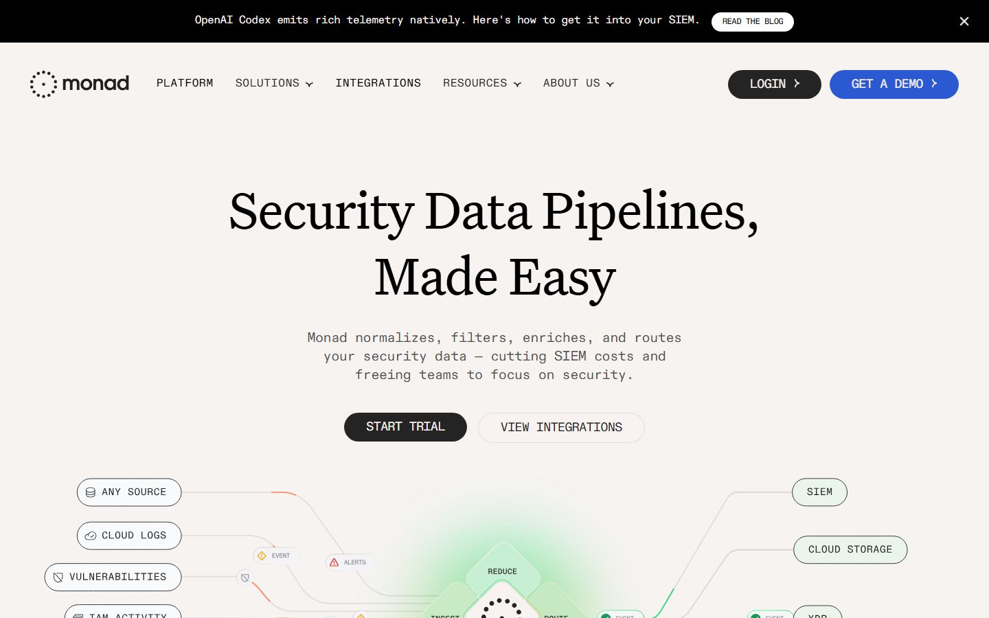
A warm, editorial security-infrastructure interface built on an off-white linen canvas (#f8f3f1) with pure-black ink, an Untitled Serif display voice, and an ABC Diatype Mono body/UI voice. The system reads as confident-technical-meets-editorial — large serif headlines over monospaced supporting copy, fully pill-shaped buttons, and a live pipeline diagram of mint-green and rounded node pills that visualizes Monad's data-routing product directly on the hero canvas.
---
version: alpha
name: Monad-design-analysis
description: A warm, editorial security-infrastructure interface built on an off-white linen canvas (#f8f3f1) with pure-black ink, an Untitled Serif display voice, and an ABC Diatype Mono body/UI voice. The system reads as confident-technical-meets-editorial — large serif headlines over monospaced supporting copy, fully pill-shaped buttons, and a live pipeline diagram of mint-green and rounded node pills that visualizes Monad's data-routing product directly on the hero canvas.

colors:
  ink: "#000000"
  ink-soft: "#060606"
  muted: "#242424"
  neutral-strong: "#333333"
  neutral-mid: "#222222"
  neutral-soft: "#3d3d3d"
  canvas: "#f8f3f1"
  surface: "#ffffff"
  surface-soft: "#f8f8f8"
  surface-softest: "#fafafa"
  hairline: "#cccccc"
  hairline-soft: "#dddddd"
  hairline-strong: "#c8c8c8"
  on-dark: "#ffffff"
  accent-orange: "#f37a0a"
  accent-mint: "#a7fccd"
  accent-green: "#27a367"
  accent-blue: "#3898ec"
  accent-blue-strong: "#0073e6"
  accent-periwinkle: "#a0b5eb"
  accent-gold: "#e2c161"

typography:
  display-xl:
    fontFamily: "Untitled Serif, Georgia, 'Times New Roman', serif"
    fontSize: 80px
    fontWeight: 400
    lineHeight: 1.2
    letterSpacing: -1.6px
  display-lg:
    fontFamily: "Untitled Serif, Georgia, 'Times New Roman', serif"
    fontSize: 48px
    fontWeight: 400
    lineHeight: 1.2
    letterSpacing: -0.96px
  display-md:
    fontFamily: "Untitled Serif, Georgia, 'Times New Roman', serif"
    fontSize: 32px
    fontWeight: 400
    lineHeight: 1.2
    letterSpacing: -0.64px
  body:
    fontFamily: "ABC Diatype Mono, ui-monospace, 'SFMono-Regular', Menlo, monospace"
    fontSize: 20px
    fontWeight: 400
    lineHeight: 1.35
    letterSpacing: -0.4px
  button:
    fontFamily: "ABC Diatype Mono, ui-monospace, 'SFMono-Regular', Menlo, monospace"
    fontSize: 20px
    fontWeight: 400
    lineHeight: 1.35
    letterSpacing: -0.4px

rounded:
  md: 16px
  lg: 40px
  pill: 100px

spacing:
  xxs: 8px
  xs: 12px
  sm: 16px
  md: 24px
  lg: 32px
  xl: 40px
  xxl: 64px
  section: 100px

components:
  announcement-bar:
    backgroundColor: "{colors.ink}"
    textColor: "{colors.on-dark}"
    typography: "{typography.button}"
    padding: 16px 40px
  top-nav:
    backgroundColor: "{colors.canvas}"
    textColor: "{colors.ink}"
    typography: "{typography.button}"
    padding: 16px 40px
  nav-link:
    backgroundColor: transparent
    textColor: "{colors.ink}"
    typography: "{typography.button}"
  button-primary:
    backgroundColor: "{colors.ink}"
    textColor: "{colors.on-dark}"
    typography: "{typography.button}"
    rounded: "{rounded.pill}"
    padding: 16px 32px
  button-primary-active:
    backgroundColor: "{colors.ink-soft}"
    textColor: "{colors.on-dark}"
    rounded: "{rounded.pill}"
  button-secondary:
    backgroundColor: transparent
    textColor: "{colors.ink}"
    typography: "{typography.button}"
    rounded: "{rounded.pill}"
    padding: 16px 32px
  button-demo:
    backgroundColor: "{colors.accent-blue}"
    textColor: "{colors.on-dark}"
    typography: "{typography.button}"
    rounded: "{rounded.pill}"
    padding: 16px 32px
  card:
    backgroundColor: "{colors.surface}"
    textColor: "{colors.ink}"
    rounded: "{rounded.md}"
  pipeline-node-pill:
    backgroundColor: "{colors.surface}"
    textColor: "{colors.ink}"
    typography: "{typography.button}"
    rounded: "{rounded.pill}"
    padding: 12px 16px
  pipeline-node-pill-success:
    backgroundColor: "{colors.accent-mint}"
    textColor: "{colors.ink}"
    typography: "{typography.button}"
    rounded: "{rounded.pill}"
    padding: 12px 16px
  logo-bar:
    backgroundColor: "{colors.canvas}"
    textColor: "{colors.muted}"
    typography: "{typography.button}"
    padding: 40px
---

## Overview

Monad's marketing surface is a warm, editorial take on security-infrastructure SaaS. The page floor is an off-white linen tone (`{colors.canvas}` — #f8f3f1) rather than pure white, which gives the whole system a softer, paper-like feel. Headlines are set in **Untitled Serif** at large sizes (`{typography.display-xl}` — 80px), and all supporting copy, navigation, and buttons are set in **ABC Diatype Mono** — a monospaced face that signals "we are an engineering / data-pipeline product" without resorting to dark dashboard chrome.

The brand's voltage comes from the **live pipeline diagram** anchored on the hero: a left-to-right flow of rounded node pills (`{component.pipeline-node-pill}` — "ANY SOURCE", "CLOUD LOGS", "SIEM", "DATA LAKE") connected by curved wires, with a mint-green glow (`{colors.accent-mint}` — #a7fccd) radiating from the central "REDUCE / NORMALIZE / ROUTE" node. The product literally shows itself routing security data on the homepage rather than illustrating it abstractly.

The action layer is monochrome: primary CTAs are fully pill-shaped black buttons (`{component.button-primary}`), the "GET A DEMO" CTA flips to blue (`{colors.accent-blue}`), and a dark announcement bar (`{component.announcement-bar}`) sits pinned above the nav. Accent colors (orange, mint, green, gold, periwinkle) appear almost exclusively inside the pipeline diagram as status/event markers — never on primary marketing CTAs.

**Key Characteristics:**
- Warm linen canvas (`{colors.canvas}` — #f8f3f1) instead of pure white — the system's most distinctive surface decision.
- Two-voice typography: **Untitled Serif** for all headlines (400 weight, negative tracking), **ABC Diatype Mono** for body + UI. The serif/mono pairing is the brand's signature.
- Fully pill-shaped buttons and node tags (`{rounded.pill}` — 100px). Black primary, transparent-outlined secondary, blue demo CTA.
- A live data-pipeline diagram of rounded node pills with curved connecting wires and a mint-green processing glow.
- Pure-black ink (`{colors.ink}` — #000000) for headlines; a soft near-black (`{colors.muted}` — #242424) for body copy.
- Cards use a restrained 16px radius (`{rounded.md}`) with no shadow, or a soft 10px glow shadow where elevation is needed.
- Dark announcement bar pinned above the nav, with an inline outlined "READ THE BLOG" pill.

## Colors

### Brand & Action
- **Ink** (`{colors.ink}` — #000000): Headlines, primary button fills, nav text. The dominant action and display color.
- **Ink Soft** (`{colors.ink-soft}` — #060606): Pressed-state near-black for the primary button.
- **Accent Blue** (`{colors.accent-blue}` — #3898ec): The "GET A DEMO" CTA fill — the one chromatic CTA in the system. A stronger blue (`{colors.accent-blue-strong}` — #0073e6) appears for inline link emphasis.

### Pipeline / Diagram Accents
These appear almost exclusively inside the hero pipeline diagram as status, event, and flow markers — not as marketing CTA colors:
- **Mint** (`{colors.accent-mint}` — #a7fccd): The processing-glow tone and "success" node pill fill.
- **Green** (`{colors.accent-green}` — #27a367): Success check icons on routed nodes.
- **Orange** (`{colors.accent-orange}` — #f37a0a): Event/alert wires and markers.
- **Gold** (`{colors.accent-gold}` — #e2c161): Warning/event icons.
- **Periwinkle** (`{colors.accent-periwinkle}` — #a0b5eb): Soft tint used in the lower integration-flow panel.

### Surface
- **Canvas** (`{colors.canvas}` — #f8f3f1): The warm off-white page floor.
- **Surface** (`{colors.surface}` — #ffffff): Card and node-pill fills that sit slightly brighter than canvas.
- **Surface Soft / Softest** (`{colors.surface-soft}` — #f8f8f8, `{colors.surface-softest}` — #fafafa): Subtle nested panel tones.

### Text
- **Ink** (`{colors.ink}` — #000000): All headlines and primary text.
- **Muted** (`{colors.muted}` — #242424): Default running body copy (the low-contrast monospaced paragraphs under the hero).
- **Neutral Strong / Mid / Soft** (`{colors.neutral-strong}` — #333333, `{colors.neutral-mid}` — #222222, `{colors.neutral-soft}` — #3d3d3d): Secondary label and caption tones.
- **On Dark** (`{colors.on-dark}` — #ffffff): Text on the black announcement bar and primary buttons.

### Hairline
- **Hairline** (`{colors.hairline}` — #cccccc), **Hairline Soft** (`{colors.hairline-soft}` — #dddddd), **Hairline Strong** (`{colors.hairline-strong}` — #c8c8c8): 1px outlines on node pills, secondary buttons, and dividers.

## Typography

### Font Family
The system runs **Untitled Serif** (Klim Type Foundry) for all display headlines and **ABC Diatype Mono** (Dinamo) for body copy, navigation, buttons, and node labels. Both are commercial/licensed typefaces — neither ships as a free web font, so open substitutes are documented below.

The split is strict and functional:
- Untitled Serif (400 weight, negative tracking -0.64 to -1.6px) — h1, h2, h3.
- ABC Diatype Mono (400 weight, -0.4px tracking) — paragraphs, labels, buttons, nav, pipeline node text.

The serif-headline-over-monospace-body pairing is Monad's defining type signature: editorial warmth up top, engineering precision in the supporting layer.

### Hierarchy

| Token | Size | Weight | Line Height | Letter Spacing | Use |
|---|---|---|---|---|---|
| `{typography.display-xl}` | 80px | 400 | 1.2 | -1.6px | Hero h1 ("Security Data Pipelines, Made Easy") — Untitled Serif |
| `{typography.display-lg}` | 48px | 400 | 1.2 | -0.96px | Section heads — Untitled Serif |
| `{typography.display-md}` | 32px | 400 | 1.2 | -0.64px | Sub-section heads, card titles — Untitled Serif |
| `{typography.body}` | 20px | 400 | 1.35 | -0.4px | Running body copy, sub-headlines — ABC Diatype Mono |
| `{typography.button}` | 20px | 400 | 1.35 | -0.4px | Button labels, nav links, node-pill text — ABC Diatype Mono |

### Principles
Headlines stay at weight 400 — the serif's natural roman weight carries the hierarchy through size, not boldness. Never bold the serif. Negative tracking (-0.4 to -1.6px) is applied at every size and is part of the voice; without it the type reads as off-brand. Body and UI copy stay monospaced — never set body copy in the serif, and never set a headline in the mono.

### Note on Font Substitutes
Neither Untitled Serif nor ABC Diatype Mono is freely licensable for web distribution. Substitutes that preserve the signature:
- **Untitled Serif →** a transitional serif such as **Source Serif 4** or **PT Serif** at weight 400 with negative tracking approximates the editorial-warm headline voice.
- **ABC Diatype Mono →** **Space Mono** or **JetBrains Mono** at weight 400 preserves the grid-aligned monospaced UI signature.

Tracking and weight (400 / negative letter-spacing) must be carried onto the substitute or the brand reads as generic.

## Layout

### Spacing System
- **Base unit:** 8px, with a frequently-used 16px and 40px step.
- **Tokens:** `{spacing.xxs}` 8px · `{spacing.xs}` 12px · `{spacing.sm}` 16px · `{spacing.md}` 24px · `{spacing.lg}` 32px · `{spacing.xl}` 40px · `{spacing.xxl}` 64px · `{spacing.section}` 100px.
- **Most-used steps (measured):** 40px (27 occurrences) and 15–16px (24 each) dominate — 40px is the primary block-gap and the 15/16px pair is the primary inner-padding rhythm.
- **Section padding:** `{spacing.section}` (100px) for the large vertical gaps between hero, logo bar, and lower bands.

### Grid & Container
- **Hero:** Centered single-column composition — h1 and sub-head are center-aligned, with the button row centered below and the pipeline diagram spanning the full content width beneath.
- **Pipeline diagram:** A left-rail of source node pills, a central processing node, and a right-rail of destination node pills, connected by curved wires.
- **Logo bar:** A single horizontal row of partner logos ("TRUSTED BY SECURITY TEAMS AT") in muted tone.

### Whitespace Philosophy
The warm canvas plus generous 100px section gaps give the page an unhurried, editorial pace. The hero leans on a single large serif headline with abundant breathing room above the diagram rather than packing content density — confident, calm, and legible.

## Elevation & Depth

| Level | Treatment | Use |
|---|---|---|
| Flat | No shadow, no border | Hero text, canvas sections, logo bar |
| Hairline | 1px `{colors.hairline}` / `{colors.hairline-soft}` border | Node pills, secondary button outlines, dividers |
| Soft glow | `rgba(0,0,0,0.1) 0px 0px 10px 0px` | Elevated node pills, floating cards (the single measured shadow) |
| Diagram glow | Mint-green radial glow (`{colors.accent-mint}`) | The central "REDUCE / NORMALIZE / ROUTE" processing node |

The system's only measured box-shadow is a soft, evenly-spread 10px blur at 0.1 alpha — there are no hard drop shadows. Depth comes mostly from the warm canvas vs. white surfaces contrast and from the diagram's chromatic glow rather than from heavy elevation.

## Shapes

### Border Radius Scale

| Token | Value | Use |
|---|---|---|
| `{rounded.md}` | 16px | Cards and larger content panels |
| `{rounded.lg}` | 40px | Larger rounded container (single measured occurrence) |
| `{rounded.pill}` | 100px | Buttons, nav CTAs, and all pipeline node pills |

The shape language is bimodal: soft-rectangle cards at 16px and fully-rounded pills at 100px. The pill radius is the dominant interactive shape — every button and every diagram node is a pill, which ties the CTA layer and the product diagram into one visual family.

### Diagram Geometry
Pipeline node pills are fully rounded (`{rounded.pill}`), each carrying a small leading icon and a monospaced uppercase label. The central processing node is rendered as a diamond/hexagonal motif with a dotted-circle logo glyph inside, surrounded by the mint glow.

## Components

### Announcement & Navigation

**`announcement-bar`** — A black bar pinned above the nav (`{colors.ink}` background, `{colors.on-dark}` text in `{typography.button}` mono). Carries a single message ("OpenAI Codex emits rich telemetry natively…"), an inline outlined "READ THE BLOG" pill, and a dismiss "×" at the right.

**`top-nav`** — Sits on the warm canvas (`{colors.canvas}`), 16px × 40px padding. Carries the Monad wordmark + dotted-circle logo at left, a horizontal menu (PLATFORM, SOLUTIONS, INTEGRATIONS, RESOURCES, ABOUT US) in `{typography.button}` mono, and a right cluster with a dark "LOGIN" pill and a blue "GET A DEMO" pill.

**`nav-link`** — Inline menu items in `{colors.ink}`, monospaced, with small caret indicators for dropdown groups.

### Buttons

**`button-primary`** — The signature CTA ("START TRIAL", "LOGIN"). Fully pill-shaped (`{rounded.pill}` — 100px), `{colors.ink}` background, `{colors.on-dark}` text in `{typography.button}` mono. Active state `button-primary-active` shifts the fill to `{colors.ink-soft}` (#060606).

**`button-secondary`** — Outlined pill ("VIEW INTEGRATIONS"). Transparent background, `{colors.ink}` text, 1px hairline outline, same pill radius and padding as primary.

**`button-demo`** — The one chromatic CTA ("GET A DEMO"). `{colors.accent-blue}` background, `{colors.on-dark}` text, pill radius. Reserved exclusively for the demo conversion action.

### Containers & Diagram

**`card`** — Content panel at `{rounded.md}` (16px), `{colors.surface}` background, no shadow by default (soft glow applied where elevated).

**`pipeline-node-pill`** — The hero diagram's source/destination tags ("ANY SOURCE", "CLOUD LOGS", "SIEM", "DATA LAKE"). `{colors.surface}` fill, 1px hairline outline, `{rounded.pill}`, small leading icon + uppercase mono label in `{typography.button}`, padding ~12px × 16px.

**`pipeline-node-pill-success`** — The routed/confirmed variant carrying a mint fill (`{colors.accent-mint}`) and a green check (`{colors.accent-green}`) — signals successfully routed data inside the diagram.

### Logo Bar

**`logo-bar`** — The "TRUSTED BY SECURITY TEAMS AT" row on `{colors.canvas}`, muted-tone partner logos, 40px padding. A single horizontal band that anchors social proof below the hero.

## Do's and Don'ts

### Do
- Set the page floor to the warm linen canvas (`{colors.canvas}` — #f8f3f1). The off-white is a deliberate brand signal — don't substitute pure white.
- Use Untitled Serif at weight 400 for every headline, paired with ABC Diatype Mono for all body and UI text. Keep the serif/mono split strict.
- Apply negative letter-spacing on every type role — it is part of the voice.
- Make all buttons and diagram tags fully pill-shaped (`{rounded.pill}`). The pill ties the CTA layer to the product diagram.
- Keep primary CTAs monochrome (`{colors.ink}`); reserve `{colors.accent-blue}` for the single "GET A DEMO" demo action.
- Confine the accent palette (mint, green, orange, gold, periwinkle) to the pipeline diagram as status/flow markers.

### Don't
- Don't bold the serif — hierarchy comes from size, not weight.
- Don't put body copy in the serif or headlines in the mono.
- Don't scatter the diagram accent colors onto marketing CTAs or buttons.
- Don't add hard drop shadows — the system uses only a soft 10px glow.
- Don't use radii between 16px and 100px — the shape language is bimodal (16px cards, 100px pills) by design.
- Don't add hover-state styling beyond the documented default and pressed states.

## Responsive Behavior

### Breakpoints
The site was captured at desktop and a tall full-page render; explicit breakpoint values were not measured. Observed behavior:

| Name | Behavior |
|---|---|
| Desktop | Full horizontal nav; centered hero h1 at `{typography.display-xl}` (80px); pipeline diagram spans full content width with left + right node rails |
| Narrow / Mobile | Hero serif scales down; nav likely collapses; pipeline diagram compresses its rails — exact rules not measured (see Known Gaps) |

### Touch Targets
- `{component.button-primary}` and `{component.button-demo}` use ~16px × 32px padding inside the pill, giving comfortable tap areas.
- `{component.pipeline-node-pill}` tags use ~12px × 16px padding; they are display/diagram elements rather than primary interactive targets.

### Collapsing Strategy
- The centered hero composition (headline → sub-head → button row → diagram) stacks naturally on narrow viewports.
- The logo bar reduces the count of visible partner logos as width shrinks.
- Exact column/stacking thresholds were not captured.

### Image Behavior
- The pipeline diagram is a vector composition; node pills and wires scale with the content width.
- Partner logos in the logo bar render at a consistent baseline height.

## Iteration Guide

1. Focus on ONE component at a time, referencing its YAML key (`{component.button-primary}`, `{component.pipeline-node-pill}`).
2. Variants (`-active`, `-success`) live as separate entries in `components:`.
3. Use `{token.refs}` everywhere — never inline a hex in a component.
4. Document only default and active/pressed states — never hover.
5. Headlines stay Untitled Serif 400 with negative tracking; body/UI stays ABC Diatype Mono 400. The two-voice split does not blur.
6. The warm canvas (`{colors.canvas}`) is the page floor; the accent palette stays inside the pipeline diagram.
7. When in doubt about emphasis: larger serif before any weight change.

## Known Gaps

- The measured `button-primary` component reported `radius: 0px` and `padding: 0px`, which conflicts with the screenshots showing fully pill-shaped buttons. The radius token `100px` is present in the measured radius scale and matches the visual ground-truth, so buttons are documented as `{rounded.pill}`; the zero-value measurement is treated as a capture artifact (likely an inner text node).
- Untitled Serif and ABC Diatype Mono are commercial typefaces; `fonts_licensed` was reported empty, but neither ships freely, so open substitutes are documented in the Typography section.
- Button padding values (16px × 32px, derived) are estimated from the spacing scale and screenshot proportions, not directly measured per-component.
- Responsive breakpoint widths and mobile collapse rules were not measured; only desktop and a full-page render were captured.
- Hover/focus states, animation, and the pipeline diagram's motion/flow timing are out of scope.
- The exact roles of the 40px radius (single occurrence) and the larger spacing steps (50px, 72px, 200px) were not tied to specific components and are omitted from the token scale; they appear once or rarely in the measured data.
- The lower-page integration panel (Splunk / Tines / Wiz / CrowdStrike flow with periwinkle tint) was partially captured; its full component spec was not extracted.

<!-- Documented by duply · real-world design systems as ready-to-use DESIGN.md for AI coding agents · https://duply.ai/monad/design-md -->
Color Palette
Accent
Neutrals
Typography
display-xl80px · 400 · 1.2
The quick brown fox jumpsdisplay-lg48px · 400 · 1.2
The quick brown fox jumpsdisplay-md32px · 400 · 1.2
The quick brown fox jumpsbody20px · 400 · 1.35
The quick brown fox jumpsbutton20px · 400 · 1.35
The quick brown fox jumpsSpacing & Shape
Spacing
| Name | Value | Preview |
|---|---|---|
| xxs | 8px | |
| xs | 12px | |
| sm | 16px | |
| md | 24px | |
| lg | 32px | |
| xl | 40px | |
| xxl | 64px | |
| section | 100px |
Border Radius
| Name | Value | Preview |
|---|---|---|
| md | 16px | |
| lg | 40px | |
| pill | 100px |
More like this


---
version: alpha
name: Monad-design-analysis
description: A warm, editorial security-infrastructure interface built on an off-white linen canvas (#f8f3f1) with pure-black ink, an Untitled Serif display voice, and an ABC Diatype Mono body/UI voice. The system reads as confident-technical-meets-editorial — large serif headlines over monospaced supporting copy, fully pill-shaped buttons, and a live pipeline diagram of mint-green and rounded node pills that visualizes Monad's data-routing product directly on the hero canvas.

colors:
  ink: "#000000"
  ink-soft: "#060606"
  muted: "#242424"
  neutral-strong: "#333333"
  neutral-mid: "#222222"
  neutral-soft: "#3d3d3d"
  canvas: "#f8f3f1"
  surface: "#ffffff"
  surface-soft: "#f8f8f8"
  surface-softest: "#fafafa"
  hairline: "#cccccc"
  hairline-soft: "#dddddd"
  hairline-strong: "#c8c8c8"
  on-dark: "#ffffff"
  accent-orange: "#f37a0a"
  accent-mint: "#a7fccd"
  accent-green: "#27a367"
  accent-blue: "#3898ec"
  accent-blue-strong: "#0073e6"
  accent-periwinkle: "#a0b5eb"
  accent-gold: "#e2c161"

typography:
  display-xl:
    fontFamily: "Untitled Serif, Georgia, 'Times New Roman', serif"
    fontSize: 80px
    fontWeight: 400
    lineHeight: 1.2
    letterSpacing: -1.6px
  display-lg:
    fontFamily: "Untitled Serif, Georgia, 'Times New Roman', serif"
    fontSize: 48px
    fontWeight: 400
    lineHeight: 1.2
    letterSpacing: -0.96px
  display-md:
    fontFamily: "Untitled Serif, Georgia, 'Times New Roman', serif"
    fontSize: 32px
    fontWeight: 400
    lineHeight: 1.2
    letterSpacing: -0.64px
  body:
    fontFamily: "ABC Diatype Mono, ui-monospace, 'SFMono-Regular', Menlo, monospace"
    fontSize: 20px
    fontWeight: 400
    lineHeight: 1.35
    letterSpacing: -0.4px
  button:
    fontFamily: "ABC Diatype Mono, ui-monospace, 'SFMono-Regular', Menlo, monospace"
    fontSize: 20px
    fontWeight: 400
    lineHeight: 1.35
    letterSpacing: -0.4px

rounded:
  md: 16px
  lg: 40px
  pill: 100px

spacing:
  xxs: 8px
  xs: 12px
  sm: 16px
  md: 24px
  lg: 32px
  xl: 40px
  xxl: 64px
  section: 100px

components:
  announcement-bar:
    backgroundColor: "{colors.ink}"
    textColor: "{colors.on-dark}"
    typography: "{typography.button}"
    padding: 16px 40px
  top-nav:
    backgroundColor: "{colors.canvas}"
    textColor: "{colors.ink}"
    typography: "{typography.button}"
    padding: 16px 40px
  nav-link:
    backgroundColor: transparent
    textColor: "{colors.ink}"
    typography: "{typography.button}"
  button-primary:
    backgroundColor: "{colors.ink}"
    textColor: "{colors.on-dark}"
    typography: "{typography.button}"
    rounded: "{rounded.pill}"
    padding: 16px 32px
  button-primary-active:
    backgroundColor: "{colors.ink-soft}"
    textColor: "{colors.on-dark}"
    rounded: "{rounded.pill}"
  button-secondary:
    backgroundColor: transparent
    textColor: "{colors.ink}"
    typography: "{typography.button}"
    rounded: "{rounded.pill}"
    padding: 16px 32px
  button-demo:
    backgroundColor: "{colors.accent-blue}"
    textColor: "{colors.on-dark}"
    typography: "{typography.button}"
    rounded: "{rounded.pill}"
    padding: 16px 32px
  card:
    backgroundColor: "{colors.surface}"
    textColor: "{colors.ink}"
    rounded: "{rounded.md}"
  pipeline-node-pill:
    backgroundColor: "{colors.surface}"
    textColor: "{colors.ink}"
    typography: "{typography.button}"
    rounded: "{rounded.pill}"
    padding: 12px 16px
  pipeline-node-pill-success:
    backgroundColor: "{colors.accent-mint}"
    textColor: "{colors.ink}"
    typography: "{typography.button}"
    rounded: "{rounded.pill}"
    padding: 12px 16px
  logo-bar:
    backgroundColor: "{colors.canvas}"
    textColor: "{colors.muted}"
    typography: "{typography.button}"
    padding: 40px
---

## Overview

Monad's marketing surface is a warm, editorial take on security-infrastructure SaaS. The page floor is an off-white linen tone (`{colors.canvas}` — #f8f3f1) rather than pure white, which gives the whole system a softer, paper-like feel. Headlines are set in **Untitled Serif** at large sizes (`{typography.display-xl}` — 80px), and all supporting copy, navigation, and buttons are set in **ABC Diatype Mono** — a monospaced face that signals "we are an engineering / data-pipeline product" without resorting to dark dashboard chrome.

The brand's voltage comes from the **live pipeline diagram** anchored on the hero: a left-to-right flow of rounded node pills (`{component.pipeline-node-pill}` — "ANY SOURCE", "CLOUD LOGS", "SIEM", "DATA LAKE") connected by curved wires, with a mint-green glow (`{colors.accent-mint}` — #a7fccd) radiating from the central "REDUCE / NORMALIZE / ROUTE" node. The product literally shows itself routing security data on the homepage rather than illustrating it abstractly.

The action layer is monochrome: primary CTAs are fully pill-shaped black buttons (`{component.button-primary}`), the "GET A DEMO" CTA flips to blue (`{colors.accent-blue}`), and a dark announcement bar (`{component.announcement-bar}`) sits pinned above the nav. Accent colors (orange, mint, green, gold, periwinkle) appear almost exclusively inside the pipeline diagram as status/event markers — never on primary marketing CTAs.

**Key Characteristics:**
- Warm linen canvas (`{colors.canvas}` — #f8f3f1) instead of pure white — the system's most distinctive surface decision.
- Two-voice typography: **Untitled Serif** for all headlines (400 weight, negative tracking), **ABC Diatype Mono** for body + UI. The serif/mono pairing is the brand's signature.
- Fully pill-shaped buttons and node tags (`{rounded.pill}` — 100px). Black primary, transparent-outlined secondary, blue demo CTA.
- A live data-pipeline diagram of rounded node pills with curved connecting wires and a mint-green processing glow.
- Pure-black ink (`{colors.ink}` — #000000) for headlines; a soft near-black (`{colors.muted}` — #242424) for body copy.
- Cards use a restrained 16px radius (`{rounded.md}`) with no shadow, or a soft 10px glow shadow where elevation is needed.
- Dark announcement bar pinned above the nav, with an inline outlined "READ THE BLOG" pill.

## Colors

### Brand & Action
- **Ink** (`{colors.ink}` — #000000): Headlines, primary button fills, nav text. The dominant action and display color.
- **Ink Soft** (`{colors.ink-soft}` — #060606): Pressed-state near-black for the primary button.
- **Accent Blue** (`{colors.accent-blue}` — #3898ec): The "GET A DEMO" CTA fill — the one chromatic CTA in the system. A stronger blue (`{colors.accent-blue-strong}` — #0073e6) appears for inline link emphasis.

### Pipeline / Diagram Accents
These appear almost exclusively inside the hero pipeline diagram as status, event, and flow markers — not as marketing CTA colors:
- **Mint** (`{colors.accent-mint}` — #a7fccd): The processing-glow tone and "success" node pill fill.
- **Green** (`{colors.accent-green}` — #27a367): Success check icons on routed nodes.
- **Orange** (`{colors.accent-orange}` — #f37a0a): Event/alert wires and markers.
- **Gold** (`{colors.accent-gold}` — #e2c161): Warning/event icons.
- **Periwinkle** (`{colors.accent-periwinkle}` — #a0b5eb): Soft tint used in the lower integration-flow panel.

### Surface
- **Canvas** (`{colors.canvas}` — #f8f3f1): The warm off-white page floor.
- **Surface** (`{colors.surface}` — #ffffff): Card and node-pill fills that sit slightly brighter than canvas.
- **Surface Soft / Softest** (`{colors.surface-soft}` — #f8f8f8, `{colors.surface-softest}` — #fafafa): Subtle nested panel tones.

### Text
- **Ink** (`{colors.ink}` — #000000): All headlines and primary text.
- **Muted** (`{colors.muted}` — #242424): Default running body copy (the low-contrast monospaced paragraphs under the hero).
- **Neutral Strong / Mid / Soft** (`{colors.neutral-strong}` — #333333, `{colors.neutral-mid}` — #222222, `{colors.neutral-soft}` — #3d3d3d): Secondary label and caption tones.
- **On Dark** (`{colors.on-dark}` — #ffffff): Text on the black announcement bar and primary buttons.

### Hairline
- **Hairline** (`{colors.hairline}` — #cccccc), **Hairline Soft** (`{colors.hairline-soft}` — #dddddd), **Hairline Strong** (`{colors.hairline-strong}` — #c8c8c8): 1px outlines on node pills, secondary buttons, and dividers.

## Typography

### Font Family
The system runs **Untitled Serif** (Klim Type Foundry) for all display headlines and **ABC Diatype Mono** (Dinamo) for body copy, navigation, buttons, and node labels. Both are commercial/licensed typefaces — neither ships as a free web font, so open substitutes are documented below.

The split is strict and functional:
- Untitled Serif (400 weight, negative tracking -0.64 to -1.6px) — h1, h2, h3.
- ABC Diatype Mono (400 weight, -0.4px tracking) — paragraphs, labels, buttons, nav, pipeline node text.

The serif-headline-over-monospace-body pairing is Monad's defining type signature: editorial warmth up top, engineering precision in the supporting layer.

### Hierarchy

| Token | Size | Weight | Line Height | Letter Spacing | Use |
|---|---|---|---|---|---|
| `{typography.display-xl}` | 80px | 400 | 1.2 | -1.6px | Hero h1 ("Security Data Pipelines, Made Easy") — Untitled Serif |
| `{typography.display-lg}` | 48px | 400 | 1.2 | -0.96px | Section heads — Untitled Serif |
| `{typography.display-md}` | 32px | 400 | 1.2 | -0.64px | Sub-section heads, card titles — Untitled Serif |
| `{typography.body}` | 20px | 400 | 1.35 | -0.4px | Running body copy, sub-headlines — ABC Diatype Mono |
| `{typography.button}` | 20px | 400 | 1.35 | -0.4px | Button labels, nav links, node-pill text — ABC Diatype Mono |

### Principles
Headlines stay at weight 400 — the serif's natural roman weight carries the hierarchy through size, not boldness. Never bold the serif. Negative tracking (-0.4 to -1.6px) is applied at every size and is part of the voice; without it the type reads as off-brand. Body and UI copy stay monospaced — never set body copy in the serif, and never set a headline in the mono.

### Note on Font Substitutes
Neither Untitled Serif nor ABC Diatype Mono is freely licensable for web distribution. Substitutes that preserve the signature:
- **Untitled Serif →** a transitional serif such as **Source Serif 4** or **PT Serif** at weight 400 with negative tracking approximates the editorial-warm headline voice.
- **ABC Diatype Mono →** **Space Mono** or **JetBrains Mono** at weight 400 preserves the grid-aligned monospaced UI signature.

Tracking and weight (400 / negative letter-spacing) must be carried onto the substitute or the brand reads as generic.

## Layout

### Spacing System
- **Base unit:** 8px, with a frequently-used 16px and 40px step.
- **Tokens:** `{spacing.xxs}` 8px · `{spacing.xs}` 12px · `{spacing.sm}` 16px · `{spacing.md}` 24px · `{spacing.lg}` 32px · `{spacing.xl}` 40px · `{spacing.xxl}` 64px · `{spacing.section}` 100px.
- **Most-used steps (measured):** 40px (27 occurrences) and 15–16px (24 each) dominate — 40px is the primary block-gap and the 15/16px pair is the primary inner-padding rhythm.
- **Section padding:** `{spacing.section}` (100px) for the large vertical gaps between hero, logo bar, and lower bands.

### Grid & Container
- **Hero:** Centered single-column composition — h1 and sub-head are center-aligned, with the button row centered below and the pipeline diagram spanning the full content width beneath.
- **Pipeline diagram:** A left-rail of source node pills, a central processing node, and a right-rail of destination node pills, connected by curved wires.
- **Logo bar:** A single horizontal row of partner logos ("TRUSTED BY SECURITY TEAMS AT") in muted tone.

### Whitespace Philosophy
The warm canvas plus generous 100px section gaps give the page an unhurried, editorial pace. The hero leans on a single large serif headline with abundant breathing room above the diagram rather than packing content density — confident, calm, and legible.

## Elevation & Depth

| Level | Treatment | Use |
|---|---|---|
| Flat | No shadow, no border | Hero text, canvas sections, logo bar |
| Hairline | 1px `{colors.hairline}` / `{colors.hairline-soft}` border | Node pills, secondary button outlines, dividers |
| Soft glow | `rgba(0,0,0,0.1) 0px 0px 10px 0px` | Elevated node pills, floating cards (the single measured shadow) |
| Diagram glow | Mint-green radial glow (`{colors.accent-mint}`) | The central "REDUCE / NORMALIZE / ROUTE" processing node |

The system's only measured box-shadow is a soft, evenly-spread 10px blur at 0.1 alpha — there are no hard drop shadows. Depth comes mostly from the warm canvas vs. white surfaces contrast and from the diagram's chromatic glow rather than from heavy elevation.

## Shapes

### Border Radius Scale

| Token | Value | Use |
|---|---|---|
| `{rounded.md}` | 16px | Cards and larger content panels |
| `{rounded.lg}` | 40px | Larger rounded container (single measured occurrence) |
| `{rounded.pill}` | 100px | Buttons, nav CTAs, and all pipeline node pills |

The shape language is bimodal: soft-rectangle cards at 16px and fully-rounded pills at 100px. The pill radius is the dominant interactive shape — every button and every diagram node is a pill, which ties the CTA layer and the product diagram into one visual family.

### Diagram Geometry
Pipeline node pills are fully rounded (`{rounded.pill}`), each carrying a small leading icon and a monospaced uppercase label. The central processing node is rendered as a diamond/hexagonal motif with a dotted-circle logo glyph inside, surrounded by the mint glow.

## Components

### Announcement & Navigation

**`announcement-bar`** — A black bar pinned above the nav (`{colors.ink}` background, `{colors.on-dark}` text in `{typography.button}` mono). Carries a single message ("OpenAI Codex emits rich telemetry natively…"), an inline outlined "READ THE BLOG" pill, and a dismiss "×" at the right.

**`top-nav`** — Sits on the warm canvas (`{colors.canvas}`), 16px × 40px padding. Carries the Monad wordmark + dotted-circle logo at left, a horizontal menu (PLATFORM, SOLUTIONS, INTEGRATIONS, RESOURCES, ABOUT US) in `{typography.button}` mono, and a right cluster with a dark "LOGIN" pill and a blue "GET A DEMO" pill.

**`nav-link`** — Inline menu items in `{colors.ink}`, monospaced, with small caret indicators for dropdown groups.

### Buttons

**`button-primary`** — The signature CTA ("START TRIAL", "LOGIN"). Fully pill-shaped (`{rounded.pill}` — 100px), `{colors.ink}` background, `{colors.on-dark}` text in `{typography.button}` mono. Active state `button-primary-active` shifts the fill to `{colors.ink-soft}` (#060606).

**`button-secondary`** — Outlined pill ("VIEW INTEGRATIONS"). Transparent background, `{colors.ink}` text, 1px hairline outline, same pill radius and padding as primary.

**`button-demo`** — The one chromatic CTA ("GET A DEMO"). `{colors.accent-blue}` background, `{colors.on-dark}` text, pill radius. Reserved exclusively for the demo conversion action.

### Containers & Diagram

**`card`** — Content panel at `{rounded.md}` (16px), `{colors.surface}` background, no shadow by default (soft glow applied where elevated).

**`pipeline-node-pill`** — The hero diagram's source/destination tags ("ANY SOURCE", "CLOUD LOGS", "SIEM", "DATA LAKE"). `{colors.surface}` fill, 1px hairline outline, `{rounded.pill}`, small leading icon + uppercase mono label in `{typography.button}`, padding ~12px × 16px.

**`pipeline-node-pill-success`** — The routed/confirmed variant carrying a mint fill (`{colors.accent-mint}`) and a green check (`{colors.accent-green}`) — signals successfully routed data inside the diagram.

### Logo Bar

**`logo-bar`** — The "TRUSTED BY SECURITY TEAMS AT" row on `{colors.canvas}`, muted-tone partner logos, 40px padding. A single horizontal band that anchors social proof below the hero.

## Do's and Don'ts

### Do
- Set the page floor to the warm linen canvas (`{colors.canvas}` — #f8f3f1). The off-white is a deliberate brand signal — don't substitute pure white.
- Use Untitled Serif at weight 400 for every headline, paired with ABC Diatype Mono for all body and UI text. Keep the serif/mono split strict.
- Apply negative letter-spacing on every type role — it is part of the voice.
- Make all buttons and diagram tags fully pill-shaped (`{rounded.pill}`). The pill ties the CTA layer to the product diagram.
- Keep primary CTAs monochrome (`{colors.ink}`); reserve `{colors.accent-blue}` for the single "GET A DEMO" demo action.
- Confine the accent palette (mint, green, orange, gold, periwinkle) to the pipeline diagram as status/flow markers.

### Don't
- Don't bold the serif — hierarchy comes from size, not weight.
- Don't put body copy in the serif or headlines in the mono.
- Don't scatter the diagram accent colors onto marketing CTAs or buttons.
- Don't add hard drop shadows — the system uses only a soft 10px glow.
- Don't use radii between 16px and 100px — the shape language is bimodal (16px cards, 100px pills) by design.
- Don't add hover-state styling beyond the documented default and pressed states.

## Responsive Behavior

### Breakpoints
The site was captured at desktop and a tall full-page render; explicit breakpoint values were not measured. Observed behavior:

| Name | Behavior |
|---|---|
| Desktop | Full horizontal nav; centered hero h1 at `{typography.display-xl}` (80px); pipeline diagram spans full content width with left + right node rails |
| Narrow / Mobile | Hero serif scales down; nav likely collapses; pipeline diagram compresses its rails — exact rules not measured (see Known Gaps) |

### Touch Targets
- `{component.button-primary}` and `{component.button-demo}` use ~16px × 32px padding inside the pill, giving comfortable tap areas.
- `{component.pipeline-node-pill}` tags use ~12px × 16px padding; they are display/diagram elements rather than primary interactive targets.

### Collapsing Strategy
- The centered hero composition (headline → sub-head → button row → diagram) stacks naturally on narrow viewports.
- The logo bar reduces the count of visible partner logos as width shrinks.
- Exact column/stacking thresholds were not captured.

### Image Behavior
- The pipeline diagram is a vector composition; node pills and wires scale with the content width.
- Partner logos in the logo bar render at a consistent baseline height.

## Iteration Guide

1. Focus on ONE component at a time, referencing its YAML key (`{component.button-primary}`, `{component.pipeline-node-pill}`).
2. Variants (`-active`, `-success`) live as separate entries in `components:`.
3. Use `{token.refs}` everywhere — never inline a hex in a component.
4. Document only default and active/pressed states — never hover.
5. Headlines stay Untitled Serif 400 with negative tracking; body/UI stays ABC Diatype Mono 400. The two-voice split does not blur.
6. The warm canvas (`{colors.canvas}`) is the page floor; the accent palette stays inside the pipeline diagram.
7. When in doubt about emphasis: larger serif before any weight change.

## Known Gaps

- The measured `button-primary` component reported `radius: 0px` and `padding: 0px`, which conflicts with the screenshots showing fully pill-shaped buttons. The radius token `100px` is present in the measured radius scale and matches the visual ground-truth, so buttons are documented as `{rounded.pill}`; the zero-value measurement is treated as a capture artifact (likely an inner text node).
- Untitled Serif and ABC Diatype Mono are commercial typefaces; `fonts_licensed` was reported empty, but neither ships freely, so open substitutes are documented in the Typography section.
- Button padding values (16px × 32px, derived) are estimated from the spacing scale and screenshot proportions, not directly measured per-component.
- Responsive breakpoint widths and mobile collapse rules were not measured; only desktop and a full-page render were captured.
- Hover/focus states, animation, and the pipeline diagram's motion/flow timing are out of scope.
- The exact roles of the 40px radius (single occurrence) and the larger spacing steps (50px, 72px, 200px) were not tied to specific components and are omitted from the token scale; they appear once or rarely in the measured data.
- The lower-page integration panel (Splunk / Tines / Wiz / CrowdStrike flow with periwinkle tint) was partially captured; its full component spec was not extracted.

<!-- Documented by duply · real-world design systems as ready-to-use DESIGN.md for AI coding agents · https://duply.ai/monad/design-md -->