EaseHealth
A calm, clinical-trust interface for behavioral-healthcare software, built on a near-white warm canvas (#fffefc) with deep forest-green ink and light sage/mint surface blocks. The system reads as soft, premium, and editorial — a low-weight Faire Octave serif display paired with a Suisse-Intl-style grotesk for UI, generously rounded surface blocks, and real product UI mockups (CRM/EHR/RCM cards) shown directly inside a pale blue-gray panel. Brand voltage comes from the green palette and the thin serif headlines, not from saturated accents.
---
version: alpha
name: EaseHealth-design-analysis
description: A calm, clinical-trust interface for behavioral-healthcare software, built on a near-white warm canvas (#fffefc) with deep forest-green ink and light sage/mint surface blocks. The system reads as soft, premium, and editorial — a low-weight Faire Octave serif display paired with a Suisse-Intl-style grotesk for UI, generously rounded surface blocks, and real product UI mockups (CRM/EHR/RCM cards) shown directly inside a pale blue-gray panel. Brand voltage comes from the green palette and the thin serif headlines, not from saturated accents.
colors:
primary: "#0f3e17"
primary-dark: "#0c2f10"
ink: "#0f3e17"
body: "#222222"
link: "#333333"
muted: "#9ca3af"
canvas: "#fffefc"
surface: "#ffffff"
surface-soft: "#fafafa"
surface-mint: "#e1f4df"
surface-green-soft: "#cfe7d3"
surface-green: "#b1dbb8"
surface-bluegray: "#b6ced5"
hairline: "#dddddd"
hairline-soft: "#eeeeee"
neutral-mid: "#cccccc"
neutral-strong: "#222222"
on-primary: "#ffffff"
accent-blue: "#3898ec"
accent-plum: "#3d0f34"
accent-mauve: "#9e718e"
typography:
display-xl:
fontFamily: "Faire Octave, Georgia, serif"
fontSize: 73.92px
fontWeight: 300
lineHeight: 1.05
letterSpacing: -2.2176px
display-md:
fontFamily: "Faire Octave, Georgia, serif"
fontSize: 40.48px
fontWeight: 300
lineHeight: 1.35
letterSpacing: -0.4048px
title:
fontFamily: "Faire Octave, Georgia, serif"
fontSize: 24.64px
fontWeight: 300
lineHeight: 1.35
letterSpacing: -0.2464px
body:
fontFamily: "Suisseintl, Inter, sans-serif"
fontSize: 16px
fontWeight: 400
lineHeight: 1.5
letterSpacing: normal
button:
fontFamily: "Suisseintl, Inter, sans-serif"
fontSize: 14.08px
fontWeight: 400
lineHeight: 1.5
letterSpacing: normal
rounded:
sm: 7px
md: 14px
pill: 999px
spacing:
xxs: 7px
xs: 14px
sm: 21px
md: 28px
lg: 35px
xl: 42px
xxl: 56px
section: 70px
section-lg: 84px
max: 141px
components:
top-nav:
backgroundColor: "{colors.canvas}"
textColor: "{colors.ink}"
typography: "{typography.button}"
padding: 21px 42px
button-primary:
backgroundColor: "{colors.primary}"
textColor: "{colors.on-primary}"
typography: "{typography.button}"
rounded: "{rounded.pill}"
padding: 14px 28px
button-cta-block:
backgroundColor: "{colors.primary-dark}"
textColor: "{colors.on-primary}"
typography: "{typography.title}"
rounded: "{rounded.md}"
padding: 42px
nav-link:
backgroundColor: transparent
textColor: "{colors.ink}"
typography: "{typography.button}"
text-link:
backgroundColor: transparent
textColor: "{colors.link}"
typography: "{typography.body}"
hero-headline-card:
backgroundColor: "{colors.surface-green}"
textColor: "{colors.ink}"
typography: "{typography.display-xl}"
rounded: "{rounded.md}"
padding: 42px
product-panel:
backgroundColor: "{colors.surface-bluegray}"
textColor: "{colors.ink}"
rounded: "{rounded.md}"
padding: 42px
product-mockup-card:
backgroundColor: "{colors.surface}"
textColor: "{colors.ink}"
typography: "{typography.body}"
rounded: "{rounded.md}"
padding: 21px
feature-card-mint:
backgroundColor: "{colors.surface-green}"
textColor: "{colors.ink}"
typography: "{typography.title}"
rounded: "{rounded.md}"
padding: 42px
pill-label:
backgroundColor: "{colors.surface}"
textColor: "{colors.ink}"
typography: "{typography.button}"
rounded: "{rounded.pill}"
padding: 7px 14px
section-label-pill:
backgroundColor: "{colors.surface-bluegray}"
textColor: "{colors.ink}"
typography: "{typography.button}"
rounded: "{rounded.pill}"
padding: 7px 14px
badge-status:
backgroundColor: "{colors.surface-mint}"
textColor: "{colors.primary}"
typography: "{typography.button}"
rounded: "{rounded.pill}"
padding: 7px 14px
avatar-circle:
backgroundColor: "{colors.surface-green-soft}"
textColor: "{colors.ink}"
rounded: "{rounded.pill}"
size: 35px
logo-bar:
backgroundColor: "{colors.canvas}"
textColor: "{colors.ink}"
typography: "{typography.body}"
padding: 42px
---
## Overview
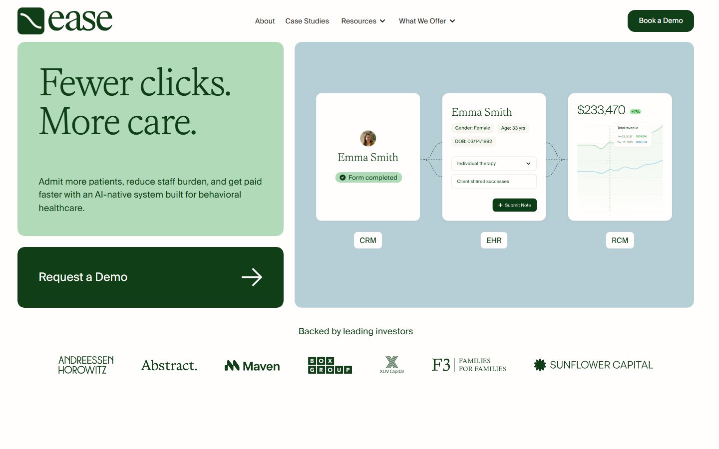
EaseHealth's marketing surface is a calm, clinical-trust interface for AI-native behavioral-healthcare software. It sits on a warm near-white canvas (`{colors.canvas}` — #fffefc) and speaks almost entirely in greens: deep forest ink (`{colors.ink}` — #0f3e17), soft sage surface blocks (`{colors.surface-green}` — #b1dbb8), and pale mint accents (`{colors.surface-mint}` — #e1f4df). The result reads as premium, soft, and editorial — healthcare software that feels reassuring rather than enterprise-cold.
The type voice is the defining signature: a **thin (weight 300) Faire Octave serif** carries every headline at large optical sizes with tight negative tracking, while a **Suisse-Intl-style grotesk** (substituted here with Inter) carries buttons and UI copy. The pairing of a light serif display against a neutral sans gives the system its understated luxury character — it never shouts.
Brand voltage comes from two places: the **green palette** (forest ink on sage and mint blocks) and the **real product UI shown in-context**. The hero pairs a sage headline block on the left with a pale blue-gray panel on the right (`{colors.surface-bluegray}` — #b6ced5) that holds three white product mockup cards labeled CRM / EHR / RCM — the actual product chrome (patient records, schedule notes, revenue charts) rendered at small scale rather than illustrated.
**Key Characteristics:**
- Warm near-white canvas (`{colors.canvas}` — #fffefc) instead of pure white — a subtle warmth that softens the whole page.
- Deep forest-green ink (`{colors.ink}` — #0f3e17) for headlines and primary actions. The brand is monochrome-green at the action layer.
- Thin Faire Octave serif (weight 300) for all display type, with strong negative letter-spacing (-2.2px on the hero h1) — light, editorial, premium.
- Soft sage and mint surface blocks (`{colors.surface-green}`, `{colors.surface-mint}`) for headline cards and feature sections; pale blue-gray (`{colors.surface-bluegray}`) for the product-demo panel.
- Generously rounded surfaces — `{rounded.md}` (14px) on cards and blocks, `{rounded.pill}` (999px) on buttons, status badges, and section-label pills.
- Real product UI fragments (patient records, EHR note tables, revenue charts) shown inside white mockup cards — Ease shows the product, it doesn't decorate around it.
- A dark-green block CTA (`{component.button-cta-block}` — #0c2f10) anchors the hero with an oversized "Request a Demo" arrow button.
## Colors
### Brand & Action
- **Primary** (`{colors.primary}` — #0f3e17): The dominant brand green. Used on the nav "Book a Demo" pill, headline text, and primary actions.
- **Primary Dark** (`{colors.primary-dark}` — #0c2f10): The deepest green, reserved for the large block CTA ("Request a Demo") in the hero.
### Surface
- **Canvas** (`{colors.canvas}` — #fffefc): The default warm near-white page floor.
- **Surface** (`{colors.surface}` — #ffffff): Pure-white product mockup cards and CRM/EHR/RCM pill labels.
- **Surface Soft** (`{colors.surface-soft}` — #fafafa): Faint off-white used for subtle section breaks.
- **Surface Mint** (`{colors.surface-mint}` — #e1f4df): The lightest green tint — status badges ("Form completed") and soft highlight fills.
- **Surface Green Soft** (`{colors.surface-green-soft}` — #cfe7d3): A mid-pale green for small fills and avatar backgrounds.
- **Surface Green** (`{colors.surface-green}` — #b1dbb8): The hero headline block and lower feature-section cards.
- **Surface Blue-Gray** (`{colors.surface-bluegray}` — #b6ced5): The right-side product-demo panel and small section-label pills ("Broad clinical support", "The problem", "Why Ease").
### Text
- **Ink** (`{colors.ink}` — #0f3e17): All headlines and primary text.
- **Body** (`{colors.body}` — #222222): Default running-text color.
- **Link** (`{colors.link}` — #333333): Inline links and nav text in some contexts.
- **Muted** (`{colors.muted}` — #9ca3af): Secondary captions and fine-print ("claims processed", "payor claims submitted").
- **On Primary** (`{colors.on-primary}` — #ffffff): Text on green primary buttons and dark block CTA.
### Hairlines & Neutrals
- **Hairline** (`{colors.hairline}` — #dddddd): 1px dividers and table rules inside product cards.
- **Hairline Soft** (`{colors.hairline-soft}` — #eeeeee): Barely-visible dividers between rows.
- **Neutral Mid** (`{colors.neutral-mid}` — #cccccc): Border and disabled tones.
- **Neutral Strong** (`{colors.neutral-strong}` — #222222): Dark UI text in product chrome.
### Incidental Accents (product chrome / logos)
- **Accent Blue** (`{colors.accent-blue}` — #3898ec): A small system blue from default link/control styling. Appears rarely.
- **Accent Plum** (`{colors.accent-plum}` — #3d0f34) and **Accent Mauve** (`{colors.accent-mauve}` — #9e718e): Low-frequency tones observed in logos/illustration fragments — not part of the core brand surface palette.
## Typography
### Font Family
The system runs two typefaces. **Faire Octave** is the brand display serif — used at weight 300 across all headline sizes with tight negative tracking — and **Suisseintl** (a Swiss-grotesk) is the UI sans used for buttons, navigation, and body copy. Both are licensed/custom faces; see the substitution note below.
The split is functional:
- Faire Octave (thin serif, weight 300, negative tracking) — h1, h2/h3, h4
- Suisseintl / Inter (grotesk, weight 400) — buttons, nav, body, captions
### Hierarchy
| Token | Size | Weight | Line Height | Letter Spacing | Use |
|---|---|---|---|---|---|
| `{typography.display-xl}` | 73.92px | 300 | 1.05 | -2.2176px | Hero h1 ("Fewer clicks. More care.") — Faire Octave |
| `{typography.display-md}` | 40.48px | 300 | 1.35 | -0.4048px | Section heads (h2/h3 — "A super-powered system, working together.") — Faire Octave |
| `{typography.title}` | 24.64px | 300 | 1.35 | -0.2464px | Sub-section heads, card titles (h4) — Faire Octave |
| `{typography.body}` | 16px | 400 | 1.5 | normal | Running text, descriptions — Suisseintl/Inter — **derived** (see note) |
| `{typography.button}` | 14.08px | 400 | 1.5 | normal | Button labels, nav links, captions, badges — Suisseintl/Inter |
### Principles
Faire Octave is the brand voice — thin and editorial. The weight stays at 300 across all display sizes; it never bolds. The negative letter-spacing (scaling from -2.2px on the hero to -0.25px on h4) is part of the voice — Faire Octave set without it reads as off-brand. Keep the serif for display only; never set body copy or buttons in it.
### Note on Font Substitutes
**Suisseintl** is a licensed Swiss grotesk and is not available as a public web font; this system substitutes **Inter** (weight 400) as the closest open-source equivalent — the geometric-humanist grotesk character is preserved. **Faire Octave** is likewise a custom/licensed display serif; an open-source approximation is **Fraunces** or **PT Serif** at light weight (300), or **Georgia** as the system fallback — none reproduce Faire Octave exactly but they preserve the thin-serif editorial silhouette. Never claim to ship the licensed fonts.
### Derived Value Note
The **body** role at 16px is **derived** — the running body copy size was not directly measured (only h1–h4 and button were captured). 16px / weight 400 / line-height 1.5 is an interpolation from the measured button metrics and the screenshot ground-truth; confirm against source before production use (see Known Gaps).
## Layout
### Spacing System
- **Base unit:** ~7px (the measured spacing values are all multiples/near-multiples of 7).
- **Tokens:** `{spacing.xxs}` 7px · `{spacing.xs}` 14px · `{spacing.sm}` 21px · `{spacing.md}` 28px · `{spacing.lg}` 35px · `{spacing.xl}` 42px · `{spacing.xxl}` 56px · `{spacing.section}` 70px · `{spacing.section-lg}` 84px · `{spacing.max}` 141px.
- **Section padding:** `{spacing.section}` (70px) and `{spacing.section-lg}` (84px) for the large vertical gaps between editorial bands; `{spacing.max}` (141px) appears on the most generous full-bleed breaks.
- **Card internal padding:** `{spacing.xl}` (42px) for the hero blocks and feature sections; `{spacing.sm}` (21px) inside product mockup cards.
### Grid & Container
- **Hero band:** Two-column split — a sage headline+CTA column on the left, the blue-gray product panel on the right.
- **Product panel:** Three white mockup cards in a row (CRM / EHR / RCM), connected by dotted flow lines.
- **Logo bar:** A single horizontal row of investor wordmarks ("Backed by leading investors").
- **Lower bands:** Single-column editorial sections with a small section-label pill above a thin-serif headline, set right-of-center for an asymmetric, editorial rhythm.
### Whitespace Philosophy
The page uses very generous whitespace — large vertical gaps (70–141px) isolate each band, and headlines sit alone with abundant air around them. The pacing is unhurried and premium: one idea per band, light serif headline, short supporting paragraph. The density is calm, never packed.
## Elevation & Depth
| Level | Treatment | Use |
|---|---|---|
| Flat | No shadow, no border | Body sections, nav, headline blocks |
| Color-block | Solid sage / mint / blue-gray fill on warm canvas | Hero headline card, product panel, feature sections |
| Card surface | White (`{colors.surface}`) fill on a colored panel | Product mockup cards inside the blue-gray panel |
The analysis captured **no shadow tokens** — the system is entirely flat. Depth comes from color-block contrast: white mockup cards lift off the pale blue-gray panel, and the sage/mint blocks separate from the warm canvas purely through hue. There is no neumorphism, no glassmorphism, and no drop shadows in the measured system.
### Decorative Depth
- Product mockup cards (patient record, EHR note table, revenue chart) carry their own internal product chrome — dividers, status badges, mini charts — shown as content, not as system tokens.
- Dotted connector lines link the CRM → EHR → RCM cards to suggest data flow across the platform.
## Shapes
### Border Radius Scale
| Token | Value | Use |
|---|---|---|
| `{rounded.sm}` | 7px | Small inner elements, inputs, mini controls inside product cards |
| `{rounded.md}` | 14px | Surface blocks (hero headline card, product panel, feature sections), product mockup cards |
| `{rounded.pill}` | 999px | Buttons ("Book a Demo"), status badges ("Form completed"), section-label pills, CRM/EHR/RCM labels, avatars |
The `{rounded.pill}` (999px) value is the most frequent radius in the measured system (24 occurrences) — pills are everywhere: buttons, labels, badges, avatars. The 14px block radius is the second-most-common (17), defining the soft surface-block geometry that gives the page its gentle character.
### Photography Geometry
Avatar images (e.g., the patient photo in the CRM card) are circular (`{rounded.pill}`) at ~35px. Product UI fragments retain their native chrome inside the white mockup cards.
## Components
### Navigation
**`top-nav`** — Warm-canvas nav bar pinned to the top. Carries the "ease" wordmark + logo at left, a centered menu (About, Case Studies, Resources ▾, What We Offer ▾) in `{typography.button}`, and a `{component.button-primary}` "Book a Demo" pill at right. Background `{colors.canvas}`, ink text.
**`nav-link`** — Inline nav menu items, transparent background, `{colors.ink}` text, `{typography.button}`.
### Buttons
**`button-primary`** — The pill CTA ("Book a Demo"). Background `{colors.primary}` (#0f3e17), text `{colors.on-primary}`, `{typography.button}`, rounded `{rounded.pill}`. Compact padding.
**`button-cta-block`** — The oversized hero CTA block ("Request a Demo" with a right-arrow glyph). Background `{colors.primary-dark}` (#0c2f10), text `{colors.on-primary}`, `{typography.title}`-scale label, rounded `{rounded.md}`, generous `{spacing.xl}` (42px) padding. The largest interactive element on the page — it anchors the hero's left column beneath the headline card.
**`text-link`** — Inline links, transparent background, `{colors.link}` (#333333) text, `{typography.body}`.
### Surface Blocks & Cards
**`hero-headline-card`** — The sage block holding the hero h1 ("Fewer clicks. More care.") and supporting paragraph. Background `{colors.surface-green}` (#b1dbb8), ink text, `{typography.display-xl}` headline, rounded `{rounded.md}`, padding `{spacing.xl}` (42px).
**`product-panel`** — The pale blue-gray panel on the hero's right holding the three product mockup cards. Background `{colors.surface-bluegray}` (#b6ced5), rounded `{rounded.md}`, padding `{spacing.xl}` (42px).
**`product-mockup-card`** — White cards showing real product UI fragments (the Emma Smith patient record, EHR note table, revenue chart). Background `{colors.surface}` (#ffffff), `{typography.body}`, rounded `{rounded.md}`, padding `{spacing.sm}` (21px). The product chrome inside is content, not decoration.
**`feature-card-mint`** — Lower-page sage feature section (e.g., "Accurate and organized EHR" with bullet pills and an embedded EHR mockup). Background `{colors.surface-green}`, ink text, `{typography.title}` heading, rounded `{rounded.md}`, padding `{spacing.xl}` (42px).
### Pills, Badges & Labels
**`pill-label`** — White rounded labels beneath the product cards (CRM / EHR / RCM). Background `{colors.surface}`, ink text, `{typography.button}`, rounded `{rounded.pill}`, padding 7px × 14px.
**`section-label-pill`** — Small blue-gray category pills above section headlines ("Broad clinical support", "The problem", "Why Ease"). Background `{colors.surface-bluegray}`, ink text, `{typography.button}`, rounded `{rounded.pill}`.
**`badge-status`** — Mint status chip inside product cards ("Form completed" with a check glyph). Background `{colors.surface-mint}` (#e1f4df), text `{colors.primary}`, `{typography.button}`, rounded `{rounded.pill}`.
**`avatar-circle`** — ~35px circular avatar (patient photo in the CRM card). Background `{colors.surface-green-soft}` fill behind photo/initials, rounded `{rounded.pill}`.
### Logo Bar
**`logo-bar`** — The "Backed by leading investors" row carrying monochrome investor wordmarks (Andreessen Horowitz, Abstract, Maven, BoxGroup, XLuv Capital, F3, Sunflower Capital). Background `{colors.canvas}`, ink-toned logos, padding `{spacing.xl}` (42px).
## Do's and Don'ts
### Do
- Reserve `{colors.primary}` (#0f3e17) and `{colors.primary-dark}` (#0c2f10) for actions and headlines. The brand is monochrome-green at the action layer.
- Set every headline in Faire Octave at weight 300 with negative tracking. The thin serif is the brand's premium voice.
- Use the warm canvas (`{colors.canvas}` — #fffefc), not pure white — the warmth softens the whole system.
- Build sections from soft color blocks (`{colors.surface-green}`, `{colors.surface-mint}`, `{colors.surface-bluegray}`) on the warm canvas; let hue contrast do the elevation work instead of shadows.
- Embed real product UI (CRM/EHR/RCM cards, patient records, charts) inside white mockup cards. Show the product, don't illustrate around it.
- Keep all interactive chips and badges fully pill-shaped (`{rounded.pill}`) and surface blocks at `{rounded.md}` (14px).
### Don't
- Don't bold the display serif. Faire Octave stays at weight 300 — heavier weights break the editorial character.
- Don't introduce drop shadows or glassmorphism — the measured system is entirely flat.
- Don't use the incidental accent tones (`{colors.accent-blue}`, `{colors.accent-plum}`, `{colors.accent-mauve}`) on primary actions — they come from product chrome / logos, not the brand surface palette.
- Don't set body copy or buttons in Faire Octave — those belong to the Suisseintl/Inter grotesk.
- Don't replace the warm canvas with stark white; the #fffefc warmth is intentional.
- Don't add hover-state styling beyond default and pressed.
## Responsive Behavior
The analysis captured only the desktop landing page; mobile/tablet specifications were not measured. The notes below are inferred from the desktop screenshot structure and should be confirmed against source.
### Breakpoints (inferred)
| Name | Width | Key Changes |
|---|---|---|
| Mobile | < 768px | Hero two-column split stacks (headline card above product panel); product mockup cards likely stack vertically; nav collapses to a menu trigger; logo bar wraps |
| Tablet | 768–1024px | Hero may retain split or stack; product panel cards may reduce from 3-up to a scrollable row |
| Desktop | > 1024px | Full two-column hero, 3-up product mockup cards, single-row logo bar (as measured) |
### Touch Targets
- `{component.button-primary}` and `{component.button-cta-block}` are comfortably sized; the block CTA is oversized and well above minimum tap area.
- Exact tap dimensions were not measured — confirm against source (see Known Gaps).
### Collapsing Strategy
- Hero's left headline column + right product panel are expected to stack on narrow viewports.
- The CRM/EHR/RCM mockup cards and their dotted connectors will need to reflow vertically on mobile.
## Iteration Guide
1. Focus on ONE component at a time. Reference its YAML key directly (`{component.hero-headline-card}`, `{component.product-mockup-card}`).
2. Variants of an existing component (`-active`, `-disabled`) live as separate entries in `components:`.
3. Use `{token.refs}` everywhere — never inline a hex in a component.
4. Never document hover. Default and Active/Pressed states only.
5. Display headlines stay Faire Octave weight 300 with negative tracking; UI/body stays Suisseintl/Inter weight 400. The pairing does not blur.
6. Keep the page flat — color blocks, not shadows, carry depth.
7. When in doubt about emphasis: larger thin-serif before any bolder weight.
## Known Gaps
- **Faire Octave** (display serif) and **Suisseintl** (UI grotesk) are both custom/licensed faces; only Suisseintl was explicitly flagged in `fonts_licensed` (→ Inter). Open-source substitutes are documented in the Typography section, but exact metrics differ.
- **Body type was not measured** — only h1–h4 and the button role were captured. The `{typography.body}` role (16px / 400) is **derived** and should be confirmed against source.
- The measured `button-primary` component reported `radius: 0px, padding: 0px` while the screenshots clearly show a pill-shaped, padded button — the selector likely captured an unstyled `<button>` element. Button geometry is documented from screenshot ground-truth + the measured `{rounded.pill}` and spacing tokens.
- The measured `card` component reported `radius: 0px, shadow: none`, but visible cards use ~14px rounded corners; card radius is documented as `{rounded.md}` from the measured radius scale and screenshots.
- **No shadow tokens** were captured; the flat-elevation model is taken as authoritative, but subtle product-chrome shadows inside mockups may exist and were not extracted.
- Accent tones `{colors.accent-plum}` (#3d0f34), `{colors.accent-mauve}` (#9e718e), and `{colors.accent-blue}` (#3898ec) appear at low frequency and likely originate from logos or default control styling, not the core brand surface palette.
- Only the desktop landing page was captured; responsive breakpoints, touch-target sizes, mobile nav behavior, and form/input states are not measured.
- Animation and transition timings (dotted-connector reveal, card states) are out of scope.
<!-- Documented by duply · real-world design systems as ready-to-use DESIGN.md for AI coding agents · https://duply.ai/easehealth/design-md -->
Color Palette
Accent
Neutrals
Typography
display-xl73.92px · 300 · 1.05
The quick brown fox jumpsdisplay-md40.48px · 300 · 1.35
The quick brown fox jumpstitle24.64px · 300 · 1.35
The quick brown fox jumpsbody16px · 400 · 1.5
The quick brown fox jumpsbutton14.08px · 400 · 1.5
The quick brown fox jumpsSpacing & Shape
Spacing
| Name | Value | Preview |
|---|---|---|
| xxs | 7px | |
| xs | 14px | |
| sm | 21px | |
| md | 28px | |
| lg | 35px | |
| xl | 42px | |
| xxl | 56px | |
| section | 70px | |
| section-lg | 84px | |
| max | 141px |
Border Radius
| Name | Value | Preview |
|---|---|---|
| sm | 7px | |
| md | 14px | |
| pill | 999px |
More like this


---
version: alpha
name: EaseHealth-design-analysis
description: A calm, clinical-trust interface for behavioral-healthcare software, built on a near-white warm canvas (#fffefc) with deep forest-green ink and light sage/mint surface blocks. The system reads as soft, premium, and editorial — a low-weight Faire Octave serif display paired with a Suisse-Intl-style grotesk for UI, generously rounded surface blocks, and real product UI mockups (CRM/EHR/RCM cards) shown directly inside a pale blue-gray panel. Brand voltage comes from the green palette and the thin serif headlines, not from saturated accents.

colors:
  primary: "#0f3e17"
  primary-dark: "#0c2f10"
  ink: "#0f3e17"
  body: "#222222"
  link: "#333333"
  muted: "#9ca3af"
  canvas: "#fffefc"
  surface: "#ffffff"
  surface-soft: "#fafafa"
  surface-mint: "#e1f4df"
  surface-green-soft: "#cfe7d3"
  surface-green: "#b1dbb8"
  surface-bluegray: "#b6ced5"
  hairline: "#dddddd"
  hairline-soft: "#eeeeee"
  neutral-mid: "#cccccc"
  neutral-strong: "#222222"
  on-primary: "#ffffff"
  accent-blue: "#3898ec"
  accent-plum: "#3d0f34"
  accent-mauve: "#9e718e"

typography:
  display-xl:
    fontFamily: "Faire Octave, Georgia, serif"
    fontSize: 73.92px
    fontWeight: 300
    lineHeight: 1.05
    letterSpacing: -2.2176px
  display-md:
    fontFamily: "Faire Octave, Georgia, serif"
    fontSize: 40.48px
    fontWeight: 300
    lineHeight: 1.35
    letterSpacing: -0.4048px
  title:
    fontFamily: "Faire Octave, Georgia, serif"
    fontSize: 24.64px
    fontWeight: 300
    lineHeight: 1.35
    letterSpacing: -0.2464px
  body:
    fontFamily: "Suisseintl, Inter, sans-serif"
    fontSize: 16px
    fontWeight: 400
    lineHeight: 1.5
    letterSpacing: normal
  button:
    fontFamily: "Suisseintl, Inter, sans-serif"
    fontSize: 14.08px
    fontWeight: 400
    lineHeight: 1.5
    letterSpacing: normal

rounded:
  sm: 7px
  md: 14px
  pill: 999px

spacing:
  xxs: 7px
  xs: 14px
  sm: 21px
  md: 28px
  lg: 35px
  xl: 42px
  xxl: 56px
  section: 70px
  section-lg: 84px
  max: 141px

components:
  top-nav:
    backgroundColor: "{colors.canvas}"
    textColor: "{colors.ink}"
    typography: "{typography.button}"
    padding: 21px 42px
  button-primary:
    backgroundColor: "{colors.primary}"
    textColor: "{colors.on-primary}"
    typography: "{typography.button}"
    rounded: "{rounded.pill}"
    padding: 14px 28px
  button-cta-block:
    backgroundColor: "{colors.primary-dark}"
    textColor: "{colors.on-primary}"
    typography: "{typography.title}"
    rounded: "{rounded.md}"
    padding: 42px
  nav-link:
    backgroundColor: transparent
    textColor: "{colors.ink}"
    typography: "{typography.button}"
  text-link:
    backgroundColor: transparent
    textColor: "{colors.link}"
    typography: "{typography.body}"
  hero-headline-card:
    backgroundColor: "{colors.surface-green}"
    textColor: "{colors.ink}"
    typography: "{typography.display-xl}"
    rounded: "{rounded.md}"
    padding: 42px
  product-panel:
    backgroundColor: "{colors.surface-bluegray}"
    textColor: "{colors.ink}"
    rounded: "{rounded.md}"
    padding: 42px
  product-mockup-card:
    backgroundColor: "{colors.surface}"
    textColor: "{colors.ink}"
    typography: "{typography.body}"
    rounded: "{rounded.md}"
    padding: 21px
  feature-card-mint:
    backgroundColor: "{colors.surface-green}"
    textColor: "{colors.ink}"
    typography: "{typography.title}"
    rounded: "{rounded.md}"
    padding: 42px
  pill-label:
    backgroundColor: "{colors.surface}"
    textColor: "{colors.ink}"
    typography: "{typography.button}"
    rounded: "{rounded.pill}"
    padding: 7px 14px
  section-label-pill:
    backgroundColor: "{colors.surface-bluegray}"
    textColor: "{colors.ink}"
    typography: "{typography.button}"
    rounded: "{rounded.pill}"
    padding: 7px 14px
  badge-status:
    backgroundColor: "{colors.surface-mint}"
    textColor: "{colors.primary}"
    typography: "{typography.button}"
    rounded: "{rounded.pill}"
    padding: 7px 14px
  avatar-circle:
    backgroundColor: "{colors.surface-green-soft}"
    textColor: "{colors.ink}"
    rounded: "{rounded.pill}"
    size: 35px
  logo-bar:
    backgroundColor: "{colors.canvas}"
    textColor: "{colors.ink}"
    typography: "{typography.body}"
    padding: 42px
---

## Overview

EaseHealth's marketing surface is a calm, clinical-trust interface for AI-native behavioral-healthcare software. It sits on a warm near-white canvas (`{colors.canvas}` — #fffefc) and speaks almost entirely in greens: deep forest ink (`{colors.ink}` — #0f3e17), soft sage surface blocks (`{colors.surface-green}` — #b1dbb8), and pale mint accents (`{colors.surface-mint}` — #e1f4df). The result reads as premium, soft, and editorial — healthcare software that feels reassuring rather than enterprise-cold.

The type voice is the defining signature: a **thin (weight 300) Faire Octave serif** carries every headline at large optical sizes with tight negative tracking, while a **Suisse-Intl-style grotesk** (substituted here with Inter) carries buttons and UI copy. The pairing of a light serif display against a neutral sans gives the system its understated luxury character — it never shouts.

Brand voltage comes from two places: the **green palette** (forest ink on sage and mint blocks) and the **real product UI shown in-context**. The hero pairs a sage headline block on the left with a pale blue-gray panel on the right (`{colors.surface-bluegray}` — #b6ced5) that holds three white product mockup cards labeled CRM / EHR / RCM — the actual product chrome (patient records, schedule notes, revenue charts) rendered at small scale rather than illustrated.

**Key Characteristics:**
- Warm near-white canvas (`{colors.canvas}` — #fffefc) instead of pure white — a subtle warmth that softens the whole page.
- Deep forest-green ink (`{colors.ink}` — #0f3e17) for headlines and primary actions. The brand is monochrome-green at the action layer.
- Thin Faire Octave serif (weight 300) for all display type, with strong negative letter-spacing (-2.2px on the hero h1) — light, editorial, premium.
- Soft sage and mint surface blocks (`{colors.surface-green}`, `{colors.surface-mint}`) for headline cards and feature sections; pale blue-gray (`{colors.surface-bluegray}`) for the product-demo panel.
- Generously rounded surfaces — `{rounded.md}` (14px) on cards and blocks, `{rounded.pill}` (999px) on buttons, status badges, and section-label pills.
- Real product UI fragments (patient records, EHR note tables, revenue charts) shown inside white mockup cards — Ease shows the product, it doesn't decorate around it.
- A dark-green block CTA (`{component.button-cta-block}` — #0c2f10) anchors the hero with an oversized "Request a Demo" arrow button.

## Colors

### Brand & Action
- **Primary** (`{colors.primary}` — #0f3e17): The dominant brand green. Used on the nav "Book a Demo" pill, headline text, and primary actions.
- **Primary Dark** (`{colors.primary-dark}` — #0c2f10): The deepest green, reserved for the large block CTA ("Request a Demo") in the hero.

### Surface
- **Canvas** (`{colors.canvas}` — #fffefc): The default warm near-white page floor.
- **Surface** (`{colors.surface}` — #ffffff): Pure-white product mockup cards and CRM/EHR/RCM pill labels.
- **Surface Soft** (`{colors.surface-soft}` — #fafafa): Faint off-white used for subtle section breaks.
- **Surface Mint** (`{colors.surface-mint}` — #e1f4df): The lightest green tint — status badges ("Form completed") and soft highlight fills.
- **Surface Green Soft** (`{colors.surface-green-soft}` — #cfe7d3): A mid-pale green for small fills and avatar backgrounds.
- **Surface Green** (`{colors.surface-green}` — #b1dbb8): The hero headline block and lower feature-section cards.
- **Surface Blue-Gray** (`{colors.surface-bluegray}` — #b6ced5): The right-side product-demo panel and small section-label pills ("Broad clinical support", "The problem", "Why Ease").

### Text
- **Ink** (`{colors.ink}` — #0f3e17): All headlines and primary text.
- **Body** (`{colors.body}` — #222222): Default running-text color.
- **Link** (`{colors.link}` — #333333): Inline links and nav text in some contexts.
- **Muted** (`{colors.muted}` — #9ca3af): Secondary captions and fine-print ("claims processed", "payor claims submitted").
- **On Primary** (`{colors.on-primary}` — #ffffff): Text on green primary buttons and dark block CTA.

### Hairlines & Neutrals
- **Hairline** (`{colors.hairline}` — #dddddd): 1px dividers and table rules inside product cards.
- **Hairline Soft** (`{colors.hairline-soft}` — #eeeeee): Barely-visible dividers between rows.
- **Neutral Mid** (`{colors.neutral-mid}` — #cccccc): Border and disabled tones.
- **Neutral Strong** (`{colors.neutral-strong}` — #222222): Dark UI text in product chrome.

### Incidental Accents (product chrome / logos)
- **Accent Blue** (`{colors.accent-blue}` — #3898ec): A small system blue from default link/control styling. Appears rarely.
- **Accent Plum** (`{colors.accent-plum}` — #3d0f34) and **Accent Mauve** (`{colors.accent-mauve}` — #9e718e): Low-frequency tones observed in logos/illustration fragments — not part of the core brand surface palette.

## Typography

### Font Family
The system runs two typefaces. **Faire Octave** is the brand display serif — used at weight 300 across all headline sizes with tight negative tracking — and **Suisseintl** (a Swiss-grotesk) is the UI sans used for buttons, navigation, and body copy. Both are licensed/custom faces; see the substitution note below.

The split is functional:
- Faire Octave (thin serif, weight 300, negative tracking) — h1, h2/h3, h4
- Suisseintl / Inter (grotesk, weight 400) — buttons, nav, body, captions

### Hierarchy

| Token | Size | Weight | Line Height | Letter Spacing | Use |
|---|---|---|---|---|---|
| `{typography.display-xl}` | 73.92px | 300 | 1.05 | -2.2176px | Hero h1 ("Fewer clicks. More care.") — Faire Octave |
| `{typography.display-md}` | 40.48px | 300 | 1.35 | -0.4048px | Section heads (h2/h3 — "A super-powered system, working together.") — Faire Octave |
| `{typography.title}` | 24.64px | 300 | 1.35 | -0.2464px | Sub-section heads, card titles (h4) — Faire Octave |
| `{typography.body}` | 16px | 400 | 1.5 | normal | Running text, descriptions — Suisseintl/Inter — **derived** (see note) |
| `{typography.button}` | 14.08px | 400 | 1.5 | normal | Button labels, nav links, captions, badges — Suisseintl/Inter |

### Principles
Faire Octave is the brand voice — thin and editorial. The weight stays at 300 across all display sizes; it never bolds. The negative letter-spacing (scaling from -2.2px on the hero to -0.25px on h4) is part of the voice — Faire Octave set without it reads as off-brand. Keep the serif for display only; never set body copy or buttons in it.

### Note on Font Substitutes
**Suisseintl** is a licensed Swiss grotesk and is not available as a public web font; this system substitutes **Inter** (weight 400) as the closest open-source equivalent — the geometric-humanist grotesk character is preserved. **Faire Octave** is likewise a custom/licensed display serif; an open-source approximation is **Fraunces** or **PT Serif** at light weight (300), or **Georgia** as the system fallback — none reproduce Faire Octave exactly but they preserve the thin-serif editorial silhouette. Never claim to ship the licensed fonts.

### Derived Value Note
The **body** role at 16px is **derived** — the running body copy size was not directly measured (only h1–h4 and button were captured). 16px / weight 400 / line-height 1.5 is an interpolation from the measured button metrics and the screenshot ground-truth; confirm against source before production use (see Known Gaps).

## Layout

### Spacing System
- **Base unit:** ~7px (the measured spacing values are all multiples/near-multiples of 7).
- **Tokens:** `{spacing.xxs}` 7px · `{spacing.xs}` 14px · `{spacing.sm}` 21px · `{spacing.md}` 28px · `{spacing.lg}` 35px · `{spacing.xl}` 42px · `{spacing.xxl}` 56px · `{spacing.section}` 70px · `{spacing.section-lg}` 84px · `{spacing.max}` 141px.
- **Section padding:** `{spacing.section}` (70px) and `{spacing.section-lg}` (84px) for the large vertical gaps between editorial bands; `{spacing.max}` (141px) appears on the most generous full-bleed breaks.
- **Card internal padding:** `{spacing.xl}` (42px) for the hero blocks and feature sections; `{spacing.sm}` (21px) inside product mockup cards.

### Grid & Container
- **Hero band:** Two-column split — a sage headline+CTA column on the left, the blue-gray product panel on the right.
- **Product panel:** Three white mockup cards in a row (CRM / EHR / RCM), connected by dotted flow lines.
- **Logo bar:** A single horizontal row of investor wordmarks ("Backed by leading investors").
- **Lower bands:** Single-column editorial sections with a small section-label pill above a thin-serif headline, set right-of-center for an asymmetric, editorial rhythm.

### Whitespace Philosophy
The page uses very generous whitespace — large vertical gaps (70–141px) isolate each band, and headlines sit alone with abundant air around them. The pacing is unhurried and premium: one idea per band, light serif headline, short supporting paragraph. The density is calm, never packed.

## Elevation & Depth

| Level | Treatment | Use |
|---|---|---|
| Flat | No shadow, no border | Body sections, nav, headline blocks |
| Color-block | Solid sage / mint / blue-gray fill on warm canvas | Hero headline card, product panel, feature sections |
| Card surface | White (`{colors.surface}`) fill on a colored panel | Product mockup cards inside the blue-gray panel |

The analysis captured **no shadow tokens** — the system is entirely flat. Depth comes from color-block contrast: white mockup cards lift off the pale blue-gray panel, and the sage/mint blocks separate from the warm canvas purely through hue. There is no neumorphism, no glassmorphism, and no drop shadows in the measured system.

### Decorative Depth
- Product mockup cards (patient record, EHR note table, revenue chart) carry their own internal product chrome — dividers, status badges, mini charts — shown as content, not as system tokens.
- Dotted connector lines link the CRM → EHR → RCM cards to suggest data flow across the platform.

## Shapes

### Border Radius Scale

| Token | Value | Use |
|---|---|---|
| `{rounded.sm}` | 7px | Small inner elements, inputs, mini controls inside product cards |
| `{rounded.md}` | 14px | Surface blocks (hero headline card, product panel, feature sections), product mockup cards |
| `{rounded.pill}` | 999px | Buttons ("Book a Demo"), status badges ("Form completed"), section-label pills, CRM/EHR/RCM labels, avatars |

The `{rounded.pill}` (999px) value is the most frequent radius in the measured system (24 occurrences) — pills are everywhere: buttons, labels, badges, avatars. The 14px block radius is the second-most-common (17), defining the soft surface-block geometry that gives the page its gentle character.

### Photography Geometry
Avatar images (e.g., the patient photo in the CRM card) are circular (`{rounded.pill}`) at ~35px. Product UI fragments retain their native chrome inside the white mockup cards.

## Components

### Navigation

**`top-nav`** — Warm-canvas nav bar pinned to the top. Carries the "ease" wordmark + logo at left, a centered menu (About, Case Studies, Resources ▾, What We Offer ▾) in `{typography.button}`, and a `{component.button-primary}` "Book a Demo" pill at right. Background `{colors.canvas}`, ink text.

**`nav-link`** — Inline nav menu items, transparent background, `{colors.ink}` text, `{typography.button}`.

### Buttons

**`button-primary`** — The pill CTA ("Book a Demo"). Background `{colors.primary}` (#0f3e17), text `{colors.on-primary}`, `{typography.button}`, rounded `{rounded.pill}`. Compact padding.

**`button-cta-block`** — The oversized hero CTA block ("Request a Demo" with a right-arrow glyph). Background `{colors.primary-dark}` (#0c2f10), text `{colors.on-primary}`, `{typography.title}`-scale label, rounded `{rounded.md}`, generous `{spacing.xl}` (42px) padding. The largest interactive element on the page — it anchors the hero's left column beneath the headline card.

**`text-link`** — Inline links, transparent background, `{colors.link}` (#333333) text, `{typography.body}`.

### Surface Blocks & Cards

**`hero-headline-card`** — The sage block holding the hero h1 ("Fewer clicks. More care.") and supporting paragraph. Background `{colors.surface-green}` (#b1dbb8), ink text, `{typography.display-xl}` headline, rounded `{rounded.md}`, padding `{spacing.xl}` (42px).

**`product-panel`** — The pale blue-gray panel on the hero's right holding the three product mockup cards. Background `{colors.surface-bluegray}` (#b6ced5), rounded `{rounded.md}`, padding `{spacing.xl}` (42px).

**`product-mockup-card`** — White cards showing real product UI fragments (the Emma Smith patient record, EHR note table, revenue chart). Background `{colors.surface}` (#ffffff), `{typography.body}`, rounded `{rounded.md}`, padding `{spacing.sm}` (21px). The product chrome inside is content, not decoration.

**`feature-card-mint`** — Lower-page sage feature section (e.g., "Accurate and organized EHR" with bullet pills and an embedded EHR mockup). Background `{colors.surface-green}`, ink text, `{typography.title}` heading, rounded `{rounded.md}`, padding `{spacing.xl}` (42px).

### Pills, Badges & Labels

**`pill-label`** — White rounded labels beneath the product cards (CRM / EHR / RCM). Background `{colors.surface}`, ink text, `{typography.button}`, rounded `{rounded.pill}`, padding 7px × 14px.

**`section-label-pill`** — Small blue-gray category pills above section headlines ("Broad clinical support", "The problem", "Why Ease"). Background `{colors.surface-bluegray}`, ink text, `{typography.button}`, rounded `{rounded.pill}`.

**`badge-status`** — Mint status chip inside product cards ("Form completed" with a check glyph). Background `{colors.surface-mint}` (#e1f4df), text `{colors.primary}`, `{typography.button}`, rounded `{rounded.pill}`.

**`avatar-circle`** — ~35px circular avatar (patient photo in the CRM card). Background `{colors.surface-green-soft}` fill behind photo/initials, rounded `{rounded.pill}`.

### Logo Bar

**`logo-bar`** — The "Backed by leading investors" row carrying monochrome investor wordmarks (Andreessen Horowitz, Abstract, Maven, BoxGroup, XLuv Capital, F3, Sunflower Capital). Background `{colors.canvas}`, ink-toned logos, padding `{spacing.xl}` (42px).

## Do's and Don'ts

### Do
- Reserve `{colors.primary}` (#0f3e17) and `{colors.primary-dark}` (#0c2f10) for actions and headlines. The brand is monochrome-green at the action layer.
- Set every headline in Faire Octave at weight 300 with negative tracking. The thin serif is the brand's premium voice.
- Use the warm canvas (`{colors.canvas}` — #fffefc), not pure white — the warmth softens the whole system.
- Build sections from soft color blocks (`{colors.surface-green}`, `{colors.surface-mint}`, `{colors.surface-bluegray}`) on the warm canvas; let hue contrast do the elevation work instead of shadows.
- Embed real product UI (CRM/EHR/RCM cards, patient records, charts) inside white mockup cards. Show the product, don't illustrate around it.
- Keep all interactive chips and badges fully pill-shaped (`{rounded.pill}`) and surface blocks at `{rounded.md}` (14px).

### Don't
- Don't bold the display serif. Faire Octave stays at weight 300 — heavier weights break the editorial character.
- Don't introduce drop shadows or glassmorphism — the measured system is entirely flat.
- Don't use the incidental accent tones (`{colors.accent-blue}`, `{colors.accent-plum}`, `{colors.accent-mauve}`) on primary actions — they come from product chrome / logos, not the brand surface palette.
- Don't set body copy or buttons in Faire Octave — those belong to the Suisseintl/Inter grotesk.
- Don't replace the warm canvas with stark white; the #fffefc warmth is intentional.
- Don't add hover-state styling beyond default and pressed.

## Responsive Behavior

The analysis captured only the desktop landing page; mobile/tablet specifications were not measured. The notes below are inferred from the desktop screenshot structure and should be confirmed against source.

### Breakpoints (inferred)

| Name | Width | Key Changes |
|---|---|---|
| Mobile | < 768px | Hero two-column split stacks (headline card above product panel); product mockup cards likely stack vertically; nav collapses to a menu trigger; logo bar wraps |
| Tablet | 768–1024px | Hero may retain split or stack; product panel cards may reduce from 3-up to a scrollable row |
| Desktop | > 1024px | Full two-column hero, 3-up product mockup cards, single-row logo bar (as measured) |

### Touch Targets
- `{component.button-primary}` and `{component.button-cta-block}` are comfortably sized; the block CTA is oversized and well above minimum tap area.
- Exact tap dimensions were not measured — confirm against source (see Known Gaps).

### Collapsing Strategy
- Hero's left headline column + right product panel are expected to stack on narrow viewports.
- The CRM/EHR/RCM mockup cards and their dotted connectors will need to reflow vertically on mobile.

## Iteration Guide

1. Focus on ONE component at a time. Reference its YAML key directly (`{component.hero-headline-card}`, `{component.product-mockup-card}`).
2. Variants of an existing component (`-active`, `-disabled`) live as separate entries in `components:`.
3. Use `{token.refs}` everywhere — never inline a hex in a component.
4. Never document hover. Default and Active/Pressed states only.
5. Display headlines stay Faire Octave weight 300 with negative tracking; UI/body stays Suisseintl/Inter weight 400. The pairing does not blur.
6. Keep the page flat — color blocks, not shadows, carry depth.
7. When in doubt about emphasis: larger thin-serif before any bolder weight.

## Known Gaps

- **Faire Octave** (display serif) and **Suisseintl** (UI grotesk) are both custom/licensed faces; only Suisseintl was explicitly flagged in `fonts_licensed` (→ Inter). Open-source substitutes are documented in the Typography section, but exact metrics differ.
- **Body type was not measured** — only h1–h4 and the button role were captured. The `{typography.body}` role (16px / 400) is **derived** and should be confirmed against source.
- The measured `button-primary` component reported `radius: 0px, padding: 0px` while the screenshots clearly show a pill-shaped, padded button — the selector likely captured an unstyled `<button>` element. Button geometry is documented from screenshot ground-truth + the measured `{rounded.pill}` and spacing tokens.
- The measured `card` component reported `radius: 0px, shadow: none`, but visible cards use ~14px rounded corners; card radius is documented as `{rounded.md}` from the measured radius scale and screenshots.
- **No shadow tokens** were captured; the flat-elevation model is taken as authoritative, but subtle product-chrome shadows inside mockups may exist and were not extracted.
- Accent tones `{colors.accent-plum}` (#3d0f34), `{colors.accent-mauve}` (#9e718e), and `{colors.accent-blue}` (#3898ec) appear at low frequency and likely originate from logos or default control styling, not the core brand surface palette.
- Only the desktop landing page was captured; responsive breakpoints, touch-target sizes, mobile nav behavior, and form/input states are not measured.
- Animation and transition timings (dotted-connector reveal, card states) are out of scope.

<!-- Documented by duply · real-world design systems as ready-to-use DESIGN.md for AI coding agents · https://duply.ai/easehealth/design-md -->