Micro
A warm, editorial productivity-app marketing surface that pairs a high-contrast Perfectly Nineties display serif (white, weight 900) over a photographic sky-blue hero with a clean Haffer grotesk for everything else. The system reads as friendly-but-premium SaaS — soft light-gray canvas, real product-UI mockups floating in rounded cards, a small saturated accent palette (sky blue, teal, violet, amber, coral) used inside product chrome, and warm near-black ink for body copy and dark CTAs.
---
version: alpha
name: Micro-design-analysis
description: A warm, editorial productivity-app marketing surface that pairs a high-contrast Perfectly Nineties display serif (white, weight 900) over a photographic sky-blue hero with a clean Haffer grotesk for everything else. The system reads as friendly-but-premium SaaS — soft light-gray canvas, real product-UI mockups floating in rounded cards, a small saturated accent palette (sky blue, teal, violet, amber, coral) used inside product chrome, and warm near-black ink for body copy and dark CTAs.
colors:
ink: "#221f1c"
ink-strong: "#18181b"
black: "#000000"
body: "#797267"
body-warm: "#796f65"
hairline: "#cccccc"
canvas: "#f5f5f5"
surface: "#fafafa"
surface-muted: "#f4f4f5"
on-dark: "#ffffff"
sky: "#518bdb"
sky-soft: "#d5ecfb"
accent-teal: "#36bab8"
accent-violet: "#bf89cd"
accent-amber: "#e5a057"
accent-coral: "#ed6d68"
accent-green: "#3a6b2a"
accent-lime: "#7efa55"
accent-navy: "#37405d"
accent-brown: "#513529"
typography:
display:
fontFamily: "Perfectly Nineties, Fraunces, Georgia, serif"
fontSize: 72px
fontWeight: 900
lineHeight: 1.0
letterSpacing: 1.44px
heading:
fontFamily: "Haffer, Inter, sans-serif"
fontSize: 24px
fontWeight: 700
lineHeight: 1.333
letterSpacing: normal
body:
fontFamily: "Haffer, Inter, sans-serif"
fontSize: 20px
fontWeight: 400
lineHeight: 1.4
letterSpacing: normal
button:
fontFamily: "Haffer, Inter, sans-serif"
fontSize: 14px
fontWeight: 500
lineHeight: 1.429
letterSpacing: normal
rounded:
none: 0px
xs: 2px
sm: 4px
md: 6px
lg: 8px
xl: 10px
card: 14px
pill: 18px
full: 9999px
spacing:
xxs: 4px
xs: 6px
sm: 8px
md: 12px
lg: 16px
xl: 20px
xxl: 24px
xxxl: 32px
huge: 48px
giant: 64px
mega: 80px
components:
button-primary:
backgroundColor: "{colors.ink-strong}"
textColor: "{colors.on-dark}"
typography: "{typography.button}"
rounded: "{rounded.lg}"
padding: 4px 12px
button-secondary:
backgroundColor: "{colors.on-dark}"
textColor: "{colors.ink}"
typography: "{typography.button}"
rounded: "{rounded.lg}"
padding: 4px 12px
badge-pill:
backgroundColor: "{colors.on-dark}"
textColor: "{colors.ink}"
typography: "{typography.button}"
rounded: "{rounded.pill}"
padding: 4px 12px
nav-pill-group:
backgroundColor: "{colors.sky-soft}"
textColor: "{colors.on-dark}"
typography: "{typography.button}"
rounded: "{rounded.pill}"
padding: 6px
hero-band:
backgroundColor: "{colors.sky}"
textColor: "{colors.on-dark}"
typography: "{typography.display}"
padding: 80px
product-mockup-card:
backgroundColor: "{colors.surface}"
textColor: "{colors.ink}"
rounded: "{rounded.card}"
padding: 24px
feature-card:
backgroundColor: "{colors.sky-soft}"
textColor: "{colors.ink}"
typography: "{typography.heading}"
rounded: "{rounded.card}"
padding: 32px
card:
backgroundColor: "{colors.surface}"
textColor: "{colors.ink}"
rounded: "{rounded.none}"
input:
backgroundColor: "{colors.surface}"
textColor: "{colors.ink}"
typography: "{typography.body}"
rounded: "{rounded.xl}"
padding: 12px
skill-tab:
backgroundColor: "{colors.surface-muted}"
textColor: "{colors.body}"
typography: "{typography.button}"
rounded: "{rounded.lg}"
padding: 6px 12px
code-terminal:
backgroundColor: "{colors.black}"
textColor: "{colors.accent-lime}"
typography: "{typography.button}"
rounded: "{rounded.lg}"
padding: 24px
footer:
backgroundColor: "{colors.canvas}"
textColor: "{colors.body}"
typography: "{typography.body}"
padding: 48px
---
## Overview
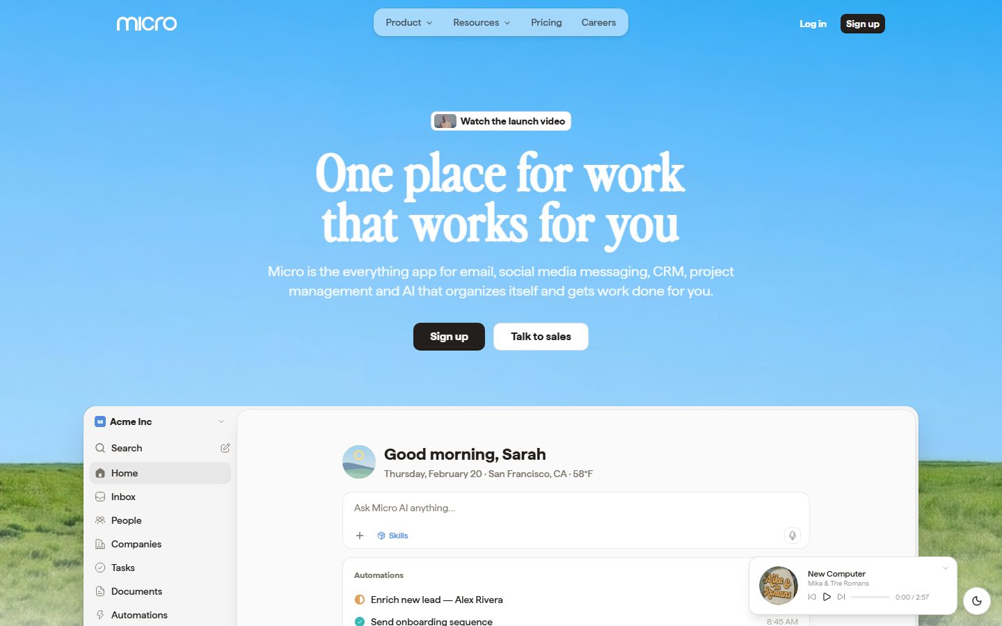
Micro's marketing landing page is a warm, editorial take on the modern productivity-app pitch. The page opens on a full-bleed photographic hero — a sky-blue gradient (`{colors.sky}` — #518bdb) fading into a green-field horizon — with the headline set in a high-contrast display serif (`{typography.display}` — Perfectly Nineties, weight 900) rendered in white (`{colors.on-dark}` — #ffffff). Below the fold the page drops onto a soft off-white canvas (`{colors.canvas}` — #f5f5f5) and becomes a clean product-led layout: real Micro app UI shown inside large rounded mockup cards, short feature lists, and a saturated-but-sparse accent palette that lives almost entirely *inside* the product chrome.
The type voice is a deliberate two-family split. **Perfectly Nineties** (a contrasted, slightly nostalgic display serif) carries the hero headline and is the brand's single moment of personality. **Haffer** (a clean neo-grotesk sans) handles everything else — h2/h3 section heads, body copy, buttons, nav. Body copy runs warm rather than pure-gray (`{colors.body}` — #797267), and ink is a warm near-black (`{colors.ink}` — #221f1c) rather than true black.
Color voltage comes from the product itself. The marketing surface is near-monochrome (warm ink on off-white), but the embedded app mockups carry a small saturated set — sky blue, teal (`{colors.accent-teal}` — #36bab8), violet (`{colors.accent-violet}` — #bf89cd), amber (`{colors.accent-amber}` — #e5a057), coral (`{colors.accent-coral}` — #ed6d68) — for status dots, integration icons, and avatar fills. The agents/engineers band introduces a dark terminal block (`{colors.black}` with `{colors.accent-lime}` — #7efa55 prompt text).
**Key Characteristics:**
- Photographic sky-to-field hero (`{colors.sky}`) with a white display-serif headline — the page's single emotive flourish.
- Display serif (`{typography.display}` — Perfectly Nineties, 72px / weight 900 / 1.44px tracking) used *only* for the hero h1.
- Haffer grotesk for all UI text — headings at 24px / 700, body at 20px / 400, buttons at 14px / 500.
- Warm neutrals throughout: warm ink (`{colors.ink}`), warm body gray (`{colors.body}`), off-white canvas (`{colors.canvas}`).
- Dark near-black CTA button (`{component.button-primary}`) paired with a white pill secondary (`{component.button-secondary}`).
- Real product UI floated in large rounded mockup cards (`{rounded.card}` — 14px), not illustrated abstractions.
- A sparse saturated accent set that appears almost exclusively inside the product mockups.
- Soft, low-alpha drop shadows on floating cards; flat (shadow-none) content cards elsewhere.
## Colors
### Brand & Hero
- **Sky** (`{colors.sky}` — #518bdb): The hero gradient base and the dominant brand color. Also tints feature panels via its soft variant.
- **Sky Soft** (`{colors.sky-soft}` — #d5ecfb): A pale tint used for feature-card backgrounds and the translucent nav-pill group over the hero.
- **On Dark** (`{colors.on-dark}` — #ffffff): White — the hero headline, sub-copy, and the pill/secondary button fills floating over the photographic hero.
### Ink & Text
- **Ink** (`{colors.ink}` — #221f1c): Warm near-black. All section headings and primary text on light surfaces.
- **Ink Strong** (`{colors.ink-strong}` — #18181b): The darkest ink, used for the primary CTA button fill.
- **Black** (`{colors.black}` — #000000): Reserved for the dark code-terminal block in the engineers band.
- **Body** (`{colors.body}` — #797267): Warm gray — default running body copy and sub-headings.
- **Body Warm** (`{colors.body-warm}` — #796f65): A near-duplicate warm gray used in tertiary captions and metadata rows.
### Surface
- **Canvas** (`{colors.canvas}` — #f5f5f5): The off-white page floor below the hero.
- **Surface** (`{colors.surface}` — #fafafa): Slightly lighter card / input / mockup surface.
- **Surface Muted** (`{colors.surface-muted}` — #f4f4f5): Skill-tab and inactive-chip backgrounds.
- **Hairline** (`{colors.hairline}` — #cccccc): 1px dividers and subtle borders.
### Accent (Product Chrome)
These saturated hues appear almost exclusively inside the embedded product UI — status dots, integration icons, avatar fills, charts:
- **Teal** (`{colors.accent-teal}` — #36bab8)
- **Violet** (`{colors.accent-violet}` — #bf89cd)
- **Amber** (`{colors.accent-amber}` — #e5a057)
- **Coral** (`{colors.accent-coral}` — #ed6d68)
- **Green** (`{colors.accent-green}` — #3a6b2a) and **Lime** (`{colors.accent-lime}` — #7efa55): the field-photo green and the terminal prompt color.
- **Navy** (`{colors.accent-navy}` — #37405d) and **Brown** (`{colors.accent-brown}` — #513529): deep accent tones observed in mockup chrome and chart fills.
Note: roles for the accent set are assigned by measured frequency, not by confirmed semantic meaning — see Known Gaps.
## Typography
### Font Family
The system runs two custom typefaces. **Perfectly Nineties** is a high-contrast display serif used for the hero headline only. **Haffer** is a neo-grotesk sans used for all other text — headings, body, buttons, and navigation. Although the analyzer's `fonts_licensed` list was empty, both Perfectly Nineties and Haffer are commercial/licensed typefaces and must not be shipped without a license — open-source substitutes are documented below.
The split is strict:
- Perfectly Nineties (serif, weight 900, +1.44px tracking) — hero h1 only.
- Haffer (sans, weights 400–700) — everything else.
### Hierarchy
| Token | Size | Weight | Line Height | Letter Spacing | Use |
|---|---|---|---|---|---|
| `{typography.display}` | 72px | 900 | 1.0 | 1.44px | Hero headline ("One place for work that works for you") — Perfectly Nineties serif |
| `{typography.heading}` | 24px | 700 | 1.333 | normal | Section heads (h2) and sub-section heads (h3) — Haffer |
| `{typography.body}` | 20px | 400 | 1.4 | normal | Running body copy, descriptions, inputs — Haffer |
| `{typography.button}` | 14px | 500 | 1.429 | normal | Button labels, nav links, chips, captions — Haffer |
### Principles
The display serif is scarce by design — it appears once, in the hero, in white. Everything below the fold is Haffer. h2 and h3 measured identically (24px / 700), so the system distinguishes section levels by position and spacing rather than by size. Body copy is unusually large (20px) — the page leans on generous size over dense layout.
### Note on Font Substitutes
- **Perfectly Nineties** → **Fraunces** (Google Fonts) at a high optical/contrast setting, weight 900, is the closest open substitute; it preserves the contrasted-serif, slightly nostalgic character. PT Serif or Playfair Display are fallbacks.
- **Haffer** → **Inter** (or **Hanken Grotesk**) at matching weights is a usable substitute for the neutral grotesk UI text.
## Layout
### Spacing System
- **Base unit:** loosely 4px, but the dominant rhythm is 6/8/12px for tight UI spacing.
- **Tokens:** `{spacing.xxs}` 4px · `{spacing.xs}` 6px · `{spacing.sm}` 8px · `{spacing.md}` 12px · `{spacing.lg}` 16px · `{spacing.xl}` 20px · `{spacing.xxl}` 24px · `{spacing.xxxl}` 32px · `{spacing.huge}` 48px · `{spacing.giant}` 64px · `{spacing.mega}` 80px.
- **Tight UI spacing:** 6px and 8px dominate the measurements (218 and 272 occurrences) — these are the internal paddings of buttons, chips, and product-mockup rows.
- **Section padding:** the larger steps (48 / 64 / 80px) carry the vertical rhythm between marketing bands.
### Grid & Container
- **Centered editorial column** with a constrained content width; the hero headline is center-aligned.
- **Feature lists** stack in a left-text / right-mockup pairing.
- **Multi-up grids** appear for the skills/automations band (3-up cards) and the integrations/scale bands.
### Whitespace Philosophy
The page alternates a tightly-spaced product surface (6–12px internal rhythm inside mockups) with generous outer band spacing (48–80px). The effect is "dense real product framed by airy marketing" — the product mockups feel busy and alive while the surrounding editorial bands breathe.
## Elevation & Depth
| Level | Treatment | Use |
|---|---|---|
| Flat | No shadow (`{component.card}` measured `shadow: none`) | Content cards, feature panels |
| Soft card | `rgba(0,0,0,0.1) 0px 1px 3px`, `rgba(0,0,0,0.1) 0px 1px 2px` | Default floating cards, chips (most frequent shadow, 51 occurrences) |
| Ringed card | `oklab(0.24 … / 0.065) 0px 0px 0px 1px` + `rgba(0,0,0,0.1) 0px 1px 3px` | Cards with a hairline ring plus soft drop (17 occurrences) |
| Lifted card | `rgba(0,0,0,0.1) 0px 10px 15px -3px` + `0px 4px …` | The large hero product-mockup card lifting off the hero photo |
| Inset chip | `rgba(0,0,0,0.1) 0px -0.9px 0px inset`, `rgba(255,255,255,0.1) 0px 1.8px 1.8px inset`, `rgba(0,0,0,0.15) 0px 0px 12px inset` | Pressed/recessed UI elements inside the product mockups |
The elevation philosophy is **soft and low-alpha** — shadows stay at 0.08–0.15 black alpha. The biggest lift is reserved for the marquee app-mockup card floating over the hero photograph; flat content cards do the work everywhere else.
### Decorative Depth
- The hero is a photographic sky-to-field gradient — depth comes from the photo itself, not from tokens.
- Embedded product UI carries its own internal shadows and inset chip treatments (the inset-shadow set above) — these are product chrome shown as content.
## Shapes
### Border Radius Scale
| Token | Value | Use |
|---|---|---|
| `{rounded.none}` | 0px | Flat content cards (`{component.card}` measured at 0px radius) |
| `{rounded.xs}` | 2px | Tiny inline accents |
| `{rounded.sm}` | 4px | Small chips, inner UI elements (most frequent small radius) |
| `{rounded.md}` | 6px | Compact buttons, dropdown items |
| `{rounded.lg}` | 8px | Primary/secondary buttons (`{component.button-primary}`), terminal block |
| `{rounded.xl}` | 10px | Inputs (`{component.input}`), mid-size chips |
| `{rounded.card}` | 14px | Product-mockup cards, feature cards |
| `{rounded.pill}` | 18px | Nav-pill group, badge pills |
| `{rounded.full}` | 9999px | Avatars, fully-round controls (rare) |
Larger radii of 22px, 32px, and 40px were also measured at very low frequency (1–2 occurrences each) — likely large mockup containers; they are not promoted into the core scale.
### Photography Geometry
The hero uses a full-bleed photographic background (sky gradient transitioning to a green field). Product-mockup cards retain native chrome with rounded `{rounded.card}` (14px) corners. Avatars inside mockups crop to circles (`{rounded.full}`).
## Components
### Navigation
**`nav-pill-group`** — The top-nav menu items (Product, Resources, Pricing, Careers) sit inside a translucent pill wrapper over the hero photo. Background `{colors.sky-soft}` (the pale-blue translucent fill is rendered as a derived soft tint), text `{colors.on-dark}`, type `{typography.button}`, rounded `{rounded.pill}` (18px), 6px internal padding. The "Micro" wordmark sits left; "Log in" text-link and a dark "Sign up" `{component.button-primary}` sit right.
### Buttons
**`button-primary`** — The dark CTA ("Sign up"). Background `{colors.ink-strong}` (derived from the near-black button observed in screenshots), text `{colors.on-dark}`, type `{typography.button}` (Haffer 14px / 500), rounded `{rounded.lg}` (8px), measured padding 4px × 12px.
**`button-secondary`** — The white pill CTA ("Talk to sales"). Background `{colors.on-dark}`, text `{colors.ink}`, same type / radius / padding as primary.
**`badge-pill`** — The small "Watch the launch video" pill above the hero headline. Background `{colors.on-dark}`, text `{colors.ink}`, type `{typography.button}`, rounded `{rounded.pill}`, padding 4px × 12px. Carries a small thumbnail at left.
### Cards & Containers
**`hero-band`** — Full-bleed photographic hero. Background `{colors.sky}`, headline text `{colors.on-dark}` in `{typography.display}`, sub-copy in `{typography.body}` (white). Generous vertical padding (`{spacing.mega}` — 80px).
**`product-mockup-card`** — The large app-UI card floating off the hero and reused down the page (the "Good morning, Sarah" dashboard, inbox, AI panels). Background `{colors.surface}` (#fafafa), text `{colors.ink}`, rounded `{rounded.card}` (14px), lifted drop shadow. These cards show real Micro product chrome at scale rather than illustrations.
**`feature-card`** — The pale-blue feature panels in the "One place for everything" and AI bands. Background `{colors.sky-soft}`, text `{colors.ink}`, heading in `{typography.heading}`, rounded `{rounded.card}`, padding `{spacing.xxxl}` (32px).
**`card`** — Generic flat content card. Background `{colors.surface}`, text `{colors.ink}`, rounded `{rounded.none}` (0px, measured), no shadow. Used for plain editorial content blocks.
### Inputs & Forms
**`input`** — The "Ask Micro AI anything…" field and similar inputs. Background `{colors.surface}` (#fafafa, measured), text `{colors.ink}`, type `{typography.body}`, rounded `{rounded.xl}` (10px, measured), 12px padding.
### Tabs / Chips
**`skill-tab`** — The category tabs in the Skills & Automations band (Featured, Startups, Investors, Personal, etc.). Background `{colors.surface-muted}`, text `{colors.body}`, type `{typography.button}`, rounded `{rounded.lg}`, padding 6px × 12px. The active tab inverts toward `{colors.ink}` text on a lighter fill.
### Specialized
**`code-terminal`** — The dark terminal block in the "Designed for agents and engineers" band. Background `{colors.black}`, prompt/output text `{colors.accent-lime}` (#7efa55), type `{typography.button}` (mono-styled), rounded `{rounded.lg}`, padding `{spacing.xxl}` (24px).
**`footer`** — Bottom of the page on the off-white canvas. Background `{colors.canvas}`, text `{colors.body}`, type `{typography.body}`, padding `{spacing.huge}` (48px). (Footer layout was only partially captured — see Known Gaps.)
## Do's and Don'ts
### Do
- Reserve `{typography.display}` (Perfectly Nineties serif) for the hero headline only. It is the brand's single emotive moment.
- Keep all UI text in Haffer (`{typography.heading}`, `{typography.body}`, `{typography.button}`). Never set body copy in the serif.
- Use warm neutrals — warm ink (`{colors.ink}`) and warm body gray (`{colors.body}`), not pure black or cool gray.
- Show real product UI inside `{component.product-mockup-card}` rather than abstract illustrations. The product is the marketing.
- Keep the saturated accents (`{colors.accent-teal}`, `{colors.accent-violet}`, `{colors.accent-amber}`, `{colors.accent-coral}`) inside product chrome — status dots, icons, avatars.
- Pair the dark `{component.button-primary}` with the white `{component.button-secondary}` for the hero CTA row.
- Use `{rounded.card}` (14px) for floating mockup cards and `{rounded.pill}` (18px) for nav and badge pills.
### Don't
- Don't apply accent colors to primary CTAs — the action layer is dark-ink + white, monochrome.
- Don't render the hero headline in a sans — the serif is the brand signature.
- Don't add heavy shadows; keep drop shadows at the measured low alphas (0.08–0.15).
- Don't add the display serif at additional sizes — there is exactly one display role.
- Don't use the dark terminal styling outside the engineers/code context.
- Don't document hover states — only default and active/pressed are in scope.
## Responsive Behavior
| Name | Width | Key Changes |
|---|---|---|
| Mobile | < 768px | Nav collapses to a menu; hero serif headline scales down from 72px; CTA buttons stack; product-mockup cards scale to full width; feature lists go 1-up |
| Tablet | 768–1024px | Horizontal nav-pill group tightens; feature/skill grids reduce to 2-up |
| Desktop | 1024–1440px | Full nav-pill group; 3-up skills/automations grid; product mockups float at full scale |
| Wide | > 1440px | Centered content column with added outer breathing room |
### Touch Targets
- `{component.button-primary}` and `{component.button-secondary}` use a compact 4px × 12px measured padding; effective tap area should be padded to a 44px minimum height on touch.
- `{component.input}` and `{component.skill-tab}` rely on surrounding spacing to reach comfortable tap sizes.
### Collapsing Strategy
- The nav-pill group collapses to a hamburger / sheet on mobile.
- The hero's headline + sub-copy + CTA row stays centered and stacks vertically.
- Product-mockup cards scale proportionally so embedded UI stays legible.
- Multi-up feature and skill grids reduce column count rather than shrinking cards.
### Image Behavior
- The photographic hero background covers full-bleed and re-crops at narrow widths.
- Product-mockup chrome retains native aspect; the card resizes around it.
## Iteration Guide
1. Focus on ONE component at a time and reference its YAML key (`{component.product-mockup-card}`, `{component.feature-card}`).
2. Variants (`-active`, `-disabled`, `-focused`) live as separate entries in `components:`.
3. Use `{token.refs}` everywhere — never inline a hex in a component.
4. Document default and active/pressed states only — never hover.
5. The serif is scarce: one display role, hero only. Body and UI stay Haffer.
6. Keep accents inside product chrome; the marketing layer stays warm-monochrome.
7. When in doubt about emphasis: larger Haffer or position/spacing before adding color.
## Known Gaps
- Both **Perfectly Nineties** and **Haffer** are licensed/custom typefaces; the analyzer's `fonts_licensed` array was empty but neither may be shipped without a license — open-source substitutes (Fraunces, Inter) are documented in Typography.
- Only the landing page was captured; interior pages, the full footer, and product/pricing pages are out of scope. Footer padding is approximated from canvas band spacing.
- Accent color roles (teal / violet / amber / coral / navy / brown) are assigned by measured frequency, not confirmed semantic function — exact usage may differ inside the product.
- Button background colors (`{colors.ink-strong}` for primary, `{colors.on-dark}` for secondary) are derived from screenshot ground-truth; the analyzer measured only button radius (8px) and padding (4px 12px), not button color.
- The `{component.card}` was measured at `radius: 0px` and `shadow: none`; whether this reflects a deliberate flat card or an un-styled wrapper is ambiguous.
- The translucent nav-pill background is rendered as a derived `{colors.sky-soft}` tint; the true value is a semi-transparent white over the hero photo and was not measured as a discrete token.
- Hover/transition animations, form validation states, and dark-mode ("Go beyond dark mode" styling seen in the Style band) were not extracted.
- h2 and h3 measured identically (24px / 700); any finer heading hierarchy is conveyed by layout, not by distinct type tokens.
<!-- Documented by duply · real-world design systems as ready-to-use DESIGN.md for AI coding agents · https://duply.ai/micro/design-md -->
Color Palette
Accent
Neutrals
Typography
display72px · 900 · 1
The quick brown fox jumpsheading24px · 700 · 1.333
The quick brown fox jumpsbody20px · 400 · 1.4
The quick brown fox jumpsbutton14px · 500 · 1.429
The quick brown fox jumpsSpacing & Shape
Spacing
| Name | Value | Preview |
|---|---|---|
| xxs | 4px | |
| xs | 6px | |
| sm | 8px | |
| md | 12px | |
| lg | 16px | |
| xl | 20px | |
| xxl | 24px | |
| xxxl | 32px | |
| huge | 48px | |
| giant | 64px | |
| mega | 80px |
Border Radius
| Name | Value | Preview |
|---|---|---|
| none | 0px | |
| xs | 2px | |
| sm | 4px | |
| md | 6px | |
| lg | 8px | |
| xl | 10px | |
| card | 14px | |
| pill | 18px | |
| full | 9999px |
More like this


---
version: alpha
name: Micro-design-analysis
description: A warm, editorial productivity-app marketing surface that pairs a high-contrast Perfectly Nineties display serif (white, weight 900) over a photographic sky-blue hero with a clean Haffer grotesk for everything else. The system reads as friendly-but-premium SaaS — soft light-gray canvas, real product-UI mockups floating in rounded cards, a small saturated accent palette (sky blue, teal, violet, amber, coral) used inside product chrome, and warm near-black ink for body copy and dark CTAs.
colors:
  ink: "#221f1c"
  ink-strong: "#18181b"
  black: "#000000"
  body: "#797267"
  body-warm: "#796f65"
  hairline: "#cccccc"
  canvas: "#f5f5f5"
  surface: "#fafafa"
  surface-muted: "#f4f4f5"
  on-dark: "#ffffff"
  sky: "#518bdb"
  sky-soft: "#d5ecfb"
  accent-teal: "#36bab8"
  accent-violet: "#bf89cd"
  accent-amber: "#e5a057"
  accent-coral: "#ed6d68"
  accent-green: "#3a6b2a"
  accent-lime: "#7efa55"
  accent-navy: "#37405d"
  accent-brown: "#513529"

typography:
  display:
    fontFamily: "Perfectly Nineties, Fraunces, Georgia, serif"
    fontSize: 72px
    fontWeight: 900
    lineHeight: 1.0
    letterSpacing: 1.44px
  heading:
    fontFamily: "Haffer, Inter, sans-serif"
    fontSize: 24px
    fontWeight: 700
    lineHeight: 1.333
    letterSpacing: normal
  body:
    fontFamily: "Haffer, Inter, sans-serif"
    fontSize: 20px
    fontWeight: 400
    lineHeight: 1.4
    letterSpacing: normal
  button:
    fontFamily: "Haffer, Inter, sans-serif"
    fontSize: 14px
    fontWeight: 500
    lineHeight: 1.429
    letterSpacing: normal

rounded:
  none: 0px
  xs: 2px
  sm: 4px
  md: 6px
  lg: 8px
  xl: 10px
  card: 14px
  pill: 18px
  full: 9999px

spacing:
  xxs: 4px
  xs: 6px
  sm: 8px
  md: 12px
  lg: 16px
  xl: 20px
  xxl: 24px
  xxxl: 32px
  huge: 48px
  giant: 64px
  mega: 80px

components:
  button-primary:
    backgroundColor: "{colors.ink-strong}"
    textColor: "{colors.on-dark}"
    typography: "{typography.button}"
    rounded: "{rounded.lg}"
    padding: 4px 12px
  button-secondary:
    backgroundColor: "{colors.on-dark}"
    textColor: "{colors.ink}"
    typography: "{typography.button}"
    rounded: "{rounded.lg}"
    padding: 4px 12px
  badge-pill:
    backgroundColor: "{colors.on-dark}"
    textColor: "{colors.ink}"
    typography: "{typography.button}"
    rounded: "{rounded.pill}"
    padding: 4px 12px
  nav-pill-group:
    backgroundColor: "{colors.sky-soft}"
    textColor: "{colors.on-dark}"
    typography: "{typography.button}"
    rounded: "{rounded.pill}"
    padding: 6px
  hero-band:
    backgroundColor: "{colors.sky}"
    textColor: "{colors.on-dark}"
    typography: "{typography.display}"
    padding: 80px
  product-mockup-card:
    backgroundColor: "{colors.surface}"
    textColor: "{colors.ink}"
    rounded: "{rounded.card}"
    padding: 24px
  feature-card:
    backgroundColor: "{colors.sky-soft}"
    textColor: "{colors.ink}"
    typography: "{typography.heading}"
    rounded: "{rounded.card}"
    padding: 32px
  card:
    backgroundColor: "{colors.surface}"
    textColor: "{colors.ink}"
    rounded: "{rounded.none}"
  input:
    backgroundColor: "{colors.surface}"
    textColor: "{colors.ink}"
    typography: "{typography.body}"
    rounded: "{rounded.xl}"
    padding: 12px
  skill-tab:
    backgroundColor: "{colors.surface-muted}"
    textColor: "{colors.body}"
    typography: "{typography.button}"
    rounded: "{rounded.lg}"
    padding: 6px 12px
  code-terminal:
    backgroundColor: "{colors.black}"
    textColor: "{colors.accent-lime}"
    typography: "{typography.button}"
    rounded: "{rounded.lg}"
    padding: 24px
  footer:
    backgroundColor: "{colors.canvas}"
    textColor: "{colors.body}"
    typography: "{typography.body}"
    padding: 48px
---

## Overview

Micro's marketing landing page is a warm, editorial take on the modern productivity-app pitch. The page opens on a full-bleed photographic hero — a sky-blue gradient (`{colors.sky}` — #518bdb) fading into a green-field horizon — with the headline set in a high-contrast display serif (`{typography.display}` — Perfectly Nineties, weight 900) rendered in white (`{colors.on-dark}` — #ffffff). Below the fold the page drops onto a soft off-white canvas (`{colors.canvas}` — #f5f5f5) and becomes a clean product-led layout: real Micro app UI shown inside large rounded mockup cards, short feature lists, and a saturated-but-sparse accent palette that lives almost entirely *inside* the product chrome.

The type voice is a deliberate two-family split. **Perfectly Nineties** (a contrasted, slightly nostalgic display serif) carries the hero headline and is the brand's single moment of personality. **Haffer** (a clean neo-grotesk sans) handles everything else — h2/h3 section heads, body copy, buttons, nav. Body copy runs warm rather than pure-gray (`{colors.body}` — #797267), and ink is a warm near-black (`{colors.ink}` — #221f1c) rather than true black.

Color voltage comes from the product itself. The marketing surface is near-monochrome (warm ink on off-white), but the embedded app mockups carry a small saturated set — sky blue, teal (`{colors.accent-teal}` — #36bab8), violet (`{colors.accent-violet}` — #bf89cd), amber (`{colors.accent-amber}` — #e5a057), coral (`{colors.accent-coral}` — #ed6d68) — for status dots, integration icons, and avatar fills. The agents/engineers band introduces a dark terminal block (`{colors.black}` with `{colors.accent-lime}` — #7efa55 prompt text).

**Key Characteristics:**
- Photographic sky-to-field hero (`{colors.sky}`) with a white display-serif headline — the page's single emotive flourish.
- Display serif (`{typography.display}` — Perfectly Nineties, 72px / weight 900 / 1.44px tracking) used *only* for the hero h1.
- Haffer grotesk for all UI text — headings at 24px / 700, body at 20px / 400, buttons at 14px / 500.
- Warm neutrals throughout: warm ink (`{colors.ink}`), warm body gray (`{colors.body}`), off-white canvas (`{colors.canvas}`).
- Dark near-black CTA button (`{component.button-primary}`) paired with a white pill secondary (`{component.button-secondary}`).
- Real product UI floated in large rounded mockup cards (`{rounded.card}` — 14px), not illustrated abstractions.
- A sparse saturated accent set that appears almost exclusively inside the product mockups.
- Soft, low-alpha drop shadows on floating cards; flat (shadow-none) content cards elsewhere.

## Colors

### Brand & Hero
- **Sky** (`{colors.sky}` — #518bdb): The hero gradient base and the dominant brand color. Also tints feature panels via its soft variant.
- **Sky Soft** (`{colors.sky-soft}` — #d5ecfb): A pale tint used for feature-card backgrounds and the translucent nav-pill group over the hero.
- **On Dark** (`{colors.on-dark}` — #ffffff): White — the hero headline, sub-copy, and the pill/secondary button fills floating over the photographic hero.

### Ink & Text
- **Ink** (`{colors.ink}` — #221f1c): Warm near-black. All section headings and primary text on light surfaces.
- **Ink Strong** (`{colors.ink-strong}` — #18181b): The darkest ink, used for the primary CTA button fill.
- **Black** (`{colors.black}` — #000000): Reserved for the dark code-terminal block in the engineers band.
- **Body** (`{colors.body}` — #797267): Warm gray — default running body copy and sub-headings.
- **Body Warm** (`{colors.body-warm}` — #796f65): A near-duplicate warm gray used in tertiary captions and metadata rows.

### Surface
- **Canvas** (`{colors.canvas}` — #f5f5f5): The off-white page floor below the hero.
- **Surface** (`{colors.surface}` — #fafafa): Slightly lighter card / input / mockup surface.
- **Surface Muted** (`{colors.surface-muted}` — #f4f4f5): Skill-tab and inactive-chip backgrounds.
- **Hairline** (`{colors.hairline}` — #cccccc): 1px dividers and subtle borders.

### Accent (Product Chrome)
These saturated hues appear almost exclusively inside the embedded product UI — status dots, integration icons, avatar fills, charts:
- **Teal** (`{colors.accent-teal}` — #36bab8)
- **Violet** (`{colors.accent-violet}` — #bf89cd)
- **Amber** (`{colors.accent-amber}` — #e5a057)
- **Coral** (`{colors.accent-coral}` — #ed6d68)
- **Green** (`{colors.accent-green}` — #3a6b2a) and **Lime** (`{colors.accent-lime}` — #7efa55): the field-photo green and the terminal prompt color.
- **Navy** (`{colors.accent-navy}` — #37405d) and **Brown** (`{colors.accent-brown}` — #513529): deep accent tones observed in mockup chrome and chart fills.

Note: roles for the accent set are assigned by measured frequency, not by confirmed semantic meaning — see Known Gaps.

## Typography

### Font Family
The system runs two custom typefaces. **Perfectly Nineties** is a high-contrast display serif used for the hero headline only. **Haffer** is a neo-grotesk sans used for all other text — headings, body, buttons, and navigation. Although the analyzer's `fonts_licensed` list was empty, both Perfectly Nineties and Haffer are commercial/licensed typefaces and must not be shipped without a license — open-source substitutes are documented below.

The split is strict:
- Perfectly Nineties (serif, weight 900, +1.44px tracking) — hero h1 only.
- Haffer (sans, weights 400–700) — everything else.

### Hierarchy

| Token | Size | Weight | Line Height | Letter Spacing | Use |
|---|---|---|---|---|---|
| `{typography.display}` | 72px | 900 | 1.0 | 1.44px | Hero headline ("One place for work that works for you") — Perfectly Nineties serif |
| `{typography.heading}` | 24px | 700 | 1.333 | normal | Section heads (h2) and sub-section heads (h3) — Haffer |
| `{typography.body}` | 20px | 400 | 1.4 | normal | Running body copy, descriptions, inputs — Haffer |
| `{typography.button}` | 14px | 500 | 1.429 | normal | Button labels, nav links, chips, captions — Haffer |

### Principles
The display serif is scarce by design — it appears once, in the hero, in white. Everything below the fold is Haffer. h2 and h3 measured identically (24px / 700), so the system distinguishes section levels by position and spacing rather than by size. Body copy is unusually large (20px) — the page leans on generous size over dense layout.

### Note on Font Substitutes
- **Perfectly Nineties** → **Fraunces** (Google Fonts) at a high optical/contrast setting, weight 900, is the closest open substitute; it preserves the contrasted-serif, slightly nostalgic character. PT Serif or Playfair Display are fallbacks.
- **Haffer** → **Inter** (or **Hanken Grotesk**) at matching weights is a usable substitute for the neutral grotesk UI text.

## Layout

### Spacing System
- **Base unit:** loosely 4px, but the dominant rhythm is 6/8/12px for tight UI spacing.
- **Tokens:** `{spacing.xxs}` 4px · `{spacing.xs}` 6px · `{spacing.sm}` 8px · `{spacing.md}` 12px · `{spacing.lg}` 16px · `{spacing.xl}` 20px · `{spacing.xxl}` 24px · `{spacing.xxxl}` 32px · `{spacing.huge}` 48px · `{spacing.giant}` 64px · `{spacing.mega}` 80px.
- **Tight UI spacing:** 6px and 8px dominate the measurements (218 and 272 occurrences) — these are the internal paddings of buttons, chips, and product-mockup rows.
- **Section padding:** the larger steps (48 / 64 / 80px) carry the vertical rhythm between marketing bands.

### Grid & Container
- **Centered editorial column** with a constrained content width; the hero headline is center-aligned.
- **Feature lists** stack in a left-text / right-mockup pairing.
- **Multi-up grids** appear for the skills/automations band (3-up cards) and the integrations/scale bands.

### Whitespace Philosophy
The page alternates a tightly-spaced product surface (6–12px internal rhythm inside mockups) with generous outer band spacing (48–80px). The effect is "dense real product framed by airy marketing" — the product mockups feel busy and alive while the surrounding editorial bands breathe.

## Elevation & Depth

| Level | Treatment | Use |
|---|---|---|
| Flat | No shadow (`{component.card}` measured `shadow: none`) | Content cards, feature panels |
| Soft card | `rgba(0,0,0,0.1) 0px 1px 3px`, `rgba(0,0,0,0.1) 0px 1px 2px` | Default floating cards, chips (most frequent shadow, 51 occurrences) |
| Ringed card | `oklab(0.24 … / 0.065) 0px 0px 0px 1px` + `rgba(0,0,0,0.1) 0px 1px 3px` | Cards with a hairline ring plus soft drop (17 occurrences) |
| Lifted card | `rgba(0,0,0,0.1) 0px 10px 15px -3px` + `0px 4px …` | The large hero product-mockup card lifting off the hero photo |
| Inset chip | `rgba(0,0,0,0.1) 0px -0.9px 0px inset`, `rgba(255,255,255,0.1) 0px 1.8px 1.8px inset`, `rgba(0,0,0,0.15) 0px 0px 12px inset` | Pressed/recessed UI elements inside the product mockups |

The elevation philosophy is **soft and low-alpha** — shadows stay at 0.08–0.15 black alpha. The biggest lift is reserved for the marquee app-mockup card floating over the hero photograph; flat content cards do the work everywhere else.

### Decorative Depth
- The hero is a photographic sky-to-field gradient — depth comes from the photo itself, not from tokens.
- Embedded product UI carries its own internal shadows and inset chip treatments (the inset-shadow set above) — these are product chrome shown as content.

## Shapes

### Border Radius Scale

| Token | Value | Use |
|---|---|---|
| `{rounded.none}` | 0px | Flat content cards (`{component.card}` measured at 0px radius) |
| `{rounded.xs}` | 2px | Tiny inline accents |
| `{rounded.sm}` | 4px | Small chips, inner UI elements (most frequent small radius) |
| `{rounded.md}` | 6px | Compact buttons, dropdown items |
| `{rounded.lg}` | 8px | Primary/secondary buttons (`{component.button-primary}`), terminal block |
| `{rounded.xl}` | 10px | Inputs (`{component.input}`), mid-size chips |
| `{rounded.card}` | 14px | Product-mockup cards, feature cards |
| `{rounded.pill}` | 18px | Nav-pill group, badge pills |
| `{rounded.full}` | 9999px | Avatars, fully-round controls (rare) |

Larger radii of 22px, 32px, and 40px were also measured at very low frequency (1–2 occurrences each) — likely large mockup containers; they are not promoted into the core scale.

### Photography Geometry
The hero uses a full-bleed photographic background (sky gradient transitioning to a green field). Product-mockup cards retain native chrome with rounded `{rounded.card}` (14px) corners. Avatars inside mockups crop to circles (`{rounded.full}`).

## Components

### Navigation

**`nav-pill-group`** — The top-nav menu items (Product, Resources, Pricing, Careers) sit inside a translucent pill wrapper over the hero photo. Background `{colors.sky-soft}` (the pale-blue translucent fill is rendered as a derived soft tint), text `{colors.on-dark}`, type `{typography.button}`, rounded `{rounded.pill}` (18px), 6px internal padding. The "Micro" wordmark sits left; "Log in" text-link and a dark "Sign up" `{component.button-primary}` sit right.

### Buttons

**`button-primary`** — The dark CTA ("Sign up"). Background `{colors.ink-strong}` (derived from the near-black button observed in screenshots), text `{colors.on-dark}`, type `{typography.button}` (Haffer 14px / 500), rounded `{rounded.lg}` (8px), measured padding 4px × 12px.

**`button-secondary`** — The white pill CTA ("Talk to sales"). Background `{colors.on-dark}`, text `{colors.ink}`, same type / radius / padding as primary.

**`badge-pill`** — The small "Watch the launch video" pill above the hero headline. Background `{colors.on-dark}`, text `{colors.ink}`, type `{typography.button}`, rounded `{rounded.pill}`, padding 4px × 12px. Carries a small thumbnail at left.

### Cards & Containers

**`hero-band`** — Full-bleed photographic hero. Background `{colors.sky}`, headline text `{colors.on-dark}` in `{typography.display}`, sub-copy in `{typography.body}` (white). Generous vertical padding (`{spacing.mega}` — 80px).

**`product-mockup-card`** — The large app-UI card floating off the hero and reused down the page (the "Good morning, Sarah" dashboard, inbox, AI panels). Background `{colors.surface}` (#fafafa), text `{colors.ink}`, rounded `{rounded.card}` (14px), lifted drop shadow. These cards show real Micro product chrome at scale rather than illustrations.

**`feature-card`** — The pale-blue feature panels in the "One place for everything" and AI bands. Background `{colors.sky-soft}`, text `{colors.ink}`, heading in `{typography.heading}`, rounded `{rounded.card}`, padding `{spacing.xxxl}` (32px).

**`card`** — Generic flat content card. Background `{colors.surface}`, text `{colors.ink}`, rounded `{rounded.none}` (0px, measured), no shadow. Used for plain editorial content blocks.

### Inputs & Forms

**`input`** — The "Ask Micro AI anything…" field and similar inputs. Background `{colors.surface}` (#fafafa, measured), text `{colors.ink}`, type `{typography.body}`, rounded `{rounded.xl}` (10px, measured), 12px padding.

### Tabs / Chips

**`skill-tab`** — The category tabs in the Skills & Automations band (Featured, Startups, Investors, Personal, etc.). Background `{colors.surface-muted}`, text `{colors.body}`, type `{typography.button}`, rounded `{rounded.lg}`, padding 6px × 12px. The active tab inverts toward `{colors.ink}` text on a lighter fill.

### Specialized

**`code-terminal`** — The dark terminal block in the "Designed for agents and engineers" band. Background `{colors.black}`, prompt/output text `{colors.accent-lime}` (#7efa55), type `{typography.button}` (mono-styled), rounded `{rounded.lg}`, padding `{spacing.xxl}` (24px).

**`footer`** — Bottom of the page on the off-white canvas. Background `{colors.canvas}`, text `{colors.body}`, type `{typography.body}`, padding `{spacing.huge}` (48px). (Footer layout was only partially captured — see Known Gaps.)

## Do's and Don'ts

### Do
- Reserve `{typography.display}` (Perfectly Nineties serif) for the hero headline only. It is the brand's single emotive moment.
- Keep all UI text in Haffer (`{typography.heading}`, `{typography.body}`, `{typography.button}`). Never set body copy in the serif.
- Use warm neutrals — warm ink (`{colors.ink}`) and warm body gray (`{colors.body}`), not pure black or cool gray.
- Show real product UI inside `{component.product-mockup-card}` rather than abstract illustrations. The product is the marketing.
- Keep the saturated accents (`{colors.accent-teal}`, `{colors.accent-violet}`, `{colors.accent-amber}`, `{colors.accent-coral}`) inside product chrome — status dots, icons, avatars.
- Pair the dark `{component.button-primary}` with the white `{component.button-secondary}` for the hero CTA row.
- Use `{rounded.card}` (14px) for floating mockup cards and `{rounded.pill}` (18px) for nav and badge pills.

### Don't
- Don't apply accent colors to primary CTAs — the action layer is dark-ink + white, monochrome.
- Don't render the hero headline in a sans — the serif is the brand signature.
- Don't add heavy shadows; keep drop shadows at the measured low alphas (0.08–0.15).
- Don't add the display serif at additional sizes — there is exactly one display role.
- Don't use the dark terminal styling outside the engineers/code context.
- Don't document hover states — only default and active/pressed are in scope.

## Responsive Behavior

| Name | Width | Key Changes |
|---|---|---|
| Mobile | < 768px | Nav collapses to a menu; hero serif headline scales down from 72px; CTA buttons stack; product-mockup cards scale to full width; feature lists go 1-up |
| Tablet | 768–1024px | Horizontal nav-pill group tightens; feature/skill grids reduce to 2-up |
| Desktop | 1024–1440px | Full nav-pill group; 3-up skills/automations grid; product mockups float at full scale |
| Wide | > 1440px | Centered content column with added outer breathing room |

### Touch Targets
- `{component.button-primary}` and `{component.button-secondary}` use a compact 4px × 12px measured padding; effective tap area should be padded to a 44px minimum height on touch.
- `{component.input}` and `{component.skill-tab}` rely on surrounding spacing to reach comfortable tap sizes.

### Collapsing Strategy
- The nav-pill group collapses to a hamburger / sheet on mobile.
- The hero's headline + sub-copy + CTA row stays centered and stacks vertically.
- Product-mockup cards scale proportionally so embedded UI stays legible.
- Multi-up feature and skill grids reduce column count rather than shrinking cards.

### Image Behavior
- The photographic hero background covers full-bleed and re-crops at narrow widths.
- Product-mockup chrome retains native aspect; the card resizes around it.

## Iteration Guide

1. Focus on ONE component at a time and reference its YAML key (`{component.product-mockup-card}`, `{component.feature-card}`).
2. Variants (`-active`, `-disabled`, `-focused`) live as separate entries in `components:`.
3. Use `{token.refs}` everywhere — never inline a hex in a component.
4. Document default and active/pressed states only — never hover.
5. The serif is scarce: one display role, hero only. Body and UI stay Haffer.
6. Keep accents inside product chrome; the marketing layer stays warm-monochrome.
7. When in doubt about emphasis: larger Haffer or position/spacing before adding color.

## Known Gaps

- Both **Perfectly Nineties** and **Haffer** are licensed/custom typefaces; the analyzer's `fonts_licensed` array was empty but neither may be shipped without a license — open-source substitutes (Fraunces, Inter) are documented in Typography.
- Only the landing page was captured; interior pages, the full footer, and product/pricing pages are out of scope. Footer padding is approximated from canvas band spacing.
- Accent color roles (teal / violet / amber / coral / navy / brown) are assigned by measured frequency, not confirmed semantic function — exact usage may differ inside the product.
- Button background colors (`{colors.ink-strong}` for primary, `{colors.on-dark}` for secondary) are derived from screenshot ground-truth; the analyzer measured only button radius (8px) and padding (4px 12px), not button color.
- The `{component.card}` was measured at `radius: 0px` and `shadow: none`; whether this reflects a deliberate flat card or an un-styled wrapper is ambiguous.
- The translucent nav-pill background is rendered as a derived `{colors.sky-soft}` tint; the true value is a semi-transparent white over the hero photo and was not measured as a discrete token.
- Hover/transition animations, form validation states, and dark-mode ("Go beyond dark mode" styling seen in the Style band) were not extracted.
- h2 and h3 measured identically (24px / 700); any finer heading hierarchy is conveyed by layout, not by distinct type tokens.

<!-- Documented by duply · real-world design systems as ready-to-use DESIGN.md for AI coding agents · https://duply.ai/micro/design-md -->