Steep
A refined, editorial analytics-SaaS interface built on a near-white canvas with a warm gradient hero, high-contrast Signifier serif display type, and Söhne for all UI text. The system reads as premium-but-calm — soft floating product cards with generous corner radii (~24px) and diffuse drop shadows, a near-black primary CTA pill, pastel-tinted feature and customer-story bands, and a deep near-black "semantic platform" section that grounds the long scroll. Brand voltage comes from the large italic-accented serif headline and from real product-UI fragments (charts, metric tiles, chat) floating around the hero.
---
version: alpha
name: Steep-design-analysis
description: A refined, editorial analytics-SaaS interface built on a near-white canvas with a warm gradient hero, high-contrast Signifier serif display type, and Söhne for all UI text. The system reads as premium-but-calm — soft floating product cards with generous corner radii (~24px) and diffuse drop shadows, a near-black primary CTA pill, pastel-tinted feature and customer-story bands, and a deep near-black "semantic platform" section that grounds the long scroll. Brand voltage comes from the large italic-accented serif headline and from real product-UI fragments (charts, metric tiles, chat) floating around the hero.
colors:
primary: "#17191c"
on-primary: "#ffffff"
black: "#000000"
canvas: "#ffffff"
ink: "#5d2a1a"
body: "#4c4c4c"
muted: "#777b86"
surface-soft: "#f7f7f8"
surface-soft-alt: "#f2f2f3"
hairline: "#ececec"
surface-dark: "#121212"
surface-dark-1a: "#1a1a1a"
surface-dark-22: "#222222"
surface-dark-23: "#232323"
surface-dark-2d: "#2d3034"
accent-peach: "#fbe1d1"
accent-blue: "#d3e3fc"
accent-green: "#d8efdf"
accent-green-deep: "#1f4720"
accent-blue-deep: "#194168"
accent-purple: "#4d2f87"
typography:
display:
fontFamily: "Signifier, Fraunces, Georgia, serif"
fontSize: 90px
fontWeight: 400
lineHeight: 1.3
letterSpacing: -2.25px
body:
fontFamily: "Sohne, Inter, sans-serif"
fontSize: 17px
fontWeight: 400
lineHeight: 1.25
letterSpacing: 0
button:
fontFamily: "Sohne, Inter, sans-serif"
fontSize: 18px
fontWeight: 430
lineHeight: 1.0
letterSpacing: 0
rounded:
md: 12px
lg: 16px
xl: 20px
xxl: 24px
pill: 9999px
spacing:
xxs: 4px
xs: 8px
sm: 12px
md: 16px
lg: 20px
xl: 24px
xxl: 32px
xxxl: 64px
section: 80px
section-lg: 96px
section-xl: 120px
components:
top-nav:
backgroundColor: "{colors.canvas}"
textColor: "{colors.primary}"
typography: "{typography.body}"
padding: 20px 32px
button-primary:
backgroundColor: "{colors.primary}"
textColor: "{colors.on-primary}"
typography: "{typography.button}"
rounded: "{rounded.pill}"
padding: 0px 20px
button-text:
backgroundColor: transparent
textColor: "{colors.primary}"
typography: "{typography.button}"
padding: 0px 20px
hero-band:
backgroundColor: "{colors.canvas}"
textColor: "{colors.primary}"
typography: "{typography.display}"
padding: 120px
metric-card:
backgroundColor: "{colors.canvas}"
textColor: "{colors.ink}"
typography: "{typography.body}"
rounded: "{rounded.xxl}"
padding: 20px
metric-card-tinted:
backgroundColor: "{colors.accent-blue}"
textColor: "{colors.accent-blue-deep}"
typography: "{typography.body}"
rounded: "{rounded.xxl}"
padding: 20px
chat-input-card:
backgroundColor: "{colors.canvas}"
textColor: "{colors.muted}"
typography: "{typography.body}"
rounded: "{rounded.xxl}"
padding: 20px
feature-card-accent:
backgroundColor: "{colors.accent-peach}"
textColor: "{colors.ink}"
typography: "{typography.body}"
rounded: "{rounded.xxl}"
padding: 32px
feature-card-plain:
backgroundColor: "{colors.surface-soft}"
textColor: "{colors.primary}"
typography: "{typography.body}"
rounded: "{rounded.xxl}"
padding: 32px
product-mockup-card:
backgroundColor: "{colors.canvas}"
textColor: "{colors.primary}"
typography: "{typography.body}"
rounded: "{rounded.xxl}"
padding: 32px
customer-story-band:
backgroundColor: "{colors.accent-blue}"
textColor: "{colors.accent-blue-deep}"
typography: "{typography.body}"
padding: 80px
semantic-platform-band:
backgroundColor: "{colors.surface-dark}"
textColor: "{colors.on-primary}"
typography: "{typography.body}"
padding: 80px
logo-strip:
backgroundColor: "{colors.canvas}"
textColor: "{colors.muted}"
typography: "{typography.body}"
padding: 32px
footer:
backgroundColor: "{colors.surface-dark}"
textColor: "{colors.muted}"
typography: "{typography.body}"
padding: 64px
---
## Overview
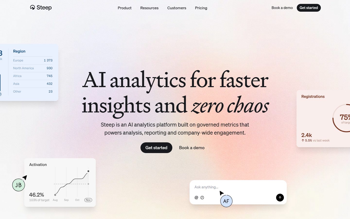
Steep's marketing surface is a refined, editorial analytics-SaaS interface. The page floor is white (`{colors.canvas}` — #ffffff) lit by a soft warm peach-to-violet gradient behind the hero, with a high-contrast serif headline (`Signifier`) anchoring the message and `Söhne` carrying every supporting word. The tone reads premium-but-calm: lots of air, soft floating product cards, and a single near-black CTA pill (`{colors.primary}` — #17191c).
The type voice splits into two roles. **Signifier** — a high-contrast didone-style serif — is used for the large hero headline at 90px with tight negative tracking (-2.25px) and an italic accent on the phrase "zero chaos." **Söhne** (substituted with Inter) carries body copy at 17px and button labels at 18px. The serif/grotesque pairing is the whole brand voice: editorial headline weight against neutral functional UI text.
Component voltage comes from **real product-UI fragments floating around the hero** — a region table, an "Activation" line chart, a "Registrations" radial gauge, and an "Ask anything…" chat input. These tiles sit on white with diffuse drop shadows and large 24px corner radii, scattered at slight offsets to feel alive. Steep shows the actual product chrome rather than illustrating it.
Lower bands alternate surface tints: a peach feature card (`{colors.accent-peach}` — #fbe1d1), neutral gray feature cards, a pale-blue customer-story band (`{colors.accent-blue}` — #d3e3fc), and finally a deep near-black "semantic platform" band (`{colors.surface-dark}` — #121212) that grounds the long scroll. The dark band and footer are the only dark surfaces in the system.
**Key Characteristics:**
- Near-white canvas with a warm peach/violet hero gradient; everything else is white or lightly tinted.
- Near-black pill CTA (`{component.button-primary}`) — fully rounded (`{rounded.pill}`), `{colors.primary}` (#17191c) on white, paired with a plain "Book a demo" text button (`{component.button-text}`).
- High-contrast `Signifier` serif display (substituted with Fraunces) at 90px with -2.25px tracking and selective italics — the single loudest element on the page.
- `Söhne` (substituted with Inter) for all body + UI text — neutral, functional, quiet.
- Floating product-UI tiles (charts, metric gauges, chat input) on white with soft 24px radii and diffuse shadows — brand voltage from real product chrome.
- Pastel-tinted bands (peach feature card, blue customer-story band) used to segment the scroll without heavy dividers.
- A deep near-black semantic-platform band + footer (`{colors.surface-dark}` — #121212) that closes the page.
- Generous, hierarchical corner radii: 12 / 16 / 20 / 24px, with 24px (`{rounded.xxl}`) dominant on product and feature cards.
## Colors
### Brand & Action
- **Primary** (`{colors.primary}` — #17191c): The near-black action color. Used for the primary CTA pill, the nav "Get started" button, and most heavy UI text. Not pure black — a slightly warm charcoal.
- **Black** (`{colors.black}` — #000000): The most-frequent measured neutral; used for the highest-contrast text and icon glyphs.
- **On Primary** (`{colors.on-primary}` — #ffffff): Label text on the dark CTA pill and on the dark bands.
### Text / Ink
- **Ink** (`{colors.ink}` — #5d2a1a): A warm reddish-brown used for text inside the warm-toned product cards (e.g. the "Registrations" gauge tile) — it harmonizes with the peach gradient and peach feature card.
- **Body** (`{colors.body}` — #4c4c4c): Default running-text gray for paragraphs.
- **Muted** (`{colors.muted}` — #777b86): Secondary text — chart axis labels, captions, placeholder text ("Ask anything…"), footer links.
### Surface
- **Canvas** (`{colors.canvas}` — #ffffff): The page floor and the fill of every floating product card.
- **Surface Soft** (`{colors.surface-soft}` — #f7f7f8) / **Surface Soft Alt** (`{colors.surface-soft-alt}` — #f2f2f3): Neutral light-gray fills for plain feature cards and quiet section backgrounds.
- **Hairline** (`{colors.hairline}` — #ececec): The 1px divider / border tone on light surfaces.
- **Surface Dark** (`{colors.surface-dark}` — #121212): The semantic-platform band and footer background — the primary dark surface that closes the page.
- **Surface Dark variants** (`{colors.surface-dark-1a}` — #1a1a1a, `{colors.surface-dark-22}` — #222222, `{colors.surface-dark-23}` — #232323, `{colors.surface-dark-2d}` — #2d3034): Nested panels and elevated cards inside the dark band.
### Accent Tints
- **Accent Peach** (`{colors.accent-peach}` — #fbe1d1): The "Built on metrics" feature card and warm gradient highlight.
- **Accent Blue** (`{colors.accent-blue}` — #d3e3fc): The customer-story band background and the region-table tile tint.
- **Accent Green** (`{colors.accent-green}` — #d8efdf): A pale-green tint used on small product-UI accents (avatar fills, status chips).
- **Accent Green Deep** (`{colors.accent-green-deep}` — #1f4720), **Accent Blue Deep** (`{colors.accent-blue-deep}` — #194168), **Accent Purple** (`{colors.accent-purple}` — #4d2f87): Deep saturated tones used for text/icon contrast inside their matching pale tints and for the violet glow in the dark semantic-platform mockup.
These accents are a chromatic palette borrowed from the product's own data-viz language — they appear inside product-UI fragments and tinted bands, never on the primary CTA, which stays monochrome.
## Typography
### Font Family
The system pairs **Signifier** (a high-contrast serif display face, licensed from Klim Type Foundry) for the hero headline with **Söhne** (a neutral grotesque, also Klim, flagged as licensed) for all body and UI text. Söhne is substituted with **Inter** per the measured substitution. Signifier is documented with an open-source substitute below.
The split is strict:
- Signifier (serif, 400 weight, -2.25px tracking, selective italics) — the hero headline only.
- Söhne / Inter (sans, 400–430 weight, 0 tracking) — paragraphs, buttons, nav, captions, chart labels.
### Hierarchy
| Token | Size | Weight | Line Height | Letter Spacing | Use |
|---|---|---|---|---|---|
| `{typography.display}` | 90px | 400 | 1.3 | -2.25px | Hero headline ("AI analytics for faster insights and *zero chaos*") — Signifier, with italic accent |
| `{typography.body}` | 17px | 400 | 1.25 | 0 | Default running text, sub-headlines, nav items, card body, captions — Söhne/Inter |
| `{typography.button}` | 18px | 430 | 1.0 | 0 | Primary CTA and text-button labels — Söhne/Inter |
### Principles
The serif headline is the brand voice — large, low-weight (400), tightly tracked, with selective italics for emphasis. Body and UI text stay neutral Söhne at a comfortable 17px. The contrast between a luxurious serif headline and a quiet grotesque body is the entire identity; never set body copy in Signifier, never set the hero in the grotesque.
The button weight (430) is a deliberate hair above body 400 — just enough optical heft on the CTA label without going to a true bold.
### Note on Font Substitutes
**Söhne** is licensed and not freely available; **Inter** (the measured substitute) is the production fallback. **Signifier** is likewise licensed; a usable open-source substitute is **Fraunces** (a variable high-contrast serif) — set at weight 400 with tight negative tracking to approximate the editorial display feel. **Playfair Display** is a second alternative if Fraunces is unavailable. The substitutes preserve the high-contrast serif character but will differ in detail.
## Layout
### Spacing System
- **Base unit:** 4px.
- **Tokens:** `{spacing.xxs}` 4px · `{spacing.xs}` 8px · `{spacing.sm}` 12px · `{spacing.md}` 16px · `{spacing.lg}` 20px · `{spacing.xl}` 24px · `{spacing.xxl}` 32px · `{spacing.xxxl}` 64px · `{spacing.section}` 80px · `{spacing.section-lg}` 96px · `{spacing.section-xl}` 120px.
- **High-frequency steps:** 8px (38×), 20px (28×), and 4px (25×) dominate small-component padding and gaps; 80px (10×) is the dominant section-level vertical rhythm.
- **Section padding:** `{spacing.section}` (80px) between major bands; the hero uses up to `{spacing.section-xl}` (120px).
- **Card internal padding:** `{spacing.xxl}` (32px) for feature and product-mockup cards; `{spacing.lg}` (20px) for small product-UI tiles.
### Grid & Container
- **Hero:** Centered headline with product-UI tiles floating at the corners (region table top-left, registrations gauge right, activation chart and chat input bottom).
- **Feature grid:** 3-up at desktop ("Built on metrics" / "Powered by AI" / "Designed for engagement").
- **Customer-story band:** Two-column — copy + CTA left, black-and-white photo right.
- **Logo strip:** Single horizontal row of partner wordmarks ("Trusted by teams at").
### Whitespace Philosophy
Steep uses generous vertical whitespace — 80px between bands and large empty zones below the hero — to let the floating product tiles breathe and to give the editorial headline room. The pacing is calm and premium, never densely packed.
## Elevation & Depth
| Level | Treatment | Use |
|---|---|---|
| Flat | No shadow, no border | Body bands, nav, tinted feature/story bands |
| Hairline ring | `0 0 0 1px` at ~5% alpha | Subtle outline around floating cards |
| Soft float | `0 4px 24px rgba(0,0,0,0.08)` + 1px ring | Smaller product-UI tiles (region table, activation chart) |
| Medium float | `0 8px 40px rgba(0,0,0,0.1)` + 1px ring | Larger floating cards (chat input, registrations gauge) |
| Strong | `0 20px 25px -5px rgba(0,0,0,0.1)` | Elevated product mockups |
| X-Large | `0 25px 50px -12px rgba(0,0,0,0.25)` | The deepest hero/mockup card lift |
The elevation philosophy is **soft and diffuse** — large blur radii at low alpha paired with a faint 1px ring, never hard or heavy. Combined with the 24px corner radius, cards feel like they float gently above the warm-gradient canvas. No neumorphism, no glassmorphism.
### Decorative Depth
- The hero's warm peach-to-violet radial gradient is the only painterly background; everything else is flat.
- Product-UI tiles carry their own internal chart chrome and small avatar circles (pastel fills in `{colors.accent-green}`, `{colors.accent-blue}`) — shown as content, not system tokens.
- The dark semantic-platform mockup carries a violet glow (`{colors.accent-purple}` family) behind nested panels.
## Shapes
### Border Radius Scale
| Token | Value | Use |
|---|---|---|
| `{rounded.md}` | 12px | Smaller inner elements / nested chips |
| `{rounded.lg}` | 16px | Mid-size cards and panels |
| `{rounded.xl}` | 20px | Larger cards |
| `{rounded.xxl}` | 24px | Dominant radius — floating product tiles, feature cards, chat input, product mockups |
| `{rounded.pill}` | 9999px | Primary CTA pill and circular avatar/icon buttons (the measured button radius resolves to a full pill — derived from the effectively-infinite measured value) |
### Photography & Tile Geometry
The customer-story band uses a black-and-white photograph with rounded corners. Avatar circles inside product tiles (e.g. "JB", "AF") are perfect circles (`{rounded.pill}`). Product-UI fragments retain their native internal chrome and chart geometry.
## Components
### Navigation
**`top-nav`** — White nav bar across the top. Carries the Steep wordmark + mark at left, a centered menu (Product, Resources, Customers, Pricing) in `{typography.body}`, and a right-side cluster with a "Book a demo" `{component.button-text}` and a "Get started" `{component.button-primary}`. Background `{colors.canvas}`, text `{colors.primary}`.
### Buttons
**`button-primary`** — The signature CTA. Background `{colors.primary}` (#17191c), label `{colors.on-primary}`, type `{typography.button}` (Söhne/Inter 18px / 430), fully rounded `{rounded.pill}`, horizontal padding 20px. Used as "Get started" in the nav and hero.
**`button-text`** — Plain text button with no background. Transparent fill, `{colors.primary}` label, same `{typography.button}` type. Used for "Book a demo" beside the primary CTA.
### Hero & Product Tiles
**`hero-band`** — Centered editorial hero on the warm-gradient canvas. Headline in `{typography.display}` (Signifier 90px, -2.25px, italic accent), sub-headline in `{typography.body}`, then a CTA row (`{component.button-primary}` + `{component.button-text}`). Vertical padding up to `{spacing.section-xl}` (120px). Background `{colors.canvas}`.
**`metric-card`** — Small floating product-UI tile (e.g. "Activation" line chart, "Registrations" radial gauge). Background `{colors.canvas}`, text `{colors.ink}` for warm tiles or `{colors.body}`/`{colors.muted}` for chart labels, rounded `{rounded.xxl}` (24px), padding `{spacing.lg}` (20px), soft-float shadow.
**`metric-card-tinted`** — A tinted variant of the floating tile (e.g. the blue "Region" table). Background `{colors.accent-blue}`, text `{colors.accent-blue-deep}`, rounded `{rounded.xxl}`.
**`chat-input-card`** — The "Ask anything…" assistant input floating near the hero. Background `{colors.canvas}`, placeholder text `{colors.muted}`, rounded `{rounded.xxl}` (24px), padding `{spacing.lg}` (20px), with a circular dark send button (`{colors.primary}` fill, `{rounded.pill}`). Medium-float shadow.
### Cards & Bands
**`feature-card-accent`** — The peach lead feature card ("Built on metrics"). Background `{colors.accent-peach}` (#fbe1d1), text `{colors.ink}`, rounded `{rounded.xxl}`, padding `{spacing.xxl}` (32px). Carries a small line-art illustration, a title, and body copy.
**`feature-card-plain`** — The neutral feature cards beside it ("Powered by AI", "Designed for engagement"). Background `{colors.surface-soft}`, text `{colors.primary}`, rounded `{rounded.xxl}`, padding `{spacing.xxl}`.
**`product-mockup-card`** — A large white card showing actual Steep product UI (the AI Explore/Reports panel). Background `{colors.canvas}`, rounded `{rounded.xxl}`, padding `{spacing.xxl}`, strong float shadow. The product chrome inside is shown directly, not illustrated.
**`customer-story-band`** — The pale-blue customer-story section. Background `{colors.accent-blue}`, text `{colors.accent-blue-deep}`, padding `{spacing.section}` (80px). Two-column: a "Read the story" dark pill button + "All stories" link on the left, a B&W photo on the right, and a row of customer logos (voi., JUNI, bounce, Once Upon) below.
**`semantic-platform-band`** — The deep near-black "Semantic platform" section that grounds the page. Background `{colors.surface-dark}` (#121212), text `{colors.on-primary}`, padding `{spacing.section}`. Carries a left-side link list (Steep API, Metrics catalog, Define in code, Manage in app) and a nested dark product mockup with a violet glow.
### Strips & Footer
**`logo-strip`** — "Trusted by teams at" partner wordmark row. Background `{colors.canvas}`, marks rendered in muted gray (`{colors.muted}`), padding `{spacing.xxl}`.
**`footer`** — Dark footer that closes the page. Background `{colors.surface-dark}` (#121212), text `{colors.muted}`, padding `{spacing.xxxl}` (64px). Carries the Steep wordmark and link columns.
## Do's and Don'ts
### Do
- Reserve `{colors.primary}` (#17191c) for the CTA pill and high-contrast UI text. The action layer stays monochrome.
- Use Signifier (or Fraunces substitute) for the hero headline only, with tight -2.25px tracking and selective italics for emphasis.
- Set all body, button, nav, and caption text in Söhne/Inter at 17–18px — quiet and functional.
- Float real product-UI tiles around the hero on white with 24px radii and diffuse shadows. Show the product, don't illustrate it.
- Use pale accent tints (`{colors.accent-peach}`, `{colors.accent-blue}`) to segment bands instead of hard dividers.
- Pair pale tints with their deep counterparts for text contrast (peach with `{colors.ink}`, blue with `{colors.accent-blue-deep}`).
- Close the page with the dark semantic-platform band + footer (`{colors.surface-dark}`).
### Don't
- Don't put accent tints or the data-viz palette on the primary CTA — it stays near-black.
- Don't increase the display weight beyond 400; Signifier's voice depends on its low-weight high-contrast strokes.
- Don't set body copy in the serif or the hero headline in the grotesque — the pairing boundary is strict.
- Don't use hard or heavy shadows; the system is built on large, low-alpha diffuse floats.
- Don't drop card radius below 12px or above 24px — 24px (`{rounded.xxl}`) is the dominant card shape.
- Don't add dark surfaces outside the semantic-platform band and footer.
- Don't add hover-state styling beyond default and pressed.
## Responsive Behavior
The provided desktop full-page screenshot shows the hero stacking its floating tiles closer around a smaller headline on narrower widths. Detailed breakpoint values were not measured; the notes below are observed/structural rather than token-backed.
### Breakpoints (observed)
| Name | Behavior |
|---|---|
| Mobile | Hero headline scales down from 90px; floating product tiles stack vertically or hide; nav collapses; feature grid goes 1-up; customer-story band stacks copy over photo |
| Tablet | Feature grid reduces to 2-up; floating tiles tighten around the hero |
| Desktop | Full hero with corner-floating tiles; 3-up feature grid; two-column customer-story band |
### Touch Targets
- `{component.button-primary}` and `{component.button-text}` use 20px horizontal padding; vertical height was not measured (see Known Gaps).
- The circular chat send button is a pill-radius icon button.
### Collapsing Strategy
- Hero's corner-floating tiles reflow or hide on small screens so the headline + CTA stay primary.
- Feature cards reduce columns rather than shrinking type.
- Dark bands and footer remain full-bleed at every width.
## Iteration Guide
1. Focus on ONE component at a time, referencing its YAML key directly (`{component.metric-card}`, `{component.feature-card-accent}`).
2. Variants (tinted vs. plain cards, `-accent` vs. `-plain`) live as separate entries in `components:`.
3. Use `{token.refs}` everywhere — never inline a hex in a component.
4. Document only default and active/pressed states — never hover.
5. The hero headline stays Signifier 400 with -2.25px tracking; all else stays Söhne/Inter. The pairing does not blur.
6. The dark semantic-platform band and footer are the only dark surfaces — add no other dark cards casually.
7. When emphasis is needed, prefer the italic serif accent or a tinted band before adding weight or color to the CTA.
## Known Gaps
- **Söhne and Signifier are both licensed** (Klim Type Foundry) and not shippable; Inter (measured substitute) and Fraunces (documented substitute) are the production fallbacks. Exact metric matching will differ.
- Only three typographic roles were measured (display/h2, body, button). Intermediate heading sizes (h1, h3, sub-headlines), caption, and nav-link sizes were not captured — values are not invented here. The nav and captions are documented as using `{typography.body}` based on observed rendering, but their true sizes are a gap.
- **Button height** was not measured — only `padding: 0px 20px` and the pill radius are confirmed; the vertical height seen in screenshots is not a token value.
- The measured button `border-radius` of ~33,554,432px is treated as a full pill (`{rounded.pill}`); this is a derived interpretation of an effectively-infinite radius.
- Exact accent-tint usage mapping (which deep tone pairs with which pale tint inside product UI) is inferred from screenshots; some pairings may shift.
- Gradient stop colors of the hero's warm peach-to-violet background were not extracted as discrete tokens — only the surrounding tints are measured.
- Animation/transition timings (tile float, chat input, chart reveal) are out of scope.
- Form/input states beyond the static chat-input appearance were not extracted.
- The product app itself (app.steep) is out of scope; only the marketing pages (landing, product, pricing) were analyzed.
<!-- Documented by duply · real-world design systems as ready-to-use DESIGN.md for AI coding agents · https://duply.ai/steep/design-md -->
Color Palette
Accent
Neutrals
Typography
display90px · 400 · 1.3
The quick brown fox jumpsbody17px · 400 · 1.25
The quick brown fox jumpsbutton18px · 430 · 1
The quick brown fox jumpsSpacing & Shape
Spacing
| Name | Value | Preview |
|---|---|---|
| xxs | 4px | |
| xs | 8px | |
| sm | 12px | |
| md | 16px | |
| lg | 20px | |
| xl | 24px | |
| xxl | 32px | |
| xxxl | 64px | |
| section | 80px | |
| section-lg | 96px | |
| section-xl | 120px |
Border Radius
| Name | Value | Preview |
|---|---|---|
| md | 12px | |
| lg | 16px | |
| xl | 20px | |
| xxl | 24px | |
| pill | 9999px |
More like this


---
version: alpha
name: Steep-design-analysis
description: A refined, editorial analytics-SaaS interface built on a near-white canvas with a warm gradient hero, high-contrast Signifier serif display type, and Söhne for all UI text. The system reads as premium-but-calm — soft floating product cards with generous corner radii (~24px) and diffuse drop shadows, a near-black primary CTA pill, pastel-tinted feature and customer-story bands, and a deep near-black "semantic platform" section that grounds the long scroll. Brand voltage comes from the large italic-accented serif headline and from real product-UI fragments (charts, metric tiles, chat) floating around the hero.

colors:
  primary: "#17191c"
  on-primary: "#ffffff"
  black: "#000000"
  canvas: "#ffffff"
  ink: "#5d2a1a"
  body: "#4c4c4c"
  muted: "#777b86"
  surface-soft: "#f7f7f8"
  surface-soft-alt: "#f2f2f3"
  hairline: "#ececec"
  surface-dark: "#121212"
  surface-dark-1a: "#1a1a1a"
  surface-dark-22: "#222222"
  surface-dark-23: "#232323"
  surface-dark-2d: "#2d3034"
  accent-peach: "#fbe1d1"
  accent-blue: "#d3e3fc"
  accent-green: "#d8efdf"
  accent-green-deep: "#1f4720"
  accent-blue-deep: "#194168"
  accent-purple: "#4d2f87"

typography:
  display:
    fontFamily: "Signifier, Fraunces, Georgia, serif"
    fontSize: 90px
    fontWeight: 400
    lineHeight: 1.3
    letterSpacing: -2.25px
  body:
    fontFamily: "Sohne, Inter, sans-serif"
    fontSize: 17px
    fontWeight: 400
    lineHeight: 1.25
    letterSpacing: 0
  button:
    fontFamily: "Sohne, Inter, sans-serif"
    fontSize: 18px
    fontWeight: 430
    lineHeight: 1.0
    letterSpacing: 0

rounded:
  md: 12px
  lg: 16px
  xl: 20px
  xxl: 24px
  pill: 9999px

spacing:
  xxs: 4px
  xs: 8px
  sm: 12px
  md: 16px
  lg: 20px
  xl: 24px
  xxl: 32px
  xxxl: 64px
  section: 80px
  section-lg: 96px
  section-xl: 120px

components:
  top-nav:
    backgroundColor: "{colors.canvas}"
    textColor: "{colors.primary}"
    typography: "{typography.body}"
    padding: 20px 32px
  button-primary:
    backgroundColor: "{colors.primary}"
    textColor: "{colors.on-primary}"
    typography: "{typography.button}"
    rounded: "{rounded.pill}"
    padding: 0px 20px
  button-text:
    backgroundColor: transparent
    textColor: "{colors.primary}"
    typography: "{typography.button}"
    padding: 0px 20px
  hero-band:
    backgroundColor: "{colors.canvas}"
    textColor: "{colors.primary}"
    typography: "{typography.display}"
    padding: 120px
  metric-card:
    backgroundColor: "{colors.canvas}"
    textColor: "{colors.ink}"
    typography: "{typography.body}"
    rounded: "{rounded.xxl}"
    padding: 20px
  metric-card-tinted:
    backgroundColor: "{colors.accent-blue}"
    textColor: "{colors.accent-blue-deep}"
    typography: "{typography.body}"
    rounded: "{rounded.xxl}"
    padding: 20px
  chat-input-card:
    backgroundColor: "{colors.canvas}"
    textColor: "{colors.muted}"
    typography: "{typography.body}"
    rounded: "{rounded.xxl}"
    padding: 20px
  feature-card-accent:
    backgroundColor: "{colors.accent-peach}"
    textColor: "{colors.ink}"
    typography: "{typography.body}"
    rounded: "{rounded.xxl}"
    padding: 32px
  feature-card-plain:
    backgroundColor: "{colors.surface-soft}"
    textColor: "{colors.primary}"
    typography: "{typography.body}"
    rounded: "{rounded.xxl}"
    padding: 32px
  product-mockup-card:
    backgroundColor: "{colors.canvas}"
    textColor: "{colors.primary}"
    typography: "{typography.body}"
    rounded: "{rounded.xxl}"
    padding: 32px
  customer-story-band:
    backgroundColor: "{colors.accent-blue}"
    textColor: "{colors.accent-blue-deep}"
    typography: "{typography.body}"
    padding: 80px
  semantic-platform-band:
    backgroundColor: "{colors.surface-dark}"
    textColor: "{colors.on-primary}"
    typography: "{typography.body}"
    padding: 80px
  logo-strip:
    backgroundColor: "{colors.canvas}"
    textColor: "{colors.muted}"
    typography: "{typography.body}"
    padding: 32px
  footer:
    backgroundColor: "{colors.surface-dark}"
    textColor: "{colors.muted}"
    typography: "{typography.body}"
    padding: 64px
---

## Overview

Steep's marketing surface is a refined, editorial analytics-SaaS interface. The page floor is white (`{colors.canvas}` — #ffffff) lit by a soft warm peach-to-violet gradient behind the hero, with a high-contrast serif headline (`Signifier`) anchoring the message and `Söhne` carrying every supporting word. The tone reads premium-but-calm: lots of air, soft floating product cards, and a single near-black CTA pill (`{colors.primary}` — #17191c).

The type voice splits into two roles. **Signifier** — a high-contrast didone-style serif — is used for the large hero headline at 90px with tight negative tracking (-2.25px) and an italic accent on the phrase "zero chaos." **Söhne** (substituted with Inter) carries body copy at 17px and button labels at 18px. The serif/grotesque pairing is the whole brand voice: editorial headline weight against neutral functional UI text.

Component voltage comes from **real product-UI fragments floating around the hero** — a region table, an "Activation" line chart, a "Registrations" radial gauge, and an "Ask anything…" chat input. These tiles sit on white with diffuse drop shadows and large 24px corner radii, scattered at slight offsets to feel alive. Steep shows the actual product chrome rather than illustrating it.

Lower bands alternate surface tints: a peach feature card (`{colors.accent-peach}` — #fbe1d1), neutral gray feature cards, a pale-blue customer-story band (`{colors.accent-blue}` — #d3e3fc), and finally a deep near-black "semantic platform" band (`{colors.surface-dark}` — #121212) that grounds the long scroll. The dark band and footer are the only dark surfaces in the system.

**Key Characteristics:**
- Near-white canvas with a warm peach/violet hero gradient; everything else is white or lightly tinted.
- Near-black pill CTA (`{component.button-primary}`) — fully rounded (`{rounded.pill}`), `{colors.primary}` (#17191c) on white, paired with a plain "Book a demo" text button (`{component.button-text}`).
- High-contrast `Signifier` serif display (substituted with Fraunces) at 90px with -2.25px tracking and selective italics — the single loudest element on the page.
- `Söhne` (substituted with Inter) for all body + UI text — neutral, functional, quiet.
- Floating product-UI tiles (charts, metric gauges, chat input) on white with soft 24px radii and diffuse shadows — brand voltage from real product chrome.
- Pastel-tinted bands (peach feature card, blue customer-story band) used to segment the scroll without heavy dividers.
- A deep near-black semantic-platform band + footer (`{colors.surface-dark}` — #121212) that closes the page.
- Generous, hierarchical corner radii: 12 / 16 / 20 / 24px, with 24px (`{rounded.xxl}`) dominant on product and feature cards.

## Colors

### Brand & Action
- **Primary** (`{colors.primary}` — #17191c): The near-black action color. Used for the primary CTA pill, the nav "Get started" button, and most heavy UI text. Not pure black — a slightly warm charcoal.
- **Black** (`{colors.black}` — #000000): The most-frequent measured neutral; used for the highest-contrast text and icon glyphs.
- **On Primary** (`{colors.on-primary}` — #ffffff): Label text on the dark CTA pill and on the dark bands.

### Text / Ink
- **Ink** (`{colors.ink}` — #5d2a1a): A warm reddish-brown used for text inside the warm-toned product cards (e.g. the "Registrations" gauge tile) — it harmonizes with the peach gradient and peach feature card.
- **Body** (`{colors.body}` — #4c4c4c): Default running-text gray for paragraphs.
- **Muted** (`{colors.muted}` — #777b86): Secondary text — chart axis labels, captions, placeholder text ("Ask anything…"), footer links.

### Surface
- **Canvas** (`{colors.canvas}` — #ffffff): The page floor and the fill of every floating product card.
- **Surface Soft** (`{colors.surface-soft}` — #f7f7f8) / **Surface Soft Alt** (`{colors.surface-soft-alt}` — #f2f2f3): Neutral light-gray fills for plain feature cards and quiet section backgrounds.
- **Hairline** (`{colors.hairline}` — #ececec): The 1px divider / border tone on light surfaces.
- **Surface Dark** (`{colors.surface-dark}` — #121212): The semantic-platform band and footer background — the primary dark surface that closes the page.
- **Surface Dark variants** (`{colors.surface-dark-1a}` — #1a1a1a, `{colors.surface-dark-22}` — #222222, `{colors.surface-dark-23}` — #232323, `{colors.surface-dark-2d}` — #2d3034): Nested panels and elevated cards inside the dark band.

### Accent Tints
- **Accent Peach** (`{colors.accent-peach}` — #fbe1d1): The "Built on metrics" feature card and warm gradient highlight.
- **Accent Blue** (`{colors.accent-blue}` — #d3e3fc): The customer-story band background and the region-table tile tint.
- **Accent Green** (`{colors.accent-green}` — #d8efdf): A pale-green tint used on small product-UI accents (avatar fills, status chips).
- **Accent Green Deep** (`{colors.accent-green-deep}` — #1f4720), **Accent Blue Deep** (`{colors.accent-blue-deep}` — #194168), **Accent Purple** (`{colors.accent-purple}` — #4d2f87): Deep saturated tones used for text/icon contrast inside their matching pale tints and for the violet glow in the dark semantic-platform mockup.

These accents are a chromatic palette borrowed from the product's own data-viz language — they appear inside product-UI fragments and tinted bands, never on the primary CTA, which stays monochrome.

## Typography

### Font Family
The system pairs **Signifier** (a high-contrast serif display face, licensed from Klim Type Foundry) for the hero headline with **Söhne** (a neutral grotesque, also Klim, flagged as licensed) for all body and UI text. Söhne is substituted with **Inter** per the measured substitution. Signifier is documented with an open-source substitute below.

The split is strict:
- Signifier (serif, 400 weight, -2.25px tracking, selective italics) — the hero headline only.
- Söhne / Inter (sans, 400–430 weight, 0 tracking) — paragraphs, buttons, nav, captions, chart labels.

### Hierarchy

| Token | Size | Weight | Line Height | Letter Spacing | Use |
|---|---|---|---|---|---|
| `{typography.display}` | 90px | 400 | 1.3 | -2.25px | Hero headline ("AI analytics for faster insights and *zero chaos*") — Signifier, with italic accent |
| `{typography.body}` | 17px | 400 | 1.25 | 0 | Default running text, sub-headlines, nav items, card body, captions — Söhne/Inter |
| `{typography.button}` | 18px | 430 | 1.0 | 0 | Primary CTA and text-button labels — Söhne/Inter |

### Principles
The serif headline is the brand voice — large, low-weight (400), tightly tracked, with selective italics for emphasis. Body and UI text stay neutral Söhne at a comfortable 17px. The contrast between a luxurious serif headline and a quiet grotesque body is the entire identity; never set body copy in Signifier, never set the hero in the grotesque.

The button weight (430) is a deliberate hair above body 400 — just enough optical heft on the CTA label without going to a true bold.

### Note on Font Substitutes
**Söhne** is licensed and not freely available; **Inter** (the measured substitute) is the production fallback. **Signifier** is likewise licensed; a usable open-source substitute is **Fraunces** (a variable high-contrast serif) — set at weight 400 with tight negative tracking to approximate the editorial display feel. **Playfair Display** is a second alternative if Fraunces is unavailable. The substitutes preserve the high-contrast serif character but will differ in detail.

## Layout

### Spacing System
- **Base unit:** 4px.
- **Tokens:** `{spacing.xxs}` 4px · `{spacing.xs}` 8px · `{spacing.sm}` 12px · `{spacing.md}` 16px · `{spacing.lg}` 20px · `{spacing.xl}` 24px · `{spacing.xxl}` 32px · `{spacing.xxxl}` 64px · `{spacing.section}` 80px · `{spacing.section-lg}` 96px · `{spacing.section-xl}` 120px.
- **High-frequency steps:** 8px (38×), 20px (28×), and 4px (25×) dominate small-component padding and gaps; 80px (10×) is the dominant section-level vertical rhythm.
- **Section padding:** `{spacing.section}` (80px) between major bands; the hero uses up to `{spacing.section-xl}` (120px).
- **Card internal padding:** `{spacing.xxl}` (32px) for feature and product-mockup cards; `{spacing.lg}` (20px) for small product-UI tiles.

### Grid & Container
- **Hero:** Centered headline with product-UI tiles floating at the corners (region table top-left, registrations gauge right, activation chart and chat input bottom).
- **Feature grid:** 3-up at desktop ("Built on metrics" / "Powered by AI" / "Designed for engagement").
- **Customer-story band:** Two-column — copy + CTA left, black-and-white photo right.
- **Logo strip:** Single horizontal row of partner wordmarks ("Trusted by teams at").

### Whitespace Philosophy
Steep uses generous vertical whitespace — 80px between bands and large empty zones below the hero — to let the floating product tiles breathe and to give the editorial headline room. The pacing is calm and premium, never densely packed.

## Elevation & Depth

| Level | Treatment | Use |
|---|---|---|
| Flat | No shadow, no border | Body bands, nav, tinted feature/story bands |
| Hairline ring | `0 0 0 1px` at ~5% alpha | Subtle outline around floating cards |
| Soft float | `0 4px 24px rgba(0,0,0,0.08)` + 1px ring | Smaller product-UI tiles (region table, activation chart) |
| Medium float | `0 8px 40px rgba(0,0,0,0.1)` + 1px ring | Larger floating cards (chat input, registrations gauge) |
| Strong | `0 20px 25px -5px rgba(0,0,0,0.1)` | Elevated product mockups |
| X-Large | `0 25px 50px -12px rgba(0,0,0,0.25)` | The deepest hero/mockup card lift |

The elevation philosophy is **soft and diffuse** — large blur radii at low alpha paired with a faint 1px ring, never hard or heavy. Combined with the 24px corner radius, cards feel like they float gently above the warm-gradient canvas. No neumorphism, no glassmorphism.

### Decorative Depth
- The hero's warm peach-to-violet radial gradient is the only painterly background; everything else is flat.
- Product-UI tiles carry their own internal chart chrome and small avatar circles (pastel fills in `{colors.accent-green}`, `{colors.accent-blue}`) — shown as content, not system tokens.
- The dark semantic-platform mockup carries a violet glow (`{colors.accent-purple}` family) behind nested panels.

## Shapes

### Border Radius Scale

| Token | Value | Use |
|---|---|---|
| `{rounded.md}` | 12px | Smaller inner elements / nested chips |
| `{rounded.lg}` | 16px | Mid-size cards and panels |
| `{rounded.xl}` | 20px | Larger cards |
| `{rounded.xxl}` | 24px | Dominant radius — floating product tiles, feature cards, chat input, product mockups |
| `{rounded.pill}` | 9999px | Primary CTA pill and circular avatar/icon buttons (the measured button radius resolves to a full pill — derived from the effectively-infinite measured value) |

### Photography & Tile Geometry
The customer-story band uses a black-and-white photograph with rounded corners. Avatar circles inside product tiles (e.g. "JB", "AF") are perfect circles (`{rounded.pill}`). Product-UI fragments retain their native internal chrome and chart geometry.

## Components

### Navigation

**`top-nav`** — White nav bar across the top. Carries the Steep wordmark + mark at left, a centered menu (Product, Resources, Customers, Pricing) in `{typography.body}`, and a right-side cluster with a "Book a demo" `{component.button-text}` and a "Get started" `{component.button-primary}`. Background `{colors.canvas}`, text `{colors.primary}`.

### Buttons

**`button-primary`** — The signature CTA. Background `{colors.primary}` (#17191c), label `{colors.on-primary}`, type `{typography.button}` (Söhne/Inter 18px / 430), fully rounded `{rounded.pill}`, horizontal padding 20px. Used as "Get started" in the nav and hero.

**`button-text`** — Plain text button with no background. Transparent fill, `{colors.primary}` label, same `{typography.button}` type. Used for "Book a demo" beside the primary CTA.

### Hero & Product Tiles

**`hero-band`** — Centered editorial hero on the warm-gradient canvas. Headline in `{typography.display}` (Signifier 90px, -2.25px, italic accent), sub-headline in `{typography.body}`, then a CTA row (`{component.button-primary}` + `{component.button-text}`). Vertical padding up to `{spacing.section-xl}` (120px). Background `{colors.canvas}`.

**`metric-card`** — Small floating product-UI tile (e.g. "Activation" line chart, "Registrations" radial gauge). Background `{colors.canvas}`, text `{colors.ink}` for warm tiles or `{colors.body}`/`{colors.muted}` for chart labels, rounded `{rounded.xxl}` (24px), padding `{spacing.lg}` (20px), soft-float shadow.

**`metric-card-tinted`** — A tinted variant of the floating tile (e.g. the blue "Region" table). Background `{colors.accent-blue}`, text `{colors.accent-blue-deep}`, rounded `{rounded.xxl}`.

**`chat-input-card`** — The "Ask anything…" assistant input floating near the hero. Background `{colors.canvas}`, placeholder text `{colors.muted}`, rounded `{rounded.xxl}` (24px), padding `{spacing.lg}` (20px), with a circular dark send button (`{colors.primary}` fill, `{rounded.pill}`). Medium-float shadow.

### Cards & Bands

**`feature-card-accent`** — The peach lead feature card ("Built on metrics"). Background `{colors.accent-peach}` (#fbe1d1), text `{colors.ink}`, rounded `{rounded.xxl}`, padding `{spacing.xxl}` (32px). Carries a small line-art illustration, a title, and body copy.

**`feature-card-plain`** — The neutral feature cards beside it ("Powered by AI", "Designed for engagement"). Background `{colors.surface-soft}`, text `{colors.primary}`, rounded `{rounded.xxl}`, padding `{spacing.xxl}`.

**`product-mockup-card`** — A large white card showing actual Steep product UI (the AI Explore/Reports panel). Background `{colors.canvas}`, rounded `{rounded.xxl}`, padding `{spacing.xxl}`, strong float shadow. The product chrome inside is shown directly, not illustrated.

**`customer-story-band`** — The pale-blue customer-story section. Background `{colors.accent-blue}`, text `{colors.accent-blue-deep}`, padding `{spacing.section}` (80px). Two-column: a "Read the story" dark pill button + "All stories" link on the left, a B&W photo on the right, and a row of customer logos (voi., JUNI, bounce, Once Upon) below.

**`semantic-platform-band`** — The deep near-black "Semantic platform" section that grounds the page. Background `{colors.surface-dark}` (#121212), text `{colors.on-primary}`, padding `{spacing.section}`. Carries a left-side link list (Steep API, Metrics catalog, Define in code, Manage in app) and a nested dark product mockup with a violet glow.

### Strips & Footer

**`logo-strip`** — "Trusted by teams at" partner wordmark row. Background `{colors.canvas}`, marks rendered in muted gray (`{colors.muted}`), padding `{spacing.xxl}`.

**`footer`** — Dark footer that closes the page. Background `{colors.surface-dark}` (#121212), text `{colors.muted}`, padding `{spacing.xxxl}` (64px). Carries the Steep wordmark and link columns.

## Do's and Don'ts

### Do
- Reserve `{colors.primary}` (#17191c) for the CTA pill and high-contrast UI text. The action layer stays monochrome.
- Use Signifier (or Fraunces substitute) for the hero headline only, with tight -2.25px tracking and selective italics for emphasis.
- Set all body, button, nav, and caption text in Söhne/Inter at 17–18px — quiet and functional.
- Float real product-UI tiles around the hero on white with 24px radii and diffuse shadows. Show the product, don't illustrate it.
- Use pale accent tints (`{colors.accent-peach}`, `{colors.accent-blue}`) to segment bands instead of hard dividers.
- Pair pale tints with their deep counterparts for text contrast (peach with `{colors.ink}`, blue with `{colors.accent-blue-deep}`).
- Close the page with the dark semantic-platform band + footer (`{colors.surface-dark}`).

### Don't
- Don't put accent tints or the data-viz palette on the primary CTA — it stays near-black.
- Don't increase the display weight beyond 400; Signifier's voice depends on its low-weight high-contrast strokes.
- Don't set body copy in the serif or the hero headline in the grotesque — the pairing boundary is strict.
- Don't use hard or heavy shadows; the system is built on large, low-alpha diffuse floats.
- Don't drop card radius below 12px or above 24px — 24px (`{rounded.xxl}`) is the dominant card shape.
- Don't add dark surfaces outside the semantic-platform band and footer.
- Don't add hover-state styling beyond default and pressed.

## Responsive Behavior

The provided desktop full-page screenshot shows the hero stacking its floating tiles closer around a smaller headline on narrower widths. Detailed breakpoint values were not measured; the notes below are observed/structural rather than token-backed.

### Breakpoints (observed)
| Name | Behavior |
|---|---|
| Mobile | Hero headline scales down from 90px; floating product tiles stack vertically or hide; nav collapses; feature grid goes 1-up; customer-story band stacks copy over photo |
| Tablet | Feature grid reduces to 2-up; floating tiles tighten around the hero |
| Desktop | Full hero with corner-floating tiles; 3-up feature grid; two-column customer-story band |

### Touch Targets
- `{component.button-primary}` and `{component.button-text}` use 20px horizontal padding; vertical height was not measured (see Known Gaps).
- The circular chat send button is a pill-radius icon button.

### Collapsing Strategy
- Hero's corner-floating tiles reflow or hide on small screens so the headline + CTA stay primary.
- Feature cards reduce columns rather than shrinking type.
- Dark bands and footer remain full-bleed at every width.

## Iteration Guide

1. Focus on ONE component at a time, referencing its YAML key directly (`{component.metric-card}`, `{component.feature-card-accent}`).
2. Variants (tinted vs. plain cards, `-accent` vs. `-plain`) live as separate entries in `components:`.
3. Use `{token.refs}` everywhere — never inline a hex in a component.
4. Document only default and active/pressed states — never hover.
5. The hero headline stays Signifier 400 with -2.25px tracking; all else stays Söhne/Inter. The pairing does not blur.
6. The dark semantic-platform band and footer are the only dark surfaces — add no other dark cards casually.
7. When emphasis is needed, prefer the italic serif accent or a tinted band before adding weight or color to the CTA.

## Known Gaps

- **Söhne and Signifier are both licensed** (Klim Type Foundry) and not shippable; Inter (measured substitute) and Fraunces (documented substitute) are the production fallbacks. Exact metric matching will differ.
- Only three typographic roles were measured (display/h2, body, button). Intermediate heading sizes (h1, h3, sub-headlines), caption, and nav-link sizes were not captured — values are not invented here. The nav and captions are documented as using `{typography.body}` based on observed rendering, but their true sizes are a gap.
- **Button height** was not measured — only `padding: 0px 20px` and the pill radius are confirmed; the vertical height seen in screenshots is not a token value.
- The measured button `border-radius` of ~33,554,432px is treated as a full pill (`{rounded.pill}`); this is a derived interpretation of an effectively-infinite radius.
- Exact accent-tint usage mapping (which deep tone pairs with which pale tint inside product UI) is inferred from screenshots; some pairings may shift.
- Gradient stop colors of the hero's warm peach-to-violet background were not extracted as discrete tokens — only the surrounding tints are measured.
- Animation/transition timings (tile float, chat input, chart reveal) are out of scope.
- Form/input states beyond the static chat-input appearance were not extracted.
- The product app itself (app.steep) is out of scope; only the marketing pages (landing, product, pricing) were analyzed.

<!-- Documented by duply · real-world design systems as ready-to-use DESIGN.md for AI coding agents · https://duply.ai/steep/design-md -->