Orb
A warm, editorial fintech interface for usage-based billing — a cream canvas (#fbf8f0) washed with soft green gradients, a low-weight ABC Marist serif for headlines, and ABC Diatype grotesque + semi-mono for body and labels. The system reads as precise-but-human: square-cornered near-black CTAs, large-radius (16px) content cards holding dark data-visualization media, mono uppercase eyebrow labels, and product-UI diagram fragments shown directly inline. Brand voltage comes from the serif/mono pairing and the green-tinted canvas rather than from saturated accent fills.
---
version: alpha
name: Orb-design-analysis
description: "A warm, editorial fintech interface for usage-based billing — a cream canvas (#fbf8f0) washed with soft green gradients, a low-weight ABC Marist serif for headlines, and ABC Diatype grotesque + semi-mono for body and labels. The system reads as precise-but-human: square-cornered near-black CTAs, large-radius (16px) content cards holding dark data-visualization media, mono uppercase eyebrow labels, and product-UI diagram fragments shown directly inline. Brand voltage comes from the serif/mono pairing and the green-tinted canvas rather than from saturated accent fills."
colors:
ink: "#130f0b"
canvas: "#fbf8f0"
white: "#ffffff"
black: "#000000"
accent-green: "#baf289"
accent-green-dark: "#375d33"
muted: "#847e74"
muted-soft: "#5b5448"
hairline: "#e4e1d8"
hairline-soft: "#d5d5d0"
surface-slate: "#282c34"
surface-light: "#f5f5f5"
border-neutral: "#e5e5e5"
neutral-mid: "#a1a1a1"
cool-gray: "#d1d5dc"
slate-blue: "#364153"
accent-violet: "#7008e7"
accent-blue: "#5b72fb"
accent-blue-deep: "#2c2af8"
accent-sky: "#effbff"
typography:
display-xl:
fontFamily: "ABC Marist, Newsreader, Georgia, serif"
fontSize: 72px
fontWeight: 350
lineHeight: 1.0
letterSpacing: -0.72px
display-lg:
fontFamily: "ABC Marist, Newsreader, Georgia, serif"
fontSize: 52px
fontWeight: 350
lineHeight: 1.2
letterSpacing: -0.52px
eyebrow:
fontFamily: "ABC Diatype Semi-Mono, Spline Sans Mono, ui-monospace, monospace"
fontSize: 12px
fontWeight: 400
lineHeight: 1.25
letterSpacing: 1.2px
body:
fontFamily: "ABC Diatype, Inter, sans-serif"
fontSize: 22px
fontWeight: 400
lineHeight: 1.5
letterSpacing: 0
button:
fontFamily: "ABC Diatype, Inter, sans-serif"
fontSize: 16px
fontWeight: 400
lineHeight: 1.5
letterSpacing: 0
rounded:
none: 0px
sm: 8px
md: 12px
lg: 16px
spacing:
xxs: 4px
xs: 8px
sm: 12px
md: 16px
lg: 24px
xl: 32px
xxl: 48px
section: 60px
components:
announcement-bar:
backgroundColor: "{colors.black}"
textColor: "{colors.white}"
typography: "{typography.button}"
padding: 12px 16px
top-nav:
backgroundColor: "{colors.canvas}"
textColor: "{colors.ink}"
typography: "{typography.button}"
rounded: "{rounded.lg}"
padding: 16px 32px
nav-link:
backgroundColor: transparent
textColor: "{colors.ink}"
typography: "{typography.button}"
button-primary:
backgroundColor: "{colors.ink}"
textColor: "{colors.white}"
typography: "{typography.button}"
rounded: "{rounded.none}"
padding: 8px 16px
button-secondary:
backgroundColor: transparent
textColor: "{colors.ink}"
typography: "{typography.button}"
rounded: "{rounded.none}"
padding: 8px 16px
hero-band:
backgroundColor: "{colors.canvas}"
textColor: "{colors.ink}"
typography: "{typography.display-xl}"
padding: 60px
eyebrow-label:
backgroundColor: transparent
textColor: "{colors.ink}"
typography: "{typography.eyebrow}"
feature-card:
backgroundColor: "{colors.canvas}"
textColor: "{colors.ink}"
rounded: "{rounded.lg}"
padding: 32px
feature-card-media:
backgroundColor: "{colors.surface-slate}"
textColor: "{colors.white}"
rounded: "{rounded.lg}"
content-card:
backgroundColor: "{colors.canvas}"
textColor: "{colors.ink}"
rounded: "{rounded.lg}"
padding: 32px
diagram-card:
backgroundColor: "{colors.canvas}"
textColor: "{colors.ink}"
rounded: "{rounded.lg}"
padding: 24px
floating-label-pill:
backgroundColor: "{colors.white}"
textColor: "{colors.ink}"
typography: "{typography.eyebrow}"
rounded: "{rounded.sm}"
solutions-tab:
backgroundColor: transparent
textColor: "{colors.muted}"
typography: "{typography.button}"
padding: 16px 24px
solutions-tab-active:
backgroundColor: transparent
textColor: "{colors.ink}"
typography: "{typography.button}"
padding: 16px 24px
testimonial:
backgroundColor: "{colors.canvas}"
textColor: "{colors.ink}"
typography: "{typography.display-lg}"
padding: 60px
---
## Overview
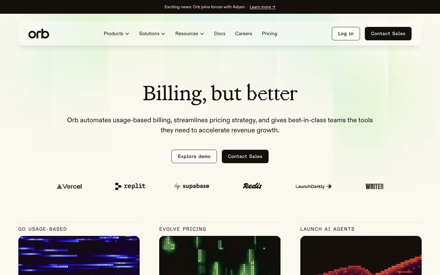
Orb's marketing surface is a warm, editorial fintech interface for usage-based billing. The page floor is a cream canvas (`{colors.canvas}` — #fbf8f0) — not pure white — washed at the top with a soft green gradient drawn from `{colors.accent-green}` (#baf289) and `{colors.accent-green-dark}` (#375d33). Text and primary actions are near-black `{colors.ink}` (#130f0b), a warm off-black that ties to the cream rather than fighting it.
The type voice is the system's signature: a low-weight serif (**ABC Marist**, weight 350) carries every headline, while **ABC Diatype** (grotesque sans) handles body copy and buttons, and **ABC Diatype Semi-Mono** handles the small uppercase eyebrow labels ("GO USAGE-BASED", "EVOLVE PRICING"). The serif-display + mono-label pairing reads as precise-but-human — financial software with editorial confidence rather than dashboard coldness.
Component voltage comes from **product-UI diagram fragments shown directly inline** — the static-vs-active pricing diagrams, the "REAL TIME PRODUCT DATA" node graphs, and the dark data-visualization media tiles inside feature cards. Orb shows abstracted versions of its own pricing machinery as content. The dark media tiles (`{colors.surface-slate}` — #282c34) and their glowing blue/green/violet data textures are the only saturated color in the system; the surrounding chrome stays cream and near-black.
**Key Characteristics:**
- Cream canvas (`{colors.canvas}` — #fbf8f0) with a green top-gradient, not a white-and-blue SaaS look.
- Near-black square-cornered CTAs — `{component.button-primary}` uses `{rounded.none}` (0px radius, measured), `{colors.ink}` background, white label. The sharp corner is a deliberate editorial choice against the soft canvas.
- Low-weight ABC Marist serif headlines (weight 350) with tight negative tracking (-0.72px at 72px). Custom licensed face; substitutes documented below.
- Mono uppercase eyebrow labels in ABC Diatype Semi-Mono, 12px, +1.2px tracking.
- Content and feature cards use `{rounded.lg}` (16px) — the largest radius in the system; cards carry no shadow by default.
- Dark slate media tiles (`{colors.surface-slate}` — #282c34) inside feature cards display glowing data-visualization textures (the only place saturated blues/violets appear).
- Floating white label pills with soft drop shadows annotate the inline pricing diagrams.
- Spacing rhythm centers on a 4px base, with `{spacing.section}` (60px) governing band separation.
## Colors
### Brand & Accent
- **Ink** (`{colors.ink}` — #130f0b): The dominant warm near-black. All body text, headlines, and primary CTA fills. The most-measured color in the system (frequency 866 on text).
- **Accent Green** (`{colors.accent-green}` — #baf289): The bright lime used in the hero's top gradient and small accent moments.
- **Accent Green Dark** (`{colors.accent-green-dark}` — #375d33): The deep green that anchors the gradient and appears in glowing data-viz textures.
- **Product-UI accents** — A set of saturated tones that appear almost exclusively inside the dark media tiles and inline diagram fragments: `{colors.accent-blue}` (#5b72fb), `{colors.accent-blue-deep}` (#2c2af8), `{colors.accent-violet}` (#7008e7), `{colors.accent-sky}` (#effbff). These are content colors (data visualization), never applied to CTAs or chrome.
### Surface
- **Canvas** (`{colors.canvas}` — #fbf8f0): The cream page floor and card background.
- **White** (`{colors.white}` — #ffffff): Floating label pills over diagrams; text on dark surfaces.
- **Black** (`{colors.black}` — #000000): The top announcement bar only.
- **Surface Slate** (`{colors.surface-slate}` — #282c34): Dark media-tile background inside feature cards.
- **Surface Light** (`{colors.surface-light}` — #f5f5f5): A lighter neutral panel tone.
- **Slate Blue** (`{colors.slate-blue}` — #364153): A cool dark used in diagram chrome.
### Text & Neutral
- **Muted** (`{colors.muted}` — #847e74): Secondary text — sub-headings, inactive tabs, captions.
- **Muted Soft** (`{colors.muted-soft}` — #5b5448): Tertiary warm-gray text.
- **Neutral Mid** (`{colors.neutral-mid}` — #a1a1a1): Fine print, disabled labels.
- **White** (`{colors.white}` — #ffffff): Text on dark media tiles, the black bar, and primary buttons.
### Hairline & Border
- **Hairline** (`{colors.hairline}` — #e4e1d8): The warm 1px divider/border tone on cream surfaces (e.g., the rules above eyebrow labels).
- **Hairline Soft** (`{colors.hairline-soft}` — #d5d5d0): A softer divider variant.
- **Border Neutral** (`{colors.border-neutral}` — #e5e5e5): Cool-neutral 1px borders.
- **Cool Gray** (`{colors.cool-gray}` — #d1d5dc): Diagram and tab divider lines.
## Typography
### Font Family
The system runs three custom ABC faces from Dinamo:
- **ABC Marist** — a contemporary low-contrast serif used for all display headlines at weight 350. Tight negative tracking gives it editorial precision.
- **ABC Diatype** — a neutral grotesque sans used for body copy (22px) and button labels (16px).
- **ABC Diatype Semi-Mono** — a semi-monospaced variant used exclusively for the small uppercase eyebrow labels.
These are licensed commercial typefaces and are NOT shipped here; see substitutes below.
### Hierarchy
| Token | Family | Size | Weight | Line Height | Letter Spacing | Use |
|---|---|---|---|---|---|---|
| `{typography.display-xl}` | ABC Marist | 72px | 350 | 1.0 | -0.72px | Hero h1 ("Billing, but better") |
| `{typography.display-lg}` | ABC Marist | 52px | 350 | 1.2 | -0.52px | Section heads, pull-quote testimonial |
| `{typography.eyebrow}` | ABC Diatype Semi-Mono | 12px | 400 | 1.25 | 1.2px | Uppercase section labels ("GO USAGE-BASED") |
| `{typography.body}` | ABC Diatype | 22px | 400 | 1.5 | 0 | Running text, sub-headlines |
| `{typography.button}` | ABC Diatype | 16px | 400 | 1.5 | 0 | Buttons, nav links, tabs |
### Principles
The serif/sans/mono split is strict: ABC Marist for headlines, ABC Diatype for prose and UI, ABC Diatype Semi-Mono for eyebrow labels. Display weight stays at the unusually low 350 — this thin serif is the brand's signature and must never be bolded into a heavier weight, which would erase the editorial lightness. Eyebrow labels are always uppercase with the +1.2px tracking.
### Note on Font Substitutes
ABC Marist, ABC Diatype, and ABC Diatype Semi-Mono are licensed and unavailable as open web fonts. Usable open-source substitutes:
- **ABC Marist → Newsreader** (Google Fonts) at a light weight, or **Fraunces** at low optical weight, preserves the low-contrast editorial serif character with thin display weight.
- **ABC Diatype → Inter** is the closest open grotesque for body and buttons.
- **ABC Diatype Semi-Mono → Spline Sans Mono** (or **JetBrains Mono** at lighter weight) approximates the semi-mono label voice.
## Layout
### Spacing System
- **Base unit:** 4px (the single most-frequent measured value alongside 8px).
- **Tokens:** `{spacing.xxs}` 4px · `{spacing.xs}` 8px · `{spacing.sm}` 12px · `{spacing.md}` 16px · `{spacing.lg}` 24px · `{spacing.xl}` 32px · `{spacing.xxl}` 48px · `{spacing.section}` 60px.
- **Dominant rhythms:** 8px (frequency 147) governs tight internal gaps; 32px (frequency 40) governs card padding and grid gutters; 60px (frequency 14) governs vertical band separation.
- **Card internal padding:** `{spacing.xl}` (32px) for feature and content cards; `{spacing.lg}` (24px) for diagram cards.
### Grid & Container
- **Editorial body:** Centered single column for the hero (h1 + sub-head + button row), widening to multi-column card grids below.
- **Feature card grid:** 3-up at desktop (the "GO USAGE-BASED / EVOLVE PRICING / LAUNCH AI AGENTS" row).
- **Logo strip:** A single centered row of customer wordmarks beneath the hero.
- **Solutions tabs:** A full-width horizontal tab strip (Hybrid pricing / SaaS / PLG / Enterprise / Cloud infra / Gen AI) above a content panel.
### Whitespace Philosophy
Orb leans on generous vertical whitespace and a centered hero to let the thin serif headline breathe. Bands are separated at ~60px, and the cream canvas keeps long-scroll editorial sections feeling calm rather than dense.
## Elevation & Depth
| Level | Treatment | Use |
|---|---|---|
| Flat | No shadow, no border | Hero band, content sections, most cards (`card` measured `shadow: none`) |
| Hairline | 1px `{colors.hairline}` rule | Dividers above eyebrow labels, tab underlines |
| Floating pill | `rgba(0,0,0,0.15) 0px 4px 16px 0px` | White label pills annotating inline diagrams |
| Inset toggle | `rgba(0,0,0,0.15) 2px 2px 9px 0px, rgba(0,0,0,0.15) 2px 2px 3px 0px inset` | Pressed/active node chips inside diagram fragments |
| Soft card lift | `rgba(0,0,0,0.08) 0px 12px 16px -4px, rgba(0,0,0,0.03) 0px 4px 6px -2px` | A single elevated card variant |
The elevation philosophy is **mostly flat** — content cards carry no shadow and rely on the cream/slate color contrast. Shadows appear only on the floating annotation pills and node chips inside the inline pricing diagrams, where they sell the "live UI" effect.
### Decorative Depth
- Dark media tiles (`{colors.surface-slate}`) carry their own glowing data-visualization textures (blue, green, red, violet point fields) — these are content imagery, not system shadow tokens.
- The hero's green gradient provides atmospheric depth at the top of the page without any shadow.
## Shapes
### Border Radius Scale
| Token | Value | Use |
|---|---|---|
| `{rounded.none}` | 0px | Buttons — `{component.button-primary}` and `{component.button-secondary}` are square-cornered (measured) |
| `{rounded.sm}` | 8px | Floating label pills, small chips (most-frequent radius, freq 43) |
| `{rounded.md}` | 12px | Occasional medium container (freq 1 — rare) |
| `{rounded.lg}` | 16px | Feature cards, content cards, media tiles, nav container (freq 15) |
The defining shape tension: **square-cornered buttons against soft 16px cards.** The sharp CTA corner is deliberate and signature — don't round it.
### Photography / Media Geometry
Feature-card media tiles are rounded at `{rounded.lg}` (16px) and contain dark abstract data-visualization renders. The inline pricing diagrams use rounded node chips and white floating pills at `{rounded.sm}` (8px).
## Components
### Top Navigation & Announcement
**`announcement-bar`** — A full-width black (`{colors.black}`) bar pinned above the nav ("Exciting news: Orb joins forces with Adyen · Learn more →"). White text in `{typography.button}`, padding ~12px.
**`top-nav`** — A floating rounded nav container on the cream canvas. Background `{colors.canvas}`, rounded `{rounded.lg}` (16px), carrying the lowercase "orb" wordmark at left, the primary menu (Products, Solutions, Resources, Docs, Careers, Pricing) center, and a `{component.button-secondary}` "Log in" + `{component.button-primary}` "Contact Sales" cluster at right.
**`nav-link`** — Menu items in `{typography.button}`, `{colors.ink}`, transparent background.
### Buttons
**`button-primary`** — The signature dark CTA ("Contact Sales"). Background `{colors.ink}` (#130f0b), white label, `{typography.button}`, padding 8px × 16px, rounded `{rounded.none}` (0px — measured square corners).
**`button-secondary`** — Outline button ("Explore demo", "Log in"). Transparent background, `{colors.ink}` text, 1px `{colors.hairline}` border, square corners `{rounded.none}`, same 8px × 16px padding.
### Hero & Editorial
**`hero-band`** — Centered hero on the green-gradient cream canvas. h1 in `{typography.display-xl}` (ABC Marist 72px / 350), sub-head in `{typography.body}`, and a two-button row beneath. Vertical padding ~`{spacing.section}` (60px).
**`eyebrow-label`** — Small uppercase mono section labels ("GO USAGE-BASED", "EVOLVE PRICING", "THE REVENUE DESIGN PLATFORM") in `{typography.eyebrow}`, `{colors.ink}`, usually sitting above a hairline rule.
**`testimonial`** — Large pull-quote ("Orb lets us move quickly when pricing needs to evolve...") set in `{typography.display-lg}` serif on the cream canvas, with attribution in small Diatype below.
### Cards & Containers
**`feature-card`** — The 3-up feature cards beneath the hero. Background `{colors.canvas}`, rounded `{rounded.lg}` (16px), padding `{spacing.xl}` (32px), no shadow. Carries an `{component.eyebrow-label}` at top, a `{component.feature-card-media}` tile, and a short description in `{typography.body}`.
**`feature-card-media`** — The dark visualization tile inside a feature card. Background `{colors.surface-slate}` (#282c34), rounded `{rounded.lg}`, displaying glowing abstract data textures (the blue/green/red/violet renders). A small circular arrow button sits at bottom-right.
**`content-card`** — General editorial cards in lower bands ("From brittle to bulletproof", "Contracting to collections", "Trust & transparency"). Background `{colors.canvas}`, rounded `{rounded.lg}`, padding `{spacing.xl}` (32px), with a heading, body copy, and an inline text-link CTA.
**`diagram-card`** — Cards holding the inline pricing-machinery diagrams (static-pricing tree, "REAL TIME PRODUCT DATA / ACTIVE PRICING" node graph). Background `{colors.canvas}`, rounded `{rounded.lg}`, padding `{spacing.lg}` (24px). Internal nodes are chips and pills.
**`floating-label-pill`** — White annotation pills floating over the diagrams ("SPREADSHEETS & CONTRACTS", "VALUE", "MARGINS", "VISIBILITY"). Background `{colors.white}`, `{colors.ink}` text in `{typography.eyebrow}`, rounded `{rounded.sm}` (8px), with a soft `rgba(0,0,0,0.15) 0px 4px 16px` drop shadow.
### Tabs
**`solutions-tab`** + **`solutions-tab-active`** — The horizontal "Solutions for modern teams" tab strip (Hybrid pricing / SaaS / PLG / Enterprise / Cloud infra / Gen AI). Inactive: transparent background, `{colors.muted}` text. Active: `{colors.ink}` text with an underline indicator. Both in `{typography.button}`, padding ~16px × 24px.
## Do's and Don'ts
### Do
- Keep the page floor cream (`{colors.canvas}` — #fbf8f0), not pure white. The warm tone is foundational.
- Use ABC Marist (substitute Newsreader) at weight 350 for every headline. The thin serif is the brand.
- Keep primary and secondary buttons square-cornered (`{rounded.none}`). The sharp CTA against soft cards is signature.
- Set eyebrow labels uppercase in the semi-mono face with +1.2px tracking.
- Confine saturated color (blue/violet/green data textures) to the dark media tiles and inline diagrams — they are content, not chrome.
- Use `{rounded.lg}` (16px) on cards and media tiles consistently.
- Annotate inline diagrams with white `{component.floating-label-pill}` shadows to sell the live-UI effect.
### Don't
- Don't bold the display serif beyond weight 350 — it erases the editorial lightness.
- Don't round the buttons. The square corner is deliberate.
- Don't paint CTAs or nav chrome in the saturated blues/violets/greens — those belong only inside data visualizations.
- Don't put body copy in ABC Marist or headlines in ABC Diatype; the serif/sans boundary is strict.
- Don't apply shadows to content cards — they stay flat (`shadow: none`).
- Don't document hover states — primary stays `{colors.ink}`; default and active only.
## Responsive Behavior
### Breakpoints
The capture covers desktop and a long full-page render; exact breakpoint widths were not measured. Inferred behavior (derived from layout structure):
| Name | Width | Key Changes |
|---|---|---|
| Mobile | < 768px | Nav collapses to a menu trigger; hero h1 scales down from 72px; 3-up feature cards stack 1-up; solutions tabs scroll or wrap |
| Tablet | 768–1024px | Feature cards drop to 2-up; nav tightens; diagrams scale within their cards |
| Desktop | > 1024px | Full nav, 3-up feature grid, full-width tab strip |
### Touch Targets
- `{component.button-primary}` padding is 8px × 16px; on touch the effective tap area should be padded to a 44px minimum height (the measured padding alone is under it — derived guidance).
- Nav links and tabs rely on surrounding padding (~16–24px) to reach comfortable tap sizes.
### Collapsing Strategy
- Feature card grids reduce columns rather than shrinking cards.
- Inline diagram fragments scale proportionally inside their cards; floating label pills reposition.
- The solutions tab strip is the most likely candidate for horizontal scroll or wrapping on narrow viewports.
### Image Behavior
- Dark media tiles retain their 16px radius and aspect ratio while resizing with their cards.
- The hero's green gradient scales with the viewport.
## Iteration Guide
1. Focus on ONE component at a time. Reference its YAML key directly (`{component.feature-card}`, `{component.button-primary}`).
2. Variants (`-active`, `-secondary`, `-media`) live as separate entries in `components:`.
3. Use `{token.refs}` everywhere — never inline hex in components.
4. Never document hover. Default and active/pressed states only.
5. Headlines stay ABC Marist 350; body stays ABC Diatype 400; eyebrows stay Semi-Mono uppercase. The trinity does not blur.
6. Buttons stay square (`{rounded.none}`); cards stay 16px. Don't homogenize the radii.
7. Saturated color belongs inside data visualizations, never on chrome.
## Known Gaps
- ABC Marist, ABC Diatype, and ABC Diatype Semi-Mono are licensed commercial typefaces (the `fonts_licensed` array was empty in the capture, but these are known licensed Dinamo faces). Open-source substitutes are documented in the Typography section; the licensed fonts are not shipped.
- Footer styling was not captured in detail — its colors, columns, and padding are unknown.
- The pricing page was captured but no distinct pricing-tier component tokens (tier card backgrounds, featured-tier treatment) were measured; those need a dedicated extraction.
- The saturated product-UI accent colors (`{colors.accent-blue}`, `{colors.accent-blue-deep}`, `{colors.accent-violet}`, `{colors.accent-sky}`) were measured at low frequency and appear inside data-visualization media; their exact application rules inside the product chrome are out of scope.
- Hero background-gradient stops and angle are inferred from the green accent tokens; exact gradient geometry was not measured.
- Form inputs, validation states, and dropdown menus (Products/Solutions/Resources) were not extracted.
- Animation and transition timings (diagram reveals, tab switching) are not in scope.
- Responsive breakpoint widths and mobile nav behavior are inferred (derived), not measured.
<!-- Documented by duply · real-world design systems as ready-to-use DESIGN.md for AI coding agents · https://duply.ai/withorb/design-md -->
Color Palette
Accent
Neutrals
Typography
display-xl72px · 350 · 1
The quick brown fox jumpsdisplay-lg52px · 350 · 1.2
The quick brown fox jumpseyebrow12px · 400 · 1.25
The quick brown fox jumpsbody22px · 400 · 1.5
The quick brown fox jumpsbutton16px · 400 · 1.5
The quick brown fox jumpsSpacing & Shape
Spacing
| Name | Value | Preview |
|---|---|---|
| xxs | 4px | |
| xs | 8px | |
| sm | 12px | |
| md | 16px | |
| lg | 24px | |
| xl | 32px | |
| xxl | 48px | |
| section | 60px |
Border Radius
| Name | Value | Preview |
|---|---|---|
| none | 0px | |
| sm | 8px | |
| md | 12px | |
| lg | 16px |
More like this


---
version: alpha
name: Orb-design-analysis
description: "A warm, editorial fintech interface for usage-based billing — a cream canvas (#fbf8f0) washed with soft green gradients, a low-weight ABC Marist serif for headlines, and ABC Diatype grotesque + semi-mono for body and labels. The system reads as precise-but-human: square-cornered near-black CTAs, large-radius (16px) content cards holding dark data-visualization media, mono uppercase eyebrow labels, and product-UI diagram fragments shown directly inline. Brand voltage comes from the serif/mono pairing and the green-tinted canvas rather than from saturated accent fills."
colors:
  ink: "#130f0b"
  canvas: "#fbf8f0"
  white: "#ffffff"
  black: "#000000"
  accent-green: "#baf289"
  accent-green-dark: "#375d33"
  muted: "#847e74"
  muted-soft: "#5b5448"
  hairline: "#e4e1d8"
  hairline-soft: "#d5d5d0"
  surface-slate: "#282c34"
  surface-light: "#f5f5f5"
  border-neutral: "#e5e5e5"
  neutral-mid: "#a1a1a1"
  cool-gray: "#d1d5dc"
  slate-blue: "#364153"
  accent-violet: "#7008e7"
  accent-blue: "#5b72fb"
  accent-blue-deep: "#2c2af8"
  accent-sky: "#effbff"
typography:
  display-xl:
    fontFamily: "ABC Marist, Newsreader, Georgia, serif"
    fontSize: 72px
    fontWeight: 350
    lineHeight: 1.0
    letterSpacing: -0.72px
  display-lg:
    fontFamily: "ABC Marist, Newsreader, Georgia, serif"
    fontSize: 52px
    fontWeight: 350
    lineHeight: 1.2
    letterSpacing: -0.52px
  eyebrow:
    fontFamily: "ABC Diatype Semi-Mono, Spline Sans Mono, ui-monospace, monospace"
    fontSize: 12px
    fontWeight: 400
    lineHeight: 1.25
    letterSpacing: 1.2px
  body:
    fontFamily: "ABC Diatype, Inter, sans-serif"
    fontSize: 22px
    fontWeight: 400
    lineHeight: 1.5
    letterSpacing: 0
  button:
    fontFamily: "ABC Diatype, Inter, sans-serif"
    fontSize: 16px
    fontWeight: 400
    lineHeight: 1.5
    letterSpacing: 0
rounded:
  none: 0px
  sm: 8px
  md: 12px
  lg: 16px
spacing:
  xxs: 4px
  xs: 8px
  sm: 12px
  md: 16px
  lg: 24px
  xl: 32px
  xxl: 48px
  section: 60px
components:
  announcement-bar:
    backgroundColor: "{colors.black}"
    textColor: "{colors.white}"
    typography: "{typography.button}"
    padding: 12px 16px
  top-nav:
    backgroundColor: "{colors.canvas}"
    textColor: "{colors.ink}"
    typography: "{typography.button}"
    rounded: "{rounded.lg}"
    padding: 16px 32px
  nav-link:
    backgroundColor: transparent
    textColor: "{colors.ink}"
    typography: "{typography.button}"
  button-primary:
    backgroundColor: "{colors.ink}"
    textColor: "{colors.white}"
    typography: "{typography.button}"
    rounded: "{rounded.none}"
    padding: 8px 16px
  button-secondary:
    backgroundColor: transparent
    textColor: "{colors.ink}"
    typography: "{typography.button}"
    rounded: "{rounded.none}"
    padding: 8px 16px
  hero-band:
    backgroundColor: "{colors.canvas}"
    textColor: "{colors.ink}"
    typography: "{typography.display-xl}"
    padding: 60px
  eyebrow-label:
    backgroundColor: transparent
    textColor: "{colors.ink}"
    typography: "{typography.eyebrow}"
  feature-card:
    backgroundColor: "{colors.canvas}"
    textColor: "{colors.ink}"
    rounded: "{rounded.lg}"
    padding: 32px
  feature-card-media:
    backgroundColor: "{colors.surface-slate}"
    textColor: "{colors.white}"
    rounded: "{rounded.lg}"
  content-card:
    backgroundColor: "{colors.canvas}"
    textColor: "{colors.ink}"
    rounded: "{rounded.lg}"
    padding: 32px
  diagram-card:
    backgroundColor: "{colors.canvas}"
    textColor: "{colors.ink}"
    rounded: "{rounded.lg}"
    padding: 24px
  floating-label-pill:
    backgroundColor: "{colors.white}"
    textColor: "{colors.ink}"
    typography: "{typography.eyebrow}"
    rounded: "{rounded.sm}"
  solutions-tab:
    backgroundColor: transparent
    textColor: "{colors.muted}"
    typography: "{typography.button}"
    padding: 16px 24px
  solutions-tab-active:
    backgroundColor: transparent
    textColor: "{colors.ink}"
    typography: "{typography.button}"
    padding: 16px 24px
  testimonial:
    backgroundColor: "{colors.canvas}"
    textColor: "{colors.ink}"
    typography: "{typography.display-lg}"
    padding: 60px
---

## Overview

Orb's marketing surface is a warm, editorial fintech interface for usage-based billing. The page floor is a cream canvas (`{colors.canvas}` — #fbf8f0) — not pure white — washed at the top with a soft green gradient drawn from `{colors.accent-green}` (#baf289) and `{colors.accent-green-dark}` (#375d33). Text and primary actions are near-black `{colors.ink}` (#130f0b), a warm off-black that ties to the cream rather than fighting it.

The type voice is the system's signature: a low-weight serif (**ABC Marist**, weight 350) carries every headline, while **ABC Diatype** (grotesque sans) handles body copy and buttons, and **ABC Diatype Semi-Mono** handles the small uppercase eyebrow labels ("GO USAGE-BASED", "EVOLVE PRICING"). The serif-display + mono-label pairing reads as precise-but-human — financial software with editorial confidence rather than dashboard coldness.

Component voltage comes from **product-UI diagram fragments shown directly inline** — the static-vs-active pricing diagrams, the "REAL TIME PRODUCT DATA" node graphs, and the dark data-visualization media tiles inside feature cards. Orb shows abstracted versions of its own pricing machinery as content. The dark media tiles (`{colors.surface-slate}` — #282c34) and their glowing blue/green/violet data textures are the only saturated color in the system; the surrounding chrome stays cream and near-black.

**Key Characteristics:**
- Cream canvas (`{colors.canvas}` — #fbf8f0) with a green top-gradient, not a white-and-blue SaaS look.
- Near-black square-cornered CTAs — `{component.button-primary}` uses `{rounded.none}` (0px radius, measured), `{colors.ink}` background, white label. The sharp corner is a deliberate editorial choice against the soft canvas.
- Low-weight ABC Marist serif headlines (weight 350) with tight negative tracking (-0.72px at 72px). Custom licensed face; substitutes documented below.
- Mono uppercase eyebrow labels in ABC Diatype Semi-Mono, 12px, +1.2px tracking.
- Content and feature cards use `{rounded.lg}` (16px) — the largest radius in the system; cards carry no shadow by default.
- Dark slate media tiles (`{colors.surface-slate}` — #282c34) inside feature cards display glowing data-visualization textures (the only place saturated blues/violets appear).
- Floating white label pills with soft drop shadows annotate the inline pricing diagrams.
- Spacing rhythm centers on a 4px base, with `{spacing.section}` (60px) governing band separation.

## Colors

### Brand & Accent
- **Ink** (`{colors.ink}` — #130f0b): The dominant warm near-black. All body text, headlines, and primary CTA fills. The most-measured color in the system (frequency 866 on text).
- **Accent Green** (`{colors.accent-green}` — #baf289): The bright lime used in the hero's top gradient and small accent moments.
- **Accent Green Dark** (`{colors.accent-green-dark}` — #375d33): The deep green that anchors the gradient and appears in glowing data-viz textures.
- **Product-UI accents** — A set of saturated tones that appear almost exclusively inside the dark media tiles and inline diagram fragments: `{colors.accent-blue}` (#5b72fb), `{colors.accent-blue-deep}` (#2c2af8), `{colors.accent-violet}` (#7008e7), `{colors.accent-sky}` (#effbff). These are content colors (data visualization), never applied to CTAs or chrome.

### Surface
- **Canvas** (`{colors.canvas}` — #fbf8f0): The cream page floor and card background.
- **White** (`{colors.white}` — #ffffff): Floating label pills over diagrams; text on dark surfaces.
- **Black** (`{colors.black}` — #000000): The top announcement bar only.
- **Surface Slate** (`{colors.surface-slate}` — #282c34): Dark media-tile background inside feature cards.
- **Surface Light** (`{colors.surface-light}` — #f5f5f5): A lighter neutral panel tone.
- **Slate Blue** (`{colors.slate-blue}` — #364153): A cool dark used in diagram chrome.

### Text & Neutral
- **Muted** (`{colors.muted}` — #847e74): Secondary text — sub-headings, inactive tabs, captions.
- **Muted Soft** (`{colors.muted-soft}` — #5b5448): Tertiary warm-gray text.
- **Neutral Mid** (`{colors.neutral-mid}` — #a1a1a1): Fine print, disabled labels.
- **White** (`{colors.white}` — #ffffff): Text on dark media tiles, the black bar, and primary buttons.

### Hairline & Border
- **Hairline** (`{colors.hairline}` — #e4e1d8): The warm 1px divider/border tone on cream surfaces (e.g., the rules above eyebrow labels).
- **Hairline Soft** (`{colors.hairline-soft}` — #d5d5d0): A softer divider variant.
- **Border Neutral** (`{colors.border-neutral}` — #e5e5e5): Cool-neutral 1px borders.
- **Cool Gray** (`{colors.cool-gray}` — #d1d5dc): Diagram and tab divider lines.

## Typography

### Font Family
The system runs three custom ABC faces from Dinamo:
- **ABC Marist** — a contemporary low-contrast serif used for all display headlines at weight 350. Tight negative tracking gives it editorial precision.
- **ABC Diatype** — a neutral grotesque sans used for body copy (22px) and button labels (16px).
- **ABC Diatype Semi-Mono** — a semi-monospaced variant used exclusively for the small uppercase eyebrow labels.

These are licensed commercial typefaces and are NOT shipped here; see substitutes below.

### Hierarchy

| Token | Family | Size | Weight | Line Height | Letter Spacing | Use |
|---|---|---|---|---|---|---|
| `{typography.display-xl}` | ABC Marist | 72px | 350 | 1.0 | -0.72px | Hero h1 ("Billing, but better") |
| `{typography.display-lg}` | ABC Marist | 52px | 350 | 1.2 | -0.52px | Section heads, pull-quote testimonial |
| `{typography.eyebrow}` | ABC Diatype Semi-Mono | 12px | 400 | 1.25 | 1.2px | Uppercase section labels ("GO USAGE-BASED") |
| `{typography.body}` | ABC Diatype | 22px | 400 | 1.5 | 0 | Running text, sub-headlines |
| `{typography.button}` | ABC Diatype | 16px | 400 | 1.5 | 0 | Buttons, nav links, tabs |

### Principles
The serif/sans/mono split is strict: ABC Marist for headlines, ABC Diatype for prose and UI, ABC Diatype Semi-Mono for eyebrow labels. Display weight stays at the unusually low 350 — this thin serif is the brand's signature and must never be bolded into a heavier weight, which would erase the editorial lightness. Eyebrow labels are always uppercase with the +1.2px tracking.

### Note on Font Substitutes
ABC Marist, ABC Diatype, and ABC Diatype Semi-Mono are licensed and unavailable as open web fonts. Usable open-source substitutes:
- **ABC Marist → Newsreader** (Google Fonts) at a light weight, or **Fraunces** at low optical weight, preserves the low-contrast editorial serif character with thin display weight.
- **ABC Diatype → Inter** is the closest open grotesque for body and buttons.
- **ABC Diatype Semi-Mono → Spline Sans Mono** (or **JetBrains Mono** at lighter weight) approximates the semi-mono label voice.

## Layout

### Spacing System
- **Base unit:** 4px (the single most-frequent measured value alongside 8px).
- **Tokens:** `{spacing.xxs}` 4px · `{spacing.xs}` 8px · `{spacing.sm}` 12px · `{spacing.md}` 16px · `{spacing.lg}` 24px · `{spacing.xl}` 32px · `{spacing.xxl}` 48px · `{spacing.section}` 60px.
- **Dominant rhythms:** 8px (frequency 147) governs tight internal gaps; 32px (frequency 40) governs card padding and grid gutters; 60px (frequency 14) governs vertical band separation.
- **Card internal padding:** `{spacing.xl}` (32px) for feature and content cards; `{spacing.lg}` (24px) for diagram cards.

### Grid & Container
- **Editorial body:** Centered single column for the hero (h1 + sub-head + button row), widening to multi-column card grids below.
- **Feature card grid:** 3-up at desktop (the "GO USAGE-BASED / EVOLVE PRICING / LAUNCH AI AGENTS" row).
- **Logo strip:** A single centered row of customer wordmarks beneath the hero.
- **Solutions tabs:** A full-width horizontal tab strip (Hybrid pricing / SaaS / PLG / Enterprise / Cloud infra / Gen AI) above a content panel.

### Whitespace Philosophy
Orb leans on generous vertical whitespace and a centered hero to let the thin serif headline breathe. Bands are separated at ~60px, and the cream canvas keeps long-scroll editorial sections feeling calm rather than dense.

## Elevation & Depth

| Level | Treatment | Use |
|---|---|---|
| Flat | No shadow, no border | Hero band, content sections, most cards (`card` measured `shadow: none`) |
| Hairline | 1px `{colors.hairline}` rule | Dividers above eyebrow labels, tab underlines |
| Floating pill | `rgba(0,0,0,0.15) 0px 4px 16px 0px` | White label pills annotating inline diagrams |
| Inset toggle | `rgba(0,0,0,0.15) 2px 2px 9px 0px, rgba(0,0,0,0.15) 2px 2px 3px 0px inset` | Pressed/active node chips inside diagram fragments |
| Soft card lift | `rgba(0,0,0,0.08) 0px 12px 16px -4px, rgba(0,0,0,0.03) 0px 4px 6px -2px` | A single elevated card variant |

The elevation philosophy is **mostly flat** — content cards carry no shadow and rely on the cream/slate color contrast. Shadows appear only on the floating annotation pills and node chips inside the inline pricing diagrams, where they sell the "live UI" effect.

### Decorative Depth
- Dark media tiles (`{colors.surface-slate}`) carry their own glowing data-visualization textures (blue, green, red, violet point fields) — these are content imagery, not system shadow tokens.
- The hero's green gradient provides atmospheric depth at the top of the page without any shadow.

## Shapes

### Border Radius Scale

| Token | Value | Use |
|---|---|---|
| `{rounded.none}` | 0px | Buttons — `{component.button-primary}` and `{component.button-secondary}` are square-cornered (measured) |
| `{rounded.sm}` | 8px | Floating label pills, small chips (most-frequent radius, freq 43) |
| `{rounded.md}` | 12px | Occasional medium container (freq 1 — rare) |
| `{rounded.lg}` | 16px | Feature cards, content cards, media tiles, nav container (freq 15) |

The defining shape tension: **square-cornered buttons against soft 16px cards.** The sharp CTA corner is deliberate and signature — don't round it.

### Photography / Media Geometry
Feature-card media tiles are rounded at `{rounded.lg}` (16px) and contain dark abstract data-visualization renders. The inline pricing diagrams use rounded node chips and white floating pills at `{rounded.sm}` (8px).

## Components

### Top Navigation & Announcement

**`announcement-bar`** — A full-width black (`{colors.black}`) bar pinned above the nav ("Exciting news: Orb joins forces with Adyen · Learn more →"). White text in `{typography.button}`, padding ~12px.

**`top-nav`** — A floating rounded nav container on the cream canvas. Background `{colors.canvas}`, rounded `{rounded.lg}` (16px), carrying the lowercase "orb" wordmark at left, the primary menu (Products, Solutions, Resources, Docs, Careers, Pricing) center, and a `{component.button-secondary}` "Log in" + `{component.button-primary}` "Contact Sales" cluster at right.

**`nav-link`** — Menu items in `{typography.button}`, `{colors.ink}`, transparent background.

### Buttons

**`button-primary`** — The signature dark CTA ("Contact Sales"). Background `{colors.ink}` (#130f0b), white label, `{typography.button}`, padding 8px × 16px, rounded `{rounded.none}` (0px — measured square corners).

**`button-secondary`** — Outline button ("Explore demo", "Log in"). Transparent background, `{colors.ink}` text, 1px `{colors.hairline}` border, square corners `{rounded.none}`, same 8px × 16px padding.

### Hero & Editorial

**`hero-band`** — Centered hero on the green-gradient cream canvas. h1 in `{typography.display-xl}` (ABC Marist 72px / 350), sub-head in `{typography.body}`, and a two-button row beneath. Vertical padding ~`{spacing.section}` (60px).

**`eyebrow-label`** — Small uppercase mono section labels ("GO USAGE-BASED", "EVOLVE PRICING", "THE REVENUE DESIGN PLATFORM") in `{typography.eyebrow}`, `{colors.ink}`, usually sitting above a hairline rule.

**`testimonial`** — Large pull-quote ("Orb lets us move quickly when pricing needs to evolve...") set in `{typography.display-lg}` serif on the cream canvas, with attribution in small Diatype below.

### Cards & Containers

**`feature-card`** — The 3-up feature cards beneath the hero. Background `{colors.canvas}`, rounded `{rounded.lg}` (16px), padding `{spacing.xl}` (32px), no shadow. Carries an `{component.eyebrow-label}` at top, a `{component.feature-card-media}` tile, and a short description in `{typography.body}`.

**`feature-card-media`** — The dark visualization tile inside a feature card. Background `{colors.surface-slate}` (#282c34), rounded `{rounded.lg}`, displaying glowing abstract data textures (the blue/green/red/violet renders). A small circular arrow button sits at bottom-right.

**`content-card`** — General editorial cards in lower bands ("From brittle to bulletproof", "Contracting to collections", "Trust & transparency"). Background `{colors.canvas}`, rounded `{rounded.lg}`, padding `{spacing.xl}` (32px), with a heading, body copy, and an inline text-link CTA.

**`diagram-card`** — Cards holding the inline pricing-machinery diagrams (static-pricing tree, "REAL TIME PRODUCT DATA / ACTIVE PRICING" node graph). Background `{colors.canvas}`, rounded `{rounded.lg}`, padding `{spacing.lg}` (24px). Internal nodes are chips and pills.

**`floating-label-pill`** — White annotation pills floating over the diagrams ("SPREADSHEETS & CONTRACTS", "VALUE", "MARGINS", "VISIBILITY"). Background `{colors.white}`, `{colors.ink}` text in `{typography.eyebrow}`, rounded `{rounded.sm}` (8px), with a soft `rgba(0,0,0,0.15) 0px 4px 16px` drop shadow.

### Tabs

**`solutions-tab`** + **`solutions-tab-active`** — The horizontal "Solutions for modern teams" tab strip (Hybrid pricing / SaaS / PLG / Enterprise / Cloud infra / Gen AI). Inactive: transparent background, `{colors.muted}` text. Active: `{colors.ink}` text with an underline indicator. Both in `{typography.button}`, padding ~16px × 24px.

## Do's and Don'ts

### Do
- Keep the page floor cream (`{colors.canvas}` — #fbf8f0), not pure white. The warm tone is foundational.
- Use ABC Marist (substitute Newsreader) at weight 350 for every headline. The thin serif is the brand.
- Keep primary and secondary buttons square-cornered (`{rounded.none}`). The sharp CTA against soft cards is signature.
- Set eyebrow labels uppercase in the semi-mono face with +1.2px tracking.
- Confine saturated color (blue/violet/green data textures) to the dark media tiles and inline diagrams — they are content, not chrome.
- Use `{rounded.lg}` (16px) on cards and media tiles consistently.
- Annotate inline diagrams with white `{component.floating-label-pill}` shadows to sell the live-UI effect.

### Don't
- Don't bold the display serif beyond weight 350 — it erases the editorial lightness.
- Don't round the buttons. The square corner is deliberate.
- Don't paint CTAs or nav chrome in the saturated blues/violets/greens — those belong only inside data visualizations.
- Don't put body copy in ABC Marist or headlines in ABC Diatype; the serif/sans boundary is strict.
- Don't apply shadows to content cards — they stay flat (`shadow: none`).
- Don't document hover states — primary stays `{colors.ink}`; default and active only.

## Responsive Behavior

### Breakpoints
The capture covers desktop and a long full-page render; exact breakpoint widths were not measured. Inferred behavior (derived from layout structure):

| Name | Width | Key Changes |
|---|---|---|
| Mobile | < 768px | Nav collapses to a menu trigger; hero h1 scales down from 72px; 3-up feature cards stack 1-up; solutions tabs scroll or wrap |
| Tablet | 768–1024px | Feature cards drop to 2-up; nav tightens; diagrams scale within their cards |
| Desktop | > 1024px | Full nav, 3-up feature grid, full-width tab strip |

### Touch Targets
- `{component.button-primary}` padding is 8px × 16px; on touch the effective tap area should be padded to a 44px minimum height (the measured padding alone is under it — derived guidance).
- Nav links and tabs rely on surrounding padding (~16–24px) to reach comfortable tap sizes.

### Collapsing Strategy
- Feature card grids reduce columns rather than shrinking cards.
- Inline diagram fragments scale proportionally inside their cards; floating label pills reposition.
- The solutions tab strip is the most likely candidate for horizontal scroll or wrapping on narrow viewports.

### Image Behavior
- Dark media tiles retain their 16px radius and aspect ratio while resizing with their cards.
- The hero's green gradient scales with the viewport.

## Iteration Guide

1. Focus on ONE component at a time. Reference its YAML key directly (`{component.feature-card}`, `{component.button-primary}`).
2. Variants (`-active`, `-secondary`, `-media`) live as separate entries in `components:`.
3. Use `{token.refs}` everywhere — never inline hex in components.
4. Never document hover. Default and active/pressed states only.
5. Headlines stay ABC Marist 350; body stays ABC Diatype 400; eyebrows stay Semi-Mono uppercase. The trinity does not blur.
6. Buttons stay square (`{rounded.none}`); cards stay 16px. Don't homogenize the radii.
7. Saturated color belongs inside data visualizations, never on chrome.

## Known Gaps

- ABC Marist, ABC Diatype, and ABC Diatype Semi-Mono are licensed commercial typefaces (the `fonts_licensed` array was empty in the capture, but these are known licensed Dinamo faces). Open-source substitutes are documented in the Typography section; the licensed fonts are not shipped.
- Footer styling was not captured in detail — its colors, columns, and padding are unknown.
- The pricing page was captured but no distinct pricing-tier component tokens (tier card backgrounds, featured-tier treatment) were measured; those need a dedicated extraction.
- The saturated product-UI accent colors (`{colors.accent-blue}`, `{colors.accent-blue-deep}`, `{colors.accent-violet}`, `{colors.accent-sky}`) were measured at low frequency and appear inside data-visualization media; their exact application rules inside the product chrome are out of scope.
- Hero background-gradient stops and angle are inferred from the green accent tokens; exact gradient geometry was not measured.
- Form inputs, validation states, and dropdown menus (Products/Solutions/Resources) were not extracted.
- Animation and transition timings (diagram reveals, tab switching) are not in scope.
- Responsive breakpoint widths and mobile nav behavior are inferred (derived), not measured.

<!-- Documented by duply · real-world design systems as ready-to-use DESIGN.md for AI coding agents · https://duply.ai/withorb/design-md -->