Convex
A developer-tooling marketing surface built on a warm off-white canvas with deep near-black product bands, GT America display type, and Archivo body. The system alternates light editorial sections with dark code-panel and product-mockup cards, using a small high-chroma accent family (violet, pink, green, orange, yellow) drawn straight from syntax-highlighting and product UI rather than from brand chrome. The voltage comes from real code editors and dashboard fragments shown in-card, framed by tight radii and a confident, condensed-feeling display headline.
---
version: alpha
name: Convex-design-analysis
description: A developer-tooling marketing surface built on a warm off-white canvas with deep near-black product bands, GT America display type, and Archivo body. The system alternates light editorial sections with dark code-panel and product-mockup cards, using a small high-chroma accent family (violet, pink, green, orange, yellow) drawn straight from syntax-highlighting and product UI rather than from brand chrome. The voltage comes from real code editors and dashboard fragments shown in-card, framed by tight radii and a confident, condensed-feeling display headline.
colors:
ink: "#141414"
body: "#525053"
muted: "#6d6d70"
muted-soft: "#848185"
neutral-light: "#a9a9ac"
neutral-soft: "#bab6c0"
hairline: "#e5e5e5"
canvas: "#f7f1ff"
on-primary: "#ffffff"
on-dark: "#ffffff"
on-dark-soft: "#fdf4cc"
surface-dark: "#1e1c1a"
surface-dark-elevated: "#292929"
surface-dark-soft: "#38383a"
surface-black: "#000000"
accent-violet: "#948ae3"
accent-pink: "#fc618d"
accent-green: "#7bd88f"
accent-orange: "#de5d33"
accent-yellow: "#f8e67a"
accent-lilac: "#e3d0df"
typography:
display-lg:
fontFamily: "GT America, Archivo, sans-serif"
fontSize: 40px
fontWeight: 700
lineHeight: 1.0
letterSpacing: -1px
display-md:
fontFamily: "GT America, Archivo, sans-serif"
fontSize: 38px
fontWeight: 500
lineHeight: 1.0
letterSpacing: -0.95px
body-md:
fontFamily: "Archivo, sans-serif"
fontSize: 18px
fontWeight: 600
lineHeight: 1.111
letterSpacing: 0
body-sm:
fontFamily: "GT America, Archivo, sans-serif"
fontSize: 16px
fontWeight: 400
lineHeight: 1.5
letterSpacing: 0
button:
fontFamily: "GT America, Archivo, sans-serif"
fontSize: 16px
fontWeight: 500
lineHeight: 1.5
letterSpacing: 0
rounded:
xxs: 3px
xs: 4px
sm: 6px
md: 8px
lg: 12px
xl: 16px
pill: 9999px
spacing:
xxs: 4px
xs: 6px
sm: 8px
smd: 10px
md: 12px
lg: 16px
xl: 24px
xxl: 48px
band: 80px
section: 96px
components:
top-nav:
backgroundColor: "{colors.surface-dark}"
textColor: "{colors.on-dark}"
typography: "{typography.button}"
padding: 12px
announcement-bar:
backgroundColor: "{colors.surface-black}"
textColor: "{colors.on-dark-soft}"
typography: "{typography.body-sm}"
padding: 12px
button-cta-light:
backgroundColor: "{colors.on-primary}"
textColor: "{colors.ink}"
typography: "{typography.button}"
rounded: "{rounded.pill}"
padding: 12px
button-secondary-outline:
backgroundColor: transparent
textColor: "{colors.on-dark}"
typography: "{typography.button}"
rounded: "{rounded.pill}"
padding: 12px
button-add:
backgroundColor: "{colors.accent-violet}"
textColor: "{colors.on-primary}"
typography: "{typography.button}"
rounded: "{rounded.md}"
padding: 12px
button-cta-orange:
backgroundColor: "{colors.accent-orange}"
textColor: "{colors.on-primary}"
typography: "{typography.button}"
rounded: "{rounded.pill}"
padding: 12px
code-input-pill:
backgroundColor: "{colors.surface-dark-elevated}"
textColor: "{colors.on-dark-soft}"
typography: "{typography.body-sm}"
rounded: "{rounded.md}"
padding: 12px
card:
backgroundColor: "{colors.canvas}"
textColor: "{colors.ink}"
rounded: "{rounded.xs}"
code-panel-card:
backgroundColor: "{colors.surface-dark}"
textColor: "{colors.on-dark}"
typography: "{typography.body-sm}"
rounded: "{rounded.lg}"
padding: 12px
product-mockup-card:
backgroundColor: "{colors.surface-dark}"
textColor: "{colors.on-dark}"
typography: "{typography.body-sm}"
rounded: "{rounded.lg}"
padding: 12px
feature-section:
backgroundColor: "{colors.canvas}"
textColor: "{colors.ink}"
typography: "{typography.body-md}"
padding: 48px
dark-feature-band:
backgroundColor: "{colors.surface-dark}"
textColor: "{colors.on-dark}"
typography: "{typography.display-md}"
rounded: "{rounded.xl}"
padding: 48px
testimonial-card:
backgroundColor: "{colors.surface-dark}"
textColor: "{colors.on-dark}"
typography: "{typography.body-sm}"
rounded: "{rounded.lg}"
padding: 16px
integration-tile:
backgroundColor: "{colors.surface-dark}"
textColor: "{colors.on-dark}"
typography: "{typography.body-sm}"
rounded: "{rounded.md}"
padding: 12px
section-label-pill:
backgroundColor: "{colors.canvas}"
textColor: "{colors.ink}"
typography: "{typography.body-sm}"
rounded: "{rounded.pill}"
padding: 6px
category-badge:
backgroundColor: "{colors.accent-yellow}"
textColor: "{colors.ink}"
typography: "{typography.body-sm}"
rounded: "{rounded.sm}"
padding: 4px
cta-band-dark:
backgroundColor: "{colors.surface-black}"
textColor: "{colors.on-dark}"
typography: "{typography.display-lg}"
padding: 96px
footer:
backgroundColor: "{colors.surface-black}"
textColor: "{colors.neutral-light}"
typography: "{typography.body-sm}"
padding: 48px
---
## Overview
Convex's marketing surface is a developer-tooling interface that pivots between two moods: a warm off-white canvas (`{colors.canvas}` — #f7f1ff) for editorial bands, and deep near-black product surfaces (`{colors.surface-dark}` — #1e1c1a) that hold the real product chrome — code editors, todo widgets, database tables, architecture diagrams. The brand doesn't illustrate the product; it shows the actual editor and dashboard at small scale inside dark cards.
Type voice splits into two families: **GT America** (the commercial display + UI face — used for h1/h2 headlines, h3 subheads, and button labels) and **Archivo** (used for emphasized body copy at weight 600). The display headlines run tight: weight 500–700 with negative letter-spacing (-0.95px to -1px), giving the "Build with confidence" and "Get your app up and running in minutes" headlines a confident, condensed-feeling presence.
Color voltage comes from a small high-chroma accent family pulled directly from syntax highlighting and product UI: violet (`{colors.accent-violet}` — #948ae3), pink (`{colors.accent-pink}` — #fc618d), green (`{colors.accent-green}` — #7bd88f), orange (`{colors.accent-orange}` — #de5d33), and yellow (`{colors.accent-yellow}` — #f8e67a). These appear on category badges, the in-card "Add" button, the footer CTA, and decorative pixel-grid accents — never as a flat brand wash.
**Key Characteristics:**
- Warm off-white canvas (`{colors.canvas}` — #f7f1ff) editorial bands alternating with near-black product bands (`{colors.surface-dark}` — #1e1c1a).
- GT America display headlines (commercial typeface — substituted below) with negative letter-spacing; Archivo for emphasized body at weight 600.
- Real product UI shown in-card: code editors, todo apps, database tables, architecture diagrams sit inside dark `{component.code-panel-card}` and `{component.product-mockup-card}` surfaces.
- A high-chroma accent family (violet / pink / green / orange / yellow) drawn from syntax colors — applied to badges, in-card buttons, and the footer CTA.
- Tight radius scale: `{rounded.xs}` (4px) for cards, `{rounded.md}` (8px) and `{rounded.lg}` (12px) for product panels, `{rounded.pill}` for hero CTAs and label pills.
- Pill-shaped hero CTAs (`{component.button-cta-light}`) in white-on-dark; the footer closes with an orange pill CTA (`{component.button-cta-orange}`).
- The page opens with a dark announcement bar (`{component.announcement-bar}`) and closes with a black CTA band + footer — dark bookends around the warm body.
## Colors
### Accent Family
- **Violet** (`{colors.accent-violet}` — #948ae3): The in-card "Add" button (`{component.button-add}`) and primary inline accent. Convex's nearest thing to a brand color.
- **Pink** (`{colors.accent-pink}` — #fc618d): Syntax + UI accent, "Work" category badge tone, decorative grid marks.
- **Green** (`{colors.accent-green}` — #7bd88f): Syntax success tone, status accents.
- **Orange** (`{colors.accent-orange}` — #de5d33): The footer CTA button background (`{component.button-cta-orange}`) and decorative pixel-grid accents.
- **Yellow** (`{colors.accent-yellow}` — #f8e67a): "Chores" category badge background, highlight tone.
- **Lilac** (`{colors.accent-lilac}` — #e3d0df): A soft mauve used in subtle UI accents and dividers.
### Surface
- **Canvas** (`{colors.canvas}` — #f7f1ff): The warm off-white page floor for editorial bands.
- **Surface Dark** (`{colors.surface-dark}` — #1e1c1a): The dominant dark band — hero background, code panels, product mockups, testimonial cards, dark feature bands.
- **Surface Dark Elevated** (`{colors.surface-dark-elevated}` — #292929): Nested input/row surfaces inside dark cards (e.g. the "Clean my room" code input).
- **Surface Dark Soft** (`{colors.surface-dark-soft}` — #38383a): Softer nested dividers and hairlines on dark surfaces.
- **Surface Black** (`{colors.surface-black}` — #000000): The announcement bar, the pre-footer CTA band, and the footer — the darkest bookends.
### Text
- **Ink** (`{colors.ink}` — #141414): All headlines and primary text on light surfaces.
- **Body** (`{colors.body}` — #525053): Default running-text color on the canvas.
- **Muted** (`{colors.muted}` — #6d6d70): Secondary text.
- **Muted Soft** (`{colors.muted-soft}` — #848185): Tertiary text and fine print.
- **Neutral Light** (`{colors.neutral-light}` — #a9a9ac): Footer link text on dark.
- **Neutral Soft** (`{colors.neutral-soft}` — #bab6c0): Faint dark-surface labels.
- **On Primary / On Dark** (`{colors.on-primary}` / `{colors.on-dark}` — #ffffff): Text on buttons and dark bands.
- **On Dark Soft** (`{colors.on-dark-soft}` — #fdf4cc): A muted warm-cream text used for the announcement bar and low-contrast labels on dark surfaces.
### Hairline
- **Hairline** (`{colors.hairline}` — #e5e5e5): 1px divider tone on light surfaces (section rules under "Everything is code", "Always in sync", "Backend built-ins").
## Typography
### Font Family
The system runs **GT America** for display headlines, h3 subheads, and button labels, and **Archivo** for emphasized body copy. GT America is a commercial typeface from Grilli Type — it is not bundled here. Archivo is open-source (Google Fonts). The fallback stack walks `Archivo, sans-serif`.
The split is functional:
- GT America (display, 500–700 weight, -0.95 to -1px tracking) — h1, h2, h3, buttons
- Archivo (body, 600 weight, 0 tracking) — emphasized running text
### Hierarchy
| Token | Size | Weight | Line Height | Letter Spacing | Use |
|---|---|---|---|---|---|
| `{typography.display-lg}` | 40px | 700 | 1.0 | -1px | Section/band headlines ("Get your app up and running in minutes") — GT America |
| `{typography.display-md}` | 38px | 500 | 1.0 | -0.95px | Hero h1 ("Build with confidence") — GT America |
| `{typography.body-sm}` | 16px | 400 | 1.5 | 0 | Subheads, sub-copy, button-adjacent labels (h3 role) — GT America |
| `{typography.body-md}` | 18px | 600 | 1.111 | 0 | Emphasized body / feature paragraphs — Archivo |
| `{typography.button}` | 16px | 500 | 1.5 | 0 | Button labels and nav links — GT America |
### Principles
Display headlines stay in GT America with negative letter-spacing — the tight tracking is part of the voice and headlines without it read as off-brand. Emphasized body copy uses Archivo 600, which is heavier than typical body weight — Convex's "body" measurement is itself a semibold paragraph style. The h3 subhead role (GT America 16px / 400 / 1.5) is the one place display type relaxes to a regular weight.
Note: the measured type set is small (5 roles). Lighter body weights, caption sizes, and the code-block monospace face used inside the editor mockups were not separately captured (see Known Gaps).
### Note on Font Substitutes
GT America is a licensed commercial face and is not shipped here. **Inter** or **Archivo** at weight 500–700 with -0.025em letter-spacing is a usable approximation for the display roles; the substitution preserves the weight + negative-tracking signature without claiming the licensed forms. Archivo (already in the body role) is open-source and ships directly.
## Layout
### Spacing System
- **Base unit:** 2px effective; the dominant rhythm steps are 4 / 6 / 8 / 10 / 12 / 16.
- **Tokens:** `{spacing.xxs}` 4px · `{spacing.xs}` 6px · `{spacing.sm}` 8px · `{spacing.smd}` 10px · `{spacing.md}` 12px · `{spacing.lg}` 16px · `{spacing.xl}` 24px · `{spacing.xxl}` 48px · `{spacing.band}` 80px · `{spacing.section}` 96px.
- **Component padding:** `{spacing.md}` (12px) is the single most common interior pad — buttons, code inputs, nav, panel interiors.
- **Section padding:** `{spacing.xxl}` (48px) for most editorial bands; `{spacing.section}` (96px) for the pre-footer CTA band.
### Grid & Container
- **Hero band:** A left text column (h1 + sub-copy + CTA + npm command pill) beside a large product-mockup cluster on the right (code editor stacked with a todo widget + database table).
- **Feature rows:** Label pill + headline + body text on the left, decorative or product artifact on the right.
- **Testimonial grid:** 3-up masonry of dark testimonial cards on the canvas.
- **Integration grid:** Label + headline left, 3-up tile grid of framework logos right.
- **Footer:** 4-column link list (Product / Developers / Company / Social) on black.
### Whitespace Philosophy
Convex packs the hero densely — the product mockup cluster is the visual payload and gets the most area — then opens up considerably in the lower editorial bands. The rhythm alternates dense (product-heavy) and airy (single-headline) bands to keep a long-scroll page moving.
## Elevation & Depth
| Level | Treatment | Use |
|---|---|---|
| Flat | No shadow | Canvas editorial bands, nav, section labels |
| Card (none) | `{rounded.xs}` card, `shadow: none` | The base `{component.card}` — flat content blocks |
| Soft drop | `0 1px 3px / 0 1px 2px rgba(0,0,0,0.1)` | Small elevated UI chips and pills |
| Medium drop | `0 10px 15px -3px / 0 4px… rgba(0,0,0,0.1)` | Product-mockup and code-panel cards lifting off the dark band |
| Deep drop | `0 16px 17px rgba(0,0,0,0.06)` + `0 9px… rgba(0,0,0,0.13)` | Larger floating panels |
| Dramatic | `0 91px 100px rgba(0,0,0,0.33)` + `0 …px rgba(0,0,0,0.23)` | The hero mockup cluster / hero-scale floating artifact |
| Inset glow | `inset 0 0 30px rgba(255,255,255,0.2)` | Inner highlight on a dark product surface (subtle rim-light) |
The elevation philosophy is **layered and cinematic on dark** — the product mockups carry progressively deeper shadows (up to a 91px-blur drop) to make the editor and dashboard fragments feel like floating app windows, while flat canvas content uses no shadow at all.
### Decorative Depth
- Pixel-grid / mosaic motifs (small squares in accent orange, pink, neutral) decorate the "LLMs love Convex" band and the pre-footer CTA band — a nod to data tables and pixel chrome.
- The "Not just a database" dark band shows an isometric exploded-stack diagram with its own internal glow; this is product art, not a system token.
## Shapes
### Border Radius Scale
| Token | Value | Use |
|---|---|---|
| `{rounded.xxs}` | 3px | Smallest UI chips, syntax tag accents |
| `{rounded.xs}` | 4px | Base content card (`{component.card}`) |
| `{rounded.sm}` | 6px | Category badges, small inline labels |
| `{rounded.md}` | 8px | In-card buttons ("Add"), code inputs, integration tiles |
| `{rounded.lg}` | 12px | Code-panel cards, product-mockup cards, testimonial cards |
| `{rounded.xl}` | 16px | Dark feature bands / larger framed surfaces |
| `{rounded.pill}` | 9999px | Hero CTAs, label pills, npm command pill — derived (the visible pill buttons exceed the measured 16px max; pill is inferred from screenshot ground-truth) |
### Photography & Geometry
There is little photography — the artifacts are product UI captures and isometric diagrams. Testimonial avatars are small circles. Product panels retain their native window chrome (traffic-light dots, tab rows, table grids) inside `{rounded.lg}` frames.
## Components
### Navigation & Bars
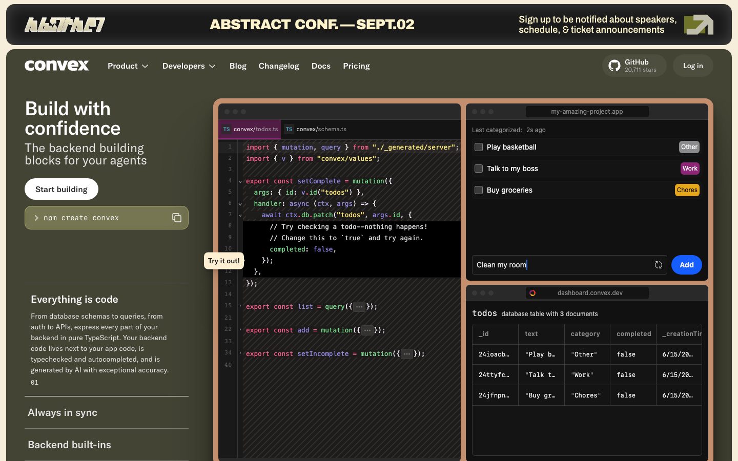
**`announcement-bar`** — The black bar pinned above the nav ("ABSTRACT CONF. — SEPT.02 / Sign up to be notified…"). Background `{colors.surface-black}`, text `{colors.on-dark-soft}` (warm cream), `{typography.body-sm}`, padding `{spacing.md}` (12px). Carries a small accent-marked logo and an arrow glyph at right.
**`top-nav`** — The primary nav band on `{colors.surface-dark}`. Carries the Convex wordmark, primary menu (Product, Developers, Blog, Changelog, Docs, Pricing) in `{typography.button}`, a GitHub star pill, and a `{component.button-secondary-outline}` "Log in". Padding `{spacing.md}` (12px).
### Buttons
**`button-cta-light`** — The hero primary CTA ("Start building"). White background (`{colors.on-primary}`), `{colors.ink}` text, `{typography.button}`, padding `{spacing.md}` (12px), `{rounded.pill}`. The dominant light-on-dark action.
**`button-secondary-outline`** — The "Log in" button in the nav. Transparent background, `{colors.on-dark}` text, hairline border, `{rounded.pill}`, padding 12px.
**`button-add`** — The in-mockup "Add" button inside the todo widget. Background `{colors.accent-violet}` (#948ae3), `{colors.on-primary}` text, `{rounded.md}` (8px), padding 12px. Convex's accent action color shown inside the live product fragment.
**`button-cta-orange`** — The pre-footer CTA button ("Start building" on the black band). Background `{colors.accent-orange}` (#de5d33), `{colors.on-primary}` text, `{rounded.pill}`, padding 12px.
**`code-input-pill`** — The "Clean my room" text input inside the todo mockup. Background `{colors.surface-dark-elevated}`, `{colors.on-dark-soft}` text, `{rounded.md}`, padding 12px. Carries a refresh glyph and sits beside `{component.button-add}`.
### Cards & Surfaces
**`card`** — The base content card. `{rounded.xs}` (4px), `shadow: none`. Flat content blocks on the canvas.
**`code-panel-card`** — The dark code-editor mockup (tabbed `convex/todos.ts` / `convex/schema.ts` with syntax highlighting). Background `{colors.surface-dark}`, `{rounded.lg}` (12px), padding 12px, carrying a deep drop shadow. Window chrome (traffic-light dots, tabs) sits inside.
**`product-mockup-card`** — The dashboard / todo-app / database-table fragments shown beside the code panel. Background `{colors.surface-dark}`, `{rounded.lg}`, padding 12px. Holds the live category badges, the todo rows, and the `todos` database table with columns.
**`dark-feature-band`** — The "Not just a database" full-width dark band. Background `{colors.surface-dark}`, `{typography.display-md}` headline centered, `{rounded.xl}`, padding `{spacing.xxl}` (48px). Holds the isometric architecture diagram and a `Learn more` pill.
**`feature-section`** — A canvas editorial band ("LLMs love Convex", "Loved by developers", "Convex ❤️ your favorite frameworks"). Background `{colors.canvas}`, `{colors.ink}` text, `{typography.body-md}` body, padding `{spacing.xxl}` (48px).
**`testimonial-card`** — Dark quote cards in the "Loved by developers" masonry grid. Background `{colors.surface-dark}`, `{colors.on-dark}` text, `{typography.body-sm}`, `{rounded.lg}`, padding `{spacing.lg}` (16px). Top/bottom row carries a small circular avatar + name + handle.
**`integration-tile`** — Framework logo tiles (React, React Native, Python, Next.js, TanStack, Rust, Remix, Vue, Svelte). Background `{colors.surface-dark}`, `{colors.on-dark}` text, `{rounded.md}`, padding 12px, with the framework glyph at left.
### Labels & Badges
**`section-label-pill`** — Small uppercase eyebrow pills ("AI TOOLS", "PRODUCT", "CUSTOMER LOVE", "INTEGRATIONS"). Background `{colors.canvas}`, `{colors.ink}` text, `{typography.body-sm}`, `{rounded.pill}`, padding `{spacing.xs}` (6px).
**`category-badge`** — The colored category chips inside the todo mockup ("Other", "Work", "Chores"). Background uses an accent (`{colors.accent-yellow}` for Chores shown; "Work" uses `{colors.accent-pink}`, "Other" uses a neutral), `{colors.ink}` text, `{typography.body-sm}`, `{rounded.sm}` (6px), padding `{spacing.xxs}` (4px).
### CTA & Footer
**`cta-band-dark`** — The pre-footer black band ("Get your app up and running in minutes"). Background `{colors.surface-black}`, `{typography.display-lg}` headline, padding `{spacing.section}` (96px), decorated with the accent pixel-grid motif. Carries `{component.button-cta-orange}` centered.
**`footer`** — The black footer that closes the page. Background `{colors.surface-black}`, link text `{colors.neutral-light}`, `{typography.body-sm}`. 4-column link list (Product / Developers / Company / Social) plus a trust-badge column (SOC 2, HIPAA, GDPR). Padding `{spacing.xxl}` (48px).
## Do's and Don'ts
### Do
- Use the warm off-white canvas (`{colors.canvas}` — #f7f1ff) for editorial bands and `{colors.surface-dark}` (#1e1c1a) for product-bearing bands. The alternation is the page rhythm.
- Show the real product inside dark `{component.code-panel-card}` and `{component.product-mockup-card}` surfaces — Convex displays its editor, todo app, and database table rather than illustrating them.
- Keep GT America display headlines with negative letter-spacing. Headlines without it read as off-brand.
- Pull accent colors from the syntax/product palette (violet, pink, green, orange, yellow) and apply them to badges, in-card actions, and decorative grids.
- Use `{rounded.pill}` for hero and footer CTAs; `{rounded.lg}` for product panels; `{rounded.xs}` for flat content cards.
- Bookend the page with dark bars — `{component.announcement-bar}` at the top, `{component.cta-band-dark}` + `{component.footer}` at the bottom.
- Layer deep shadows on the hero product cluster to make it read as floating app windows.
### Don't
- Don't flatten the accent family into a single brand fill — the chroma comes from real syntax/UI fragments, used sparingly.
- Don't set body copy in GT America — emphasized body is Archivo 600.
- Don't put product mockups on light surfaces; the editor and dashboard fragments live on `{colors.surface-dark}`.
- Don't exceed `{rounded.xl}` (16px) on framed surfaces except for fully-pill CTAs.
- Don't run two dark product bands back-to-back without a canvas band between them — the alternation is what gives the long page its pacing.
- Don't add hover-state styling beyond default and pressed.
## Responsive Behavior
The two captured pages (landing, pricing) were measured at desktop width; explicit breakpoints were not captured. The following is the inferred collapsing strategy (derived from layout structure).
### Breakpoints (derived)
| Name | Width | Key Changes |
|---|---|---|
| Mobile | < 768px | Nav collapses to hamburger; hero text stacks above the product mockup cluster; testimonial masonry → 1 column; integration grid → 1-up; footer columns → 1–2 |
| Tablet | 768–1024px | Hero text + mockup may stay split or stack; testimonial grid → 2 columns; integration tiles → 2-up |
| Desktop | > 1024px | Full hero split (text left, mockup cluster right); testimonial 3-up; integration 3-up; 4-column footer |
### Touch Targets
- `{component.button-cta-light}` and `{component.button-cta-orange}` carry 12px padding inside pill silhouettes — adequate for touch.
- `{component.button-add}` at 12px padding is small; tap area depends on the surrounding input row.
- `{component.integration-tile}` and `{component.section-label-pill}` tap areas meet comfortable minimums with their padding.
### Image Behavior
- Product mockups (code panels, dashboard, database table) scale proportionally; their internal text stays legible at desktop and likely simplifies on mobile.
- Decorative pixel-grid motifs are background ornaments and can crop freely.
## Iteration Guide
1. Focus on ONE component at a time. Reference its YAML key directly (`{component.code-panel-card}`, `{component.button-cta-orange}`).
2. Variants of an existing component live as separate entries in `components:`.
3. Use `{token.refs}` everywhere — never inline hex.
4. Never document hover. Default and Active/Pressed states only.
5. Display headlines stay GT America (substitute Inter/Archivo) with negative tracking; emphasized body stays Archivo 600.
6. The accent family is scarce and product-derived — reach for it on badges and in-card actions, not on large fills.
7. Maintain the light-band / dark-band alternation; the dark announcement bar and dark footer are the fixed bookends.
## Known Gaps
- The measured `button-primary` reported `radius: 0px` and `padding: 12px` with white text — but the visible hero and footer CTAs are clearly pill-shaped. The pill radius is derived from screenshot ground-truth and flagged as such; the 0px reading is likely a capture artifact (the measured `<button>` may not be the styled CTA element).
- Only 5 typography roles were captured. Lighter body weights, caption/fine-print sizes, footer link type, and the monospace face used inside the code-editor mockups were not separately measured.
- GT America is a licensed commercial typeface; substitutes are documented in the Typography section. No font was flagged in `fonts_licensed`, but GT America is treated as licensed and not shipped.
- Category badge background colors ("Other", "Work") beyond the yellow "Chores" chip are inferred from screenshot color matches against the accent family; exact per-badge hex assignments were not individually measured.
- Shadow values are truncated in the source data; the listed treatments are reconstructed from the captured fragments and mapped to elevation levels by inference.
- No explicit breakpoints, animation, or transition timings were captured; responsive behavior is inferred from layout structure.
- The pricing page was captured but no pricing-specific components (tier cards, toggles, comparison tables) were extracted into the measured component set — those remain undocumented.
- Form/input states beyond the in-mockup `{component.code-input-pill}` (focus, error, success) were not extracted.
<!-- Documented by duply · real-world design systems as ready-to-use DESIGN.md for AI coding agents · https://duply.ai/convex/design-md -->
Color Palette
Accent
Neutrals
Typography
display-lg40px · 700 · 1
The quick brown fox jumpsdisplay-md38px · 500 · 1
The quick brown fox jumpsbody-md18px · 600 · 1.111
The quick brown fox jumpsbody-sm16px · 400 · 1.5
The quick brown fox jumpsbutton16px · 500 · 1.5
The quick brown fox jumpsSpacing & Shape
Spacing
| Name | Value | Preview |
|---|---|---|
| xxs | 4px | |
| xs | 6px | |
| sm | 8px | |
| smd | 10px | |
| md | 12px | |
| lg | 16px | |
| xl | 24px | |
| xxl | 48px | |
| band | 80px | |
| section | 96px |
Border Radius
| Name | Value | Preview |
|---|---|---|
| xxs | 3px | |
| xs | 4px | |
| sm | 6px | |
| md | 8px | |
| lg | 12px | |
| xl | 16px | |
| pill | 9999px |
More like this


---
version: alpha
name: Convex-design-analysis
description: A developer-tooling marketing surface built on a warm off-white canvas with deep near-black product bands, GT America display type, and Archivo body. The system alternates light editorial sections with dark code-panel and product-mockup cards, using a small high-chroma accent family (violet, pink, green, orange, yellow) drawn straight from syntax-highlighting and product UI rather than from brand chrome. The voltage comes from real code editors and dashboard fragments shown in-card, framed by tight radii and a confident, condensed-feeling display headline.

colors:
  ink: "#141414"
  body: "#525053"
  muted: "#6d6d70"
  muted-soft: "#848185"
  neutral-light: "#a9a9ac"
  neutral-soft: "#bab6c0"
  hairline: "#e5e5e5"
  canvas: "#f7f1ff"
  on-primary: "#ffffff"
  on-dark: "#ffffff"
  on-dark-soft: "#fdf4cc"
  surface-dark: "#1e1c1a"
  surface-dark-elevated: "#292929"
  surface-dark-soft: "#38383a"
  surface-black: "#000000"
  accent-violet: "#948ae3"
  accent-pink: "#fc618d"
  accent-green: "#7bd88f"
  accent-orange: "#de5d33"
  accent-yellow: "#f8e67a"
  accent-lilac: "#e3d0df"

typography:
  display-lg:
    fontFamily: "GT America, Archivo, sans-serif"
    fontSize: 40px
    fontWeight: 700
    lineHeight: 1.0
    letterSpacing: -1px
  display-md:
    fontFamily: "GT America, Archivo, sans-serif"
    fontSize: 38px
    fontWeight: 500
    lineHeight: 1.0
    letterSpacing: -0.95px
  body-md:
    fontFamily: "Archivo, sans-serif"
    fontSize: 18px
    fontWeight: 600
    lineHeight: 1.111
    letterSpacing: 0
  body-sm:
    fontFamily: "GT America, Archivo, sans-serif"
    fontSize: 16px
    fontWeight: 400
    lineHeight: 1.5
    letterSpacing: 0
  button:
    fontFamily: "GT America, Archivo, sans-serif"
    fontSize: 16px
    fontWeight: 500
    lineHeight: 1.5
    letterSpacing: 0

rounded:
  xxs: 3px
  xs: 4px
  sm: 6px
  md: 8px
  lg: 12px
  xl: 16px
  pill: 9999px

spacing:
  xxs: 4px
  xs: 6px
  sm: 8px
  smd: 10px
  md: 12px
  lg: 16px
  xl: 24px
  xxl: 48px
  band: 80px
  section: 96px

components:
  top-nav:
    backgroundColor: "{colors.surface-dark}"
    textColor: "{colors.on-dark}"
    typography: "{typography.button}"
    padding: 12px
  announcement-bar:
    backgroundColor: "{colors.surface-black}"
    textColor: "{colors.on-dark-soft}"
    typography: "{typography.body-sm}"
    padding: 12px
  button-cta-light:
    backgroundColor: "{colors.on-primary}"
    textColor: "{colors.ink}"
    typography: "{typography.button}"
    rounded: "{rounded.pill}"
    padding: 12px
  button-secondary-outline:
    backgroundColor: transparent
    textColor: "{colors.on-dark}"
    typography: "{typography.button}"
    rounded: "{rounded.pill}"
    padding: 12px
  button-add:
    backgroundColor: "{colors.accent-violet}"
    textColor: "{colors.on-primary}"
    typography: "{typography.button}"
    rounded: "{rounded.md}"
    padding: 12px
  button-cta-orange:
    backgroundColor: "{colors.accent-orange}"
    textColor: "{colors.on-primary}"
    typography: "{typography.button}"
    rounded: "{rounded.pill}"
    padding: 12px
  code-input-pill:
    backgroundColor: "{colors.surface-dark-elevated}"
    textColor: "{colors.on-dark-soft}"
    typography: "{typography.body-sm}"
    rounded: "{rounded.md}"
    padding: 12px
  card:
    backgroundColor: "{colors.canvas}"
    textColor: "{colors.ink}"
    rounded: "{rounded.xs}"
  code-panel-card:
    backgroundColor: "{colors.surface-dark}"
    textColor: "{colors.on-dark}"
    typography: "{typography.body-sm}"
    rounded: "{rounded.lg}"
    padding: 12px
  product-mockup-card:
    backgroundColor: "{colors.surface-dark}"
    textColor: "{colors.on-dark}"
    typography: "{typography.body-sm}"
    rounded: "{rounded.lg}"
    padding: 12px
  feature-section:
    backgroundColor: "{colors.canvas}"
    textColor: "{colors.ink}"
    typography: "{typography.body-md}"
    padding: 48px
  dark-feature-band:
    backgroundColor: "{colors.surface-dark}"
    textColor: "{colors.on-dark}"
    typography: "{typography.display-md}"
    rounded: "{rounded.xl}"
    padding: 48px
  testimonial-card:
    backgroundColor: "{colors.surface-dark}"
    textColor: "{colors.on-dark}"
    typography: "{typography.body-sm}"
    rounded: "{rounded.lg}"
    padding: 16px
  integration-tile:
    backgroundColor: "{colors.surface-dark}"
    textColor: "{colors.on-dark}"
    typography: "{typography.body-sm}"
    rounded: "{rounded.md}"
    padding: 12px
  section-label-pill:
    backgroundColor: "{colors.canvas}"
    textColor: "{colors.ink}"
    typography: "{typography.body-sm}"
    rounded: "{rounded.pill}"
    padding: 6px
  category-badge:
    backgroundColor: "{colors.accent-yellow}"
    textColor: "{colors.ink}"
    typography: "{typography.body-sm}"
    rounded: "{rounded.sm}"
    padding: 4px
  cta-band-dark:
    backgroundColor: "{colors.surface-black}"
    textColor: "{colors.on-dark}"
    typography: "{typography.display-lg}"
    padding: 96px
  footer:
    backgroundColor: "{colors.surface-black}"
    textColor: "{colors.neutral-light}"
    typography: "{typography.body-sm}"
    padding: 48px

---

## Overview

Convex's marketing surface is a developer-tooling interface that pivots between two moods: a warm off-white canvas (`{colors.canvas}` — #f7f1ff) for editorial bands, and deep near-black product surfaces (`{colors.surface-dark}` — #1e1c1a) that hold the real product chrome — code editors, todo widgets, database tables, architecture diagrams. The brand doesn't illustrate the product; it shows the actual editor and dashboard at small scale inside dark cards.

Type voice splits into two families: **GT America** (the commercial display + UI face — used for h1/h2 headlines, h3 subheads, and button labels) and **Archivo** (used for emphasized body copy at weight 600). The display headlines run tight: weight 500–700 with negative letter-spacing (-0.95px to -1px), giving the "Build with confidence" and "Get your app up and running in minutes" headlines a confident, condensed-feeling presence.

Color voltage comes from a small high-chroma accent family pulled directly from syntax highlighting and product UI: violet (`{colors.accent-violet}` — #948ae3), pink (`{colors.accent-pink}` — #fc618d), green (`{colors.accent-green}` — #7bd88f), orange (`{colors.accent-orange}` — #de5d33), and yellow (`{colors.accent-yellow}` — #f8e67a). These appear on category badges, the in-card "Add" button, the footer CTA, and decorative pixel-grid accents — never as a flat brand wash.

**Key Characteristics:**
- Warm off-white canvas (`{colors.canvas}` — #f7f1ff) editorial bands alternating with near-black product bands (`{colors.surface-dark}` — #1e1c1a).
- GT America display headlines (commercial typeface — substituted below) with negative letter-spacing; Archivo for emphasized body at weight 600.
- Real product UI shown in-card: code editors, todo apps, database tables, architecture diagrams sit inside dark `{component.code-panel-card}` and `{component.product-mockup-card}` surfaces.
- A high-chroma accent family (violet / pink / green / orange / yellow) drawn from syntax colors — applied to badges, in-card buttons, and the footer CTA.
- Tight radius scale: `{rounded.xs}` (4px) for cards, `{rounded.md}` (8px) and `{rounded.lg}` (12px) for product panels, `{rounded.pill}` for hero CTAs and label pills.
- Pill-shaped hero CTAs (`{component.button-cta-light}`) in white-on-dark; the footer closes with an orange pill CTA (`{component.button-cta-orange}`).
- The page opens with a dark announcement bar (`{component.announcement-bar}`) and closes with a black CTA band + footer — dark bookends around the warm body.

## Colors

### Accent Family
- **Violet** (`{colors.accent-violet}` — #948ae3): The in-card "Add" button (`{component.button-add}`) and primary inline accent. Convex's nearest thing to a brand color.
- **Pink** (`{colors.accent-pink}` — #fc618d): Syntax + UI accent, "Work" category badge tone, decorative grid marks.
- **Green** (`{colors.accent-green}` — #7bd88f): Syntax success tone, status accents.
- **Orange** (`{colors.accent-orange}` — #de5d33): The footer CTA button background (`{component.button-cta-orange}`) and decorative pixel-grid accents.
- **Yellow** (`{colors.accent-yellow}` — #f8e67a): "Chores" category badge background, highlight tone.
- **Lilac** (`{colors.accent-lilac}` — #e3d0df): A soft mauve used in subtle UI accents and dividers.

### Surface
- **Canvas** (`{colors.canvas}` — #f7f1ff): The warm off-white page floor for editorial bands.
- **Surface Dark** (`{colors.surface-dark}` — #1e1c1a): The dominant dark band — hero background, code panels, product mockups, testimonial cards, dark feature bands.
- **Surface Dark Elevated** (`{colors.surface-dark-elevated}` — #292929): Nested input/row surfaces inside dark cards (e.g. the "Clean my room" code input).
- **Surface Dark Soft** (`{colors.surface-dark-soft}` — #38383a): Softer nested dividers and hairlines on dark surfaces.
- **Surface Black** (`{colors.surface-black}` — #000000): The announcement bar, the pre-footer CTA band, and the footer — the darkest bookends.

### Text
- **Ink** (`{colors.ink}` — #141414): All headlines and primary text on light surfaces.
- **Body** (`{colors.body}` — #525053): Default running-text color on the canvas.
- **Muted** (`{colors.muted}` — #6d6d70): Secondary text.
- **Muted Soft** (`{colors.muted-soft}` — #848185): Tertiary text and fine print.
- **Neutral Light** (`{colors.neutral-light}` — #a9a9ac): Footer link text on dark.
- **Neutral Soft** (`{colors.neutral-soft}` — #bab6c0): Faint dark-surface labels.
- **On Primary / On Dark** (`{colors.on-primary}` / `{colors.on-dark}` — #ffffff): Text on buttons and dark bands.
- **On Dark Soft** (`{colors.on-dark-soft}` — #fdf4cc): A muted warm-cream text used for the announcement bar and low-contrast labels on dark surfaces.

### Hairline
- **Hairline** (`{colors.hairline}` — #e5e5e5): 1px divider tone on light surfaces (section rules under "Everything is code", "Always in sync", "Backend built-ins").

## Typography

### Font Family
The system runs **GT America** for display headlines, h3 subheads, and button labels, and **Archivo** for emphasized body copy. GT America is a commercial typeface from Grilli Type — it is not bundled here. Archivo is open-source (Google Fonts). The fallback stack walks `Archivo, sans-serif`.

The split is functional:
- GT America (display, 500–700 weight, -0.95 to -1px tracking) — h1, h2, h3, buttons
- Archivo (body, 600 weight, 0 tracking) — emphasized running text

### Hierarchy

| Token | Size | Weight | Line Height | Letter Spacing | Use |
|---|---|---|---|---|---|
| `{typography.display-lg}` | 40px | 700 | 1.0 | -1px | Section/band headlines ("Get your app up and running in minutes") — GT America |
| `{typography.display-md}` | 38px | 500 | 1.0 | -0.95px | Hero h1 ("Build with confidence") — GT America |
| `{typography.body-sm}` | 16px | 400 | 1.5 | 0 | Subheads, sub-copy, button-adjacent labels (h3 role) — GT America |
| `{typography.body-md}` | 18px | 600 | 1.111 | 0 | Emphasized body / feature paragraphs — Archivo |
| `{typography.button}` | 16px | 500 | 1.5 | 0 | Button labels and nav links — GT America |

### Principles
Display headlines stay in GT America with negative letter-spacing — the tight tracking is part of the voice and headlines without it read as off-brand. Emphasized body copy uses Archivo 600, which is heavier than typical body weight — Convex's "body" measurement is itself a semibold paragraph style. The h3 subhead role (GT America 16px / 400 / 1.5) is the one place display type relaxes to a regular weight.

Note: the measured type set is small (5 roles). Lighter body weights, caption sizes, and the code-block monospace face used inside the editor mockups were not separately captured (see Known Gaps).

### Note on Font Substitutes
GT America is a licensed commercial face and is not shipped here. **Inter** or **Archivo** at weight 500–700 with -0.025em letter-spacing is a usable approximation for the display roles; the substitution preserves the weight + negative-tracking signature without claiming the licensed forms. Archivo (already in the body role) is open-source and ships directly.

## Layout

### Spacing System
- **Base unit:** 2px effective; the dominant rhythm steps are 4 / 6 / 8 / 10 / 12 / 16.
- **Tokens:** `{spacing.xxs}` 4px · `{spacing.xs}` 6px · `{spacing.sm}` 8px · `{spacing.smd}` 10px · `{spacing.md}` 12px · `{spacing.lg}` 16px · `{spacing.xl}` 24px · `{spacing.xxl}` 48px · `{spacing.band}` 80px · `{spacing.section}` 96px.
- **Component padding:** `{spacing.md}` (12px) is the single most common interior pad — buttons, code inputs, nav, panel interiors.
- **Section padding:** `{spacing.xxl}` (48px) for most editorial bands; `{spacing.section}` (96px) for the pre-footer CTA band.

### Grid & Container
- **Hero band:** A left text column (h1 + sub-copy + CTA + npm command pill) beside a large product-mockup cluster on the right (code editor stacked with a todo widget + database table).
- **Feature rows:** Label pill + headline + body text on the left, decorative or product artifact on the right.
- **Testimonial grid:** 3-up masonry of dark testimonial cards on the canvas.
- **Integration grid:** Label + headline left, 3-up tile grid of framework logos right.
- **Footer:** 4-column link list (Product / Developers / Company / Social) on black.

### Whitespace Philosophy
Convex packs the hero densely — the product mockup cluster is the visual payload and gets the most area — then opens up considerably in the lower editorial bands. The rhythm alternates dense (product-heavy) and airy (single-headline) bands to keep a long-scroll page moving.

## Elevation & Depth

| Level | Treatment | Use |
|---|---|---|
| Flat | No shadow | Canvas editorial bands, nav, section labels |
| Card (none) | `{rounded.xs}` card, `shadow: none` | The base `{component.card}` — flat content blocks |
| Soft drop | `0 1px 3px / 0 1px 2px rgba(0,0,0,0.1)` | Small elevated UI chips and pills |
| Medium drop | `0 10px 15px -3px / 0 4px… rgba(0,0,0,0.1)` | Product-mockup and code-panel cards lifting off the dark band |
| Deep drop | `0 16px 17px rgba(0,0,0,0.06)` + `0 9px… rgba(0,0,0,0.13)` | Larger floating panels |
| Dramatic | `0 91px 100px rgba(0,0,0,0.33)` + `0 …px rgba(0,0,0,0.23)` | The hero mockup cluster / hero-scale floating artifact |
| Inset glow | `inset 0 0 30px rgba(255,255,255,0.2)` | Inner highlight on a dark product surface (subtle rim-light) |

The elevation philosophy is **layered and cinematic on dark** — the product mockups carry progressively deeper shadows (up to a 91px-blur drop) to make the editor and dashboard fragments feel like floating app windows, while flat canvas content uses no shadow at all.

### Decorative Depth
- Pixel-grid / mosaic motifs (small squares in accent orange, pink, neutral) decorate the "LLMs love Convex" band and the pre-footer CTA band — a nod to data tables and pixel chrome.
- The "Not just a database" dark band shows an isometric exploded-stack diagram with its own internal glow; this is product art, not a system token.

## Shapes

### Border Radius Scale

| Token | Value | Use |
|---|---|---|
| `{rounded.xxs}` | 3px | Smallest UI chips, syntax tag accents |
| `{rounded.xs}` | 4px | Base content card (`{component.card}`) |
| `{rounded.sm}` | 6px | Category badges, small inline labels |
| `{rounded.md}` | 8px | In-card buttons ("Add"), code inputs, integration tiles |
| `{rounded.lg}` | 12px | Code-panel cards, product-mockup cards, testimonial cards |
| `{rounded.xl}` | 16px | Dark feature bands / larger framed surfaces |
| `{rounded.pill}` | 9999px | Hero CTAs, label pills, npm command pill — derived (the visible pill buttons exceed the measured 16px max; pill is inferred from screenshot ground-truth) |

### Photography & Geometry
There is little photography — the artifacts are product UI captures and isometric diagrams. Testimonial avatars are small circles. Product panels retain their native window chrome (traffic-light dots, tab rows, table grids) inside `{rounded.lg}` frames.

## Components

### Navigation & Bars

**`announcement-bar`** — The black bar pinned above the nav ("ABSTRACT CONF. — SEPT.02 / Sign up to be notified…"). Background `{colors.surface-black}`, text `{colors.on-dark-soft}` (warm cream), `{typography.body-sm}`, padding `{spacing.md}` (12px). Carries a small accent-marked logo and an arrow glyph at right.

**`top-nav`** — The primary nav band on `{colors.surface-dark}`. Carries the Convex wordmark, primary menu (Product, Developers, Blog, Changelog, Docs, Pricing) in `{typography.button}`, a GitHub star pill, and a `{component.button-secondary-outline}` "Log in". Padding `{spacing.md}` (12px).

### Buttons

**`button-cta-light`** — The hero primary CTA ("Start building"). White background (`{colors.on-primary}`), `{colors.ink}` text, `{typography.button}`, padding `{spacing.md}` (12px), `{rounded.pill}`. The dominant light-on-dark action.

**`button-secondary-outline`** — The "Log in" button in the nav. Transparent background, `{colors.on-dark}` text, hairline border, `{rounded.pill}`, padding 12px.

**`button-add`** — The in-mockup "Add" button inside the todo widget. Background `{colors.accent-violet}` (#948ae3), `{colors.on-primary}` text, `{rounded.md}` (8px), padding 12px. Convex's accent action color shown inside the live product fragment.

**`button-cta-orange`** — The pre-footer CTA button ("Start building" on the black band). Background `{colors.accent-orange}` (#de5d33), `{colors.on-primary}` text, `{rounded.pill}`, padding 12px.

**`code-input-pill`** — The "Clean my room" text input inside the todo mockup. Background `{colors.surface-dark-elevated}`, `{colors.on-dark-soft}` text, `{rounded.md}`, padding 12px. Carries a refresh glyph and sits beside `{component.button-add}`.

### Cards & Surfaces

**`card`** — The base content card. `{rounded.xs}` (4px), `shadow: none`. Flat content blocks on the canvas.

**`code-panel-card`** — The dark code-editor mockup (tabbed `convex/todos.ts` / `convex/schema.ts` with syntax highlighting). Background `{colors.surface-dark}`, `{rounded.lg}` (12px), padding 12px, carrying a deep drop shadow. Window chrome (traffic-light dots, tabs) sits inside.

**`product-mockup-card`** — The dashboard / todo-app / database-table fragments shown beside the code panel. Background `{colors.surface-dark}`, `{rounded.lg}`, padding 12px. Holds the live category badges, the todo rows, and the `todos` database table with columns.

**`dark-feature-band`** — The "Not just a database" full-width dark band. Background `{colors.surface-dark}`, `{typography.display-md}` headline centered, `{rounded.xl}`, padding `{spacing.xxl}` (48px). Holds the isometric architecture diagram and a `Learn more` pill.

**`feature-section`** — A canvas editorial band ("LLMs love Convex", "Loved by developers", "Convex ❤️ your favorite frameworks"). Background `{colors.canvas}`, `{colors.ink}` text, `{typography.body-md}` body, padding `{spacing.xxl}` (48px).

**`testimonial-card`** — Dark quote cards in the "Loved by developers" masonry grid. Background `{colors.surface-dark}`, `{colors.on-dark}` text, `{typography.body-sm}`, `{rounded.lg}`, padding `{spacing.lg}` (16px). Top/bottom row carries a small circular avatar + name + handle.

**`integration-tile`** — Framework logo tiles (React, React Native, Python, Next.js, TanStack, Rust, Remix, Vue, Svelte). Background `{colors.surface-dark}`, `{colors.on-dark}` text, `{rounded.md}`, padding 12px, with the framework glyph at left.

### Labels & Badges

**`section-label-pill`** — Small uppercase eyebrow pills ("AI TOOLS", "PRODUCT", "CUSTOMER LOVE", "INTEGRATIONS"). Background `{colors.canvas}`, `{colors.ink}` text, `{typography.body-sm}`, `{rounded.pill}`, padding `{spacing.xs}` (6px).

**`category-badge`** — The colored category chips inside the todo mockup ("Other", "Work", "Chores"). Background uses an accent (`{colors.accent-yellow}` for Chores shown; "Work" uses `{colors.accent-pink}`, "Other" uses a neutral), `{colors.ink}` text, `{typography.body-sm}`, `{rounded.sm}` (6px), padding `{spacing.xxs}` (4px).

### CTA & Footer

**`cta-band-dark`** — The pre-footer black band ("Get your app up and running in minutes"). Background `{colors.surface-black}`, `{typography.display-lg}` headline, padding `{spacing.section}` (96px), decorated with the accent pixel-grid motif. Carries `{component.button-cta-orange}` centered.

**`footer`** — The black footer that closes the page. Background `{colors.surface-black}`, link text `{colors.neutral-light}`, `{typography.body-sm}`. 4-column link list (Product / Developers / Company / Social) plus a trust-badge column (SOC 2, HIPAA, GDPR). Padding `{spacing.xxl}` (48px).

## Do's and Don'ts

### Do
- Use the warm off-white canvas (`{colors.canvas}` — #f7f1ff) for editorial bands and `{colors.surface-dark}` (#1e1c1a) for product-bearing bands. The alternation is the page rhythm.
- Show the real product inside dark `{component.code-panel-card}` and `{component.product-mockup-card}` surfaces — Convex displays its editor, todo app, and database table rather than illustrating them.
- Keep GT America display headlines with negative letter-spacing. Headlines without it read as off-brand.
- Pull accent colors from the syntax/product palette (violet, pink, green, orange, yellow) and apply them to badges, in-card actions, and decorative grids.
- Use `{rounded.pill}` for hero and footer CTAs; `{rounded.lg}` for product panels; `{rounded.xs}` for flat content cards.
- Bookend the page with dark bars — `{component.announcement-bar}` at the top, `{component.cta-band-dark}` + `{component.footer}` at the bottom.
- Layer deep shadows on the hero product cluster to make it read as floating app windows.

### Don't
- Don't flatten the accent family into a single brand fill — the chroma comes from real syntax/UI fragments, used sparingly.
- Don't set body copy in GT America — emphasized body is Archivo 600.
- Don't put product mockups on light surfaces; the editor and dashboard fragments live on `{colors.surface-dark}`.
- Don't exceed `{rounded.xl}` (16px) on framed surfaces except for fully-pill CTAs.
- Don't run two dark product bands back-to-back without a canvas band between them — the alternation is what gives the long page its pacing.
- Don't add hover-state styling beyond default and pressed.

## Responsive Behavior

The two captured pages (landing, pricing) were measured at desktop width; explicit breakpoints were not captured. The following is the inferred collapsing strategy (derived from layout structure).

### Breakpoints (derived)

| Name | Width | Key Changes |
|---|---|---|
| Mobile | < 768px | Nav collapses to hamburger; hero text stacks above the product mockup cluster; testimonial masonry → 1 column; integration grid → 1-up; footer columns → 1–2 |
| Tablet | 768–1024px | Hero text + mockup may stay split or stack; testimonial grid → 2 columns; integration tiles → 2-up |
| Desktop | > 1024px | Full hero split (text left, mockup cluster right); testimonial 3-up; integration 3-up; 4-column footer |

### Touch Targets
- `{component.button-cta-light}` and `{component.button-cta-orange}` carry 12px padding inside pill silhouettes — adequate for touch.
- `{component.button-add}` at 12px padding is small; tap area depends on the surrounding input row.
- `{component.integration-tile}` and `{component.section-label-pill}` tap areas meet comfortable minimums with their padding.

### Image Behavior
- Product mockups (code panels, dashboard, database table) scale proportionally; their internal text stays legible at desktop and likely simplifies on mobile.
- Decorative pixel-grid motifs are background ornaments and can crop freely.

## Iteration Guide

1. Focus on ONE component at a time. Reference its YAML key directly (`{component.code-panel-card}`, `{component.button-cta-orange}`).
2. Variants of an existing component live as separate entries in `components:`.
3. Use `{token.refs}` everywhere — never inline hex.
4. Never document hover. Default and Active/Pressed states only.
5. Display headlines stay GT America (substitute Inter/Archivo) with negative tracking; emphasized body stays Archivo 600.
6. The accent family is scarce and product-derived — reach for it on badges and in-card actions, not on large fills.
7. Maintain the light-band / dark-band alternation; the dark announcement bar and dark footer are the fixed bookends.

## Known Gaps

- The measured `button-primary` reported `radius: 0px` and `padding: 12px` with white text — but the visible hero and footer CTAs are clearly pill-shaped. The pill radius is derived from screenshot ground-truth and flagged as such; the 0px reading is likely a capture artifact (the measured `<button>` may not be the styled CTA element).
- Only 5 typography roles were captured. Lighter body weights, caption/fine-print sizes, footer link type, and the monospace face used inside the code-editor mockups were not separately measured.
- GT America is a licensed commercial typeface; substitutes are documented in the Typography section. No font was flagged in `fonts_licensed`, but GT America is treated as licensed and not shipped.
- Category badge background colors ("Other", "Work") beyond the yellow "Chores" chip are inferred from screenshot color matches against the accent family; exact per-badge hex assignments were not individually measured.
- Shadow values are truncated in the source data; the listed treatments are reconstructed from the captured fragments and mapped to elevation levels by inference.
- No explicit breakpoints, animation, or transition timings were captured; responsive behavior is inferred from layout structure.
- The pricing page was captured but no pricing-specific components (tier cards, toggles, comparison tables) were extracted into the measured component set — those remain undocumented.
- Form/input states beyond the in-mockup `{component.code-input-pill}` (focus, error, success) were not extracted.

<!-- Documented by duply · real-world design systems as ready-to-use DESIGN.md for AI coding agents · https://duply.ai/convex/design-md -->