Brainfish
A neo-brutalist B2B-AI support interface built on a white canvas with a single high-voltage lime accent (#a3e635), hard 2px offset drop-shadows, square-to-slightly-rounded edges, and the Geist sans typeface. The system reads as confident and technical — large 56px display headlines with tight negative tracking and italic serif emphasis words, hairline-bordered metric cards, a deep charcoal "enterprise-ready" band, and lime CTA buttons that sit on black borders with hard shadows rather than soft elevation.
---
version: alpha
name: Brainfish-design-analysis
description: A neo-brutalist B2B-AI support interface built on a white canvas with a single high-voltage lime accent (#a3e635), hard 2px offset drop-shadows, square-to-slightly-rounded edges, and the Geist sans typeface. The system reads as confident and technical — large 56px display headlines with tight negative tracking and italic serif emphasis words, hairline-bordered metric cards, a deep charcoal "enterprise-ready" band, and lime CTA buttons that sit on black borders with hard shadows rather than soft elevation.
colors:
ink: "#262626"
canvas: "#ffffff"
accent-lime: "#a3e635"
accent-mint-pale: "#dcfff1"
accent-off-white: "#fcfff7"
accent-green-dark: "#10663f"
accent-blue: "#1a4fff"
black: "#000000"
surface-dark: "#303030"
neutral-600: "#525252"
neutral-500: "#737373"
neutral-400: "#999999"
hairline: "#e5e5e5"
on-lime: "#262626"
on-dark: "#ffffff"
typography:
display-xl:
fontFamily: "Geist, sans-serif"
fontSize: 56px
fontWeight: 600
lineHeight: 1.161
letterSpacing: "-1.12px"
display-lg:
fontFamily: "Geist, sans-serif"
fontSize: 56px
fontWeight: 600
lineHeight: 1.161
letterSpacing: "-0.28px"
display-md:
fontFamily: "Geist, sans-serif"
fontSize: 48px
fontWeight: 600
lineHeight: 1.083
letterSpacing: "-0.96px"
eyebrow:
fontFamily: "Geist, sans-serif"
fontSize: 16px
fontWeight: 500
lineHeight: 1.3
letterSpacing: "1.28px"
body:
fontFamily: "Geist, sans-serif"
fontSize: 20px
fontWeight: 400
lineHeight: 1.5
letterSpacing: "normal"
button:
fontFamily: "Geist, sans-serif"
fontSize: 16px
fontWeight: 400
lineHeight: 1.25
letterSpacing: "normal"
rounded:
none: 0px
sm: 4px
md: 8px
lg: 25px
pill: 999px
spacing:
xxs: 4px
xs: 8px
sm: 12px
md: 16px
lg: 24px
xl: 32px
xxl: 40px
section: 56px
components:
top-nav:
backgroundColor: "{colors.canvas}"
textColor: "{colors.ink}"
typography: "{typography.button}"
padding: 24px
nav-link:
backgroundColor: transparent
textColor: "{colors.ink}"
typography: "{typography.button}"
button-primary:
backgroundColor: "{colors.accent-lime}"
textColor: "{colors.ink}"
typography: "{typography.button}"
rounded: "{rounded.none}"
padding: 0px
button-secondary:
backgroundColor: "{colors.canvas}"
textColor: "{colors.ink}"
typography: "{typography.button}"
rounded: "{rounded.sm}"
padding: 12px 24px
badge-pill:
backgroundColor: "{colors.accent-lime}"
textColor: "{colors.accent-green-dark}"
typography: "{typography.eyebrow}"
rounded: "{rounded.pill}"
padding: 4px 12px
eyebrow-label:
backgroundColor: transparent
textColor: "{colors.neutral-500}"
typography: "{typography.eyebrow}"
chat-bubble:
backgroundColor: "{colors.accent-mint-pale}"
textColor: "{colors.ink}"
typography: "{typography.body}"
rounded: "{rounded.md}"
padding: 16px
metric-card:
backgroundColor: "{colors.canvas}"
textColor: "{colors.ink}"
typography: "{typography.display-md}"
rounded: "{rounded.none}"
padding: 24px
feature-card:
backgroundColor: "{colors.canvas}"
textColor: "{colors.ink}"
typography: "{typography.body}"
rounded: "{rounded.sm}"
padding: 24px
testimonial-card:
backgroundColor: "{colors.canvas}"
textColor: "{colors.ink}"
typography: "{typography.body}"
rounded: "{rounded.sm}"
padding: 24px
compliance-strip:
backgroundColor: "{colors.canvas}"
textColor: "{colors.ink}"
typography: "{typography.button}"
padding: 24px
logo-strip:
backgroundColor: "{colors.canvas}"
textColor: "{colors.neutral-500}"
typography: "{typography.button}"
padding: 16px
dark-band:
backgroundColor: "{colors.surface-dark}"
textColor: "{colors.on-dark}"
typography: "{typography.body}"
padding: 56px
integration-tile:
backgroundColor: "{colors.surface-dark}"
textColor: "{colors.on-dark}"
typography: "{typography.button}"
rounded: "{rounded.none}"
padding: 16px
cta-band:
backgroundColor: "{colors.canvas}"
textColor: "{colors.ink}"
typography: "{typography.display-md}"
padding: 56px
footer:
backgroundColor: "{colors.canvas}"
textColor: "{colors.neutral-500}"
typography: "{typography.button}"
padding: 40px
---
## Overview
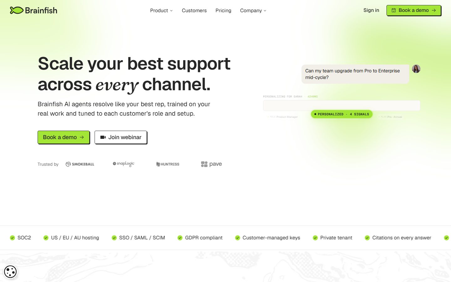
Brainfish's marketing surface is a **neo-brutalist B2B-AI interface** built on white canvas (`{colors.canvas}` — #ffffff) with a single high-voltage lime accent (`{colors.accent-lime}` — #a3e635) and ink-black text (`{colors.ink}` — #262626). The system reads as confident, technical, and slightly playful — large 56px Geist display headlines with tight negative letter-spacing, hard-edged ink borders, and the signature neo-brutalist **hard offset drop-shadow** (`2px 2px 0px` in ink, no blur) that replaces soft elevation everywhere.
Type runs entirely on **Geist** (Vercel's open-source geometric sans) — display headlines at weight 600 with negative tracking (-0.28px to -1.12px), body at weight 400 / 20px, and uppercase eyebrow labels at +1.28px tracking. Headlines mix in **italic serif emphasis words** (e.g. "every", "actually", "growth tool") for editorial voltage — see Known Gaps, as that serif face was not captured in the measured type set.
The lime accent is scarce and deliberate: it appears on the primary CTA button, a small "PERSONALIZED" status pill, and ambient gradient washes behind the hero and section transitions. Everything else is monochrome — ink text on white, with a charcoal `{colors.surface-dark}` (#303030) "Enterprise-ready" band and integration grid that inverts the palette near the page foot.
**Key Characteristics:**
- White canvas with a single lime CTA (`{colors.accent-lime}` — #a3e635). The primary button carries ink text and an ink border with a hard `2px 2px 0px` offset shadow — neo-brutalist, not soft-elevated.
- Geist throughout — display 600 with negative tracking, body 400 at 20px, uppercase eyebrows at +1.28px tracking.
- Italic serif emphasis words inside Geist headlines provide editorial accent (serif face undocumented — see Known Gaps).
- Hard offset shadows (`{colors.ink}` `2px 2px 0px`) and hairline grid borders (`{colors.ink}` `-1px 0px / 0px -1px`) instead of blurred elevation.
- Square-leaning radius: most surfaces are `{rounded.none}` (0px) or `{rounded.sm}` (4px); the pill badge uses `{rounded.pill}`.
- Charcoal `{colors.surface-dark}` (#303030) "Enterprise-ready" band with white text and white-shadowed integration tiles — the only dark surface, used to anchor the lower page.
- Metric cards in hairline-bordered grids carrying large 48px display numbers.
- Generous section rhythm at `{spacing.section}` (56px) between major bands.
## Colors
### Brand & Accent
- **Accent Lime** (`{colors.accent-lime}` — #a3e635): The single brand-voltage color. Primary CTA fill, status pills, ambient hero/section gradient washes. Used sparingly against monochrome.
- **Accent Green Dark** (`{colors.accent-green-dark}` — #10663f): Text color inside the lime status pill — a deep green that holds contrast on the lime fill.
- **Accent Mint Pale** (`{colors.accent-mint-pale}` — #dcfff1): Faint mint fill used on the hero chat-bubble product fragment.
- **Accent Off-White** (`{colors.accent-off-white}` — #fcfff7): A barely-tinted near-white used for soft section/card fills against pure white.
- **Accent Blue** (`{colors.accent-blue}` — #1a4fff): A single-use blue, appears once on an inline link/accent. Not part of the core voice.
### Surface
- **Canvas** (`{colors.canvas}` — #ffffff): The default page floor and card background.
- **Surface Dark** (`{colors.surface-dark}` — #303030): The "Enterprise-ready on day one" band and integration tiles — the only dark surface in the system.
- **Black** (`{colors.black}` — #000000): Used on logo marks and a small set of strong text/border moments.
- **Hairline** (`{colors.hairline}` — #e5e5e5): The 1px divider tone for soft card outlines and dividers between white surfaces.
### Text
- **Ink** (`{colors.ink}` — #262626): All headlines and primary text; also the border + hard-shadow color.
- **Neutral 600** (`{colors.neutral-600}` — #525252): Secondary running text and sub-labels.
- **Neutral 500** (`{colors.neutral-500}` — #737373): Tertiary text — eyebrows, "Trusted by" label, footer body.
- **Neutral 400** (`{colors.neutral-400}` — #999999): Faintest captions and fine-print.
- **On Lime** (`{colors.on-lime}` — #262626): Ink text on the lime CTA.
- **On Dark** (`{colors.on-dark}` — #ffffff): Text on the charcoal band and integration tiles.
## Typography
### Font Family
The system runs entirely on **Geist** — Vercel's open-source geometric sans — for display, body, buttons, eyebrows, and navigation. Geist is freely available, so no substitution is required; a reasonable fallback stack is `Geist, "Inter", -apple-system, BlinkMacSystemFont, sans-serif`.
Display headlines use weight 600 with negative letter-spacing (-0.28px to -1.12px) — tight, confident, modern. Body sits at weight 400 / 20px with 1.5 line-height. Eyebrow labels invert the tracking to a wide +1.28px uppercase treatment.
### Hierarchy
| Token | Size | Weight | Line Height | Letter Spacing | Use |
|---|---|---|---|---|---|
| `{typography.display-xl}` | 56px | 600 | 1.161 | -1.12px | Hero h1 ("Scale your best support across every channel.") |
| `{typography.display-lg}` | 56px | 600 | 1.161 | -0.28px | Section h2 ("Agents your customers actually trust.") |
| `{typography.display-md}` | 48px | 600 | 1.083 | -0.96px | Sub-section heads, metric numbers, CTA-band heads |
| `{typography.eyebrow}` | 16px | 500 | 1.3 | 1.28px | Uppercase eyebrow labels ("THE BRAINFISH DIFFERENCE", step labels) |
| `{typography.body}` | 20px | 400 | 1.5 | normal | Default running text, sub-headlines, list copy |
| `{typography.button}` | 16px | 400 | 1.25 | normal | Button labels, nav links, footer links |
### Principles
Geist is the only voice. Display weight holds steady at 600 — never heavier. Negative letter-spacing on display sizes is part of the look; rendering headlines without it reads as off-brand. The wide-tracked uppercase eyebrow (+1.28px) provides the contrast counterpoint to the tight display tracking.
### Note on Italic Serif Emphasis
Brainfish's headlines mix in **italic serif emphasis words** (e.g. "every", "actually", "growth tool", "right context"). This serif display face was not captured in the measured type set — see Known Gaps. If reproducing the effect with only Geist available, an italic serif such as **Newsreader** or **Lora** (open-source) at the same optical size is a reasonable approximation, but this is a derived recommendation, not a measured value.
## Layout
### Spacing System
- **Base unit:** 4px (with frequent 6px and 10px increments observed).
- **Tokens:** `{spacing.xxs}` 4px · `{spacing.xs}` 8px · `{spacing.sm}` 12px · `{spacing.md}` 16px · `{spacing.lg}` 24px · `{spacing.xl}` 32px · `{spacing.xxl}` 40px · `{spacing.section}` 56px.
- **Section rhythm:** `{spacing.section}` (56px) is the largest measured increment, used between major editorial bands.
- **Card internal padding:** `{spacing.lg}` (24px) for metric and content cards; `{spacing.md}` (16px) for tiles and chat fragments.
- **Most frequent values:** 8px (50×) and 24px (26×) dominate the spacing distribution — the system runs tight inner gaps with 24px structural padding.
### Grid & Container
- **Hero:** Two-column split — h1 + sub-head + button row on the left, animated product chat fragment on the right.
- **Metric row:** 4-up hairline-bordered grid of stat cards.
- **Feature sections:** Alternating product-mockup-left / copy-right rows (Build → Grow → Refine).
- **Integration grid:** Multi-column tile grid inside the dark band.
- **Compliance strip:** Single horizontal row of check-marked badges spanning full width.
### Whitespace Philosophy
The system pairs tight component-level spacing (8px gaps) with generous 56px band separation. Headlines are large and given room; metric and feature grids sit on clear hairline structure rather than heavy chrome.
## Elevation & Depth
| Level | Treatment | Use |
|---|---|---|
| Flat | No shadow | Body sections, nav, hero copy |
| Grid hairline | `{colors.ink}` `-1px 0px 0px 0px, 0px -1px 0px 0px` (measured) | Metric-card grid lines, table-style dividers — 1px ink lines on top/left edges |
| Hard offset (light) | `{colors.ink}` `2px 2px 0px 0px` (measured, no blur) | Primary CTA button, badges, raised cards — the signature neo-brutalist shadow |
| Hard offset (dark) | `{colors.canvas}` `2px 2px 0px 0px` (measured) | The same hard offset inverted to white, used on the charcoal dark band |
| Soft drop | `rgba(0,0,0,0.2) 1px 2px 8px 0px` (measured) | A single soft-blur shadow used on the floating product/chat fragment |
The elevation philosophy is **neo-brutalist**: depth comes from hard, blur-free offset shadows and 1px ink grid lines, not from soft ambient shadows. The one soft-blur shadow is reserved for the floating product UI fragment.
### Decorative Depth
- An ambient lime-to-white gradient wash sits behind the hero and at section transitions — atmospheric color, not a token surface.
- A faint topographic line-art texture appears as a background motif on white bands (decorative, not a measured token).
## Shapes
### Border Radius Scale
| Token | Value | Use |
|---|---|---|
| `{rounded.none}` | 0px | Primary CTA button, metric cards, integration tiles — the default square edge |
| `{rounded.sm}` | 4px | Feature cards, secondary buttons, most soft-cornered surfaces |
| `{rounded.md}` | 8px | Chat-bubble product fragment, small rounded containers |
| `{rounded.lg}` | 25px | Occasional large-radius pill-ish container (single observed use) |
| `{rounded.pill}` | 999px | Status badge pill ("PERSONALIZED · 4 SIGNALS") |
The radius vocabulary is square-leaning — 0px and 4px dominate (20× at 4px, plus the measured 0px on buttons), with the pill reserved for status badges.
### Photography & Avatar Geometry
- Testimonial and chat avatars render as small circles.
- Product UI fragments (chat threads, agent panels) retain their own internal chrome shown at small scale inside the marketing flow.
## Components
### Top Navigation
**`top-nav`** — White nav bar on `{colors.canvas}` carrying the Brainfish lime-fish wordmark at left, centered menu (Product, Customers, Pricing, Company), and a right cluster with a "Sign in" text link and a `{component.button-primary}` "Book a demo". Links use `{typography.button}` (Geist 16px / 400).
### Buttons
**`button-primary`** — The signature lime CTA. Background `{colors.accent-lime}`, text `{colors.ink}`, `{typography.button}`. Measured radius `{rounded.none}` and padding `0px` (the visual button shows an ink border and a hard `2px 2px 0px` ink offset shadow with internal padding — see Known Gaps; the measured 0/0 values reflect a flex-child capture, not the rendered chrome). Used for "Book a demo" across hero, CTA band, and nav.
**`button-secondary`** — White outline button ("Join webinar"). Background `{colors.canvas}`, text `{colors.ink}`, ink border, `{rounded.sm}` (4px), padding 12px × 24px. Carries the same hard offset shadow as primary.
### Badges & Labels
**`badge-pill`** — Lime status pill ("PERSONALIZED · 4 SIGNALS"). Background `{colors.accent-lime}`, text `{colors.accent-green-dark}`, `{typography.eyebrow}`, `{rounded.pill}`, padding 4px × 12px. Used inside product UI fragments to show agent state.
**`eyebrow-label`** — Uppercase section eyebrow ("THE BRAINFISH DIFFERENCE", numbered step labels "1. Build"). Transparent background, `{colors.neutral-500}` text, `{typography.eyebrow}` with its wide +1.28px tracking.
### Cards & Containers
**`chat-bubble`** — The hero's animated support-conversation fragment. Pale mint background `{colors.accent-mint-pale}`, ink text, `{rounded.md}` (8px), padding `{spacing.md}` (16px). Shows a real customer question with avatar — product chrome as content. Carries the soft-blur shadow.
**`metric-card`** — Used in the 4-up "Agents your customers actually trust" stat grid. Background `{colors.canvas}`, large number in `{typography.display-md}` (48px), `{rounded.none}`, padding `{spacing.lg}` (24px). Sits inside the ink hairline grid (`-1px / 0px` border shadow) so the cards read as one bordered table.
**`feature-card`** — Content cards in the Build/Grow/Refine sections and product-mockup panels. Background `{colors.canvas}`, body in `{typography.body}`, `{rounded.sm}` (4px), padding `{spacing.lg}` (24px).
**`testimonial-card`** — Customer quote block ("Brainfish freed our Customer Care team…") with avatar, name, role, and inline mini-metrics. Background `{colors.canvas}`, `{typography.body}`, `{rounded.sm}`, padding `{spacing.lg}`.
### Strips
**`compliance-strip`** — Full-width horizontal row of lime check-marked trust badges (SOC2, US/EU/AU hosting, SSO/SAML/SCIM, GDPR, Customer-managed keys, Private tenant, Citations on every answer). Background `{colors.canvas}`, ink text, `{typography.button}`, padding `{spacing.lg}`.
**`logo-strip`** — "Trusted by" customer-logo row (Smokeball, SnapLogic, Huntress, Pave). Background `{colors.canvas}`, label in `{colors.neutral-500}`, logos rendered in muted gray.
### Dark Band & Integrations
**`dark-band`** — The "Enterprise-ready on day one" section. Background `{colors.surface-dark}` (#303030), text `{colors.on-dark}`, `{typography.body}`, padding `{spacing.section}` (56px). The only dark surface — anchors the lower page and groups the compliance + integrations story.
**`integration-tile`** — Tile inside the dark band (Slack, Zendesk, Intercom, Microsoft Teams, HubSpot, Notion, Google Drive, ReadMe, Claude MCP). Background `{colors.surface-dark}`, white text, `{rounded.none}`, padding `{spacing.md}` (16px), with the inverted white hard-offset shadow.
### CTA & Footer
**`cta-band`** — Closing "Build an AI agent that knows your customers." band. Background `{colors.canvas}`, headline in `{typography.display-md}`, padding `{spacing.section}` (56px), with a centered `{component.button-primary}`.
**`footer`** — White footer with the Brainfish wordmark, a one-line descriptor, and PRODUCT / COMPANY link columns. Background `{colors.canvas}`, links + body in `{colors.neutral-500}`, `{typography.button}`, padding `{spacing.xxl}` (40px).
## Do's and Don'ts
### Do
- Reserve `{colors.accent-lime}` (#a3e635) for the primary CTA, status pills, and ambient gradient washes. It is the only voltage color — keep it scarce.
- Use the hard `2px 2px 0px` ink offset shadow for raised interactive surfaces. This blur-free shadow is the neo-brutalist signature.
- Keep display headlines in Geist 600 with negative tracking (-0.28px to -1.12px). The tight tracking is part of the voice.
- Use the wide +1.28px uppercase eyebrow as the deliberate counterpoint to the tight display tracking.
- Keep most surfaces square (`{rounded.none}`) or near-square (`{rounded.sm}` 4px); reserve `{rounded.pill}` for status badges.
- Use the charcoal `{colors.surface-dark}` band to group the enterprise/security/integration story and anchor the lower page.
- Build metric grids on ink hairline grid lines so cards read as one connected table.
### Don't
- Don't add soft, blurred ambient shadows to cards — depth comes from hard offsets and hairline grids. The single soft-blur shadow is reserved for the floating product fragment.
- Don't bold display weight past 600.
- Don't introduce the one-off blue (`{colors.accent-blue}`) as a system accent — it appears once and is not part of the core voice.
- Don't add additional dark surfaces beyond the enterprise band — the dark band is a deliberate, scarce anchor.
- Don't round CTAs into soft pills — the primary button is square-edged with a hard shadow.
- Don't document hover styling — default and active/pressed states only.
## Responsive Behavior
### Breakpoints
| Name | Width | Key Changes |
|---|---|---|
| Mobile | < 768px | Hamburger nav; hero stacks (copy then product fragment); hero h1 scales down from 56px; metric grid 4 → 1-up; integration grid collapses to 1-up; compliance strip wraps |
| Tablet | 768–1024px | Top nav tightens; metric grid 4 → 2-up; feature rows may stack copy under mockup |
| Desktop | 1024–1440px | Full horizontal nav; two-column hero; 4-up metric grid; alternating feature rows |
| Wide | > 1440px | Same as desktop with more outer breathing room |
### Touch Targets
- `{component.button-primary}` and `{component.button-secondary}` provide comfortable tap areas via their internal padding (the measured 0px padding reflects capture, not render — see Known Gaps).
- Nav links and footer links use `{typography.button}` (16px) with surrounding padding.
### Collapsing Strategy
- Top nav collapses to a hamburger at mobile.
- The hero's two-column split stacks to single column — headline, sub-head, and buttons first, then the product chat fragment.
- Metric and integration grids reduce column count rather than shrinking content.
- The charcoal dark band keeps its contrast at every breakpoint.
### Image Behavior
- Product UI fragments (chat threads, agent panels, integration tiles) retain native aspect and scale proportionally.
- Avatars crop to circles at every breakpoint.
## Iteration Guide
1. Focus on ONE component at a time. Reference its YAML key directly (`{component.metric-card}`, `{component.button-primary}`).
2. Variants (`-active`, `-disabled`) live as separate entries in `components:`.
3. Use `{token.refs}` everywhere — never inline a hex in a component.
4. Never document hover. Default and active/pressed only.
5. Keep the lime accent scarce; keep depth hard-edged.
6. Display headlines stay Geist 600 with negative tracking; body stays Geist 400 / 20px.
7. The charcoal band is the only dark surface — don't add others casually.
## Known Gaps
- **Button padding & radius:** `button-primary` was measured at `radius 0px` and `padding 0px`, but the rendered button clearly shows an ink border, internal padding, and a hard `2px 2px 0px` offset shadow. The measured values likely reflect a flex-child wrapper rather than the styled element; the visual chrome is documented from screenshot ground-truth and the values flagged as unreliable.
- **Italic serif emphasis face:** headlines mix italic serif emphasis words ("every", "actually", "growth tool"), but only Geist was captured in the type analysis. The serif face is undocumented; an open-source approximation (Newsreader / Lora italic) is a derived suggestion, not a measured value.
- **Pricing page** was captured but yielded no distinct measured component tokens; pricing-tier card specs are not documented.
- **Border colors on buttons/tiles** are inferred to be `{colors.ink}` / `{colors.canvas}` from the measured box-shadow values; explicit `border` properties were not separately captured.
- **The `{rounded.lg}` (25px)** value appears once in the radius measurements; its exact component application could not be confidently mapped from the screenshots.
- **Animation/transition timings** (hero chat typing sequence, personalization pill reveal, section gradient washes) are out of scope.
- **Ambient gradient washes and topographic background texture** are decorative and not represented as discrete tokens.
<!-- Documented by duply · real-world design systems as ready-to-use DESIGN.md for AI coding agents · https://duply.ai/brainfishai/design-md -->
Color Palette
Accent
Neutrals
Typography
display-xl56px · 600 · 1.161
The quick brown fox jumpsdisplay-lg56px · 600 · 1.161
The quick brown fox jumpsdisplay-md48px · 600 · 1.083
The quick brown fox jumpseyebrow16px · 500 · 1.3
The quick brown fox jumpsbody20px · 400 · 1.5
The quick brown fox jumpsbutton16px · 400 · 1.25
The quick brown fox jumpsSpacing & Shape
Spacing
| Name | Value | Preview |
|---|---|---|
| xxs | 4px | |
| xs | 8px | |
| sm | 12px | |
| md | 16px | |
| lg | 24px | |
| xl | 32px | |
| xxl | 40px | |
| section | 56px |
Border Radius
| Name | Value | Preview |
|---|---|---|
| none | 0px | |
| sm | 4px | |
| md | 8px | |
| lg | 25px | |
| pill | 999px |
More like this


---
version: alpha
name: Brainfish-design-analysis
description: A neo-brutalist B2B-AI support interface built on a white canvas with a single high-voltage lime accent (#a3e635), hard 2px offset drop-shadows, square-to-slightly-rounded edges, and the Geist sans typeface. The system reads as confident and technical — large 56px display headlines with tight negative tracking and italic serif emphasis words, hairline-bordered metric cards, a deep charcoal "enterprise-ready" band, and lime CTA buttons that sit on black borders with hard shadows rather than soft elevation.

colors:
  ink: "#262626"
  canvas: "#ffffff"
  accent-lime: "#a3e635"
  accent-mint-pale: "#dcfff1"
  accent-off-white: "#fcfff7"
  accent-green-dark: "#10663f"
  accent-blue: "#1a4fff"
  black: "#000000"
  surface-dark: "#303030"
  neutral-600: "#525252"
  neutral-500: "#737373"
  neutral-400: "#999999"
  hairline: "#e5e5e5"
  on-lime: "#262626"
  on-dark: "#ffffff"

typography:
  display-xl:
    fontFamily: "Geist, sans-serif"
    fontSize: 56px
    fontWeight: 600
    lineHeight: 1.161
    letterSpacing: "-1.12px"
  display-lg:
    fontFamily: "Geist, sans-serif"
    fontSize: 56px
    fontWeight: 600
    lineHeight: 1.161
    letterSpacing: "-0.28px"
  display-md:
    fontFamily: "Geist, sans-serif"
    fontSize: 48px
    fontWeight: 600
    lineHeight: 1.083
    letterSpacing: "-0.96px"
  eyebrow:
    fontFamily: "Geist, sans-serif"
    fontSize: 16px
    fontWeight: 500
    lineHeight: 1.3
    letterSpacing: "1.28px"
  body:
    fontFamily: "Geist, sans-serif"
    fontSize: 20px
    fontWeight: 400
    lineHeight: 1.5
    letterSpacing: "normal"
  button:
    fontFamily: "Geist, sans-serif"
    fontSize: 16px
    fontWeight: 400
    lineHeight: 1.25
    letterSpacing: "normal"

rounded:
  none: 0px
  sm: 4px
  md: 8px
  lg: 25px
  pill: 999px

spacing:
  xxs: 4px
  xs: 8px
  sm: 12px
  md: 16px
  lg: 24px
  xl: 32px
  xxl: 40px
  section: 56px

components:
  top-nav:
    backgroundColor: "{colors.canvas}"
    textColor: "{colors.ink}"
    typography: "{typography.button}"
    padding: 24px
  nav-link:
    backgroundColor: transparent
    textColor: "{colors.ink}"
    typography: "{typography.button}"
  button-primary:
    backgroundColor: "{colors.accent-lime}"
    textColor: "{colors.ink}"
    typography: "{typography.button}"
    rounded: "{rounded.none}"
    padding: 0px
  button-secondary:
    backgroundColor: "{colors.canvas}"
    textColor: "{colors.ink}"
    typography: "{typography.button}"
    rounded: "{rounded.sm}"
    padding: 12px 24px
  badge-pill:
    backgroundColor: "{colors.accent-lime}"
    textColor: "{colors.accent-green-dark}"
    typography: "{typography.eyebrow}"
    rounded: "{rounded.pill}"
    padding: 4px 12px
  eyebrow-label:
    backgroundColor: transparent
    textColor: "{colors.neutral-500}"
    typography: "{typography.eyebrow}"
  chat-bubble:
    backgroundColor: "{colors.accent-mint-pale}"
    textColor: "{colors.ink}"
    typography: "{typography.body}"
    rounded: "{rounded.md}"
    padding: 16px
  metric-card:
    backgroundColor: "{colors.canvas}"
    textColor: "{colors.ink}"
    typography: "{typography.display-md}"
    rounded: "{rounded.none}"
    padding: 24px
  feature-card:
    backgroundColor: "{colors.canvas}"
    textColor: "{colors.ink}"
    typography: "{typography.body}"
    rounded: "{rounded.sm}"
    padding: 24px
  testimonial-card:
    backgroundColor: "{colors.canvas}"
    textColor: "{colors.ink}"
    typography: "{typography.body}"
    rounded: "{rounded.sm}"
    padding: 24px
  compliance-strip:
    backgroundColor: "{colors.canvas}"
    textColor: "{colors.ink}"
    typography: "{typography.button}"
    padding: 24px
  logo-strip:
    backgroundColor: "{colors.canvas}"
    textColor: "{colors.neutral-500}"
    typography: "{typography.button}"
    padding: 16px
  dark-band:
    backgroundColor: "{colors.surface-dark}"
    textColor: "{colors.on-dark}"
    typography: "{typography.body}"
    padding: 56px
  integration-tile:
    backgroundColor: "{colors.surface-dark}"
    textColor: "{colors.on-dark}"
    typography: "{typography.button}"
    rounded: "{rounded.none}"
    padding: 16px
  cta-band:
    backgroundColor: "{colors.canvas}"
    textColor: "{colors.ink}"
    typography: "{typography.display-md}"
    padding: 56px
  footer:
    backgroundColor: "{colors.canvas}"
    textColor: "{colors.neutral-500}"
    typography: "{typography.button}"
    padding: 40px
---

## Overview

Brainfish's marketing surface is a **neo-brutalist B2B-AI interface** built on white canvas (`{colors.canvas}` — #ffffff) with a single high-voltage lime accent (`{colors.accent-lime}` — #a3e635) and ink-black text (`{colors.ink}` — #262626). The system reads as confident, technical, and slightly playful — large 56px Geist display headlines with tight negative letter-spacing, hard-edged ink borders, and the signature neo-brutalist **hard offset drop-shadow** (`2px 2px 0px` in ink, no blur) that replaces soft elevation everywhere.

Type runs entirely on **Geist** (Vercel's open-source geometric sans) — display headlines at weight 600 with negative tracking (-0.28px to -1.12px), body at weight 400 / 20px, and uppercase eyebrow labels at +1.28px tracking. Headlines mix in **italic serif emphasis words** (e.g. "every", "actually", "growth tool") for editorial voltage — see Known Gaps, as that serif face was not captured in the measured type set.

The lime accent is scarce and deliberate: it appears on the primary CTA button, a small "PERSONALIZED" status pill, and ambient gradient washes behind the hero and section transitions. Everything else is monochrome — ink text on white, with a charcoal `{colors.surface-dark}` (#303030) "Enterprise-ready" band and integration grid that inverts the palette near the page foot.

**Key Characteristics:**
- White canvas with a single lime CTA (`{colors.accent-lime}` — #a3e635). The primary button carries ink text and an ink border with a hard `2px 2px 0px` offset shadow — neo-brutalist, not soft-elevated.
- Geist throughout — display 600 with negative tracking, body 400 at 20px, uppercase eyebrows at +1.28px tracking.
- Italic serif emphasis words inside Geist headlines provide editorial accent (serif face undocumented — see Known Gaps).
- Hard offset shadows (`{colors.ink}` `2px 2px 0px`) and hairline grid borders (`{colors.ink}` `-1px 0px / 0px -1px`) instead of blurred elevation.
- Square-leaning radius: most surfaces are `{rounded.none}` (0px) or `{rounded.sm}` (4px); the pill badge uses `{rounded.pill}`.
- Charcoal `{colors.surface-dark}` (#303030) "Enterprise-ready" band with white text and white-shadowed integration tiles — the only dark surface, used to anchor the lower page.
- Metric cards in hairline-bordered grids carrying large 48px display numbers.
- Generous section rhythm at `{spacing.section}` (56px) between major bands.

## Colors

### Brand & Accent
- **Accent Lime** (`{colors.accent-lime}` — #a3e635): The single brand-voltage color. Primary CTA fill, status pills, ambient hero/section gradient washes. Used sparingly against monochrome.
- **Accent Green Dark** (`{colors.accent-green-dark}` — #10663f): Text color inside the lime status pill — a deep green that holds contrast on the lime fill.
- **Accent Mint Pale** (`{colors.accent-mint-pale}` — #dcfff1): Faint mint fill used on the hero chat-bubble product fragment.
- **Accent Off-White** (`{colors.accent-off-white}` — #fcfff7): A barely-tinted near-white used for soft section/card fills against pure white.
- **Accent Blue** (`{colors.accent-blue}` — #1a4fff): A single-use blue, appears once on an inline link/accent. Not part of the core voice.

### Surface
- **Canvas** (`{colors.canvas}` — #ffffff): The default page floor and card background.
- **Surface Dark** (`{colors.surface-dark}` — #303030): The "Enterprise-ready on day one" band and integration tiles — the only dark surface in the system.
- **Black** (`{colors.black}` — #000000): Used on logo marks and a small set of strong text/border moments.
- **Hairline** (`{colors.hairline}` — #e5e5e5): The 1px divider tone for soft card outlines and dividers between white surfaces.

### Text
- **Ink** (`{colors.ink}` — #262626): All headlines and primary text; also the border + hard-shadow color.
- **Neutral 600** (`{colors.neutral-600}` — #525252): Secondary running text and sub-labels.
- **Neutral 500** (`{colors.neutral-500}` — #737373): Tertiary text — eyebrows, "Trusted by" label, footer body.
- **Neutral 400** (`{colors.neutral-400}` — #999999): Faintest captions and fine-print.
- **On Lime** (`{colors.on-lime}` — #262626): Ink text on the lime CTA.
- **On Dark** (`{colors.on-dark}` — #ffffff): Text on the charcoal band and integration tiles.

## Typography

### Font Family
The system runs entirely on **Geist** — Vercel's open-source geometric sans — for display, body, buttons, eyebrows, and navigation. Geist is freely available, so no substitution is required; a reasonable fallback stack is `Geist, "Inter", -apple-system, BlinkMacSystemFont, sans-serif`.

Display headlines use weight 600 with negative letter-spacing (-0.28px to -1.12px) — tight, confident, modern. Body sits at weight 400 / 20px with 1.5 line-height. Eyebrow labels invert the tracking to a wide +1.28px uppercase treatment.

### Hierarchy

| Token | Size | Weight | Line Height | Letter Spacing | Use |
|---|---|---|---|---|---|
| `{typography.display-xl}` | 56px | 600 | 1.161 | -1.12px | Hero h1 ("Scale your best support across every channel.") |
| `{typography.display-lg}` | 56px | 600 | 1.161 | -0.28px | Section h2 ("Agents your customers actually trust.") |
| `{typography.display-md}` | 48px | 600 | 1.083 | -0.96px | Sub-section heads, metric numbers, CTA-band heads |
| `{typography.eyebrow}` | 16px | 500 | 1.3 | 1.28px | Uppercase eyebrow labels ("THE BRAINFISH DIFFERENCE", step labels) |
| `{typography.body}` | 20px | 400 | 1.5 | normal | Default running text, sub-headlines, list copy |
| `{typography.button}` | 16px | 400 | 1.25 | normal | Button labels, nav links, footer links |

### Principles
Geist is the only voice. Display weight holds steady at 600 — never heavier. Negative letter-spacing on display sizes is part of the look; rendering headlines without it reads as off-brand. The wide-tracked uppercase eyebrow (+1.28px) provides the contrast counterpoint to the tight display tracking.

### Note on Italic Serif Emphasis
Brainfish's headlines mix in **italic serif emphasis words** (e.g. "every", "actually", "growth tool", "right context"). This serif display face was not captured in the measured type set — see Known Gaps. If reproducing the effect with only Geist available, an italic serif such as **Newsreader** or **Lora** (open-source) at the same optical size is a reasonable approximation, but this is a derived recommendation, not a measured value.

## Layout

### Spacing System
- **Base unit:** 4px (with frequent 6px and 10px increments observed).
- **Tokens:** `{spacing.xxs}` 4px · `{spacing.xs}` 8px · `{spacing.sm}` 12px · `{spacing.md}` 16px · `{spacing.lg}` 24px · `{spacing.xl}` 32px · `{spacing.xxl}` 40px · `{spacing.section}` 56px.
- **Section rhythm:** `{spacing.section}` (56px) is the largest measured increment, used between major editorial bands.
- **Card internal padding:** `{spacing.lg}` (24px) for metric and content cards; `{spacing.md}` (16px) for tiles and chat fragments.
- **Most frequent values:** 8px (50×) and 24px (26×) dominate the spacing distribution — the system runs tight inner gaps with 24px structural padding.

### Grid & Container
- **Hero:** Two-column split — h1 + sub-head + button row on the left, animated product chat fragment on the right.
- **Metric row:** 4-up hairline-bordered grid of stat cards.
- **Feature sections:** Alternating product-mockup-left / copy-right rows (Build → Grow → Refine).
- **Integration grid:** Multi-column tile grid inside the dark band.
- **Compliance strip:** Single horizontal row of check-marked badges spanning full width.

### Whitespace Philosophy
The system pairs tight component-level spacing (8px gaps) with generous 56px band separation. Headlines are large and given room; metric and feature grids sit on clear hairline structure rather than heavy chrome.

## Elevation & Depth

| Level | Treatment | Use |
|---|---|---|
| Flat | No shadow | Body sections, nav, hero copy |
| Grid hairline | `{colors.ink}` `-1px 0px 0px 0px, 0px -1px 0px 0px` (measured) | Metric-card grid lines, table-style dividers — 1px ink lines on top/left edges |
| Hard offset (light) | `{colors.ink}` `2px 2px 0px 0px` (measured, no blur) | Primary CTA button, badges, raised cards — the signature neo-brutalist shadow |
| Hard offset (dark) | `{colors.canvas}` `2px 2px 0px 0px` (measured) | The same hard offset inverted to white, used on the charcoal dark band |
| Soft drop | `rgba(0,0,0,0.2) 1px 2px 8px 0px` (measured) | A single soft-blur shadow used on the floating product/chat fragment |

The elevation philosophy is **neo-brutalist**: depth comes from hard, blur-free offset shadows and 1px ink grid lines, not from soft ambient shadows. The one soft-blur shadow is reserved for the floating product UI fragment.

### Decorative Depth
- An ambient lime-to-white gradient wash sits behind the hero and at section transitions — atmospheric color, not a token surface.
- A faint topographic line-art texture appears as a background motif on white bands (decorative, not a measured token).

## Shapes

### Border Radius Scale

| Token | Value | Use |
|---|---|---|
| `{rounded.none}` | 0px | Primary CTA button, metric cards, integration tiles — the default square edge |
| `{rounded.sm}` | 4px | Feature cards, secondary buttons, most soft-cornered surfaces |
| `{rounded.md}` | 8px | Chat-bubble product fragment, small rounded containers |
| `{rounded.lg}` | 25px | Occasional large-radius pill-ish container (single observed use) |
| `{rounded.pill}` | 999px | Status badge pill ("PERSONALIZED · 4 SIGNALS") |

The radius vocabulary is square-leaning — 0px and 4px dominate (20× at 4px, plus the measured 0px on buttons), with the pill reserved for status badges.

### Photography & Avatar Geometry
- Testimonial and chat avatars render as small circles.
- Product UI fragments (chat threads, agent panels) retain their own internal chrome shown at small scale inside the marketing flow.

## Components

### Top Navigation

**`top-nav`** — White nav bar on `{colors.canvas}` carrying the Brainfish lime-fish wordmark at left, centered menu (Product, Customers, Pricing, Company), and a right cluster with a "Sign in" text link and a `{component.button-primary}` "Book a demo". Links use `{typography.button}` (Geist 16px / 400).

### Buttons

**`button-primary`** — The signature lime CTA. Background `{colors.accent-lime}`, text `{colors.ink}`, `{typography.button}`. Measured radius `{rounded.none}` and padding `0px` (the visual button shows an ink border and a hard `2px 2px 0px` ink offset shadow with internal padding — see Known Gaps; the measured 0/0 values reflect a flex-child capture, not the rendered chrome). Used for "Book a demo" across hero, CTA band, and nav.

**`button-secondary`** — White outline button ("Join webinar"). Background `{colors.canvas}`, text `{colors.ink}`, ink border, `{rounded.sm}` (4px), padding 12px × 24px. Carries the same hard offset shadow as primary.

### Badges & Labels

**`badge-pill`** — Lime status pill ("PERSONALIZED · 4 SIGNALS"). Background `{colors.accent-lime}`, text `{colors.accent-green-dark}`, `{typography.eyebrow}`, `{rounded.pill}`, padding 4px × 12px. Used inside product UI fragments to show agent state.

**`eyebrow-label`** — Uppercase section eyebrow ("THE BRAINFISH DIFFERENCE", numbered step labels "1. Build"). Transparent background, `{colors.neutral-500}` text, `{typography.eyebrow}` with its wide +1.28px tracking.

### Cards & Containers

**`chat-bubble`** — The hero's animated support-conversation fragment. Pale mint background `{colors.accent-mint-pale}`, ink text, `{rounded.md}` (8px), padding `{spacing.md}` (16px). Shows a real customer question with avatar — product chrome as content. Carries the soft-blur shadow.

**`metric-card`** — Used in the 4-up "Agents your customers actually trust" stat grid. Background `{colors.canvas}`, large number in `{typography.display-md}` (48px), `{rounded.none}`, padding `{spacing.lg}` (24px). Sits inside the ink hairline grid (`-1px / 0px` border shadow) so the cards read as one bordered table.

**`feature-card`** — Content cards in the Build/Grow/Refine sections and product-mockup panels. Background `{colors.canvas}`, body in `{typography.body}`, `{rounded.sm}` (4px), padding `{spacing.lg}` (24px).

**`testimonial-card`** — Customer quote block ("Brainfish freed our Customer Care team…") with avatar, name, role, and inline mini-metrics. Background `{colors.canvas}`, `{typography.body}`, `{rounded.sm}`, padding `{spacing.lg}`.

### Strips

**`compliance-strip`** — Full-width horizontal row of lime check-marked trust badges (SOC2, US/EU/AU hosting, SSO/SAML/SCIM, GDPR, Customer-managed keys, Private tenant, Citations on every answer). Background `{colors.canvas}`, ink text, `{typography.button}`, padding `{spacing.lg}`.

**`logo-strip`** — "Trusted by" customer-logo row (Smokeball, SnapLogic, Huntress, Pave). Background `{colors.canvas}`, label in `{colors.neutral-500}`, logos rendered in muted gray.

### Dark Band & Integrations

**`dark-band`** — The "Enterprise-ready on day one" section. Background `{colors.surface-dark}` (#303030), text `{colors.on-dark}`, `{typography.body}`, padding `{spacing.section}` (56px). The only dark surface — anchors the lower page and groups the compliance + integrations story.

**`integration-tile`** — Tile inside the dark band (Slack, Zendesk, Intercom, Microsoft Teams, HubSpot, Notion, Google Drive, ReadMe, Claude MCP). Background `{colors.surface-dark}`, white text, `{rounded.none}`, padding `{spacing.md}` (16px), with the inverted white hard-offset shadow.

### CTA & Footer

**`cta-band`** — Closing "Build an AI agent that knows your customers." band. Background `{colors.canvas}`, headline in `{typography.display-md}`, padding `{spacing.section}` (56px), with a centered `{component.button-primary}`.

**`footer`** — White footer with the Brainfish wordmark, a one-line descriptor, and PRODUCT / COMPANY link columns. Background `{colors.canvas}`, links + body in `{colors.neutral-500}`, `{typography.button}`, padding `{spacing.xxl}` (40px).

## Do's and Don'ts

### Do
- Reserve `{colors.accent-lime}` (#a3e635) for the primary CTA, status pills, and ambient gradient washes. It is the only voltage color — keep it scarce.
- Use the hard `2px 2px 0px` ink offset shadow for raised interactive surfaces. This blur-free shadow is the neo-brutalist signature.
- Keep display headlines in Geist 600 with negative tracking (-0.28px to -1.12px). The tight tracking is part of the voice.
- Use the wide +1.28px uppercase eyebrow as the deliberate counterpoint to the tight display tracking.
- Keep most surfaces square (`{rounded.none}`) or near-square (`{rounded.sm}` 4px); reserve `{rounded.pill}` for status badges.
- Use the charcoal `{colors.surface-dark}` band to group the enterprise/security/integration story and anchor the lower page.
- Build metric grids on ink hairline grid lines so cards read as one connected table.

### Don't
- Don't add soft, blurred ambient shadows to cards — depth comes from hard offsets and hairline grids. The single soft-blur shadow is reserved for the floating product fragment.
- Don't bold display weight past 600.
- Don't introduce the one-off blue (`{colors.accent-blue}`) as a system accent — it appears once and is not part of the core voice.
- Don't add additional dark surfaces beyond the enterprise band — the dark band is a deliberate, scarce anchor.
- Don't round CTAs into soft pills — the primary button is square-edged with a hard shadow.
- Don't document hover styling — default and active/pressed states only.

## Responsive Behavior

### Breakpoints

| Name | Width | Key Changes |
|---|---|---|
| Mobile | < 768px | Hamburger nav; hero stacks (copy then product fragment); hero h1 scales down from 56px; metric grid 4 → 1-up; integration grid collapses to 1-up; compliance strip wraps |
| Tablet | 768–1024px | Top nav tightens; metric grid 4 → 2-up; feature rows may stack copy under mockup |
| Desktop | 1024–1440px | Full horizontal nav; two-column hero; 4-up metric grid; alternating feature rows |
| Wide | > 1440px | Same as desktop with more outer breathing room |

### Touch Targets
- `{component.button-primary}` and `{component.button-secondary}` provide comfortable tap areas via their internal padding (the measured 0px padding reflects capture, not render — see Known Gaps).
- Nav links and footer links use `{typography.button}` (16px) with surrounding padding.

### Collapsing Strategy
- Top nav collapses to a hamburger at mobile.
- The hero's two-column split stacks to single column — headline, sub-head, and buttons first, then the product chat fragment.
- Metric and integration grids reduce column count rather than shrinking content.
- The charcoal dark band keeps its contrast at every breakpoint.

### Image Behavior
- Product UI fragments (chat threads, agent panels, integration tiles) retain native aspect and scale proportionally.
- Avatars crop to circles at every breakpoint.

## Iteration Guide

1. Focus on ONE component at a time. Reference its YAML key directly (`{component.metric-card}`, `{component.button-primary}`).
2. Variants (`-active`, `-disabled`) live as separate entries in `components:`.
3. Use `{token.refs}` everywhere — never inline a hex in a component.
4. Never document hover. Default and active/pressed only.
5. Keep the lime accent scarce; keep depth hard-edged.
6. Display headlines stay Geist 600 with negative tracking; body stays Geist 400 / 20px.
7. The charcoal band is the only dark surface — don't add others casually.

## Known Gaps

- **Button padding & radius:** `button-primary` was measured at `radius 0px` and `padding 0px`, but the rendered button clearly shows an ink border, internal padding, and a hard `2px 2px 0px` offset shadow. The measured values likely reflect a flex-child wrapper rather than the styled element; the visual chrome is documented from screenshot ground-truth and the values flagged as unreliable.
- **Italic serif emphasis face:** headlines mix italic serif emphasis words ("every", "actually", "growth tool"), but only Geist was captured in the type analysis. The serif face is undocumented; an open-source approximation (Newsreader / Lora italic) is a derived suggestion, not a measured value.
- **Pricing page** was captured but yielded no distinct measured component tokens; pricing-tier card specs are not documented.
- **Border colors on buttons/tiles** are inferred to be `{colors.ink}` / `{colors.canvas}` from the measured box-shadow values; explicit `border` properties were not separately captured.
- **The `{rounded.lg}` (25px)** value appears once in the radius measurements; its exact component application could not be confidently mapped from the screenshots.
- **Animation/transition timings** (hero chat typing sequence, personalization pill reveal, section gradient washes) are out of scope.
- **Ambient gradient washes and topographic background texture** are decorative and not represented as discrete tokens.

<!-- Documented by duply · real-world design systems as ready-to-use DESIGN.md for AI coding agents · https://duply.ai/brainfishai/design-md -->