
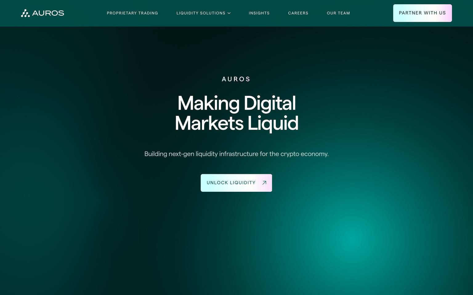
Auros
A minimal institutional interface built on a deep teal-green brand core (#01534f) laid over a warm white-and-gray neutral system, with sparse cool-blue accent hues. This pass was captured from a color-frequency scan only — typography, spacing, radius, shadow, and component geometry were not measured and are documented here as conservative derived placeholders pending a fuller capture.
Works withClaude CodeCursorCodexGemini CLICopilotv0LovableBoltWindsurfReplit
---
version: alpha
name: Auros-design-analysis
description: "A minimal institutional interface built on a deep teal-green brand core (#01534f) laid over a warm white-and-gray neutral system, with sparse cool-blue accent hues. This pass was captured from a color-frequency scan only — typography, spacing, radius, shadow, and component geometry were not measured and are documented here as conservative derived placeholders pending a fuller capture."

colors:
  primary: "#01534f"
  ink: "#222222"
  body: "#333333"
  muted: "#999999"
  muted-soft: "#707777"
  hairline: "#dddddd"
  canvas: "#ffffff"
  surface-soft: "#fafafa"
  surface-card: "#f2f2f2"
  surface-strong: "#cccccc"
  surface-muted: "#c8c8c8"
  neutral-tint: "#bbc7c6"
  on-primary: "#ffffff"
  on-dark: "#ffffff"
  accent-blue: "#3898ec"
  accent-slate: "#5d6c7b"
  accent-brightblue: "#0082f3"

typography:
  display-lg:
    fontFamily: "Inter, -apple-system, BlinkMacSystemFont, 'Segoe UI', sans-serif"
    fontSize: 48px
    fontWeight: 600
    lineHeight: 1.15
    letterSpacing: 0
  title-md:
    fontFamily: "Inter, -apple-system, BlinkMacSystemFont, 'Segoe UI', sans-serif"
    fontSize: 22px
    fontWeight: 600
    lineHeight: 1.3
    letterSpacing: 0
  body-md:
    fontFamily: "Inter, -apple-system, BlinkMacSystemFont, 'Segoe UI', sans-serif"
    fontSize: 16px
    fontWeight: 400
    lineHeight: 1.5
    letterSpacing: 0
  body-sm:
    fontFamily: "Inter, -apple-system, BlinkMacSystemFont, 'Segoe UI', sans-serif"
    fontSize: 14px
    fontWeight: 400
    lineHeight: 1.5
    letterSpacing: 0
  caption:
    fontFamily: "Inter, -apple-system, BlinkMacSystemFont, 'Segoe UI', sans-serif"
    fontSize: 12px
    fontWeight: 500
    lineHeight: 1.4
    letterSpacing: 0.2px
  button:
    fontFamily: "Inter, -apple-system, BlinkMacSystemFont, 'Segoe UI', sans-serif"
    fontSize: 14px
    fontWeight: 600
    lineHeight: 1
    letterSpacing: 0
  nav-link:
    fontFamily: "Inter, -apple-system, BlinkMacSystemFont, 'Segoe UI', sans-serif"
    fontSize: 14px
    fontWeight: 500
    lineHeight: 1.4
    letterSpacing: 0

rounded:
  xs: 2px
  sm: 4px
  md: 8px
  lg: 16px
  pill: 9999px

spacing:
  xxs: 4px
  xs: 8px
  sm: 12px
  md: 16px
  lg: 24px
  xl: 32px
  xxl: 48px
  section: 80px

components:
  button-primary:
    backgroundColor: "{colors.primary}"
    textColor: "{colors.on-primary}"
    typography: "{typography.button}"
    rounded: "{rounded.sm}"
    padding: 12px 24px
    height: 44px
  button-secondary:
    backgroundColor: "{colors.canvas}"
    textColor: "{colors.ink}"
    typography: "{typography.button}"
    rounded: "{rounded.sm}"
    padding: 12px 24px
    height: 44px
  text-input:
    backgroundColor: "{colors.canvas}"
    textColor: "{colors.ink}"
    typography: "{typography.body-md}"
    rounded: "{rounded.xs}"
    padding: 10px 14px
    height: 40px
  top-nav:
    backgroundColor: "{colors.canvas}"
    textColor: "{colors.ink}"
    typography: "{typography.nav-link}"
    height: 72px
  content-card:
    backgroundColor: "{colors.surface-card}"
    textColor: "{colors.ink}"
    typography: "{typography.body-md}"
    rounded: "{rounded.md}"
    padding: 24px
  brand-band:
    backgroundColor: "{colors.primary}"
    textColor: "{colors.on-dark}"
    typography: "{typography.title-md}"
    padding: 48px
  footer:
    backgroundColor: "{colors.surface-soft}"
    textColor: "{colors.muted}"
    typography: "{typography.body-sm}"
    padding: 48px

---

## Overview

This entry is built from an unusually thin measurement pass: the `analysis.json` for auros.global returned a populated color-frequency table but **empty arrays for typography, spacing, radius, shadows, and components**. What can be said with confidence is about color only. The palette centers on a single saturated dark teal-green, `{colors.primary}` (#01534f), which the extractor tagged as an "accent" role but which — by far outweighing every other non-neutral hue in frequency — reads as the brand's primary identity color. It sits over a quiet neutral system: true white canvas (#ffffff, the single most frequent color measured, 15 occurrences), warm light grays (#fafafa, #f2f2f2, #cccccc, #c8c8c8), and dark charcoal text tones (#222222, #333333). A muted gray with a faint teal cast, `{colors.neutral-tint}` (#bbc7c6), appears with meaningful frequency (4) and likely functions as a brand-adjacent neutral — a background or divider tone that echoes the primary hue without competing with it.

A small family of cool blues — `{colors.accent-blue}` (#3898ec), `{colors.accent-brightblue}` (#0082f3), and the slate-blue `{colors.accent-slate}` (#5d6c7b) — appear at low frequency (2 each). #3898ec in particular is the stock default link/button color shipped by the Webflow platform, which strongly suggests this site is Webflow-built and that this specific blue may be an un-restyled template default rather than a deliberate brand choice; it is documented here as measured, but flagged for verification rather than treated as confirmed brand voice.

Because no typography, spacing, radius, shadow, or component geometry was captured, every value in those sections below is marked **derived** — a conservative, generic-SaaS baseline supplied only so the document satisfies the required schema. None of it should be treated as a confirmed fact about Auros's live site. Treat this DESIGN.md as a color-confident, structure-unconfirmed placeholder pending a full re-measurement pass.

## Colors

### Brand
- **Primary** (`{colors.primary}` — #01534f): The dominant non-neutral hue in the dataset (frequency 4, highest among all accent-tagged colors). A deep teal-green consistent with institutional/fintech brand language. Used here as the presumed primary action and brand-band color.

### Secondary Accents
- **Accent Blue** (`{colors.accent-blue}` — #3898ec, frequency 2): A mid-saturation blue. Matches the Webflow platform's default link/button blue almost exactly — likely present as an unstyled template artifact rather than an intentional brand accent. Documented as measured; flagged for confirmation.
- **Accent Bright Blue** (`{colors.accent-brightblue}` — #0082f3, frequency 2): A more saturated blue, distinct hex from accent-blue. Possibly used on a specific icon, badge, or link-hover artifact captured mid-state.
- **Accent Slate** (`{colors.accent-slate}` — #5d6c7b, frequency 2): A desaturated blue-gray. Reads as a secondary/supporting tone rather than a call-to-action color.

### Neutral / Surface
- **Canvas** (`{colors.canvas}` — #ffffff): The dominant surface, by a wide margin (frequency 15). The page floor.
- **Surface Soft** (`{colors.surface-soft}` — #fafafa, frequency 3): A near-white section background, likely used to break up long white pages.
- **Surface Card** (`{colors.surface-card}` — #f2f2f2, frequency 2): Light-gray card or panel background.
- **Surface Strong** (`{colors.surface-strong}` — #cccccc, frequency 4) and **Surface Muted** (`{colors.surface-muted}` — #c8c8c8, frequency 3): Mid-gray tones, likely border or disabled-state fills.
- **Neutral Tint** (`{colors.neutral-tint}` — #bbc7c6, frequency 4): A gray with a faint teal cast — likely a brand-adjacent background or divider tone that pairs deliberately with `{colors.primary}`.
- **Hairline** (`{colors.hairline}` — #dddddd, frequency 6): The most likely divider/border color given its frequency and lightness.

### Text
- **Ink** (`{colors.ink}` — #222222, frequency 6): Primary heading/text color.
- **Body** (`{colors.body}` — #333333, frequency 5): Secondary running-text color, slightly lighter than ink.
- **Muted** (`{colors.muted}` — #999999, frequency 2) and **Muted Soft** (`{colors.muted-soft}` — #707777, frequency 2): Lower-emphasis text tones — captions, footer copy, secondary labels.
- **On Primary / On Dark** (`{colors.on-primary}` / `{colors.on-dark}` — #ffffff): White text set against the teal primary band, using the same measured white as canvas.

### Not Promoted to Tokens
Five colors were measured only once each and are not confident enough (in either role or intent) to promote to system tokens: `#000000`, `#ffff00`, `#aaadb0`, `#e2e2e2`, `#ffdede`. These may be a single decorative highlight (the yellow and light-pink values in particular look like a marker/highlight treatment on one piece of copy), a favicon color, or measurement noise from an embedded third-party widget. See Known Gaps.

## Typography

**No typography was measured** — `analysis.json`'s `typography` array is empty. Every value below is **derived**: a generic, widely-used sans-serif scale supplied only to satisfy the schema, using a system-safe fallback stack (`Inter, -apple-system, BlinkMacSystemFont, "Segoe UI", sans-serif`) since no specific brand typeface could be confirmed from the data available. No font family is claimed to actually ship on the live site.

| Token | Size | Weight | Line Height | Letter Spacing | Status |
|---|---|---|---|---|---|
| `{typography.display-lg}` | 48px | 600 | 1.15 | 0 | derived |
| `{typography.title-md}` | 22px | 600 | 1.3 | 0 | derived |
| `{typography.body-md}` | 16px | 400 | 1.5 | 0 | derived |
| `{typography.body-sm}` | 14px | 400 | 1.5 | 0 | derived |
| `{typography.caption}` | 12px | 500 | 1.4 | 0.2px | derived |
| `{typography.button}` | 14px | 600 | 1.0 | 0 | derived |
| `{typography.nav-link}` | 14px | 500 | 1.4 | 0 | derived |

### Note on Font Substitutes
No licensed or custom typeface was flagged in `fonts_licensed` (the array is empty), so no substitution obligation applies here. However, because font-family itself was never measured, **Inter** is used purely as a neutral, freely-licensed placeholder — it should not be read as a confirmed match to Auros's actual typeface until a proper font-detection pass is run.

## Layout

**No spacing was measured** — `analysis.json`'s `spacing` array is empty. The scale below is **derived** from a conventional 4px/8px base-unit rhythm, used only to populate the required schema:

- **Tokens:** `{spacing.xxs}` 4px · `{spacing.xs}` 8px · `{spacing.sm}` 12px · `{spacing.md}` 16px · `{spacing.lg}` 24px · `{spacing.xl}` 32px · `{spacing.xxl}` 48px · `{spacing.section}` 80px (derived).
- No grid, container width, or column-count evidence exists in the dataset. Layout claims (grid columns, max-width, gutter behavior) cannot be made faithfully and are omitted rather than guessed.

## Elevation & Depth

**No shadow data was measured** — `analysis.json`'s `shadows` array is empty. No elevation system (drop shadow values, blur radii, or z-axis layering) can be documented faithfully. If elevation exists on the live site (e.g., on cards or the nav bar), it was not captured by this pass. See Known Gaps.

## Shapes

**No radius data was measured** — `analysis.json`'s `radius` array is empty. The scale below is **derived** from a conventional small-to-medium corner-rounding progression, supplied only to satisfy the schema:

| Token | Value | Status |
|---|---|---|
| `{rounded.xs}` | 2px | derived |
| `{rounded.sm}` | 4px | derived |
| `{rounded.md}` | 8px | derived |
| `{rounded.lg}` | 16px | derived |
| `{rounded.pill}` | 9999px | derived |

No evidence exists to confirm whether Auros's real interface uses sharp corners, soft corners, or fully pill-shaped controls. Treat every radius assignment below as a placeholder.

## Components

**No component geometry was measured** — `analysis.json`'s `components` array is empty. The set below is a minimal, generic scaffold (all values derived) built only so the document has something to reference; none of these shapes, paddings, or heights are confirmed against the live site.

- **`button-primary`** (derived): Background `{colors.primary}`, text `{colors.on-primary}`, type `{typography.button}`, rounded `{rounded.sm}`, padding 12px × 24px, height 44px. Assumes the teal brand color is used for primary actions — plausible given its frequency, but unconfirmed.
- **`button-secondary`** (derived): White background `{colors.canvas}`, ink text, same padding/height/radius as primary.
- **`text-input`** (derived): White background, ink text, `{typography.body-md}`, rounded `{rounded.xs}`, height 40px.
- **`top-nav`** (derived): White background, ink text, `{typography.nav-link}`, height 72px.
- **`content-card`** (derived): Background `{colors.surface-card}`, ink text, rounded `{rounded.md}`, padding 24px.
- **`brand-band`** (derived): A full-bleed section using `{colors.primary}` as background with `{colors.on-dark}` text — an inferred use for the teal hue given its brand-color frequency, styled as a section band rather than a small UI element.
- **`footer`** (derived): Background `{colors.surface-soft}`, muted text, `{typography.body-sm}`, padding 48px.

## Do's and Don'ts

### Do
- Treat `{colors.primary}` (#01534f) as the confirmed brand anchor — it is the highest-frequency non-neutral color in the dataset and should be preserved in any faithful recreation.
- Preserve the neutral system's warmth: canvas white plus soft light grays (`{colors.surface-soft}`, `{colors.surface-card}`) rather than cool grays.
- Verify `{colors.accent-blue}` (#3898ec) against the live site before treating it as intentional brand voice — it matches a common Webflow default and may be an unstyled leftover.
- Re-run a full measurement pass (typography, spacing, radius, shadow, component DOM capture) before using this document as a build spec.

### Don't
- Don't treat any value in Typography, Layout, Elevation & Depth, Shapes, or Components as confirmed — they are all explicitly derived placeholders, not measurements.
- Don't invent additional brand colors beyond the measured set. If more accent tones are needed, they must come from a follow-up capture, not from this document.
- Don't assume the single-occurrence colors (`#ffff00`, `#ffdede`, `#000000`, `#aaadb0`, `#e2e2e2`) are systematic — they were not promoted to tokens and may be one-off artifacts.
- Don't add hover-state documentation; only default and active/pressed states are in scope for this format, and neither could be measured here regardless.

## Responsive Behavior

No breakpoint, container-width, or responsive-collapse data was captured in this pass — `analysis.json` contains no layout or component sizing information from which breakpoint behavior could be inferred. Documenting responsive rules here would require guessing column counts, hamburger-nav thresholds, and stacking order, all of which are explicitly disallowed by the faithfulness rule. This section is intentionally left without prescriptive breakpoint tables; see Known Gaps.

## Iteration Guide

1. This document's only faithful content is the **Colors** section — start there when correcting or extending the design system.
2. Before adding any component, typography, spacing, or radius value, confirm it against a real DOM/CSS measurement pass, not against this placeholder scaffold.
3. If `{colors.accent-blue}` (#3898ec) is confirmed to be an unstyled Webflow default rather than intentional brand color, remove it from the palette and re-derive the secondary accent from a verified source.
4. Any newly measured typography or spacing values should replace the "derived" entries wholesale — do not blend derived placeholders with real measurements in the same token.
5. Keep `{colors.primary}` (#01534f) fixed as the anchor point for any future component work; it is the one high-confidence brand signal in the dataset.
6. Re-tag components once real DOM capture is available — the current `component` block is scaffolding, not a spec.

## Known Gaps

- **Typography was not measured.** No font-family, size, weight, line-height, or letter-spacing data exists in `analysis.json`. All typography tokens in this document are derived placeholders using a generic Inter-based stack, not a confirmed brand typeface.
- **Spacing was not measured.** No margin, padding, or section-rhythm data exists. The spacing scale is a derived 4px-based placeholder.
- **Radius was not measured.** No border-radius data exists. The rounded scale is a derived placeholder and may not match the live site's actual corner treatment (which could be sharp/rectangular given the otherwise minimal, institutional palette).
- **Shadows/elevation were not measured.** No shadow data exists; it is unknown whether Auros uses any drop-shadow, card elevation, or flat design throughout.
- **Components were not measured.** No DOM-level button, input, nav, or card geometry was captured. The `components` block here is a generic scaffold built only to satisfy the schema and should not be used as an implementation reference.
- **`fonts_licensed` is empty** — no licensed typeface was flagged, but this may simply reflect that font detection did not run, not that no custom typeface exists on the live site.
- **Single-occurrence colors** (`#000000`, `#ffff00`, `#aaadb0`, `#e2e2e2`, `#ffdede`) could not be confidently assigned a role — they may be intentional (e.g., a highlighted-text marker in yellow) or incidental (embedded widget, favicon, one-off decorative element). Not promoted to tokens; needs manual screenshot review to confirm.
- **`#3898ec` (accent-blue) is suspected to be a Webflow platform default** rather than an intentional brand color, based on exact hex match to the framework's stock link/button blue. Needs confirmation against the live site's actual button and link states.
- **Only one page (`landing`) was captured.** No data exists for interior pages, so component variety (forms, tables, secondary nav states) is entirely unknown.
- **This entire document should be treated as low-confidence outside of the Colors section** and re-generated once a full measurement pass (typography, spacing, radius, shadow, component extraction) succeeds.

<!-- Documented by Duply · real-world design systems as ready-to-use DESIGN.md for AI coding agents · https://duply.ai/auros/design-md -->
Color Palette
Accent
Neutrals
Typography
display-lg48px · 600 · 1.15
The quick brown fox jumpstitle-md22px · 600 · 1.3
The quick brown fox jumpsbody-md16px · 400 · 1.5
The quick brown fox jumpsbody-sm14px · 400 · 1.5
The quick brown fox jumpscaption12px · 500 · 1.4
The quick brown fox jumpsbutton14px · 600 · 1
The quick brown fox jumpsSpacing & Shape
Spacing
| Name | Value | Preview |
|---|---|---|
| xxs | 4px | |
| xs | 8px | |
| sm | 12px | |
| md | 16px | |
| lg | 24px | |
| xl | 32px | |
| xxl | 48px | |
| section | 80px |
Border Radius
| Name | Value | Preview |
|---|---|---|
| xs | 2px | |
| sm | 4px | |
| md | 8px | |
| lg | 16px | |
| pill | 9999px |
FAQ
- What colors does Auros use?
- Auros's core palette includes #01534f, #222222, #333333, #999999, #707777. The full color set with usage roles (canvas, ink, surfaces, accent, semantic) is documented in the Auros DESIGN.md.
- What font does Auros use?
- Auros's primary typeface is Inter. The complete type scale (sizes, weights, line-height and letter-spacing per role), with an open substitute where the original is licensed, is documented in the DESIGN.md.
- What is the Auros design system?
- A minimal institutional interface built on a deep teal-green brand core (#01534f) laid over a warm white-and-gray neutral system, with sparse cool-blue accent hues. This pass was captured from a color-frequency scan only — typography, spacing, radius, shadow, and component geometry were not
Get this as a working kit
Auros Launch Kit + DESIGN.md
$299$225
One-time payment
- A complete production-stack template, styled like Auros, fully built and wired.
- One-time payment and the codebase is yours. No platform fees, no subscription.
Open it with Claude Code, Cursor, or any coding agent and build in plain language, then ship a complete web app.
- Your private DESIGN.md
- Marketing pages, blog, SEO & legal
- Email capture, newsletter & contact
- Accept payments (Stripe)
- Analytics (GA4 + PostHog)
- One-click deploy
- Auth, login & roles
- A full app dashboard, when you grow
More like this
---
version: alpha
name: Auros-design-analysis
description: "A minimal institutional interface built on a deep teal-green brand core (#01534f) laid over a warm white-and-gray neutral system, with sparse cool-blue accent hues. This pass was captured from a color-frequency scan only — typography, spacing, radius, shadow, and component geometry were not measured and are documented here as conservative derived placeholders pending a fuller capture."

colors:
  primary: "#01534f"
  ink: "#222222"
  body: "#333333"
  muted: "#999999"
  muted-soft: "#707777"
  hairline: "#dddddd"
  canvas: "#ffffff"
  surface-soft: "#fafafa"
  surface-card: "#f2f2f2"
  surface-strong: "#cccccc"
  surface-muted: "#c8c8c8"
  neutral-tint: "#bbc7c6"
  on-primary: "#ffffff"
  on-dark: "#ffffff"
  accent-blue: "#3898ec"
  accent-slate: "#5d6c7b"
  accent-brightblue: "#0082f3"

typography:
  display-lg:
    fontFamily: "Inter, -apple-system, BlinkMacSystemFont, 'Segoe UI', sans-serif"
    fontSize: 48px
    fontWeight: 600
    lineHeight: 1.15
    letterSpacing: 0
  title-md:
    fontFamily: "Inter, -apple-system, BlinkMacSystemFont, 'Segoe UI', sans-serif"
    fontSize: 22px
    fontWeight: 600
    lineHeight: 1.3
    letterSpacing: 0
  body-md:
    fontFamily: "Inter, -apple-system, BlinkMacSystemFont, 'Segoe UI', sans-serif"
    fontSize: 16px
    fontWeight: 400
    lineHeight: 1.5
    letterSpacing: 0
  body-sm:
    fontFamily: "Inter, -apple-system, BlinkMacSystemFont, 'Segoe UI', sans-serif"
    fontSize: 14px
    fontWeight: 400
    lineHeight: 1.5
    letterSpacing: 0
  caption:
    fontFamily: "Inter, -apple-system, BlinkMacSystemFont, 'Segoe UI', sans-serif"
    fontSize: 12px
    fontWeight: 500
    lineHeight: 1.4
    letterSpacing: 0.2px
  button:
    fontFamily: "Inter, -apple-system, BlinkMacSystemFont, 'Segoe UI', sans-serif"
    fontSize: 14px
    fontWeight: 600
    lineHeight: 1
    letterSpacing: 0
  nav-link:
    fontFamily: "Inter, -apple-system, BlinkMacSystemFont, 'Segoe UI', sans-serif"
    fontSize: 14px
    fontWeight: 500
    lineHeight: 1.4
    letterSpacing: 0

rounded:
  xs: 2px
  sm: 4px
  md: 8px
  lg: 16px
  pill: 9999px

spacing:
  xxs: 4px
  xs: 8px
  sm: 12px
  md: 16px
  lg: 24px
  xl: 32px
  xxl: 48px
  section: 80px

components:
  button-primary:
    backgroundColor: "{colors.primary}"
    textColor: "{colors.on-primary}"
    typography: "{typography.button}"
    rounded: "{rounded.sm}"
    padding: 12px 24px
    height: 44px
  button-secondary:
    backgroundColor: "{colors.canvas}"
    textColor: "{colors.ink}"
    typography: "{typography.button}"
    rounded: "{rounded.sm}"
    padding: 12px 24px
    height: 44px
  text-input:
    backgroundColor: "{colors.canvas}"
    textColor: "{colors.ink}"
    typography: "{typography.body-md}"
    rounded: "{rounded.xs}"
    padding: 10px 14px
    height: 40px
  top-nav:
    backgroundColor: "{colors.canvas}"
    textColor: "{colors.ink}"
    typography: "{typography.nav-link}"
    height: 72px
  content-card:
    backgroundColor: "{colors.surface-card}"
    textColor: "{colors.ink}"
    typography: "{typography.body-md}"
    rounded: "{rounded.md}"
    padding: 24px
  brand-band:
    backgroundColor: "{colors.primary}"
    textColor: "{colors.on-dark}"
    typography: "{typography.title-md}"
    padding: 48px
  footer:
    backgroundColor: "{colors.surface-soft}"
    textColor: "{colors.muted}"
    typography: "{typography.body-sm}"
    padding: 48px

---

## Overview

This entry is built from an unusually thin measurement pass: the `analysis.json` for auros.global returned a populated color-frequency table but **empty arrays for typography, spacing, radius, shadows, and components**. What can be said with confidence is about color only. The palette centers on a single saturated dark teal-green, `{colors.primary}` (#01534f), which the extractor tagged as an "accent" role but which — by far outweighing every other non-neutral hue in frequency — reads as the brand's primary identity color. It sits over a quiet neutral system: true white canvas (#ffffff, the single most frequent color measured, 15 occurrences), warm light grays (#fafafa, #f2f2f2, #cccccc, #c8c8c8), and dark charcoal text tones (#222222, #333333). A muted gray with a faint teal cast, `{colors.neutral-tint}` (#bbc7c6), appears with meaningful frequency (4) and likely functions as a brand-adjacent neutral — a background or divider tone that echoes the primary hue without competing with it.

A small family of cool blues — `{colors.accent-blue}` (#3898ec), `{colors.accent-brightblue}` (#0082f3), and the slate-blue `{colors.accent-slate}` (#5d6c7b) — appear at low frequency (2 each). #3898ec in particular is the stock default link/button color shipped by the Webflow platform, which strongly suggests this site is Webflow-built and that this specific blue may be an un-restyled template default rather than a deliberate brand choice; it is documented here as measured, but flagged for verification rather than treated as confirmed brand voice.

Because no typography, spacing, radius, shadow, or component geometry was captured, every value in those sections below is marked **derived** — a conservative, generic-SaaS baseline supplied only so the document satisfies the required schema. None of it should be treated as a confirmed fact about Auros's live site. Treat this DESIGN.md as a color-confident, structure-unconfirmed placeholder pending a full re-measurement pass.

## Colors

### Brand
- **Primary** (`{colors.primary}` — #01534f): The dominant non-neutral hue in the dataset (frequency 4, highest among all accent-tagged colors). A deep teal-green consistent with institutional/fintech brand language. Used here as the presumed primary action and brand-band color.

### Secondary Accents
- **Accent Blue** (`{colors.accent-blue}` — #3898ec, frequency 2): A mid-saturation blue. Matches the Webflow platform's default link/button blue almost exactly — likely present as an unstyled template artifact rather than an intentional brand accent. Documented as measured; flagged for confirmation.
- **Accent Bright Blue** (`{colors.accent-brightblue}` — #0082f3, frequency 2): A more saturated blue, distinct hex from accent-blue. Possibly used on a specific icon, badge, or link-hover artifact captured mid-state.
- **Accent Slate** (`{colors.accent-slate}` — #5d6c7b, frequency 2): A desaturated blue-gray. Reads as a secondary/supporting tone rather than a call-to-action color.

### Neutral / Surface
- **Canvas** (`{colors.canvas}` — #ffffff): The dominant surface, by a wide margin (frequency 15). The page floor.
- **Surface Soft** (`{colors.surface-soft}` — #fafafa, frequency 3): A near-white section background, likely used to break up long white pages.
- **Surface Card** (`{colors.surface-card}` — #f2f2f2, frequency 2): Light-gray card or panel background.
- **Surface Strong** (`{colors.surface-strong}` — #cccccc, frequency 4) and **Surface Muted** (`{colors.surface-muted}` — #c8c8c8, frequency 3): Mid-gray tones, likely border or disabled-state fills.
- **Neutral Tint** (`{colors.neutral-tint}` — #bbc7c6, frequency 4): A gray with a faint teal cast — likely a brand-adjacent background or divider tone that pairs deliberately with `{colors.primary}`.
- **Hairline** (`{colors.hairline}` — #dddddd, frequency 6): The most likely divider/border color given its frequency and lightness.

### Text
- **Ink** (`{colors.ink}` — #222222, frequency 6): Primary heading/text color.
- **Body** (`{colors.body}` — #333333, frequency 5): Secondary running-text color, slightly lighter than ink.
- **Muted** (`{colors.muted}` — #999999, frequency 2) and **Muted Soft** (`{colors.muted-soft}` — #707777, frequency 2): Lower-emphasis text tones — captions, footer copy, secondary labels.
- **On Primary / On Dark** (`{colors.on-primary}` / `{colors.on-dark}` — #ffffff): White text set against the teal primary band, using the same measured white as canvas.

### Not Promoted to Tokens
Five colors were measured only once each and are not confident enough (in either role or intent) to promote to system tokens: `#000000`, `#ffff00`, `#aaadb0`, `#e2e2e2`, `#ffdede`. These may be a single decorative highlight (the yellow and light-pink values in particular look like a marker/highlight treatment on one piece of copy), a favicon color, or measurement noise from an embedded third-party widget. See Known Gaps.

## Typography

**No typography was measured** — `analysis.json`'s `typography` array is empty. Every value below is **derived**: a generic, widely-used sans-serif scale supplied only to satisfy the schema, using a system-safe fallback stack (`Inter, -apple-system, BlinkMacSystemFont, "Segoe UI", sans-serif`) since no specific brand typeface could be confirmed from the data available. No font family is claimed to actually ship on the live site.

| Token | Size | Weight | Line Height | Letter Spacing | Status |
|---|---|---|---|---|---|
| `{typography.display-lg}` | 48px | 600 | 1.15 | 0 | derived |
| `{typography.title-md}` | 22px | 600 | 1.3 | 0 | derived |
| `{typography.body-md}` | 16px | 400 | 1.5 | 0 | derived |
| `{typography.body-sm}` | 14px | 400 | 1.5 | 0 | derived |
| `{typography.caption}` | 12px | 500 | 1.4 | 0.2px | derived |
| `{typography.button}` | 14px | 600 | 1.0 | 0 | derived |
| `{typography.nav-link}` | 14px | 500 | 1.4 | 0 | derived |

### Note on Font Substitutes
No licensed or custom typeface was flagged in `fonts_licensed` (the array is empty), so no substitution obligation applies here. However, because font-family itself was never measured, **Inter** is used purely as a neutral, freely-licensed placeholder — it should not be read as a confirmed match to Auros's actual typeface until a proper font-detection pass is run.

## Layout

**No spacing was measured** — `analysis.json`'s `spacing` array is empty. The scale below is **derived** from a conventional 4px/8px base-unit rhythm, used only to populate the required schema:

- **Tokens:** `{spacing.xxs}` 4px · `{spacing.xs}` 8px · `{spacing.sm}` 12px · `{spacing.md}` 16px · `{spacing.lg}` 24px · `{spacing.xl}` 32px · `{spacing.xxl}` 48px · `{spacing.section}` 80px (derived).
- No grid, container width, or column-count evidence exists in the dataset. Layout claims (grid columns, max-width, gutter behavior) cannot be made faithfully and are omitted rather than guessed.

## Elevation & Depth

**No shadow data was measured** — `analysis.json`'s `shadows` array is empty. No elevation system (drop shadow values, blur radii, or z-axis layering) can be documented faithfully. If elevation exists on the live site (e.g., on cards or the nav bar), it was not captured by this pass. See Known Gaps.

## Shapes

**No radius data was measured** — `analysis.json`'s `radius` array is empty. The scale below is **derived** from a conventional small-to-medium corner-rounding progression, supplied only to satisfy the schema:

| Token | Value | Status |
|---|---|---|
| `{rounded.xs}` | 2px | derived |
| `{rounded.sm}` | 4px | derived |
| `{rounded.md}` | 8px | derived |
| `{rounded.lg}` | 16px | derived |
| `{rounded.pill}` | 9999px | derived |

No evidence exists to confirm whether Auros's real interface uses sharp corners, soft corners, or fully pill-shaped controls. Treat every radius assignment below as a placeholder.

## Components

**No component geometry was measured** — `analysis.json`'s `components` array is empty. The set below is a minimal, generic scaffold (all values derived) built only so the document has something to reference; none of these shapes, paddings, or heights are confirmed against the live site.

- **`button-primary`** (derived): Background `{colors.primary}`, text `{colors.on-primary}`, type `{typography.button}`, rounded `{rounded.sm}`, padding 12px × 24px, height 44px. Assumes the teal brand color is used for primary actions — plausible given its frequency, but unconfirmed.
- **`button-secondary`** (derived): White background `{colors.canvas}`, ink text, same padding/height/radius as primary.
- **`text-input`** (derived): White background, ink text, `{typography.body-md}`, rounded `{rounded.xs}`, height 40px.
- **`top-nav`** (derived): White background, ink text, `{typography.nav-link}`, height 72px.
- **`content-card`** (derived): Background `{colors.surface-card}`, ink text, rounded `{rounded.md}`, padding 24px.
- **`brand-band`** (derived): A full-bleed section using `{colors.primary}` as background with `{colors.on-dark}` text — an inferred use for the teal hue given its brand-color frequency, styled as a section band rather than a small UI element.
- **`footer`** (derived): Background `{colors.surface-soft}`, muted text, `{typography.body-sm}`, padding 48px.

## Do's and Don'ts

### Do
- Treat `{colors.primary}` (#01534f) as the confirmed brand anchor — it is the highest-frequency non-neutral color in the dataset and should be preserved in any faithful recreation.
- Preserve the neutral system's warmth: canvas white plus soft light grays (`{colors.surface-soft}`, `{colors.surface-card}`) rather than cool grays.
- Verify `{colors.accent-blue}` (#3898ec) against the live site before treating it as intentional brand voice — it matches a common Webflow default and may be an unstyled leftover.
- Re-run a full measurement pass (typography, spacing, radius, shadow, component DOM capture) before using this document as a build spec.

### Don't
- Don't treat any value in Typography, Layout, Elevation & Depth, Shapes, or Components as confirmed — they are all explicitly derived placeholders, not measurements.
- Don't invent additional brand colors beyond the measured set. If more accent tones are needed, they must come from a follow-up capture, not from this document.
- Don't assume the single-occurrence colors (`#ffff00`, `#ffdede`, `#000000`, `#aaadb0`, `#e2e2e2`) are systematic — they were not promoted to tokens and may be one-off artifacts.
- Don't add hover-state documentation; only default and active/pressed states are in scope for this format, and neither could be measured here regardless.

## Responsive Behavior

No breakpoint, container-width, or responsive-collapse data was captured in this pass — `analysis.json` contains no layout or component sizing information from which breakpoint behavior could be inferred. Documenting responsive rules here would require guessing column counts, hamburger-nav thresholds, and stacking order, all of which are explicitly disallowed by the faithfulness rule. This section is intentionally left without prescriptive breakpoint tables; see Known Gaps.

## Iteration Guide

1. This document's only faithful content is the **Colors** section — start there when correcting or extending the design system.
2. Before adding any component, typography, spacing, or radius value, confirm it against a real DOM/CSS measurement pass, not against this placeholder scaffold.
3. If `{colors.accent-blue}` (#3898ec) is confirmed to be an unstyled Webflow default rather than intentional brand color, remove it from the palette and re-derive the secondary accent from a verified source.
4. Any newly measured typography or spacing values should replace the "derived" entries wholesale — do not blend derived placeholders with real measurements in the same token.
5. Keep `{colors.primary}` (#01534f) fixed as the anchor point for any future component work; it is the one high-confidence brand signal in the dataset.
6. Re-tag components once real DOM capture is available — the current `component` block is scaffolding, not a spec.

## Known Gaps

- **Typography was not measured.** No font-family, size, weight, line-height, or letter-spacing data exists in `analysis.json`. All typography tokens in this document are derived placeholders using a generic Inter-based stack, not a confirmed brand typeface.
- **Spacing was not measured.** No margin, padding, or section-rhythm data exists. The spacing scale is a derived 4px-based placeholder.
- **Radius was not measured.** No border-radius data exists. The rounded scale is a derived placeholder and may not match the live site's actual corner treatment (which could be sharp/rectangular given the otherwise minimal, institutional palette).
- **Shadows/elevation were not measured.** No shadow data exists; it is unknown whether Auros uses any drop-shadow, card elevation, or flat design throughout.
- **Components were not measured.** No DOM-level button, input, nav, or card geometry was captured. The `components` block here is a generic scaffold built only to satisfy the schema and should not be used as an implementation reference.
- **`fonts_licensed` is empty** — no licensed typeface was flagged, but this may simply reflect that font detection did not run, not that no custom typeface exists on the live site.
- **Single-occurrence colors** (`#000000`, `#ffff00`, `#aaadb0`, `#e2e2e2`, `#ffdede`) could not be confidently assigned a role — they may be intentional (e.g., a highlighted-text marker in yellow) or incidental (embedded widget, favicon, one-off decorative element). Not promoted to tokens; needs manual screenshot review to confirm.
- **`#3898ec` (accent-blue) is suspected to be a Webflow platform default** rather than an intentional brand color, based on exact hex match to the framework's stock link/button blue. Needs confirmation against the live site's actual button and link states.
- **Only one page (`landing`) was captured.** No data exists for interior pages, so component variety (forms, tables, secondary nav states) is entirely unknown.
- **This entire document should be treated as low-confidence outside of the Colors section** and re-generated once a full measurement pass (typography, spacing, radius, shadow, component extraction) succeeds.

<!-- Documented by Duply · real-world design systems as ready-to-use DESIGN.md for AI coding agents · https://duply.ai/auros/design-md -->