
Amra
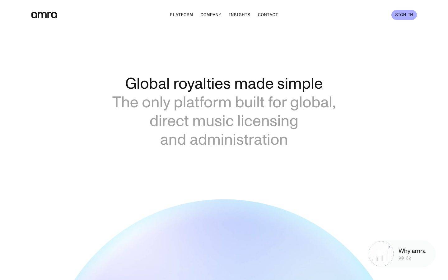
An ultra-minimal, near-monochrome marketing surface for a music-royalties platform — white canvas, near-black ink, and a single soft periwinkle accent. The system leans on generous whitespace, large light-weight (400) display type set centered, and one signature piece of brand voltage: a large teal-to-periwinkle gradient orb floating below the hero. Interface chrome is quiet and flat (no shadows), with uppercase monospace navigation and a small pill-shaped audio-player card.
Works withClaude CodeCursorCodexGemini CLICopilotv0LovableBoltWindsurfReplit
---
version: alpha
name: Amra-design-analysis
description: "An ultra-minimal, near-monochrome marketing surface for a music-royalties platform — white canvas, near-black ink, and a single soft periwinkle accent. The system leans on generous whitespace, large light-weight (400) display type set centered, and one signature piece of brand voltage: a large teal-to-periwinkle gradient orb floating below the hero. Interface chrome is quiet and flat (no shadows), with uppercase monospace navigation and a small pill-shaped audio-player card."

colors:
  ink: "#141414"
  black: "#000000"
  canvas: "#ffffff"
  muted: "#a1a1a1"
  muted-strong: "#727272"
  hairline: "#f3f4f5"
  accent-periwinkle: "#acafff"
  accent-periwinkle-soft: "#ebecff"
  accent-violet: "#676999"
  accent-teal: "#25564d"
  accent-blue: "#007aff"

typography:
  display-lg:
    fontFamily: "Inter, sans-serif"
    fontSize: 50px
    fontWeight: 400
    lineHeight: 1.2
    letterSpacing: normal
  heading:
    fontFamily: "Inter, sans-serif"
    fontSize: 30px
    fontWeight: 400
    lineHeight: 1.2
    letterSpacing: -0.01em
  body:
    fontFamily: "Inter, sans-serif"
    fontSize: 50px
    fontWeight: 400
    lineHeight: 1.2
    letterSpacing: normal
  button:
    fontFamily: "Space Mono, ui-monospace, monospace"
    fontSize: 16px
    fontWeight: 400
    lineHeight: 1.0
    letterSpacing: normal

rounded:
  md: 8px
  lg: 16px
  xl: 24px
  xxl: 40px
  pill: 44px

spacing:
  xxs: 4px
  xs: 8px
  sm: 12px
  md: 16px
  lg: 24px
  xl: 32px
  xxl: 40px
  xxxl: 56px
  section: 80px
  section-lg: 104px
  section-xl: 160px

components:
  top-nav:
    backgroundColor: "{colors.canvas}"
    textColor: "{colors.ink}"
    typography: "{typography.button}"
  nav-link:
    backgroundColor: transparent
    textColor: "{colors.ink}"
    typography: "{typography.button}"
  button-signin:
    backgroundColor: "{colors.accent-periwinkle}"
    textColor: "{colors.ink}"
    typography: "{typography.button}"
    rounded: "{rounded.pill}"
  button-text:
    backgroundColor: transparent
    textColor: "{colors.ink}"
    typography: "{typography.button}"
    padding: 0px
  hero-band:
    backgroundColor: "{colors.canvas}"
    textColor: "{colors.ink}"
    typography: "{typography.display-lg}"
    padding: 160px
  hero-subhead:
    backgroundColor: transparent
    textColor: "{colors.muted}"
    typography: "{typography.body}"
  feature-item:
    backgroundColor: transparent
    textColor: "{colors.muted}"
    typography: "{typography.body}"
  audio-player-card:
    backgroundColor: "{colors.canvas}"
    textColor: "{colors.ink}"
    typography: "{typography.button}"
    rounded: "{rounded.pill}"
---

## Overview

Amra's landing surface is an exercise in restraint — a white canvas (`{colors.canvas}` — #ffffff) with near-black ink (`{colors.ink}` — #141414), enormous amounts of vertical whitespace, and a single soft periwinkle accent (`{colors.accent-periwinkle}` — #acafff). It reads as calm, premium fintech-for-musicians: the page opens with a centered large display headline, immediately drops most of its text weight to muted gray, and lets a single large gradient orb carry all the brand color.

The type voice is quiet and light. Display headlines run at 50px in weight **400** — Amra never bolds. The muted subhead ("The only platform built for global, direct music licensing and administration") is set at the same large size but in `{colors.muted}` (#a1a1a1), so the hero reads as one continuous block that fades from ink to gray. Interface chrome — the nav items and the "SIGN IN" button — flips to a **monospace** face in uppercase, a deliberate contrast against the humanist display type.

Brand voltage comes from exactly one place: the large gradient orb below the hero, blending `{colors.accent-teal}` (#25564d), `{colors.accent-periwinkle}` (#acafff) and `{colors.accent-violet}` (#676999). It's the only saturated color on an otherwise monochrome page. A small pill-shaped audio-player card ("Why amra · 00:32") floats at the lower right as the one piece of persistent interactive product chrome.

**Key Characteristics:**
- White canvas, near-black ink, one soft periwinkle accent. The system is monochrome except for the gradient orb and the periwinkle "SIGN IN" pill.
- Large, light (400-weight) centered display type. Amra never uses bold; hierarchy comes from color (ink → muted) and size, not weight.
- Monospace uppercase interface type (`{typography.button}`) for navigation and buttons — a deliberate cold-contrast against the warm humanist display face.
- A single large gradient orb (teal → periwinkle → violet) is the entire brand-color moment on the page.
- Completely flat — the measured analysis found **zero shadows**. Depth is implied by color and whitespace only.
- Extreme whitespace rhythm — the largest measured spacing token is 160px, used eight times, defining the generous band-to-band gaps.
- Rounded scale spans `{rounded.md}` (8px) for small chrome up to `{rounded.pill}` (44px) for the sign-in button and the audio-player card.

## Colors

### Brand & Accent
- **Periwinkle** (`{colors.accent-periwinkle}` — #acafff): The one interactive accent — the "SIGN IN" pill button fill and the brightest hue in the gradient orb.
- **Periwinkle Soft** (`{colors.accent-periwinkle-soft}` — #ebecff): A very pale periwinkle tint used in soft gradient/hover fills.
- **Violet** (`{colors.accent-violet}` — #676999): A muted mid-violet appearing in the gradient orb's transitional zone.
- **Teal** (`{colors.accent-teal}` — #25564d): The deep teal-green anchoring the bottom of the gradient orb.
- **Blue** (`{colors.accent-blue}` — #007aff): A system/utility blue captured once — likely a focus or link accent; used sparingly.

### Text
- **Ink** (`{colors.ink}` — #141414): The dominant text color — headlines, nav, logo. By far the most frequent color in the analysis (481 occurrences).
- **Muted** (`{colors.muted}` — #a1a1a1): The subhead and secondary/body copy. Amra deliberately fades most running text to gray.
- **Muted Strong** (`{colors.muted-strong}` — #727272): A slightly darker gray for finer captions inside the audio-player card.
- **Black** (`{colors.black}` — #000000): Pure black, used sparingly on icons/details rather than text.

### Surface
- **Canvas** (`{colors.canvas}` — #ffffff): The universal page floor. Nearly every surface is white.
- **Hairline** (`{colors.hairline}` — #f3f4f5): A barely-visible off-white used for subtle dividers and the audio-player card outline.

## Typography

### Font Family
The site loads two obfuscated web fonts: a **primary** humanist sans (`__primaryFont_fb23f9`) used for the logo, headlines, and body, and a **secondary monospace** face (`__secondaryFont_85f780`) used for uppercase nav items, the "SIGN IN" button, and the "00:32" timestamp. The real font names are hashed by the build pipeline and were not recoverable, so open-source substitutes are documented here: **Inter** for the primary display/body face and **Space Mono** for the monospace interface face (both are derived substitutes, not the shipped fonts).

The type split is functional:
- Primary sans (weight 400 throughout) — logo, h1, h2, body
- Monospace (weight 400, uppercase) — navigation, buttons, timestamps

### Hierarchy

| Token | Size | Weight | Line Height | Letter Spacing | Use |
|---|---|---|---|---|---|
| `{typography.display-lg}` | 50px | 400 | 1.2 | normal | Hero h1 ("Global royalties made simple") |
| `{typography.body}` | 50px | 400 | 1.2 | normal | Hero subhead / large muted body copy (measured at 50px) |
| `{typography.heading}` | 30px | 400 | 1.2 | -0.01em | h2 section headings |
| `{typography.button}` | 16px | 400 | 1.0 | normal | Nav links, buttons, audio-player labels — monospace |

### Principles
Amra hierarchy is built on **size and color, never weight** — everything measured is weight 400. The hero fades from ink display text into muted gray body text of the same size, so the whole opening reads as one soft paragraph. The only tracking adjustment measured is a slight -0.01em tightening on h2. The monospace interface face is the sole typographic contrast in the system — keep it uppercase and reserved for chrome.

### Note on Font Substitutes
The shipped faces are hashed/obfuscated and not publicly identifiable. **Inter** (weight 400) approximates the light humanist display face; **Space Mono** approximates the monospace interface face. These are documented substitutes — do not claim to ship the original Amra fonts.

## Layout

### Spacing System
- **Base unit:** 4px.
- **Tokens:** `{spacing.xxs}` 4px · `{spacing.xs}` 8px · `{spacing.sm}` 12px · `{spacing.md}` 16px · `{spacing.lg}` 24px · `{spacing.xl}` 32px · `{spacing.xxl}` 40px · `{spacing.xxxl}` 56px · `{spacing.section}` 80px · `{spacing.section-lg}` 104px · `{spacing.section-xl}` 160px.
- **Section rhythm:** `{spacing.section-xl}` (160px) is the dominant band gap (8 occurrences) — Amra breathes with unusually large vertical spacing.
- **Mid-scale rhythm:** `{spacing.lg}` (24px) is the most frequent finer spacing (9 occurrences), used for internal grouping.

### Grid & Container
- **Hero:** Fully centered single-column — headline and subhead are center-aligned in the viewport.
- **Feature section:** A left image block paired with a right-aligned stack of three text items ("Fast", "Direct", "Transparent"), each with a heading + muted body.
- **Nav:** Horizontal row — logo left, centered menu, sign-in pill right.

### Whitespace Philosophy
Whitespace is the primary design material. The 160px section spacing and the huge empty gap between the hero and the feature section give the page a slow, premium cadence. Content never crowds; each idea gets its own vertical stage.

## Elevation & Depth

| Level | Treatment | Use |
|---|---|---|
| Flat | No shadow, no border | Nearly everything — hero, nav, feature text |
| Hairline | 1px `{colors.hairline}` outline | Audio-player card edge |
| Color depth | Gradient orb (teal → periwinkle → violet) | The single depth/brand moment on the page |

The measured analysis returned **zero shadow tokens** — the system is deliberately flat. What little depth exists is created by the soft-focus gradient orb and by whitespace, not by drop shadows or elevation layers.

### Decorative Depth
- The large gradient orb is the signature decorative element — a soft radial blend of `{colors.accent-teal}`, `{colors.accent-periwinkle}`, and `{colors.accent-violet}` that reads as a glowing sphere below the hero.
- A blurred image tile in the feature section echoes the same soft-focus treatment.

## Shapes

### Border Radius Scale

| Token | Value | Use |
|---|---|---|
| `{rounded.md}` | 8px | Small chrome / inline elements (most frequent radius) |
| `{rounded.lg}` | 16px | Medium containers |
| `{rounded.xl}` | 24px | Larger cards / image tiles |
| `{rounded.xxl}` | 40px | Extra-large rounded surfaces |
| `{rounded.pill}` | 44px | "SIGN IN" button and the audio-player card |

### Geometry
The system favors soft, generous corners — the sign-in button and audio-player card are fully pill-rounded (`{rounded.pill}`), and image tiles carry larger radii. The gradient orb is a perfect circle (its exact radius was not captured as a token).

## Components

### Navigation

**`top-nav`** — Flat white nav bar. Lowercase "amra" wordmark at left (in `{colors.ink}`), a centered uppercase monospace menu (PLATFORM, COMPANY, INSIGHTS, CONTACT), and the periwinkle sign-in pill at right. Background `{colors.canvas}`, type `{typography.button}` (monospace 16px).

**`nav-link`** — Individual uppercase monospace menu items. Transparent background, `{colors.ink}` text, `{typography.button}`.

### Buttons

**`button-signin`** — The single filled CTA. Background `{colors.accent-periwinkle}` (#acafff), `{colors.ink}` text, uppercase monospace `{typography.button}`, fully pill-rounded (`{rounded.pill}` — 44px). This is the only saturated interactive element in the page chrome.

**`button-text`** — A borderless text button (measured with 0px padding, 0px radius). Transparent background, `{colors.ink}` text, `{typography.button}`. Used for inline text-style CTAs.

### Hero

**`hero-band`** — Centered hero with `{spacing.section-xl}` (160px) vertical padding. Carries the h1 in `{typography.display-lg}` (50px / 400, `{colors.ink}`) directly above the muted subhead.

**`hero-subhead`** — The large gray sub-line beneath the headline. Transparent background, `{colors.muted}` text, `{typography.body}` (50px / 400). Reads as a continuation of the headline in a lighter tone.

### Feature Section

**`feature-item`** — A single feature entry ("Fast" / "Direct" / "Transparent") in the right-hand stack. Transparent background, `{colors.muted}` text, `{typography.body}`. Each item pairs a heading with muted description copy; a blurred image tile sits to the left of the stack.

### Product Chrome

**`audio-player-card`** — A small floating pill card at the lower-right ("Why amra · 00:32") with a circular waveform thumbnail. Background `{colors.canvas}` with a `{colors.hairline}` edge, `{colors.ink}` title text, `{colors.muted-strong}` timestamp, `{typography.button}` labels, fully pill-rounded (`{rounded.pill}`). It's the page's one persistent interactive artifact.

## Do's and Don'ts

### Do
- Keep the palette monochrome — ink on white — and let the gradient orb be the only saturated moment.
- Set display type at weight 400. Hierarchy comes from size and from the ink→muted color fade, never from bolding.
- Use the monospace face uppercase and only for chrome (nav, buttons, timestamps).
- Reserve `{colors.accent-periwinkle}` for the single sign-in CTA.
- Lean on huge whitespace (`{spacing.section-xl}` — 160px) between bands. The slow cadence is the brand.
- Keep the sign-in button and audio-player card fully pill-rounded (`{rounded.pill}`).

### Don't
- Don't introduce drop shadows — the system is flat by design (zero shadows measured).
- Don't bold headlines; weight 400 is the ceiling.
- Don't add saturated color beyond the periwinkle CTA and the gradient orb.
- Don't set body copy in the monospace face — it is reserved for interface chrome.
- Don't crowd sections; the large vertical gaps are intentional.

## Responsive Behavior

### Breakpoints
Only the desktop landing page was captured, so breakpoint behavior is inferred from layout structure, not measured.

| Name | Width | Key Changes (inferred) |
|---|---|---|
| Mobile | < 768px | Centered hero stacks; nav likely collapses; feature image tile stacks above its text stack |
| Tablet | 768–1024px | Nav tightens; feature section may narrow to single column |
| Desktop | > 1024px | Full centered hero, horizontal nav, image-left / text-right feature layout as captured |

### Touch Targets
- `{component.button-signin}` is a pill CTA; exact height was not measured.
- `{component.nav-link}` monospace items sit at 16px; padded tap area not measured.

### Collapsing Strategy
- The centered hero naturally reflows to narrower viewports without layout change.
- The feature section's image + three-item stack most likely stacks vertically on mobile.
- Actual mobile/tablet rules are unconfirmed (single page captured).

## Iteration Guide

1. Focus on ONE component at a time. Reference its YAML key directly (`{component.button-signin}`, `{component.audio-player-card}`).
2. Variants of an existing component (`-active`, `-disabled`, `-focused`) should be added as separate entries in `components:`.
3. Use `{token.refs}` everywhere — never inline hex.
4. Never document hover. Default and Active/Pressed states only.
5. Keep display type light (400) and let color carry hierarchy.
6. Preserve the flat, shadowless aesthetic — depth belongs to the gradient orb alone.
7. When adding emphasis: increase size or shift ink→muted, never bold.

## Known Gaps

- Both shipped fonts are build-obfuscated (`__primaryFont_fb23f9`, `__secondaryFont_85f780`); real names could not be recovered. Inter and Space Mono are documented substitutes only.
- The measured `body` role reads 50px — it captured the large hero subhead rather than small running text. Amra's smaller paragraph/body sizes (e.g., the feature descriptions) were not separately measured, so no small body-scale token is declared.
- The measured `button-primary` component reported `color #141414, radius 0px, padding 0px` — this describes a text-style button and conflicts with the visible periwinkle pill "SIGN IN"; the pill is documented as `button-signin` from screenshot ground-truth plus measured tokens (`{colors.accent-periwinkle}`, `{rounded.pill}`).
- No shadow tokens were measured; the flat treatment is confirmed, but any faint elevation on the audio-player card could not be quantified.
- Nav-link and button letter-spacing/tracking beyond the measured values (h2 -0.01em) were not captured; the uppercase nav may carry tracking that is not documented.
- The gradient orb's exact gradient stops, dimensions, and radius are not tokenized; colors are documented from the accent hues measured.
- Only the desktop landing page was captured — responsive breakpoints, mobile nav behavior, focus/error states, and additional pages are out of scope.
- The `{colors.accent-blue}` (#007aff) was captured once; its precise usage (link vs. system focus) is unconfirmed.

<!-- Documented by Duply · real-world design systems as ready-to-use DESIGN.md for AI coding agents · https://duply.ai/amra/design-md -->
Color Palette
Accent
Neutrals
Typography
display-lg50px · 400 · 1.2
The quick brown fox jumpsheading30px · 400 · 1.2
The quick brown fox jumpsbody50px · 400 · 1.2
The quick brown fox jumpsbutton16px · 400 · 1
The quick brown fox jumpsSpacing & Shape
Spacing
| Name | Value | Preview |
|---|---|---|
| xxs | 4px | |
| xs | 8px | |
| sm | 12px | |
| md | 16px | |
| lg | 24px | |
| xl | 32px | |
| xxl | 40px | |
| xxxl | 56px | |
| section | 80px | |
| section-lg | 104px | |
| section-xl | 160px |
Border Radius
| Name | Value | Preview |
|---|---|---|
| md | 8px | |
| lg | 16px | |
| xl | 24px | |
| xxl | 40px | |
| pill | 44px |
FAQ
- What colors does Amra use?
- Amra's core palette includes #141414, #000000, #ffffff, #a1a1a1, #727272. The full color set with usage roles (canvas, ink, surfaces, accent, semantic) is documented in the Amra DESIGN.md.
- What font does Amra use?
- Amra's primary typeface is Inter. The complete type scale (sizes, weights, line-height and letter-spacing per role), with an open substitute where the original is licensed, is documented in the DESIGN.md.
- What is the Amra design system?
- An ultra-minimal, near-monochrome marketing surface for a music-royalties platform — white canvas, near-black ink, and a single soft periwinkle accent. The system leans on generous whitespace, large light-weight (400) display type set centered, and one signature piece of brand voltage: a large
Get this as a working kit
Amra Launch Kit + DESIGN.md
$299$225
One-time payment
- A complete production-stack template, styled like Amra, fully built and wired.
- One-time payment and the codebase is yours. No platform fees, no subscription.
Open it with Claude Code, Cursor, or any coding agent and build in plain language, then ship a complete web app.
- Your private DESIGN.md
- Marketing pages, blog, SEO & legal
- Email capture, newsletter & contact
- Accept payments (Stripe)
- Analytics (GA4 + PostHog)
- One-click deploy
- Auth, login & roles
- A full app dashboard, when you grow
More like this
---
version: alpha
name: Amra-design-analysis
description: "An ultra-minimal, near-monochrome marketing surface for a music-royalties platform — white canvas, near-black ink, and a single soft periwinkle accent. The system leans on generous whitespace, large light-weight (400) display type set centered, and one signature piece of brand voltage: a large teal-to-periwinkle gradient orb floating below the hero. Interface chrome is quiet and flat (no shadows), with uppercase monospace navigation and a small pill-shaped audio-player card."

colors:
  ink: "#141414"
  black: "#000000"
  canvas: "#ffffff"
  muted: "#a1a1a1"
  muted-strong: "#727272"
  hairline: "#f3f4f5"
  accent-periwinkle: "#acafff"
  accent-periwinkle-soft: "#ebecff"
  accent-violet: "#676999"
  accent-teal: "#25564d"
  accent-blue: "#007aff"

typography:
  display-lg:
    fontFamily: "Inter, sans-serif"
    fontSize: 50px
    fontWeight: 400
    lineHeight: 1.2
    letterSpacing: normal
  heading:
    fontFamily: "Inter, sans-serif"
    fontSize: 30px
    fontWeight: 400
    lineHeight: 1.2
    letterSpacing: -0.01em
  body:
    fontFamily: "Inter, sans-serif"
    fontSize: 50px
    fontWeight: 400
    lineHeight: 1.2
    letterSpacing: normal
  button:
    fontFamily: "Space Mono, ui-monospace, monospace"
    fontSize: 16px
    fontWeight: 400
    lineHeight: 1.0
    letterSpacing: normal

rounded:
  md: 8px
  lg: 16px
  xl: 24px
  xxl: 40px
  pill: 44px

spacing:
  xxs: 4px
  xs: 8px
  sm: 12px
  md: 16px
  lg: 24px
  xl: 32px
  xxl: 40px
  xxxl: 56px
  section: 80px
  section-lg: 104px
  section-xl: 160px

components:
  top-nav:
    backgroundColor: "{colors.canvas}"
    textColor: "{colors.ink}"
    typography: "{typography.button}"
  nav-link:
    backgroundColor: transparent
    textColor: "{colors.ink}"
    typography: "{typography.button}"
  button-signin:
    backgroundColor: "{colors.accent-periwinkle}"
    textColor: "{colors.ink}"
    typography: "{typography.button}"
    rounded: "{rounded.pill}"
  button-text:
    backgroundColor: transparent
    textColor: "{colors.ink}"
    typography: "{typography.button}"
    padding: 0px
  hero-band:
    backgroundColor: "{colors.canvas}"
    textColor: "{colors.ink}"
    typography: "{typography.display-lg}"
    padding: 160px
  hero-subhead:
    backgroundColor: transparent
    textColor: "{colors.muted}"
    typography: "{typography.body}"
  feature-item:
    backgroundColor: transparent
    textColor: "{colors.muted}"
    typography: "{typography.body}"
  audio-player-card:
    backgroundColor: "{colors.canvas}"
    textColor: "{colors.ink}"
    typography: "{typography.button}"
    rounded: "{rounded.pill}"
---

## Overview

Amra's landing surface is an exercise in restraint — a white canvas (`{colors.canvas}` — #ffffff) with near-black ink (`{colors.ink}` — #141414), enormous amounts of vertical whitespace, and a single soft periwinkle accent (`{colors.accent-periwinkle}` — #acafff). It reads as calm, premium fintech-for-musicians: the page opens with a centered large display headline, immediately drops most of its text weight to muted gray, and lets a single large gradient orb carry all the brand color.

The type voice is quiet and light. Display headlines run at 50px in weight **400** — Amra never bolds. The muted subhead ("The only platform built for global, direct music licensing and administration") is set at the same large size but in `{colors.muted}` (#a1a1a1), so the hero reads as one continuous block that fades from ink to gray. Interface chrome — the nav items and the "SIGN IN" button — flips to a **monospace** face in uppercase, a deliberate contrast against the humanist display type.

Brand voltage comes from exactly one place: the large gradient orb below the hero, blending `{colors.accent-teal}` (#25564d), `{colors.accent-periwinkle}` (#acafff) and `{colors.accent-violet}` (#676999). It's the only saturated color on an otherwise monochrome page. A small pill-shaped audio-player card ("Why amra · 00:32") floats at the lower right as the one piece of persistent interactive product chrome.

**Key Characteristics:**
- White canvas, near-black ink, one soft periwinkle accent. The system is monochrome except for the gradient orb and the periwinkle "SIGN IN" pill.
- Large, light (400-weight) centered display type. Amra never uses bold; hierarchy comes from color (ink → muted) and size, not weight.
- Monospace uppercase interface type (`{typography.button}`) for navigation and buttons — a deliberate cold-contrast against the warm humanist display face.
- A single large gradient orb (teal → periwinkle → violet) is the entire brand-color moment on the page.
- Completely flat — the measured analysis found **zero shadows**. Depth is implied by color and whitespace only.
- Extreme whitespace rhythm — the largest measured spacing token is 160px, used eight times, defining the generous band-to-band gaps.
- Rounded scale spans `{rounded.md}` (8px) for small chrome up to `{rounded.pill}` (44px) for the sign-in button and the audio-player card.

## Colors

### Brand & Accent
- **Periwinkle** (`{colors.accent-periwinkle}` — #acafff): The one interactive accent — the "SIGN IN" pill button fill and the brightest hue in the gradient orb.
- **Periwinkle Soft** (`{colors.accent-periwinkle-soft}` — #ebecff): A very pale periwinkle tint used in soft gradient/hover fills.
- **Violet** (`{colors.accent-violet}` — #676999): A muted mid-violet appearing in the gradient orb's transitional zone.
- **Teal** (`{colors.accent-teal}` — #25564d): The deep teal-green anchoring the bottom of the gradient orb.
- **Blue** (`{colors.accent-blue}` — #007aff): A system/utility blue captured once — likely a focus or link accent; used sparingly.

### Text
- **Ink** (`{colors.ink}` — #141414): The dominant text color — headlines, nav, logo. By far the most frequent color in the analysis (481 occurrences).
- **Muted** (`{colors.muted}` — #a1a1a1): The subhead and secondary/body copy. Amra deliberately fades most running text to gray.
- **Muted Strong** (`{colors.muted-strong}` — #727272): A slightly darker gray for finer captions inside the audio-player card.
- **Black** (`{colors.black}` — #000000): Pure black, used sparingly on icons/details rather than text.

### Surface
- **Canvas** (`{colors.canvas}` — #ffffff): The universal page floor. Nearly every surface is white.
- **Hairline** (`{colors.hairline}` — #f3f4f5): A barely-visible off-white used for subtle dividers and the audio-player card outline.

## Typography

### Font Family
The site loads two obfuscated web fonts: a **primary** humanist sans (`__primaryFont_fb23f9`) used for the logo, headlines, and body, and a **secondary monospace** face (`__secondaryFont_85f780`) used for uppercase nav items, the "SIGN IN" button, and the "00:32" timestamp. The real font names are hashed by the build pipeline and were not recoverable, so open-source substitutes are documented here: **Inter** for the primary display/body face and **Space Mono** for the monospace interface face (both are derived substitutes, not the shipped fonts).

The type split is functional:
- Primary sans (weight 400 throughout) — logo, h1, h2, body
- Monospace (weight 400, uppercase) — navigation, buttons, timestamps

### Hierarchy

| Token | Size | Weight | Line Height | Letter Spacing | Use |
|---|---|---|---|---|---|
| `{typography.display-lg}` | 50px | 400 | 1.2 | normal | Hero h1 ("Global royalties made simple") |
| `{typography.body}` | 50px | 400 | 1.2 | normal | Hero subhead / large muted body copy (measured at 50px) |
| `{typography.heading}` | 30px | 400 | 1.2 | -0.01em | h2 section headings |
| `{typography.button}` | 16px | 400 | 1.0 | normal | Nav links, buttons, audio-player labels — monospace |

### Principles
Amra hierarchy is built on **size and color, never weight** — everything measured is weight 400. The hero fades from ink display text into muted gray body text of the same size, so the whole opening reads as one soft paragraph. The only tracking adjustment measured is a slight -0.01em tightening on h2. The monospace interface face is the sole typographic contrast in the system — keep it uppercase and reserved for chrome.

### Note on Font Substitutes
The shipped faces are hashed/obfuscated and not publicly identifiable. **Inter** (weight 400) approximates the light humanist display face; **Space Mono** approximates the monospace interface face. These are documented substitutes — do not claim to ship the original Amra fonts.

## Layout

### Spacing System
- **Base unit:** 4px.
- **Tokens:** `{spacing.xxs}` 4px · `{spacing.xs}` 8px · `{spacing.sm}` 12px · `{spacing.md}` 16px · `{spacing.lg}` 24px · `{spacing.xl}` 32px · `{spacing.xxl}` 40px · `{spacing.xxxl}` 56px · `{spacing.section}` 80px · `{spacing.section-lg}` 104px · `{spacing.section-xl}` 160px.
- **Section rhythm:** `{spacing.section-xl}` (160px) is the dominant band gap (8 occurrences) — Amra breathes with unusually large vertical spacing.
- **Mid-scale rhythm:** `{spacing.lg}` (24px) is the most frequent finer spacing (9 occurrences), used for internal grouping.

### Grid & Container
- **Hero:** Fully centered single-column — headline and subhead are center-aligned in the viewport.
- **Feature section:** A left image block paired with a right-aligned stack of three text items ("Fast", "Direct", "Transparent"), each with a heading + muted body.
- **Nav:** Horizontal row — logo left, centered menu, sign-in pill right.

### Whitespace Philosophy
Whitespace is the primary design material. The 160px section spacing and the huge empty gap between the hero and the feature section give the page a slow, premium cadence. Content never crowds; each idea gets its own vertical stage.

## Elevation & Depth

| Level | Treatment | Use |
|---|---|---|
| Flat | No shadow, no border | Nearly everything — hero, nav, feature text |
| Hairline | 1px `{colors.hairline}` outline | Audio-player card edge |
| Color depth | Gradient orb (teal → periwinkle → violet) | The single depth/brand moment on the page |

The measured analysis returned **zero shadow tokens** — the system is deliberately flat. What little depth exists is created by the soft-focus gradient orb and by whitespace, not by drop shadows or elevation layers.

### Decorative Depth
- The large gradient orb is the signature decorative element — a soft radial blend of `{colors.accent-teal}`, `{colors.accent-periwinkle}`, and `{colors.accent-violet}` that reads as a glowing sphere below the hero.
- A blurred image tile in the feature section echoes the same soft-focus treatment.

## Shapes

### Border Radius Scale

| Token | Value | Use |
|---|---|---|
| `{rounded.md}` | 8px | Small chrome / inline elements (most frequent radius) |
| `{rounded.lg}` | 16px | Medium containers |
| `{rounded.xl}` | 24px | Larger cards / image tiles |
| `{rounded.xxl}` | 40px | Extra-large rounded surfaces |
| `{rounded.pill}` | 44px | "SIGN IN" button and the audio-player card |

### Geometry
The system favors soft, generous corners — the sign-in button and audio-player card are fully pill-rounded (`{rounded.pill}`), and image tiles carry larger radii. The gradient orb is a perfect circle (its exact radius was not captured as a token).

## Components

### Navigation

**`top-nav`** — Flat white nav bar. Lowercase "amra" wordmark at left (in `{colors.ink}`), a centered uppercase monospace menu (PLATFORM, COMPANY, INSIGHTS, CONTACT), and the periwinkle sign-in pill at right. Background `{colors.canvas}`, type `{typography.button}` (monospace 16px).

**`nav-link`** — Individual uppercase monospace menu items. Transparent background, `{colors.ink}` text, `{typography.button}`.

### Buttons

**`button-signin`** — The single filled CTA. Background `{colors.accent-periwinkle}` (#acafff), `{colors.ink}` text, uppercase monospace `{typography.button}`, fully pill-rounded (`{rounded.pill}` — 44px). This is the only saturated interactive element in the page chrome.

**`button-text`** — A borderless text button (measured with 0px padding, 0px radius). Transparent background, `{colors.ink}` text, `{typography.button}`. Used for inline text-style CTAs.

### Hero

**`hero-band`** — Centered hero with `{spacing.section-xl}` (160px) vertical padding. Carries the h1 in `{typography.display-lg}` (50px / 400, `{colors.ink}`) directly above the muted subhead.

**`hero-subhead`** — The large gray sub-line beneath the headline. Transparent background, `{colors.muted}` text, `{typography.body}` (50px / 400). Reads as a continuation of the headline in a lighter tone.

### Feature Section

**`feature-item`** — A single feature entry ("Fast" / "Direct" / "Transparent") in the right-hand stack. Transparent background, `{colors.muted}` text, `{typography.body}`. Each item pairs a heading with muted description copy; a blurred image tile sits to the left of the stack.

### Product Chrome

**`audio-player-card`** — A small floating pill card at the lower-right ("Why amra · 00:32") with a circular waveform thumbnail. Background `{colors.canvas}` with a `{colors.hairline}` edge, `{colors.ink}` title text, `{colors.muted-strong}` timestamp, `{typography.button}` labels, fully pill-rounded (`{rounded.pill}`). It's the page's one persistent interactive artifact.

## Do's and Don'ts

### Do
- Keep the palette monochrome — ink on white — and let the gradient orb be the only saturated moment.
- Set display type at weight 400. Hierarchy comes from size and from the ink→muted color fade, never from bolding.
- Use the monospace face uppercase and only for chrome (nav, buttons, timestamps).
- Reserve `{colors.accent-periwinkle}` for the single sign-in CTA.
- Lean on huge whitespace (`{spacing.section-xl}` — 160px) between bands. The slow cadence is the brand.
- Keep the sign-in button and audio-player card fully pill-rounded (`{rounded.pill}`).

### Don't
- Don't introduce drop shadows — the system is flat by design (zero shadows measured).
- Don't bold headlines; weight 400 is the ceiling.
- Don't add saturated color beyond the periwinkle CTA and the gradient orb.
- Don't set body copy in the monospace face — it is reserved for interface chrome.
- Don't crowd sections; the large vertical gaps are intentional.

## Responsive Behavior

### Breakpoints
Only the desktop landing page was captured, so breakpoint behavior is inferred from layout structure, not measured.

| Name | Width | Key Changes (inferred) |
|---|---|---|
| Mobile | < 768px | Centered hero stacks; nav likely collapses; feature image tile stacks above its text stack |
| Tablet | 768–1024px | Nav tightens; feature section may narrow to single column |
| Desktop | > 1024px | Full centered hero, horizontal nav, image-left / text-right feature layout as captured |

### Touch Targets
- `{component.button-signin}` is a pill CTA; exact height was not measured.
- `{component.nav-link}` monospace items sit at 16px; padded tap area not measured.

### Collapsing Strategy
- The centered hero naturally reflows to narrower viewports without layout change.
- The feature section's image + three-item stack most likely stacks vertically on mobile.
- Actual mobile/tablet rules are unconfirmed (single page captured).

## Iteration Guide

1. Focus on ONE component at a time. Reference its YAML key directly (`{component.button-signin}`, `{component.audio-player-card}`).
2. Variants of an existing component (`-active`, `-disabled`, `-focused`) should be added as separate entries in `components:`.
3. Use `{token.refs}` everywhere — never inline hex.
4. Never document hover. Default and Active/Pressed states only.
5. Keep display type light (400) and let color carry hierarchy.
6. Preserve the flat, shadowless aesthetic — depth belongs to the gradient orb alone.
7. When adding emphasis: increase size or shift ink→muted, never bold.

## Known Gaps

- Both shipped fonts are build-obfuscated (`__primaryFont_fb23f9`, `__secondaryFont_85f780`); real names could not be recovered. Inter and Space Mono are documented substitutes only.
- The measured `body` role reads 50px — it captured the large hero subhead rather than small running text. Amra's smaller paragraph/body sizes (e.g., the feature descriptions) were not separately measured, so no small body-scale token is declared.
- The measured `button-primary` component reported `color #141414, radius 0px, padding 0px` — this describes a text-style button and conflicts with the visible periwinkle pill "SIGN IN"; the pill is documented as `button-signin` from screenshot ground-truth plus measured tokens (`{colors.accent-periwinkle}`, `{rounded.pill}`).
- No shadow tokens were measured; the flat treatment is confirmed, but any faint elevation on the audio-player card could not be quantified.
- Nav-link and button letter-spacing/tracking beyond the measured values (h2 -0.01em) were not captured; the uppercase nav may carry tracking that is not documented.
- The gradient orb's exact gradient stops, dimensions, and radius are not tokenized; colors are documented from the accent hues measured.
- Only the desktop landing page was captured — responsive breakpoints, mobile nav behavior, focus/error states, and additional pages are out of scope.
- The `{colors.accent-blue}` (#007aff) was captured once; its precise usage (link vs. system focus) is unconfirmed.

<!-- Documented by Duply · real-world design systems as ready-to-use DESIGN.md for AI coding agents · https://duply.ai/amra/design-md -->