Brex
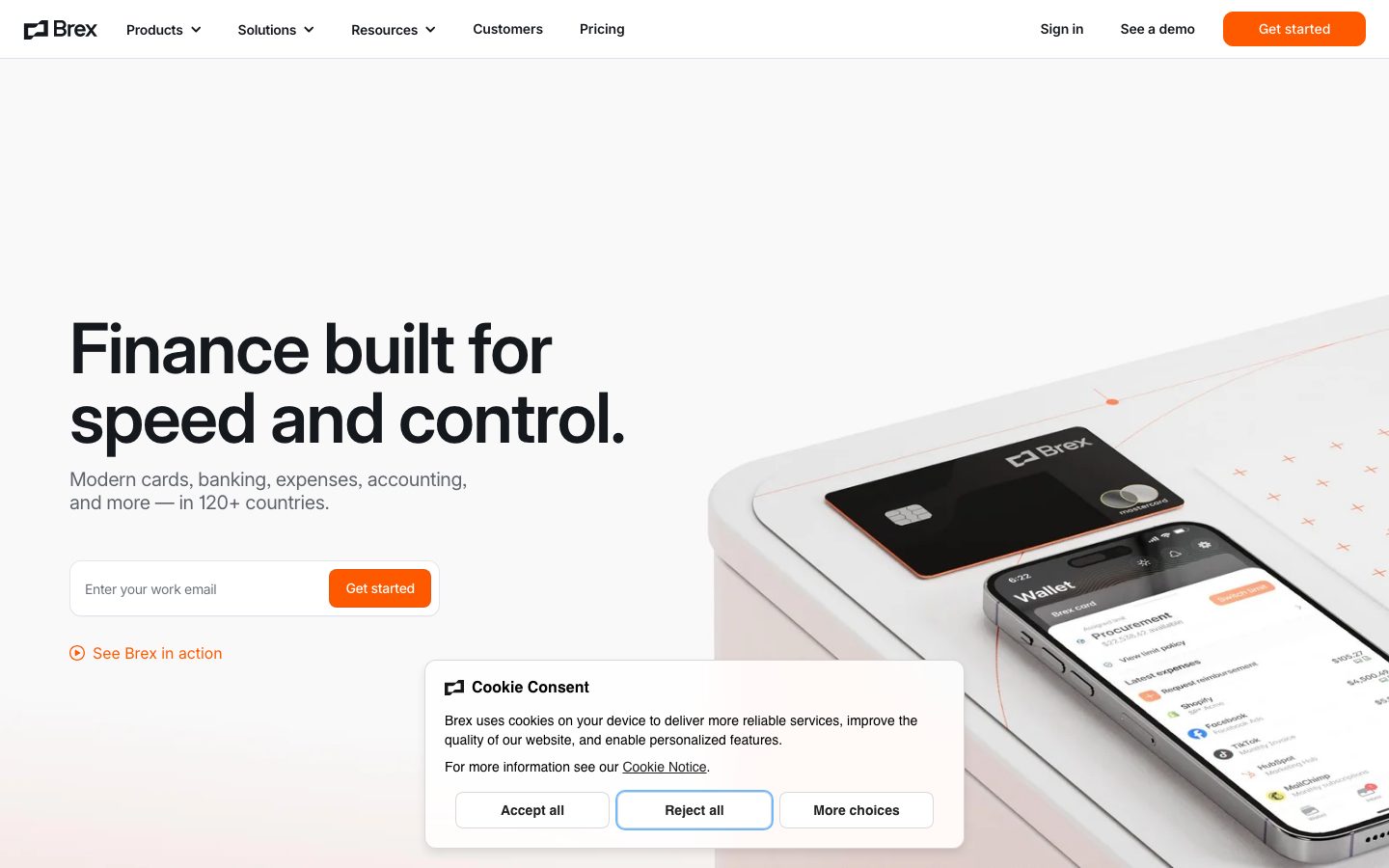
A precise, fintech-confident interface anchored on white canvas with near-black Inter headlines and a single high-voltage orange accent (#ff5900). The system reads as modern enterprise-finance — tight negative letter-spacing on a very large display headline, small-radius cards holding real product UI fragments, soft pastel tints (mint, sky, violet) carried only inside in-card status chips, and pure-black CTA and footer bands that close the page. Brand voltage comes from the orange accent and the oversized 72px Inter display headline rather than from decoration.
---
version: alpha
name: Brex-design-analysis
description: "A precise, fintech-confident interface anchored on white canvas with near-black Inter headlines and a single high-voltage orange accent (#ff5900). The system reads as modern enterprise-finance — tight negative letter-spacing on a very large display headline, small-radius cards holding real product UI fragments, soft pastel tints (mint, sky, violet) carried only inside in-card status chips, and pure-black CTA and footer bands that close the page. Brand voltage comes from the orange accent and the oversized 72px Inter display headline rather than from decoration."

colors:
  accent: "#ff5900"
  ink: "#15191e"
  body: "#60646c"
  muted: "#8b8d98"
  muted-soft: "#6f737b"
  hairline: "#b9bbc6"
  canvas: "#ffffff"
  surface-soft: "#fcfcfd"
  surface-card: "#f3f3f7"
  surface-dark: "#000000"
  on-primary: "#000000"
  info: "#006ef5"
  violet: "#3c16d5"
  success: "#0d9926"
  success-bright: "#1ec425"
  success-dark: "#165020"
  tint-mint: "#d1f4d2"
  tint-mint-soft: "#f0fdf1"
  tint-sky: "#d5e8fb"
  tint-sky-soft: "#ecf4fd"
  tint-violet: "#e6e2ff"

typography:
  display-xl:
    fontFamily: "Inter, sans-serif"
    fontSize: 72px
    fontWeight: 500
    lineHeight: 1.0
    letterSpacing: -1.44px
  title:
    fontFamily: "Inter, sans-serif"
    fontSize: 20px
    fontWeight: 500
    lineHeight: 1.2
    letterSpacing: -0.4px
  label:
    fontFamily: "Inter, sans-serif"
    fontSize: 14px
    fontWeight: 500
    lineHeight: 1.5
    letterSpacing: -0.28px
  body:
    fontFamily: "Inter, sans-serif"
    fontSize: 16px
    fontWeight: 400
    lineHeight: 1.5
    letterSpacing: -0.32px

rounded:
  xs: 4px
  sm: 6px
  md: 8px
  lg: 10px
  xl: 12px

spacing:
  xxs: 4px
  xs: 8px
  sm: 12px
  md: 16px
  lg: 24px
  xl: 32px
  xxl: 48px
  section: 72px
  section-lg: 80px
  section-xl: 160px

components:
  top-nav:
    backgroundColor: "{colors.canvas}"
    textColor: "{colors.ink}"
    typography: "{typography.label}"
    padding: 16px 24px
  nav-link:
    backgroundColor: transparent
    textColor: "{colors.ink}"
    typography: "{typography.label}"
  button-primary:
    backgroundColor: "{colors.accent}"
    textColor: "{colors.canvas}"
    typography: "{typography.label}"
    rounded: "{rounded.sm}"
    padding: 4px 8px
  button-secondary:
    backgroundColor: "{colors.canvas}"
    textColor: "{colors.on-primary}"
    typography: "{typography.label}"
    rounded: "{rounded.sm}"
    padding: 4px 8px
  button-text-link:
    backgroundColor: transparent
    textColor: "{colors.accent}"
    typography: "{typography.label}"
  text-input:
    backgroundColor: "{colors.canvas}"
    textColor: "{colors.ink}"
    typography: "{typography.body}"
    rounded: "{rounded.xs}"
    padding: 16px
  email-capture:
    backgroundColor: "{colors.canvas}"
    textColor: "{colors.ink}"
    rounded: "{rounded.md}"
    padding: 8px
  feature-card:
    backgroundColor: "{colors.surface-card}"
    textColor: "{colors.ink}"
    typography: "{typography.title}"
    rounded: "{rounded.xl}"
    padding: 24px
  solution-card:
    backgroundColor: "{colors.canvas}"
    textColor: "{colors.ink}"
    typography: "{typography.title}"
    rounded: "{rounded.xl}"
    padding: 24px
  product-mockup-card:
    backgroundColor: "{colors.surface-soft}"
    textColor: "{colors.ink}"
    rounded: "{rounded.xl}"
    padding: 24px
  status-chip:
    backgroundColor: "{colors.tint-mint}"
    textColor: "{colors.success-dark}"
    typography: "{typography.label}"
    rounded: "{rounded.sm}"
    padding: 4px 8px
  metric-stat:
    backgroundColor: transparent
    textColor: "{colors.accent}"
    typography: "{typography.display-xl}"
  testimonial-card:
    backgroundColor: "{colors.canvas}"
    textColor: "{colors.ink}"
    typography: "{typography.body}"
    rounded: "{rounded.xl}"
    padding: 32px
  logo-cloud:
    backgroundColor: "{colors.surface-card}"
    textColor: "{colors.muted}"
    typography: "{typography.label}"
    padding: 48px
  cta-band-dark:
    backgroundColor: "{colors.surface-dark}"
    textColor: "{colors.canvas}"
    typography: "{typography.title}"
    padding: 72px
  cookie-consent-card:
    backgroundColor: "{colors.canvas}"
    textColor: "{colors.body}"
    typography: "{typography.body}"
    rounded: "{rounded.xl}"
    padding: 24px
  footer:
    backgroundColor: "{colors.surface-dark}"
    textColor: "{colors.muted}"
    typography: "{typography.label}"
    padding: 80px
---

## Overview

Brex's marketing surface is a precise, enterprise-finance interface — white canvas (`{colors.canvas}` — #ffffff) with near-black Inter headlines (`{colors.ink}` — #15191e) and a single high-voltage orange accent (`{colors.accent}` — #ff5900) reserved for primary CTAs, metric numbers, and inline action links. The system reads as confidently engineered: a huge 72px display headline, generous whitespace, small-radius cards holding real product UI fragments, and pure-black bands that punctuate the page.

The type system is monolithic by family — **Inter at every level**, weight 500 for headings and 400 for body, always with negative letter-spacing (-0.28px to -1.44px). There is no second typeface. Hierarchy is built from size and the 72px-to-16px jump rather than from a display/text family split.

Component voltage comes from **product UI fragments shown directly inside light cards** — expense rows, treasury charts, vendor-payment forms, policy status chips. Brex doesn't draw illustrations of the product; it embeds the actual product chrome at small scale. The soft pastel set (mint, sky-blue, violet) appears almost exclusively *inside* those fragments — as "In policy" chips, chart fills, and small status accents — never on top-level CTAs.

Two bands flip to pure black (`{colors.surface-dark}` — #000000): the "See what Brex can do for you" CTA band and the footer. These dark bands close long-scroll sections and give the orange CTA maximum contrast.

**Key Characteristics:**
- White canvas with near-black ink (`{colors.ink}` — #15191e). The orange accent (`{colors.accent}` — #ff5900) is the only brand color and is rationed to CTAs, metrics, and inline links.
- Inter everywhere, weight 500 headings / 400 body, all with negative letter-spacing. No display typeface — the 72px headline (`{typography.display-xl}`) does the brand work.
- Small radii: `{rounded.sm}` (6px) on buttons, `{rounded.xl}` (12px) on content cards. Inputs are nearly square (`{rounded.xs}` — 4px / 0px measured).
- Product UI fragments embedded inside light cards (`{colors.surface-card}` — #f3f3f7 / `{colors.surface-soft}` — #fcfcfd) carry the pastel tint set and product status chips.
- Pure-black CTA band + footer (`{colors.surface-dark}` — #000000) close the page and frame the orange CTA.
- Tight spacing rhythm with a `{spacing.section}` (72px) vertical beat and an outsized `{spacing.section-xl}` (160px) gap used once for major separation.

## Colors

### Brand & Accent
- **Accent** (`{colors.accent}` — #ff5900): The single brand color — Brex orange. Used on the primary CTA background, metric numbers (`{component.metric-stat}`), inline "Explore / Learn more" links, and the "See Brex in action" play link. Rationed deliberately; everything else stays monochrome.
- **Info** (`{colors.info}` — #006ef5): A blue accent appearing inside product UI fragments (links, chart accents).
- **Violet** (`{colors.violet}` — #3c16d5): A secondary product-UI accent.

### Surface
- **Canvas** (`{colors.canvas}` — #ffffff): The default page floor and card background.
- **Surface Soft** (`{colors.surface-soft}` — #fcfcfd): Near-white panels behind product-mockup cards.
- **Surface Card** (`{colors.surface-card}` — #f3f3f7): Feature cards and the logo-cloud band.
- **Surface Dark** (`{colors.surface-dark}` — #000000): The CTA band and footer — the only dark surfaces in the system.

### Text
- **Ink** (`{colors.ink}` — #15191e): Headlines and primary links — a near-black with a faint cool cast.
- **Body** (`{colors.body}` — #60646c): Default running text.
- **Muted** (`{colors.muted}` — #8b8d98): Secondary text, footer links, logo-cloud labels.
- **Muted Soft** (`{colors.muted-soft}` — #6f737b): Tertiary captions and fine print.
- **Hairline** (`{colors.hairline}` — #b9bbc6): 1px borders and dividers.
- **On Primary** (`{colors.on-primary}` — #000000): Black text on light secondary buttons (e.g., the cookie-consent "More choices" / "Accept all"). Also doubles as the pure-black dark-band surface.

### Status & Tints (in-card only)
- **Success** (`{colors.success}` — #0d9926), **Success Bright** (`{colors.success-bright}` — #1ec425), **Success Dark** (`{colors.success-dark}` — #165020): Green family for "In policy" / confirmation states inside product fragments.
- **Tint Mint** (`{colors.tint-mint}` — #d1f4d2) and **Tint Mint Soft** (`{colors.tint-mint-soft}` — #f0fdf1): Mint fills for status chips and chart areas.
- **Tint Sky** (`{colors.tint-sky}` — #d5e8fb) and **Tint Sky Soft** (`{colors.tint-sky-soft}` — #ecf4fd): Sky-blue fills inside treasury / chart fragments.
- **Tint Violet** (`{colors.tint-violet}` — #e6e2ff): Violet fill for vendor/payment fragment accents.

These pastels appear strictly inside embedded product UI — never on top-level marketing CTAs or bands.

## Typography

### Font Family
The system runs **Inter** for everything — headlines, body, buttons, navigation, captions. There is no secondary or display typeface; the fallback stack walks `Inter, -apple-system, BlinkMacSystemFont, "Segoe UI", Roboto, sans-serif`. Brand character comes from the extreme size of the hero headline plus consistent negative letter-spacing, not from a custom face. No licensed/custom fonts were flagged.

### Hierarchy

| Token | Size | Weight | Line Height | Letter Spacing | Use |
|---|---|---|---|---|---|
| `{typography.display-xl}` | 72px | 500 | 1.0 | -1.44px | Hero h1 ("Finance built for speed and control.") and oversized metric numbers |
| `{typography.title}` | 20px | 500 | 1.2 | -0.4px | Section heads and card titles (h2/h3 share this spec) |
| `{typography.label}` | 14px | 500 | 1.5 | -0.28px | Nav links, button labels, status chips, footer links (h4) |
| `{typography.body}` | 16px | 400 | 1.5 | -0.32px | Default running text and input text |

### Principles
The headline-to-body jump is dramatic: 72px display straight down to 20px section titles and 16px body. There is no 30–50px tier in the measured set — section heads stay at 20px and lean on weight and whitespace rather than scale. Heading weight is consistently 500 (medium), never 600/700; the medium weight is part of the calm, engineered voice. Negative letter-spacing is applied at every level — Inter without it would read as off-brand for this system.

### Note on Font Substitutes
No licensed fonts are in use — Inter is open-source and ships directly. No substitution is required.

## Layout

### Spacing System
- **Base unit:** 4px.
- **Tokens:** `{spacing.xxs}` 4px · `{spacing.xs}` 8px · `{spacing.sm}` 12px · `{spacing.md}` 16px · `{spacing.lg}` 24px · `{spacing.xl}` 32px · `{spacing.xxl}` 48px · `{spacing.section}` 72px · `{spacing.section-lg}` 80px · `{spacing.section-xl}` 160px.
- **Dominant rhythm:** 8px is the most frequent gap (76 occurrences), with 24px and 32px handling card interiors and 72px setting the vertical band beat.
- **Card internal padding:** `{spacing.lg}` (24px) for feature/product cards; `{spacing.xl}` (32px) for testimonial cards.
- **Section padding:** `{spacing.section}` (72px) for most bands; `{spacing.section-lg}` (80px) for the footer; `{spacing.section-xl}` (160px) used once for major separation.

### Grid & Container
- **Editorial body:** Centered max-width container with a left-aligned hero (headline + sub-copy + email capture on the left, product photography bleeding off the right edge).
- **Feature grid:** 5-up card row ("The card is just the start") at desktop.
- **Solution grid:** 3-up image cards ("Solutions for every stage of growth").
- **Alternating product rows:** 2-column copy-and-mockup rows that alternate text/visual sides down the "Supercharge your financial operations" section.
- **Metric row:** 3-up stat columns with oversized orange numbers.
- **Footer:** Multi-column link list on the black surface.

### Whitespace Philosophy
Brex uses tight-but-confident spacing — an 8px micro-rhythm inside components and a 72px macro-rhythm between bands. The hero leans heavily on negative space around the 72px headline, while content sections pack feature cards more densely. The single 160px gap is a deliberate breath.

## Elevation & Depth

| Level | Treatment | Use |
|---|---|---|
| Flat | No shadow, no border | Body bands, nav, hero |
| Hairline | 1px `{colors.hairline}` border | Inputs, email-capture group, card outlines |
| Faint lift | `rgba(66, 87, 138, 0.15) 0px 1px 0px 0px` | Subtle 1px bottom edge on grouped surfaces (e.g., sticky nav / chips) |
| Soft drop | `rgba(0, 0, 0, 0.04) 0px 1px 1px 0px` | Barely-there elevation on cards and the cookie-consent card |
| Dark band | `{colors.surface-dark}` (#000000) surface | CTA band + footer — color contrast does the elevation work |

The elevation philosophy is **nearly flat**. The two measured shadows are both extremely low-alpha 1px treatments — Brex relies on hairlines, light card fills, and the black bands rather than drop shadows for depth.

### Decorative Depth
- Product UI fragments embedded in cards (expense rows, treasury charts, vendor forms) carry their own internal chrome and chip shadows — these are product content, not system tokens.
- Hero photography (the physical Brex card + phone showing the Wallet UI) bleeds off the right edge, adding depth through scale and partial framing rather than shadow.

## Shapes

### Border Radius Scale

| Token | Value | Use |
|---|---|---|
| `{rounded.xs}` | 4px | Text inputs (measured at 0–4px — inputs are effectively square) |
| `{rounded.sm}` | 6px | Primary + secondary buttons |
| `{rounded.md}` | 8px | Email-capture group wrapper |
| `{rounded.lg}` | 10px | Mid-size grouped surfaces |
| `{rounded.xl}` | 12px | Content cards (feature, solution, product-mockup, testimonial, cookie-consent) |

The radius ceiling is low — 12px is the largest measured value. The square-ish inputs (`{component.text-input}`) against the 6px buttons give the email-capture row its characteristic crisp, technical look.

### Photography Geometry
Hero product photography (physical card + phone UI) bleeds off the right viewport edge with no containing radius. Solution-card cover photos sit inside `{rounded.xl}` (12px) corners. Product UI fragments retain their native internal radii.

## Components

### Top Navigation

**`top-nav`** — White nav bar pinned to the top of every page. `{colors.canvas}` background, ink wordmark at left ("Brex" + logo mark), primary horizontal menu (Products, Solutions, Resources, Customers, Pricing) with dropdown carets, and a right cluster: "Sign in" text link, "See a demo" link, and a "Get started" `{component.button-primary}` in orange. Menu items use `{typography.label}` (Inter 14px / 500).

**`nav-link`** — Inline nav item, transparent background, `{colors.ink}` text, `{typography.label}`.

### Buttons

**`button-primary`** — The orange CTA. Background `{colors.accent}` (#ff5900), text `{colors.canvas}` (white), type `{typography.label}`, rounded `{rounded.sm}` (6px), measured inner padding 4px × 8px (the rendered hit area is larger — see Known Gaps). Used for "Get started" in the nav, hero email-capture, and the dark CTA band.

**`button-secondary`** — Light button with black text. Background `{colors.canvas}`, text `{colors.on-primary}` (#000000), rounded `{rounded.sm}`, same padding. Used for cookie-consent actions ("Accept all", "More choices") and secondary actions.

**`button-text-link`** — Inline action link in `{colors.accent}` (orange) with `{typography.label}` — "Explore Brex cards", "Learn more", "Read the case study". The orange inline link is a signature Brex pattern.

### Inputs & Forms

**`text-input`** — Standard text input (e.g., "Enter your work email"). Background `{colors.canvas}`, text `{colors.ink}`, type `{typography.body}`, rounded `{rounded.xs}` (measured at 0px — inputs are effectively square), padding `{spacing.md}` (16px). 1px hairline border.

**`email-capture`** — The hero lead-capture group: a `{component.text-input}` and a `{component.button-primary}` ("Get started") sharing one bordered wrapper. Background `{colors.canvas}`, rounded `{rounded.md}` (8px), padding `{spacing.xs}` (8px), 1px hairline frame.

### Cards & Containers

**`feature-card`** — Used in the 5-up "The card is just the start" row. Background `{colors.surface-card}` (#f3f3f7), rounded `{rounded.xl}` (12px), padding `{spacing.lg}` (24px). Carries a title in `{typography.title}`, short body, and a small embedded product fragment or card photo.

**`solution-card`** — Used in the 3-up "Solutions for every stage of growth" row. Background `{colors.canvas}`, rounded `{rounded.xl}`, padding `{spacing.lg}`. Carries an orange-toned cover photo, a `{typography.title}` label ("Startups" / "Mid-size companies" / "Enterprises"), short copy, and a `{component.button-text-link}` ("Learn more").

**`product-mockup-card`** — A card showing real Brex product UI (expense list, treasury chart, vendor-payment form, "Marketing offsite" budget panel). Background `{colors.surface-soft}` (#fcfcfd), rounded `{rounded.xl}`, padding `{spacing.lg}`. The product UI inside carries its own chrome and `{component.status-chip}` accents.

**`testimonial-card`** — Customer quote block (e.g., DoorDash). Background `{colors.canvas}`, rounded `{rounded.xl}`, padding `{spacing.xl}` (32px). Quote in `{typography.body}`, attribution below, with a `{component.button-text-link}` to the case study and a small tab row of customer names above.

**`cookie-consent-card`** — Fixed consent dialog. Background `{colors.canvas}`, rounded `{rounded.xl}`, padding `{spacing.lg}`, faint soft-drop shadow. Header with Brex mark, body copy in `{colors.body}`, and a row of `{component.button-secondary}` actions ("Accept all", "Reject all", "More choices").

### Status & Metrics

**`status-chip`** — Small in-card status pill ("In policy", "Receipt", "Invoice scanned successfully"). Background `{colors.tint-mint}` (#d1f4d2), text `{colors.success-dark}` (#165020), type `{typography.label}`, rounded `{rounded.sm}`, padding 4px × 8px. Other variants use `{colors.tint-sky}` / `{colors.tint-violet}` fills. These chips live exclusively inside product-mockup cards.

**`metric-stat`** — Oversized statistic in the "Save and earn more" band. Number rendered in `{colors.accent}` (orange) at `{typography.display-xl}` ("4,250 hours", "Up to 3.66%", "99%"), with a label + description below in muted text.

### Logo & Closing Bands

**`logo-cloud`** — "Trusted by 35,000+ top companies" band. Background `{colors.surface-card}`, partner wordmarks rendered in `{colors.muted}` monochrome, label in `{typography.label}`, padding `{spacing.xxl}` (48px).

**`cta-band-dark`** — The pre-footer "See what Brex can do for you" band. Background `{colors.surface-dark}` (#000000), heading + body in `{colors.canvas}` (white), type `{typography.title}`, padding `{spacing.section}` (72px), with a `{component.button-primary}` in orange. The black surface gives the orange CTA maximum contrast.

**`footer`** — Black footer that closes the page. Background `{colors.surface-dark}` (#000000), link columns (Product / Platform / Company / Resources) in `{colors.muted}`, type `{typography.label}`, padding `{spacing.section-lg}` (80px). The Brex wordmark sits top-left in white.

## Do's and Don'ts

### Do
- Reserve `{colors.accent}` (#ff5900) for primary CTAs, metric numbers, and inline action links. The orange is the only brand color — keep it scarce and loud.
- Use Inter weight 500 for all headings and 400 for body, always with the negative letter-spacing the system specifies.
- Lean on the 72px-to-20px size jump for hierarchy. Section heads stay at 20px — emphasize with whitespace, not bigger type.
- Embed real product UI fragments inside `{component.product-mockup-card}` and `{component.feature-card}`. Show the product, don't illustrate it.
- Keep pastel tints (`{colors.tint-mint}`, `{colors.tint-sky}`, `{colors.tint-violet}`) inside product fragments and `{component.status-chip}` only.
- Use the black bands (`{colors.surface-dark}`) to close major sections and frame the orange CTA.
- Keep radii small — `{rounded.sm}` on buttons, `{rounded.xl}` on cards, near-square inputs.

### Don't
- Don't put the orange accent on large surfaces or backgrounds — it's an action/highlight color, not a fill.
- Don't bold headings beyond weight 500. The medium weight is the calm engineered voice.
- Don't introduce a second typeface. Inter carries the entire system.
- Don't add rounded radii beyond `{rounded.xl}` (12px) — larger radii break the crisp technical look.
- Don't surface the pastel tints on top-level marketing CTAs or bands.
- Don't add hover-state styling beyond default and pressed.

## Responsive Behavior

### Breakpoints

| Name | Width | Key Changes |
|---|---|---|
| Mobile | < 768px | Hamburger nav; hero headline scales down from 72px; product photography crops; feature row stacks 1-up; metric stats stack |
| Tablet | 768–1024px | Nav tightens; feature row reduces from 5-up toward 2–3-up; solution cards 2-up; alternating product rows stack copy above mockup |
| Desktop | 1024–1440px | Full nav; 5-up feature row; 3-up solution cards; 2-column product rows |
| Wide | > 1440px | Same as desktop with more outer margin; hero photography bleeds further off the right edge |

### Touch Targets
- `{component.button-primary}` rendered tap area exceeds its measured 4×8 inner padding (see Known Gaps); effective target meets standard minimums.
- `{component.text-input}` uses 16px padding for a comfortable field height.
- Nav links rely on surrounding padding for tap area.

### Collapsing Strategy
- Top nav collapses to hamburger at mobile; the orange "Get started" CTA stays visible.
- Hero collapses to single column — headline + sub-copy + email-capture first, product photography below or cropped.
- Feature/solution grids reduce column count rather than shrinking cards excessively.
- Product-mockup rows stack their copy and visual vertically on narrow widths.
- Black CTA band and footer retain full-width dark surfaces at every breakpoint.

### Image Behavior
- Hero product photography (card + phone UI) bleeds off the right edge and crops on narrow viewports.
- Solution-card cover photos retain `{rounded.xl}` corners and crop to fit.
- Embedded product UI fragments keep native aspect ratios while their cards resize.

## Iteration Guide

1. Focus on ONE component at a time. Reference its YAML key directly (`{component.feature-card}`, `{component.cta-band-dark}`).
2. Variants (`-active`, `-disabled`, `-focused`) live as separate entries in `components:`.
3. Use `{token.refs}` everywhere — never inline a hex in a component.
4. Never document hover. Default and Active/Pressed states only.
5. Headings stay Inter 500 with negative letter-spacing; body stays Inter 400. One family, two weights.
6. The orange accent and the black bands are the only high-contrast moves — use them sparingly and deliberately.
7. When in doubt about emphasis: more whitespace and bigger size before any new color.

## Known Gaps

- The measured `button-primary` reports `color: #000000`, `radius: 6px`, `padding: 4px 8px`. The orange-background / white-text primary CTA is documented from screenshot ground-truth combined with the measured `{colors.accent}` and `{colors.canvas}` tokens; the measured black-text value is mapped to `{component.button-secondary}` (the cookie-consent light buttons). The 4×8 padding is an inner measurement — the rendered button is visibly larger.
- The pure-black dark bands (`{colors.surface-dark}` — #000000) reuse the measured #000000 hex (captured as `on-primary`/button color). The exact footer/CTA-band background was not separately sampled.
- Input radius measured at 0px; documented as `{rounded.xs}` (4px nearest token) — inputs render effectively square.
- The pricing and product-credit-card pages were captured but yielded no distinct measured tokens beyond the landing set; their unique components are not documented.
- The pastel tint set (mint / sky / violet) is documented from in-card product fragments; exact per-chip usage mapping is inferred from screenshots.
- Section heads (h2/h3) measured at 20px only — no intermediate 30–50px display tier was captured; large mid-page headings may use sizes not present in the measured set.
- Animation, transition timings, form validation states, and hover treatments are out of scope.
- Only two faint box-shadow values were measured; any heavier elevation used elsewhere was not captured.

<!-- Documented by duply · real-world design systems as ready-to-use DESIGN.md for AI coding agents · https://duply.ai/brex/design-md -->
Color Palette
Accent
Neutrals
Typography
display-xl72px · 500 · 1
The quick brown fox jumpstitle20px · 500 · 1.2
The quick brown fox jumpslabel14px · 500 · 1.5
The quick brown fox jumpsbody16px · 400 · 1.5
The quick brown fox jumpsSpacing & Shape
Spacing
| Name | Value | Preview |
|---|---|---|
| xxs | 4px | |
| xs | 8px | |
| sm | 12px | |
| md | 16px | |
| lg | 24px | |
| xl | 32px | |
| xxl | 48px | |
| section | 72px | |
| section-lg | 80px | |
| section-xl | 160px |
Border Radius
| Name | Value | Preview |
|---|---|---|
| xs | 4px | |
| sm | 6px | |
| md | 8px | |
| lg | 10px | |
| xl | 12px |
More like this


---
version: alpha
name: Brex-design-analysis
description: "A precise, fintech-confident interface anchored on white canvas with near-black Inter headlines and a single high-voltage orange accent (#ff5900). The system reads as modern enterprise-finance — tight negative letter-spacing on a very large display headline, small-radius cards holding real product UI fragments, soft pastel tints (mint, sky, violet) carried only inside in-card status chips, and pure-black CTA and footer bands that close the page. Brand voltage comes from the orange accent and the oversized 72px Inter display headline rather than from decoration."

colors:
  accent: "#ff5900"
  ink: "#15191e"
  body: "#60646c"
  muted: "#8b8d98"
  muted-soft: "#6f737b"
  hairline: "#b9bbc6"
  canvas: "#ffffff"
  surface-soft: "#fcfcfd"
  surface-card: "#f3f3f7"
  surface-dark: "#000000"
  on-primary: "#000000"
  info: "#006ef5"
  violet: "#3c16d5"
  success: "#0d9926"
  success-bright: "#1ec425"
  success-dark: "#165020"
  tint-mint: "#d1f4d2"
  tint-mint-soft: "#f0fdf1"
  tint-sky: "#d5e8fb"
  tint-sky-soft: "#ecf4fd"
  tint-violet: "#e6e2ff"

typography:
  display-xl:
    fontFamily: "Inter, sans-serif"
    fontSize: 72px
    fontWeight: 500
    lineHeight: 1.0
    letterSpacing: -1.44px
  title:
    fontFamily: "Inter, sans-serif"
    fontSize: 20px
    fontWeight: 500
    lineHeight: 1.2
    letterSpacing: -0.4px
  label:
    fontFamily: "Inter, sans-serif"
    fontSize: 14px
    fontWeight: 500
    lineHeight: 1.5
    letterSpacing: -0.28px
  body:
    fontFamily: "Inter, sans-serif"
    fontSize: 16px
    fontWeight: 400
    lineHeight: 1.5
    letterSpacing: -0.32px

rounded:
  xs: 4px
  sm: 6px
  md: 8px
  lg: 10px
  xl: 12px

spacing:
  xxs: 4px
  xs: 8px
  sm: 12px
  md: 16px
  lg: 24px
  xl: 32px
  xxl: 48px
  section: 72px
  section-lg: 80px
  section-xl: 160px

components:
  top-nav:
    backgroundColor: "{colors.canvas}"
    textColor: "{colors.ink}"
    typography: "{typography.label}"
    padding: 16px 24px
  nav-link:
    backgroundColor: transparent
    textColor: "{colors.ink}"
    typography: "{typography.label}"
  button-primary:
    backgroundColor: "{colors.accent}"
    textColor: "{colors.canvas}"
    typography: "{typography.label}"
    rounded: "{rounded.sm}"
    padding: 4px 8px
  button-secondary:
    backgroundColor: "{colors.canvas}"
    textColor: "{colors.on-primary}"
    typography: "{typography.label}"
    rounded: "{rounded.sm}"
    padding: 4px 8px
  button-text-link:
    backgroundColor: transparent
    textColor: "{colors.accent}"
    typography: "{typography.label}"
  text-input:
    backgroundColor: "{colors.canvas}"
    textColor: "{colors.ink}"
    typography: "{typography.body}"
    rounded: "{rounded.xs}"
    padding: 16px
  email-capture:
    backgroundColor: "{colors.canvas}"
    textColor: "{colors.ink}"
    rounded: "{rounded.md}"
    padding: 8px
  feature-card:
    backgroundColor: "{colors.surface-card}"
    textColor: "{colors.ink}"
    typography: "{typography.title}"
    rounded: "{rounded.xl}"
    padding: 24px
  solution-card:
    backgroundColor: "{colors.canvas}"
    textColor: "{colors.ink}"
    typography: "{typography.title}"
    rounded: "{rounded.xl}"
    padding: 24px
  product-mockup-card:
    backgroundColor: "{colors.surface-soft}"
    textColor: "{colors.ink}"
    rounded: "{rounded.xl}"
    padding: 24px
  status-chip:
    backgroundColor: "{colors.tint-mint}"
    textColor: "{colors.success-dark}"
    typography: "{typography.label}"
    rounded: "{rounded.sm}"
    padding: 4px 8px
  metric-stat:
    backgroundColor: transparent
    textColor: "{colors.accent}"
    typography: "{typography.display-xl}"
  testimonial-card:
    backgroundColor: "{colors.canvas}"
    textColor: "{colors.ink}"
    typography: "{typography.body}"
    rounded: "{rounded.xl}"
    padding: 32px
  logo-cloud:
    backgroundColor: "{colors.surface-card}"
    textColor: "{colors.muted}"
    typography: "{typography.label}"
    padding: 48px
  cta-band-dark:
    backgroundColor: "{colors.surface-dark}"
    textColor: "{colors.canvas}"
    typography: "{typography.title}"
    padding: 72px
  cookie-consent-card:
    backgroundColor: "{colors.canvas}"
    textColor: "{colors.body}"
    typography: "{typography.body}"
    rounded: "{rounded.xl}"
    padding: 24px
  footer:
    backgroundColor: "{colors.surface-dark}"
    textColor: "{colors.muted}"
    typography: "{typography.label}"
    padding: 80px
---

## Overview

Brex's marketing surface is a precise, enterprise-finance interface — white canvas (`{colors.canvas}` — #ffffff) with near-black Inter headlines (`{colors.ink}` — #15191e) and a single high-voltage orange accent (`{colors.accent}` — #ff5900) reserved for primary CTAs, metric numbers, and inline action links. The system reads as confidently engineered: a huge 72px display headline, generous whitespace, small-radius cards holding real product UI fragments, and pure-black bands that punctuate the page.

The type system is monolithic by family — **Inter at every level**, weight 500 for headings and 400 for body, always with negative letter-spacing (-0.28px to -1.44px). There is no second typeface. Hierarchy is built from size and the 72px-to-16px jump rather than from a display/text family split.

Component voltage comes from **product UI fragments shown directly inside light cards** — expense rows, treasury charts, vendor-payment forms, policy status chips. Brex doesn't draw illustrations of the product; it embeds the actual product chrome at small scale. The soft pastel set (mint, sky-blue, violet) appears almost exclusively *inside* those fragments — as "In policy" chips, chart fills, and small status accents — never on top-level CTAs.

Two bands flip to pure black (`{colors.surface-dark}` — #000000): the "See what Brex can do for you" CTA band and the footer. These dark bands close long-scroll sections and give the orange CTA maximum contrast.

**Key Characteristics:**
- White canvas with near-black ink (`{colors.ink}` — #15191e). The orange accent (`{colors.accent}` — #ff5900) is the only brand color and is rationed to CTAs, metrics, and inline links.
- Inter everywhere, weight 500 headings / 400 body, all with negative letter-spacing. No display typeface — the 72px headline (`{typography.display-xl}`) does the brand work.
- Small radii: `{rounded.sm}` (6px) on buttons, `{rounded.xl}` (12px) on content cards. Inputs are nearly square (`{rounded.xs}` — 4px / 0px measured).
- Product UI fragments embedded inside light cards (`{colors.surface-card}` — #f3f3f7 / `{colors.surface-soft}` — #fcfcfd) carry the pastel tint set and product status chips.
- Pure-black CTA band + footer (`{colors.surface-dark}` — #000000) close the page and frame the orange CTA.
- Tight spacing rhythm with a `{spacing.section}` (72px) vertical beat and an outsized `{spacing.section-xl}` (160px) gap used once for major separation.

## Colors

### Brand & Accent
- **Accent** (`{colors.accent}` — #ff5900): The single brand color — Brex orange. Used on the primary CTA background, metric numbers (`{component.metric-stat}`), inline "Explore / Learn more" links, and the "See Brex in action" play link. Rationed deliberately; everything else stays monochrome.
- **Info** (`{colors.info}` — #006ef5): A blue accent appearing inside product UI fragments (links, chart accents).
- **Violet** (`{colors.violet}` — #3c16d5): A secondary product-UI accent.

### Surface
- **Canvas** (`{colors.canvas}` — #ffffff): The default page floor and card background.
- **Surface Soft** (`{colors.surface-soft}` — #fcfcfd): Near-white panels behind product-mockup cards.
- **Surface Card** (`{colors.surface-card}` — #f3f3f7): Feature cards and the logo-cloud band.
- **Surface Dark** (`{colors.surface-dark}` — #000000): The CTA band and footer — the only dark surfaces in the system.

### Text
- **Ink** (`{colors.ink}` — #15191e): Headlines and primary links — a near-black with a faint cool cast.
- **Body** (`{colors.body}` — #60646c): Default running text.
- **Muted** (`{colors.muted}` — #8b8d98): Secondary text, footer links, logo-cloud labels.
- **Muted Soft** (`{colors.muted-soft}` — #6f737b): Tertiary captions and fine print.
- **Hairline** (`{colors.hairline}` — #b9bbc6): 1px borders and dividers.
- **On Primary** (`{colors.on-primary}` — #000000): Black text on light secondary buttons (e.g., the cookie-consent "More choices" / "Accept all"). Also doubles as the pure-black dark-band surface.

### Status & Tints (in-card only)
- **Success** (`{colors.success}` — #0d9926), **Success Bright** (`{colors.success-bright}` — #1ec425), **Success Dark** (`{colors.success-dark}` — #165020): Green family for "In policy" / confirmation states inside product fragments.
- **Tint Mint** (`{colors.tint-mint}` — #d1f4d2) and **Tint Mint Soft** (`{colors.tint-mint-soft}` — #f0fdf1): Mint fills for status chips and chart areas.
- **Tint Sky** (`{colors.tint-sky}` — #d5e8fb) and **Tint Sky Soft** (`{colors.tint-sky-soft}` — #ecf4fd): Sky-blue fills inside treasury / chart fragments.
- **Tint Violet** (`{colors.tint-violet}` — #e6e2ff): Violet fill for vendor/payment fragment accents.

These pastels appear strictly inside embedded product UI — never on top-level marketing CTAs or bands.

## Typography

### Font Family
The system runs **Inter** for everything — headlines, body, buttons, navigation, captions. There is no secondary or display typeface; the fallback stack walks `Inter, -apple-system, BlinkMacSystemFont, "Segoe UI", Roboto, sans-serif`. Brand character comes from the extreme size of the hero headline plus consistent negative letter-spacing, not from a custom face. No licensed/custom fonts were flagged.

### Hierarchy

| Token | Size | Weight | Line Height | Letter Spacing | Use |
|---|---|---|---|---|---|
| `{typography.display-xl}` | 72px | 500 | 1.0 | -1.44px | Hero h1 ("Finance built for speed and control.") and oversized metric numbers |
| `{typography.title}` | 20px | 500 | 1.2 | -0.4px | Section heads and card titles (h2/h3 share this spec) |
| `{typography.label}` | 14px | 500 | 1.5 | -0.28px | Nav links, button labels, status chips, footer links (h4) |
| `{typography.body}` | 16px | 400 | 1.5 | -0.32px | Default running text and input text |

### Principles
The headline-to-body jump is dramatic: 72px display straight down to 20px section titles and 16px body. There is no 30–50px tier in the measured set — section heads stay at 20px and lean on weight and whitespace rather than scale. Heading weight is consistently 500 (medium), never 600/700; the medium weight is part of the calm, engineered voice. Negative letter-spacing is applied at every level — Inter without it would read as off-brand for this system.

### Note on Font Substitutes
No licensed fonts are in use — Inter is open-source and ships directly. No substitution is required.

## Layout

### Spacing System
- **Base unit:** 4px.
- **Tokens:** `{spacing.xxs}` 4px · `{spacing.xs}` 8px · `{spacing.sm}` 12px · `{spacing.md}` 16px · `{spacing.lg}` 24px · `{spacing.xl}` 32px · `{spacing.xxl}` 48px · `{spacing.section}` 72px · `{spacing.section-lg}` 80px · `{spacing.section-xl}` 160px.
- **Dominant rhythm:** 8px is the most frequent gap (76 occurrences), with 24px and 32px handling card interiors and 72px setting the vertical band beat.
- **Card internal padding:** `{spacing.lg}` (24px) for feature/product cards; `{spacing.xl}` (32px) for testimonial cards.
- **Section padding:** `{spacing.section}` (72px) for most bands; `{spacing.section-lg}` (80px) for the footer; `{spacing.section-xl}` (160px) used once for major separation.

### Grid & Container
- **Editorial body:** Centered max-width container with a left-aligned hero (headline + sub-copy + email capture on the left, product photography bleeding off the right edge).
- **Feature grid:** 5-up card row ("The card is just the start") at desktop.
- **Solution grid:** 3-up image cards ("Solutions for every stage of growth").
- **Alternating product rows:** 2-column copy-and-mockup rows that alternate text/visual sides down the "Supercharge your financial operations" section.
- **Metric row:** 3-up stat columns with oversized orange numbers.
- **Footer:** Multi-column link list on the black surface.

### Whitespace Philosophy
Brex uses tight-but-confident spacing — an 8px micro-rhythm inside components and a 72px macro-rhythm between bands. The hero leans heavily on negative space around the 72px headline, while content sections pack feature cards more densely. The single 160px gap is a deliberate breath.

## Elevation & Depth

| Level | Treatment | Use |
|---|---|---|
| Flat | No shadow, no border | Body bands, nav, hero |
| Hairline | 1px `{colors.hairline}` border | Inputs, email-capture group, card outlines |
| Faint lift | `rgba(66, 87, 138, 0.15) 0px 1px 0px 0px` | Subtle 1px bottom edge on grouped surfaces (e.g., sticky nav / chips) |
| Soft drop | `rgba(0, 0, 0, 0.04) 0px 1px 1px 0px` | Barely-there elevation on cards and the cookie-consent card |
| Dark band | `{colors.surface-dark}` (#000000) surface | CTA band + footer — color contrast does the elevation work |

The elevation philosophy is **nearly flat**. The two measured shadows are both extremely low-alpha 1px treatments — Brex relies on hairlines, light card fills, and the black bands rather than drop shadows for depth.

### Decorative Depth
- Product UI fragments embedded in cards (expense rows, treasury charts, vendor forms) carry their own internal chrome and chip shadows — these are product content, not system tokens.
- Hero photography (the physical Brex card + phone showing the Wallet UI) bleeds off the right edge, adding depth through scale and partial framing rather than shadow.

## Shapes

### Border Radius Scale

| Token | Value | Use |
|---|---|---|
| `{rounded.xs}` | 4px | Text inputs (measured at 0–4px — inputs are effectively square) |
| `{rounded.sm}` | 6px | Primary + secondary buttons |
| `{rounded.md}` | 8px | Email-capture group wrapper |
| `{rounded.lg}` | 10px | Mid-size grouped surfaces |
| `{rounded.xl}` | 12px | Content cards (feature, solution, product-mockup, testimonial, cookie-consent) |

The radius ceiling is low — 12px is the largest measured value. The square-ish inputs (`{component.text-input}`) against the 6px buttons give the email-capture row its characteristic crisp, technical look.

### Photography Geometry
Hero product photography (physical card + phone UI) bleeds off the right viewport edge with no containing radius. Solution-card cover photos sit inside `{rounded.xl}` (12px) corners. Product UI fragments retain their native internal radii.

## Components

### Top Navigation

**`top-nav`** — White nav bar pinned to the top of every page. `{colors.canvas}` background, ink wordmark at left ("Brex" + logo mark), primary horizontal menu (Products, Solutions, Resources, Customers, Pricing) with dropdown carets, and a right cluster: "Sign in" text link, "See a demo" link, and a "Get started" `{component.button-primary}` in orange. Menu items use `{typography.label}` (Inter 14px / 500).

**`nav-link`** — Inline nav item, transparent background, `{colors.ink}` text, `{typography.label}`.

### Buttons

**`button-primary`** — The orange CTA. Background `{colors.accent}` (#ff5900), text `{colors.canvas}` (white), type `{typography.label}`, rounded `{rounded.sm}` (6px), measured inner padding 4px × 8px (the rendered hit area is larger — see Known Gaps). Used for "Get started" in the nav, hero email-capture, and the dark CTA band.

**`button-secondary`** — Light button with black text. Background `{colors.canvas}`, text `{colors.on-primary}` (#000000), rounded `{rounded.sm}`, same padding. Used for cookie-consent actions ("Accept all", "More choices") and secondary actions.

**`button-text-link`** — Inline action link in `{colors.accent}` (orange) with `{typography.label}` — "Explore Brex cards", "Learn more", "Read the case study". The orange inline link is a signature Brex pattern.

### Inputs & Forms

**`text-input`** — Standard text input (e.g., "Enter your work email"). Background `{colors.canvas}`, text `{colors.ink}`, type `{typography.body}`, rounded `{rounded.xs}` (measured at 0px — inputs are effectively square), padding `{spacing.md}` (16px). 1px hairline border.

**`email-capture`** — The hero lead-capture group: a `{component.text-input}` and a `{component.button-primary}` ("Get started") sharing one bordered wrapper. Background `{colors.canvas}`, rounded `{rounded.md}` (8px), padding `{spacing.xs}` (8px), 1px hairline frame.

### Cards & Containers

**`feature-card`** — Used in the 5-up "The card is just the start" row. Background `{colors.surface-card}` (#f3f3f7), rounded `{rounded.xl}` (12px), padding `{spacing.lg}` (24px). Carries a title in `{typography.title}`, short body, and a small embedded product fragment or card photo.

**`solution-card`** — Used in the 3-up "Solutions for every stage of growth" row. Background `{colors.canvas}`, rounded `{rounded.xl}`, padding `{spacing.lg}`. Carries an orange-toned cover photo, a `{typography.title}` label ("Startups" / "Mid-size companies" / "Enterprises"), short copy, and a `{component.button-text-link}` ("Learn more").

**`product-mockup-card`** — A card showing real Brex product UI (expense list, treasury chart, vendor-payment form, "Marketing offsite" budget panel). Background `{colors.surface-soft}` (#fcfcfd), rounded `{rounded.xl}`, padding `{spacing.lg}`. The product UI inside carries its own chrome and `{component.status-chip}` accents.

**`testimonial-card`** — Customer quote block (e.g., DoorDash). Background `{colors.canvas}`, rounded `{rounded.xl}`, padding `{spacing.xl}` (32px). Quote in `{typography.body}`, attribution below, with a `{component.button-text-link}` to the case study and a small tab row of customer names above.

**`cookie-consent-card`** — Fixed consent dialog. Background `{colors.canvas}`, rounded `{rounded.xl}`, padding `{spacing.lg}`, faint soft-drop shadow. Header with Brex mark, body copy in `{colors.body}`, and a row of `{component.button-secondary}` actions ("Accept all", "Reject all", "More choices").

### Status & Metrics

**`status-chip`** — Small in-card status pill ("In policy", "Receipt", "Invoice scanned successfully"). Background `{colors.tint-mint}` (#d1f4d2), text `{colors.success-dark}` (#165020), type `{typography.label}`, rounded `{rounded.sm}`, padding 4px × 8px. Other variants use `{colors.tint-sky}` / `{colors.tint-violet}` fills. These chips live exclusively inside product-mockup cards.

**`metric-stat`** — Oversized statistic in the "Save and earn more" band. Number rendered in `{colors.accent}` (orange) at `{typography.display-xl}` ("4,250 hours", "Up to 3.66%", "99%"), with a label + description below in muted text.

### Logo & Closing Bands

**`logo-cloud`** — "Trusted by 35,000+ top companies" band. Background `{colors.surface-card}`, partner wordmarks rendered in `{colors.muted}` monochrome, label in `{typography.label}`, padding `{spacing.xxl}` (48px).

**`cta-band-dark`** — The pre-footer "See what Brex can do for you" band. Background `{colors.surface-dark}` (#000000), heading + body in `{colors.canvas}` (white), type `{typography.title}`, padding `{spacing.section}` (72px), with a `{component.button-primary}` in orange. The black surface gives the orange CTA maximum contrast.

**`footer`** — Black footer that closes the page. Background `{colors.surface-dark}` (#000000), link columns (Product / Platform / Company / Resources) in `{colors.muted}`, type `{typography.label}`, padding `{spacing.section-lg}` (80px). The Brex wordmark sits top-left in white.

## Do's and Don'ts

### Do
- Reserve `{colors.accent}` (#ff5900) for primary CTAs, metric numbers, and inline action links. The orange is the only brand color — keep it scarce and loud.
- Use Inter weight 500 for all headings and 400 for body, always with the negative letter-spacing the system specifies.
- Lean on the 72px-to-20px size jump for hierarchy. Section heads stay at 20px — emphasize with whitespace, not bigger type.
- Embed real product UI fragments inside `{component.product-mockup-card}` and `{component.feature-card}`. Show the product, don't illustrate it.
- Keep pastel tints (`{colors.tint-mint}`, `{colors.tint-sky}`, `{colors.tint-violet}`) inside product fragments and `{component.status-chip}` only.
- Use the black bands (`{colors.surface-dark}`) to close major sections and frame the orange CTA.
- Keep radii small — `{rounded.sm}` on buttons, `{rounded.xl}` on cards, near-square inputs.

### Don't
- Don't put the orange accent on large surfaces or backgrounds — it's an action/highlight color, not a fill.
- Don't bold headings beyond weight 500. The medium weight is the calm engineered voice.
- Don't introduce a second typeface. Inter carries the entire system.
- Don't add rounded radii beyond `{rounded.xl}` (12px) — larger radii break the crisp technical look.
- Don't surface the pastel tints on top-level marketing CTAs or bands.
- Don't add hover-state styling beyond default and pressed.

## Responsive Behavior

### Breakpoints

| Name | Width | Key Changes |
|---|---|---|
| Mobile | < 768px | Hamburger nav; hero headline scales down from 72px; product photography crops; feature row stacks 1-up; metric stats stack |
| Tablet | 768–1024px | Nav tightens; feature row reduces from 5-up toward 2–3-up; solution cards 2-up; alternating product rows stack copy above mockup |
| Desktop | 1024–1440px | Full nav; 5-up feature row; 3-up solution cards; 2-column product rows |
| Wide | > 1440px | Same as desktop with more outer margin; hero photography bleeds further off the right edge |

### Touch Targets
- `{component.button-primary}` rendered tap area exceeds its measured 4×8 inner padding (see Known Gaps); effective target meets standard minimums.
- `{component.text-input}` uses 16px padding for a comfortable field height.
- Nav links rely on surrounding padding for tap area.

### Collapsing Strategy
- Top nav collapses to hamburger at mobile; the orange "Get started" CTA stays visible.
- Hero collapses to single column — headline + sub-copy + email-capture first, product photography below or cropped.
- Feature/solution grids reduce column count rather than shrinking cards excessively.
- Product-mockup rows stack their copy and visual vertically on narrow widths.
- Black CTA band and footer retain full-width dark surfaces at every breakpoint.

### Image Behavior
- Hero product photography (card + phone UI) bleeds off the right edge and crops on narrow viewports.
- Solution-card cover photos retain `{rounded.xl}` corners and crop to fit.
- Embedded product UI fragments keep native aspect ratios while their cards resize.

## Iteration Guide

1. Focus on ONE component at a time. Reference its YAML key directly (`{component.feature-card}`, `{component.cta-band-dark}`).
2. Variants (`-active`, `-disabled`, `-focused`) live as separate entries in `components:`.
3. Use `{token.refs}` everywhere — never inline a hex in a component.
4. Never document hover. Default and Active/Pressed states only.
5. Headings stay Inter 500 with negative letter-spacing; body stays Inter 400. One family, two weights.
6. The orange accent and the black bands are the only high-contrast moves — use them sparingly and deliberately.
7. When in doubt about emphasis: more whitespace and bigger size before any new color.

## Known Gaps

- The measured `button-primary` reports `color: #000000`, `radius: 6px`, `padding: 4px 8px`. The orange-background / white-text primary CTA is documented from screenshot ground-truth combined with the measured `{colors.accent}` and `{colors.canvas}` tokens; the measured black-text value is mapped to `{component.button-secondary}` (the cookie-consent light buttons). The 4×8 padding is an inner measurement — the rendered button is visibly larger.
- The pure-black dark bands (`{colors.surface-dark}` — #000000) reuse the measured #000000 hex (captured as `on-primary`/button color). The exact footer/CTA-band background was not separately sampled.
- Input radius measured at 0px; documented as `{rounded.xs}` (4px nearest token) — inputs render effectively square.
- The pricing and product-credit-card pages were captured but yielded no distinct measured tokens beyond the landing set; their unique components are not documented.
- The pastel tint set (mint / sky / violet) is documented from in-card product fragments; exact per-chip usage mapping is inferred from screenshots.
- Section heads (h2/h3) measured at 20px only — no intermediate 30–50px display tier was captured; large mid-page headings may use sizes not present in the measured set.
- Animation, transition timings, form validation states, and hover treatments are out of scope.
- Only two faint box-shadow values were measured; any heavier elevation used elsewhere was not captured.

<!-- Documented by duply · real-world design systems as ready-to-use DESIGN.md for AI coding agents · https://duply.ai/brex/design-md -->