Together.ai
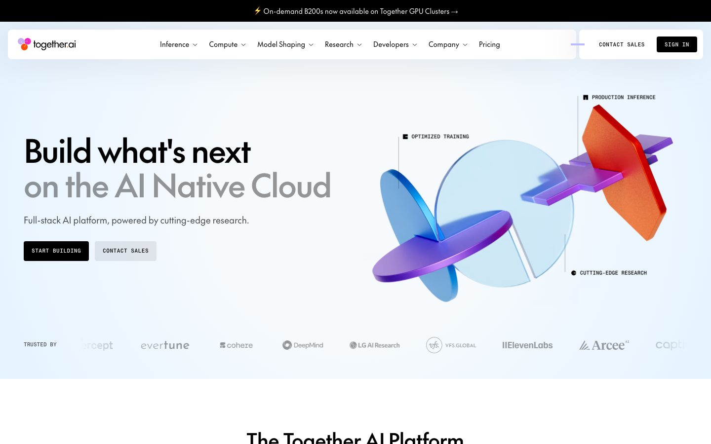
A research-lab-meets-developer-cloud interface anchored on pure white canvas with hard-edged (0px radius) black CTAs and the custom geometric grotesque "The Future" typeface. The system reads as precise and technical — sharp rectangular buttons and cards, pastel-tinted stat blocks (sky-blue, lilac, aqua), a near-black research band that anchors the mid-page, and a monochrome utility nav. Brand voltage comes from the 3D iridescent hero render and the candy-pastel surface tints rather than from heavy color elsewhere.
---
version: alpha
name: Together.ai-design-analysis
description: A research-lab-meets-developer-cloud interface anchored on pure white canvas with hard-edged (0px radius) black CTAs and the custom geometric grotesque "The Future" typeface. The system reads as precise and technical — sharp rectangular buttons and cards, pastel-tinted stat blocks (sky-blue, lilac, aqua), a near-black research band that anchors the mid-page, and a monochrome utility nav. Brand voltage comes from the 3D iridescent hero render and the candy-pastel surface tints rather than from heavy color elsewhere.

colors:
  primary: "#000000"
  ink: "#000000"
  ink-soft: "#13171b"
  body: "#333333"
  neutral-strong: "#222222"
  muted: "#999999"
  hairline: "#dddddd"
  hairline-soft: "#cccccc"
  hairline-warm: "#d3d1d1"
  canvas: "#ffffff"
  surface-50: "#fafafa"
  surface-pale: "#f6fafd"
  surface-cool: "#f3f6fa"
  surface-sky: "#e5f3ff"
  surface-cyan: "#c8f6f9"
  surface-aqua: "#70e9f0"
  card-blue: "#c1dff9"
  surface-dark: "#13171b"
  accent-lilac: "#bdbbff"
  accent-lilac-soft: "#dfddfe"
  accent-blue: "#0f6fff"
  accent-blue-bright: "#3898ec"
  on-dark: "#ffffff"

typography:
  display:
    fontFamily: "The Future, Space Grotesk, sans-serif"
    fontSize: 64px
    fontWeight: 500
    lineHeight: 1.1
    letterSpacing: -1.92px
  heading:
    fontFamily: "The Future, Space Grotesk, sans-serif"
    fontSize: 40px
    fontWeight: 500
    lineHeight: 1.2
    letterSpacing: -0.8px
  body:
    fontFamily: "The Future, Space Grotesk, sans-serif"
    fontSize: 14px
    fontWeight: 400
    lineHeight: 1.4
    letterSpacing: 0
  button:
    fontFamily: "The Future, Space Grotesk, sans-serif"
    fontSize: 16px
    fontWeight: 400
    lineHeight: 1.25
    letterSpacing: 0

rounded:
  none: 0px
  sm: 4px
  md: 8px
  lg: 16px

spacing:
  xxs: 4px
  micro: 6px
  xs: 8px
  sm: 12px
  md: 16px
  lg: 20px
  xl: 24px
  xxl: 32px
  x3: 40px
  x4: 48px
  x5: 64px
  section: 88px

components:
  announcement-bar:
    backgroundColor: "{colors.ink}"
    textColor: "{colors.on-dark}"
    typography: "{typography.body}"
    rounded: "{rounded.none}"
  top-nav:
    backgroundColor: "{colors.canvas}"
    textColor: "{colors.ink}"
    typography: "{typography.body}"
    rounded: "{rounded.none}"
    height: 64px
  nav-link:
    backgroundColor: transparent
    textColor: "{colors.ink}"
    typography: "{typography.body}"
  button-primary:
    backgroundColor: "{colors.ink}"
    textColor: "{colors.on-dark}"
    typography: "{typography.button}"
    rounded: "{rounded.none}"
    padding: 16px 24px
  button-secondary:
    backgroundColor: "{colors.surface-cool}"
    textColor: "{colors.ink}"
    typography: "{typography.button}"
    rounded: "{rounded.none}"
    padding: 16px 24px
  hero-band:
    backgroundColor: "{colors.surface-pale}"
    textColor: "{colors.ink}"
    typography: "{typography.display}"
    padding: 88px
  stat-card:
    backgroundColor: "{colors.card-blue}"
    textColor: "{colors.ink}"
    typography: "{typography.heading}"
    rounded: "{rounded.none}"
    padding: 24px
  tab-switcher:
    backgroundColor: "{colors.canvas}"
    textColor: "{colors.body}"
    typography: "{typography.body}"
    rounded: "{rounded.none}"
    padding: 16px
  tab-active:
    backgroundColor: "{colors.surface-cyan}"
    textColor: "{colors.ink}"
    typography: "{typography.body}"
    rounded: "{rounded.none}"
    padding: 16px
  feature-panel:
    backgroundColor: "{colors.surface-pale}"
    textColor: "{colors.ink}"
    typography: "{typography.body}"
    rounded: "{rounded.none}"
    padding: 24px
  research-band:
    backgroundColor: "{colors.surface-dark}"
    textColor: "{colors.on-dark}"
    typography: "{typography.heading}"
    padding: 88px
  research-card:
    backgroundColor: "{colors.surface-dark}"
    textColor: "{colors.on-dark}"
    typography: "{typography.body}"
    rounded: "{rounded.none}"
    padding: 24px
  customer-story-card:
    backgroundColor: "{colors.canvas}"
    textColor: "{colors.ink}"
    typography: "{typography.body}"
    rounded: "{rounded.lg}"
    padding: 20px
  blog-list-item:
    backgroundColor: "{colors.canvas}"
    textColor: "{colors.ink}"
    typography: "{typography.body}"
    rounded: "{rounded.none}"
  category-label:
    backgroundColor: "{colors.surface-cool}"
    textColor: "{colors.ink}"
    typography: "{typography.body}"
    rounded: "{rounded.sm}"
    padding: 4px 8px
  footer:
    backgroundColor: "{colors.canvas}"
    textColor: "{colors.body}"
    typography: "{typography.body}"
    padding: 88px
---

## Overview

Together.ai's marketing surface is a precise, developer-cloud-meets-research-lab interface — pure white canvas (`{colors.canvas}` — #ffffff) with hard-edged black CTAs (`{colors.primary}` — #000000) and the custom geometric grotesque **The Future** running every text role. The system reads as technical and confident: rectangular buttons with **0px corners** (`{rounded.none}`), candy-pastel stat blocks, and a near-black research band that anchors the long-scroll page mid-fold.

Brand voltage comes from two sources: the **3D iridescent hero render** (a glassy turbine of blue, purple, and orange shapes) and a **pastel tint family** used on surface blocks — sky-blue card surface (`{colors.card-blue}` — #c1dff9), cyan tab highlight (`{colors.surface-cyan}` — #c8f6f9), and the lilac accent (`{colors.accent-lilac}` — #bdbbff). Color elsewhere stays restrained: text is black-on-white, and the only chromatic CTA accent is a true blue (`{colors.accent-blue}` — #0f6fff) used sparingly on links.

Type voice is unusually monolithic: **The Future** carries display, heading, body, AND button — a single geometric grotesque at weights 400 (body/button) and 500 (display/heading), with aggressive negative tracking on the large sizes (-1.92px on h1). There is no secondary body face. The discipline is the brand.

The structural signature is **hard edges**. Buttons and major cards measure 0px radius; only customer-story cards and small category labels carry rounding. The combination of sharp rectangles, pastel tints, and a single grotesque typeface reads as engineered-precision rather than friendly-SaaS.

**Key Characteristics:**
- White canvas with pure-black, square-cornered primary CTA (`{component.button-primary}` — `{colors.ink}` at `{rounded.none}`). No radius softening — the rectangle is the brand.
- Single typeface across all roles: **The Future** (substituted with Space Grotesk here), 400/500 weights, heavy negative tracking on display.
- Pastel surface tint family — sky-blue `{colors.card-blue}`, cyan `{colors.surface-cyan}`, aqua `{colors.surface-aqua}`, lilac `{colors.accent-lilac}`. Used on stat blocks and tab highlights; never on CTAs.
- A near-black research band (`{colors.surface-dark}` — #13171b) anchors the mid-page — the only dark surface, used to frame the "cutting-edge research" section.
- Hard-edged geometry: `{rounded.none}` (0px) on buttons + stat cards, `{rounded.sm}` (4px) the dominant small radius, `{rounded.lg}` (16px) appearing only once (customer-story card).
- Minimal elevation — two soft shadows (`rgba(1,1,32,0.1) 0px 4px 10px` and a `-10px 0px 75px` wide bloom) used sparingly; most surfaces are flat.
- Section rhythm at `{spacing.section}` (88px) between major bands — a high-frequency measured value.

## Colors

### Brand & Accent
- **Primary / Ink** (`{colors.primary}` / `{colors.ink}` — #000000): The dominant action and text color. All primary CTAs, the h1/h2 display type, the SIGN IN button, and the black announcement bar.
- **Accent Blue** (`{colors.accent-blue}` — #0f6fff): A true blue used sparingly on inline links and small interactive accents.
- **Accent Blue Bright** (`{colors.accent-blue-bright}` — #3898ec): A slightly lighter blue appearing in iconography and link states.
- **Accent Lilac** (`{colors.accent-lilac}` — #bdbbff): The most frequent chromatic accent — a soft periwinkle used in the 3D render and small UI tints. **Accent Lilac Soft** (`{colors.accent-lilac-soft}` — #dfddfe) is its paler companion.

### Surface
- **Canvas** (`{colors.canvas}` — #ffffff): The default page floor.
- **Surface 50 / Pale / Cool** (`{colors.surface-50}` — #fafafa, `{colors.surface-pale}` — #f6fafd, `{colors.surface-cool}` — #f3f6fa): A trio of barely-tinted near-whites used for the hero band, feature panels, and the secondary-button fill. Pale carries a faint blue cast; cool a faint gray.
- **Surface Sky** (`{colors.surface-sky}` — #e5f3ff): Light blue section tint.
- **Surface Cyan** (`{colors.surface-cyan}` — #c8f6f9): The active-tab highlight in the full-stack-cloud switcher.
- **Surface Aqua** (`{colors.surface-aqua}` — #70e9f0): A brighter teal used in accent moments and the 3D render.
- **Card Blue** (`{colors.card-blue}` — #c1dff9): The measured card background — the sky-blue stat block ("2x faster inference").
- **Surface Dark** (`{colors.surface-dark}` — #13171b): The near-black research band and its nested research cards — the only dark surface in the system.

### Text
- **Ink** (`{colors.ink}` — #000000): All headlines and primary text.
- **Body** (`{colors.body}` — #333333): Default running-text color.
- **Neutral Strong** (`{colors.neutral-strong}` — #222222): A slightly heavier dark-gray for emphasis text.
- **Muted** (`{colors.muted}` — #999999): Secondary text — captions, "TRUSTED BY" label, fine print.
- **On Dark** (`{colors.on-dark}` — #ffffff): Text on the black announcement bar, black CTA, and the dark research band.

### Lines
- **Hairline** (`{colors.hairline}` — #dddddd): The 1px divider tone between blog-list rows and footer sections.
- **Hairline Soft** (`{colors.hairline-soft}` — #cccccc) and **Hairline Warm** (`{colors.hairline-warm}` — #d3d1d1): Alternate divider tones for lighter / warmer contexts.

> No semantic success/warning/error colors were measured — see Known Gaps.

## Typography

### Font Family
The entire system runs a single typeface: **The Future** — a custom geometric grotesque with a slightly humanist 'a' and tight apertures. It is used for every role: display headlines, section headings, body copy, and button labels. Weight 500 carries the display + heading sizes; weight 400 carries body + button. The signature move is **heavy negative letter-spacing on large sizes** (-1.92px on the 64px h1, -0.8px on the 40px h2), which collapses the display type into a tight, engineered block.

**The Future** is a licensed commercial typeface (it was not flagged in `fonts_licensed`, but it is not a free web font). If unavailable, **Space Grotesk** is the closest open-source substitute — a geometric grotesque with similar proportions and a comparable feel under negative tracking. **Neue Haas Grotesk Display** or **Inter** at weight 500 with -0.03em tracking are usable fallbacks. The fallback stack walks `The Future, Space Grotesk, sans-serif`.

### Hierarchy

| Token | Size | Weight | Line Height | Letter Spacing | Use |
|---|---|---|---|---|---|
| `{typography.display}` | 64px | 500 | 1.1 | -1.92px | Hero h1 ("Build what's next on the AI Native Cloud") |
| `{typography.heading}` | 40px | 500 | 1.2 | -0.8px | Section heads ("The Together AI Platform", "Full-stack cloud"), stat numbers |
| `{typography.body}` | 14px | 400 | 1.4 | 0 | All running text, nav links, captions, list items |
| `{typography.button}` | 16px | 400 | 1.25 | 0 | Button labels (START BUILDING, CONTACT SALES) |

### Principles
The single-typeface discipline IS the brand voice. Hierarchy is built from size + weight, never from family contrast. Display sizes (500 weight) get aggressive negative tracking; body and buttons (400 weight) sit at normal tracking. Note that button labels (16px) are LARGER than body text (14px) — the system pushes interactive labels up rather than bolding them. Never inflate body weight to 500 or display weight to 700 — the system stays at 400/500.

## Layout

### Spacing System
- **Base unit:** 4px, with a heavily-used 8px step (231 occurrences) and 16px step (213 occurrences).
- **Tokens:** `{spacing.xxs}` 4px · `{spacing.micro}` 6px · `{spacing.xs}` 8px · `{spacing.sm}` 12px · `{spacing.md}` 16px · `{spacing.lg}` 20px · `{spacing.xl}` 24px · `{spacing.xxl}` 32px · `{spacing.x3}` 40px · `{spacing.x4}` 48px · `{spacing.x5}` 64px · `{spacing.section}` 88px.
- **Section padding:** `{spacing.section}` (88px) — the dominant large rhythm (77 occurrences), used between major editorial bands.
- **Card internal padding:** `{spacing.xl}` (24px) for stat cards and feature panels; `{spacing.lg}` (20px) for customer-story cards.
- **Tight clusters:** `{spacing.xs}` (8px) and `{spacing.md}` (16px) handle most inline gaps (icon + label, button rows, list spacing).

### Grid & Container
- **Max content width:** ~1280px centered on marketing pages.
- **Hero band:** Two-column split — h1 + sub-head + button row on the left, 3D render on the right.
- **Stat blocks:** 3-up at desktop (sky-blue / pink / peach tinted), full-width band.
- **Customer stories:** 3-up card grid.
- **Footer:** 4-column link list (Products / Models / Developers / Resources).

### Whitespace Philosophy
Together.ai uses 88px section rhythm with comparatively dense 14px body type — the result reads as information-rich-but-organized, typical of developer-cloud marketing. Bands alternate between white canvas, pale-tinted panels, and the single near-black research band to pace the long scroll.

## Elevation & Depth

| Level | Treatment | Use |
|---|---|---|
| Flat | No shadow, no border | Body sections, top nav, stat cards, research band |
| Soft drop shadow | `rgba(1,1,32,0.1) 0px 4px 10px 0px` | Floating panels, the hero code-mockup, elevated cards |
| Wide bloom | `rgba(1,1,32,0.1) -10px 0px 75px 0px` | A large soft directional glow behind floating product UI |

The elevation philosophy is **mostly flat**. The measured card carries `shadow: none` — most surfaces sit flat on the canvas, separated by color tint or hairline rather than shadow. The two measured shadows use a deep near-black-blue alpha (`rgba(1,1,32,0.1)`) and appear only on floating product-UI panels. No neumorphism, no glassmorphism.

### Decorative Depth
- The 3D iridescent hero render (blue/purple/orange glassy turbine shapes) is the system's single decorative depth moment — it is illustration, not a system token.
- Pastel surface tints (`{colors.card-blue}`, `{colors.surface-cyan}`) do the visual separation work that shadows would in a softer system.

## Shapes

### Border Radius Scale

| Token | Value | Use |
|---|---|---|
| `{rounded.none}` | 0px | Primary buttons, secondary buttons, stat cards, tab switcher — the dominant treatment |
| `{rounded.sm}` | 4px | The most frequent measured radius (281 occurrences) — small labels, inline chips, input fields |
| `{rounded.md}` | 8px | Mid-size elements (39 occurrences) — some panels and form controls |
| `{rounded.lg}` | 16px | Appears once (1 occurrence) — the customer-story card |

### Shape Philosophy
The system is fundamentally **hard-edged**. Both measured components (button-primary, card) report 0px radius. The 4px radius dominates small UI controls, but anything large — buttons, stat blocks, the research band, tab switcher — stays perfectly square. The single 16px instance (customer-story card) is the rare exception, not the rule. Sharp rectangles are the structural identity.

### Photography & Render Geometry
- Customer-story cards use full-bleed photography with `{rounded.lg}` (16px) corners — the only rounded photo treatment.
- The hero 3D render floats without a container frame.
- Logo wall ("TRUSTED BY") uses grayscale wordmarks at consistent baseline, no frames.

## Components

### Announcement & Navigation

**`announcement-bar`** — A full-width black strip pinned above the nav ("⚡ On-demand B200s now available on Together GPU Clusters →"). Background `{colors.ink}`, text `{colors.on-dark}`, type `{typography.body}`, square corners.

**`top-nav`** — White nav bar, 64px tall, `{colors.canvas}` background. Carries the together.ai wordmark + dot-cluster logo at left, a center menu (Inference, Compute, Model Shaping, Research, Developers, Company, Pricing) with dropdown carets, and a right cluster: "CONTACT SALES" (`{component.button-secondary}` style) + black "SIGN IN" (`{component.button-primary}`). Menu items in `{typography.body}` (The Future 14px / 400).

**`nav-link`** — Inline nav menu item, transparent background, `{colors.ink}` text, `{typography.body}`.

### Buttons

**`button-primary`** — The signature CTA. Background `{colors.ink}` (#000000), text `{colors.on-dark}`, type `{typography.button}` (The Future 16px / 400), `{rounded.none}` (0px square corners). Padding derived from screenshots as ~16px × 24px (the measured `padding: 0px` is a capture artifact — see Known Gaps). Used for START BUILDING, SIGN IN, GET STARTED NOW.

**`button-secondary`** — Light companion button (CONTACT SALES). Background `{colors.surface-cool}` (#f3f6fa), text `{colors.ink}`, same square corners and type. Sits beside the primary in hero + CTA rows.

### Bands & Cards

**`hero-band`** — Pale-tinted hero (`{colors.surface-pale}`) with a two-column split: display h1 + sub-head + button row on the left, the 3D iridescent render on the right. Vertical padding `{spacing.section}` (88px).

**`stat-card`** — The measured card. Background `{colors.card-blue}` (#c1dff9 — sky-blue), `{rounded.none}`, no shadow, padding `{spacing.xl}` (24px). Carries a small uppercase label ("FASTER INFERENCE"), a large `{typography.heading}` number ("2x"), and a `{typography.body}` description. Rendered in a 3-up band with sibling pink and peach tints (those tints not measured — see Known Gaps).

**`tab-switcher`** + **`tab-active`** — The full-stack-cloud product switcher (Inference / Compute / Model shaping). Inactive tabs: `{colors.canvas}` background, `{colors.body}` text. Active tab: `{colors.surface-cyan}` (#c8f6f9) background, `{colors.ink}` text. Square corners, 16px padding.

**`feature-panel`** — The light panel below the tab switcher showing serverless/batch inference options + a product code-mockup. Background `{colors.surface-pale}`, `{rounded.none}`, padding `{spacing.xl}` (24px). The embedded code mockup carries the soft drop shadow.

**`research-band`** — The near-black mid-page band ("Grounded in cutting-edge research"). Background `{colors.surface-dark}` (#13171b), text `{colors.on-dark}`, type `{typography.heading}`, padding `{spacing.section}` (88px). The only dark band on the page.

**`research-card`** — Dark cards nested inside the research band (Violin, Parcae, EinsteinArena papers). Background `{colors.surface-dark}`, text `{colors.on-dark}`, square corners, padding `{spacing.xl}` (24px). Each carries an uppercase category tag, a paper title, and author line.

**`customer-story-card`** — Used in the "AI natives build on Together AI" 3-up grid (Cursor, Decagon, Vercept). Full-bleed photography with `{rounded.lg}` (16px) corners — the system's only rounded card. Overlaid title + metric in `{colors.on-dark}`. Padding `{spacing.lg}` (20px).

**`blog-list-item`** — Rows in "What's new at Together AI". Background `{colors.canvas}`, `{rounded.none}`, separated by `{colors.hairline}` dividers. Each carries a `{component.category-label}`, a `{typography.body}` headline, and a muted summary.

**`category-label`** — Small uppercase tag ("INFERENCE", "COMPANY", "AGENTS"). Background `{colors.surface-cool}`, text `{colors.ink}`, type `{typography.body}`, `{rounded.sm}` (4px), padding 4px × 8px.

### Footer

**`footer`** — White footer (NOT dark — together.ai keeps the footer on canvas). Background `{colors.canvas}`, text `{colors.body}`, type `{typography.body}`, padding `{spacing.section}` (88px). 4-column link list (Products / Models / Developers / Resources), the dot-cluster logo top-left, a large ghosted "together.ai" wordmark watermark, and a bottom legal row in `{colors.muted}`.

## Do's and Don'ts

### Do
- Keep primary buttons pure black (`{colors.ink}`) with square `{rounded.none}` corners. The hard rectangle is the brand.
- Use The Future for every text role. The single-typeface discipline is intentional — build hierarchy with size + weight, not family contrast.
- Apply heavy negative tracking (-1.92px / -0.8px) on display + heading sizes. The tight display block is the typographic signature.
- Use the pastel tint family (`{colors.card-blue}`, `{colors.surface-cyan}`, `{colors.accent-lilac}`) on surface blocks and tab highlights — never on CTAs.
- Reserve the dark band (`{colors.surface-dark}`) for the research section. It is the only dark surface and anchors the page mid-fold.
- Let button labels (16px) read larger than body (14px) — the system pushes interactive labels up rather than bolding them.
- Keep most surfaces flat; use color tint and hairlines for separation, not shadows.

### Don't
- Don't round buttons or stat cards. The 16px radius is reserved for the single customer-story card.
- Don't bold body text to 500 or push display to 700 — the system lives at 400/500.
- Don't use accent blue (`{colors.accent-blue}`) as a CTA fill — CTAs are black. Blue is for inline links only.
- Don't add dark cards outside the research band. The dark surface is scarce and deliberate.
- Don't substitute a humanist body face — if The Future is unavailable, use a geometric grotesque (Space Grotesk), not Inter-as-body, to preserve the engineered character.
- Don't add hover-state styling beyond the system's default + pressed treatment.

## Responsive Behavior

### Breakpoints

| Name | Width | Key Changes |
|---|---|---|
| Mobile | < 768px | Hamburger nav; hero h1 64→~32px; 3D render stacks below copy; stat cards 3-up → 1-up; story cards 1-up; footer 4 cols → stacked |
| Tablet | 768–1024px | Nav tightens, may collapse to hamburger; stat cards 2-up; story cards 2-up |
| Desktop | 1024–1440px | Full horizontal nav; 3-up stat / story grids; two-column hero |
| Wide | > 1440px | Same as desktop, content caps ~1280px with added outer margin |

### Touch Targets
- `{component.button-primary}` and `{component.button-secondary}` derive a ~48px effective height from ~16px vertical padding + 16px label.
- Nav links and tab-switcher tabs use 16px padding for comfortable tap areas.
- Note: precise mobile button heights are derived from screenshot proportions, not measured.

### Collapsing Strategy
- Top nav collapses to a hamburger menu on mobile; the right-side CONTACT SALES / SIGN IN cluster moves into the menu sheet.
- Hero two-column split stacks to single column — copy + buttons first, 3D render below.
- Stat-card and customer-story grids reduce column count rather than scaling cards.
- The dark research band stays full-width and full-bleed at every breakpoint.

### Image Behavior
- The 3D hero render scales proportionally and may crop on narrow viewports.
- Customer-story photography retains 16px-rounded corners and crops to fit the card.
- "TRUSTED BY" logo wall scrolls horizontally / wraps on small screens.

## Iteration Guide

1. Focus on ONE component at a time. Reference its YAML key directly (`{component.stat-card}`, `{component.research-band}`).
2. Variants of an existing component (`-active`, `-secondary`) live as separate entries in `components:`.
3. Use `{token.refs}` everywhere — never inline hex.
4. Never document hover. Default and Active/Pressed states only.
5. Keep the single-typeface discipline — all text is The Future; build hierarchy with size + weight.
6. Hard edges are default: `{rounded.none}` for buttons and cards unless explicitly the customer-story card.
7. The dark research band is the only dark surface — don't add others casually.
8. When in doubt about emphasis: bigger display before bolder body.

## Known Gaps

- The measured `button-primary` reports `radius: 0px` and `padding: 0px` — the radius is faithful (the buttons are visibly square), but `padding: 0px` is a capture artifact; the documented 16px × 24px padding is **derived** from screenshot proportions.
- The 3-up stat band shows sky-blue, pink, and peach tinted cards. Only the sky-blue (`{colors.card-blue}` — #c1dff9) was measured; the pink and peach tints were not captured and are NOT documented as tokens.
- No semantic colors (success / warning / error) were measured — they would require a sign-up or product flow to surface.
- **The Future** is a licensed commercial typeface (not flagged in the capture's `fonts_licensed` array but not a free web font); Space Grotesk is documented as the open substitute. Exact metric matching is not guaranteed.
- Typography capture returned only four roles (display, heading, body, button). Intermediate sizes (h3, small-caps labels, footer fine print) are visible in screenshots but were not individually measured — they are approximated within the documented roles.
- The pricing page was captured but no pricing-specific tokens (table styles, tier cards) were extracted; those components are out of scope here.
- Animation and transition timings (3D render motion, tab-switch reveal, dropdown menus) are not in scope.
- Exact 3D-render gradient colors (the iridescent blue/purple/orange turbine) are illustration assets, not system tokens, and are not documented.

<!-- Documented by duply · real-world design systems as ready-to-use DESIGN.md for AI coding agents · https://duply.ai/together/design-md -->
Color Palette
Accent
Neutrals
Typography
display64px · 500 · 1.1
The quick brown fox jumpsheading40px · 500 · 1.2
The quick brown fox jumpsbody14px · 400 · 1.4
The quick brown fox jumpsbutton16px · 400 · 1.25
The quick brown fox jumpsSpacing & Shape
Spacing
| Name | Value | Preview |
|---|---|---|
| xxs | 4px | |
| micro | 6px | |
| xs | 8px | |
| sm | 12px | |
| md | 16px | |
| lg | 20px | |
| xl | 24px | |
| xxl | 32px | |
| x3 | 40px | |
| x4 | 48px | |
| x5 | 64px | |
| section | 88px |
Border Radius
| Name | Value | Preview |
|---|---|---|
| none | 0px | |
| sm | 4px | |
| md | 8px | |
| lg | 16px |
More like this


---
version: alpha
name: Together.ai-design-analysis
description: A research-lab-meets-developer-cloud interface anchored on pure white canvas with hard-edged (0px radius) black CTAs and the custom geometric grotesque "The Future" typeface. The system reads as precise and technical — sharp rectangular buttons and cards, pastel-tinted stat blocks (sky-blue, lilac, aqua), a near-black research band that anchors the mid-page, and a monochrome utility nav. Brand voltage comes from the 3D iridescent hero render and the candy-pastel surface tints rather than from heavy color elsewhere.

colors:
  primary: "#000000"
  ink: "#000000"
  ink-soft: "#13171b"
  body: "#333333"
  neutral-strong: "#222222"
  muted: "#999999"
  hairline: "#dddddd"
  hairline-soft: "#cccccc"
  hairline-warm: "#d3d1d1"
  canvas: "#ffffff"
  surface-50: "#fafafa"
  surface-pale: "#f6fafd"
  surface-cool: "#f3f6fa"
  surface-sky: "#e5f3ff"
  surface-cyan: "#c8f6f9"
  surface-aqua: "#70e9f0"
  card-blue: "#c1dff9"
  surface-dark: "#13171b"
  accent-lilac: "#bdbbff"
  accent-lilac-soft: "#dfddfe"
  accent-blue: "#0f6fff"
  accent-blue-bright: "#3898ec"
  on-dark: "#ffffff"

typography:
  display:
    fontFamily: "The Future, Space Grotesk, sans-serif"
    fontSize: 64px
    fontWeight: 500
    lineHeight: 1.1
    letterSpacing: -1.92px
  heading:
    fontFamily: "The Future, Space Grotesk, sans-serif"
    fontSize: 40px
    fontWeight: 500
    lineHeight: 1.2
    letterSpacing: -0.8px
  body:
    fontFamily: "The Future, Space Grotesk, sans-serif"
    fontSize: 14px
    fontWeight: 400
    lineHeight: 1.4
    letterSpacing: 0
  button:
    fontFamily: "The Future, Space Grotesk, sans-serif"
    fontSize: 16px
    fontWeight: 400
    lineHeight: 1.25
    letterSpacing: 0

rounded:
  none: 0px
  sm: 4px
  md: 8px
  lg: 16px

spacing:
  xxs: 4px
  micro: 6px
  xs: 8px
  sm: 12px
  md: 16px
  lg: 20px
  xl: 24px
  xxl: 32px
  x3: 40px
  x4: 48px
  x5: 64px
  section: 88px

components:
  announcement-bar:
    backgroundColor: "{colors.ink}"
    textColor: "{colors.on-dark}"
    typography: "{typography.body}"
    rounded: "{rounded.none}"
  top-nav:
    backgroundColor: "{colors.canvas}"
    textColor: "{colors.ink}"
    typography: "{typography.body}"
    rounded: "{rounded.none}"
    height: 64px
  nav-link:
    backgroundColor: transparent
    textColor: "{colors.ink}"
    typography: "{typography.body}"
  button-primary:
    backgroundColor: "{colors.ink}"
    textColor: "{colors.on-dark}"
    typography: "{typography.button}"
    rounded: "{rounded.none}"
    padding: 16px 24px
  button-secondary:
    backgroundColor: "{colors.surface-cool}"
    textColor: "{colors.ink}"
    typography: "{typography.button}"
    rounded: "{rounded.none}"
    padding: 16px 24px
  hero-band:
    backgroundColor: "{colors.surface-pale}"
    textColor: "{colors.ink}"
    typography: "{typography.display}"
    padding: 88px
  stat-card:
    backgroundColor: "{colors.card-blue}"
    textColor: "{colors.ink}"
    typography: "{typography.heading}"
    rounded: "{rounded.none}"
    padding: 24px
  tab-switcher:
    backgroundColor: "{colors.canvas}"
    textColor: "{colors.body}"
    typography: "{typography.body}"
    rounded: "{rounded.none}"
    padding: 16px
  tab-active:
    backgroundColor: "{colors.surface-cyan}"
    textColor: "{colors.ink}"
    typography: "{typography.body}"
    rounded: "{rounded.none}"
    padding: 16px
  feature-panel:
    backgroundColor: "{colors.surface-pale}"
    textColor: "{colors.ink}"
    typography: "{typography.body}"
    rounded: "{rounded.none}"
    padding: 24px
  research-band:
    backgroundColor: "{colors.surface-dark}"
    textColor: "{colors.on-dark}"
    typography: "{typography.heading}"
    padding: 88px
  research-card:
    backgroundColor: "{colors.surface-dark}"
    textColor: "{colors.on-dark}"
    typography: "{typography.body}"
    rounded: "{rounded.none}"
    padding: 24px
  customer-story-card:
    backgroundColor: "{colors.canvas}"
    textColor: "{colors.ink}"
    typography: "{typography.body}"
    rounded: "{rounded.lg}"
    padding: 20px
  blog-list-item:
    backgroundColor: "{colors.canvas}"
    textColor: "{colors.ink}"
    typography: "{typography.body}"
    rounded: "{rounded.none}"
  category-label:
    backgroundColor: "{colors.surface-cool}"
    textColor: "{colors.ink}"
    typography: "{typography.body}"
    rounded: "{rounded.sm}"
    padding: 4px 8px
  footer:
    backgroundColor: "{colors.canvas}"
    textColor: "{colors.body}"
    typography: "{typography.body}"
    padding: 88px
---

## Overview

Together.ai's marketing surface is a precise, developer-cloud-meets-research-lab interface — pure white canvas (`{colors.canvas}` — #ffffff) with hard-edged black CTAs (`{colors.primary}` — #000000) and the custom geometric grotesque **The Future** running every text role. The system reads as technical and confident: rectangular buttons with **0px corners** (`{rounded.none}`), candy-pastel stat blocks, and a near-black research band that anchors the long-scroll page mid-fold.

Brand voltage comes from two sources: the **3D iridescent hero render** (a glassy turbine of blue, purple, and orange shapes) and a **pastel tint family** used on surface blocks — sky-blue card surface (`{colors.card-blue}` — #c1dff9), cyan tab highlight (`{colors.surface-cyan}` — #c8f6f9), and the lilac accent (`{colors.accent-lilac}` — #bdbbff). Color elsewhere stays restrained: text is black-on-white, and the only chromatic CTA accent is a true blue (`{colors.accent-blue}` — #0f6fff) used sparingly on links.

Type voice is unusually monolithic: **The Future** carries display, heading, body, AND button — a single geometric grotesque at weights 400 (body/button) and 500 (display/heading), with aggressive negative tracking on the large sizes (-1.92px on h1). There is no secondary body face. The discipline is the brand.

The structural signature is **hard edges**. Buttons and major cards measure 0px radius; only customer-story cards and small category labels carry rounding. The combination of sharp rectangles, pastel tints, and a single grotesque typeface reads as engineered-precision rather than friendly-SaaS.

**Key Characteristics:**
- White canvas with pure-black, square-cornered primary CTA (`{component.button-primary}` — `{colors.ink}` at `{rounded.none}`). No radius softening — the rectangle is the brand.
- Single typeface across all roles: **The Future** (substituted with Space Grotesk here), 400/500 weights, heavy negative tracking on display.
- Pastel surface tint family — sky-blue `{colors.card-blue}`, cyan `{colors.surface-cyan}`, aqua `{colors.surface-aqua}`, lilac `{colors.accent-lilac}`. Used on stat blocks and tab highlights; never on CTAs.
- A near-black research band (`{colors.surface-dark}` — #13171b) anchors the mid-page — the only dark surface, used to frame the "cutting-edge research" section.
- Hard-edged geometry: `{rounded.none}` (0px) on buttons + stat cards, `{rounded.sm}` (4px) the dominant small radius, `{rounded.lg}` (16px) appearing only once (customer-story card).
- Minimal elevation — two soft shadows (`rgba(1,1,32,0.1) 0px 4px 10px` and a `-10px 0px 75px` wide bloom) used sparingly; most surfaces are flat.
- Section rhythm at `{spacing.section}` (88px) between major bands — a high-frequency measured value.

## Colors

### Brand & Accent
- **Primary / Ink** (`{colors.primary}` / `{colors.ink}` — #000000): The dominant action and text color. All primary CTAs, the h1/h2 display type, the SIGN IN button, and the black announcement bar.
- **Accent Blue** (`{colors.accent-blue}` — #0f6fff): A true blue used sparingly on inline links and small interactive accents.
- **Accent Blue Bright** (`{colors.accent-blue-bright}` — #3898ec): A slightly lighter blue appearing in iconography and link states.
- **Accent Lilac** (`{colors.accent-lilac}` — #bdbbff): The most frequent chromatic accent — a soft periwinkle used in the 3D render and small UI tints. **Accent Lilac Soft** (`{colors.accent-lilac-soft}` — #dfddfe) is its paler companion.

### Surface
- **Canvas** (`{colors.canvas}` — #ffffff): The default page floor.
- **Surface 50 / Pale / Cool** (`{colors.surface-50}` — #fafafa, `{colors.surface-pale}` — #f6fafd, `{colors.surface-cool}` — #f3f6fa): A trio of barely-tinted near-whites used for the hero band, feature panels, and the secondary-button fill. Pale carries a faint blue cast; cool a faint gray.
- **Surface Sky** (`{colors.surface-sky}` — #e5f3ff): Light blue section tint.
- **Surface Cyan** (`{colors.surface-cyan}` — #c8f6f9): The active-tab highlight in the full-stack-cloud switcher.
- **Surface Aqua** (`{colors.surface-aqua}` — #70e9f0): A brighter teal used in accent moments and the 3D render.
- **Card Blue** (`{colors.card-blue}` — #c1dff9): The measured card background — the sky-blue stat block ("2x faster inference").
- **Surface Dark** (`{colors.surface-dark}` — #13171b): The near-black research band and its nested research cards — the only dark surface in the system.

### Text
- **Ink** (`{colors.ink}` — #000000): All headlines and primary text.
- **Body** (`{colors.body}` — #333333): Default running-text color.
- **Neutral Strong** (`{colors.neutral-strong}` — #222222): A slightly heavier dark-gray for emphasis text.
- **Muted** (`{colors.muted}` — #999999): Secondary text — captions, "TRUSTED BY" label, fine print.
- **On Dark** (`{colors.on-dark}` — #ffffff): Text on the black announcement bar, black CTA, and the dark research band.

### Lines
- **Hairline** (`{colors.hairline}` — #dddddd): The 1px divider tone between blog-list rows and footer sections.
- **Hairline Soft** (`{colors.hairline-soft}` — #cccccc) and **Hairline Warm** (`{colors.hairline-warm}` — #d3d1d1): Alternate divider tones for lighter / warmer contexts.

> No semantic success/warning/error colors were measured — see Known Gaps.

## Typography

### Font Family
The entire system runs a single typeface: **The Future** — a custom geometric grotesque with a slightly humanist 'a' and tight apertures. It is used for every role: display headlines, section headings, body copy, and button labels. Weight 500 carries the display + heading sizes; weight 400 carries body + button. The signature move is **heavy negative letter-spacing on large sizes** (-1.92px on the 64px h1, -0.8px on the 40px h2), which collapses the display type into a tight, engineered block.

**The Future** is a licensed commercial typeface (it was not flagged in `fonts_licensed`, but it is not a free web font). If unavailable, **Space Grotesk** is the closest open-source substitute — a geometric grotesque with similar proportions and a comparable feel under negative tracking. **Neue Haas Grotesk Display** or **Inter** at weight 500 with -0.03em tracking are usable fallbacks. The fallback stack walks `The Future, Space Grotesk, sans-serif`.

### Hierarchy

| Token | Size | Weight | Line Height | Letter Spacing | Use |
|---|---|---|---|---|---|
| `{typography.display}` | 64px | 500 | 1.1 | -1.92px | Hero h1 ("Build what's next on the AI Native Cloud") |
| `{typography.heading}` | 40px | 500 | 1.2 | -0.8px | Section heads ("The Together AI Platform", "Full-stack cloud"), stat numbers |
| `{typography.body}` | 14px | 400 | 1.4 | 0 | All running text, nav links, captions, list items |
| `{typography.button}` | 16px | 400 | 1.25 | 0 | Button labels (START BUILDING, CONTACT SALES) |

### Principles
The single-typeface discipline IS the brand voice. Hierarchy is built from size + weight, never from family contrast. Display sizes (500 weight) get aggressive negative tracking; body and buttons (400 weight) sit at normal tracking. Note that button labels (16px) are LARGER than body text (14px) — the system pushes interactive labels up rather than bolding them. Never inflate body weight to 500 or display weight to 700 — the system stays at 400/500.

## Layout

### Spacing System
- **Base unit:** 4px, with a heavily-used 8px step (231 occurrences) and 16px step (213 occurrences).
- **Tokens:** `{spacing.xxs}` 4px · `{spacing.micro}` 6px · `{spacing.xs}` 8px · `{spacing.sm}` 12px · `{spacing.md}` 16px · `{spacing.lg}` 20px · `{spacing.xl}` 24px · `{spacing.xxl}` 32px · `{spacing.x3}` 40px · `{spacing.x4}` 48px · `{spacing.x5}` 64px · `{spacing.section}` 88px.
- **Section padding:** `{spacing.section}` (88px) — the dominant large rhythm (77 occurrences), used between major editorial bands.
- **Card internal padding:** `{spacing.xl}` (24px) for stat cards and feature panels; `{spacing.lg}` (20px) for customer-story cards.
- **Tight clusters:** `{spacing.xs}` (8px) and `{spacing.md}` (16px) handle most inline gaps (icon + label, button rows, list spacing).

### Grid & Container
- **Max content width:** ~1280px centered on marketing pages.
- **Hero band:** Two-column split — h1 + sub-head + button row on the left, 3D render on the right.
- **Stat blocks:** 3-up at desktop (sky-blue / pink / peach tinted), full-width band.
- **Customer stories:** 3-up card grid.
- **Footer:** 4-column link list (Products / Models / Developers / Resources).

### Whitespace Philosophy
Together.ai uses 88px section rhythm with comparatively dense 14px body type — the result reads as information-rich-but-organized, typical of developer-cloud marketing. Bands alternate between white canvas, pale-tinted panels, and the single near-black research band to pace the long scroll.

## Elevation & Depth

| Level | Treatment | Use |
|---|---|---|
| Flat | No shadow, no border | Body sections, top nav, stat cards, research band |
| Soft drop shadow | `rgba(1,1,32,0.1) 0px 4px 10px 0px` | Floating panels, the hero code-mockup, elevated cards |
| Wide bloom | `rgba(1,1,32,0.1) -10px 0px 75px 0px` | A large soft directional glow behind floating product UI |

The elevation philosophy is **mostly flat**. The measured card carries `shadow: none` — most surfaces sit flat on the canvas, separated by color tint or hairline rather than shadow. The two measured shadows use a deep near-black-blue alpha (`rgba(1,1,32,0.1)`) and appear only on floating product-UI panels. No neumorphism, no glassmorphism.

### Decorative Depth
- The 3D iridescent hero render (blue/purple/orange glassy turbine shapes) is the system's single decorative depth moment — it is illustration, not a system token.
- Pastel surface tints (`{colors.card-blue}`, `{colors.surface-cyan}`) do the visual separation work that shadows would in a softer system.

## Shapes

### Border Radius Scale

| Token | Value | Use |
|---|---|---|
| `{rounded.none}` | 0px | Primary buttons, secondary buttons, stat cards, tab switcher — the dominant treatment |
| `{rounded.sm}` | 4px | The most frequent measured radius (281 occurrences) — small labels, inline chips, input fields |
| `{rounded.md}` | 8px | Mid-size elements (39 occurrences) — some panels and form controls |
| `{rounded.lg}` | 16px | Appears once (1 occurrence) — the customer-story card |

### Shape Philosophy
The system is fundamentally **hard-edged**. Both measured components (button-primary, card) report 0px radius. The 4px radius dominates small UI controls, but anything large — buttons, stat blocks, the research band, tab switcher — stays perfectly square. The single 16px instance (customer-story card) is the rare exception, not the rule. Sharp rectangles are the structural identity.

### Photography & Render Geometry
- Customer-story cards use full-bleed photography with `{rounded.lg}` (16px) corners — the only rounded photo treatment.
- The hero 3D render floats without a container frame.
- Logo wall ("TRUSTED BY") uses grayscale wordmarks at consistent baseline, no frames.

## Components

### Announcement & Navigation

**`announcement-bar`** — A full-width black strip pinned above the nav ("⚡ On-demand B200s now available on Together GPU Clusters →"). Background `{colors.ink}`, text `{colors.on-dark}`, type `{typography.body}`, square corners.

**`top-nav`** — White nav bar, 64px tall, `{colors.canvas}` background. Carries the together.ai wordmark + dot-cluster logo at left, a center menu (Inference, Compute, Model Shaping, Research, Developers, Company, Pricing) with dropdown carets, and a right cluster: "CONTACT SALES" (`{component.button-secondary}` style) + black "SIGN IN" (`{component.button-primary}`). Menu items in `{typography.body}` (The Future 14px / 400).

**`nav-link`** — Inline nav menu item, transparent background, `{colors.ink}` text, `{typography.body}`.

### Buttons

**`button-primary`** — The signature CTA. Background `{colors.ink}` (#000000), text `{colors.on-dark}`, type `{typography.button}` (The Future 16px / 400), `{rounded.none}` (0px square corners). Padding derived from screenshots as ~16px × 24px (the measured `padding: 0px` is a capture artifact — see Known Gaps). Used for START BUILDING, SIGN IN, GET STARTED NOW.

**`button-secondary`** — Light companion button (CONTACT SALES). Background `{colors.surface-cool}` (#f3f6fa), text `{colors.ink}`, same square corners and type. Sits beside the primary in hero + CTA rows.

### Bands & Cards

**`hero-band`** — Pale-tinted hero (`{colors.surface-pale}`) with a two-column split: display h1 + sub-head + button row on the left, the 3D iridescent render on the right. Vertical padding `{spacing.section}` (88px).

**`stat-card`** — The measured card. Background `{colors.card-blue}` (#c1dff9 — sky-blue), `{rounded.none}`, no shadow, padding `{spacing.xl}` (24px). Carries a small uppercase label ("FASTER INFERENCE"), a large `{typography.heading}` number ("2x"), and a `{typography.body}` description. Rendered in a 3-up band with sibling pink and peach tints (those tints not measured — see Known Gaps).

**`tab-switcher`** + **`tab-active`** — The full-stack-cloud product switcher (Inference / Compute / Model shaping). Inactive tabs: `{colors.canvas}` background, `{colors.body}` text. Active tab: `{colors.surface-cyan}` (#c8f6f9) background, `{colors.ink}` text. Square corners, 16px padding.

**`feature-panel`** — The light panel below the tab switcher showing serverless/batch inference options + a product code-mockup. Background `{colors.surface-pale}`, `{rounded.none}`, padding `{spacing.xl}` (24px). The embedded code mockup carries the soft drop shadow.

**`research-band`** — The near-black mid-page band ("Grounded in cutting-edge research"). Background `{colors.surface-dark}` (#13171b), text `{colors.on-dark}`, type `{typography.heading}`, padding `{spacing.section}` (88px). The only dark band on the page.

**`research-card`** — Dark cards nested inside the research band (Violin, Parcae, EinsteinArena papers). Background `{colors.surface-dark}`, text `{colors.on-dark}`, square corners, padding `{spacing.xl}` (24px). Each carries an uppercase category tag, a paper title, and author line.

**`customer-story-card`** — Used in the "AI natives build on Together AI" 3-up grid (Cursor, Decagon, Vercept). Full-bleed photography with `{rounded.lg}` (16px) corners — the system's only rounded card. Overlaid title + metric in `{colors.on-dark}`. Padding `{spacing.lg}` (20px).

**`blog-list-item`** — Rows in "What's new at Together AI". Background `{colors.canvas}`, `{rounded.none}`, separated by `{colors.hairline}` dividers. Each carries a `{component.category-label}`, a `{typography.body}` headline, and a muted summary.

**`category-label`** — Small uppercase tag ("INFERENCE", "COMPANY", "AGENTS"). Background `{colors.surface-cool}`, text `{colors.ink}`, type `{typography.body}`, `{rounded.sm}` (4px), padding 4px × 8px.

### Footer

**`footer`** — White footer (NOT dark — together.ai keeps the footer on canvas). Background `{colors.canvas}`, text `{colors.body}`, type `{typography.body}`, padding `{spacing.section}` (88px). 4-column link list (Products / Models / Developers / Resources), the dot-cluster logo top-left, a large ghosted "together.ai" wordmark watermark, and a bottom legal row in `{colors.muted}`.

## Do's and Don'ts

### Do
- Keep primary buttons pure black (`{colors.ink}`) with square `{rounded.none}` corners. The hard rectangle is the brand.
- Use The Future for every text role. The single-typeface discipline is intentional — build hierarchy with size + weight, not family contrast.
- Apply heavy negative tracking (-1.92px / -0.8px) on display + heading sizes. The tight display block is the typographic signature.
- Use the pastel tint family (`{colors.card-blue}`, `{colors.surface-cyan}`, `{colors.accent-lilac}`) on surface blocks and tab highlights — never on CTAs.
- Reserve the dark band (`{colors.surface-dark}`) for the research section. It is the only dark surface and anchors the page mid-fold.
- Let button labels (16px) read larger than body (14px) — the system pushes interactive labels up rather than bolding them.
- Keep most surfaces flat; use color tint and hairlines for separation, not shadows.

### Don't
- Don't round buttons or stat cards. The 16px radius is reserved for the single customer-story card.
- Don't bold body text to 500 or push display to 700 — the system lives at 400/500.
- Don't use accent blue (`{colors.accent-blue}`) as a CTA fill — CTAs are black. Blue is for inline links only.
- Don't add dark cards outside the research band. The dark surface is scarce and deliberate.
- Don't substitute a humanist body face — if The Future is unavailable, use a geometric grotesque (Space Grotesk), not Inter-as-body, to preserve the engineered character.
- Don't add hover-state styling beyond the system's default + pressed treatment.

## Responsive Behavior

### Breakpoints

| Name | Width | Key Changes |
|---|---|---|
| Mobile | < 768px | Hamburger nav; hero h1 64→~32px; 3D render stacks below copy; stat cards 3-up → 1-up; story cards 1-up; footer 4 cols → stacked |
| Tablet | 768–1024px | Nav tightens, may collapse to hamburger; stat cards 2-up; story cards 2-up |
| Desktop | 1024–1440px | Full horizontal nav; 3-up stat / story grids; two-column hero |
| Wide | > 1440px | Same as desktop, content caps ~1280px with added outer margin |

### Touch Targets
- `{component.button-primary}` and `{component.button-secondary}` derive a ~48px effective height from ~16px vertical padding + 16px label.
- Nav links and tab-switcher tabs use 16px padding for comfortable tap areas.
- Note: precise mobile button heights are derived from screenshot proportions, not measured.

### Collapsing Strategy
- Top nav collapses to a hamburger menu on mobile; the right-side CONTACT SALES / SIGN IN cluster moves into the menu sheet.
- Hero two-column split stacks to single column — copy + buttons first, 3D render below.
- Stat-card and customer-story grids reduce column count rather than scaling cards.
- The dark research band stays full-width and full-bleed at every breakpoint.

### Image Behavior
- The 3D hero render scales proportionally and may crop on narrow viewports.
- Customer-story photography retains 16px-rounded corners and crops to fit the card.
- "TRUSTED BY" logo wall scrolls horizontally / wraps on small screens.

## Iteration Guide

1. Focus on ONE component at a time. Reference its YAML key directly (`{component.stat-card}`, `{component.research-band}`).
2. Variants of an existing component (`-active`, `-secondary`) live as separate entries in `components:`.
3. Use `{token.refs}` everywhere — never inline hex.
4. Never document hover. Default and Active/Pressed states only.
5. Keep the single-typeface discipline — all text is The Future; build hierarchy with size + weight.
6. Hard edges are default: `{rounded.none}` for buttons and cards unless explicitly the customer-story card.
7. The dark research band is the only dark surface — don't add others casually.
8. When in doubt about emphasis: bigger display before bolder body.

## Known Gaps

- The measured `button-primary` reports `radius: 0px` and `padding: 0px` — the radius is faithful (the buttons are visibly square), but `padding: 0px` is a capture artifact; the documented 16px × 24px padding is **derived** from screenshot proportions.
- The 3-up stat band shows sky-blue, pink, and peach tinted cards. Only the sky-blue (`{colors.card-blue}` — #c1dff9) was measured; the pink and peach tints were not captured and are NOT documented as tokens.
- No semantic colors (success / warning / error) were measured — they would require a sign-up or product flow to surface.
- **The Future** is a licensed commercial typeface (not flagged in the capture's `fonts_licensed` array but not a free web font); Space Grotesk is documented as the open substitute. Exact metric matching is not guaranteed.
- Typography capture returned only four roles (display, heading, body, button). Intermediate sizes (h3, small-caps labels, footer fine print) are visible in screenshots but were not individually measured — they are approximated within the documented roles.
- The pricing page was captured but no pricing-specific tokens (table styles, tier cards) were extracted; those components are out of scope here.
- Animation and transition timings (3D render motion, tab-switch reveal, dropdown menus) are not in scope.
- Exact 3D-render gradient colors (the iridescent blue/purple/orange turbine) are illustration assets, not system tokens, and are not documented.

<!-- Documented by duply · real-world design systems as ready-to-use DESIGN.md for AI coding agents · https://duply.ai/together/design-md -->