
Shop.app
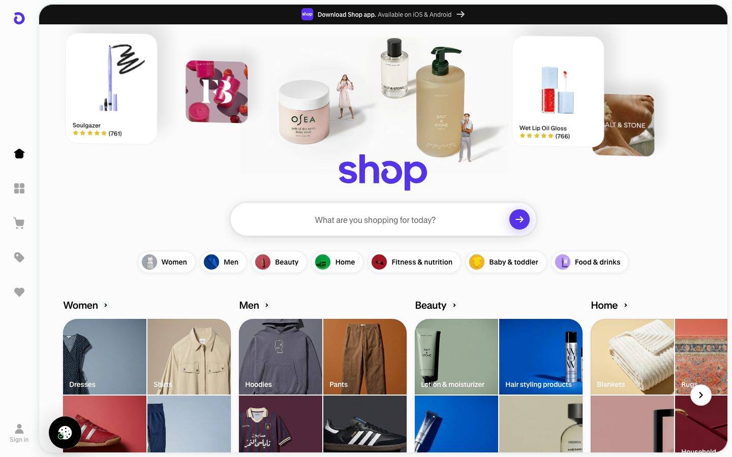
A commerce-discovery interface built on a white canvas with a heavily-rounded, card-forward layout and a single bright Shop-purple accent (#5433eb). The system reads as friendly consumer marketplace — a dark app-download banner pinned to the top, a large pill search bar as the hero action, rounded brand/product cards with soft ambient shadows, and a left icon rail for navigation. Brand voltage comes from the purple search-submit button + logo and from real merchant product photography shown inside big rounded cards rather than from decorative color.
Works withClaude CodeCursorCodexGemini CLICopilotv0LovableBoltWindsurfReplit
---
version: alpha
name: Shop.app-design-analysis
description: "A commerce-discovery interface built on a white canvas with a heavily-rounded, card-forward layout and a single bright Shop-purple accent (#5433eb). The system reads as friendly consumer marketplace — a dark app-download banner pinned to the top, a large pill search bar as the hero action, rounded brand/product cards with soft ambient shadows, and a left icon rail for navigation. Brand voltage comes from the purple search-submit button + logo and from real merchant product photography shown inside big rounded cards rather than from decorative color."

colors:
  primary: "#5433eb"
  ink: "#000000"
  body: "#807c7a"
  muted: "#7b7b7b"
  hairline: "#c9cbcc"
  canvas: "#ffffff"
  surface-soft: "#f2f4f5"
  surface-bright: "#fbfbfb"
  surface-dark: "#121212"
  accent-amber: "#e3be2b"
  on-primary: "#ffffff"
  on-dark: "#ffffff"

typography:
  heading-lg:
    fontFamily: "GT Standard, Inter, sans-serif"
    fontSize: 20px
    fontWeight: 400
    lineHeight: 1.1
    letterSpacing: "-0.05em"
  heading-sm:
    fontFamily: "GT Standard, Inter, sans-serif"
    fontSize: 14px
    fontWeight: 400
    lineHeight: 1.286
    letterSpacing: "-0.0143em"
  body:
    fontFamily: "Shopify Sans, Inter, sans-serif"
    fontSize: 10px
    fontWeight: 400
    lineHeight: 1.2
    letterSpacing: "0"
  button:
    fontFamily: "Shopify Sans, Inter, sans-serif"
    fontSize: 14px
    fontWeight: 400
    lineHeight: 1.571
    letterSpacing: "0"

rounded:
  xs: 4px
  sm: 8px
  md: 11px
  lg: 17px
  xl: 20px
  xxl: 28px
  xxxl: 32px
  huge: 40px
  pill: 9999px

spacing:
  xxs: 4px
  xs: 6px
  sm: 8px
  md: 10px
  lg: 12px
  xl: 16px
  xxl: 24px
  xxxl: 32px
  section: 48px
  section-lg: 64px

components:
  top-banner:
    backgroundColor: "{colors.ink}"
    textColor: "{colors.on-dark}"
    typography: "{typography.body}"
    rounded: "{rounded.xxxl}"
  sidebar-rail:
    backgroundColor: "{colors.canvas}"
    textColor: "{colors.ink}"
    typography: "{typography.body}"
  search-bar:
    backgroundColor: "{colors.canvas}"
    textColor: "{colors.muted}"
    typography: "{typography.button}"
    rounded: "{rounded.pill}"
    padding: 12px 16px
  search-submit-button:
    backgroundColor: "{colors.primary}"
    textColor: "{colors.on-primary}"
    rounded: "{rounded.pill}"
  category-pill:
    backgroundColor: "{colors.canvas}"
    textColor: "{colors.ink}"
    typography: "{typography.button}"
    rounded: "{rounded.pill}"
    padding: 6px 12px
  brand-card:
    backgroundColor: "{colors.canvas}"
    textColor: "{colors.ink}"
    typography: "{typography.heading-sm}"
    rounded: "{rounded.xxl}"
    padding: 12px
  product-tile:
    backgroundColor: "{colors.surface-soft}"
    textColor: "{colors.ink}"
    rounded: "{rounded.xl}"
  category-tile:
    backgroundColor: "{colors.surface-soft}"
    textColor: "{colors.on-dark}"
    typography: "{typography.body}"
    rounded: "{rounded.xl}"
  section-heading:
    backgroundColor: transparent
    textColor: "{colors.ink}"
    typography: "{typography.heading-lg}"
  footer:
    backgroundColor: "{colors.canvas}"
    textColor: "{colors.muted}"
    typography: "{typography.body}"
    padding: 48px
---

## Overview

Shop.app's landing surface is a friendly consumer-marketplace interface — a white canvas (`{colors.canvas}` — #ffffff) framed by a dark app-download banner (`{colors.ink}` — #000000) pinned to the top, with a single bright **Shop-purple** accent (`{colors.primary}` — #5433eb) carrying the logo and the search-submit button. The system reads as a shopping-discovery home screen ported to the web: a big pill search bar as the hero action, a row of category pills beneath it, and a deep scroll of rounded brand/product cards organized by shopping category (Women, Men, Beauty, Home, Baby & Toddler, and so on).

Type voice splits into two families: **GT Standard** (a licensed display face used for headings — h2/h3, with tight negative letter-spacing) and **Shopify Sans** (Shopify's proprietary UI face used for body copy and button labels). Both are custom/proprietary and are documented here with open-source substitutes.

Component voltage comes from **real merchant product photography shown inside large rounded cards** — brand tiles carry a big logo lockup over a photographic background, with a strip of small product thumbnails below. Shop.app doesn't illustrate commerce; it shows the actual merchant storefronts at card scale.

The rounding is the dominant visual signature — measured border-radius clusters heavily at 20px and 28px (over 1,200 combined occurrences), with a pill (`{rounded.pill}` — 9999px) radius on the search bar, category pills, and the circular submit button. Everything is soft-cornered; nothing is a sharp rectangle.

**Key Characteristics:**
- White canvas with a scarce Shop-purple accent (`{colors.primary}` — #5433eb) reserved for the logo and the circular search-submit button. The purple never appears on card surfaces.
- Dark app-download banner (`{colors.ink}` — #000000) pinned across the top — the only dark surface at the top of the page.
- Heavily-rounded card system — `{rounded.xl}` (20px) and `{rounded.xxl}` (28px) are the two dominant measured radii; the search bar and pills go full `{rounded.pill}`.
- Soft ambient card shadows — a low-alpha `rgba(0,0,0,0.06) 0px 2px 8px` (312 occurrences) is the workhorse elevation; deeper `0.12 0px 4px 24px` for prominent cards.
- Big pill search bar as the hero action, with a circular purple submit button at its right edge.
- Category pills — small white pills with a circular category thumbnail + label, in `{rounded.pill}`.
- Left icon rail for primary navigation (home, grid, cart, tag, wishlist, sign-in) running the full height of the viewport.
- Brand cards show real merchant logos + photography + product thumbnail rows and 5-star ratings in `{colors.accent-amber}` (#e3be2b).

## Colors

### Brand & Accent
- **Primary** (`{colors.primary}` — #5433eb): The Shop-purple accent. Used for the "shop" logo wordmark and the circular search-submit button. This is the only saturated hue in the interface's chrome — it appears rarely (measured frequency 8) and carries the whole brand signal. The submit button also carries a purple-tinted ambient shadow (`rgba(69,36,219,0.34) 0px 4px 24px`).
- **Accent Amber** (`{colors.accent-amber}` — #e3be2b): The gold used for 5-star merchant rating rows inside brand cards. A secondary accent distinct from primary; it never appears on chrome or CTAs.

### Surface
- **Canvas** (`{colors.canvas}` — #ffffff): The default page floor and the fill for cards, pills, and the search bar.
- **Surface Bright** (`{colors.surface-bright}` — #fbfbfb): A barely-off-white used for large neutral fills / section backgrounds.
- **Surface Soft** (`{colors.surface-soft}` — #f2f4f5): The light-gray fill behind product tiles and category imagery placeholders.
- **Surface Dark** (`{colors.surface-dark}` — #121212): A near-black surface variant (the top banner reads as pure `{colors.ink}` #000000; #121212 appears as a slightly-lifted dark tone).
- **Hairline** (`{colors.hairline}` — #c9cbcc): The 1px divider / border tone on light surfaces.

### Text
- **Ink** (`{colors.ink}` — #000000): Headings, section titles, and primary text. Also the top banner background.
- **Body** (`{colors.body}` — #807c7a): A warm-gray running-text tone (measured neutral).
- **Muted** (`{colors.muted}` — #7b7b7b): Secondary / placeholder text — search-bar placeholder, footer body, fine print.
- **On Primary / On Dark** (`{colors.on-primary}` / `{colors.on-dark}` — #ffffff): Text on the purple submit button and on the dark top banner.

## Typography

### Font Family
The system runs **GT Standard** for headings and **Shopify Sans** for body + button labels. GT Standard (measured family `GTStandard-MSemibold`) is a licensed display face from Grilli Type; Shopify Sans is Shopify's proprietary UI typeface. Neither ships as a public web font, so both are documented here with open-source substitutes. Headings carry tight negative letter-spacing (-0.05em at h2, -0.0143em at h3); body and button labels use normal tracking.

The split is functional:
- GT Standard (headings, weight 400 as measured, negative tracking) — section titles, brand-card names
- Shopify Sans (body + UI, weight 400) — descriptions, placeholder text, button labels

### Hierarchy

| Token | Size | Weight | Line Height | Letter Spacing | Use |
|---|---|---|---|---|---|
| `{typography.heading-lg}` | 20px | 400 | 1.1 | -0.05em | Section headings ("Women", "Men", "Beauty") — GT Standard |
| `{typography.heading-sm}` | 14px | 400 | 1.286 | -0.0143em | Brand-card names, small titles — GT Standard |
| `{typography.body}` | 10px | 400 | 1.2 | 0 | Fine print, banner copy, footer body — Shopify Sans |
| `{typography.button}` | 14px | 400 | 1.571 | 0 | Search placeholder, category-pill labels, button text — Shopify Sans |

### Principles
Headings carry their character through GT Standard's negative letter-spacing (the -0.05em at h2 is the tighter, display-scale signature). Body copy stays in Shopify Sans at normal tracking. The measured body size is unusually small (10px) — this reflects the dense, mobile-first card grid rendered at desktop scale; treat 10px as a floor and scale up for accessibility where copy must be read (see Known Gaps).

Measured weight is 400 across all measured roles — the "MSemibold" in the GT Standard family name refers to the shipped cut, not a distinct CSS weight value.

### Note on Font Substitutes
- **GT Standard** is licensed (Grilli Type) and not available as a public web font. **Inter** with negative letter-spacing (-0.04em to -0.05em) is a usable approximation; **Manrope** at a medium weight is a close geometric alternative.
- **Shopify Sans** is proprietary to Shopify and not publicly distributed. **Inter** at weight 400 is the closest open substitute; the fallback stack should walk `Inter, -apple-system, "Segoe UI", Roboto, sans-serif`.

## Layout

### Spacing System
- **Base unit:** measured spacing clusters at 4px and 12px (the two highest-frequency values: 220 and 240 occurrences respectively), with 6px as a common secondary step.
- **Tokens:** `{spacing.xxs}` 4px · `{spacing.xs}` 6px · `{spacing.sm}` 8px · `{spacing.md}` 10px · `{spacing.lg}` 12px · `{spacing.xl}` 16px · `{spacing.xxl}` 24px · `{spacing.xxxl}` 32px · `{spacing.section}` 48px · `{spacing.section-lg}` 64px.
- **Section rhythm:** `{spacing.section}` (48px, frequency 14) and `{spacing.section-lg}` (64px, frequency 11) separate major category bands.
- **Card internal padding:** `{spacing.lg}` (12px) is the dominant internal gutter for cards and pills.
- **Tight in-card spacing:** `{spacing.xxs}` (4px) and `{spacing.xs}` (6px) dominate thumbnail rows and label stacks.

### Grid & Container
- **Overall layout:** left icon rail (fixed) + main scroll column offset to its right.
- **Hero:** app-download banner (full width) → floating product collage → "shop" logo → pill search bar → category pill row.
- **Category bands:** horizontally-scrolling rows of brand cards, 3–4 visible at desktop, each with a right-edge carousel arrow (`›`).
- **Top category grid:** a 4-up quick-nav grid (Women / Men / Beauty / Home) of image tiles above the brand-card bands.
- **Footer:** multi-column link list (Start selling / Information / Social / Legal) plus App Store + Google Play badges.

### Whitespace Philosophy
Shop.app is a dense discovery surface — the whitespace budget is spent on generous card rounding and soft shadows rather than on wide margins. Section bands sit at 48–64px apart; inside a band the cards pack tightly (4–12px gutters). The result reads as a scrollable app home screen: lots to browse, softly separated.

## Elevation & Depth

| Level | Treatment | Use |
|---|---|---|
| Flat | No shadow | Section headings, banner text, category imagery placeholders |
| Soft ambient | `rgba(0,0,0,0.06) 0px 2px 8px` | The workhorse card/pill shadow (312 occurrences) — brand cards, category pills, search bar |
| Medium lift | `rgba(0,0,0,0.1) 0px 4px 6px -1px, rgba(0,0,0,0.1) 0px 2px 4px -2px` | Elevated cards, hover-lifted tiles (107 occurrences) |
| Prominent | `rgba(0,0,0,0.12) 0px 4px 24px` | Featured cards / modals (22 occurrences) |
| Purple glow | `rgba(69,36,219,0.34) 0px 4px 24px` | The circular search-submit button — a purple-tinted ambient shadow tying the CTA to the brand hue |
| Deep modal | `rgba(0,0,0,0.25) 0px 10px 50px, rgba(255,255,255,0.25) 0px 0px 0px 1px` | Overlay / spotlight surface (single occurrence) |

The elevation philosophy is **soft and ambient** — every card floats on a faint low-alpha shadow rather than sitting behind a border. No hard borders, no heavy drop shadows; the softness plus heavy rounding gives the whole page a tactile, app-like feel.

### Decorative Depth
- The search-submit button's purple glow (`rgba(69,36,219,0.34)`) is the only chromatic shadow in the system — it reinforces the single accent.
- The hero "shop" logo section uses a composite ring-shadow (`rgb(242,244,245) 0px -1px 30px, rgb(252,252,252) 0px 0px 0px 40px`) to blend the floating product collage into the canvas.

## Shapes

### Border Radius Scale

| Token | Value | Use |
|---|---|---|
| `{rounded.xs}` | 4px | Smallest accents (rare) |
| `{rounded.sm}` | 8px | Small chips / inner elements |
| `{rounded.md}` | 11px | Small cards, thumbnail cells |
| `{rounded.lg}` | 17px | Mid-size tiles |
| `{rounded.xl}` | 20px | The dominant card/tile radius (900 occurrences) — product tiles, category imagery |
| `{rounded.xxl}` | 28px | The second dominant radius (316 occurrences) — brand cards |
| `{rounded.xxxl}` | 32px | Larger container cards |
| `{rounded.huge}` | 40px | Largest rounded surfaces |
| `{rounded.pill}` | 9999px | Search bar, category pills, circular submit button, avatars |

### Photography Geometry
Brand-card photography fills the card and is clipped to the card's `{rounded.xxl}` (28px) corners. Product thumbnail strips inside cards use `{rounded.md}` (11px) cells. Category quick-nav tiles use `{rounded.xl}` (20px). Circular category thumbnails inside pills and the submit button use `{rounded.pill}`.

## Components

### Navigation & Chrome

**`top-banner`** — A dark bar pinned across the top of the page (`{colors.ink}` — #000000, text `{colors.on-dark}`). Carries the Shop app icon + "Download Shop app. Available on iOS & Android" copy with a forward arrow. Corners rounded (`{rounded.xxxl}`) to match the framed-canvas treatment. Typography `{typography.body}`.

**`sidebar-rail`** — A fixed vertical icon rail at the far left (`{colors.canvas}` background, `{colors.ink}` icons). Holds the Shop logo mark at top, primary nav icons (home, grid, cart, tag, wishlist), and a "Sign in" avatar affordance at the bottom. Labels in `{typography.body}`.

### Search & Filter

**`search-bar`** — The hero action. A large pill input (`{rounded.pill}`), `{colors.canvas}` fill, placeholder "What are you shopping for today?" in `{colors.muted}` (`{typography.button}`). Sits on the soft ambient shadow. Padding ~12px × 16px.

**`search-submit-button`** — A circular purple button (`{colors.primary}` — #5433eb, `{rounded.pill}`) anchored at the right edge of the search bar, carrying a white forward-arrow icon (`{colors.on-primary}`). Wears the purple-tinted ambient glow shadow.

**`category-pill`** — A row of white pills beneath the search bar (Women, Men, Beauty, Home, Fitness & nutrition, Baby & toddler, Food & drinks). Each pill: `{colors.canvas}` fill, `{rounded.pill}`, a small circular category thumbnail at left + label in `{typography.button}` (`{colors.ink}`), padding ~6px × 12px, soft ambient shadow.

### Cards & Tiles

**`brand-card`** — The primary content unit inside category bands. `{colors.canvas}` fill, `{rounded.xxl}` (28px), soft ambient shadow, padding `{spacing.lg}` (12px). Layout: merchant name + star rating (`{colors.accent-amber}`) at top, a large photographic logo lockup in the middle, and a strip of small product thumbnails at the bottom. Title in `{typography.heading-sm}`.

**`product-tile`** — Product/imagery cells (used inside brand cards and category grids). `{colors.surface-soft}` (#f2f4f5) fill behind the product photo, `{rounded.xl}` (20px).

**`category-tile`** — The 4-up quick-nav grid tiles (Dresses, Shirts, Hoodies, Pants, etc.). Full-bleed photography clipped to `{rounded.xl}` (20px) with a category label overlaid in `{colors.on-dark}` (`{typography.body}`) at the bottom.

**`section-heading`** — Band titles ("Women", "Men", "Beauty", "Home", "Fitness & nutrition"...) in `{typography.heading-lg}` (GT Standard 20px, -0.05em tracking), `{colors.ink}`, with a small `›` chevron affordance. Transparent background.

### Footer

**`footer`** — Light footer on `{colors.canvas}`, text `{colors.muted}` (`{typography.body}`). Carries the "shop" wordmark + mission line, App Store + Google Play download badges, and four link columns (Start selling / Information / Social / Legal). Padding `{spacing.section}` (48px). "Powered by Shopify" sits at the bottom.

## Do's and Don'ts

### Do
- Reserve `{colors.primary}` (#5433eb) for the logo and the search-submit button. Shop's purple is a scarce, high-signal accent — one moment per screen.
- Round everything: cards at `{rounded.xl}` (20px) / `{rounded.xxl}` (28px), pills and the submit button at `{rounded.pill}`. Sharp corners read as off-brand.
- Float cards on the soft ambient shadow (`rgba(0,0,0,0.06) 0px 2px 8px`) rather than outlining them with borders.
- Use `{colors.accent-amber}` (#e3be2b) only for star ratings inside brand cards.
- Show real merchant photography and product thumbnails inside brand cards — Shop.app displays storefronts, it doesn't illustrate them.
- Keep the dark app-download banner (`{colors.ink}`) pinned to the top — it's the persistent app-conversion moment.
- Pair GT Standard headings (negative tracking) with Shopify Sans body; keep the boundary strict.

### Don't
- Don't apply the purple to card surfaces or multiple CTAs — it loses its signal.
- Don't use hard borders for separation; the system relies on shadow + rounding.
- Don't set headings without negative letter-spacing — GT Standard at 0 tracking reads as off-brand.
- Don't introduce additional saturated hues into the chrome; the interface is white + black + one purple.
- Don't drop below the measured card radii (20/28px) on content cards — smaller radii break the soft, app-like feel.
- Don't add hover-state documentation here — default and active/pressed only.

## Responsive Behavior

The captured surface is a single desktop landing page; Shop.app is fundamentally a mobile-first app experience rendered to the web, so responsive rules below are partly inferred from the card-grid structure (see Known Gaps).

### Breakpoints

| Name | Width | Key Changes (inferred) |
|---|---|---|
| Mobile | < 768px | Left icon rail collapses to a bottom tab bar or hamburger; category bands become single horizontal scrollers; search bar spans full width |
| Tablet | 768–1024px | Icon rail persists; brand-card bands show 2–3 cards; category quick-grid drops to 2-up |
| Desktop | 1024–1440px | Full icon rail + 3–4 brand cards per band + 4-up category quick-grid (as captured) |
| Wide | > 1440px | Same layout with more outer breathing room around the framed canvas |

### Touch Targets
- `{component.search-submit-button}` is a circular target sized for comfortable tapping.
- `{component.category-pill}` uses ~6px × 12px padding; the pill silhouette plus its circular thumbnail keeps the effective tap area comfortable.
- Icon-rail items are full-width rail cells.

### Collapsing Strategy
- Category bands scroll horizontally with a right-edge `›` carousel control rather than reflowing.
- Brand cards keep their `{rounded.xxl}` corners and shadows at every width; only the count-per-row changes.
- The hero collage + logo + search stack stays centered.

## Iteration Guide

1. Focus on ONE component at a time. Reference its YAML key directly (`{component.brand-card}`, `{component.search-submit-button}`).
2. Variants of an existing component live as separate entries in `components:`.
3. Use `{token.refs}` everywhere — never inline hex.
4. Never document hover. Default and Active/Pressed states only.
5. Headings stay GT Standard with negative tracking; body stays Shopify Sans. The two-family split does not blur.
6. The purple accent is scarce by design — do not spread it across the UI.
7. When adding a card type, default to `{rounded.xl}` (20px) or `{rounded.xxl}` (28px) and the soft ambient shadow — this is the system's baseline card.

## Known Gaps

- **Type sizes measured small:** the computed body size (10px) and heading sizes (20px / 14px) reflect the dense, mobile-first card grid rendered at desktop scale. These are reported faithfully but should be scaled up for accessible body copy — treat 10px as a floor, not a recommendation.
- **Custom typefaces unavailable:** GT Standard (Grilli Type, licensed) and Shopify Sans (Shopify proprietary) are not public web fonts. `fonts_licensed` came back empty in the analysis, but both families are custom/proprietary; open-source substitutes (Inter, Manrope) are documented in Typography.
- **Measured component props unreliable:** the analyzer reported `button-primary` with radius 0 / padding 0, `card` with radius 0 / shadow none, and `input` with radius 1e7px (effectively pill). These likely captured a base/reset element rather than the styled search-submit button and brand cards. Button, card, and input specs here are reconstructed from screenshot ground-truth plus the dominant measured radius (20/28px) and shadow tokens.
- **Weight ambiguity:** all measured roles report weight 400 even for the "MSemibold" GT Standard cut; true weight mapping would need the loaded font files.
- **Responsive behavior inferred:** only the desktop landing page was captured; breakpoint behavior is reconstructed from the card-grid structure and Shop's known mobile-app heritage.
- **Interaction & motion out of scope:** carousel scrolling, card hover-lift transitions, search autocomplete, and category-band animation timings were not measured.
- **Muted photographic hues excluded:** several low-frequency neutral browns/grays (#bbafa9, #837670, #9f8b89, etc.) appear in the analysis as sampled product-photography colors, not system tokens, and are intentionally omitted from the palette.

<!-- Documented by Duply · real-world design systems as ready-to-use DESIGN.md for AI coding agents · https://duply.ai/shop/design-md -->
Color Palette
Accent
Neutrals
Typography
heading-lg20px · 400 · 1.1
The quick brown fox jumpsheading-sm14px · 400 · 1.286
The quick brown fox jumpsbody10px · 400 · 1.2
The quick brown fox jumpsbutton14px · 400 · 1.571
The quick brown fox jumpsSpacing & Shape
Spacing
| Name | Value | Preview |
|---|---|---|
| xxs | 4px | |
| xs | 6px | |
| sm | 8px | |
| md | 10px | |
| lg | 12px | |
| xl | 16px | |
| xxl | 24px | |
| xxxl | 32px | |
| section | 48px | |
| section-lg | 64px |
Border Radius
| Name | Value | Preview |
|---|---|---|
| xs | 4px | |
| sm | 8px | |
| md | 11px | |
| lg | 17px | |
| xl | 20px | |
| xxl | 28px | |
| xxxl | 32px | |
| huge | 40px | |
| pill | 9999px |
FAQ
- What colors does Shop.app use?
- Shop.app's core palette includes #5433eb, #000000, #807c7a, #7b7b7b, #c9cbcc. The full color set with usage roles (canvas, ink, surfaces, accent, semantic) is documented in the Shop.app DESIGN.md.
- What font does Shop.app use?
- Shop.app's primary typeface is GT Standard. The complete type scale (sizes, weights, line-height and letter-spacing per role), with an open substitute where the original is licensed, is documented in the DESIGN.md.
- What is the Shop.app design system?
- A commerce-discovery interface built on a white canvas with a heavily-rounded, card-forward layout and a single bright Shop-purple accent (#5433eb). The system reads as friendly consumer marketplace — a dark app-download banner pinned to the top, a large pill search bar as the hero action, rounded
Get this as a working kit
Shop.app Launch Kit + DESIGN.md
$299$225
One-time payment
- A complete production-stack template, styled like Shop.app, fully built and wired.
- One-time payment and the codebase is yours. No platform fees, no subscription.
Open it with Claude Code, Cursor, or any coding agent and build in plain language, then ship a complete web app.
- Your private DESIGN.md
- Marketing pages, blog, SEO & legal
- Email capture, newsletter & contact
- Accept payments (Stripe)
- Analytics (GA4 + PostHog)
- One-click deploy
- Auth, login & roles
- A full app dashboard, when you grow
More like this
---
version: alpha
name: Shop.app-design-analysis
description: "A commerce-discovery interface built on a white canvas with a heavily-rounded, card-forward layout and a single bright Shop-purple accent (#5433eb). The system reads as friendly consumer marketplace — a dark app-download banner pinned to the top, a large pill search bar as the hero action, rounded brand/product cards with soft ambient shadows, and a left icon rail for navigation. Brand voltage comes from the purple search-submit button + logo and from real merchant product photography shown inside big rounded cards rather than from decorative color."

colors:
  primary: "#5433eb"
  ink: "#000000"
  body: "#807c7a"
  muted: "#7b7b7b"
  hairline: "#c9cbcc"
  canvas: "#ffffff"
  surface-soft: "#f2f4f5"
  surface-bright: "#fbfbfb"
  surface-dark: "#121212"
  accent-amber: "#e3be2b"
  on-primary: "#ffffff"
  on-dark: "#ffffff"

typography:
  heading-lg:
    fontFamily: "GT Standard, Inter, sans-serif"
    fontSize: 20px
    fontWeight: 400
    lineHeight: 1.1
    letterSpacing: "-0.05em"
  heading-sm:
    fontFamily: "GT Standard, Inter, sans-serif"
    fontSize: 14px
    fontWeight: 400
    lineHeight: 1.286
    letterSpacing: "-0.0143em"
  body:
    fontFamily: "Shopify Sans, Inter, sans-serif"
    fontSize: 10px
    fontWeight: 400
    lineHeight: 1.2
    letterSpacing: "0"
  button:
    fontFamily: "Shopify Sans, Inter, sans-serif"
    fontSize: 14px
    fontWeight: 400
    lineHeight: 1.571
    letterSpacing: "0"

rounded:
  xs: 4px
  sm: 8px
  md: 11px
  lg: 17px
  xl: 20px
  xxl: 28px
  xxxl: 32px
  huge: 40px
  pill: 9999px

spacing:
  xxs: 4px
  xs: 6px
  sm: 8px
  md: 10px
  lg: 12px
  xl: 16px
  xxl: 24px
  xxxl: 32px
  section: 48px
  section-lg: 64px

components:
  top-banner:
    backgroundColor: "{colors.ink}"
    textColor: "{colors.on-dark}"
    typography: "{typography.body}"
    rounded: "{rounded.xxxl}"
  sidebar-rail:
    backgroundColor: "{colors.canvas}"
    textColor: "{colors.ink}"
    typography: "{typography.body}"
  search-bar:
    backgroundColor: "{colors.canvas}"
    textColor: "{colors.muted}"
    typography: "{typography.button}"
    rounded: "{rounded.pill}"
    padding: 12px 16px
  search-submit-button:
    backgroundColor: "{colors.primary}"
    textColor: "{colors.on-primary}"
    rounded: "{rounded.pill}"
  category-pill:
    backgroundColor: "{colors.canvas}"
    textColor: "{colors.ink}"
    typography: "{typography.button}"
    rounded: "{rounded.pill}"
    padding: 6px 12px
  brand-card:
    backgroundColor: "{colors.canvas}"
    textColor: "{colors.ink}"
    typography: "{typography.heading-sm}"
    rounded: "{rounded.xxl}"
    padding: 12px
  product-tile:
    backgroundColor: "{colors.surface-soft}"
    textColor: "{colors.ink}"
    rounded: "{rounded.xl}"
  category-tile:
    backgroundColor: "{colors.surface-soft}"
    textColor: "{colors.on-dark}"
    typography: "{typography.body}"
    rounded: "{rounded.xl}"
  section-heading:
    backgroundColor: transparent
    textColor: "{colors.ink}"
    typography: "{typography.heading-lg}"
  footer:
    backgroundColor: "{colors.canvas}"
    textColor: "{colors.muted}"
    typography: "{typography.body}"
    padding: 48px
---

## Overview

Shop.app's landing surface is a friendly consumer-marketplace interface — a white canvas (`{colors.canvas}` — #ffffff) framed by a dark app-download banner (`{colors.ink}` — #000000) pinned to the top, with a single bright **Shop-purple** accent (`{colors.primary}` — #5433eb) carrying the logo and the search-submit button. The system reads as a shopping-discovery home screen ported to the web: a big pill search bar as the hero action, a row of category pills beneath it, and a deep scroll of rounded brand/product cards organized by shopping category (Women, Men, Beauty, Home, Baby & Toddler, and so on).

Type voice splits into two families: **GT Standard** (a licensed display face used for headings — h2/h3, with tight negative letter-spacing) and **Shopify Sans** (Shopify's proprietary UI face used for body copy and button labels). Both are custom/proprietary and are documented here with open-source substitutes.

Component voltage comes from **real merchant product photography shown inside large rounded cards** — brand tiles carry a big logo lockup over a photographic background, with a strip of small product thumbnails below. Shop.app doesn't illustrate commerce; it shows the actual merchant storefronts at card scale.

The rounding is the dominant visual signature — measured border-radius clusters heavily at 20px and 28px (over 1,200 combined occurrences), with a pill (`{rounded.pill}` — 9999px) radius on the search bar, category pills, and the circular submit button. Everything is soft-cornered; nothing is a sharp rectangle.

**Key Characteristics:**
- White canvas with a scarce Shop-purple accent (`{colors.primary}` — #5433eb) reserved for the logo and the circular search-submit button. The purple never appears on card surfaces.
- Dark app-download banner (`{colors.ink}` — #000000) pinned across the top — the only dark surface at the top of the page.
- Heavily-rounded card system — `{rounded.xl}` (20px) and `{rounded.xxl}` (28px) are the two dominant measured radii; the search bar and pills go full `{rounded.pill}`.
- Soft ambient card shadows — a low-alpha `rgba(0,0,0,0.06) 0px 2px 8px` (312 occurrences) is the workhorse elevation; deeper `0.12 0px 4px 24px` for prominent cards.
- Big pill search bar as the hero action, with a circular purple submit button at its right edge.
- Category pills — small white pills with a circular category thumbnail + label, in `{rounded.pill}`.
- Left icon rail for primary navigation (home, grid, cart, tag, wishlist, sign-in) running the full height of the viewport.
- Brand cards show real merchant logos + photography + product thumbnail rows and 5-star ratings in `{colors.accent-amber}` (#e3be2b).

## Colors

### Brand & Accent
- **Primary** (`{colors.primary}` — #5433eb): The Shop-purple accent. Used for the "shop" logo wordmark and the circular search-submit button. This is the only saturated hue in the interface's chrome — it appears rarely (measured frequency 8) and carries the whole brand signal. The submit button also carries a purple-tinted ambient shadow (`rgba(69,36,219,0.34) 0px 4px 24px`).
- **Accent Amber** (`{colors.accent-amber}` — #e3be2b): The gold used for 5-star merchant rating rows inside brand cards. A secondary accent distinct from primary; it never appears on chrome or CTAs.

### Surface
- **Canvas** (`{colors.canvas}` — #ffffff): The default page floor and the fill for cards, pills, and the search bar.
- **Surface Bright** (`{colors.surface-bright}` — #fbfbfb): A barely-off-white used for large neutral fills / section backgrounds.
- **Surface Soft** (`{colors.surface-soft}` — #f2f4f5): The light-gray fill behind product tiles and category imagery placeholders.
- **Surface Dark** (`{colors.surface-dark}` — #121212): A near-black surface variant (the top banner reads as pure `{colors.ink}` #000000; #121212 appears as a slightly-lifted dark tone).
- **Hairline** (`{colors.hairline}` — #c9cbcc): The 1px divider / border tone on light surfaces.

### Text
- **Ink** (`{colors.ink}` — #000000): Headings, section titles, and primary text. Also the top banner background.
- **Body** (`{colors.body}` — #807c7a): A warm-gray running-text tone (measured neutral).
- **Muted** (`{colors.muted}` — #7b7b7b): Secondary / placeholder text — search-bar placeholder, footer body, fine print.
- **On Primary / On Dark** (`{colors.on-primary}` / `{colors.on-dark}` — #ffffff): Text on the purple submit button and on the dark top banner.

## Typography

### Font Family
The system runs **GT Standard** for headings and **Shopify Sans** for body + button labels. GT Standard (measured family `GTStandard-MSemibold`) is a licensed display face from Grilli Type; Shopify Sans is Shopify's proprietary UI typeface. Neither ships as a public web font, so both are documented here with open-source substitutes. Headings carry tight negative letter-spacing (-0.05em at h2, -0.0143em at h3); body and button labels use normal tracking.

The split is functional:
- GT Standard (headings, weight 400 as measured, negative tracking) — section titles, brand-card names
- Shopify Sans (body + UI, weight 400) — descriptions, placeholder text, button labels

### Hierarchy

| Token | Size | Weight | Line Height | Letter Spacing | Use |
|---|---|---|---|---|---|
| `{typography.heading-lg}` | 20px | 400 | 1.1 | -0.05em | Section headings ("Women", "Men", "Beauty") — GT Standard |
| `{typography.heading-sm}` | 14px | 400 | 1.286 | -0.0143em | Brand-card names, small titles — GT Standard |
| `{typography.body}` | 10px | 400 | 1.2 | 0 | Fine print, banner copy, footer body — Shopify Sans |
| `{typography.button}` | 14px | 400 | 1.571 | 0 | Search placeholder, category-pill labels, button text — Shopify Sans |

### Principles
Headings carry their character through GT Standard's negative letter-spacing (the -0.05em at h2 is the tighter, display-scale signature). Body copy stays in Shopify Sans at normal tracking. The measured body size is unusually small (10px) — this reflects the dense, mobile-first card grid rendered at desktop scale; treat 10px as a floor and scale up for accessibility where copy must be read (see Known Gaps).

Measured weight is 400 across all measured roles — the "MSemibold" in the GT Standard family name refers to the shipped cut, not a distinct CSS weight value.

### Note on Font Substitutes
- **GT Standard** is licensed (Grilli Type) and not available as a public web font. **Inter** with negative letter-spacing (-0.04em to -0.05em) is a usable approximation; **Manrope** at a medium weight is a close geometric alternative.
- **Shopify Sans** is proprietary to Shopify and not publicly distributed. **Inter** at weight 400 is the closest open substitute; the fallback stack should walk `Inter, -apple-system, "Segoe UI", Roboto, sans-serif`.

## Layout

### Spacing System
- **Base unit:** measured spacing clusters at 4px and 12px (the two highest-frequency values: 220 and 240 occurrences respectively), with 6px as a common secondary step.
- **Tokens:** `{spacing.xxs}` 4px · `{spacing.xs}` 6px · `{spacing.sm}` 8px · `{spacing.md}` 10px · `{spacing.lg}` 12px · `{spacing.xl}` 16px · `{spacing.xxl}` 24px · `{spacing.xxxl}` 32px · `{spacing.section}` 48px · `{spacing.section-lg}` 64px.
- **Section rhythm:** `{spacing.section}` (48px, frequency 14) and `{spacing.section-lg}` (64px, frequency 11) separate major category bands.
- **Card internal padding:** `{spacing.lg}` (12px) is the dominant internal gutter for cards and pills.
- **Tight in-card spacing:** `{spacing.xxs}` (4px) and `{spacing.xs}` (6px) dominate thumbnail rows and label stacks.

### Grid & Container
- **Overall layout:** left icon rail (fixed) + main scroll column offset to its right.
- **Hero:** app-download banner (full width) → floating product collage → "shop" logo → pill search bar → category pill row.
- **Category bands:** horizontally-scrolling rows of brand cards, 3–4 visible at desktop, each with a right-edge carousel arrow (`›`).
- **Top category grid:** a 4-up quick-nav grid (Women / Men / Beauty / Home) of image tiles above the brand-card bands.
- **Footer:** multi-column link list (Start selling / Information / Social / Legal) plus App Store + Google Play badges.

### Whitespace Philosophy
Shop.app is a dense discovery surface — the whitespace budget is spent on generous card rounding and soft shadows rather than on wide margins. Section bands sit at 48–64px apart; inside a band the cards pack tightly (4–12px gutters). The result reads as a scrollable app home screen: lots to browse, softly separated.

## Elevation & Depth

| Level | Treatment | Use |
|---|---|---|
| Flat | No shadow | Section headings, banner text, category imagery placeholders |
| Soft ambient | `rgba(0,0,0,0.06) 0px 2px 8px` | The workhorse card/pill shadow (312 occurrences) — brand cards, category pills, search bar |
| Medium lift | `rgba(0,0,0,0.1) 0px 4px 6px -1px, rgba(0,0,0,0.1) 0px 2px 4px -2px` | Elevated cards, hover-lifted tiles (107 occurrences) |
| Prominent | `rgba(0,0,0,0.12) 0px 4px 24px` | Featured cards / modals (22 occurrences) |
| Purple glow | `rgba(69,36,219,0.34) 0px 4px 24px` | The circular search-submit button — a purple-tinted ambient shadow tying the CTA to the brand hue |
| Deep modal | `rgba(0,0,0,0.25) 0px 10px 50px, rgba(255,255,255,0.25) 0px 0px 0px 1px` | Overlay / spotlight surface (single occurrence) |

The elevation philosophy is **soft and ambient** — every card floats on a faint low-alpha shadow rather than sitting behind a border. No hard borders, no heavy drop shadows; the softness plus heavy rounding gives the whole page a tactile, app-like feel.

### Decorative Depth
- The search-submit button's purple glow (`rgba(69,36,219,0.34)`) is the only chromatic shadow in the system — it reinforces the single accent.
- The hero "shop" logo section uses a composite ring-shadow (`rgb(242,244,245) 0px -1px 30px, rgb(252,252,252) 0px 0px 0px 40px`) to blend the floating product collage into the canvas.

## Shapes

### Border Radius Scale

| Token | Value | Use |
|---|---|---|
| `{rounded.xs}` | 4px | Smallest accents (rare) |
| `{rounded.sm}` | 8px | Small chips / inner elements |
| `{rounded.md}` | 11px | Small cards, thumbnail cells |
| `{rounded.lg}` | 17px | Mid-size tiles |
| `{rounded.xl}` | 20px | The dominant card/tile radius (900 occurrences) — product tiles, category imagery |
| `{rounded.xxl}` | 28px | The second dominant radius (316 occurrences) — brand cards |
| `{rounded.xxxl}` | 32px | Larger container cards |
| `{rounded.huge}` | 40px | Largest rounded surfaces |
| `{rounded.pill}` | 9999px | Search bar, category pills, circular submit button, avatars |

### Photography Geometry
Brand-card photography fills the card and is clipped to the card's `{rounded.xxl}` (28px) corners. Product thumbnail strips inside cards use `{rounded.md}` (11px) cells. Category quick-nav tiles use `{rounded.xl}` (20px). Circular category thumbnails inside pills and the submit button use `{rounded.pill}`.

## Components

### Navigation & Chrome

**`top-banner`** — A dark bar pinned across the top of the page (`{colors.ink}` — #000000, text `{colors.on-dark}`). Carries the Shop app icon + "Download Shop app. Available on iOS & Android" copy with a forward arrow. Corners rounded (`{rounded.xxxl}`) to match the framed-canvas treatment. Typography `{typography.body}`.

**`sidebar-rail`** — A fixed vertical icon rail at the far left (`{colors.canvas}` background, `{colors.ink}` icons). Holds the Shop logo mark at top, primary nav icons (home, grid, cart, tag, wishlist), and a "Sign in" avatar affordance at the bottom. Labels in `{typography.body}`.

### Search & Filter

**`search-bar`** — The hero action. A large pill input (`{rounded.pill}`), `{colors.canvas}` fill, placeholder "What are you shopping for today?" in `{colors.muted}` (`{typography.button}`). Sits on the soft ambient shadow. Padding ~12px × 16px.

**`search-submit-button`** — A circular purple button (`{colors.primary}` — #5433eb, `{rounded.pill}`) anchored at the right edge of the search bar, carrying a white forward-arrow icon (`{colors.on-primary}`). Wears the purple-tinted ambient glow shadow.

**`category-pill`** — A row of white pills beneath the search bar (Women, Men, Beauty, Home, Fitness & nutrition, Baby & toddler, Food & drinks). Each pill: `{colors.canvas}` fill, `{rounded.pill}`, a small circular category thumbnail at left + label in `{typography.button}` (`{colors.ink}`), padding ~6px × 12px, soft ambient shadow.

### Cards & Tiles

**`brand-card`** — The primary content unit inside category bands. `{colors.canvas}` fill, `{rounded.xxl}` (28px), soft ambient shadow, padding `{spacing.lg}` (12px). Layout: merchant name + star rating (`{colors.accent-amber}`) at top, a large photographic logo lockup in the middle, and a strip of small product thumbnails at the bottom. Title in `{typography.heading-sm}`.

**`product-tile`** — Product/imagery cells (used inside brand cards and category grids). `{colors.surface-soft}` (#f2f4f5) fill behind the product photo, `{rounded.xl}` (20px).

**`category-tile`** — The 4-up quick-nav grid tiles (Dresses, Shirts, Hoodies, Pants, etc.). Full-bleed photography clipped to `{rounded.xl}` (20px) with a category label overlaid in `{colors.on-dark}` (`{typography.body}`) at the bottom.

**`section-heading`** — Band titles ("Women", "Men", "Beauty", "Home", "Fitness & nutrition"...) in `{typography.heading-lg}` (GT Standard 20px, -0.05em tracking), `{colors.ink}`, with a small `›` chevron affordance. Transparent background.

### Footer

**`footer`** — Light footer on `{colors.canvas}`, text `{colors.muted}` (`{typography.body}`). Carries the "shop" wordmark + mission line, App Store + Google Play download badges, and four link columns (Start selling / Information / Social / Legal). Padding `{spacing.section}` (48px). "Powered by Shopify" sits at the bottom.

## Do's and Don'ts

### Do
- Reserve `{colors.primary}` (#5433eb) for the logo and the search-submit button. Shop's purple is a scarce, high-signal accent — one moment per screen.
- Round everything: cards at `{rounded.xl}` (20px) / `{rounded.xxl}` (28px), pills and the submit button at `{rounded.pill}`. Sharp corners read as off-brand.
- Float cards on the soft ambient shadow (`rgba(0,0,0,0.06) 0px 2px 8px`) rather than outlining them with borders.
- Use `{colors.accent-amber}` (#e3be2b) only for star ratings inside brand cards.
- Show real merchant photography and product thumbnails inside brand cards — Shop.app displays storefronts, it doesn't illustrate them.
- Keep the dark app-download banner (`{colors.ink}`) pinned to the top — it's the persistent app-conversion moment.
- Pair GT Standard headings (negative tracking) with Shopify Sans body; keep the boundary strict.

### Don't
- Don't apply the purple to card surfaces or multiple CTAs — it loses its signal.
- Don't use hard borders for separation; the system relies on shadow + rounding.
- Don't set headings without negative letter-spacing — GT Standard at 0 tracking reads as off-brand.
- Don't introduce additional saturated hues into the chrome; the interface is white + black + one purple.
- Don't drop below the measured card radii (20/28px) on content cards — smaller radii break the soft, app-like feel.
- Don't add hover-state documentation here — default and active/pressed only.

## Responsive Behavior

The captured surface is a single desktop landing page; Shop.app is fundamentally a mobile-first app experience rendered to the web, so responsive rules below are partly inferred from the card-grid structure (see Known Gaps).

### Breakpoints

| Name | Width | Key Changes (inferred) |
|---|---|---|
| Mobile | < 768px | Left icon rail collapses to a bottom tab bar or hamburger; category bands become single horizontal scrollers; search bar spans full width |
| Tablet | 768–1024px | Icon rail persists; brand-card bands show 2–3 cards; category quick-grid drops to 2-up |
| Desktop | 1024–1440px | Full icon rail + 3–4 brand cards per band + 4-up category quick-grid (as captured) |
| Wide | > 1440px | Same layout with more outer breathing room around the framed canvas |

### Touch Targets
- `{component.search-submit-button}` is a circular target sized for comfortable tapping.
- `{component.category-pill}` uses ~6px × 12px padding; the pill silhouette plus its circular thumbnail keeps the effective tap area comfortable.
- Icon-rail items are full-width rail cells.

### Collapsing Strategy
- Category bands scroll horizontally with a right-edge `›` carousel control rather than reflowing.
- Brand cards keep their `{rounded.xxl}` corners and shadows at every width; only the count-per-row changes.
- The hero collage + logo + search stack stays centered.

## Iteration Guide

1. Focus on ONE component at a time. Reference its YAML key directly (`{component.brand-card}`, `{component.search-submit-button}`).
2. Variants of an existing component live as separate entries in `components:`.
3. Use `{token.refs}` everywhere — never inline hex.
4. Never document hover. Default and Active/Pressed states only.
5. Headings stay GT Standard with negative tracking; body stays Shopify Sans. The two-family split does not blur.
6. The purple accent is scarce by design — do not spread it across the UI.
7. When adding a card type, default to `{rounded.xl}` (20px) or `{rounded.xxl}` (28px) and the soft ambient shadow — this is the system's baseline card.

## Known Gaps

- **Type sizes measured small:** the computed body size (10px) and heading sizes (20px / 14px) reflect the dense, mobile-first card grid rendered at desktop scale. These are reported faithfully but should be scaled up for accessible body copy — treat 10px as a floor, not a recommendation.
- **Custom typefaces unavailable:** GT Standard (Grilli Type, licensed) and Shopify Sans (Shopify proprietary) are not public web fonts. `fonts_licensed` came back empty in the analysis, but both families are custom/proprietary; open-source substitutes (Inter, Manrope) are documented in Typography.
- **Measured component props unreliable:** the analyzer reported `button-primary` with radius 0 / padding 0, `card` with radius 0 / shadow none, and `input` with radius 1e7px (effectively pill). These likely captured a base/reset element rather than the styled search-submit button and brand cards. Button, card, and input specs here are reconstructed from screenshot ground-truth plus the dominant measured radius (20/28px) and shadow tokens.
- **Weight ambiguity:** all measured roles report weight 400 even for the "MSemibold" GT Standard cut; true weight mapping would need the loaded font files.
- **Responsive behavior inferred:** only the desktop landing page was captured; breakpoint behavior is reconstructed from the card-grid structure and Shop's known mobile-app heritage.
- **Interaction & motion out of scope:** carousel scrolling, card hover-lift transitions, search autocomplete, and category-band animation timings were not measured.
- **Muted photographic hues excluded:** several low-frequency neutral browns/grays (#bbafa9, #837670, #9f8b89, etc.) appear in the analysis as sampled product-photography colors, not system tokens, and are intentionally omitted from the palette.

<!-- Documented by Duply · real-world design systems as ready-to-use DESIGN.md for AI coding agents · https://duply.ai/shop/design-md -->