Relate
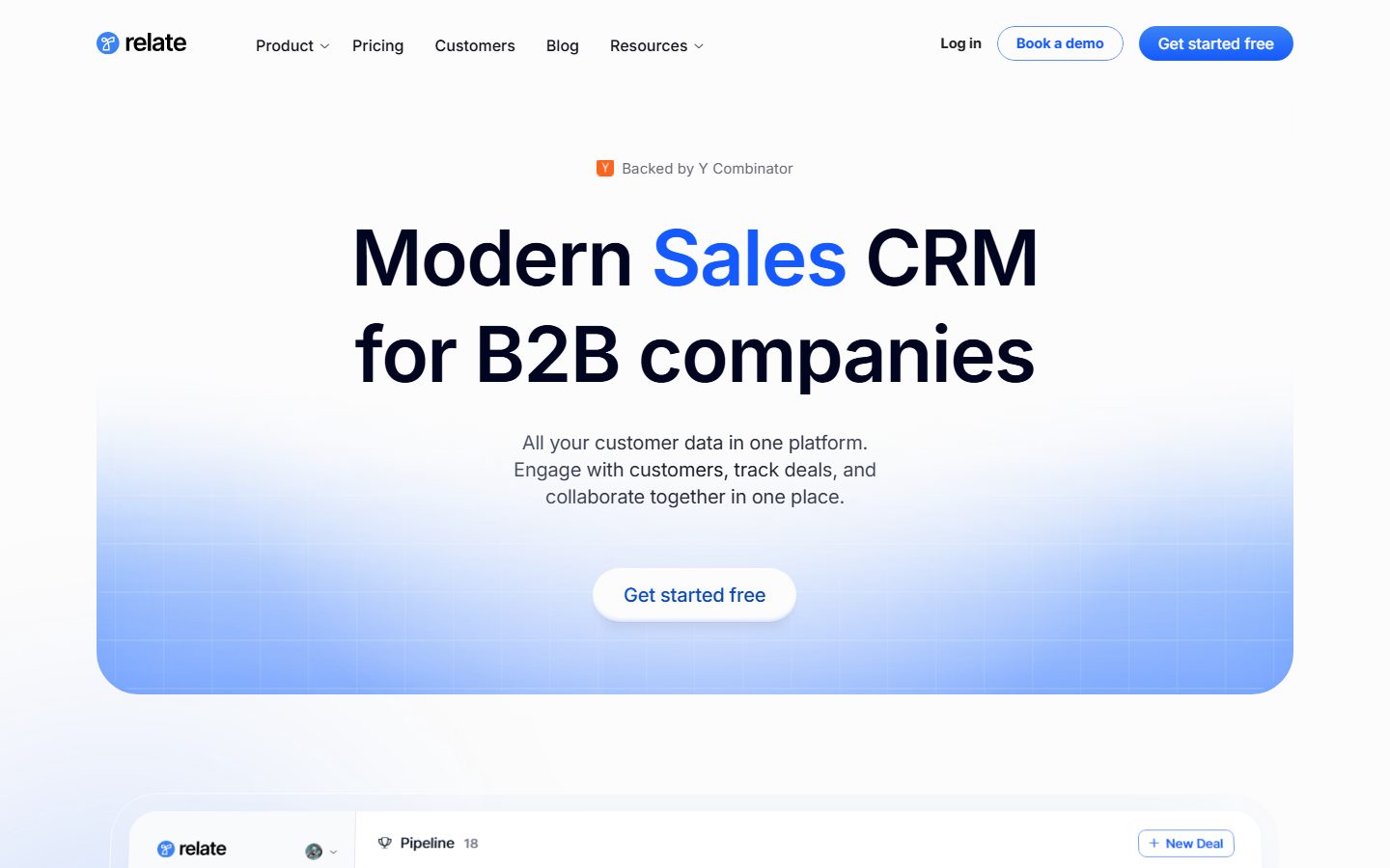
A bright, modern-SaaS CRM marketing surface anchored on a near-white canvas (#fcfcfc) with a single saturated electric-blue primary action (#145aff). The system reads as clean, product-forward B2B software — Inter throughout, a very large weight-600 hero headline with negative tracking, fully pill-shaped buttons (100px radius), soft white product-UI cards floating on a faint blue-tinted hero gradient, and a deep near-black footer (#020520) that closes the page. Brand voltage comes from one electric-blue accent and from real CRM pipeline UI fragments shown directly inside cards.
---
version: alpha
name: Relate-design-analysis
description: A bright, modern-SaaS CRM marketing surface anchored on a near-white canvas (#fcfcfc) with a single saturated electric-blue primary action (#145aff). The system reads as clean, product-forward B2B software — Inter throughout, a very large weight-600 hero headline with negative tracking, fully pill-shaped buttons (100px radius), soft white product-UI cards floating on a faint blue-tinted hero gradient, and a deep near-black footer (#020520) that closes the page. Brand voltage comes from one electric-blue accent and from real CRM pipeline UI fragments shown directly inside cards.

colors:
  primary: "#145aff"
  primary-soft: "#3b82f6"
  ink: "#000000"
  ink-rich: "#14141e"
  ink-900: "#111827"
  neutral-800: "#262626"
  neutral-700: "#374151"
  neutral: "#696a72"
  muted: "#6b7280"
  muted-soft: "#95959b"
  canvas: "#fcfcfc"
  surface: "#ffffff"
  surface-soft: "#f9fafb"
  footer: "#020520"
  on-primary: "#ffffff"
  link: "#0000ee"
  success: "#16ca2e"
  success-deep: "#2cae1e"
  error: "#ff4d4d"
  coral: "#f26052"
  warning: "#ffa64d"

typography:
  display:
    fontFamily: "Inter, sans-serif"
    fontSize: 80px
    fontWeight: 600
    lineHeight: 1.05
    letterSpacing: -1.5px
  lead:
    fontFamily: "Inter, sans-serif"
    fontSize: 20px
    fontWeight: 400
    lineHeight: 1.4
    letterSpacing: -0.2px
  title:
    fontFamily: "Inter, sans-serif"
    fontSize: 20px
    fontWeight: 600
    lineHeight: 1.5
    letterSpacing: normal
  body:
    fontFamily: "Inter, sans-serif"
    fontSize: 16px
    fontWeight: 500
    lineHeight: 1.0
    letterSpacing: normal

rounded:
  xs: 4px
  sm: 6px
  md: 8px
  lg: 12px
  xl: 16px
  xxl: 20px
  xxxl: 32px
  pill: 100px

spacing:
  xxs: 4px
  xs: 6px
  sm: 8px
  md: 10px
  lg: 12px
  xl: 16px
  xxl: 20px
  x3: 24px
  x4: 28px

components:
  top-nav:
    backgroundColor: "{colors.canvas}"
    textColor: "{colors.ink}"
    typography: "{typography.body}"
  nav-link:
    backgroundColor: transparent
    textColor: "{colors.neutral-700}"
    typography: "{typography.body}"
  button-primary:
    backgroundColor: "{colors.primary}"
    textColor: "{colors.on-primary}"
    typography: "{typography.body}"
    rounded: "{rounded.pill}"
    padding: 12px 20px
  button-outline:
    backgroundColor: "{colors.surface}"
    textColor: "{colors.primary}"
    typography: "{typography.body}"
    rounded: "{rounded.pill}"
    padding: 12px 20px
  button-login-text:
    backgroundColor: transparent
    textColor: "{colors.ink}"
    typography: "{typography.body}"
  hero-cta-pill:
    backgroundColor: "{colors.surface}"
    textColor: "{colors.primary}"
    typography: "{typography.body}"
    rounded: "{rounded.pill}"
    padding: 16px 24px
  hero-band:
    backgroundColor: "{colors.canvas}"
    textColor: "{colors.ink}"
    typography: "{typography.display}"
  hero-gradient-panel:
    backgroundColor: "{colors.primary-soft}"
    textColor: "{colors.primary}"
    rounded: "{rounded.xxxl}"
  product-mockup-card:
    backgroundColor: "{colors.surface}"
    textColor: "{colors.ink-rich}"
    rounded: "{rounded.xl}"
    padding: 16px
  feature-card:
    backgroundColor: "{colors.surface}"
    textColor: "{colors.ink-rich}"
    typography: "{typography.title}"
    rounded: "{rounded.xl}"
    padding: 20px
  pipeline-column-card:
    backgroundColor: "{colors.surface-soft}"
    textColor: "{colors.ink-rich}"
    rounded: "{rounded.lg}"
    padding: 12px
  badge-yc:
    backgroundColor: "{colors.surface-soft}"
    textColor: "{colors.neutral-700}"
    typography: "{typography.body}"
    rounded: "{rounded.pill}"
    padding: 4px 12px
  status-badge:
    backgroundColor: "{colors.surface-soft}"
    textColor: "{colors.neutral}"
    typography: "{typography.body}"
    rounded: "{rounded.pill}"
    padding: 4px 8px
  text-input:
    backgroundColor: "{colors.surface}"
    textColor: "{colors.ink-rich}"
    typography: "{typography.body}"
    rounded: "{rounded.lg}"
    padding: 10px 12px
  text-link:
    backgroundColor: transparent
    textColor: "{colors.link}"
    typography: "{typography.body}"
  footer:
    backgroundColor: "{colors.footer}"
    textColor: "{colors.muted-soft}"
    typography: "{typography.body}"
    padding: 28px
  footer-signup-input:
    backgroundColor: "{colors.surface}"
    textColor: "{colors.ink-rich}"
    typography: "{typography.body}"
    rounded: "{rounded.lg}"
    padding: 10px 12px

---

## Overview

Relate's marketing surface is a bright, product-forward B2B SaaS interface — a near-white canvas (`{colors.canvas}` — #fcfcfc) carrying a single saturated electric-blue primary action (`{colors.primary}` — #145aff) and a very large weight-600 hero headline. The system reads as clean, confident, and engineering-led: lots of whitespace, fully pill-shaped buttons, soft white product cards floating over a faint blue hero gradient, and a deep near-black footer (`{colors.footer}` — #020520) that closes the page.

Type is single-family: **Inter** for everything — display headline, supporting copy, UI labels. The hero h1 runs at a measured 80px / weight 600 / -1.5px tracking, which is the loudest moment in the system. Below it, supporting copy is light (weight 400, `{typography.lead}`) and UI labels sit at 16px weight 500 (`{typography.body}`).

Brand voltage comes from two places: the **electric-blue accent** (`{colors.primary}`), used on the primary CTA, the highlighted word in the headline ("Sales"), and link affordances; and **real CRM product UI fragments** — pipeline kanban columns, deal rows, inbox panes, customer-health tables — shown directly inside white cards rather than illustrated. Relate shows the actual product chrome at marketing scale.

**Key Characteristics:**
- Near-white canvas (`{colors.canvas}` — #fcfcfc) with one saturated blue CTA (`{colors.primary}` — #145aff). The blue carries a soft blue glow shadow (measured `rgba(20,90,255,...)`).
- Fully pill-shaped buttons — border-radius 100px (`{rounded.pill}`) is the single most frequent radius in the system (332 occurrences). Buttons are capsules, not rounded rectangles.
- Inter everywhere, no second typeface. Display weight 600 with negative tracking; supporting copy weight 400; labels weight 500.
- Product UI fragments embedded directly in white cards (`{component.product-mockup-card}`) — pipeline kanban, deal rows, customer-health tables. Real chrome, not marketing illustration.
- Faint blue hero gradient panel (`{component.hero-gradient-panel}`) behind the hero CTA — the only chromatic background block on the page.
- Status accents pulled from the embedded product UI: `{colors.success}` (#16ca2e), `{colors.coral}` (#f26052), `{colors.warning}` (#ffa64d) appear on deal/customer status pills inside cards, never on hero CTAs.
- Deep near-black footer (`{colors.footer}` — #020520) — the only dark surface on the page, closing the long scroll.

## Colors

### Brand & Accent
- **Primary** (`{colors.primary}` — #145aff): The dominant action color. The "Get started free" CTA, the highlighted headline word ("Sales"), and the hero-CTA-pill's text color. Carries a soft blue glow shadow (measured `rgba(20,90,255,0.65/0.3/0.145)` stack).
- **Primary Soft** (`{colors.primary-soft}` — #3b82f6): The lighter blue used in the hero gradient panel and softer accent moments.
- **Link** (`{colors.link}` — #0000ee): The raw default anchor color measured on `<a>` elements — used as the inline text-link tone.

### Surface
- **Canvas** (`{colors.canvas}` — #fcfcfc): The default page floor.
- **Surface** (`{colors.surface}` — #ffffff): Cards, inputs, the hero CTA pill, product-mockup cards.
- **Surface Soft** (`{colors.surface-soft}` — #f9fafb): Pipeline column backgrounds, badge pills, faint inner panels.
- **Footer** (`{colors.footer}` — #020520): The deep near-black footer — the only dark surface on the page.

### Text
- **Ink** (`{colors.ink}` — #000000): The hero headline and highest-contrast text.
- **Ink Rich** (`{colors.ink-rich}` — #14141e): Default paragraph / running-text color (measured on `p`).
- **Ink 900** (`{colors.ink-900}` — #111827): A near-black used on dense UI text.
- **Neutral 800** (`{colors.neutral-800}` — #262626): Dark UI labels.
- **Neutral 700** (`{colors.neutral-700}` — #374151): Nav links and secondary labels.
- **Neutral** (`{colors.neutral}` — #696a72): Secondary text inside product cards.
- **Muted** (`{colors.muted}` — #6b7280): Tertiary text, sub-headings.
- **Muted Soft** (`{colors.muted-soft}` — #95959b): Footer body text, fine-print.
- **On Primary** (`{colors.on-primary}` — #ffffff): Text on the blue primary button.

### Semantic (observed inside product UI fragments)
- **Success** (`{colors.success}` — #16ca2e) and **Success Deep** (`{colors.success-deep}` — #2cae1e): "Closed Won" / healthy-customer status.
- **Coral** (`{colors.coral}` — #f26052): "Churned" / lost status pills.
- **Error** (`{colors.error}` — #ff4d4d): Error / lost-deal accents.
- **Warning** (`{colors.warning}` — #ffa64d): At-risk / renewal-soon status.

These semantic colors appear only inside embedded CRM UI fragments — never on marketing CTAs.

## Typography

### Font Family
The system runs **Inter** for everything — there is no second typeface. The hero headline, supporting copy, navigation, and embedded-UI labels are all Inter at varying sizes and weights. A reasonable fallback stack is `Inter, -apple-system, BlinkMacSystemFont, "Segoe UI", Roboto, sans-serif`.

No licensed/custom typeface was detected (`fonts_licensed` is empty), so no substitution is required — Inter is an open-source font shipped directly.

### Hierarchy

| Token | Size | Weight | Line Height | Letter Spacing | Use |
|---|---|---|---|---|---|
| `{typography.display}` | 80px | 600 | 1.05 | -1.5px | Hero h1 ("Modern Sales CRM for B2B companies") |
| `{typography.lead}` | 20px | 400 | 1.4 | -0.2px | Hero sub-headline, section intro paragraphs (h2) |
| `{typography.title}` | 20px | 600 | 1.5 | normal | Section / card titles (h3, e.g. "Prospect.", "Close.") |
| `{typography.body}` | 16px | 500 | 1.0 | normal | Default UI labels, buttons, nav links, footer copy |

### Principles
The hierarchy is intentionally compressed: there is one very large display size (80px) and then a steep drop to 20px for both supporting copy and titles. Emphasis at the title tier comes from weight (600 vs the lead's 400) rather than size — both measure 20px. Keep the hero headline at weight 600 with negative tracking; pushing it to 700 would break the clean, modern voice.

The body role's measured line-height of 1.0 reflects tightly-set UI labels and button text; for multi-line running paragraphs the lead role (line-height 1.4) carries the readable copy. Button and nav-link text reuse `{typography.body}` — no separate button type role was measured.

## Layout

### Spacing System
- **Base unit:** appears to be a loose 2px grid; the dominant measured steps cluster at 8, 10, and 12px.
- **Tokens:** `{spacing.xxs}` 4px · `{spacing.xs}` 6px · `{spacing.sm}` 8px · `{spacing.md}` 10px · `{spacing.lg}` 12px · `{spacing.xl}` 16px · `{spacing.xxl}` 20px · `{spacing.x3}` 24px · `{spacing.x4}` 28px.
- **Most frequent steps:** 8px (343), 10px (341), 12px (331) — these three carry the bulk of internal padding and gaps, consistent with dense product-UI card layouts.
- **Card internal padding:** `{spacing.xl}` (16px) for product-mockup and feature cards; `{spacing.lg}` (12px) inside pipeline columns.

### Grid & Container
- **Hero:** centered single-column — badge, h1, sub-headline, CTA pill all center-aligned over a max content width that caps around the gradient panel.
- **Product showcase:** full-width white cards holding multi-column CRM UI (pipeline kanban with 4–5 columns).
- **Feature grid:** 2-up cards at desktop ("Simple & Clean UI" / "Built for SaaS", etc.).
- **Footer:** multi-column link list (Product / Learn / Company) plus a brand + signup column at left.

### Whitespace Philosophy
Relate uses generous vertical whitespace between editorial bands (each "Prospect / Close / Retain / Recycle" beat gets its own breathing room) while the embedded product cards stay internally dense — the contrast between airy marketing spacing and tight product UI is intentional. Note: no large section-level spacing token (e.g. 64/96px) was measured; see Known Gaps.

## Elevation & Depth

| Level | Treatment | Use |
|---|---|---|
| Flat | No shadow | Canvas bands, nav |
| Soft hairline shadow | `rgba(0,0,0,0.1) 0px 0px 4px -2px` (measured) | Small UI chips, badges |
| Card lift | `rgba(0,0,0,0.082) 0px 0.36px 1.8px, rgba(0,0,0,0.07) 0px 1.37px 6.87px, rgba(0,0,0,0.016) 0px 6px 30px -4.25px` (measured) | Product-mockup cards, feature cards |
| Primary blue glow | `rgba(20,90,255,0.65) 0px 0.12px 0.6px, rgba(20,90,255,0.3) 0px 1px 5px, + inset` (measured) | The blue primary button and hero CTA pill |
| Ambient blue bloom | `rgba(20,90,255,0.1) 0px 0px 100px -28px` (measured) | Large soft blue glow behind hero artifacts |

The elevation philosophy is **soft and layered** — multi-stop, low-alpha shadows give product cards a gentle float, and the primary action carries a distinctive blue glow rather than a plain drop shadow. There is no heavy/hard shadow, no neumorphism.

### Decorative Depth
- The hero CTA pill sits on a faint blue-to-white gradient panel, lifting it off the canvas via color and the blue glow shadow rather than a hard border.
- Embedded CRM UI fragments carry their own internal card shadows (the soft three-stop stack above), reinforcing the "this is the real product" reading.

## Shapes

### Border Radius Scale

| Token | Value | Use |
|---|---|---|
| `{rounded.xs}` | 4px | Small inner chips, tiny status markers |
| `{rounded.sm}` | 6px | Compact inline elements |
| `{rounded.md}` | 8px | Common UI element radius (113 occurrences) — list rows, small panels |
| `{rounded.lg}` | 12px | Inputs (measured), pipeline column cards |
| `{rounded.xl}` | 16px | Product-mockup cards, feature cards |
| `{rounded.xxl}` | 20px | Larger nested panels |
| `{rounded.xxxl}` | 32px | Hero gradient panel, large rounded section blocks |
| `{rounded.pill}` | 100px | All buttons, badges, status pills (332 occurrences — the system's signature) |

### Photography / Artifact Geometry
There are no marketing photographs — the visual content is the embedded product UI, which retains its native chrome radii (`{rounded.md}` rows inside `{rounded.xl}` cards). Avatars inside CRM rows are small circles (radius 50/100, fully round). The dominant shape language is **the pill** (buttons + badges) sitting on **softly-rounded white cards**.

## Components

### Top Navigation

**`top-nav`** — Bar pinned to the top of the page on the `{colors.canvas}` floor. Left: the Relate wordmark with its blue rounded logo glyph. Center: text links (Product ⌄, Pricing, Customers, Blog, Resources ⌄) in `{component.nav-link}` style. Right cluster: "Log in" (`{component.button-login-text}`), "Book a demo" (`{component.button-outline}`), and "Get started free" (`{component.button-primary}`).

**`nav-link`** — Inline menu item, transparent background, `{colors.neutral-700}` text, `{typography.body}`.

### Buttons

**`button-primary`** — The signature CTA. Background `{colors.primary}` (#145aff), text `{colors.on-primary}`, `{typography.body}`, fully pill-shaped (`{rounded.pill}` — 100px), padding ~12px × 20px (derived from measured spacing steps; exact padding not measured). Carries the measured blue glow shadow.

**`button-outline`** — The "Book a demo" button. White `{colors.surface}` background, `{colors.primary}` text, 1px blue outline, `{rounded.pill}`, same padding profile as primary.

**`button-login-text`** — Plain text button ("Log in"), transparent background, `{colors.ink}` text, `{typography.body}`.

**`hero-cta-pill`** — The large in-hero "Get started free" capsule. White `{colors.surface}` background with `{colors.primary}` text, pill-shaped, padding ~16px × 24px (derived). Lifted off the blue gradient panel by the soft white card shadow and ambient blue bloom.

### Hero

**`hero-band`** — Centered hero on `{colors.canvas}`. Badge "Backed by Y Combinator" (`{component.badge-yc}`) at top, then the `{typography.display}` h1 with "Sales" set in `{colors.primary}`, then `{typography.lead}` sub-copy, then the `{component.hero-cta-pill}`.

**`hero-gradient-panel`** — A large rounded (`{rounded.xxxl}` — 32px) panel filled with a faint blue-to-white gradient (`{colors.primary-soft}` tone) sitting behind the hero CTA. The only chromatic background block on the page.

### Cards & Containers

**`product-mockup-card`** — White card showing real Relate CRM UI fragments (pipeline kanban, inbox pane, deal detail, customer-health table). Background `{colors.surface}`, text `{colors.ink-rich}`, rounded `{rounded.xl}` (16px), padding `{spacing.xl}` (16px), the measured soft three-stop card shadow. These cards display the product — they don't decorate around it.

**`feature-card`** — Used in the 2-up Features grid ("Simple & Clean UI", "Built for SaaS", "A Full CRM"). Background `{colors.surface}`, rounded `{rounded.xl}`, padding `{spacing.xxl}` (20px), title in `{typography.title}`, supporting copy in `{typography.lead}`.

**`pipeline-column-card`** — A kanban column inside the product mockups (Potential / Pending / Closed Won / Lost). Background `{colors.surface-soft}` (#f9fafb), rounded `{rounded.lg}` (12px), padding `{spacing.lg}` (12px). Holds stacked deal rows with company name, value, owner avatar, and status accents.

### Badges & Status

**`badge-yc`** — The "Backed by Y Combinator" pill above the hero. Background `{colors.surface-soft}`, text `{colors.neutral-700}`, `{typography.body}`, rounded `{rounded.pill}`, padding ~4px × 12px (derived).

**`status-badge`** — Small pill labels inside CRM UI (Customer, Closing, Churned, deal stage). Background `{colors.surface-soft}` with text in the relevant semantic color (`{colors.success}`, `{colors.coral}`, `{colors.warning}`), `{typography.body}`, rounded `{rounded.pill}`, padding ~4px × 8px (derived).

### Inputs & Forms

**`text-input`** — Standard input (measured). Background `{colors.surface}` (#ffffff), text `{colors.ink-rich}`, `{typography.body}`, rounded `{rounded.lg}` (12px), padding ~10px × 12px (derived from measured spacing).

**`text-link`** — Inline anchor in `{colors.link}` (#0000ee), `{typography.body}`.

### Footer

**`footer`** — Deep near-black footer that closes the page. Background `{colors.footer}` (#020520), text `{colors.muted-soft}`, `{typography.body}`, padding `{spacing.x4}` (28px). Carries the Relate wordmark + tagline ("The Collaborative Sales CRM") at left, a newsletter signup row, and 3 link columns (Product / Learn / Company). The only dark surface on the page.

**`footer-signup-input`** — Email signup field in the footer. White `{colors.surface}` background, `{colors.ink-rich}` text, rounded `{rounded.lg}`, paired with a "Sign Up" `{component.button-primary}`.

## Do's and Don'ts

### Do
- Reserve `{colors.primary}` (#145aff) for the primary CTA, the single highlighted headline word, and link affordances. The blue is scarce and deliberate.
- Keep every button fully pill-shaped (`{rounded.pill}` — 100px). The capsule is the system's signature shape.
- Set the hero headline in Inter weight 600 with -1.5px tracking. Emphasis comes from size (80px), not extra weight.
- Embed real CRM product UI inside `{component.product-mockup-card}`. Show the actual pipeline / inbox / health table rather than illustrating it.
- Use the semantic accents (`{colors.success}`, `{colors.coral}`, `{colors.warning}`) only inside product UI status pills.
- Keep the soft multi-stop card shadow on product cards and the blue glow on the primary button — they're measured and on-brand.
- End the page with the deep near-black footer (`{colors.footer}`). The light-to-dark close is part of the rhythm.

### Don't
- Don't use the blue accent on more than one primary action per band. Two blue capsules competing breaks the hierarchy.
- Don't put status/semantic colors (green, coral, orange) on marketing CTAs — they belong to the embedded CRM chrome.
- Don't introduce a second typeface; Inter carries the whole system.
- Don't square off the buttons — rounded rectangles read as off-brand against the pill language.
- Don't add a second dark surface above the footer. The near-black is the page's single closing block.
- Don't document hover states — primary and active/pressed only.

## Responsive Behavior

| Name | Width | Key Changes |
|---|---|---|
| Mobile | < 768px | Nav collapses to a compact bar; hero h1 scales down sharply from 80px; product-mockup cards scroll horizontally or scale to fit; feature grid 2-up → 1-up; footer columns stack |
| Tablet | 768–1024px | Nav stays horizontal but tightens; feature cards 2-up; product mockups scale proportionally |
| Desktop | 1024–1440px | Full nav with all links + 3 right-side actions; product mockups at full multi-column width; feature grid 2-up |
| Wide | > 1440px | Same as desktop with more outer breathing room around the centered hero |

(Exact breakpoints were not measured; the table above is inferred from the two captured layouts — see Known Gaps.)

### Touch Targets
- `{component.button-primary}` and `{component.button-outline}` use generous pill padding; effective tap area comfortably clears 44px in height.
- `{component.text-input}` height derives from `{typography.body}` plus ~10px vertical padding.

### Collapsing Strategy
- The centered hero stacks naturally (badge → headline → sub-copy → CTA) at every width.
- Product-mockup cards are the main responsive challenge: the wide pipeline kanban must scroll or scale rather than reflow, to keep the real-UI reading intact.
- Footer link columns collapse to stacked groups on mobile.

### Image Behavior
- There are no marketing photos; embedded product UI retains native aspect ratios while the white card wrappers resize.

## Iteration Guide

1. Focus on ONE component at a time. Reference its YAML key directly (`{component.product-mockup-card}`, `{component.button-primary}`).
2. Variants of an existing component (`-active`, `-disabled`, `-focused`) live as separate entries in `components:`.
3. Use `{token.refs}` everywhere — never inline a hex in a component.
4. Never document hover. Default and Active/Pressed states only.
5. Keep buttons pill-shaped and the accent blue scarce — these two rules define the brand.
6. The deep near-black footer is the only dark surface; don't add other dark blocks casually.
7. When emphasis is needed, scale Inter up before adding weight — the system leans on the 80px display jump.

## Known Gaps

- **Button padding and exact CTA dimensions** were not measured; padding values in components are derived from the dominant measured spacing steps (8/10/12px) and screenshot proportions, and are flagged "derived" in the component notes.
- **Only one component (`input`) was captured** by the analyzer (background #ffffff, radius 12px). All other components are documented from screenshot ground-truth plus the measured color/type/radius/spacing tokens.
- **No large section-level spacing token** (e.g. 48/64/96px) was measured; vertical band rhythm is described qualitatively. Maximum measured spacing step is 28px.
- **Letter-spacing for the title and body roles** measured as "normal"; precise sub-pixel tracking was not extracted.
- **Body line-height of 1.0** reflects tightly-set UI labels; the readable multi-line copy uses the lead role (1.4). A dedicated long-form paragraph role was not separately measured.
- **Breakpoints and responsive scaling values** are inferred from the landing + pricing captures, not measured.
- **The full blue-glow and card shadow stacks** were truncated in measurement (one shadow string is cut off mid-value); the documented values reflect the captured portions.
- **Form validation, focus, disabled, and active/pressed states** were not extracted — these would need an interactive flow to confirm.
- **The pricing page** was captured but its tier-card structure was not separately measured; pricing-specific components are out of scope here.

<!-- Documented by duply · real-world design systems as ready-to-use DESIGN.md for AI coding agents · https://duply.ai/relate/design-md -->
Color Palette
Accent
Neutrals
Typography
display80px · 600 · 1.05
The quick brown fox jumpslead20px · 400 · 1.4
The quick brown fox jumpstitle20px · 600 · 1.5
The quick brown fox jumpsbody16px · 500 · 1
The quick brown fox jumpsSpacing & Shape
Spacing
| Name | Value | Preview |
|---|---|---|
| xxs | 4px | |
| xs | 6px | |
| sm | 8px | |
| md | 10px | |
| lg | 12px | |
| xl | 16px | |
| xxl | 20px | |
| x3 | 24px | |
| x4 | 28px |
Border Radius
| Name | Value | Preview |
|---|---|---|
| xs | 4px | |
| sm | 6px | |
| md | 8px | |
| lg | 12px | |
| xl | 16px | |
| xxl | 20px | |
| xxxl | 32px | |
| pill | 100px |
More like this


---
version: alpha
name: Relate-design-analysis
description: A bright, modern-SaaS CRM marketing surface anchored on a near-white canvas (#fcfcfc) with a single saturated electric-blue primary action (#145aff). The system reads as clean, product-forward B2B software — Inter throughout, a very large weight-600 hero headline with negative tracking, fully pill-shaped buttons (100px radius), soft white product-UI cards floating on a faint blue-tinted hero gradient, and a deep near-black footer (#020520) that closes the page. Brand voltage comes from one electric-blue accent and from real CRM pipeline UI fragments shown directly inside cards.

colors:
  primary: "#145aff"
  primary-soft: "#3b82f6"
  ink: "#000000"
  ink-rich: "#14141e"
  ink-900: "#111827"
  neutral-800: "#262626"
  neutral-700: "#374151"
  neutral: "#696a72"
  muted: "#6b7280"
  muted-soft: "#95959b"
  canvas: "#fcfcfc"
  surface: "#ffffff"
  surface-soft: "#f9fafb"
  footer: "#020520"
  on-primary: "#ffffff"
  link: "#0000ee"
  success: "#16ca2e"
  success-deep: "#2cae1e"
  error: "#ff4d4d"
  coral: "#f26052"
  warning: "#ffa64d"

typography:
  display:
    fontFamily: "Inter, sans-serif"
    fontSize: 80px
    fontWeight: 600
    lineHeight: 1.05
    letterSpacing: -1.5px
  lead:
    fontFamily: "Inter, sans-serif"
    fontSize: 20px
    fontWeight: 400
    lineHeight: 1.4
    letterSpacing: -0.2px
  title:
    fontFamily: "Inter, sans-serif"
    fontSize: 20px
    fontWeight: 600
    lineHeight: 1.5
    letterSpacing: normal
  body:
    fontFamily: "Inter, sans-serif"
    fontSize: 16px
    fontWeight: 500
    lineHeight: 1.0
    letterSpacing: normal

rounded:
  xs: 4px
  sm: 6px
  md: 8px
  lg: 12px
  xl: 16px
  xxl: 20px
  xxxl: 32px
  pill: 100px

spacing:
  xxs: 4px
  xs: 6px
  sm: 8px
  md: 10px
  lg: 12px
  xl: 16px
  xxl: 20px
  x3: 24px
  x4: 28px

components:
  top-nav:
    backgroundColor: "{colors.canvas}"
    textColor: "{colors.ink}"
    typography: "{typography.body}"
  nav-link:
    backgroundColor: transparent
    textColor: "{colors.neutral-700}"
    typography: "{typography.body}"
  button-primary:
    backgroundColor: "{colors.primary}"
    textColor: "{colors.on-primary}"
    typography: "{typography.body}"
    rounded: "{rounded.pill}"
    padding: 12px 20px
  button-outline:
    backgroundColor: "{colors.surface}"
    textColor: "{colors.primary}"
    typography: "{typography.body}"
    rounded: "{rounded.pill}"
    padding: 12px 20px
  button-login-text:
    backgroundColor: transparent
    textColor: "{colors.ink}"
    typography: "{typography.body}"
  hero-cta-pill:
    backgroundColor: "{colors.surface}"
    textColor: "{colors.primary}"
    typography: "{typography.body}"
    rounded: "{rounded.pill}"
    padding: 16px 24px
  hero-band:
    backgroundColor: "{colors.canvas}"
    textColor: "{colors.ink}"
    typography: "{typography.display}"
  hero-gradient-panel:
    backgroundColor: "{colors.primary-soft}"
    textColor: "{colors.primary}"
    rounded: "{rounded.xxxl}"
  product-mockup-card:
    backgroundColor: "{colors.surface}"
    textColor: "{colors.ink-rich}"
    rounded: "{rounded.xl}"
    padding: 16px
  feature-card:
    backgroundColor: "{colors.surface}"
    textColor: "{colors.ink-rich}"
    typography: "{typography.title}"
    rounded: "{rounded.xl}"
    padding: 20px
  pipeline-column-card:
    backgroundColor: "{colors.surface-soft}"
    textColor: "{colors.ink-rich}"
    rounded: "{rounded.lg}"
    padding: 12px
  badge-yc:
    backgroundColor: "{colors.surface-soft}"
    textColor: "{colors.neutral-700}"
    typography: "{typography.body}"
    rounded: "{rounded.pill}"
    padding: 4px 12px
  status-badge:
    backgroundColor: "{colors.surface-soft}"
    textColor: "{colors.neutral}"
    typography: "{typography.body}"
    rounded: "{rounded.pill}"
    padding: 4px 8px
  text-input:
    backgroundColor: "{colors.surface}"
    textColor: "{colors.ink-rich}"
    typography: "{typography.body}"
    rounded: "{rounded.lg}"
    padding: 10px 12px
  text-link:
    backgroundColor: transparent
    textColor: "{colors.link}"
    typography: "{typography.body}"
  footer:
    backgroundColor: "{colors.footer}"
    textColor: "{colors.muted-soft}"
    typography: "{typography.body}"
    padding: 28px
  footer-signup-input:
    backgroundColor: "{colors.surface}"
    textColor: "{colors.ink-rich}"
    typography: "{typography.body}"
    rounded: "{rounded.lg}"
    padding: 10px 12px

---

## Overview

Relate's marketing surface is a bright, product-forward B2B SaaS interface — a near-white canvas (`{colors.canvas}` — #fcfcfc) carrying a single saturated electric-blue primary action (`{colors.primary}` — #145aff) and a very large weight-600 hero headline. The system reads as clean, confident, and engineering-led: lots of whitespace, fully pill-shaped buttons, soft white product cards floating over a faint blue hero gradient, and a deep near-black footer (`{colors.footer}` — #020520) that closes the page.

Type is single-family: **Inter** for everything — display headline, supporting copy, UI labels. The hero h1 runs at a measured 80px / weight 600 / -1.5px tracking, which is the loudest moment in the system. Below it, supporting copy is light (weight 400, `{typography.lead}`) and UI labels sit at 16px weight 500 (`{typography.body}`).

Brand voltage comes from two places: the **electric-blue accent** (`{colors.primary}`), used on the primary CTA, the highlighted word in the headline ("Sales"), and link affordances; and **real CRM product UI fragments** — pipeline kanban columns, deal rows, inbox panes, customer-health tables — shown directly inside white cards rather than illustrated. Relate shows the actual product chrome at marketing scale.

**Key Characteristics:**
- Near-white canvas (`{colors.canvas}` — #fcfcfc) with one saturated blue CTA (`{colors.primary}` — #145aff). The blue carries a soft blue glow shadow (measured `rgba(20,90,255,...)`).
- Fully pill-shaped buttons — border-radius 100px (`{rounded.pill}`) is the single most frequent radius in the system (332 occurrences). Buttons are capsules, not rounded rectangles.
- Inter everywhere, no second typeface. Display weight 600 with negative tracking; supporting copy weight 400; labels weight 500.
- Product UI fragments embedded directly in white cards (`{component.product-mockup-card}`) — pipeline kanban, deal rows, customer-health tables. Real chrome, not marketing illustration.
- Faint blue hero gradient panel (`{component.hero-gradient-panel}`) behind the hero CTA — the only chromatic background block on the page.
- Status accents pulled from the embedded product UI: `{colors.success}` (#16ca2e), `{colors.coral}` (#f26052), `{colors.warning}` (#ffa64d) appear on deal/customer status pills inside cards, never on hero CTAs.
- Deep near-black footer (`{colors.footer}` — #020520) — the only dark surface on the page, closing the long scroll.

## Colors

### Brand & Accent
- **Primary** (`{colors.primary}` — #145aff): The dominant action color. The "Get started free" CTA, the highlighted headline word ("Sales"), and the hero-CTA-pill's text color. Carries a soft blue glow shadow (measured `rgba(20,90,255,0.65/0.3/0.145)` stack).
- **Primary Soft** (`{colors.primary-soft}` — #3b82f6): The lighter blue used in the hero gradient panel and softer accent moments.
- **Link** (`{colors.link}` — #0000ee): The raw default anchor color measured on `<a>` elements — used as the inline text-link tone.

### Surface
- **Canvas** (`{colors.canvas}` — #fcfcfc): The default page floor.
- **Surface** (`{colors.surface}` — #ffffff): Cards, inputs, the hero CTA pill, product-mockup cards.
- **Surface Soft** (`{colors.surface-soft}` — #f9fafb): Pipeline column backgrounds, badge pills, faint inner panels.
- **Footer** (`{colors.footer}` — #020520): The deep near-black footer — the only dark surface on the page.

### Text
- **Ink** (`{colors.ink}` — #000000): The hero headline and highest-contrast text.
- **Ink Rich** (`{colors.ink-rich}` — #14141e): Default paragraph / running-text color (measured on `p`).
- **Ink 900** (`{colors.ink-900}` — #111827): A near-black used on dense UI text.
- **Neutral 800** (`{colors.neutral-800}` — #262626): Dark UI labels.
- **Neutral 700** (`{colors.neutral-700}` — #374151): Nav links and secondary labels.
- **Neutral** (`{colors.neutral}` — #696a72): Secondary text inside product cards.
- **Muted** (`{colors.muted}` — #6b7280): Tertiary text, sub-headings.
- **Muted Soft** (`{colors.muted-soft}` — #95959b): Footer body text, fine-print.
- **On Primary** (`{colors.on-primary}` — #ffffff): Text on the blue primary button.

### Semantic (observed inside product UI fragments)
- **Success** (`{colors.success}` — #16ca2e) and **Success Deep** (`{colors.success-deep}` — #2cae1e): "Closed Won" / healthy-customer status.
- **Coral** (`{colors.coral}` — #f26052): "Churned" / lost status pills.
- **Error** (`{colors.error}` — #ff4d4d): Error / lost-deal accents.
- **Warning** (`{colors.warning}` — #ffa64d): At-risk / renewal-soon status.

These semantic colors appear only inside embedded CRM UI fragments — never on marketing CTAs.

## Typography

### Font Family
The system runs **Inter** for everything — there is no second typeface. The hero headline, supporting copy, navigation, and embedded-UI labels are all Inter at varying sizes and weights. A reasonable fallback stack is `Inter, -apple-system, BlinkMacSystemFont, "Segoe UI", Roboto, sans-serif`.

No licensed/custom typeface was detected (`fonts_licensed` is empty), so no substitution is required — Inter is an open-source font shipped directly.

### Hierarchy

| Token | Size | Weight | Line Height | Letter Spacing | Use |
|---|---|---|---|---|---|
| `{typography.display}` | 80px | 600 | 1.05 | -1.5px | Hero h1 ("Modern Sales CRM for B2B companies") |
| `{typography.lead}` | 20px | 400 | 1.4 | -0.2px | Hero sub-headline, section intro paragraphs (h2) |
| `{typography.title}` | 20px | 600 | 1.5 | normal | Section / card titles (h3, e.g. "Prospect.", "Close.") |
| `{typography.body}` | 16px | 500 | 1.0 | normal | Default UI labels, buttons, nav links, footer copy |

### Principles
The hierarchy is intentionally compressed: there is one very large display size (80px) and then a steep drop to 20px for both supporting copy and titles. Emphasis at the title tier comes from weight (600 vs the lead's 400) rather than size — both measure 20px. Keep the hero headline at weight 600 with negative tracking; pushing it to 700 would break the clean, modern voice.

The body role's measured line-height of 1.0 reflects tightly-set UI labels and button text; for multi-line running paragraphs the lead role (line-height 1.4) carries the readable copy. Button and nav-link text reuse `{typography.body}` — no separate button type role was measured.

## Layout

### Spacing System
- **Base unit:** appears to be a loose 2px grid; the dominant measured steps cluster at 8, 10, and 12px.
- **Tokens:** `{spacing.xxs}` 4px · `{spacing.xs}` 6px · `{spacing.sm}` 8px · `{spacing.md}` 10px · `{spacing.lg}` 12px · `{spacing.xl}` 16px · `{spacing.xxl}` 20px · `{spacing.x3}` 24px · `{spacing.x4}` 28px.
- **Most frequent steps:** 8px (343), 10px (341), 12px (331) — these three carry the bulk of internal padding and gaps, consistent with dense product-UI card layouts.
- **Card internal padding:** `{spacing.xl}` (16px) for product-mockup and feature cards; `{spacing.lg}` (12px) inside pipeline columns.

### Grid & Container
- **Hero:** centered single-column — badge, h1, sub-headline, CTA pill all center-aligned over a max content width that caps around the gradient panel.
- **Product showcase:** full-width white cards holding multi-column CRM UI (pipeline kanban with 4–5 columns).
- **Feature grid:** 2-up cards at desktop ("Simple & Clean UI" / "Built for SaaS", etc.).
- **Footer:** multi-column link list (Product / Learn / Company) plus a brand + signup column at left.

### Whitespace Philosophy
Relate uses generous vertical whitespace between editorial bands (each "Prospect / Close / Retain / Recycle" beat gets its own breathing room) while the embedded product cards stay internally dense — the contrast between airy marketing spacing and tight product UI is intentional. Note: no large section-level spacing token (e.g. 64/96px) was measured; see Known Gaps.

## Elevation & Depth

| Level | Treatment | Use |
|---|---|---|
| Flat | No shadow | Canvas bands, nav |
| Soft hairline shadow | `rgba(0,0,0,0.1) 0px 0px 4px -2px` (measured) | Small UI chips, badges |
| Card lift | `rgba(0,0,0,0.082) 0px 0.36px 1.8px, rgba(0,0,0,0.07) 0px 1.37px 6.87px, rgba(0,0,0,0.016) 0px 6px 30px -4.25px` (measured) | Product-mockup cards, feature cards |
| Primary blue glow | `rgba(20,90,255,0.65) 0px 0.12px 0.6px, rgba(20,90,255,0.3) 0px 1px 5px, + inset` (measured) | The blue primary button and hero CTA pill |
| Ambient blue bloom | `rgba(20,90,255,0.1) 0px 0px 100px -28px` (measured) | Large soft blue glow behind hero artifacts |

The elevation philosophy is **soft and layered** — multi-stop, low-alpha shadows give product cards a gentle float, and the primary action carries a distinctive blue glow rather than a plain drop shadow. There is no heavy/hard shadow, no neumorphism.

### Decorative Depth
- The hero CTA pill sits on a faint blue-to-white gradient panel, lifting it off the canvas via color and the blue glow shadow rather than a hard border.
- Embedded CRM UI fragments carry their own internal card shadows (the soft three-stop stack above), reinforcing the "this is the real product" reading.

## Shapes

### Border Radius Scale

| Token | Value | Use |
|---|---|---|
| `{rounded.xs}` | 4px | Small inner chips, tiny status markers |
| `{rounded.sm}` | 6px | Compact inline elements |
| `{rounded.md}` | 8px | Common UI element radius (113 occurrences) — list rows, small panels |
| `{rounded.lg}` | 12px | Inputs (measured), pipeline column cards |
| `{rounded.xl}` | 16px | Product-mockup cards, feature cards |
| `{rounded.xxl}` | 20px | Larger nested panels |
| `{rounded.xxxl}` | 32px | Hero gradient panel, large rounded section blocks |
| `{rounded.pill}` | 100px | All buttons, badges, status pills (332 occurrences — the system's signature) |

### Photography / Artifact Geometry
There are no marketing photographs — the visual content is the embedded product UI, which retains its native chrome radii (`{rounded.md}` rows inside `{rounded.xl}` cards). Avatars inside CRM rows are small circles (radius 50/100, fully round). The dominant shape language is **the pill** (buttons + badges) sitting on **softly-rounded white cards**.

## Components

### Top Navigation

**`top-nav`** — Bar pinned to the top of the page on the `{colors.canvas}` floor. Left: the Relate wordmark with its blue rounded logo glyph. Center: text links (Product ⌄, Pricing, Customers, Blog, Resources ⌄) in `{component.nav-link}` style. Right cluster: "Log in" (`{component.button-login-text}`), "Book a demo" (`{component.button-outline}`), and "Get started free" (`{component.button-primary}`).

**`nav-link`** — Inline menu item, transparent background, `{colors.neutral-700}` text, `{typography.body}`.

### Buttons

**`button-primary`** — The signature CTA. Background `{colors.primary}` (#145aff), text `{colors.on-primary}`, `{typography.body}`, fully pill-shaped (`{rounded.pill}` — 100px), padding ~12px × 20px (derived from measured spacing steps; exact padding not measured). Carries the measured blue glow shadow.

**`button-outline`** — The "Book a demo" button. White `{colors.surface}` background, `{colors.primary}` text, 1px blue outline, `{rounded.pill}`, same padding profile as primary.

**`button-login-text`** — Plain text button ("Log in"), transparent background, `{colors.ink}` text, `{typography.body}`.

**`hero-cta-pill`** — The large in-hero "Get started free" capsule. White `{colors.surface}` background with `{colors.primary}` text, pill-shaped, padding ~16px × 24px (derived). Lifted off the blue gradient panel by the soft white card shadow and ambient blue bloom.

### Hero

**`hero-band`** — Centered hero on `{colors.canvas}`. Badge "Backed by Y Combinator" (`{component.badge-yc}`) at top, then the `{typography.display}` h1 with "Sales" set in `{colors.primary}`, then `{typography.lead}` sub-copy, then the `{component.hero-cta-pill}`.

**`hero-gradient-panel`** — A large rounded (`{rounded.xxxl}` — 32px) panel filled with a faint blue-to-white gradient (`{colors.primary-soft}` tone) sitting behind the hero CTA. The only chromatic background block on the page.

### Cards & Containers

**`product-mockup-card`** — White card showing real Relate CRM UI fragments (pipeline kanban, inbox pane, deal detail, customer-health table). Background `{colors.surface}`, text `{colors.ink-rich}`, rounded `{rounded.xl}` (16px), padding `{spacing.xl}` (16px), the measured soft three-stop card shadow. These cards display the product — they don't decorate around it.

**`feature-card`** — Used in the 2-up Features grid ("Simple & Clean UI", "Built for SaaS", "A Full CRM"). Background `{colors.surface}`, rounded `{rounded.xl}`, padding `{spacing.xxl}` (20px), title in `{typography.title}`, supporting copy in `{typography.lead}`.

**`pipeline-column-card`** — A kanban column inside the product mockups (Potential / Pending / Closed Won / Lost). Background `{colors.surface-soft}` (#f9fafb), rounded `{rounded.lg}` (12px), padding `{spacing.lg}` (12px). Holds stacked deal rows with company name, value, owner avatar, and status accents.

### Badges & Status

**`badge-yc`** — The "Backed by Y Combinator" pill above the hero. Background `{colors.surface-soft}`, text `{colors.neutral-700}`, `{typography.body}`, rounded `{rounded.pill}`, padding ~4px × 12px (derived).

**`status-badge`** — Small pill labels inside CRM UI (Customer, Closing, Churned, deal stage). Background `{colors.surface-soft}` with text in the relevant semantic color (`{colors.success}`, `{colors.coral}`, `{colors.warning}`), `{typography.body}`, rounded `{rounded.pill}`, padding ~4px × 8px (derived).

### Inputs & Forms

**`text-input`** — Standard input (measured). Background `{colors.surface}` (#ffffff), text `{colors.ink-rich}`, `{typography.body}`, rounded `{rounded.lg}` (12px), padding ~10px × 12px (derived from measured spacing).

**`text-link`** — Inline anchor in `{colors.link}` (#0000ee), `{typography.body}`.

### Footer

**`footer`** — Deep near-black footer that closes the page. Background `{colors.footer}` (#020520), text `{colors.muted-soft}`, `{typography.body}`, padding `{spacing.x4}` (28px). Carries the Relate wordmark + tagline ("The Collaborative Sales CRM") at left, a newsletter signup row, and 3 link columns (Product / Learn / Company). The only dark surface on the page.

**`footer-signup-input`** — Email signup field in the footer. White `{colors.surface}` background, `{colors.ink-rich}` text, rounded `{rounded.lg}`, paired with a "Sign Up" `{component.button-primary}`.

## Do's and Don'ts

### Do
- Reserve `{colors.primary}` (#145aff) for the primary CTA, the single highlighted headline word, and link affordances. The blue is scarce and deliberate.
- Keep every button fully pill-shaped (`{rounded.pill}` — 100px). The capsule is the system's signature shape.
- Set the hero headline in Inter weight 600 with -1.5px tracking. Emphasis comes from size (80px), not extra weight.
- Embed real CRM product UI inside `{component.product-mockup-card}`. Show the actual pipeline / inbox / health table rather than illustrating it.
- Use the semantic accents (`{colors.success}`, `{colors.coral}`, `{colors.warning}`) only inside product UI status pills.
- Keep the soft multi-stop card shadow on product cards and the blue glow on the primary button — they're measured and on-brand.
- End the page with the deep near-black footer (`{colors.footer}`). The light-to-dark close is part of the rhythm.

### Don't
- Don't use the blue accent on more than one primary action per band. Two blue capsules competing breaks the hierarchy.
- Don't put status/semantic colors (green, coral, orange) on marketing CTAs — they belong to the embedded CRM chrome.
- Don't introduce a second typeface; Inter carries the whole system.
- Don't square off the buttons — rounded rectangles read as off-brand against the pill language.
- Don't add a second dark surface above the footer. The near-black is the page's single closing block.
- Don't document hover states — primary and active/pressed only.

## Responsive Behavior

| Name | Width | Key Changes |
|---|---|---|
| Mobile | < 768px | Nav collapses to a compact bar; hero h1 scales down sharply from 80px; product-mockup cards scroll horizontally or scale to fit; feature grid 2-up → 1-up; footer columns stack |
| Tablet | 768–1024px | Nav stays horizontal but tightens; feature cards 2-up; product mockups scale proportionally |
| Desktop | 1024–1440px | Full nav with all links + 3 right-side actions; product mockups at full multi-column width; feature grid 2-up |
| Wide | > 1440px | Same as desktop with more outer breathing room around the centered hero |

(Exact breakpoints were not measured; the table above is inferred from the two captured layouts — see Known Gaps.)

### Touch Targets
- `{component.button-primary}` and `{component.button-outline}` use generous pill padding; effective tap area comfortably clears 44px in height.
- `{component.text-input}` height derives from `{typography.body}` plus ~10px vertical padding.

### Collapsing Strategy
- The centered hero stacks naturally (badge → headline → sub-copy → CTA) at every width.
- Product-mockup cards are the main responsive challenge: the wide pipeline kanban must scroll or scale rather than reflow, to keep the real-UI reading intact.
- Footer link columns collapse to stacked groups on mobile.

### Image Behavior
- There are no marketing photos; embedded product UI retains native aspect ratios while the white card wrappers resize.

## Iteration Guide

1. Focus on ONE component at a time. Reference its YAML key directly (`{component.product-mockup-card}`, `{component.button-primary}`).
2. Variants of an existing component (`-active`, `-disabled`, `-focused`) live as separate entries in `components:`.
3. Use `{token.refs}` everywhere — never inline a hex in a component.
4. Never document hover. Default and Active/Pressed states only.
5. Keep buttons pill-shaped and the accent blue scarce — these two rules define the brand.
6. The deep near-black footer is the only dark surface; don't add other dark blocks casually.
7. When emphasis is needed, scale Inter up before adding weight — the system leans on the 80px display jump.

## Known Gaps

- **Button padding and exact CTA dimensions** were not measured; padding values in components are derived from the dominant measured spacing steps (8/10/12px) and screenshot proportions, and are flagged "derived" in the component notes.
- **Only one component (`input`) was captured** by the analyzer (background #ffffff, radius 12px). All other components are documented from screenshot ground-truth plus the measured color/type/radius/spacing tokens.
- **No large section-level spacing token** (e.g. 48/64/96px) was measured; vertical band rhythm is described qualitatively. Maximum measured spacing step is 28px.
- **Letter-spacing for the title and body roles** measured as "normal"; precise sub-pixel tracking was not extracted.
- **Body line-height of 1.0** reflects tightly-set UI labels; the readable multi-line copy uses the lead role (1.4). A dedicated long-form paragraph role was not separately measured.
- **Breakpoints and responsive scaling values** are inferred from the landing + pricing captures, not measured.
- **The full blue-glow and card shadow stacks** were truncated in measurement (one shadow string is cut off mid-value); the documented values reflect the captured portions.
- **Form validation, focus, disabled, and active/pressed states** were not extracted — these would need an interactive flow to confirm.
- **The pricing page** was captured but its tier-card structure was not separately measured; pricing-specific components are out of scope here.

<!-- Documented by duply · real-world design systems as ready-to-use DESIGN.md for AI coding agents · https://duply.ai/relate/design-md -->