Lottielab
A bright, designer-friendly motion-tooling marketing site built on a white canvas with a single electric-indigo primary action (#7270ff). The system reads as clean modern SaaS — Plus Jakarta Sans throughout, generous vertical rhythm, soft-rounded cards holding real product UI and animation fragments, and one deep near-black band that anchors the "ship to iOS, Android, Web" story. Brand voltage comes from the indigo CTA and from live Lottie animation artifacts shown directly inside cards rather than from a wide accent palette.
---
version: alpha
name: Lottielab-design-analysis
description: A bright, designer-friendly motion-tooling marketing site built on a white canvas with a single electric-indigo primary action (#7270ff). The system reads as clean modern SaaS — Plus Jakarta Sans throughout, generous vertical rhythm, soft-rounded cards holding real product UI and animation fragments, and one deep near-black band that anchors the "ship to iOS, Android, Web" story. Brand voltage comes from the indigo CTA and from live Lottie animation artifacts shown directly inside cards rather than from a wide accent palette.
colors:
primary: "#7270ff"
primary-light: "#8887fd"
primary-indigo: "#6366f1"
ink: "#2f2b4a"
ink-deep: "#111827"
body: "#6b7280"
body-strong: "#374151"
muted: "#9ca3af"
muted-strong: "#4b5563"
surface-strong: "#d1d5db"
hairline: "#e5e7eb"
hairline-soft: "#f3f4f6"
surface-soft: "#f9fafb"
canvas: "#ffffff"
surface-dark: "#1c1b25"
surface-darkest: "#030712"
black: "#000000"
on-primary: "#ffffff"
on-dark: "#ffffff"
accent-teal: "#049d90"
typography:
display-xl:
fontFamily: "Plus Jakarta Sans, sans-serif"
fontSize: 60px
fontWeight: 600
lineHeight: 1.0
letterSpacing: -1.5px
display-lg:
fontFamily: "Plus Jakarta Sans, sans-serif"
fontSize: 48px
fontWeight: 600
lineHeight: 1.0
letterSpacing: 0
display-md:
fontFamily: "Plus Jakarta Sans, sans-serif"
fontSize: 36px
fontWeight: 600
lineHeight: 1.111
letterSpacing: 0
label:
fontFamily: "Plus Jakarta Sans, sans-serif"
fontSize: 16px
fontWeight: 500
lineHeight: 1.5
letterSpacing: 0
body-lg:
fontFamily: "Plus Jakarta Sans, sans-serif"
fontSize: 18px
fontWeight: 400
lineHeight: 1.556
letterSpacing: 0
button:
fontFamily: "Plus Jakarta Sans, sans-serif"
fontSize: 16px
fontWeight: 400
lineHeight: 1.5
letterSpacing: 0
rounded:
xs: 4px
sm: 6px
md: 8px
base: 9px
lg: 12px
xl: 24px
full: 9999px
spacing:
xxs: 4px
xs: 8px
sm: 12px
md: 16px
lg: 24px
xl: 32px
xxl: 40px
xxxl: 48px
section: 64px
section-lg: 96px
mega: 128px
ultra: 192px
components:
button-primary:
backgroundColor: "{colors.primary}"
textColor: "{colors.on-primary}"
typography: "{typography.button}"
rounded: "{rounded.lg}"
padding: 6px 20px
button-primary-active:
backgroundColor: "{colors.primary-indigo}"
textColor: "{colors.on-primary}"
typography: "{typography.button}"
rounded: "{rounded.lg}"
padding: 6px 20px
button-secondary:
backgroundColor: "{colors.canvas}"
textColor: "{colors.ink}"
typography: "{typography.button}"
rounded: "{rounded.lg}"
padding: 6px 20px
top-nav:
backgroundColor: "{colors.canvas}"
textColor: "{colors.ink}"
typography: "{typography.label}"
nav-link:
backgroundColor: transparent
textColor: "{colors.ink}"
typography: "{typography.label}"
text-link:
backgroundColor: transparent
textColor: "{colors.ink}"
typography: "{typography.body-lg}"
logo-mark:
backgroundColor: "{colors.primary}"
textColor: "{colors.on-primary}"
rounded: "{rounded.md}"
hero-band:
backgroundColor: "{colors.canvas}"
textColor: "{colors.ink}"
typography: "{typography.display-xl}"
padding: 96px
count-badge:
backgroundColor: "{colors.surface-soft}"
textColor: "{colors.body}"
typography: "{typography.label}"
rounded: "{rounded.md}"
padding: 4px 8px
mockup-card:
backgroundColor: "{colors.canvas}"
textColor: "{colors.ink}"
rounded: "{rounded.lg}"
padding: 24px
feature-card:
backgroundColor: "{colors.canvas}"
textColor: "{colors.ink}"
typography: "{typography.label}"
rounded: "{rounded.lg}"
padding: 24px
dark-band:
backgroundColor: "{colors.surface-dark}"
textColor: "{colors.on-dark}"
typography: "{typography.display-md}"
padding: 96px
testimonial-card:
backgroundColor: "{colors.canvas}"
textColor: "{colors.ink}"
typography: "{typography.body-lg}"
rounded: "{rounded.lg}"
padding: 24px
template-tile:
backgroundColor: "{colors.surface-soft}"
textColor: "{colors.ink}"
rounded: "{rounded.xs}"
cta-band:
backgroundColor: "{colors.canvas}"
textColor: "{colors.ink}"
typography: "{typography.display-md}"
padding: 96px
footer:
backgroundColor: "{colors.surface-soft}"
textColor: "{colors.body}"
typography: "{typography.label}"
padding: 64px
---
## Overview
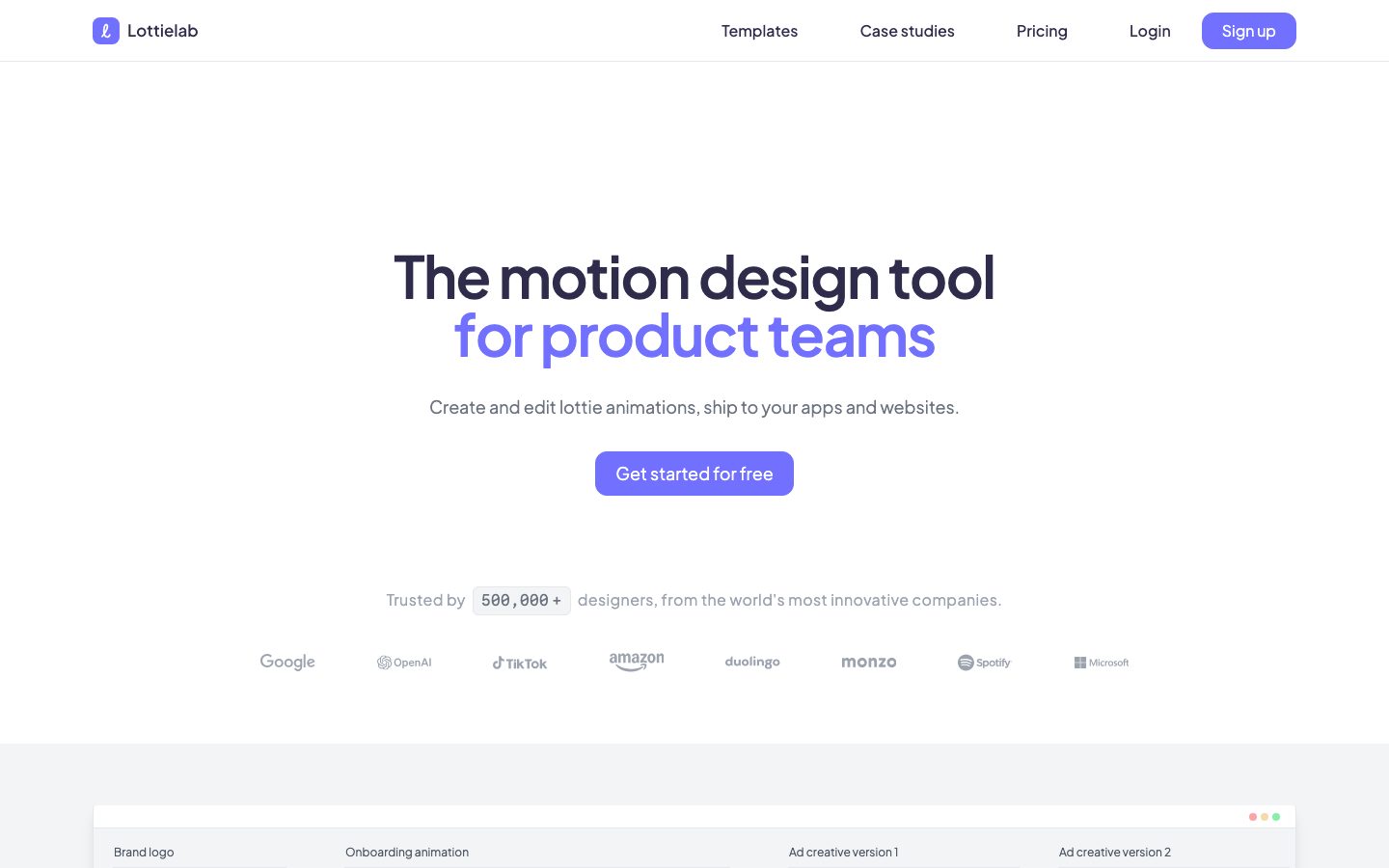
Lottielab's marketing surface is a clean, designer-first modern-SaaS interface — white canvas (`{colors.canvas}` — #ffffff) with a single electric-indigo primary action (`{colors.primary}` — #7270ff) and `Plus Jakarta Sans` used for every text role. The system reads as friendly and confident: large centered hero headline, one obvious CTA, and product/animation fragments shown directly inside soft-rounded cards rather than as marketing illustrations.
Type voice is single-family. `Plus Jakarta Sans` carries everything — display headlines at weight 600 with tight negative tracking on the hero, and body/UI text at weight 400-500. There is no secondary display face; hierarchy comes from size and weight alone.
Brand voltage comes from two places: the indigo CTA (`{colors.primary}`) and **live Lottie animation artifacts shown inside cards** — the brand-logo loops, onboarding animations, ad-creative loops, and editor timeline fragments that appear directly in the marketing flow. Lottielab shows the actual product output as content.
The system stays light almost everywhere; a single deep near-black band (`{colors.surface-dark}` — #1c1b25) carries the "Share, review, and ship to iOS, Android, and Web" cross-platform story and is the only dark surface on the page.
**Key Characteristics:**
- White canvas with one electric-indigo CTA (`{colors.primary}` — #7270ff). Buttons are `{rounded.lg}` (12px) with weight-400 labels — a soft, low-contrast button voice rather than heavy bold caps.
- Single typeface: `Plus Jakarta Sans` across display, body, nav, and buttons. Hero h1 is 60px / 600 / -1.5px tracking.
- The hero "for product teams" line is set in indigo (`{colors.primary}` / `{colors.primary-light}`) — a two-tone headline where the second line carries the brand color.
- Live Lottie/product artifacts embedded inside cards (`{component.mockup-card}`) — editor timelines, animation loops, mobile-share previews shown as the actual product, not decoration.
- A single dark band (`{colors.surface-dark}` — #1c1b25) for the cross-platform shipping section, with indigo accent text. Everything else is white or `{colors.surface-soft}` (#f9fafb).
- Pill-radius (`{rounded.full}`) used heavily on small chips, count badges, and dots; cards use `{rounded.lg}` (12px); template tiles use `{rounded.xs}` (4px).
- Soft, low-alpha drop shadows on elevated cards, including one signature indigo-tinted glow (`rgba(136, 135, 253, 0.2)`) carrying the `{colors.primary-light}` hue.
- Generous vertical rhythm — section spacing reaching `{spacing.section-lg}` (96px) and beyond, with the largest measured gaps at `{spacing.mega}` (128px) and `{spacing.ultra}` (192px).
## Colors
### Brand & Accent
- **Primary** (`{colors.primary}` — #7270ff): The dominant action color. The "Get started for free" / "Sign up" CTAs, the indigo half of the hero headline, and the logo mark. The single source of brand voltage.
- **Primary Light** (`{colors.primary-light}` — #8887fd): A lighter indigo used on the second hero line and as the hue inside the signature indigo glow shadow (`rgba(136, 135, 253, 0.2)`).
- **Primary Indigo** (`{colors.primary-indigo}` — #6366f1): A slightly deeper indigo in the same family; used here as the pressed/active CTA treatment (derived as the press-darken of `{colors.primary}`).
- **Accent Teal** (`{colors.accent-teal}` — #049d90): A rare teal seen inside product/animation artifacts (e.g. editor chrome). Appears only inside product fragments, never on CTAs.
### Surface
- **Canvas** (`{colors.canvas}` — #ffffff): The default page floor and most card backgrounds.
- **Surface Soft** (`{colors.surface-soft}` — #f9fafb): Very-light section/card panels, the count badge, footer background, template tiles.
- **Surface Strong** (`{colors.surface-strong}` — #d1d5db): Stronger gray for borders, dividers, and disabled fills.
- **Surface Dark** (`{colors.surface-dark}` — #1c1b25): The single dark band ("Share, review, and ship"). The only dark surface on the page.
- **Surface Darkest** (`{colors.surface-darkest}` — #030712): Near-black used inside dark product previews / nested chrome on the dark band.
- **Hairline** (`{colors.hairline}` — #e5e7eb): The 1px border tone on light surfaces.
- **Hairline Soft** (`{colors.hairline-soft}` — #f3f4f6): A barely-visible divider on white-on-white sections.
- **Black** (`{colors.black}` — #000000): Pure black, used sparingly inside artwork and icon strokes.
### Text
- **Ink** (`{colors.ink}` — #2f2b4a): The dominant text + headline color — a deep desaturated navy. Highest-frequency text tone (links and headings).
- **Ink Deep** (`{colors.ink-deep}` — #111827): The darkest near-black, used on the heaviest headings and high-contrast labels.
- **Body** (`{colors.body}` — #6b7280): Default running-text / supporting copy.
- **Body Strong** (`{colors.body-strong}` — #374151): Slightly darker body for emphasized paragraphs.
- **Muted** (`{colors.muted}` — #9ca3af): Secondary text — fine-print, trusted-by labels, partner logos.
- **Muted Strong** (`{colors.muted-strong}` — #4b5563): Mid-gray for sub-labels.
- **On Primary / On Dark** (`{colors.on-primary}` / `{colors.on-dark}` — #ffffff): Text on the indigo CTA and on the dark band.
## Typography
### Font Family
The system runs a single typeface — **Plus Jakarta Sans** — across every role: display headlines, body copy, navigation, and button labels. Plus Jakarta Sans is an open-source geometric humanist sans (SIL Open Font License), so it can ship directly with no substitution required. The fallback stack walks `Plus Jakarta Sans, -apple-system, BlinkMacSystemFont, "Segoe UI", sans-serif`.
Hierarchy is created by size and weight only:
- Display headlines: weight 600, tightened tracking on the largest size (-1.5px on the hero)
- Body + UI: weight 400-500, normal tracking
### Hierarchy
| Token | Size | Weight | Line Height | Letter Spacing | Use |
|---|---|---|---|---|---|
| `{typography.display-xl}` | 60px | 600 | 1.0 | -1.5px | Hero h1 ("The motion design tool / for product teams") |
| `{typography.display-lg}` | 48px | 600 | 1.0 | 0 | Large section headlines (h3 role) |
| `{typography.display-md}` | 36px | 600 | 1.111 | 0 | Section heads ("All you need, and more", "Built by designers") |
| `{typography.label}` | 16px | 500 | 1.5 | 0 | Card titles, nav links, sub-labels (h4 role) |
| `{typography.body-lg}` | 18px | 400 | 1.556 | 0 | Default running-text, hero sub-headline, testimonial copy |
| `{typography.button}` | 16px | 400 | 1.5 | 0 | Button labels |
Note: the measured h3 role (48px) is larger than the measured h2 role (36px) — Lottielab assigns heading tags by visual weight rather than strict document order, so `display-lg` and `display-md` are documented by their measured sizes, not their tag names.
### Principles
One family, weight-and-size hierarchy. Display headlines sit at 600 — never 700. Body copy stays at 400 with a relaxed 1.5-1.556 line height for comfortable reading. Button labels are deliberately light (weight 400) — the CTA leans on its indigo fill, not on bold type, for emphasis.
### Note on Font Substitutes
No substitution is required — Plus Jakarta Sans is freely available under the SIL Open Font License and can be self-hosted or loaded from Google Fonts. `fonts_licensed` in the analysis is empty, confirming no proprietary face is in use.
## Layout
### Spacing System
- **Base unit:** 4px.
- **Tokens:** `{spacing.xxs}` 4px · `{spacing.xs}` 8px · `{spacing.sm}` 12px · `{spacing.md}` 16px · `{spacing.lg}` 24px · `{spacing.xl}` 32px · `{spacing.xxl}` 40px · `{spacing.xxxl}` 48px · `{spacing.section}` 64px · `{spacing.section-lg}` 96px · `{spacing.mega}` 128px · `{spacing.ultra}` 192px.
- **Dominant rhythm:** `{spacing.lg}` (24px) is by far the most frequent gap (used for card padding and grid gutters), with `{spacing.section-lg}` (96px) the dominant band-to-band rhythm.
- **Card internal padding:** `{spacing.lg}` (24px) for feature and mockup cards.
- **Large editorial gaps:** `{spacing.mega}` (128px) and `{spacing.ultra}` (192px) appear between the marquee bands for dramatic breathing room.
### Grid & Container
- **Editorial body:** Centered single-column hero (headline + sub + CTA stacked and centered), shifting to multi-column grids below.
- **Feature grids:** 3-up at desktop for the "All you need, and more" cards, with one wider 2-span card in the mix.
- **Template grid:** Multi-column tile mosaic of `{component.template-tile}`.
- **Testimonial grid:** Multi-column quote cards.
- **Footer:** Multi-column link list (Product / Resources / Company).
### Whitespace Philosophy
Lottielab uses generous whitespace — the hero is centered in a tall white field, and bands are separated by large vertical gaps (96px and up). The rhythm is calibrated for a calm, premium-tool feel: one clear message per band, a single CTA, and plenty of air around the product artifacts.
## Elevation & Depth
| Level | Treatment | Use |
|---|---|---|
| Flat | No shadow, no border | Body sections, hero, top nav |
| Card soft | `rgba(0,0,0,0.1) 0px 4px 6px -1px, rgba(0,0,0,0.1) 0px 2px 4px -2px` | Standard elevated cards |
| Card lifted | `rgba(0,0,0,0.1) 0px 10px 15px -3px, rgba(0,0,0,0.1) 0px 4px 6px -4px` | More-prominent floating cards / mockup containers |
| Brand glow | `rgba(136,135,253,0.2) 0px 20px 25px -5px, rgba(136,135,253,0.2) 0px 8px 10px -6px` | Signature indigo-tinted glow on a featured surface — carries the `{colors.primary-light}` hue |
The elevation philosophy is **soft and modern** — low-alpha multi-layer drop shadows, plus one indigo-tinted glow that ties depth back to the brand color. No heavy shadows, no neumorphism.
### Decorative Depth
- Live Lottie animation artifacts inside `{component.mockup-card}` and the dark band carry their own internal chrome and motion — these are product output shown as content, not system tokens.
- The dark band (`{colors.surface-dark}`) uses color-block contrast rather than shadow to lift its content off the white page above and below.
## Shapes
### Border Radius Scale
| Token | Value | Use |
|---|---|---|
| `{rounded.xs}` | 4px | Template mosaic tiles, small accents |
| `{rounded.sm}` | 6px | Small inline elements |
| `{rounded.md}` | 8px | Logo mark, count badge, inputs / small controls — the most frequent flat radius |
| `{rounded.base}` | 9px | Occasional control radius variant |
| `{rounded.lg}` | 12px | Buttons and content cards |
| `{rounded.xl}` | 24px | Larger feature containers |
| `{rounded.full}` | 9999px | Pills, chips, dots, circular controls |
`{rounded.full}` and `{rounded.md}` are the two most-used radii (22 and 21 occurrences respectively) — the system pairs fully-round small chips with 8-12px content rounding.
### Artifact Geometry
Product and animation artifacts inside cards retain their native chrome (editor panels, timeline rows, mobile previews). Template tiles use the tight 4px radius (`{rounded.xs}`) to read as a crisp mosaic. The logo mark is a rounded-square (`{rounded.md}`) holding the indigo "l".
## Components
### Top Navigation
**`top-nav`** — White nav bar pinned to the top of every page. `{colors.canvas}` background. Carries the `{component.logo-mark}` + "Lottielab" wordmark at left, a center/right horizontal menu (Templates, Case studies, Pricing, Login) in `{typography.label}`, and a `{component.button-primary}` ("Sign up") at far right.
**`logo-mark`** — A rounded-square indigo tile (`{colors.primary}`, `{rounded.md}`) holding a white "l" glyph. Sits left of the wordmark.
### Buttons
**`button-primary`** — The signature CTA. Background `{colors.primary}` (#7270ff), text `{colors.on-primary}`, type `{typography.button}` (Plus Jakarta Sans 16px / 400), padding 6px × 20px, rounded `{rounded.lg}` (12px). Used for "Get started for free", "Sign up", "Browse all templates".
**`button-primary-active`** — Pressed state, shifting the fill to `{colors.primary-indigo}` (#6366f1). Derived as the press-darken of the primary indigo; same geometry as `button-primary`.
**`button-secondary`** — White/low-contrast button for secondary actions. Background `{colors.canvas}`, text `{colors.ink}`, same radius and padding as primary.
### Navigation & Links
**`nav-link`** — Top-nav menu item. Transparent background, `{colors.ink}` text, `{typography.label}`.
**`text-link`** — Inline body link in `{colors.ink}` set in `{typography.body-lg}`.
### Cards & Containers
**`hero-band`** — Centered white hero. Stacked h1 (`{typography.display-xl}`, two-tone with the indigo "for product teams" line) + 18px sub-headline + a single centered `{component.button-primary}`, followed by a "Trusted by" row with the `{component.count-badge}` and partner logos. Vertical padding to `{spacing.section-lg}` (96px).
**`count-badge`** — A small inset chip ("500,000+") on `{colors.surface-soft}` with `{colors.body}` text, `{typography.label}`, rounded `{rounded.md}`, padding 4px × 8px. Sits inline within the trusted-by sentence.
**`mockup-card`** — A card showing live Lottie/product artifacts (brand-logo loops, onboarding animation, ad-creative loops, editor timeline). Background `{colors.canvas}`, rounded `{rounded.lg}`, padding `{spacing.lg}` (24px). The artifacts inside have their own chrome — these cards display the product, they don't decorate around it.
**`feature-card`** — Used in the "All you need, and more" 3-up grid (Modern intuitive interface, Collaborative, Fast & performant, Optimised file sizes). Background `{colors.canvas}`, title in `{typography.label}`, rounded `{rounded.lg}`, padding `{spacing.lg}` (24px). Carries a title, short description, and an embedded product/animation visual.
**`dark-band`** — The single dark cross-platform band ("Share, review, and ship to iOS, Android, and Web"). Background `{colors.surface-dark}` (#1c1b25), text `{colors.on-dark}`, indigo accent on the platform line, heading in `{typography.display-md}`. Vertical padding to `{spacing.section-lg}` (96px). The only dark surface on the page.
**`testimonial-card`** — Customer-quote card in the "Built by designers, for designers" grid. Background `{colors.canvas}`, rounded `{rounded.lg}`, padding `{spacing.lg}` (24px). Quote in `{typography.body-lg}`, with a small avatar + name + role row.
**`template-tile`** — A tile in the "Templates for all scenarios" mosaic. Background `{colors.surface-soft}` (or a template thumbnail), rounded `{rounded.xs}` (4px). Tiles tessellate into a crisp grid.
### CTA / Footer
**`cta-band`** — The pre-footer "Bring your products to life" band. White canvas, centered `{component.logo-mark}` enlarged, heading in `{typography.display-md}`, sub-line, and a centered `{component.button-primary}` ("Get started for free"). Vertical padding `{spacing.section-lg}` (96px).
**`footer`** — Light footer that closes the page. Background `{colors.surface-soft}` (#f9fafb), body text `{colors.body}`, links in `{typography.label}`. Multi-column link list (Product / Resources / Company) with the wordmark and copyright. Vertical padding `{spacing.section}` (64px). Note the footer stays light — the dark band mid-page, not the footer, is the system's dark anchor.
## Do's and Don'ts
### Do
- Reserve `{colors.primary}` (#7270ff) for the primary CTA, the indigo half of the hero headline, and the logo mark. The brand has one accent color — use it deliberately.
- Set every text role in Plus Jakarta Sans. Build hierarchy with size and weight (600 display / 400-500 body), not with a second typeface.
- Keep button labels at weight 400 — the indigo fill carries the emphasis, not bold type.
- Embed real Lottie animations and product UI inside `{component.mockup-card}` and `{component.feature-card}`. Show the product output, don't illustrate around it.
- Use the single `{component.dark-band}` (`{colors.surface-dark}`) for the cross-platform shipping moment — one dark surface, mid-page.
- Use `{rounded.full}` for chips and dots, `{rounded.lg}` (12px) for buttons/cards, and `{rounded.xs}` (4px) for the template mosaic.
- Lean on generous vertical rhythm — 96px and up between marquee bands.
### Don't
- Don't introduce additional accent colors on CTAs. `{colors.accent-teal}` and the pastels appear only inside product artifacts.
- Don't bold display headings past 600 or set body copy heavier than 500.
- Don't make the footer dark — the footer is `{colors.surface-soft}`; the mid-page band is the only dark surface.
- Don't apply heavy or hard-edged shadows — depth is soft, low-alpha, and occasionally indigo-tinted.
- Don't document hover state — primary darkens to `{colors.primary-indigo}` on press; nothing else changes.
## Responsive Behavior
The site was captured at desktop and a full-length scroll; specific breakpoint values were not measured. The following reflects observed structure and standard practice (derived).
### Breakpoints
| Name | Width | Key Changes |
|---|---|---|
| Mobile | < 768px | Nav collapses to a compact bar; hero h1 scales down from 60px; feature grids and testimonial grids stack 1-up; template mosaic reduces columns |
| Tablet | 768–1024px | Nav stays horizontal but tightens; feature cards 2-up; template mosaic fewer columns |
| Desktop | 1024–1440px | Full horizontal nav; 3-up feature grid; full template mosaic |
| Wide | > 1440px | Same as desktop with more outer breathing room; centered content |
### Touch Targets
- `{component.button-primary}` uses 6px × 20px padding around 16px text; effective tap height should be padded to a 44px minimum on touch (derived — not measured).
- Nav links and footer links are text targets; spacing should keep them tappable.
### Collapsing Strategy
- Hero stays centered and single-column at every breakpoint; headline scales down.
- Feature, testimonial, and template grids reduce column count rather than shrinking content.
- The dark band's three device previews reflow vertically on narrow widths.
## Iteration Guide
1. Focus on ONE component at a time. Reference its YAML key directly (`{component.mockup-card}`, `{component.dark-band}`).
2. Variants of an existing component (`-active`, `-secondary`) live as separate entries in `components:`.
3. Use `{token.refs}` everywhere — never inline hex in components.
4. Never document hover. Default and Active/Pressed states only.
5. Keep the type system single-family — Plus Jakarta Sans only. Hierarchy is size + weight.
6. The indigo (`{colors.primary}`) is the only action color. The single dark band is the only dark surface.
7. When in doubt about emphasis: bigger Plus Jakarta Sans before bolder, and reach for the indigo fill before a second color.
## Known Gaps
- Only `button-primary` was captured by the component extractor (`background #7270ff`, `radius 12px`, `padding 6px 20px`); all other component specs are documented from screenshot ground-truth plus the measured token sets. Secondary/disabled button fills, input borders, and card border treatments were not individually measured.
- The pressed/active CTA color (`{colors.primary-indigo}` — #6366f1) is documented as a derived press-darken of the primary indigo; the actual interactive state was not measured.
- The measured heading roles are size-inverted relative to tag order (h3 = 48px is larger than h2 = 36px); `display-lg`/`display-md` are documented by measured size, not tag name.
- Responsive breakpoints, touch-target heights, and collapsing behavior are inferred from a single desktop capture (marked derived) — no mobile capture was measured.
- Animation/transition timings for the embedded Lottie artifacts (the product's core output) are out of scope for this static analysis.
- The pricing page was captured but no distinct pricing-card tokens (tier card backgrounds, featured-tier treatment) were extracted; pricing-specific components are a gap.
- `{colors.accent-teal}` (#049d90) and pure `{colors.black}` appear at low frequency inside product artifacts; their exact roles outside that chrome are not confirmed.
- The 6px, 10px, 20px, and 224px spacing values and the 9px radius were measured but appear rarely; they are noted in the token sets but not assigned dedicated component roles.
<!-- Documented by duply · real-world design systems as ready-to-use DESIGN.md for AI coding agents · https://duply.ai/lottielab/design-md -->
Color Palette
Accent
Neutrals
Typography
display-xl60px · 600 · 1
The quick brown fox jumpsdisplay-lg48px · 600 · 1
The quick brown fox jumpsdisplay-md36px · 600 · 1.111
The quick brown fox jumpslabel16px · 500 · 1.5
The quick brown fox jumpsbody-lg18px · 400 · 1.556
The quick brown fox jumpsbutton16px · 400 · 1.5
The quick brown fox jumpsSpacing & Shape
Spacing
| Name | Value | Preview |
|---|---|---|
| xxs | 4px | |
| xs | 8px | |
| sm | 12px | |
| md | 16px | |
| lg | 24px | |
| xl | 32px | |
| xxl | 40px | |
| xxxl | 48px | |
| section | 64px | |
| section-lg | 96px | |
| mega | 128px | |
| ultra | 192px |
Border Radius
| Name | Value | Preview |
|---|---|---|
| xs | 4px | |
| sm | 6px | |
| md | 8px | |
| base | 9px | |
| lg | 12px | |
| xl | 24px | |
| full | 9999px |
More like this


---
version: alpha
name: Lottielab-design-analysis
description: A bright, designer-friendly motion-tooling marketing site built on a white canvas with a single electric-indigo primary action (#7270ff). The system reads as clean modern SaaS — Plus Jakarta Sans throughout, generous vertical rhythm, soft-rounded cards holding real product UI and animation fragments, and one deep near-black band that anchors the "ship to iOS, Android, Web" story. Brand voltage comes from the indigo CTA and from live Lottie animation artifacts shown directly inside cards rather than from a wide accent palette.

colors:
  primary: "#7270ff"
  primary-light: "#8887fd"
  primary-indigo: "#6366f1"
  ink: "#2f2b4a"
  ink-deep: "#111827"
  body: "#6b7280"
  body-strong: "#374151"
  muted: "#9ca3af"
  muted-strong: "#4b5563"
  surface-strong: "#d1d5db"
  hairline: "#e5e7eb"
  hairline-soft: "#f3f4f6"
  surface-soft: "#f9fafb"
  canvas: "#ffffff"
  surface-dark: "#1c1b25"
  surface-darkest: "#030712"
  black: "#000000"
  on-primary: "#ffffff"
  on-dark: "#ffffff"
  accent-teal: "#049d90"

typography:
  display-xl:
    fontFamily: "Plus Jakarta Sans, sans-serif"
    fontSize: 60px
    fontWeight: 600
    lineHeight: 1.0
    letterSpacing: -1.5px
  display-lg:
    fontFamily: "Plus Jakarta Sans, sans-serif"
    fontSize: 48px
    fontWeight: 600
    lineHeight: 1.0
    letterSpacing: 0
  display-md:
    fontFamily: "Plus Jakarta Sans, sans-serif"
    fontSize: 36px
    fontWeight: 600
    lineHeight: 1.111
    letterSpacing: 0
  label:
    fontFamily: "Plus Jakarta Sans, sans-serif"
    fontSize: 16px
    fontWeight: 500
    lineHeight: 1.5
    letterSpacing: 0
  body-lg:
    fontFamily: "Plus Jakarta Sans, sans-serif"
    fontSize: 18px
    fontWeight: 400
    lineHeight: 1.556
    letterSpacing: 0
  button:
    fontFamily: "Plus Jakarta Sans, sans-serif"
    fontSize: 16px
    fontWeight: 400
    lineHeight: 1.5
    letterSpacing: 0

rounded:
  xs: 4px
  sm: 6px
  md: 8px
  base: 9px
  lg: 12px
  xl: 24px
  full: 9999px

spacing:
  xxs: 4px
  xs: 8px
  sm: 12px
  md: 16px
  lg: 24px
  xl: 32px
  xxl: 40px
  xxxl: 48px
  section: 64px
  section-lg: 96px
  mega: 128px
  ultra: 192px

components:
  button-primary:
    backgroundColor: "{colors.primary}"
    textColor: "{colors.on-primary}"
    typography: "{typography.button}"
    rounded: "{rounded.lg}"
    padding: 6px 20px
  button-primary-active:
    backgroundColor: "{colors.primary-indigo}"
    textColor: "{colors.on-primary}"
    typography: "{typography.button}"
    rounded: "{rounded.lg}"
    padding: 6px 20px
  button-secondary:
    backgroundColor: "{colors.canvas}"
    textColor: "{colors.ink}"
    typography: "{typography.button}"
    rounded: "{rounded.lg}"
    padding: 6px 20px
  top-nav:
    backgroundColor: "{colors.canvas}"
    textColor: "{colors.ink}"
    typography: "{typography.label}"
  nav-link:
    backgroundColor: transparent
    textColor: "{colors.ink}"
    typography: "{typography.label}"
  text-link:
    backgroundColor: transparent
    textColor: "{colors.ink}"
    typography: "{typography.body-lg}"
  logo-mark:
    backgroundColor: "{colors.primary}"
    textColor: "{colors.on-primary}"
    rounded: "{rounded.md}"
  hero-band:
    backgroundColor: "{colors.canvas}"
    textColor: "{colors.ink}"
    typography: "{typography.display-xl}"
    padding: 96px
  count-badge:
    backgroundColor: "{colors.surface-soft}"
    textColor: "{colors.body}"
    typography: "{typography.label}"
    rounded: "{rounded.md}"
    padding: 4px 8px
  mockup-card:
    backgroundColor: "{colors.canvas}"
    textColor: "{colors.ink}"
    rounded: "{rounded.lg}"
    padding: 24px
  feature-card:
    backgroundColor: "{colors.canvas}"
    textColor: "{colors.ink}"
    typography: "{typography.label}"
    rounded: "{rounded.lg}"
    padding: 24px
  dark-band:
    backgroundColor: "{colors.surface-dark}"
    textColor: "{colors.on-dark}"
    typography: "{typography.display-md}"
    padding: 96px
  testimonial-card:
    backgroundColor: "{colors.canvas}"
    textColor: "{colors.ink}"
    typography: "{typography.body-lg}"
    rounded: "{rounded.lg}"
    padding: 24px
  template-tile:
    backgroundColor: "{colors.surface-soft}"
    textColor: "{colors.ink}"
    rounded: "{rounded.xs}"
  cta-band:
    backgroundColor: "{colors.canvas}"
    textColor: "{colors.ink}"
    typography: "{typography.display-md}"
    padding: 96px
  footer:
    backgroundColor: "{colors.surface-soft}"
    textColor: "{colors.body}"
    typography: "{typography.label}"
    padding: 64px
---

## Overview

Lottielab's marketing surface is a clean, designer-first modern-SaaS interface — white canvas (`{colors.canvas}` — #ffffff) with a single electric-indigo primary action (`{colors.primary}` — #7270ff) and `Plus Jakarta Sans` used for every text role. The system reads as friendly and confident: large centered hero headline, one obvious CTA, and product/animation fragments shown directly inside soft-rounded cards rather than as marketing illustrations.

Type voice is single-family. `Plus Jakarta Sans` carries everything — display headlines at weight 600 with tight negative tracking on the hero, and body/UI text at weight 400-500. There is no secondary display face; hierarchy comes from size and weight alone.

Brand voltage comes from two places: the indigo CTA (`{colors.primary}`) and **live Lottie animation artifacts shown inside cards** — the brand-logo loops, onboarding animations, ad-creative loops, and editor timeline fragments that appear directly in the marketing flow. Lottielab shows the actual product output as content.

The system stays light almost everywhere; a single deep near-black band (`{colors.surface-dark}` — #1c1b25) carries the "Share, review, and ship to iOS, Android, and Web" cross-platform story and is the only dark surface on the page.

**Key Characteristics:**
- White canvas with one electric-indigo CTA (`{colors.primary}` — #7270ff). Buttons are `{rounded.lg}` (12px) with weight-400 labels — a soft, low-contrast button voice rather than heavy bold caps.
- Single typeface: `Plus Jakarta Sans` across display, body, nav, and buttons. Hero h1 is 60px / 600 / -1.5px tracking.
- The hero "for product teams" line is set in indigo (`{colors.primary}` / `{colors.primary-light}`) — a two-tone headline where the second line carries the brand color.
- Live Lottie/product artifacts embedded inside cards (`{component.mockup-card}`) — editor timelines, animation loops, mobile-share previews shown as the actual product, not decoration.
- A single dark band (`{colors.surface-dark}` — #1c1b25) for the cross-platform shipping section, with indigo accent text. Everything else is white or `{colors.surface-soft}` (#f9fafb).
- Pill-radius (`{rounded.full}`) used heavily on small chips, count badges, and dots; cards use `{rounded.lg}` (12px); template tiles use `{rounded.xs}` (4px).
- Soft, low-alpha drop shadows on elevated cards, including one signature indigo-tinted glow (`rgba(136, 135, 253, 0.2)`) carrying the `{colors.primary-light}` hue.
- Generous vertical rhythm — section spacing reaching `{spacing.section-lg}` (96px) and beyond, with the largest measured gaps at `{spacing.mega}` (128px) and `{spacing.ultra}` (192px).

## Colors

### Brand & Accent
- **Primary** (`{colors.primary}` — #7270ff): The dominant action color. The "Get started for free" / "Sign up" CTAs, the indigo half of the hero headline, and the logo mark. The single source of brand voltage.
- **Primary Light** (`{colors.primary-light}` — #8887fd): A lighter indigo used on the second hero line and as the hue inside the signature indigo glow shadow (`rgba(136, 135, 253, 0.2)`).
- **Primary Indigo** (`{colors.primary-indigo}` — #6366f1): A slightly deeper indigo in the same family; used here as the pressed/active CTA treatment (derived as the press-darken of `{colors.primary}`).
- **Accent Teal** (`{colors.accent-teal}` — #049d90): A rare teal seen inside product/animation artifacts (e.g. editor chrome). Appears only inside product fragments, never on CTAs.

### Surface
- **Canvas** (`{colors.canvas}` — #ffffff): The default page floor and most card backgrounds.
- **Surface Soft** (`{colors.surface-soft}` — #f9fafb): Very-light section/card panels, the count badge, footer background, template tiles.
- **Surface Strong** (`{colors.surface-strong}` — #d1d5db): Stronger gray for borders, dividers, and disabled fills.
- **Surface Dark** (`{colors.surface-dark}` — #1c1b25): The single dark band ("Share, review, and ship"). The only dark surface on the page.
- **Surface Darkest** (`{colors.surface-darkest}` — #030712): Near-black used inside dark product previews / nested chrome on the dark band.
- **Hairline** (`{colors.hairline}` — #e5e7eb): The 1px border tone on light surfaces.
- **Hairline Soft** (`{colors.hairline-soft}` — #f3f4f6): A barely-visible divider on white-on-white sections.
- **Black** (`{colors.black}` — #000000): Pure black, used sparingly inside artwork and icon strokes.

### Text
- **Ink** (`{colors.ink}` — #2f2b4a): The dominant text + headline color — a deep desaturated navy. Highest-frequency text tone (links and headings).
- **Ink Deep** (`{colors.ink-deep}` — #111827): The darkest near-black, used on the heaviest headings and high-contrast labels.
- **Body** (`{colors.body}` — #6b7280): Default running-text / supporting copy.
- **Body Strong** (`{colors.body-strong}` — #374151): Slightly darker body for emphasized paragraphs.
- **Muted** (`{colors.muted}` — #9ca3af): Secondary text — fine-print, trusted-by labels, partner logos.
- **Muted Strong** (`{colors.muted-strong}` — #4b5563): Mid-gray for sub-labels.
- **On Primary / On Dark** (`{colors.on-primary}` / `{colors.on-dark}` — #ffffff): Text on the indigo CTA and on the dark band.

## Typography

### Font Family
The system runs a single typeface — **Plus Jakarta Sans** — across every role: display headlines, body copy, navigation, and button labels. Plus Jakarta Sans is an open-source geometric humanist sans (SIL Open Font License), so it can ship directly with no substitution required. The fallback stack walks `Plus Jakarta Sans, -apple-system, BlinkMacSystemFont, "Segoe UI", sans-serif`.

Hierarchy is created by size and weight only:
- Display headlines: weight 600, tightened tracking on the largest size (-1.5px on the hero)
- Body + UI: weight 400-500, normal tracking

### Hierarchy

| Token | Size | Weight | Line Height | Letter Spacing | Use |
|---|---|---|---|---|---|
| `{typography.display-xl}` | 60px | 600 | 1.0 | -1.5px | Hero h1 ("The motion design tool / for product teams") |
| `{typography.display-lg}` | 48px | 600 | 1.0 | 0 | Large section headlines (h3 role) |
| `{typography.display-md}` | 36px | 600 | 1.111 | 0 | Section heads ("All you need, and more", "Built by designers") |
| `{typography.label}` | 16px | 500 | 1.5 | 0 | Card titles, nav links, sub-labels (h4 role) |
| `{typography.body-lg}` | 18px | 400 | 1.556 | 0 | Default running-text, hero sub-headline, testimonial copy |
| `{typography.button}` | 16px | 400 | 1.5 | 0 | Button labels |

Note: the measured h3 role (48px) is larger than the measured h2 role (36px) — Lottielab assigns heading tags by visual weight rather than strict document order, so `display-lg` and `display-md` are documented by their measured sizes, not their tag names.

### Principles
One family, weight-and-size hierarchy. Display headlines sit at 600 — never 700. Body copy stays at 400 with a relaxed 1.5-1.556 line height for comfortable reading. Button labels are deliberately light (weight 400) — the CTA leans on its indigo fill, not on bold type, for emphasis.

### Note on Font Substitutes
No substitution is required — Plus Jakarta Sans is freely available under the SIL Open Font License and can be self-hosted or loaded from Google Fonts. `fonts_licensed` in the analysis is empty, confirming no proprietary face is in use.

## Layout

### Spacing System
- **Base unit:** 4px.
- **Tokens:** `{spacing.xxs}` 4px · `{spacing.xs}` 8px · `{spacing.sm}` 12px · `{spacing.md}` 16px · `{spacing.lg}` 24px · `{spacing.xl}` 32px · `{spacing.xxl}` 40px · `{spacing.xxxl}` 48px · `{spacing.section}` 64px · `{spacing.section-lg}` 96px · `{spacing.mega}` 128px · `{spacing.ultra}` 192px.
- **Dominant rhythm:** `{spacing.lg}` (24px) is by far the most frequent gap (used for card padding and grid gutters), with `{spacing.section-lg}` (96px) the dominant band-to-band rhythm.
- **Card internal padding:** `{spacing.lg}` (24px) for feature and mockup cards.
- **Large editorial gaps:** `{spacing.mega}` (128px) and `{spacing.ultra}` (192px) appear between the marquee bands for dramatic breathing room.

### Grid & Container
- **Editorial body:** Centered single-column hero (headline + sub + CTA stacked and centered), shifting to multi-column grids below.
- **Feature grids:** 3-up at desktop for the "All you need, and more" cards, with one wider 2-span card in the mix.
- **Template grid:** Multi-column tile mosaic of `{component.template-tile}`.
- **Testimonial grid:** Multi-column quote cards.
- **Footer:** Multi-column link list (Product / Resources / Company).

### Whitespace Philosophy
Lottielab uses generous whitespace — the hero is centered in a tall white field, and bands are separated by large vertical gaps (96px and up). The rhythm is calibrated for a calm, premium-tool feel: one clear message per band, a single CTA, and plenty of air around the product artifacts.

## Elevation & Depth

| Level | Treatment | Use |
|---|---|---|
| Flat | No shadow, no border | Body sections, hero, top nav |
| Card soft | `rgba(0,0,0,0.1) 0px 4px 6px -1px, rgba(0,0,0,0.1) 0px 2px 4px -2px` | Standard elevated cards |
| Card lifted | `rgba(0,0,0,0.1) 0px 10px 15px -3px, rgba(0,0,0,0.1) 0px 4px 6px -4px` | More-prominent floating cards / mockup containers |
| Brand glow | `rgba(136,135,253,0.2) 0px 20px 25px -5px, rgba(136,135,253,0.2) 0px 8px 10px -6px` | Signature indigo-tinted glow on a featured surface — carries the `{colors.primary-light}` hue |

The elevation philosophy is **soft and modern** — low-alpha multi-layer drop shadows, plus one indigo-tinted glow that ties depth back to the brand color. No heavy shadows, no neumorphism.

### Decorative Depth
- Live Lottie animation artifacts inside `{component.mockup-card}` and the dark band carry their own internal chrome and motion — these are product output shown as content, not system tokens.
- The dark band (`{colors.surface-dark}`) uses color-block contrast rather than shadow to lift its content off the white page above and below.

## Shapes

### Border Radius Scale

| Token | Value | Use |
|---|---|---|
| `{rounded.xs}` | 4px | Template mosaic tiles, small accents |
| `{rounded.sm}` | 6px | Small inline elements |
| `{rounded.md}` | 8px | Logo mark, count badge, inputs / small controls — the most frequent flat radius |
| `{rounded.base}` | 9px | Occasional control radius variant |
| `{rounded.lg}` | 12px | Buttons and content cards |
| `{rounded.xl}` | 24px | Larger feature containers |
| `{rounded.full}` | 9999px | Pills, chips, dots, circular controls |

`{rounded.full}` and `{rounded.md}` are the two most-used radii (22 and 21 occurrences respectively) — the system pairs fully-round small chips with 8-12px content rounding.

### Artifact Geometry
Product and animation artifacts inside cards retain their native chrome (editor panels, timeline rows, mobile previews). Template tiles use the tight 4px radius (`{rounded.xs}`) to read as a crisp mosaic. The logo mark is a rounded-square (`{rounded.md}`) holding the indigo "l".

## Components

### Top Navigation

**`top-nav`** — White nav bar pinned to the top of every page. `{colors.canvas}` background. Carries the `{component.logo-mark}` + "Lottielab" wordmark at left, a center/right horizontal menu (Templates, Case studies, Pricing, Login) in `{typography.label}`, and a `{component.button-primary}` ("Sign up") at far right.

**`logo-mark`** — A rounded-square indigo tile (`{colors.primary}`, `{rounded.md}`) holding a white "l" glyph. Sits left of the wordmark.

### Buttons

**`button-primary`** — The signature CTA. Background `{colors.primary}` (#7270ff), text `{colors.on-primary}`, type `{typography.button}` (Plus Jakarta Sans 16px / 400), padding 6px × 20px, rounded `{rounded.lg}` (12px). Used for "Get started for free", "Sign up", "Browse all templates".

**`button-primary-active`** — Pressed state, shifting the fill to `{colors.primary-indigo}` (#6366f1). Derived as the press-darken of the primary indigo; same geometry as `button-primary`.

**`button-secondary`** — White/low-contrast button for secondary actions. Background `{colors.canvas}`, text `{colors.ink}`, same radius and padding as primary.

### Navigation & Links

**`nav-link`** — Top-nav menu item. Transparent background, `{colors.ink}` text, `{typography.label}`.

**`text-link`** — Inline body link in `{colors.ink}` set in `{typography.body-lg}`.

### Cards & Containers

**`hero-band`** — Centered white hero. Stacked h1 (`{typography.display-xl}`, two-tone with the indigo "for product teams" line) + 18px sub-headline + a single centered `{component.button-primary}`, followed by a "Trusted by" row with the `{component.count-badge}` and partner logos. Vertical padding to `{spacing.section-lg}` (96px).

**`count-badge`** — A small inset chip ("500,000+") on `{colors.surface-soft}` with `{colors.body}` text, `{typography.label}`, rounded `{rounded.md}`, padding 4px × 8px. Sits inline within the trusted-by sentence.

**`mockup-card`** — A card showing live Lottie/product artifacts (brand-logo loops, onboarding animation, ad-creative loops, editor timeline). Background `{colors.canvas}`, rounded `{rounded.lg}`, padding `{spacing.lg}` (24px). The artifacts inside have their own chrome — these cards display the product, they don't decorate around it.

**`feature-card`** — Used in the "All you need, and more" 3-up grid (Modern intuitive interface, Collaborative, Fast & performant, Optimised file sizes). Background `{colors.canvas}`, title in `{typography.label}`, rounded `{rounded.lg}`, padding `{spacing.lg}` (24px). Carries a title, short description, and an embedded product/animation visual.

**`dark-band`** — The single dark cross-platform band ("Share, review, and ship to iOS, Android, and Web"). Background `{colors.surface-dark}` (#1c1b25), text `{colors.on-dark}`, indigo accent on the platform line, heading in `{typography.display-md}`. Vertical padding to `{spacing.section-lg}` (96px). The only dark surface on the page.

**`testimonial-card`** — Customer-quote card in the "Built by designers, for designers" grid. Background `{colors.canvas}`, rounded `{rounded.lg}`, padding `{spacing.lg}` (24px). Quote in `{typography.body-lg}`, with a small avatar + name + role row.

**`template-tile`** — A tile in the "Templates for all scenarios" mosaic. Background `{colors.surface-soft}` (or a template thumbnail), rounded `{rounded.xs}` (4px). Tiles tessellate into a crisp grid.

### CTA / Footer

**`cta-band`** — The pre-footer "Bring your products to life" band. White canvas, centered `{component.logo-mark}` enlarged, heading in `{typography.display-md}`, sub-line, and a centered `{component.button-primary}` ("Get started for free"). Vertical padding `{spacing.section-lg}` (96px).

**`footer`** — Light footer that closes the page. Background `{colors.surface-soft}` (#f9fafb), body text `{colors.body}`, links in `{typography.label}`. Multi-column link list (Product / Resources / Company) with the wordmark and copyright. Vertical padding `{spacing.section}` (64px). Note the footer stays light — the dark band mid-page, not the footer, is the system's dark anchor.

## Do's and Don'ts

### Do
- Reserve `{colors.primary}` (#7270ff) for the primary CTA, the indigo half of the hero headline, and the logo mark. The brand has one accent color — use it deliberately.
- Set every text role in Plus Jakarta Sans. Build hierarchy with size and weight (600 display / 400-500 body), not with a second typeface.
- Keep button labels at weight 400 — the indigo fill carries the emphasis, not bold type.
- Embed real Lottie animations and product UI inside `{component.mockup-card}` and `{component.feature-card}`. Show the product output, don't illustrate around it.
- Use the single `{component.dark-band}` (`{colors.surface-dark}`) for the cross-platform shipping moment — one dark surface, mid-page.
- Use `{rounded.full}` for chips and dots, `{rounded.lg}` (12px) for buttons/cards, and `{rounded.xs}` (4px) for the template mosaic.
- Lean on generous vertical rhythm — 96px and up between marquee bands.

### Don't
- Don't introduce additional accent colors on CTAs. `{colors.accent-teal}` and the pastels appear only inside product artifacts.
- Don't bold display headings past 600 or set body copy heavier than 500.
- Don't make the footer dark — the footer is `{colors.surface-soft}`; the mid-page band is the only dark surface.
- Don't apply heavy or hard-edged shadows — depth is soft, low-alpha, and occasionally indigo-tinted.
- Don't document hover state — primary darkens to `{colors.primary-indigo}` on press; nothing else changes.

## Responsive Behavior

The site was captured at desktop and a full-length scroll; specific breakpoint values were not measured. The following reflects observed structure and standard practice (derived).

### Breakpoints

| Name | Width | Key Changes |
|---|---|---|
| Mobile | < 768px | Nav collapses to a compact bar; hero h1 scales down from 60px; feature grids and testimonial grids stack 1-up; template mosaic reduces columns |
| Tablet | 768–1024px | Nav stays horizontal but tightens; feature cards 2-up; template mosaic fewer columns |
| Desktop | 1024–1440px | Full horizontal nav; 3-up feature grid; full template mosaic |
| Wide | > 1440px | Same as desktop with more outer breathing room; centered content |

### Touch Targets
- `{component.button-primary}` uses 6px × 20px padding around 16px text; effective tap height should be padded to a 44px minimum on touch (derived — not measured).
- Nav links and footer links are text targets; spacing should keep them tappable.

### Collapsing Strategy
- Hero stays centered and single-column at every breakpoint; headline scales down.
- Feature, testimonial, and template grids reduce column count rather than shrinking content.
- The dark band's three device previews reflow vertically on narrow widths.

## Iteration Guide

1. Focus on ONE component at a time. Reference its YAML key directly (`{component.mockup-card}`, `{component.dark-band}`).
2. Variants of an existing component (`-active`, `-secondary`) live as separate entries in `components:`.
3. Use `{token.refs}` everywhere — never inline hex in components.
4. Never document hover. Default and Active/Pressed states only.
5. Keep the type system single-family — Plus Jakarta Sans only. Hierarchy is size + weight.
6. The indigo (`{colors.primary}`) is the only action color. The single dark band is the only dark surface.
7. When in doubt about emphasis: bigger Plus Jakarta Sans before bolder, and reach for the indigo fill before a second color.

## Known Gaps

- Only `button-primary` was captured by the component extractor (`background #7270ff`, `radius 12px`, `padding 6px 20px`); all other component specs are documented from screenshot ground-truth plus the measured token sets. Secondary/disabled button fills, input borders, and card border treatments were not individually measured.
- The pressed/active CTA color (`{colors.primary-indigo}` — #6366f1) is documented as a derived press-darken of the primary indigo; the actual interactive state was not measured.
- The measured heading roles are size-inverted relative to tag order (h3 = 48px is larger than h2 = 36px); `display-lg`/`display-md` are documented by measured size, not tag name.
- Responsive breakpoints, touch-target heights, and collapsing behavior are inferred from a single desktop capture (marked derived) — no mobile capture was measured.
- Animation/transition timings for the embedded Lottie artifacts (the product's core output) are out of scope for this static analysis.
- The pricing page was captured but no distinct pricing-card tokens (tier card backgrounds, featured-tier treatment) were extracted; pricing-specific components are a gap.
- `{colors.accent-teal}` (#049d90) and pure `{colors.black}` appear at low frequency inside product artifacts; their exact roles outside that chrome are not confirmed.
- The 6px, 10px, 20px, and 224px spacing values and the 9px radius were measured but appear rarely; they are noted in the token sets but not assigned dedicated component roles.

<!-- Documented by duply · real-world design systems as ready-to-use DESIGN.md for AI coding agents · https://duply.ai/lottielab/design-md -->