Letter
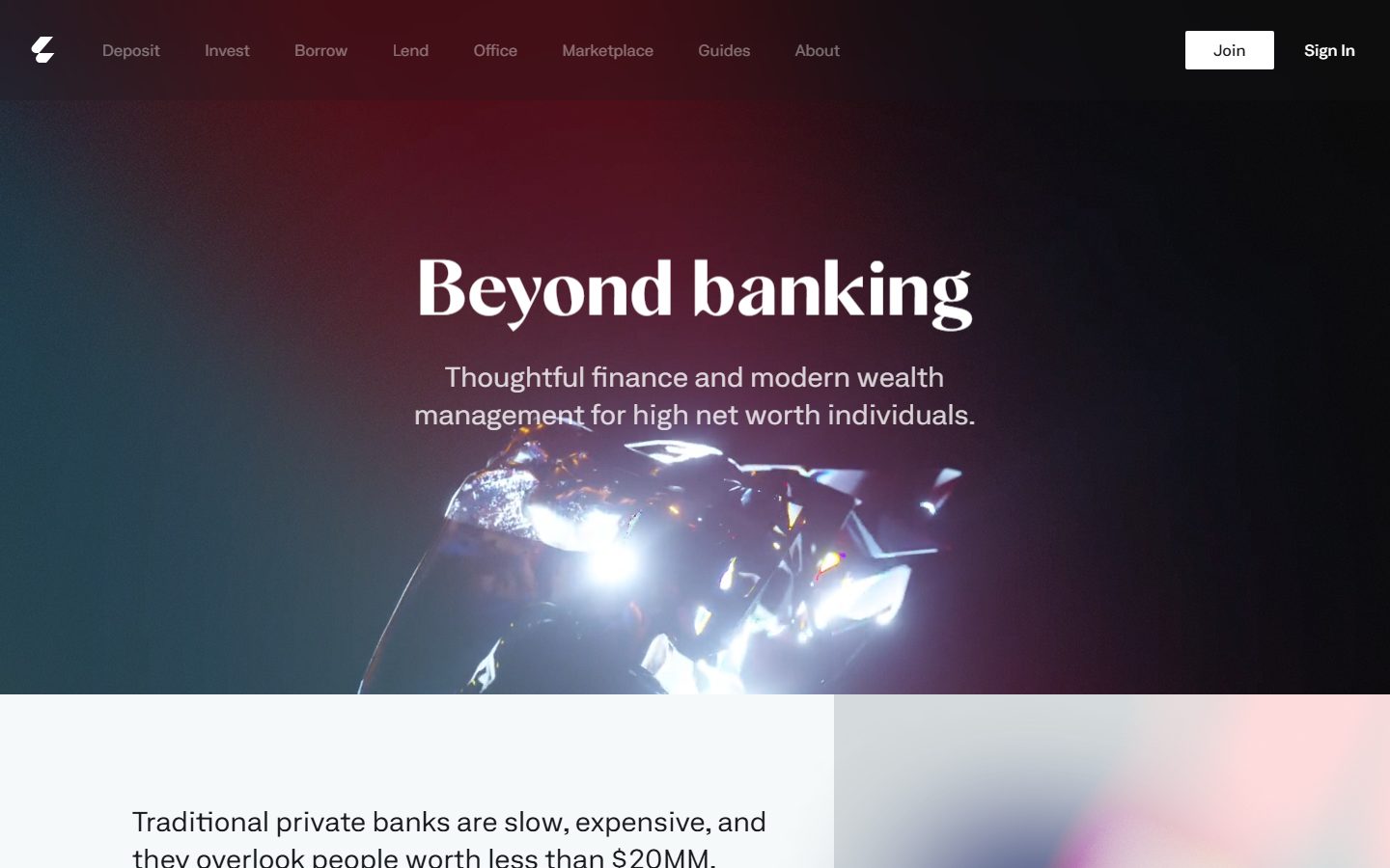
A private-banking marketing surface that opens on a near-black cinematic hero with a high-contrast Albra Sans display headline, then drops to bright off-white editorial bands carrying 3D-rendered product imagery and iridescent gradient cards. The system is monochrome at the structural layer — black hero, white canvas, dark ink — with a wide palette of soft pastel accents reserved for rendered imagery rather than UI chrome. Corners are nearly square (2px), there are no shadows, and the type voice splits between a flared display face and an extended grotesk for everything else.
---
version: alpha
name: Letter-design-analysis
description: A private-banking marketing surface that opens on a near-black cinematic hero with a high-contrast Albra Sans display headline, then drops to bright off-white editorial bands carrying 3D-rendered product imagery and iridescent gradient cards. The system is monochrome at the structural layer — black hero, white canvas, dark ink — with a wide palette of soft pastel accents reserved for rendered imagery rather than UI chrome. Corners are nearly square (2px), there are no shadows, and the type voice splits between a flared display face and an extended grotesk for everything else.

colors:
  ink: "#191b1f"
  canvas: "#ffffff"
  hero-dark: "#000000"
  on-dark: "#ffffff"
  surface-soft: "#f6f9f9"
  surface-mist: "#e6ebec"
  muted: "#9fabad"
  muted-soft: "#c6c8c8"
  accent-teal: "#186f64"
  accent-teal-soft: "#e1f1f0"
  accent-blue: "#536eff"
  accent-blue-deep: "#154ea5"
  accent-blue-soft: "#7395e6"
  accent-periwinkle: "#8889e7"
  accent-violet: "#644bc4"
  accent-purple: "#a876e9"
  accent-sky: "#a8dbf8"
  accent-peach: "#fcede1"
  accent-mint: "#eefcef"
  accent-lilac: "#e6def0"
  accent-rose: "#ffcccb"

typography:
  h1:
    fontFamily: "Albra Sans, Fraunces, Georgia, serif"
    fontSize: 80px
    fontWeight: 600
    lineHeight: 1.1
    letterSpacing: normal
  h2:
    fontFamily: "Albra Sans, Fraunces, Georgia, serif"
    fontSize: 46px
    fontWeight: 600
    lineHeight: 1.2
    letterSpacing: normal
  h3:
    fontFamily: "Neufile Grotesk Extended, Space Grotesk, sans-serif"
    fontSize: 20px
    fontWeight: 600
    lineHeight: 1.2
    letterSpacing: 0.4px
  body:
    fontFamily: "Neufile Grotesk Extended, Space Grotesk, sans-serif"
    fontSize: 28px
    fontWeight: 400
    lineHeight: 1.4
    letterSpacing: normal
  button:
    fontFamily: "Neufile Grotesk Extended, Space Grotesk, sans-serif"
    fontSize: 16px
    fontWeight: 500
    lineHeight: 1.0
    letterSpacing: normal

rounded:
  none: 0px
  xs: 2px

spacing:
  xxs: 8px
  xs: 12px
  sm: 16px
  md: 23px
  lg: 27px
  xl: 32px
  xxl: 52px
  huge: 72px
  section: 104px
  jumbo: 128px
  max: 192px

components:
  top-nav:
    backgroundColor: "{colors.hero-dark}"
    textColor: "{colors.on-dark}"
    typography: "{typography.button}"
    padding: 16px 32px
  nav-link:
    backgroundColor: transparent
    textColor: "{colors.on-dark}"
    typography: "{typography.button}"
  button-primary:
    backgroundColor: "{colors.canvas}"
    textColor: "{colors.ink}"
    typography: "{typography.button}"
    rounded: "{rounded.xs}"
    padding: 12px 27.2px
  button-signin:
    backgroundColor: transparent
    textColor: "{colors.on-dark}"
    typography: "{typography.button}"
  hero-band:
    backgroundColor: "{colors.hero-dark}"
    textColor: "{colors.on-dark}"
    typography: "{typography.h1}"
    padding: 104px 32px
  editorial-band:
    backgroundColor: "{colors.surface-soft}"
    textColor: "{colors.ink}"
    typography: "{typography.body}"
    padding: 52px 32px
  card:
    backgroundColor: transparent
    textColor: "{colors.ink}"
    rounded: "{rounded.none}"
  gradient-image-card:
    backgroundColor: "{colors.surface-mist}"
    textColor: "{colors.ink}"
    rounded: "{rounded.none}"
  footer:
    backgroundColor: "{colors.canvas}"
    textColor: "{colors.ink}"
    typography: "{typography.button}"
    padding: 52px 32px
  footer-heading:
    backgroundColor: transparent
    textColor: "{colors.ink}"
    typography: "{typography.h3}"
  footer-copyright:
    backgroundColor: transparent
    textColor: "{colors.muted}"
    typography: "{typography.button}"
---

## Overview

Letter is a private-banking marketing surface ("Beyond banking — thoughtful finance and modern wealth management for high net worth individuals"). The page opens on a near-black, cinematic hero (`{colors.hero-dark}` — #000000) with a glassy 3D render behind a large high-contrast display headline, then drops abruptly to bright off-white editorial bands (`{colors.surface-soft}` — #f6f9f9) carrying rendered product imagery — a translucent payment card floating on an iridescent gradient, a chrome sculptural object. The contrast between the black hero and the white body is the system's primary editorial move.

The type voice splits cleanly into two roles: a **flared display face** (measured as `Albra Sans`, used for h1 and h2 — the "Beyond banking" headline reads as a high-contrast serif/flared display) and an **extended grotesk** (measured as `Neufile Grotesk Extended`, used for h3, body, and buttons). Both are commercial/custom faces — open-source substitutes are documented in the Typography section.

The structural layer is strictly monochrome: black hero, white canvas, near-black ink (`{colors.ink}` — #191b1f). The wide palette of soft pastels and saturated accents that dembrandt measured (`{colors.accent-teal}`, `{colors.accent-blue}`, `{colors.accent-violet}`, and a family of mints, peaches, and lilacs) almost entirely live inside the 3D-rendered imagery and iridescent gradients — they are picked up from the rendered scenes, not applied to UI chrome. The single primary CTA ("Join") is a white button with dark text.

**Key Characteristics:**
- Black cinematic hero (`{colors.hero-dark}` — #000000) with white display type (`{colors.on-dark}` — #ffffff) over a glassy 3D render. The dark band anchors the top of the page.
- White / off-white editorial body — `{colors.canvas}` (#ffffff) and `{colors.surface-soft}` (#f6f9f9) — carrying near-black text (`{colors.ink}` — #191b1f).
- Nearly-square corners: the only measured radius is `{rounded.xs}` (2px) on the primary button; cards measure `{rounded.none}` (0px). The system reads sharp and editorial.
- No shadows anywhere — dembrandt measured zero shadow tokens. Depth comes entirely from the rendered imagery and the black-to-white band contrast.
- A single white primary CTA (`{component.button-primary}`) — white background, `{colors.ink}` text, 2px radius. Nav also carries a low-emphasis "Sign In" text link.
- Pastel and saturated accents (teal #186f64, blue #536eff, violet #644bc4, plus mints/peaches/lilacs) appear inside iridescent gradients and 3D renders, not on interactive chrome.
- Generous, irregular vertical rhythm — large spacing steps (`{spacing.section}` 104px, `{spacing.jumbo}` 128px, `{spacing.max}` 192px) separate the rendered imagery from text blocks.

## Colors

### Brand & Accent
The accent palette is broad but almost entirely decorative — it is sampled from the 3D renders and iridescent gradients rather than applied to UI.
- **Accent Teal** (`{colors.accent-teal}` — #186f64): The most frequent accent (frequency 26), seen in the hero gradient's left edge and in the logo mark. Its soft tint is `{colors.accent-teal-soft}` (#e1f1f0).
- **Accent Blue** (`{colors.accent-blue}` — #536eff) and **Accent Blue Deep** (`{colors.accent-blue-deep}` — #154ea5), with **Accent Blue Soft** (`{colors.accent-blue-soft}` — #7395e6): the blue family that appears in gradient washes.
- **Accent Violet / Purple** (`{colors.accent-violet}` — #644bc4, `{colors.accent-purple}` — #a876e9, `{colors.accent-periwinkle}` — #8889e7): the purple family on the card-on-gradient render.
- **Pastel washes** — `{colors.accent-sky}` (#a8dbf8), `{colors.accent-peach}` (#fcede1), `{colors.accent-mint}` (#eefcef), `{colors.accent-lilac}` (#e6def0), `{colors.accent-rose}` (#ffcccb): the iridescent gradient behind the translucent payment card. These appear only inside rendered imagery.

### Surface
- **Hero Dark** (`{colors.hero-dark}` — #000000): The hero band and top-nav backdrop — the only dark surface, and the highest-frequency color measured (frequency 106).
- **Canvas** (`{colors.canvas}` — #ffffff): The default light page floor and footer background.
- **Surface Soft** (`{colors.surface-soft}` — #f6f9f9): The off-white editorial band that holds the product imagery.
- **Surface Mist** (`{colors.surface-mist}` — #e6ebec): A slightly cooler neutral used as a soft block / gradient-card base.

### Text
- **Ink** (`{colors.ink}` — #191b1f): All dark text on light bands and the primary button label (measured as the button text color, frequency 46).
- **On Dark** (`{colors.on-dark}` — #ffffff): Hero headline, sub-head, and nav text on the black band (frequency 54).
- **Muted** (`{colors.muted}` — #9fabad): Tertiary text — footer copyright line, fine print.
- **Muted Soft** (`{colors.muted-soft}` — #c6c8c8): The faintest neutral — disabled / divider tone.

### Semantic
No dedicated success / warning / error tokens were measured on the captured landing page — see Known Gaps.

## Typography

### Font Family
The system runs two custom/commercial faces:
- **Albra Sans** — used for h1 (80px) and h2 (46px), both weight 600. In the hero the "Beyond banking" headline reads as a high-contrast, flared display face. This is the brand display voice.
- **Neufile Grotesk Extended** — an extended-width grotesk used for h3 (20px), body (28px), and buttons (16px). It carries all running text, labels, and UI.

Both are non-free, foundry-licensed typefaces. They MUST NOT be shipped without a license. Documented substitutes appear below; the fallback stacks above walk to those substitutes and then to system serif / sans.

### Hierarchy

| Token | Family | Size | Weight | Line Height | Letter Spacing | Use |
|---|---|---|---|---|---|---|
| `{typography.h1}` | Albra Sans | 80px | 600 | 1.1 | normal | Hero headline ("Beyond banking") |
| `{typography.h2}` | Albra Sans | 46px | 600 | 1.2 | normal | Section headlines |
| `{typography.h3}` | Neufile Grotesk Extended | 20px | 600 | 1.2 | 0.4px | Footer column headings, eyebrow labels |
| `{typography.body}` | Neufile Grotesk Extended | 28px | 400 | 1.4 | normal | Hero sub-head, editorial body copy |
| `{typography.button}` | Neufile Grotesk Extended | 16px | 500 | 1.0 | normal | Button labels, nav links, footer links |

### Principles
The display/grotesk boundary is strict: Albra Sans for headlines, Neufile Grotesk Extended for everything else. Display headlines stay at weight 600 — large-and-flared, not heavier. The extended grotesk's wide letterforms give the body a calm, premium-financial cadence; the small 0.4px tracking on h3 is the only positive letter-spacing in the system.

### Note on Font Substitutes
Neither Albra Sans nor Neufile Grotesk Extended is an open-source web font — they must be substituted unless licensed:
- **Albra Sans → Fraunces** (variable, optical-size aware) at weight 600 approximates the flared, high-contrast display character of the hero headline. **Spectral** or a high-optical-contrast **Playfair Display** are alternatives if a more serif read is acceptable.
- **Neufile Grotesk Extended → Space Grotesk** is the closest open alternative for the extended-grotesk body; **Familjen Grotesk** is another option. For a wider, more "extended" feel, apply a subtle `font-stretch` / slightly increased letter-spacing.

## Layout

### Spacing System
- **Tokens (measured):** `{spacing.xxs}` 8px · `{spacing.xs}` 12px · `{spacing.sm}` 16px · `{spacing.md}` 23px · `{spacing.lg}` 27px · `{spacing.xl}` 32px · `{spacing.xxl}` 52px · `{spacing.huge}` 72px · `{spacing.section}` 104px · `{spacing.jumbo}` 128px · `{spacing.max}` 192px.
- The high-frequency steps are 16px (frequency 33), 8px (17), 12px (16), 32px (11), and 52px (12) — these drive most internal padding and gaps. The 23px and 27px steps (frequency 8 each) come from the button's vertical/horizontal padding.
- **Section rhythm:** the large steps (104px / 128px / 192px) separate the black hero from the editorial band and the rendered imagery from text — note these are derived as the dominant large-gap values; each was measured once.

### Grid & Container
- **Hero:** full-bleed black band; centered headline + sub-head stack with the 3D render behind/below.
- **Editorial band:** a 2-column split — left text column ("Traditional private banks are slow…" / "We've built our own platform…") against a right-side gradient-image-card holding the translucent payment card.
- **Footer:** multi-column link list (Product / Company / Legal) with the wordmark and copyright beneath.

### Whitespace Philosophy
Letter uses dramatic, asymmetric whitespace — the editorial band leaves large vertical voids between the two text blocks, and the chrome-sculpture render sits alone with significant surrounding space. The pacing is deliberately sparse and gallery-like, signalling a premium, high-net-worth audience.

## Elevation & Depth

| Level | Treatment | Use |
|---|---|---|
| Flat | No shadow, no border | Every surface — nav, buttons, cards, footer |
| Band contrast | Black hero → white body | The primary depth cue is the hard transition from `{colors.hero-dark}` to `{colors.surface-soft}` |
| Rendered depth | 3D imagery carries its own lighting | The glassy hero render, translucent payment card, and chrome sculpture supply all visual depth |

dembrandt measured **zero shadow tokens**. There is no drop-shadow, no border-elevation, no glassmorphism in the UI layer. All sense of depth is delivered by the photographic/3D-rendered imagery and the black-to-white band contrast — the chrome is rendered with reflective lighting rather than CSS shadow.

### Decorative Depth
- The iridescent gradient behind the payment card (pastel sky / peach / lilac / rose) supplies chromatic depth without any system shadow token.
- The hero's glassy shard render is lit from within — the only light source in the dark band.

## Shapes

### Border Radius Scale

| Token | Value | Use |
|---|---|---|
| `{rounded.none}` | 0px | Cards, image blocks, editorial containers — measured at 0px |
| `{rounded.xs}` | 2px | The primary button (the only rounded element measured) |

The system is essentially square-cornered. The 2px on `{component.button-primary}` is barely perceptible — just enough to soften the corner of the white CTA. Everything else is hard-edged (0px), which reinforces the editorial, gallery-like tone.

### Photography / Render Geometry
Rendered imagery (the payment card, the chrome sculpture, the hero shard) sits in hard-edged rectangular frames with no corner rounding. Aspect ratios vary — the hero is wide and cinematic; the chrome-sculpture render is a tall portrait block.

## Components

### Navigation

**`top-nav`** — A black bar pinned to the top of the hero (`{colors.hero-dark}`), text in `{colors.on-dark}`. Carries the Letter logo mark at left, a horizontal menu (Deposit, Invest, Borrow, Lend, Office, Marketplace, Guides, About) in `{typography.button}`, and a right cluster with a "Join" `{component.button-primary}` and a "Sign In" text link. Sits transparently over the dark cinematic hero.

**`nav-link`** — Inline menu items, transparent background, `{colors.on-dark}` text, `{typography.button}` (Neufile Grotesk Extended 16px / 500).

### Buttons

**`button-primary`** — The signature "Join" CTA. Background `{colors.canvas}` (#ffffff), text `{colors.ink}` (#191b1f), `{typography.button}`, rounded `{rounded.xs}` (2px), padding 12px × 27.2px. A white pill-less block button — high contrast against the black nav.

**`button-signin`** — Low-emphasis text action in the nav. Transparent background, `{colors.on-dark}` text, `{typography.button}`. No fill or border.

### Bands & Containers

**`hero-band`** — Full-bleed black band (`{colors.hero-dark}`) holding the centered `{typography.h1}` headline and `{typography.body}` sub-head in `{colors.on-dark}`, layered over a glassy 3D render. Padding `{spacing.section}` (104px) vertical.

**`editorial-band`** — The off-white band (`{colors.surface-soft}`) below the hero. Two-column: left text in `{colors.ink}` using `{typography.body}`, right side holding the `{component.gradient-image-card}`.

**`card`** — Generic content container measured at `{rounded.none}` (0px), no shadow, transparent fill (defaults to the band behind it). Letter's cards are unstyled frames around imagery and text rather than elevated surfaces.

**`gradient-image-card`** — The rendered-product block (translucent payment card on an iridescent pastel gradient). Background `{colors.surface-mist}` as the base behind the render, hard-edged (`{rounded.none}`). The pastel accents (`{colors.accent-sky}`, `{colors.accent-peach}`, `{colors.accent-lilac}`, `{colors.accent-rose}`) live inside this rendered gradient.

### Footer

**`footer`** — Light footer on `{colors.canvas}`, text in `{colors.ink}`, links in `{typography.button}`. Organized as multi-column link lists (Product / Company / Legal) with the Letter wordmark beneath.

**`footer-heading`** — Column heads ("Product", "Company", "Legal") in `{typography.h3}` (Neufile Grotesk Extended 20px / 600, 0.4px tracking), `{colors.ink}`.

**`footer-copyright`** — Fine-print copyright line in `{colors.muted}` (#9fabad), `{typography.button}`.

## Do's and Don'ts

### Do
- Anchor the page with a single black hero (`{colors.hero-dark}`) and keep the rest of the body white / off-white. The black-to-white transition is the brand's primary depth move.
- Use Albra Sans (or its Fraunces substitute) for h1/h2 only; keep Neufile Grotesk Extended (or Space Grotesk) for everything else.
- Keep the primary CTA a white block with `{colors.ink}` text and `{rounded.xs}` (2px) corners.
- Confine the pastel and saturated accents to rendered imagery and iridescent gradients — they belong inside the renders, not on buttons or text.
- Keep corners hard (0px) on cards and image frames; reserve the 2px only for the button.
- Lean on large spacing steps (104 / 128 / 192px) to create the sparse, gallery-like pacing.

### Don't
- Don't add shadows — the system measured none. Use band contrast and rendered lighting for depth.
- Don't apply accent colors (`{colors.accent-blue}`, `{colors.accent-violet}`, the pastels) to UI chrome or CTAs; they're decorative render colors only.
- Don't round card corners — the editorial sharpness depends on 0px frames.
- Don't ship Albra Sans or Neufile Grotesk Extended without a license; use the documented substitutes.
- Don't bold the display headline beyond 600 or mix the two families across roles.
- Don't document hover styling — only default and active/pressed states are in scope.

## Responsive Behavior

| Name | Width | Key Changes |
|---|---|---|
| Mobile | < 768px | Nav likely collapses; hero h1 scales down from 80px; editorial band's 2-column text/image split stacks; footer link columns wrap |
| Tablet | 768–1024px | Nav menu tightens; editorial split may narrow; imagery scales proportionally |
| Desktop | 1024–1440px | Full horizontal nav; 2-column editorial band; large rendered imagery |
| Wide | > 1440px | Same as desktop with more outer breathing room |

Note: only the desktop landing page was captured. The breakpoint behavior above is inferred from the desktop layout — see Known Gaps.

### Touch Targets
- `{component.button-primary}` padding (12px × 27.2px) on `{typography.button}` (16px) yields a comfortably tappable block.
- Nav links and footer links are rendered in `{typography.button}` (16px / 500); their tap area depends on surrounding padding (16px is the dominant spacing step).

### Collapsing Strategy
- The hero headline (80px) must scale down substantially on narrow viewports to avoid wrapping awkwardly.
- The editorial band's text + gradient-image-card split should stack to single-column.
- Footer Product / Company / Legal columns wrap to fewer columns.

### Image Behavior
- The hero 3D render is full-bleed and should crop, not letterbox, on narrow viewports.
- The gradient-image-card and chrome-sculpture render retain native aspect ratios; their hard-edged frames resize.

## Iteration Guide

1. Focus on ONE component at a time. Reference its YAML key directly (`{component.button-primary}`, `{component.gradient-image-card}`).
2. Variants of an existing component (`-active`, `-disabled`) live as separate entries in `components:`.
3. Use `{token.refs}` everywhere — never inline a hex in a component.
4. Never document hover. Default and Active/Pressed states only.
5. Display headlines stay Albra Sans (Fraunces substitute) 600; body stays Neufile Grotesk Extended (Space Grotesk substitute). The split does not blur.
6. The black hero is the only dark surface — don't introduce other dark cards casually.
7. Keep accents inside imagery; the UI layer stays monochrome (black / white / ink).

## Known Gaps

- Only the desktop **landing** page was captured; responsive breakpoints, mobile nav, and any interior pages are inferred, not measured.
- No shadow tokens were measured (dembrandt returned an empty shadow set); the "no shadow" reading is from ground truth but could miss subtle blurs on imagery.
- Only two radii were measured (0px and 2px); any larger radii on unseen components are unknown.
- The accent palette (teal, blues, violets, and the pastel washes) was measured by CSS frequency and is largely sampled from 3D-rendered gradients — exact roles (which accent maps to which UI use) are unconfirmed because they don't appear on interactive chrome.
- Albra Sans and Neufile Grotesk Extended are commercial/custom faces (the `fonts_licensed` flag was empty, but neither is open-source); substitutes are documented but exact metrics will differ.
- No semantic colors (success / warning / error), form inputs, focus states, or hover states were present on the captured page.
- Button active/pressed and disabled states were not measured — only the default `{component.button-primary}` is confirmed.
- The exact background fill of the generic `{component.card}` was not measured (radius and shadow only); it is documented as transparent / inheriting the band behind it.
- Animation and transition timings (hero render motion, scroll reveals) are out of scope.

<!-- Documented by duply · real-world design systems as ready-to-use DESIGN.md for AI coding agents · https://duply.ai/letter/design-md -->
Color Palette
Accent
Neutrals
Typography
h180px · 600 · 1.1
The quick brown fox jumpsh246px · 600 · 1.2
The quick brown fox jumpsh320px · 600 · 1.2
The quick brown fox jumpsbody28px · 400 · 1.4
The quick brown fox jumpsbutton16px · 500 · 1
The quick brown fox jumpsSpacing & Shape
Spacing
| Name | Value | Preview |
|---|---|---|
| xxs | 8px | |
| xs | 12px | |
| sm | 16px | |
| md | 23px | |
| lg | 27px | |
| xl | 32px | |
| xxl | 52px | |
| huge | 72px | |
| section | 104px | |
| jumbo | 128px | |
| max | 192px |
Border Radius
| Name | Value | Preview |
|---|---|---|
| none | 0px | |
| xs | 2px |
More like this


---
version: alpha
name: Letter-design-analysis
description: A private-banking marketing surface that opens on a near-black cinematic hero with a high-contrast Albra Sans display headline, then drops to bright off-white editorial bands carrying 3D-rendered product imagery and iridescent gradient cards. The system is monochrome at the structural layer — black hero, white canvas, dark ink — with a wide palette of soft pastel accents reserved for rendered imagery rather than UI chrome. Corners are nearly square (2px), there are no shadows, and the type voice splits between a flared display face and an extended grotesk for everything else.

colors:
  ink: "#191b1f"
  canvas: "#ffffff"
  hero-dark: "#000000"
  on-dark: "#ffffff"
  surface-soft: "#f6f9f9"
  surface-mist: "#e6ebec"
  muted: "#9fabad"
  muted-soft: "#c6c8c8"
  accent-teal: "#186f64"
  accent-teal-soft: "#e1f1f0"
  accent-blue: "#536eff"
  accent-blue-deep: "#154ea5"
  accent-blue-soft: "#7395e6"
  accent-periwinkle: "#8889e7"
  accent-violet: "#644bc4"
  accent-purple: "#a876e9"
  accent-sky: "#a8dbf8"
  accent-peach: "#fcede1"
  accent-mint: "#eefcef"
  accent-lilac: "#e6def0"
  accent-rose: "#ffcccb"

typography:
  h1:
    fontFamily: "Albra Sans, Fraunces, Georgia, serif"
    fontSize: 80px
    fontWeight: 600
    lineHeight: 1.1
    letterSpacing: normal
  h2:
    fontFamily: "Albra Sans, Fraunces, Georgia, serif"
    fontSize: 46px
    fontWeight: 600
    lineHeight: 1.2
    letterSpacing: normal
  h3:
    fontFamily: "Neufile Grotesk Extended, Space Grotesk, sans-serif"
    fontSize: 20px
    fontWeight: 600
    lineHeight: 1.2
    letterSpacing: 0.4px
  body:
    fontFamily: "Neufile Grotesk Extended, Space Grotesk, sans-serif"
    fontSize: 28px
    fontWeight: 400
    lineHeight: 1.4
    letterSpacing: normal
  button:
    fontFamily: "Neufile Grotesk Extended, Space Grotesk, sans-serif"
    fontSize: 16px
    fontWeight: 500
    lineHeight: 1.0
    letterSpacing: normal

rounded:
  none: 0px
  xs: 2px

spacing:
  xxs: 8px
  xs: 12px
  sm: 16px
  md: 23px
  lg: 27px
  xl: 32px
  xxl: 52px
  huge: 72px
  section: 104px
  jumbo: 128px
  max: 192px

components:
  top-nav:
    backgroundColor: "{colors.hero-dark}"
    textColor: "{colors.on-dark}"
    typography: "{typography.button}"
    padding: 16px 32px
  nav-link:
    backgroundColor: transparent
    textColor: "{colors.on-dark}"
    typography: "{typography.button}"
  button-primary:
    backgroundColor: "{colors.canvas}"
    textColor: "{colors.ink}"
    typography: "{typography.button}"
    rounded: "{rounded.xs}"
    padding: 12px 27.2px
  button-signin:
    backgroundColor: transparent
    textColor: "{colors.on-dark}"
    typography: "{typography.button}"
  hero-band:
    backgroundColor: "{colors.hero-dark}"
    textColor: "{colors.on-dark}"
    typography: "{typography.h1}"
    padding: 104px 32px
  editorial-band:
    backgroundColor: "{colors.surface-soft}"
    textColor: "{colors.ink}"
    typography: "{typography.body}"
    padding: 52px 32px
  card:
    backgroundColor: transparent
    textColor: "{colors.ink}"
    rounded: "{rounded.none}"
  gradient-image-card:
    backgroundColor: "{colors.surface-mist}"
    textColor: "{colors.ink}"
    rounded: "{rounded.none}"
  footer:
    backgroundColor: "{colors.canvas}"
    textColor: "{colors.ink}"
    typography: "{typography.button}"
    padding: 52px 32px
  footer-heading:
    backgroundColor: transparent
    textColor: "{colors.ink}"
    typography: "{typography.h3}"
  footer-copyright:
    backgroundColor: transparent
    textColor: "{colors.muted}"
    typography: "{typography.button}"
---

## Overview

Letter is a private-banking marketing surface ("Beyond banking — thoughtful finance and modern wealth management for high net worth individuals"). The page opens on a near-black, cinematic hero (`{colors.hero-dark}` — #000000) with a glassy 3D render behind a large high-contrast display headline, then drops abruptly to bright off-white editorial bands (`{colors.surface-soft}` — #f6f9f9) carrying rendered product imagery — a translucent payment card floating on an iridescent gradient, a chrome sculptural object. The contrast between the black hero and the white body is the system's primary editorial move.

The type voice splits cleanly into two roles: a **flared display face** (measured as `Albra Sans`, used for h1 and h2 — the "Beyond banking" headline reads as a high-contrast serif/flared display) and an **extended grotesk** (measured as `Neufile Grotesk Extended`, used for h3, body, and buttons). Both are commercial/custom faces — open-source substitutes are documented in the Typography section.

The structural layer is strictly monochrome: black hero, white canvas, near-black ink (`{colors.ink}` — #191b1f). The wide palette of soft pastels and saturated accents that dembrandt measured (`{colors.accent-teal}`, `{colors.accent-blue}`, `{colors.accent-violet}`, and a family of mints, peaches, and lilacs) almost entirely live inside the 3D-rendered imagery and iridescent gradients — they are picked up from the rendered scenes, not applied to UI chrome. The single primary CTA ("Join") is a white button with dark text.

**Key Characteristics:**
- Black cinematic hero (`{colors.hero-dark}` — #000000) with white display type (`{colors.on-dark}` — #ffffff) over a glassy 3D render. The dark band anchors the top of the page.
- White / off-white editorial body — `{colors.canvas}` (#ffffff) and `{colors.surface-soft}` (#f6f9f9) — carrying near-black text (`{colors.ink}` — #191b1f).
- Nearly-square corners: the only measured radius is `{rounded.xs}` (2px) on the primary button; cards measure `{rounded.none}` (0px). The system reads sharp and editorial.
- No shadows anywhere — dembrandt measured zero shadow tokens. Depth comes entirely from the rendered imagery and the black-to-white band contrast.
- A single white primary CTA (`{component.button-primary}`) — white background, `{colors.ink}` text, 2px radius. Nav also carries a low-emphasis "Sign In" text link.
- Pastel and saturated accents (teal #186f64, blue #536eff, violet #644bc4, plus mints/peaches/lilacs) appear inside iridescent gradients and 3D renders, not on interactive chrome.
- Generous, irregular vertical rhythm — large spacing steps (`{spacing.section}` 104px, `{spacing.jumbo}` 128px, `{spacing.max}` 192px) separate the rendered imagery from text blocks.

## Colors

### Brand & Accent
The accent palette is broad but almost entirely decorative — it is sampled from the 3D renders and iridescent gradients rather than applied to UI.
- **Accent Teal** (`{colors.accent-teal}` — #186f64): The most frequent accent (frequency 26), seen in the hero gradient's left edge and in the logo mark. Its soft tint is `{colors.accent-teal-soft}` (#e1f1f0).
- **Accent Blue** (`{colors.accent-blue}` — #536eff) and **Accent Blue Deep** (`{colors.accent-blue-deep}` — #154ea5), with **Accent Blue Soft** (`{colors.accent-blue-soft}` — #7395e6): the blue family that appears in gradient washes.
- **Accent Violet / Purple** (`{colors.accent-violet}` — #644bc4, `{colors.accent-purple}` — #a876e9, `{colors.accent-periwinkle}` — #8889e7): the purple family on the card-on-gradient render.
- **Pastel washes** — `{colors.accent-sky}` (#a8dbf8), `{colors.accent-peach}` (#fcede1), `{colors.accent-mint}` (#eefcef), `{colors.accent-lilac}` (#e6def0), `{colors.accent-rose}` (#ffcccb): the iridescent gradient behind the translucent payment card. These appear only inside rendered imagery.

### Surface
- **Hero Dark** (`{colors.hero-dark}` — #000000): The hero band and top-nav backdrop — the only dark surface, and the highest-frequency color measured (frequency 106).
- **Canvas** (`{colors.canvas}` — #ffffff): The default light page floor and footer background.
- **Surface Soft** (`{colors.surface-soft}` — #f6f9f9): The off-white editorial band that holds the product imagery.
- **Surface Mist** (`{colors.surface-mist}` — #e6ebec): A slightly cooler neutral used as a soft block / gradient-card base.

### Text
- **Ink** (`{colors.ink}` — #191b1f): All dark text on light bands and the primary button label (measured as the button text color, frequency 46).
- **On Dark** (`{colors.on-dark}` — #ffffff): Hero headline, sub-head, and nav text on the black band (frequency 54).
- **Muted** (`{colors.muted}` — #9fabad): Tertiary text — footer copyright line, fine print.
- **Muted Soft** (`{colors.muted-soft}` — #c6c8c8): The faintest neutral — disabled / divider tone.

### Semantic
No dedicated success / warning / error tokens were measured on the captured landing page — see Known Gaps.

## Typography

### Font Family
The system runs two custom/commercial faces:
- **Albra Sans** — used for h1 (80px) and h2 (46px), both weight 600. In the hero the "Beyond banking" headline reads as a high-contrast, flared display face. This is the brand display voice.
- **Neufile Grotesk Extended** — an extended-width grotesk used for h3 (20px), body (28px), and buttons (16px). It carries all running text, labels, and UI.

Both are non-free, foundry-licensed typefaces. They MUST NOT be shipped without a license. Documented substitutes appear below; the fallback stacks above walk to those substitutes and then to system serif / sans.

### Hierarchy

| Token | Family | Size | Weight | Line Height | Letter Spacing | Use |
|---|---|---|---|---|---|---|
| `{typography.h1}` | Albra Sans | 80px | 600 | 1.1 | normal | Hero headline ("Beyond banking") |
| `{typography.h2}` | Albra Sans | 46px | 600 | 1.2 | normal | Section headlines |
| `{typography.h3}` | Neufile Grotesk Extended | 20px | 600 | 1.2 | 0.4px | Footer column headings, eyebrow labels |
| `{typography.body}` | Neufile Grotesk Extended | 28px | 400 | 1.4 | normal | Hero sub-head, editorial body copy |
| `{typography.button}` | Neufile Grotesk Extended | 16px | 500 | 1.0 | normal | Button labels, nav links, footer links |

### Principles
The display/grotesk boundary is strict: Albra Sans for headlines, Neufile Grotesk Extended for everything else. Display headlines stay at weight 600 — large-and-flared, not heavier. The extended grotesk's wide letterforms give the body a calm, premium-financial cadence; the small 0.4px tracking on h3 is the only positive letter-spacing in the system.

### Note on Font Substitutes
Neither Albra Sans nor Neufile Grotesk Extended is an open-source web font — they must be substituted unless licensed:
- **Albra Sans → Fraunces** (variable, optical-size aware) at weight 600 approximates the flared, high-contrast display character of the hero headline. **Spectral** or a high-optical-contrast **Playfair Display** are alternatives if a more serif read is acceptable.
- **Neufile Grotesk Extended → Space Grotesk** is the closest open alternative for the extended-grotesk body; **Familjen Grotesk** is another option. For a wider, more "extended" feel, apply a subtle `font-stretch` / slightly increased letter-spacing.

## Layout

### Spacing System
- **Tokens (measured):** `{spacing.xxs}` 8px · `{spacing.xs}` 12px · `{spacing.sm}` 16px · `{spacing.md}` 23px · `{spacing.lg}` 27px · `{spacing.xl}` 32px · `{spacing.xxl}` 52px · `{spacing.huge}` 72px · `{spacing.section}` 104px · `{spacing.jumbo}` 128px · `{spacing.max}` 192px.
- The high-frequency steps are 16px (frequency 33), 8px (17), 12px (16), 32px (11), and 52px (12) — these drive most internal padding and gaps. The 23px and 27px steps (frequency 8 each) come from the button's vertical/horizontal padding.
- **Section rhythm:** the large steps (104px / 128px / 192px) separate the black hero from the editorial band and the rendered imagery from text — note these are derived as the dominant large-gap values; each was measured once.

### Grid & Container
- **Hero:** full-bleed black band; centered headline + sub-head stack with the 3D render behind/below.
- **Editorial band:** a 2-column split — left text column ("Traditional private banks are slow…" / "We've built our own platform…") against a right-side gradient-image-card holding the translucent payment card.
- **Footer:** multi-column link list (Product / Company / Legal) with the wordmark and copyright beneath.

### Whitespace Philosophy
Letter uses dramatic, asymmetric whitespace — the editorial band leaves large vertical voids between the two text blocks, and the chrome-sculpture render sits alone with significant surrounding space. The pacing is deliberately sparse and gallery-like, signalling a premium, high-net-worth audience.

## Elevation & Depth

| Level | Treatment | Use |
|---|---|---|
| Flat | No shadow, no border | Every surface — nav, buttons, cards, footer |
| Band contrast | Black hero → white body | The primary depth cue is the hard transition from `{colors.hero-dark}` to `{colors.surface-soft}` |
| Rendered depth | 3D imagery carries its own lighting | The glassy hero render, translucent payment card, and chrome sculpture supply all visual depth |

dembrandt measured **zero shadow tokens**. There is no drop-shadow, no border-elevation, no glassmorphism in the UI layer. All sense of depth is delivered by the photographic/3D-rendered imagery and the black-to-white band contrast — the chrome is rendered with reflective lighting rather than CSS shadow.

### Decorative Depth
- The iridescent gradient behind the payment card (pastel sky / peach / lilac / rose) supplies chromatic depth without any system shadow token.
- The hero's glassy shard render is lit from within — the only light source in the dark band.

## Shapes

### Border Radius Scale

| Token | Value | Use |
|---|---|---|
| `{rounded.none}` | 0px | Cards, image blocks, editorial containers — measured at 0px |
| `{rounded.xs}` | 2px | The primary button (the only rounded element measured) |

The system is essentially square-cornered. The 2px on `{component.button-primary}` is barely perceptible — just enough to soften the corner of the white CTA. Everything else is hard-edged (0px), which reinforces the editorial, gallery-like tone.

### Photography / Render Geometry
Rendered imagery (the payment card, the chrome sculpture, the hero shard) sits in hard-edged rectangular frames with no corner rounding. Aspect ratios vary — the hero is wide and cinematic; the chrome-sculpture render is a tall portrait block.

## Components

### Navigation

**`top-nav`** — A black bar pinned to the top of the hero (`{colors.hero-dark}`), text in `{colors.on-dark}`. Carries the Letter logo mark at left, a horizontal menu (Deposit, Invest, Borrow, Lend, Office, Marketplace, Guides, About) in `{typography.button}`, and a right cluster with a "Join" `{component.button-primary}` and a "Sign In" text link. Sits transparently over the dark cinematic hero.

**`nav-link`** — Inline menu items, transparent background, `{colors.on-dark}` text, `{typography.button}` (Neufile Grotesk Extended 16px / 500).

### Buttons

**`button-primary`** — The signature "Join" CTA. Background `{colors.canvas}` (#ffffff), text `{colors.ink}` (#191b1f), `{typography.button}`, rounded `{rounded.xs}` (2px), padding 12px × 27.2px. A white pill-less block button — high contrast against the black nav.

**`button-signin`** — Low-emphasis text action in the nav. Transparent background, `{colors.on-dark}` text, `{typography.button}`. No fill or border.

### Bands & Containers

**`hero-band`** — Full-bleed black band (`{colors.hero-dark}`) holding the centered `{typography.h1}` headline and `{typography.body}` sub-head in `{colors.on-dark}`, layered over a glassy 3D render. Padding `{spacing.section}` (104px) vertical.

**`editorial-band`** — The off-white band (`{colors.surface-soft}`) below the hero. Two-column: left text in `{colors.ink}` using `{typography.body}`, right side holding the `{component.gradient-image-card}`.

**`card`** — Generic content container measured at `{rounded.none}` (0px), no shadow, transparent fill (defaults to the band behind it). Letter's cards are unstyled frames around imagery and text rather than elevated surfaces.

**`gradient-image-card`** — The rendered-product block (translucent payment card on an iridescent pastel gradient). Background `{colors.surface-mist}` as the base behind the render, hard-edged (`{rounded.none}`). The pastel accents (`{colors.accent-sky}`, `{colors.accent-peach}`, `{colors.accent-lilac}`, `{colors.accent-rose}`) live inside this rendered gradient.

### Footer

**`footer`** — Light footer on `{colors.canvas}`, text in `{colors.ink}`, links in `{typography.button}`. Organized as multi-column link lists (Product / Company / Legal) with the Letter wordmark beneath.

**`footer-heading`** — Column heads ("Product", "Company", "Legal") in `{typography.h3}` (Neufile Grotesk Extended 20px / 600, 0.4px tracking), `{colors.ink}`.

**`footer-copyright`** — Fine-print copyright line in `{colors.muted}` (#9fabad), `{typography.button}`.

## Do's and Don'ts

### Do
- Anchor the page with a single black hero (`{colors.hero-dark}`) and keep the rest of the body white / off-white. The black-to-white transition is the brand's primary depth move.
- Use Albra Sans (or its Fraunces substitute) for h1/h2 only; keep Neufile Grotesk Extended (or Space Grotesk) for everything else.
- Keep the primary CTA a white block with `{colors.ink}` text and `{rounded.xs}` (2px) corners.
- Confine the pastel and saturated accents to rendered imagery and iridescent gradients — they belong inside the renders, not on buttons or text.
- Keep corners hard (0px) on cards and image frames; reserve the 2px only for the button.
- Lean on large spacing steps (104 / 128 / 192px) to create the sparse, gallery-like pacing.

### Don't
- Don't add shadows — the system measured none. Use band contrast and rendered lighting for depth.
- Don't apply accent colors (`{colors.accent-blue}`, `{colors.accent-violet}`, the pastels) to UI chrome or CTAs; they're decorative render colors only.
- Don't round card corners — the editorial sharpness depends on 0px frames.
- Don't ship Albra Sans or Neufile Grotesk Extended without a license; use the documented substitutes.
- Don't bold the display headline beyond 600 or mix the two families across roles.
- Don't document hover styling — only default and active/pressed states are in scope.

## Responsive Behavior

| Name | Width | Key Changes |
|---|---|---|
| Mobile | < 768px | Nav likely collapses; hero h1 scales down from 80px; editorial band's 2-column text/image split stacks; footer link columns wrap |
| Tablet | 768–1024px | Nav menu tightens; editorial split may narrow; imagery scales proportionally |
| Desktop | 1024–1440px | Full horizontal nav; 2-column editorial band; large rendered imagery |
| Wide | > 1440px | Same as desktop with more outer breathing room |

Note: only the desktop landing page was captured. The breakpoint behavior above is inferred from the desktop layout — see Known Gaps.

### Touch Targets
- `{component.button-primary}` padding (12px × 27.2px) on `{typography.button}` (16px) yields a comfortably tappable block.
- Nav links and footer links are rendered in `{typography.button}` (16px / 500); their tap area depends on surrounding padding (16px is the dominant spacing step).

### Collapsing Strategy
- The hero headline (80px) must scale down substantially on narrow viewports to avoid wrapping awkwardly.
- The editorial band's text + gradient-image-card split should stack to single-column.
- Footer Product / Company / Legal columns wrap to fewer columns.

### Image Behavior
- The hero 3D render is full-bleed and should crop, not letterbox, on narrow viewports.
- The gradient-image-card and chrome-sculpture render retain native aspect ratios; their hard-edged frames resize.

## Iteration Guide

1. Focus on ONE component at a time. Reference its YAML key directly (`{component.button-primary}`, `{component.gradient-image-card}`).
2. Variants of an existing component (`-active`, `-disabled`) live as separate entries in `components:`.
3. Use `{token.refs}` everywhere — never inline a hex in a component.
4. Never document hover. Default and Active/Pressed states only.
5. Display headlines stay Albra Sans (Fraunces substitute) 600; body stays Neufile Grotesk Extended (Space Grotesk substitute). The split does not blur.
6. The black hero is the only dark surface — don't introduce other dark cards casually.
7. Keep accents inside imagery; the UI layer stays monochrome (black / white / ink).

## Known Gaps

- Only the desktop **landing** page was captured; responsive breakpoints, mobile nav, and any interior pages are inferred, not measured.
- No shadow tokens were measured (dembrandt returned an empty shadow set); the "no shadow" reading is from ground truth but could miss subtle blurs on imagery.
- Only two radii were measured (0px and 2px); any larger radii on unseen components are unknown.
- The accent palette (teal, blues, violets, and the pastel washes) was measured by CSS frequency and is largely sampled from 3D-rendered gradients — exact roles (which accent maps to which UI use) are unconfirmed because they don't appear on interactive chrome.
- Albra Sans and Neufile Grotesk Extended are commercial/custom faces (the `fonts_licensed` flag was empty, but neither is open-source); substitutes are documented but exact metrics will differ.
- No semantic colors (success / warning / error), form inputs, focus states, or hover states were present on the captured page.
- Button active/pressed and disabled states were not measured — only the default `{component.button-primary}` is confirmed.
- The exact background fill of the generic `{component.card}` was not measured (radius and shadow only); it is documented as transparent / inheriting the band behind it.
- Animation and transition timings (hero render motion, scroll reveals) are out of scope.

<!-- Documented by duply · real-world design systems as ready-to-use DESIGN.md for AI coding agents · https://duply.ai/letter/design-md -->