January.ai
A calm, clinical-precision health-tech interface built on a warm off-white canvas with stark black display type set in Maison Neue, fully-rounded black pill CTAs, and a deep near-black surface used for the diagnostic "before/after" comparison cards and the closing footer. The system reads as trustworthy precision-medicine SaaS — generous whitespace, a scattered editorial photo-collage hero, monochrome restraint with a single clinical blue link accent, and image-driven product mockups shown in soft cool-gray frames.
---
version: alpha
name: January.ai-design-analysis
description: "A calm, clinical-precision health-tech interface built on a warm off-white canvas with stark black display type set in Maison Neue, fully-rounded black pill CTAs, and a deep near-black surface used for the diagnostic \"before/after\" comparison cards and the closing footer. The system reads as trustworthy precision-medicine SaaS — generous whitespace, a scattered editorial photo-collage hero, monochrome restraint with a single clinical blue link accent, and image-driven product mockups shown in soft cool-gray frames."
colors:
primary: "#0050bd"
ink: "#000000"
ink-soft: "#32343a"
body: "#43464d"
muted: "#8f8f8f"
link: "#333333"
canvas: "#ffffff"
canvas-warm: "#fffcfc"
surface-soft: "#fafafa"
surface-cool: "#f5f7fa"
surface-sand: "#e8e8db"
surface-accent-soft: "#e4ebf3"
surface-dark: "#1a1b1f"
surface-darker: "#222222"
hairline: "#dddddd"
hairline-strong: "#cccccc"
hairline-soft: "#c5c5c5"
on-dark: "#ffffff"
accent-bright: "#3898ec"
accent-blue-alt: "#1e73be"
accent-teal: "#009eb5"
typography:
display-xl:
fontFamily: "Maison Neue, Inter, sans-serif"
fontSize: 64px
fontWeight: 600
lineHeight: 1.1
letterSpacing: normal
display-lg:
fontFamily: "Maison Neue, Inter, sans-serif"
fontSize: 44px
fontWeight: 600
lineHeight: 1.1
letterSpacing: normal
display-md:
fontFamily: "Maison Neue, Inter, sans-serif"
fontSize: 44px
fontWeight: 600
lineHeight: 1.2
letterSpacing: normal
body:
fontFamily: "Maison Neue, Inter, sans-serif"
fontSize: 18px
fontWeight: 500
lineHeight: 1.1
letterSpacing: normal
button:
fontFamily: "Maison Neue, Inter, sans-serif"
fontSize: 20.16px
fontWeight: 500
lineHeight: 1.25
letterSpacing: normal
rounded:
none: 0px
md: 12px
lg: 20px
pill: 200px
full: 2880px
spacing:
xxs: 8px
xs: 14px
sm: 16px
md: 18px
lg: 20px
xl: 30px
xxl: 32px
huge: 36px
components:
top-nav:
backgroundColor: "{colors.canvas}"
textColor: "{colors.ink}"
typography: "{typography.body}"
padding: 18px 30px
button-primary:
backgroundColor: "{colors.ink}"
textColor: "{colors.on-dark}"
typography: "{typography.button}"
rounded: "{rounded.pill}"
padding: 20px 40px 20px 20px
hero-band:
backgroundColor: "{colors.surface-sand}"
textColor: "{colors.ink}"
typography: "{typography.display-xl}"
padding: 36px
label-tag:
backgroundColor: "{colors.canvas}"
textColor: "{colors.ink}"
typography: "{typography.body}"
rounded: "{rounded.md}"
padding: 8px 14px
logo-strip:
backgroundColor: "{colors.canvas}"
textColor: "{colors.muted}"
typography: "{typography.body}"
padding: 30px
challenge-card-dark:
backgroundColor: "{colors.surface-dark}"
textColor: "{colors.on-dark}"
typography: "{typography.body}"
rounded: "{rounded.md}"
padding: 32px
how-it-works-band:
backgroundColor: "{colors.surface-soft}"
textColor: "{colors.ink}"
typography: "{typography.display-lg}"
padding: 36px
unify-step-card:
backgroundColor: "{colors.surface-sand}"
textColor: "{colors.ink}"
typography: "{typography.body}"
rounded: "{rounded.md}"
padding: 20px
feature-icon-card:
backgroundColor: transparent
textColor: "{colors.ink}"
typography: "{typography.body}"
padding: 18px
product-mockup-card:
backgroundColor: "{colors.surface-cool}"
textColor: "{colors.ink}"
rounded: "{rounded.lg}"
padding: 30px
text-input:
backgroundColor: "{colors.surface-dark}"
textColor: "{colors.on-dark}"
typography: "{typography.body}"
rounded: "{rounded.lg}"
padding: 16px 20px
cta-band-dark:
backgroundColor: "{colors.surface-dark}"
textColor: "{colors.on-dark}"
typography: "{typography.display-lg}"
padding: 36px
footer:
backgroundColor: "{colors.surface-dark}"
textColor: "{colors.on-dark}"
typography: "{typography.body}"
padding: 32px
---
## Overview
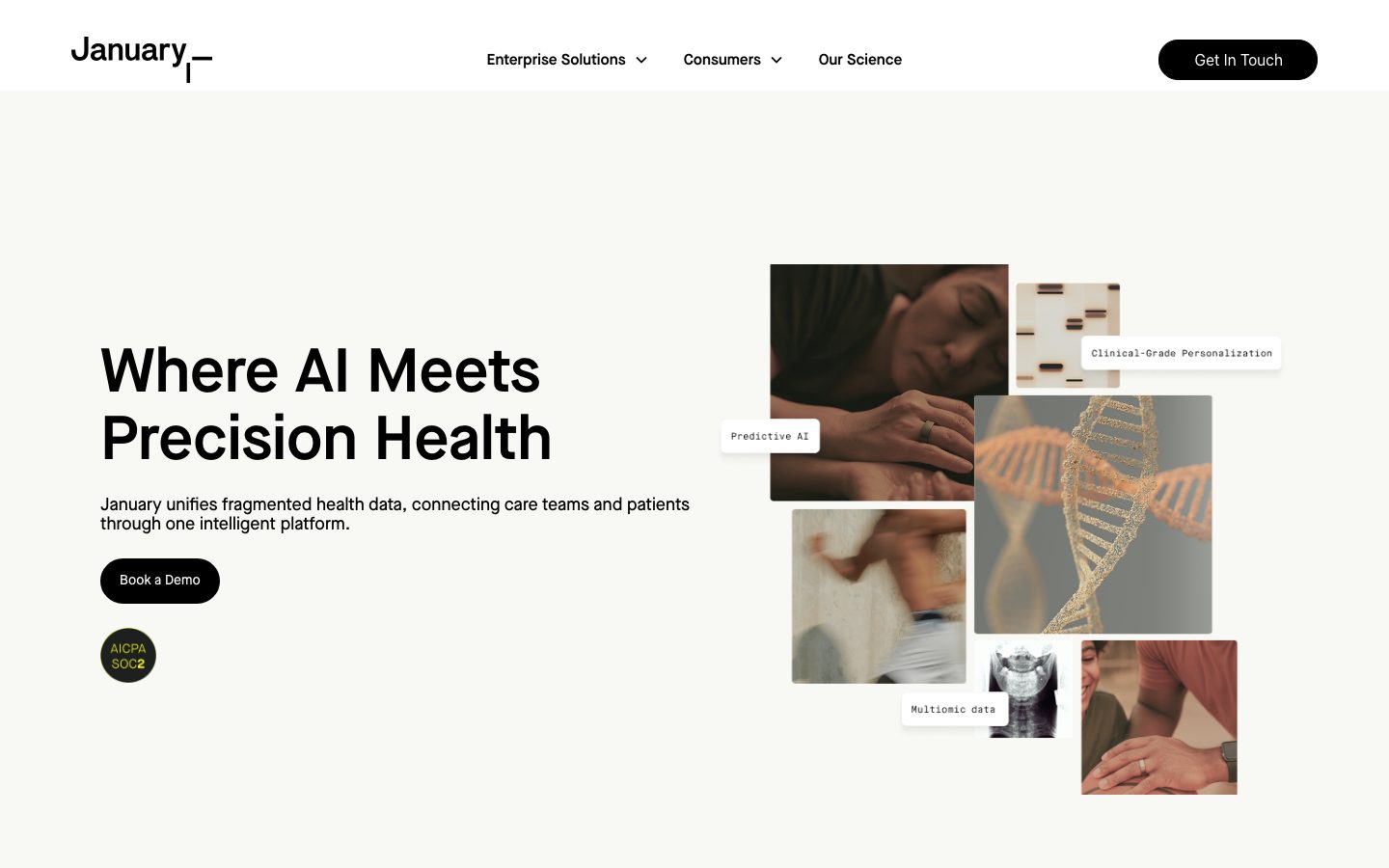
January.ai's marketing surface is a calm, clinical precision-health interface. The page floor alternates between a warm off-white sand canvas (`{colors.surface-sand}` — #e8e8db) in the hero and pure white (`{colors.canvas}` — #ffffff) through the editorial body, punctuated by deep near-black bands (`{colors.surface-dark}` — #1a1b1f) for the "Before / With January" comparison cards, the "Pioneering Innovation" statement band, and the footer. The voice is restrained and trustworthy — heavy black display type, generous whitespace, and a single clinical blue (`{colors.primary}` — #0050bd) reserved for inline links.
Type is monolithic: the entire system runs on **Maison Neue**, a clean geometric grotesque used at weight 600 for all headlines and weight 500 for body and button labels. There is no second typeface — hierarchy comes from size and color rather than family contrast. Headlines hit hard at 64px (h1) and 44px (h2/h3); body sits at 18px / weight 500.
Brand voltage comes from **a scattered editorial photo-collage hero** — overlapping clinical and lifestyle photographs interleaved with small white floating `{component.label-tag}` chips ("Predictive AI", "Clinical-Grade Personalization", "Multiomic data") — and from **product UI mockups shown in soft cool-gray frames** (a laptop dashboard, a phone app). January doesn't draw the product; it photographs it.
The CTA system is a single shape: fully-rounded black pill buttons (`{rounded.pill}` — 200px) with white labels. "Book a Demo", "Get In Touch", and "Get Started" all use the identical `{component.button-primary}`.
**Key Characteristics:**
- Warm sand hero canvas (`{colors.surface-sand}` — #e8e8db) transitioning to pure white editorial bands and deep near-black (`{colors.surface-dark}` — #1a1b1f) statement/footer bands.
- Single typeface — Maison Neue — across all roles. Hierarchy by size + weight, not family.
- Fully-rounded black pill CTAs (`{rounded.pill}` — 200px) with white labels; the only button style in the system.
- Editorial photo-collage hero with small white floating label chips overlapping clinical and lifestyle photography.
- Near-black diagnostic comparison cards ("Before January" / "With January") with light hairline borders and dotted-network texture inside.
- Monochrome restraint — black, sand, white, and near-black do almost all the work; clinical blue (`{colors.primary}` — #0050bd) appears only on inline links.
- Soft single shadow (`rgba(150,163,181,0.08) 0 4px 24px`) on the few elevated surfaces — the system is otherwise flat.
- Dark footer (`{colors.surface-dark}`) with a pill-rounded newsletter input closes every page.
## Colors
### Brand & Accent
- **Primary** (`{colors.primary}` — #0050bd): A clinical blue used sparingly — inline text links ("CMS Medicare App Library") and small accent moments. January is a near-monochrome brand; the blue is a fine-print accent, never a CTA fill.
- **Accent Bright** (`{colors.accent-bright}` — #3898ec), **Accent Blue Alt** (`{colors.accent-blue-alt}` — #1e73be), **Accent Teal** (`{colors.accent-teal}` — #009eb5): A small secondary blue/teal family measured at low frequency — used inside product UI fragments (chart lines, status dots) and link variants. These never appear on marketing chrome.
### Surface
- **Canvas** (`{colors.canvas}` — #ffffff): The default editorial page floor.
- **Canvas Warm** (`{colors.canvas-warm}` — #fffcfc): A barely-warm white used on label chips and very-soft panels.
- **Surface Soft** (`{colors.surface-soft}` — #fafafa): The "How January works" band background.
- **Surface Cool** (`{colors.surface-cool}` — #f5f7fa): Cool-gray frames around product mockups (laptop, phone).
- **Surface Sand** (`{colors.surface-sand}` — #e8e8db): The warm off-white hero canvas and the highlighted "Unify your data" step card.
- **Surface Accent Soft** (`{colors.surface-accent-soft}` — #e4ebf3): A soft blue-gray tint used on subtle accent fills.
- **Surface Dark** (`{colors.surface-dark}` — #1a1b1f): The near-black used for comparison cards, the "Pioneering Innovation" band, and the footer.
- **Surface Darker** (`{colors.surface-darker}` — #222222): A slightly deeper near-black used for nested dark panels.
### Text
- **Ink** (`{colors.ink}` — #000000): All headlines and the pill-button fill.
- **Ink Soft** (`{colors.ink-soft}` — #32343a): Strong secondary text.
- **Body** (`{colors.body}` — #43464d): Default running-text color.
- **Muted** (`{colors.muted}` — #8f8f8f): Tertiary text, logo-strip labels, fine print.
- **Link** (`{colors.link}` — #333333): Default anchor color for non-accent links.
- **On Dark** (`{colors.on-dark}` — #ffffff): Text on the near-black bands, footer, and pill buttons.
### Hairline
- **Hairline** (`{colors.hairline}` — #dddddd), **Hairline Strong** (`{colors.hairline-strong}` — #cccccc), **Hairline Soft** (`{colors.hairline-soft}` — #c5c5c5): The 1px border tones — used on dark-card outlines, dividers, and input borders.
## Typography
### Font Family
The system runs entirely on **Maison Neue** — a clean geometric grotesque — for every role: display headlines, body, and button labels. There is no secondary typeface. Maison Neue is a **commercial, licensed typeface** and is not freely available as a web font; the spec below documents an open-source substitute.
The functional split is by weight, not family:
- Maison Neue 600 — h1, h2, h3 (display)
- Maison Neue 500 — body, button labels
### Hierarchy
| Token | Size | Weight | Line Height | Letter Spacing | Use |
|---|---|---|---|---|---|
| `{typography.display-xl}` | 64px | 600 | 1.1 | normal | Hero h1 ("Where AI Meets Precision Health") |
| `{typography.display-lg}` | 44px | 600 | 1.1 | normal | Section heads ("One intelligence layer for care teams and patients") |
| `{typography.display-md}` | 44px | 600 | 1.2 | normal | Alternate section heads / sub-section heads (h3) |
| `{typography.body}` | 18px | 500 | 1.1 | normal | Default running-text, nav links, card descriptions |
| `{typography.button}` | 20.16px | 500 | 1.25 | normal | Pill-button labels |
### Principles
Hierarchy is carried by size and color rather than typeface contrast. Display heads stay at weight 600; body and buttons stay at 500 — the system never goes lighter than 500 or heavier than 600. The tight line-height (1.1) on both display and body produces a dense, confident block of type. There is no italic, no condensed cut, and no letter-spacing manipulation — everything is set `normal`.
### Note on Font Substitutes
Maison Neue is licensed and cannot be shipped. **Inter** at the same weights (600 display / 500 body) is the closest free substitute — it shares Maison Neue's neutral geometric-grotesque skeleton. **Helvetica Now** or **Neue Haas Grotesk** are closer-but-also-licensed alternatives; for a fully open stack, **Inter** is the recommended fallback and is encoded in the `fontFamily` stacks above.
## Layout
### Spacing System
- **Tokens (measured):** `{spacing.xxs}` 8px · `{spacing.xs}` 14px · `{spacing.sm}` 16px · `{spacing.md}` 18px · `{spacing.lg}` 20px · `{spacing.xl}` 30px · `{spacing.xxl}` 32px · `{spacing.huge}` 36px.
- **Most common rhythm:** 30px (`{spacing.xl}`) and 18px (`{spacing.md}`) dominate the measured set — they handle most card gaps and internal padding.
- **Card internal padding:** ~32px (`{spacing.xxl}`) on the dark comparison cards; ~20px (`{spacing.lg}`) on the highlighted step card.
- **Button padding:** 20px 40px 20px 20px (asymmetric — measured), giving the pill extra right-side room.
### Grid & Container
- **Editorial body:** Left-aligned single column for headline + copy + CTA, with a paired media zone (collage, dashboard photo, phone photo) at right or below.
- **Hero:** Two-zone split — h1 + sub-copy + CTA at left, scattered photo collage at right.
- **Comparison band:** 2-up dark cards ("Before January" / "With January").
- **Feature row:** 3-up icon cards ("Easy-to-integrate APIs", "EHR-connected workflows", "White-label apps").
- **Footer:** Multi-column link list (Blog / Careers / About Us / Press, Contact / Privacy Policy / Terms, AI Whitepaper / What is Metabolic Health / Glycemic index) with newsletter signup.
### Whitespace Philosophy
January uses generous vertical whitespace between bands and lets the heavy 64px/44px display type anchor each section. Sections breathe — there is rarely more than one headline plus a short paragraph and a single CTA per band. The pacing alternates surface tone (sand → white → soft-gray → dark → white → dark footer) to segment the long scroll.
## Elevation & Depth
| Level | Treatment | Use |
|---|---|---|
| Flat | No shadow, no border | Hero band, editorial body sections, footer |
| Soft hairline | 1px `{colors.hairline}` / `{colors.hairline-strong}` border | Dark comparison cards, input outlines |
| Soft drop shadow | `rgba(150, 163, 181, 0.08) 0px 4px 24px 0px` | The few elevated surfaces (floating label chips, lifted mockup frames) |
| Color-block dark | `{colors.surface-dark}` fill | Comparison cards, statement band, footer — contrast does the elevation work |
The elevation philosophy is **flat and editorial**. Only one shadow token was measured — a very low-alpha 24px-blur drop shadow — used to lift the floating photo-collage label chips off the imagery. Dark near-black bands provide depth through color contrast rather than shadow.
### Decorative Depth
- The hero photo collage overlaps frames at slightly different depths, with small white `{component.label-tag}` chips floating over the photography — the layering is the hero's depth signal.
- The dark comparison cards carry an internal dotted-network texture (a faint constellation of dots), reinforcing the "health data everywhere" message.
## Shapes
### Border Radius Scale
| Token | Value | Use |
|---|---|---|
| `{rounded.none}` | 0px | Sharp image-frame edges; measured button base radius (see Known Gaps) |
| `{rounded.md}` | 12px | Floating label chips, dark comparison cards, content panels |
| `{rounded.lg}` | 20px | Text inputs, product-mockup frames |
| `{rounded.pill}` | 200px | All CTA buttons — the fully-rounded pill silhouette |
| `{rounded.full}` | 2880px | Circular elements (e.g., the AICPA SOC2 certification badge) |
A 13px radius was also measured (frequency 2) — treated here as a rounding variant of `{rounded.md}` (12px).
### Photography Geometry
The hero collage mixes rectangular crops with subtly rounded corners (~`{rounded.md}`). Product mockups (laptop dashboard, phone app) sit inside `{rounded.lg}` cool-gray frames. The certification badge is a perfect circle (`{rounded.full}`).
## Components
### Top Navigation
**`top-nav`** — White nav bar across the top of the page. Carries the "January" wordmark with its small underline-mark at left, a center menu ("Enterprise Solutions ▾", "Consumers ▾", "Our Science"), and a black pill `{component.button-primary}` ("Get In Touch") at the right. Menu items in `{typography.body}` (Maison Neue 18px / 500), `{colors.ink}`.
### Buttons
**`button-primary`** — The single CTA style. Fully-rounded black pill: background `{colors.ink}` (#000000), text `{colors.on-dark}` (#ffffff), type `{typography.button}` (Maison Neue 20.16px / 500), rounded `{rounded.pill}` (200px), padding 20px 40px 20px 20px (asymmetric — measured). Used for "Book a Demo", "Get In Touch", and "Get Started" identically.
### Hero & Bands
**`hero-band`** — Warm sand canvas (`{colors.surface-sand}` — #e8e8db). Left zone: h1 in `{typography.display-xl}`, a short sub-paragraph in `{typography.body}`, a `{component.button-primary}` ("Book a Demo"), and the circular AICPA SOC2 badge below. Right zone: the scattered photo collage with floating `{component.label-tag}` chips.
**`label-tag`** — Small white floating chips overlaid on the hero photography ("Predictive AI", "Clinical-Grade Personalization", "Multiomic data"). Background `{colors.canvas}`, text `{colors.ink}`, rounded `{rounded.md}`, with the soft drop shadow lifting them off the imagery.
**`logo-strip`** — "Trusted by Clinicians and Health Platforms Worldwide" partner-logo row. Background `{colors.canvas}`, logo labels in `{colors.muted}`.
**`challenge-card-dark`** — The "Before January" / "With January" comparison cards. Background `{colors.surface-dark}` (#1a1b1f), text `{colors.on-dark}`, 1px hairline border, rounded `{rounded.md}`, internal dotted-network texture. Body checklist items in `{typography.body}`.
**`how-it-works-band`** — The "One intelligence layer…" section. Background `{colors.surface-soft}` (#fafafa), heading in `{typography.display-lg}`. Hosts the stepped list (Unify / Integrate / Activate) beside a dark product dashboard mockup.
**`unify-step-card`** — The highlighted first step ("Unify your data") in the stepped list. Background `{colors.surface-sand}`, text `{colors.ink}`, rounded `{rounded.md}` — the sand fill marks it as the active/featured step against the white sibling steps.
**`feature-icon-card`** — Used in the 3-up "Your Platform. Your Workflow." row. Transparent background, small line icon at top, title and description in `{typography.body}`, `{colors.ink}`. No card fill or border — the icon + text float on the white canvas.
**`product-mockup-card`** — The cool-gray framed product photographs (laptop dashboard, phone app). Background `{colors.surface-cool}` (#f5f7fa), rounded `{rounded.lg}`. Shows the actual January product UI at scale rather than illustrating it.
### Inputs & Forms
**`text-input`** — The footer newsletter signup field ("Enter your email"). Rounded `{rounded.lg}` (20px), set on the dark footer surface — background `{colors.surface-dark}`, text `{colors.on-dark}`, hairline border. Paired with a circular submit arrow.
### CTA & Footer
**`cta-band-dark`** — The "Pioneering Innovation Since 2017" statement band and the "Ready to Get Started?" closer. Background `{colors.surface-dark}` (#1a1b1f), text `{colors.on-dark}`, heading in `{typography.display-lg}`, with a `{component.button-primary}` centered in the closer.
**`footer`** — The dark footer that closes the page. Background `{colors.surface-dark}` (#1a1b1f), text `{colors.on-dark}`. Carries the newsletter signup (`{component.text-input}`), multi-column link lists, social icons, and copyright fine print in `{colors.muted}`.
## Do's and Don'ts
### Do
- Reserve the black pill `{component.button-primary}` for every primary action. January uses one button shape across the whole page.
- Set every headline in Maison Neue 600 and every body/button in 500. Keep the single-typeface discipline.
- Use the warm sand canvas (`{colors.surface-sand}`) for the hero and reserve white for editorial bands.
- Use near-black bands (`{colors.surface-dark}`) deliberately — for the comparison cards, the statement band, and the footer. Color contrast is the depth system.
- Show real product UI inside `{component.product-mockup-card}` cool-gray frames rather than illustrating the product.
- Float small white `{component.label-tag}` chips over hero photography with the soft drop shadow to create the collage layering.
- Keep the clinical blue (`{colors.primary}` — #0050bd) for inline links only.
### Don't
- Don't use the clinical blue as a button or large fill — January's action layer is black-and-white only.
- Don't introduce a second display typeface. Hierarchy comes from size and weight within Maison Neue.
- Don't square off the CTA buttons — the fully-rounded `{rounded.pill}` is the signature shape.
- Don't add heavy shadows. Only the single low-alpha `rgba(150,163,181,0.08) 0 4px 24px` shadow exists; everything else is flat or color-blocked.
- Don't place dark surfaces casually — the near-black bands are scarce, deliberate anchors (comparison, statement, footer).
- Don't document hover states — default and active/pressed only.
## Responsive Behavior
| Name | Width | Key Changes |
|---|---|---|
| Mobile | < 768px | Nav collapses to a compact bar; hero h1 scales down from 64px; photo collage stacks below copy; 3-up feature row → 1-up; comparison cards stack; footer columns collapse |
| Tablet | 768–1024px | Hero split tightens; feature row 3 → 2-up; product mockups scale proportionally |
| Desktop | 1024–1440px | Full two-zone hero with scattered collage; 3-up feature row; side-by-side comparison cards |
| Wide | > 1440px | Same as desktop with more outer breathing room |
### Touch Targets
- `{component.button-primary}` padding (20px 40px 20px 20px) plus the 20.16px label gives a tap target comfortably above 44px tall.
- `{component.text-input}` in the footer is a full-width-on-mobile field with the circular submit button as a discrete target.
### Collapsing Strategy
- The hero collapses from a left-copy / right-collage split to a stacked column; the collage scales beneath the headline.
- Comparison cards stack vertically; the dark fill keeps them distinct at every breakpoint.
- The 3-up feature icon row reduces columns rather than shrinking text.
- Product mockup frames scale proportionally so the dashboard and phone UI stay legible.
### Image Behavior
- Hero collage photographs retain their crop ratios and re-flow into a stack on narrow viewports; floating label chips re-anchor to their parent images.
- Product mockups keep native aspect ratios inside their `{rounded.lg}` frames.
## Iteration Guide
1. Focus on ONE component at a time. Reference its YAML key directly (`{component.challenge-card-dark}`, `{component.product-mockup-card}`).
2. Variants of an existing component live as separate entries in `components:`.
3. Use `{token.refs}` everywhere — never inline hex.
4. Never document hover. Default and Active/Pressed states only.
5. Keep all type in Maison Neue (substitute Inter) — 600 for display, 500 for body/buttons. Do not introduce a second family.
6. The black pill is the only CTA shape; the clinical blue stays on links.
7. Dark near-black bands are scarce anchors — don't multiply them casually.
## Known Gaps
- The component measurement reported `button-primary` radius as `0px`, which contradicts the clearly pill-shaped (`~200px` radius) CTAs in every screenshot. The documented `{rounded.pill}` reflects ground-truth visuals; the 0px reading is likely an inner element or pseudo-state and is flagged here rather than trusted.
- Maison Neue is a commercial licensed typeface but was NOT flagged in `fonts_licensed`; substitution to Inter is documented defensively. Exact licensed-vs-served weights could not be confirmed.
- The hero "With January" heading and AICPA SOC2 badge appear to use a yellow/olive accent in the screenshots, but no such hue was measured — it is omitted from the palette rather than guessed.
- Nav-link, eyebrow-label ("THE CHALLENGE", "HOW JANUARY WORKS"), and caption type roles were not separately measured; body type is referenced as the nearest documented role.
- Only a single shadow value was captured; hover/elevated-state shadows (if any) are not in scope.
- Footer-input background and border tones are inferred from the dark footer context; exact field fill was not measured.
- Animation, transition timings, and dropdown-menu (Enterprise Solutions / Consumers) open states are out of scope.
- Only the landing page was captured; interior pages, product flows, and form validation states are not represented.
<!-- Documented by duply · real-world design systems as ready-to-use DESIGN.md for AI coding agents · https://duply.ai/january/design-md -->
Color Palette
Accent
Neutrals
Typography
display-xl64px · 600 · 1.1
The quick brown fox jumpsdisplay-lg44px · 600 · 1.1
The quick brown fox jumpsdisplay-md44px · 600 · 1.2
The quick brown fox jumpsbody18px · 500 · 1.1
The quick brown fox jumpsbutton20.16px · 500 · 1.25
The quick brown fox jumpsSpacing & Shape
Spacing
| Name | Value | Preview |
|---|---|---|
| xxs | 8px | |
| xs | 14px | |
| sm | 16px | |
| md | 18px | |
| lg | 20px | |
| xl | 30px | |
| xxl | 32px | |
| huge | 36px |
Border Radius
| Name | Value | Preview |
|---|---|---|
| none | 0px | |
| md | 12px | |
| lg | 20px | |
| pill | 200px | |
| full | 2880px |
More like this


---
version: alpha
name: January.ai-design-analysis
description: "A calm, clinical-precision health-tech interface built on a warm off-white canvas with stark black display type set in Maison Neue, fully-rounded black pill CTAs, and a deep near-black surface used for the diagnostic \"before/after\" comparison cards and the closing footer. The system reads as trustworthy precision-medicine SaaS — generous whitespace, a scattered editorial photo-collage hero, monochrome restraint with a single clinical blue link accent, and image-driven product mockups shown in soft cool-gray frames."
colors:
  primary: "#0050bd"
  ink: "#000000"
  ink-soft: "#32343a"
  body: "#43464d"
  muted: "#8f8f8f"
  link: "#333333"
  canvas: "#ffffff"
  canvas-warm: "#fffcfc"
  surface-soft: "#fafafa"
  surface-cool: "#f5f7fa"
  surface-sand: "#e8e8db"
  surface-accent-soft: "#e4ebf3"
  surface-dark: "#1a1b1f"
  surface-darker: "#222222"
  hairline: "#dddddd"
  hairline-strong: "#cccccc"
  hairline-soft: "#c5c5c5"
  on-dark: "#ffffff"
  accent-bright: "#3898ec"
  accent-blue-alt: "#1e73be"
  accent-teal: "#009eb5"
typography:
  display-xl:
    fontFamily: "Maison Neue, Inter, sans-serif"
    fontSize: 64px
    fontWeight: 600
    lineHeight: 1.1
    letterSpacing: normal
  display-lg:
    fontFamily: "Maison Neue, Inter, sans-serif"
    fontSize: 44px
    fontWeight: 600
    lineHeight: 1.1
    letterSpacing: normal
  display-md:
    fontFamily: "Maison Neue, Inter, sans-serif"
    fontSize: 44px
    fontWeight: 600
    lineHeight: 1.2
    letterSpacing: normal
  body:
    fontFamily: "Maison Neue, Inter, sans-serif"
    fontSize: 18px
    fontWeight: 500
    lineHeight: 1.1
    letterSpacing: normal
  button:
    fontFamily: "Maison Neue, Inter, sans-serif"
    fontSize: 20.16px
    fontWeight: 500
    lineHeight: 1.25
    letterSpacing: normal
rounded:
  none: 0px
  md: 12px
  lg: 20px
  pill: 200px
  full: 2880px
spacing:
  xxs: 8px
  xs: 14px
  sm: 16px
  md: 18px
  lg: 20px
  xl: 30px
  xxl: 32px
  huge: 36px
components:
  top-nav:
    backgroundColor: "{colors.canvas}"
    textColor: "{colors.ink}"
    typography: "{typography.body}"
    padding: 18px 30px
  button-primary:
    backgroundColor: "{colors.ink}"
    textColor: "{colors.on-dark}"
    typography: "{typography.button}"
    rounded: "{rounded.pill}"
    padding: 20px 40px 20px 20px
  hero-band:
    backgroundColor: "{colors.surface-sand}"
    textColor: "{colors.ink}"
    typography: "{typography.display-xl}"
    padding: 36px
  label-tag:
    backgroundColor: "{colors.canvas}"
    textColor: "{colors.ink}"
    typography: "{typography.body}"
    rounded: "{rounded.md}"
    padding: 8px 14px
  logo-strip:
    backgroundColor: "{colors.canvas}"
    textColor: "{colors.muted}"
    typography: "{typography.body}"
    padding: 30px
  challenge-card-dark:
    backgroundColor: "{colors.surface-dark}"
    textColor: "{colors.on-dark}"
    typography: "{typography.body}"
    rounded: "{rounded.md}"
    padding: 32px
  how-it-works-band:
    backgroundColor: "{colors.surface-soft}"
    textColor: "{colors.ink}"
    typography: "{typography.display-lg}"
    padding: 36px
  unify-step-card:
    backgroundColor: "{colors.surface-sand}"
    textColor: "{colors.ink}"
    typography: "{typography.body}"
    rounded: "{rounded.md}"
    padding: 20px
  feature-icon-card:
    backgroundColor: transparent
    textColor: "{colors.ink}"
    typography: "{typography.body}"
    padding: 18px
  product-mockup-card:
    backgroundColor: "{colors.surface-cool}"
    textColor: "{colors.ink}"
    rounded: "{rounded.lg}"
    padding: 30px
  text-input:
    backgroundColor: "{colors.surface-dark}"
    textColor: "{colors.on-dark}"
    typography: "{typography.body}"
    rounded: "{rounded.lg}"
    padding: 16px 20px
  cta-band-dark:
    backgroundColor: "{colors.surface-dark}"
    textColor: "{colors.on-dark}"
    typography: "{typography.display-lg}"
    padding: 36px
  footer:
    backgroundColor: "{colors.surface-dark}"
    textColor: "{colors.on-dark}"
    typography: "{typography.body}"
    padding: 32px
---

## Overview

January.ai's marketing surface is a calm, clinical precision-health interface. The page floor alternates between a warm off-white sand canvas (`{colors.surface-sand}` — #e8e8db) in the hero and pure white (`{colors.canvas}` — #ffffff) through the editorial body, punctuated by deep near-black bands (`{colors.surface-dark}` — #1a1b1f) for the "Before / With January" comparison cards, the "Pioneering Innovation" statement band, and the footer. The voice is restrained and trustworthy — heavy black display type, generous whitespace, and a single clinical blue (`{colors.primary}` — #0050bd) reserved for inline links.

Type is monolithic: the entire system runs on **Maison Neue**, a clean geometric grotesque used at weight 600 for all headlines and weight 500 for body and button labels. There is no second typeface — hierarchy comes from size and color rather than family contrast. Headlines hit hard at 64px (h1) and 44px (h2/h3); body sits at 18px / weight 500.

Brand voltage comes from **a scattered editorial photo-collage hero** — overlapping clinical and lifestyle photographs interleaved with small white floating `{component.label-tag}` chips ("Predictive AI", "Clinical-Grade Personalization", "Multiomic data") — and from **product UI mockups shown in soft cool-gray frames** (a laptop dashboard, a phone app). January doesn't draw the product; it photographs it.

The CTA system is a single shape: fully-rounded black pill buttons (`{rounded.pill}` — 200px) with white labels. "Book a Demo", "Get In Touch", and "Get Started" all use the identical `{component.button-primary}`.

**Key Characteristics:**
- Warm sand hero canvas (`{colors.surface-sand}` — #e8e8db) transitioning to pure white editorial bands and deep near-black (`{colors.surface-dark}` — #1a1b1f) statement/footer bands.
- Single typeface — Maison Neue — across all roles. Hierarchy by size + weight, not family.
- Fully-rounded black pill CTAs (`{rounded.pill}` — 200px) with white labels; the only button style in the system.
- Editorial photo-collage hero with small white floating label chips overlapping clinical and lifestyle photography.
- Near-black diagnostic comparison cards ("Before January" / "With January") with light hairline borders and dotted-network texture inside.
- Monochrome restraint — black, sand, white, and near-black do almost all the work; clinical blue (`{colors.primary}` — #0050bd) appears only on inline links.
- Soft single shadow (`rgba(150,163,181,0.08) 0 4px 24px`) on the few elevated surfaces — the system is otherwise flat.
- Dark footer (`{colors.surface-dark}`) with a pill-rounded newsletter input closes every page.

## Colors

### Brand & Accent
- **Primary** (`{colors.primary}` — #0050bd): A clinical blue used sparingly — inline text links ("CMS Medicare App Library") and small accent moments. January is a near-monochrome brand; the blue is a fine-print accent, never a CTA fill.
- **Accent Bright** (`{colors.accent-bright}` — #3898ec), **Accent Blue Alt** (`{colors.accent-blue-alt}` — #1e73be), **Accent Teal** (`{colors.accent-teal}` — #009eb5): A small secondary blue/teal family measured at low frequency — used inside product UI fragments (chart lines, status dots) and link variants. These never appear on marketing chrome.

### Surface
- **Canvas** (`{colors.canvas}` — #ffffff): The default editorial page floor.
- **Canvas Warm** (`{colors.canvas-warm}` — #fffcfc): A barely-warm white used on label chips and very-soft panels.
- **Surface Soft** (`{colors.surface-soft}` — #fafafa): The "How January works" band background.
- **Surface Cool** (`{colors.surface-cool}` — #f5f7fa): Cool-gray frames around product mockups (laptop, phone).
- **Surface Sand** (`{colors.surface-sand}` — #e8e8db): The warm off-white hero canvas and the highlighted "Unify your data" step card.
- **Surface Accent Soft** (`{colors.surface-accent-soft}` — #e4ebf3): A soft blue-gray tint used on subtle accent fills.
- **Surface Dark** (`{colors.surface-dark}` — #1a1b1f): The near-black used for comparison cards, the "Pioneering Innovation" band, and the footer.
- **Surface Darker** (`{colors.surface-darker}` — #222222): A slightly deeper near-black used for nested dark panels.

### Text
- **Ink** (`{colors.ink}` — #000000): All headlines and the pill-button fill.
- **Ink Soft** (`{colors.ink-soft}` — #32343a): Strong secondary text.
- **Body** (`{colors.body}` — #43464d): Default running-text color.
- **Muted** (`{colors.muted}` — #8f8f8f): Tertiary text, logo-strip labels, fine print.
- **Link** (`{colors.link}` — #333333): Default anchor color for non-accent links.
- **On Dark** (`{colors.on-dark}` — #ffffff): Text on the near-black bands, footer, and pill buttons.

### Hairline
- **Hairline** (`{colors.hairline}` — #dddddd), **Hairline Strong** (`{colors.hairline-strong}` — #cccccc), **Hairline Soft** (`{colors.hairline-soft}` — #c5c5c5): The 1px border tones — used on dark-card outlines, dividers, and input borders.

## Typography

### Font Family
The system runs entirely on **Maison Neue** — a clean geometric grotesque — for every role: display headlines, body, and button labels. There is no secondary typeface. Maison Neue is a **commercial, licensed typeface** and is not freely available as a web font; the spec below documents an open-source substitute.

The functional split is by weight, not family:
- Maison Neue 600 — h1, h2, h3 (display)
- Maison Neue 500 — body, button labels

### Hierarchy

| Token | Size | Weight | Line Height | Letter Spacing | Use |
|---|---|---|---|---|---|
| `{typography.display-xl}` | 64px | 600 | 1.1 | normal | Hero h1 ("Where AI Meets Precision Health") |
| `{typography.display-lg}` | 44px | 600 | 1.1 | normal | Section heads ("One intelligence layer for care teams and patients") |
| `{typography.display-md}` | 44px | 600 | 1.2 | normal | Alternate section heads / sub-section heads (h3) |
| `{typography.body}` | 18px | 500 | 1.1 | normal | Default running-text, nav links, card descriptions |
| `{typography.button}` | 20.16px | 500 | 1.25 | normal | Pill-button labels |

### Principles
Hierarchy is carried by size and color rather than typeface contrast. Display heads stay at weight 600; body and buttons stay at 500 — the system never goes lighter than 500 or heavier than 600. The tight line-height (1.1) on both display and body produces a dense, confident block of type. There is no italic, no condensed cut, and no letter-spacing manipulation — everything is set `normal`.

### Note on Font Substitutes
Maison Neue is licensed and cannot be shipped. **Inter** at the same weights (600 display / 500 body) is the closest free substitute — it shares Maison Neue's neutral geometric-grotesque skeleton. **Helvetica Now** or **Neue Haas Grotesk** are closer-but-also-licensed alternatives; for a fully open stack, **Inter** is the recommended fallback and is encoded in the `fontFamily` stacks above.

## Layout

### Spacing System
- **Tokens (measured):** `{spacing.xxs}` 8px · `{spacing.xs}` 14px · `{spacing.sm}` 16px · `{spacing.md}` 18px · `{spacing.lg}` 20px · `{spacing.xl}` 30px · `{spacing.xxl}` 32px · `{spacing.huge}` 36px.
- **Most common rhythm:** 30px (`{spacing.xl}`) and 18px (`{spacing.md}`) dominate the measured set — they handle most card gaps and internal padding.
- **Card internal padding:** ~32px (`{spacing.xxl}`) on the dark comparison cards; ~20px (`{spacing.lg}`) on the highlighted step card.
- **Button padding:** 20px 40px 20px 20px (asymmetric — measured), giving the pill extra right-side room.

### Grid & Container
- **Editorial body:** Left-aligned single column for headline + copy + CTA, with a paired media zone (collage, dashboard photo, phone photo) at right or below.
- **Hero:** Two-zone split — h1 + sub-copy + CTA at left, scattered photo collage at right.
- **Comparison band:** 2-up dark cards ("Before January" / "With January").
- **Feature row:** 3-up icon cards ("Easy-to-integrate APIs", "EHR-connected workflows", "White-label apps").
- **Footer:** Multi-column link list (Blog / Careers / About Us / Press, Contact / Privacy Policy / Terms, AI Whitepaper / What is Metabolic Health / Glycemic index) with newsletter signup.

### Whitespace Philosophy
January uses generous vertical whitespace between bands and lets the heavy 64px/44px display type anchor each section. Sections breathe — there is rarely more than one headline plus a short paragraph and a single CTA per band. The pacing alternates surface tone (sand → white → soft-gray → dark → white → dark footer) to segment the long scroll.

## Elevation & Depth

| Level | Treatment | Use |
|---|---|---|
| Flat | No shadow, no border | Hero band, editorial body sections, footer |
| Soft hairline | 1px `{colors.hairline}` / `{colors.hairline-strong}` border | Dark comparison cards, input outlines |
| Soft drop shadow | `rgba(150, 163, 181, 0.08) 0px 4px 24px 0px` | The few elevated surfaces (floating label chips, lifted mockup frames) |
| Color-block dark | `{colors.surface-dark}` fill | Comparison cards, statement band, footer — contrast does the elevation work |

The elevation philosophy is **flat and editorial**. Only one shadow token was measured — a very low-alpha 24px-blur drop shadow — used to lift the floating photo-collage label chips off the imagery. Dark near-black bands provide depth through color contrast rather than shadow.

### Decorative Depth
- The hero photo collage overlaps frames at slightly different depths, with small white `{component.label-tag}` chips floating over the photography — the layering is the hero's depth signal.
- The dark comparison cards carry an internal dotted-network texture (a faint constellation of dots), reinforcing the "health data everywhere" message.

## Shapes

### Border Radius Scale

| Token | Value | Use |
|---|---|---|
| `{rounded.none}` | 0px | Sharp image-frame edges; measured button base radius (see Known Gaps) |
| `{rounded.md}` | 12px | Floating label chips, dark comparison cards, content panels |
| `{rounded.lg}` | 20px | Text inputs, product-mockup frames |
| `{rounded.pill}` | 200px | All CTA buttons — the fully-rounded pill silhouette |
| `{rounded.full}` | 2880px | Circular elements (e.g., the AICPA SOC2 certification badge) |

A 13px radius was also measured (frequency 2) — treated here as a rounding variant of `{rounded.md}` (12px).

### Photography Geometry
The hero collage mixes rectangular crops with subtly rounded corners (~`{rounded.md}`). Product mockups (laptop dashboard, phone app) sit inside `{rounded.lg}` cool-gray frames. The certification badge is a perfect circle (`{rounded.full}`).

## Components

### Top Navigation

**`top-nav`** — White nav bar across the top of the page. Carries the "January" wordmark with its small underline-mark at left, a center menu ("Enterprise Solutions ▾", "Consumers ▾", "Our Science"), and a black pill `{component.button-primary}` ("Get In Touch") at the right. Menu items in `{typography.body}` (Maison Neue 18px / 500), `{colors.ink}`.

### Buttons

**`button-primary`** — The single CTA style. Fully-rounded black pill: background `{colors.ink}` (#000000), text `{colors.on-dark}` (#ffffff), type `{typography.button}` (Maison Neue 20.16px / 500), rounded `{rounded.pill}` (200px), padding 20px 40px 20px 20px (asymmetric — measured). Used for "Book a Demo", "Get In Touch", and "Get Started" identically.

### Hero & Bands

**`hero-band`** — Warm sand canvas (`{colors.surface-sand}` — #e8e8db). Left zone: h1 in `{typography.display-xl}`, a short sub-paragraph in `{typography.body}`, a `{component.button-primary}` ("Book a Demo"), and the circular AICPA SOC2 badge below. Right zone: the scattered photo collage with floating `{component.label-tag}` chips.

**`label-tag`** — Small white floating chips overlaid on the hero photography ("Predictive AI", "Clinical-Grade Personalization", "Multiomic data"). Background `{colors.canvas}`, text `{colors.ink}`, rounded `{rounded.md}`, with the soft drop shadow lifting them off the imagery.

**`logo-strip`** — "Trusted by Clinicians and Health Platforms Worldwide" partner-logo row. Background `{colors.canvas}`, logo labels in `{colors.muted}`.

**`challenge-card-dark`** — The "Before January" / "With January" comparison cards. Background `{colors.surface-dark}` (#1a1b1f), text `{colors.on-dark}`, 1px hairline border, rounded `{rounded.md}`, internal dotted-network texture. Body checklist items in `{typography.body}`.

**`how-it-works-band`** — The "One intelligence layer…" section. Background `{colors.surface-soft}` (#fafafa), heading in `{typography.display-lg}`. Hosts the stepped list (Unify / Integrate / Activate) beside a dark product dashboard mockup.

**`unify-step-card`** — The highlighted first step ("Unify your data") in the stepped list. Background `{colors.surface-sand}`, text `{colors.ink}`, rounded `{rounded.md}` — the sand fill marks it as the active/featured step against the white sibling steps.

**`feature-icon-card`** — Used in the 3-up "Your Platform. Your Workflow." row. Transparent background, small line icon at top, title and description in `{typography.body}`, `{colors.ink}`. No card fill or border — the icon + text float on the white canvas.

**`product-mockup-card`** — The cool-gray framed product photographs (laptop dashboard, phone app). Background `{colors.surface-cool}` (#f5f7fa), rounded `{rounded.lg}`. Shows the actual January product UI at scale rather than illustrating it.

### Inputs & Forms

**`text-input`** — The footer newsletter signup field ("Enter your email"). Rounded `{rounded.lg}` (20px), set on the dark footer surface — background `{colors.surface-dark}`, text `{colors.on-dark}`, hairline border. Paired with a circular submit arrow.

### CTA & Footer

**`cta-band-dark`** — The "Pioneering Innovation Since 2017" statement band and the "Ready to Get Started?" closer. Background `{colors.surface-dark}` (#1a1b1f), text `{colors.on-dark}`, heading in `{typography.display-lg}`, with a `{component.button-primary}` centered in the closer.

**`footer`** — The dark footer that closes the page. Background `{colors.surface-dark}` (#1a1b1f), text `{colors.on-dark}`. Carries the newsletter signup (`{component.text-input}`), multi-column link lists, social icons, and copyright fine print in `{colors.muted}`.

## Do's and Don'ts

### Do
- Reserve the black pill `{component.button-primary}` for every primary action. January uses one button shape across the whole page.
- Set every headline in Maison Neue 600 and every body/button in 500. Keep the single-typeface discipline.
- Use the warm sand canvas (`{colors.surface-sand}`) for the hero and reserve white for editorial bands.
- Use near-black bands (`{colors.surface-dark}`) deliberately — for the comparison cards, the statement band, and the footer. Color contrast is the depth system.
- Show real product UI inside `{component.product-mockup-card}` cool-gray frames rather than illustrating the product.
- Float small white `{component.label-tag}` chips over hero photography with the soft drop shadow to create the collage layering.
- Keep the clinical blue (`{colors.primary}` — #0050bd) for inline links only.

### Don't
- Don't use the clinical blue as a button or large fill — January's action layer is black-and-white only.
- Don't introduce a second display typeface. Hierarchy comes from size and weight within Maison Neue.
- Don't square off the CTA buttons — the fully-rounded `{rounded.pill}` is the signature shape.
- Don't add heavy shadows. Only the single low-alpha `rgba(150,163,181,0.08) 0 4px 24px` shadow exists; everything else is flat or color-blocked.
- Don't place dark surfaces casually — the near-black bands are scarce, deliberate anchors (comparison, statement, footer).
- Don't document hover states — default and active/pressed only.

## Responsive Behavior

| Name | Width | Key Changes |
|---|---|---|
| Mobile | < 768px | Nav collapses to a compact bar; hero h1 scales down from 64px; photo collage stacks below copy; 3-up feature row → 1-up; comparison cards stack; footer columns collapse |
| Tablet | 768–1024px | Hero split tightens; feature row 3 → 2-up; product mockups scale proportionally |
| Desktop | 1024–1440px | Full two-zone hero with scattered collage; 3-up feature row; side-by-side comparison cards |
| Wide | > 1440px | Same as desktop with more outer breathing room |

### Touch Targets
- `{component.button-primary}` padding (20px 40px 20px 20px) plus the 20.16px label gives a tap target comfortably above 44px tall.
- `{component.text-input}` in the footer is a full-width-on-mobile field with the circular submit button as a discrete target.

### Collapsing Strategy
- The hero collapses from a left-copy / right-collage split to a stacked column; the collage scales beneath the headline.
- Comparison cards stack vertically; the dark fill keeps them distinct at every breakpoint.
- The 3-up feature icon row reduces columns rather than shrinking text.
- Product mockup frames scale proportionally so the dashboard and phone UI stay legible.

### Image Behavior
- Hero collage photographs retain their crop ratios and re-flow into a stack on narrow viewports; floating label chips re-anchor to their parent images.
- Product mockups keep native aspect ratios inside their `{rounded.lg}` frames.

## Iteration Guide

1. Focus on ONE component at a time. Reference its YAML key directly (`{component.challenge-card-dark}`, `{component.product-mockup-card}`).
2. Variants of an existing component live as separate entries in `components:`.
3. Use `{token.refs}` everywhere — never inline hex.
4. Never document hover. Default and Active/Pressed states only.
5. Keep all type in Maison Neue (substitute Inter) — 600 for display, 500 for body/buttons. Do not introduce a second family.
6. The black pill is the only CTA shape; the clinical blue stays on links.
7. Dark near-black bands are scarce anchors — don't multiply them casually.

## Known Gaps

- The component measurement reported `button-primary` radius as `0px`, which contradicts the clearly pill-shaped (`~200px` radius) CTAs in every screenshot. The documented `{rounded.pill}` reflects ground-truth visuals; the 0px reading is likely an inner element or pseudo-state and is flagged here rather than trusted.
- Maison Neue is a commercial licensed typeface but was NOT flagged in `fonts_licensed`; substitution to Inter is documented defensively. Exact licensed-vs-served weights could not be confirmed.
- The hero "With January" heading and AICPA SOC2 badge appear to use a yellow/olive accent in the screenshots, but no such hue was measured — it is omitted from the palette rather than guessed.
- Nav-link, eyebrow-label ("THE CHALLENGE", "HOW JANUARY WORKS"), and caption type roles were not separately measured; body type is referenced as the nearest documented role.
- Only a single shadow value was captured; hover/elevated-state shadows (if any) are not in scope.
- Footer-input background and border tones are inferred from the dark footer context; exact field fill was not measured.
- Animation, transition timings, and dropdown-menu (Enterprise Solutions / Consumers) open states are out of scope.
- Only the landing page was captured; interior pages, product flows, and form validation states are not represented.

<!-- Documented by duply · real-world design systems as ready-to-use DESIGN.md for AI coding agents · https://duply.ai/january/design-md -->