Infisical
A sharp, engineering-first security-tooling interface built on pure-white canvas with true-black ink and zero corner radius — every card, button, and container is a hard rectangle. Brand voltage comes from a single high-voltage yellow highlight (#f5f841) used as a marker-pen swipe behind the hero headline, plus warm lime-to-green and peach gradient artifacts inside product-UI mockups. The type system runs one custom geometric family (Alliance) across display and body, with tight negative tracking on headlines and monospace fragments inside the product chrome.
---
version: alpha
name: Infisical-design-analysis
description: A sharp, engineering-first security-tooling interface built on pure-white canvas with true-black ink and zero corner radius — every card, button, and container is a hard rectangle. Brand voltage comes from a single high-voltage yellow highlight (#f5f841) used as a marker-pen swipe behind the hero headline, plus warm lime-to-green and peach gradient artifacts inside product-UI mockups. The type system runs one custom geometric family (Alliance) across display and body, with tight negative tracking on headlines and monospace fragments inside the product chrome.
colors:
ink: "#000000"
body: "#52525b"
muted: "#737373"
muted-soft: "#999ea8"
muted-cool: "#808591"
neutral-gray: "#6b7280"
hairline: "#dcdcdc"
hairline-soft: "#c0c4cc"
canvas: "#ffffff"
on-dark: "#ffffff"
surface-dark: "#14171f"
surface-charcoal: "#262626"
accent-highlight: "#f5f841"
accent-yellow: "#ffe601"
accent-lime: "#c2d62b"
accent-green: "#56a600"
accent-green-deep: "#0f7a47"
accent-peach: "#ffc299"
warning: "#a16207"
error: "#dc2626"
error-deep: "#b82924"
typography:
display-xl:
fontFamily: "Alliance, Inter, sans-serif"
fontSize: 56px
fontWeight: 500
lineHeight: 1.1
letterSpacing: -1.12px
display-lg:
fontFamily: "Alliance, Inter, sans-serif"
fontSize: 46.08px
fontWeight: 600
lineHeight: 1.05
letterSpacing: -1.3824px
heading:
fontFamily: "Alliance, Inter, sans-serif"
fontSize: 25.92px
fontWeight: 500
lineHeight: 1.1
letterSpacing: -0.5184px
body:
fontFamily: "Alliance, Inter, sans-serif"
fontSize: 16px
fontWeight: 400
lineHeight: 1.5
letterSpacing: normal
button:
fontFamily: "Alliance, Inter, sans-serif"
fontSize: 14px
fontWeight: 400
lineHeight: 1.5
letterSpacing: normal
rounded:
none: 0px
pill: 999px
full: 9999px
spacing:
xxs: 4px
xs: 8px
s: 10px
sm: 12px
md: 14px
lg: 18px
xl: 24px
components:
top-nav:
backgroundColor: "{colors.canvas}"
textColor: "{colors.ink}"
typography: "{typography.button}"
rounded: "{rounded.none}"
padding: 24px
nav-link:
backgroundColor: transparent
textColor: "{colors.ink}"
typography: "{typography.button}"
button-primary:
backgroundColor: "{colors.ink}"
textColor: "{colors.on-dark}"
typography: "{typography.button}"
rounded: "{rounded.none}"
padding: 12px 18px
button-primary-active:
backgroundColor: "{colors.surface-charcoal}"
textColor: "{colors.on-dark}"
rounded: "{rounded.none}"
button-secondary:
backgroundColor: "{colors.canvas}"
textColor: "{colors.body}"
typography: "{typography.button}"
rounded: "{rounded.none}"
padding: 12px 18px
text-link:
backgroundColor: transparent
textColor: "{colors.ink}"
typography: "{typography.body}"
hero-highlight-mark:
backgroundColor: "{colors.accent-highlight}"
textColor: "{colors.ink}"
typography: "{typography.display-lg}"
rounded: "{rounded.none}"
hero-mockup-card:
backgroundColor: "{colors.surface-charcoal}"
textColor: "{colors.on-dark}"
rounded: "{rounded.none}"
card:
backgroundColor: "{colors.canvas}"
textColor: "{colors.ink}"
rounded: "{rounded.none}"
feature-card:
backgroundColor: "{colors.canvas}"
textColor: "{colors.ink}"
typography: "{typography.body}"
rounded: "{rounded.none}"
padding: 24px
product-mockup-card:
backgroundColor: "{colors.canvas}"
textColor: "{colors.ink}"
typography: "{typography.body}"
rounded: "{rounded.none}"
padding: 18px
logo-strip:
backgroundColor: "{colors.canvas}"
textColor: "{colors.muted}"
typography: "{typography.button}"
rounded: "{rounded.none}"
padding: 24px
status-badge-active:
backgroundColor: transparent
textColor: "{colors.accent-green}"
typography: "{typography.button}"
rounded: "{rounded.none}"
status-badge-expired:
backgroundColor: transparent
textColor: "{colors.error}"
typography: "{typography.button}"
rounded: "{rounded.none}"
pill-tag:
backgroundColor: "{colors.accent-highlight}"
textColor: "{colors.ink}"
typography: "{typography.button}"
rounded: "{rounded.pill}"
padding: 4px 12px
---
## Overview
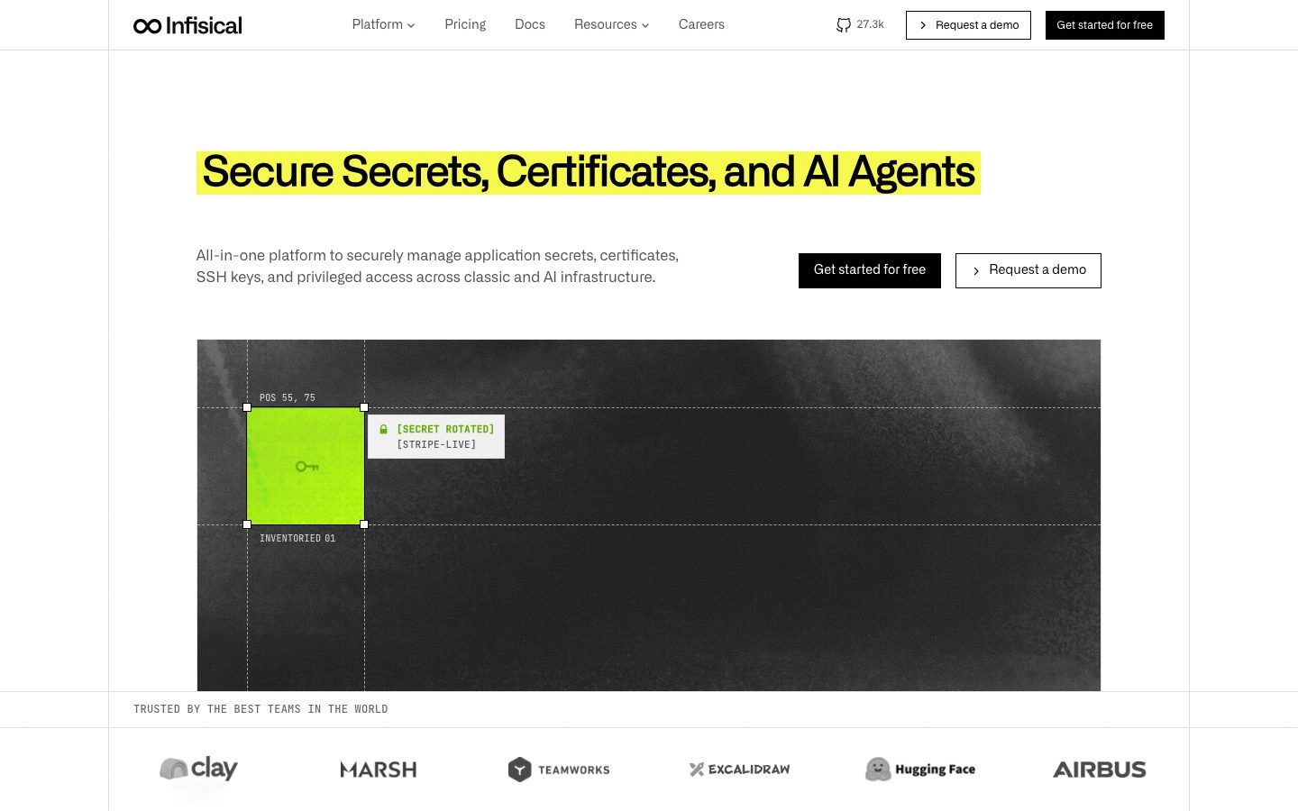
Infisical's marketing surface is a sharp, engineering-first security-tooling interface — pure-white canvas (`{colors.canvas}` — #ffffff), true-black ink (`{colors.ink}` — #000000), and a strict zero-radius geometry where every card, button, and container is a hard rectangle. The system reads as developer-credible and deliberately un-decorated: thin hairline rules section the page, section labels run in small monospace-feeling caps, and the only visual "shout" is a single high-voltage yellow highlight swiped behind the hero headline like a marker pen.
The type voice is monolithic by design: one custom geometric family — **Alliance** — runs from the 56px display headline down to the 14px button label. Display sizes carry tight negative letter-spacing (-1.12px to -1.38px) and middle weights (500–600); body and buttons sit at weight 400 with normal tracking. There is no second brand face on the marketing chrome — the product-UI fragments embedded inside cards switch to a monospace look, but that is product chrome, not a documented marketing role.
Brand voltage comes from two places. First, the **yellow highlight mark** (`{colors.accent-highlight}` — #f5f841) — a solid rectangle behind the hero h1 that turns the headline into a highlighted line of code. Second, **product-UI fragments shown directly inside cards** — certificate tables, secret-rotation panels, session-replay players, an integration grid — each carrying its own warm gradient artifacts (lime-to-green, peach-to-orange). Infisical doesn't illustrate the product; it embeds real product chrome at small scale.
**Key Characteristics:**
- Pure-white canvas with true-black ink and black primary CTAs (`{colors.ink}` — #000000). Buttons are zero-radius (`{rounded.none}`) hard rectangles — no rounding anywhere on cards or buttons.
- Single custom display+body typeface (`Alliance`, substituted with Inter here). Display headlines use weight 500–600 with tight negative tracking; body and buttons stay weight 400.
- The signature yellow highlight mark (`{colors.accent-highlight}` — #f5f841) swiped behind the hero headline — the brand's one high-voltage moment.
- Product-UI fragments embedded inside white cards — certificate tables, secret panels, session-replay players — carrying their own lime-green and peach gradient artifacts.
- Hairline-ruled layout: thin `{colors.hairline}` (#dcdcdc) and `{colors.hairline-soft}` (#c0c4cc) rules divide sections and bound the content column, evoking a technical/blueprint feel.
- Section labels in small caps (e.g. "PRODUCTS", "TRUSTED BY THE BEST TEAMS IN THE WORLD") set the engineering tone.
- Status uses semantic color only: `{colors.accent-green}` (#56a600) for Active, `{colors.error}` (#dc2626) for Expired inside the certificate table.
- Radius is binary: `{rounded.none}` (0px) for everything structural; `{rounded.pill}` / `{rounded.full}` reserved for the occasional inline tag or toggle.
## Colors
### Brand & Accent
- **Highlight** (`{colors.accent-highlight}` — #f5f841): The signature high-voltage yellow. Used as the solid marker-pen rectangle behind the hero headline and on small inline tags. The brand's single loudest color — never used for body text or large fills beyond the headline mark.
- **Yellow** (`{colors.accent-yellow}` — #ffe601): A slightly warmer yellow appearing inside product-UI gradient artifacts (certificate-table glow).
- **Lime** (`{colors.accent-lime}` — #c2d62b) and **Green** (`{colors.accent-green}` — #56a600): The lime-to-green gradient inside the hero mockup's "INVENTORIED 01" swatch and the secrets-management panel. `{colors.accent-green}` also carries the "Active" status state.
- **Green Deep** (`{colors.accent-green-deep}` — #0f7a47): A darker green used for deeper gradient stops and success accents.
- **Peach** (`{colors.accent-peach}` — #ffc299): The warm peach-to-orange gradient in the Privileged Access / session-replay mockup.
### Surface
- **Canvas** (`{colors.canvas}` — #ffffff): The default page floor. Nearly every band sits on white.
- **Surface Dark** (`{colors.surface-dark}` — #14171f): Deep near-black used in product-UI chrome and dark mockup zones.
- **Surface Charcoal** (`{colors.surface-charcoal}` — #262626): The textured dark hero-mockup background (the satellite/terrain image frame) and dark UI fragments.
### Text
- **Ink** (`{colors.ink}` — #000000): All headlines and primary text. The default text tone.
- **Body** (`{colors.body}` — #52525b): Secondary body text and the measured button/control text color.
- **Muted** (`{colors.muted}` — #737373): Section labels, sub-headings, captions.
- **Muted Soft** (`{colors.muted-soft}` — #999ea8) and **Muted Cool** (`{colors.muted-cool}` — #808591): Tertiary text — fine print, table meta, disabled labels.
- **Neutral Gray** (`{colors.neutral-gray}` — #6b7280): Another tertiary tone in product-UI tables.
- **On Dark** (`{colors.on-dark}` — #ffffff): Text and links on black buttons and dark mockup surfaces (measured as the link color).
### Lines
- **Hairline** (`{colors.hairline}` — #dcdcdc): The 1px divider tone — section rules, content-column bounds, ring borders on inputs/cards.
- **Hairline Soft** (`{colors.hairline-soft}` — #c0c4cc): A slightly stronger gray for secondary dividers.
### Semantic
- **Warning** (`{colors.warning}` — #a16207): "Expiring soon" status in the certificate table.
- **Error** (`{colors.error}` — #dc2626): "Expired" status state.
- **Error Deep** (`{colors.error-deep}` — #b82924): A darker red variant for emphasis/icons.
## Typography
### Font Family
The system runs **Alliance** — a custom geometric sans — for the entire marketing surface: display headlines, body copy, buttons, and labels. There is no second marketing face. Display sizes use weights 500–600 with tight negative letter-spacing; body and button labels drop to weight 400 with normal tracking. The fallback stack walks `Inter, -apple-system, BlinkMacSystemFont, "Segoe UI", sans-serif`.
Inside the embedded product-UI fragments (certificate tables, "POS 55, 75", session timestamps) a monospace face is used — but that is product chrome shown as content, not a measured marketing role (see Known Gaps).
### Hierarchy
| Token | Size | Weight | Line Height | Letter Spacing | Use |
|---|---|---|---|---|---|
| `{typography.display-xl}` | 56px | 500 | 1.1 | -1.12px | Largest section statements ("Everyone has secrets. We secure 10 Billion every day.") — Alliance |
| `{typography.display-lg}` | 46.08px | 600 | 1.05 | -1.3824px | Hero h1 ("Secure Secrets, Certificates, and AI Agents") — Alliance |
| `{typography.heading}` | 25.92px | 500 | 1.1 | -0.5184px | Sub-section heads, feature titles ("Secrets Management", "Certificate Management") |
| `{typography.body}` | 16px | 400 | 1.5 | normal | Default running text, descriptions |
| `{typography.button}` | 14px | 400 | 1.5 | normal | Button labels, nav links, small caps section labels |
### Principles
The single-family discipline is the voice: Alliance everywhere, varied only by size, weight (400/500/600), and tracking. Display sizes must carry the negative letter-spacing (-0.5px to -1.4px) — Alliance set with normal tracking at display size reads as off-brand. Body and buttons stay at weight 400 with normal tracking. Never push display weight past 600.
Note the unusual size relationship: the measured h2 (`display-xl`, 56px) is larger than the hero h1 (`display-lg`, 46px) — the hero headline is sized for its highlighted-mark line length, while later editorial statements run larger. Honor the measured roles rather than assuming h1 is always biggest.
### Note on Font Substitutes
Alliance (by Degarism) is a commercial typeface and is not bundled here. **Inter** at the documented weights is a usable substitute that preserves the geometric, near-neutral character; apply roughly -0.025em tracking on display sizes to approximate Alliance's tight headline set. **Suisse Int'l** or **Neue Haas Grotesk** are closer paid alternatives if licensing allows. Never claim to ship Alliance itself.
## Layout
### Spacing System
- **Base unit:** ~4px, but the measured rhythm is irregular (frequent 5/7/9/10/14px values alongside 4/8/12/24).
- **Tokens:** `{spacing.xxs}` 4px · `{spacing.xs}` 8px · `{spacing.s}` 10px · `{spacing.sm}` 12px · `{spacing.md}` 14px · `{spacing.lg}` 18px · `{spacing.xl}` 24px.
- **Most frequent values:** 12px (78×), 18px (48×), 24px (48×), 14px (44×), 8px (43×) — the 12/18/24 cluster carries card padding and gutter rhythm.
- **Card / control padding:** `{spacing.xl}` (24px) for feature cards; `{spacing.lg}` (18px) inside product-mockup panels; `{spacing.sm}` (12px) for tight control padding.
### Grid & Container
- **Content column:** A centered column bounded left and right by thin hairline rules — visible as vertical guides on the landing page.
- **Hero:** Headline + highlight mark and CTA row stack at the top; the wide dark product-mockup card spans the full content width below.
- **Feature bands:** Two-part layouts — a left description/checklist column paired with a right product-UI mockup panel (Secrets, Certificate, Privileged Access management).
- **Logo strip:** A single horizontal row of customer logos (Clay, Marsh, Teamworks, Excalidraw, Hugging Face, Airbus) under a small-caps label.
### Whitespace Philosophy
Infisical uses generous vertical whitespace between bands but keeps it disciplined with hairline rules and small-caps section labels — the page reads like technical documentation rather than a glossy brochure. Whitespace plus thin rules, not shadow or color, does the structural work.
## Elevation & Depth
| Level | Treatment | Use |
|---|---|---|
| Flat | No shadow, no border | Body sections, nav, hero text |
| Hairline ring | `rgb(220,220,220) 0px 0px 0px 1px inset` (`{colors.hairline}`) | Card and panel borders, control outlines |
| Black ring | `rgb(0,0,0) 0px 0px 0px 1px` (`{colors.ink}`) | Emphasized/active control outline |
| Inset soft | `rgba(0,0,0,0.04) 0px 1px 0px inset, rgba(0,0,0,0.05) 0px 2px 8px inset` | Pressed/recessed input fields |
| Colored glow | `oklab(0.648 -0.134 0.134 / 0.28) 0px 0px 28px` (green glow) | Halo behind the lime-green hero swatch / accent moments |
The elevation philosophy is **borders not shadows**. Structure is communicated almost entirely with 1px rings (hairline or black) and zero radius. The only soft shadows are subtle insets on inputs and a single green color-glow used as a brand accent behind the lime swatch.
### Decorative Depth
- The hero mockup card uses a dark textured terrain/satellite photo (`{colors.surface-charcoal}`) with dashed measurement guides, a lime swatch, and a small white "[SECRET ROTATED]" callout chip — depth here is illustrative product chrome, not a system token.
- Product-UI fragments (certificate table, session-replay player) carry their own gradient washes (lime-green, peach-orange) at the panel edge.
## Shapes
### Border Radius Scale
| Token | Value | Use |
|---|---|---|
| `{rounded.none}` | 0px | Everything structural — buttons, cards, panels, inputs, the hero highlight mark. The system is defined by hard rectangles. |
| `{rounded.pill}` | 999px | Rare inline tags / small toggles |
| `{rounded.full}` | 9999px | Fully-round elements — toggle knobs, small status dots |
Zero radius is the system's signature shape decision. Buttons and cards measured at exactly 0px. The only rounded geometry observed is a handful of pill/full elements (38 occurrences of 9999px) used for small inline controls.
### Mockup Geometry
Product-UI fragments shown inside cards retain their native (mostly squared) chrome. The hero mockup uses a wide landscape frame; the lime accent swatch is a hard square. No photography uses rounded corners.
## Components
### Top Navigation
**`top-nav`** — White nav bar pinned to the top of every page. `{colors.canvas}` background, `{colors.ink}` wordmark ("∞ Infisical") at left, horizontal menu (Platform, Pricing, Docs, Resources, Careers) center, and a right cluster with a GitHub star count, a "Request a demo" `{component.button-secondary}`, and a "Get started for free" `{component.button-primary}`. Links use `{typography.button}` (Alliance 14px / 400).
**`nav-link`** — Inline nav menu item, transparent background, `{colors.ink}` text, `{typography.button}`.
### Buttons
**`button-primary`** — The signature primary CTA ("Get started for free"). Black background (`{colors.ink}` — #000000), white text (`{colors.on-dark}`), `{typography.button}`, zero radius (`{rounded.none}`). Active state `button-primary-active` shifts to `{colors.surface-charcoal}` (#262626).
**`button-secondary`** — Outlined demo CTA ("Request a demo"). White background (`{colors.canvas}`), text in `{colors.body}` (#52525b — the measured control color), 1px `{colors.hairline}` ring, zero radius. Carries a small leading chevron icon.
**`text-link`** — Inline "Learn more" / "Explore …" links in `{colors.ink}`, `{typography.body}`, with a leading chevron.
### Hero
**`hero-highlight-mark`** — The brand's signature element: a solid `{colors.accent-highlight}` (#f5f841) rectangle swiped behind the hero h1, turning the headline into a highlighted line. Text inside is `{colors.ink}`, `{typography.display-lg}`, zero radius.
**`hero-mockup-card`** — The wide dark product mockup spanning the content column. Background `{colors.surface-charcoal}` (#262626) with a textured terrain photo, dashed measurement guides ("POS 55, 75", "INVENTORIED 01"), a lime-green accent swatch with a key glyph, and a white "[SECRET ROTATED] / [STRIPE-LIVE]" callout chip. Zero radius.
### Cards & Containers
**`card`** — The base container: `{colors.canvas}` background, zero radius, no shadow (measured `radius: 0px, shadow: none`). Borders, when present, are 1px hairline rings.
**`feature-card`** — Left-column feature description blocks (e.g. "Granular access controls", "Secret rotation & dynamic secrets", "Approval workflows"). White background, `{colors.ink}` title + `{colors.body}` description in `{typography.body}`, a small leading icon, a `{component.text-link}` "Learn more". Padding `{spacing.xl}` (24px), zero radius, hairline-ruled separators between rows.
**`product-mockup-card`** — Panels embedding real product UI: the certificate table (with Active/Expired/Expiring-soon status), the session-replay player, the integration grid. White background, `{spacing.lg}` (18px) padding, zero radius. The product UI inside carries its own gradient artifacts (lime-green, peach-orange) — these cards display the product rather than decorate around it.
### Logos & Tags
**`logo-strip`** — Horizontal customer-logo row under a small-caps "TRUSTED BY THE BEST TEAMS IN THE WORLD" label. White background, logos in muted gray (`{colors.muted}`), `{spacing.xl}` padding, zero radius.
**`pill-tag`** — Small inline tag in `{colors.accent-highlight}` fill with `{colors.ink}` text, `{typography.button}`, `{rounded.pill}`, padding 4px × 12px. One of the few rounded elements in the system.
### Status
**`status-badge-active`** — Inline "Active" status in the certificate table. Transparent background, `{colors.accent-green}` (#56a600) text, `{typography.button}`, zero radius.
**`status-badge-expired`** — Inline "Expired" status. Transparent background, `{colors.error}` (#dc2626) text, `{typography.button}`, zero radius. ("Expiring soon" uses `{colors.warning}` — #a16207.)
## Do's and Don'ts
### Do
- Keep zero radius everywhere structural. Buttons, cards, panels, and the highlight mark are hard rectangles — this is the system's defining shape decision.
- Reserve `{colors.accent-highlight}` (#f5f841) for the hero highlight mark and rare inline tags. It is the brand's one loud color — use it sparingly.
- Run Alliance across all roles; vary by size, weight (400/500/600), and tracking only.
- Apply negative letter-spacing on display sizes (-0.5px to -1.4px). Alliance at display size with normal tracking reads as off-brand.
- Use 1px rings (`{colors.hairline}` or `{colors.ink}`) for structure instead of shadows.
- Embed real product-UI fragments inside white cards. Show the certificate table, the session player, the integration grid — don't illustrate them.
- Use semantic color for status (green Active, red Expired, amber Expiring) and nowhere else in tables.
### Don't
- Don't round corners on cards or buttons. A rounded button reads as a different product.
- Don't use `{colors.accent-highlight}` for body text, large fills, or multiple elements per band — it loses its voltage.
- Don't introduce a second marketing typeface. The monospace look belongs only inside product-UI chrome.
- Don't add drop shadows for elevation — the system uses borders and inset rings, plus a single green glow accent.
- Don't push display weight past 600 or set body above weight 400.
- Don't document hover state — black CTA darkens to `{colors.surface-charcoal}` on press; nothing else changes.
## Responsive Behavior
### Breakpoints
| Name | Width | Key Changes |
|---|---|---|
| Mobile | < 768px | Nav collapses to a menu trigger; hero highlight mark wraps; two-part feature bands stack (description above mockup); logo strip wraps to a grid |
| Tablet | 768–1024px | Nav tightens; feature bands keep the two-part layout but narrow; mockup panels scale down |
| Desktop | 1024–1440px | Full nav with all menu items + GitHub stars + dual CTAs; full-width hero mockup card; side-by-side feature/mockup bands |
| Wide | > 1440px | Same as desktop with more outer breathing room; hairline-bounded content column caps the width |
### Touch Targets
- `{component.button-primary}` and `{component.button-secondary}` carry ~12px × 18px padding around 14px labels — effective tap height clears comfortable minimums.
- Nav links and `{component.text-link}` "Learn more" rows rely on label height plus padding; verify ≥44px effective targets on mobile.
### Collapsing Strategy
- Two-part feature bands (description column + product mockup) stack vertically on mobile: text first, mockup below.
- The wide hero mockup card scales proportionally; its dashed guides and lime swatch stay legible.
- The customer logo strip wraps from a single row to a multi-row grid.
- Hairline content-column rules give way to full-width edges on small screens.
### Image Behavior
- Product-UI fragments retain native aspect ratios; the panels resize around them.
- The dark hero terrain image crops to its frame rather than letterboxing.
## Iteration Guide
1. Focus on ONE component at a time. Reference its YAML key directly (`{component.feature-card}`, `{component.product-mockup-card}`).
2. Variants of a component (`-active`, `-expired`, `-secondary`) live as separate entries in `components:`.
3. Use `{token.refs}` everywhere — never inline a hex in a component.
4. Never document hover. Default and Active/Pressed states only.
5. Keep zero radius on all structural elements; the pill/full radii are reserved for small inline controls.
6. The yellow highlight mark is the brand's one loud moment — don't multiply it.
7. When in doubt about emphasis: bigger Alliance with tighter tracking before brighter color.
## Known Gaps
- The frequency analyzer captured `button-primary` text color as `#52525b` (the gray control/secondary text color) and `padding: 0px / radius: 0px` — the black-background primary CTA is documented from screenshot ground-truth (`{colors.ink}` fill, white label). Exact primary-button padding is approximated as 12px × 18px from the spacing scale (derived).
- Alliance is a commercial typeface; an Inter substitute and tracking guidance are documented, but the bundled rendering will not match Alliance exactly.
- The monospace face used inside product-UI fragments ("POS 55, 75", certificate tables, session timestamps) was not measured as a marketing role — only Alliance roles were captured. A dedicated mono token would need extraction from the product chrome.
- Gradient stops inside product mockups (lime-to-green, peach-to-orange) are inferred from observed accent colors (`{colors.accent-lime}`, `{colors.accent-green}`, `{colors.accent-green-deep}`, `{colors.accent-peach}`); exact gradient geometry/angles are not measured.
- No footer was captured in the analysis; footer surface, color, and layout are out of scope.
- The pricing page was captured but no pricing-specific components (tier cards, toggles) were measured separately — those would need a dedicated extraction pass.
- Animation and transition timings (highlight reveal, session-replay scrubber, integration-grid reveal) are not in scope.
- The irregular spacing rhythm (frequent 5/7/9/10px values) suggests sub-pixel or component-library-derived spacing; tokens here normalize to the dominant 4/8/12/14/18/24 cluster.
<!-- Documented by duply · real-world design systems as ready-to-use DESIGN.md for AI coding agents · https://duply.ai/infisical/design-md -->
Color Palette
Accent
Neutrals
Typography
display-xl56px · 500 · 1.1
The quick brown fox jumpsdisplay-lg46.08px · 600 · 1.05
The quick brown fox jumpsheading25.92px · 500 · 1.1
The quick brown fox jumpsbody16px · 400 · 1.5
The quick brown fox jumpsbutton14px · 400 · 1.5
The quick brown fox jumpsSpacing & Shape
Spacing
| Name | Value | Preview |
|---|---|---|
| xxs | 4px | |
| xs | 8px | |
| s | 10px | |
| sm | 12px | |
| md | 14px | |
| lg | 18px | |
| xl | 24px |
Border Radius
| Name | Value | Preview |
|---|---|---|
| none | 0px | |
| pill | 999px | |
| full | 9999px |
More like this


---
version: alpha
name: Infisical-design-analysis
description: A sharp, engineering-first security-tooling interface built on pure-white canvas with true-black ink and zero corner radius — every card, button, and container is a hard rectangle. Brand voltage comes from a single high-voltage yellow highlight (#f5f841) used as a marker-pen swipe behind the hero headline, plus warm lime-to-green and peach gradient artifacts inside product-UI mockups. The type system runs one custom geometric family (Alliance) across display and body, with tight negative tracking on headlines and monospace fragments inside the product chrome.

colors:
  ink: "#000000"
  body: "#52525b"
  muted: "#737373"
  muted-soft: "#999ea8"
  muted-cool: "#808591"
  neutral-gray: "#6b7280"
  hairline: "#dcdcdc"
  hairline-soft: "#c0c4cc"
  canvas: "#ffffff"
  on-dark: "#ffffff"
  surface-dark: "#14171f"
  surface-charcoal: "#262626"
  accent-highlight: "#f5f841"
  accent-yellow: "#ffe601"
  accent-lime: "#c2d62b"
  accent-green: "#56a600"
  accent-green-deep: "#0f7a47"
  accent-peach: "#ffc299"
  warning: "#a16207"
  error: "#dc2626"
  error-deep: "#b82924"

typography:
  display-xl:
    fontFamily: "Alliance, Inter, sans-serif"
    fontSize: 56px
    fontWeight: 500
    lineHeight: 1.1
    letterSpacing: -1.12px
  display-lg:
    fontFamily: "Alliance, Inter, sans-serif"
    fontSize: 46.08px
    fontWeight: 600
    lineHeight: 1.05
    letterSpacing: -1.3824px
  heading:
    fontFamily: "Alliance, Inter, sans-serif"
    fontSize: 25.92px
    fontWeight: 500
    lineHeight: 1.1
    letterSpacing: -0.5184px
  body:
    fontFamily: "Alliance, Inter, sans-serif"
    fontSize: 16px
    fontWeight: 400
    lineHeight: 1.5
    letterSpacing: normal
  button:
    fontFamily: "Alliance, Inter, sans-serif"
    fontSize: 14px
    fontWeight: 400
    lineHeight: 1.5
    letterSpacing: normal

rounded:
  none: 0px
  pill: 999px
  full: 9999px

spacing:
  xxs: 4px
  xs: 8px
  s: 10px
  sm: 12px
  md: 14px
  lg: 18px
  xl: 24px

components:
  top-nav:
    backgroundColor: "{colors.canvas}"
    textColor: "{colors.ink}"
    typography: "{typography.button}"
    rounded: "{rounded.none}"
    padding: 24px
  nav-link:
    backgroundColor: transparent
    textColor: "{colors.ink}"
    typography: "{typography.button}"
  button-primary:
    backgroundColor: "{colors.ink}"
    textColor: "{colors.on-dark}"
    typography: "{typography.button}"
    rounded: "{rounded.none}"
    padding: 12px 18px
  button-primary-active:
    backgroundColor: "{colors.surface-charcoal}"
    textColor: "{colors.on-dark}"
    rounded: "{rounded.none}"
  button-secondary:
    backgroundColor: "{colors.canvas}"
    textColor: "{colors.body}"
    typography: "{typography.button}"
    rounded: "{rounded.none}"
    padding: 12px 18px
  text-link:
    backgroundColor: transparent
    textColor: "{colors.ink}"
    typography: "{typography.body}"
  hero-highlight-mark:
    backgroundColor: "{colors.accent-highlight}"
    textColor: "{colors.ink}"
    typography: "{typography.display-lg}"
    rounded: "{rounded.none}"
  hero-mockup-card:
    backgroundColor: "{colors.surface-charcoal}"
    textColor: "{colors.on-dark}"
    rounded: "{rounded.none}"
  card:
    backgroundColor: "{colors.canvas}"
    textColor: "{colors.ink}"
    rounded: "{rounded.none}"
  feature-card:
    backgroundColor: "{colors.canvas}"
    textColor: "{colors.ink}"
    typography: "{typography.body}"
    rounded: "{rounded.none}"
    padding: 24px
  product-mockup-card:
    backgroundColor: "{colors.canvas}"
    textColor: "{colors.ink}"
    typography: "{typography.body}"
    rounded: "{rounded.none}"
    padding: 18px
  logo-strip:
    backgroundColor: "{colors.canvas}"
    textColor: "{colors.muted}"
    typography: "{typography.button}"
    rounded: "{rounded.none}"
    padding: 24px
  status-badge-active:
    backgroundColor: transparent
    textColor: "{colors.accent-green}"
    typography: "{typography.button}"
    rounded: "{rounded.none}"
  status-badge-expired:
    backgroundColor: transparent
    textColor: "{colors.error}"
    typography: "{typography.button}"
    rounded: "{rounded.none}"
  pill-tag:
    backgroundColor: "{colors.accent-highlight}"
    textColor: "{colors.ink}"
    typography: "{typography.button}"
    rounded: "{rounded.pill}"
    padding: 4px 12px
---

## Overview

Infisical's marketing surface is a sharp, engineering-first security-tooling interface — pure-white canvas (`{colors.canvas}` — #ffffff), true-black ink (`{colors.ink}` — #000000), and a strict zero-radius geometry where every card, button, and container is a hard rectangle. The system reads as developer-credible and deliberately un-decorated: thin hairline rules section the page, section labels run in small monospace-feeling caps, and the only visual "shout" is a single high-voltage yellow highlight swiped behind the hero headline like a marker pen.

The type voice is monolithic by design: one custom geometric family — **Alliance** — runs from the 56px display headline down to the 14px button label. Display sizes carry tight negative letter-spacing (-1.12px to -1.38px) and middle weights (500–600); body and buttons sit at weight 400 with normal tracking. There is no second brand face on the marketing chrome — the product-UI fragments embedded inside cards switch to a monospace look, but that is product chrome, not a documented marketing role.

Brand voltage comes from two places. First, the **yellow highlight mark** (`{colors.accent-highlight}` — #f5f841) — a solid rectangle behind the hero h1 that turns the headline into a highlighted line of code. Second, **product-UI fragments shown directly inside cards** — certificate tables, secret-rotation panels, session-replay players, an integration grid — each carrying its own warm gradient artifacts (lime-to-green, peach-to-orange). Infisical doesn't illustrate the product; it embeds real product chrome at small scale.

**Key Characteristics:**
- Pure-white canvas with true-black ink and black primary CTAs (`{colors.ink}` — #000000). Buttons are zero-radius (`{rounded.none}`) hard rectangles — no rounding anywhere on cards or buttons.
- Single custom display+body typeface (`Alliance`, substituted with Inter here). Display headlines use weight 500–600 with tight negative tracking; body and buttons stay weight 400.
- The signature yellow highlight mark (`{colors.accent-highlight}` — #f5f841) swiped behind the hero headline — the brand's one high-voltage moment.
- Product-UI fragments embedded inside white cards — certificate tables, secret panels, session-replay players — carrying their own lime-green and peach gradient artifacts.
- Hairline-ruled layout: thin `{colors.hairline}` (#dcdcdc) and `{colors.hairline-soft}` (#c0c4cc) rules divide sections and bound the content column, evoking a technical/blueprint feel.
- Section labels in small caps (e.g. "PRODUCTS", "TRUSTED BY THE BEST TEAMS IN THE WORLD") set the engineering tone.
- Status uses semantic color only: `{colors.accent-green}` (#56a600) for Active, `{colors.error}` (#dc2626) for Expired inside the certificate table.
- Radius is binary: `{rounded.none}` (0px) for everything structural; `{rounded.pill}` / `{rounded.full}` reserved for the occasional inline tag or toggle.

## Colors

### Brand & Accent
- **Highlight** (`{colors.accent-highlight}` — #f5f841): The signature high-voltage yellow. Used as the solid marker-pen rectangle behind the hero headline and on small inline tags. The brand's single loudest color — never used for body text or large fills beyond the headline mark.
- **Yellow** (`{colors.accent-yellow}` — #ffe601): A slightly warmer yellow appearing inside product-UI gradient artifacts (certificate-table glow).
- **Lime** (`{colors.accent-lime}` — #c2d62b) and **Green** (`{colors.accent-green}` — #56a600): The lime-to-green gradient inside the hero mockup's "INVENTORIED 01" swatch and the secrets-management panel. `{colors.accent-green}` also carries the "Active" status state.
- **Green Deep** (`{colors.accent-green-deep}` — #0f7a47): A darker green used for deeper gradient stops and success accents.
- **Peach** (`{colors.accent-peach}` — #ffc299): The warm peach-to-orange gradient in the Privileged Access / session-replay mockup.

### Surface
- **Canvas** (`{colors.canvas}` — #ffffff): The default page floor. Nearly every band sits on white.
- **Surface Dark** (`{colors.surface-dark}` — #14171f): Deep near-black used in product-UI chrome and dark mockup zones.
- **Surface Charcoal** (`{colors.surface-charcoal}` — #262626): The textured dark hero-mockup background (the satellite/terrain image frame) and dark UI fragments.

### Text
- **Ink** (`{colors.ink}` — #000000): All headlines and primary text. The default text tone.
- **Body** (`{colors.body}` — #52525b): Secondary body text and the measured button/control text color.
- **Muted** (`{colors.muted}` — #737373): Section labels, sub-headings, captions.
- **Muted Soft** (`{colors.muted-soft}` — #999ea8) and **Muted Cool** (`{colors.muted-cool}` — #808591): Tertiary text — fine print, table meta, disabled labels.
- **Neutral Gray** (`{colors.neutral-gray}` — #6b7280): Another tertiary tone in product-UI tables.
- **On Dark** (`{colors.on-dark}` — #ffffff): Text and links on black buttons and dark mockup surfaces (measured as the link color).

### Lines
- **Hairline** (`{colors.hairline}` — #dcdcdc): The 1px divider tone — section rules, content-column bounds, ring borders on inputs/cards.
- **Hairline Soft** (`{colors.hairline-soft}` — #c0c4cc): A slightly stronger gray for secondary dividers.

### Semantic
- **Warning** (`{colors.warning}` — #a16207): "Expiring soon" status in the certificate table.
- **Error** (`{colors.error}` — #dc2626): "Expired" status state.
- **Error Deep** (`{colors.error-deep}` — #b82924): A darker red variant for emphasis/icons.

## Typography

### Font Family
The system runs **Alliance** — a custom geometric sans — for the entire marketing surface: display headlines, body copy, buttons, and labels. There is no second marketing face. Display sizes use weights 500–600 with tight negative letter-spacing; body and button labels drop to weight 400 with normal tracking. The fallback stack walks `Inter, -apple-system, BlinkMacSystemFont, "Segoe UI", sans-serif`.

Inside the embedded product-UI fragments (certificate tables, "POS 55, 75", session timestamps) a monospace face is used — but that is product chrome shown as content, not a measured marketing role (see Known Gaps).

### Hierarchy

| Token | Size | Weight | Line Height | Letter Spacing | Use |
|---|---|---|---|---|---|
| `{typography.display-xl}` | 56px | 500 | 1.1 | -1.12px | Largest section statements ("Everyone has secrets. We secure 10 Billion every day.") — Alliance |
| `{typography.display-lg}` | 46.08px | 600 | 1.05 | -1.3824px | Hero h1 ("Secure Secrets, Certificates, and AI Agents") — Alliance |
| `{typography.heading}` | 25.92px | 500 | 1.1 | -0.5184px | Sub-section heads, feature titles ("Secrets Management", "Certificate Management") |
| `{typography.body}` | 16px | 400 | 1.5 | normal | Default running text, descriptions |
| `{typography.button}` | 14px | 400 | 1.5 | normal | Button labels, nav links, small caps section labels |

### Principles
The single-family discipline is the voice: Alliance everywhere, varied only by size, weight (400/500/600), and tracking. Display sizes must carry the negative letter-spacing (-0.5px to -1.4px) — Alliance set with normal tracking at display size reads as off-brand. Body and buttons stay at weight 400 with normal tracking. Never push display weight past 600.

Note the unusual size relationship: the measured h2 (`display-xl`, 56px) is larger than the hero h1 (`display-lg`, 46px) — the hero headline is sized for its highlighted-mark line length, while later editorial statements run larger. Honor the measured roles rather than assuming h1 is always biggest.

### Note on Font Substitutes
Alliance (by Degarism) is a commercial typeface and is not bundled here. **Inter** at the documented weights is a usable substitute that preserves the geometric, near-neutral character; apply roughly -0.025em tracking on display sizes to approximate Alliance's tight headline set. **Suisse Int'l** or **Neue Haas Grotesk** are closer paid alternatives if licensing allows. Never claim to ship Alliance itself.

## Layout

### Spacing System
- **Base unit:** ~4px, but the measured rhythm is irregular (frequent 5/7/9/10/14px values alongside 4/8/12/24).
- **Tokens:** `{spacing.xxs}` 4px · `{spacing.xs}` 8px · `{spacing.s}` 10px · `{spacing.sm}` 12px · `{spacing.md}` 14px · `{spacing.lg}` 18px · `{spacing.xl}` 24px.
- **Most frequent values:** 12px (78×), 18px (48×), 24px (48×), 14px (44×), 8px (43×) — the 12/18/24 cluster carries card padding and gutter rhythm.
- **Card / control padding:** `{spacing.xl}` (24px) for feature cards; `{spacing.lg}` (18px) inside product-mockup panels; `{spacing.sm}` (12px) for tight control padding.

### Grid & Container
- **Content column:** A centered column bounded left and right by thin hairline rules — visible as vertical guides on the landing page.
- **Hero:** Headline + highlight mark and CTA row stack at the top; the wide dark product-mockup card spans the full content width below.
- **Feature bands:** Two-part layouts — a left description/checklist column paired with a right product-UI mockup panel (Secrets, Certificate, Privileged Access management).
- **Logo strip:** A single horizontal row of customer logos (Clay, Marsh, Teamworks, Excalidraw, Hugging Face, Airbus) under a small-caps label.

### Whitespace Philosophy
Infisical uses generous vertical whitespace between bands but keeps it disciplined with hairline rules and small-caps section labels — the page reads like technical documentation rather than a glossy brochure. Whitespace plus thin rules, not shadow or color, does the structural work.

## Elevation & Depth

| Level | Treatment | Use |
|---|---|---|
| Flat | No shadow, no border | Body sections, nav, hero text |
| Hairline ring | `rgb(220,220,220) 0px 0px 0px 1px inset` (`{colors.hairline}`) | Card and panel borders, control outlines |
| Black ring | `rgb(0,0,0) 0px 0px 0px 1px` (`{colors.ink}`) | Emphasized/active control outline |
| Inset soft | `rgba(0,0,0,0.04) 0px 1px 0px inset, rgba(0,0,0,0.05) 0px 2px 8px inset` | Pressed/recessed input fields |
| Colored glow | `oklab(0.648 -0.134 0.134 / 0.28) 0px 0px 28px` (green glow) | Halo behind the lime-green hero swatch / accent moments |

The elevation philosophy is **borders not shadows**. Structure is communicated almost entirely with 1px rings (hairline or black) and zero radius. The only soft shadows are subtle insets on inputs and a single green color-glow used as a brand accent behind the lime swatch.

### Decorative Depth
- The hero mockup card uses a dark textured terrain/satellite photo (`{colors.surface-charcoal}`) with dashed measurement guides, a lime swatch, and a small white "[SECRET ROTATED]" callout chip — depth here is illustrative product chrome, not a system token.
- Product-UI fragments (certificate table, session-replay player) carry their own gradient washes (lime-green, peach-orange) at the panel edge.

## Shapes

### Border Radius Scale

| Token | Value | Use |
|---|---|---|
| `{rounded.none}` | 0px | Everything structural — buttons, cards, panels, inputs, the hero highlight mark. The system is defined by hard rectangles. |
| `{rounded.pill}` | 999px | Rare inline tags / small toggles |
| `{rounded.full}` | 9999px | Fully-round elements — toggle knobs, small status dots |

Zero radius is the system's signature shape decision. Buttons and cards measured at exactly 0px. The only rounded geometry observed is a handful of pill/full elements (38 occurrences of 9999px) used for small inline controls.

### Mockup Geometry
Product-UI fragments shown inside cards retain their native (mostly squared) chrome. The hero mockup uses a wide landscape frame; the lime accent swatch is a hard square. No photography uses rounded corners.

## Components

### Top Navigation

**`top-nav`** — White nav bar pinned to the top of every page. `{colors.canvas}` background, `{colors.ink}` wordmark ("∞ Infisical") at left, horizontal menu (Platform, Pricing, Docs, Resources, Careers) center, and a right cluster with a GitHub star count, a "Request a demo" `{component.button-secondary}`, and a "Get started for free" `{component.button-primary}`. Links use `{typography.button}` (Alliance 14px / 400).

**`nav-link`** — Inline nav menu item, transparent background, `{colors.ink}` text, `{typography.button}`.

### Buttons

**`button-primary`** — The signature primary CTA ("Get started for free"). Black background (`{colors.ink}` — #000000), white text (`{colors.on-dark}`), `{typography.button}`, zero radius (`{rounded.none}`). Active state `button-primary-active` shifts to `{colors.surface-charcoal}` (#262626).

**`button-secondary`** — Outlined demo CTA ("Request a demo"). White background (`{colors.canvas}`), text in `{colors.body}` (#52525b — the measured control color), 1px `{colors.hairline}` ring, zero radius. Carries a small leading chevron icon.

**`text-link`** — Inline "Learn more" / "Explore …" links in `{colors.ink}`, `{typography.body}`, with a leading chevron.

### Hero

**`hero-highlight-mark`** — The brand's signature element: a solid `{colors.accent-highlight}` (#f5f841) rectangle swiped behind the hero h1, turning the headline into a highlighted line. Text inside is `{colors.ink}`, `{typography.display-lg}`, zero radius.

**`hero-mockup-card`** — The wide dark product mockup spanning the content column. Background `{colors.surface-charcoal}` (#262626) with a textured terrain photo, dashed measurement guides ("POS 55, 75", "INVENTORIED 01"), a lime-green accent swatch with a key glyph, and a white "[SECRET ROTATED] / [STRIPE-LIVE]" callout chip. Zero radius.

### Cards & Containers

**`card`** — The base container: `{colors.canvas}` background, zero radius, no shadow (measured `radius: 0px, shadow: none`). Borders, when present, are 1px hairline rings.

**`feature-card`** — Left-column feature description blocks (e.g. "Granular access controls", "Secret rotation & dynamic secrets", "Approval workflows"). White background, `{colors.ink}` title + `{colors.body}` description in `{typography.body}`, a small leading icon, a `{component.text-link}` "Learn more". Padding `{spacing.xl}` (24px), zero radius, hairline-ruled separators between rows.

**`product-mockup-card`** — Panels embedding real product UI: the certificate table (with Active/Expired/Expiring-soon status), the session-replay player, the integration grid. White background, `{spacing.lg}` (18px) padding, zero radius. The product UI inside carries its own gradient artifacts (lime-green, peach-orange) — these cards display the product rather than decorate around it.

### Logos & Tags

**`logo-strip`** — Horizontal customer-logo row under a small-caps "TRUSTED BY THE BEST TEAMS IN THE WORLD" label. White background, logos in muted gray (`{colors.muted}`), `{spacing.xl}` padding, zero radius.

**`pill-tag`** — Small inline tag in `{colors.accent-highlight}` fill with `{colors.ink}` text, `{typography.button}`, `{rounded.pill}`, padding 4px × 12px. One of the few rounded elements in the system.

### Status

**`status-badge-active`** — Inline "Active" status in the certificate table. Transparent background, `{colors.accent-green}` (#56a600) text, `{typography.button}`, zero radius.

**`status-badge-expired`** — Inline "Expired" status. Transparent background, `{colors.error}` (#dc2626) text, `{typography.button}`, zero radius. ("Expiring soon" uses `{colors.warning}` — #a16207.)

## Do's and Don'ts

### Do
- Keep zero radius everywhere structural. Buttons, cards, panels, and the highlight mark are hard rectangles — this is the system's defining shape decision.
- Reserve `{colors.accent-highlight}` (#f5f841) for the hero highlight mark and rare inline tags. It is the brand's one loud color — use it sparingly.
- Run Alliance across all roles; vary by size, weight (400/500/600), and tracking only.
- Apply negative letter-spacing on display sizes (-0.5px to -1.4px). Alliance at display size with normal tracking reads as off-brand.
- Use 1px rings (`{colors.hairline}` or `{colors.ink}`) for structure instead of shadows.
- Embed real product-UI fragments inside white cards. Show the certificate table, the session player, the integration grid — don't illustrate them.
- Use semantic color for status (green Active, red Expired, amber Expiring) and nowhere else in tables.

### Don't
- Don't round corners on cards or buttons. A rounded button reads as a different product.
- Don't use `{colors.accent-highlight}` for body text, large fills, or multiple elements per band — it loses its voltage.
- Don't introduce a second marketing typeface. The monospace look belongs only inside product-UI chrome.
- Don't add drop shadows for elevation — the system uses borders and inset rings, plus a single green glow accent.
- Don't push display weight past 600 or set body above weight 400.
- Don't document hover state — black CTA darkens to `{colors.surface-charcoal}` on press; nothing else changes.

## Responsive Behavior

### Breakpoints

| Name | Width | Key Changes |
|---|---|---|
| Mobile | < 768px | Nav collapses to a menu trigger; hero highlight mark wraps; two-part feature bands stack (description above mockup); logo strip wraps to a grid |
| Tablet | 768–1024px | Nav tightens; feature bands keep the two-part layout but narrow; mockup panels scale down |
| Desktop | 1024–1440px | Full nav with all menu items + GitHub stars + dual CTAs; full-width hero mockup card; side-by-side feature/mockup bands |
| Wide | > 1440px | Same as desktop with more outer breathing room; hairline-bounded content column caps the width |

### Touch Targets
- `{component.button-primary}` and `{component.button-secondary}` carry ~12px × 18px padding around 14px labels — effective tap height clears comfortable minimums.
- Nav links and `{component.text-link}` "Learn more" rows rely on label height plus padding; verify ≥44px effective targets on mobile.

### Collapsing Strategy
- Two-part feature bands (description column + product mockup) stack vertically on mobile: text first, mockup below.
- The wide hero mockup card scales proportionally; its dashed guides and lime swatch stay legible.
- The customer logo strip wraps from a single row to a multi-row grid.
- Hairline content-column rules give way to full-width edges on small screens.

### Image Behavior
- Product-UI fragments retain native aspect ratios; the panels resize around them.
- The dark hero terrain image crops to its frame rather than letterboxing.

## Iteration Guide

1. Focus on ONE component at a time. Reference its YAML key directly (`{component.feature-card}`, `{component.product-mockup-card}`).
2. Variants of a component (`-active`, `-expired`, `-secondary`) live as separate entries in `components:`.
3. Use `{token.refs}` everywhere — never inline a hex in a component.
4. Never document hover. Default and Active/Pressed states only.
5. Keep zero radius on all structural elements; the pill/full radii are reserved for small inline controls.
6. The yellow highlight mark is the brand's one loud moment — don't multiply it.
7. When in doubt about emphasis: bigger Alliance with tighter tracking before brighter color.

## Known Gaps

- The frequency analyzer captured `button-primary` text color as `#52525b` (the gray control/secondary text color) and `padding: 0px / radius: 0px` — the black-background primary CTA is documented from screenshot ground-truth (`{colors.ink}` fill, white label). Exact primary-button padding is approximated as 12px × 18px from the spacing scale (derived).
- Alliance is a commercial typeface; an Inter substitute and tracking guidance are documented, but the bundled rendering will not match Alliance exactly.
- The monospace face used inside product-UI fragments ("POS 55, 75", certificate tables, session timestamps) was not measured as a marketing role — only Alliance roles were captured. A dedicated mono token would need extraction from the product chrome.
- Gradient stops inside product mockups (lime-to-green, peach-to-orange) are inferred from observed accent colors (`{colors.accent-lime}`, `{colors.accent-green}`, `{colors.accent-green-deep}`, `{colors.accent-peach}`); exact gradient geometry/angles are not measured.
- No footer was captured in the analysis; footer surface, color, and layout are out of scope.
- The pricing page was captured but no pricing-specific components (tier cards, toggles) were measured separately — those would need a dedicated extraction pass.
- Animation and transition timings (highlight reveal, session-replay scrubber, integration-grid reveal) are not in scope.
- The irregular spacing rhythm (frequent 5/7/9/10px values) suggests sub-pixel or component-library-derived spacing; tokens here normalize to the dominant 4/8/12/14/18/24 cluster.

<!-- Documented by duply · real-world design systems as ready-to-use DESIGN.md for AI coding agents · https://duply.ai/infisical/design-md -->